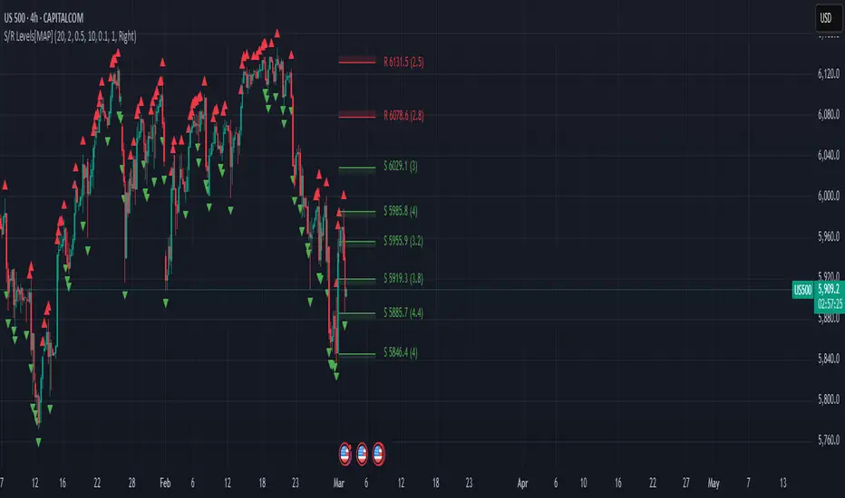
Advanced Support and Resistance Levels[MAP]Advanced Support and Resistance Levels Indicator
Author
Developed by:
Overview
The "Advanced Support and Resistance Levels" indicator, created, is a sophisticated tool designed for TradingView's Pine Script v6 platform. It identifies and plots key support and resistance levels on a price chart, enhancing technical analysis by incorporating pivot strength, volume weighting, and level decay. The indicator overlays lines, zones, and labels on the chart, providing a visual representation of significant price levels where the market has historically reversed or consolidated.
Purpose
This indicator, authored by , aims to:
Detect significant pivot points (highs and lows) with customizable strength requirements.
Track and rank support/resistance levels based on their recency, volume, and number of touches.
Display these levels as lines and optional zones, with strength-based visual cues (e.g., line thickness and opacity).
Offer flexibility through user-configurable settings to adapt to different trading styles and market conditions.
Features
Pivot Detection:
Identifies high and low pivots using a strength parameter, requiring a specified number of bars on either side where no higher highs or lower lows occur.
Incorporates closing price checks and SMA-based trend confirmation to filter out noise and ensure pivots align with the broader market direction.
Level Management:
Maintains a dynamic array of levels with attributes: price, type (support/resistance), bars since last touch, strength, and volume.
Merges nearby levels within a tolerance percentage, updating prices with a strength-weighted average.
Prunes weaker or older levels when exceeding the maximum allowed, prioritizing those with higher calculated strength.
Strength Calculation:
Combines the number of touches (strength), volume (if enabled), and age decay (if enabled) into a single metric.
Volume weighting uses a logarithmic scale to emphasize high-volume pivots without over-amplifying extreme values.
Age decay reduces the importance of older levels over time, ensuring relevance to current price action.
Visualization:
Draws horizontal lines at each level, with thickness reflecting the number of touches (up to a user-defined maximum).
Optional price zones around levels, sized as a percentage of the price, to indicate areas of influence.
Labels display the level type (S for support, R for resistance), price, and strength score, with position (left or right) customizable.
Line opacity varies with strength, providing a visual hierarchy of level significance.
Plots small triangles at detected pivot points for reference.
Inputs
Lookback Period (lookback, default: 20): Number of bars to consider for trend confirmation via SMA. Range: 5–100.
Pivot Strength (strength, default: 2): Number of bars required on each side of a pivot to confirm it. Range: 1–10.
Price Tolerance % (tolerance, default: 0.5): Percentage range for merging similar levels. Range: 0.1–5.
Max Levels to Show (maxLevels, default: 10): Maximum number of levels displayed. Range: 2–50.
Zone Size % (zoneSizePercent, default: 0.1): Size of the S/R zone as a percentage of the price. Range: 0–1.
Line Width (lineWidth, default: 1): Maximum thickness of level lines. Range: 1–5.
Show Labels (showLabels, default: true): Toggle visibility of level labels.
Label Position (labelPos, default: "Right"): Position of labels ("Left" or "Right").
Level Strength Decay (levelDecay, default: true): Enable gradual reduction in strength for older levels.
Volume Weighting (volumeWeight, default: true): Incorporate volume into level strength calculations.
Support Color (supportColor, default: green): Color for support levels.
Resistance Color (resistColor, default: red): Color for resistance levels.
How It Works
Pivot Detection:
Checks for pivots only after enough bars (2 * strength) have passed.
A high pivot requires strength bars before and after with no higher highs or closes, and a short-term SMA above a long-term SMA.
A low pivot requires strength bars before and after with no lower lows or closes, and a short-term SMA below a long-term SMA.
Level Tracking:
New pivots create levels with initial strength and volume.
Existing levels within tolerance are updated: strength increases, volume takes the maximum value, and price adjusts via a weighted average.
Levels older than lookback * 4 bars with strength below 0.5 are removed.
If the number of levels exceeds maxLevels, the weakest (by calculated strength) are pruned using a selection sort algorithm.
Drawing:
Updates on the last confirmed bar or in real-time.
Lines extend lookback bars left and right from the current bar, with thickness based on touches.
Zones (if enabled) are drawn symmetrically around the level price.
Labels show detailed info, with opacity tied to strength.
Usage
Add to Chart: Apply the indicator to any TradingView chart via the Pine Script editor, as designed by .
Adjust Settings: Customize inputs to match your trading strategy (e.g., increase strength for stronger pivots, adjust tolerance for tighter level merging).
Interpret Levels: Focus on thicker, less transparent lines for stronger levels; use zones to identify potential reversal areas.
Combine with Other Tools: Pair with trend indicators or oscillators for confluence in trading decisions.
Notes
Performance: The indicator uses arrays and sorting, which may slow down on very long charts with many levels. Keep maxLevels reasonable for efficiency.
Accuracy: Enhanced by trend confirmation and volume weighting, making it more reliable than basic S/R indicators, thanks to 's design.
Limitations: Real-time updates may shift levels as new pivots form; historical levels are more stable.
Example Settings
For day trading: lookback=10, strength=1, tolerance=0.3, maxLevels=5.
For swing trading: lookback=50, strength=3, tolerance=0.7, maxLevels=10.
Credits
Author: – Creator of this advanced support and resistance tool, blending precision and customization for traders.
"track" için komut dosyalarını ara
Market Snap Shot with Pine ScreenerMarket Snap Shot
The Market Snap Shot is a comprehensive technical analysis tool designed to track and display key price metrics across multiple timeframes, including daily, weekly, monthly, quarterly, and yearly data. This script provides a range of essential calculations for traders and investors, enabling them to assess price action, volatility, and market trends at a glance.
Features:
Daily Metrics: Includes the daily percentage change, closing range relative to the daily high/low.
Weekly Metrics: Tracks weekly open, close, range, and calculates week-to-date performance for a broader market view.
Monthly Metrics: Provides similar calculations for monthly price action, offering insights into monthly performance.
Quarter-to-Date (QTD): Displays performance for the current quarter, offering insights into quarterly price movements.
Year-to-Date (YTD): Calculates year-to-date price change, helping users track performance relative to the start of the year.
52-Week High/Low: Displays the current price's distance from the 52-week high and low, giving context to long-term price levels.
Usage:
Traders can use this screener to quickly assess the current market position and make informed decisions based on short-term and long-term trends.
Investors can leverage the 52-week and YTD metrics to gauge the overall strength of an asset in the market.
The tool is versatile for both active traders looking for real-time performance data and for those focusing on longer-term market trends.
Instructions:
This script displays multiple metrics such as percentage changes and range data for daily, weekly, monthly, quarterly, and yearly timeframes. It is designed to be used as a screener tool to assess price action and monitor performance across these key time periods.
Warning:
The "Market Snap Shot" does not provide buy or sell signals but rather serves as a performance tracking tool. Users are encouraged to use this data in conjunction with other technical and fundamental analysis tools.
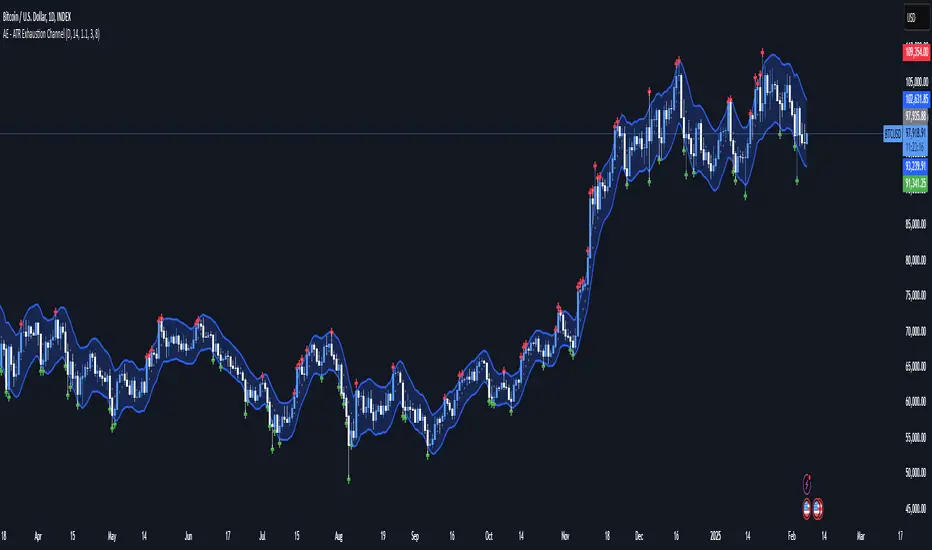
AE - ATR Exhaustion ChannelAE - ATR Exhaustion Channel
📈 Overview
Identify Exhaustion Zones & Trend Breakouts with ATR Precision!
The AE - ATR Exhaustion Channel is a powerful volatility-based trading tool that combines an averaged SMA with ATR bands to dynamically highlight potential trend exhaustion zones. It provides real-time breakout detection by marking when price moves beyond key volatility bands, helping traders spot overextensions and reversals with ease.
🔑 Key Features
✔️ ATR-SMA Hybrid Channel: Uses an averaged SMA as the core trend filter while incorporating adaptive ATR-based bands for precise volatility tracking.
✔️ Dynamic Exhaustion Markers: Marks red crosses when price exceeds the upper band and green crosses when price drops below the lower band.
✔️ Customizable ATR Sensitivity: Adjust the ATR multiplier and length settings to fine-tune band sensitivity based on market conditions.
✔️ Clear Channel Visualization: A gray SMA midpoint and a blue-filled ATR band zone make it easy to track market structure.
📚 How It Works
1️⃣ Averaged SMA Calculation: The script calculates an averaged SMA over a user-defined range (min/max period). This smooths out short-term fluctuations while preserving trend direction.
2️⃣ ATR Band Construction: The ATR value (adjusted by a multiplier) is added to/subtracted from the SMA to form dynamic upper and lower volatility bands.
3️⃣ Exhaustion Detection:
If high > upper ATR band, a red cross is plotted (potential overextension).
If low < lower ATR band, a green cross is plotted (potential reversal zone).
4️⃣ Filled ATR Channel: The area between the upper and lower bands is shaded blue, providing a visual trading range.
🎨 Customization & Settings
⚙️ ATR Length – Adjusts the ATR calculation period (default: 14).
⚙️ ATR Multiplier – Scales the ATR bands for tighter or wider volatility tracking (default: 0.8, adjustable in 0.1 steps).
⚙️ SMA Range (Min/Max Length) – Defines the period range for calculating the averaged SMA (default: 5-20).
⚙️ Rolling Lookback Length – Controls how far back the high/low comparison is calculated (default: 50 bars).
🚀 Practical Usage
📌 Spotting Exhaustion Zones – Look for red/green markers appearing outside the ATR bands, signaling potential trend exhaustion and possible reversal opportunities.
📌 Breakout Confirmation – Price consistently breaching the upper band with momentum could indicate continuation, while repeated touches without strong closes may hint at reversal zones.
📌 Trend Reversal Signals – Watch for green markers below the lower band in uptrends (buy signals) and red markers above the upper band in downtrends (sell signals).
🔔 Alerts & Notifications
📢 Set Alerts for Exhaustion Signals!
Traders can configure alerts to trigger when price breaches the ATR bands, allowing for instant notifications when volatility-based exhaustion is detected.
📊 Example Scenarios
✔ Trend Exhaustion in Overextended Moves – A series of red crosses near resistance may indicate a short opportunity.
✔ Trend Exhaustion in Overextended Moves – A series of red crosses near resistance may indicate an opportunity to open a short trade.
✔ Volatility Compression Breakouts – If price consolidates within the ATR bands and suddenly breaks out, it could signify a momentum shift.
✔ Reversal Catching in Trending Markets – Spot potential trend reversals by looking for green markers below the ATR bands in bullish markets.
🌟 Why Choose AE - ATR Exhaustion Channel?
Trade with Confidence. Spot Volatility. Catch Breakouts.
The AE - ATR Exhaustion Channel is an essential tool for traders looking to identify trend exhaustion, detect breakouts, and manage volatility effectively. Whether you're trading stocks, crypto, or forex, this ATR-SMA hybrid system provides clear visual cues to help you stay ahead of market moves.
✅ Customizable to Fit Any Market
✅ Combines Volatility & Trend Analysis
✅ Easy-to-Use with Instant Breakout Detection
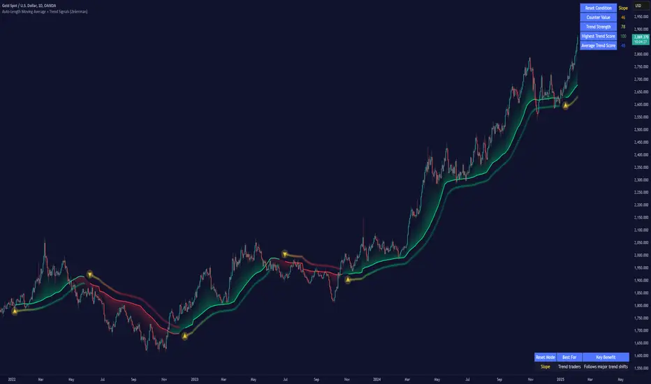
Auto-Length Moving Average + Trend Signals (Zeiierman)█ Overview
The Auto-Length Moving Average + Trend Signals (Zeiierman) is an easy-to-use indicator designed to help traders dynamically adjust their moving average length based on market conditions. This tool adapts in real-time, expanding and contracting the moving average based on trend strength and momentum shifts.
The indicator smooths out price fluctuations by modifying its length while ensuring responsiveness to new trends. In addition to its adaptive length algorithm, it incorporates trend confirmation signals, helping traders identify potential trend reversals and continuations with greater confidence.
This indicator suits scalpers, swing traders, and trend-following investors who want a self-adjusting moving average that adapts to volatility, momentum, and price action dynamics.
█ How It Works
⚪ Dynamic Moving Average Length
The core feature of this indicator is its ability to automatically adjust the length of the moving average based on trend persistence and market conditions:
Expands in strong trends to reduce noise.
Contracts in choppy or reversing markets for faster reaction.
This allows for a more accurate moving average that aligns with current price dynamics.
⚪ Trend Confirmation & Signals
The indicator includes built-in trend detection logic, classifying trends based on market structure. It evaluates trend strength based on consecutive bars and smooths out transitions between bullish, bearish, and neutral conditions.
Uptrend: Price is persistently above the adjusted moving average.
Downtrend: Price remains below the adjusted moving average.
Neutral: Price fluctuates around the moving average, indicating possible consolidation.
⚪ Adaptive Trend Smoothing
A smoothing factor is applied to enhance trend readability while minimizing excessive lag. This balances reactivity with stability, making it easier to follow longer-term trends while avoiding false signals.
█ How to Use
⚪ Trend Identification
Bullish Trend: The indicator confirms an uptrend when the price consistently stays above the dynamically adjusted moving average.
Bearish Trend: A downtrend is recognized when the price remains below the moving average.
⚪ Trade Entry & Exit
Enter long when the dynamic moving average is green and a trend signal occurs. Exit when the price crosses below the dynamic moving average.
Enter short when the dynamic moving average is red and a trend signal occurs. Exit when the price crosses above the dynamic moving average.
█ Slope-Based Reset
This mode resets the trend counter when the moving average slope changes direction.
⚪ Interpretation & Insights
Best for trend-following traders who want to filter out noise and only reset when a clear shift in momentum occurs.
Higher slope length (N): More stable trends, fewer resets.
Lower slope length (N): More reactive to small price swings, frequent resets.
Useful in swing trading to track significant trend reversals.
█ RSI-Based Reset
The counter resets when the Relative Strength Index (RSI) crosses predefined overbought or oversold levels.
⚪ Interpretation & Insights
Best for reversal traders who look for extreme overbought/oversold conditions.
High RSI threshold (e.g., 80/20): Fewer resets, only extreme conditions trigger adjustments.
Lower RSI threshold (e.g., 60/40): More frequent resets, detecting smaller corrections.
Great for detecting exhaustion in trends before potential reversals.
█ Volume-Based Reset
A reset occurs when current volume significantly exceeds its moving average, signaling a shift in market participation.
⚪ Interpretation & Insights
Best for traders who follow institutional activity (high volume often means large players are active).
Higher volume SMA length: More stable trends, only resets on massive volume spikes.
Lower volume SMA length: More reactive to short-term volume shifts.
Useful in identifying breakout conditions and trend acceleration points.
█ Bollinger Band-Based Reset
A reset occurs when price closes above the upper Bollinger Band or below the lower Bollinger Band, signaling potential overextension.
⚪ Interpretation & Insights
Best for traders looking for volatility-based trend shifts.
Higher Bollinger Band multiplier (k = 2.5+): Captures only major price extremes.
Lower Bollinger Band multiplier (k = 1.5): Resets on moderate volatility changes.
Useful for detecting overextensions in strong trends before potential retracements.
█ MACD-Based Reset
A reset occurs when the MACD line crosses the signal line, indicating a momentum shift.
⚪ Interpretation & Insights
Best for momentum traders looking for trend continuation vs. exhaustion signals.
Longer MACD lengths (260, 120, 90): Captures major trend shifts.
Shorter MACD lengths (10, 5, 3): Reacts quickly to momentum changes.
Useful for detecting strong divergences and market shifts.
█ Stochastic-Based Reset
A reset occurs when Stochastic %K crosses overbought or oversold levels.
⚪ Interpretation & Insights
Best for short-term traders looking for fast momentum shifts.
Longer Stochastic length: Filters out false signals.
Shorter Stochastic length: Captures quick intraday shifts.
█ CCI-Based Reset
A reset occurs when the Commodity Channel Index (CCI) crosses predefined overbought or oversold levels. The CCI measures the price deviation from its statistical mean, making it a useful tool for detecting overextensions in price action.
⚪ Interpretation & Insights
Best for cycle traders who aim to identify overextended price deviations in trending or ranging markets.
Higher CCI threshold (e.g., ±200): Detects extreme overbought/oversold conditions before reversals.
Lower CCI threshold (e.g., ±10): More sensitive to trend shifts, useful for early signal detection.
Ideal for detecting momentum shifts before price reverts to its mean or continues trending strongly.
█ Momentum-Based Reset
A reset occurs when Momentum (Rate of Change) crosses zero, indicating a potential shift in price direction.
⚪ Interpretation & Insights
Best for trend-following traders who want to track acceleration vs. deceleration.
Higher momentum length: Captures longer-term shifts.
Lower momentum length: More responsive to short-term trend changes.
█ How to Interpret the Trend Strength Table
The Trend Strength Table provides valuable insights into the current market conditions by tracking how the dynamic moving average is adjusting based on trend persistence. Each metric in the table plays a role in understanding the strength, longevity, and stability of a trend.
⚪ Counter Value
Represents the current length of trend persistence before a reset occurs.
The higher the counter, the longer the current trend has been in place without resetting.
When this value reaches the Counter Break Threshold, the moving average resets and contracts to become more reactive.
Example:
A low counter value (e.g., 10) suggests a recent trend reset, meaning the market might be changing directions frequently.
A high counter value (e.g., 495) means the trend has been ongoing for a long time, indicating strong trend persistence.
⚪ Trend Strength
Measures how strong the current trend is based on the trend confirmation logic.
Higher values indicate stronger trends, while lower values suggest weaker trends or consolidations.
This value is dynamic and updates based on price action.
Example:
Trend Strength of 760 → Indicates a high-confidence trend.
Trend Strength of 50 → Suggests weak price action, possibly a choppy market.
⚪ Highest Trend Score
Tracks the strongest trend score recorded during the session.
Helps traders identify the most dominant trend observed in the timeframe.
This metric is useful for analyzing historical trend strength and comparing it with current conditions.
Example:
Highest Trend Score = 760 → Suggests that at some point, there was a strong trend in play.
If the current trend strength is much lower than this value, it could indicate trend exhaustion.
⚪ Average Trend Score
This is a rolling average of trend strength across the session.
Provides a bigger picture of how the trend strength fluctuates over time.
If the average trend score is high, the market has had persistent trends.
If it's low, the market may have been choppy or sideways.
Example:
Average Trend Score of 147 vs. Current Trend Strength of 760 → Indicates that the current trend is significantly stronger than the historical average, meaning a breakout might be occurring.
Average Trend Score of 700+ → Suggests a strong trending market overall.
█ Settings
⚪ Dynamic MA Controls
Base MA Length – Sets the starting length of the moving average before dynamic adjustments.
Max Dynamic Length – Defines the upper limit for how much the moving average can expand.
Trend Confirmation Length – The number of bars required to validate an uptrend or downtrend.
⚪ Reset & Adaptive Conditions
Reset Condition Type – Choose what triggers the moving average reset (Slope, RSI, Volume, MACD, etc.).
Trend Smoothing Factor – Adjusts how smoothly the moving average responds to price changes.
-----------------
Disclaimer
The content provided in my scripts, indicators, ideas, algorithms, and systems is for educational and informational purposes only. It does not constitute financial advice, investment recommendations, or a solicitation to buy or sell any financial instruments. I will not accept liability for any loss or damage, including without limitation any loss of profit, which may arise directly or indirectly from the use of or reliance on such information.
All investments involve risk, and the past performance of a security, industry, sector, market, financial product, trading strategy, backtest, or individual's trading does not guarantee future results or returns. Investors are fully responsible for any investment decisions they make. Such decisions should be based solely on an evaluation of their financial circumstances, investment objectives, risk tolerance, and liquidity needs.
Uptrick Signal Density Cloud🟪 Introduction
The Uptrick Signal Density Cloud is designed to track market direction and highlight potential reversals or shifts in momentum. It plots two smoothed lines on the chart and fills the space between them (often called a “cloud”). The bars on the chart change color depending on bullish or bearish conditions, and small triangles appear when certain reversal criteria are met. A metrics table displays real-time values for easy reference.
🟩 Why These Features Have Been Linked Together
1) Dual-Line Structure
Two separate lines represent shorter- and longer-term market tendencies. Linking them in one tool allows traders to view both near-term changes and the broader directional bias in a single glance.
2) Smoothed Averages
The script offers multiple smoothing methods—exponential, simple, hull, and an optimized approach—to reduce noise. Using more than one type of moving average can help balance responsiveness with stability.
3) Density Cloud Concept
Shading the region between the two lines highlights the gap or “thickness.” A wider gap typically signals stronger momentum, while a narrower gap could indicate a weakening trend or potential market indecision. When the cloud is too wide and crosses a certain threshold defined by the user, it indicates a possible reversal. When the cloud is too narrow it may indicate a potential breakout.
🟪 Why Use This Indicator
• Trend Visibility: The color-coded lines and bars make it easier to distinguish bullish from bearish conditions.
• Momentum Tracking: Thicker cloud regions suggest stronger separation between the faster and slower lines, potentially indicating robust momentum.
• Possible Reversal Alerts: Small triangles appear within thick zones when the indicator detects a crossover, drawing attention to key moments of potential trend change.
• Quick Reference Table: A metrics table shows line values, bullish or bearish status, and cloud thickness without needing to hover over chart elements.
🟩 Inputs
1) First Smoothing Length (length1)
Default: 14
Defines the lookback period for the faster line. Lower values make the line respond more quickly to price changes.
2) Second Smoothing Length (length2)
Default: 28
Defines the lookback period for the slower line or one of the moving averages in optimized mode. It generally responds more slowly than the faster line.
3) Extra Smoothing Length (extraLength)
Default: 50
A medium-term period commonly seen in technical analysis. In optimized mode, it helps add broader perspective to the combined lines.
4) Source (source)
Default: close
Specifies the price data (for example, open, high, low, or a custom source) used in the calculations.
5) Cloud Type (cloudType)
Options: Optimized, EMA, SMA, HMA
Determines the smoothing method used for the lines. “Optimized” blends multiple exponential averages at different lengths.
6) Cloud Thickness Threshold (thicknessThreshold)
Default: 0.5
Sets the minimum separation between the two lines to qualify as a “thick” zone, indicating potentially stronger momentum.
🟪 Core Components
1) Faster and Slower Lines
Each line is smoothed according to user preferences or the optimized technique. The faster line typically reacts more quickly, while the slower line provides a broader overview.
2) Filled Density Cloud
The space between the two lines is filled to visualize in which direction the market is trending.
3) Color-Coded Bars
Price bars adopt bullish or bearish colors based on which line is on top, providing an immediate sense of trend direction.
4) Reversal Triangles
When the cloud is thick (exceeding the threshold) and the lines cross in the opposite direction, small triangles appear, signaling a possible market shift.
5) Metrics Table
A compact table shows the current values of both lines, their bullish/bearish statuses, the cloud thickness, and whether the cloud is in a “reversal zone.”
🟩 Calculation Process
1) Raw Averages
Depending on the mode, standard exponential, simple, hull, or “optimized” exponential blends are calculated.
2) Optimized Averages (if selected)
The faster line is the average of three exponential moving averages using length1, length2, and extraLength.
The slower line similarly uses those same lengths multiplied by 1.5, then averages them together for broader smoothing.
3) Difference and Threshold
The absolute gap between the two lines is measured. When it exceeds thicknessThreshold, the cloud is considered thick.
4) Bullish or Bearish Determination
If sma1 (the faster line) is above sma2 (the slower line), conditions are deemed bullish; otherwise, they are bearish. This distinction is reflected in both bar colors and cloud shading.
5) Reversal Markers
In thick zones, a crossover triggers a triangle at the point of potential reversal, alerting traders to a possible trend change.
🟪 Smoothing Methods
1) Exponential (EMA)
Prioritizes recent data for quicker responsiveness.
2) Simple (SMA)
Takes a straightforward average of the chosen period, smoothing price action but often lagging more in volatile markets.
3) Hull (HMA)
Employs a specialized formula to reduce lag while maintaining smoothness.
4) Optimized (Blended Exponential)
Combines multiple EMA calculations to strike a balance between responsiveness and noise reduction.
🟩 Cloud Logic and Reversal Zones
Cloud thickness above the defined threshold typically signals exceeding momentum and can lead to a quick reversal. During these thick periods, if the width exceeds the defined threshold, small triangles mark potential reversal points. In order for the reversal shape to show, the color of the cloud has to be the opposite. So, for example, if the cloud is bearish, and exceeds momentum, defined by the user, a bullish signal appears. The opposite conditions for a bullish signal. This approach can help traders focus on notable changes rather than minor oscillations.
🟪 Bar Coloring and Layered Lines
Bars take on bullish or bearish tints, matching the faster line’s position relative to the slower line. The lines themselves are plotted multiple times with varying opacities, creating a layered, glowing look that enhances visibility without affecting calculations.
🟩 The Metrics Table
Located in the top-right corner of the chart, this table displays:
• SMA1 and SMA2 current values.
• Bullish or bearish alignment for each line.
• Cloud thickness.
• Reversal zone status (in or out of zone).
This numeric readout allows for a quick data check without hovering over the chart.
🟪 Why These Specific Moving Average Lengths Are Used
Default lengths of 14, 28, and 50 are common in technical analysis. Fourteen captures near-term price movement without overreacting. Twenty-eight, roughly double 14, provides a moderate smoothing level. Fifty is widely regarded as a medium-term benchmark. Multiplying each length by 1.5 for the slower line enhances separation when combined with the faster line.
🟩 Originality and Usefulness
• Multi-Layered Smoothing. The user can select from several moving average modes, including a unique “optimized” blend, possibly reducing random fluctuations in the market data.
• Combined Visual and Numeric Clarity. Bars, clouds, and a real-time table merge into a single interface, enabling efficient trend analysis.
• Focus on Significant Shifts. Thick cloud zones and triangles draw attention to potentially stronger momentum changes and plausible reversals.
• Flexible Across Markets. The adjustable lengths and threshold can be tuned to different asset classes (stocks, forex, commodities, crypto) and timeframes.
By integrating multiple technical concepts—cloud-based trend detection, color coding, reversal markers, and an immediate reference table—the Uptrick Signal Density Cloud aims to streamline chart reading and decision-making.
🟪 Additional Considerations
• Timeframes. Intraday, daily, and weekly charts each yield different signals. Adjust the smoothing lengths and threshold to suit specific trading horizons.
• Market Types. Though applicable across asset classes, parameters might need tweaking to address the volatility of commodities, forex pairs, or cryptocurrencies.
• Confirmation Tools. Pairing this indicator with volume studies or support/resistance analysis can improve the reliability of signals.
• Potential Limitations. No indicator is foolproof; sudden market shifts or choppy conditions may reduce accuracy. Cautious position sizing and risk management remain essential.
🟩 Disclaimers
The Uptrick Signal Density Cloud relies on historical price data and may lag sudden moves or provide false positives in ranging conditions. Always combine it with other analytical techniques and sound risk management. This script is offered for educational purposes only and should not be considered financial advice.
🟪 Conclusion
The Uptrick Signal Density Cloud blends trend identification, momentum assessment, and potential reversal alerts in a single, user-friendly tool. With customizable smoothing methods and a focus on cloud thickness, it visually highlights important market conditions. While it cannot guarantee predictive accuracy, it can serve as a comprehensive reference for traders seeking both a quick snapshot of the current trend and deeper insights into market dynamics.

MEMEQUANTMEMEQUANT
This script is a comprehensive and specialized tool designed for tracking trends and money flow within meme coins and DEX tokens. By combining various features such as trend lines, Fibonacci levels, and category-based indices, it helps traders make informed decisions in highly volatile markets.
Key Features:
1. Category-Based Indices:
• Tracks the performance of token categories like:
• AI Agent Tokens
• AI Tokens
• Animal Tokens
• Murad Picks
• Each category consists of leader tokens, which are selected based on their higher market cap and trading volume. These tokens act as benchmarks for their respective categories.
• Visualizes category indices in a line chart to identify trends and compare money flow between categories.
2. Fibonacci Correction Zones:
• Highlights key retracement levels (e.g., 60%, 70%, 80%).
• These levels are crucial for identifying potential reversal zones, commonly observed in meme coin trading patterns.
• Fully customizable to match individual trading strategies.
3. Trend Lines:
• Automatically detects major support and resistance levels.
• Separates long-term and short-term trend lines, allowing traders to focus on significant price movements.
4. Enhanced Info Table:
• Provides real-time insights, including:
• % Distance from All-Time High (ATH)
• Current Trading Volume
• 50-bar Average Volume
• Volume Change Percentage
• Displays information in an easy-to-read table on the chart.
5. Customizable Settings:
• Users can adjust transparency, colors, and ranges for Fibonacci zones, trend lines, and the table.
• Enables or disables individual features (e.g., Fibonacci, trend lines, table) based on preferences.
How It Works:
1. Tracking Money Flow Across Categories:
• The script calculates the market cap to volume ratio for each category of tokens to help identify the dominant trend.
• A higher ratio indicates greater liquidity and stability, while a lower ratio suggests higher volatility or price manipulation.
2. Identifying Retracement Patterns:
• Leverages common retracement behaviors (e.g., 70% correction levels) observed in meme coins to detect potential reversal zones.
• Combines this with trend line analysis for additional confirmation.
3. Leader Tokens as Indicators:
• Each category is represented by its leader tokens, which have historically higher liquidity and market cap. This allows the script to accurately reflect the overall trend in each category.
When to Use:
• Trend Analysis: To identify which category (e.g., AI Tokens or Animal Tokens) is leading the market.
• Reversal Zones: To spot potential support or resistance levels using Fibonacci zones.
• Money Flow: To understand how capital is moving across different token categories in real time.
Who Is This For?
This script is tailored for:
• Traders specializing in meme coins and DEX tokens.
• Those looking for an edge in trend-based trading by analyzing market cap, volume, and retracement levels.
• Anyone aiming to track money flow dynamics between different token categories.
Future Updates:
This is the initial version of the script. Future updates may include:
• Support for additional token categories and DEX data.
• More advanced pattern recognition and alerts for volume and price anomalies.
• Enhanced visualization for historical data trends.
With this tool, traders can combine money flow analysis with the 60-70% retracement strategy, turning it into a powerful assistant for navigating the fast-paced world of meme coins and DEX tokens.
This script is designed to provide meaningful insights and practical utility for traders, adhering to TradingView’s standards for originality, clarity, and user value.

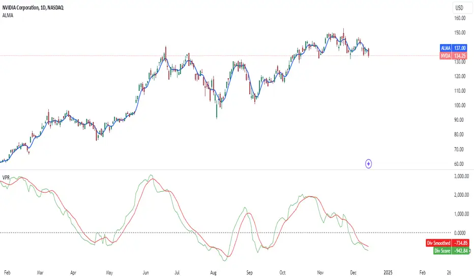
Volume and Price, EMA Hierarchy Scoring Relations V 1.1Understanding the Volume and Price, EMA Hierarchy Scoring Indicator
Financial markets are often analyzed through a series of technical indicators, each providing valuable but isolated insights into price movements, volume dynamics, and trends. While these tools are widely used, they often lack context when applied individually. The Volume and Price, EMA Hierarchy Scoring Indicator was developed to bridge this gap by introducing structure, context, and relationships between these known indicators.
By utilizing Exponential Moving Averages (EMAs) and assigning periods derived from prime numbers, this indicator creates a scoring system that evaluates the relative positioning and interaction of 13 widely used technical tools. This approach adds meaning to individual indicator outputs by:
Revealing how their results align, diverge, or complement each other.
Quantifying their collective behavior through a hierarchy scoring system.
Enabling traders to not only analyze indicators individually but also combine them to uncover how they influence and interact with each other.
The result is a tool that provides clarity and insight into market behavior, enabling traders to move beyond surface-level analysis and uncover deeper patterns and relationships within the data.
Key Features and Methodology
The Volume and Price, EMA Hierarchy Scoring Indicator is built on a robust mathematical framework that evaluates and visualizes the relationships between 13 widely used technical indicators. By leveraging Exponential Moving Averages (EMAs) and prime numbers, the indicator provides meaningful insights into individual indicator performance as well as their combined behavior.
1. EMA Hierarchy Scoring
At the core of the indicator is its ability to assess the hierarchy of EMAs for each tool. This hierarchy scoring evaluates how the EMAs are aligned relative to one another, providing traders with a quantifiable measure of the indicator's internal consistency and its alignment with trends.
How It Works:
Each EMA is assigned a period derived from a unique prime number. This ensures that no two EMAs overlap, preserving their individuality.
The scoring system measures the gaps between these EMAs, assigning weighted values to these relationships based on their position in the hierarchy.
Why Prime Numbers?
Prime numbers ensure that the EMA periods are distinct and mathematically unrelated, creating a structured yet diverse dataset for analysis.
This approach allows the scoring system to capture both short-term and long-term trends, while avoiding redundancy.
2. Independent Indicator Evaluation
One of the key features of this indicator is the ability to analyze any of the 13 tools individually. Each indicator has its own module, complete with adjustable parameters and dedicated visualizations:
Histograms: Represent the raw EMA hierarchy score. Positive bars indicate alignment with upward trends, while negative bars highlight potential reversals or misalignments.
Smoothed Line: Averages the histogram values, reducing short-term noise and emphasizing longer-term trends.
Signal Line: Highlights trend shifts by smoothing the smoothed line further. Crossovers between the smoothed line and the signal line act as actionable signals for traders.
3. Combining Indicators for Context
Beyond individual analysis, the indicator allows users to combine multiple indicators to evaluate their interactions. For example:
Pairing ALMA (price smoothing) with Volume enables traders to see how price trends are supported or contradicted by market activity.
Combining Delta Volume and CMF (Chaikin Money Flow) reveals nuanced dynamics of buying and selling pressure.
Number of Combinations
With 13 tools available, the indicator supports "two to the power of thirteen minus one," which equals 8,191possible combinations. This flexibility empowers traders to experiment with various subsets of indicators, tailoring their analysis to specific market conditions or strategies.
Detailed Breakdown of Indicators
The Volume and Price, EMA Hierarchy Scoring Indicator integrates 13 widely used technical indicators, each bringing a unique perspective to market analysis. These indicators are scored individually using the EMA hierarchy system and can also be combined for more comprehensive insights.
Here’s a detailed look at what each indicator contributes:
Price Analysis
Arnaud Legoux Moving Average (ALMA):
Purpose:
ALMA smooths price data, reducing noise while maintaining responsiveness to trends.
Unique Features:
The EMA hierarchy scoring highlights how well ALMA’s EMAs align, revealing the strength of price trends.
Visualization includes a histogram of ALMA scores, a smoothed line, and a signal line.
Settings:
Adjustable parameters for the window size, offset, and sigma.
Tooltips guide users on how each setting affects the calculation.
Application:
Evaluate price momentum or combine with volume-based indicators to validate trends.
2. Price Hierarchy Score (PRC):
Purpose:
Focuses solely on price behavior to identify consistency and strength.
Visualization:
Includes a histogram representing raw scores and smoothed and signal lines for trend detection.
Settings:
Adjustable EMA periods derived from prime numbers.
Customizable smoothing and signal periods.
Volume Insights
3. Chaikin Money Flow (CMF):
Purpose:
Integrates price and volume data to measure capital flow direction and strength.
Visualization:
Raw CMF hierarchy scores are plotted, alongside smoothed and signal lines for easier trend identification.
Settings:
Lookback period adjustment for CMF calculation.
Toggle for enabling/disabling the module.
Application:
Use alongside Delta Volume to assess buying and selling pressure.
Above chart snapshot, in addition to the well-known CMF indicator, the Volume and Price indicator and the EMA Hierarchy Scoring can also be seen in the chart. By enabling the CMF evaluation, you can observe both how the CMF is analyzed and how it aligns with the price chart.
4. Delta Volume:
Purpose:
Captures the balance between buying and selling activity in the market.
Visualization:
A histogram represents the raw divergence in buying and selling strength.
Signal lines help identify momentum shifts.
Settings:
Options to set lower timeframes for more granular analysis.
Adjustable smoothing and signal periods.
Application:
Combine with CMF for a deeper understanding of capital flow dynamics.
In the above chart, alongside the Volume Delta indicator, you can observe our evaluation of this indicator's performance.
In the above chart, as explained, you can observe the impact of our evaluation metrics both individually and in combination with other indicators. This chart featuring VPR (Volume and Price Indicator along with EMA Hierarchy Scoring) illustrates the interplay between CMF and Volume Delta.
5. Volume Hierarchy Score (VOL):
Purpose:
Tracks raw volume data to identify areas of heightened market activity.
Visualization:
Histogram and smoothed lines highlight volume trends.
Settings:
Prime-numbered EMA periods to analyze volume hierarchy.
Adjustable smoothing and signal line parameters.
In the above chart, as previously explained, by analyzing the EMA of volume data over 25 iterations within specified periods (based on the first 25 prime numbers), you can observe the relationship between volume and price. We are witnessing a price increase, while the current volume position shows significant deviation and instability relative to the EMAs calculated over 25 different time periods.
In the above chart, by simultaneously enabling the evaluation of both volume and price, you can clearly observe the interplay and impact of volume and price in relation to each other.
Momentum and Trend Strength
6. Aroon Up:
Purpose:
Evaluates the strength of trends by measuring time since price highs.
Visualization :
Hierarchy scores plotted as histograms with trend-tracking smoothed and signal lines.
Settings:
Lookback period adjustments.
Module toggle for focus on Aroon trends.
If the analysis and interpretation of Aroon lines seem somewhat complex, the Volume and Price Indicator along with EMA Hierarchy Scoring provides a clear and intuitive representation of the Aroon indicator in relation to the price chart, as you can see in the current chart.
7. Average Directional Index (ADX):
Purpose:
Quantifies the strength of trends, regardless of direction.
Visualization:
ADX scores and smoothed lines for trend confirmation.
Settings:
Adjustable directional indicator (DI) and ADX smoothing periods.
Tooltip guidance for parameter optimization.
The simultaneous chart of the well-known ADX indicator alongside the evaluation system of the Volume and Price Indicator with EMA Hierarchy Scoring provides an integrated perspective on the ADX indicator.
8. Elder Force Index (EFI):
Purpose:
Combines price and volume to measure the strength of price movements.
Visualization:
EFI hierarchy scores with clear trend representation through signal and smoothed lines.
Settings:
Length adjustments for sensitivity control.
Smoothing and signal line customization.
In the above chart, we simultaneously have the well-known EFI indicator and the Volume and Price Indicator along with EMA Hierarchy Scoring. As we progress further, you will become increasingly familiar with the functionality and precision of the Volume and Price Indicator along with EMA Hierarchy Scoring.
Volatility and Oscillators
9. Ehler Fisher Transform:
Purpose:
Highlights extreme price movements by transforming price data into a Gaussian distribution.
Visualization:
Fisher Transform scores with smoothed trend indicators.
Settings:
Fisher length adjustment.
Module toggle and smoothing controls.
10. McGinley Dynamic (MGD):
Purpose:
Tracks price trends while adjusting for volatility, providing a smoother signal.
Visualization:
Raw MGD hierarchy scores with smoothed and signal lines.
Settings:
Lookback period customization.
Adjustable smoothing and signal periods
.
Ichimoku Components
11. Conversion Line (ICMC):
Purpose:
Captures short-term price equilibrium levels within the Ichimoku framework.
Visualization:
Short-term hierarchy scores visualized with smoothed lines.
Settings:
Adjustable conversion line length.
Tooltips explaining Ichimoku-related insights.
12. Base Line (ICMB):
Purpose:
Identifies medium-term equilibrium levels in the Ichimoku system.
Visualization:
Scores and smoothed trend lines for medium-term trends.
Settings:
Base line period adjustments.
Tooltip guidance for Ichimoku analysis.
In the chart below, to better illustrate the capabilities of the Volume and Price, EMA Hierarchy Scoring relation, we present a chart that evaluates the simultaneous interaction of Ichimoku Base and Conversion lines, Price, Volume, and Delta Volume.
Market Health
13. Money Flow Index (MFI):
Purpose:
Detects overbought or oversold conditions using price and volume data.
Visualization:
MFI hierarchy scores with trend tracking through smoothed and signal lines.
Settings:
Lookback period customization for sensitivity adjustment.
Module toggle and visualization controls.
EMA of Indicators: A Unified Scoring Metric
The EMA of Indicators module introduces a unique way to aggregate and analyze the individual scores of all 13 indicators. By applying a unified EMA calculation to their hierarchy scores, this module provides a single, combined metric that reflects the overall market sentiment based on the collective behavior of all indicators.
How It Works
1. Indicator-Specific EMAs:
An EMA is calculated for each of the 13 indicator hierarchy scores. The EMA period is adjustable in the settings menu, allowing traders to control how responsive the metric is to recent changes.
2. Combined EMA Calculation:
The individual EMAs are summed and averaged to generate a single Combined EMA Value. This value represents the average performance and alignment of all the indicators.
3. Smoothed and Signal Lines:
To enhance the interpretability of the Combined EMA Value:
- A Smoothed EMA is calculated using an additional EMA to filter out short-term fluctuations.
- A Signal Line is applied to the Smoothed EMA, providing actionable signals when crossovers occur.
Visualization
The Combined EMA Value is visualized as:
Histogram Bars: Represent the raw Combined EMA Value, highlighting positive or negative market alignment.
Smoothed Line: Tracks longer-term trends by smoothing the combined value.
Signal Line: Marks potential shifts in market sentiment when it crosses the Smoothed Line.
Customization and Settings
The settings menu allows full control over the EMA calculation:
Enable/Disable Module: Toggle the entire EMA of Indicators functionality.
Adjust EMA Period: Define the responsiveness of the individual indicator EMAs.
Set Smoothing Period: Control the degree of smoothing applied to the combined score.
Signal Line Period: Fine-tune the signal line's sensitivity for detecting trend shifts.
Tooltips accompany each parameter, ensuring that users understand their impact on the final visualization.
Applications in Market Analysis
1. Market Health Overview:
Use the Combined EMA Value as a quick snapshot of overall market sentiment based on all 13 indicators.
2. Trend Confirmation:
Analyze crossovers between the Smoothed EMA and Signal Line to confirm market trends or reversals.
3. Flexible Strategy Development:
Adjust EMA and smoothing periods to align the module with short-term or long-term trading strategies.
From EMA Scoring to Divergence-Weighted Insights
While the EMA scoring system provides insights into individual indicators and their trends, the Divergence-Weighted Volatility Adjusted Score takes this analysis further by combining and comparing all 13 indicators into a unified metric.
The Divergence-Weighted Volatility Adjusted Score
This score evaluates how the EMA scores of the 13 indicators interact and diverge, adding a layer of context and collective behavior analysis to the raw hierarchy scores.
1. Normalization:
All EMA scores are scaled to a common range, ensuring comparability regardless of the magnitude of individual indicators.
2. Divergence Analysis:
The system calculates the average score of the 13 indicators and evaluates the deviation (or divergence) of each individual score from this average.
Indicators with significant divergence are highlighted, as they often signal critical market dynamics.
3. Dynamic Weighting:
Indicators with greater divergence are assigned higher weights in the combined score. This ensures that outliers with meaningful signals are emphasized.
4. Volatility Adjustment:
The combined score is adjusted based on market volatility (calculated as the standard deviation of the score over a defined lookback period). This stabilizes the output, making it reliable even during turbulent market conditions.
Visualization and Customization
The Divergence-Weighted Volatility Adjusted Score is plotted as a dynamic line chart, offering a clear visual summary of the collective behavior of all indicators. The chart includes:
Smoothed Score Line: Filters out noise and emphasizes longer-term trends.
Signal Line: Helps identify potential trend shifts by tracking smoothed score crossovers.
Settings:
Lookback Period: Defines the time frame for volatility calculation.
Smoothing Period: Controls the degree of noise reduction in the smoothed score line.
Signal Line Period: Adjusts the responsiveness of the signal line.
These settings are fully adjustable, with tooltips guiding users to understand their impact.
Applications
The Divergence-Weighted Volatility Adjusted Score has several practical applications:
1. Cross-Indicator Alignment:
Detect when multiple indicators align or diverge, signaling potential opportunities or risks.
2. Dynamic Market Insights:
Adapt to changing conditions with the volatility-adjusted scoring.
3. Trend Confirmation:
Use smoothed and signal lines to validate trends identified by individual indicators.
Conclusion
The Volume and Price, EMA Hierarchy Scoring Indicator redefines how traders analyze financial markets. By combining 13 widely used technical tools with a structured scoring system based on Exponential Moving Averages (EMAs) and prime-numbered periods, this indicator brings depth and context to market analysis.
Key features include:
Independent Analysis: Evaluate individual indicators with precise EMA hierarchy scoring to assess their alignment with market trends.
Dynamic Combinations: Explore the relationships between indicators through over 8,000 combinations to uncover nuanced interactions and patterns.
Divergence-Weighted Scoring: Compare the collective behavior of indicators using a divergence-weighted system, providing a holistic market perspective adjusted for volatility.
Customization: Enable or disable modules, adjust smoothing and signal periods, and fine-tune settings to align the indicator with specific trading strategies.
User-Friendly Visualizations: Intuitive histograms, smoothed lines, and signal lines help traders identify trends, reversals, and market alignment at a glance.
This indicator empowers traders to move beyond isolated analysis by creating meaning and context between known tools. Whether you’re a scalper seeking short-term trends or a swing trader analyzing broader market movements, the Volume and Price, EMA Hierarchy Scoring Indicator offers insights tailored to your strategy.
Disclaimer
The Volume and Price, EMA Hierarchy Scoring Indicator is a tool for technical analysis and market evaluation. While it provides structured insights into market behavior, no indicator can guarantee success or eliminate the inherent risks of trading. Market conditions are complex, and multiple factors influence price movements.
Users are advised to:
Combine this indicator with other analysis methods, such as fundamental analysis or risk management strategies.
Make informed decisions based on their own analysis, trading goals, and risk tolerance.
Trading involves significant risk, and past performance does not guarantee future results. Always consult with a financial advisor or professional before making trading decisions.
Crypto Sectors Performance [Daveatt]IMPORTANT
⚠️ This script must be used on the Daily timeframe only.
OVERVIEW
This indicator brings the powerful sector analysis capabilities from velo.xyz/market's
Sector Performance chart to TradingView.
It enables traders to track and compare performance across the crypto market's major sectors, providing essential insights for sector rotation strategies and market analysis.
CALCULATION METHOD
The indicator calculates performance across six key crypto sectors: DeFi, Gaming, Layer 1s, Layer 2s, AI, and Memecoins.
For each sector, it computes a rolling percentage performance by averaging the performance of multiple representative tokens.
All sector performances are rebased to 0% at the start of each period, making relative comparisons clear and intuitive.
VISUALIZATION MODES
The script features two distinct visualization methods:
Plots Mode:
Displays continuous performance lines for each sector over time, ideal for tracking relative strength trends and sector momentum. Each sector has its own color-coded line with performance values clearly marked.
Bars Mode:
Presents current sector performance as vertical bars, offering an immediate visual comparison of sector gains and losses.
The bars are color-coded and labeled with exact percentage values for precise analysis.
For the "Bars Mode", I used the box.new() function
SECTOR COMPOSITION
Each sector comprises carefully selected representative tokens:
- DeFi: AAVE, 1INCH, JUP, MKR, UNI
- Gaming: GALA, AXS, RONIN, SAND
- Layer 1: BTC, ETH, AVAX, APT, SOL, BNB, SUI
- Layer 2: ARB, OP, ZK, POL, STRK, MNT
- AI: FET, NEAR, RENDER, TAO
- Memecoins: PEPE, BONK, SHIB, DOGE, WIFU, POPCAT
PERFORMANCE TRACKING
The indicator implements a rolling window approach for performance calculations.
Starting from 0% at the beginning of each period, it tracks relative performance with positive values indicating outperformance and negative values showing underperformance.
Multiple timeframe options (1W, 1M, 3M, 6M, and 1Y) allow for both short-term and long-term analysis.
APPLICATIONS
This tool proves invaluable for:
- Sector rotation analysis
- Identifying trending sectors
- Comparing relative strength
- Gauging market sentiment
- Understanding market structure through sector performance
Thanks for reading and for the support
Daveatt

[AlbaTherium] Volume Venturius Premium Volume Venturius Premium
Introduction
The Volume Venturius Premium is an advanced market analysis tool designed to deeply investigate the behavior of active market participants. By focusing exclusively on executed market orders, Volume Venturius offers traders a unique perspective on buy and sell volumes. Unlike traditional order books that track passive orders, this indicator isolates active orders, shedding light on real market dynamics.
Chapter 1: Understanding Market Participants
1.1 Categories of Market Participants
Market participants can be classified into several categories based on their:
Size : The volume of trades executed.
Influence : Their ability to initiate bull or bear campaigns.
Strategy : The trading methods employed, such as scalping, swing trading, or high-frequency trading.
Objectives : Whether their focus is on speculation, hedging, or arbitrage.
Time Horizon : Short-term versus long-term goals.
Behavioral Patterns : Their reaction to liquidity levels or price movements.
1.2 Objectives of Market Participants
Each category pursues specific objectives, such as profit-making or risk management. Regulatory reports like the Commitment of Traders (COT) provide weekly insights into the positions and intentions of major players.
Chapter 2: The Philosophy of Volume Analysis
2.1 Active Orders vs. Passive Orders
Unlike passive orders waiting to be filled at specific prices, active orders directly impact market prices. By focusing on these executed orders, Volume Venturius Premium provides traders with actionable insights into market trends and momentum.
2.2 Wyckoff’s Market Dynamics
According to Wyckoff, markets operate in two primary phases:
Manipulation: Where large participants accumulate or distribute positions to prepare for a move.
Expansion: The phase where price trends begin to unfold, either in a bullish or bearish direction.
Wyckoff’s theory emphasizes understanding how major players manipulate the market to identify accumulation or distribution zones. Volume Venturius Premium aids in pinpointing these manipulative actions by analyzing volume and order flow data.
Chapter 3: The Secrets of Order Flow and Volume
3.1 Unveiling Market Control
By studying the positioning and execution volumes of large players, traders can discern who holds control in the market. Volume Venturius Premium identifies the balance of power and tracks shifts that signal potential trend reversals.
3.2 Behavioral Patterns in Volume
Key metrics tracked by Volume Venturius Premium include:
Volume Clusters : Areas of concentrated buying or selling activity.
Directional Bias : Whether market participants are net buyers or sellers.
Momentum Shifts : Changes in execution speed and volume that may precede major moves.
3.2.1 Volume Clusters, Directional Bias and Directional Bias: Areas of Concentrated Buying or Selling Activity
Volume clusters play a crucial role in understanding market dynamics by highlighting areas where aggressive buying or selling activity is most concentrated. These clusters often serve as key decision zones, providing insights into potential reversals, breakouts, or continuations. To better visualize and interpret these zones, a distinct color-coding system has been implemented. Each color represents a specific market condition or level of activity, allowing for a more intuitive analysis of volume behavior and its influence on price movement.
Below is a detailed explanation of the color logic used to represent these clusters and their significance within the trading framework.
Color Interpretation and Meaning :
Extra Extreme Zones
These zones highlight areas where clusters of aggressive buyers or sellers are most heavily concentrated. They represent critical levels for identifying potential reversals or strong continuations.
Bright Red (#ff003c) : Represents extra-extreme sell zones, where aggressive sellers dominate.
Meaning: Indicates extreme selling pressure, often signaling potential exhaustion of sellers.
Bright Blue (#001eff) : Represents extra-extreme buy zones, where aggressive buyers are most active.
Meaning: Shows extreme buying pressure, possibly marking a saturation point for buyers.
Main Zones
These zones help identify key levels based on volume activity and well-defined clusters.
Dark Red (#d60033) : Represents strong selling pressure.
Orange (#ff8000) : Indicates significant selling pressure that begins to fade.
Yellow (#ffff00) : Represents moderate selling pressure, signaling a potential slowdown.
White (#ffffff) : Marks transition zones, which are interesting entry points for potential reversals or continuations.
Transition Zones (Frontier Zones)
These zones indicate intermediate movements and potential shifts in momentum.
Transparent Black (#000000, 50) : Represents transition areas, where the market tests boundaries between buyers and sellers.
Meaning: These are critical decision points.
Neutral Zone (Sea Zone)- Trend Zones
These zones represent more balanced market activity, where neither buyers nor sellers dominate clearly.
Transparent Green (#00e040, 25) : Indicates slight bullish activity in a neutral zone.
Transparent Red (#e01a00, 25) : Indicates slight bearish activity in a neutral zone.
This color logic allows you to pinpoint areas where volume clusters show a clear dominance, exhaustion, or optimal entry opportunities.
3.3 Divergences Between Price and Volume
Divergences between price and volume are critical for identifying key shifts in market sentiment. Volume Venturius Premium distinguishes two main types of divergences: Lack of Participation and Absorption, each offering valuable signals for potential reversals or continuations.
Lack of Participation
This divergence occurs when price movements are not supported by corresponding volume dynamics, signaling a reduction in activity from significant market participants.
1. Bullish Lack of Participation:
Characteristics : Price is making lower lows, but volume is making higher lows.
This indicates waning selling pressure as prices drop.
Inference : A potential bullish reversal may occur. Traders could consider looking for opportunities to go long.
2.Bearish Lack of Participation:
Characteristics : Price is making higher highs, but volume is making lower highs. This suggests diminishing buying pressure even as prices rise.
Inference : A potential bearish reversal might follow. Traders might position to go short.
Absorption
Absorption occurs when larger market participants neutralize the pressure from smaller participants, often leading to significant market moves.
1.Bullish Absorption:
Characteristics : Price is making higher bottoms, but volume is making lower bottoms.
This reflects sellers being trapped as their selling efforts are absorbed by larger buyers.
Inference : A potential upward breakout is likely. Traders may look for opportunities to go long.
2.Bearish Absorption:
Characteristics : Price is making lower tops, but volume is making higher tops. This indicates buyers being trapped as larger sellers absorb their buying activity.
Inference : A downward breakout is probable. Traders may consider positioning to go short.
Chapter 4: Practical Application and Trading Strategies
4.1 Leveraging Active Order Insights
Learn how to use Volume Venturius Premium to detect hidden accumulation or distribution phases. Strategies include identifying spikes in active volume that signal institutional participation.
4.2 Confirming Bull and Bear Campaigns
Gain confidence in detecting the early stages of bullish or bearish campaigns by analyzing the interplay between active orders and volume flow.
Chapter 5: Real-World Examples
5.1 Analyzing Market Manipulation
See how Volume Venturius Premium can reveal manipulation tactics employed by large players to trigger liquidity events.
5.2 Spotting Trends with Active Orders
Real-life scenarios demonstrate how the tool can be used to identify and ride the market’s dominant trend.
Conclusion
The Volume Venturius Premium is an indispensable tool for traders who seek to understand the underlying mechanics of market movement. By focusing on active order flows and drawing on Wyckoff’s principles, it provides unique insights into market manipulation and expansion phases. Whether you’re an intraday trader or a long-term strategist, this tool empowers you to anticipate market shifts and trade with confidence.
Stay tuned for updates as we continue to refine Volume Venturius Premium to further enhance your trading journey.

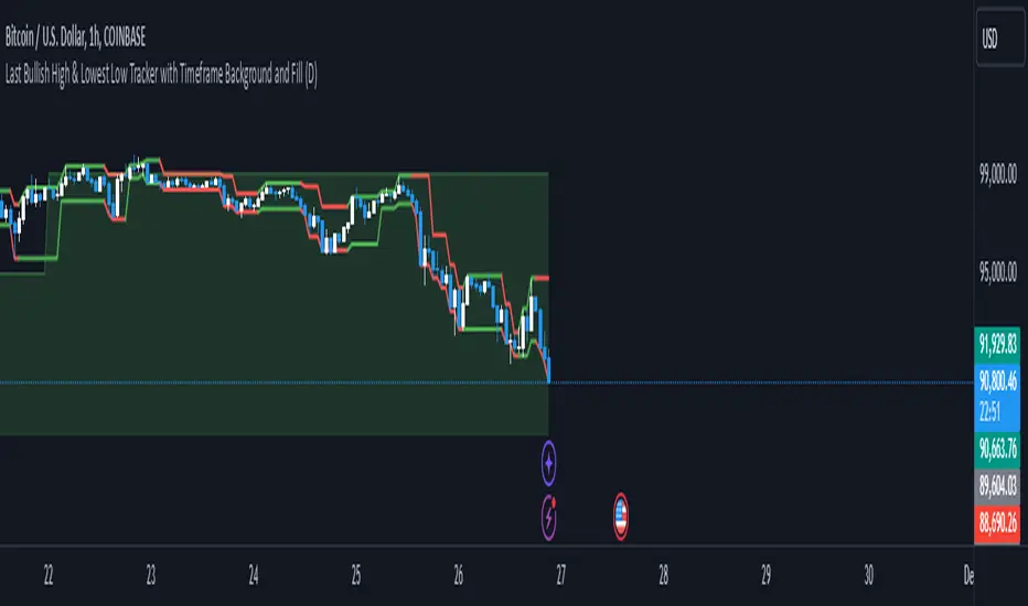
Richs Market StructureThis Pine Script indicator, "Last Bullish High & Lowest Low Tracker with Timeframe Background and Fill", is designed to visually track bullish and bearish trends based on price action on the current chart and a user-defined timeframe. It provides dynamic line plotting, area fills, and background coloring to represent trend alignment between the current chart and the selected timeframe.
Features and Functionalities
Tracks Bullish Highs and Bearish Lows:
The script identifies:
Bullish High: The highest price reached after a bullish (green) candle.
Bearish Low: The lowest price reached after a bearish (red) candle.
It dynamically updates these levels based on the price movements.
Line Plotting:
Current Chart Lines:
The Plotted Bullish High line (green/red) indicates the last bullish high.
The Lowest Low line (green/red) indicates the last bearish low.
Selected Timeframe Lines:
A separate set of lines is plotted for the user-defined timeframe (e.g., daily, weekly):
A Bullish High Line for the selected timeframe (lighter green).
A Lowest Low Line for the selected timeframe (lighter red).
Dynamic Area Fills:
The area between the Plotted Bullish High and Lowest Low is filled:
Green Fill: When both lines are green (indicating a bullish alignment).
Red Fill: When both lines are red (indicating a bearish alignment).
For the selected timeframe:
The area between the timeframe-specific Bullish High and Lowest Low is similarly filled with lighter colors.
Background Color Based on Timeframe Alignment:
The background color represents the trend alignment on the selected timeframe:
Green Background: When the timeframe’s Bullish High is rising and Lowest Low is rising (bullish trend).
Red Background: When the timeframe’s Bullish High is falling and Lowest Low is falling (bearish trend).
What It’s For
This indicator is designed for traders who want to:
Visualize Trends Across Timeframes:
It helps identify when the current chart’s trend aligns with a higher timeframe trend (e.g., daily, weekly).
Useful for multi-timeframe analysis.
Spot Bullish and Bearish Trends:
The color-coded lines and fills clearly show the dominant trend on both the current chart and the selected timeframe.
Plan Trades Based on Trend Alignment:
When the current chart and selected timeframe show the same trend:
Both lines and fills turn green (bullish).
Both lines and fills turn red (bearish).
This alignment is a potential signal for entering long or short trades.
Identify Reversals and Divergences:
Divergence between the current chart and timeframe trends (e.g., green on one, red on the other) may indicate trend weakening or reversal.
Visual Elements
Lines:
Solid lines (current chart): Represent the Plotted Bullish High and Lowest Low.
Dashed/lighter lines (selected timeframe): Represent the timeframe-specific Bullish High and Lowest Low.
Fills:
Green/Red fills highlight trend zones:
On the current chart (darker).
On the selected timeframe (lighter).
Background:
The entire chart background turns green or red based on the selected timeframe’s trend alignment.
Summary
This indicator is ideal for traders who want a clear visual representation of price trends and multi-timeframe alignment. It simplifies trend-following strategies by providing:
Easy-to-interpret fills and background colors.
Clear bullish and bearish zones.
Multi-timeframe trend confirmation.
Adaptive bollinger bands cloud v1 trend & trade signalsadaptive bollinger bands cloud:
the script extends the concept of bollinger bands by creating a "cloud" between the upper and lower bands. this cloud visually represents market conditions, with its color dynamically adjusting based on trend strength and volatility.
the gradient fill between the bands changes according to the deviation of the price from its basis, offering a visual cue for trend momentum.
trend detection logic:
a trend variable determines whether the price is in a bullish, bearish, or neutral state. if the price is above the upper band and the basis, the trend is marked bullish. if it's below the lower band and the basis, the trend is bearish. otherwise, it's neutral.
this trend logic is further enhanced with visual markers like arrows to indicate potential trend reversals.
extended take-profit bands:
additional upper and lower bands are calculated using a higher multiplier. these extended bands help identify potential take-profit levels, signaling when the price may have reached an overextended state.
gradient calculation:
the script computes a gradient based on the deviation of the price from its basis and normalizes it over a lookback period. this normalized gradient is smoothed to reflect volatility intensity and used to color the cloud dynamically.
signal generation:
buy and sell signals are generated based on crossovers of the trend variable. for instance, when the trend shifts from negative to positive, it signals a bullish opportunity. conversely, a shift from positive to negative indicates bearish conditions.
take-profit markers ("x") are plotted when the price crosses the extended bands, suggesting potential exit points.
trade entry tracking:
the script includes a table to display real-time entry signals and prices for long (buy) or short (sell) trades. this feature helps traders keep track of signals without needing to reference the chart visually.
customizable inputs:
users can adjust the bb period, multiplier, and colors to suit their trading preferences. this flexibility allows for tuning the indicator based on different market conditions or asset classes.
overall, the indicator blends traditional bollinger bands with innovative visualization, trend identification, and trading signals to enhance decision-making.
how to use this indicator
trend detection:
watch for arrows indicating trend shifts:
an upward arrow (green) signals a bullish trend; consider buying or entering a long position.
a downward arrow (red) signals a bearish trend; consider selling or entering a short position.
use the gradient-colored cloud to assess trend strength:
bright and strong colors indicate significant momentum.
fading colors suggest weakening trends or consolidation.
entry signals:
refer to the table in the top-right corner of the chart for real-time buy or sell entry signals.
when a "buy" signal is displayed with the price, it suggests a potential entry point for a long trade.
when a "sell" signal is displayed, consider shorting or exiting long positions.
take-profit signals:
look for the "x" markers near the extended bands (upper1 and lower1):
an "x" above the price suggests taking profit on long positions.
an "x" below the price suggests taking profit on short positions.
background gradient analysis:
observe the dynamic background color:
a strong purple gradient indicates significant price movement or volatility.
a lighter gradient suggests reduced momentum, signaling caution or a potential reversal.
alerts for automation:
set alerts using the predefined conditions:
bullish trend start, bearish trend start, and take-profit levels can be used to automate notifications for trade actions.
why to use this indicator
enhanced decision-making:
the adaptive cloud and gradient provide visual insights into trend strength and volatility, allowing traders to assess market conditions at a glance.
precise signals:
the indicator uses crossover logic and extended bollinger bands to generate clear buy, sell, and take-profit signals, reducing guesswork.
trend confirmation:
combining the bollinger bands with the trend variable ensures that traders only act on confirmed market trends rather than noise.
dynamic volatility assessment:
the normalized gradient calculation highlights periods of high or low volatility, helping traders adjust their strategies accordingly.
customizable settings:
adjustable parameters (period, multiplier, colors) allow the indicator to fit various markets, timeframes, and trading styles.
all-in-one tool:
integrates trend detection, entry signals, and take-profit levels into a single indicator, minimizing the need for multiple tools.
this indicator is especially useful for traders seeking a balance between simplicity and precision, whether scalping, day trading, or swing trading. it not only identifies trends but also highlights actionable entry and exit points, making it a versatile addition to any trading strategy.

Dynamic Support & Resistance based on SMI CrossoverExplanation:
SMI Calculation: The script calculates the Stochastic Momentum Index (SMI) and its signal line using the specified input lengths.
Crossover Detection: It detects when the SMI crosses above (crossUp) or below (crossDown) its signal line.
Period Tracking: The script keeps track of up and down periods based on SMI crossovers. During an up period, it records the lowest low (support), and during a down period, it records the highest high (resistance).
Support and Resistance Levels: When a crossover occurs, it captures the highest or lowest value since the last crossover to define dynamic resistance and support levels.
Midline Calculation: The midline is calculated as the average of the current support and resistance levels.
Buy and Sell Signals: Buy signals are generated when the close price crosses above the midline, and sell signals are generated when it crosses below.
Plotting: The support, resistance, and midline are plotted on the upper chart. Buy and sell signals are indicated with arrows. Trendlines are added for visual clarity.
Note: This indicator should be used in conjunction with other analysis tools and is intended for educational purposes. Always perform thorough analysis before making trading decisions.
Like all technical indicators, this script is based on historical data and may not predict future market movements.
Always perform due diligence and consider multiple factors when making trading decisions.

Manual Trading Checklist by Afnan TajuddinHey traders! This Trading Checklist indicator like your personal to-do list right on your chart! Here’s what it does:
Easy Tracking: Seven checkboxes to make sure you’ve done all your trading steps.
Colorful Signs: Green "✔" for done stuff and red "✘" for things you need to fix.
Make It Yours: Change where the table is on the chart, pick your favorite colors, and set the text size just how you like it.
Simple Setup: Rename the checklist items and toggle them on or off in the settings.
Clean Look: It stays neat on your chart without messing things up.
Whether you’re just starting out or you’ve been trading for a while, this checklist helps you stay organized and stick to your plan. Perfect for anyone who loves keeping things tidy and on track!
Important to Know: This checklist is not dynamic or automatic and not specific to any symbol. You need to manually check it every time for all the stocks you’re planning to trade. It won’t do the checking for you, so make sure to update it yourself! 🚨

ATAMOKU: A Hierarchical Scoring Tool Based on Ichimoku Principle
Overview and Purpose of ATAMOKU
The name "ATAMOKU" combines “Ata” (meaning “ancestor” in Turkish) and “Moku” (meaning “cloud” in Japanese). ATAMOKU is built on Ichimoku principles, designed to assist traders in analyzing trend direction and strength. By providing a structured, score-based approach, ATAMOKU aims to make Ichimoku data more accessible for identifying potential entry and exit points.
How ATAMOKU Works
ATAMOKU uses Ichimoku’s essential elements—including the Conversion Line (Tenkan-sen), Base Line (Kijun-sen), and Leading Spans A and B—and applies a scoring hierarchy to assess market conditions. The scoring system measures trend strength and alignment by comparing the relationships between these elements. This method allows ATAMOKU to produce an objective score that reflects whether the market is in an “ideal” or “non-ideal” state.
Key Features of ATAMOKU
1 - Hierarchy-Based Scoring System:
ATAMOKU calculates a score that represents the strength and direction of the current trend. Each component of Ichimoku is assigned a weight, and the indicator scores these components based on their hierarchical position. When all components align for an upward trend, ATAMOKU’s score will approach +364 (representing an ideal state). In contrast, a score of -364 indicates a non-ideal or bearish alignment.
2 - Optimal and Suboptimal Tracking:
ATAMOKU includes Optimal and Suboptimal markers to track the highest and lowest scores over a specific period, with a default of 52 periods. The Optimal score captures the highest recorded value within the period, while the Suboptimal score captures the lowest. These markers help traders gauge how current conditions compare to recent peaks and troughs, indicating market stability or volatility.
3 - Real-Time Scoring Display (Hierarchy Table):
ATAMOKU uses a Hierarchy Table adjacent to the main chart to present real-time scoring data for each Ichimoku component. This table displays values for Conversion Line, Base Line, Leading Spans, and Lagging Span, providing traders with a detailed view of each component’s contribution to the total score. By referencing the table, traders can understand the weight and impact of each Ichimoku element on the overall score.
4 - Histogram Visualization:
ATAMOKU’s scores are displayed on a histogram with green and red bars to indicate market sentiment. Green bars represent bullish conditions, while red bars indicate bearish conditions. This visual format allows traders to quickly assess trend direction and strength at a glance, providing context for decision-making.
5 - Signal and Smoothing Lines:
To help reduce noise, ATAMOKU features Signal and Smooth lines, which can be customized using different smoothing methods (such as SMA, EMA, or WMA). When the Signal and Smooth lines cross, the indicator will label the trend as UP or DOWN based on the direction of the crossover. This feature helps traders detect potential reversals or trend confirmations.
6 - Adjustable Settings:
* Scoring Weights: Traders can configure the relative weights of each Ichimoku component to match their analysis preferences.
* Smoothing Techniques: Users may choose from SMA, EMA, and WMA smoothing methods to adjust signal sensitivity.
* Period Adjustments: Scoring and smoothing period lengths can be customized to fit various trading styles and time frames.
Intended Use and Practical Application
ATAMOKU is best used alongside the Ichimoku Cloud, as its scoring and signal features complement the visual data provided by Ichimoku. The Hierarchy Score, combined with Optimal/Suboptimal markers, gives traders insight into the current market conditions and allows for comparisons across time. ATAMOKU is adaptable to any time frame and provides both trend analysis and potential entry/exit signals based on Ichimoku principles.
Legal Disclaimer
ATAMOKU is a technical analysis tool and does not guarantee profitability. It is designed to aid in decision-making by providing additional market insights. Traders are encouraged to exercise their judgment and assume responsibility for their trading actions.

FTMO Rules MonitorFTMO Rules Monitor: Stay on Track with Your FTMO Challenge Goals
TLDR; You can test with this template whether your strategy for one asset would pass the FTMO challenges step 1 then step 2, then with real money conditions.
Passing a prop firm challenge is ... challenging.
I believe a toolkit allowing to test in minutes whether a strategy would have passed a prop firm challenge in the past could be very powerful.
The FTMO Rules Monitor is designed to help you stay within FTMO’s strict risk management guidelines directly on your chart. Whether you’re aiming for the $10,000 or the $200,000 account challenge, this tool provides real-time tracking of your performance against FTMO’s rules to ensure you don’t accidentally breach any limits.
NOTES
The connected indicator for this post doesn't matter.
It's just a dummy double supertrends (see below)
The strategy results for this script post does not matter as I'm posting a FTMO rules template on which you can connect any indicator/strategy.
//@version=5
indicator("Supertrends", overlay=true)
// Supertrend 1 Parameters
var string ST1 = "Supertrend 1 Settings"
st1_atrPeriod = input.int(10, "ATR Period", minval=1, maxval=50, group=ST1)
st1_factor = input.float(2, "Factor", minval=0.5, maxval=10, step=0.5, group=ST1)
// Supertrend 2 Parameters
var string ST2 = "Supertrend 2 Settings"
st2_atrPeriod = input.int(14, "ATR Period", minval=1, maxval=50, group=ST2)
st2_factor = input.float(3, "Factor", minval=0.5, maxval=10, step=0.5, group=ST2)
// Calculate Supertrends
= ta.supertrend(st1_factor, st1_atrPeriod)
= ta.supertrend(st2_factor, st2_atrPeriod)
// Entry conditions
longCondition = direction1 == -1 and direction2 == -1 and direction1 == 1
shortCondition = direction1 == 1 and direction2 == 1 and direction1 == -1
// Optional: Plot Supertrends
plot(supertrend1, "Supertrend 1", color = direction1 == -1 ? color.green : color.red, linewidth=3)
plot(supertrend2, "Supertrend 2", color = direction2 == -1 ? color.lime : color.maroon, linewidth=3)
plotshape(series=longCondition, location=location.belowbar, color=color.green, style=shape.triangleup, title="Long")
plotshape(series=shortCondition, location=location.abovebar, color=color.red, style=shape.triangledown, title="Short")
signal = longCondition ? 1 : shortCondition ? -1 : na
plot(signal, "Signal", display = display.data_window)
To connect your indicator to this FTMO rules monitor template, please update it as follow
Create a signal variable to store 1 for the long/buy signal or -1 for the short/sell signal
Plot it in the display.data_window panel so that it doesn't clutter your chart
signal = longCondition ? 1 : shortCondition ? -1 : na
plot(signal, "Signal", display = display.data_window)
In the FTMO Rules Monitor template, I'm capturing this external signal with this input.source variable
entry_connector = input.source(close, "Entry Connector", group="Entry Connector")
longCondition = entry_connector == 1
shortCondition = entry_connector == -1
🔶 USAGE
This indicator displays essential FTMO Challenge rules and tracks your progress toward meeting each one. Here’s what’s monitored:
Max Daily Loss
• 10k Account: $500
• 25k Account: $1,250
• 50k Account: $2,500
• 100k Account: $5,000
• 200k Account: $10,000
Max Total Loss
• 10k Account: $1,000
• 25k Account: $2,500
• 50k Account: $5,000
• 100k Account: $10,000
• 200k Account: $20,000
Profit Target
• 10k Account: $1,000
• 25k Account: $2,500
• 50k Account: $5,000
• 100k Account: $10,000
• 200k Account: $20,000
Minimum Trading Days: 4 consecutive days for all account sizes
🔹 Key Features
1. Real-Time Compliance Check
The FTMO Rules Monitor keeps track of your daily and total losses, profit targets, and trading days. Each metric updates in real-time, giving you peace of mind that you’re within FTMO’s rules.
2. Color-Coded Visual Feedback
Each rule’s status is shown clearly with a ✓ for compliance or ✗ if the limit is breached. When a rule is broken, the indicator highlights it in red, so there’s no confusion.
3. Completion Notification
Once all FTMO requirements are met, the indicator closes all open positions and displays a celebratory message on your chart, letting you know you’ve successfully completed the challenge.
4. Easy-to-Read Table
A table on your chart provides an overview of each rule, your target, current performance, and whether you’re meeting each goal. The table adjusts its color scheme based on your chart settings for optimal visibility.
5. Dynamic Position Sizing
Integrated ATR-based position sizing helps you manage risk and avoid large drawdowns, ensuring each trade aligns with FTMO’s risk management principles.
Daveatt

J Lines EMA + VWAPThe EMA + VWAP indicator combines the power of Exponential Moving Averages (EMA) with the Volume Weighted Average Price (VWAP) to help traders spot trends, identify potential entries/exits, and understand market momentum with ease. This dual-purpose tool is designed to give both beginner and experienced traders a clear view of price direction and volume influence, whether for day trading or swing trading.
Key Features:
Dynamic EMA Lines:
Six customizable moving averages (EMA by default) adapt to your selected timeframe. EMAs help track trend direction and strength, with various colors and opacity settings that visually separate them for clarity.
VWAP Tracking: A standalone VWAP line (blue) shows the average trading price adjusted for volume, making it ideal for pinpointing significant price levels where institutional interest often lies.
EMA Ribbons for Trend Confirmation: Soft-colored ribbons are placed between EMA pairs to make the trend strength visually apparent, with different color fills between lines. This makes it easy to gauge bullish or bearish conditions at a glance.
Flexible MA Options: Besides EMA, you can choose from SMA, WMA, HMA, and RMA, allowing you to adapt the indicator to various trading strategies.
This tool simplifies trend-following and volume-based analysis by giving you insight into both price momentum and market participation levels. EMAs adapt to volatility and changing market conditions, while the VWAP keeps you aware of critical price zones based on trading volume. Together, these help you stay on the right side of the market, avoid false breakouts, and make informed decisions on when to enter or exit trades.
Ideal for beginners due to its visual clarity and flexible enough for seasoned traders, EMA + VWAP is your go-to indicator for a structured approach to market trends.

Percent Trend Change [BigBeluga]The Percent Trend Change indicator is a trend-following tool that provides real-time percentage changes during trends based on entry prices. Using John Ehlers’ Ultimate Smoother filter, it detects trend direction, identifies uptrends and downtrends, and tracks percentage changes during the trend. Additionally, it has a channel that can be toggled on or off, and the width can be customized, adding an extra visual layer to assess trend strength and direction.
NIFTY50:
META:
🔵 IDEA
The Percent Trend Change indicator helps traders visualize the progression of a trend with percentage changes from entry points. It identifies trends and marks percentage changes during the trend, making it easier to assess the strength and sustainability of the ongoing trend.
The use of John Ehlers' Ultimate Smoother filter helps detect trend changes based on consecutive price movements over five bars, making it highly responsive to short- and medium-term trends.
🔵 KEY FEATURES & USAGE
◉ Ultimate Smoother Filter for Trend Detection:
The trend is detected using the Ultimate Smoother filter. If the smoothed line rises five times in a row, the indicator identifies an uptrend. If it falls five times in a row, it identifies a downtrend.
◉ Trend Entry with Price Labels:
The indicator marks trend entry points with up (green) and down (red) triangles. These triangles are labeled with the entry price, allowing traders to track the starting price of the trend.
◉ Percentage Change Labels During Trends:
During a trend, the indicator periodically plots percentage change labels based on the bar period set in the settings.
In an uptrend, positive changes are marked in green, while negative changes are marked in orange. In a downtrend, negative changes are marked in red, while positive changes are marked in orange.
Each plotted percentage label also includes a count of the trend points, allowing traders to track how many times the percentage labels have been plotted during the current trend.
These percentage labels help traders understand how much the price has changed since the trend began and can be used to define potential take-profit targets.
◉ Channel Toggle and Width Customization:
The indicator includes a channel that visually highlights the trend. Traders can toggle this channel on or off, and the width of the channel can be adjusted to match individual preferences. The channel helps visualize the overall trend direction and the range within which price fluctuations occur.
🔵 CUSTOMIZATION
Smoother Length: Adjusts the length of the Ultimate Smoother filter, affecting how responsive the indicator is to price fluctuations.
Bars Percent: Defines how many bars must pass before a new percentage label is plotted. A smaller value plots labels more frequently, while a higher value shows fewer labels.
Channel Width & Show Channel: The width of the channel can be customized, and traders can toggle the channel on or off depending on their preferences.
Color Customization: Traders can customize the colors for the uptrend, downtrend, and percentage labels, providing flexibility in how the indicator is displayed on the chart.
By combining trend-following capabilities with percentage change tracking, the Percent Trend Change indicator offers a powerful tool for identifying trend direction and setting potential take-profit targets. The ability to customize the channel and percentage labels makes it adaptable to various trading strategies.

Portfolio SnapShot v0.3Here is a Tradingview Pinescript that I call "Portfolio Snapshot". It is based on two other separate scripts that I combined, modified and simplified - shoutout to RedKTrader (Portfolio Tracker - Table Version) and FriendOfTheTrend (Portfolio Tracker For Stocks & Crypto) for their inspiration and code. I was using both of these scripts, and decided to combine the two and increase the number of stocks to 20. I was looking for an easy way to track my entire portfolio (scattered across 5 accounts) PnL on a total and stock basis. PnL - that's it, very simple by design. The features are:
1) Track PnL across multiple accounts, from inception and current day.
2) PnL is reported in two tables, at the portfolio level and individual stock level
3) Both tables can be turned on/off and placed anywhere on the chart.
4) Input up to 20 assets (stocks, crypto, ETFs)
The user has to manually calculate total shares and average basis for stocks in multiple accounts, and then inputs this in the user input dialog. I update mine as each trade is made, or you can just update once a week or so.
I've pre-loaded it with the major indices and sector ETFs, plus URA, GLD, SLV. 100 shares of each, and prices are based on the close Jan 2 2024. So if you don't want to track your portfolio, you can use it to track other things you find interesting, such as annual performance of each sector.
THISMA BTC cme gapsDescription:
This script is specially designed for traders who want to track and visualize gaps in the Bitcoin futures market (CME) directly on any chart. It detects when gaps form at market close and monitors their evolution until they are filled or expire.
Key Features:
Dynamic gap management: Each gap is stored with its opening price, closing price, direction (bullish or bearish), and color. The system automatically adjusts active gaps based on market closures and reopenings. Prices will depend of the asset's chart you are on, highlighting the close and open times of the CME.
Gap detection across multiple timeframes: If the timeframe is greater than 60 minutes, the script automatically adjusts the retrieval of hourly data for improved accuracy at market open and close.
Dynamic gap formation: When the market closes, the script displays the closing price as a gray line until the market reopens. This helps predict the forming gap.
Gap lifespan: Each gap has a predefined lifespan (4 months).
Intuitive visualization: Gaps are visually represented with specific colors: light blue for bullish gaps, red for bearish gaps. These gaps are displayed as lines connecting the opening and closing prices on the chart.
Daylight saving time adaptation: The script accounts for daylight saving time adjustments to manage CME market opening and closing times.
Applications:
CME gap tracking: This tool is ideal for traders monitoring gaps in Bitcoin futures contracts (CME). It provides a clear visualization of market open and close moments, facilitating the identification of key areas to watch. It also could be helpful to identify market dynamics on altcoins while CME is closed.
Opportunity analysis: By visualizing unfilled gaps, traders can better assess the resulting trading opportunities.

Stablecoins: Market Cap Delta [Kendrick_Chan]Stablecoins Market Cap Growth Indicator is a tool designed to track and analyze the changes in the market capitalization of stablecoins over time. This indicator provides valuable insights into the stability and growth trends of stablecoins, which are digital currencies pegged to a stable asset like fiat currency or commodities.
Key Features:
1. Market Cap Tracking: Monitors the total market capitalization of various stablecoins, such as USDT, USDC, and BUSD, providing a comprehensive view of the stablecoin market.
2. Growth Analysis: Analyzes the growth rate of stablecoins, highlighting periods of significant increase or decrease in market cap.
3. Dominance Metrics: Shows the dominance of individual stablecoins within the overall market, helping to identify leading stablecoins and their market share.
4. Historical Data: Provides historical data on market cap changes, allowing users to identify long-term trends and patterns.
5. Comparative Insights: Compares the market cap growth of stablecoins against other cryptocurrencies and traditional financial assets.
Benefits:
Investment Decisions: Helps investors make informed decisions by understanding the stability and growth potential of different stablecoins.
Market Sentiment: Offers insights into market sentiment and investor confidence in stablecoins.
Risk Management: Assists in risk management by identifying stablecoins with consistent growth and stability.
By leveraging this indicator, users can gain a clearer perspective on the performance and reliability of stablecoins in the ever-evolving digital currency landscape.

The real breakout indicator CCI + Money Flow + Buy / SellComponents of the indicator
1. CCI (Commodity Channel Index)
The CCI component measures the deviation of the price from its statistical average. It is used to identify overbought or oversold conditions and is integrated into the trend logic to determine potential trend reversals. High values may indicate overbought conditions, while low values could signify oversold situations.
Detailed
The CCI (Commodity Channel Index) used in "The Real Breakout Indicator Hawk" is an enhanced version compared to the traditional CCI, offering several advantages:
1. Weighting and Smoothing Mechanism
In this version, the CCI values are weighted and smoothed using custom parameters (c1, c2, c3), which allows for greater flexibility in adjusting the sensitivity of the CCI to market conditions. This smoothing reduces noise and provides clearer signals compared to the standard CCI, which can be prone to whipsaws in volatile markets.
2. Multi-level Calculation
The indicator uses an array-based approach to calculate multiple variations of CCI values (with p as the parameter for different levels of calculation), which is then combined to create a more robust signal. This multi-level approach allows for capturing different market cycles, unlike the traditional CCI that only uses a single period for calculation.
3. Integration with Moving Averages and Trend Detection
Unlike the original CCI, which is often used in isolation, this version integrates with the trend detection logic by combining it with moving averages and money flow. The enhanced CCI contributes to the broader trend analysis, ensuring that buy/sell signals are not just based on CCI overbought/oversold levels but also validated by moving averages and slope calculations.
4. Trend-Weighted CCI
This version adds weight to recent price action trends, making it more adaptive to current market momentum. The CCI values are influenced by recent high and low prices, adding a trend-following aspect that is missing from the original CCI, which treats all price deviations equally.
This image of EURAD shows for example that when CCI component is green a strong trend is detected which can hold for up to 10 days in this example, ideal for swing trades;
EURAUD 2H
5. Improved Overbought/Oversold Detection
The script incorporates a dynamic overbought/oversold detection zone based on the enhanced CCI. It accounts for market volatility, allowing it to adjust its thresholds (such as the 200 level) more effectively in different market environments. This makes the enhanced CCI better suited for varying market conditions compared to the fixed thresholds of the original CCI.
You can see that the red diamond signal is generated at the absolute top of the price range after which price started to reverse, the detection is based on a cross over value together with Money Flow strength
BTCUSDT 2H
6. Strong Buy/Sell Confirmation
The enhanced CCI works in tandem with other components like Money Flow and Moving Averages to confirm buy or sell signals. This cross-validation makes the indicator less reliant on CCI alone and ensures that the signals generated are stronger and less prone to false positives, which is a common issue with the standalone CCI.
The green diamond buy signal in a strong downtrend is mostly a short retrace of price before continuing down further, yo can use this as an entry signal after the bounce up into an FVG for example. However when price is at a support, meaning price is not moving down further and this occurs this could be a potential reversal signal as shown on the right side on the chart below. FVG is not respected, retested and price continues up.
BTCUSDT 2H
Summary:
In summary, the enhanced CCI in this indicator improves over the original CCI by providing better noise reduction, multi-level analysis, trend integration, and adaptability to different market conditions. These improvements lead to more reliable and actionable trading signals.
2. Money Flow (MF) www.tradingview.com
The Money Flow component tracks the flow of capital in and out of an asset. Positive values indicate strong buying pressure, while negative values show selling pressure. This is smoothed to avoid noise and is used to confirm strong buy or sell conditions.
The Money Flow (MF) in "The Real Breakout Indicator Hawk" measures the flow of capital into or out of an asset, helping to assess the underlying buying or selling pressure in the market.
1. Positive Money Flow (Buying Pressure)
When the MF is positive, it indicates that more money is flowing into the asset, which suggests strong buying interest. This helps confirm that a price increase or breakout to the upside is supported by demand.
2. Negative Money Flow (Selling Pressure)
A negative MF indicates that capital is leaving the asset, reflecting selling pressure. This is a sign that the market is under bearish conditions, and prices are likely to decline or break down.
3. Confirmation of Buy and Sell Signals
The MF is used to confirm buy and sell signals generated by other components of the indicator. When the MF aligns with other bullish signals, it strengthens the buy condition, and similarly, when the MF shows strong selling pressure, it reinforces a sell signal.
4. Filtering Noise
The MF is smoothed to filter out noise, ensuring that only significant movements in buying or selling pressure are considered. This helps avoid false signals and makes the MF a reliable tool for detecting true market strength.
5. Range Sensitivity
The MF operates within defined ranges, ensuring that buy or sell signals are only triggered when the flow of money is strong enough, adding precision to signal generation.
In summary, the Money Flow component is crucial for validating market direction, enhancing signal reliability, and helping traders make more informed decisions based on the underlying capital movement in the market.
3. Moving Averages (MA)
Multiple types of moving averages (SMA, EMA, HMA, etc.) are used to smooth price action and highlight the trend direction. The script supports different types of moving averages, and their slopes are calculated to assist in identifying changes in trend momentum.
The Moving Averages (MA) section of "The Real Breakout Indicator Hawk" plays a critical role in smoothing price data, identifying trends, and generating buy/sell signals. Here’s a breakdown of what it does and how you can use it effectively without diving into the script:
1. Moving Average Types
This section allows the user to choose from different types of moving averages, each with unique characteristics:
SMA (Simple Moving Average): Takes the average of closing prices over a specific period. It’s slower and better suited for detecting long-term trends.
EMA (Exponential Moving Average): Gives more weight to recent prices, making it more responsive to new price action and suitable for short-term trading.
HMA (Hull Moving Average): A smoother and faster moving average, useful for reducing lag in fast-moving markets.
LVMA (Linear Weighted Moving Average): Places the most weight on recent prices, making it even more responsive than EMA.
Alma (Arnaud Legoux Moving Average): A smoother version that reduces noise while maintaining responsiveness to recent price action.
2. Smoothing and Trend Detection
The moving average smooths out price data to remove small fluctuations and focuses on the overall trend. When prices are trading above the moving average, it suggests that the market is in an uptrend. When prices are below the moving average, it indicates a downtrend.
3. Trend Confirmation
The moving average serves as a confirmation tool. When the price crosses above the moving average, it could signal the start of a bullish trend, and when the price crosses below, it may indicate the beginning of a bearish trend.
4. Buy and Sell Signals
Buy Signal: The system detects a buy signal when:
The moving average crosses above 0, indicating a potential upward momentum.
Other indicators like Money Flow and CCI align to confirm the trend.
Sell Signal: A sell signal is triggered when:
The moving average crosses below 0, signaling a potential downtrend.
This signal is further validated by other components such as Money Flow and CCI to reduce false signals.
5. Using Moving Averages in Trading
Crossover Strategy: One of the simplest ways to use moving averages is by employing a crossover strategy. For instance:
When the shorter-term moving average (e.g., 20-period) crosses above a longer-term moving average (e.g., 50-period), this is a bullish crossover, indicating a buy signal.
Conversely, when the shorter-term moving average crosses below the longer-term moving average, this is a bearish crossover, indicating a sell signal.
Trend Following: If you’re trading with the trend, you can use a moving average to stay in the trade as long as the price remains above (for long positions) or below (for short positions) the moving average.
Support and Resistance: Moving averages can also act as dynamic support or resistance levels. For example, in an uptrend, the CCI might bounce off the moving average, offering a good entry point for a long position. In a downtrend, the moving average could act as resistance where prices may reverse, offering a shorting opportunity.
To use the MA section effectively:
Choose the right type of moving average based on your trading style (e.g., use EMA for faster response or SMA for long-term trends).
Watch for crossovers as buy/sell signals, especially in combination with other indicators.
Follow the trend by observing whether the price is above or below the moving average.
Use the moving average as a dynamic support/resistance level to find optimal entry/exit points.
This approach makes the moving average a versatile tool for identifying trends, refining entry and exit points, and confirming overall market direction.
an example when MA crosses below 0, keep in mind that when it it starts curving up and turning green there is a reversal brewing, this could take time...
BTCUSDT 2H
4. Buy Signals
Buy signals are generated when the moving average crosses up, and the Money Flow and other trend-based conditions are met, including CCI levels confirming the strength of the breakout. Additionally, slope calculations and other momentum indicators provide extra confirmation for entries.
5. Sell Signals
Sell signals occur when the moving average crosses down, combined with negative Money Flow, confirming downward pressure. Other trend-based conditions, including the CCI, must also align to validate the signal, and slope calculations ensure that momentum is on the sell side.
6. Slope and Trend Detection
The script includes calculations for the slope of price action over a lookback period to measure trend strength and direction. The slope is normalized to help identify when the market is gaining or losing momentum. This slope is used in conjunction with the moving averages and Money Flow to give more accurate trend signals.
The Slope and Trend Detection component in "The Real Breakout Indicator Hawk" is designed to measure the direction and strength of the market’s trend by calculating the slope of the price action over a specific period. This helps to identify whether the market is gaining or losing momentum, and it is a key element in refining buy/sell signals.
Here’s how the Slope and Trend Detection works and how you can use it effectively without diving into the script:
1. Slope Calculation
Slope is essentially the rate of change of the moving average (or price) over a given number of bars. It measures how steeply the price is moving up or down.
The script calculates the slope by measuring the difference between the moving average over a defined number of bars (e.g., 12 bars in this case). A larger slope indicates a stronger trend, while a smaller slope suggests a weaker or consolidating trend.
2. Normalized Slope
The slope is normalized, meaning it is adjusted to fall within a range that makes it easier to compare across different time frames and markets. This normalization helps to gauge whether the slope is strong or weak relative to historical data.
Positive slopes (above 0) indicate an uptrend or rising price momentum, while negative slopes (below 0) indicate a downtrend or falling price momentum.
3. Trend Detection
The slope of the moving average is used to detect the current trend:
If the slope is positive, the market is in an uptrend.
If the slope is negative, the market is in a downtrend.
The stronger the slope (the steeper it is), the stronger the trend. A small slope indicates a weak trend or consolidation.
4. Slope Thresholds
The system uses thresholds to determine the significance of the slope. These thresholds are set as upper and lower bounds:
Upper Threshold: If the slope exceeds this threshold, the trend is considered strong, and it could trigger a buy signal.
Lower Threshold: If the slope falls below this threshold (into the negative range), it indicates a strong downtrend, and it could trigger a sell signal.
These thresholds help filter out weak or false signals that occur in sideways or low-momentum markets.
5. Positive and Negative Slope Arrays
The system keeps track of both positive and negative slopes over a defined lookback period (e.g., 500 bars). By storing these values, it creates a historical context that helps to assess the current slope in relation to past price movements.
It calculates the standard deviation and the average of these slopes to dynamically adjust the thresholds for each market condition, making the trend detection more adaptive to different types of assets or market phases.
6. Using Slope and Trend Detection in Trading
Buy Signal with Positive Slope: When the slope is positive and exceeds a certain threshold, it confirms that the market is in a strong uptrend. This can be used as a signal to enter a long position or add to existing long trades.
Sell Signal with Negative Slope: When the slope turns negative and falls below the lower threshold, it signals a strong downtrend, indicating a potential short-selling opportunity or the time to exit long positions.
Avoiding Flat Markets: If the slope remains close to zero (neither strongly positive nor negative), it suggests a lack of clear trend or a consolidating market. In these conditions, it might be better to avoid taking new trades or use additional filters to confirm signals.
7. Slope-Based Trend Strength Indicator
You can also use the slope as a measure of trend strength:
Strong Trend: When the slope is steep (either positive or negative), it indicates strong momentum, and you can be more confident in holding a trade in that direction.
Weak Trend or Consolidation: When the slope is flat, it indicates weak price momentum, which may signal a period of consolidation or indecision in the market.
8. Visual Representation
The slope is often visually represented as a gradient or line that fluctuates around a central point (usually zero). Positive values are shown in one color (e.g., green for an uptrend), while negative values are shown in another color (e.g., red for a downtrend). This allows traders to quickly identify the current trend direction and its strength.
Summary:
To use Slope and Trend Detection effectively:
Monitor the slope to determine the trend direction (positive = uptrend, negative = downtrend).
Look for thresholds to identify strong trends. For instance, a steep positive slope signals a strong uptrend, while a steep negative slope signals a strong downtrend.
Use slope changes to confirm buy/sell signals. For example, if you receive a buy signal and the slope is positive and increasing, it confirms that momentum is behind the trade.
Avoid low-slope periods when the slope is close to zero, indicating a lack of trend or sideways market conditions.
This approach helps traders stay on the right side of the trend while avoiding periods of low momentum, enhancing the accuracy of trade signals.
7. Banker Fund Flow Trend
This component identifies potential large institutional moves by tracking specific patterns in price and volume data. When the institutional or "banker" entry or exit conditions are met, it highlights these moments with candles and generates alerts.
The Banker Fund Flow Trend in "The Real Breakout Indicator Hawk" helps detect the flow of institutional (or "smart money") into and out of the market by tracking price trends and large player activity. It uses red and yellow candles to signal when institutional money is influencing the market.
Key Points:
Yellow Candles (Banker Entry):
A yellow candle is plotted when institutional money starts flowing into the market.
This signals a potential buy opportunity, as large market players are likely pushing prices upward.
Red Candles (Banker Exit):
A red candle appears when institutional money starts exiting the market.
This is a signal to consider selling or exiting long positions, as institutional selling could drive prices lower.
Usage:
Yellow candles: Use these as signals to enter long trades or add to existing positions, confirming upward momentum driven by institutional buyers.
Red candles: Treat these as signals to exit long trades or consider short positions, as institutional selling may lead to further downside.
BTCUSDT 2H
The yellow and red candles provide clear, actionable signals for aligning trades with institutional flows, ensuring you’re following the "smart money."
8. Dynamic Buy/Sell Calculations
A dynamic component is designed to refine the buy and sell signals further based on additional conditions like price patterns, volatility, and Money Flow. This ensures that signals are more responsive to changing market conditions.
The Dynamic Buy/Sell Calculations in "The Real Breakout Indicator Hawk" are designed to refine entry and exit points for trades by using additional conditions beyond simple crossovers. These calculations adapt to the current market conditions, making them more responsive to changes in volatility, trend strength, and momentum.
Key Features:
Dynamic Buy Calculation:
The indicator generates a buy signal when multiple conditions align. These conditions include the money flow (MF) being within a favorable range, the moving average (MA) confirming upward momentum, and the CCI and other trend components indicating strength.
This makes the buy signal more reliable, as it considers multiple aspects of market behavior (price, momentum, and money flow) to avoid false entries.
Dynamic Sell Calculation:
Similarly, the sell signal is triggered when the dynamic conditions indicate downward momentum.
This includes:
The moving average crossing down.
Negative money flow, suggesting selling pressure.
Other trend signals confirming a bearish move.
The dynamic nature of these conditions ensures that sell signals are only generated when there’s a high probability of continued downside movement.
Adaptive to Market Conditions:
The dynamic nature of these calculations means that the buy/sell signals adapt to market changes, like volatility spikes or sudden trend reversals. Instead of relying on static conditions, the system adjusts to current price movements and volatility.
Avoiding Noise:
By adding multiple filters like MF thresholds, slope, and moving averages, the dynamic calculations help reduce false signals that occur in noisy, sideways markets. This helps traders avoid entering trades during periods of low momentum or unclear trends.
How to Use:
Buy Signals: Use these signals to enter long trades when the dynamic conditions align, confirming that upward momentum is strong and backed by institutional flows.
BTCUSDT 2H
Aqua marker/cross signals (price manipulation/continuation)
BTCUSDT 2H
Sell Signals: Use the sell signals to exit long positions or enter short trades when the market shows signs of bearish momentum, confirmed by multiple conditions like MA crossovers and negative money flow.
BTCUSDT 2H
In summary, the Dynamic Buy/Sell Calculations provide a more sophisticated approach to generating trade signals by combining various trend and momentum indicators, helping traders make more informed decisions in different market conditions.
This part of the code is identifying two key trading signals: moments to buy and moments to sell based on the behavior of a calculated trend line.
Buy Condition:
The system looks for a situation where the trend has been moving downward but has started to reverse upward. Specifically, it checks if the trend was declining a little while ago, then stopped falling, and is now starting to rise. If these conditions are met and the trend is still below a certain level, the system considers this a possible time to buy.
Sell Condition:
The opposite happens for selling. The system monitors for a situation where the trend has been moving upward but starts to turn downward. It checks if the trend was rising, leveled off, and now seems to be starting to fall. If these conditions are met and the trend is above a certain level, this could indicate a good time to sell.
Visual Markers:
To help the user easily see these signals on a chart, the system places symbols at specific points. A marker appears on the chart where the conditions for buying or selling are met, allowing the trader to quickly spot potential entry or exit points in the market.
In summary, this logic is designed to detect possible changes in trend direction and signal appropriate times to consider buying or selling, with clear visual markers on the chart for quick identification.
9. Alerts for Buy and Sell
The indicator provides built-in alert conditions for both buy and sell signals. When these conditions are met, the system generates alerts, making it suitable for automated monitoring.
Each of these components works together to detect potential breakout opportunities, trend continuations, and reversals, making the indicator suitable for both short-term and long-term trading strategies.

AndyB Buy and Sell Signals TTomIndicator: AndyB Buy and Sell Signals TTom
Originality:
The AndyB Buy and Sell Signals TTom is a straightforward, yet effective tool designed to generate clear buy and sell signals based on price action, specifically focusing on short-term breakout conditions. This indicator helps traders identify breakout opportunities by assessing whether the current price has exceeded recent highs or lows, thereby providing actionable signals for potential entries or exits. What distinguishes this script is its simplicity and focus on immediate market action, making it a useful addition for traders who prefer clear, rule-based decision-making.
Purpose:
This indicator is best used as part of a broader trading strategy, including moving averages or price action analysis that uses higher highs for long positions and lower lows for short positions. The AndyB Buy and Sell Signals TTom gives traders quick visual cues on possible breakout conditions, helping them catch shifts in price momentum. It is particularly well-suited for day traders or swing traders looking to capture shorter-term price movements.
How It Works:
Buy Signal Conditions:
The script generates a buy signal when the current close price exceeds both the high of the previous candle and the high of three candles ago. This setup identifies breakout conditions where the price is moving above recent resistance.
The buy signal is visually represented with a green arrow and is plotted below the price bar when the conditions are met.
Sell Signal Conditions:
A sell signal is triggered when the current close price drops below both the low of the previous candle and the low of three candles ago. This highlights a potential downward breakout, signaling a shift in momentum.
The sell signal is represented with a red arrow and plotted above the price bar.
Signal State Tracking:
The indicator keeps track of the most recent signal, ensuring that buy and sell signals are not repeated consecutively without a change in market conditions.
This feature helps prevent signal noise by waiting for a fresh condition to occur before generating the next signal.
Alerts:
Alerts are built into the indicator for both buy and sell signals, allowing traders to receive notifications when new breakout opportunities arise.
How to Use:
Buy Strategy: Use the buy signals as potential long entry points. These should ideally align with confirmation from other trend indicators like moving averages (e.g., price above the 200-period MA) or price action setups showing higher highs.
Sell Strategy: The sell signals are potential short entry points, best confirmed by moving averages (e.g., price below the 200-period MA) or price action indicating lower lows.
Combining Signals: While the indicator is powerful on its own for detecting breakouts, its effectiveness is enhanced when combined with moving averages to confirm the direction of the broader trend. For instance, a buy signal is stronger if the price is already trending upwards based on longer-term MAs.
Usefulness:
The simplicity of this indicator makes it ideal for traders looking for straightforward breakout signals without the complexity of oscillators or volume analysis. By focusing on price action and breakout conditions, it helps identify shifts in momentum quickly. Combining these signals with other trend-following tools, such as moving averages or support/resistance analysis, provides traders with a robust framework for timing their entries and exits.

Uptrick: TimeFrame Trends: Performance & Sentiment Indicator### **Uptrick: TimeFrame Trends: Performance & Sentiment Indicator (TFT) - In-Depth Explanation**
#### **Overview**
The **Uptrick: TimeFrame Trends: Performance & Sentiment Indicator (TFT)** is a sophisticated trading tool designed to provide traders with a comprehensive view of market trends across multiple timeframes, combined with a sentiment gauge through the Relative Strength Index (RSI). This indicator offers a unique blend of performance analysis, sentiment evaluation, and visual signal generation, making it an invaluable resource for traders who seek to understand both the macro and micro trends within a financial instrument.
#### **Purpose**
The primary purpose of the TFT indicator is to empower traders with the ability to assess the performance of an asset over various timeframes while simultaneously gauging market sentiment through the RSI. By analyzing price changes over periods ranging from one week to one year, and complementing this with sentiment signals, TFT enables traders to make informed decisions based on a well-rounded analysis of historical price performance and current market conditions.
#### **Key Components and Features**
1. **Multi-Timeframe Performance Analysis:**
- **Performance Lookback Periods:**
- The TFT indicator calculates the percentage price change over several predefined timeframes: 7 days (1 week), 14 days (2 weeks), 30 days (1 month), 180 days (6 months), and 365 days (1 year). These timeframes provide a layered view of how an asset has performed over short, medium, and long-term periods.
- **Percentage Change Calculation:**
- The indicator computes the percentage change for each timeframe by comparing the current closing price to the closing price at the start of each period. This gives traders insight into the strength and direction of the trend over different periods, helping them identify consistent trends or potential reversals.
2. **Sentiment Analysis Using RSI:**
- **Relative Strength Index (RSI):**
- RSI is a widely-used momentum oscillator that measures the speed and change of price movements. It oscillates between 0 and 100 and is typically used to identify overbought or oversold conditions. In TFT, the RSI is calculated using a 14-period lookback, which is standard for most RSI implementations.
- **RSI Smoothing with EMA:**
- To refine the RSI signal and reduce noise, TFT applies a 10-period Exponential Moving Average (EMA) to the RSI values. This smoothed RSI is then used to generate buy, sell, and neutral signals based on its position relative to the 50 level:
- **Buy Signal:** Triggered when the smoothed RSI crosses above 50, indicating bullish sentiment.
- **Sell Signal:** Triggered when the smoothed RSI crosses below 50, indicating bearish sentiment.
- **Neutral Signal:** Triggered when the smoothed RSI equals 50, suggesting indecision or a balanced market.
3. **Visual Signal Generation:**
- **Signal Plots:**
- TFT provides clear visual cues directly on the price chart by plotting shapes at the points where buy, sell, or neutral signals are generated. These shapes are color-coded (green for buy, red for sell, yellow for neutral) and are positioned below or above the price bars for easy identification.
- **First Occurrence Trigger:**
- To avoid clutter and focus on significant market shifts, TFT only triggers the first occurrence of each signal type. This feature helps traders concentrate on the most relevant signals without being overwhelmed by repeated alerts.
4. **Customizable Performance & Sentiment Table:**
- **Table Display:**
- The TFT indicator includes a customizable table that displays the calculated percentage changes for each timeframe. This table is positioned on the chart according to user preference (top-left, top-right, bottom-left, bottom-right) and provides a quick reference to the asset’s performance across multiple periods.
- **Dynamic Text Color:**
- To enhance readability and provide immediate visual feedback, the text color in the table changes based on the direction of the percentage change: green for positive (upward movement) and red for negative (downward movement). This color-coding helps traders quickly assess whether the asset is in an uptrend or downtrend for each period.
- **Customizable Font Size:**
- Traders can adjust the font size of the table to fit their chart layout and personal preferences, ensuring that the information is accessible without being intrusive.
5. **Flexibility and Customization:**
- **Lookback Period Customization:**
- While the default lookback periods are set for common trading intervals (7 days, 14 days, etc.), these can be adjusted to match different trading strategies or market conditions. This flexibility allows traders to tailor the indicator to focus on the timeframes most relevant to their analysis.
- **RSI and EMA Settings:**
- The length of the RSI calculation and the smoothing EMA can also be customized. This is particularly useful for traders who prefer shorter or longer periods for their momentum analysis, allowing them to fine-tune the sensitivity of the indicator.
- **Table Position and Appearance:**
- The table’s position on the chart, along with its font size and colors, is fully customizable. This ensures that the indicator can be integrated seamlessly into any chart setup without obstructing key price data.
#### **Use Cases and Applications**
1. **Trend Identification and Confirmation:**
- **Short-Term Traders:**
- Traders focused on short-term movements can use the 7-day and 14-day performance metrics to identify recent trends and momentum shifts. The RSI signals provide additional confirmation, helping traders enter or exit positions based on the latest market sentiment.
- **Swing Traders:**
- For those holding positions over days to weeks, the 30-day and 180-day performance data are particularly useful. These metrics highlight medium-term trends, and when combined with RSI signals, they provide a robust framework for swing trading strategies.
- **Long-Term Investors:**
- Long-term investors can benefit from the 1-year performance data to gauge the overall health and direction of an asset. The indicator’s ability to track performance across different periods helps in identifying long-term trends and potential reversal points.
2. **Sentiment Analysis and Market Timing:**
- **Market Sentiment Tracking:**
- By using RSI in conjunction with performance metrics, TFT provides a clear picture of market sentiment. Traders can use this information to time their entries and exits more effectively, aligning their trades with periods of strong bullish or bearish sentiment.
- **Avoiding False Signals:**
- The smoothing of RSI helps reduce noise and avoid false signals that are common in volatile markets. This makes the TFT indicator a reliable tool for identifying true market trends and avoiding whipsaws that can lead to losses.
3. **Comprehensive Market Analysis:**
- **Multi-Timeframe Analysis:**
- TFT’s ability to analyze multiple timeframes simultaneously makes it an excellent tool for comprehensive market analysis. Traders can compare short-term and long-term performance to understand the broader market context, making it easier to align their trading strategies with the overall trend.
- **Performance Benchmarking:**
- The percentage change metrics provide a clear benchmark for an asset’s performance over time. This information can be used to compare the asset against broader market indices or other assets, helping traders make more informed decisions about where to allocate their capital.
4. **Custom Strategy Development:**
- **Tailoring to Specific Markets:**
- TFT can be customized to suit different markets, whether it’s stocks, forex, commodities, or cryptocurrencies. For instance, traders in volatile markets may opt for shorter lookback periods and more sensitive RSI settings, while those in stable markets may prefer longer periods for a smoother analysis.
- **Integrating with Other Indicators:**
- TFT can be used alongside other technical indicators to create a more comprehensive trading strategy. For example, combining TFT with moving averages, Bollinger Bands, or MACD can provide additional layers of confirmation and reduce the likelihood of false signals.
#### **Best Practices for Using TFT**
- **Regularly Adjust Lookback Periods:**
- Depending on the market conditions and the asset being traded, it’s important to regularly review and adjust the lookback periods for the performance metrics. This ensures that the indicator remains relevant and responsive to current market trends.
- **Combine with Volume Analysis:**
- While TFT provides a solid foundation for trend and sentiment analysis, combining it with volume indicators can further enhance its effectiveness. Volume can confirm the strength of a trend or signal potential reversals when divergences occur.
- **Use RSI with Other Momentum Indicators:**
- Although RSI is a powerful tool on its own, using it alongside other momentum indicators like Stochastic Oscillator or MACD can provide additional confirmation and help refine entry and exit points.
- **Customize Table Settings for Clarity:**
- Ensure that the performance table is positioned and sized appropriately on the chart. It should be easily readable without obstructing important price data. Adjust the text size and colors as needed to maintain clarity.
- **Monitor Multiple Timeframes:**
- Utilize the multi-timeframe analysis feature of TFT to monitor trends across different periods. This helps in identifying the dominant trend and avoiding trades that go against the broader market direction.
#### **Conclusion**
The **Uptrick: TimeFrame Trends: Performance & Sentiment Indicator (TFT)** is a comprehensive and versatile tool that combines the power of multi-timeframe performance analysis with sentiment gauging through RSI. Its ability to customize and adapt to various trading strategies and markets makes it a valuable asset for traders at all levels. By offering a clear visual representation of trends and market sentiment, TFT empowers traders to make more informed and confident trading decisions, whether they are focusing on short-term price movements or long-term investment opportunities. With its deep integration of performance metrics and sentiment analysis, TFT stands out as a must-have indicator for any trader looking to gain a holistic understanding of market dynamics.