KilluminatiFX DashboardThe KilluminatiFX Dashboard is designed to help traders visually track key Market Maker concepts such as Peak Formations, Daily Range (DR), Average Daily Range (ADR), and ADR projections — all in one compact table, aligned with your chart in real-time.
What This Indicator Does:
Identifies Peak Formation Highs (PFH) and Peak Formation Lows (PFL) using a 3-bar swing pattern on the daily chart.
Highlights Potential PFs early using body and close criteria for the middle candle.
Plots horizontal lines at PF levels and extends them across the day for visual context.
Projects ADR, 2xADR, and 3xADR levels from the PF candle to measure potential price expansion.
Tracks:
Current Daily Range (DR)
3-day ADR
Distance from PF (in pips)
Percentage of 3xADR covered
Dashboard Columns:
PAIR The symbol being analyzed
PF H/L Current Peak Formation status
DR Today's range (high - low)
ADR 3-day average daily range
3xADR Target expansion zone (ADR × 3)
PF Dist Pips from current price to PF
3xADR% % of 3xADR covered from the PF
Color Coding Explained
PF H/L Column
Background: Red, Text: White → "0 PFH" = Potential Peak Formation High
Background: Green, Text: White → "0 PFL" = Potential Peak Formation Low
Background: Red, Text: Black → "1 PFH", "2 PFH", etc. = Confirmed PF High, aged by days
Background: Green, Text: Black → "1 PFL", "2 PFL", etc. = Confirmed PF Low, aged by days
No background color, Text: Black → No peak formation found
"0 PFH/PFL" indicates a fresh unconfirmed potential peak.
"1 PFH", "2 PFH", etc., denote confirmed peaks and how many days have passed since formation.
DR Column (Daily Range)
Text: Green → DR is less than 40% of ADR - **Optimal Asian Range**
Text: Yellow → DR is between 40% and 99% of ADR - **Asia Range Exceeded**
Text: Red → DR exceeds ADR - **ADR Exceeded**
This column helps you determine if the market has enough range to consider setups or if it has already expanded too far.
PF Dist Column (Distance from PF)
Measured in pips from the current close to the PF level
Not color-coded, but useful for measuring overextension
3xADR % Column (Distance vs 3×ADR)
Text: Green → Less than 40% of 3×ADR reached -Suggests price is early in its expansion
Text: Yellow → Between 40% and 60% of 3×ADR - Indicates the move is developing
Text: Red → Between 60% and 90% of 3×ADR -Watch for signs of exhaustion or reversals
Text: White → Over 90% of 3×ADR - Indicates price is overextended; high probability of reversal or consolidation
Line and Label Indicators
Solid red horizontal line = Confirmed Peak Formation High
Solid green horizontal line = Confirmed Peak Formation Low
Dotted black lines = ADR-based projected targets (ADR, 2×ADR, 3×ADR)
Red downward label = PFH marker
Green upward label = PFL marker
Komut dosyalarını "track" için ara

Support and Resistance Power Channel [ChartPrime]The Support and Resistance Power Channel indicator helps traders visualize key support and resistance zones, along with buy and sell power within those zones. By identifying the highest and lowest prices within a defined range, this indicator provides insight into potential price reversals and market strength. It calculates the strength of buy and sell pressure within the zones and includes additional features like midline values and delayed signals to reduce false breakouts.
⯁ KEY FEATURES AND HOW TO USE
⯌ Support and Resistance Zones :
This indicator identifies dynamic support (lower zone) and resistance (upper zone) levels, allowing traders to easily visualize key price levels. These zones are customizable with settings for the length of the channel and how far the zones extend into the future. The zones can be used to predict areas of potential price reversal or consolidation.
⯌ Buy and Sell Power :
Within the upper resistance zone, the indicator calculates Sell Power based on the number of bearish candles, while the lower support zone calculates Buy Power based on bullish candles. This feature helps traders understand the strength of buying or selling activity within each zone.
Example of buy and sell power tracking:
⯌ Highest, Lowest, and Mid Price Levels :
The indicator marks the highest and lowest price levels within the channel with an "X," and displays these values at the end of the channel. Additionally, the midline (average of the high and low) is plotted with a dotted line, showing a key area that the price often retests during trends.
⯌ Delayed Signal Markers :
To prevent false breakouts, the indicator includes a 2-bar delay for signals. These signals are plotted when the price crosses above or below the resistance or support zones, confirming potential reversals or breakouts. Arrows or diamonds are used to mark these signals on the chart.
Example of delayed breakout signals on the chart:
⯌ Extend Zones into the Future :
In the settings, traders can extend the support and resistance zones further into the future, allowing for ongoing analysis even after the initial levels have been identified. This feature can help with forward-looking trade planning.
⯁ USER INPUTS
Length : Defines the number of bars used to calculate the support and resistance zones.
Extend : Sets how far the support and resistance zones should be extended into the future.
Top and Bottom Colors : Allows customization of the colors for the support and resistance zones.
⯁ CONCLUSION
The Support and Resistance Power Channel indicator provides a powerful and visually intuitive way to track key market levels, buy and sell pressure, and potential reversals. With its real-time zone plotting and the calculation of power within each zone, it offers traders essential insights for making more informed trading decisions.

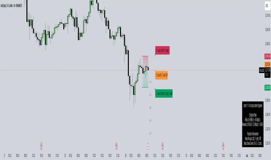
LotSize CalculatorLotSize Calculator Documentation
Overview
The LotSize Calculator is a powerful TradingView indicator designed to help traders calculate optimal position sizes based on risk management principles. It provides a visual representation of trade setups, including entry points, stop losses, and take profits, while calculating the appropriate lot size based on your risk preferences.
Key Features
Automatic lot size calculation based on risk amount
Support for multiple asset classes (forex, commodities, indices, etc.)
Visual R-multiple levels (1R to 5R)
Real-time position tracking with drawdown and run-up statistics
Customizable visual elements and display options
Input Parameters
Risk Management Settings
Risk Amount Type: Choose between risking a fixed amount in dollars ($) or a specific lot size.
Risk Amount: The amount you want to risk on the trade (in dollars if Risk Amount Type is set to $, or in lots if set to Lots).
Overwrite TP: Optional setting to automatically set take profit at a specific R-multiple (1R, 2R, 3R, 4R, or 5R).
Table Comments: Optional field to add personal notes to the position table.
Trade Setup Levels
Trigger Price: The price at which your trade will be entered.
Stop Loss: Your predetermined exit price to limit losses.
Take Profit: Your target price to secure profits.
Time Of Setup Start Bar: The starting time for your trade setup window.
Display Settings
Plot Position Labels: Toggle to show/hide position information labels on the chart.
Plot Position Table: Toggle to show/hide the position information table.
Show Money: Toggle to display monetary values ($) in the labels and table.
Show Points: Toggle to display point values in the labels and table.
Show Ticks: Toggle to display tick values in the labels and table.
Visual Appearance
Entry Color: Color for entry level line and labels.
Take Profit Color: Color for take profit level line and labels.
Stop Loss Color: Color for stop loss level line and labels.
Label Text Color: Color for text in the position labels.
Table Background: Background color for the position information table.
Table Text: Text color for the position information table.
R Labels: Color for the R-multiple level labels.
Table Position: Position of the information table on the chart (options: Bottom Right, Bottom Left, Bottom Middle, Top Right, Top Middle).
How to Use
Basic Setup
Set your entry price in the "Trigger Price" field.
Set your stop loss level in the "Stop Loss" field.
Set your take profit level in the "Take Profit" field.
Choose your risk amount type ($ or Lots) and enter the risk amount.
Optionally, select an R-multiple for automatic take profit calculation.
Understanding the Display
The indicator will show:
Horizontal lines for entry, stop loss, and take profit levels
Colored zones between entry and take profit (potential profit zone) and between entry and stop loss (potential loss zone)
R-multiple levels based on your risk (1R, 2R, 3R, 4R, 5R)
A table displaying:
Position type (long/short) and size
Original risk and reward figures
Maximum run-up and drawdown during the trade
Trade Monitoring
Once a trade is triggered (either by price crossing a stop entry or reaching a limit entry), the indicator tracks:
Current position value
Maximum run-up (highest profit seen)
Maximum drawdown (largest loss seen)
Trade outcome when take profit or stop loss is hit
Advanced Features
Asset Type Detection
The LotSize Calculator automatically detects the type of asset being traded (forex, commodity, index, etc.) and adjusts calculations accordingly to ensure accurate position sizing.
R-Multiple Visualization
R-multiples help visualize potential reward relative to risk. For example, 2R means the potential reward is twice the amount risked. The indicator displays these levels directly on your chart for easy reference.
Adaptive Position Labels
Position labels adjust their display based on trade direction (long or short) and include relevant information about risk, reward, and current position status.
Best Practices
Always confirm your risk is appropriate for your account size (typically 1-2% of account per trade).
Use the R-multiple visualization to ensure your trades offer favorable risk-to-reward ratios.
The indicator works best when used alongside your existing strategy for entry and exit signals.
Customize the visual appearance to match your chart theme for better visibility.
Troubleshooting
If position calculations seem incorrect, verify that the indicator is detecting the correct instrument type.
For forex pairs, ensure your broker's lot size conventions match those used by the indicator.
The indicator may need adjustment for certain exotic instruments or markets with unusual tick sizes.
SessionBarThis PineScript is designed to display various visual elements on a chart to help traders track session activity within the lower time frames, specifically for the USA main session. Here's a breakdown of the script's functionality:
Session Tracking
The script tracks the USA main session, defined as 9:30 AM to 4:00 PM ET, Monday through Friday.
Visual Elements
The script displays various visual elements, including:
1. Session Open and Close Lines: Lines marking the open and close of the USA main session.
2. Session High and Low Lines: Lines marking the high and low of the USA sessions.
3. Active Session Bar: A Realtime Candle as the current session bar.
4. Overnight Session Bar: A Realtime Candle as the overnight session bar.
5. Session Timer: A label displaying the time left until the next session.
6. Background Colors: Colors indicating different session periods, such as pre-market, post-market, and active session.
Customization
The script allows users to customize various aspects, including:
1. Session Time: Users can adjust the session time.
2. Colors: Users can choose colors for different visual elements.
3. Display Options: Users can toggle the display of various visual elements.
Overall, this script provides a educational tool for traders to track session activity and visualize key market data.

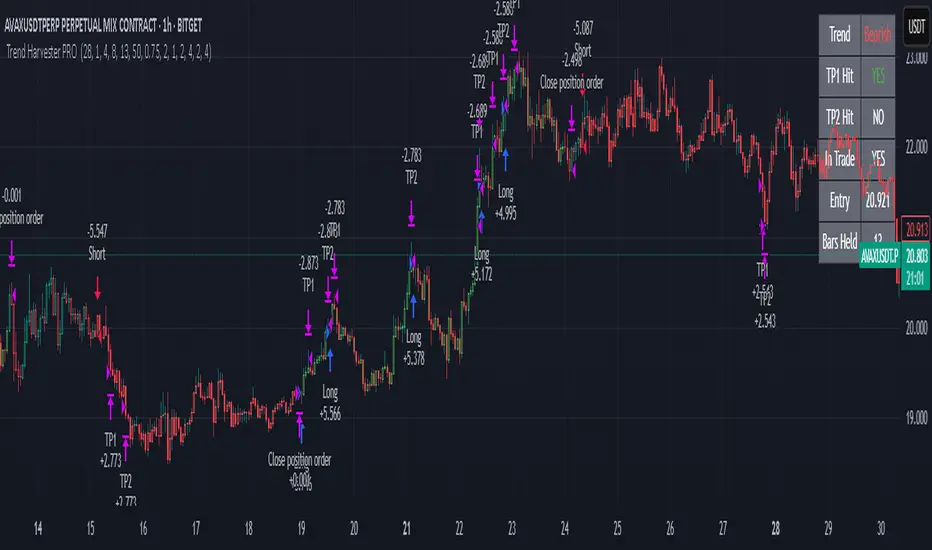
Trend Harvester PRO Trend Harvester PRO – Adaptive Trend-Following Strategy for Crypto
Trend Harvester PRO is a fully systematic trend-following strategy built for cryptocurrency markets on intraday timeframes — particularly optimized for the 1-hour chart. The script combines ZLEMA-based trend tracking, momentum confirmation, and a volatility-aware filter to detect high-probability directional moves with clarity and precision.
This is not a mashup of random indicators — each component serves a specific purpose in validating trends, avoiding choppy zones, and timing entries responsibly.
🔍 Strategy Logic Overview
The core objective is to detect sustainable, real-time trends and exit with multi-stage profit targets. To do this, the script uses several layers of confirmation:
1. 📊 ZLEMA Trend Engine (Zero Lag EMA)
This is the backbone of the strategy.
ZLEMA (Zero-Lag EMA) is a moving average that minimizes lag by adjusting for past data offset.
The strategy uses a fast ZLEMA and a slow ZLEMA, combined with a slope calculation, to assess the current trend.
When:
Fast ZLEMA > Slow ZLEMA
The ZLEMA is rising (positive slope)
→ The market is considered in an uptrend.
Conversely, if:
Fast ZLEMA < Slow ZLEMA
The slope is negative
→ The market is considered in a downtrend.
This setup detects not just direction, but also whether the trend has meaningful acceleration.
2. ⚡ Momentum Confirmation
Trend direction alone isn’t enough — we also need momentum agreement.
The script calculates a smoothed Rate of Change (ROC) to evaluate if momentum supports the direction of the ZLEMA trend.
For long trades: ROC must be positive
For short trades: ROC must be negative
This prevents taking trades where price is crossing moving averages but lacks follow-through power.
3. 🌪️ Volatility Filter
Choppy markets are common in crypto. To reduce false signals:
The script compares short-term volatility (10-bar standard deviation of price changes) to longer-term volatility.
If the ratio is too high (i.e., short-term volatility is spiking), the strategy avoids entry.
This ensures trades are only taken when the market is relatively calm and directional — avoiding false breakouts.
4. 🧠 Confirmation Bars + Trend State
Signals only trigger after a certain number of consecutive bars confirm trend direction (confirmBars).
This prevents reacting to just 1 candle and requires consistent evidence of trend.
A state machine is used to track current trend status:
+1 = confirmed uptrend
-1 = confirmed downtrend
0 = neutral / no trade
This trend state changes only after all conditions are met and confirmation bars pass.
5. 🧊 Cooldown Enforcement
After a trade exits (from TP or a trend reversal), the strategy enforces a cooldown period before new entries are allowed. This:
Prevents back-to-back entries on trend flips
Reduces overtrading
Helps avoid whipsaws or same-bar reversal trades
6. 🎯 Multi-Level Take Profits (TP1 & TP2)
Once a trade is entered:
Two limit exits are set automatically:
TP1: Closes 50% of the position at a configurable profit level
TP2: Closes the remaining 50%
If the trend weakens before TP2 is reached, the position is closed early.
Both long and short trades use the same logic, with user-defined percentages.
This system allows for partial profit-taking while keeping a portion of the trade running.
7. 🧾 Built-in Dashboard
The script includes a real-time dashboard showing:
Trend direction: Bullish, Bearish, or Neutral
Whether TP1 / TP2 was hit
Entry price
If currently in a trade
How many bars the trade has been open
This helps monitor strategy performance at a glance without needing extra labels.
8. 🔔 Webhook-Compatible Alerts
The strategy includes custom alerts that can be used for:
Long and Short entries
TP1 and TP2 hits
Exiting trades
These can be integrated into automated bot systems or used manually.
🔒 Non-Repainting Logic
The strategy uses only confirmed bar data (i.e., values from closed bars).
There are no repainting indicators.
Entries and exits are placed using strategy.entry and strategy.exit on confirmed conditions.
✅ How to Use It
Apply the strategy to 1H altcoin charts (BTC, ETH, SOL, etc.).
Tune the TP percentages (longTP1Pct, longTP2Pct, etc.) based on volatility.
Use the dashboard to monitor trend state and trade progress.
Combine with additional tools (like support/resistance or volume) for higher confluence.
Use the date filter to run backtests over defined periods.
⚠️ Risk Management Notice
This strategy does not include stop losses by default. It is designed to exit based on trend reversal or take-profit limits.
Always backtest thoroughly and use realistic sizing.
Do not risk more than 5–10% of your account on any trade.
Past results do not guarantee future performance. This tool is for educational and research purposes.
🧬 What Makes This Original
Trend Harvester PRO was built from scratch with tightly integrated logic:
ZLEMA tracks early trend direction with low lag
ROC confirms momentum in the same direction
Volatility filter avoids false setups
Multi-bar confirmation and cooldown logic control trade pacing
Dual TP exits manage partial profit-taking
A live dashboard makes real-time tracking intuitive
Unlike mashups of indicators with no synergy, each component here directly supports the quality of trade decisions, and the logic is modular, transparent, and non-repainting.
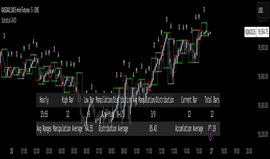
Statistical AMDOverview
The Statistical AMD ("Accumulation, Manipulation, Distribution") is a real-time statistical analyzer and visual segmentation tool for price action.
It identifies and tracks the structure of major movements within higher timeframe candles — breaking them into three key phases:
Manipulation (M): Early-stage liquidity sweeps.
Distribution (D): Mid-phase trending moves.
Accumulation (A): Late-stage compression zones.
The tool records and visualizes where highs and lows form relative to the open of a larger candle (e.g., 1-hour) and aggregates statistical behavior across sessions.
This is not a predictive indicator — it is a segmentation and statistical probability builder for real-time and historical analysis.
What It Does
Tracks High/Low Timing:
Identifies when the high and low occur during each higher timeframe candle (like hourly).
Plots Box Structures:
Color-coded boxes for each phase:
Red = Manipulation
Green = Distribution
White = Accumulation
Displays Statistical Table:
Average timing of highs and lows
Current vs historical bar position tracking
Average ranges for each phase
Historical Aggregation:
Aggregates hundreds of candles' data to build probabilistic expectations.
Live Updates:
Boxes dynamically expand as price evolves within each phase.
Key Settings
HTF Reference:
Select the higher timeframe to analyze (Default: 1 Hour).
Manually Input Legs:
Customize leg sizes for manipulation, distribution, and no-trade zones.
Defaults:
Manipulation Leg = 3 bars
Distribution Leg = 6 bars
No Trade Zone = 6 bars
Ideal For
Liquidity and Manipulation Traders:
Those analyzing sweep behaviors, fakeouts, and structural rotations.
Time-based Statistical Analysts:
Users who build mean-reversion or breakout models based on timing patterns.
ICT, Smart Money Concept (SMC) Traders:
Traders who track sweep → displacement → compression cycles.
Scalpers and Intraday Traders:
Anyone needing microstructural framing inside large candles.
Important Notes
Higher timeframe anchoring is critical.
Make sure you align the "HTF Reference" with your intended analysis frame (e.g., if you scalp on 1-min, set HTF to 1H or 4H).
The tool doesn’t predict future moves directly — it helps build a contextual, statistically-backed map of where you are inside the cycle.
Manual input flexibility allows tailoring for different asset volatility.
Final Thought
If you're trading without understanding the internal phases of a candle — you're navigating blind.
Statistical AMD arms you with objective, historical data about how and when price tends to expand, manipulate, and compress — so you can act with probability on your side.
ICT Swiftedge# ICT SwiftEdge: Advanced Market Structure Trading System
**Overview**
ICT SwiftEdge is a powerful trading system built upon the foundation of ICTProTools' ICT Breakers, licensed under the Mozilla Public License 2.0 (mozilla.org). This script has been significantly enhanced by to combine market structure analysis with modern technical indicators and a sleek, AI-inspired statistics dashboard. The goal is to provide traders with a comprehensive tool for identifying high-probability trade setups, managing exits, and tracking performance in a visually intuitive way.
**Credits**
This script is a derivative work based on the original "ICT Breakers" by ICTProTools, used with permission under the Mozilla Public License 2.0. Significant enhancements, including RSI-MA signals, trend filtering, dynamic timeframe adjustments, dual exit strategies, and an AI-style statistics dashboard, were developed by . We express our gratitude to ICTProTools for their foundational work in market structure analysis.
**What It Does**
ICT SwiftEdge integrates multiple trading concepts to help traders identify and manage trades based on market structure and momentum:
- **Market Structure Analysis**: Identifies Break of Structure (BOS) and Market Structure Shift (MSS) patterns, which signal potential trend continuations or reversals. BOS indicates a continuation of the current trend, while MSS highlights a shift in market direction, providing key entry points.
- **RSI-MA Signals**: Generates "BUY" and "SELL" signals when BOS or MSS patterns align with the Relative Strength Index (RSI) smoothed by a Moving Average (RSI-MA). Signals are filtered to occur only when RSI-MA is above 50 (for buys) or below 50 (for sells), ensuring momentum supports the trade direction.
- **Trend Filtering**: Prevents multiple signals in the same trend, ensuring only one buy or sell signal per trend direction, reducing noise and improving trade clarity.
- **Dynamic Timeframe Adjustment**: Automatically adjusts pivot points, RSI, and MA parameters based on the selected chart timeframe (1M to 1D), optimizing performance across different market conditions.
- **Flexible Exit Strategies**: Offers two user-selectable exit methods:
- **Trailing Stop-Loss (TSL)**: Exits trades when price moves against the position by a user-defined distance (in points), locking in profits or limiting losses.
- **RSI-MA Exit**: Exits trades when RSI-MA crosses the 50 level, signaling a potential loss of momentum.
- Users can enable either or both strategies, providing flexibility to adapt to different trading styles.
- **AI-Style Statistics Dashboard**: Displays real-time trade performance metrics in a futuristic, neon-colored interface, including total trades, wins, losses, win/loss ratio, and win percentage. This helps traders evaluate the system's effectiveness without external tools.
**Why This Combination?**
The integration of these components creates a synergistic trading system:
- **BOS/MSS and RSI-MA**: Combining market structure breaks with RSI-MA ensures entries are based on both price action (structure) and momentum (RSI-MA), increasing the likelihood of high-probability trades.
- **Trend Filtering**: By limiting signals to one per trend, the system avoids overtrading and focuses on significant market moves.
- **Dynamic Adjustments**: Timeframe-specific parameters make the system versatile, suitable for scalping (1M, 5M) or swing trading (4H, 1D).
- **Dual Exit Strategies**: TSL protects profits during trending markets, while RSI-MA exits are ideal for range-bound or reversing markets, catering to diverse market conditions.
- **Statistics Dashboard**: Provides immediate feedback on trade performance, enabling data-driven decision-making without manual tracking.
This combination balances technical precision with user-friendly visuals, making it accessible to both novice and experienced traders.
**How to Use**
1. **Add to Chart**: Apply the script to any TradingView chart.
2. **Configure Settings**:
- **Chart Timeframe**: Select your chart's timeframe (1M to 1D) to optimize parameters.
- **Structure Timeframe**: Choose a timeframe for market structure analysis (leave blank for chart timeframe).
- **Exit Strategy**: Enable Trailing Stop-Loss (`useTslExit`), RSI-MA Exit (`useRsiMaExit`), or both. Adjust `tslPoints` for TSL distance.
- **Show Signals/Labels**: Toggle `showSignals` and `showExit` to display "BUY", "SELL", and "EXIT" labels.
- **Dashboard**: Enable `showDashboard` to view trade statistics. Customize colors with `dashboardBgColor` and `dashboardTextColor`.
3. **Trading**:
- Look for "BUY" or "SELL" labels to enter trades when BOS/MSS aligns with RSI-MA.
- Exit trades at "EXIT" labels based on your chosen strategy.
- Monitor the statistics dashboard to track performance (total trades, win/loss ratio, win percentage).
4. **Alerts**: Set up alerts for BOS, MSS, buy, sell, or exit signals using the provided alert conditions.
**License**
This script is licensed under the Mozilla Public License 2.0 (mozilla.org). The source code is available for review and modification under the terms of this license.
**Compliance with TradingView House Rules**
This publication adheres to TradingView's House Rules and Scripts Publication Rules. It provides a clear, self-contained description of the script's functionality, credits the original author (ICTProTools), and explains the rationale for combining indicators. The script contains no promotional content, offensive language, or proprietary restrictions beyond MPL 2.0.
**Note**
Trading involves risk, and past performance is not indicative of future results. Always backtest and validate the system on your preferred markets and timeframes before live trading.
Enjoy trading with ICT SwiftEdge, and let data-driven insights guide your decisions!

Rotation Phase Signal OnlyHow to Use the “Rotation Phase Signal Only” Script
(Floating Dashboard Version)
This version gives you a clean, unobtrusive way to monitor the market regime and rotation instructions on any chart — whether you’re tracking your dividend ETFs, growth funds, or defensive positions.
✅ What It Does
This script tracks:
SPY:TLT — Stocks vs. Bonds (macro equity trend)
QQQ:XLU — Growth vs. Defensive (sector risk appetite)
It calculates weekly EMAs of these ratios to determine which phase we are in:
Phase Signal Interpretation Reallocation Action
GROWTH Stocks & growth sectors lead Add MTUM, VUN, XMTM / Trim income assets
INCOME Stocks weak, growth holding Add HHIS, HYLD, QQQY / Trim growth
DEFENSIVE Bonds and defensives lead Add HPYT, HPYT.U, ZGLD / Exit most equity
NEUTRAL Mixed or unclear signals Hold / minor rebalancing only
🧱 Key Features of This Version
Feature Description
📊 Floating Table Always visible in the top-right corner of the chart
🔄 Dynamic Updates Adjusts weekly as the regime changes
✅ Use On Any Ticker You can run this on DFN, QQQY, HYLD, etc.
🔔 Built-In Alerts Alerts trigger when the phase changes
🗓️ Weekly Workflow (Suggested)
Open Your Main Chart
Use this on any ticker — your dividend ETFs, growth ETF, or even individual stocks.
Check the Floating Table
PHASE: The current regime (GROWTH, INCOME, DEFENSIVE, or NEUTRAL)
ADD: What ETFs to accumulate
SELL: What ETFs or sectors to trim or rotate out of
Take Action
Rebalance or allocate new capital based on the table guidance.
Set Alerts (Optional)
Click “🔔 Alerts” in TradingView
Set up alerts for when the Phase changes
Example: “Alert me when Phase = DEFENSIVE”
🔔 Example Alert Setup
Click on Alerts
Choose:
Condition: Rotation Phase Signal Only
Value: GROWTH or INCOME or DEFENSIVE
Choose alert type: pop-up, email, webhook, etc.
💡 Pro Tips
Use this alongside your Dividend or Income Dashboards for smarter reinvestment decisions.

Swing Trade IndicatorThis is a Swing Trade Indicator that combines several technical indicators to analyze market conditions and generate trade signals. I've included two tables that provide real-time information to help you analyze the market and track trades: the Market Status Table and the Trade Tracking Table. These tables are overlaid on the TradingView chart and are customizable in terms of position and visibility.
Simple Moving Averages (SMAs):
Determines trend direction (e.g., bullish if fastMA > slowMA).
Calculates the average closing price over a set period:
fastMA: 21-period SMA (short-term trend).
slowMA: 50-period SMA (medium-term trend).
ultraSlowMA: 200-period SMA (long-term trend).
How:
ta.sma(close, fastLength) computes the SMA of the closing price over fastLength bars (similarly for slowLength and ultraSlowLength).
Volume Analysis:
Identifies potential liquidity spikes.
Measures trading volume to detect high activity.
Average volume over liquidityPeriod (20 bars).
Standard deviation of volume to set a dynamic threshold.
How:
avgVolume = ta.sma(volume, liquidityPeriod): Average volume.
volumeStdDev = ta.stdev(volume, liquidityPeriod): Volatility of volume.
highVolume = volume > avgVolume + volumeStdDev * volumeThresholdMultiplier: Flags high volume if it exceeds the average plus a multiplier (default 1.0) times the standard deviation.
Relative Strength Index (RSI):
Filters entries to avoid overextended markets.
Measures momentum and overbought/oversold conditions.
14-period RSI with thresholds at 60 (overbought) and 40 (oversold).
How:
rsiValue = ta.rsi(close, rsiLength) calculates RSI based on price changes over 14 bars.
Average Directional Index (ADX):
Gauges whether the trend is strong enough to trade.
Assesses trend strength.
14-period ADX.
How:
Calculates True Range (tr), Plus Directional Movement (plusDM), and Minus Directional Movement (minusDM).
Smooths these with ta.rma (Running Moving Average) over adxLength (14).
Computes plusDI and minusDI (directional indicators), then dx (difference), and finally adxValue = ta.rma(dx, adxLength) for trend strength.
Classifies as "Strong" (≥40), "Moderate" (≥20), or "Weak" (<20).
Moving Average Convergence Divergence (MACD) (Optional):
Optional filter for entry conditions if useMacdFilter is enabled.
Tracks momentum and trend changes.
Fast EMA (12), Slow EMA (26), Signal Line (9).
How:
= ta.macd(close, macdFastLength, macdSlowLength, macdSignalLength) computes the MACD components.
macdBullish = macdLine > signalLine: Bullish signal.
macdBearish = macdLine < signalLine: Bearish signal.
Liquidity Zones:
Confirms entries near key levels and suggests next trade setups.
Identifies support and resistance levels based on recent price extremes.
Dynamic levels over 20 bars (if useDynamicLevels is true).
How:
highLiquidityLevel1 = ta.highest(high, 20): Highest high in last 20 bars.
highLiquidityLevel2 = ta.highest(high , 20): Highest high from 20 to 40 bars ago.
highLiquidityLevel3 = ta.lowest(low, 20): Lowest low in last 20 bars.
highLiquidityLevel4 = ta.lowest(low , 20): Lowest low from 20 to 40 bars ago.
Upper and lower zones are derived (upperLevel, lowerLevel), with a midpoint between them.
How It Calculates Entries and Exits
Long Entry:
Basic Conditions (longEntry):
close > fastMA: Price is above the 21-period SMA.
fastMA > slowMA: Short-term trend is above medium-term trend (bullish).
rsiValue < rsiOverbought: RSI below 60 (not overbought).
(not useMacdFilter or macdBullish): If MACD filter is off, ignore it; if on, MACD must be bullish.
Confirmed Entry (confirmedLongEntry):
longEntry is true.
close >= highLiquidityLevel3 * 0.95 and close <= highLiquidityLevel3 * 1.05: Price is within 5% of the lower liquidity level (support).
Action: Sets currentPosition = 'long', records entry price and bar, plots a green triangle below the bar.
Short Entry:
Basic Conditions (shortEntry):
close < fastMA: Price is below the 21-period SMA.
fastMA < slowMA: Short-term trend is below medium-term trend (bearish).
rsiValue > rsiOversold: RSI above 40 (not oversold).
(not useMacdFilter or macdBearish): If MACD filter is off, ignore it; if on, MACD must be bearish.
Confirmed Entry (confirmedShortEntry):
shortEntry is true.
close <= highLiquidityLevel1 * 1.05 and close >= highLiquidityLevel1 * 0.95: Price is within 5% of the upper liquidity level (resistance).
Action: Sets currentPosition = 'short', records entry price and bar, plots a red triangle above the bar.
Exit Conditions
Note: The exit logic is defined but commented out in the script (//longExit and //shortExit), meaning it doesn’t automatically exit positions. It calculates stop-loss and take-profit levels for manual use:
Long Exit (if uncommented):
close < stopLossLevelLong: Price falls below stop-loss (entry price × (1 - 1.5%)).
close > takeProfitLevelLong: Price exceeds take-profit (entry price × (1 + 1.5% × 2.0)).
Short Exit (if uncommented):
close > stopLossLevelShort: Price rises above stop-loss (entry price × (1 + 1.5%)).
close < takeProfitLevelShort: Price falls below take-profit (entry price × (1 - 1.5% × 2.0)).
Suggested Levels: The script provides suggestedLongSL, suggestedLongTP, suggestedShortSL, and suggestedShortTP in the Market Status Table, based on liquidity levels rather than entry price, for manual exits.
Users Can Edit Settings:
Market Status Table Position: Dropdown (e.g., "top_right" to "bottom_left").
Trade Tracking Table Position: Dropdown (e.g., "bottom_right" to "middle_center").
Visibility Toggles (checkboxes):
Show Tables: Enable/disable tables (default: true).
Show Liquidity Zones: Not plotted but affects logic (default: true).
Show Entry Points: Show/hide entry triangles (default: true).
Use Dynamic Levels: Enable/disable liquidity zones (default: true).
Use MACD for Entry Filter: Add MACD to entry conditions (default: false).
Show MACD on Chart: Not implemented but reserved (default: false).
Indicator Periods:
Fast MA Length: Integer (default: 21, e.g., change to 10).
Slow MA Length: Integer (default: 50, e.g., change to 30).
Ultra Slow MA Length: Integer (default: 200, e.g., change to 100).
Liquidity Detection Period: Integer (default: 20, e.g., change to 10).
RSI Length: Integer (default: 14, e.g., change to 7).
ADX Length: Integer (default: 14, e.g., change to 20).
MACD Fast/Slow/Signal Length: Integers (default: 12/26/9, e.g., 9/21/5).
Thresholds:
Volume Threshold Multiplier: Float (default: 1.0, e.g., 1.5 for stricter high volume).
RSI Overbought: Integer (default: 60, e.g., 70).
RSI Oversold: Integer (default: 40, e.g., 30).
Stop Loss %: Float (default: 1.5, e.g., 2.0, range 0.1-10).
Take Profit Ratio: Float (default: 2.0, e.g., 3.0, range 1.0-5.0).
Liquidity Threshold (%): Float (default: 2.0, e.g., 1.5, range 0.5-5.0).

Logarithmic Regression Channel-Trend [BigBeluga]
This indicator utilizes logarithmic regression to track price trends and identify overbought and oversold conditions within a trend. It provides traders with a dynamic channel based on logarithmic regression, offering insights into trend strength and potential reversal zones.
🔵Key Features:
Logarithmic Regression Trend Tracking: Uses log regression to model price trends and determine trend direction dynamically.
f_log_regression(src, length) =>
float sumX = 0.0
float sumY = 0.0
float sumXSqr = 0.0
float sumXY = 0.0
for i = 0 to length - 1
val = math.log(src )
per = i + 1.0
sumX += per
sumY += val
sumXSqr += per * per
sumXY += val * per
slope = (length * sumXY - sumX * sumY) / (length * sumXSqr - sumX * sumX)
average = sumY / length
intercept = average - slope * sumX / length + slope
Regression-Based Channel: Plots a log regression channel around the price to highlight overbought and oversold conditions.
Adaptive Trend Colors: The color of the regression trend adjusts dynamically based on price movement.
Trend Shift Signals: Marks trend reversals when the log regression line cross the log regression line 3 bars back.
Dashboard for Key Insights: Displays:
- The regression slope (multiplied by 100 for better scale).
- The direction of the regression channel.
- The trend status of the logarithmic regression band.
🔵Usage:
Trend Identification: Observe the regression slope and channel direction to determine bullish or bearish trends.
Overbought/Oversold Conditions: Use the channel boundaries to spot potential reversal zones when price deviates significantly.
Breakout & Continuation Signals: Price breaking outside the channel may indicate strong trend continuation or exhaustion.
Confirmation with Other Indicators: Combine with volume or momentum indicators to strengthen trend confirmation.
Customizable Display: Users can modify the lookback period, channel width, midline visibility, and color preferences.
Logarithmic Regression Channel-Trend is an essential tool for traders who want a dynamic, regression-based approach to market trends while monitoring potential price extremes.

All-Time High MarkerThis indicator automatically identifies and displays the All-Time High (ATH) price on a chart. When a new ATH is reached, a horizontal line is drawn, extending from a user-specified number of bars to the left of the ATH candle to the current bar, and continuing indefinitely to the right. An "ATH" label is placed at the beginning of the line. Key features:
Dynamic ATH Tracking: Automatically updates as new all-time highs are reached.
Customizable Line: Adjust the line color and width to match your chart theme.
Customizable Label: Change the label color, text color, and vertical offset.
Line Start Offset: Control how far back the ATH line starts from the ATH candle.
This tool helps traders quickly visualize and track ATH levels for potential breakouts or resistance zones.

The Investment Clock Orbital GraphThe Investment Clock Orbital Graph is an advanced visualization tool designed to help traders and investors track economic cycles using a dynamic scatter plot of GDP growth vs. CPI inflation rates.
This indicator is a fusion of two powerful TradingView indicators:
LuxAlgo ’s Relative Strength Scatter Plot – A robust scatter plot for tracking relative strength.
The Investment Clock Indicator – A cycle-based approach to market rotation. This indicator contains more information regarding The Investment Clock.
By combining these approaches, the Investment Clock Orbital Graph enables traders to visualize economic momentum and inflationary trends in a unique, orbital-style scatter plot.
Key Features & Improvements
Orbital Graph Representation – Displays GDP growth and CPI inflation as a dynamic, evolving scatter plot, showing how the economy moves through different phases.
Quadrant-Based Market Regimes – Identifies four key economic phases:
1)🔥 Overheating (High Growth, High Inflation)
2)📉 Stagflation (Low Growth, High Inflation)
3)🤒 Recovery (High Growth, Low Inflation)
4)🎈 Reflation (Low Growth, Low Inflation)
Data-Driven Analysis – Utilizes FRED (Federal Reserve Economic Data) for accurate real-world GDP & CPI data.
Trailing Path of Economic Evolution – Tracks historical economic cycles over time to show momentum and cyclical movements.
Customizable Parameters – Set sustainable GDP growth and inflation thresholds, adjust trail length, and fine-tune scatter plot resolution.
Auto-Labeled Quadrants & Revised Accurate Market Guidance – Each quadrant includes newly updated tooltips and annotations (like ETF suggestions) to help traders make informed decisions.
Live Macro Forecasting Tool – Helps traders anticipate future market conditions, rate hikes/cuts, and sector rotations.
How to Use for Trading Decisions
The Investment Clock Orbital Graph helps traders and macro investors by identifying market phases and providing insights into asset class performance during different economic conditions.
📌 Step 1: Identify the Current Quadrant
Locate the most recent point on the orbital graph to see if the economy is in Overheating, Stagflation, Recovery, or Reflation.
📌 Step 2: Forecast Market Trends
The trajectory of the points can predict upcoming economic shifts:
Overheating → Stagflation ➡️ Expect economic slowdowns, bearish stock markets.
Stagflation → Reflation ➡️ Interest rate cuts likely, bonds and defensive stocks perform well.
Reflation → Recovery ➡️ Risk-on rally, technology and cyclicals perform best.
Recovery → Overheating ➡️ Commodities surge, inflation rises, and central banks intervene.
📌 Step 3: Align Trading & Investing Strategies
🔥 Overheating – Favor commodities & energy (Oil, Industrial Stocks, Materials).
📉 Stagflation – Favor defensive assets (Cash, Utilities, Healthcare).
🤒 Recovery – Favor growth stocks (Technology, Consumer Discretionary).
🎈 Reflation – Favor bonds, value stocks, and financials.
📌 Step 4: Monitor Trends Over Time
The indicator visualizes economic movement over multiple months, allowing traders to confirm long-term trends vs. short-term noise.
The Investment Clock Orbital Graph is an essential macro trading tool, providing a real-time visualization of economic conditions. By tracking GDP growth vs. CPI inflation, traders and investors can align their portfolios with major macroeconomic shifts, predict sector rotations, and anticipate central bank policy changes.

[S1B] Engulfing Orderblock
The Engulfing Orderblock indicator is a custom script designed to visually highlight and track bullish and bearish engulfing patterns on a price chart. These patterns are widely used in technical analysis to identify potential reversal points. The indicator dynamically draws colored boxes around the previous candle involved in the engulfing event, making it easier for traders to spot these setups in the price action.
Key Features:
Bullish Engulfing Pattern:
When a bearish candle (one where the open is higher than the close) is followed by a candle whose close is above the previous candle’s open, the indicator detects a bullish engulfing pattern. A green box is drawn around the previous candle.
• Box Style Options: Users can choose whether the box represents the candle’s body (from open to close) or its wick (from open to low).
Bearish Engulfing Pattern:
When a bullish candle (one where the open is lower than the close) is followed by a candle whose close is below the previous candle’s open, a bearish engulfing pattern is identified. A red box is drawn around the previous candle.
• Box Style Options: The box can be drawn using the candle’s body (from close to open) or its wick (from high to open), according to the user’s preference.
Dynamic Box Management:
Once a box is drawn, the indicator continuously monitors the price. If the price moves beyond the box’s range, the box is either deleted or its color changes to gray, indicating that the pattern’s relevance may be diminishing.
Max Pattern Tracking:
To prevent clutter, the indicator limits the number of displayed engulfing boxes to 500 by default. Older boxes are removed as new patterns are detected.
Customization:
Users can adjust the number of previous bars scanned for engulfing patterns as well as the maximum number of patterns displayed. An option is also provided to select whether the box should reflect the candle’s body or include the wick.
How It Works:
Pattern Detection:
The script compares the current price with the previous candle’s data to detect either a bullish or bearish engulfing pattern.
Box Creation:
When a pattern is detected, a colored box is drawn around the previous candle’s price range (using the user-selected style) to visually highlight the orderblock.
Pattern Expiry and Cleanup:
The indicator monitors each drawn box, deleting or modifying it (changing the color to gray) if the price moves significantly beyond the box’s range.
Remark:
The original concept for this indicator is from daisukeburn .

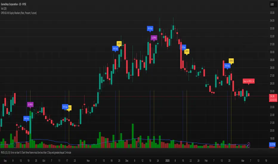
OPEX & VIX Expiry Markers (Past, Present, Future)Expiry Date Indicator for Options & Index Traders
Track Key Expiration Dates Automatically
For traders focused on options, indices, and expiration-based strategies, staying aware of key expiration dates is essential. This TradingView indicator automatically plots OPEX, VIX Expiry, and Quarterly Expirations on your charts—helping you plan trades more effectively without manual tracking.
Features:
✔ OPEX Expiration Markers – Highlights the third Friday of each month, when equity and index options expire.
✔ VIX Expiration Tracking – Marks Wednesday VIX expirations, useful for volatility-based trades.
✔ Quarterly Expiration Highlights – Identifies major market expiration cycles for better trade management.
✔ Live Countdown to Next OPEX – Displays how many days remain until the next expiration.
✔ Works on Any Timeframe – Past, present, and future expiration dates update dynamically.
✔ Customizable Settings – Enable or disable specific features based on your trading style.
Ideal for Traders Who Use:
📈 SPX / SPY / NDX / VIX Options Strategies
📅 Iron Condors, Credit Spreads, and Expiration-Based Trades
This tool helps traders stay ahead of expiration cycles, ensuring they never miss an important date. Simple, effective, and built for seamless integration into your trading workflow.
This keeps it professional and to the point without overhyping it. Let me know if you'd like any further refinements! 🚀
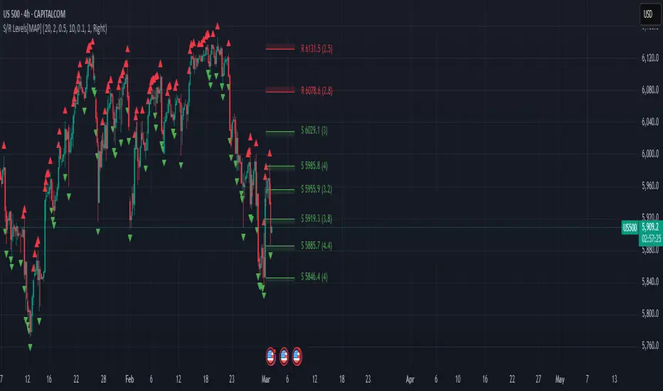
Advanced Support and Resistance Levels[MAP]Advanced Support and Resistance Levels Indicator
Author
Developed by:
Overview
The "Advanced Support and Resistance Levels" indicator, created, is a sophisticated tool designed for TradingView's Pine Script v6 platform. It identifies and plots key support and resistance levels on a price chart, enhancing technical analysis by incorporating pivot strength, volume weighting, and level decay. The indicator overlays lines, zones, and labels on the chart, providing a visual representation of significant price levels where the market has historically reversed or consolidated.
Purpose
This indicator, authored by , aims to:
Detect significant pivot points (highs and lows) with customizable strength requirements.
Track and rank support/resistance levels based on their recency, volume, and number of touches.
Display these levels as lines and optional zones, with strength-based visual cues (e.g., line thickness and opacity).
Offer flexibility through user-configurable settings to adapt to different trading styles and market conditions.
Features
Pivot Detection:
Identifies high and low pivots using a strength parameter, requiring a specified number of bars on either side where no higher highs or lower lows occur.
Incorporates closing price checks and SMA-based trend confirmation to filter out noise and ensure pivots align with the broader market direction.
Level Management:
Maintains a dynamic array of levels with attributes: price, type (support/resistance), bars since last touch, strength, and volume.
Merges nearby levels within a tolerance percentage, updating prices with a strength-weighted average.
Prunes weaker or older levels when exceeding the maximum allowed, prioritizing those with higher calculated strength.
Strength Calculation:
Combines the number of touches (strength), volume (if enabled), and age decay (if enabled) into a single metric.
Volume weighting uses a logarithmic scale to emphasize high-volume pivots without over-amplifying extreme values.
Age decay reduces the importance of older levels over time, ensuring relevance to current price action.
Visualization:
Draws horizontal lines at each level, with thickness reflecting the number of touches (up to a user-defined maximum).
Optional price zones around levels, sized as a percentage of the price, to indicate areas of influence.
Labels display the level type (S for support, R for resistance), price, and strength score, with position (left or right) customizable.
Line opacity varies with strength, providing a visual hierarchy of level significance.
Plots small triangles at detected pivot points for reference.
Inputs
Lookback Period (lookback, default: 20): Number of bars to consider for trend confirmation via SMA. Range: 5–100.
Pivot Strength (strength, default: 2): Number of bars required on each side of a pivot to confirm it. Range: 1–10.
Price Tolerance % (tolerance, default: 0.5): Percentage range for merging similar levels. Range: 0.1–5.
Max Levels to Show (maxLevels, default: 10): Maximum number of levels displayed. Range: 2–50.
Zone Size % (zoneSizePercent, default: 0.1): Size of the S/R zone as a percentage of the price. Range: 0–1.
Line Width (lineWidth, default: 1): Maximum thickness of level lines. Range: 1–5.
Show Labels (showLabels, default: true): Toggle visibility of level labels.
Label Position (labelPos, default: "Right"): Position of labels ("Left" or "Right").
Level Strength Decay (levelDecay, default: true): Enable gradual reduction in strength for older levels.
Volume Weighting (volumeWeight, default: true): Incorporate volume into level strength calculations.
Support Color (supportColor, default: green): Color for support levels.
Resistance Color (resistColor, default: red): Color for resistance levels.
How It Works
Pivot Detection:
Checks for pivots only after enough bars (2 * strength) have passed.
A high pivot requires strength bars before and after with no higher highs or closes, and a short-term SMA above a long-term SMA.
A low pivot requires strength bars before and after with no lower lows or closes, and a short-term SMA below a long-term SMA.
Level Tracking:
New pivots create levels with initial strength and volume.
Existing levels within tolerance are updated: strength increases, volume takes the maximum value, and price adjusts via a weighted average.
Levels older than lookback * 4 bars with strength below 0.5 are removed.
If the number of levels exceeds maxLevels, the weakest (by calculated strength) are pruned using a selection sort algorithm.
Drawing:
Updates on the last confirmed bar or in real-time.
Lines extend lookback bars left and right from the current bar, with thickness based on touches.
Zones (if enabled) are drawn symmetrically around the level price.
Labels show detailed info, with opacity tied to strength.
Usage
Add to Chart: Apply the indicator to any TradingView chart via the Pine Script editor, as designed by .
Adjust Settings: Customize inputs to match your trading strategy (e.g., increase strength for stronger pivots, adjust tolerance for tighter level merging).
Interpret Levels: Focus on thicker, less transparent lines for stronger levels; use zones to identify potential reversal areas.
Combine with Other Tools: Pair with trend indicators or oscillators for confluence in trading decisions.
Notes
Performance: The indicator uses arrays and sorting, which may slow down on very long charts with many levels. Keep maxLevels reasonable for efficiency.
Accuracy: Enhanced by trend confirmation and volume weighting, making it more reliable than basic S/R indicators, thanks to 's design.
Limitations: Real-time updates may shift levels as new pivots form; historical levels are more stable.
Example Settings
For day trading: lookback=10, strength=1, tolerance=0.3, maxLevels=5.
For swing trading: lookback=50, strength=3, tolerance=0.7, maxLevels=10.
Credits
Author: – Creator of this advanced support and resistance tool, blending precision and customization for traders.
Market Snap Shot with Pine ScreenerMarket Snap Shot
The Market Snap Shot is a comprehensive technical analysis tool designed to track and display key price metrics across multiple timeframes, including daily, weekly, monthly, quarterly, and yearly data. This script provides a range of essential calculations for traders and investors, enabling them to assess price action, volatility, and market trends at a glance.
Features:
Daily Metrics: Includes the daily percentage change, closing range relative to the daily high/low.
Weekly Metrics: Tracks weekly open, close, range, and calculates week-to-date performance for a broader market view.
Monthly Metrics: Provides similar calculations for monthly price action, offering insights into monthly performance.
Quarter-to-Date (QTD): Displays performance for the current quarter, offering insights into quarterly price movements.
Year-to-Date (YTD): Calculates year-to-date price change, helping users track performance relative to the start of the year.
52-Week High/Low: Displays the current price's distance from the 52-week high and low, giving context to long-term price levels.
Usage:
Traders can use this screener to quickly assess the current market position and make informed decisions based on short-term and long-term trends.
Investors can leverage the 52-week and YTD metrics to gauge the overall strength of an asset in the market.
The tool is versatile for both active traders looking for real-time performance data and for those focusing on longer-term market trends.
Instructions:
This script displays multiple metrics such as percentage changes and range data for daily, weekly, monthly, quarterly, and yearly timeframes. It is designed to be used as a screener tool to assess price action and monitor performance across these key time periods.
Warning:
The "Market Snap Shot" does not provide buy or sell signals but rather serves as a performance tracking tool. Users are encouraged to use this data in conjunction with other technical and fundamental analysis tools.
AE - ATR Exhaustion ChannelAE - ATR Exhaustion Channel
📈 Overview
Identify Exhaustion Zones & Trend Breakouts with ATR Precision!
The AE - ATR Exhaustion Channel is a powerful volatility-based trading tool that combines an averaged SMA with ATR bands to dynamically highlight potential trend exhaustion zones. It provides real-time breakout detection by marking when price moves beyond key volatility bands, helping traders spot overextensions and reversals with ease.
🔑 Key Features
✔️ ATR-SMA Hybrid Channel: Uses an averaged SMA as the core trend filter while incorporating adaptive ATR-based bands for precise volatility tracking.
✔️ Dynamic Exhaustion Markers: Marks red crosses when price exceeds the upper band and green crosses when price drops below the lower band.
✔️ Customizable ATR Sensitivity: Adjust the ATR multiplier and length settings to fine-tune band sensitivity based on market conditions.
✔️ Clear Channel Visualization: A gray SMA midpoint and a blue-filled ATR band zone make it easy to track market structure.
📚 How It Works
1️⃣ Averaged SMA Calculation: The script calculates an averaged SMA over a user-defined range (min/max period). This smooths out short-term fluctuations while preserving trend direction.
2️⃣ ATR Band Construction: The ATR value (adjusted by a multiplier) is added to/subtracted from the SMA to form dynamic upper and lower volatility bands.
3️⃣ Exhaustion Detection:
If high > upper ATR band, a red cross is plotted (potential overextension).
If low < lower ATR band, a green cross is plotted (potential reversal zone).
4️⃣ Filled ATR Channel: The area between the upper and lower bands is shaded blue, providing a visual trading range.
🎨 Customization & Settings
⚙️ ATR Length – Adjusts the ATR calculation period (default: 14).
⚙️ ATR Multiplier – Scales the ATR bands for tighter or wider volatility tracking (default: 0.8, adjustable in 0.1 steps).
⚙️ SMA Range (Min/Max Length) – Defines the period range for calculating the averaged SMA (default: 5-20).
⚙️ Rolling Lookback Length – Controls how far back the high/low comparison is calculated (default: 50 bars).
🚀 Practical Usage
📌 Spotting Exhaustion Zones – Look for red/green markers appearing outside the ATR bands, signaling potential trend exhaustion and possible reversal opportunities.
📌 Breakout Confirmation – Price consistently breaching the upper band with momentum could indicate continuation, while repeated touches without strong closes may hint at reversal zones.
📌 Trend Reversal Signals – Watch for green markers below the lower band in uptrends (buy signals) and red markers above the upper band in downtrends (sell signals).
🔔 Alerts & Notifications
📢 Set Alerts for Exhaustion Signals!
Traders can configure alerts to trigger when price breaches the ATR bands, allowing for instant notifications when volatility-based exhaustion is detected.
📊 Example Scenarios
✔ Trend Exhaustion in Overextended Moves – A series of red crosses near resistance may indicate a short opportunity.
✔ Trend Exhaustion in Overextended Moves – A series of red crosses near resistance may indicate an opportunity to open a short trade.
✔ Volatility Compression Breakouts – If price consolidates within the ATR bands and suddenly breaks out, it could signify a momentum shift.
✔ Reversal Catching in Trending Markets – Spot potential trend reversals by looking for green markers below the ATR bands in bullish markets.
🌟 Why Choose AE - ATR Exhaustion Channel?
Trade with Confidence. Spot Volatility. Catch Breakouts.
The AE - ATR Exhaustion Channel is an essential tool for traders looking to identify trend exhaustion, detect breakouts, and manage volatility effectively. Whether you're trading stocks, crypto, or forex, this ATR-SMA hybrid system provides clear visual cues to help you stay ahead of market moves.
✅ Customizable to Fit Any Market
✅ Combines Volatility & Trend Analysis
✅ Easy-to-Use with Instant Breakout Detection
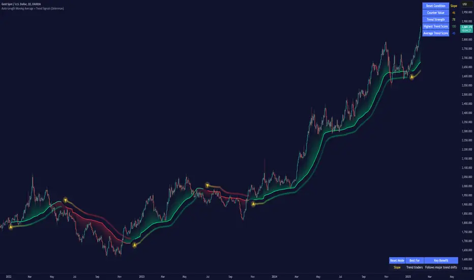
Auto-Length Moving Average + Trend Signals (Zeiierman)█ Overview
The Auto-Length Moving Average + Trend Signals (Zeiierman) is an easy-to-use indicator designed to help traders dynamically adjust their moving average length based on market conditions. This tool adapts in real-time, expanding and contracting the moving average based on trend strength and momentum shifts.
The indicator smooths out price fluctuations by modifying its length while ensuring responsiveness to new trends. In addition to its adaptive length algorithm, it incorporates trend confirmation signals, helping traders identify potential trend reversals and continuations with greater confidence.
This indicator suits scalpers, swing traders, and trend-following investors who want a self-adjusting moving average that adapts to volatility, momentum, and price action dynamics.
█ How It Works
⚪ Dynamic Moving Average Length
The core feature of this indicator is its ability to automatically adjust the length of the moving average based on trend persistence and market conditions:
Expands in strong trends to reduce noise.
Contracts in choppy or reversing markets for faster reaction.
This allows for a more accurate moving average that aligns with current price dynamics.
⚪ Trend Confirmation & Signals
The indicator includes built-in trend detection logic, classifying trends based on market structure. It evaluates trend strength based on consecutive bars and smooths out transitions between bullish, bearish, and neutral conditions.
Uptrend: Price is persistently above the adjusted moving average.
Downtrend: Price remains below the adjusted moving average.
Neutral: Price fluctuates around the moving average, indicating possible consolidation.
⚪ Adaptive Trend Smoothing
A smoothing factor is applied to enhance trend readability while minimizing excessive lag. This balances reactivity with stability, making it easier to follow longer-term trends while avoiding false signals.
█ How to Use
⚪ Trend Identification
Bullish Trend: The indicator confirms an uptrend when the price consistently stays above the dynamically adjusted moving average.
Bearish Trend: A downtrend is recognized when the price remains below the moving average.
⚪ Trade Entry & Exit
Enter long when the dynamic moving average is green and a trend signal occurs. Exit when the price crosses below the dynamic moving average.
Enter short when the dynamic moving average is red and a trend signal occurs. Exit when the price crosses above the dynamic moving average.
█ Slope-Based Reset
This mode resets the trend counter when the moving average slope changes direction.
⚪ Interpretation & Insights
Best for trend-following traders who want to filter out noise and only reset when a clear shift in momentum occurs.
Higher slope length (N): More stable trends, fewer resets.
Lower slope length (N): More reactive to small price swings, frequent resets.
Useful in swing trading to track significant trend reversals.
█ RSI-Based Reset
The counter resets when the Relative Strength Index (RSI) crosses predefined overbought or oversold levels.
⚪ Interpretation & Insights
Best for reversal traders who look for extreme overbought/oversold conditions.
High RSI threshold (e.g., 80/20): Fewer resets, only extreme conditions trigger adjustments.
Lower RSI threshold (e.g., 60/40): More frequent resets, detecting smaller corrections.
Great for detecting exhaustion in trends before potential reversals.
█ Volume-Based Reset
A reset occurs when current volume significantly exceeds its moving average, signaling a shift in market participation.
⚪ Interpretation & Insights
Best for traders who follow institutional activity (high volume often means large players are active).
Higher volume SMA length: More stable trends, only resets on massive volume spikes.
Lower volume SMA length: More reactive to short-term volume shifts.
Useful in identifying breakout conditions and trend acceleration points.
█ Bollinger Band-Based Reset
A reset occurs when price closes above the upper Bollinger Band or below the lower Bollinger Band, signaling potential overextension.
⚪ Interpretation & Insights
Best for traders looking for volatility-based trend shifts.
Higher Bollinger Band multiplier (k = 2.5+): Captures only major price extremes.
Lower Bollinger Band multiplier (k = 1.5): Resets on moderate volatility changes.
Useful for detecting overextensions in strong trends before potential retracements.
█ MACD-Based Reset
A reset occurs when the MACD line crosses the signal line, indicating a momentum shift.
⚪ Interpretation & Insights
Best for momentum traders looking for trend continuation vs. exhaustion signals.
Longer MACD lengths (260, 120, 90): Captures major trend shifts.
Shorter MACD lengths (10, 5, 3): Reacts quickly to momentum changes.
Useful for detecting strong divergences and market shifts.
█ Stochastic-Based Reset
A reset occurs when Stochastic %K crosses overbought or oversold levels.
⚪ Interpretation & Insights
Best for short-term traders looking for fast momentum shifts.
Longer Stochastic length: Filters out false signals.
Shorter Stochastic length: Captures quick intraday shifts.
█ CCI-Based Reset
A reset occurs when the Commodity Channel Index (CCI) crosses predefined overbought or oversold levels. The CCI measures the price deviation from its statistical mean, making it a useful tool for detecting overextensions in price action.
⚪ Interpretation & Insights
Best for cycle traders who aim to identify overextended price deviations in trending or ranging markets.
Higher CCI threshold (e.g., ±200): Detects extreme overbought/oversold conditions before reversals.
Lower CCI threshold (e.g., ±10): More sensitive to trend shifts, useful for early signal detection.
Ideal for detecting momentum shifts before price reverts to its mean or continues trending strongly.
█ Momentum-Based Reset
A reset occurs when Momentum (Rate of Change) crosses zero, indicating a potential shift in price direction.
⚪ Interpretation & Insights
Best for trend-following traders who want to track acceleration vs. deceleration.
Higher momentum length: Captures longer-term shifts.
Lower momentum length: More responsive to short-term trend changes.
█ How to Interpret the Trend Strength Table
The Trend Strength Table provides valuable insights into the current market conditions by tracking how the dynamic moving average is adjusting based on trend persistence. Each metric in the table plays a role in understanding the strength, longevity, and stability of a trend.
⚪ Counter Value
Represents the current length of trend persistence before a reset occurs.
The higher the counter, the longer the current trend has been in place without resetting.
When this value reaches the Counter Break Threshold, the moving average resets and contracts to become more reactive.
Example:
A low counter value (e.g., 10) suggests a recent trend reset, meaning the market might be changing directions frequently.
A high counter value (e.g., 495) means the trend has been ongoing for a long time, indicating strong trend persistence.
⚪ Trend Strength
Measures how strong the current trend is based on the trend confirmation logic.
Higher values indicate stronger trends, while lower values suggest weaker trends or consolidations.
This value is dynamic and updates based on price action.
Example:
Trend Strength of 760 → Indicates a high-confidence trend.
Trend Strength of 50 → Suggests weak price action, possibly a choppy market.
⚪ Highest Trend Score
Tracks the strongest trend score recorded during the session.
Helps traders identify the most dominant trend observed in the timeframe.
This metric is useful for analyzing historical trend strength and comparing it with current conditions.
Example:
Highest Trend Score = 760 → Suggests that at some point, there was a strong trend in play.
If the current trend strength is much lower than this value, it could indicate trend exhaustion.
⚪ Average Trend Score
This is a rolling average of trend strength across the session.
Provides a bigger picture of how the trend strength fluctuates over time.
If the average trend score is high, the market has had persistent trends.
If it's low, the market may have been choppy or sideways.
Example:
Average Trend Score of 147 vs. Current Trend Strength of 760 → Indicates that the current trend is significantly stronger than the historical average, meaning a breakout might be occurring.
Average Trend Score of 700+ → Suggests a strong trending market overall.
█ Settings
⚪ Dynamic MA Controls
Base MA Length – Sets the starting length of the moving average before dynamic adjustments.
Max Dynamic Length – Defines the upper limit for how much the moving average can expand.
Trend Confirmation Length – The number of bars required to validate an uptrend or downtrend.
⚪ Reset & Adaptive Conditions
Reset Condition Type – Choose what triggers the moving average reset (Slope, RSI, Volume, MACD, etc.).
Trend Smoothing Factor – Adjusts how smoothly the moving average responds to price changes.
-----------------
Disclaimer
The content provided in my scripts, indicators, ideas, algorithms, and systems is for educational and informational purposes only. It does not constitute financial advice, investment recommendations, or a solicitation to buy or sell any financial instruments. I will not accept liability for any loss or damage, including without limitation any loss of profit, which may arise directly or indirectly from the use of or reliance on such information.
All investments involve risk, and the past performance of a security, industry, sector, market, financial product, trading strategy, backtest, or individual's trading does not guarantee future results or returns. Investors are fully responsible for any investment decisions they make. Such decisions should be based solely on an evaluation of their financial circumstances, investment objectives, risk tolerance, and liquidity needs.
Uptrick Signal Density Cloud🟪 Introduction
The Uptrick Signal Density Cloud is designed to track market direction and highlight potential reversals or shifts in momentum. It plots two smoothed lines on the chart and fills the space between them (often called a “cloud”). The bars on the chart change color depending on bullish or bearish conditions, and small triangles appear when certain reversal criteria are met. A metrics table displays real-time values for easy reference.
🟩 Why These Features Have Been Linked Together
1) Dual-Line Structure
Two separate lines represent shorter- and longer-term market tendencies. Linking them in one tool allows traders to view both near-term changes and the broader directional bias in a single glance.
2) Smoothed Averages
The script offers multiple smoothing methods—exponential, simple, hull, and an optimized approach—to reduce noise. Using more than one type of moving average can help balance responsiveness with stability.
3) Density Cloud Concept
Shading the region between the two lines highlights the gap or “thickness.” A wider gap typically signals stronger momentum, while a narrower gap could indicate a weakening trend or potential market indecision. When the cloud is too wide and crosses a certain threshold defined by the user, it indicates a possible reversal. When the cloud is too narrow it may indicate a potential breakout.
🟪 Why Use This Indicator
• Trend Visibility: The color-coded lines and bars make it easier to distinguish bullish from bearish conditions.
• Momentum Tracking: Thicker cloud regions suggest stronger separation between the faster and slower lines, potentially indicating robust momentum.
• Possible Reversal Alerts: Small triangles appear within thick zones when the indicator detects a crossover, drawing attention to key moments of potential trend change.
• Quick Reference Table: A metrics table shows line values, bullish or bearish status, and cloud thickness without needing to hover over chart elements.
🟩 Inputs
1) First Smoothing Length (length1)
Default: 14
Defines the lookback period for the faster line. Lower values make the line respond more quickly to price changes.
2) Second Smoothing Length (length2)
Default: 28
Defines the lookback period for the slower line or one of the moving averages in optimized mode. It generally responds more slowly than the faster line.
3) Extra Smoothing Length (extraLength)
Default: 50
A medium-term period commonly seen in technical analysis. In optimized mode, it helps add broader perspective to the combined lines.
4) Source (source)
Default: close
Specifies the price data (for example, open, high, low, or a custom source) used in the calculations.
5) Cloud Type (cloudType)
Options: Optimized, EMA, SMA, HMA
Determines the smoothing method used for the lines. “Optimized” blends multiple exponential averages at different lengths.
6) Cloud Thickness Threshold (thicknessThreshold)
Default: 0.5
Sets the minimum separation between the two lines to qualify as a “thick” zone, indicating potentially stronger momentum.
🟪 Core Components
1) Faster and Slower Lines
Each line is smoothed according to user preferences or the optimized technique. The faster line typically reacts more quickly, while the slower line provides a broader overview.
2) Filled Density Cloud
The space between the two lines is filled to visualize in which direction the market is trending.
3) Color-Coded Bars
Price bars adopt bullish or bearish colors based on which line is on top, providing an immediate sense of trend direction.
4) Reversal Triangles
When the cloud is thick (exceeding the threshold) and the lines cross in the opposite direction, small triangles appear, signaling a possible market shift.
5) Metrics Table
A compact table shows the current values of both lines, their bullish/bearish statuses, the cloud thickness, and whether the cloud is in a “reversal zone.”
🟩 Calculation Process
1) Raw Averages
Depending on the mode, standard exponential, simple, hull, or “optimized” exponential blends are calculated.
2) Optimized Averages (if selected)
The faster line is the average of three exponential moving averages using length1, length2, and extraLength.
The slower line similarly uses those same lengths multiplied by 1.5, then averages them together for broader smoothing.
3) Difference and Threshold
The absolute gap between the two lines is measured. When it exceeds thicknessThreshold, the cloud is considered thick.
4) Bullish or Bearish Determination
If sma1 (the faster line) is above sma2 (the slower line), conditions are deemed bullish; otherwise, they are bearish. This distinction is reflected in both bar colors and cloud shading.
5) Reversal Markers
In thick zones, a crossover triggers a triangle at the point of potential reversal, alerting traders to a possible trend change.
🟪 Smoothing Methods
1) Exponential (EMA)
Prioritizes recent data for quicker responsiveness.
2) Simple (SMA)
Takes a straightforward average of the chosen period, smoothing price action but often lagging more in volatile markets.
3) Hull (HMA)
Employs a specialized formula to reduce lag while maintaining smoothness.
4) Optimized (Blended Exponential)
Combines multiple EMA calculations to strike a balance between responsiveness and noise reduction.
🟩 Cloud Logic and Reversal Zones
Cloud thickness above the defined threshold typically signals exceeding momentum and can lead to a quick reversal. During these thick periods, if the width exceeds the defined threshold, small triangles mark potential reversal points. In order for the reversal shape to show, the color of the cloud has to be the opposite. So, for example, if the cloud is bearish, and exceeds momentum, defined by the user, a bullish signal appears. The opposite conditions for a bullish signal. This approach can help traders focus on notable changes rather than minor oscillations.
🟪 Bar Coloring and Layered Lines
Bars take on bullish or bearish tints, matching the faster line’s position relative to the slower line. The lines themselves are plotted multiple times with varying opacities, creating a layered, glowing look that enhances visibility without affecting calculations.
🟩 The Metrics Table
Located in the top-right corner of the chart, this table displays:
• SMA1 and SMA2 current values.
• Bullish or bearish alignment for each line.
• Cloud thickness.
• Reversal zone status (in or out of zone).
This numeric readout allows for a quick data check without hovering over the chart.
🟪 Why These Specific Moving Average Lengths Are Used
Default lengths of 14, 28, and 50 are common in technical analysis. Fourteen captures near-term price movement without overreacting. Twenty-eight, roughly double 14, provides a moderate smoothing level. Fifty is widely regarded as a medium-term benchmark. Multiplying each length by 1.5 for the slower line enhances separation when combined with the faster line.
🟩 Originality and Usefulness
• Multi-Layered Smoothing. The user can select from several moving average modes, including a unique “optimized” blend, possibly reducing random fluctuations in the market data.
• Combined Visual and Numeric Clarity. Bars, clouds, and a real-time table merge into a single interface, enabling efficient trend analysis.
• Focus on Significant Shifts. Thick cloud zones and triangles draw attention to potentially stronger momentum changes and plausible reversals.
• Flexible Across Markets. The adjustable lengths and threshold can be tuned to different asset classes (stocks, forex, commodities, crypto) and timeframes.
By integrating multiple technical concepts—cloud-based trend detection, color coding, reversal markers, and an immediate reference table—the Uptrick Signal Density Cloud aims to streamline chart reading and decision-making.
🟪 Additional Considerations
• Timeframes. Intraday, daily, and weekly charts each yield different signals. Adjust the smoothing lengths and threshold to suit specific trading horizons.
• Market Types. Though applicable across asset classes, parameters might need tweaking to address the volatility of commodities, forex pairs, or cryptocurrencies.
• Confirmation Tools. Pairing this indicator with volume studies or support/resistance analysis can improve the reliability of signals.
• Potential Limitations. No indicator is foolproof; sudden market shifts or choppy conditions may reduce accuracy. Cautious position sizing and risk management remain essential.
🟩 Disclaimers
The Uptrick Signal Density Cloud relies on historical price data and may lag sudden moves or provide false positives in ranging conditions. Always combine it with other analytical techniques and sound risk management. This script is offered for educational purposes only and should not be considered financial advice.
🟪 Conclusion
The Uptrick Signal Density Cloud blends trend identification, momentum assessment, and potential reversal alerts in a single, user-friendly tool. With customizable smoothing methods and a focus on cloud thickness, it visually highlights important market conditions. While it cannot guarantee predictive accuracy, it can serve as a comprehensive reference for traders seeking both a quick snapshot of the current trend and deeper insights into market dynamics.

MEMEQUANTMEMEQUANT
This script is a comprehensive and specialized tool designed for tracking trends and money flow within meme coins and DEX tokens. By combining various features such as trend lines, Fibonacci levels, and category-based indices, it helps traders make informed decisions in highly volatile markets.
Key Features:
1. Category-Based Indices:
• Tracks the performance of token categories like:
• AI Agent Tokens
• AI Tokens
• Animal Tokens
• Murad Picks
• Each category consists of leader tokens, which are selected based on their higher market cap and trading volume. These tokens act as benchmarks for their respective categories.
• Visualizes category indices in a line chart to identify trends and compare money flow between categories.
2. Fibonacci Correction Zones:
• Highlights key retracement levels (e.g., 60%, 70%, 80%).
• These levels are crucial for identifying potential reversal zones, commonly observed in meme coin trading patterns.
• Fully customizable to match individual trading strategies.
3. Trend Lines:
• Automatically detects major support and resistance levels.
• Separates long-term and short-term trend lines, allowing traders to focus on significant price movements.
4. Enhanced Info Table:
• Provides real-time insights, including:
• % Distance from All-Time High (ATH)
• Current Trading Volume
• 50-bar Average Volume
• Volume Change Percentage
• Displays information in an easy-to-read table on the chart.
5. Customizable Settings:
• Users can adjust transparency, colors, and ranges for Fibonacci zones, trend lines, and the table.
• Enables or disables individual features (e.g., Fibonacci, trend lines, table) based on preferences.
How It Works:
1. Tracking Money Flow Across Categories:
• The script calculates the market cap to volume ratio for each category of tokens to help identify the dominant trend.
• A higher ratio indicates greater liquidity and stability, while a lower ratio suggests higher volatility or price manipulation.
2. Identifying Retracement Patterns:
• Leverages common retracement behaviors (e.g., 70% correction levels) observed in meme coins to detect potential reversal zones.
• Combines this with trend line analysis for additional confirmation.
3. Leader Tokens as Indicators:
• Each category is represented by its leader tokens, which have historically higher liquidity and market cap. This allows the script to accurately reflect the overall trend in each category.
When to Use:
• Trend Analysis: To identify which category (e.g., AI Tokens or Animal Tokens) is leading the market.
• Reversal Zones: To spot potential support or resistance levels using Fibonacci zones.
• Money Flow: To understand how capital is moving across different token categories in real time.
Who Is This For?
This script is tailored for:
• Traders specializing in meme coins and DEX tokens.
• Those looking for an edge in trend-based trading by analyzing market cap, volume, and retracement levels.
• Anyone aiming to track money flow dynamics between different token categories.
Future Updates:
This is the initial version of the script. Future updates may include:
• Support for additional token categories and DEX data.
• More advanced pattern recognition and alerts for volume and price anomalies.
• Enhanced visualization for historical data trends.
With this tool, traders can combine money flow analysis with the 60-70% retracement strategy, turning it into a powerful assistant for navigating the fast-paced world of meme coins and DEX tokens.
This script is designed to provide meaningful insights and practical utility for traders, adhering to TradingView’s standards for originality, clarity, and user value.

Volume and Price, EMA Hierarchy Scoring Relations V 1.1Understanding the Volume and Price, EMA Hierarchy Scoring Indicator
Financial markets are often analyzed through a series of technical indicators, each providing valuable but isolated insights into price movements, volume dynamics, and trends. While these tools are widely used, they often lack context when applied individually. The Volume and Price, EMA Hierarchy Scoring Indicator was developed to bridge this gap by introducing structure, context, and relationships between these known indicators.
By utilizing Exponential Moving Averages (EMAs) and assigning periods derived from prime numbers, this indicator creates a scoring system that evaluates the relative positioning and interaction of 13 widely used technical tools. This approach adds meaning to individual indicator outputs by:
Revealing how their results align, diverge, or complement each other.
Quantifying their collective behavior through a hierarchy scoring system.
Enabling traders to not only analyze indicators individually but also combine them to uncover how they influence and interact with each other.
The result is a tool that provides clarity and insight into market behavior, enabling traders to move beyond surface-level analysis and uncover deeper patterns and relationships within the data.
Key Features and Methodology
The Volume and Price, EMA Hierarchy Scoring Indicator is built on a robust mathematical framework that evaluates and visualizes the relationships between 13 widely used technical indicators. By leveraging Exponential Moving Averages (EMAs) and prime numbers, the indicator provides meaningful insights into individual indicator performance as well as their combined behavior.
1. EMA Hierarchy Scoring
At the core of the indicator is its ability to assess the hierarchy of EMAs for each tool. This hierarchy scoring evaluates how the EMAs are aligned relative to one another, providing traders with a quantifiable measure of the indicator's internal consistency and its alignment with trends.
How It Works:
Each EMA is assigned a period derived from a unique prime number. This ensures that no two EMAs overlap, preserving their individuality.
The scoring system measures the gaps between these EMAs, assigning weighted values to these relationships based on their position in the hierarchy.
Why Prime Numbers?
Prime numbers ensure that the EMA periods are distinct and mathematically unrelated, creating a structured yet diverse dataset for analysis.
This approach allows the scoring system to capture both short-term and long-term trends, while avoiding redundancy.
2. Independent Indicator Evaluation
One of the key features of this indicator is the ability to analyze any of the 13 tools individually. Each indicator has its own module, complete with adjustable parameters and dedicated visualizations:
Histograms: Represent the raw EMA hierarchy score. Positive bars indicate alignment with upward trends, while negative bars highlight potential reversals or misalignments.
Smoothed Line: Averages the histogram values, reducing short-term noise and emphasizing longer-term trends.
Signal Line: Highlights trend shifts by smoothing the smoothed line further. Crossovers between the smoothed line and the signal line act as actionable signals for traders.
3. Combining Indicators for Context
Beyond individual analysis, the indicator allows users to combine multiple indicators to evaluate their interactions. For example:
Pairing ALMA (price smoothing) with Volume enables traders to see how price trends are supported or contradicted by market activity.
Combining Delta Volume and CMF (Chaikin Money Flow) reveals nuanced dynamics of buying and selling pressure.
Number of Combinations
With 13 tools available, the indicator supports "two to the power of thirteen minus one," which equals 8,191possible combinations. This flexibility empowers traders to experiment with various subsets of indicators, tailoring their analysis to specific market conditions or strategies.
Detailed Breakdown of Indicators
The Volume and Price, EMA Hierarchy Scoring Indicator integrates 13 widely used technical indicators, each bringing a unique perspective to market analysis. These indicators are scored individually using the EMA hierarchy system and can also be combined for more comprehensive insights.
Here’s a detailed look at what each indicator contributes:
Price Analysis
Arnaud Legoux Moving Average (ALMA):
Purpose:
ALMA smooths price data, reducing noise while maintaining responsiveness to trends.
Unique Features:
The EMA hierarchy scoring highlights how well ALMA’s EMAs align, revealing the strength of price trends.
Visualization includes a histogram of ALMA scores, a smoothed line, and a signal line.
Settings:
Adjustable parameters for the window size, offset, and sigma.
Tooltips guide users on how each setting affects the calculation.
Application:
Evaluate price momentum or combine with volume-based indicators to validate trends.
2. Price Hierarchy Score (PRC):
Purpose:
Focuses solely on price behavior to identify consistency and strength.
Visualization:
Includes a histogram representing raw scores and smoothed and signal lines for trend detection.
Settings:
Adjustable EMA periods derived from prime numbers.
Customizable smoothing and signal periods.
Volume Insights
3. Chaikin Money Flow (CMF):
Purpose:
Integrates price and volume data to measure capital flow direction and strength.
Visualization:
Raw CMF hierarchy scores are plotted, alongside smoothed and signal lines for easier trend identification.
Settings:
Lookback period adjustment for CMF calculation.
Toggle for enabling/disabling the module.
Application:
Use alongside Delta Volume to assess buying and selling pressure.
Above chart snapshot, in addition to the well-known CMF indicator, the Volume and Price indicator and the EMA Hierarchy Scoring can also be seen in the chart. By enabling the CMF evaluation, you can observe both how the CMF is analyzed and how it aligns with the price chart.
4. Delta Volume:
Purpose:
Captures the balance between buying and selling activity in the market.
Visualization:
A histogram represents the raw divergence in buying and selling strength.
Signal lines help identify momentum shifts.
Settings:
Options to set lower timeframes for more granular analysis.
Adjustable smoothing and signal periods.
Application:
Combine with CMF for a deeper understanding of capital flow dynamics.
In the above chart, alongside the Volume Delta indicator, you can observe our evaluation of this indicator's performance.
In the above chart, as explained, you can observe the impact of our evaluation metrics both individually and in combination with other indicators. This chart featuring VPR (Volume and Price Indicator along with EMA Hierarchy Scoring) illustrates the interplay between CMF and Volume Delta.
5. Volume Hierarchy Score (VOL):
Purpose:
Tracks raw volume data to identify areas of heightened market activity.
Visualization:
Histogram and smoothed lines highlight volume trends.
Settings:
Prime-numbered EMA periods to analyze volume hierarchy.
Adjustable smoothing and signal line parameters.
In the above chart, as previously explained, by analyzing the EMA of volume data over 25 iterations within specified periods (based on the first 25 prime numbers), you can observe the relationship between volume and price. We are witnessing a price increase, while the current volume position shows significant deviation and instability relative to the EMAs calculated over 25 different time periods.
In the above chart, by simultaneously enabling the evaluation of both volume and price, you can clearly observe the interplay and impact of volume and price in relation to each other.
Momentum and Trend Strength
6. Aroon Up:
Purpose:
Evaluates the strength of trends by measuring time since price highs.
Visualization :
Hierarchy scores plotted as histograms with trend-tracking smoothed and signal lines.
Settings:
Lookback period adjustments.
Module toggle for focus on Aroon trends.
If the analysis and interpretation of Aroon lines seem somewhat complex, the Volume and Price Indicator along with EMA Hierarchy Scoring provides a clear and intuitive representation of the Aroon indicator in relation to the price chart, as you can see in the current chart.
7. Average Directional Index (ADX):
Purpose:
Quantifies the strength of trends, regardless of direction.
Visualization:
ADX scores and smoothed lines for trend confirmation.
Settings:
Adjustable directional indicator (DI) and ADX smoothing periods.
Tooltip guidance for parameter optimization.
The simultaneous chart of the well-known ADX indicator alongside the evaluation system of the Volume and Price Indicator with EMA Hierarchy Scoring provides an integrated perspective on the ADX indicator.
8. Elder Force Index (EFI):
Purpose:
Combines price and volume to measure the strength of price movements.
Visualization:
EFI hierarchy scores with clear trend representation through signal and smoothed lines.
Settings:
Length adjustments for sensitivity control.
Smoothing and signal line customization.
In the above chart, we simultaneously have the well-known EFI indicator and the Volume and Price Indicator along with EMA Hierarchy Scoring. As we progress further, you will become increasingly familiar with the functionality and precision of the Volume and Price Indicator along with EMA Hierarchy Scoring.
Volatility and Oscillators
9. Ehler Fisher Transform:
Purpose:
Highlights extreme price movements by transforming price data into a Gaussian distribution.
Visualization:
Fisher Transform scores with smoothed trend indicators.
Settings:
Fisher length adjustment.
Module toggle and smoothing controls.
10. McGinley Dynamic (MGD):
Purpose:
Tracks price trends while adjusting for volatility, providing a smoother signal.
Visualization:
Raw MGD hierarchy scores with smoothed and signal lines.
Settings:
Lookback period customization.
Adjustable smoothing and signal periods
.
Ichimoku Components
11. Conversion Line (ICMC):
Purpose:
Captures short-term price equilibrium levels within the Ichimoku framework.
Visualization:
Short-term hierarchy scores visualized with smoothed lines.
Settings:
Adjustable conversion line length.
Tooltips explaining Ichimoku-related insights.
12. Base Line (ICMB):
Purpose:
Identifies medium-term equilibrium levels in the Ichimoku system.
Visualization:
Scores and smoothed trend lines for medium-term trends.
Settings:
Base line period adjustments.
Tooltip guidance for Ichimoku analysis.
In the chart below, to better illustrate the capabilities of the Volume and Price, EMA Hierarchy Scoring relation, we present a chart that evaluates the simultaneous interaction of Ichimoku Base and Conversion lines, Price, Volume, and Delta Volume.
Market Health
13. Money Flow Index (MFI):
Purpose:
Detects overbought or oversold conditions using price and volume data.
Visualization:
MFI hierarchy scores with trend tracking through smoothed and signal lines.
Settings:
Lookback period customization for sensitivity adjustment.
Module toggle and visualization controls.
EMA of Indicators: A Unified Scoring Metric
The EMA of Indicators module introduces a unique way to aggregate and analyze the individual scores of all 13 indicators. By applying a unified EMA calculation to their hierarchy scores, this module provides a single, combined metric that reflects the overall market sentiment based on the collective behavior of all indicators.
How It Works
1. Indicator-Specific EMAs:
An EMA is calculated for each of the 13 indicator hierarchy scores. The EMA period is adjustable in the settings menu, allowing traders to control how responsive the metric is to recent changes.
2. Combined EMA Calculation:
The individual EMAs are summed and averaged to generate a single Combined EMA Value. This value represents the average performance and alignment of all the indicators.
3. Smoothed and Signal Lines:
To enhance the interpretability of the Combined EMA Value:
- A Smoothed EMA is calculated using an additional EMA to filter out short-term fluctuations.
- A Signal Line is applied to the Smoothed EMA, providing actionable signals when crossovers occur.
Visualization
The Combined EMA Value is visualized as:
Histogram Bars: Represent the raw Combined EMA Value, highlighting positive or negative market alignment.
Smoothed Line: Tracks longer-term trends by smoothing the combined value.
Signal Line: Marks potential shifts in market sentiment when it crosses the Smoothed Line.
Customization and Settings
The settings menu allows full control over the EMA calculation:
Enable/Disable Module: Toggle the entire EMA of Indicators functionality.
Adjust EMA Period: Define the responsiveness of the individual indicator EMAs.
Set Smoothing Period: Control the degree of smoothing applied to the combined score.
Signal Line Period: Fine-tune the signal line's sensitivity for detecting trend shifts.
Tooltips accompany each parameter, ensuring that users understand their impact on the final visualization.
Applications in Market Analysis
1. Market Health Overview:
Use the Combined EMA Value as a quick snapshot of overall market sentiment based on all 13 indicators.
2. Trend Confirmation:
Analyze crossovers between the Smoothed EMA and Signal Line to confirm market trends or reversals.
3. Flexible Strategy Development:
Adjust EMA and smoothing periods to align the module with short-term or long-term trading strategies.
From EMA Scoring to Divergence-Weighted Insights
While the EMA scoring system provides insights into individual indicators and their trends, the Divergence-Weighted Volatility Adjusted Score takes this analysis further by combining and comparing all 13 indicators into a unified metric.
The Divergence-Weighted Volatility Adjusted Score
This score evaluates how the EMA scores of the 13 indicators interact and diverge, adding a layer of context and collective behavior analysis to the raw hierarchy scores.
1. Normalization:
All EMA scores are scaled to a common range, ensuring comparability regardless of the magnitude of individual indicators.
2. Divergence Analysis:
The system calculates the average score of the 13 indicators and evaluates the deviation (or divergence) of each individual score from this average.
Indicators with significant divergence are highlighted, as they often signal critical market dynamics.
3. Dynamic Weighting:
Indicators with greater divergence are assigned higher weights in the combined score. This ensures that outliers with meaningful signals are emphasized.
4. Volatility Adjustment:
The combined score is adjusted based on market volatility (calculated as the standard deviation of the score over a defined lookback period). This stabilizes the output, making it reliable even during turbulent market conditions.
Visualization and Customization
The Divergence-Weighted Volatility Adjusted Score is plotted as a dynamic line chart, offering a clear visual summary of the collective behavior of all indicators. The chart includes:
Smoothed Score Line: Filters out noise and emphasizes longer-term trends.
Signal Line: Helps identify potential trend shifts by tracking smoothed score crossovers.
Settings:
Lookback Period: Defines the time frame for volatility calculation.
Smoothing Period: Controls the degree of noise reduction in the smoothed score line.
Signal Line Period: Adjusts the responsiveness of the signal line.
These settings are fully adjustable, with tooltips guiding users to understand their impact.
Applications
The Divergence-Weighted Volatility Adjusted Score has several practical applications:
1. Cross-Indicator Alignment:
Detect when multiple indicators align or diverge, signaling potential opportunities or risks.
2. Dynamic Market Insights:
Adapt to changing conditions with the volatility-adjusted scoring.
3. Trend Confirmation:
Use smoothed and signal lines to validate trends identified by individual indicators.
Conclusion
The Volume and Price, EMA Hierarchy Scoring Indicator redefines how traders analyze financial markets. By combining 13 widely used technical tools with a structured scoring system based on Exponential Moving Averages (EMAs) and prime-numbered periods, this indicator brings depth and context to market analysis.
Key features include:
Independent Analysis: Evaluate individual indicators with precise EMA hierarchy scoring to assess their alignment with market trends.
Dynamic Combinations: Explore the relationships between indicators through over 8,000 combinations to uncover nuanced interactions and patterns.
Divergence-Weighted Scoring: Compare the collective behavior of indicators using a divergence-weighted system, providing a holistic market perspective adjusted for volatility.
Customization: Enable or disable modules, adjust smoothing and signal periods, and fine-tune settings to align the indicator with specific trading strategies.
User-Friendly Visualizations: Intuitive histograms, smoothed lines, and signal lines help traders identify trends, reversals, and market alignment at a glance.
This indicator empowers traders to move beyond isolated analysis by creating meaning and context between known tools. Whether you’re a scalper seeking short-term trends or a swing trader analyzing broader market movements, the Volume and Price, EMA Hierarchy Scoring Indicator offers insights tailored to your strategy.
Disclaimer
The Volume and Price, EMA Hierarchy Scoring Indicator is a tool for technical analysis and market evaluation. While it provides structured insights into market behavior, no indicator can guarantee success or eliminate the inherent risks of trading. Market conditions are complex, and multiple factors influence price movements.
Users are advised to:
Combine this indicator with other analysis methods, such as fundamental analysis or risk management strategies.
Make informed decisions based on their own analysis, trading goals, and risk tolerance.
Trading involves significant risk, and past performance does not guarantee future results. Always consult with a financial advisor or professional before making trading decisions.
Overnight High/LowThe script identifies the Overnight High (the highest price) and Overnight Low (the lowest price) for a trading instrument during a specified overnight session. It then plots these levels on the chart for reference in subsequent trading sessions.
Key Features:
Time Settings:
The script defines the start (startHour) and end (endHour + endMinute) times for the overnight session.
The session spans across two calendar days, such as 5:00 PM (17:00) to 9:30 AM (09:30).
Tracking High and Low:
During the overnight session, the script dynamically tracks:
Overnight High: The highest price reached during the session.
Overnight Low: The lowest price reached during the session.
Reset Mechanism:
After the overnight session ends (at the specified end time), the script resets the overnightHigh and overnightLow variables, preparing for the next session.
Visual Representation:
The script uses horizontal dotted lines to plot:
A green line for the Overnight High.
A red line for the Overnight Low.
These lines extend to the right of the chart, providing visual reference points for traders.
How It Works:
Session Detection:
The script checks whether the current time falls within the overnight session:
If the hour is greater than or equal to the start hour (e.g., 17:00).
Or if the hour is less than or equal to the end hour (e.g., 09:30), considering the next day.
The end minute (e.g., 30 minutes past the hour) is also considered for precision.
High and Low Calculation:
During the overnight session:
If the overnightHigh is not yet defined, it initializes with the current candle's high.
If already defined, it updates by comparing the current candle's high to the existing overnightHigh using the math.max function.
Similarly, overnightLow is initialized or updated using the math.min function.
Post-Session Reset:
After the session ends, the script clears the overnightHigh and overnightLow variables by setting them to na (not available).
Line Drawing:
The script draws horizontal dotted lines for the Overnight High and Low during and after the session.
The lines extend indefinitely to the right of the chart.
Benefits:
Visual Aid: Helps traders quickly identify overnight support and resistance levels, which are critical for intraday trading.
Automation: Removes the need for manually plotting these levels each day.
Customizable: Time settings can be adjusted to match different markets or trading strategies.
This script is ideal for traders who use the overnight range as part of their analysis for breakouts, reversals, or trend continuation strategies.
Crypto Sectors Performance [Daveatt]IMPORTANT
⚠️ This script must be used on the Daily timeframe only.
OVERVIEW
This indicator brings the powerful sector analysis capabilities from velo.xyz/market's
Sector Performance chart to TradingView.
It enables traders to track and compare performance across the crypto market's major sectors, providing essential insights for sector rotation strategies and market analysis.
CALCULATION METHOD
The indicator calculates performance across six key crypto sectors: DeFi, Gaming, Layer 1s, Layer 2s, AI, and Memecoins.
For each sector, it computes a rolling percentage performance by averaging the performance of multiple representative tokens.
All sector performances are rebased to 0% at the start of each period, making relative comparisons clear and intuitive.
VISUALIZATION MODES
The script features two distinct visualization methods:
Plots Mode:
Displays continuous performance lines for each sector over time, ideal for tracking relative strength trends and sector momentum. Each sector has its own color-coded line with performance values clearly marked.
Bars Mode:
Presents current sector performance as vertical bars, offering an immediate visual comparison of sector gains and losses.
The bars are color-coded and labeled with exact percentage values for precise analysis.
For the "Bars Mode", I used the box.new() function
SECTOR COMPOSITION
Each sector comprises carefully selected representative tokens:
- DeFi: AAVE, 1INCH, JUP, MKR, UNI
- Gaming: GALA, AXS, RONIN, SAND
- Layer 1: BTC, ETH, AVAX, APT, SOL, BNB, SUI
- Layer 2: ARB, OP, ZK, POL, STRK, MNT
- AI: FET, NEAR, RENDER, TAO
- Memecoins: PEPE, BONK, SHIB, DOGE, WIFU, POPCAT
PERFORMANCE TRACKING
The indicator implements a rolling window approach for performance calculations.
Starting from 0% at the beginning of each period, it tracks relative performance with positive values indicating outperformance and negative values showing underperformance.
Multiple timeframe options (1W, 1M, 3M, 6M, and 1Y) allow for both short-term and long-term analysis.
APPLICATIONS
This tool proves invaluable for:
- Sector rotation analysis
- Identifying trending sectors
- Comparing relative strength
- Gauging market sentiment
- Understanding market structure through sector performance
Thanks for reading and for the support
Daveatt
