Smart Flow Tracker [The_lurker]
Smart Flow Tracker (SFT): Advanced Order Flow Tracking Indicator
Overview
Smart Flow Tracker (SFT) is an advanced indicator designed for real-time tracking and analysis of order flows. It focuses on detecting institutional patterns, massive orders, and potential reversals through analysis of lower timeframes (Lower Timeframe) or live ticks. It provides deep insights into market behavior using a multi-layered intelligent detection system and a clear visual interface, giving traders a competitive edge.
SFT focuses on trade volumes, directions, and frequencies to uncover unusual activity that may indicate institutional intervention, massive orders, or manipulation attempts (traps).
Indicator Operation Levels
SFT operates on three main levels:
1. Microscopic Monitoring: Tracks every trade at precise timeframes (down to one second), providing visibility not available in standard timeframes.
2. Advanced Statistical Analysis: Calculates averages, deviations, patterns, and anomalies using precise mathematical algorithms.
3. Behavioral Artificial Intelligence: Recognizes behavioral patterns such as hidden institutional accumulation, manipulation attempts and traps, and potential reversal points.
Key Features
SFT features a set of advanced functions to enhance the trader's experience:
1. Intelligent Order Classification System: Classifies orders into six categories based on size and pattern:
- Standard: Normal orders with typical size.
- Significant 💎: Orders larger than average by 1.5 times.
- Major 🔥: Orders larger than average by 2.5 times.
- Massive 🐋: Orders larger than average by 3 times.
- Institutional 🏛️: Consistent patterns indicating institutional activity.
- Reversal 🔄: Large orders indicating direction change.
- Trap ⚠️: Patterns that may be price traps.
2. Institutional Patterns Detection: Tracks sequences of similar-sized orders, detects organized institutional activity, and is customizable (number of trades, variance ratio).
3. Reversals Detection: Compares recent flows with previous ones, detects direction shifts from up to down or vice versa, and operates only on large orders (Major/Massive/Institutional).
4. Traps Detection: Identifies sequences of large orders in one direction, followed by an institutional order in the opposite direction, with early alerts for false moves.
5. Flow Delta Bar: Displays the difference between buy and sell volumes as a percentage for balance, with instant updates per trade.
6. Dynamic Statistics Panel: Displays overall buy and sell ratios with real-time updates and interactive colors.
How It Works and Understanding
SFT relies on logical sequential stages for data processing:
A. Data Collection: Uses the `request.security_lower_tf()` function to extract data from a lower timeframe (like 1S) even on a higher timeframe (like 5D). For each time unit, it calculates:
- Adjusted Volume: Either normal volume or "price-weighted volume" (hlc3 * volume) based on user choice.
- Trade Direction: Compared to previous close (rise → buy, fall → sell).
B. Building Temporary Memory: Maintains a dynamic list (sizeHistory) of the last 100 trade sizes, continuously calculating the moving average (meanSize).
C. Intelligent Classification: Compares each new trade to the average:
- > 1.5 × average → Significant.
- > 2.5 × average → Major.
- > 3.0 × average → Massive.
- Institutional Patterns Check: A certain number of trades (e.g., 5) with a specified variance ratio (±5%) → Institutional.
D. Advanced Detection:
- Reversal: Compares buy/sell totals in two consecutive periods.
- Trap: Sequence of large trades in one direction followed by an opposite institutional trade.
E. Display and Alerts: Results displayed in an automatically updated table, with option to enable alerts for notable events.
Settings (Fully Customizable)
SFT offers extensive options to adapt to the trader's needs:
A. Display Settings:
- Language: English / Arabic.
- Table Position: 9 options (e.g., Top Right, Middle Right, Bottom Left).
- Display Size: Tiny / Small / Normal / Large.
- Max Rows: 10–100.
- Enable Flow Delta Bar: Yes / No.
- Enable Statistics Panel: Yes / No (displays buy/sell % ratio).
B.- Technical Settings:
- Data Source: Lower Timeframe / Live Tick (simulation).
- Timeframe: Optional (e.g., 1S, 5S, 1).
- Calculation Type: Volume / Price Volume.
C. Intelligent Detection System:
- Enable Institutional Patterns Detection.
- Pattern Length: 3–20 trades.
- Allowed Variance Ratio: 1%–20%.
- Massive Orders Detection Factor: 2.0–10.0.
D. Classification Criteria:
- Significant Orders Factor: 1.2–3.0.
- Major Orders Factor: 2.0–5.0.
E. **Advanced Detection**:
- Enable Reversals Detection (with review period).
- Enable Traps Detection (with minimum sequence limit).
F. Alerts System:
- Enable for each type: Massive orders, institutional patterns, reversals, traps, severe imbalance (60%–90%).
G. Color System: Manual customization for each category:
- Standard Buy 🟢: Dark gray green.
- Standard Sell 🔴: Dark gray red.
- Significant Buy 🟢: Medium green.
- Significant Sell 🔴: Medium red.
- Major Orders 🟣: Purple.
- Massive Orders 🟠: Orange.
- Institutional 🟦: Sky blue.
- Reversal 🔵: Blue.
- Trap 🟣: Pink-purple.
Target Audiences
SFT benefits a wide range of traders and investors:
1. Scalpers: Instant detection of large orders, liquidity points identification, avoiding traps in critical moments.
2. Day Traders: Tracking smart money footprint, determining real session direction, early reversals detection.
3. Swing Traders: Confirming trend strength, detecting institutional accumulation/distribution, identifying optimal entry points.
4. Investors: Understanding true market sentiments, avoiding entry at false peaks, identifying real value zones.
⚠️ Disclaimer:
This indicator is for educational and analytical purposes only. It does not constitute financial, investment, or trading advice. Use it in conjunction with your own strategy and risk management. Neither TradingView nor the developer is liable for any financial decisions or losses.
Smart Flow Tracker (SFT): مؤشر متقدم لتتبع تدفقات الأوامر
نظرة عامة
Smart Flow Tracker (SFT) مؤشر متقدم مصمم لتتبع وتحليل تدفقات الأوامر في الوقت الفعلي. يركز على كشف الأنماط المؤسسية، الأوامر الضخمة، والانعكاسات المحتملة من خلال تحليل الأطر الزمنية الأقل (Lower Timeframe) أو التيك الحي. يوفر رؤية عميقة لسلوك السوق باستخدام نظام كشف ذكي متعدد الطبقات وواجهة مرئية واضحة، مما يمنح المتداولين ميزة تنافسية.
يركز SFT على حجم الصفقات، اتجاهها، وتكرارها لكشف النشاط غير العادي الذي قد يشير إلى تدخل مؤسسات، أوامر ضخمة، أو محاولات تلاعب (فخاخ).
مستويات عمل المؤشر
يعمل SFT على ثلاثة مستويات رئيسية:
1. المراقبة المجهرية: يتتبع كل صفقة على مستوى الأطر الزمنية الدقيقة (حتى الثانية الواحدة)، مما يوفر رؤية غير متوفرة في الأطر الزمنية العادية.
2. التحليل الإحصائي المتقدم: يحسب المتوسطات، الانحرافات، الأنماط، والشذوذات باستخدام خوارزميات رياضية دقيقة.
3. الذكاء الاصطناعي السلوكي: يتعرف على أنماط سلوكية مثل التراكم المؤسسي المخفي، محاولات التلاعب والفخاخ، ونقاط الانعكاس المحتملة.
الميزات الرئيسية
يتميز SFT بمجموعة من الوظائف المتقدمة لتحسين تجربة المتداول:
1. نظام تصنيف الأوامر الذكي: يصنف الأوامر إلى ست فئات بناءً على الحجم والنمط:
- Standard (قياسي)**: أوامر عادية بحجم طبيعي.
- Significant 💎 (مهم)**: أوامر أكبر من المتوسط بـ1.5 ضعف.
- Major 🔥 (كبير)**: أوامر أكبر من المتوسط بـ2.5 ضعف.
- Massive 🐋 (ضخم)**: أوامر أكبر من المتوسط بـ3 أضعاف.
- Institutional 🏛️ (مؤسسي)**: أنماط متسقة تشير إلى نشاط مؤسسي.
- Reversal 🔄 (انعكاس)**: أوامر كبيرة تشير إلى تغيير اتجاه.
- Trap ⚠️ (فخ)**: أنماط قد تكون فخاخًا سعرية.
2. كشف الأنماط المؤسسية: يتتبع تسلسل الأوامر المتشابهة في الحجم، يكشف النشاط المؤسسي المنظم، وقابل للتخصيص (عدد الصفقات، نسبة التباين).
3. كشف الانعكاسات: يقارن التدفقات الأخيرة بالسابقة، يكشف تحول الاتجاه من صعود إلى هبوط أو العكس، ويعمل فقط على الأوامر الكبيرة (Major/Massive/Institutional).
4. كشف الفخاخ: يحدد تسلسل أوامر كبيرة في اتجاه واحد، يليها أمر مؤسسي في الاتجاه المعاكس، مع تنبيه مبكر للحركات الكاذبة.
5. شريط دلتا التدفق: يعرض الفرق بين حجم الشراء والبيع كنسبة مئوية للتوازن، مع تحديث فوري لكل صفقة.
6. لوحة إحصائيات ديناميكية: تعرض نسبة الشراء والبيع الإجمالية مع تحديث لحظي وألوان تفاعلية.
طريقة العمل والفهم
يعتمد SFT على مراحل منطقية متسلسلة لمعالجة البيانات:
أ. جمع البيانات: يستخدم دالة `request.security_lower_tf()` لاستخراج بيانات من إطار زمني أدنى (مثل 1S) حتى على إطار زمني أعلى (مثل 5D). لكل وحدة زمنية، يحسب:
- الحجم المعدّل: إما الحجم العادي (volume) أو "الحجم المرجّح بالسعر" (hlc3 * volume) حسب الاختيار.
- اتجاه الصفقة: مقارنة الإغلاق الحالي بالسابق (ارتفاع → شراء، انخفاض → بيع).
ب. بناء الذاكرة المؤقتة: يحتفظ بقائمة ديناميكية (sizeHistory) لآخر 100 حجم صفقة، ويحسب المتوسط المتحرك (meanSize) باستمرار.
ج. التصنيف الذكي: يقارن كل صفقة جديدة بالمتوسط:
- > 1.5 × المتوسط → Significant.
- > 2.5 × المتوسط → Major.
- > 3.0 × المتوسط → Massive.
- فحص الأنماط المؤسسية: عدد معين من الصفقات (مثل 5) بنسبة تباين محددة (±5%) → Institutional.
د. الكشف المتقدم:
- الانعكاس: مقارنة مجموع الشراء/البيع في فترتين متتاليتين.
- الفخ: تسلسل صفقات كبيرة في اتجاه واحد يتبعها صفقة مؤسسية معاكسة.
هـ. العرض والتنبيه: عرض النتائج في جدول محدّث تلقائيًا، مع إمكانية تفعيل تنبيهات للأحداث المميزة.
لإعدادات (قابلة للتخصيص بالكامل)
يوفر SFT خيارات واسعة للتكييف مع احتياجات المتداول:
أ. إعدادات العرض:
- اللغة: English / العربية.
- موقع الجدول: 9 خيارات (مثل Top Right, Middle Right, Bottom Left).
- حجم العرض: Tiny / Small / Normal / Large.
- الحد الأقصى للصفوف: 10–100.
- تفعيل شريط دلتا التدفق: نعم / لا.
- تفعيل لوحة الإحصائيات: نعم / لا (تعرض نسبة الشراء/البيع %).
ب. الإعدادات التقنية:
- مصدر البيانات: Lower Timeframe / Live Tick (محاكاة).
- الإطار الزمني: اختياري (مثل 1S, 5S, 1).
- نوع الحساب: Volume / Price Volume.
ج. نظام الكشف الذكي:
- تفعيل كشف الأنماط المؤسسية.
- طول النمط: 3–20 صفقة.
- نسبة التباين: 1%–20%.
- عامل كشف الأوامر الضخمة: 2.0–10.0.
د. معايير التصنيف:
- عامل الأوامر المهمة: 1.2–3.0.
- عامل الأوامر الكبرى: 2.0–5.0.
هـ. الكشف المتقدم:
- تفعيل كشف الانعكاسات (مع فترة مراجعة).
- تفعيل كشف الفخاخ (مع حد أدنى للتسلسل).
و. نظام التنبيهات:
- تفعيل لكل نوع: أوامر ضخمة، أنماط مؤسسية، انعكاسات، فخاخ، عدم توازن شديد (60%–90%).
ز. نظام الألوان**: تخصيص يدوي لكل فئة:
- شراء قياسي 🟢: أخضر رمادي داكن.
- بيع قياسي 🔴: أحمر رمادي داكن.
- شراء مهم 🟢: أخضر متوسط.
- بيع مهم 🔴: أحمر متوسط.
- أوامر كبرى 🟣: بنفسجي.
- أوامر ضخمة 🟠: برتقالي.
- مؤسسي 🟦: أزرق سماوي.
- انعكاس 🔵: أزرق.
- فخ 🟣: وردي-أرجواني.
الفئات المستهدفة
يستفيد من SFT مجموعة واسعة من المتداولين والمستثمرين:
1. السكالبرز (Scalpers): كشف لحظي للأوامر الكبيرة، تحديد نقاط السيولة، تجنب الفخاخ في اللحظات الحرجة.
2. المتداولون اليوميون (Day Traders): تتبع بصمة الأموال الذكية، تحديد اتجاه الجلسة الحقيقي، كشف الانعكاسات المبكرة.
3. المتداولون المتأرجحون (Swing Traders): تأكيد قوة الاتجاه، كشف التراكم/التوزيع المؤسسي، تحديد نقاط الدخول المثلى.
4. المستثمرون: فهم معنويات السوق الحقيقية، تجنب الدخول في قمم كاذبة، تحديد مناطق القيمة الحقيقية.
⚠️ إخلاء مسؤولية:
هذا المؤشر لأغراض تعليمية وتحليلية فقط. لا يُمثل نصيحة مالية أو استثمارية أو تداولية. استخدمه بالتزامن مع استراتيجيتك الخاصة وإدارة المخاطر. لا يتحمل TradingView ولا المطور مسؤولية أي قرارات مالية أو خسائر.
"track" için komut dosyalarını ara

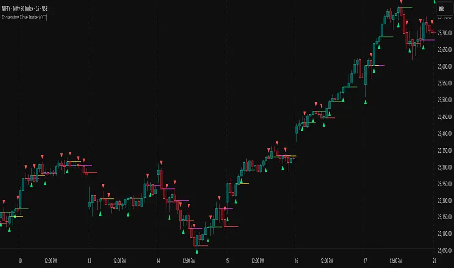
Consecutive Close Tracker (CCT)Consecutive Close Tracker (CCT) Indicator
The Consecutive Close Tracker (CCT) is a powerful momentum and breakout detection tool designed to identify consecutive bullish and bearish closes, potential reversals, and breakout points. By tracking consecutive candle closes and plotting key levels, this indicator provides traders with visual cues to recognize trend continuations, reversals, and breakout opportunities effectively.
🔹 Key Features of CCT
1️⃣ Consecutive Move Lines (Green/Red/Yellow Lines)
Tracks three consecutive bullish or bearish closes.
If the fourth candle confirms the trend, a green line (bullish) or red line (bearish) is drawn.
If the fourth candle fails to confirm, a yellow line is drawn, signaling potential indecision.
Helps traders spot trend continuations and exhaustion points.
2️⃣ Reversal Detection Lines (Cyan & Light Red)
Identifies bullish and bearish reversals based on three higher/lower closes followed by a reversal.
A cyan line indicates a bullish reversal, while a light red line signals a bearish reversal.
Useful for traders looking for trend reversals and key turning points.
3️⃣ Breakout Line (Dynamic Resistance/Support Level)
Automatically calculates a breakout level based on the previous timeframe’s open and close.
Can be customized to use different timeframes (e.g., hourly, daily, weekly).
Acts as a dynamic resistance or support level, helping traders determine breakout opportunities.
🔍 How to Use the Indicator?
✅ 1. Spotting Trend Continuations with Consecutive Move Lines
Green Line: Three consecutive bullish closes followed by a fourth higher close.
🚀 Indicates strong buying pressure & potential uptrend continuation.
Red Line: Three consecutive bearish closes followed by a fourth lower close.
📉 Indicates strong selling pressure & potential downtrend continuation.
Yellow Line: Three consecutive closes, but the fourth candle fails to confirm.
⚠️ Signals possible indecision or trend exhaustion.
🔥 Best Strategy:
If a green line appears near support, consider long entries.
If a red line appears near resistance, consider short entries.
If a yellow line appears, wait for further confirmation before entering a trade.
✅ 2. Identifying Trend Reversals with Reversal Lines
Cyan Line: A bearish trend with three consecutive lower closes, followed by a bullish candle → Possible uptrend reversal.
Light Red Line: A bullish trend with three consecutive higher closes, followed by a bearish candle → Possible downtrend reversal.
🔥 Best Strategy:
If a cyan line appears near a major support level, look for long entry opportunities.
If a light red line appears near resistance, prepare for a potential short entry.
Use these lines in combination with candlestick patterns (e.g., bullish engulfing, pin bars) for confirmation.
✅ 3. Using the Breakout Line for Key Entry & Exit Points
The breakout line represents a key dynamic level (midpoint of the previous timeframe’s open & close).
If price breaks above the breakout line, it suggests bullish momentum → Consider long trades.
If price breaks below the breakout line, it suggests bearish momentum → Consider short trades.
🔥 Best Strategy:
Use the breakout line in combination with support & resistance levels.
When price approaches the breakout line, watch for confirmation candles before entering a trade.
The breakout line can also act as a stop-loss or take-profit level.
🎯 How to Utilize CCT Effectively?
✅ For Intraday Traders
Use the consecutive close tracker on a 5M or 15M chart to catch short-term trends.
Watch for reversal lines near major intraday support/resistance for quick scalping opportunities.
Use the breakout line from the hourly chart to identify potential trend shifts.
✅ For Swing Traders
Apply the indicator on 1H, 4H, or daily charts to track medium-term trends.
Look for green/red lines near key Fibonacci retracement or pivot levels.
Use reversal lines to detect early trend reversals before bigger moves occur.
✅ For Breakout Traders
Focus on the breakout line on higher timeframes (e.g., 1H, 4H, Daily) to identify strong momentum shifts.
If price crosses the breakout line with strong volume, enter trades with trend confirmation.
Place stop-loss just below the breakout level for controlled risk management.
🏆 Final Thoughts
The Consecutive Close Tracker (CCT) is a powerful momentum and reversal indicator that helps traders:
✅ Identify strong trend continuations (green/red lines).
✅ Detect early reversal points (cyan/light red lines).
✅ Use a dynamic breakout line for better trade entries & exits.
Whether you’re an intraday trader, swing trader, or breakout trader, this tool can enhance your market insights and improve your trading decisions. 📈🔥
🚀 Try it out, and integrate it with your strategy to maximize its potential! 🚀
TradeTrackerLibrary "TradeTracker"
Simple Library for tracking trades
method track(this)
tracks trade when called on every bar
Namespace types: Trade
Parameters:
this (Trade) : Trade object
Returns: current Trade object
Trade
Has the constituents to track trades generated by any method.
Fields:
id (series int)
direction (series int) : Trade direction. Positive values for long and negative values for short trades
initialEntry (series float) : Initial entry price. This value will not change even if the entry is changed in the lifecycle of the trade
entry (series float) : Updated entry price. Allows variations to initial calculated entry. Useful in cases of trailing entry.
initialStop (series float) : Initial stop. Similar to initial entry, this is the first calculated stop for the lifecycle of trade.
stop (series float) : Trailing Stop. If there is no trailing, the value will be same as that of initial trade
targets (float ) : array of target values.
startBar (series int) : bar index of starting bar. Set by default when object is created. No need to alter this after that.
endBar (series int) : bar index of last bar in trade. Set by tracker on each execution
startTime (series int) : time of the start bar. Set by default when object is created. No need to alter this after that.
endTime (series int) : time of the ending bar. Updated by tracking method.
status (series int) : Integer parameter to track the status of the trade
retest (series bool) : Boolean parameter to notify if there was retest of the entry price
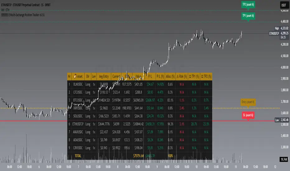
𝙷✪𝚕𝚍𝚎𝚖 🦇 Multi-Exchange Position Tracker v5.51
𝙷✪𝚕𝚍𝚎𝚖 🦇 Multi-Exchange Position Tracker v5.51
Overview
The 𝙷✪𝚕𝚍𝚎𝚖 🦇 Multi-Exchange Position Tracker v5.51 is a powerful and highly customizable Pine Script v6 indicator designed for traders managing portfolios across multiple exchanges and assets. This advanced dashboard provides real-time tracking of up to 20 positions, offering comprehensive insights into your trading performance with support for Dollar-Cost Averaging (DCA), leverage, and risk management.
Key Features
Multi-Exchange Support : Track positions across major exchanges like Binance, Bybit, Bitvavo, Coinbase, Kraken, and OKX.
Multi-Asset Management : Monitor up to 20 assets with customizable symbols, directions (Long/Short), and leverage settings.
DCA Calculations : Input comma-separated entry prices and sizes for accurate Dollar-Cost Averaging calculations.
Real-Time Data : Fetches current prices for each asset to calculate position value, profit/loss (P/L), and allocation percentages.
Customizable Dashboard : Display key metrics such as Asset, Direction, Leverage, Average Entry, Current Price, Size, Value, P/L, P/L (%), Allocation (%), Risk (%), TP1 (%), and TP2 (%) in a flexible table.
TP/SL/Entry Visualization : Plot Take Profit (TP1, TP2), Stop Loss (SL), and Entry levels directly on the chart with customizable line styles, widths, and colors.
Alerts : Receive notifications when TP1, TP2, or SL levels are hit for any enabled asset.
Theming Options : Choose between Dark and Light themes with adjustable transparency, zebra row styling, and cell padding for enhanced readability.
Currency Conversion : Supports USD and EUR as base currencies, with automatic conversion for assets quoted in different currencies.
Debugging Tools : Enable debug labels to troubleshoot NaN issues or DCA mismatches.
How to Use
1. Configure Assets : In the "Asset Positions" section, enable up to 20 assets and specify their exchange, symbol, direction, leverage, entry prices, sizes, stop loss, and take-profit levels.
2. Customize Dashboard : Adjust visibility of columns, table position, size, and styling under "Dashboard Settings" and "Column Visibility" sections.
3. Set Base Currency : Choose USD or EUR for unified P/L and value calculations.
4. Visualize Levels : Enable TP/SL/Entry plotting to see key price levels on the chart, with customizable styles and label positions.
5. Enable Alerts : Turn on alerts to get notified when price crosses TP or SL levels.
6. Debugging : Use debug labels to identify and resolve any input errors or invalid symbols.
Settings Breakdown
Dashboard Settings : Toggle dashboard visibility, hide zero-size positions, show total account row, and set table position/size.
Column Visibility : Select which columns to display (e.g., Asset, P/L, Risk %).
Styling & Colors : Customize themes (Dark/Light), transparency, zebra row colors, and border styles.
TP/SL/Entry Styling : Adjust line styles, widths, colors, and label positions for Stop Loss, Take Profit, and Entry levels.
Asset Positions : Input details for each asset, including exchange, symbol, direction, leverage, and DCA entries.
Notes
Ensure correct symbol formats (e.g., BTCUSDT for Binance, ADAEUR for Bitvavo) to avoid price fetch errors.
DCA entries and sizes must match in count and be valid numbers to prevent calculation errors.
The indicator supports up to 500 lines and labels for optimal performance.
For best results, use on a chart matching one of your tracked asset symbols to visualize TP/SL/Entry lines.
Why Use This Indicator?
This indicator is ideal for traders juggling multiple positions across exchanges. It consolidates critical data into a single, visually appealing dashboard, saving time and improving decision-making. With robust customization, real-time calculations, and alert functionality, it’s a must-have tool for both novice and experienced traders.
Developed by 𝙷✪𝚕𝚍𝚎𝚖 🦇, 2025 ©
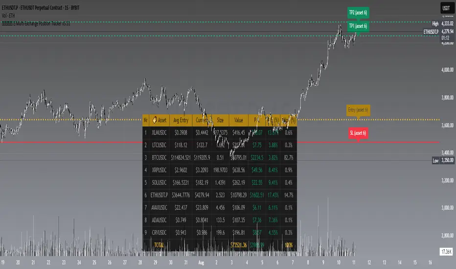
𝙷✪𝚕𝚍𝚎𝚖 🦇 Multi-Exchange Position Tracker v5.51
𝙷✪𝚕𝚍𝚎𝚖 🦇 Multi-Exchange Position Tracker v5.51
Overview
The 𝙷✪𝚕𝚍𝚎𝚖 🦇 Multi-Exchange Position Tracker v5.51 is a powerful and highly customizable Pine Script v6 indicator designed for traders managing portfolios across multiple exchanges and assets. This advanced dashboard provides real-time tracking of up to 20 positions, offering comprehensive insights into your trading performance with support for Dollar-Cost Averaging (DCA), leverage, and risk management.
Key Features
Multi-Exchange Support : Track positions across major exchanges like Binance, Bybit, Bitvavo, Coinbase, Kraken, and OKX.
Multi-Asset Management : Monitor up to 20 assets with customizable symbols, directions (Long/Short), and leverage settings.
DCA Calculations : Input comma-separated entry prices and sizes for accurate Dollar-Cost Averaging calculations.
Real-Time Data : Fetches current prices for each asset to calculate position value, profit/loss (P/L), and allocation percentages.
Customizable Dashboard : Display key metrics such as Asset, Direction, Leverage, Average Entry, Current Price, Size, Value, P/L, P/L (%), Allocation (%), Risk (%), TP1 (%), and TP2 (%) in a flexible table.
TP/SL/Entry Visualization : Plot Take Profit (TP1, TP2), Stop Loss (SL), and Entry levels directly on the chart with customizable line styles, widths, and colors.
Alerts : Receive notifications when TP1, TP2, or SL levels are hit for any enabled asset.
Theming Options : Choose between Dark and Light themes with adjustable transparency, zebra row styling, and cell padding for enhanced readability.
Currency Conversion : Supports USD and EUR as base currencies, with automatic conversion for assets quoted in different currencies.
Debugging Tools : Enable debug labels to troubleshoot NaN issues or DCA mismatches.
How to Use
1. Configure Assets : In the "Asset Positions" section, enable up to 20 assets and specify their exchange, symbol, direction, leverage, entry prices, sizes, stop loss, and take-profit levels.
2. Customize Dashboard : Adjust visibility of columns, table position, size, and styling under "Dashboard Settings" and "Column Visibility" sections.
3. Set Base Currency : Choose USD or EUR for unified P/L and value calculations.
4. Visualize Levels : Enable TP/SL/Entry plotting to see key price levels on the chart, with customizable styles and label positions.
5. Enable Alerts : Turn on alerts to get notified when price crosses TP or SL levels.
6. Debugging : Use debug labels to identify and resolve any input errors or invalid symbols.
Settings Breakdown
Dashboard Settings : Toggle dashboard visibility, hide zero-size positions, show total account row, and set table position/size.
Column Visibility : Select which columns to display (e.g., Asset, P/L, Risk %).
Styling & Colors : Customize themes (Dark/Light), transparency, zebra row colors, and border styles.
TP/SL/Entry Styling : Adjust line styles, widths, colors, and label positions for Stop Loss, Take Profit, and Entry levels.
Asset Positions : Input details for each asset, including exchange, symbol, direction, leverage, and DCA entries.
Notes
Ensure correct symbol formats (e.g., BTCUSDT for Binance, ADAEUR for Bitvavo) to avoid price fetch errors.
DCA entries and sizes must match in count and be valid numbers to prevent calculation errors.
The indicator supports up to 500 lines and labels for optimal performance.
For best results, use on a chart matching one of your tracked asset symbols to visualize TP/SL/Entry lines.
Why Use This Indicator?
This indicator is ideal for traders juggling multiple positions across exchanges. It consolidates critical data into a single, visually appealing dashboard, saving time and improving decision-making. With robust customization, real-time calculations, and alert functionality, it’s a must-have tool for both novice and experienced traders.
Developed by 𝙷✪𝚕𝚍𝚎𝚖 🦇, 2025 ©
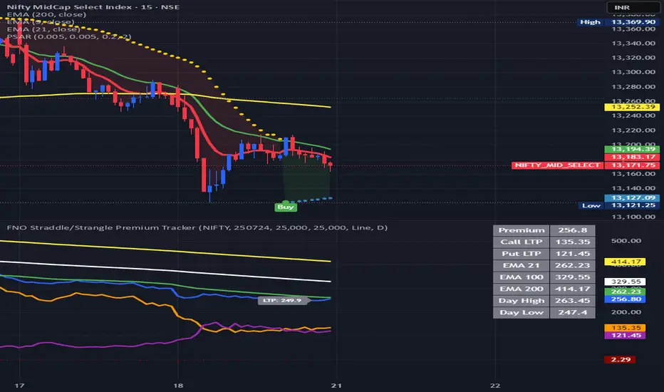
FNO Straddle/Strangle Premium TrackerThe FNO Straddle/Strangle Premium Tracker is a powerful Pine Script indicator designed for options traders to monitor the combined premium of a straddle or strangle strategy for Indian F&O instruments. It tracks the sum of call and put option prices, visualizes the premium as a candlestick or line chart, and includes technical indicators like EMAs and premium percentage change. The indicator also provides a real-time data table, alerts for key events, and exportable data for analysis, making it ideal for tracking premium movements and identifying trading opportunities.
Key Features
Customizable Inputs: Select from a wide range of underlying symbols (e.g., NIFTY, BANKNIFTY, stocks like RELIANCE, TCS), expiry date, call/put strike prices, chart type (Candlestick or Line), and timeframe (1-min to Daily).
Premium Visualization: Plots the combined premium (Call + Put) as a candlestick or line chart, with customizable colors for easy trend identification.
Exponential Moving Averages (EMAs): Displays 21, 100, and 200-period EMAs to track premium trends, with alerts for premium crossing above/below the 21-period EMA.
Premium % Change: Shows the percentage change in the combined premium as a histogram for quick momentum analysis.
Real-Time Data Table: A table in the top-right corner displays the latest premium, call/put Last Traded Prices (LTP), and EMA values (21, 100, 200).
Error Handling: Alerts users with a warning label if the selected symbol, expiry, or strike is invalid or data is unavailable.
Data Export: Outputs the latest premium, call LTP, and put LTP as a text string for easy copying or analysis.
LTP Label: Displays the current premium value every 5 bars for quick reference.
How It Works
Input Selection: Choose the underlying symbol, expiry date (YYMMDD format, e.g., 250626 for June 26, 2025), call and put strike prices, chart type, and timeframe.
Data Fetching: The script fetches real-time OHLC (Open, High, Low, Close) data for the selected call and put options using the specified symbol and expiry.
Premium Calculation: Combines the call and put option prices to calculate the straddle/strangle premium (Open, High, Low, Close).
Visualization: Plots the premium as a candlestick (green for bullish, red for bearish) or a blue line chart, along with EMAs, call/put LTP lines, and a premium % change histogram.
Alerts & Notifications: Triggers alerts when the premium crosses the 21-period EMA and displays a warning if data is invalid.
Data Display: Shows key metrics in a table and provides exportable data for further analysis.
Inputs
Select Symbol: Choose the underlying instrument (e.g., NIFTY, BANKNIFTY, RELIANCE, etc.).
Expiry Date: Enter the option expiry in YYMMDD format (e.g., 250626).
Call/Put Strike: Specify the strike prices for the call and put options.
Chart Type: Select "Candlestick" or "Line" to visualize the premium.
Timeframe: Choose the data aggregation period (e.g., 1-min, 5-min, Daily).
Outputs
Chart: Candlestick or line plot of the combined premium, with EMAs (21, 100, 200), call/put LTP, and premium % change histogram.
Table: Real-time display of premium, call/put LTP, and EMA values.
Alerts: Notifications for premium crossing EMA21 or invalid data.
Export Data: A text string with the latest premium, call LTP, and put LTP for external use.
Use Cases
Straddle/Strangle Trading: Monitor premium movements for at-the-money (ATM) straddles or out-of-the-money (OTM) strangles to time entries/exits.
Trend Analysis: Use EMAs to identify bullish or bearish trends in the premium.
Momentum Trading: Leverage the premium % change histogram to spot rapid price movements.
Risk Management: Track call and put LTP individually to assess option price behavior.
Data Analysis: Export premium data for backtesting or strategy development.
How to Use
Add the indicator to your TradingView chart.
Configure the inputs (symbol, expiry, strikes, chart type, timeframe) based on your trading setup.
Monitor the chart for premium trends, EMA crossovers, and % change signals.
Use the table and export data for real-time insights or external analysis.
Set up alerts to get notified when the premium crosses the 21-period EMA.
Notes
Ensure the symbol, expiry, and strike prices are valid for your data provider to avoid "Invalid Symbol" errors.
The indicator works best on Indian F&O instruments (NSE/BSE) with active options chains.
For optimal performance, use shorter timeframes (e.g., 1-min, 5-min) for intraday trading or Daily for positional analysis.
The premium % change histogram helps identify volatility spikes, useful for breakout strategies.
Limitations
Requires valid option chain data from TradingView’s data provider.
Performance may vary on low-liquidity instruments or illiquid strike prices.
Alerts are limited to EMA21 crossovers; additional custom alerts can be added as needed.
Feedback
If you have suggestions or need additional features (e.g., Bollinger Bands, RSI, or volatility metrics), feel free to comment! Happy trading!
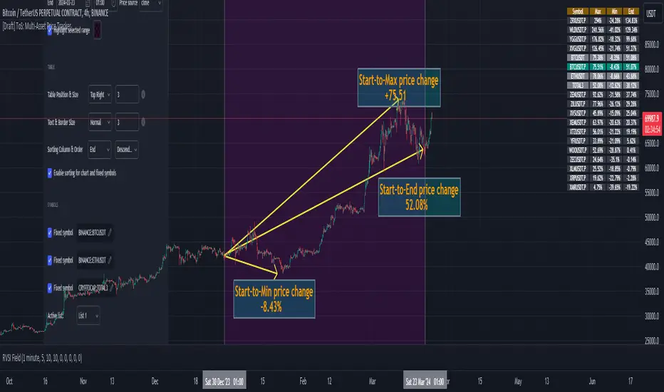
Trade-o-Scope: Multi-Asset Price TrackerTrade-o-Scope team presents the "Multi-Asset Price Tracker" indicator.
"Multi-Asset Price Tracker" is designed to help analyze price changes across multiple assets within time intervals you define.
Motivation:
Most screeners on the market track price changes over predefined periods, like 1H\4H\12H\1D\3D\7D\etc. Typically, they compare initial and current prices.
But what if you want to analyze assets' performance over arbitrary historical intervals?
Perhaps you want to spot which assets dropped most within 7 hours after a specific industry announcement? Or do you want to check which asset grew the most in January last year?
This is where the "Multi-Asset Price Tracker" shines. It lets you define arbitrary intervals and track price changes for selected assets.
Overview and functionality:
Define arbitrary time intervals in history for analyzing price changes.
Create up to 10 lists, each with up to 40 symbols to track. Populate lists with data from text files, Excel, or CSV. Lists are just multiline text strings, each line representing an individual symbol.
Switch between lists, with one active list at a time.
Specify up to 3 fixed symbols for additional analysis alongside active list symbols. You may use them as reference points to compare price changes of the symbols in the List.
Customize table appearance and position.
Set sorting criteria and direction for displayed values.
View the results in a table on the chart.
How it works:
"Multi-Asset Price Tracker" will track the symbol's price during the interval you define.
The indicator identifies each symbol's Start, Max, Min, and End prices during the interval. It then calculates relative changes: Start-to-Max, Start-to-Min, and Start-to-End.
The list of relative changes is ordered by the column chosen in settings and displayed on the chart.
List example (up to 10 Lists):
BINANCE:WLDUSDT.P
BINANCE:WOOUSDT.P
BINANCE:XEMUSDT.P
...
...
(up to 40 symbols per List)
Calculation example:
Symbol Start-price = $100
Symbol Max-price = $150
Symbol Min-price = $75
Symbol End-price = $110
Start-to-Max = 100% * (Max-price - Start-price) / Start-price = 100% * ($150 - $100) / $100 = 50%
Start-to-Min = 100% * (Min-price - Start-price) / Start-price = 100% * ($75 - $100) / $100 = -25%
Start-to-End = 100% * (End-price - Start-price) / Start-price = 100% * ($110 - $100) / $100 = 10%
Chart example:
In the provided chart, you can observe an example with a table generated by the indicator, along with manually added arrows and labels explaining the calculation process for an individual symbol from the list.
How to use:
1) Add "Multi-Asset Price Tracker" indicator to the chart
2) The indicator will ask you to define the start and the end of the interval using the mouse on the chart.
Voila! You'll see the table with sorted relative price changes based on default list values and settings.
3) Customize the indicator's settings:
Define the interval Start and End datetime.
Optionally, change the interval Start and End by clicking on the indicator name and dragging the vertical mark at the edges of the interval to a new position.
Define the Start and End price sources.
Choose a color to highlight the interval on the chart's background.
Set the table position, size, text size, and border size.
Specify the column for sorting and its direction.
Choose whether to sort chart symbols and fixed symbols together with list symbols or display them at the top of the table irrespective of their relative price change.
Enable fixed symbols if needed, and define up to 3 fixed symbols.
Define symbol lists, with up to 10 lists and 40 symbols each.
Select which List to make active - symbols from the active list will be calculated and displayed.
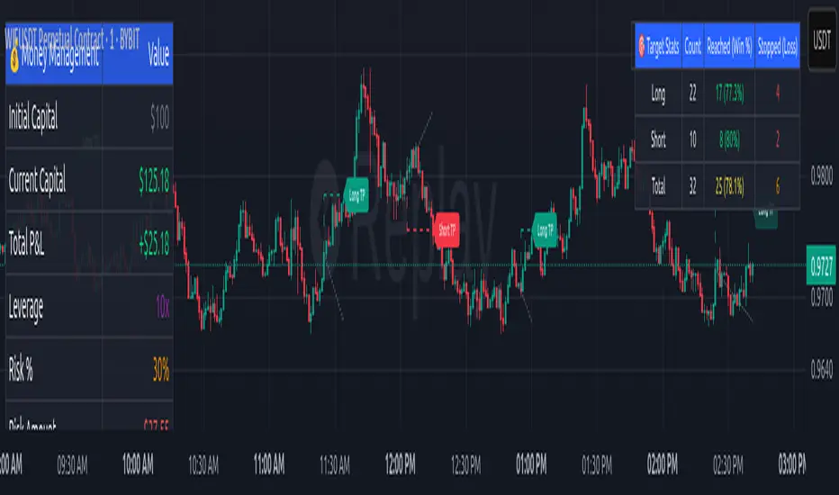
Money Risk Management with Trade Tracking
Overview
The Money Risk Management with Trade Tracking indicator is a powerful tool designed for traders on TradingView to simplify trade simulation and risk management. Unlike the TradingView Strategy Tester, which can be complex for beginners, this indicator provides an intuitive, beginner-friendly interface to evaluate trading strategies in a realistic manner, mirroring real-world trading conditions.
Built on the foundation of open-source contributions from LuxAlgo and TCP, this indicator integrates external indicator signals, overlays take-profit (TP) and stop-loss (SL) levels, and provides detailed money management analytics. It empowers traders to visualize potential profits, losses, and risk-reward ratios, making it easier to understand the financial outcomes of their strategies.
Key Features
Signal Integration: Seamlessly integrates with external long and short signals from other indicators, allowing traders to overlay TP/SL levels based on their preferred strategies.
Realistic Trade Simulation: Simulates trades as they would occur in real-world scenarios, accounting for initial capital, risk percentage, leverage, and compounding effects.
Money Management Dashboard: Displays critical metrics such as current capital, unrealized P&L, risk amount, potential profit, risk-reward ratio, and trade status in a customizable, beginner-friendly table.
TP/SL Visualization: Plots TP and SL levels on the chart with customizable styles (solid, dashed, dotted) and colors, along with optional labels for clarity.
Performance Tracking: Tracks total trades, win/loss counts, win rate, and profit factor, providing a clear overview of strategy performance.
Liquidation Risk Alerts: Warns traders if stop-loss levels risk liquidation based on leverage settings, enhancing risk awareness.
Benefits for Traders
Beginner-Friendly: Simplifies the complexities of the TradingView Strategy Tester, offering an intuitive interface for new traders to simulate and evaluate trades without confusion.
Real-World Insights: Helps traders understand the actual profit or loss potential of their strategies by factoring in capital, risk, and leverage, bridging the gap between theoretical backtesting and real-world execution.
Enhanced Decision-Making: Provides clear, real-time analytics on risk-reward ratios, unrealized P&L, and trade performance, enabling informed trading decisions.
Customizable and Flexible: Allows customization of TP/SL settings, table positions, colors, and sizes, catering to individual trader preferences.
Risk Management Focus: Encourages disciplined trading by highlighting risk amounts, potential profits, and liquidation risks, fostering better financial planning.
Why This Indicator Stands Out
Many traders struggle to translate backtested strategy results into real-world outcomes due to the abstract nature of percentage-based profitability metrics. This indicator addresses that challenge by providing a practical, user-friendly tool that simulates trades with real-world parameters like capital, leverage, and compounding. Its open-source nature ensures accessibility, while its integration with other indicators makes it versatile for various trading styles.
How to Use
Add to TradingView: Copy the Pine Script code into TradingView’s Pine Editor and add it to your chart.
Configure Inputs: Set your initial capital, risk percentage, leverage, and TP/SL values in the indicator settings. Select external long/short signal sources if integrating with other indicators.
Monitor Dashboards: Use the Money Management and Target Dashboard tables to track trade performance and risk metrics in real time.
Analyze Results: Review win rates, profit factors, and P&L to refine your trading strategy.
Credits
This indicator builds upon the open-source contributions of LuxAlgo and TCP , whose efforts in sharing their code have made this tool possible. Their dedication to the trading community is deeply appreciated.
Leveraged Share Decay Tracker [SS]Releasing this utility tool for leveraged share traders and investors.
It is very difficult to track the amount of decay and efficiency that is associated with leveraged shares and since not all leveraged shares are created equally, I developed this tool to help investors/traders ascertain:
1. The general risk, in $$, per share associated with investing in a particular leveraged ETF
2. The ability of a leveraged share to match what it purports to do (i.e. if it is a 3X Bull share, is it actually returning consistently 3X the underlying or is there a large variance?)
3. The general decay at various timepoints expressed in $$$
How to use:
You need to be opened on the chart of the underlying. In the example above, the chart is on DIA, the leveraged share being tracked is UDOW (3X bull share of the DOW).
Once you are on the chart of the underlying, you then put in the leveraged share of interest. The indicator will perform two major assessments:
1. An analysis of the standard error between the underlying and the leveraged share. This is accomplished through linear regression, but instead of creating a linreg equation, it simply uses the results to ascertain the degree of error associated at various time points (the time points are 10, 20, 30, 40, 50, 100, 252).
2. An analysis of the variance of returns. The indicator requires you to put in the leverage amount. So if the leverage amount is 3% (i.e. SPXL or UPRO is 3 X SPY), be sure that you are putting that factor in the settings. It will then modify the underlying to match the leverage amount, and perform an assessment of variance over 10, 20, 30, 40, 50, 100, 252 days to ensure stability. This will verify whether the leveraged ETF is actually consistently performing how it purports to perform.
Here are some examples, and some tales of caution so you can see, for yourself, how not all leveraged shares are created equal.
SPY and SPXL:
SPY and UPRO:
XBI and LABU (3 x bull share):
XBI and LABD (3 x bear share):
SOX and SOXL:
AAPL and AAPU:
It is VERY pivotal you remember to check and adjust the Leveraged % factor.
For example, AAPU is leveraged 1.5%. You can see above it tracks this well. However, if you accidently leave it at 3%, you will get an erroneous result:
You can also see how some can fail to track the quoted leveraged amount, but still produce relatively lower risk decay.
And, as a final example, let's take a look at the worst leveraged share of life, BOIL:
Trainwreck that one. Stay far away from it!
The chart:
The chart will show you the drift (money value over time) and the variance (% variance between the expected and actual returns) over time. From here, you can ascertain the general length you feel comfortable holding a leveraged share. In general, for most stable shares, <= 50 trading days tends to be the sweet spot, but always check the chart.
There are also options to plot the variances and the drifts so you can see them visually.
And that is the indicator! Kind of boring, but there are absolutely 0 resources out there for doing this job, so hopefully you see the use for it!
Safe trades everyone!

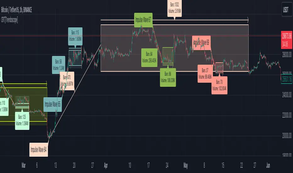
Consolidation Range Tracker[Trendoscope]🎲 Introducing Consolidation Range Tracker: Visualising Price Consolidation after Impulsive Moves
ConsolidationRangeTracker is an innovative indicator designed to assist traders in identifying and tracking price consolidation zones following impulsive market moves. This indicator is built on Auto Motive Wave indicator and Interactive Motive Wave indicator. This is also an attempt to plot Wyckoff Distribution pattern. But, instead of implying the price movement after consolidation, we are just leaving it to the interpretation of the users.
🎲 Process
Find impulse wave using the methods defined in Auto Motive Wave indicator and Interactive Motive Wave indicator
Define the range of consolidation based on predefined ratio (available as input settings)
Track the price movement within range along with number of bars and cumulative volume.
When price breaks out of the range, check if price ranged long enough to consider it as consolidation.
Retain the drawings and visualisation if the consolidation is confirmed before the breakout. Or else, remove them from the chart to keep it clean.
Overall output can be visualised as
Note : Patterns will not be there on the chart every time. It is normal for indicator not to show any drawings or patterns on the chart.
🎲 Stages of the Indicator
🎯 When an Impulse is formed
When an impulse wave is detected, wave is drawn on the chart along with details such as number of bars and volume spawning the impulse wave and the calculated range based on the input value. An alert of new impulse is also triggered if configured for alerts.
🎯 When an Impulse is updated
When price extends further without consolidating, the impulse wave is also updated to consider the latest values. This repaint is expected and as designed. We will also trigger an alert related to update of an impulse wave.
🎯 Update of range as and when it happens
Range is not bound and it keeps moving based on the highest and lowest price. Value of range is constant and it is calculated based on certain ratio of impulse as configured in settings. But, this range can move up and down based on which direction the price moves.
For example, this is the initial range when the impulse wave is formed.
But, after certain bars, we can see that the range shift slightly up because, price has more upward movement than downward.
No alerts are triggered during this phase.
🎯 Confirmed consolidation
Consolidation range is confirmed after price range through certain bars with respect to number of bars involved in the impulse wave. The default setting of 1 for range bar ratio means that range is confirmed when price ranges for same number of bars as that of impulse.
An alert is triggered when consolidation range is confirmed.
🎯 Breakout
Breakout happen if the price exceeds the range bracket. Breakout may happen either before or after confirmation of consolidation. In either case, an alert is triggered.
Patterns are removed from the chart if the consolidation is not confirmed. In other words, the price did not stay in range for long time.
🎲 Settings
Simple settings to define the zigzag base and few pattern related configuration.
🎲 Alerts
Alerts are configured using alert function and are triggered in following scenarios.
A new impulse created
An impulse wave is updated
Consolidation range confirmed
Breakout with/without confirmed consolidation.
🎲 Use Cases
Indicator can be used for identifying few types of patterns on the chart. But, they may involve user's discretion. Major patterns that can be identified are:
🎯 Flag Formation Consolidation after an impulse can be termed as flag and is a sign of trend continuation after consolidation.
🎯 Wyckoff Distribution Long consolidation with high volume after an impulse can be a sign of wyckoff distribution formation. This pattern is trend reversal pattern.
AI Market Open - Live Session Tracker (PDH/PDL/ONH/ONL)🤖 AI MARKET OPEN - LIVE SESSION TRACKER
A comprehensive real-time tracking system designed for intraday traders who trade the market open using previous day levels (PDH/PDL) and overnight session ranges (ONH/ONL). This indicator provides intelligent context and mitigation tracking to help you make informed trading decisions during the critical morning session.
═══════════════════════════════════════════════════════════════
📊 WHAT THIS INDICATOR DOES
This indicator automatically tracks and displays six critical price levels:
• PDH (Previous Day High) - Yesterday's regular session high (9:30 AM - 4:00 PM ET)
• PDL (Previous Day Low) - Yesterday's regular session low
• PDC (Previous Day Close) - Yesterday's 3:59 PM ET close price
• ONH (Overnight High) - Overnight session high (6:00 PM - 9:29 AM ET)
• ONL (Overnight Low) - Overnight session low
• 9:30 Open - The exact opening price at market open
It monitors whether each level has been "mitigated" (touched/tested) in real-time and provides AI-generated context about current market structure.
═══════════════════════════════════════════════════════════════
🎯 KEY FEATURES
✅ REAL-TIME MITIGATION TRACKING
• Live status updates showing ✅ (mitigated) or ⏳ (unmitigated) for each level
• Persistent tracking - once a level is touched, it stays marked
• Gap fill detection with 🌕 (filled) or 🌒 (open) status
✅ DYNAMIC CALCULATIONS
• Δ Open: Distance from 9:30 AM opening price to each level
• RT Δ: Real-time distance from current price to each level
• Automatic color coding (green for resistance, red for support)
✅ AI MARKET CONTEXT SUMMARY
The indicator generates intelligent commentary based on:
• Gap size classification (large/moderate/small)
• PDH/PDL mitigation status
• Current position within overnight range
• Directional bias and key levels to watch
✅ CUSTOMIZABLE DISPLAY
• Choose table position (9 locations available)
• Adjustable text size (tiny/small/normal/large)
• Custom colors for headers, summary text, and background
• Show/hide table with single toggle
✅ PROFESSIONAL LEVEL LINES
• Ray-style horizontal lines extending right
• Customizable line width (1-4)
• Three line styles: Solid, Dashed, Dotted
• Color-coded labels with exact price values
• Lines auto-update and reset each session
═══════════════════════════════════════════════════════════════
🔧 HOW IT WORKS
SESSION TRACKING
• Regular Session: 9:30 AM - 4:00 PM ET (for PDH/PDL calculation)
• Close Capture: 3:59 PM ET close becomes PDC
• Overnight Session: 6:00 PM - 9:29 AM ET (for ONH/ONL)
• Session Reset: 6:00 PM ET daily
MITIGATION LOGIC
A level is considered "mitigated" when price touches or crosses it:
• PDH mitigated: High >= PDH at any point after 6:00 PM previous day
• PDL mitigated: Low <= PDL at any point after 6:00 PM previous day
• ONH mitigated: High >= ONH after 9:30 AM open
• ONL mitigated: Low <= ONL after 9:30 AM open
• Gap filled: Price crosses PDC after gapping up or down
AI SUMMARY ALGORITHM
The indicator analyzes three key dimensions:
1. GAP CLASSIFICATION
• Large gap (>50 pts): Suggests gap-fill or extension scenarios
• Moderate gap (20-50 pts): Monitor overnight levels for direction
• Small gap (<20 pts): Range-bound expectation
2. PDH/PDL STATUS
• Both untested: Clean liquidity zones
• One mitigated: Remaining level becomes primary target
• Both mitigated: Expect range/balance trade
3. OVERNIGHT RANGE POSITION
• Top 25%: Bullish bias, watch PDH
• Mid-upper: Slight bull bias
• Mid-lower: Neutral
• Bottom 25%: Vulnerable to PDL sweep
═══════════════════════════════════════════════════════════════
📖 HOW TO USE
STEP 1: ADD TO CHART
• Apply to any intraday timeframe (1m, 5m, 15m recommended)
• Works on ES, NQ, YM, RTY, and other CME futures
• Can be used on stocks and forex (adjust session times accordingly)
STEP 2: SET YOUR TIMEZONE
• Default: America/New_York (Eastern Time)
• Also supports: Chicago, Los Angeles, Phoenix
• Ensure your chart timezone matches your selection
STEP 3: CUSTOMIZE APPEARANCE
• Position table where it doesn't block your chart action
• Adjust text size based on screen resolution
• Customize colors to match your chart theme
• Toggle line styles for visual preference
STEP 4: INTERPRET THE DATA
• Before market open (pre-9:30 AM): Review gap size and overnight levels
• At market open: Check which levels are closest to price
• During session: Monitor mitigation status and RT Δ values
• Read AI summary for contextual bias and key scenarios
STEP 5: APPLY TO YOUR STRATEGY
• Use unmitigated levels as potential targets
• Watch for reactions when price approaches key levels
• Gap-fill setups: Trade reversions when gap is open
• Breakout setups: Trade continuations when levels get mitigated
═══════════════════════════════════════════════════════════════
⚙️ INDICATOR SETTINGS
DISPLAY SETTINGS
• Timezone: Select your local market timezone
• Table Position: 9 locations (corners, edges, center)
• Text Size: tiny | small | normal | large
• Show Summary Table: Toggle on/off
COLOR CUSTOMIZATION
• Header Text Color: Default white
• AI Summary Color: Default aqua
• Background Color: Default semi-transparent black
• Border Color: Default blue
LINE CUSTOMIZATION (PDH)
• Line Width: 1-4 pixels
• Line Style: Solid | Dashed | Dotted
• Color: Default red with 40% transparency
LINE CUSTOMIZATION (PDL)
• Line Width: 1-4 pixels
• Line Style: Solid | Dashed | Dotted
• Color: Default green with 40% transparency
LINE CUSTOMIZATION (PDC)
• Line Width: 1-4 pixels
• Line Style: Solid | Dashed | Dotted
• Color: Default yellow with 60% transparency
LINE CUSTOMIZATION (ONH)
• Line Width: 1-4 pixels
• Line Style: Solid | Dashed | Dotted
• Color: Default orange with 50% transparency
LINE CUSTOMIZATION (ONL)
• Line Width: 1-4 pixels
• Line Style: Solid | Dashed | Dotted
• Color: Default blue with 50% transparency
LINE CUSTOMIZATION (9:30 Open)
• Line Width: 1-4 pixels
• Line Style: Solid | Dashed | Dotted
• Color: Default white with 50% transparency
═══════════════════════════════════════════════════════════════
💡 BEST PRACTICES
✓ Use on 1-minute or 5-minute charts for precise level tracking
✓ Combine with volume profile for confluence
✓ Wait for confirmation candles near key levels
✓ Pay attention to gap-fill probability (larger gaps more likely to fill)
✓ Use RT Δ values to gauge distance and set realistic targets
✓ Review AI summary each morning for bias and scenario planning
✓ Don't trade blindly - use levels as reference points, not mechanical signals
═══════════════════════════════════════════════════════════════
⚠️ IMPORTANT NOTES
• This indicator is designed for CME session times (futures markets)
• For stocks, session times may differ - adjust expectations accordingly
• Levels reset daily at 6:00 PM ET - no weekend carryover
• Mitigation tracking persists throughout the session
• The AI summary provides context, not trade signals
• Always use proper risk management
═══════════════════════════════════════════════════════════════
📌 IDEAL FOR
• Day traders focusing on market open
• Scalpers using previous day levels
• Session-based traders (Asia/London/NY)
• Traders who need automated level tracking
• Anyone trading overnight gaps and ranges
═══════════════════════════════════════════════════════════════
🔄 VERSION HISTORY
v1.0 - Initial Release
• Core tracking system for PDH/PDL/PDC/ONH/ONL/Open
• Real-time mitigation status
• AI context summary
• Fully customizable display and lines
• Multi-timezone support
═══════════════════════════════════════════════════════════════
📧 FEEDBACK & SUPPORT
If you find this indicator helpful, please:
• Leave a like 👍
• Add to favorites ⭐
• Share with fellow traders
• Comment with suggestions or questions
Happy trading! 📈
═══════════════════════════════════════════════════════════════

Cycle Phase & ETA Tracker [Robust v4]
Cycle Phase & ETA Tracker
Description
The Cycle Phase & ETA Tracker is a powerful tool for analyzing market cycles and predicting the completion of the current cycle (Estimated Time of Arrival, or ETA). It visualizes the cycle phase (0–100%) using a smoothed signal and displays the forecasted completion date with an optional confidence band based on cycle length variability. Ideal for traders looking to time their trades based on cyclical patterns, this indicator offers flexible settings for robust cycle analysis.
Key Features
Cycle Phase Visualization: Tracks the current cycle phase (0–100%) with color-coded zones: green (0–33%), blue (33–66%), orange (66–100%).
ETA Forecast: Shows a vertical line and label indicating the estimated date of cycle completion.
Confidence Band (±σ): Displays a band around the ETA to reflect uncertainty, calculated using the standard deviation of cycle lengths.
Multiple Averaging Methods: Choose from three methods to calculate average cycle length:
Median (Robust): Uses the median for resilience against outliers.
Weighted Mean: Prioritizes recent cycles with linear or quadratic weights.
Simple Mean: Applies equal weights to all cycles.
Adaptive Cycle Length: Automatically adjusts cycle length based on the timeframe or allows a fixed length.
Debug Histogram: Optionally displays the smoothed signal for diagnostic purposes.
Setup and Usage
Add the Indicator:
Search for "Cycle Phase & ETA Tracker " in TradingView’s indicator library and apply it to your chart.
Configure Parameters:
Core Settings:
Track Last N Cycles: Sets the number of recent cycles used to calculate the average cycle length (default: 20). Higher values provide stability but may lag market shifts.
Source: Selects the data source for analysis (e.g., close, open, high; default: close price).
Use Adaptive Cycle Length?: Enables automatic cycle length adjustment based on timeframe (e.g., shorter for intraday, longer for daily) or uses a fixed length if disabled.
Fixed Cycle Length: Defines the cycle length in bars when adaptive mode is off (default: 14). Smaller values increase sensitivity to short-term cycles.
Show Debug Histogram: Enables a histogram of the smoothed signal for debugging signal behavior.
Cycle Length Estimation:
Average Mode: Selects the method for calculating average cycle length: "Median (Robust)", "Weighted Mean", or "Simple Mean".
Weights (for Weighted Mean): For "Weighted Mean", chooses "linear" (moderate emphasis on recent cycles) or "quadratic" (strong emphasis on recent cycles).
ETA Visualization:
Show ETA Line & Label: Toggles the display of the ETA line and date label.
Show ETA Confidence Band (±σ): Toggles the confidence band around the ETA, showing the uncertainty range.
Band Transparency: Adjusts the transparency of the confidence band (0 = fully transparent, 100 = fully opaque; default: 85).
ETA Color: Sets the color for the ETA line, label, and confidence band (default: orange).
Interpretation:
The cycle phase (0–100%) indicates progress: green for the start, blue for the middle, and orange for the end of the cycle.
The ETA line and label show the predicted cycle completion date.
The confidence band reflects the uncertainty range (±1 standard deviation) of the ETA.
If a warning "Insufficient cycles for ETA" appears, wait for the indicator to collect at least 3 cycles.
Limitations
Requires at least 3 cycles for reliable ETA and confidence band calculations.
On low timeframes or low-volatility markets, zero-crossings may be infrequent, delaying ETA updates.
Accuracy depends on proper cycle length settings (adaptive or fixed).
Notes
Test the indicator across different assets and timeframes to optimize settings.
Use the debug histogram to troubleshoot if the ETA appears inaccurate.
For feedback or suggestions, contact the author via TradingView.
Cycle Phase & ETA Tracker
Описание
Индикатор Cycle Phase & ETA Tracker предназначен для анализа рыночных циклов и прогнозирования времени завершения текущего цикла (ETA — Estimated Time of Arrival). Он отслеживает фазы цикла (0–100%) на основе сглаженного сигнала и отображает предполагаемую дату завершения цикла с опциональной доверительной полосой, основанной на стандартном отклонении длин циклов. Индикатор идеально подходит для трейдеров, которые хотят выявлять циклические закономерности и планировать свои действия на основе прогнозируемого времени.
Ключевые особенности
Фазы цикла: Визуализирует текущую фазу цикла (0–100%) с цветовой кодировкой: зеленый (0–33%), синий (33–66%), оранжевый (66–100%).
Прогноз ETA: Показывает вертикальную линию и метку с предполагаемой датой завершения цикла.
Доверительная полоса (±σ): Отображает зону неопределенности вокруг ETA, основанную на стандартном отклонении длин циклов.
Гибкие методы усреднения: Поддерживает три метода расчета средней длины цикла:
Median (Robust): Медиана, устойчивая к выбросам.
Weighted Mean: Взвешенное среднее, где недавние циклы имеют больший вес (линейный или квадратичный).
Simple Mean: Простое среднее с равными весами.
Адаптивная длина цикла: Автоматически подстраивает длину цикла под таймфрейм или позволяет задать фиксированную длину.
Отладочная гистограмма: Опционально отображает сглаженный сигнал для анализа.
Настройка и использование
Добавьте индикатор:
Найдите "Cycle Phase & ETA Tracker " в библиотеке индикаторов TradingView и добавьте его на график.
Настройте параметры:
Core Settings:
Track Last N Cycles: Количество последних циклов для расчета средней длины (по умолчанию 20). Большие значения дают более стабильные результаты, но могут запаздывать.
Source: Источник данных (по умолчанию цена закрытия).
Use Adaptive Cycle Length?: Включите для автоматической настройки длины цикла по таймфрейму или отключите для использования фиксированной длины.
Fixed Cycle Length: Длина цикла в барах, если адаптивная длина отключена (по умолчанию 14).
Show Debug Histogram: Включите для отображения сглаженного сигнала (полезно для отладки).
Cycle Length Estimation:
Average Mode: Выберите метод усреднения: "Median (Robust)", "Weighted Mean" или "Simple Mean".
Weights (for Weighted Mean): Для режима "Weighted Mean" выберите "linear" (умеренный вес для новых циклов) или "quadratic" (сильный вес для новых циклов).
ETA Visualization:
Show ETA Line & Label: Включите для отображения линии и метки ETA.
Show ETA Confidence Band (±σ): Включите для отображения доверительной полосы.
Band Transparency: Прозрачность полосы (0 — полностью прозрачная, 100 — полностью непрозрачная, по умолчанию 85).
ETA Color: Цвет для линии, метки и полосы (по умолчанию оранжевый).
Интерпретация:
Фаза цикла (0–100%) показывает прогресс текущего цикла: зеленый — начало, синий — середина, оранжевый — конец.
Линия и метка ETA указывают предполагаемую дату завершения цикла.
Доверительная полоса показывает диапазон неопределенности (±1 стандартное отклонение).
Если отображается предупреждение "Insufficient cycles for ETA", дождитесь, пока индикатор соберет минимум 3 цикла.
Ограничения
Требуется минимум 3 цикла для надежного расчета ETA и доверительной полосы.
На низких таймфреймах или рынках с низкой волатильностью пересечения нуля могут быть редкими, что замедляет обновление ETA.
Эффективность зависит от правильной настройки длины цикла (fixedL или адаптивной).
Примечания
Протестируйте индикатор на разных таймфреймах и активах, чтобы подобрать оптимальные параметры.
Используйте отладочную гистограмму для анализа сигнала, если ETA кажется неточным.
Для вопросов или предложений по улучшению свяжитесь через TradingView.

Stock ETF Tracker 2.0The Stock Sector ETF tracker with Indicators is a versatile tool designed to track the performance of sector-specific ETFs relative to the current asset. It automatically identifies the sector of the underlying symbol and displays the corresponding ETF’s price action alongside key technical indicators. This helps traders analyze sector trends and correlations in real time.
---
Key Features
Automatic Sector Detection:
Fetches the sector of the current asset (e.g., "Technology" for AAPL).
Maps the sector to a user-defined ETF (default: SPDR sector ETFs) .
Technical Indicators:
Simple Moving Average (SMA): Tracks the ETF’s trend.
Bollinger Bands: Highlights volatility and potential reversals.
Donchian High (52-Week High): Identifies long-term resistance levels.
SPY Regime Filter: Red background color if SP500 is below 200 day SMA.
Customizable Inputs:
Adjust indicator parameters (length, visibility).
Override default ETFs for specific sectors.
Informative Table:
Displays the current sector and ETF symbol in the bottom-right corner.
---
Input Settings
SMA Settings
SMA Length: Period for calculating the Simple Moving Average (default: 200).
Show SMA: Toggle visibility of the SMA line.
Bollinger Bands Settings
BB Length: Period for Bollinger Bands calculation (default: 20).
BB Multiplier: Standard deviation multiplier (default: 2.0).
Show Bollinger Bands: Toggle visibility of the bands.
Donchian High (52-Week High)
Daily High Length: Days used to calculate the high (default: 252, approx. 1 year).
Show High: Toggle visibility of the 52-week high line.
Sector Selections
Customize ETFs for each sector (e.g., replace XLU with another utilities ETF).
---
Example Use Cases
Trend Analysis: Compare a stock’s price action to its sector ETF’s SMA for trend confirmation.
Volatility Signals: Use Bollinger Bands to spot ETF price squeezes or breakouts.
Sector Strength: Monitor if the ETF is approaching its 52-week high to gauge sector momentum.
Enjoy tracking sector trends with ease! 🚀

Dynamic Date and Price Tracker with Entry PriceThe Dynamic Date and Price Tracker indicator is a simple tool designed for traders to visualize and monitor their trade's progress in real-time from a specified starting point.
This tool provides an intuitive graphical representation of your trade's profitability based on a custom entry date and price.
Features:
-Starting Date Selection: Choose a specific starting date, after which the indicator begins tracking your trade's performance.
-Custom Entry Price: Input a starting price to accurately reflect your actual entry price for performance tracking across different timeframes.
-Real-Time Tracking: As new bars form, the indicator automatically adjusts a dynamic line to the current closing price.
-Profit/Loss Color Coding: The dynamic line color changes based on whether the current price is above (green for profit) or below (red for loss) your specified entry price.
-Performance Label: A real-time label displays the absolute and percentage change in price since your initial entry, color-coded for positive (green) or negative (red) performance.
-Entry Price Line: The horizontal line marks your starting price for easy visual comparison.

ADR Tracker Version 2Description
The **ADR Tracker** plots a customizable panel on your chart that monitors the Average Daily Range (ADR) and shows how today’s price action compares to that average. It calculates the daily high–low range for each of the past 14 days (can be adjusted) and then takes a simple moving average of those ranges to determine the ADR.
**Features:**
* **Current ADR value:** Shows the 14‑day ADR in price units.
* **ADR status:** Indicates whether today’s range has reached or exceeded the ADR.
* **Ticks remaining:** Calculates how many minimum price ticks remain before the ADR would be met.
* **Real‑time tracking:** Monitors the intraday high and low to update the range continuously.
* **Customizable panel:** Uses TradingView’s table object to display the information. You can set the table’s horizontal and vertical position (top/middle/bottom and left/centre/right) with inputs. The script also lets you change the text and background colours, as well as the width and height of each row. Table cells use explicit width and height percentages, which Pine supports in v6. Each call to `table.cell()` defines the text, colours and dimensions for its cell, so the panel resizes automatically based on your settings.
**Usage:**
Apply the indicator to any chart. For the most accurate real‑time tracking, use it on intraday timeframes (e.g. 5‑min or 1‑hour) so the current day’s range updates as new bars arrive. Adjust the inputs in the settings panel to reposition the list or change its appearance.
---
This description explains what the indicator does and highlights its customizable table display, referencing the Pine Script table features used.

Developing Midpoint TrackerDeveloping Midpoint Tracker (DMT)
Original Concept: This indicator tracks key midpoint levels from either session opens or custom timeframe periods, providing precise reference levels for intraday trading decisions.
Dual Tracking Modes:
Session Mode: Tracks midpoints from a specific session start time (e.g., 1800 ET electronic trading open) with full timezone support
Timeframe Mode: Tracks midpoints from any custom timeframe (15m, 1H, 4H, etc.) using higher timeframe OHLC data via request.security()
Core Calculations:
The indicator calculates three distinct midpoint levels:
Open-to-High Midpoint: (Session/Timeframe Open + Highest High) / 2
Open-to-Low Midpoint: (Session/Timeframe Open + Lowest Low) / 2
High-to-Low Midpoint: (Highest High + Lowest Low) / 2
Visual Features:
Horizontal lines extending from the reference period start with customizable colors, styles, and extension length
Smart collision detection prevents duplicate lines at identical price levels
Price labels with transparent backgrounds showing exact values
Optional reference open price line
Real-time info table displaying current mode and all calculated levels
Technical Implementation:
Uses Pine Script's native time() function for accurate session detection across multiple timezones
Employs request.security() for reliable higher timeframe data access
Implements proper line and label management to prevent memory issues
Supports 13 major global timezones including US markets, Europe, and Asia
Use Cases:
Identifying potential support/resistance levels from key price relationships
Setting profit targets and stop levels based on mathematical price midpoints
Analyzing price behavior around session or timeframe-specific reference levels
Multi-timeframe analysis when using custom timeframe mode on lower timeframe charts
This indicator is particularly useful for traders who utilize midpoint reversion strategies or need precise reference levels derived from session or timeframe opens.

Thiru TOI TrackerThiru TOI Tracker - Time of Interest Trading Indicator
OVERVIEW
Thiru TOI Tracker identifies critical Time-of-Interest (TOI) windows during major trading sessions. This proprietary indicator automatically marks key institutional trading times with dynamic line extensions that adapt to price action, helping traders identify optimal entry and exit points.
KEY FEATURES
• Three Major Sessions: London (2:45-3:15 AM & 3:45-4:15 AM), NY AM (9:45-10:15 AM & 10:45-11:15 AM), NY PM (1:45-2:15 PM & 2:45-3:15 PM EST)
• Dynamic Line Extension: Lines automatically extend based on price action, creating adaptive support/resistance levels
• Multi-Session Tracking: Monitor multiple sessions simultaneously with independent customization
• Intelligent Memory Management: Automatic cleanup maintains optimal performance
• Customizable Visuals: Colors, line styles, labels, and timeframe filtering
HOW IT WORKS
The indicator uses proprietary time window detection to identify 30-minute TOI windows within major trading sessions. When a window becomes active, it draws vertical lines at start/end times with horizontal extensions. Lines dynamically extend upward when price breaks above them, creating adaptive support/resistance levels that respond to market conditions.
USAGE
1. Set "Draw Timing Limit" (recommended: "5" for 5m and below)
2. Enable sessions you trade in "Session Settings"
3. Customize colors and line styles in "Visual Settings"
4. Watch for vertical lines at TOI window start times
5. Use dynamic line extensions as support/resistance levels
BEST PRACTICES
• Use on lower timeframes (1m, 5m, 15m) for best results
• Enable only sessions you actively trade
• Combine with price action analysis for entry/exit decisions
• Monitor multiple sessions to identify confluence zones
• Adjust colors to match your chart theme
SETTINGS
Session Settings: Enable/disable individual time windows for London, NY AM, NY PM
Visual Settings: Customize colors, line styles (Solid/Dotted/Dashed), width (1-5), labels, and extension
Timeframe Filter: Control which timeframes display TOI lines (default: 5-minute and below)
TECHNICAL
• Pine Script v6
• Max Lines: 50 | Max Labels: 50
• Timezone: America/New_York
• Automatic memory management
• Works on all instruments and chart types
UNIQUE FEATURES
• Proprietary time window detection algorithm
• Dynamic line extension system (not static markers)
• Intelligent memory management
• Multi-session architecture with independent customization
• Adaptive support/resistance levels
© 2025 ThiruDinesh - Proprietary Algorithm - All Rights Reserved
Contact: TradingView @ThiruDinesh

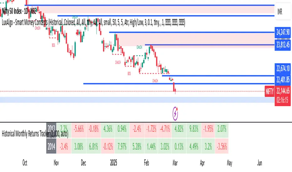
Historical Monthly Returns TrackerThe Historical Monthly Returns Tracker is a powerful Pine Script v5 indicator designed to provide a detailed performance analysis of an asset’s monthly returns over time. It calculates and displays the percentage change for each month, aggregated into a structured table. The indicator helps traders and investors identify seasonal trends, recurring patterns, and historical profitability for a selected asset.
Key Features
✅ Historical Performance Analysis – Tracks monthly percentage changes for any asset.
✅ Customizable Start Year – Users can define the beginning year for data analysis.
✅ Comprehensive Data Table – Displays a structured table with yearly returns per month.
✅ Aggregated Statistics – Shows average return, total sum, number of positive months, and win rate (WR) for each month.
✅ Clear Color Coding – Highlights positive returns in green, negative in red, and neutral in gray.
✅ Works on Daily & Monthly Timeframes – Ensures accurate calculations based on higher timeframes.
How It Works
Data Collection:
The script fetches monthly closing prices.
It calculates month-over-month percentage change.
The values are stored in a matrix for further processing.
Table Generation:
Displays a structured table where each row represents a year, and each column represents a month (Jan–Dec).
Monthly returns are color-coded for easy interpretation.
Aggregated Statistics:
AVG: The average return per month across all available years.
SUM: The total cumulative return for each month.
+ive: The number of times a month had positive performance vs. total occurrences.
WR (Win Rate): The percentage of times a month had a positive return.
Use Cases
📈 Seasonality Analysis: Identify which months historically perform better or worse.
📊 Risk Management: Plan trading strategies based on historical trends.
🔍 Backtesting Aid: Support algorithmic and discretionary traders with real data insights.
🔄 Asset Comparison: Compare different stocks, forex pairs, or cryptocurrencies for their seasonal behavior.
How to Use
Apply the Indicator to a chart in TradingView.
Ensure your timeframe is Daily or Monthly (lower timeframes are not supported).
The table will automatically populate based on available historical data.
Analyze the patterns, trends, and win rates to optimize trading decisions.
Limitations
⚠️ Requires a sufficient amount of historical data to provide accurate analysis.
⚠️ Works best on high-liquidity assets (stocks, indices, forex, crypto).
⚠️ Not a predictive tool but rather a historical performance tracker.
Final Thoughts
The Historical Monthly Returns Tracker is an excellent tool for traders seeking to leverage seasonal trends in their strategies. Whether you're a stock, forex, or crypto trader, this indicator provides clear, data-driven insights to help refine entry and exit points based on historical patterns.
🚀 Use this tool to make smarter, more informed trading decisions!
Asset MaxGain MinLoss Tracker [CHE]Asset MaxGain MinLoss Tracker – Your Tool to Discover the Best Trading Opportunities
Introduction
Hello dear traders,
Today, I'd like to introduce you to a fantastic tool: the Asset MaxGain MinLoss Tracker . This indicator is designed to help you identify the best trading opportunities in the market by analyzing the maximum gain and adjusted maximum loss potentials of various assets.
Why Use This Indicator?
1. Time-Saving Analysis
Instead of spending hours sifting through different charts, this indicator provides you with key metrics for up to 10 assets at a glance.
2. Compare Multiple Assets Simultaneously
Monitor and compare multiple assets to discover which ones offer the highest profit potential and the lowest risk of loss.
3. Customizable Settings
Adjust the observation period and select the assets you want to analyze according to your trading strategy.
4. Clear Visual Representation
Data is presented in an easy-to-read table directly on your chart, highlighting assets with the highest maximum gain and the lowest adjusted maximum loss.
How to Use It in Everyday Trading
Step 1: Setting Up the Indicator
Select Your Assets: Choose up to 10 assets you wish to track. These can be cryptocurrencies, stocks, forex pairs, etc.
Configure the Trading Period Length: Set the number of bars (candles) over which you want to calculate the maximum gain and adjusted maximum loss. This allows you to tailor the analysis to your preferred time frame, whether it's short-term trading or long-term investing.
Step 2: Interpreting the Results
Maximum Gain (%): This value shows the potential upside of each asset over the selected period. A higher percentage indicates a greater potential for profit if the asset's price moves upward.
Adjusted Maximum Loss (%): This figure represents the potential downside risk, adjusted to give a more accurate reflection of loss potential. A lower percentage means less risk of significant loss.
Category Highlighting: Assets are categorized based on their performance:
High Gain & Low Loss: Assets that have both the highest max gain and the lowest adjusted max loss.
High Gain: Assets with the highest max gain.
Low Loss: Assets with the lowest adjusted max loss.
Step 3: Making Trading Decisions
Identify Opportunities: Focus on assets categorized as High Gain & Low Loss for the most favorable risk-to-reward scenarios.
Risk Management: Use the adjusted maximum loss to assess and mitigate potential risks associated with each asset.
Portfolio Diversification: Allocate your investments across assets with varying levels of gain and loss potentials to diversify your portfolio effectively.
Practical Example
Imagine you're monitoring the following assets:
Asset 1: BTCUSD
Asset 2: ETHUSD
Asset 3: ADAUSD
Asset 4: XRPUSD
After applying the indicator:
BTCUSD shows a high maximum gain but also a high adjusted maximum loss.
ETHUSD has both a high maximum gain and a low adjusted maximum loss, categorizing it as High Gain & Low Loss.
ADAUSD indicates a low maximum gain but the lowest adjusted maximum loss.
XRPUSD reflects moderate values in both categories.
Decision Making:
Primary Focus: ETHUSD may be your top choice due to its high reward and lower risk.
Risk-Averse Option: ADAUSD could be considered if you prioritize minimizing losses.
Balanced Approach: Diversify by investing in both ETHUSD and ADAUSD.
Understanding the Core Functionality
While you don't need to delve deep into the code to use the indicator effectively, understanding its core function can enhance your confidence in the tool.
The Main Function: Calculating Max Gain and Adjusted Max Loss
The heart of the indicator is a function that calculates two critical metrics for each asset:
Maximum Gain (sym_MaxGain):
Purpose: Measures the highest potential profit over the selected period.
How It Works: It finds the lowest price (sym_minlow) within the period and calculates the percentage increase to the current high price. This shows how much you could have gained if you bought at the lowest point.
Adjusted Maximum Loss (sym_AdjustedMaxLoss):
Purpose: Provides an adjusted measure of the potential loss, giving a more realistic risk assessment.
How It Works: It identifies the highest price (sym_maxhigh) within the period and calculates the percentage decrease to the current low price. This value is adjusted to account for the diminishing impact as losses approach 100%.
Simplified Explanation of the Function
Data Retrieval: For each asset (sym), the function retrieves the high and low prices over the specified timeframe.
Calculations:
Find Highest and Lowest Prices: Determines sym_maxhigh and sym_minlow within the tracking period.
Compute Max Gain: Calculates the potential gain from sym_minlow to the current high.
Compute Max Loss: Calculates the potential loss from sym_maxhigh to the current low.
Adjust Max Loss: Adjusts the max loss calculation to prevent distortion as losses near 100%.
Output: Returns both sym_MaxGain and sym_AdjustedMaxLoss for further analysis.
Benefits of Understanding the Function
Transparency: Knowing how these values are calculated can increase your trust in the indicator's outputs.
Customization: If you're familiar with coding, you might tailor the function to suit specific trading strategies.
Enhanced Analysis: Understanding the underlying calculations allows you to interpret the results more effectively, aiding in better decision-making.
Conclusion
The Asset MaxGain MinLoss Tracker is a powerful tool that can significantly enhance your trading efficiency and effectiveness by:
Providing Quick Insights: Save time by getting immediate access to essential performance metrics of multiple assets.
Assisting in Risk Management: Use the adjusted maximum loss to understand and mitigate potential risks.
Supporting Strategic Decisions: Identify assets with the best risk-to-reward ratios to optimize your trading strategy.
Take advantage of this indicator to elevate your trading game and make more informed decisions with confidence.
Thank you for your time, and happy trading!
Disclaimer:
The content provided, including all code and materials, is strictly for educational and informational purposes only. It is not intended as, and should not be interpreted as, financial advice, a recommendation to buy or sell any financial instrument, or an offer of any financial product or service. All strategies, tools, and examples discussed are provided for illustrative purposes to demonstrate coding techniques and the functionality of Pine Script within a trading context.
Any results from strategies or tools provided are hypothetical, and past performance is not indicative of future results. Trading and investing involve high risk, including the potential loss of principal, and may not be suitable for all individuals. Before making any trading decisions, please consult with a qualified financial professional to understand the risks involved.
By using this script, you acknowledge and agree that any trading decisions are made solely at your discretion and risk.
This indicator is inspired by the "Max Gain" indicator. A special thanks to Skipper86 for his relentless effort, creativity, and contributions to the TradingView community, which served as a foundation for this work.

RedK_Portfolio Tracker v2: few enhancements and display optionsThis is an update for the PTracker v1 that I published couple of days ago. wanted to publish this as a separate script to get a chance to show how the new Portfolio Summary Infobox can be displayed on the price chart as an option. In my opinion, that info box is the most important element in this tool and that's the piece i was most looking for.
quick note here: you can track your portfolio (if not so many positions) by entering something like (without the brackets) in TradingView's chart symbol area - TradingView will resolve these symbols and chart the total -- there's a nice post by our friend @boji1 about this in a lot more details - however, that wouldn't show the stats that i need to look at to track my portfolio on daily basis.
i also made couple of other enhancements, like adding the ability to include "free cash" in the portfolio - While this free cash value will impact the Total P/L and P/L %, as part of the overall portfolio (and the denominator), it will not impact the "cost of positions" or the (current) "value of positions" -- also "Cash" will not count towards the total 10 positions that we can track with this tool.
Using Portfolio Tracker as a floating panel on the price chart
====================================================
By default, when the Portfolio Tracker is added to the chart, it will occupy its own lower panel like the picture above.
if your charts are already busy (like mine :)) - you most probably already have a couple of lower studies and it's crowded there.
in this case, you can use the Object Tree tool after adding the PTracker, to drag it onto the price panel, or you can also do that by right-clicking on the infobox and choose to move up to the price panel.
when you do that, remember to also use the Style settings of PTracker to hide both Portfolio and PnL plots, and choose Scale = no scale - this way you get the infobox to work like a floating panel on the price chart
here's a screenshot that shows this scenario - also shows how the infobox color can be easily changed from the PTracker settings to suit your chart background and for best visibility
i hope this is useful in your trading - i look forward to @TradingView team surprising us with a real portfolio tracking capability soon :)
good luck.
🗓️ FTD Cycle Lite Tracker🗓️ FTD Cycle Lite Tracker (Open Source)This is the simplified, open-source companion to the premium FTD SPIKE PREDICTOR - ML Model.This Lite version focuses purely on time-based cyclic analysis, highlighting the periods when the market is approaching the most well-known FTD-related time windows, based on historical, cyclic patterns.It's the perfect tool for traders who want clean, visual confirmation of anticipated cyclic dates without the complexity or predictive power of a multi-factor model.Key Features of the Lite Version:T+35 Cycle Tracking: Highlights the approximate 49-day calendar cycle (representing 35 trading days) often associated with mandatory Failures-to-Deliver clearing.147-Day Major Cycle: Highlights the long-term institutional cycle commonly observed in assets with complex contract deadlines, anchored from the January 28, 2021 date.Custom Anchor Points: Both cycles allow you to adjust the anchor date to suit different ticker-specific patterns.Visual Windows: Provides clear background shading and shape markers to indicate when the critical 5-day cycle windows are active.👑 Upgrade to the Full Prediction Engine!The open-source Lite version only gives you the calendar dates. The full, proprietary indicator goes far beyond simple calendar counting by telling you how probable a spike is on those dates, and which other factors are confirming the risk.Why Upgrade?FeatureFTD Cycle Lite (Free)FTD SPIKE PREDICTOR (Premium)OutputCalendar Dates0-100% Probability ScoreLogic2 Time Cycles Only7 Weighted Features (ML Model)ConfirmationNoneVolume, Price, Volatility, OPEX, Swap RollConfidenceNone95% Confidence IntervalsSignalsDate MarkersCritical Alerts & Feature BreakdownUnlock the Full PowerYou can get the FTD SPIKE PREDICTOR - ML Model for a one-time fee of $50.00.Since TradingView's invite-only feature is not available, you can contact me directly to gain access:TradingView: Timmy741X.com (Twitter): TimmyCrypto78

Compression Period Tracker (600 Max) [SharkCharts.live]Compression Period Tracker is the companion script to Compression MA to read out the period length that is actually being tracked. It is analogous to Mean Reversion Period Tracker, and makes sense to use in the same indicator window when using the two sets of indicators together on the same chart.
This version caps the maximum period length at 600, an empirically-chosen number based on some testing of Mean Reversion MA to try to avoid picking overly distant targets and which dramatically improves stability. In practice, it should be extraordinarily rare for compression MA to need to track something longer than 600, small TFs notwithstanding.
My volatility indicators are available by subscription in several packages through SharkCharts.live - and this is planned to be the first new one ready to add. I plan to release a video explaining how to use this indicator coinciding with launch, as there's a lot to talk about. Videos on my other indicators are currently hosted on DadShark's YouTube channel.
Current pricing and subscription details will be kept up-to-date on SharkCharts.live

Session ATR Progression Tracker📊 Session ATR Progression Tracker - SIYL Regression Trading Tool
Track how much of your instrument's 7-day Average True Range (ATR) has been covered during the current trading session. This indicator is specifically designed for regression traders who follow the "Stay In Your Lane" (SIYL) methodology, helping you identify when the probability of mean reversion significantly increases. If you are interested in more on that check out Rod Casselli and tradersdevgroup.com.
🎯 Key Features:
• Real-time ATR Coverage Percentage - See at a glance what percentage of the 7-day ATR has been covered in the current session
• SIYL-Optimized Thresholds - See at a glance when the instrument has achieved 80% and 100% ATR coverage, the proven thresholds where mean reversion probability increases (customizable)
• Flexible Session Modes:
- Daily: Resets at calendar day change
- Session: Uses exchange-defined trading sessions
- Custom Session: Set your exact session start/end times (perfect for futures traders and international markets)
• Visual Alerts - Color-coded display (gray → orange → red) and optional background highlighting
• Repositionable Display - Choose from 9 screen positions to avoid chart clutter
• Session Markers - Green triangles mark the start of each new session
• Detailed Stats - View current range, ATR value, session high/low, and session status
💡 Why Use This Indicator?
This tool is built around a proven concept: regression trading becomes significantly more effective once a session has achieved at least 80% of its 7-day ATR. At this threshold, the probability of price reverting to mean increases substantially, creating higher-probability trade setups for SIYL practitioners.
Benefits for regression traders:
- Identify optimal entry points when mean reversion probability is highest (≥80% ATR coverage)
- Avoid premature regression entries before adequate range has been established
- Recognize when daily moves have "earned their range" and are ripe for reversal
- Time fade-the-move and counter-trend strategies with statistical backing
- Improve win rates by trading only after proven probability thresholds are met
⚙️ Setup Instructions:
1. Add the indicator to your chart
2. Select your preferred "Reset Mode" (recommend "Custom Session" for futures/international markets)
3. If using Custom Session, enter your session times in 24-hour format (e.g., 0930-1600 for US stocks, 1700-1600 for CME futures)
4. Adjust alert thresholds if desired (default: 80% and 100% - proven SIYL thresholds)
5. Position the display where it's most visible on your chart
📈 Works Across All Markets:
Stocks • Futures • Forex • Indices • Crypto • Commodities
Perfect for regression traders, mean reversion specialists, and SIYL practitioners who want to trade with probability on their side by entering only after the session has "earned its range."
---
Tip: For futures contracts with overnight sessions that span calendar days (like MES, MNQ, MYM), use "Custom Session" mode with your exchange's official session times for accurate tracking.
