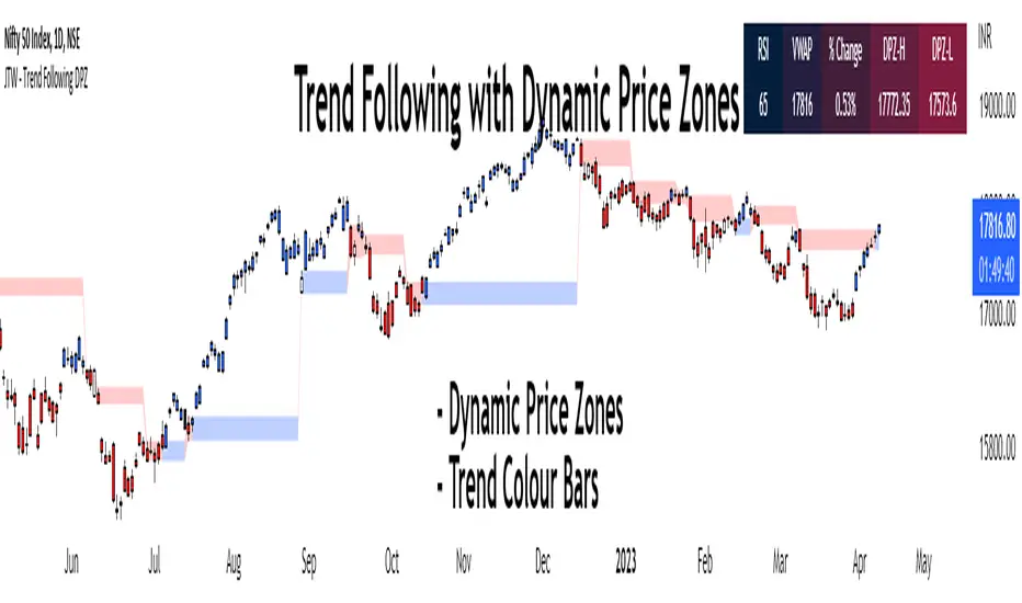
Trend Following with Dynamic Price ZonesThis script provides a complete framework for following trends , especially on those assets which are sufficiently liquid and don't go through random spikes.
Since it is a trend-following system, it works well during trends only. However, I cannot claim any numbers since the execution requires some discretion at the user's end. This framework can also be combined with other technical tools such as trend lines to increase its efficacy.
Features:
Dynamic Price Zones:
• The Dynamic Price Zones (DPZ) are determined using a proprietary logic that incorporates price movement and certain other factors.
• These zones change more rapidly than conventional support and resistance (S/R) zones, which is why I have named them "Dynamic".
• DPZs can serve as support and resistance zones and help with trend identification to some extent.
• The upper boundary of a zone is called Dynamic Price Zone High (DPZ-H) , while the lower boundary is called Dynamic Price Zone Low (DPZ-L) .
Colour Bars:
• Candle colours are based on another proprietary logic, independent of dynamic price zones .
• These are not traditional moving average-based coloured bars, which is evident from the presence of uncoloured bars in between.
• The uncoloured bars indicate periods of uncertain trends .
• Colour functionality helps in smoothening the trend and assists in riding it for as long as possible.
Stats Table:
• RSI
• VWAP
• % Change from the previous day's closing
• Dynamic Price Zone High (DPZ-H) value
• Dynamic Price Zone Low (DPZ-L) value
Settings:
• DPZs are displayed as horizontal lines with background fill by default, but users can toggle lines and background fill on or off.
• Bar colours can be customized according to user preferences.
• The table can be enabled or disabled based on user input.
• The position of the table can be changed based on 4 available options: Top Left, Top Right, Bottom Left, and Bottom Right.
• Users can toggle individual table fields on or off . For example: If the user wants to hide "Vwap" and "%Change" values, he can turn them off. In that case, only 3 fields will be displayed on the table without occupying additional space.
• Background and text colours for each field of the table can be customized based on user preferences.
How to Use the Dynamic Price Zones:
• When the price is above a DPZ, it indicates a bullish trend , suggesting the possibility of higher prices. These zones are termed Bullish DPZs.
• Conversely, if the price is below a DPZ, it signals a bearish trend , with an expectation of lower prices. These zones are termed Bearish DPZs.
• In a trending market, when the price returns to a previous DPZ, it can present a trading opportunity in the direction of the prior trend (e.g., if the market is falling and the price returns to a previous DPZ, it is likely to reject it).
• Consecutive ascending DPZs indicate a shift in buyers from lower to higher levels and can provide buying opportunities. This also indicates a period of a strong bullish trend.
• Similarly, consecutive descending DPZs indicate a shift in sellers from higher to lower levels and can provide selling opportunities. This also indicates a period of a strong bearish trend.
• Please note that we must be flexible when determining the consecutive zones. For example: There may be a few smaller bearish DPZs in between the bullish DPZs but if the area is dominated by the bullish DPZs then we can consider the zones as consecutive. Similar is true for bearish consecutive zones.
• Closely stacked or adjacent zones suggest that prices will likely remain within a range, moving sideways.
• Wider zones act as big hurdles and, the price may struggle to cross them. They may also lead to a sideways movement.
• Zones that remain clean and untested for several sessions are likely to act as strong support or resistance when the price revisits them.
Bullish Examples:
Bearish Examples:
Some Examples of the Complete System
Trend follower system combined with Trendlines
Special Thanks
I would like to extend my special thanks to all the experts whose lectures and blogs I have studied to gain a limited yet significant knowledge of the Pine language.
Best regards,
Rajat Kumar Singh (@johntradingwick)
Community Manager (India), TradingView.
"zone" için komut dosyalarını ara
Diddly - Liquidity ZonesDiddly Liquidity Zones is an indicator to highlight where the liquidity exists in a market place.
What is Liquidity
Liquidity refers to the ability of an asset to be turned into cash. Cash is the more liquid form of any asset, whereas selling a house would take a little longer to liquidate and convert to cash.
Liquidity in financial markets is in essence based on the same principle and refers to how easily an asset can be bought and sold.
Liquidity in simple terms is the volume of participants who are willing to be involved in the market at any given time. Markets are based on auction theory, the more participants who want to buy at a certain price than sell, will dictate that the price goes up. As a result it is important to understand the role that volume has in financial markets, as volume will directly correlate to liquidity and supply and demand.
What does it mean?
Areas of abnormal liquidity and volume can lead to a price range where there is high supply and demand, which in turn can become a zone that forms a support and resistance level in the future. As we all know what happens in the past does not mean it will happen in the future, but what liquidity zones will tell us is that in the past a higher number of people were interested in doing business at those prices, which is critical information when making trading decisions.
Although markets are based on auction theory, sadly we don't have the advantage of a traditional auction, where we are all sitting in a room putting our hands in the air when we are interested in paying x price for a particular item. In this environment it is very clear to see how popular the item for sale is and whether it is possible to pick up a bargain.
Being able to identify liquidity areas on a chart, provides an insight into market sentiment at a given price range. Also we have to consider that typically most retail traders participate in very liquid markets, where you can get in and out of a position with relative ease.
There are obviously exceptions, extremely low float stocks, but on the whole with liquid assets it takes some big orders to move price, especially with currencies and high float stocks. Understanding these principles helps us as retail traders identify where the big money is seeing a bargain, if buying or overpriced if selling.
However you identify liquidity, I hope you agree that it is an extremely important element to be considering before taking a trade. The last thing any trader wants to be doing if they can help it, is selling where the market perceives price to be a bargain and buying when overpriced.
Just as a side note, high and low "Float Stocks" refers to the number of shares in general circulation for buying and selling.
What is Diddly Liquidity Zones
This liquidity zones indicator in simple terms will plot zones on the chart and make an assessment of whether this is predominately buying or selling liquidity. Price will frequently come back to test areas of liquidity before making any further continuation in a specific direction. This is why liquidity zones are often described as areas of support and resistance.
How does it Work
To identify these zones the indicator is looking at a number of pieces of information predominantly based on volume.
Volume
Rate of Change
Relative Strength
From these calculations the algorithm is then looking for the standard deviation away from the normal, to identify exceptions that then become the liquidity zones. These can be classified up to 4 levels, the first being the weakest exception to four being the strongest. By default 3 levels are displayed.
What is the Indicator Showing me?
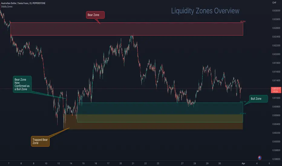
The Liquidity Zones indicator comprises two basic elements: Bull Zones and Bear Zones.
Zones that are not broken in the past are projected forward and can act as strong support and resistance levels that can also be used for targets or ignoring a trade due to lack of room above or below.
Here on AUDCHF 15 minute chart, during March 2023, it provides an example of the three indicator zone types. Details have been annotated on the chart.
The third type of zone is a “Trap Zone” which can be extremely powerful for identifying potential reversals. A Trap Zone can be either Trapped Buyers or Trapper Sellers. In essence it is a Zone that is identified, but price can never trade above or below in the direction of the zone.
As an example if a bear zone is identified and price fails to trade below the lower edge and bounces immediately out of the top. The trap is set and the indicator changes the zone from the default green (bull) or red (bear) zone to a different colour, which is orange by default.
As price moves higher away from the zone, those in their short positions start to feel the pain. The higher the move away before a retracement the higher the pain. When the retracement finally comes and price returns to the zone, you will often see price bounce off the zone for the move back to retest the highs, following the same principles of support and resistance.
In this example above a resistance level is broken, which has been identified by a volume exception identified by the indicator, when price returns to that area it now becomes support as those traders in short positions look to cover at breakeven.
Here on EURUSD 15 minute chart, during the last week in March 2023, it provides a great example of a "trap zone" setup. Details have been annotated on the chart.
Usage
This indicator will compliment any existing strategy or could be traded as part of a support and resistance trading strategy. One of the great advantages of support and resistance is that levels and zones are identified ahead of time, so trades can be planned and considered well in advance.
There is also the advantage of where to stop out, once a support or resistance level is broken then we no longer want to be in that trade. We have to accept the facts that the market sentiment has changed and no longer sees price here as good value for bull zones or overpriced at bear zones.
You will sometimes see spikes of price through a zone, where the market has grabbed the liquidity in the form of stops on the other-side, which can be extremely frustrating as a trader, but important to understand that it does happen and why it is happening.
You will find liquidity zones on all charts, from the daily to the 1 second chart. The higher the timeframe, the wider the zones are. As a result we would not recommend planning an entry purely on a daily zone, but it is extremely useful information when drilling into the lower time frame charts. So using multiple timeframe analysis is a really useful technique when looking to understand a market.
There are a number of elements to consider before taking entries around support and resistance levels. The most important thing to remember is these levels have to break at some point, otherwise price would never go anywhere. Understanding that these levels can fail is important and is the reason we should always have clearly defined stops and manage risk.
You may also want to consider higher timeframe trend analysis to try and ensure you are trading with the trend. First and second retests work better as these zones will weaken over multiple retests as traders give up on that area, as it no longer is giving the reactions of price that it used to.
The easiest entry method when working with support and resistance levels, is to place limit orders in the market. This is not a recommended approach, although it can be useful for traders who can't sit in front of charts all day. By taking this approach you would want to ensure that you are trading with the predominant trend on a higher timeframe and are in effect using these levels on a lower timeframe as pullback entries. You would also want to ensure that you have a wide enough stop to ensure that any spikes through don't stop out the trade, so using an Average True Range multiplier can be very helpful. The key point is don't oversize and manage risk.
A better approach to identifying entries would be to look at price action on a lower time frame chart, once price has arrived at the level.
A more conservative approach would be to wait for price to close outside the zone in the direction you want to trade on the signal chart and look for an entry on the retest of the top of the zone for buys or the bottom of the zone for the sells, with the stop the other-side of the zone.
For the purpose of examples we will focus on the last two methods, although there are many sources of information on how to trade support and resistance levels, so please don't take the above as the only way to plan or take entries.
Multiple Timeframe Alignment
Here on a stock asset MSFT (Microsoft), we have a zoomed out 15 minute chart. The top left is August 2022 and the bottom right is November 2022, which is quite a sell-off and there were many opportunities to the short side, although many traders would have been looking to see when this stock was at a bargain price.
Here on the 7th November 2022, there were the first signs of a potential change in market sentiment, as the indicator identified a Bull Zone on the 15 minute chart. At this stage the stock has been beaten up for a long time and there is a Bear Zone, above price - so not much distance to get a decent risk reward trade as yet.
Then on the Thursday of the same week, price came back to test the high of this previously created Bull Zone, after being rejected from the Bear Zone above.
So drilling into the 1 minute chart to find good risk : reward entries, price at the opening bell explodes through Bear Zones in the above chart and prints a big 1 minute Bull Zone. This on its own would be hard to trade, is it a fake out? price must surely retrace before a move higher, also there is a trapped buyers zone above price, so there will be a lot of liquidity and sell orders at that level.
Here again on the 1 minute chart, we see the breakout of the orange zone with a new Bull Zone (which is coloured blue, being a 2nd level zone) . Now we just want to see this zone being confirmed by breaking the top and then we would look for entries on the retest.
Price action is now ready for taking a buy entry for a short-term swing trade as illustrated on the next chart.
About a month later the price hit the target, as shown on the 4 hour chart.
The target was set on the 15 min chart, being the next substantial level of a bear zone. Also on the 1 hour chart above, a big green bull zone of liquidity was identified, so there's a fair chance that price will come back to retest liquidity before a greater move away. The trade planner has been removed from this chart, so it is easier to see the printed zones, but the entry was at the 238.00
You will see since January 2023 there have been many opportunities on this stock using the 15 minute chart to find zones to trades and manage risk. The one thing that is clear in this chart is where the market sentiment was on this stock as it made the run-up to current price.
Alerting
Utilising the power of TradingView Alerts enables you to monitor many pairs, when you are away from your charts. You can set up alert for the indicator, by right-clicking on a zone that you see on a chart and choose the first option that appears on the menu "Add Alert to Diddly Zones". You can also perform the same operation from the indicator tile that appears in the top left corner of the chart.
Within setting you can choose to be alerted under the following conditions:
When New Bull Zone has been Identified
When New Bear Zone has been Identified
When Price approaches a Bear Zone from below. Notifying traders that we are approaching a resistance level
When Price approaches a Bull Zone from above. Notifying traders that we are approaching a support level
When Price is Trading inside a Zone at a certain configurable time.
On the last point above: This is useful on a slightly higher timeframe, where large zones exist and you may want to be notified if this asset is trading in a zone at say the London open. You would have already been sent an alert telling you price was arriving at the zone, but that could have been a couple of days ago.
Key Settings
Within the indicator settings there are a number of options that are available to users. From changing the colours and their transparency of different zone types, to the number of exception levels that you want to see on the chart.
The most important ones that are in need of explanation are outline below:
To simplify the settings, the indicator is configured by using a similar analogy to driving style. The reason this is needed is because different assets and asset classes have different levels of liquidity, as a result the indicator requires some basic information to provide the best results. The principle being the faster you drive the more zones you will encounter.
To continue with the analogy, it is important not to drive too fast on a particular asset otherwise all you will see is zones and nowhere for price to go. If this is the case, slow the setting down or go to a higher time frame for a broader perspective.
Settings
"Determine Algo Driving Style" : Available options = "Slow", "Steady", "Sports", "Racing", "Rocket" (Default Setting = Sports)
So this is setting the speed of the indicator
"Turn on Turbo Mode" : True or False (Default Settings = True)
This setting will give the indicator a boost
"What type of asset is the Algo looking at" : Available Options = "Small Caps", "Large Caps", "Futures", "Currencies" (Default Setting = Currencies)
The only difference in these settings currently is a magnification element that is applied to the calculations, which is particularly relevant for highly liquid assets like currencies, futures and large cap stock. The only option that by default does not use the magnification element is Small Cap low float stocks, where liquidity is lower this setting is not required. This magnification can be change later in the settings under "Zone Identification Calculation Models"
Finally
We greatly appreciate the support and feedback from the Trading View community, and we are dedicated to continuing to improve our indicators with your support.
We want to help you manage risk, and that's why we emphasise that trading is risky and any technology used to support our trading decisions is based on information from the past. We encourage traders to take responsibility for their trading businesses and always prioritise risk management.
Accumulation And Distribution Zones (Zeiierman)█ Overview
Accumulation And Distribution Zones (Zeiierman) is a structural zone indicator that highlights where the market has recently been absorbing sell pressure (Accumulation) or releasing buy pressure (Distribution).
The indicator tracks a refined sequence of swing highs and lows and measures how these swings tighten, expand, or step directionally. When they form staircase-style structures such as higher lows with compressing highs for Accumulation or lower highs with compressing lows for Distribution, the script marks these areas as shifts in market control.
Once the full pattern completes, the indicator converts it into an Accumulation or Distribution zone. Each zone is based on a confirmed structural sequence rather than a single point, making it more reliable and reflective of actual market behavior.
The indicator can also display a mini-volume profile within each zone and extend POC levels forward, showing where trading activity clustered most. Combined, these features reveal areas where price has recently shown acceptance, absorption, or rejection, helping you understand whether current price action is reacting to, breaking from, or retesting these important structural regions.
█ How It Works
⚪ Swing Structure
The indicator builds its foundation by detecting swing highs and lows using a configurable Swing Detection Window. Each confirmed swing is stored with its price, time, bar index, and direction. If two consecutive swings share the same direction, only the more extreme one is kept. This produces a clean structural sequence that removes noise and keeps only meaningful turning points.
⚪ Accumulation vs Distribution Pattern Logic
Using the refined swing sequence, the script looks for staircase-style formations that signal shifts in control:
Accumulation (bottoming): higher lows combined with compressing highs.
Distribution (topping): lower highs combined with compressing lows.
Two detection modes are available:
Quick for compact 4-swing formations
Slow for broader 6-swing structures
When a full structural pattern completes, the indicator marks the zone and resets the swing buffer for the next formation.
⚪ Volume Profile Construction
The price range between the zone’s upper and lower boundary is divided into several Rows. For every bar within the zone’s swing range, the bar’s volume is added to the appropriate price row.
Volume is classified as:
Bullish volume when close > open
Bearish volume when close < open
Each row is drawn as two horizontal segments (bull and bear), colored with smooth gradients based on your bull/bear color settings. This creates a compact profile that reveals where trading activity is concentrated inside the zone and whether buyers or sellers dominate those price levels.
█ How to Use
The indicator is designed to provide context and confluence, not raw buy/sell signals.
⚪ Spot Fresh Accumulation & Distribution
Use newly printed zones as a map of where the market has recently:
Absorbed selling and formed a floor (Accumulation below price).
Absorbed buying and formed a cap (Distribution above price).
In a trending environment, fresh accumulation zones below price are often areas to watch for pullbacks, while distribution zones above price can act as sell zones or targets.
⚪ Volume Profile
Longer horizontal bars show where the market traded the most volume inside the zone.
Bull-leaning rows inside an accumulation zone often signal strong buying interest during the formation.
Bear-leaning rows inside a distribution zone highlight concentrated selling pressure.
By combining this volume distribution with the zone label and the broader trend context, you can judge whether the structure is more likely to hold, break, or retest as the price approaches it again.
⚪ POC (Point of Control) Trading
Extended POC zones (Regular or Faded) can be treated as dynamic support/resistance rails:
When price revisits a prior accumulation POC and rejects it from above, the level may act as support. When price retests a distribution POC from below and fails to break through, it can act as resistance.
⚪ Combine with Your Own Strategy
The script does not decide direction for you. You get the most value by combining it with:
Your own trend filters (moving averages, higher timeframe structure, volatility measures).
Your preferred entry models (reversal candles, momentum breaks, liquidity grabs, etc.).
Higher-timeframe mapping.
Think of this tool as a map of where the market did meaningful business. You decide how to trade around those areas.
█ Settings
Acc/Dist Ranges – Master switch for drawing all Accumulation and Distribution zones. Turn this off to temporarily hide boxes while leaving supporting logic active.
Pattern – Shows or hides the swing-based pattern outline that formed each zone. Good for structural debugging and education.
Pattern Sensitivity
Quick – more responsive, detects smaller compact structures.
Slow – stricter, focuses on wider and more established zones.
Swing Detection Window – Pivot width used to confirm swing highs and lows. Larger values filter noise and produce bigger zones; smaller values pick up more minor structures.
Volume Profile – Enables the embedded volume profile inside each zone.
Rows – Number of price slices used to aggregate volume in the zone. Higher values give more detail but increase visual density.
Switch Order – Flips the horizontal order of bull vs bear volume segments within each row.
Extend Zones – Behaviour of POC and zone extension:
None – No forward extension.
Faded Zones – Store and draw up to four past POC zones as faded horizontal levels.
Regular Zones – Extend POC boxes forward until price breaks out.
-----------------
Disclaimer
The content provided in my scripts, indicators, ideas, algorithms, and systems is for educational and informational purposes only. It does not constitute financial advice, investment recommendations, or a solicitation to buy or sell any financial instruments. I will not accept liability for any loss or damage, including without limitation any loss of profit, which may arise directly or indirectly from the use of or reliance on such information.
All investments involve risk, and the past performance of a security, industry, sector, market, financial product, trading strategy, backtest, or individual's trading does not guarantee future results or returns. Investors are fully responsible for any investment decisions they make. Such decisions should be based solely on an evaluation of their financial circumstances, investment objectives, risk tolerance, and liquidity needs.

Demand & Supply Smart Zones (Riz)A professional zone engine that detects, ranks, and maintains Supply and Demand areas across multiple timeframes. It combines swing structure, engulfing/imbalance logic, optional liquidity-sweep validation, and trend/volume filters. Zones are refined, merged, aged, and removed automatically, while a dashboard and mini-map summarize the state of the market at a glance.
How it works (why this isn’t a simple mashup)
⦁ Zone Detection (Auto/Manual/Hybrid):
⦁ Auto finds zones from three independent catalysts: swing turns, engulfing patterns, and imbalance candles.
⦁ Manual lets you define a zone precisely (top/bottom + type).
⦁ Hybrid adds your manual zones on top of the model’s detections.
⦁ Strength Model: Each zone receives a score using ATR-scaled size, relative volume (vs SMA), timeframe weight (higher TF = more authority), and session context (optional Killzone boost). This surfaces the most actionable areas rather than plotting everything.
⦁ Filters for Quality (Conservative/Aggressive):
⦁ Conservative can require trend alignment (EMA), volume validation, wide-body candles, structure context, and optional liquidity sweep checks.
⦁ Aggressive relaxes filters for faster, more frequent zones (e.g., scalping).
⦁ Refinement & Styling: Zones can be refined by wick, body, or hybrid logic to avoid over-sized regions. Visuals support solid/gradient/border styles, fresh/retest labels, and a heat-map emoji for strength.
⦁ Lifecycle Management: Zones can auto-delete on touch, delete on break, shrink on retests, expire after X bars, and cap retests. Old/merged zones are cleaned up to keep charts responsive.
⦁ Multi-Timeframe (MTF) Logic: Detects and optionally normalizes HTF zones (e.g., 60/240/D). Overlapping zones are merged across TFs with the higher TF taking precedence and receiving a small strength bonus. This prevents duplication and emphasizes institutional levels.
⦁ Proximity & Interaction Alerts: Alerts can fire on approach, first entry, and break, with separate Supply/Demand variants and per-TF options. An internal tracker avoids duplicate alert spam.
On-chart tools
⦁ Zones: Supply (red) / Demand (green), with “Fresh” or “R#” labels and strength heat-map.
⦁ Dashboard: Counts zones per TF, shows nearest supply/demand (in pips), trend state, and mode.
⦁ Mini-Map: A compact list of the 10 closest zones with TF, freshness, strength, and distance.
⦁ Trend Line (optional): EMA for directional context.
⦁ Killzone Background (optional): Session emphasis for timing.
Inputs & Key Options
⦁ Detection Mode: Auto · Manual · Hybrid
⦁ Strictness: Aggressive (more zones) · Conservative (fewer, higher quality)
⦁ Catalysts: Engulfing, Imbalance (ATR + volume threshold), Swing strength
⦁ Filters: Volume multiplier, wide-body %, trend EMA, structure checks, liquidity sweep lookback
⦁ MTF: Up to 3 higher TFs, with normalization to prevent oversized zones and priority stacking
⦁ Management: Auto-delete on touch, delete on break, dynamic shrinking, expiry bars, max retests
⦁ Merging: Overlap threshold and cross-TF consolidation
⦁ Alerts: Proximity (distance in pips), First Entry (fresh touch), Break, per-TF toggles
⦁ Display: Labels, size, heat-map, merging tags, dashboard position, mini-map
How to use
1. Choose Strictness
⦁ Conservative for swing/HTF traders who prefer cleaner, stronger zones.
⦁ Aggressive for scalpers who want earlier, more frequent levels.
2. Enable MTF and set HTF1/HTF2(/HTF3). Turn on Normalization to avoid giant HTF boxes.
3. Pick Catalysts & Filters. Start with Engulfing + Imbalance + Swing. Add volume/EMA/liquidity filters for quality.
4. Watch the Dashboard: It highlights mode, counts per TF, nearest zones (with distance), and overall trend.
5. Trade the Interaction:
⦁ Proximity alert → prepare;
⦁ First entry (fresh touch) → your confirmation rules;
⦁ Break → consider flips or invalidation.
6. Manual Zones (Hybrid): Add precise institutional levels and let the engine manage them (shrink, expire, merge).
Alerts (titles you’ll see)
⦁ Zone Proximity – approach within X pips
⦁ Zone Entry / Supply Zone Entry / Demand Zone Entry – first touch
⦁ Zone Break / Supply Zone Break / Demand Zone Break – clean break
⦁ Current TF / HTF1 / HTF2 Zone Alert – timeframe-specific triggers
⦁ Any Zone Alert – catch-all for any interaction
Notes & Tips
⦁ Fresh > Retested: First touches generally score better and are labeled accordingly.
⦁ Context Matters: Combining HTF zones with trend and volume filters significantly improves selectivity.
⦁ Performance: Zone limits and periodic cleanup are built in. If you plot many HTFs with Aggressive mode, consider raising strictness or lowering max zones.
Disclaimer
This tool is for educational and analytical purposes only. It does not constitute financial advice, nor does it guarantee outcomes. Trading involves risk; use proper risk management and your own judgment.
Pivot Cluster Support Resistance ZonesPivot Cluster Support Resistance Zones
An adaptive S/R tool that turns recent pivots into clean, readable zones with optional trade setup guidance and midline cross alerts.
What the script shows on your chart
It draws shaded price zones that act as support or resistance based on where the zone midpoint sits relative to the current close. Zones above price are tinted as resistance and zones below price are tinted as support. Each zone carries a compact label that prints the current timeframe plus the exact mid price, for example “4H | 4325.25”. When you enable trade setups, the script adds labels for an entry at the nearest zone midpoint, a stop placed just outside the zone with a volatility aware buffer, and one or more take profit points at the next zone midpoints in the path of the move. The script also exposes three alert conditions that trigger when price crosses a zone midpoint upward, downward, or either way.
How to use it if you are new to TradingView or price action
Apply the indicator to a clean chart first so the shaded boxes and labels are easy to read. Green tinted boxes are support areas that can catch pullbacks when price trades above them. Red tinted boxes are resistance areas that can cap rallies when price trades below them. Start by watching how price reacts when it approaches the nearest zone. If you enable the trade setup option, use the “Entry” label as a suggested fair value inside the nearest zone, place the “Stop Loss” just beyond the zone using the automatic buffer shown in the label, and consider scaling out at the “Take Profit” labels as price reaches the next zones. Treat these labels as a structured map rather than a promise. Always wait for your own confirmation, such as a candle close that respects the zone, and always size your risk.
How it works in plain language
The script waits for real, confirmed turning points in price called pivots. When a pivot forms, it gets saved into a rolling list of recent turning points. The script then looks for tight groups of those pivots that sit near each other in price. The allowed distance for a group is not fixed. It scales with the asset’s recent 300 bar range so that busy, volatile markets get wider tolerance and quiet markets get tighter tolerance. Each group of nearby pivots becomes a candidate zone. The number of pivots inside the group is the strength of the zone. If two candidate zones overlap in price, the script keeps the stronger one and removes the weaker one. Only the strongest zones are kept on the chart up to your chosen limit. For each final zone the midpoint is the single reference used for tinting, labels, and alerts. This keeps the logic consistent and easy to reason about.
Technical explanation for advanced users
Pivot detection is based on a symmetric period length over either High or Low, or a Close or Open surrogate using max and min. Each confirmed pivot is unshifted into an array capped by your “Maximum Number of Pivot”. On rebuild, a clustering pass iterates over the array to compute zone candidates. The cluster width equals the recent 300 bar range multiplied by “Maximum Channel Width %”. For a given seed value the pass grows the candidate by including any pivot value that stays within the current low to high bounds while the total spread remains within the width threshold. The count of included pivots is the strength metric. A second pass enforces mutual exclusion, replacing an existing zone with a new one if the new strength is higher within an overlapping price interval. Zones are kept in descending order of strength and trimmed to “Maximum Number of S/R”. Each drawn zone uses a midpoint rounded to mintick for label clarity. The visual is a background box centered around the midpoint with a small pad for legibility. Zone shading updates every bar so the support or resistance tint always reflects the current close, while the full set of zones and trade labels rebuild on new pivot confirmation. Alerts compute midpoint crosses using close on the previous bar versus the current close to avoid repainting.
Inputs and practical tuning in real trading
Pivot Period controls how quickly turning points confirm. Lower values confirm sooner and create more candidate pivots, which can make zones appear faster at the cost of noise. Source lets you choose between High and Low or a Close and Open surrogate that can be more conservative during gaps. Maximum Number of Pivot caps memory and performance. Maximum Channel Width % scales zone formation relative to the last 300 bars. If your chart looks messy, reduce this percentage to demand tighter clusters and raise Minimum Strength so that only zones formed by multiple pivots survive. Maximum Number of S or R limits the number of visible zones so the view stays readable. Label Location shifts labels to the right if they sit too close to candles. The trade setup block has a switch to show or hide guidance, a number that controls how many take profits you want to see, and a Stop Loss Buffer percent that extends beyond the zone height to account for volatility and slippage. If you want fewer signals, raise Minimum Strength and lower the channel width. If you want more signals, do the opposite. If labels overlap on lower timeframes, move Label Location farther to the right.
Reading the zones with a repeatable workflow
Begin on a higher timeframe to understand the main structure then drop to a lower timeframe to refine entries around the same zones. When price approaches a support zone from above, look for a reaction such as a wick rejection, a strong close back above the midpoint, or a quick reclaim after a shallow break. When price approaches a resistance zone from below, watch for hesitation, lower highs inside the zone, or a decisive close under the midpoint. If you use the optional trade setup labels, treat the midpoint entry as a baseline. Use the buffer based stop as a pre planned exit that avoids getting tagged by normal chop inside the zone. Use the staged take profits at the next zone midpoints to reduce risk as price reaches logical targets. Alerts on midpoint crosses can help you monitor multiple charts without staring at them.
Alerts and how to set them
Open the alert dialog on TradingView and select one of the three exposed conditions. Choose “Resistance Broken” when you want a notification for crosses above any zone midpoint, “Support Broken” when you want a notification for crosses below any zone midpoint, or the combined condition if you simply want to know when price has moved through any midpoint in either direction. Consider adding a secondary filter in your trading plan, for example only take alerts that align with the higher timeframe bias.
Notes, limitations, and expectations
Pivots confirm only after the chosen period, which means zones update when a new pivot locks in. This is intentional and avoids repainting. If price moves far without forming a new pivot, the optional trade setup labels will not update until the next pivot confirms. Zones are derived from recent data and can change as new pivots arrive. Treat the script as a structure and risk framework, not as a signal generator. Your own confirmation, risk sizing, and trade management remain essential.
Originality
This publication and code are original works by the author. No third party or open source code was reused.
Publication guidance to satisfy moderator checks
Use a clean chart for your main screenshot so the shaded boxes and labels are obvious. If you show the optional trade setup labels, include a short caption that explains Entry, Stop Loss, and Take Profit placement. If you show the alert dialog, include a second image with a brief caption so reviewers can match the conditions to what the script exposes.
Changelog
Version 2 introduces strength ordered clustering with overlap resolution, range scaled width based on the last 300 bars, midpoint based coloring and alerts, optional trade setup labels with a buffer based stop and multiple take profits, and timeframe aware zone labels. Presentation defaults were tuned so zones and labels are readable on a blank chart.
Disclaimer
This tool is for research and charting. It does not predict outcomes or guarantee results. Always validate ideas with your own method and manage risk accordingly.
Alert condition references
// Exposed alert conditions
alertcondition(crossed_over, title='Resistance Broken', message='Resistance Broken')
alertcondition(crossed_under, title='Support Broken', message='Support Broken')
alertcondition(crossed_over or crossed_under, title='Support or Resistance Broken', message='Support or Resistance Broken')

ICTProTools | ICT Insight - Time & Price Zones🚀 INTRODUCTION
The Time and Price Zones indicator builds upon the foundational concepts of ICT (Inner Circle Trader) and Smart Money Concepts (SMC). These methodologies analyze the behavior of institutional traders (known as "smart money") by focusing on liquidity, key price levels, and market timing.
Liquidity refers to areas with high concentrations of pending orders (stops, take-profits, entries) in the market. Large institutions efficiently need to execute their massive orders without causing excessive slippage. To achieve this, they strategically create and exploit liquidity pools by driving the price toward areas where retail traders cluster their positions.
Then, through "liquidity grabs" or "stop hunts,” institutions accumulate or distribute positions at optimal prices . This strategy allows them to fill large orders with minimal market impact, typically clearing out retail traders' positions before the price reverses.
This indicator helps traders apply these principles by merging time-based and price-based analysis tools for better market understanding. By combining high-impact sessions like Kill Zones with pivotal price markers such as Previous Highs and Lows, traders can see where institutional activity intersects with liquidity pools, improving their decision-making.
This powerful combination allows users to monitor market dynamics in real time, helping them spot sentiment shifts and identify crucial turning points more effectively.
💎 FEATURES
Kill Zones
Kill Zones are critical periods of the trading day characterized by heightened institutional activity, resulting in increased liquidity and significant price movements. By recognizing these zones, you can strategically focus your efforts on the most advantageous moments for trading.
The Asian Session , which runs from 5 PM to 1 AM New York time, serves as an essential liquidity provider before the onset of more volatile trading periods. This session is intricately linked to the Smart Money Tool (SMT - See below), as the highs and lows established during this period provide foundational liquidity levels. You can set alerts when these levels are breached , allowing you to stay informed without constant chart monitoring and make timely trading decisions.
Transitioning into the London Kill Zone from 2 to 5 AM New York time marks the beginning of the European session, often associated with increased volatility. Following this, the New York Kill Zone , occurring from 7 to 10 AM , sees significant overlap between the London and New York sessions, where liquidity flows intensify and frequently correlate with notable price reversals. Finally, the London Close from 10 to 12 PM signifies the end of the European session, often ending the day with a retracement in the daily range.
Thanks to the timezone you can select relative to a region, Kill Zones will automatically adapt to time changes throughout the year and between different brokers , ensuring accurate Kill Zone timings without manual adjustments.
Incorporating our advanced Kill Zones indicator into your trading strategy gives you unparalleled insights and enhanced functionality. With integrated alerts for breaches of key levels, you can stay informed and ready to act without the need for constant chart monitoring, allowing you to focus on executing your trading strategies effectively.
We can see on this chart the identified Kill Zones during the trading day on EURUSD , including the Asian Session in gray, which tends to consolidate slightly (creating liquidity), the London Kill Zone in orange, which tends to move fast, often taking Asian quickly, the New York Kill Zone in green, with always a lot of movements, and the London Close in blue, seeming rather to retrace.
The midline indicates the 50% mark of the session, serving as a reference point for potential price reactions. Additionally, the highs and lows established during the Asian Session are linked to the Smart Money Tool (SMT) and can trigger alerts when breached. Here, you could have received an alert when Asian Low (marked AL) and Asian High (marked AH) were swept.
Previous & Open Levels
Previous and Open levels are key elements in ICT methodology, showing important price points from major timeframes (Daily, Weekly, Monthly). These levels (Previous High, Low, Open, and their separators) help traders understand price dynamics and anticipate market shifts.
The Previous levels connect directly to the Smart Money Tool (SMT - See below) as they provide foundational liquidity levels. In ICT methodology, previous are levels where many traders place their Stop Loss, thus creating liquidity. This helps you understand potential market reactions and whether prices will likely continue their trend or reverse.
You’ll be instantly notified whenever the price interacts with any of these Previous levels. This means you can stay informed about critical market movements without the need to monitor your charts constantly.
The indicator also displays Opening prices and includes separators for daily, weekly, and monthly levels, offering a clear market overview.
Open levels can act as simplified indicators of Premium and Discount Zones. To be above the opening price can be considered as the Premium Zone , where the market offers higher prices, typically suitable for selling opportunities. Conversely, to be below this price can be considered as the Discount Zone , where prices are relatively lower, offering potential buying opportunities.
These visual elements help you identify crucial market zones that reflect both past price action and current market dynamics.
Our indicator offers you the exclusive ability to integrate the True Day Range, as described by ICT. Based on institutional logic, this concept defines the trading day starting at 00:00 New York time. You can adapt this flexible feature to match your trading style and analysis needs.
By incorporating our advanced Previous levels indicator into your trading arsenal, you gain powerful insights and enhanced functionality.
The chart above displays key Previous and open levels on EURUSD , including the Month, Week, and Day lines, along with separators for enhanced clarity. All levels are based on the True Day Range Mode. The notes indicate significant price points, highlighting how the price interacts with these important levels, which helps us to understand it…
We can start with the biggest liquidity, the Previous Month. In this example, we can see the PMH, and the price seems to have used this level as a reversal point. The PM levels are indeed significant liquidity zones. We can observe the creation of wicks that interact with this level, signaling a liquidity grab.
Following this, the price drops quickly before rebounding, creating a liquidity range, that will probably be liquidated then… This is why it rises again to form what is now the PDH (Previous Day High), using it as liquidity (inducement) while using the PWH (Previous Week High) as a rebound level. The PWH is indeed a High Resistance (HR) area since there is only a few liquidity at this point thanks to the liquidity grab. The price has no reason to move higher.
Looking ahead, we can forecast that the price may continue its decline, potentially targeting lower liquidity levels. There is likely additional liquidity beneath the current range, particularly near the PDL (Previous Day Low) and PWL (Previous Week Low).
Additionally, we can note that at this point, the price was above the D.O.P (Daily Open) and W.O.P (Weekly Open), areas where selling would be more favorable. The price reacts significantly around these levels, creating large wicks, demonstrating their importance.
SMT Dashboard (Smart Money Tool)
The Smart Money Tool (SMT) is a powerful concept within the ICT methodology that enables you to compare various assets based on liquidity uptake from significant price levels.
By utilizing the SMT, you can analyze any asset , whether it’s a currency pair, stock, cryptocurrency, or other financial instruments. The dashboard helps you identify the strongest and weakest assets by analyzing their interactions with critical liquidity levels and identifying divergences , including those related to the Previous Month, Previous Week, Previous Day, and Asian Session Highs and Lows. By doing so, he identifies the most bullish symbol. It will therefore tend to rise more easily, or at least fall less, than the other one.
The SMT includes alert functionality that notifies you whenever a new SMT is created or has changed , allowing you to stay informed about which asset is currently the strongest. This means you can react promptly to market changes without constantly monitoring your charts.
Additionally, since the SMT relies on the Previous levels, it is influenced by the selected mode, whether based on traditional Previous levels or the True Day Range . This flexibility ensures that you are using the most relevant information available for your trading decisions. Asian High and Asian Low levels are also calculated according to the schedules configured in the Kill Zones section.
In summary, the Smart Money Tool displays the strongest and weakest assets based on liquidity uptake, providing you with clear information on which asset to prioritize, so you can maximize your potential profits. By incorporating this concept into your approach, you align your decisions with prevailing market dynamics, offering you unparalleled insights and features tailored to enhance your trading strategy.
This chart displays the Smart Money Tool (SMT) dashboard on the GBPUSD symbol, which compares the liquidity uptake for EURUSD and GBPUSD pairs. The indicator shows that both Previous Month's and Week's High and Low were taken for both pairs. However, the Asian High (AH) has been breached on GBPUSD but not on EURUSD, while the Asian Low (AL) has been taken by EURUSD. As a result, GBPUSD is identified as the stronger asset, indicating that traders should focus on buying opportunities with GBPUSD rather than EURUSD. This analysis helps traders prioritize the best symbol for their strategies based on the most relevant liquidity divergences.
✨ SETTINGS
Kill Zones: Customize the display options for the Asian (with lines), London, New York, and London Close Kill Zones. Configure timezone options, midlines, and color preferences.
Previous & Open Levels: Adjust how Previous High/Low levels, Open and separators are displayed. Select between Classic or True Day Range Mode based on your trading preferences.
SMT: Choose the correlated assets for the SMT comparison and select which liquidity (Monthly, Weekly, Daily, Asian) to use and display. Configure settings like liquidity sweeps and strongest pair emojis.
Alerts: Configure alerts for key events such as the Asian High/Low or Previous Levels liquidity sweep, and SMT divergences.
🎯 CONCLUSION
The Time and Price Zones indicator offers a practical and insightful approach to market analysis by combining major principles of ICT and Smart Money Concepts into a cohesive tool. It empowers traders to understand key price levels, liquidity dynamics, and institutional activity with ease. By helping traders avoid being the liquidity of the market and instead align with institutional flows, the indicator can significantly enhance performances. While its features provide a valuable edge, it’s essential to remember that none should be used on its own and many more factors go into being a profitable trader.

Supply and Demand Zones with Enhanced SignalsThis Pine Script indicator combines supply and demand zone analysis with dynamic buy/sell signals to enhance trading strategies. It provides a robust framework for identifying optimal trading opportunities and managing existing trades.
Key Features:
Supply and Demand Zones: The indicator identifies significant supply and demand zones based on recent price action. These zones are plotted as horizontal lines to help traders visualize potential reversal points.
Exponential Moving Average (EMA): A 21-period EMA is used to determine the prevailing trend and generate buy and sell signals.
Relative Strength Index (RSI): The 14-period RSI is utilized to filter buy and sell signals, providing additional context on overbought and oversold conditions.
Signal Generation:
Buy Signal: Triggered when the price crosses above the EMA and RSI indicates that the market is not overbought.
Sell Signal: Triggered when the price crosses below the EMA and RSI indicates that the market is not oversold.
Enhanced Exit Signals:
Exit Buy Signal: Generated if an opposite sell signal occurs or the higher timeframe RSI indicates overbought conditions.
Exit Sell Signal: Generated if an opposite buy signal occurs or the higher timeframe RSI indicates oversold conditions.
Trade Management:
Tracks active trades and provides exit signals based on the occurrence of opposite trading signals. This helps in managing positions more effectively and reducing potential losses.
Usage:
Supply and Demand Zones: Look for price action around these zones to identify potential trading opportunities.
EMA and RSI: Use buy and sell signals in conjunction with EMA and RSI to validate trading decisions.
Higher Timeframe RSI: Utilize this for additional confirmation and exit signals.
Plotting:
Supply Zone: Plotted as a red horizontal line.
Demand Zone: Plotted as a green horizontal line.
EMA: Plotted as a blue line.
Buy and Sell Signals: Indicated by green and red triangle shapes, respectively.
Exit Signals: Indicated by blue and orange X shapes.
This indicator is designed to help traders make informed decisions by combining technical analysis with strategic trade management.

Supply & Demand Zones (Order Block) Pro [BacktestBot]Supply & Demand Zones (Order Block) Pro with DBD/RBR/RBD/DBR/FVG
This indicator helps to identify large price moves driven by banks and institutions. It can be used for any asset type (FOREX, crypto, commodities, indices) and any timeframe.
How to use this indicator
Message me to gain access. I try to reply within 24 hours.
Consider this as more of a visual aid to add to your confluences.
Use a side by side chart layout with different timeframes to see more zones.
(See example of use at the bottom)
Pullback trades are popular with zones.
⭑⭑⭑ Zones ⭑⭑⭑
How are zones created?
Supply zones are created when the price drops quickly, so are found above the price action.
Demand zones are created when the price rallies quickly, so are found below the price action.
The script uses a combination of quick price movements and user defined minimum price % changes. All user defined settings have default settings which vary depending on asset type and timeframe.
What is a strong zone?
The zones boxes have either a dashed border or a solid border. A solid border represents a strong zone which is when
the price has moved very quickly from it, or
the price has bounced off the zone multiple times.
What is a deactivated zone?
When the price has gone through the zone by a certain %, the zone is deactivated and displayed in a more transparant colour.
How are deactivated zones used for switch zones?
When a new zone is created, it is checked to see if it overlaps a recently deactivated zone.
e.g. If a new demand zone overlaps a recently deactivated supply zone, then the zone has switched from supply to demand. This might mean the new zone could be a strong one and the number of hits on the previous zone (also a potential indicator of strength) is displayed in the zone label tooltip.
Zone information
Basic zone information can be found in the zone label.
Users can choose what information is displayed in the label including the number of hits and prices.
More detailed information can be found in the zone label tooltip.
Hovering over the label will display more information including the zone start time and height %.
DBD/RBR/RBD/DBR/FVG
Zones are defined as drop base drop, rally base rally, rally base drop, drop base rally, and fair value gap.
Zone height
Users have the option of choosing
Wick to wick, or
Wick to body
The indicator does its best to meet the user preference but sometimes it is not possible. The information in the label tooltip will show if the preference was matched.
Minimum and maximum height default settings help to prevent zone boxes which might fill the whole chart.
⭑⭑⭑ Lines of Interest ⭑⭑⭑
Lines of interest are displayed as an added bonus.
Long wick
Long wicks might show areas of support or resistance. Very long and long wicks are defined by the % change in the wicks.
Very long wick lines are always displayed, and long wicks are displayed if they are not near a zone.
Possible Support / Resistance
After a big rally or drop, lines are displayed to show where the price might pullback to. These lines can act as possible support or resistance, and
are taken from recently deactivated zones. A solid line respresents a strong deactivated zone.
⭑⭑⭑ Alerts ⭑⭑⭑
Limit the number of alerts to the recommended ones. Consider this as more of a visual aid to add to your confluences.
Alert types
Early alerts happen immediately.
Bar end alerts happen when the bar closes.
Alert display
Alerts can be displayed on the chart with symbols. The most recent symbols have a tooltip which allow alert information to be displayed when hovering over them.
It is recommended to turn the alert display off, as it can clutter up the chart. The alerts will continue to work with the display off.
⭑⭑⭑ Example of use ⭑⭑⭑
Side by side chart with different timeframes
⭑⭑⭑ Disclaimer ⭑⭑⭑
Trading is very high risk. All content, tools and scripts provided by BacktestBot are for informational & educational purposes only. Past performance does not guarantee future results.
Institutional Demand and Supply Indicator- Professional Zones V1*** Technical Analysis intro to Demand & Supply Zones:
Analyzing supply and demand has become a prevalent approach for day and swing traders engaged in equity, forex, and futures markets. The objective of studying supply and demand zones is to anticipate potential price pivots before they occur, providing traders with a strategic advantage. While various charting and trading strategies fall within the supply and demand framework, our emphasis will primarily be on Institutional Zones of Demand and Supply Imbalances, as highlighted by our TradingView indicator.
See the demstration for what Demand & Supply Zones inbalances may look like:
To start, let's deconstruct the mentioned expression. The term 'institutional' holds significant importance in our trading approach. As a retail trader, it's crucial to grasp that individuals like you and me have minimal influence over and impact on price movements in major markets. The daily price fluctuations are primarily driven by substantial transactions conducted by large institutions and hedge funds, involving substantial quantities of buying and selling in the equity market.
The presented chart illustrates the price dynamics of ES, representing the S&P500 E-mini futures.
See the Example below for Demand & Supply Zones:
Recognizing the pivotal role of institutions in influencing market prices is essential for comprehending the creation of supply and demand imbalances. This understanding is derived from an analysis of historical price movements.
Price action manifests in two primary forms: balanced and imbalanced. Balanced price action represents a flat, consolidative market movement characterized by a sideways overall direction. In contrast, imbalanced price action denotes a pronounced upward or downward shift in price. The critical insight lies in the fact that institutional demand and supply imbalances emerge when the market transitions from balanced to imbalanced price action. The following illustration provides an example of balanced price action.
Below is example that measure the strength/ weakness of Demand & Supply zones!!!!
The duration of consolidation directly influences the size of the demand/supply zone, with its strength gauged by the originating time frame. Each zone may emerge on various time frames, ranging from the largest on the 1-Month time frame to the smallest on the 30-Minute time frame. Automatic labeling of supply and demand zones occurs based on their respective time frames.
Weaker zones are associated with the 30-Minute time frame, indicating a formation period of merely two 30-minute candles. This limited time span restricts the opportunity for institutions to execute substantial orders, resulting in smaller bounces and rejections, typically lasting no more than a few days.
In contrast, larger zones like 1 Day, 1 Week, and 1 Month have the potential to instigate significant market swings lasting for weeks, months, or even years. It is imperative to consider not only the current placement of demand and supply zones but also the strength associated with each zone. Examining the instance of the market bottoming and reversing, it becomes evident that the demand zone was notably robust, being a powerful weekly zone.
These zones operate on an order-based principle, distinguishing them from standard trend-based support and resistance levels. Unlike conventional levels, a supply zone doesn't transform into demand when price action surpasses it, and vice versa. If the price action drops below demand or above supply, even by a mere $0.01, indicating that all buy orders have been fulfilled, the demand or supply zone is then removed from the chart.
While it is feasible to approach these zone breaks as continuation opportunities based on the ongoing significant price action, predicting the extent of price movement after breaking supply or demand during that phase remains uncertain. Nevertheless, drawing upon my years of experience in demand and supply, I've observed a tendency for the market to eventually gravitate toward the next viable demand zone if the current one breaks. This is because without a pivot induced by an institutional-created demand or supply imbalance, there often lacks sufficient participation to sustain a prolonged trend reversal.
Limitations for the Indicator:
TradingView has a few constraints that impact the functionality of the Professional Zones - Institutional Supply and Demand Imbalances indicator. The primary limitation arises from the data provided by TradingView to its users. A basic TradingView account grants access to only 5,000 candles of data. Therefore, users operating on a 1-minute time frame can view a maximum of 5,000 candles leading up to the current point. This is crucial because our advanced indicator analyzes historical price action to identify demand and supply zones, displaying them on your chart. Consequently, users on a 1-minute time frame can only observe zones formed within the last 5,000 candles. Older demand and supply zones cannot be showcased. However, with a Premium TradingView subscription, users can access up to 20,000 candles, significantly expanding the potential zones visible on smaller time frames.
To address this limitation, we strongly recommend examining larger time frames before commencing your trading day, as there might be an older zone hidden from view. Once identified on, for instance, a 30-minute time frame, you can easily take note of the demand zone and its location.
Please Note for the what is offered in the indicator:
4 options to chose EMA/SMA/VMA/HMA
1 option to choose VWAP
Options to choose the on/off for Demand & Supply zones alone with to choose how it will read the candle pattern based on a "Use 2X Candle Logic & Factor %%
Options to choose zone labels on/off and Price levels on/off
Options to change the wording on "Demand Text": D to any wording
Options to change the wording on "Supply Text": S to any wording
Option to turn on /off broken zones
Option to choose how many zone extentions to show above or below price on chart
Option to choose on/off how many "TF" = Time Frames/ Zones from 1 week down to the 15 minutes
PS will try and update with charts and the setting box

ICT Kill Zones [dR-Algo]ICT Kill Zones Indicator by dR-Algo
Introducing the dR-Algo's ICT Kill Zones Indicator – a tool meticulously crafted to blend with the elegance of the ICT Concept of Kill Zones. Built for traders who seek clarity and focus, this unique indicator is tailored to highlight the essential time frames while ensuring minimal distraction from the core price action.
Key Features:
Three Kill Zones:
London Kill Zone: Kickstart your trading day with the London Kill Zone, highlighting the critical period between 03:00 to 04:00 (UTC-4). The London session, known for its volatility due to the overlapping of the Asian session, is captured precisely for your benefit.
NY AM Session: As the European markets gear towards close and the US markets come alive, our indicator emphasizes the activity from 10:00 to 11:00 (UTC-4). It’s a window where significant market moves often originate.
NY PM Session: Capture the late-day trading action between 14:00 to 15:00 (UTC-4). As markets prepare to close, this time frame can offer last-minute opportunities.
Subtle Yet Effective Visualization: Unlike many other indicators that bombard traders with an array of colors, our ICT Kill Zones Indicator is intentionally designed to be subtle. It provides just the right amount of visual emphasis without overwhelming the chart. The primary goal is to let traders focus on what truly matters: the price action.
User-Friendly Customization: The indicator's settings can be easily tailored to align with individual trading styles, allowing traders to adjust and tweak as per their preference.
Seamless Integration with Trading View: Smoothly integrates with your TradingView charts ensuring optimal performance and real-time responsiveness.
Why Choose Our ICT Kill Zones Indicator?
The market is flooded with indicators, each promising to be the 'next big thing.' What sets dR-Algo's ICT Kill Zones Indicator apart is its dedication to simplicity and effectiveness. It's not just about adding an indicator to your chart; it's about adding value to your trading experience. By seamlessly merging vital time frames without overshadowing the price action, we ensure traders get the best of both worlds.
Join the trading revolution with dR-Algo and embrace a focused approach to the markets.

Advanced Support & Resistance Zone DetectionAdvanced Support & Resistance Zone Detection Indicator: A Comprehensive Overview
The "Advanced Support & Resistance Zone Detection" indicator, developed by @HarryCTC, is a powerful tool designed to identify support and resistance levels in trading markets. This indicator helps traders identify areas where the price is likely to encounter obstacles and potentially reverse its direction. By understanding these key levels, traders can make more informed decisions and improve their overall trading strategies.
This indicator is based on the Williams Fractal Indicator.
The indicator employs a fractal-based approach to identify support and resistance levels. Fractals are patterns that indicate potential price reversals. The indicator scans the price data and looks for specific fractal patterns that signify the presence of support or resistance.
For support levels, the indicator searches for downward fractals, where a lower low is formed surrounded by higher lows on both sides. This pattern suggests a potential support level as the price has temporarily stopped declining and may reverse its direction.
Conversely, for resistance levels, the indicator looks for upward fractals, where a higher high is formed surrounded by lower highs on both sides. This pattern indicates a potential resistance level where the price has temporarily halted its ascent and may reverse downwards.
The indicator applies certain conditions and filters to ensure the significance of the identified support and resistance levels. These conditions prevent the inclusion of minor price fluctuations and focus on capturing major turning points in the market.
Once a support or resistance level is detected, the indicator plots it on the chart either as a zone or a line, based on user preferences. The indicator also keeps track of previously identified levels and updates them as new levels are found.
By utilizing fractal analysis, the "Advanced Support & Resistance Zone Detection" indicator provides traders with valuable insights into key levels where price reversals are likely to occur. Traders can use this information to plan their entries, exits, and overall trading strategies more effectively.
The indicator utilizes several input parameters that allow users to customize its behavior according to their preferences and trading styles. Let's explore each of these parameters in detail:
1. Periods: This parameter determines the number of periods considered when identifying support and resistance levels. It indicates the length of the lookback period used to analyze price action and detect potential zones.
2. S&R Distance: The S&R distance parameter specifies the minimum distance, in pips, between the identified support and resistance levels. It helps filter out insignificant price fluctuations and focuses on significant price zones.
3. Number of S&R Levels to Show: This parameter controls the maximum number of support and resistance levels displayed on the chart. Users can set the desired number to avoid cluttering the chart with excessive information.
4. Draw S&R Zones: If enabled, this parameter allows the indicator to draw support and resistance zones on the chart. These zones represent areas where price reversals are likely to occur. Traders can visually analyze the chart and observe the significance of these zones.
5. Draw S&R Lines: This parameter determines whether the indicator should draw lines representing support and resistance levels on the chart. These lines provide a clear visual representation of the detected levels.
6. Resistance Zone Color: Users can customize the color of the resistance zones drawn on the chart. By choosing distinct colors, traders can easily differentiate between support and resistance zones.
7. Support Zone Color: Similarly, this parameter allows users to specify the color of the support zones displayed on the chart.
8. Resistance Line Color: Traders can choose the color of the lines representing resistance levels. This color customization helps in visually distinguishing resistance levels from other elements on the chart.
9. Support Line Color: This parameter determines the color of the lines representing support levels.
10. S&R Zone & Line Extension: The S&R zone and line extension parameter defines the extension of support and resistance zones and lines to the right side of the chart. It provides traders with a visual projection of the potential future behavior of these levels.
11. S&R Line Width: Users can adjust the width of the lines representing support and resistance levels. This customization option helps traders emphasize or de-emphasize these lines based on their preferences.

Direction via Zone Break [by rukich]🟠 OVERVIEW
The indicator shows the direction of movement and zones: SSL, BSL, FVG.
Zones serve as support/resistance and as validation/invalidation of a movement reversal.
🟠 COMPONENTS
The direction of movement is built based on a three-candle swing high (BSL) and swing low (SSL) pattern. If swing high (BSL) and swing low (SSL) are formed, and then an internal swing high/low is formed (depending on the direction of movement), then in case the initial movement continues — for example, in an upward movement — the new swing low (SSL) will be the minimum before the update, i.e., the internal low, while the swing high (BSL) will be formed according to the three-candle pattern.
A change of direction is considered when a candle closes beyond the key swing high/low (BSL/SSL), depending on the direction of movement. For example, in an upward movement, a break occurs when a candle closes beyond the swing low (SSL). After that, the swing high (BSL) will be the nearest fractal (swing high), and the swing low (SSL) will be formed according to the three-candle pattern.
All the above logic also applies to downward movements.
Within each movement, there can be FVG zones, which can act as support/resistance or indicate weakness in the movement direction.
Note: if the movement is upward, only bullish FVG+ will be displayed; if the movement is downward, only bearish FVG- will be displayed.
Weakness of movement direction.
For example, consider an upward impulse with the nearest FVG+ zone. If the price closes beyond the lower boundary of the zone, it will be considered invalidated (inv. FVG-), which in turn indicates weakness in the movement direction and a possible local short, which may subsequently lead to a break of the entire movement.
🟠 HOW TO USE
There are only two visual settings in the configuration:
Show previous SSL/BSL – enables/disables the display of all previous SSL/BSL zones
Show Bullish/Bearish trend – enables/disables background shading between SSL and BSL for visual understanding of the movement direction
On the chart, the following are displayed:
Labels with current SSL/BSL
FVG+- / inv. FVG+- zones, for trading in the movement direction
In case the nearest FVG is invalidated, a label will appear with the text: Weak bullish/bearish & local short/long (this is not a signal, but only indicates the probability of a potential move based on the weakness of the nearest zone)
🟠 CONCLUSION
The indicator helps determine the current movement with zones for trading in the direction, and also indicates movement weakness through invalidation of the nearest zones.

FVG Zones with Signals█ OVERVIEW
"FVG Zones with Signals" is a technical analysis tool that identifies Fair Value Gaps (FVG) on the chart and draws customizable zones in the form of boxes. It is ideal for traders using price action and market structure strategies, helping to identify potential imbalance zones and trading opportunities based on breakout and exit signals. With flexible size filter settings, box styles, and signal options, the indicator ensures clarity and precision on the chart.
█ CONCEPTS
The indicator is designed to identify potential entry points for trades based on FVG breakouts or retests. For chart clarity, a size filter for FVGs is included, based on a multiplier of the average candle size over a specified period.
Why are FVGs important? FVG zones represent areas of market imbalance, often attracting price back to "fill" the gap. Larger gaps (with a higher size multiplier) have a greater chance of being retested, as they indicate deeper imbalances—leaving more unexecuted orders in those zones, which attracts liquidity. Market makers and institutions often return to these levels to "refresh" liquidity before further moves. However, not every large FVG is retested quickly—in strong trends, smaller imbalances may be ignored, and the location (e.g., near swing highs/lows) is critical for retest probability.
█ FEATURES
- FVG Detection: Identifies bullish and bearish FVGs based on size filters (Candle Size Period and FVG Size Multiplier), with automatic initialization of historical gaps up to 500 candles back.
- Customizable Boxes: Draws FVG boxes with adjustable border colors, background gradients, border styles (solid, dashed, dotted), border widths, and transparency for both the background and the 50% FVG midline.
- Breakout and Exit Signals: Generates "Break" signals (green upward triangle for breakouts above bearish FVG, red downward triangle for breakouts below bullish FVG) and "Exit" signals (circles for exiting the zone), with options to select signal types (Break, Exit, or Both). A break signal causes the box to disappear, leaving a triangle as a trace of the breakout, which may serve as a signal to open a position. Exit signals (circles) may also indicate entry opportunities but require additional confirmation, such as alignment with the main trend.
- Midline: Automatically draws a dashed line at the 50% FVG level with adjustable transparency, aiding in assessing price reactions within the zone.
- Box Limitation: Automatically removes old or inactive FVGs after 500 candles to avoid chart clutter.
- Alerts: Built-in alerts for all signal types, including price and FVG type descriptions.
█ HOW TO USE
Add to Chart: Apply the indicator to your TradingView chart via the Pine Editor or Indicators menu.
Configure Settings:
- FVG Settings: Adjust Candle Size Period (default 20) and FVG Size Multiplier (default 1) to filter out small gaps—higher values generate fewer but more significant FVGs.
- Box Settings: Configure colors and styles for bullish (green) and bearish (red) boxes, including background transparency (default 80) and midline transparency.
- Signal Settings: Select signal types (Break, Exit, or Both) in Signal Type. Breakout signals appear after a candle closes outside the zone, while exit signals appear when exiting an FVG without a full breakout.
- Styling: Customize signal colors (green for buy/up, red for sell/down) and shape sizes.
Interpreting Signals:
- Break Up Signal: A green triangle below the bar indicates a breakout above a bearish FVG, suggesting potential continuation of an uptrend.
- Break Down Signal: A red triangle above the bar indicates a breakout below a bullish FVG, suggesting potential continuation of a downtrend.
- Exit Up/Down Signal: A green/red circle indicates an exit from an FVG without a full breakout, which may signal the end of a correction or preparation for a reversal.
- FVG Zones: If the price returns to an FVG and fills the gap, it may indicate equilibrium; an unfilled gap often leads to a retest.
- Use signals in conjunction with other technical analysis tools for confirmation, such as RSI (to identify overbought/oversold conditions) or MACD (to confirm momentum). Analyze FVGs from higher timeframes—these zones act as stronger imbalance levels and carry greater structural significance.
Exit signals (retests without breakouts) tend to be most effective when traded in line with the current trend.
█ APPLICATIONS
- Price Action Trading: Use FVG zones as dynamic support and resistance levels. In an uptrend, look for buying opportunities in bullish FVGs, where price often tests the gap before continuing. Combining with RSI, MACD, or Fibonacci levels enhances the significance of zones.
- Breakout Strategies: Trade based on breakout signals from FVGs. A buy signal after breaking a bearish FVG may indicate a strong upward impulse, especially when supported by a rising MACD or RSI exiting oversold conditions.
Larger FVG gaps (higher multiplier) have a greater chance of retest, as they indicate deeper imbalances.
█ NOTES
- Test the indicator across different timeframes and markets (stocks, forex, crypto) to optimize size filters for your trading style.
- The indicator initializes historical FVGs up to 500 candles back, which may slow loading on longer charts.
- For best results, use on high-liquidity markets where FVGs are more frequently retested.
- In consolidation zones, the indicator may generate more false signals, so additional confirmation is recommended.

Extreme Pressure Zones Indicator (EPZ) [BullByte]Extreme Pressure Zones Indicator(EPZ)
The Extreme Pressure Zones (EPZ) Indicator is a proprietary market analysis tool designed to highlight potential overbought and oversold "pressure zones" in any financial chart. It does this by combining several unique measurements of price action and volume into a single, bounded oscillator (0–100). Unlike simple momentum or volatility indicators, EPZ captures multiple facets of market pressure: price rejection, trend momentum, supply/demand imbalance, and institutional (smart money) flow. This is not a random mashup of generic indicators; each component was chosen and weighted to reveal extreme market conditions that often precede reversals or strong continuations.
What it is?
EPZ estimates buying/selling pressure and highlights potential extreme zones with a single, bounded 0–100 oscillator built from four normalized components. Context-aware weighting adapts to volatility, trendiness, and relative volume. Visual tools include adaptive thresholds, confirmed-on-close extremes, divergence, an MTF dashboard, and optional gradient candles.
Purpose and originality (not a mashup)
Purpose: Identify when pressure is building or reaching potential extremes while filtering noise across regimes and symbols.
Originality: EPZ integrates price rejection, momentum cascade, pressure distribution, and smart money flow into one bounded scale with context-aware weighting. It is not a cosmetic mashup of public indicators.
Why a trader might use EPZ
EPZ provides a multi-dimensional gauge of market extremes that standalone indicators may miss. Traders might use it to:
Spot Reversals: When EPZ enters an "Extreme High" zone (high red), it implies selling pressure might soon dominate. This can hint at a topside reversal or at least a pause in rallies. Conversely, "Extreme Low" (green) can highlight bottom-fish opportunities. The indicator's divergence module (optional) also finds hidden bullish/bearish divergences between price and EPZ, a clue that price momentum is weakening.
Measure Momentum Shifts: Because EPZ blends momentum and volume, it reacts faster than many single metrics. A rising MPO indicates building bullish pressure, while a falling MPO shows increasing bearish pressure. Traders can use this like a refined RSI: above 50 means bullish bias, below 50 means bearish bias, but with context provided by the thresholds.
Filter Trades: In trend-following systems, one could require EPZ to be in the bullish (green) zone before taking longs, or avoid new trades when EPZ is extreme. In mean-reversion systems, one might specifically look to fade extremes flagged by EPZ.
Multi-Timeframe Confirmation: The dashboard can fetch a higher timeframe EPZ value. For example, you might trade a 15-minute chart only when the 60-minute EPZ agrees on pressure direction.
Components and how they're combined
Rejection (PRV) – Captures price rejection based on candle wicks and volume (see Price Rejection Volume).
Momentum Cascade (MCD) – Blends multiple momentum periods (3,5,8,13) into a normalized momentum score.
Pressure Distribution (PDI) – Measures net buy/sell pressure by comparing volume on up vs down candles.
Smart Money Flow (SMF) – An adaptation of money flow index that emphasizes unusual volume spikes.
Each of these components produces a 0–100 value (higher means more bullish pressure). They are then weighted and averaged into the final Market Pressure Oscillator (MPO), which is smoothed and scaled. By combining these four views, EPZ stands out as a comprehensive pressure gauge – the whole is greater than the sum of parts
Context-aware weighting:
Higher volatility → more PRV weight
Trendiness up (RSI of ATR > 25) → more MCD weight
Relative volume > 1.2x → more PDI weight
SMF holds a stable weight
The weighted average is smoothed and scaled into MPO ∈ with 50 as the neutral midline.
What makes EPZ stand out
Four orthogonal inputs (price action, momentum, pressure, flow) unified in a single bounded oscillator with consistent thresholds.
Adaptive thresholds (optional) plus robust extreme detection that also triggers on crossovers, so static thresholds work reliably too.
Confirm Extremes on Bar Close (default ON): dots/arrows/labels/alerts print on closed bars to avoid repaint confusion.
Clean dashboard, divergence tools, pre-alerts, and optional on-price gradients. Visual 3D layering uses offsets for depth only,no lookahead.
Recommended markets and timeframes
Best: liquid symbols (index futures, large-cap equities, major FX, BTC/ETH).
Timeframes: 5–15m (more signals; consider higher thresholds), 1H–4H (balanced), 1D (clear regimes).
Use caution on illiquid or very low TFs where wick/volume geometry is erratic.
Logic and thresholds
MPO ∈ ; 50 = neutral. Above 50 = bullish pressure; below 50 = bearish.
Static thresholds (defaults): thrHigh = 70, thrLow = 30; warning bands 5 pts inside extremes (65/35).
Adaptive thresholds (optional):
thrHigh = min(BaseHigh + 5, mean(MPO,100) + stdev(MPO,100) × ExtremeSensitivity)
thrLow = max(BaseLow − 5, mean(MPO,100) − stdev(MPO,100) × ExtremeSensitivity)
Extreme detection
High: MPO ≥ thrHigh with peak/slope or crossover filter.
Low: MPO ≤ thrLow with trough/slope or crossover filter.
Cooldown: 5 bars (default). A new extreme will not print until the cooldown elapses, even if MPO re-enters the zone.
Confirmation
"Confirm Extremes on Bar Close" (default ON) gates extreme markers, pre-alerts, and alerts to closed bars (non-repainting).
Divergences
Pivot-based bullish/bearish divergence; tags appear only after left/right bars elapse (lookbackPivot).
MTF
HTF MPO retrieved with lookahead_off; values can update intrabar and finalize at HTF close. This is disclosed and expected.
Inputs and defaults (key ones)
Core: Sensitivity=1.0; Analysis Period=14; Smoothing=3; Adaptive Thresholds=OFF.
Extremes: Base High=70, Base Low=30; Extreme Sensitivity=1.5; Confirm Extremes on Bar Close=ON; Cooldown=5; Dot size Small/Tiny.
Visuals: Heatmap ON; 3D depth optional; Strength bars ON; Pre-alerts OFF; Divergences ON with tags ON; Gradient candles OFF; Glow ON.
Dashboard: ON; Position=Top Right; Size=Normal; MTF ON; HTF=60m; compact overlay table on price chart.
Advanced caps: Max Oscillator Labels=80; Max Extreme Guide Lines=80; Divergence objects=60.
Dashboard: what each element means
Header: EPZ ANALYSIS.
Large readout: Current MPO; color reflects state (extreme, approaching, or neutral).
Status badge: "Extreme High/Low", "Approaching High/Low", "Bullish/Neutral/Bearish".
HTF cell (when MTF ON): Higher-timeframe MPO, color-coded vs extremes; updates intrabar, settles at HTF close.
Predicted (when MTF OFF): Simple MPO extrapolation using momentum/acceleration—illustrative only.
Thresholds: Current thrHigh/thrLow (static or adaptive).
Components: ASCII bars + values for PRV, MCD, PDI, SMF.
Market metrics: Volume Ratio (x) and ATR% of price.
Strength: Bar indicator of |MPO − 50| × 2.
Confidence: Heuristic gauge (100 in extremes, 70 in warnings, 50 with divergence, else |MPO − 50|). Convenience only, not probability.
How to read the oscillator
MPO Value (0–100): A reading of 50 is neutral. Values above ~55 are increasingly bullish (green), while below ~45 are increasingly bearish (red). Think of these as "market pressure".
Extreme Zones: When MPO climbs into the bright orange/red area (above the base-high line, default 70), the chart will display a dot and downward arrow marking that extreme. Traders often treat this as a sign to tighten stops or look for shorts. Similarly, a bright green dot/up-arrow appears when MPO falls below the base-low (30), hinting at a bullish setup.
Heatmap/Candles: If "Pressure Heatmap" is enabled, the background of the oscillator pane will fade green or red depending on MPO. Users can optionally color the price candles by MPO value (gradient candles) to see these extremes on the main chart.
Prediction Zone(optional): A dashed projection line extends the MPO forward by a small number of bars (prediction_bars) using current MPO momentum and acceleration. This is a heuristic extrapolation best used for short horizons (1–5 bars) to anticipate whether MPO may touch a warning or extreme zone. It is provisional and becomes less reliable with longer projection lengths — always confirm predicted moves with bar-close MPO and HTF context before acting.
Divergences: When price makes a higher high but EPZ makes a lower high (bearish divergence), the indicator can draw dotted lines and a "Bear Div" tag. The opposite (lower low price, higher EPZ) gives "Bull Div". These signals confirm waning momentum at extremes.
Zones: Warning bands near extremes; Extreme zones beyond thresholds.
Crossovers: MPO rising through 35 suggests easing downside pressure; falling through 65 suggests waning upside pressure.
Dots/arrows: Extreme markers appear on closed bars when confirmation is ON and respect the 5-bar cooldown.
Pre-alert dots (optional): Proximity cues in warning zones; also gated to bar close when confirmation is ON.
Histogram: Distance from neutral (50); highlights strengthening or weakening pressure.
Divergence tags: "Bear Div" = higher price high with lower MPO high; "Bull Div" = lower price low with higher MPO low.
Pressure Heatmap : Layered gradient background that visually highlights pressure strength across the MPO scale; adjustable intensity and optional zone overlays (warning / extreme) for quick visual scanning.
A typical reading: If the oscillator is rising from neutral towards the high zone (green→orange→red), the chart may see strong buying culminating in a stall. If it then turns down from the extreme, that peak EPZ dot signals sell pressure.
Alerts
EPZ: Extreme Context — fires on confirmed extremes (respects cooldown).
EPZ: Approaching Threshold — fires in warning zones if no extreme.
EPZ: Divergence — fires on confirmed pivot divergences.
Tip: Set alerts to "Once per bar close" to align with confirmation and avoid intrabar repaint.
Practical usage ideas
Trend continuation: In positive regimes (MPO > 50 and rising), pullbacks holding above 50 often precede continuation; mirror for bearish regimes.
Exhaustion caution: E High/E Low can mark exhaustion risk; many wait for MPO rollover or divergence to time fades or partial exits.
Adaptive thresholds: Useful on assets with shifting volatility regimes to maintain meaningful "extreme" levels.
MTF alignment: Prefer setups that agree with the HTF MPO to reduce countertrend noise.
Examples
Screenshots captured in TradingView Replay to freeze the bar at close so values don't fluctuate intrabar. These examples use default settings and are reproducible on the same bars; they are for illustration, not cherry-picking or performance claims.
Example 1 — BTCUSDT, 1h — E Low
MPO closed at 26.6 (below the 30 extreme), printing a confirmed E Low. HTF MPO is 26.6, so higher-timeframe pressure remains bearish. Components are subdued (Momentum/Pressure/Smart$ ≈ 29–37), with Vol Ratio ≈ 1.19x and ATR% ≈ 0.37%. A prior Bear Div flagged weakening impulse into the drop. With cooldown set to 5 bars, new extremes are rate-limited. Many traders wait for MPO to curl up and reclaim 35 or for a fresh Bull Div before considering countertrend ideas; if MPO cannot reclaim 35 and HTF stays weak, treat bounces cautiously. Educational illustration only.
Example 2 — ETHUSD, 30m — E High
A strong impulse pushed MPO into the extreme zone (≥ 70), printing a confirmed E High on close. Shortly after, MPO cooled to ~61.5 while a Bear Div appeared, showing momentum lag as price pushed a higher high. Volume and volatility were elevated (≈ 1.79x / 1.25%). With a 5-bar cooldown, additional extremes won't print immediately. Some treat E High as exhaustion risk—either waiting for MPO rollover under 65/50 to fade, or for a pullback that holds above 50 to re-join the trend if higher-timeframe pressure remains constructive. Educational illustration only.
Known limitations and caveats
The MPO line itself can change intrabar; extreme markers/alerts do not repaint when "Confirm Extremes on Bar Close" is ON.
HTF values settle at the close of the HTF bar.
Illiquid symbols or very low TFs can be noisy; consider higher thresholds or longer smoothing.
Prediction line (when enabled) is a visual extrapolation only.
For coders
Pine v6. MTF via request.security with lookahead_off.
Extremes include crossover triggers so static thresholds also yield E High/E Low.
Extreme markers and pre-alerts are gated by barstate.isconfirmed when confirmation is ON.
Arrays prune oldest objects to respect resource limits; defaults (80/80/60) are conservative for low TFs.
3D layering uses negative offsets purely for drawing depth (no lookahead).
Screenshot methodology:
To make labels legible and to demonstrate non-repainting behavior, the examples were captured in TradingView Replay with "Confirm Extremes on Bar Close" enabled. Replay is used only to freeze the bar at close so plots don't change intrabar. The examples use default settings, include both Extreme Low and Extreme High cases, and can be reproduced by scrolling to the same bars outside Replay. This is an educational illustration, not a performance claim.
Disclaimer
This script is for educational purposes only and does not constitute financial advice. Markets involve risk; past behavior does not guarantee future results. You are responsible for your own testing, risk management, and decisions.

MTF Supply and Demand Zones [MMT]Description
The MTF Supply and Demand Zones indicator is a powerful tool designed to identify and display supply and demand zones across multiple timeframes (MTF) on your TradingView chart. These zones highlight key areas where price is likely to react, based on significant price movements in higher timeframes. The indicator is highly customizable, allowing traders to adjust zone strength, timeframes, colors, and display settings to suit their trading style.
Key Features
Multi-Timeframe Analysis : Detects supply and demand zones from up to five user-defined timeframes (e.g., 30m, 1H, 4H, 1D, 1W).
Zone Strength Filter : Filters zones based on the strength of price movements, ensuring only significant zones are displayed.
Customizable Display : Toggle supply and demand zones on/off, adjust colors, border styles, and label settings for clarity.
Dynamic Zone Extension : Extends zones to the right of the chart for better visibility, with adjustable extension length.
Zone Cleanup : Automatically removes zones when price breaks through them, keeping the chart clean and relevant.
Labels : Displays timeframe labels on zones for easy identification, with customizable size, color, and alignment.
How It Works
Supply Zones : Identified when a strong bearish candle follows a bullish or neutral candle, indicating potential selling pressure.
Demand Zones : Identified when a strong bullish candle follows a bearish or neutral candle, indicating potential buying pressure.
Zones are drawn as boxes, with the top and bottom based on key price levels (e.g., highs/lows or open prices).
The indicator uses a strength filter to ensure only significant zones (based on candle size ratios) are plotted.
Zones are updated dynamically, extending to the right by a user-defined number of bars and removed when price breaks through them.
Settings
S&D Zones Settings
Zone Strength Filter : Adjust the minimum candle size ratio (default: 1.8) to filter weaker zones.
Show Supply/Demand : Enable or disable supply and/or demand zones.
Supply/Demand Colors : Customize the fill and border colors for supply (default: red) and demand (default: green) zones.
Timeframes : Enable up to five timeframes (e.g., 30m, 1H, 4H, 1D, 1W) to analyze zones. Only zones from timeframes higher than the chart’s timeframe are displayed.
Display Settings
Zone Extension : Set how far zones extend to the right (in bars, default: 15).
Show Label: Toggle timeframe labels on zones.
Label Style : Customize label color, size (tiny, small, normal, large, huge), and alignment (horizontal/vertical).
Usage Tips
Use higher timeframes (e.g., 4H, 1D) for stronger, more reliable zones.
Combine with other indicators (e.g., support/resistance, trendlines) to confirm trade setups.
Adjust the Zone Strength Filter to reduce noise in volatile markets.
Enable labels to quickly identify the timeframe of each zone.
Notes
The indicator is overlayed on the price chart and supports up to 500 zones.
Zones are removed when price breaks above (supply) or below (demand), ensuring only active zones remain.
Works best on markets with clear price action, such as futures, forex, stocks, or cryptocurrencies.
Happy trading! 🚀

S&R ZonesThis indicator automatically detects swing highs and swing lows on the chart using a 3-bar swing structure. Once a swing point is confirmed, it evaluates the price movement and body size of subsequent candles. If the movement meets a volume-based range condition (2.5× the average body size of the last 5 candles), the indicator creates a zone around that swing.
Swing High Zones: Drawn from the highest price of the swing cluster down to its midpoint.
Swing Low Zones: Drawn from the lowest price of the swing cluster up to its midpoint.
These zones act as dynamic support and resistance levels and remain on the chart until they are either:
Broken (price closes beyond the zone), or
Expired (more than 200 bars old).
Zones are color-coded for clarity:
🔴 Red shaded areas = Swing High resistance zones.
🟢 Green shaded areas = Swing Low support zones.
This makes the indicator useful for identifying high-probability reversal areas, liquidity zones, and supply/demand imbalances that persist until invalidated.
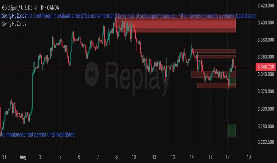
Auction S/D Zones (Pivot + Volume + ATR) - S9Trader
Short Summary
Plots high-probability Supply & Demand zones from confirmed pivots, validated by volume and an ATR-impulse filter. Highlights the first retest, supports optional invalidation, and includes touch alerts. Works on any symbol and timeframe.
Script Description
What it does
Detects swing highs/lows (confirmed pivots) and draws Supply (red) / Demand (green) zones.
Confirms potential institutional activity with Volume > SMA × multiplier.
Requires an impulse move at the pivot (range ≥ ATR × multiplier) to avoid weak swings.
Extends zones to the right, highlights the first touch, and can invalidate zones on clean breaks.
Provides alerts when price touches an active zone.
Principles (why it works)
Auction Market Theory: Markets rotate between balance and imbalance; sharp moves often mark “unfair” highs/lows that react on retest.
Supply/Demand Mapping: Swing highs tend to act as Supply on revisit; swing lows as Demand.
Volume Confirmation: Above-average pivot volume suggests non-retail participation.
ATR Impulse: Prioritizes pivots formed by meaningful range expansion, not noise.
How it works (logic)
Pivot detection: ta.pivothigh/low(leftBars, rightBars) confirms a swing after rightBars candles.
Zone construction: Supply = top at pivot high, bottom at max(open, close). Demand = bottom at pivot low, top at min(open, close). Optional minimum % height filter.
Filters: Volume > SMA(Volume, volLen) × volMult AND true range ≥ ATR × impATRmult.
Management: Keeps up to maxZones per side; highlights first retest; invalidates on decisive close through the far edge.
Alerts: Triggers when the current bar intersects any active zone.
Inputs (recommended starting points)
Pivot Left/Right Bars (5/5): Higher = stronger, fewer zones. Intraday: 3–6; Swing: 8–12.
Volume SMA Length (20) & High-Volume Multiplier (1.5–2.0): Higher = stricter.
ATR Length (14) & Impulse Multiplier (1.0–1.5): Higher = stricter.
Min Zone Height % (0.05–0.15%): Skip micro-zones.
Max Zones / Side (5–15): Reduce clutter & stay within object limits.
Invalidate on Break: Remove “proven wrong” zones.
Highlight First Touch: Emphasize the first interaction.
Extend Left: Optional historical context.
How to use (playbook)
Start with context: Identify the higher-timeframe trend/structure.
Prioritize first touch: Reactions are typically strongest on the first revisit.
Seek confluence: Favor zones aligned with trend or near HTF levels, VWAP/MA confluence, or round numbers.
Risk: Place stops just beyond the zone; size so a clean break is tolerable.
Targets: Mid-range, opposite side of the session’s rotation, or next HTF level; trail if momentum persists.
Alerts available
Supply Zone Touch
Demand Zone Touch
Notes & limitations
Pivots confirm only after rightBars candles; zones appear at the confirmed pivot (no instant hindsight).
Order flow/footprint is not available in Pine; bar volume is used as a proxy.
Drawing objects are limited by TradingView; keep maxZones modest on long histories.
Indicator only (not a strategy); backtesting requires a separate strategy script.
Changelog
v1.0.0 — Initial release: pivots + volume + ATR impulse, first-touch highlight, invalidation, alerts, zone caps.
Disclaimer
For educational purposes only. Not financial advice. Trading involves risk—do your own research and manage risk.
Auction S/D Zones (Pivot + Volume + ATR) -S9TraderShort Summary
Plots high-probability Supply & Demand zones from confirmed pivots, validated by volume and an ATR-impulse filter. Highlights the first retest, supports optional invalidation, and includes touch alerts. Works on any symbol and timeframe.
Script Description
What it does
* Detects swing highs/lows (confirmed pivots) and draws Supply (red) / Demand (green) zones.
* Confirms potential institutional activity with Volume > SMA × multiplier.
* Requires an impulse move at the pivot (range ≥ ATR × multiplier) to avoid weak swings.
* Extends zones to the right, highlights the first touch, and can invalidate zones on clean breaks.
* Provides alerts when price touches an active zone.
Principles (why it works)
* Auction Market Theory: Markets rotate between balance and imbalance; sharp moves often mark “unfair” highs/lows that react on retest.
* Supply/Demand Mapping: Swing highs tend to act as Supply on revisit; swing lows as Demand.
* Volume Confirmation: Above-average pivot volume suggests non-retail participation.
* ATR Impulse: Prioritizes pivots formed by meaningful range expansion, not noise.
How it works (logic)
* Pivot detection: `ta.pivothigh/low(leftBars, rightBars)` confirms a swing after rightBars candles.
* Zone construction: Supply = top at pivot high, bottom at max(open, close). Demand = bottom at pivot low, top at min(open, close). Optional minimum % height filter.
* Filters: `Volume > SMA(Volume, volLen) × volMult` AND `true range ≥ ATR × impATRmult`.
* Management: Keeps up to maxZones per side; highlights first retest; invalidates on decisive close through the far edge.
* Alerts: Triggers when the current bar intersects any active zone.
Inputs (recommended starting points)
* Pivot Left/Right Bars (5/5): Higher = stronger, fewer zones. Intraday: 3–6; Swing: 8–12.
* Volume SMA Length (20) & High-Volume Multiplier (1.5–2.0): Higher = stricter.
* ATR Length (14) & Impulse Multiplier (1.0–1.5): Higher = stricter.
* Min Zone Height % (0.05–0.15%): Skip micro-zones.
* Max Zones / Side (5–15): Reduce clutter & stay within object limits.
* Invalidate on Break: Remove “proven wrong” zones.
* Highlight First Touch: Emphasize the first interaction.
* Extend Left: Optional historical context.
How to use (playbook)
* Start with context: Identify the higher-timeframe trend/structure.
* Prioritize first touch: Reactions are typically strongest on the first revisit.
* Seek confluence: Favor zones aligned with trend or near HTF levels, VWAP/MA confluence, or round numbers.
* Risk: Place stops just beyond the zone; size so a clean break is tolerable.
* Targets: Mid-range, opposite side of the session’s rotation, or next HTF level; trail if momentum persists.
Alerts available
* Supply Zone Touch
* Demand Zone Touch
Notes & limitations
* Pivots confirm only after rightBars candles; zones appear at the confirmed pivot (no instant hindsight).
* Order flow/footprint is not available in Pine; bar volume is used as a proxy.
* Drawing objects are limited by TradingView; keep maxZones modest on long histories.
* Indicator only (not a strategy); backtesting requires a separate strategy script.
Changelog
* v1.0.0 — Initial release: pivots + volume + ATR impulse, first-touch highlight, invalidation, alerts, zone caps.
Disclaimer
For educational purposes only. Not financial advice. Trading involves risk—do your own research and manage risk.

Dynamic S/R Zones Pro [By TraderMan]Dynamic S/R Zones Pro
Short pitch:
Dynamic S/R Zones Pro automatically maps support and resistance levels using pivot highs/lows and draws surrounding zones. It displays lines, labels and a table — making it fast to spot relevant price areas on your chart. 📊✨
🔎 What does this indicator do?
Detects pivot highs/lows and converts them into dynamic S/R levels.
Draws a zone around each level (upper & lower bands) so you can see the interaction area. 🟢🔴
Counts how often each level was tested and writes that “strength” in the table — so you can prioritize levels.
Fully configurable colors, line styles, zone width and table display. 🎛️
Note: Pivot-based S/R is a widely used, objective way to map price levels — see pivot basics.
Investopedia
⚙️ How it works (technical)
Uses pivotRange = 10 to search for highs/lows inside that window.
Looks back analysisPeriod (284 in your script) and selects meaningful pivots; filters by strengthSR threshold.
channelPercent and zonePercent define band thickness (zone), with zoneWidthPercent applied over the last 300 bars.
Strength = number of times price tested that band; used for filtering and the table.
High/Low Zones option draws wide reference bands around the period’s highest/lowest pivots.
(Pivot logic here is pivot-based SR mapping — not classical static pivot formulas, but the same principle of marking widely watched price levels.)
Investopedia
🛠️ How to use (step-by-step)
Enable SR: toggle S/R drawing on/off.
Strength (strengthSR): increase to show only well-tested levels, decrease to show more levels.
Line Style / Width: readability and aesthetics.
Show Zones / Zone Width %: enable zones and set width (e.g. 2% of recent range).
Show High/Low Zones: draw wide reference zones for the highest/lowest pivots.
Extend SR: extend lines across the chart (past/future) for clarity.
Show Table: display levels, zone boundaries and strength in the top-right table. 📋
🎯 Trade entry ideas (examples)
Not financial advice — examples of how traders commonly use S/R zones.
1) Bounce Long (support zone buy)
Condition: Price arrives at a support zone and shows a bullish confirmation candle (e.g., hammer, bullish engulfing).
Extra confirmation: oversold RSI or supportive volume.
Entry: on confirmed candle close (market or limit).
SL: slightly below the zone’s lower band.
TP: next resistance or target R:R ≥ 1:2. (Retest confirmations reduce false-breakout risk.)
fxopen.com
Investopedia
2) Breakout Long
Condition: Price breaks resistance with increased volume.
Tactic: wait for a retest of the broken resistance (now support). Enter on confirmation.
SL: below the retest low or zone lower band.
TP: next zone / predetermined R:R target. Breakouts need volume/retest confirmation to avoid fakeouts.
Investopedia
fxopen.com
3) Scalp
Use narrower zones, smaller TF, very tight SL and smaller R:R (e.g., 1:1), account for spreads/fees.
🛡️ Risk management
Don’t risk too much per trade — follow a fixed % (e.g., 1–2% max).
cmegroup.com
Plan SL & TP before entry; avoid emotional adjustments.
Investopedia
Calculate risk/reward; aim for a favorable R:R and backtest your rules.
CenterPoint Securities
✔️ Practical tips
Filter by strength to remove noisy levels.
Timeframe matters: higher TF = stronger levels.
Combine with other indicators (volume, RSI, MAs) for better confirmation.
Backtest the script and your entry rules before deploying live.
Quick summary: Dynamic S/R Zones Pro is a pivot-based S/R & zone mapper that highlights strong levels and helps you trade bounces, breakouts and retests — but always use SL/TP and solid risk management.
Investopedia
+2
Investopedia
+2
fxopen.com
Disclaimer: Not financial advice. Trading involves risk. 🔒

Quantum Delta Zones with EnhancementsQuantum Delta Zones (QDZ)
Short Title: QDZ
Overview
The Quantum Delta Zones (QDZ) is a unique technical indicator designed to highlight high-probability order block zones in the market based on a combination of Delta Sensitivity, order block tightness, and volume-based filters.
This indicator helps traders to identify key support and resistance levels (bullish and bearish order blocks) that are backed by strong volume and optimal market structure. It employs advanced zone detection and automatic zone management (box creation and deletion) to enhance trade analysis.
The primary objective of QDZ is to provide clear, visually appealing support/resistance zones while factoring in market order flow dynamics, ensuring that you are trading at optimal levels with confirmed volume behind it.
Key Features
Delta Sensitivity: The indicator uses a body-to-range ratio to assess the "delta" between the body and wick of each candlestick, helping to identify strong order block formations based on market sentiment.
Order Block Tightness: A filter is used to detect small, tight order blocks where price action shows accumulation (small body candles) near high-probability levels.
Projection Distance: The ability to project the detected order block zones into the future, providing an idea of where price might react based on historical price action.
Fade Strength: Allows you to adjust the transparency of the projected zones, giving you visual flexibility depending on how prominent you want these order blocks to appear.
Volume Filter: A high-volume filter ensures that only zones with substantial volume (based on a moving average) are considered for box creation, preventing false signals and low-probability trades.
Auto Box Deletion: When the market invalidates a zone (price moves beyond the zone’s projected area), the boxes are automatically deleted to keep the chart clean.
Alerts: Built-in alerts for when a bullish or bearish order block is detected, providing real-time notifications of significant potential trading opportunities.
How it Works
Step-by-Step Explanation:
Delta Sensitivity:
A candlestick is considered "Bullish" if the closing price is above the opening price and the body-to-range ratio is above the user-defined delta Sensitivity.
A candlestick is considered "Bearish" if the closing price is below the opening price with the same body-to-range ratio criteria.
Order Block Tightness:
The indicator looks for tight order blocks, where the body-to-range ratio is below the orderBlock Tightness setting, indicating small candles that may represent accumulation or distribution zones.
Volume Filter:
The indicator applies a filter to check if the volume is above the 50-period simple moving average (SMA) and multiplied by the user-defined volume Multiplier. Only zones with sufficient volume are considered.
Box Creation:
Once a valid order block is detected, the corresponding bullish or bearish box is drawn on the chart. These boxes extend forward by the number of bars specified by projection Bars.
Box Deletion:
If the price moves against the order block (for example, if a bullish box is invalidated when the price closes below its bottom), the box is automatically deleted to keep your chart uncluttered.
Alert System:
Alerts can be set for both bullish and bearish order block detection, notifying traders of the formation of a potential market opportunity.
Inputs / Settings
Delta Sensitivity: The ratio between the candlestick body and its range. Higher values mean stronger bullish/bearish pressure is required to trigger the order block detection.
Order Block Tightness: Defines how tight or small an order block should be to qualify for detection. Smaller values are more sensitive to smaller candlesticks.
Projection Distance: The number of bars into the future that the identified order block should be projected. Useful for seeing potential future support/resistance zones.
Fade Strength: Defines the transparency level of the order block boxes. Higher values result in more transparent boxes, lower values make the boxes more opaque.
Auto Delete: Automatically deletes order blocks if they are invalidated by price action.
Volume Filter: When enabled, only order blocks formed with higher-than-average volume will be considered. This helps eliminate low-probability signals.
Volume Multiplier: Multiplies the average volume by this factor to determine whether the current volume qualifies as "high" for an order block detection.
Visuals
Bullish Order Block: A green box is drawn when a bullish order block is detected. The box is projected forward based on the projection Bars setting.
Bearish Order Block: A red box is drawn when a bearish order block is detected. Similar to the bullish box, it is projected forward.
Fading: Both bullish and bearish boxes fade based on the fade Strength, making the most recent zones more visible while fading out older, less relevant zones.
How to Use in Trading
Bullish Order Block:
A bullish order block is a potential buy area. Once price retraces to the bottom of a detected bullish box, traders may consider it a buy zone, especially if it aligns with other technical factors (e.g., support, trend).
Bearish Order Block:
A bearish order block is a potential sell area. Once price retraces to the top of a detected bearish box, traders may consider it a sell zone, particularly in downtrends or near resistance.
Risk Management:
The projection Bars setting helps to set a clear projection distance. Traders should use their own risk management strategies, such as stop-loss placements below/above the order block zones, and take-profit levels based on market conditions.
Volume Confirmation:
The Volume Filter can be very useful for confirming order blocks. Trading only when an order block is accompanied by high volume ensures the zone has institutional or market-maker backing.
Box Deletion:
The Auto Delete feature automatically removes invalidated zones, keeping the chart clean and preventing you from trading out-of-date or broken levels.
Trading Strategy Example
Bullish Setup:
Look for a bullish order block (green box) formed after price has been trending down and volume is high.
Wait for price to retrace back into the order block zone.
Enter long at the bottom of the order block when price shows signs of support (e.g., bullish candlestick pattern).
Set stop-loss below the bottom of the order block and a take-profit target at a significant resistance level.
Bearish Setup:
Look for a bearish order block (red box) formed after price has been trending up and volume is high.
Wait for price to retrace back into the order block zone.
Enter short at the top of the order block when price shows signs of resistance (e.g., bearish candlestick pattern).
Set stop-loss above the top of the order block and a take-profit target at a significant support level.
Limitations
The QDZ indicator is based on historical price action, and while it is designed to identify areas of strong market participation, it does not guarantee future price behavior.
Traders should always combine this indicator with other technical analysis tools, such as trend analysis, oscillators, or fundamental factors, to improve their decision-making process.
Conclusion
The Quantum Delta Zones (QDZ) indicator is a powerful tool for traders looking to pinpoint high-probability order blocks that are backed by volume and strong market dynamics.
It integrates well with existing trading strategies by providing clear, actionable zones of support and resistance, while also offering advanced features like fade strength, auto-deletion, and volume filters.
Whether you're trading intraday or longer-term, this tool can be an essential part of your trading toolbox.
This is an educational idea, trade at your own desecration.
Regards.

Bunker Zone ProtectionBunker Zone Protection (BZP) Indicator Description:
The Bunker Zone Protection (BZP) is a dynamic protection zone indicator designed for traders who want to identify key areas of support and resistance based on price action and the exponential moving average (EMA). This indicator highlights zones where prices are likely to reverse, find support, or meet resistance, depending on the relationship between the current price and the EMA.
Key Features:
Dynamic Protection Zones:
The BZP identifies protection zones based on market trend dynamics. It calculates upper and lower bands of protection using market highs and lows, adjusting these levels according to the prevailing trend.
Exponential Moving Average (EMA):
A customizable EMA is used to filter the market's current trend. If the price is above the EMA, it highlights support zones (demand), while if the price is below the EMA, resistance zones (supply) are displayed.
Visual Zone Highlighting:
The protection zones are visually represented on the chart, with customizable colors for upper (resistance) and lower (support) zones, making it easy to quickly assess market behavior.
Customization Options:
Configurable EMA length to fit different trading styles (short-term, medium-term).
A toggle option to easily enable or disable zone highlighting.
Adjustable colors and styles to match your preferred chart aesthetics.
How to Use:
Trade Reversals: Use the BZP to identify areas where price may potentially reverse. When the price approaches the upper or lower bounds of the protection zone, it could signal an imminent reversal.
Filter Out False Signals: The Bunker Zone Protection uses an EMA to filter the trend, helping to eliminate false signals and focus on significant market zones.
Parameters:
Range Input: Determines the price source for calculations (default: close price).
EMA Length: Defines the length of the EMA used to filter trends (default: 30).
Zone Toggle: Allows you to enable or disable the visual display of protection zones.
The BZP is a powerful tool for any trader looking to enhance decision-making based on strategic price zones, making it easier to read market trends and identify potential reversal points
Reversal Zones with SignalsThe "Reversal Zones with Signals" indicator is an advanced technical analysis tool designed to help traders identify potential market reversal points. By integrating Relative Strength Index (RSI), moving averages, and swing high/low detection, this indicator provides traders with clear visual cues for potential buy and sell opportunities.
Key Features and Benefits
Integration of Multiple Technical Analysis Tools:
The indicator seamlessly combines RSI, moving averages, and swing high/low detection. This multi-faceted approach enhances the reliability of the signals by confirming potential reversals through different technical analysis perspectives.
Customizable Parameters:
Users can adjust the sensitivity of the moving averages, the RSI overbought and oversold levels, and the length of the reversal zones. This flexibility allows traders to tailor the indicator to fit their specific trading strategies and market conditions.
Clear Visual Signals:
Buy and sell signals are plotted directly on the chart as easily recognizable green and red labels. This visual clarity simplifies the process of identifying potential entry and exit points, enabling traders to act quickly and decisively.
Reversal Zones:
The indicator plots reversal zones based on swing highs and lows in conjunction with RSI conditions. Green lines represent potential support levels (zone bottoms), while red lines represent potential resistance levels (zone tops). These zones provide traders with clear areas where price reversals are likely to occur.
Automated Alerts:
Custom alerts can be set for both buy and sell signals, providing real-time notifications when potential trading opportunities arise. This feature ensures that traders do not miss critical market moves.
How It Works
RSI Calculation:
The Relative Strength Index (RSI) is calculated to determine overbought and oversold conditions. When RSI exceeds the overbought threshold, it indicates that the market may be overbought, and when it falls below the oversold threshold, it indicates that the market may be oversold. This helps in identifying potential reversal points.
Swing High/Low Detection:
Swing highs and lows are detected using a specified lookback period. These points represent significant price levels where reversals are likely to occur. Swing highs are detected using the ta.pivothigh function, and swing lows are detected using the ta.pivotlow function.
Reversal Zones:
Reversal zones are defined by plotting lines at swing high and low levels when RSI conditions are met. These zones serve as visual cues for potential support and resistance areas, providing a structured framework for identifying reversal points.
Buy and Sell Signals:
Buy signals are generated when the price crosses above a defined reversal zone bottom, indicating a potential upward reversal. Sell signals are generated when the price crosses below a defined reversal zone top, indicating a potential downward reversal. These signals are further confirmed by the presence of bullish or bearish engulfing patterns.
Plotting and Alerts:
The indicator plots buy and sell signals directly on the chart with corresponding labels. Additionally, alerts can be set up to notify the user when a signal is generated, ensuring timely action.
Originality and Usefulness
Innovative Integration of Technical Tools:
The "Reversal Zones with Signals" indicator uniquely combines multiple technical analysis tools into a single, cohesive indicator. This integration provides a comprehensive view of market conditions, enhancing the accuracy of the signals and offering a robust tool for traders.
Enhanced Trading Decisions:
By providing clear and actionable signals, the indicator helps traders make better-informed decisions. The visualization of reversal zones and the integration of RSI and moving averages ensure that traders have a solid framework for identifying potential reversals.
Flexibility and Customization:
The customizable parameters allow traders to adapt the indicator to different trading styles and market conditions. This flexibility ensures that the indicator can be used effectively by a wide range of traders, from beginners to advanced professionals.
Clear and User-Friendly Interface:
The indicator's design prioritizes ease of use, with clear visual signals and intuitive settings. This user-friendly approach makes it accessible to traders of all experience levels.
Real-Time Alerts:
The ability to set up custom alerts ensures that traders are notified of potential trading opportunities as they arise, helping them to act quickly and efficiently.
Versatility Across Markets:
The indicator is suitable for use in various financial markets, including stocks, forex, and cryptocurrencies. Its adaptability across different asset classes makes it a valuable addition to any trader's toolkit.
How to Use
Adding the Indicator:
Add the "Reversal Zones with Signals" indicator to your chart.
Adjust the parameters (Sensitivity, RSI OverBought Value, RSI OverSold Value, Zone Length) to match your trading strategy and market conditions.
Interpreting Signals:
Buy Signal: A green "BUY" label appears below a bar, indicating a potential buying opportunity based on the detected reversal zone and price action.
Sell Signal: A red "SELL" label appears above a bar, indicating a potential selling opportunity based on the detected reversal zone and price action.
Setting Alerts:
Set alerts for buy and sell signals to receive notifications when potential trading opportunities arise. This ensures timely action and helps traders stay informed about critical market moves.

Omega AnalystThe Omega Analyst is a toolkit designed to help both experienced and new traders with their trading decisions.
This indicator is a part of the omega toolkit, and his creation method is based on the concept that every trading strategy should have a way to determine the trend, or the bias, that answers the question “long or short?”; the location, which identifies the best price level to enter into a position and to exit, both in profit and in loss, and that will decide the final risk-to-reward ratio of the trade you take; the signal, which is useful to determine the best moment to enter into a position and that if paired with the trend point, his purpose is to identify when the large trend picture is in confluence with the small term; and last but not least the filter point, the filter is used to have another way to have an additional confluence with the trade you want to take, and it’s important to reduce the number of false signals and to increase the win rate.
This tool aims to help traders with the identification of the location points, thanks to different technical analysis tools that allow determining objectively if the price is in a discount area or in a premium area, to evaluate both entry and exit points. It’s important to note that indicator and technical analysis is only one of the several different ways to analyze an asset.
One of the main things to keep in mind when working with the financial markets is that not every asset, every historical phase, and every market condition is the same, this is why this tool can be highly personalized and adjustable and provide different overlay tools in order to allow traders to choose the best settings considering this variable and your backtests.
This tool, thanks to the previously cited characteristics, can work on any market and any horizontal time frame, and it has different features:
- 7 different tools of technical analysis to analyze the market, some of them with multiple variants.
- An additional tool to display the open price of different sessions
- Easy setup: You can easily choose which indicator to display in order to analyze the markets the best.
- Easy to use and easy to adjust: common settings for all the indicators are easily configurable in the settings with the length or the size parameter. Note that not all the indicators use both parameters, in particular: the indicator mode works for the consolidation levels, the range of motion, the sr zones, and the regression line; the continuous length parameter changes the settings to the consolidation levels, the range of motion, the sr zones, the Fibonacci area, and the regression line; the interval size parameter change the anchor to the volume price, the pivot points and the range of motion.
- Common aesthetics: You can easily change the default premium, discount, and average color in order to have the best view of the indicators together with the line width, or choose to have the monochrome setting to have a more minimalistic style.
- Common usage: Every one of these uses has the same functionality: determine if the price is the fair value, in a premium situation, or in the discount area.
- Automatic settings: The indicator can be used in “Auto” mode if it works with resets like the range of motion interval, the VWAP, the pivot points, and the open prices. This way the indicator will automatically adjust itself to show the optimal results for the analysis you want to make on your chosen timeframe.
The first tool is called Consolidation levels, and it’s a great tool to use during ranging markets.
The consolidation levels are support and resistance levels and zones automatically displayed on the chart to identify the range of bargaining, that adapts considering the price volatility and automatically moves once the price has broken the extreme levels.
This tool has two variants. The fixed variants have, just like the name says, all fixed levels that stay the same until the price doesn’t break one of them.
The Adaptive variants of the Consolidation levels tool have a unique feature that makes the support and resistance zones move considering the price volatility and standard deviation.
The second tool is called “Range of Motion” and it comes in two different versions, called “Continuous” and “Interval”. The difference is just that the “Interval” version stays the same for the whole duration of the interval length you choose.
The range of motion indicator allows the user to see the level that works like support and resistance and the area that works like premium and discount areas. The levels are calculated using the ATR indicator on the mean center line.
On the fixed variant of the range of motion indicator, these levels, once plotted, stay the same until the end of the chosen time frame in the interval size setting to plot the indicator. This way it’s easier to adopt a kind of analysis that uses passive orders like limit buy and limit sell orders. The interval range of motion indicator works like fixed extension levels that display the optimal range of bargaining of that specific asset.
The third tool is the Support and Resistance zones. With this tool, you'll see automatic support and resistance based on past prices and pivot data.
The area and the least efficient levels can be disabled using the "Interval" indicator mode.
The color area automatically changes looking at the effective support or resistance purpose of that area. The area also changes with the "Continuous length" parameter.
The fourth tool is the Fibonacci zones, which display the area of discount and premium pricing using the quartile theory, showing the 25% and the 75% of the current swings as area and the golden zone as a standard line, that includes the space between the 61.8% and the 38.2%, with the 50% line in the middle. This tool works like a Donchian Channel but it shows areas instead of simple lines. The usage of this indicator is both for trend following and for mean reversal, the general definition is that it shows attention zones.
Now in the photo, you can see the fifth tool which is the Anchored VWAP, under the name of "Volume Price". The Volume-weighted average price is a powerful indicator that aims to give the average price of a determined time period and can be used, combined with the standard deviation, to find not only support and resistance levels but also the volume-objective premium and discount zone.
This specific indicator displays 5 lines: the VWAP, the first upper and lower deviation, and the first and second upper deviation lines, that create the previously mentioned zone.
The sixth tool is the Pivot Points standard. This tool is a popular indicator that displays key levels for a determined period of time.
The levels for each interval time are five different lines. The middle one, colored by default in gray, should be the prediction, based on the key price levels of the previous period chosen, of the fair value. The other one, called S1 and R1 are respectively the first level of support and resistance and are great if used as exit points and when combined with other S/R tools, the same is valid for the S2 and R2 levels, on the extreme part of the indicator.
Between the R1 and the R2, and between the S1 and S2 lines there are the previously mentioned Discount and Premium zones.
The seventh tool is the Regression Line. This indicator will show the deviation bands from the standard regression line. Given the fact that the usual linear regression channels available are repainting, and so they don't give realistic outcomes, this tool will give you past results based on the data of the channel in that price moment, being non-repainting. This tool also has an extension that aims to be a prediction about future outcomes in terms of volatility and direction of the price, and this extension can be disabled using the "Continuous" mode.
Just like other tools in this indicator, the linear regression channel will display the middle line and the two premium and discount zones.
The last tool of the Omega Analyst is the open prices.
With this simple-to-read tool, you will see plotted as dotted lines the open prices of the period you have chosen.
The open prices are common support and resistance level and can be used both for entry and exit points. Additionally, on higher timeframes, such as the open prices of the different months, these levels can be further extended to the recent days to have more support and resistance levels.
This tool needs to be adjusted based on your time zone in order to have the best results and can be done directly in the settings of the indicator under the Open prices section, just simply write down at what time it’s midnight in your country watching the desired hour on the chart.
In order to determine the premium or discount area with this tool, you’ll need to pay attention if the current open price indicator is higher or lower than the previous one plotted, if it’s higher you can assume that the price is in an up trend and this way the zone under the current dotted line is the discount zone.
The lines you’ll see plotted are either in the chosen discount or premium color, based if the price is above or below the current open prices indicator plotted.
Risk Disclaimer:
All content and scripts provided are purely for informational & educational purposes only and do not constitute financial advice or a solicitation to buy or sell any securities of any type. Past performance does not guarantee future results. Trading can lead to a loss of the invested capital in the financial markets. I will not accept liability for any loss or damage, including without limitation any loss of profit, which may arise directly or indirectly from the use of or reliance on such information. All investments involve risk, and the past performance of a security, industry, sector, market, financial product, trading strategy, backtest, or individual's trading does not guarantee future results or returns. Investors are fully responsible for any investment decisions they make. Such decisions should be based solely on an evaluation of their financial circumstances, investment objectives, risk tolerance, and liquidity needs.
