WaveTrend 4h/24mWaveTrend 4h/24m is a trading tool based on two WaveTrend timeframes.
For this script the WaveTrend calculations made by LazyBear were used. WaveTrend is a widely used indicator for finding direction of an asset.
The strategy is developed by Youtuber Jayson Casper. The main strategy on the 4 hour and 24 minute timeframes, this will be the default timeframes. Timeframes can be adjusted in the indicator interface.
With Jaysons' we wait for both timeframes to have last printed a green dot for longs, and both timeframes to have last printed a red dot for shorts. When this occurs a green diamond will be printed for longs, a red diamond for shorts.
Make sure to always use the chart from the smallest timeframe you're using, so by defaults use the 24 minute chart.
Features of the indicator:
- WaveTrend Timeframe 1 (Blue/Lightblue wave).
- WaveTrend Timeframe 2 (Blue/Purple line with filled background between the lines).
- VWAP (Yellow wave which is turned off by default)
- Green/Red Diamonds
What to look for?
This script is all about the Green and Red Diamonds.
A Green diamond will be printed when on both the 4 hour and 24 minute timeframe the last printed dot was a green dot.
A Red diamond will be printed when on both the 4 hour and 24 minute timeframe the last printed dot was a red dot.
What are the Green and Red Diamonds based on?
When both VWAP timeframes are ABOVE 0, a green diamond will be printed. This is equivalent to the last dot on both WaveTrend timeframes being a green dot.
When both VWAP timeframes are BELOW 0, a red diamond will be printed. This is equivalent to the last dot on both WaveTrend timeframes being a red dot.
Happy Trading!
Komut dosyalarını "vwap" için ara

PROFIT INDICATORFirst let me tell you which indicators have been used in this script so that you have the confidence while taking the trade:
(a) Bollinger Band with 20 SMA Inside it - Currently it is off, you can turn it on from settings.
(b) HMA 33, I have added the option of using two HMA's simultaneously. You can use HMA, EMA, SMA as per your settings and it would be color trending.
(c) VWAP- you can turn it on from settings
(d) CPR- you can turn it on from settings
(e) EMA's 20, 50, 200. Currently off, you can turn it on from settings.
(d) SMA's 50 and 200. Currently off, yu can turn it on from settings, if you want to use 20 SMA you can use bollinger band basis that is 20 period SMA.
(f) Trend bar at bottom on the basis of 50 EMA.
(g) Half Trend
(h) Trend strength Detector
(d) EMA 50 high and low to show the pac channel. I am not using this however as per request I have added this. Currently, it is trun on and you can turn it off from settings.
(f) Auto Fib levels
Please use a stick note for few days and mention imp notes before taking trade to check if all the conditions are matching to take the trade.
Buy Condition:-
1. Bolling band should be widely open.
2. Check the support and resistance from CPR. Candle should close above support in green.
3. Check the trend bar at bottom, it should be green, if it is grey in colour dont enter in trade.
4. Candle should be closing above EMA 50 and its upto you if you need additional confirmation, you can use EMA 20, 50, 200 and SMA 50 and 200, this is optional.
5. You can use VWAP as support or resistance and you can turn it on from settings.
6. Trending HMA of 33 should be in green for buy.
7. Half trend Indicator should give buy signal.
8. Trend Strength Indicator for checking the strength of the trend, if the arrow is big upside, you can go for buy.
9. Exit from buy trade when it start showing very small arrow which means trend is about to change.
10.Exit buy trade at 61.8 Fib level
Sell Condition:-
1. Bolling band should be widely open.
2. Check the support and resistance from CPR. Candle should close below resistance in red.
3. Check the trend bar at bottom, it should be red, if it is grey in colour dont enter in trade.
4. Candle should be closing below EMA 50 and its upto you if you need additional confirmation, you can use EMA 20, 50, 200 and SMA 50 and 200, this is optional.
5. You can use VWAP as support or resistance and you can turn it on from settings.
6. Trending HMA of 33 should be in red for sell.
7. Half trend Indicator should give sell signal.
8. Trend Strength Indicator for checking the strength of the trend, if the arrow is big downside, you can go for sell.
9. Exit from sell trade when down arrows start showing very small in size which means trend is about to change.
10.Exit sell trade at 61.8 Fib level

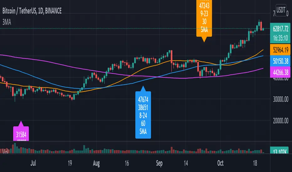
Pulu's 3 Moving Averages
Pulu's 3 Moving Averages
Release version 1, date 2021-09-28
This script allows you to customize three sets of moving averages, turn on/off, set color and parameters. It also tags the start date of the last set of moving average if there is. This, release version 1, supports eight moving average algorithms:
ALMA, Arnaud Legoux Moving Average
EMA, Exponential Moving Average
RMA, Adjusted exponential moving average (aka Wilder’s EMA)
SMA, Simple Moving Average
SWMA, Symmetrically-Weighted Moving Average
VWAP, Volume-Weighted Average Price
VWMA, Volume-Weighted Moving Average
WMA, Weighted Moving Average
The availability and function parameters
Func. Availability Parameters
ALMA
MA1, MA2, MA3
source
length
offset
sigma
EMA
RMA
SMA
VWMA
WMA
MA1, MA2, MA3
source
length
SWMA
VWAP
MA1
source
Parameters
Parameter Description
source the series of values to process. The default is to use the closing price to calculate the moving average.
length an integer value that defines the number of bars to calculate the moving average on. The SWMA and VWAP do not use this parameter.
ALMA offset a floating-point value that controls the tradeoff between smoothness (with a value closer to 1) and responsiveness (with a value closer to 0). This parameter is only used by ALMA.
ALMA sigma a floating-point value that specifies the ALMA’s smoothness. The larger this value, the smoother the moving average is. This parameter is only used by ALMA.
I'm not sure if it is needed, so I do not let the three Moving Averages of the script to have indivial algorithm setting. Because that will involve much complicated condition testing and use up more TradingView script lines limit. If you need to combine different algorithms in the three sets of moving averages, or have other ideas, leave a message to let me know; maybe I will try it in the next update.
我不確定是否需要,所以我沒有讓腳本的三組移動平均線有各別的算法設置。因為這將涉及更多複雜的條件測試,並使用更多 TradingView 腳本列數限制。如果您需要在三組均線中組合不同的算法,或者有其他想法,請留言告訴我;也許我會在下一次更新中嘗試。
Exponential moving averages Convergence to identify Strength of Exponential moving averages Convergence to identify Strength of the stock.
Description:
This script is developed to find Convergences for many indicators. It analyses Convergences of 20days, 50days, 100days, 150days and 200days exponential moving averages. When all the plotted lines are converged and Price of stock is above the Convergence the stock is bullish, similarly if the price of the stock is below the convergence stock is bearish.
This indicator gives you VWAP and EMA’s for convergence along with Bollinger Bands.
VWAP and Bollinger bands and EMA’s can be altered as you required.
In settings menu we can enable and disable VWAP, EMA’S & Bollinger bands and in style menu even we can choose required EMA
It helps for convergence.

TWAP TrendHere we are experimenting with using TWAP for trend analysis. It appears to work better than VWAP on lower timeframes.
TWAP is a tool used by algorithm based traders that allows them to distribute their orders throughout the day without disturbing price or having their positions known to rival traders in the market. It's similar to VWAP and serves the same function, except it lacks the volume aspect. This can be an issue when position entry/exit may be affected by slippage.
The main benefit of TWAP is deciding how to distribute orders throughout the chosen timeframe. However, just like the VWAP traders will normally use it as a moving average or target for price action to pull into.
There is an option to change the timeframe that TWAP is calculated from.
Originally by NeoButane:

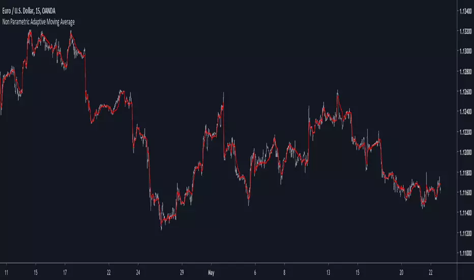
Non Parametric Adaptive Moving AverageIntroduction
Not be confused with non-parametric statistics, i define a "non-parametric" indicator as an indicator who does not have any parameter input. Such indicators can be useful since they don't need to go through parameter optimization. I present here a non parametric adaptive moving average based on exponential averaging using a modified ratio of open-close to high-low range indicator as smoothing variable.
The Indicator
The ratio of open-close to high-low range is a measurement involving calculating the ratio between the absolute close/open price difference and the range (high - low) , now the relationship between high/low and open/close price has been studied in econometrics for some time but there are no reason that the ohlc range ratio may be an indicator of volatility, however we can make the hypothesis that trending markets contain less indecision than ranging market and that indecision is measured by the high/low movements, this is an idea that i've heard various time.
Since the range is always greater than the absolute close/open difference we have a scaled smoothing variable in a range of 0/1, this allow to perform exponential averaging. The ratio of open-close to high-low range is calculated using the vwap of the close/high/low/open price in order to increase the smoothing effect. The vwap tend to smooth more with low time frames than higher ones, since the indicator use vwap for the calculation of its smoothing variable, smoothing may differ depending on the time frame you are in.
1 minute tf
1 hour tf
Conclusion
Making non parametric indicators is quite efficient, but they wont necessarily outperform classical parametric indicators. I also presented a modified version of the ratio of open-close to high-low range who can provide a smoothing variable for exponential averaging. I hope the indicator can help you in any way.
Thanks for reading !
Relative Directional Index (RDI)🔍 Overview
The Relative Directional Index (RDI) is a hybrid tool that fuses the Average Directional and the Relative Strength Indices (ADX and RSI) into a single, highly visual interface. While the former captures trend strength, the latter reveals momentum shifts and potential exhaustion. Together, they can confirm trend structure, anticipate reversals, and sharpen the timing entries and exits.
📌 Why Combine ADX with RSI?
Most indicators focus on either trend-following (like ADX) or momentum detection (like RSI)—but rarely both. Each comes with trade-offs:
- ADX alone confirms trend strength but ignores momentum.
- RSI alone signals overbought/oversold, but lacks trend context.
The RDI resolves this by integrating both, offering:
- Smarter filters for trend entries
- Early warnings of momentum breakdowns
- More confident signal validation
🧠 Design Note: Fibonacci Harmony
All default values—5, 13, 21—are Fibonacci numbers. This is intentional, as these values reflect the natural rhythm of market cycles, and promote harmonic calibration between price action and indicator logic.
🔥 Key Features
✅ ADX Histogram
- Green bars = trend gaining strength
- Red bars = trend weakening
- Adjustable transparency for visual tuning
✅ ADX Line (Orange)
- Measures trend strength over time
- Rising = accelerating trend
- Falling = trend may be fading
✅ RSI Line (Lemon Yellow)
- Captures momentum surges and slowdowns
- Above 50 = bullish control
- Below 50 = bearish pressure
✅ Trend Strength Squares
- Bright green = strong uptrend
- Bright red = strong downtrend
- Faded colors = range-bound or indecisive
✅ ADX/RSI Crossover Markers
- Yellow square = RSI crosses above ADX → momentum building
- Orange square = ADX crosses above RSI → trend still dominant
✅ Customizable Reference Lines
- Yellow (50) = strong trend threshold
- Red (30) = weak trend zone
- Green (70) = overextended, potential exhaustion
_______________________________________________________
🎯 How to Trade with the RDI
The RDI helps traders identify momentum-supported trends, catch early reversals, and avoid false signals during consolidation.
✅ Trend Confirmation Entries
🔼 Bullish → Enter long on pullbacks or resistance breakouts
- ADX rising above 30
- RSI above 50
- Green trend square visible
🔽 Bearish → Enter short on breakdowns or failed retests
- ADX rising
- RSI below 50
- Red trend square visible
🧯 Exit if RSI crosses back against trend direction or ADX flattens
🚨 Reversal Setups Using Divergence
📈 Bullish Divergence → Long entry after confirmation (e.g. engulfing bar, volume spike)
- Price prints lower low
- RSI prints higher low
- Green triangle
📉 Bearish Divergence → Short entry on breakdown
- Price prints higher high
- RSI prints lower high
- Red triangle
Tip: Stronger if ADX is declining (fading trend strength)
🔂 Breakout Detection via Cross Markers
- Yellow square = RSI > ADX → breakout brewing
- Orange square = ADX > RSI → trend continuation likely
⏸️ Avoid Choppy Markets
- RSI between 45–55
- Faded trend squares
- Flat ADX below 20–30
🧠 Pro Tips
- Combine RDI with VWAPs, moving averages and/or pitchforks
- Watch for alignment between trend and momentum
- Use divergence markers as confirmation, not stand-alone triggers
_______________________________________________________
⚠️ Hidden Divergence (Optional)
The RDI includes optional hidden divergence detection. These signals suggest trend continuation but are off by default. Use with discretion—best in established trends, not sideways markets.
🙈 Hidden Bullish
- Price prints higher low
- RSI prints lower low
🙈 Hidden Bearish
- Price prints lower high
- RSI prints higher high

Supply & Demand Zones
_____________________________________________________________________
Supply and Demand Zones
This indicator displays valid Supply and Demand zones on any chart and timeframe, using dynamically updating visuals. Users can see the moment that zones become validated, used, and then invalidated during live sessions. It is sleek, lightweight, and offers a feature-rich settings panel that allows customization of how each element appears and functions. Zones can enhance the probability of successful trades by locating areas that are most likely to contain resting orders of Supply or Demand, which are needed for price reversals.
Disclaimer
____________________
Like all indicators, this can be a valuable tool when incorporated into a comprehensive, risk-based trading system.
Supply and Demand is not the same thing as Support and Resistance.
Trading based on price hitting a zone without understanding which zones are of higher quality and which are of lower quality (only discernible with a trained human eye) will yield poor results.
Supply and Demand works well as a system and even better when added to an existing one. However, like all effective trading techniques, it requires diligent study, practice, and repetition to become proficient. This is an indicator for use with Supply and Demand concepts, not a replacement for learning them.
Features
____________________
Once a valid candle sequence is confirmed, a box will appear that displays the zone over the precise zone range. At 50% zone penetration, a zone becomes used , and at 100% it becomes invalidated . Each of these zone classifications changes the behavior of the zone on the chart immediately. The settings panel offers custom colors for Supply , Demand , Used , and Invalidated zone types.
Borders : The subtle border colors can be changed or hidden.
Boxes or Bases : Advanced users can opt to hide zone boxes and instead display small, subtle tags over base candle groups. This allows for more customizable selection over what is displayed and how.
Max Zones and Hide Invalidated :
There are limitations on how many objects TradingView allows at once. Because of this, once zones go from used to invalidated , they are hidden (deleted) by default. This allows the zones index to be allocated to display more valid , usable zones instead. If a user prefers to keep invalidated zones visible, they can be enabled; however, this will result in showing more recent zones for fewer historical zones.
All zones share one pool, so if you allow fifty max zones, forty-five might be supply while five might be demand on a big sell-off trend. You will always see the most recent zones, regardless of type or status.
It’s up to you how much clutter you want on your screen and how much improved load time you want - but once loaded, zone creation and function are always instantaneous.
Load Time
____________________
Load time refers to the time it takes from when you switch tickers or timeframes before the zones are displayed initially. There is zero lag in the dynamic function and minimal load time, regardless of settings. However, if you are a fine-tuner or multi-screener, the number of Max Zones displayed is the only major variable affecting load time.
I run everything at Max when I develop. When I trade, I run mine at 25 max zones because I change timeframes often and want a very quick display of zones when I do. I have invalidated hidden, and simply enable it if I want to check an old zone. This gives me more zones than I need and reduces the load time to right where I like it.
Thresholds
____________________
It is recommended to leave these as the default.
Base Body Threshold : Determines the maximum ratio of a candle’s body to wick before invalidation. Default (50% or 0.5). A higher number loosens thresholds, resulting in more zones being displayed.
Unrequire 2nd FT if LO is Strong & Strength Multiplier :
The standard logic sequence requires two Follow-Through candles. Under some strong price movement, Leg-Out candles can make an explosive directional move from a base, making a convincing argument for supply and demand perfectly at work, if not for a single Follow-Through candle instead of two.
By enabling this feature, you can tell the script to ignore second Follow-Through candles, if and only if, the Leg-Out candle's range is (Strength) X the base range. exceeds the range of the Base by a factor of X (Strength). ie: At 5x, this would require a Leg-Out range to be 500% the range of the Base.
If enabled and the Leg-Out is not strong enough, the default logic kicks in, and a second follow-through candle will validate the zone as per usual. This loosens thresholds overall and should result in more zones.
Recommended Usage
____________________
Form a thesis using your primary trend trading system (eg: Elliott Wave, Structure Reversal, TheStrat, et al) to identify locations of a pullback for a long or short entry.
Identify a pullback area using your system, then use this indicator to find a high-quality zone on your chosen timeframe.
Once located, draw your own channel over the indicator's zone box. Start on 1m, check for zones, 2m, 3m, and so on. When you see a zone you like, recreate it; thus, when finished, you can see every timeframe’s highest-quality zones that you created, regardless of what timeframe you switch to. Tip: Be selective
To make the process faster, save a channel design in settings for “Demand” and one for “Supply”, then you can quickly get through this process in less than a minute with practice.
Optional: Use additional methods (eg: Fibonacci retracements, Elliott Wave Theory, Anchored VWAPs) to find congruent confirmation.
Version 1.0
____________________
No known bugs remain from the closed beta.
In Development
____________________
Powerful combination zones occur when standard zone sequences are extended with additional levels of demand or supply by adding more conditionals to the state machine logic. Got this mostly working in a dev version and it adds minimal extra resources. Set aside to polish a clean standard 1.0 for release first, but now displaying these extended zones is my top priority for next version.
MTF support is essentially working in a dev copy, but adds resources. Not sure if it is in the spirit of price action being the primary focus of a chart for serious traders, rather than indicators. If there is demand for it, I'll consider it.
Additional Threshold Settings
Thanks!
____________________
Thank you for your interest in my work. This was a personal passion project of mine, and I was delighted it turned out better than I hoped, so I decided to share it. If you have any comments, bugs, or suggestions, please leave them here, or you can find me on Twitter or Discord.
@ ContrarianIRL
Open-source developer for over 25 years

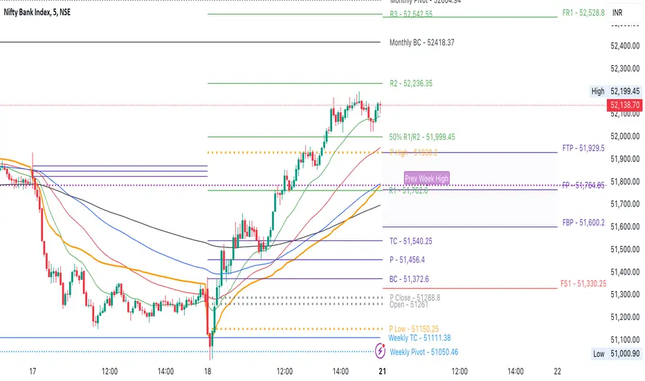
CPR by NKDCentral Pivot Range (CPR) Trading Strategy:
The Central Pivot Range (CPR) is a widely-used tool in technical analysis, helping traders pinpoint potential support and resistance levels in the market. By using the CPR effectively, traders can better gauge market trends and determine favorable entry and exit points. This guide explores how the CPR works, outlines its calculation, and describes how traders can enhance their strategies using an extended 10-line version of CPR.
What Really Central Pivot Range (CPR) is?
At its core, the CPR consists of three key lines:
Pivot Point (PP) – The central line, calculated as the average of the previous day’s high, low, and closing prices.
Upper Range (R1) – Positioned above the Pivot Point, acting as a potential ceiling where price may face resistance.
Lower Range (S1) – Found below the Pivot Point, serving as a potential floor where price might find support.
Advanced traders often expand on the traditional three-line CPR by adding extra levels above and below the pivot, creating up to a 10-line system. This extended CPR allows for a more nuanced understanding of the market and helps identify more detailed trading opportunities.
Applying CPR for Trading Success
1. How CPR is Calculation
The CPR relies on the previous day's high (H), low (L), and close (C) prices to create its structure:
Pivot Point (PP) = (H + L + C) / 3
First Resistance (R1) = (2 * PP) - L
First Support (S1) = (2 * PP) - H
Additional resistance levels (R2, R3) and support levels (S2, S3) are calculated by adding or subtracting multiples of the previous day’s price range (H - L) from the Pivot Point.
2. Recognizing the Market Trend
To effectively trade using CPR, it’s essential to first determine whether the market is trending up (bullish) or down (bearish). In an upward-trending market, traders focus on buying at support levels, while in a downward market, they look to sell near resistance.
3. Finding Ideal Entry Points
Traders often look to enter trades when price approaches key levels within the CPR range. Support levels (S1, S2) offer buying opportunities, while resistance levels (R1, R2) provide selling opportunities. These points are considered potential reversal zones, where price may bounce or reverse direction.
4. Managing Risk with Stop-Loss Orders
Proper risk management is crucial in any trading strategy. A stop-loss should be set slightly beyond the support level for buy positions and above the resistance level for sell positions, ensuring that losses are contained if the market moves against the trader’s position.
5. Determining Profit Targets
Profit targets are typically set based on the distance between entry points and the next support or resistance level. Many traders apply a risk-reward ratio, aiming for larger potential profits compared to the potential losses. However, if the next resistance and support level is far then middle levels are used for targets (i.e. 50% of R1 and R2)
6. Confirmation Through Other Indicators
While CPR provides strong support and resistance levels, traders often use additional indicators to confirm potential trade setups. Indicators such as moving averages can
help validate the signals provided by the CPR.
7. Monitoring Price Action At CPR Levels
Constantly monitoring price movement near CPR levels is essential. If the price fails to break through a resistance level (R1) or holds firm at support (S1), it can offer cues on when to exit or adjust a trade. However, a strong price break past these levels often signals a continued trend.
8. Trading Breakouts with CPR
When the price breaks above resistance or below support with strong momentum, it may signal a potential breakout. Traders can capitalize on these movements by entering positions in the direction of the breakout, ideally confirmed by volume or other technical indicators.
9. Adapting to Changing Market Conditions
CPR should be used in the context of broader market influences, such as economic reports, news events, or geopolitical shifts. These factors can dramatically affect market direction and how price reacts to CPR levels, making it important to stay informed about external market conditions.
10. Practice and Backtesting for Improvements
Like any trading tool, the CPR requires practice. Traders are encouraged to backtest their strategies on historical price data to get a better sense of how CPR works in different market environments. Continuous analysis and practice help improve decision-making and strategy refinement.
The Advantages of Using a 10-Line CPR System
An extended 10-line CPR system—comprising up to five resistance and five support levels—provides more granular control and insight into market movements. This expanded view helps traders better gauge trends and identify more opportunities for entry and exit. Key benefits include:
R2, S2 Levels: These act as secondary resistance or support zones, giving traders additional opportunities to refine their trade entries and exits.
R3, S3 Levels: Provide an even wider range for identifying reversals or trend continuations in more volatile markets.
Flexibility: The broader range of levels allows traders to adapt to changing market conditions and make more precise decisions based on market momentum.
So in Essential:
The Central Pivot Range is a valuable tool for traders looking to identify critical price levels in the market. By providing a clear framework for identifying potential support and resistance zones, it helps traders make informed decisions about entering and exiting trades. However, it’s important to combine CPR with sound risk management and additional confirmation through other technical indicators for the best results.
Although no trading tool guarantees success, the CPR, when used effectively and combined with practice, can significantly enhance a trader’s ability to navigate market fluctuations.
15-Metric Strong Buy System (Final Version)This Pine Script analyzes 15 key technical signals to identify strong buy opportunities.
It assigns a score out of 13 for core conditions and checks 2 optional filters (Delivery Spike and RS > Nifty).
It only shows signals on the latest bar to keep the chart clean.
🧠 Core Structure Breakdown
✅ SECTION 1: Core Technical Signals (13 total)
Each of the following conditions adds 1 point to the score:
# Signal What It Checks Why It's Used
1 RSI (Daily & 1H) Both timeframes >55 and rising Confirms strength across multiple timeframes
2 Price > EMA20 & EMA50 Above short/medium-term trend lines Confirms uptrend support
3 Price near 20-day High Within 2% of recent high Breakout proximity
4 Volume > 20 SMA Unusual trading activity Confirms strength behind move
5 MACD Bullish Line > Signal and Histogram > 0 Momentum is building
6 ADX > 20 and +DI > -DI Trend strength and direction Validates strong directional trend
7 Bullish Candle Green candle with higher close Confirms bullish price action
8 BB Breakout Close > Upper Bollinger Band Volatility breakout confirmation
9 Supertrend Proxy Close above custom supertrend Simple trend direction filter
10 Close > Prev. High Break of short-term resistance Momentum continuation
11 VWAP Filter Close above VWAP Price leadership relative to volume
12 Weekly RSI > 50 Long-term trend momentum Confirms broader trend strength
13 BB Squeeze Bollinger Band width is low Signals potential upcoming move
🎯 Total Score = 0 to 13
🎯 SECTION 2: Optional Strength Filters (Displayed as labels)
Label What It Means Why It Matters
RS > Nifty Relative strength RSI > 55 vs Nifty Indicates outperformance
Delivery Spike Volume > 1.5× avg & bullish candle Suggests institutional activity
These are not included in the score, but if triggered, the chart displays:
🏷️ "RS > NIFTY" and/or
🏷️ "DELIVERY SPIKE"
in black background + white text boxes above the latest bar.
✅ SECTION 3: Output Logic
If score ≥ 12 → Show "STRONG BUY" on latest candle
If score = 11 → Show "BUY"
Also shows score label like Score: 12/13
Optional filters are displayed as labels if true
No clutter on historical candles — only current signal is shown.
🔔 SECTION 4: Alerts
Alert Trigger What It Does
score >= 12 Fires "Strong Buy Alert"
score == 11 Fires "Buy Alert"
⚖️ Pros & Cons (Analyst View)
✅ Pros:
Covers breadth of momentum, trend, breakout, and strength
Uses multi-timeframe confirmation for reliability
Avoids repainting by using latest bar only
Optional filters help detect smart money participation
Clean, uncluttered interface
❌ Cons:
Doesn’t include fundamentals
False positives possible during sideways or news-driven moves
No exit logic or Sell trigger
Uses proxy for Delivery spike, not actual delivery % (due to TradingView data limits)
💡 When to Trust the Signal?
Score Label Confidence
13/13 ✅ STRONG BUY + optional filters 🔥 Extremely strong
12/13 ✅ STRONG BUY ✅ Very high
11/13 BUY ⚠️ Medium — confirm with chart pattern
<11 — ❌ Avoid

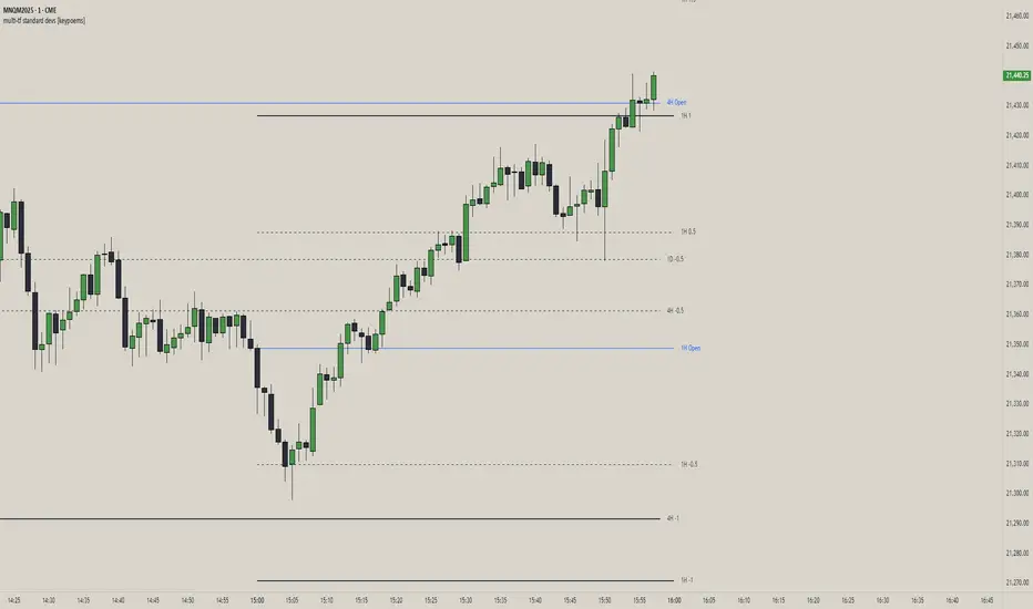
multi-tf standard devs [keypoems]Multi-Timeframe Standard Deviations Levels
A visual map of “how far is too far” across any three higher time-frames.
1. What it does
This script plots dynamic price “rails” built from standard deviation (StDev)—the same math that underpins the bell curve—on up to three higher-time-frames (HTFs) at once.
• It measures the volatility of intraday open-to-close increments, reaching back as far as 5000 bars (≈ 20 years on daily data).
• Each HTF can be extended to the next session or truncated at session close for tidy dashboards.
• Lines can be mirrored so you see symmetric positive/negative bands, and optional background fills shade the “probability cone.”
Because ≈ 68 % of moves live inside ±1 StDev, ≈ 95 % inside ±2, and ≈ 99.7 % inside ±3, the plot instantly shows when price is statistically stretched or compressed.
3. Key settings
Higher Time-Frame #1-3 Turn each HTF on/off, pick the interval (anything from 1 min to 1 year), and decide whether lines should extend into the next period.
Show levels for last X days Keep your chart clean by limiting how many historical sessions are displayed (1-50).
Based on last X periods Length of the StDev sample. Long look-backs (e.g. 5 000) iron-out day-to-day noise; short look-backs make the bands flex with recent volatility.
Fib Settings Toggle each multiple, line thickness/style/colour, label size, whether to print the numeric level, the live price, the HTF label, and whether to tint the background (choose your own opacity).
4. Under-the-hood notes
StDev is calculated on (close – open) / open rather than absolute prices, making the band width scale-agnostic.
Watch for tests of ±1:
Momentum traders ride the breakout with a target at the next band.
Mean-reversion traders wait for the first stall candle and trade back to zero line or VWAP.
Bottom line: Multi-Timeframe Standard-Deviations turns raw volatility math into an intuitive “price terrain map,” helping you instantly judge whether a move is ordinary, stretched, or extreme—across the time-frames that matter to you.
Original code by fadizeidan and stats by NQStats's ProbableChris.
CPR-Based Fib S/R with Circles by Arthavidhi📌 **CPR-Based Fibonacci S/R with Circles – Description**
This indicator combines the power of **CPR (Central Pivot Range)** and **Fibonacci ratios** to plot highly probable intraday and swing Support/Resistance levels derived from the **daily price structure**.
### 🧠 **How It Works**
* It uses the **Daily High, Low, and Close** to calculate the **Pivot Point** (P) as:
`P = (High + Low + Close) / 3`
* Then it calculates the **daily range**:
`Range = High - Low`
* Using this pivot and range, it derives both **Fibonacci-based Support and Resistance levels**:
* **Support levels** at: 0.382, 0.5, 0.618, 1.0, 1.272, 1.618 below pivot
* **Resistance levels** at: 0.382, 0.5, 0.618, 1.0, 1.272, 1.618 above pivot
These are **plotted as small colored circles** on your chart, with **labels on the left** for easy identification of each Fib level (e.g., "0.382", "1.618").
---
### 📈 **How to Use It**
🔹 **Intraday or Swing Traders**:
* Use these levels to **anticipate reversals**, **breakouts**, or **targets**.
* The levels act like a **natural price magnet** — price tends to pause, bounce, or reverse near them.
🔹 **Entry/Exit Zones**:
* Combine with price action (like pin bars, engulfing, or inside bars) or volume near these levels to plan entries.
* **R1.618 and S1.618** are great for extended targets or aggressive reversal setups.
🔹 **CPR Center Line**:
* Acts as a key mean-reversion zone or midline. You can combine this with VWAP or RSI for confirmation.
---
### 🧩 **Best Practices**
* **Higher Timeframe Confluence**: Align this with HTF S/R or trendlines.
* **Use Alerts**: Combine this with price action alerting tools (manually or with separate indicators).
* **Do Not Use Alone**: For best results, combine with a strategy (e.g., Supply/Demand, VWAP bounce, Trendline breaks).

Functionally Weighted Moving AverageOVERVIEW
An anchor-able moving average that weights historical prices with mathematical curves (shaping functions) such as Smoothstep , Ease In / Out , or even a Cubic Bézier . This level of configurability lends itself to more versatile price modeling, over conventional moving averages.
SESSION ANCHORS
Aside from VWAP, conventional moving averages do not allow you to use the first bar of each session as an anchor. This can make averages less useful near the open when price is sufficiently different from yesterdays close. For example, in this screenshot the EMA (blue) lags behind the sessionally anchored FWMA (yellow) at the open, making it slower to indicate a pivot higher.
An incrementing length is what makes a moving average anchor-able. VWAP is designed to do this, indefinitely growing until a new anchor resets the average (which is why it doesn't have a length parameter). But conventional MA's are designed to have a set length (they do not increment). Combining these features, the FWMA treats the length like a maximum rather than a set length, incrementing up to it from the anchor (when enabled).
Quick aside: If you code and want to anchor a conventional MA, the length() function in my UtilityLibrary will help you do this.
Incrementing an averages length introduces near-anchor volatility. For this reason, the FWMA also includes an option to saturate the anchor with the source , making values near the anchor more resistant to change. The following screenshot illustrates how saturation affects the average near the anchor when disabled (aqua) and enabled (fuchsia).
AVERAGING MATH
While there's nothing special about the math, it's worth documenting exactly how the average is affected by the anchor.
Average = Dot Product / Sum of Weights
Dot Product
This is the sum of element-wise multiplication between the Price and Weight arrays.
Dot Product = Price1 × Weight1 + Price2 × Weight2 + Price3 × Weight3 ...
When the Price and Weight arrays are equally sized (aka. the length is no longer incrementing from the anchor), there's a 1-1 mapping between Price and Weight indices. Anchoring, however, purges historical data from the Price array, making it temporarily smaller. When this happens, a dot product is synthesized by linearly interpolating for proportional indices (rather than a 1-1 mapping) to maintain the intended shape of weights.
Synthetic Dot Product = FirstPrice × FirstWeight + ... MidPrice × MidWeight ... + LastPrice × LastWeight
Sum of Weights
Exactly what it sounds like, the sum of weights used by the dot product operation. The sum of used weights may be less than the sum of all weights when the dot product is synthesized.
Sum of Weights = Weight1 + Weight2 + Weight3 ...
CALCULATING WEIGHTS
Shaping functions are mathematical curves used for interpolation. They are what give the Functionally Weighted Moving Average its name, and define how each historical price in the look back period is weighted.
The included shaping functions are:
Linear (conventional WMA)
Smoothstep (S curve)
Ease In Out (adjustable S curve)
Ease In (first half of Ease In Out)
Ease Out (second half of Ease In Out)
Ease Out In (eases out and then back in)
Cubic Bézier (aka. any curve you want)
In the following screenshot, the only difference between the three FWMA's is the shaping function (Ease In, Ease In Out, and Ease Out) illustrating how different curves can influence the responsiveness of an average.
And here is the same example, but with anchor saturation disabled .
ADJUSTING WEIGHTS
Each function outputs a range of values between 0 and 1. While you can't expand or shrink the range, you can nudge it higher or lower using the Scalar . For example, setting the scalar to -0.2 remaps to , and +0.2 remaps to . The following screenshot illustrates how -0.2 (lightest blue) and +0.2 (darkest blue) affect the average.
Easing functions can be further adjusted with the Degree (how much the shaping function curves). There's an interactive example of this here and the following illustrates how a degrees 0, 1, and 20 (dark orange, orange, and light orange) affect the average.
This level of configurability completely changes how a moving average models price for a given length, making the FWMA extremely versatile.
INPUTS
You can configure:
Length (how many historical bars to average)
Source (the bar value to average)
Offset (horizontal offset of the plot)
Weight (the shaping function)
Scalar (how much to adjust each weight)
Degree (how much to ease in / out)
Bézier Points (controls shape of Bézier)
Divisor & Anchor parameters
Style of the plot
BUT ... WHY?
We use moving averages to anticipate trend initialization, continuation, and termination. For a given look back period (length) we want the average to represent the data as accurately and smoothly as possible. The better it does this, the better it is at modeling price.
In this screenshot, both the FWMA (yellow) and EMA (blue) have a length of 9. They are both smooth, but one of them more accurately models price.
You wouldn't necessarily want to trade with these FWMA parameters, but knowing it does a better job of modeling price allows you to confidently expand the model to larger timeframes for bigger moves. Here, both the FWMA (yellow) and EMA (blue) have a length of 195 (aka. 50% of NYSE market hours).
INSPIRATION
I predominantly trade ETF derivatives and hold the position that markets are chaotic, not random . The salient difference being that randomness is entirely unpredictable, and chaotic systems can be modeled. The kind of analysis I value requires a very good pricing model.
The term "model" sounds more intimidating than it is. Math terms do that sometimes. It's just a mathematical estimation . That's it. For example, a regression is an "average regressing" model (aka. mean reversion ), and LOWESS (Locally Weighted Scatterplot Smoothing) is a statistically rigorous local regression .
LOWESS is excellent for modeling data. Also, it's not practical for trading. It's computationally expensive and uses data to the right of the point it's averaging, which is impossible in realtime (everything to the right is in the future). But many techniques used within LOWESS are still valuable.
My goal was to create an efficient real time emulation of LOWESS. Specifically I wanted something that was weighted non-linearly, was efficient, left-side only, and data faithful. Incorporate trading paradigms (like anchoring) and you get a Functionally Weighted Moving Average.
The formulas for determining the weights in LOWESS are typically chosen just because they seem to work well. Meaning ... they can be anything, and there's no justification other than "looks about right". So having a variety of functions (aka. kernels) for the FWMA, and being able to slide the weight range higher or lower, allows you to also make it "look about right".
William Cleveland, prominent figure in statistics known for his contributions to LOWESS, preferred using a tri-cube weighting function. Using Weight = Ease Out In with the Degrees = 3 is comparable to this. Enjoy!

Intraday Trading IndicatorIndicator Overview
Moving Averages: Uses a fast EMA (9-period) and a slow EMA (21-period) to determine the trend direction.
Market Profile Approximation: Utilizes VWAP (Volume Weighted Average Price) as a simplified proxy for value area, acting as a dynamic support/resistance level.
SMC: Incorporates the concept of trend confirmation and price interaction with key levels, focusing on pullbacks to the fast EMA within a trending market.
Signals: Generates buy and sell signals when price crosses the fast EMA, filtered by the trend (fast EMA vs. slow EMA) and VWAP position, aiming for high-probability setups.
This design ensures responsiveness on short timeframes while filtering out noise, aligning with the goal of accurate signals for intraday trading.

John's Sig PROJohn's Sig PRO is a powerful Wyckoff-style trade detection tool that identifies potential long and short setups based on pivot formations, trading range analysis, and optional confluence filters.
🔹 Core Features:
Pivot-Based Springs and Upthrusts (customizable "Loose" or "Strict" setups)
Dynamic Risk Management:
Static % Risk OR ATR-based stops
2 Risk/Reward Targets (Target 1 and Target 2)
Volume Confirmation (optional)
Dynamic Range Monitoring: Highest high/Lowest low over user-defined periods
🔹 Optional Setup Filters (for higher probability entries):
✅ EMA Filter (Price above/below EMA)
✅ RSI Oversold/Overbought Confirmation
✅ MACD Cross Confirmation
✅ VWAP Filter (Price above/below VWAP)
✅ SuperTrend Direction Confirmation
🔹 Visual Highlights:
Entry, Stoploss, Target 1, Target 2 auto-plotted with lines
Setup labels colored based on strength (Loose/Strict)
Real-time alert generation (LONG/SHORT)
🔹 How to Use:
Enable Loose Springs for more aggressive setups or keep strict validation.
Customize risk settings: ATR-based dynamic stops or static pivot % risk.
Turn on optional filters to tighten your entry criteria.
Watch for plotted signals and set alerts!
⚡ Ideal For:
Intraday Traders
Swing Traders
Wyckoff Enthusiasts
Traders wanting automated pivot-based signals + multi-filter confluence
Created with ❤️ by John.
Trade smart, not hard!

PowerHouse SwiftEdge AI v2.10 with Custom Filters & AI AnalysisPowerHouse SwiftEdge AI v2.10 with Custom Filters & AI Analysis
Overview
PowerHouse SwiftEdge AI v2.10 is an advanced TradingView Pine Script indicator designed to identify high-probability trading setups by combining pivot-based structure analysis, multi-timeframe trend detection, and adaptive AI-driven signal filtering. The script integrates Change of Character (CHoCH) and Break of Structure (BOS) signals with customizable momentum, volume, breakout, and trend filters to enhance trade precision. Additionally, it offers an optional AI Market Analysis module that predicts future price trends across multiple timeframes, providing traders with a comprehensive market outlook.
The script is highly customizable, allowing users to tailor inputs to their trading style, whether for scalping, swing trading, or long-term strategies. It is suitable for all asset classes, including stocks, forex, crypto, and commodities, and performs optimally on timeframes ranging from 1-minute to daily charts.
Key Features
Pivot-Based Signal Generation:
Identifies pivot highs and lows to detect CHoCH (reversal patterns) and BOS (continuation patterns).
Signals are plotted as "Buy" or "Sell" labels with optional "Get Ready" pre-signals to prepare traders for potential setups.
Take-profit (TP) levels are automatically calculated based on user-defined points, with optional TP box visualization.
Multi-Timeframe Trend Analysis:
Analyzes trends across seven timeframes (1M, 5M, 15M, 30M, 1H, 4H, D) using EMA and VWAP to determine bullish, bearish, or neutral conditions.
Displays a futuristic AI-Trend Matrix dashboard showing trend direction, strength, and confidence levels for quick decision-making.
Customizable Signal Filters:
Momentum Filter: Ensures signals align with significant price changes, adjusted dynamically using ATR-based volatility.
Higher Timeframe Trend Filter: Requires signals to align with the trend of a user-selected higher timeframe (e.g., 1H).
Lower Timeframe Trend Filter: Prevents signals that conflict with the trend of a user-selected lower timeframe (e.g., 5M).
Volume Filter: Optionally requires above-average volume to confirm signals.
Breakout Filter: Optionally requires price to break previous highs/lows for signal validation.
Repeated Signal Restriction: Prevents consecutive signals in the same trend direction until the trend changes on a user-defined timeframe.
AI-Driven Adaptivity:
Incorporates Cumulative Volume Delta (CVD) to assess buying/selling pressure and classify market volatility (Low, Medium, High).
Uses ATR to dynamically adjust momentum thresholds, ensuring signals adapt to current market conditions.
Optional AI Market Analysis module predicts trends across multiple timeframes by combining trend, momentum, and volatility scores.
Visual Elements:
Plots CHoCH and BOS levels as horizontal lines with distinct colors (aqua for CHoCH sell, lime for CHoCH buy, fuchsia for BOS sell, teal for BOS buy).
Draws dynamic support and resistance trendlines based on short and long-term price action, colored by trend strength.
Displays TP levels and pivot highs/lows for easy reference.
How It Works
The script combines several technical analysis concepts to create a robust trading system:
Market Structure Analysis:
Pivot highs and lows are identified using a user-defined lookback period (Pivot Length).
CHoCH occurs when price crosses below a pivot high (bearish reversal) or above a pivot low (bullish reversal).
BOS occurs when price breaks a previous pivot low (bearish continuation) or pivot high (bullish continuation).
Trend and Momentum Integration:
Trends are determined by comparing price to EMA and VWAP on multiple timeframes.
Momentum is calculated as the percentage price change, with thresholds adjusted by ATR to account for volatility.
"Get Ready" signals appear when momentum approaches the threshold, preparing traders for potential CHoCH or BOS signals.
Signal Filtering:
Filters ensure signals align with user-defined criteria (e.g., trend direction, volume, breakouts).
The Restrict Repeated Signals option prevents over-signaling by requiring a trend change on a specified timeframe before generating a new signal in the same direction.
AI Market Analysis:
The optional AI module calculates a score for each timeframe based on trend direction, momentum, and volatility (ATR compared to its SMA).
Scores are translated into predictions (▲ for bullish, ▼ for bearish, — for neutral), displayed in a dedicated table.
CVD and Volatility Context:
CVD tracks buying vs. selling pressure by accumulating volume based on price direction.
Volatility is classified using CVD magnitude, influencing the script’s visual cues and signal sensitivity.
Why This Combination?
The integration of pivot-based structure analysis, multi-timeframe trend filtering, and AI-driven adaptivity addresses common trading challenges:
Precision: CHoCH and BOS signals focus on key market turning points, reducing noise from minor price fluctuations.
Context: Multi-timeframe analysis ensures trades align with broader market trends, improving win rates.
Adaptivity: ATR and CVD adjustments make the script responsive to changing market conditions, avoiding static thresholds that fail in volatile or quiet markets.
Customization: Extensive input options allow traders to adapt the script to their preferred markets, timeframes, and risk profiles.
Predictive Insight: The AI Market Analysis module provides forward-looking trend predictions, helping traders anticipate market moves.
This combination creates a self-contained system that balances responsiveness with reliability, making it suitable for both novice and experienced traders.
How to Use
Add to Chart:
Apply the indicator to your TradingView chart for any asset and timeframe.
Recommended timeframes: 5M to 1H for scalping/day trading, 4H to D for swing trading.
Configure Inputs:
Pivot Length: Adjust (default 5) to control sensitivity to pivot highs/lows. Lower values for faster signals, higher for stronger confirmations.
Momentum Threshold: Set the minimum price change (default 0.01%) for signals. Increase for stricter conditions.
Take Profit Points: Define TP distance (default 10 points). Adjust based on asset volatility.
Signal Filters: Enable/disable filters (momentum, trend, volume, breakout) to match your strategy.
Higher/Lower Timeframe: Select timeframes for trend alignment (e.g., 1H for higher, 5M for lower).
AI Market Analysis: Enable for predictive trend insights across timeframes.
Get Ready Signals: Enable to see pre-signals for potential setups.
Interpret Signals:
Buy/Sell Labels: Act on green "Buy" or red "Sell" labels, confirming with TP levels and trend direction.
Get Ready Labels: Yellow "Get Ready BUY" or orange "Get Ready SELL" indicate potential setups; prepare but wait for confirmation.
CHoCH/BOS Lines: Use aqua/lime (CHoCH) and fuchsia/teal (BOS) lines as key support/resistance levels.
AI-Trend Matrix: Check the top-right dashboard for trend strength (%), confidence (%), and timeframe-specific trends.
AI Market Analysis Table: If enabled, view predictions (▲/▼/—) for each timeframe to anticipate market direction.
Trading Tips:
Combine signals with other indicators (e.g., RSI, MACD) for additional confirmation.
Use higher timeframe trend alignment for higher-probability trades.
Adjust TP and signal distance based on asset volatility and trading style.
Monitor the AI-Trend Matrix for trend strength; values above 50% or below -50% indicate strong directional bias.
Originality
PowerHouse SwiftEdge AI v2.10 stands out due to its unique blend of:
Adaptive Signal Generation: ATR-based momentum thresholds and CVD-driven volatility context ensure signals remain relevant across market conditions.
Multi-Timeframe Synergy: The script’s ability to filter signals based on both higher and lower timeframe trends provides a rare balance of precision and context.
AI-Powered Insights: The AI Market Analysis module offers predictive capabilities not commonly found in traditional indicators, simulating institutional-grade analysis.
Visual Clarity: The futuristic dashboard and color-coded trendlines make complex data accessible, enhancing usability for all trader levels.
Unlike standalone pivot or trend indicators, this script integrates multiple layers of analysis into a cohesive system, reducing false signals and providing actionable insights without requiring external tools or research.
Limitations
False Signals: No indicator is foolproof; signals may fail in choppy or low-volume markets. Use filters to mitigate.
Timeframe Sensitivity: Performance varies by timeframe and asset. Test settings thoroughly.
AI Predictions: The AI Market Analysis is based on historical data and simplified scoring; it’s not a guaranteed forecast.
Resource Usage: Enabling all filters and AI analysis may slow performance on lower-end devices.

Rogue ORB PRORogue ORB Pro is a precision-engineered Opening Range Breakout (ORB) indicator built for active intraday traders who need real signals, not noise.
This tool identifies high-probability breakout entries from the opening range, enhanced with optional ATR-based stop loss levels, deviation targets, cooldown filters, and a relative volume gate to filter weak setups.
🔍 Key Features:
Opening Range High/Low: Drawn from a user-defined time window and locked for the day
Deviations: Automatically plots target zones above and below the OR range (e.g. 1, 2 deviations)
Pre-Market Levels: Automatically draws pre market high and low lines at the end of pre market session
Buy/Sell Signals: Triggered on breakout of the OR High/Low with configurable breakout logic (touch or close)
ATR Stop Loss Line: Dynamically drawn at a fixed ATR distance from breakout candle, with optional SL label
Cooldown Period: Prevents back-to-back signals by enforcing a user-defined bar delay between entries, can help with overtrading
Volume Filter: Optional relative volume filter that requires breakout candles to exceed a custom volume threshold
VWAP Overlay: Visual VWAP for directional bias and confluence

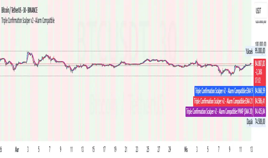
Triple Confirmation Scalper v2 - Alarm CompatibleTriple Confirmation Scalper Strategy
A high-probability scalping strategy combining trend momentum, overbought/sold conditions, and volume confirmation to filter low-noise signals.
📊 Strategy Logic
Trend Direction
Dual EMA crossover (9 & 21 periods) for momentum and trend bias.
Overbought/Oversold Zones
RSI (14-period) to avoid entries at extremes.
Volume Spike Filter
OBV + 20-period volume average to confirm breakout validity.
Dynamic Risk Management
Stop-loss: Adaptive to recent price action (5-candle low/high ±1%).
Take-profit: 1.5% target (1.5:1 risk/reward).
🔍 Advanced Features
Precision VWAP (20-period, HLC3-based) for dynamic S/R levels.
Visual Aids:
EMA/VWAP bands + trend-colored background.
Volume spike alerts.
TradingView Alerts pre-configured for long/short signals.
⚙️ Default Settings
Commission: 0.1% factored into backtests.
Mode: Supports both long/short positions.
⚠️ Disclaimer
This is a technical analysis tool, not financial advice.
Past performance ≠ future results. Test thoroughly in a demo account.
Adjust parameters (e.g., EMA periods, RSI thresholds) to match your risk tolerance.
✅ TradingView Compliance Notes:
No exaggerated claims (e.g., "100% win rate").
Clear disclaimer included.
Focus on objective strategy logic (no promotional language).
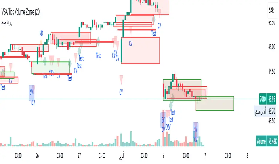
VSA Tick Volume Zones0
مؤشر VSA Tick Volume مع مناطق العرض والطلب (إصدار تجريبي)
مؤشر مخصص لمنصة TradingView يعتمد على تحليل الحجم والسعر (VSA - Volume Spread Analysis)، ويقوم تلقائيًا بتحديد مناطق الطلب والعرض استنادًا إلى إشارات VSA القوية. يهدف المؤشر إلى كشف تحركات المتداولين المحترفين وتحديد نقاط الانعكاس الذكية.
---
✅ الميزات الأساسية:
1. إشارات VSA:
المؤشر يتعرف تلقائيًا على أبرز إشارات تحليل VSA:
- *Climactic Volume (CV):* حجم تداول مرتفع بشكل استثنائي يشير لنهاية الاتجاه الحالي.
- *No Demand (ND):* شموع صعودية ضعيفة الحجم، تشير إلى غياب اهتمام المشترين.
- *No Supply (NS):* شموع هبوطية ضعيفة الحجم، تشير إلى غياب اهتمام البائعين.
- *Stopping Volume (SV):* ارتفاع مفاجئ في الحجم بعد اتجاه هابط، يشير لتدخل المشترين.
- *UpThrust (UT):* اختراق كاذب للسعر نحو الأعلى مع حجم كبير وإغلاق منخفض.
- *Test (T):* شموع اختبارية بحجم منخفض للتحقق من غياب البائعين استعدادًا للصعود.
2. تلوين الشموع:
- كل إشارة تُلوَّن تلقائيًا على الشارت لتسهيل المتابعة البصرية:
- CV باللون الأحمر
- ND باللون البرتقالي
- NS باللون الأخضر
- SV باللون الأزرق
- UT باللون الأرجواني
- Test باللون السماوي
3. رسم مناطق العرض والطلب تلقائيًا:
- يتم تحديد المناطق بناءً على إشارات *UT* و*SV* و*Test*، حيث تعتبر مناطق تمركز ذكي للمؤسسات (Smart Money Zones).
🎯 الهدف من المؤشر:
يساعد هذا المؤشر:
- المتداول اليومي على اتخاذ قرارات مدروسة.
- المحلل الفني على فهم السياق المؤسساتي للسوق.
- دعم استراتيجيات الدخول والخروج بدقة أعلى من خلال الدمج بين إشارات VSA والمناطق الفعلية للعرض والطلب.
---
🧪 ملاحظات:
- المؤشر لا يعتبر توصية شراء أو بيع.
- الإشارات تحتاج إلى تأكيد من خلال حركة السعر أو مؤشرات مساعدة.
- يمكن استخدامه مع أدوات إضافية مثل RSI أو Moving Averages.
---
⚙ الاقتراحات المستقبلية:
- دمج أدوات تدفق السيولة (مثل OBV أو VWAP).
- تنبيه صوتي وإشعار عند ظهور إشارات محددة.
- تخصيص أكبر للمستخدم من حيث الألوان ونوع الإشارات.
---
للتواصل أو المساهمة في تطوير المؤشر، يرجى مراسلتي.
VSA Tick Volume Indicator with Supply and Demand Zones (Beta Version)
A custom indicator for the TradingView platform based on Volume and Price Analysis (VSA - Volume Spread Analysis), it automatically identifies supply and demand zones based on strong VSA signals. The indicator aims to uncover the movements of professional traders and identify smart reversal points.
✅ Key Features:
VSA Signals: The indicator automatically detects key VSA analysis signals:
Climactic Volume (CV): Exceptionally high trading volume indicating the end of the current trend.
No Demand (ND): Bullish candles with weak volume, indicating a lack of buyer interest.
No Supply (NS): Bearish candles with weak volume, indicating a lack of seller interest.
Stopping Volume (SV): A sudden volume spike after a downtrend, indicating buyer intervention.
UpThrust (UT): A false price breakout upwards with high volume and a low close.
Test (T): Low-volume test candles to check for the absence of sellers, signaling readiness for an upward move.
Candle Coloring:
Each signal is automatically color-coded on the chart for easy visual tracking:
CV in red
ND in orange
NS in green
SV in blue
UT in purple
Test in cyan
Automatic Supply and Demand Zone Drawing:
Zones are determined based on the UT, SV, and Test signals, which are considered smart money zones.
🎯 Purpose of the Indicator:
This indicator helps:
The day trader make informed decisions.
The technical analyst understand the market's institutional context.
Enhance entry and exit strategies with more accuracy by combining VSA signals and actual supply and demand zones.
🧪 Notes:
The indicator is not a buy or sell recommendation.
Signals need confirmation through price action or additional indicators.
Can be used alongside other tools such as RSI or Moving Averages.
⚙ Future Suggestions:
Integration of liquidity flow tools (such as OBV or VWAP).
Sound alerts and notifications when specific signals appear.
Greater customization options for users regarding colors and signal types.
For inquiries or contributions to the indicator's development, please contact me.
J Weighted Average Price📘 How to Use the OBV VWAP Reentry Signal Effectively
This indicator plots a VWAP based on OBV (On-Balance Volume), along with dynamic bands to identify overbought and oversold conditions in volume flow.
🔺 Red Triangle Up: Appears when OBV crosses back below the upper band → Potential reversal from overbought → Watch for short opportunities.
🔻 Blue Triangle Down: Appears when OBV crosses back above the lower band → Potential reversal from oversold → Watch for long opportunities.
📌 Tip: Use these signals in confluence with price action or trend confirmation to filter false signals. For example:
Enter short after a reentry from upper band and a lower high in price.
Enter long after a reentry from lower band and a bullish candle structure.
This setup helps you catch mean reversion moves based on volume flow, not just price.
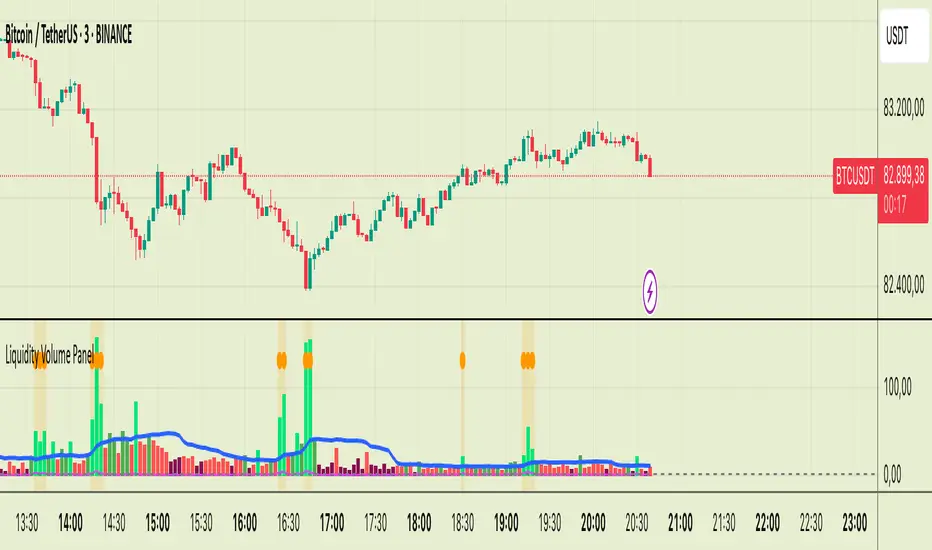
Liquidity Volume Panel Liquidity Volume Panel – Precision Tool for Scalpers & Intraday Traders
This panel is designed to help traders quickly identify volume-driven moves, liquidity events, and fair-value zones. It combines classic volume analysis with enhanced tools like RVOL and VWAP deviation bands, making it ideal for scalping, momentum trading, and intraday strategies.
🔍 Included Features:
✅ Relative Volume (RVOL) Indicator
Displays current volume in relation to its 20-period average – excellent for spotting low-activity zones or high-pressure breakouts.
✅ Dynamic Volume Coloring & Spike Detection
Color-coded volume logic highlights normal, strong, and extremely high volume, with visual markers for volume spikes (>200% of average).
✅ VWAP with ±1σ & ±2σ Bands
Industry-standard deviation bands show overbought/oversold conditions and dynamic support/resistance based on volume-weighted pricing.
✅ Background Highlighting
Subtle orange background alerts you when volume surges beyond extreme levels – making liquidity clusters instantly recognizable.
Usage:
Use this panel as a decision-making tool for entries, reversals, or breakouts – especially in fast-moving markets.
Best used on lower timeframes for precision scalping.
SemaforThis is the 4 Level Semafor indicator with Daily Open Line and Average Session Range. Also on the chart is the EMA Ribbon indicator.
Credit to:
Devlucem for the Semafor indicator
Quantvue for the Average Session Range
Shusterivi for the Daily Open Line
MYNAMEISBRANDON for the EMA Ribbon
The Semafors are based on the ZigZag indicator and show higher highs/lower lows of a specified period, determined by the user and applied in settings.
The default periods I use are:
10 period (hidden on this chart)
50 period-blue dots
250 period-white dots
615 period-black dots
Just as the ZigZag indicator will recalculate so to will the semafors, as additional candles are built. The semafor indicator is never to be used as a stand alone signal. It must be combined with other indicators to be used effectively. What we look for are the semafor patterns of a large white dot followed by a 1st blue dot opposite of the white. Then a 2nd blue dot in agreement with the white dot. In theory, the 2nd blue dot is seen as confirmation of the establishment of the white semafor..
When combined with Daily Open Line, ADR (Average Sessions Range), EMA cross and VWAP anchored to your 250 semafors, your odds are greatly increased. Add to that the knowledge of basic market structure and the wisdom that comes from patience and you have a very powerful weapon.
The Daily Open...I trade the M1 chart and also draw a H4 Open Line on my chart for the smaller time frames. Price will tend to trade away from the Daily Open Line. In many cases until it reaches certain levels...Fib, Gann, ADR, etc., then runs through a pullback cycle. I like the ADR levels. The ADR can give clues when entering a consolidation phase, ie trading between the buy side and sell side 15% levels. Trading away from the Daily Open(or H4 open) along with breaking the 15% level, while in agreement with a semafor pattern is a good sign.
Add to that confluence the agreement of your MA cross and the 250 semafor Anchored VWAP and you have a solid signal to help determine your actions. This trend following layout will work on any time frame. I just really like the M1 for its precision, not for crazy back and forth all day. With the exception of some strong pull back signals, I don't enter any more trades on the M1 than on M5, 15 or 30.
This is based on and follows the teachings of Xard and his trading strategy. Just as I don't want to take anyone's credit for these indicators, I won't take credit for what I have been taught either.
The trader can obviously use their favorite MA cross indicator. But this one is visually beautiful AND displays the current time frame and 1 time frame higher on the chart...awesome!
Of note, I do run into trouble at times with the 615 period semafor. I have been told it is because TradingView has trouble with extended period indicators. As a matter of fact, I would like a much higher period for my biggest semafor. I would like it set at 1250, but that seems to be a no starter. If anyone has a solution, that would be welcomed news.

Impulse MACD enhancedThis indicator is designed to provide robust trade entry signals by combining multiple technical filters. Here’s a summary of its key components:
Impulse MACD Calculation:
Uses a Zero-Lag EMA (ZLEMA) based approach to generate a momentum indicator (with a signal line and histogram) that identifies shifts in market momentum.
Simulated Higher Timeframe (HTF) Trend Filter:
Computes an SMA over a multiplied period to simulate a higher timeframe trend. It requires the price to be in line with this broader trend before signaling an entry.
RSI Filter:
Ensures that for bullish entries the RSI is above a set threshold (indicating momentum) and for bearish entries it’s below a threshold.
ADX Filter:
Uses a manually calculated ADX to confirm that the market is in a strong trend (ADX > 30) to reduce false signals in weakly trending or sideways markets.
Volume Filter:
Compares the current volume to a 20‑bar SMA of volume, requiring volume to be significantly higher (by a user-defined percentage) to confirm the strength of the move.
VWAP Confirmation:
Uses the Volume-Weighted Average Price as an extra layer of confirmation: bullish signals require the price to be above VWAP, bearish signals below.
Optional Long-Term & Short-Term MA Filters:
These filters can be enabled to ensure the price is trading above (or below) longer-term and shorter-term moving averages, further aligning the trade with the prevailing trend.
ATR Volatility Filter:
Checks that volatility (as measured by the ATR relative to price) is below a maximum threshold, which helps avoid taking trades in overly volatile conditions.
Price Action Filter:
Ensures that for a bullish signal the current close is above the highest high over a specified lookback period (and vice versa for bearish), indicating a clear breakout.
Signal Throttling:
Signals are limited to one every 10 bars to prevent excessive trading.
When all these conditions are met, the indicator outputs an entry signal for either a bullish or bearish trade.
This multi-filter approach aims to increase win rate by reducing false signals and aligning trades with strong, confirmed trends while filtering out noise.
