BOSS Automatic TrendlinesTHE BEST FOREX, BINARY OPTIONS, AND CRYPTO INDICATORS FOR TRADINGVIEW.COM
Trendlines when drawn properly make an excellent tool for traders. Used improperly though, they become ineffective and even counterproductive, resulting in a belief that prices have made a reversal when they really haven't, or that a trend has strength when price action suggests it doesn't.
The Boss Auto Trendline Indicator draws the trendlines automatically, and now you can effectively use trendlines as part of your trading strategy.
Trendlines highlight a trend or range (sideways movement). A trendline connects swing lows, where the low is lower than the surrounding prices, and swing highs in price. When the price rises, the swing lows rise.
Red Lines & Dots.
Connecting these lows with a line results in an ascending trendline, showing you that the trend is up. A trendline can also be drawn along the swing highs. This shows the angle of ascent, and the strength of the price move, whether strongly higher or not.
Green Lines & Dots
When the price falls, the swing highs fall. Connecting these highs with a line results in a descending trendline, illustrating the downward trend. A trendline can also be drawn along the swing lows. This shows the angle of descent and the strength of the downward price movement.
Available at bosscripts.com
Website bosscripts.com
"trendline" için komut dosyalarını ara

Draw Trendline with Breakout by Pooja🌟 Draw Trendline with Breakout by Pooja
Draw Trendline with Breakout by Pooja
✨ A smart & clean auto–trendline tool that detects swings, plots dynamic trendlines, and highlights real-time breakouts — designed for intraday, swing & positional traders.
Indicator intelligently reads market structure using objective statistical calculations (ATR / Stdev / LinReg) and gives you clarity on trend direction, structural shifts, and breakout opportunities.
Works on Stocks • Indian Stock Market • Crypto • Forex • Commodities
Suitable for Scalping • Day Trading • Swing Trading
🔥 Key Features
🔹 Auto Trendline Detection
Auto-detects swing highs/lows
Draws adaptive upper & lower trendlines
No manual drawing required
🔹 Dynamic Slope Engine
Choose from 3 professional slope methods:
📏 ATR Mode – volatility-adaptive
📊 Stdev Mode – statistical noise filtering
📐 Linear Regression Mode – structural slope mapping
🔹 Real-Time Breakout Signals
⚡ Instant breakout markers (Up/Down)
🔔 Alert support for both breakout types
Helps catch trend continuation & reversals early
🔹 Extended Projection Lines
➡️ Projects trendlines forward
🎯 Helps identify possible future reaction zones
🔹 Backpaint Control
🧩 Optional historical offset display
Great for forward testing & clean charts
🔹 Flexible Customization
Swing length
Colors
Slope sensitivity
Extended line visibility
📈 How to Use
Apply indicator
Set swing length based on volatility
Choose slope mode (ATR/Stdev/LinReg)
Observe auto trendlines
Watch for breakout markers
Set alerts for faster entries
Best used together with:
📌 Support & Resistance
📉 Price Action
🧭 Market Structure
🔊 Volume
💡 Why Traders Like It
Clean & lag-free structure mapping
Zero manual drawing
Breakouts are visually clear
Works on all assets & timeframes
⚠️ Disclaimer
This indicator is a technical analysis tool meant for charting assistance.
It does not guarantee profits or predict markets with certainty.
Always combine with your own analysis and proper risk management.
Past performance ≠ future results.

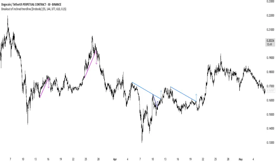
Breakout of inclined trendline [Drobode]█ DESCRIPTION
The script is designed to automatically detect a possible trendline breakout under the conditions of the popular "Slanted Trendline Breakout" strategy. The algorithm assumes that during the movement the price approaches the slanted (trend) line several times. With each subsequent approach (touch) to the trend line, the price consolidates more and more near this line, the distances between the extremes (touches) decrease, which indicates a high probability of a breakout of this line. The script checks the number of touches (approaches) of the extremes and the distances between the extremes. If all conditions are met, the script draws a slanted (trend) line in the corresponding area and an arrow with a possible price breakout direction. The length of the arrow is half the height of the slanted (trend) line and may indicate the level (price) at which it is advisable to fix the profit. In the script, you can enable or disable additional analysis periods (history length, number of bars), the more periods are enabled, the slower the script may load. For example, when placing the script on M-15, we can additionally enable the period 300 or 500, which will allow us to take into account a larger number of historical bars, and this can be considered as the extremes of the older timeframe. The script calculates each period separately, so one large period will not be able to take into account and analyze smaller periods. You can set the percentage deviation of the distance of the extremes from the trend line that touch the inclined line, depending on your needs and style of technical analysis. The smaller the percentage, the more accurate and closer to the inclined line the price extreme should be and vice versa. The main goal of the script is to facilitate the trader's routine work of identifying a possible trend line breakout. However, it should be understood that the script is not a full-fledged self-sufficient strategy, in case of receiving a signal, it is recommended to additionally conduct a comprehensive thorough analysis before taking trading actions. The script can be useful for traders of all levels, both beginners and experienced analysts. Like any other strategy or script, this script can work better on some instruments than on others. When analyzing trading setups, it is desirable to have a clear trend, it is recommended to take into account the signal of this script with a small period when the arrow shows the direction of the trend. However, at the same time, it is necessary to deeply analyze many other factors at this stage, in particular, such as volumes, consolidation, volatility, candlestick patterns, etc.
█ SCRIPT SETTINGS
By default, the script was developed and tested on medium timeframes with cryptocurrency futures instruments USDT.P
Alert
The Alert function in the script is enabled by default, you just need to activate Alert in the TradingView window and select the signal source - Breakout of inclined trendline .
The notification provides the following information (example):
Possible breakout to the upside
Ticker- DOGEUSDT.P
Price- 0.15844
Timeframe- 30
Period length- 377
Periods length
The script allows you to set the length of the period (number of bars) for which the calculation will be performed. Different periods allow you to cover more timeframes (in particular, larger timeframes). You can change up to 4 periods at a time. However, if you choose too large periods, the script may slow down and the loading time will increase. To increase the loading speed of the script, disable additional periods 3, 4, i.e. uncheck the corresponding checkboxes and use only fields 1 and 2 for periods, where you can also set the period length you need.
Percentage deviation of extremes from the trend line
The next settings are the percentage deviation of the extremes from the sloping line. The smaller the deviation, the more accurate and closer to the line the extreme bars should be, however, in this case the number of identification signals will be smaller. By default, the rejection zone is - 0.15%. On larger timeframes, the deviation can be set to be larger.
RSI Trendlines with BreakoutsA pivot-based breakout indicator that attempts to provide traders with a visual aid for finding breakouts on the RSI. Similar to how we use trendlines on our charts, using them on the Relative Strength Index can also give us a sense of direction in the markets.
This script uses its own pivot-based system that checks for real-time swing levels and triggers a new pivot event after every dip and nth bars. The breakout alerts that are given were not designed to be taken as signals since their purpose is to provide an extra bit of confluence. Because of this, I added no other conditions that try to make the alerts "perfect", but instead, print every breakout that is detected. Despite stating this, I did happen to add a condition that checks the difference in RSI and the breakout value, but that's as far as it'll go.
There are alerts built-in to the script, along with adjustable repainting options.
🔳 Settings
Lookback Range: Lookback period to trigger a new pivot point when conditions are met.
RSI Difference: The difference between the current RSI value and the breakout value. How much higher in value should the current RSI be compared to the breakout value in order to detect a breakout?
RSI Settings
Styling Options
🔳 Repaint Options
On: Allows repainting
Off - Bar Confirmation: Prevents repainting and generates alerts when the bar closes. (1 candle later)
🔳 How it Works
Before a trendline is drawn, the script retrieves the slope between the previous pivot point and the current. Then it adds or subtracts the slope x amount of times (based on the lookback range) from the current pivot value until the current x-axis is reached. By doing this we can get a trendline that will detect a breakout accurately.
The result
When using the RSI Difference condition, the script will print breakouts whenever the condition is true, because of this dotted lines were added to track where the alert was triggered.
🔳 Alerts

Liquidity Trendline With Signals [BigBeluga]The Liquidity Trendline is an indicator designed to identify potential breakouts by utilizing pivot points. These pivotal moments can trigger significant market reactions, either by breaking out or by serving as breakout and retest signals.
🔶 FEATURES
The indicator contains the following features:
Period of the calculation
Padding (spacing between the 2 lines)
Signal for breakouts
🔶 USAGE
As shown in the example, breakouts can be powerful points to see reversions in the market and can lead to a lot of volatility in the market.
When a trendline is broken, a signal will be plotted; the user can disable/enable those signals.
A trendline is formed when 2 consecutive pivot points are found, each of them lower or higher than the previous one. this is the anchor point for our trend line that we will use to spot rejection or breakouts
The delay in the creation of those trend lines will be the period input used to find the pivot point on the chart.
Another good example is using these trendlines as simple retests.
Prices bouncing on top of them will suggest a possible continuation of the current trend.
We can filter out stronger breakouts by looking at how many times the price has rejected the trendline, more rejections will result in more liquidity once the price breaks it.
Signals are plotted on the chart for every breakout that happens.
Another good utility is simply using them as retest once the price breaks those levels and holding above/below them, indicating a possible support or resistance area used for confluence
Here is another good example of how we can correctly spot price deviating from our trendline and spotting powerful continuation in price.
As said before we can filter out bad and good breakouts simply by looking at how many times rejected from those levels.
More rejection will result in a stronger reaction
🔶 CONCLUSION
This script is as simple as that and can be used in a few ways to spot reversals, price continuation, or even sentiment in price (bullish or bearish).

Pivot Trendlines with Breaks [HG]🧾 Pivot Trendlines and Breaks
A script meant to debut and provide an example usage of the Simple Trendlines library using Pine Script's built-in pivot system.
In under 50 lines of code, with inputs, plots, styling, and alerts included we're able to create trendlines with a breakout system.
▶️ How it works
Calculating pivot points helps traders identify moments at which the market's attitude can shift from bullish to bearish. In the background, the script tracks pivot events for trendlines and uses a system that prevents any leakage between the trendlines before they are drawn.
⚫️ Settings
Pivot Length
Color Adjustments
⚫️ Alerts

RSI Trendlines [RG]Overview
RSI Trendlines combines the power of automatic trendline detection with the popular Relative Strength Index (RSI) indicator. This tool identifies and plots dynamic support and resistance trendlines directly on the RSI chart, helping you spot potential trend changes and divergences in momentum before they appear in price.
Key Features
Automatically detects and draws trendlines on the RSI indicator
Identifies significant pivot points in RSI momentum
Customizable appearance with adjustable colors and line widths
Built-in alerts for trendline breaks
How It Works
The indicator calculates the standard RSI using your preferred settings
It identifies pivot highs and lows in the RSI using the specified lookback period
Valid trendlines are drawn connecting consecutive pivots
Lines extend until they experience a confirmed break
Customization Options
RSI Parameters: Adjust length and source to your preference
Trendline Settings: Control pivot detection sensitivity and maximum lines
Visual Options: Customize colors, line widths, and optional midline display
Ideal For
Identifying established trends in momentum
Spotting potential RSI divergences early
Timing entries and exits based on momentum shifts
Confirming trend changes with objective trendline breaks
This indicator aims to help traders move beyond static overbought/oversold levels by revealing the dynamic structure of momentum trends and highlighting potential reversals and continuations.
Please don't use this as a buy and sell indicator. Use it to get an idea on the market trend and as an extra confirmation for your trades. Happy Trading :)
Bounce Manager TrendlinesThe trendline script is made for manual input of trendlines using point clicks on the chart. The script will then see if price respects these lines by the parameters you input in settings panel. On a respectable bounce it will print buy/sell arrows. The script also has functionality to send alerts, this is helpful if you want to automate trendlines . I created this script and many others under the bounce manager toolkit to expand on the signalling capabilities of popular drawing tools as I find using just a crossover to be lacking especialy for full automation.
components:
- Line respect: When price moves past this the script will no longer look for entry until a new trend has been established. The line can also be used as a stop loss.
- Confirmation: When price touches the line during a trend it
will wait to cross over this line to confirm a reaction from the line.
- Consolidation filter: A trend filtering system, this is a distance from
the line price has to break to confirm trend direction.
- Stop loss: This can be set to a percentage distance from the low after
bounce. Or it can be set to the line respect line
- Take profit: This can be a fixed take profit target or a risk to reward
based take profit. With risk to reward it will multiply the stop loss
distance by the input and use that to create target (green cross)
- ATR based or % based: there are 2 versions of the script, one for strict
percentage based logic and another one based on ATR values
If you are having problems figuring out which settings to use I recommend you check the Bounce Manager ATR script for reference as this script plots the components:
Zignaly automation settings:
zignaly integration, you can use the settings panel to decide your risk management. Option to use a fixed take profit % or an automatic risk to reward calculation based on the stop loss. Stop loss can get calculated using the max violation setting as a stop loss (this will put stop loss below line respect level) or when not checked it will use 0.01% below the low of the signal candle as stop loss. Just add your zignaly private key in the settings and use any alert function call as alert. Make sure to use zignaly.com as your webhook url.
If 5 trendlines are not enough use the 20 line input version, this script is for the clean strong trendline trader.
Part of the Honest Algo indicator suite


Auto Bull/Bear TrendlinesAutomated trendlines for easily identifying market trend continuation or reversals

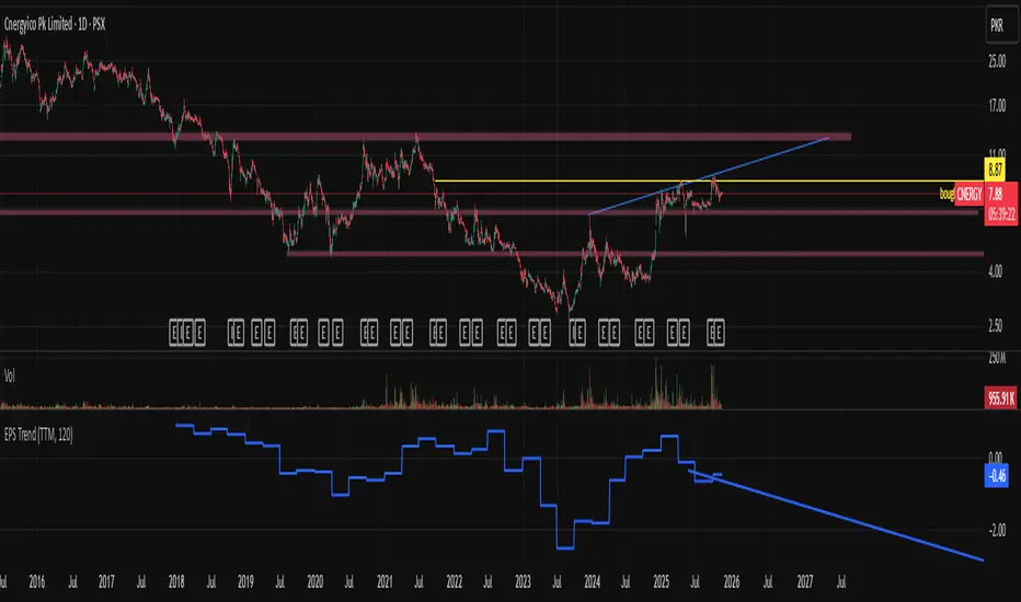
EPS Trendline (Fundamentals Insight by Mazhar Karimi)Overview
This indicator visualizes a company’s Earnings Per Share (EPS) data directly on the chart—pulled from TradingView’s fundamental database—and applies a dynamic linear regression trendline to highlight the long-term direction of earnings growth or decline.
It’s designed to help investors and quantitative traders quickly see how the company’s profitability (EPS) has evolved over time and whether it’s trending upward (growth), flat (stagnant), or downward (decline).
How it Works
Uses request.financial() to fetch EPS data (Diluted or Basic).
You can select whether to use TTM (Trailing Twelve Months), FQ (Fiscal Quarter), or FY (Fiscal Year) data.
The script fits a regression line (using ta.linreg) over a configurable window to visualize the underlying EPS trend.
Updates automatically when new financial data is released.
Inputs
EPS Period: Choose between FQ / FY / TTM
Use Diluted EPS: Toggle to compare Diluted vs. Basic EPS
Regression Window: Adjust how many bars are used to fit the trendline
Interpretation Tips
A rising trendline indicates earnings momentum and potential investor confidence.
A flat or declining trendline may warn of profitability slowdowns.
Combine with price action or valuation ratios (like P/E) for deeper analysis.
Works best on stocks or ETFs with fundamental data (not available for crypto or FX).
Suggestions / Use Cases
Pair with Price/Earnings ratio indicators to evaluate valuation vs. fundamentals.
Use in conjunction with earnings release events for context.
Ideal for long-term investors, swing traders, or fundamental quants tracking financial health trends.
Future Enhancements (Planned Ideas)
🔹 Option to display multiple regression lines (short-term and long-term)
🔹 Support for comparing multiple tickers’ EPS in the same pane
🔹 Integration with Net Income, Revenue, or Free Cash Flow trends
🔹 Add a “Rate of Change” signal for momentum-based EPS analysis
Smarter SNR (Support and Ressistance, Trendline, MTF OSC)Built with love "Smarter SNR (Support and Ressistance, Trendline, MTF OSC) "
This indiator will show you Support & Ressistance, Good Trendline, and Multi-timeframe analyzing of Oscillator (Stochastic and RSI)
You can combine with your own strategy, or use this purely
DISCLAIMER :
Measure the risk first before use it in real market
Backtest The Strategy was very important, so you know the probability
Fundamentally Logical :
SNR -> Last 3 Zigzag Pivot
Trendline -> Using two last pivot for calculating the slope
Features :
1. SNR
2. Trendline
3. MTF Oscillator Analyzing
How to use it :
1. All Label, Table & Line can be turned on/off in settings
2. Pivot Period can be Adjusted in settings
3. All Label, Table & Line style can be adjusted in settings
Regards,
Hanabil

Auto Trendline with Alert [TORYS]plot trendline
display trendline break
alert : trendline break
detail => my website

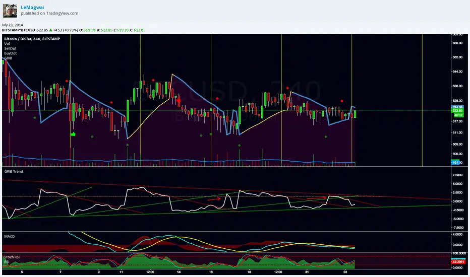
GRIB TrendlineGRIB Trendline show the distance betwen the price and the SAR with the GRIB settings in percentage. It highlight the elasticity of the wave. It's designed to be used with trendlines to spot the bottoms and the tops.
More explanation here :
and here :
note : do not use "selldot" and "buydot", i was testing something and gave up about the idea
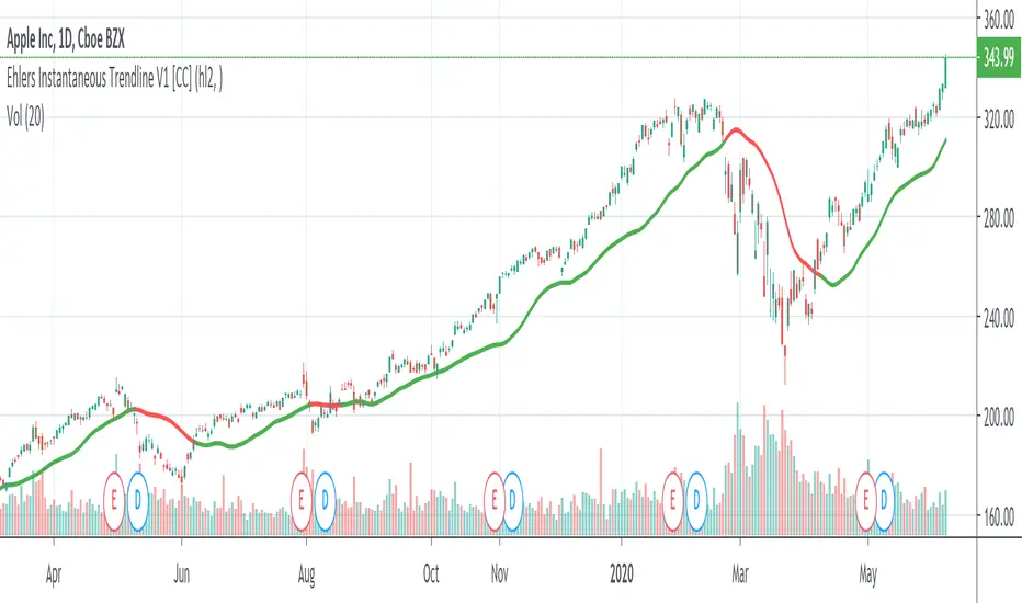
Ehlers Instantaneous Trendline V1 [CC]The Instantaneous Trendline was created by John Ehlers (Rocket Science For Traders pgs 109-110) and this indicator is perfect for determining the medium to long term trend. Buy when the indicator line is green and sell when it is red. I will be introducing a different version of this indicator which is perfect for short term trends so these will pair great together.
Let me know if there are other scripts you would like to see me publish or if you want something custom done!

Trendline Breaks + Supertrend [Delta BTC-P]Trendline Breaks + Supertrend in same direct Best on 5 min

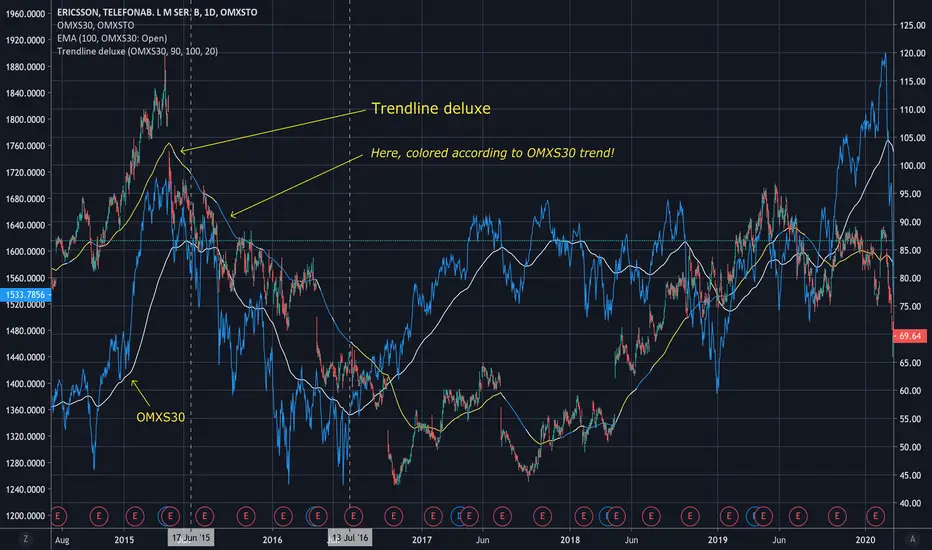
Trendline deluxeTrendline deluxe
As someone said:
"The best trend indicator is when you print the chart, put it on the wall
and take a few steps back. If you now can identify the trend you're done!"
This is an attempt of doing the same thing...
I find it handy to switch the color of the trendline depending on the where
the Trend is going. Especially when zooming in on the chart, the color tells
you what the overall Trend is.
Trendline deluxe comes with an extra twist in that it can be colored according
to your Stock index of choice, but still be plotted according to the Stock at hand.
SPY TrendlineThis indicator helps to see the SPY trendline in all stock charts without opening the SPY chart explicitly.
Hope this helps many of you to be more efficient in your chart analysis - have fun!
DTFilter - Bovespa - By Trendline365DAY TRADE.
With this indicator it is possible to read the trend of the graphical time,
so that the user can compare with other graph times and check if the market is aligned or not.
Thus it is possible to define if the market is aligned in several times of reading, following the same direction, mainly the sequential times, or 1/5 / 15min .
DTFIlter is not recommended for use as a point of entry or exit indicator.

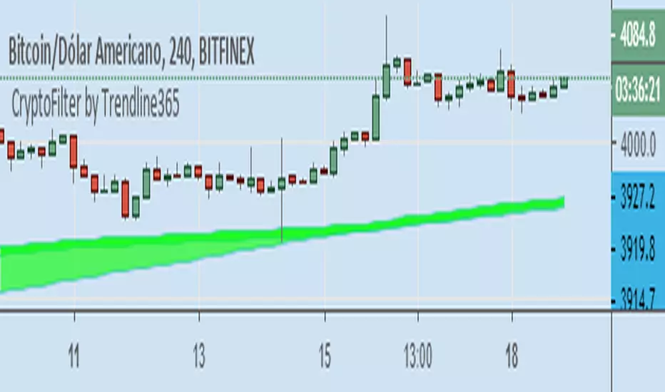
Cryptofilter by Trendline365Cryptofilter: Indicator filter trend for Crypto-Market.
With this indicator it is possible to read the trend of the graphical time,
so that the user can compare with other graph times and check if the market is aligned or not.
Thus it is possible to define if the market is aligned in several times of reading, following the same direction, mainly the sequential times, or 1/5 / 15min and 5/15/60 min.
Cryptofilter is not recommended for use as a point of entry or exit indicator.
TrendFilter by Trendline365This is our first indicator here.
The TrendFilter works like a filter to find main trends.
The TrendFilter does not provider entry points.
Just use for see main trends.
Setup:
Uptrend = Green.
Downtred = Red.
side trend = Yellow.
Any features? Comment bellow.