CAD CHF JPY (Index) vs USDDescription:
Analyze the combined performance of CAD, CHF, and JPY against the USD with this customized Forex currency index. This tool enables traders to gain a broader perspective of how these three currencies behave relative to the US Dollar by aggregating their movements into a single index. It’s a versatile tool designed for traders seeking actionable insights and trend identification.
Core Features:
Flexible Display Options:
Choose between Line Mode for a simplified view of the index trend or Candlestick Mode for detailed analysis of price action.
Custom Weight Adjustments:
Fine-tune the weight of each currency pair (USD/CAD, USD/CHF, USD/JPY) to better reflect your trading priorities or market expectations.
Moving Average Integration:
Add a moving average to smooth the data and identify trends more effectively. Choose your preferred type: SMA, EMA, WMA, or VWMA, and configure the number of periods to suit your strategy.
Streamlined Calculation:
The index aggregates data from USD/CAD, USD/CHF, and USD/JPY using a weighted average of their OHLC (Open, High, Low, Close) values, ensuring accuracy and adaptability to different market conditions.
Practical Applications:
Trend Identification:
Use the Line Mode with a moving average to confirm whether CAD, CHF, and JPY collectively show strength or weakness against the USD. A rising trendline signals currency strength, while a declining line suggests USD dominance.
Weight-Based Analysis:
If CAD is expected to lead, adjust its weight higher relative to CHF and JPY to emphasize its influence in the index. This customization makes the indicator adaptable to your market outlook.
Actionable Insights:
Identify key reversal points or breakout opportunities by analyzing the interaction of the index with its moving average. Combined with other technical tools, this indicator becomes a robust addition to any trader’s toolkit.
Additional Notes:
This indicator is a valuable resource for comparing the collective behavior of CAD, CHF, and JPY against the USD. Pair it with additional oscillators or divergence tools for a comprehensive market overview.
Perfect for both intraday analysis and swing trading strategies. Combine it with EUR GPB AUD (Index) indicator.
Good Profits!
Komut dosyalarını "trendline" için ara

MTF RSI CandlesThis Pine Script indicator is designed to provide a visual representation of Relative Strength Index (RSI) values across multiple timeframes. It enhances traditional candlestick charts by color-coding candles based on RSI levels, offering a clearer picture of overbought, oversold, and sideways market conditions. Additionally, it displays a hoverable table with RSI values for multiple predefined timeframes.
Key Features
1. Candle Coloring Based on RSI Levels:
Candles are color-coded based on predefined RSI ranges for easy interpretation of market conditions.
RSI Levels:
75-100: Strongest Overbought (Green)
65-75: Stronger Overbought (Dark Green)
55-65: Overbought (Teal)
45-55: Sideways (Gray)
35-45: Oversold (Light Red)
25-35: Stronger Oversold (Dark Red)
0-25: Strongest Oversold (Bright Red)
2. Multi-Timeframe RSI Table:
Displays RSI values for the following timeframes:
1 Min, 2 Min, 3 Min, 4 Min, 5 Min
10 Min, 15 Min, 30 Min, 1 Hour, 1 Day, 1 Week
Helps traders identify RSI trends across different time horizons.
3. Hoverable RSI Values:
Displays the RSI value of any candle when hovering over it, providing additional insights for analysis.
Inputs
1. RSI Length:
Default: 14
Determines the calculation period for the RSI indicator.
2. RSI Levels:
Configurable thresholds for RSI zones:
75-100: Strongest Overbought
65-75: Stronger Overbought
55-65: Overbought
45-55: Sideways
35-45: Oversold
25-35: Stronger Oversold
0-25: Strongest Oversold
How It Works:
1. RSI Calculation:
The RSI is calculated for the current timeframe using the input RSI Length.
It is also computed for 11 additional predefined timeframes using request.security.
2. Candle Coloring:
Candles are colored based on their RSI values and the specified RSI levels.
3. Hoverable RSI Values:
Each candle displays its RSI value when hovered over, via a dynamically created label.
Multi-Timeframe Table:
A table at the bottom-left of the chart displays RSI values for all predefined timeframes, making it easy to compare trends.
Usage:
1. Trend Identification:
Use candle colors to quickly assess market conditions (overbought, oversold, or sideways).
2. Timeframe Analysis:
Compare RSI values across different timeframes to determine long-term and short-term momentum.
3. Signal Confirmation:
Combine RSI signals with other indicators or patterns for higher-confidence trades.
Best Practices
Use this indicator in conjunction with volume analysis, support/resistance levels, or trendline strategies for better results.
Customize RSI levels and timeframes based on your trading strategy or market conditions.
Limitations
RSI is a lagging indicator and may not always predict immediate market reversals.
Multi-timeframe analysis can lead to conflicting signals; consider your trading horizon.

MEMEQUANTMEMEQUANT
This script is a comprehensive and specialized tool designed for tracking trends and money flow within meme coins and DEX tokens. By combining various features such as trend lines, Fibonacci levels, and category-based indices, it helps traders make informed decisions in highly volatile markets.
Key Features:
1. Category-Based Indices:
• Tracks the performance of token categories like:
• AI Agent Tokens
• AI Tokens
• Animal Tokens
• Murad Picks
• Each category consists of leader tokens, which are selected based on their higher market cap and trading volume. These tokens act as benchmarks for their respective categories.
• Visualizes category indices in a line chart to identify trends and compare money flow between categories.
2. Fibonacci Correction Zones:
• Highlights key retracement levels (e.g., 60%, 70%, 80%).
• These levels are crucial for identifying potential reversal zones, commonly observed in meme coin trading patterns.
• Fully customizable to match individual trading strategies.
3. Trend Lines:
• Automatically detects major support and resistance levels.
• Separates long-term and short-term trend lines, allowing traders to focus on significant price movements.
4. Enhanced Info Table:
• Provides real-time insights, including:
• % Distance from All-Time High (ATH)
• Current Trading Volume
• 50-bar Average Volume
• Volume Change Percentage
• Displays information in an easy-to-read table on the chart.
5. Customizable Settings:
• Users can adjust transparency, colors, and ranges for Fibonacci zones, trend lines, and the table.
• Enables or disables individual features (e.g., Fibonacci, trend lines, table) based on preferences.
How It Works:
1. Tracking Money Flow Across Categories:
• The script calculates the market cap to volume ratio for each category of tokens to help identify the dominant trend.
• A higher ratio indicates greater liquidity and stability, while a lower ratio suggests higher volatility or price manipulation.
2. Identifying Retracement Patterns:
• Leverages common retracement behaviors (e.g., 70% correction levels) observed in meme coins to detect potential reversal zones.
• Combines this with trend line analysis for additional confirmation.
3. Leader Tokens as Indicators:
• Each category is represented by its leader tokens, which have historically higher liquidity and market cap. This allows the script to accurately reflect the overall trend in each category.
When to Use:
• Trend Analysis: To identify which category (e.g., AI Tokens or Animal Tokens) is leading the market.
• Reversal Zones: To spot potential support or resistance levels using Fibonacci zones.
• Money Flow: To understand how capital is moving across different token categories in real time.
Who Is This For?
This script is tailored for:
• Traders specializing in meme coins and DEX tokens.
• Those looking for an edge in trend-based trading by analyzing market cap, volume, and retracement levels.
• Anyone aiming to track money flow dynamics between different token categories.
Future Updates:
This is the initial version of the script. Future updates may include:
• Support for additional token categories and DEX data.
• More advanced pattern recognition and alerts for volume and price anomalies.
• Enhanced visualization for historical data trends.
With this tool, traders can combine money flow analysis with the 60-70% retracement strategy, turning it into a powerful assistant for navigating the fast-paced world of meme coins and DEX tokens.
This script is designed to provide meaningful insights and practical utility for traders, adhering to TradingView’s standards for originality, clarity, and user value.

VWAP Fibonacci Bands (Zeiierman)█ Overview
The VWAP Fibonacci Bands is a sophisticated yet user-friendly indicator designed to assist traders in visualizing market trends, volatility, and potential support/resistance levels. Developed by Zeiierman, this tool integrates the MIDAS (Market Interpretation Data Analysis System) methodology with Standard Deviation Bands and user-defined Fibonacci levels to provide a comprehensive market analysis framework.
This indicator is built for traders who want a dynamic and customizable approach to understanding market movements, offering features that adapt to varying market conditions. Whether you're a scalper, swing trader, or long-term investor.
█ How It Works
⚪ Anchor Point System
The indicator begins its calculations based on an anchor point, which can be set to:
A specific date for historical analysis or alignment with significant market events.
A timeframe-based reset, dynamically restarting calculations at the beginning of each selected period (e.g., daily, weekly, or monthly).
This dual-anchor method ensures flexibility, allowing the indicator to align with various trading strategies.
⚪ MIDAS Calculation
The MIDAS calculation is central to this indicator. It uses cumulative price and volume data to compute a volume-weighted average price (VWAP), offering a trendline that reflects the true value weighted by trading activity.
⚪ Standard Deviation Bands
The upper and lower bands are calculated using the standard deviation of price movements around the MIDAS line.
⚪ Fibonacci Levels
User-defined Fibonacci ratios are used to plot additional support and resistance levels between the bands. These levels provide visual cues for potential price reversals or trend continuations.
█ How to Use
⚪ Trend Identification
Uptrend: The price remains above the MIDAS line.
Downtrend: The price stays below the MIDAS line and aligns with the lower bands.
⚪ Support and Resistance
The upper and lower bands act as support and resistance levels.
Fibonacci levels provide intermediate zones for potential price reversals.
⚪ Volatility Analysis
Wider bands indicate periods of high volatility.
Narrower bands suggest low-volatility conditions, often preceding breakouts.
⚪ Overbought/Oversold Conditions
Look for the price beyond the upper or lower bands to identify extreme conditions.
█ Settings
Set Anchor Method
Anchor Method: Choose between Timeframe or Date to define the starting point of calculations.
Anchor Timeframe: For Timeframe mode, specify the interval (e.g., Daily, Weekly).
Anchor Date: For Date mode, set the exact starting date for historical alignment.
Set Std Dev Multiplier
Controls the width of the bands:
Higher values widen the bands, filtering out minor fluctuations.
Lower values tighten the bands for more responsive analysis.
Set Fibonacci Levels
Define custom Fibonacci ratios (e.g., 0.236, 0.382) to plot intermediate levels between the bands.
█ Tips for Fine-Tuning
⚪ For Trend Trading:
Use higher Std Dev Multipliers to focus on long-term trends and avoid noise. Adjust Anchor Timeframe to Weekly or Monthly for broader trend analysis.
⚪ For Reversal Trading:
Tighten the bands with a lower Std Dev Multiplier.
Use shorter anchor timeframes for intraday reversals (e.g., Hourly).
⚪ For Volatile Markets:
Increase the Std Dev Multiplier to accommodate wider price swings.
⚪ For Quiet Markets:
Decrease the Std Dev Multiplier to highlight smaller fluctuations.
-----------------
Disclaimer
The information contained in my Scripts/Indicators/Ideas/Algos/Systems does not constitute financial advice or a solicitation to buy or sell any securities of any type. I will not accept liability for any loss or damage, including without limitation any loss of profit, which may arise directly or indirectly from the use of or reliance on such information.
All investments involve risk, and the past performance of a security, industry, sector, market, financial product, trading strategy, backtest, or individual's trading does not guarantee future results or returns. Investors are fully responsible for any investment decisions they make. Such decisions should be based solely on an evaluation of their financial circumstances, investment objectives, risk tolerance, and liquidity needs.
My Scripts/Indicators/Ideas/Algos/Systems are only for educational purposes!
Colored Stacked EMA RibbonThis script is my interpretation of an idea from John Carter in his interview with Richard Moglen.
The idea of moving average ribbons or simply multiple moving averages has been around since moving averages were created. But many of these ideas, such as the Guppy Multiple Moving Averages focus on price closes above a moving average (or multiple moving averages).
In this version, the idea is that the EMAs are compared to each other from shortest to longest. In a completely bullish alignment, the EMAs are referred to as "stacked" in which, for example, the 8 EMA > 13 EMA, the 13 EMA > 21 EMA and so on. When the EMAs are "stacked" in a fully bullish alignment, the EMA cloud is filled green. When the EMAs are "stacked" in a fully bearish alignment, the EMA cloud is filled red.
In addition, I've colored the EMA lines themselves according to if they are rising (green) or falling (red) over a user inputted lookback. The default is "1" period, but it is adjustable. (Generally, I use "1" for the lookback.)
When the EMA lines flip from mixed (rising/falling) to all rising, a green triangle is drawn under the bar/candle. Similarly, when the EMA lines flip from mixed (falling/rising) to all falling, a red triangle is drawn over the bar/candle. This gives the user another potential entry in the context of a stacked EMA cloud. It also can give early signals for entry in a neutral cloud.
Candles/bars are colored according to the EMA cloud & EMA line status. So, for example, a bullish stacked EMA cloud (green) and all EMA lines green, will result in a bright green candle color. IF the cloud is green, but the EMA lines are mixed (red/green), this will result in a dark green candle. Similar logic applies to the bearish conditions which result in red (most bearish) or orange (still bearish) candle colors. IF the EMA cloud is neither bullishly stacked or bearishly stacked, then those candles will appear as gray (neutral).
There are many ways to use this script, but it excels in a trending market. John Carter often sets limit buys in an area near the 21D EMA in names that are trending & he wants to get in. The 13D EMA linewidth is set at 2 and the 21D EMA linewidth is set a 3 to easily identify this area. Now, you can "buy the dip" or "short the rip" within the context of a trending market (which the script identifies with green or red EMA clouds). Or you can wait for some confirmation via the green triangle (or something else like a candle stick pattern or trendline break). Remember to set stops in case price goes against you.
1 final note this is not a "magic bullet", but for a single indicator it does alot of work & personally I've found it to be very useful on multiple time frames. I do recommend combining it with volume (or a volume-based indicator).
Update #1: This updated version allows the user to adjust candle colors, forces the script to wait for bar closes on intraday charts (if conditions are met) before plotting triangles, and removes a link to YT. In addition, non-intraday charts (daily, weekly, etc) will flash a triangle intraday (if conditions are met) before updating completely at the close.
Regime Classifier Oscillator (AiBitcoinTrend)The Regime Classifier Oscillator (AiBitcoinTrend) is an advanced tool for understanding market structure and detecting dynamic price regimes. By combining filtered price trends, clustering algorithms, and an adaptive oscillator, it provides traders with detailed insights into market phases, including accumulation, distribution, advancement, and decline.
This innovative tool simplifies market regime classification, enabling traders to align their strategies with evolving market conditions effectively.
👽 What is a Regime Classifier, and Why is it Useful?
A Regime Classifier is a concept in financial analysis that identifies distinct market conditions or "regimes" based on price behavior and volatility. These regimes often correspond to specific phases of the market, such as trends, consolidations, or periods of high or low volatility. By classifying these regimes, traders and analysts can better understand the underlying market dynamics, allowing them to adapt their strategies to suit prevailing conditions.
👽 Common Uses in Finance
Risk Management: Identifying high-volatility regimes helps traders adjust position sizes or hedge risks.
Strategy Optimization: Traders tailor their approaches—trend-following strategies in trending regimes, mean-reversion strategies in consolidations.
Forecasting: Understanding the current regime aids in predicting potential transitions, such as a shift from accumulation to an upward breakout.
Portfolio Allocation: Investors allocate assets differently based on market regimes, such as increasing cash positions in high-volatility environments.
👽 Why It’s Important
Markets behave differently under varying conditions. A regime classifier provides a structured way to analyze these changes, offering a systematic approach to decision-making. This improves both accuracy and confidence in navigating diverse market scenarios.
👽 How We Implemented the Regime Classifier in This Indicator
The Regime Classifier Oscillator takes the foundational concept of market regime classification and enhances it with advanced computational techniques, making it highly adaptive.
👾 Median Filtering: We smooth price data using a custom median filter to identify significant trends while eliminating noise. This establishes a baseline for price movement analysis.
👾 Clustering Model: Using clustering techniques, the indicator classifies volatility and price trends into distinct regimes:
Advance: Strong upward trends with low volatility.
Decline: Downward trends marked by high volatility.
Accumulation: Consolidation phases with subdued volatility.
Distribution: Topping or bottoming patterns with elevated volatility.
This classification leverages historical price data to refine cluster boundaries dynamically, ensuring adaptive and accurate detection of market states.
Volatility Classification: Price volatility is analyzed through rolling windows, separating data into high and low volatility clusters using distance-based assignments.
Price Trends: The interaction of price levels with the filtered trendline and volatility clusters determines whether the market is advancing, declining, accumulating, or distributing.
👽 Dynamic Cycle Oscillator (DCO):
Captures cyclic behavior and overlays it with smoothed oscillations, providing real-time feedback on price momentum and potential reversals.
Regime Visualization:
Regimes are displayed with intuitive labels and background colors, offering clear, actionable insights directly on the chart.
👽 Why This Implementation Stands Out
Dynamic and Adaptive: The clustering and refit mechanisms adapt to changing market conditions, ensuring relevance across different asset classes and timeframes.
Comprehensive Insights: By combining price trends, volatility, and cyclic behaviors, the indicator provides a holistic view of the market.
This implementation bridges the gap between theoretical regime classification and practical trading needs, making it a powerful tool for both novice and experienced traders.
👽 Applications
👾 Regime-Based Trading Strategies
Traders can use the regime classifications to adapt their strategies effectively:
Advance & Accumulation: Favorable for entering or holding long positions.
Decline & Distribution: Opportunities for short positions or risk management.
👾 Oscillator Insights for Trend Analysis
Overbought/oversold conditions: Early warning of potential reversals.
Dynamic trends: Highlights the strength of price momentum.
👽 Indicator Settings
👾 Filter and Classification Settings
Filter Window Size: Controls trend detection sensitivity.
ATR Lookback: Adjusts the threshold for regime classification.
Clustering Window & Refit Interval: Fine-tunes regime accuracy.
👾 Oscillator Settings
Dynamic Cycle Oscillator Lookback: Defines the sensitivity of cycle detection.
Smoothing Factor: Balances responsiveness and stability.
Disclaimer: This information is for entertainment purposes only and does not constitute financial advice. Please consult with a qualified financial advisor before making any investment decisions.

Rolling Window Geometric Brownian Motion Projections📊 Rolling GBM Projections + EV & Adjustable Confidence Bands
Overview
The Rolling GBM Projections + EV & Adjustable Confidence Bands indicator provides traders with a robust, dynamic tool to model and project future price movements using Geometric Brownian Motion (GBM). By combining GBM-based simulations, expected value (EV) calculations, and customizable confidence bands, this indicator offers valuable insights for decision-making and risk management.
Key Features
Rolling GBM Projections: Simulate potential future price paths based on drift (μμ) and volatility (σσ).
Expected Value (EV) Line: Represents the average projection of simulated price paths.
Confidence Bands: Define ranges where the price is expected to remain, adjustable from 51% to 99%.
Simulation Lines: Visualize individual GBM paths for detailed analysis.
EV of EV Line: A smoothed trend of the EV, offering additional clarity on price dynamics.
Customizable Lookback Periods: Adjust the rolling lookback periods for drift and volatility calculations.
Mathematical Foundation
1. Geometric Brownian Motion (GBM)
GBM is a mathematical model used to simulate the random movement of asset prices, described by the following stochastic differential equation:
dSt=μStdt+σStdWt
dSt=μStdt+σStdWt
Where:
StSt: Price at time tt
μμ: Drift term (expected return)
σσ: Volatility (standard deviation of returns)
dWtdWt: Wiener process (standard Brownian motion)
2. Drift (μμ) and Volatility (σσ)
Drift (μμ): Represents the average logarithmic return of the asset. Calculated using a simple moving average (SMA) over a rolling lookback period.
μ=SMA(ln(St/St−1),Lookback Drift)
μ=SMA(ln(St/St−1),Lookback Drift)
Volatility (σσ): Measures the standard deviation of logarithmic returns over a rolling lookback period.
σ=STD(ln(St/St−1),Lookback Volatility)
σ=STD(ln(St/St−1),Lookback Volatility)
3. Price Simulation Using GBM
The GBM formula for simulating future prices is:
St+Δt=St×e(μ−12σ2)Δt+σϵΔt
St+Δt=St×e(μ−21σ2)Δt+σϵΔt
Where:
ϵϵ: Random variable from a standard normal distribution (N(0,1)N(0,1)).
4. Confidence Bands
Confidence bands are determined using the Z-score corresponding to a user-defined confidence percentage (CC):
Upper Band=EV+Z⋅σ
Upper Band=EV+Z⋅σ
Lower Band=EV−Z⋅σ
Lower Band=EV−Z⋅σ
The Z-score is computed using an inverse normal distribution function, approximating the relationship between confidence and standard deviations.
Methodology
Rolling Drift and Volatility:
Drift and volatility are calculated using logarithmic returns over user-defined rolling lookback periods (default: μ=20μ=20, σ=16σ=16).
Drift defines the overall directional tendency, while volatility determines the randomness and variability of price movements.
Simulations:
Multiple GBM paths (default: 30) are generated for a specified number of projection candles (default: 12).
Each path is influenced by the current drift and volatility, incorporating random shocks to simulate real-world price dynamics.
Expected Value (EV):
The EV is calculated as the average of all simulated paths for each projection step, offering a statistical mean of potential price outcomes.
Confidence Bands:
The upper and lower bounds of the confidence bands are derived using the Z-score corresponding to the selected confidence percentage (e.g., 68%, 95%).
EV of EV:
A running average of the EV values, providing a smoothed perspective of price trends over the projection horizon.
Indicator Functionality
User Inputs:
Drift Lookback (Bars): Define the number of bars for rolling drift calculation (default: 20).
Volatility Lookback (Bars): Define the number of bars for rolling volatility calculation (default: 16).
Projection Candles (Bars): Set the number of bars to project future prices (default: 12).
Number of Simulations: Specify the number of GBM paths to simulate (default: 30).
Confidence Percentage: Input the desired confidence level for bands (default: 68%, adjustable from 51% to 99%).
Visualization Components:
Simulation Lines (Blue): Display individual GBM paths to visualize potential price scenarios.
Expected Value (EV) Line (Orange): Highlight the mean projection of all simulated paths.
Confidence Bands (Green & Red): Show the upper and lower confidence limits.
EV of EV Line (Orange Dashed): Provide a smoothed trendline of the EV values.
Current Price (White): Overlay the real-time price for context.
Display Toggles:
Enable or disable components (e.g., simulation lines, EV line, confidence bands) based on preference.
Practical Applications
Risk Management:
Utilize confidence bands to set stop-loss levels and manage trade risk effectively.
Use narrower confidence intervals (e.g., 50%) for aggressive strategies or wider intervals (e.g., 95%) for conservative approaches.
Trend Analysis:
Observe the EV and EV of EV lines to identify overarching trends and potential reversals.
Scenario Planning:
Analyze simulation lines to explore potential outcomes under varying market conditions.
Statistical Insights:
Leverage confidence bands to understand the statistical likelihood of price movements.
How to Use
Add the Indicator:
Copy the script into the TradingView Pine Editor, save it, and apply it to your chart.
Customize Settings:
Adjust the lookback periods for drift and volatility.
Define the number of projection candles and simulations.
Set the confidence percentage to tailor the bands to your strategy.
Interpret the Visualization:
Use the EV and confidence bands to guide trade entry, exit, and position sizing decisions.
Combine with other indicators for a holistic trading strategy.
Disclaimer
This indicator is a mathematical and statistical tool. It does not guarantee future performance.
Use it in conjunction with other forms of analysis and always trade responsibly.
Happy Trading! 🚀

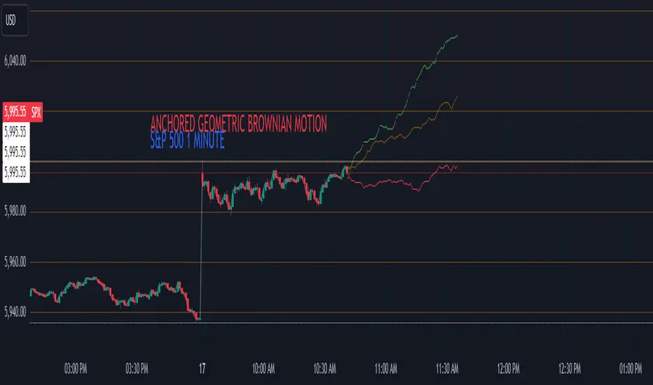
Anchored Geometric Brownian Motion Projections w/EVAnchored GBM (Geometric Brownian Motion) Projections + EV & Confidence Bands
Version: Pine Script v6
Overlay: Yes
Author:
Published On:
Overview
The Anchored GBM Projections + EV & Confidence Bands indicator leverages the Geometric Brownian Motion (GBM) model to project future price movements based on historical data. By simulating multiple potential future price paths, it provides traders with insights into possible price trajectories, their expected values, and confidence intervals. Additionally, it offers a "Mean of EV" (EV of EV) line, representing the running average of expected values across the projection period.
Key Features
Anchor Time Setup:
Define a specific point in time from which the projections commence.
By default, it uses the current bar's timestamp but can be customized.
Projection Parameters:
Projection Candles (Bars): Determines the number of future bars (time periods) to project.
Number of Simulations: Specifies how many GBM paths to simulate, ensuring statistical relevance via the Central Limit Theorem (CLT).
Display Toggles:
Simulation Lines: Visual representation of individual GBM simulation paths.
Expected Value (EV) Line: The average price across all simulations at each projection bar.
Upper & Lower Confidence Bands: 95% confidence intervals indicating potential price boundaries.
EV of EV Line: Running average of EV values, providing a smoothed central tendency across the projection period. Additionally, this line often acts as an indicator of trend direction.
Visualization:
Clear and distinguishable lines with customizable colors and styles.
Overlayed on the price chart for direct comparison with actual price movements.
Mathematical Foundation
Geometric Brownian Motion (GBM):
Definition: GBM is a continuous-time stochastic process used to model stock prices. It assumes that the logarithm of the stock price follows a Brownian motion with drift.
Equation:
S(t)=S0⋅e(μ−12σ2)t+σW(t)
S(t)=S0⋅e(μ−21σ2)t+σW(t) Where:
S(t)S(t) = Stock price at time tt
S0S0 = Initial stock price
μμ = Drift coefficient (average return)
σσ = Volatility coefficient (standard deviation of returns)
W(t)W(t) = Wiener process (standard Brownian motion)
Drift (μμ) and Volatility (σσ):
Drift (μμ) represents the expected return of the stock.
Volatility (σσ) measures the stock's price fluctuation intensity.
Central Limit Theorem (CLT):
Principle: With a sufficiently large number of independent simulations, the distribution of the sample mean (EV) approaches a normal distribution, regardless of the underlying distribution.
Application: Ensures that the EV and confidence bands are statistically reliable.
Expected Value (EV) and Confidence Bands:
EV: The mean price across all simulations at each projection bar.
Confidence Bands: Range within which the actual price is expected to lie with a specified probability (e.g., 95%).
EV of EV (Mean of Sample Means):
Definition: Represents the running average of EV values across the projection period, offering a smoothed central tendency.
Methodology
Anchor Time Setup:
The indicator starts projecting from a user-defined Anchor Time. If not customized, it defaults to the current bar's timestamp.
Purpose: Allows users to analyze projections from a specific historical point or the latest market data.
Calculating Drift and Volatility:
Returns Calculation: Computes the logarithmic returns from the Anchor Time to the current bar.
returns=ln(StSt−1)
returns=ln(St−1St)
Drift (μμ): Calculated as the simple moving average (SMA) of returns over the period since the Anchor Time.
Volatility (σσ): Determined using the standard deviation (stdev) of returns over the same period.
Simulation Generation:
Number of Simulations: The user defines how many GBM paths to simulate (e.g., 30).
Projection Candles: Determines the number of future bars to project (e.g., 12).
Process:
For each simulation:
Start from the current close price.
For each projection bar:
Generate a random number zz from a standard normal distribution.
Calculate the next price using the GBM formula:
St+1=St⋅e(μ−12σ2)+σz
St+1=St⋅e(μ−21σ2)+σz
Store the projected price in an array.
Expected Value (EV) and Confidence Bands Calculation:
EV Path: At each projection bar, compute the mean of all simulated prices.
Variance and Standard Deviation: Calculate the variance and standard deviation of simulated prices to determine the confidence intervals.
Confidence Bands: Using the standard normal z-score (1.96 for 95% confidence), establish upper and lower bounds:
Upper Band=EV+z⋅σEV
Upper Band=EV+z⋅σEV
Lower Band=EV−z⋅σEV
Lower Band=EV−z⋅σEV
EV of EV (Running Average of EV Values):
Calculation: For each projection bar, compute the average of all EV values up to that bar.
EV of EV =1j+1∑k=0jEV
EV of EV =j+11k=0∑jEV
Visualization: Plotted as a dynamic line reflecting the evolving average EV across the projection period.
Visualization Elements
Simulation Lines:
Appearance: Semi-transparent blue lines representing individual GBM simulation paths.
Purpose: Illustrate a range of possible future price trajectories based on current drift and volatility.
Expected Value (EV) Line:
Appearance: Solid orange line.
Purpose: Shows the average projected price at each future bar across all simulations.
Confidence Bands:
Upper Band: Dashed green line indicating the upper 95% confidence boundary.
Lower Band: Dashed red line indicating the lower 95% confidence boundary.
Purpose: Highlight the range within which the price is statistically expected to remain with 95% confidence.
EV of EV Line:
Appearance: Dashed purple line.
Purpose: Displays the running average of EV values, providing a smoothed trend of the central tendency across the projection period. As the mean of sample means it approximates the population mean (i.e. the trend since the anchor point.)
Current Price:
Appearance: Semi-transparent white line.
Purpose: Serves as a reference point for comparing actual price movements against projected paths.
Usage Instructions
Configuring User Inputs:
Anchor Time:
Set to a specific timestamp to start projections from a historical point or leave it as default to use the current bar's time.
Projection Candles (Bars):
Define the number of future bars to project (e.g., 12). Adjust based on your trading timeframe and analysis needs.
Number of Simulations:
Specify the number of GBM paths to simulate (e.g., 30). Higher numbers yield more accurate EV and confidence bands but may impact performance.
Display Toggles:
Show Simulation Lines: Toggle to display or hide individual GBM simulation paths.
Show Expected Value Line: Toggle to display or hide the EV path.
Show Upper Confidence Band: Toggle to display or hide the upper confidence boundary.
Show Lower Confidence Band: Toggle to display or hide the lower confidence boundary.
Show EV of EV Line: Toggle to display or hide the running average of EV values.
Managing TradingView's Object Limits:
Understanding Limits:
TradingView imposes a limit on the number of graphical objects (e.g., lines) that can be rendered. High values for projection candles and simulations can quickly consume these limits. TradingView appears to only allow a total of 55 candles to be projected, so if you want to see two complete lines, you would have to set the projection length to 27: since 27 * 2 = 54 and 54 < 55.
Optimizing Performance:
Use Toggles: Enable only the necessary visual elements. For instance, disable simulation lines and confidence bands when focusing on the EV and EV of EV lines. You can also use the maximum projection length of 55 with the lower limit confidence band as the only line, visualizing a long horizon for your risk.
Adjust Parameters: Lower the number of projection candles or simulations to stay within object limits without compromising essential insights.
Interpreting the Indicator:
Simulation Lines (Blue):
Represent individual potential future price paths based on GBM. A wider spread indicates higher volatility.
Expected Value (EV) Line (Goldenrod):
Shows the mean projected price at each future bar, providing a central trend.
Confidence Bands (Green & Red):
Indicate the statistical range (95% confidence) within which the price is expected to remain.
EV of EV Line (Dotted Line - Goldenrod):
Reflects the running average of EV values, offering a smoothed perspective of expected price trends over the projection period.
Current Price (White):
Serves as a benchmark for assessing how actual prices compare to projected paths.
Practical Applications
Risk Management:
Confidence Bands: Help in identifying potential support and resistance levels based on statistical confidence intervals.
EV Path: Assists in setting realistic target prices and stop-loss levels aligned with projected expectations.
Trend Analysis:
EV of EV Line: Offers a smoothed trendline, aiding in identifying overarching market directions amidst price volatility. Indicative of the population mean/overall trend of the data since your anchor point.
Scenario Planning:
Simulation Lines: Enable traders to visualize multiple potential outcomes, fostering better decision-making under uncertainty.
Performance Evaluation:
Comparing Actual vs. Projected Prices: Assess how actual price movements align with projected scenarios, refining trading strategies over time.
Mathematical and Statistical Insights
Simulation Integrity:
Independence: Each simulation path is generated independently, ensuring unbiased and diverse projections.
Randomness: Utilizes a Gaussian random number generator to introduce variability in diffusion terms, mimicking real market randomness.
Statistical Reliability:
Central Limit Theorem (CLT): By simulating a sufficient number of paths (e.g., 30), the sample mean (EV) converges to the population mean, ensuring reliable EV and confidence band calculations.
Variance Calculation: Accurate computation of variance from simulation data ensures precise confidence intervals.
Dynamic Projections:
Running Average (EV of EV): Provides a cumulative perspective, allowing traders to observe how the average expectation evolves as the projection progresses.
Customization and Enhancements
Adjustable Parameters:
Tailor the projection length and simulation count to match your trading style and analysis depth.
Visual Customization:
Modify line colors, styles, and transparency to enhance clarity and fit chart aesthetics.
Extended Statistical Metrics:
Future iterations can incorporate additional metrics like median projections, skewness, or alternative confidence intervals.
Dynamic Recalculation:
Implement logic to automatically update projections as new data becomes available, ensuring real-time relevance.
Performance Considerations
Object Count Management:
High simulation counts and extended projection periods can lead to a significant number of graphical objects, potentially slowing down chart performance.
Solution: Utilize display toggles effectively and optimize projection parameters to balance detail with performance.
Computational Efficiency:
The script employs efficient array handling and conditional plotting to minimize unnecessary computations and object creation.
Conclusion
The Anchored GBM Projections + EV & Confidence Bands indicator is a robust tool for traders seeking to forecast potential future price movements using statistical models. By integrating Geometric Brownian Motion simulations with expected value calculations and confidence intervals, it offers a comprehensive view of possible market scenarios. The addition of the "EV of EV" line further enhances analytical depth by providing a running average of expected values, aiding in trend identification and strategic decision-making.
Hope it helps!
OBV Divergence Indicator [TradingFinder] On-Balance Vol Reversal🔵 Introduction
The On-Balance Volume (OBV) indicator, introduced by Joe Granville in 1963, is a powerful technical analysis tool used to measure buying and selling pressure based on trading volume and price.
By aggregating trading volume—adding it on positive days and subtracting it on negative days—OBV creates a cumulative line that reflects market volume pressure, making it valuable for confirming trends, identifying entry and exit points, and forecasting potential price movements.
Divergences between price and OBV often provide significant signals. A bearish divergence occurs when the price forms higher highs while the OBV line forms lower highs. This discrepancy indicates that upward momentum is weakening, increasing the likelihood of a downward trend.
In contrast, a bullish divergence happens when the price makes lower lows, but the OBV line forms higher lows. This suggests increasing buying pressure and the potential for an upward trend reversal.
For instance, if the price is rising but the OBV trendline is falling, it may signal a bearish divergence, warning of a possible price decline. Conversely, if the price is falling while the OBV line is rising, this could signal a bullish divergence, indicating a possible price recovery. These signals are particularly useful for identifying market turning points.
OBV often acts as a leading indicator, moving ahead of price changes. For example, a rising OBV alongside stable or declining prices can signal an impending upward breakout.
Conversely, a declining OBV with rising prices may indicate that the current uptrend is losing strength. Traders using this strategy often consider entering positions at breakout levels while setting stop losses near recent swing highs or lows to manage risk effectively.
This integration highlights how OBV divergences can provide actionable insights for predicting price movements and managing trades efficiently.
Bullish Divergence :
Bearish Divergence :
🔵 How to Use
The OBV indicator, as a cumulative tool, assists analysts in comparing volume and price changes to identify new trends and key levels for entering or exiting trades. Beyond confirming existing trends, it is particularly effective in analyzing positive and negative divergences between price and volume, providing valuable signals for trading decisions.
🟣 Bullish Divergence
A bullish divergence occurs when the price continues its downward or stable trend, but the OBV line starts rising, forming a higher low compared to its previous low. This suggests increasing volume on up days relative to down days and often signals a reversal to the upside.
For instance, if an asset's price stabilizes near a support level but the OBV line shows an upward trend, this divergence could present an opportunity to enter a long position.
🟣 Bearish Divergence
A bearish divergence occurs when the price forms higher highs, but the OBV line declines, creating lower highs compared to previous peaks. This indicates decreasing volume on up days relative to down days and often acts as a warning for a reversal to the downside.
For example, if an asset’s price approaches a resistance level while OBV starts declining, this divergence may signal the beginning of a downtrend and could indicate a good time to exit long trades or enter short positions.
🔵 Setting
Period : The "Period" setting allows you to define the number of bars or intervals for "Periodic" and "EMA" modes. A shorter period captures more short-term movements, while a longer period smooths out the fluctuations and provides a broader view of market trends.
You can enable or disable labels to highlight key levels or divergences and tables to show numerical details like values and divergence types. These options allow for a customized chart display.
🔵 Table
The following table breaks down the main features of the oscillator. It covers four critical categories: Exist, Consecutive, Divergence Quality, and Change Phase Indicator.
Exist : If divergence is detected, a "+" will appear in this row.
Consecutive: Shows the number of consecutive divergences that have formed in a short period.
Divergence Quality : Evaluates the quality of the divergence based on the number of occurrences. One is labeled "Normal," two are "Good," and three or more are considered "Strong."
Change Phase Indicator : If a phase change is detected between two oscillation peaks, this is marked in the table.
🔵 Conclusion
The OBV (On Balance Volume) indicator is a simple yet effective tool in technical analysis that combines volume and price changes to provide a comprehensive view of market buying and selling pressure. By identifying positive and negative divergences, OBV enables analysts to detect early signs of trend reversals and refine their trading strategies.
Divergences in OBV often precede price changes, making it a leading indicator for predicting market movements. Using OBV alongside other technical tools can enhance decision-making accuracy and help traders identify better entry and exit points. However, it is essential to consider the limitations of OBV, such as the potential for signal errors and the impact of sudden news events.
Ultimately, OBV serves as a complementary tool in technical analysis, aiding in trend identification, signal confirmation, and risk management. A thoughtful application of this indicator, in combination with other analytical tools, can create valuable opportunities for profiting in financial markets.

X3 Absolute Moving Average The X3 Absolute Moving Average (X3AMA) is a powerful and versatile trend-following indicator built on a combination of Fibonacci-based moving averages and advanced smoothing techniques. This tool is designed to help traders identify and act on market trends with greater precision.
Logic Behind the Indicator:
Fibonacci Midline Source:
The script calculates a dynamic midline by averaging 15 Fibonacci-based exponential moving averages (EMAs) of high and low prices.
Triple Smoothing:
The calculated midline serves as the base data for further trend analysis.
Three levels of smoothing are applied using adjustable moving average methods (e.g., EMA, SMA, RMA) to reduce noise and provide a clean representation of the trend.
Dynamic Gradient Fill:
The area between the Primary Trend Line (fast) and the Secondary Trend Line (slow) is shaded with a gradient fill.
The gradient dynamically transitions between the primary and secondary trend colors, offering a visual representation of trend strength and direction.
Key Features:
Primary Trend Line: Represents short-term trend direction and momentum.
Secondary Trend Line: Captures the longer-term trend for broader market context.
Gradient Fill: Enhances visual interpretation of the trend's strength and alignment.
Customizable Settings:
Adjustable smoothing lengths and methods.
Configurable colors for trend lines and gradient fill.
Timeframe flexibility for the Fibonacci midline.
How to Use:
Trend Identification:
Use crossovers between the Primary and Secondary Trend Lines to identify potential trend reversals.
Observe the gradient fill to assess the strength of the current trend.
Customization:
Adjust the smoothing lengths and moving average methods to align with your trading strategy.
Modify the gradient and trendline colors for better visual clarity.
Disclaimer:
This indicator is a powerful tool for analyzing trends, but it should not be used in isolation. Always complement it with other technical analysis tools and risk management strategies.

Divergence-Weighted clouds V 1.0Comprehensive Introduction to Divergence-Weighted Clouds V 1.0 (DW)
In financial markets, the analysis of volume and price plays a fundamental role in identifying trends, reversals, and making trading decisions. Volume indicates the level of market interest and liquidity focused on an asset, while price reflects changes in supply and demand. Alongside these two elements, market volatility, support and resistance levels, and cash flow are also critical factors that help analysts form a comprehensive view of the market. The Divergence-Weighted Clouds V 1.0 (DW) indicator is designed to simultaneously analyze these fundamental elements and other important market dynamics. To achieve this, it utilizes data generated from 13 distinct indicators, each measuring specific aspects of the market:
Trend and Momentum: Analyzing the direction and strength of price movements.
Volume and Cash Flow: Understanding the inflow and outflow of capital in the market.
Oscillators: Identifying overbought and oversold conditions.
Support and Resistance Levels: Highlighting key price levels.
The Core Challenge: Standardizing Diverse Data
The primary challenge lies in the fact that the outputs of these indicators differ significantly in scale and meaning. For example:
Volume often generates very large values (e.g., millions of shares).
Oscillators provide data within fixed ranges (e.g., 0 to 100).
Price-based metrics may vary in entirely different scales (e.g., tens or hundreds of units).
These differences make direct comparison of the data impractical. The DW indicator resolves this challenge through an advanced mathematical methodology:
Normalization and Hierarchical Evaluation:
To standardize the data, a process called hierarchical EMA evaluation is employed. Initially, the raw outputs of each indicator are computed over different timeframes using Exponential Moving Averages (EMA) based on prime-number intervals.
Hierarchical Scoring:
A pyramid-like structure is used to evaluate the performance of each indicator. This method examines the relationships and distances between EMAs for each indicator and assigns a numerical score.
Final Integration and Aggregation:
The scores of all 13 indicators are then mathematically aggregated into a single number. This final value represents the overall market performance at that moment, enabling a unified interpretation of volume, price, and volatility.
-------------------------------------------------------------------------------------------------
Indicators Used in DW
To achieve this comprehensive analysis, DW leverages 13 carefully selected indicators, each offering unique insights into market dynamics:
Trend and Momentum
- ALMA (Arnaud Legoux Moving Average): Reduces lag for faster trend identification.
- Aroon Up: Analyzes the stability of uptrends.
- ADX (Average Directional Index): Measures the strength of a trend.
Volume and Cash Flow
- CMF (Chaikin Money Flow): Identifies cash flow based on price and volume.
- EFI (Elder’s Force Index): Evaluates the strength of price changes alongside volume.
- Volume Delta: Tracks the balance between buying and selling pressure.
- Raw Volume: Analyzes unprocessed volume data.
Oscillators
- Fisher Transform: Normalizes data to detect price reversals.
- MFI (Money Flow Index): Identifies overbought and oversold levels.
Support, Resistance, and Price Dynamics
- Ichimoku Lines (Tenkan-sen & Kijun-sen): Analyzes support and resistance levels.
- McGinley Dynamic: Minimizes errors caused by rapid price movements.
- Price Hierarchy: Evaluates the relative position of prices across timeframes.
-------------------------------------------------------------------------------------------------
Example: Hierarchical Scoring for Price Analysis
To illustrate how the DW indicator processes data, let’s take the price as an example and analyze it using the first four prime numbers (2, 3, 5, and 7) as intervals for Exponential Moving Averages (EMAs). This example will demonstrate how the indicator evaluates price relationships and assigns a hierarchical score.
Step-by-Step Calculation:
1. Raw Data:
Let’s assume the closing prices for a specific asset over recent days are as follows:
Day 1: 100
Day 2: 102
Day 3: 101
Day 4: 104
Day 5: 103
Day 6: 105
Day 7: 106
2. Calculate EMAs for Prime Number Intervals:
Using the prime-number intervals (2, 3, 5, 7), we calculate the EMAs for these timeframes:
EMA(2): Averages the last 2 closing prices equal to 105.33
EMA(3): Averages the last 3 closing prices equal to 104.25
EMA(5): Averages the last 5 closing prices equal to 103.17
EMA(7): Averages the last 7 closing prices equal to 102.67
3. Compare EMAs Hierarchically:
To assign a score, the relationships between the EMAs are analyzed hierarchically. We evaluate whether each smaller EMA is greater or less than the larger ones:
Compare EMA(2) to EMA(3), EMA(5), and EMA(7):
EMA(2) > EMA(3):105.33>104.25 => +1
EMA(2) > EMA(5): 105.33>103.17 => +1
EMA(2) > EMA(7): 105.33 > 102.67 => +1
Compare EMA(3) to EMA(5) and EMA(7):
EMA(3) > EMA(5) : 104.25>103.17 => +1
EMA(3) > EMA(7):104.25 >102.67 => +1
Compare EMA(5) to EMA(7):
EMA(5) > EMA(7):103.17>102.67 => +1
Assign a Score:
Each positive comparison adds +1 to the score. In this example:
Total Score for Price = 1+1+1+1+1+1+1=6
-------------------------------------------------------------------------------------------------
Logic Behind Scoring:
The score reflects the "steepness" or "hierarchy" of price movement across different timeframes:
A higher score indicates that shorter EMAs are consistently above longer ones, signaling a strong upward trend.
A lower score or negative values would indicate the opposite (e.g., short-term prices lagging behind long-term averages, signaling weakness or potential reversal).
This method ensures that even complex data points (like price, volume, or oscillators) can be distilled into a single, comparable numerical value. When repeated across all 13 indicators, it enables the DW indicator to create a unified, normalized score that represents the overall market condition.
-------------------------------------------------------------------------------------------------
Settings and Customization in Divergence-Weighted Clouds V 1.0 (DW)
The Divergence-Weighted Clouds V 1.0 (DW) indicator provides extensive customization options to empower traders to fine-tune the analysis according to their specific needs and trading strategies. Each of the 13 indicators is fully customizable through the settings menu, allowing adjustments to parameters such as lookback periods, sensitivity, and calculation methods. This flexibility ensures that DW can adapt seamlessly to a wide range of market conditions and asset classes.
Key Features of the Settings Menu
1. Global Settings:
Lookback Periods: Define the timeframe for data aggregation and analysis across all indicators.
Normalization Settings: Adjust parameters to refine the process of scaling diverse outputs to a comparable range.
Divergence Sensitivity: Control the weight given to indicators deviating from the average, enabling a focus on outliers or broader trends.
2. Indicator-Specific Settings:
Each of the 13 indicators has its own dedicated section in the settings menu for precise customization. Examples include:
ALMA (Arnaud Legoux Moving Average):
Window Size: Set the number of bars used for calculating the average.
Offset: Control the sensitivity of trend detection.
Sigma: Adjust the smoothing factor for the calculation.
Aroon Up:
Length: Modify the lookback period for identifying highs and evaluating uptrends.
ADX (Average Directional Index):
DI Length: Specify the period for calculating directional indicators (DI).
ADX Smoothing: Adjust the smoothing period for trend strength analysis.
3. Oscillator Settings:
Fisher Transform:
Length: Customize the period for normalization and detecting reversals.
Money Flow Index (MFI):
Length: Set the timeframe for analyzing overbought and oversold conditions.
4. Volume and Cash Flow Settings:
Chaikin Money Flow (CMF):
Length: Define the period for analyzing cash flow based on price and volume.
Volume Delta:
Timeframe: Select a custom timeframe for analyzing buying and selling pressure.
5. Support and Resistance Settings:
In the Support and Resistance category of the DW indicator, we address the logic behind four components:
McGinley Dynamic
Price Hierarchy
Base Line
Conversion Line
The settings structure for this section primarily focuses on McGinley Dynamic, while the other three elements—Price Hierarchy, Base Line, and Conversion Line—operate based on predefined values derived from the mathematical structure and logic of the DW indicator. Let’s explore this in detail:
McGinley Dynamic
Length: The only customizable setting in this category. Users can adjust the length parameter to tailor the responsiveness of the McGinley Dynamic to different market conditions. McGinley Dynamic adapts dynamically to the speed of price changes, reducing lag and minimizing false signals. Its flexibility allows it to serve as both a trendline and a support/resistance guide.
Price Hierarchy
The Price Hierarchy component in DW leverages a pyramid structure and triangular scoring based on prime-number intervals (e.g., 2, 3, 5, 7). This methodology ensures a mathematically robust framework for evaluating the relative position of prices across multiple timeframes.
Why No Settings for Price Hierarchy?
The unique properties of prime numbers make them ideal for constructing this hierarchical scoring system. Changing these intervals would compromise the integrity of the calculations, as they are specifically designed to ensure precision and consistency. Therefore, no customization is allowed for this component in the settings menu.
Conversion Line and Base Line
The Conversion Line (Tenkan-sen) and Base Line (Kijun-sen) are integral components derived from DW’s scoring methodology and represent short-term and medium-term equilibrium levels, respectively. These lines are calculated using the Ichimoku framework, which provides a reliable and well-recognized mathematical basis:
Conversion Line: The average of the highest high and lowest low over a fixed period of 9 bars.
Base Line: The average of the highest high and lowest low over a fixed period of 26 bars./list]
Both lines are utilized in DW as part of the 13 generated indicator variables to assess market equilibrium.
Why Default Values for Conversion and Base Lines?
These values are fixed to the default Ichimoku parameters to:
- Ensure consistency with the broader Ichimoku logic for users familiar with its methodology.
- Prevent confusion in the settings menu, as customization of these parameters is unnecessary for DW’s scoring system.
Important Note: While these lines are derived using Ichimoku logic, they are not standalone Ichimoku components but are embedded into DW’s mathematical structure. In the next section, we will elaborate on how the Ichimoku framework is employed for the graphical visualization of DW’s calculations.
Displaying the Results of 13 Indicator Integration in DW Indicator
The Divergence-Weighted Clouds V 1.0 (DW) employs a rigorous methodology to integrate 13 distinct indicators into a single, normalized output. Here's how the process works, followed by an explanation of the visualization strategy leveraging Ichimoku logic.
Simultaneous Evaluation of 13 Indicators
1. Mathematical Integration Logic:
Normalization: The outputs of all 13 indicators (e.g., ALMA, ADX, CMF) are normalized into comparable ranges, ensuring compatibility despite their diverse scales.
Hierarchical Scoring with Prime Intervals: For each indicator, Exponential Moving Averages (EMAs) are calculated using prime-number intervals (e.g., 2, 3, 5, 7). These EMAs are evaluated through a triangular scoring system, creating individual scores for each indicator.
Divergence Weighting: Indicators showing significant divergence from group averages are given higher weights, amplifying their influence on the final score.
2. Unified Score Calculation:
The normalized and weighted outputs of all 13 indicators are aggregated into a single score.
This score represents the overall behavior of the market, based on the simultaneous evaluation of trend, volume, oscillators, and price metrics.
------------------------------------------------------------------------------------------
Challenge of Visualizing Results
The next challenge lies in effectively visualizing the score to make it actionable for traders. The DW indicator resolves this challenge by leveraging the Ichimoku framework.
Why Ichimoku for Visualization?
The Ichimoku system is known for its clear and predictive visualization capabilities, making it ideal for representing DW’s complex calculations:
1. Cloud-Based Display: Ichimoku Clouds (Kumo) are intuitive for identifying equilibrium zones and future price movements.
2. Projection Ability: The forward-projected Leading Spans (Senkou A and B) provide predictive insights based on past and current data.
3. Trader Familiarity: Ichimoku is widely recognized, reducing the learning curve for users.
Implementation of Ichimoku Logic
1. Mapping Score to Price:
The score is normalized and mapped to price using a scale factor, ensuring alignment with price data while preserving DW’s analytical integrity.
2. Ichimoku Cloud Lines:
Conversion Line (Tenkan-sen): Short-term equilibrium based on the score, calculated using a 9-period high-low average.
Base Line (Kijun-sen): Medium-term equilibrium calculated using a 26-period high-low average.
Leading Spans (Senkou A & B):
- Senkou A: Average of the Conversion and Base Lines.
- Senkou B: High-low average over a 52-period window.
Lagging Span (Chikou): Unlike traditional Ichimoku, DW’s Lagging Span reflects the Nebula Score shifted backward, providing a historical perspective on combined indicator behavior
3. Cloud Dynamics:
The Kumo Cloud is filled based on the relative position of Senkou A and Senkou B, using color shading to distinguish bullish and bearish conditions.
------------------------------------------------------------------------------------------
Customization in Computational Settings
The core computational components of DW allow some customization for sensitivity adjustments:
Divergence Sensitivity: Controls the weight assigned to indicators with higher divergence.
Volatility Normalization: Adjusts the lookback period for volatility adjustments, refining the Nebula Score scaling.
------------------------------------------------------------------------------------------
Advantages of Using Ichimoku Logic
1. Predictive Visualization:
The forward-projected cloud provides actionable insights for identifying trends and reversals earlier than traditional Ichimoku.
2. Aligned Lagging Span:
DW’s Lagging Span represents the normalized evaluation of all 13 indicators, offering a unique perspective beyond just closing price.
3. Intuitive Interpretation:
Traders familiar with Ichimoku can easily interpret DW’s outputs, making it accessible and effective.
Conclusion
By combining rigorous mathematical evaluation with Ichimoku’s visualization strengths, DW provides traders with a clear, actionable representation of market conditions. This ensures that the complex integration of 13 indicators is not only analytically robust but also visually intuitive.
------------------------------------------------------------------------------------------
Comparison Between Divergence-Weighted Clouds V 1.0 (DW) and Traditional Ichimoku: NVIDIA 4H Chart
The chart showcases a side-by-side comparison of the Divergence-Weighted Clouds V 1.0 (DW) indicator (on the left) and the Traditional Ichimoku indicator (on the right). This comparison highlights the differences in how the two indicators interpret market trends and project equilibrium zones using their respective methodologies.
Key Observations and Insights
1. Base and Conversion Line Movements:
On Thursday, November 21, 2024, 17:30, in the DW indicator (left chart), the Base Line crosses above the Conversion Line, signaling a shift in medium-term equilibrium relative to short-term equilibrium.
On the Traditional Ichimoku (right chart), this crossover is not reflected until Monday, November 25, 2024, 17:30, occurring 4 days later.
Significance:
The DW indicator identifies the crossover and equilibrium shift significantly earlier due to its ability to process and normalize data from 13 distinct indicators.
This predictive capability provides traders with earlier insights, enabling them to anticipate changes and adjust their strategies proactively.
2. Cloud Dynamics and Leading Spans:
In both charts, the cloud (Kumo) represents the equilibrium and potential support/resistance zones.
The DW indicator’s Leading Span A and Leading Span B react faster to market changes, creating a more responsive and forward-looking cloud compared to the traditional Ichimoku.
Example:
On the DW chart (left), the cloud begins shifting to reflect the crossover earlier, signaling potential future support/resistance levels.
In the Ichimoku chart (right), the cloud reacts more slowly, lagging behind the DW indicator.
3. Lagging Span (Chikou Line):
In the DW indicator, the Lagging Span is based on the normalized output of the 13 indicators, reflecting their aggregated behavior rather than just the closing price shifted backward as in the traditional Ichimoku.
This provides a unique perspective on past market strength, aligning the Lagging Span more closely with the overall market condition derived from DW’s computations.
4. Price Alignment:
In the DW indicator, all normalized scores and values are mapped to align with price action, ensuring that the visualization remains intuitive while incorporating complex calculations.
------------------------------------------------------------------------------------------
Advantages of DW Over Traditional Ichimoku
1.Earlier Signal Detection:
As demonstrated by the Base and Conversion Line crossover, DW detects changes in market equilibrium 4 days earlier, giving traders a significant advantage in anticipating price movements.
2. Enhanced Predictive Power:
The Leading Spans in DW’s cloud react faster, providing clearer forward-looking support and resistance zones compared to the traditional Ichimoku.
3. Comprehensive Data Integration:
While the Ichimoku relies solely on price-based calculations, DW integrates outputs from 13 distinct indicators, offering a more robust and comprehensive analysis of market conditions.
4. Alignment with Market Behavior:
The DW Lagging Span reflects the aggregated score of multiple indicators, aligning more closely with overall market sentiment and providing a deeper context than the price-based Lagging Span in Ichimoku.
------------------------------------------------------------------------------------------
Final Note
The chart comparison illustrates how the Divergence-Weighted Clouds V 1.0 (DW) indicator outperforms traditional Ichimoku in terms of signal responsiveness and predictive accuracy. By combining the mathematical rigor of DW’s calculations with the visual clarity of Ichimoku, traders gain a powerful tool for analyzing market trends and making informed decisions.
Look at the DW chart (left) to see how early signals and cloud adjustments provide actionable insights compared to the slower reactions of the Traditional Ichimoku chart (right).

Stoch RSI and RSI Buy/Sell Signals with MACD Trend FilterDescription of the Indicator
This Pine Script is designed to provide traders with buy and sell signals based on the combination of Stochastic RSI, RSI, and MACD indicators, enhanced by the confirmation of candle colors. The primary goal is to facilitate informed trading decisions in various market conditions by utilizing different indicators and their interactions. The script allows customization of various parameters, providing flexibility for traders to adapt it to their specific trading styles.
Usefulness
This indicator is not just a mashup of existing indicators; it integrates the functionality of multiple momentum and trend-detection methods into a cohesive trading tool. The combination of Stochastic RSI, RSI, and MACD offers a well-rounded approach to analyzing market conditions, allowing traders to identify entry and exit points effectively. The inclusion of color-coded signals (strong vs. weak) further enhances its utility by providing visual cues about the strength of the signals.
How to Use This Indicator
Input Settings: Adjust the parameters for the Stochastic RSI, RSI, and MACD to fit your trading style. Set the overbought/oversold levels according to your risk tolerance.
Signal Colors:
Strong Buy Signal: Indicated by a green label and confirmed by a green candle (close > open).
Weak Buy Signal: Indicated by a blue label and confirmed by a green candle (close > open).
Strong Sell Signal: Indicated by a red label and confirmed by a red candle (close < open).
Weak Sell Signal: Indicated by an orange label and confirmed by a red candle (close < open).
Example Trading Strategy Using This Indicator
To effectively use this indicator as part of your trading strategy, follow these detailed steps:
Setup:
Timeframe : Select a timeframe that aligns with your trading style (e.g., 15-minute for intraday, 1-hour for swing trading, or daily for longer-term positions).
Indicator Settings : Customize the Stochastic RSI, RSI, and MACD parameters to suit your trading approach. Adjust overbought/oversold levels to match your risk tolerance.
Strategy:
1. Strong Buy Entry Criteria :
Wait for a strong buy signal (green label) when the RSI is at or below the oversold level (e.g., ≤ 35), indicating a deeply oversold market. Confirm that the MACD shows a decreasing trend (bearish momentum weakening) to validate a potential reversal. Ensure the current candle is green (close > open) if candle color confirmation is enabled.
Example Use : On a 1-hour chart, if the RSI drops below 35, MACD shows three consecutive bars of decreasing negative momentum, and a green candle forms, enter a buy position. This setup signals a robust entry with strong momentum backing it.
2. Weak Buy Entry Criteria :
Monitor for weak buy signals (blue label) when RSI is above the oversold level but still below the neutral (e.g., between 36 and 50). This indicates a market recovering from an oversold state but not fully reversing yet. These signals can be used for early entries with additional confirmations, such as support levels or higher timeframe trends.
Example Use : On the same 1-hour chart, if RSI is at 45, the MACD shows momentum stabilizing (not necessarily negative), and a green candle appears, consider a partial or cautious entry. Use this as an early warning for a potential bullish move, especially when higher timeframe indicators align.
3. Strong Sell Entry Criteria :
Look for a strong sell signal (red label) when RSI is at or above the overbought level (e.g., ≥ 65), signaling a strong overbought condition. The MACD should show three consecutive bars of increasing positive momentum to indicate that the bullish trend is weakening. Ensure the current candle is red (close < open) if candle color confirmation is enabled.
Example Use : If RSI reaches 70, MACD shows increasing momentum that starts to level off, and a red candle forms on a 1-hour chart, initiate a short position with a stop loss set above recent resistance. This is a high-confidence signal for potential price reversal or pullback.
4. Weak Sell Entry Criteria :
Use weak sell signals (orange label) when RSI is between the neutral and overbought levels (e.g., between 50 and 64). These can indicate potential short opportunities that might not yet be fully mature but are worth monitoring. Look for other confirmations like resistance levels or trendline touches to strengthen the signal.
Example Use : If RSI reads 60 on a 1-hour chart, and the MACD shows slight positive momentum with signs of slowing down, place a cautious sell position or scale out of existing long positions. This setup allows you to prepare for a possible downtrend.
Trade Management:
Stop Loss : For buy trades, place stop losses below recent swing lows. For sell trades, set stops above recent swing highs to manage risk effectively.
Take Profit : Target nearby resistance or support levels, apply risk-to-reward ratios (e.g., 1:2), or use trailing stops to lock in profits as price moves in your favor.
Confirmation : Align these signals with broader trends on higher timeframes. For example, if you receive a weak buy signal on a 15-minute chart, check the 1-hour or daily chart to ensure the overall trend is not bearish.
Real-World Example: Imagine trading on a 15-minute chart :
For a buy:
A strong buy signal (green) appears when the RSI dips to 32, MACD shows declining bearish momentum, and a green candle forms. Enter a buy position with a stop loss below the most recent support level.
Alternatively, a weak buy signal (blue) appears when RSI is at 47. Use this as a signal to start monitoring the market closely or enter a smaller position if other indicators (like support and volume analysis) align.
For a sell:
A strong sell signal (red) with RSI at 72 and a red candle signals to short with conviction. Place your stop loss just above the last peak.
A weak sell signal (orange) with RSI at 62 might prompt caution but can still be acted on if confirmed by declining volume or touching a resistance level.
These strategies show how to blend both strong and weak signals into your trading for more nuanced decision-making.
Technical Analysis of the Code
1. Stochastic RSI Calculation:
The script calculates the Stochastic RSI (stochRsiK) using the RSI as input and smooths it with a moving average (stochRsiD).
Code Explanation : ta.stoch(rsi, rsi, rsi, stochLength) computes the Stochastic RSI, and ta.sma(stochRsiK, stochSmoothing) applies smoothing.
2. RSI Calculation :
The RSI is computed over a user-defined period and checks for overbought or oversold conditions.
Code Explanation : rsi = ta.rsi(close, rsiLength) calculates RSI values.
3. MACD Trend Filter :
MACD is calculated with fast, slow, and signal lengths, identifying trends via three consecutive bars moving in the same direction.
Code Explanation : = ta.macd(close, macdLengthFast, macdLengthSlow, macdSignalLength) sets MACD values. Conditions like macdLine < macdLine confirm trends.
4. Buy and Sell Conditions :
The script checks Stochastic RSI, RSI, and MACD values to set buy/sell flags. Candle color filters further confirm valid entries.
Code Explanation : buyConditionMet and sellConditionMet logically check all conditions and toggles (enableStochCondition, enableRSICondition, etc.).
5. Signal Flags and Confirmation :
Flags track when conditions are met and ensure signals only appear on appropriate candle colors.
Code Explanation : Conditional blocks (if statements) update buyFlag and sellFlag.
6. Labels and Alerts :
The indicator plots "BUY" or "SELL" labels with the RSI value when signals trigger and sets alerts through alertcondition().
Code Explanation : label.new() displays the signal, color-coded for strength based on RSI.
NOTE : All strategies can be enabled or disabled in the settings, allowing traders to customize the indicator to their preferences and trading styles.

Linear Regression Zscore | QuantumResearch Linear Regression Z-Score Indicator by Rocheur
The Linear Regression Z-Score Indicator developed by Rocheur is a robust technical analysis tool that combines valuation through Z-score analysis with trend detection . This indicator is designed to provide traders with a comprehensive understanding of both price extremities and trend strength. It is highly customizable, allowing users to adjust visual and calculation settings to suit their specific trading styles and asset classes.
1. Visual Settings
The indicator offers flexibility in how it displays its outputs through customizable visual settings. Users can choose from a variety of color modes that modify the appearance of the bullish and bearish signals. Additionally, there are two key visual modes :
Valuation Mode : Highlights price movements based on the Z-score, using a color gradient to show the magnitude of price deviation from its mean.
Trend Mode : Displays the overall market trend, coloring bullish trends in one color (typically green) and bearish trends in another (usually red).
These visual options allow traders to tailor the indicator to match their charting preferences, making it easier to interpret key signals quickly.
2. Indicator Settings
Users can modify key calculation parameters to fit their trading needs:
Length : This setting defines the lookback period used for calculating the linear regression line, which reflects the overall market trend. A longer length provides a smoother trendline, whereas a shorter length makes the indicator more responsive to price changes.
Offset : The offset shifts the calculation by a specified number of bars, which can help traders in certain backtesting scenarios.
These settings ensure that the indicator is adaptable to different trading strategies, whether you prefer short-term or long-term market analysis.
3. Threshold Settings
The indicator allows users to set upper and lower thresholds that help define overbought and oversold conditions:
Upper Threshold : When the Z-score exceeds this level, it indicates that the price may be overbought, signaling a potential reversal or selling opportunity.
Lower Threshold : If the Z-score falls below this value, it indicates that the price may be oversold, signaling a possible buying opportunity.
These thresholds can be customized depending on the asset’s volatility, providing flexibility to traders based on their risk tolerance and market conditions.
4. Z-Score Calculation
The heart of the indicator is its calculation of the Z-score , a measure of price deviation from its mean, adjusted for volatility. This Z-score is derived from three key components:
Linear Regression : The indicator uses a linear regression line to assess the overall trend in the market over a specific period.
Mean : The use of a moving average smooths the linear regression line, calculating the average price over a longer period. This ensures that the Z-score is calculated relative to the asset's historical average.
Standard Deviation : The standard deviation measures price volatility, allowing the indicator to adjust for the magnitude of price swings relative to the trend.
The resulting Z-score shows how far the price has moved from its mean in terms of standard deviations. A positive Z-score indicates that the price is above the mean, while a negative Z-score shows that the price is below the mean. This provides traders with insights into whether an asset is overbought or oversold.
5. Scoring System
The indicator employs a simple scoring mechanism to determine whether the market is in a bullish or bearish state:
Bullish Trend : When the Z-score is above the upper threshold, the indicator assigns a score of 1, signaling a potential buying opportunity.
Bearish Trend : When the Z-score falls below the lower threshold, the score is set to -1, indicating a potential selling opportunity.
This scoring system helps simplify trend detection by categorizing market conditions into clear bullish or bearish states, making it easier for traders to follow trends.
6. Plotting and Visualization
The indicator uses dynamic color gradients to visualize the Z-score and its corresponding trend on the chart:
Gradient Visualization : When the Z-score is positive (above zero), the color gradient moves from neutral to bright, indicating the strength of the trend. Similarly, when the Z-score is negative, the color gradient shifts from neutral to darker tones, highlighting bearish trends.
Trend Color Coding : In Trend Mode , the bars are colored based on the score. If the score is positive (bullish), the bars are colored in one shade (usually green). If the score is negative (bearish), the bars take on a different shade (typically red).
This color-based visualization simplifies interpreting market movements, allowing traders to quickly identify whether the market is trending up or down.
7. Range Highlights and Visual Aids
To aid in analysis, the indicator includes range highlights at key Z-score levels:
Highlighted Zones : The indicator highlights specific Z-score ranges (such as +1.5 and -1.5), which indicate strong overbought or oversold conditions. These zones help traders visually grasp when the price is reaching an extreme, signaling potential reversal points.
These visual aids ensure that traders can quickly detect critical price levels and make more informed trading decisions.
8. Strategic Value and Advantages
The Linear Regression Z-Score Indicator offers several strategic advantages for traders:
Combines Valuation and Trend Detection : The dual functionality of this indicator makes it a powerful tool for identifying both overbought/oversold conditions and trend direction. This combination allows traders to assess the market holistically and make better-timed trades.
Precision in Detecting Market Extremes : The Z-score calculation provides a clear measure of how far the price has moved from its historical average, giving traders a precise tool for detecting price extremes and potential turning points.
Adaptability Across Markets : This indicator works across multiple asset classes and timeframes, making it suitable for stocks, forex, commodities, and cryptocurrencies. Whether you are a day trader, swing trader, or long-term investor, this tool can be tailored to your strategy.
Customizable for Risk Profiles : The ability to adjust thresholds, length, and visual settings means that traders can fine-tune the indicator to align with their risk tolerance and market conditions.
Enhanced Trend-Following : In strong trending markets, this indicator helps traders stay aligned with the broader market movement. The scoring system ensures that traders don’t exit trades too early by filtering out minor price fluctuations and focusing on sustained trends.
Note:
Backtests are based on past results and are not indicative of future performance.
Conclusion
The Linear Regression Z-Score Indicator by Rocheur is a versatile, powerful tool that provides both valuation insights and trend detection in one package. Its customization options make it suitable for a wide range of trading strategies and market conditions. The indicator’s dynamic color visualization and scoring system simplify market analysis, helping traders make informed decisions in real-time. By integrating valuation extremes with trend direction, this indicator enhances a trader’s ability to identify optimal entry and exit points, making it a valuable addition to any trading toolkit.

RSI/MFI Divergence Finder [idahodev]Monitoring RSI (Relative Strength Index) and MFI (Money Flow Index) divergences on a stock or index chart offers several benefits to traders and analysts. Let's break down the advantages:
Comprehensive Market View: Combining both indicators provides a more complete picture of market conditions, as they measure different aspects of price movement. RSI focuses on recent gains/losses relative to price change, while MFI incorporates volume data to assess money flow in and out of a security.
Enhanced Signal Accuracy: When divergences occur simultaneously in both RSI and MFI, it may be considered a stronger signal than if only one indicator showed divergence. This can potentially lead to more reliable trading decisions.
Identification of False Breakouts: Divergences between these indicators and price action can help identify false breakouts or misleading price movements that are not supported by underlying market strength or volume.
More Nuanced Market Understanding: By examining divergent behavior between money flow (MFI) and momentum (RSI), traders gain a more detailed comprehension of the interplay between these factors in shaping market trends.
Early Warning Signs: These divergences can act as early warning signs for potential trend reversals or changes in market sentiment, allowing traders to adjust their strategies proactively.
It's important to note that RSI/MFI divergences should be used as part of a broader trading strategy rather than solely relying on them for buy/sell signals. They can serve as valuable tools for confirming trends, identifying potential turning points, or warning against overbought/oversold conditions.
When using these indicators together, traders must be cautious of false signals, especially in choppy markets or during periods of high volatility. It's crucial to combine this analysis with other technical and fundamental factors before making trading decisions.
In summary, monitoring RSI/MFI divergences may offer a way to gain insights into the underlying strengths and weaknesses of market movements.
This utility differs from other in that it allows for a choke/threshold/sensitivity setting to help weed out noisy signals. This needs to be carefully adjusted per chart.
It also allows for tuning of the MFI smoothing length (number of bars on the current chart) as well as how many previous bars it will take into consideration when calculating RSI and MFI divergences. It will signal when it sees alignment forming between RSI and MFI divergences in a direction. You will likely need to tune this script's settings every few days or at least anytime there is a change in overall market behavior or sustained volatility.
Ultimately, the goal with this script is to provide an additional level of confirmation of weakness or strength. It should be combined with other indicators such as exhaustion, pivots, supply/demand, trendline breaks or tests, and structure changes, to name a few complementary tools or strategies. It's not meant to be a standalone buy/sell signal indicator!
Here are some settings for futures that may help you get started:
ES (4m chart)
RSI Length: 26
MFI Length: 8
MFI Smoothing Length: 32
Divergence Sensitivity: 124
Left Bars for Pivot: 10
Right Bars for Pivot: 1
NQ (4m chart)
RSI Length: 14
MFI Length: 14
MFI Smoothing Length: 21
Divergence Sensitivity: 400
Left Bars for Pivot: 21
Right Bars for Pivot: 1
YM (4m chart)
RSI Length: 14
MFI Length: 14
MFI Smoothing Length: 21
Divergence Sensitivity: 810
Left Bars for Pivot: 33
Right Bars for Pivot: 1

Leading Indicator by Parag RautBreakdown of the Leading Indicator:
Linear Regression (LRC):
A linear regression line is used to estimate the current trend direction. When the price is above or below the regression line, it indicates whether the price is deviating from its mean, signaling potential reversals.
Rate of Change (ROC):
ROC measures the momentum of the price over a set period. By using thresholds (positive or negative), we predict that the price will continue in the same direction if momentum is strong enough.
Leading Indicator Calculation:
We calculate the difference between the price and the linear regression line. This is normalized using the standard deviation of price over the same period, giving us a leading signal based on price divergence from the mean trend.
The leading indicator is used to forecast changes in price behavior by identifying when the price is either stretched too far from the mean (indicating a potential reversal) or showing strong momentum in a particular direction (predicting trend continuation).
Buy and Sell Signals:
Buy Signal: Generated when ROC is above a threshold and the leading indicator shows the price is above the regression line.
Sell Signal: Generated when ROC is below a negative threshold and the leading indicator shows the price is below the regression line.
Visual Representation:
The indicator oscillates around zero. Values above zero signal potential upward price movements, while values below zero signal potential downward movements.
Background colors highlight potential buy (green) and sell (red) areas based on our conditions.
How It Works as a Leading Indicator:
This indicator attempts to predict price movements before they happen by combining the trend (via linear regression) and momentum (via ROC).
When the price significantly diverges from the trendline and momentum supports a continuation, it signals a potential entry point (either buy or sell).
It is leading in that it anticipates price movement before it becomes fully apparent in the market.
Next Steps:
You can adjust the length of the linear regression and ROC to fine-tune the indicator’s sensitivity to your trading style.
This can be combined with other indicators or used as part of a larger strategy

FloWave Oscillator [StabTrading]The FloWave Oscillator is a powerful trading tool designed to identify market trends and reversals by analysing reversal zones based on momentum and fear algorithms.
Serving as the first stage in a comprehensive trading system, it is intentionally straightforward, allowing traders to clearly see potential entry points across all charts and timeframes.
By inputting their own market sentiment, traders can customize the algorithm to align with their trading style. This flexibility helps traders navigate complex market environments with greater precision, whether they are seeking to capitalize on short-term opportunities or ride longer-term trends.
💡 Features
Reversal Zones - The FloWave Oscillator identifies key reversal zones driven by momentum and fear dynamics. Lighter green zones signal the initial stages of a potential reversal, while darker green zones indicate that a trend flip is imminent.
Trading Style Customization - The indicator allows traders to adjust their trading style with sensitivity settings ranging from Very Aggressive to Very Conservative. This flexibility lets traders tailor the indicator to their preferred time horizon—whether they seek to scalp short-term opportunities or capture long-term reversals.
🔥 Sensitivity Settings
Very Aggressive/Aggressive - These settings increase the indicator's sensitivity, generating more frequent signals, ideal for traders focused on short-term gains or those navigating choppy markets.
Neutral - Offers a balanced approach, combining both aggressive and conservative elements. It's a starting point for traders to evaluate performance before adjusting to more specific styles.
Conservative/Very Conservative - These settings reduce signal frequency, focusing on stronger, more reliable reversals. Best suited for long-term traders aiming to minimize risk and avoid premature market entries or exits.
🛠️ Usage/Practice
In the above example we’ll analysis how the indicator accurately predicts both the tops and bottoms of a market cycle.
Top of the Bull Market - The trendline initially shows two light red reversal zones, signalling a potential weakening in the upward momentum. As the trend progresses, a dark red zone emerges, confirming that a more substantial trend reversal to the downside is likely. This sequence provides an early warning, allowing traders to prepare for a possible market shift.
First Bull Signal - In the following phase, the indicator mirrors the previous action but in the opposite direction, identifying a reversal towards the upside. This behaviour demonstrates the indicator's ability to adapt to changing market conditions.
Bottom of the Bear Market - As the market continues its downward trajectory, the indicator presents two dark green reversal zones, highlighting areas where the selling pressure may be easing. These dark green zones offer three distinct opportunities to dollar-cost average (DCA) into the asset, allowing traders to build or enhance their positions during the end of the bear cycle. The indicator’s sensitivity in this phase ensures that traders can navigate the bearish market with confidence.
Continuation of Bull Cycle - In this segment, the indicator does not display any dark green reversal zones, implying that the uptrend remains robust. The absence of these zones suggests that the upward momentum is likely to continue, providing traders with another opportunity to add to their long positions. This scenario underscores the indicator’s capacity to identify when a trend is strong enough to warrant additional investment.
Potential Correction in an Uptrend - A light red zone appears, signalling a possible correction within the ongoing uptrend. However, the absence of a dark red zone indicates that the correction may be minor and that the overall trend is still upward. Traders might view this as a conservative point to take some profits off the table, managing risk while staying aligned with the broader bull market.
Bearish Signal - Eventually, a dark red reversal zone emerges, indicating that the trend has lost its upward momentum. This signal serves as a strong indicator that the uptrend may be concluding, prompting traders to consider exiting their positions or taking a more defensive stance. As the market enters a sideways phase, the trader can switch to a more aggressive trading style, seeking opportunities to scalp within the range while navigating the flat market conditions.
In this example, we demonstrate how to identify scalp trading opportunities by combining the Very Conservative and Very Aggressive settings. The key strategy is to use the Very Conservative trend to confirm the validity of reversal zones identified by the Very Aggressive setting.
The VC trend doesn’t indicate a buy reversal zone, but it shows an upward divergence. This suggests that the reversal buy zone on the VA chart is a potential entry point due to the supportive VC trend.
Multiple sell zones appear on the VA chart, but the VC trend shows a strong and steady uptrend. This suggests that we should wait for confirmation from the VC trend before considering a sell position, as the market is still moving upward strongly.
The VA chart shows several buy zones, but the VC trend indicates a strong downtrend, and no buy zone appears on the conservative setting. This suggests waiting for the next VA buy zone, confirmed by an upward divergence on the VC trend, before entering a trade.
Similar to Point 3 but in the opposite direction, the VA chart shows sell zones, but the VC trend indicates caution. The strategy would be to wait for confirmation from the VC trend before making a move.
🔶Conclusion
When used in conjunction with other indicators like the MeanRevert Matrix, the FloWave Oscillator becomes an integral part of a comprehensive trading system. It helps traders make informed decisions by providing clear signals that are aligned with the current market sentiment and broader economic trends. By following the implementation guidelines and adjusting the indicator settings as market conditions change, traders can effectively enhance their trading performance.

BTC Top Indicator - Extension from 20 Week SMA (Normalized)This Indicator calculates the logarithmic deviation of the BTCUSD price from its 20-week SMA and dynamically normalizes it between a lower signal line (-0.57) and an upper trendline defined by two historical points (May 30, 2011, at 1.75 and March 4, 2024, at 0.45).
The indicator line color changes dynamically:
green below 0
blue at 0.5
red above 1
Ideal for analyzing BTCUSD on the Index chart to identify potential overbought or oversold levels. It's better suited for identifying tops, than bottoms.

Retest Confirm Point TibbuCreating a "Retest Confirm Point" indicator that generates buy and sell signals involves defining criteria to confirm that a price retest is valid before issuing a trade signal. This generally requires identifying a key level (such as support, resistance, or a trendline), detecting a retest of this level, and then confirming the validity of the retest.
Here’s a Pine Script example to help you create such an indicator. This script identifies and confirms retests of previous highs and lows, and generates buy and sell signals based on those retests: Explanation:
Recent High and Low:
The script identifies the highest and lowest prices over a specified lookback period.
These levels are plotted on the chart as reference points.
Retest Conditions:
Retest High: The closing price is within a buffer range around the recent high.
Retest Low: The closing price is within a buffer range around the recent low.
Confirmation:
Confirm High: The closing price reaches a new high over a set number of bars after the retest condition.
Confirm Low: The closing price reaches a new low over a set number of bars after the retest condition.
Signals:
Buy Signal: Issued when a confirmed retest of the recent high occurs.
Sell Signal: Issued when a confirmed retest of the recent low occurs.
Customization:
Lookback Period: Adjust to determine the historical range for finding recent highs and lows.
Confirmation Bars: Change the number of bars used to confirm the retest.
Retest Buffer: Adjust the percentage buffer to fine-tune the retest conditions.
Testing and Optimization:
Backtest: Always backtest the strategy on historical data to ensure it behaves as expected.
Adjust Parameters: Modify parameters based on the asset, timeframe, and market conditions.
Feel free to modify this script further based on your specific trading strategy and needs. If you need help with any additional features or further customization, let me know!
ChatGPT can make mistakes. Check important info.
Ripster MTF CloudsDescription:
MTF EMA Cloud By Ripster
EMA Cloud System is a Trading System Invented by Ripster where areas are shaded between two desired EMAs. The concept implies the EMA cloud area serves as support or resistance for Intraday & Swing Trading. This can be utilized effectively on 10 Min for day trading and 1Hr/Daily for Swings. Ripster himself utilizes various combinations of the 5-12, 34-50, 8-9, 20-21 EMA clouds but the possibilities are endless to find what works best for you.
“Ideally, 5-12 or 5-13 EMA cloud acts as a fluid trendline for day trades. 8-9 EMA Clouds can be used as pullback Levels –(optional). Additionally, a high level price over or under 34-50 EMA clouds confirms either bullish or bearish bias on the price action for any timeframe” – Ripster
This indicator is an extension of the Ripster EMA Clouds. It allows you to visualize Exponential Moving Average (EMA) clouds from any time frame on your current chart, regardless of the chart's own time frame. This functionality is especially useful for traders who want to monitor higher time frame trends and support/resistance levels while trading on lower time frames.
What does this code do?
The Ripster MTF Clouds indicator displays two sets of EMA clouds. Each set consists of a short EMA and a long EMA. By default, the indicator uses Daily 20/21 and 50/55 EMAs, but you can customize these settings to fit your trading strategy. The EMAs are plotted on your chart along with their corresponding clouds, colored for easy differentiation:
EMA 1 (default 50/55): Plotted in blue.
EMA 2 (default 20/21): Plotted in teal.
The indicator uses the security function to fetch EMA values from higher time frames and plots them on your current chart, allowing you to see how these higher time frame EMAs interact with your current time frame's price action.
How to use this indicator:
Adjust Resolution:
Set the "Resolution" input to the time frame from which you want to fetch EMA values. For example, set it to "1H" if you want to see 1-hour EMAs on your current chart.
Customize EMAs:
Modify the "EMA 1 Short Length" and "EMA 1 Long Length" inputs to change the default 50/55 EMAs.
Adjust the "EMA 2 Short Length" and "EMA 2 Long Length" inputs to change the default 20/21 EMAs.
Monitor Clouds:
The indicator fills the area between the short and long EMAs, creating a cloud that helps visualize the trend. A blue cloud indicates the area between the EMA 1 pair, while a teal cloud indicates the area between the EMA 2 pair.
Use Multiple Instances:
You can add multiple instances of this indicator to your chart to monitor multiple higher time frames simultaneously. For instance, one instance can show daily clouds while another shows hourly clouds.
Integration with Trading Strategy:
Use this indicator to identify higher time frame trends and support/resistance levels, which can help improve your trading decisions on lower time frames.
For example, you can go long when the stock is above the 50-55 EMA clouds and 20-21 EMA clouds with daily resolution on a 10-minute chart and short when it is below it.
Similarly, you can short a stock under the 1-hour 34/50 EMA clouds while still trading on a 10-minute chart.
Hindsight TrendNon-realtime but highly accurate trend analyzer with only one fundamental parameter ( period aka "minimum trend length")
Basically Hindsight Trend is pivot points on steroids (handles many cases much better). Plus it shows the trend line.
Period
I usually like periods of 10, 20 or 30.
The indicator's delay is identical to the chosen period.
You can actually try a low period like 4 or 5 to get something resembling a realtime indicator.
Uptrends are based on candle lows, downtrends are based on candle highs. So it is possible to have an uptrend and a downtrend at the same time.
Triangles
At trend start, a triangle is drawn. (Trendline isn't always there if the trend didn't last that long.)
Triangle size shows how long the high or low that started the trend remained unbroken. E.g. with period 20: Small triangle = 20+ candles, medium triangle = 40+ candles, big triangle = 80+ candles. So a big triangle marks an important reversal point.
How Hindsight Trend works
Whenever a candle completes, its high and low are saved as potentially "notable" points. A high or low is the more notable the longer it stays unbroken (= not touched again by price).
Now we simply take the notable highs and lows (as in, staying unbroken at least for the user-selected period)... and connect them together - if they are close enough to each other (less than "period" candles away). And decorate the first point in each trend with a triangle.
We only know whether a point is notable after "period" more candles have printed, so that's where the indicator's delay comes from.
Finally we divide the period by 2 and look at highs and lows which are unbroken for that shorter time. While they are not fully "notable" as defined above, we'll call them "semi-notable". Those points are only considered at the end of a trend, and help us extend the trend line a bit further.
Bilson Gann CountGann counting is a method for identifying swing points,trends, and overall market structure. It simplifies price action by drawing short trend lines that summarize moves.
There's essentially 4 types of bar/candle.
Up bar - Higher high and higher low than previous bar
Down bar - Lower high and lower low than previous bar
Inside bar - Lower high and higher low than previous bar
Outside bar - Higher high and lower low than previous bar
We use these determinations to decide how the trendline moves through the candles.
Up bars we join to the high, down bars we join to the low, inside bars are ignored.
There are other indicators that already exist which do this, the difference here is how we handle outside bars.
Other gann counting methods skip outside bars, this method determines how to handle the outside bar after the outside bar is broken.
examples
UP -> OUTSIDE -> UP = Outside bar treated as swing low
UP -> OUTSIDE -> DOWN = Outside bar treated as swing high
DOWN -> OUTSIDE -> UP = Outside bar treated as swing low
DOWN -> OUTSIDE -> DOWN = Outside bar treated as swing high
Last Kiss - PullBack to TrendLine
So far, various indicators have been published to draw the trend line. There are also indicators to detect trend line breakouts. But in rare indicators, the issue of " pullback to the trend line " has been discussed.
After breaking the trend line, the price usually returns to the trend line, which is called a pullback or the last kiss.
A pullback is a confirmation of the strength of the trend break.
1. Find the trend line
An uptrend line is formed by connecting two low-pivots.
low-pivot is a candle that has a lower low value than the before and after candles.
The pivot period is optional and can be changed from the indicator settings.
A pivot may form trend lines with several pivots before it. One of the important features of the indicator is that it can identify all trend lines.
The maximum number of trend lines for each pivot can be determined from the indicator settings.
It is also possible to determine the minimum and maximum distance between two pivots.
2. Find the trend line breakout
After the formation of the trend line, we wait for the price to return to it and break that line. As soon as the first candle closes after the trend line, the breakout is confirmed.
A trend line is not valid forever. If after a certain number of candles, the price does not move towards the trend line, the trend line becomes invalid.
The allowed distance from the formation of the trend line to the breaking point is optional.
3. Detect the last kiss (pullback)
For a valid pullback, after breaking the trend line, the price should move far enough away from the trend line (minimum distance is an optional factor of ATR) and then return to the trend line range and react to it.
Since the price reaction to the exact value of a trend line seems to be rare, therefore, we define an area parallel and close to the trend line as the range of the trend line.
The range is defined as an optional factor of ATR(50).
Also, the allowed distance between the trend line breakout and the pullback can be changed from the indicator settings.
Some features of indicator:
- Manage pivots and their distance
- Trend-Line detection of live market
- Extend lines from the right side for more clarity
- Detection of trend line breakout with the possibility of displaying on the chart and sending alarms
- Fast changing the color of broken lines
- Follow the broken lines to detect the pullback to the broken trend line
- Find pullback points and show them on the chart and send alarms
- Color management of trend lines, broken lines and pullback
- Instructions for using the indicator in the form of different tooltips.

Ghost Tangent Crossings [ChartPrime]Ghost Tangent Crossings (ChartPrime) is a revolutionary way to visualize pivot points and zig-zag patterns that utilizes ellipses. This indicator makes sure that each pivot is plotted from high to low, ensuring a correct zig-zag wave pattern. Before a zig-zag is confirmed Ghost Tangent Crossings (ChartPrime) plots an estimate of the next valid move allowing you to plan well ahead of time. Once it is confirmed, the indicator will fill in the plot with a solid color and print a break label.
Unlike other zig-zag or pivot point indicators, Ghost Tangent Crossings (ChartPrime) only has a pivot lookforward input. This is because the lookback is automatically adjusted based on the last known zig-zag. This allows the indicator to dynamically look for the most recent valid market movement. The equipoint is calculated as the point along the ellipse with an equal change in price on either side. From this point we plot a line with the slope at that location and when the price breaks this level a break label is plotted. Alternatively you can plot this point as a horizontal line. This area works as support and resistance for the market as its the point where the balance in movement is found. We feel that this is a simple and elegant solution to connected zig-zag patterns that utilizes a novel method of visualization that many traders will find useful. With its simple controls and intuitive style, we believe that Ghost Tangent Crossings (ChartPrime) will find a home on most traders charts.
To use Ghost Tangent Crossings (ChartPrime) simply add it to your chart and adjust the lookforward to your taste. From there you can adjust the color of the zig-zags and enable or disable any of the visual features. We have included both wick and body pivot types to accommodate most trading style. From there, you are all done and ready to trade!
Enjoy