Bantlar ve Kanallar

Sunny Quantum Momentum Framework (SQMF)Sunny Quantum Momentum Framework (SQMF) – Strategy Description
The Sunny Quantum Momentum Framework is a dynamic trend-adaptive trading model designed to identify early momentum shifts and capitalize on directional price movements. The strategy blends multiple market-sensitive components to filter noise, detect emerging trends, and optimize entries with precision.
SQMF works by continuously evaluating price behavior, volatility fluctuations, and short-term trend acceleration to generate actionable signals. Instead of relying on a single indicator, the framework integrates layered momentum structures and adaptive smoothing techniques to maintain signal quality across different market conditions.
The system focuses on:
Detecting momentum transitions with minimal lag
Reducing false signals through multi-stage validation
Aligning entries with broader trend conditions
Managing trades dynamically using built-in risk controls
SQMF is designed for traders seeking a balanced approach—fast enough to catch early movements, but stable enough to avoid common market noise. The strategy is suitable for intraday, swing, and algorithmic trading environments.
Swing Aurora v7.0 — The ExecutionerSwing Aurora v7.0 — The Executioner
Swing Aurora v7.0 is a multi-engine swing trading framework that combines trend-following, momentum, HTF confluence and SMC/Fibonacci structure in one script.
This version moves from a rigid gate logic to a scoring + state machine engine, so you can see not only if there is a signal, but how strong that signal really is.
🧠 1. Scoring Engine – A-Grade & B-Grade Signals
Instead of a single if (all conditions == true) check, v7.0 builds a score on every bar:
Trend score – position vs Baseline, slope, Supertrend direction.
Momentum score – MACD, RSI-Stoch triggers, ADX, local HH/LL.
HTF score – alignment with higher timeframe Baseline, Bias EMA, EMAs and RSI.
Confluence flags – divergences, ST flip/retest, SMC zones, VDub context.
Results:
A-Grade (Strong) signals → high score, strong trend + momentum + HTF alignment.
B-Grade (Speculative) signals → early/partial setups, clearly marked as higher risk.
You no longer lose good entries just because one minor filter disagrees, but you can clearly distinguish high-quality setups from speculative ones.
🔁 2. Strict Trade Cycle – State Machine
v7.0 uses a simple state machine:
0 = Flat, 1 = Long, -1 = Short.
When you are Long, the script only looks for exits or reversals, not new BUY entries.
Same for Short.
This enforces a clean, disciplined flow:
BUY → Hold → EXIT → wait for next setup, without label spam or conflicting signals while already in a position.
🛡️ 3. Quality Gates & Anti-FOMO Filters
To avoid buying local tops or chopping yourself to death:
RSI Gate – blocks BUY when RSI is already overbought (and vice-versa for SELL).
ATR Over-Extension filter – no entries when price is too far from the Baseline (parabolic moves).
No-Trade / Chop zone – combines ADX, ATR vs ATR-slow, distance to Baseline, Bollinger/Keltner squeeze and volume behavior.
Volume Gate – requires a real volume spike, not just random price wiggle.
Supertrend Gate – entries are synchronized with ST (flip / early / retest — configurable).
HTF Guardrails – optional: blocks entries against the dominant HTF regime.
📈 4. Visual Layer: Trend Map, Labels & Gradient
BUY/SELL labels with confidence percentage.
Background gradient based on trend direction and strength (ADX).
EMA 13/21 + Baseline with dynamic bull/bear colors.
Optional mini-legend showing: TS / RSI / ADX / HTF status at a glance.
🧩 5. Divergences, VDub & Macro Map
Full divergence engine (classic + hidden) on a basket of indicators (RSI, MACD, CCI, OBV, etc.), with optional lines and count labels.
VDub levels & signals – “smart levels” (solid/dotted) and add-on BUY/SELL signals filtered by market regime.
HTF Macro Map – higher timeframe Baseline, Bias EMA, fast EMAs, RSI and slope, using an auto or user-selected higher TF.
🧱 6. SMC Zones & Fibonacci (v7.0 Logic)
The SMC / Fibo component was refined so it is not hard-wired to the current bar’s entry signal:
Automatic HH / HL / LH / LL market structure labelling.
Demand / Supply zones:
derived from BOS with ATR buffer,
auto-update bar-by-bar,
auto-delete when broken or after a user-defined lifetime.
Fibonacci range:
built from the latest valid swing-high / swing-low,
shows 0 / 0.382 / 0.5 / 0.618 / 1 / 1.618 levels plus equilibrium line,
persists while the range is valid (independent of being in a trade).
AI zone boost (v7.0) – optional: zone opacity adapts dynamically to the underlying confidence score, highlighting higher-quality areas.
⚙️ 7. Modes & Configuration
Modes: Aggressive / Balanced / Conservative – adjust score thresholds and confidence requirements.
Risk & Quality: slope filter, min ATR distance, strict anti-chop, volume gate, HTF guardrails.
Visual toggles: labels on/off, baseline & EMAs, gradient, mini-legend, SMC boxes, Fibonacci.
This script does not trade for you – it provides a structured, consistent framework for reading trend, momentum and structure, plus graded signals so you can execute your own risk management and strategy.
Disclaimer
This script is provided strictly for educational and research purposes. It does not constitute financial advice, investment recommendation or any guarantee of profit. Historical performance, backtests and chart examples do not ensure future results.
Always use your own risk management rules, test the script on multiple instruments and timeframes, and never trade with money you cannot afford to lose. The author and contributors accept no responsibility for any trading decisions made based on this indicator.

AMORY Dashboard VIPAmory VIP Dashboard: Indicators visually display Trend (EMA), RSI, ADX, ATR, Volume and buy/sell signals right on the chart. Current volume is 100% accurate, STRONG/BUY/SELL classified signals, easy-to-read right-hand corner dashboard with distinguishing colors, updated according to the last candle.

Phenom(指標版:EMA 交叉訊號 v8.8 + 結構與風險)標題 (Title): Phenom Intelligence: Trend & Risk Structure System (v8.8)
內文 (Description):
Introduction Phenom Intelligence v8.8 is a comprehensive trading system designed to capture trends while strictly managing risk. It integrates Dynamic EMA Structures, Momentum Filters, and Risk Boundaries (ATR & Pivots) into one chart, providing a complete decision-making framework.
Key Features
Dynamic EMA Ribbon: Automatically adjusts EMA lengths based on the selected mode (Swing, Scalping, Trend-Following, or Long-Term Investment).
ATR Risk Channel: Visualizes volatility risk. A close below the lower ATR band signals a potential structure break and suggests defensive measures.
Pivot Points (Auto-Structure): Automatically plots Pivot (P), Resistance (R1), and Support (S1) levels to identify optimal take-profit and stop-loss zones.
Golden Confluence Signals: High-quality buy/sell signals are triggered only when Trend, Momentum (MACD), RSI, and Multi-Timeframe (MTF) conditions align.
Disclaimer This script is "Invite-Only" and intended for educational purposes. It does not constitute financial advice.
系統簡介 Phenom Intelligence v8.8 是一套專為捕捉波段趨勢與風險控管而設計的綜合交易系統。整合了「趨勢結構」、「動能濾網」與「風險邊界」,協助交易者在進場前具備完整的決策依據。
核心功能
智能趨勢均線 (Dynamic EMA): 內建四種戰略模式,系統會根據選定的模式自動調整均線週期。
ATR 動態風險通道: 以均線為軸心繪製波動率通道。當價格跌破下通道時,視為結構破壞警訊,提供客觀的離場參考。
結構支撐壓力 (Pivots): 自動計算關鍵結構點位。R1 (阻力) 可作為獲利調節目標,S1 (支撐) 作為防守區。
黃金共振訊號: 當 EMA 趨勢、MACD 動能、RSI 強度與多週期狀態完全共振時,才會觸發特定訊號,過濾雜訊。
免責聲明 本指標僅供技術分析參考與教育用途,不代表任何形式的投資建議。


TRK19121. Add the Script to TradingView
• Copy the Pine Script code I gave you.
• In TradingView, open the Pine Editor (bottom of the screen).
• Paste the code and click Add to Chart.
2. What You’ll See
• On your chart, Fibonacci retracement levels will be drawn automatically between the highest and lowest points in the last lookback bars (default = 100).
• Bollinger Bands (20-period SMA with ±2 standard deviations) will also appear.
• On the top-right corner, a table will show all Fibonacci levels (0%, 23.6%, 38.2%, 50%, 61.8%, 78.6%, 100%) with their exact price values.
• All text in the table is black for clarity.
3. How It Updates
• Every new candle, the script recalculates the highest and lowest points in the lookback window.
• The Fibonacci levels and the table update automatically.
• You don’t need to manually redraw fibo lines — the script does it for you.
4. How to Interpret
• Fibonacci levels act as potential support/resistance zones.
• Bollinger Bands show volatility and overbought/oversold conditions.
• If price is near a Fibonacci level and touches the Bollinger upper/lower band, that’s a strong signal area.
• Example:
• Price near 61.8% fibo + lower band → possible bounce (long).
• Price near 38.2% fibo + upper band → possible rejection (short).
5. Customization
• You can change the value (default 100 bars) to adjust how far back the script finds the high/low.
• You can change Bollinger settings (, ) to fit your trading style.
• The table always shows the current fibo levels clearly, so you don’t need to measure them manually.

Fibo + Bollinger + Fibo Tablosu1. Add the Script to TradingView
• Copy the Pine Script code I gave you.
• In TradingView, open the Pine Editor (bottom of the screen).
• Paste the code and click Add to Chart.
2. What You’ll See
• On your chart, Fibonacci retracement levels will be drawn automatically between the highest and lowest points in the last lookback bars (default = 100).
• Bollinger Bands (20-period SMA with ±2 standard deviations) will also appear.
• On the top-right corner, a table will show all Fibonacci levels (0%, 23.6%, 38.2%, 50%, 61.8%, 78.6%, 100%) with their exact price values.
• All text in the table is black for clarity.
3. How It Updates
• Every new candle, the script recalculates the highest and lowest points in the lookback window.
• The Fibonacci levels and the table update automatically.
• You don’t need to manually redraw fibo lines — the script does it for you.
4. How to Interpret
• Fibonacci levels act as potential support/resistance zones.
• Bollinger Bands show volatility and overbought/oversold conditions.
• If price is near a Fibonacci level and touches the Bollinger upper/lower band, that’s a strong signal area.
• Example:
• Price near 61.8% fibo + lower band → possible bounce (long).
• Price near 38.2% fibo + upper band → possible rejection (short).
5. Customization
• You can change the value (default 100 bars) to adjust how far back the script finds the high/low.
• You can change Bollinger settings (, ) to fit your trading style.
• The table always shows the current fibo levels clearly, so you don’t need to measure them manually.


QuantBot StrategyAutomated opening range breakout strategy for futures and intraday trading. Identifies the initial trading range and executes trades on breakouts with multiple confluence filters.
Key Features:
Opening Range Detection: Automatically identifies and tracks the opening range
Multi-Filter Entry System: Optional confluence filters to improve entry quality
Flexible Profit Targets: Dynamic targets based on recent volatility, or fixed tick/dollar targets
Advanced Position Management: Add to positions at key levels; partial profit-taking with trailing runners
Risk Controls: Multiple stop loss methods, maximum trade limits, and distance filters
Time-Based Filters: Configurable trading hours and days, with optional holiday blackouts
Visual Indicators: Displays trend lines, bands, and range levels on your chart
Designed for disciplined, systematic trading with customizable risk management and position sizing.

Weekly & Monthly Thresholds + VIX-Based Dynamic TargetsWeekly & Monthly Thresholds + VIX-Based Dynamic Targets
Weekly & Monthly Thresholds + VIX-Based Dynamic TargetsWeekly & Monthly Thresholds + VIX-Based Dynamic Targets

Weekly & Monthly Thresholds + Targets (final, fixed)bullish and bearish weekly and monthly range for the whole audience

Weekly & Monthly Thresholds + Targets (final, fixed)with alerts the weekly and monthly bullish and bearish ranges

Zumiko ADHD Trend🎶 ZuMiKo – Team of the Future 🎶
ZuMiKo on the front line, competition in the background,
Team number one – everyone knows that!
Indicators like gold, dollars flying by,
The machine does the work, you just count the profits.
Zero accidents, every move is right here,
The algorithm is like a sniper – it hits without fail.
From zero to a hundred, the pace doesn't slow down here,
Whoever bets on ZuMiKo will win and reign supreme tomorrow.
Zu-Mi-Ko! – the future is in motion,
One click and you get a financial boost!
Zu-Mi-Ko! – the plan is fulfilled here,
The machine works, and you count the balance!
A new era of business, no carrying,
The system does the selling, you have time to use.
Phone in your pocket, money spinning,
When others are afraid – our team just rushes ahead.
No bullshit here, just results and facts,
Indicators in the green, like lights for a rocket.
A team like concrete, everyone here is a player,
Either you stand and watch, or you join in and get it!
Zu-Mi-Ko! – the future is in motion,
One click and you get a financial boost!
Zu-Mi-Ko! – the plan is coming true here,
The machine is working, and you're counting your money!
Don't wait for a miracle, because the miracle is already here,
Technology is working for your future and peace of mind.
Don't ask “is it worth it?”, just “when do we start?”,
Because this is the moment to deal the cards.
Zu-Mi-Ko! – it's not a dream, it's a game,
Team number one – this is where you win money!
Zu-Mi-Ko! – jump into the game,
One click separates you from this story!
t.me

Zumiko Haso🎶 ZuMiKo – Team of the Future 🎶
ZuMiKo on the front line, competition in the background,
Team number one – everyone knows that!
Indicators like gold, dollars flying by,
The machine does the work, you just count the profits.
Zero accidents, every move is right here,
The algorithm is like a sniper – it hits without fail.
From zero to a hundred, the pace doesn't slow down here,
Whoever bets on ZuMiKo will win and reign supreme tomorrow.
Zu-Mi-Ko! – the future is in motion,
One click and you get a financial boost!
Zu-Mi-Ko! – the plan is fulfilled here,
The machine works, and you count the balance!
A new era of business, no carrying,
The system does the selling, you have time to use.
Phone in your pocket, money spinning,
When others are afraid – our team just rushes ahead.
No bullshit here, just results and facts,
Indicators in the green, like lights for a rocket.
A team like concrete, everyone here is a player,
Either you stand and watch, or you join in and get it!
Zu-Mi-Ko! – the future is in motion,
One click and you get a financial boost!
Zu-Mi-Ko! – the plan is coming true here,
The machine is working, and you're counting your money!
Don't wait for a miracle, because the miracle is already here,
Technology is working for your future and peace of mind.
Don't ask “is it worth it?”, just “when do we start?”,
Because this is the moment to deal the cards.
Zu-Mi-Ko! – it's not a dream, it's a game,
Team number one – this is where you win money!
Zu-Mi-Ko! – jump into the game,
One click separates you from this story!
t.me

Simple Moving Averages + LabelsSimple Moving Averages
With this indicator, you can add a personal and visual touch to your simple mobile averages, activating and customizing the way you view your SMAs with or without labels and prices.

Zumiko Haso🎶 ZuMiKo – Team of the Future 🎶
ZuMiKo on the front line, competition in the background,
Team number one – everyone knows that!
Indicators like gold, dollars flying by,
The machine does the work, you just count the profits.
Zero accidents, every move is right here,
The algorithm is like a sniper – it hits without fail.
From zero to a hundred, the pace doesn't slow down here,
Whoever bets on ZuMiKo will win and reign supreme tomorrow.
Zu-Mi-Ko! – the future is in motion,
One click and you get a financial boost!
Zu-Mi-Ko! – the plan is fulfilled here,
The machine works, and you count the balance!
A new era of business, no carrying,
The system does the selling, you have time to use.
Phone in your pocket, money spinning,
When others are afraid – our team just rushes ahead.
No bullshit here, just results and facts,
Indicators in the green, like lights for a rocket.
A team like concrete, everyone here is a player,
Either you stand and watch, or you join in and get it!
Zu-Mi-Ko! – the future is in motion,
One click and you get a financial boost!
Zu-Mi-Ko! – the plan is coming true here,
The machine is working, and you're counting your money!
Don't wait for a miracle, because the miracle is already here,
Technology is working for your future and peace of mind.
Don't ask “is it worth it?”, just “when do we start?”,
Because this is the moment to deal the cards.
Zu-Mi-Ko! – it's not a dream, it's a game,
Team number one – this is where you win money!
Zu-Mi-Ko! – jump into the game,
One click separates you from this story!
t.me

Aether Market MapAether Market Map A multi-component structure-based tool that aids chart analysis by visually displaying various market structure elements.
It combines order blocks, fair value gaps, liquidity segments, trend-shifting signals, and more to help users interpret the pricing structure more clearly.
This script does not provide specific trading strategies or investment advice and is a reference tool for chart analysis.
🔍 Key Features
1. Order Blocks (OB)
Displays the potential inflection sections in box form according to the specified conditions.
This feature helps to visually grasp the price segments that market participants have repeatedly responded to.
2. Fair Value Gaps (FVG)
It detects the area where the imbalance between the candles has occurred and displays it in a box form.
The area represents the section where there has been a fast movement or abnormal flow of prices.
3. Liquidity Levels
Shapes the points where liquidity was gathered through a short-term high-point and low-point pivot structure.
You can see the structural levels at which prices can react repeatedly.
4. BOS / CHOCH (Structural Change Detection)
Label changes in market structure based on recent high/low breakthroughs.
This is not just trend tracking, it helps us to visually grasp the changes in the structure itself.
📈 Analysis of multi-time frame trends
We compute the comprehensive trend state by leveraging the moving average slope of the swing and macro higher order time frames.
These values are reflected in chart background and EMA color changes to intuitively display the overall market mood.
Positive Environment (Regime > 0) → Green Family
Negative Environment (Regime < 0) → Red Series
This is a simple visualization of the flow of the market to the user, not a specific trading direction.
🔧 Signal Engine (Confluence-Based Visual Tool)
The script does not provide a transaction signal and does not induce a particular trading decision.
The Signal feature is a visual notification element that appears on the chart when a number of conditions overlap.
a change in the ratio of trading volume
Structural activities in recent analysis sections
Trending Environment
short-term momentum change
This feature is a reference visual element for interpreting market data from multiple perspectives.
🎛 Setting Items
Show Order Blocks — Visualize Order Blocks
Show Fair Value Gaps — Show FVG Detection
Show Liquidity Levels — Show pivot-based liquidity areas
Show BOS/CHoCH — Show Structural Switching Points
Show Trade Signals — Display visual signal notifications
HTF Settings — Enter parent timeframe analysis values
💡 Precautions for Use
This script is a market structure visualization tool and does not guarantee specific trading strategies, forecasts, or returns.
Components are calculated based on historical data and may not fully reflect real-time market changes.
All features are intended for research and chart analysis assistance purposes.
📌 Official Disclaimer
This script does not provide investment, finance, or trading advice.
All trading judgments made by the user and their consequences are the user's own responsibility.
This tool only provides a reference visualization function to assist with analysis.
Daily Low < Threshold AND Close > Threshold//@version=5
indicator("Daily Low < Threshold AND Close > Threshold", overlay=true)
// Get 1-month close (no lookahead)
monthlyClose = request.security(syminfo.tickerid, "1M", close, lookahead=barmerge.lookahead_off)
// Compute adjustment and threshold
adjustment = monthlyClose * 12.15 / (100 * math.sqrt(360.0 / 30.0))
threshold = monthlyClose - adjustment
// Conditions
condLow = low < threshold
condClose = close > threshold
signal = condLow and condClose
// Plots
plot(threshold, title="Threshold", color=color.orange, linewidth=2)
plot(low, title="Daily Low", color=color.red, linewidth=1)
plot(close, title="Daily Close", color=color.green, linewidth=1)
// Signal marker
plotshape(signal,
title="Signal",
location=location.belowbar,
style=shape.labelup,
text="OK",
textcolor=color.white,
size=size.tiny,
color=color.green)

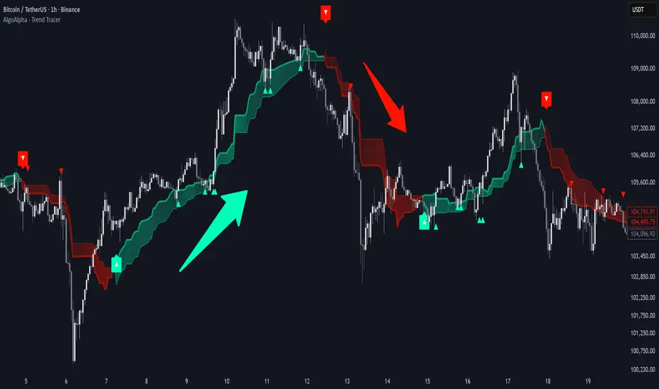
Trend Tracer [AlgoAlpha]🟠 OVERVIEW
This tool builds a two-stage trend model that reacts to structure shifts while also showing how strong or weak the move is. It uses a mid-price band (from the highest high and lowest low over a lookback) and applies two Supertrend passes on top of it. The first pass smoothens the basis. The second pass refines that direction and produces the final trail used for signals. A gradient fill between the two trails uses RSI of price-to-trail distance to show when price is stretched or cooling off. The aim is to give traders a simple way to read trend alignment, pressure, and early turns without guessing.
🟠 CONCEPTS
The script starts with a mid-range basis. This is the average of the rolling highest high and lowest low. It acts as a stable structure reference instead of raw close or typical price. From there, two Supertrend layers are applied:
• The first Supertrend uses a shorter ATR period and lower factor. It reacts faster and sets the main regime.
• The second Supertrend uses a slightly longer ATR and higher factor. It filters noise, waits for confirmed continuation, and generates the signal line.
The interaction between these trails matters. The outer Supertrend provides context by defining the broader regime. The inner Supertrend provides timing by flipping earlier and marking possible shifts. The gradient fill uses RSI of (close − supertrend value) to display when price stretches away from the trail. This shows strength, exhaustion, or compression within the trend.
🟠 FEATURES
Bullish and bearish flip markers placed at recent highs/lows
Rejection signals off the trend tracer line
Alerts for bullish and bearish trend changes
🟠 USAGE
Setup : Add the script to your chart. Timeframe is flexible; lower timeframes show more flips while higher ones give cleaner swings. Adjust Length to change how wide the basis range is. Use the two ATR settings and factors to match the volatility of the market you trade.
Read the chart : When the refined trail (stv_) sits above price the regime is bearish; when below, it is bullish. The wide trail (stv) confirms the larger move. Watch the gradient fill: darker colors appear when price is stretched from the trail and lighter colors appear when the move is weakening. Flip markers ▲ or ▼ highlight the first clean shift of the refined trail.
Settings that matter : Increasing the Main Factor slows main-trend flips and filters chop. Increasing the Signal Factor delays the timing trail but reduces noise. Shortening Length makes the basis more reactive. ATR periods change how sensitive each Supertrend pass is to volatility.
Pious 3/8 EMA High-Low + 89 EMA Strategybuy signal when 3emah cross above 8emah, 3emal cross above 8emal,high cross above previous 3 high with volume and vice versa
