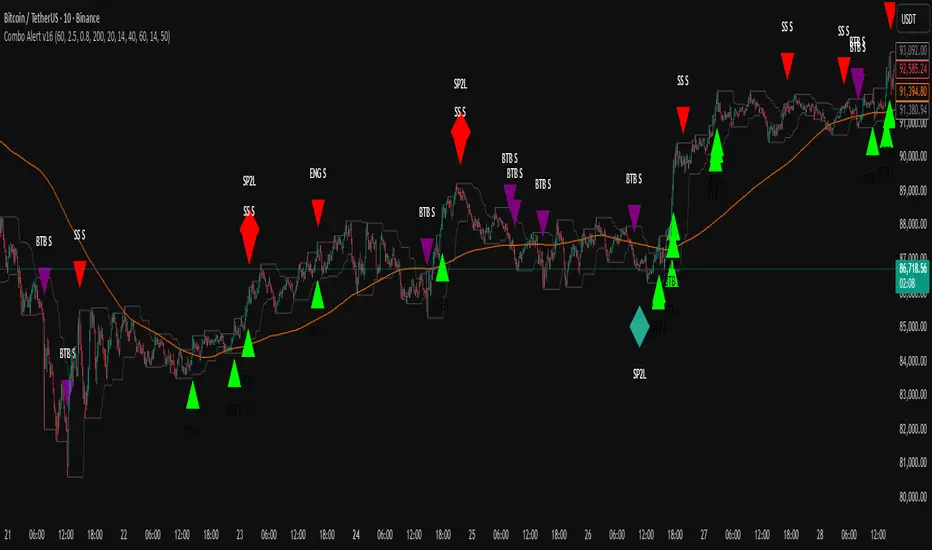
TWS + Engulfing + SP2L + BTB (RSI Focused)-by-shahriar📝 Final TradingView Script Description: Combo Alert v16 (Updated)
TWS + Engulfing + SP2L + BTB (RSI Focused) - Combo Alert v16
This script is a comprehensive, multi-component technical analysis tool designed to identify high-probability reversal and continuation patterns, focusing on strict filtering via Relative Strength Index (RSI) and Volume. It combines four distinct pattern types: Three White Soldiers (TWS), Engulfing Candles, Setup Price Action + 2-Candle Confirmation (SP2L), and Breakout Through Bands (BTB).
🔑 Core Logic and Signal Generation
The script utilizes a tiered filtering system. Here is a breakdown of the two most critical signals:
1. SP2L (Setup Price Action + 2-Candle Confirmation) - Reversal Focus
SP2L is designed to catch strong reversals after a clear setup phase.
• Setup: The first candle must be a strong reversal pattern (Hammer, Shooting Star, or Engulfing).
• Confirmation: The current candle must definitively break the previous candle's range:
o SP2L Buy: The current candle's Close price must exceed the High of the setup candle.
o SP2L Sell: The current candle's Close price must fall below the Low of the setup candle.
• Filter: This signal only fires when the RSI confirms an oversold (Buy) or overbought (Sell) condition.
2. BTB (Breakout Through Bands) - Trend Focus
BTB is a powerful trend-following signal.
• Breakout: The price must break out of the Donchian Channel (the highest high or lowest low over the past dcLength periods).
• Trend Filter: The breakout must align with the broader trend, meaning the Close price must be above the 200-period SMA for Buy signals (and below for Sell signals).
• Volume Filter: The breakout must be confirmed by high volatility, requiring the current Volume to exceed the Average Volume by the specified Multiplier.
⚙️. Full Customization and Sensitivity Control (Inputs)
The indicator provides granular control over all filtering mechanisms, allowing traders to adjust sensitivity and signal strength based on the asset and desired timeframe.
Input Name,Default,Code Variable,Adjustment Guide
Volume Multiplier (x Avg),2.5,volMult,"Controls Volume Sensitivity (BTB). Increase value for fewer, higher conviction signals."
Min Body Ratio (0.8 = 80%),0.8,minBodyRatio,Controls the required proportion of the candle body relative to its total range.
RSI Oversold Level,40,rsiOversold,Controls Reversal Sensitivity (Buy Filter). Lowering this value requires a deeper oversold condition.
RSI Overbought Level,60,rsiOverbought,Controls Reversal Sensitivity (Sell Filter). Raising this value requires a deeper overbought condition.
SMA Length (Trend Filter),200,smaLength,Period for the Moving Average used to define the overall market trend.
Donchian Channel Length (BTB),20,dcLength,Look-back period for the Donchian Channel breakout window.
⚙️.Users can manage which patterns are displayed by going to the Styles tab in the indicator settings and selectively enabling or disabling the plot visibility for each specific signal type. This allows you to focus only on the patterns that fit your specific strategy.
⚠️ Due Diligence and Risk Disclaimer
Prior to making any trading decisions, all users must conduct their own thorough research (Due Diligence). This indicator is a tool for confirmation and analysis, not a recommendation to buy or sell. All trades should be executed based on your personal knowledge, independent analysis, and established risk management framework.
Bantlar ve Kanallar
ASI Momentum CloudASI Momentum Cloud (AMC) — a scaled Accumulative Swing Index (ASI) momentum indicator with an EMA cloud for visual trend context, signal smoothing, and configurable scaling for any instrument.
---
## Overview
The ASI Momentum Cloud visualizes ASI-based momentum while providing a three-EMA cloud that highlights trend bias and momentum strength. The indicator scales ASI values for better visibility across different instruments and adds an SMA signal line for entry/exit clarity. Designed for traders who want a momentum oscillator with trend context and simple alertable signals.
## Key features
* Scaled ASI value (`ASI Multiplier`) for improved chart readability.
* Configurable `Daily Limit` to adapt the ASI calculation to different asset volatilities.
* SMA signal line to smooth ASI and provide clear cross signals.
* Three-EMA cloud (Fast / Mid / Slow) to show bullish/bearish bias and momentum shifts.
* Lightweight, low-latency computation — suitable for multiple timeframes.
* Built-in cloud coloring: green tint when Fast EMA > Slow EMA, red tint otherwise.
## How it works (brief)
1. ASI is calculated each bar using price movement components (high/low/close relationships) and normalized by the `Daily Limit`.
2. `ASI Multiplier` scales the values for visual clarity.
3. A short SMA (`Period Length`) acts as the indicator’s signal/smoother.
4. Three EMAs (Fast / Mid / Slow) form a cloud — their relative positions determine the cloud color and trend bias.
## Inputs (as shown in settings)
* **Daily Limit** — numeric; adjusts ASI normalization (default: `10000`). Tune to instrument volatility.
* **ASI Multiplier** — numeric; scales the ASI for visibility (default: `100`).
* **Period Length** — SMA length for the signal line (default: `14`).
* **EMA Cloud Fast Length** — fast EMA (default: `7`).
* **EMA Cloud Mid Length** — middle EMA (default: `14`).
* **EMA Cloud Slow Length** — slow EMA (default: `28`).
## How to interpret signals
* **Bullish bias:** EMA Fast > EMA Slow → cloud green (favour long bias).
* **Bearish bias:** EMA Fast < EMA Slow → cloud red (favour short bias).
* **Momentum entry:** ASI line crossing **above** the Signal SMA — momentum turning positive.
* **Momentum exit / short entry:** ASI line crossing **below** the Signal SMA — momentum turning negative.
* **Confirmation:** Prefer entries that align with cloud bias (e.g., take long crossovers when cloud is green).
* **Divergence:** Watch for price making new highs/lows while ASI fails to confirm — possible momentum exhaustion.
## Suggested alert messages (copy/paste)
* `ASI Momentum Cloud — ASI crossed above Signal (potential buy)`
* `ASI Momentum Cloud — ASI crossed below Signal (potential sell)`
* `ASI Momentum Cloud — Cloud turned bullish (EMA Fast > EMA Slow)`
* `ASI Momentum Cloud — Cloud turned bearish (EMA Fast < EMA Slow)`
Use these messages in TradingView alert conditions tied to the corresponding cross or condition.
## Recommended usage & timeframes
* Works on any timeframe; commonly useful on 1H, 4H, Daily for trend-following, and lower timeframes for intra-day momentum signals.
* Adjust **Daily Limit** and **ASI Multiplier** for low-volatility instruments (smaller limit, higher multiplier) or high-volatility instruments (larger limit, lower multiplier).
* Combine with price action, support/resistance, or higher-timeframe trend for better signal quality.
## Notes & credits
* Version: 1.0 — initial release.
* If you adapt or redistribute, please credit the original script.
* Built for clarity and practical trading signals — tweak the input values to match your instrument and trading style.
## Risk disclaimer
This indicator is a technical tool and not investment advice. Backtest and paper-trade any strategy before using real capital. Use proper risk management.

My Band by MAMY-BAND – Adaptive Moving Average Channel Indicator
MY-BAND is a customizable Moving Average Band / Channel indicator designed to help traders clearly visualize trend direction, dynamic support & resistance, and market structure on any timeframe.
This indicator builds adaptive price bands around Moving Averages, making it easier to identify:
- Trend continuation
- Trend reversal
- Volatility expansion and contraction
- Key breakout and pullback zones
It works perfectly for crypto, forex, and stock markets.
🔧 Key Features
✅ Multi-Timeframe MA Bands
✅ HiLo & LLMA Moving Average Types
✅ Dynamic Channel Width
✅ ZigZag Structure Detection
✅ Average Center Line
✅ Trend Bending Option
✅ Support & Resistance Layer
✅ Fully Adjustable Inputs
✅ Works on All Timeframes
📊 How to Use
Trend Trading
Price above upper band → Strong bullish trend
Price below lower band → Strong bearish trend
Pullback Entries
Enter on pullback to middle MA in trend direction
Breakout Trading
Strong breakout outside the band signals continuation
Market Structure
ZigZag feature helps identify swing highs & lows
⚙️ Inputs Explanation
MA Timeframe (MA TF) – Select the timeframe for MA calculation
Length 1 & Length 2 – Fine-tune band sensitivity
MA Type – Choose between HiLo or LLMA
Width – Controls band distance
AVG Line – Show central average line
Zigzag – Display market structure swings
Extend – Extend channel into the future
Bending – Smooth adaptive band behavior
✅ Best For
Trend Followers
Scalpers
Swing Traders
Crypto Futures Traders
Breakout & Pullback Strategies
⚠️ Disclaimer
This indicator is for educational and analytical purposes only. It does not provide financial advice. Always use proper risk management and confirm signals with other indicators.

Trend Trader//@version=6
indicator("Trend Trader", shorttitle="Trend Trader", overlay=true)
// User-defined input for moving averages
shortMA = input.int(10, minval=1, title="Short MA Period")
longMA = input.int(100, minval=1, title="Long MA Period")
// User-defined input for the instrument selection
instrument = input.string("US30", title="Select Instrument", options= )
// Set target values based on selected instrument
target_1 = instrument == "US30" ? 50 :
instrument == "NDX100" ? 25 :
instrument == "GER40" ? 25 :
instrument == "GOLD" ? 5 : 5 // default value
target_2 = instrument == "US30" ? 100 :
instrument == "NDX100" ? 50 :
instrument == "GER40" ? 50 :
instrument == "GOLD" ? 10 : 10 // default value
// User-defined input for the start and end times with default values
startTimeInput = input.int(12, title="Start Time for Session (UTC, in hours)", minval=0, maxval=23)
endTimeInput = input.int(17, title="End Time Session (UTC, in hours)", minval=0, maxval=23)
// Convert the input hours to minutes from midnight
startTime = startTimeInput * 60
endTime = endTimeInput * 60
// Function to convert the current exchange time to UTC time in minutes
toUTCTime(exchangeTime) =>
exchangeTimeInMinutes = exchangeTime / 60000
// Adjust for UTC time
utcTime = exchangeTimeInMinutes % 1440
utcTime
// Get the current time in UTC in minutes from midnight
utcTime = toUTCTime(time)
// Check if the current UTC time is within the allowed timeframe
isAllowedTime = (utcTime >= startTime and utcTime < endTime)
// Calculating moving averages
shortMAValue = ta.sma(close, shortMA)
longMAValue = ta.sma(close, longMA)
// Plotting the MAs
plot(shortMAValue, title="Short MA", color=color.blue)
plot(longMAValue, title="Long MA", color=color.red)
// MACD calculation for 15-minute chart
= request.security(syminfo.tickerid, "15", ta.macd(close, 12, 26, 9))
macdColor = macdLine > signalLine ? color.new(color.green, 70) : color.new(color.red, 70)
// Apply MACD color only during the allowed time range
bgcolor(isAllowedTime ? macdColor : na)
// Flags to track if a buy or sell signal has been triggered
var bool buyOnce = false
var bool sellOnce = false
// Tracking buy and sell entry prices
var float buyEntryPrice_1 = na
var float buyEntryPrice_2 = na
var float sellEntryPrice_1 = na
var float sellEntryPrice_2 = na
if not isAllowedTime
buyOnce :=false
sellOnce :=false
// Logic for Buy and Sell signals
buySignal = ta.crossover(shortMAValue, longMAValue) and isAllowedTime and macdLine > signalLine and not buyOnce
sellSignal = ta.crossunder(shortMAValue, longMAValue) and isAllowedTime and macdLine <= signalLine and not sellOnce
// Update last buy and sell signal values
if (buySignal)
buyEntryPrice_1 := close
buyEntryPrice_2 := close
buyOnce := true
if (sellSignal)
sellEntryPrice_1 := close
sellEntryPrice_2 := close
sellOnce := true
// Apply background color for entry candles
barcolor(buySignal or sellSignal ? color.yellow : na)
/// Creating buy and sell labels
if (buySignal)
label.new(bar_index, low, text="BUY", style=label.style_label_up, color=color.green, textcolor=color.white, yloc=yloc.belowbar)
if (sellSignal)
label.new(bar_index, high, text="SELL", style=label.style_label_down, color=color.red, textcolor=color.white, yloc=yloc.abovebar)
// Creating labels for 100-point movement
if (not na(buyEntryPrice_1) and close >= buyEntryPrice_1 + target_1)
label.new(bar_index, high, text=str.tostring(target_1), style=label.style_label_down, color=color.green, textcolor=color.white, yloc=yloc.abovebar)
buyEntryPrice_1 := na // Reset after label is created
if (not na(buyEntryPrice_2) and close >= buyEntryPrice_2 + target_2)
label.new(bar_index, high, text=str.tostring(target_2), style=label.style_label_down, color=color.green, textcolor=color.white, yloc=yloc.abovebar)
buyEntryPrice_2 := na // Reset after label is created
if (not na(sellEntryPrice_1) and close <= sellEntryPrice_1 - target_1)
label.new(bar_index, low, text=str.tostring(target_1), style=label.style_label_up, color=color.red, textcolor=color.white, yloc=yloc.belowbar)
sellEntryPrice_1 := na // Reset after label is created
if (not na(sellEntryPrice_2) and close <= sellEntryPrice_2 - target_2)
label.new(bar_index, low, text=str.tostring(target_2), style=label.style_label_up, color=color.red, textcolor=color.white, yloc=yloc.belowbar)
sellEntryPrice_2 := na // Reset after label is created

Grok/Claude Quantum Signal Pro * Enhanced v2# QSig Pro+ v2 — Dynamic RSI Enhancement
## Release: Quantum Signal Pro Enhanced v2
**Author:** ralis24 (with Claude assistance)
**Version:** 2.0
**Platform:** TradingView (Pine Script v6)
---
## Overview
Version 2 introduces **Trend-Adaptive RSI Thresholds** — a significant enhancement that dynamically adjusts buy and sell levels based on real-time trend strength. This allows the indicator to more effectively capture dips in uptrends and sell bounces in downtrends, rather than waiting for extreme oversold/overbought conditions that rarely occur during strong directional moves.
---
## The Problem v2 Solves
In the original QSig Pro+, RSI thresholds were fixed at 30 (oversold) and 70 (overbought). While these levels work well in ranging markets, they create issues in trending conditions:
- **Strong Uptrends:** Price rarely drops to RSI 30. Pullbacks typically bottom around RSI 40-50, causing missed buy opportunities.
- **Strong Downtrends:** Relief rallies rarely push RSI above 70. Bounces often exhaust around RSI 55-65, causing missed sell opportunities.
The v2 solution: **Let the market's trend strength dictate the appropriate RSI levels.**
---
## New Feature: Dynamic RSI Thresholds
### How It Works
The indicator now detects three distinct market states and applies corresponding RSI thresholds:
| Market State | Detection Criteria | RSI Buy Level | RSI Sell Level |
|--------------|-------------------|---------------|----------------|
| **Strong Uptrend** | +DI > -DI, ADX > 24, ADX rising | < 40 | > 80 |
| **Strong Downtrend** | -DI > +DI, ADX > 24, ADX rising | < 20 | > 60 |
| **Neutral/Ranging** | ADX < 24 or ADX falling | < 30 | > 70 |
### Trend State Detection Logic
```
Strong Uptrend = (+DI > -DI) AND (ADX > threshold) AND (ADX > ADX )
Strong Downtrend = (-DI > +DI) AND (ADX > threshold) AND (ADX > ADX )
Neutral = Neither condition met
```
### Anti-Whipsaw Protection
To prevent rapid switching between threshold sets during choppy transitions, a **confirmation buffer** requires the trend state to persist for a configurable number of bars (default: 2) before the indicator switches regimes.
---
## New Input Parameters
A new input group "**Dynamic RSI Thresholds**" has been added with the following settings:
| Parameter | Default | Range | Description |
|-----------|---------|-------|-------------|
| Enable Trend-Adaptive RSI Levels | ON | toggle | Master switch for the feature |
| ADX Strong Trend Threshold | 24 | 15-40 | ADX must exceed this to qualify as "strong" trend |
| ADX Rising Lookback (bars) | 3 | 1-10 | ADX must be higher than N bars ago to confirm rising |
| Trend Confirmation Bars | 2 | 1-5 | Bars trend must persist before switching thresholds |
| RSI Buy Level (Strong Uptrend) | 40 | 30-55 | Oversold threshold during confirmed uptrends |
| RSI Sell Level (Strong Uptrend) | 80 | 70-90 | Overbought threshold during confirmed uptrends |
| RSI Buy Level (Strong Downtrend) | 20 | 10-30 | Oversold threshold during confirmed downtrends |
| RSI Sell Level (Strong Downtrend) | 60 | 50-70 | Overbought threshold during confirmed downtrends |
| RSI Buy Level (Neutral/Ranging) | 30 | 20-40 | Standard oversold threshold |
| RSI Sell Level (Neutral/Ranging) | 70 | 60-80 | Standard overbought threshold |
---
## Enhanced Info Panel
The information panel now displays two new rows:
1. **Trend State** — Shows current regime: "STRONG UP" (green), "STRONG DOWN" (red), or "NEUTRAL" (gray)
2. **RSI Levels** — Displays the currently active thresholds (e.g., "40 / 80" during uptrends)
Additionally, the **ADX row** now includes a directional arrow (↑ or ↓) indicating whether ADX is rising or falling.
---
## Enhanced Signal Labels
Buy and sell labels on the chart now include contextual information:
**Before (v1):**
```
BUY: 97,234.50
```
**After (v2):**
```
BUY: 97,234.50
STRONG UP | RSI<40
```
This provides immediate visual confirmation of which threshold regime triggered the signal.
---
## Enhanced Alert System
### New Alert Conditions
Three new alerts have been added for trend state changes:
- **🔼 Strong Uptrend Started** — Fires when market transitions to strong uptrend (thresholds shift to 40/80)
- **🔽 Strong Downtrend Started** — Fires when market transitions to strong downtrend (thresholds shift to 20/60)
- **⚖️ Trend Neutralized** — Fires when trend weakens and thresholds reset to 30/70
### Enhanced Webhook JSON
The JSON alert payload now includes additional fields for bot integration:
```json
{
"action": "BUY",
"symbol": "BTC/USDT",
"price": "97234.50",
"rsi": "38.5",
"rsi_threshold": "40",
"adx": "28.3",
"fisher": "-1.87",
"trend_state": "STRONG UP"
}
```
---
## Bonus Enhancement: Dynamic Fisher Thresholds
As an additional refinement, the Fisher Transform thresholds now adjust slightly based on trend state:
| Trend State | Fisher Buy Level | Fisher Sell Level |
|-------------|------------------|-------------------|
| Strong Uptrend | -1.5 (loosened) | -2.0 (standard) |
| Strong Downtrend | -2.0 (standard) | +1.5 (loosened) |
| Neutral | -2.0 (standard) | +2.0 (standard) |
This allows the indicator to trigger signals in strong trends where momentum oscillators rarely reach extreme levels.
---
## Practical Trading Impact
### Strong Uptrend Example (BTC rally)
- **Before:** Waiting for RSI < 30 means missing most pullback entries
- **After:** RSI < 40 triggers buy signals on normal pullbacks within the trend
### Strong Downtrend Example (Bear market bounce)
- **Before:** Waiting for RSI > 70 means holding through entire relief rallies
- **After:** RSI > 60 triggers sell signals on bounce exhaustion
### Ranging Market
- Thresholds remain at traditional 30/70 levels where mean reversion works best
---
## Backward Compatibility
The dynamic RSI feature can be completely disabled by turning off "Enable Trend-Adaptive RSI Levels" in the settings. When disabled, the indicator behaves identically to v1 using the neutral threshold values (30/70).
---
## Summary of Changes
| Component | v1 | v2 |
|-----------|----|----|
| RSI Thresholds | Fixed 30/70 | Dynamic based on trend state |
| Trend State Detection | Not present | +DI/-DI + ADX + Rising confirmation |
| Whipsaw Protection | Not present | Configurable confirmation bars |
| Info Panel Rows | 10 | 12 (added Trend State, RSI Levels) |
| ADX Display | Value only | Value + direction arrow |
| Signal Labels | Price only | Price + Trend State + Threshold |
| Alert Conditions | 10 | 13 (added 3 trend state alerts) |
| Webhook Fields | 5 | 7 (added rsi_threshold, trend_state) |
| Fisher Thresholds | Fixed | Adaptive (subtle adjustment) |
---
## Recommended Settings by Market Type
### Crypto (High Volatility)
- ADX Strong Trend Threshold: 24
- RSI Buy (Uptrend): 40-45
- RSI Sell (Downtrend): 55-60
### Forex (Medium Volatility)
- ADX Strong Trend Threshold: 22
- RSI Buy (Uptrend): 38-42
- RSI Sell (Downtrend): 58-62
### Stocks/Indices (Lower Volatility)
- ADX Strong Trend Threshold: 20
- RSI Buy (Uptrend): 35-40
- RSI Sell (Downtrend): 60-65
---
## Installation
1. Open TradingView and navigate to Pine Editor
2. Remove or rename existing QSig Pro+ indicator
3. Paste the complete v2 code
4. Click "Add to Chart"
5. Configure Dynamic RSI Thresholds in settings as desired
---
*QSig Pro+ v2 — Smarter entries through trend-aware signal generation*

3:55 PM Candle High/Low Levels (ARADO VERSION)a lil better in smaller tfs. Its a veryyyyy cool indicator guys (thanks ivan)

Bank Zone by TheRealWealthVision V2The Bank Zone indicator is designed to help traders identify key price areas where institutions, banks, and large market participants are likely active. It highlights potential zones of accumulation, distribution, liquidity grabs, and high-value reaction levels.
This tool automatically detects structural shifts, dynamic zones, and real-time market behavior to support more accurate decision-making. It is suitable for scalping, intraday trading, and swing trading across all markets including Forex, Indices, Crypto, Stocks, Commodities, and more.
Main Features
Automatic detection of potential institutional zones
Real-time dynamic updates
Clear visual highlights on the chart
Designed to work on all timeframes
Fully compatible with the latest TradingView Pine Script engine
Best For
Identifying high-probability reaction areas
Understanding where big players may enter or exit
Improving trade timing and precision
Building a cleaner, more structured market view
Important Notice
This indicator does not repaint historical zones improperly, does not generate unrealistic signals, and follows all TradingView guidelines for script behavior.

Fib Golden RatioDynamic Fib High → Low (0.5 & 0.618)
This indicator automatically tracks the current day’s High and Low and plots the key Fibonacci retracement levels 0.5 (50%) and 0.618 (Golden Ratio) based on the live intraday price range.
The tool is designed for traders who want simple, clean, and dynamic intraday Fibonacci levels without clutter on the chart.
How It Works
Detects the start of a new trading day
Tracks the highest high and lowest low of the current day
Continuously recalculates:
Fibonacci 0.5 (Midpoint)
Fibonacci 0.618 (Golden Ratio)
Plots clean continuous lines across the chart
Fib is calculated from High → Low, matching how typical intraday fib tools are visually applied
Why This Indicator
No drawings to manually adjust
No user configuration required
Extremely lightweight and fast
Automatically adjusts as the day progresses
Perfect for identifying intraday mean reversion zones, pullback zones, and reaction levels
Ideal Use Cases
Intraday directional trading
Scalping pullbacks
Mean reversion setups
Identifying dynamic support/resistance zones
Option scalping (CE/PE)

Deviaton Tracker - QuantSyDeviation Tracker - QuantSy
An adaptive volatility band system that maps price behavior across statistical deviation zones. Provides visual context for market extremes and tracks duration patterns for probabilistic mean reversion analysis.
What it offers:
Dynamic bands that adjust to current volatility conditions, creating clear visual zones for price action. The system continuously monitors time spent in each zone and builds a statistical profile of typical duration patterns, helping identify when price may be overextended.
Best for:
Spotting potential reversal areas at volatility extremes
Understanding current price positioning relative to recent behavior
Timing entries and exits based on statistical probabilities
Risk management and position sizing decisions
Clean gradient visualization provides immediate context while the underlying statistical engine tracks behavioral patterns across all market conditions.
**⚠️ Disclaimer**
Educational tool only - does not constitute investment advice. The developer assumes no liability for any trading profits or losses incurred through the use/misuse of this indicator.
This indicator does not include any features related to interest, leverage, or gambling. Users are fully responsible for making sure their assets and trading practices align with Islamic guidelines.

SCOTTGO ORB V1SCOTTGO ORB (Opening Range Breakout) Indicator
The ORB Indicator is a powerful tool for day traders and scalpers, designed to automatically identify and project key price levels based on the market's initial trading activity—the Opening Range (OR).
It helps you quickly visualize the market structure, potential breakout zones, and price targets for the day.
🔑 Key Features & Customization
1. Dynamic Opening Range Calculation
Flexible Time Periods: Easily define your Opening Range using preset times of 5, 15, or 30 minutes. You can also use the International Overrides to set a custom start and end time with a specified timezone.
Visual Range: The indicator automatically calculates and shades the range between the ORB High and ORB Low prices. The Opacity of this shaded box is fully adjustable.
2. Comprehensive Price Targets
The indicator projects multiple levels of price targets (PTs) based on the size of the initial Opening Range, enabling you to set profit targets and manage risk. Targets are grouped for easy toggling:
Default Targets (50%): Visualize the immediate $50\%$ price extension above and below the ORB.
Extended Targets (75%, 100%): View the $75\%$ and full $100\%$ extension levels.
Further Targets (150%, 200%): Explore extended targets for volatile or trending days.
Mid Point: Optional line to display the $50\%$ retracement/midpoint of the ORB itself.
3. Fibonacci Extensions
Access highly relevant price projections using classic Fibonacci ratios:27.2% and 61.8% Extensions: These provide additional high-probability price targets for breakout scenarios.
4. Breakout & Retest Signaling
Entry Signals: Displays on-chart labels for potential ORB Breakouts and subsequent
Retests (BRB), helping you identify high-probability entry points.
Alert Options: Set alerts for simple ORB level crosses or restrict alerts only to confirmed breakout scenarios (Alert only on ORB breakouts).
🎨 Style Customization
All main ORB lines, target levels, and Fibonacci lines can be individually styled (color, thickness, line type) directly within the TradingView Style tab for a personalized chart experience. Dedicated inputs are available for setting colors for 50%, 75%, 100%, and Fibonacci 27.2% / 61.8% levels.
💡 How to Use
1. Set Your ORB Period: Choose the time frame that best suits your market (e.g., 15 minutes is common for US indices).
2. Monitor the Breakout: Once the ORB session ends, wait for the price to break above the ORB High or below the ORB Low.
3. Target and Risk: Use the projected Price Targets to define your potential profit zones, and place stop-losses just inside the ORB range.
SCOTTGO

Anchored VWAP + Bands + Signals//@version=5
indicator("Anchored VWAP + Bands + Signals", overlay=true)
// ===== INPUTS =====
anchorTime = input.time(timestamp("2025-12-02 00:00"), "Anchor Date/Time")
std1 = input.float(1.0, "±1σ Band")
std2 = input.float(2.0, "±2σ Band")
// ===== VWAP CALCULATION =====
var float cumPV = 0.0
var float cumVol = 0.0
if time >= anchorTime
cumPV += close * volume
cumVol += volume
vwap = cumVol != 0 ? cumPV / cumVol : na
// ===== STANDARD DEVIATION =====
barsSinceAnchor = bar_index - ta.valuewhen(time >= anchorTime, bar_index, 0)
sd = barsSinceAnchor > 1 ? ta.stdev(close, barsSinceAnchor) : 0
// ===== BANDS =====
upper1 = vwap + std1 * sd
lower1 = vwap - std1 * sd
upper2 = vwap + std2 * sd
lower2 = vwap - std2 * sd
plot(vwap, color=color.orange, title="VWAP")
plot(upper1, color=color.green, title="+1σ Band")
plot(lower1, color=color.green, title="-1σ Band")
plot(upper2, color=color.red, title="+2σ Band")
plot(lower2, color=color.red, title="-2σ Band")
// ===== SIGNALS =====
buySignal = ta.crossover(close, lower1)
sellSignal = ta.crossunder(close, upper1)
plotshape(buySignal, style=shape.triangleup, location=location.belowbar, color=color.green, size=size.small, title="Buy Signal")
plotshape(sellSignal, style=shape.triangledown, location=location.abovebar, color=color.red, size=size.small, title="Sell Signal")
alertcondition(buySignal, title="Buy Alert", message="Price touched lower 1σ band – Buy Opportunity")
alertcondition(sellSignal, title="Sell Alert", message="Price touched upper 1σ band – Sell Opportunity")

BT LigmaThe BT Ligma indicator combines momentum-based signals with volatility filters to identify potential trend reversals and high-probability entry points.
It uses a set of Exponential Moving Averages (EMAs) – typically a fast EMA (e.g., 9-period) crossing over a slower one (e.g., 21-period) – to generate baseline buy/sell signals. These are enhanced by a proprietary "Ligma Spread" filter, which measures the dynamic spread between short-term price action and a volatility envelope (similar to Bollinger Bands but customized with ATR multipliers). This filter helps weed out false signals in choppy markets by requiring a minimum spread threshold before confirming a trade alert.
BT Ligma allows a user to select up to 3 EMAs, the MA calculation method, and signal individual candles that cross EMA 1 & 2, or all 3 bands in the same bar.
Version 1.4, includes refined alert logic, including audio/visual notifications and optional trailing stops based on EMA alignments.
To use it effectively for trade entries:
Long (Buy) Entries: Look for a bullish EMA crossover (fast EMA above slow) combined with a positive Ligma Spread expansion (indicating increasing momentum). Enter when the signal fires on a close above the recent swing high, ideally on a timeframe like 15m or 1h for scalping/day trading. Pair this with volume confirmation or RSI above 50 to avoid overbought traps.
Short (Sell) Entries: Wait for a bearish EMA crossover (fast below slow) with a contracting or negative Ligma Spread (signaling potential downside volatility). Enter on a close below the recent swing low, using higher timeframes (e.g., 4h) for swing trades to capture larger moves.
General Tips: Always apply risk management – set stops below/above the slow EMA, target 2-3x risk-reward ratios, and avoid trading during low-liquidity periods. Backtest on historical data to tweak parameters, and combine with fundamentals like news events for better context.
Daily Anchored VWAPAnchors VWAP to whatever time you want instead of the usual start of session. I use it for BTC so that I can anchor around NY open instead of the night before.

Donchian ForecastDonchian Forecast – multi-timeframe Donchian/ATR bias with ADX regime blending
Donchian Forecast is a multi-timeframe bias tool that turns classic Donchian channels into a normalized trend/mean-reversion “forecast” and a single bias value in .
It projects a short polyline path from the current price and shows how that path adapts when the market shifts from ranging to trending (via ADX).
---
Concept
1. Donchian position → direction
For each timeframe, the script measures where price sits inside its Donchian channel:
-1 = near channel low
0 = middle
+1 = near channel high
This Donchian position is multiplied by ATR to create a **price delta** (how far the forecast moves from current price).
2. Local behavior: trend vs mean-reversion around Donchian
The indicator treats the edges vs middle of the Donchian channel differently:
* By default, edges behave more “trend-like”, middle more “mean-reverting”.
* If you enable the reversed option, this logic flips (edges = mean-reverting, middle = trend-
like).
* This “local” behavior is controlled smoothly by the absolute Donchian position |pos| (not by hard zone switches).
3. Global ADX modulation (regime aware)
ADX is mapped from your chosen low → high thresholds into a signed factor in :
* ADX ≤ low → -1 (fully reversed behavior, more range/mean-reversion oriented)
* ADX ≥ high → +1 (fully normal behavior, more trend oriented)
* Values in between create a **smooth transition**.
* This global factor can:
* Keep the local behavior as is (trending regime),
* Flip it (range regime), or
* Neutralize it (indecisive regime).
4. Multi-timeframe aggregation (1x–12x chart timeframe)
* The script repeats the same logic across 12 horizons:
* 1x = chart timeframe
* 2x..12x = multiples of the chart timeframe (e.g., 5m → 10m, 15m, …; 1h → 2h, 3h, …).
* For each horizon it builds:
* Donchian position
* ATR-scaled delta (in price units)
* Locally + globally blended delta (after Donchian + ADX logic).
* These blended deltas are ATR-weighted and summed into a single bias in , which is then shown as Bias % in the on-chart table.
---
### What you see on the chart
* Forecast polyline
* Starting at the current close, the indicator draws a short chain of **up to 12 segments**:
* Segment 1: from current price → 1x projection
* Segment 2: 1x → 2x projection
* … up to 12x.
* Each segment is:
* Green when its blended delta is ≥ 0 (upward bias)
* Red when its blended delta is < 0 (downward bias)
* This is not future price, but a synthetic path showing how the Donchian/ATR/ADX model “expects” price to drift across multiple horizons.
* Bias table (top-center)
* `Bias: X.Y%`
* > 0% (green) → net upward bias across horizons
* < 0% (red) → net downward bias
* Magnitude (e.g., ±70–100%) ≈ strength of the directional skew.
* `ADX:` current ADX value (from your DMI settings).
* `ADXBlend:` the signed ADX factor in :
* +1 ≈ fully “trend-interpretation” of Donchian behavior
* 0 ≈ neutral / mixed regime
* -1 ≈ fully “reversed/mean-reversion interpretation”
---
Inputs & settings
Core Donchian / ATR
* Donchian Length – lookback for Donchian high/low on each horizon.
* Price Source – input series used for position inside the Donchian channel (default: close).
* ATR Length – ATR lookback for all horizons.
* ATR Multiplier – scales the size of each forecast step in price units (higher = longer segments / more aggressive forecast).
*Local behavior at high ADX
* Reversed local blend at high ADX?
* Off (default) – edges behave more trend-like, middle more mean-reverting.
* On – flips that logic (edges more mean-reverting, middle more trend-like).
* The actual effect is always modulated by the global ADX factor, so you can experiment with how the regime logic feels in different markets.
Global ADX blending
* DMI DI Length – period for the DI+ and DI- components.
* ADX Smoothing – smoothing length for ADX.
* ADX low (mean-rev zone) – below this level, the global factor pushes behavior toward reversal/range logic .
* ADX high (trend zone) – above this level, the global factor pushes behavior toward **trend logic**.
* Values between low and high create a smooth blend rather than a hard on/off switch.
---
How to use it (examples)
* Directional bias dashboard
* Use the Bias % as a compact summary of multi-horizon Donchian/ATR/ADX conditions:
* Consider only trades aligned with the sign of Bias (e.g., longs only when Bias > 0).
* Use the magnitude to filter for **strong vs weak** directional contexts.
* Regime-aware context
* Watch ADX and ADXBlend:
* High ADX & ADXBlend ≈ +1 → favor trend-continuation ideas.
* Low ADX & ADXBlend ≈ -1 → favor range/mean-reversion ideas.
* Around 0 → mixed/transition regimes; forecasts will be more muted.
* Visual sanity check for systems
* Overlay Donchian Forecast on your usual entries/exits to see:
* When your system trades **with** the multi-TF Donchian bias.
* When it trades **against** it (possible fade setups or no-trade zones).
This script does not generate entry or exit signals by itself. It is a contextual/forecast tool meant to sit on top of your own trading logic.
---
Notes
* Works on most symbols and timeframes; higher-timeframe multiples are built from the chart timeframe.
* The forecast line is a model-based projection, not a prediction or guarantee of future price.
* Always combine this with your own risk management, testing, and judgement. This is for educational and analytical purposes only and is not financial advice.

YaS-IN Multi-Timeframe RSI AnalyzerYAS-IN MULTI-TIMEFRAME RSI ANALYZER
📊 OVERVIEW
YaS-IN (Yield and Signal Indicator) is an advanced RSI-based trading tool that analyzes multiple timeframe RSI data (14, 25, 100 periods) to identify 5 key market scenarios with confirmation from volume, MACD, and ATR indicators.
🎯 KEY FEATURES
1. MULTI-TIMEFRAME RSI ANALYSIS
RSI 14: Short-term momentum
RSI 25: Medium-term trend
RSI 100: Long-term structural trend
2. 5 MARKET SCENARIOS
Trend Start (New trend confirmation)
Trend Continuation (Healthy uptrend)
Trend End (Overbought, reversal imminent)
Dip Buy Opportunity (Oversold, bounce expected)
Structural Turn (Major trend change)
3. CONFIRMATION SYSTEM
Volume: Above/below average confirmation
MACD: Momentum and crossover confirmation
ATR: Volatility confirmation
4. VISUAL TABLE DISPLAY
Real-time color-coded table showing:
Current RSI values
Active scenarios
Confirmation status
Scenario colors
🔧 HOW IT WORKS
SCENARIO DETECTION
The indicator analyzes RSI values against predefined thresholds to identify which market scenario is currently active.
CONFIRMATION STATUS
Each scenario is validated against three confirmation indicators:
✅ CONFIRMED: 2+ indicators confirm
🔶 PARTIAL: 1 indicator confirms
⚠️ WARNING: 1 indicator contradicts
⚠️ DIVERGENT: 2+ indicators contradict
➖ NEUTRAL: No clear signal
TABLE COLORS
Green: Active bullish scenario
Blue: Active continuation scenario
Red: Active bearish scenario
Orange: Active dip buy scenario
Purple: Active structural turn
Gray: Inactive scenario
⚙️ CUSTOMIZATION OPTIONS
1. RSI PERIODS
Adjust RSI calculation periods (14, 25, 100 default)
2. CONFIRMATION INDICATORS
Toggle Volume/MACD/ATR confirmation on/off
Adjust volume threshold multiplier
Set ATR change percentage
3. TABLE SETTINGS
Position: 6 different screen positions
Size: Small/Medium/Large text
Colors: Custom text and background
Opacity: Background transparency
4. VISUAL OPTIONS
Show/hide chart label
Customize text colors
Adjust table transparency
📈 OPTIMAL TIMEFRAMES
BEST PERFORMANCE
1-Hour: Optimal balance for most traders
4-Hour: Excellent for swing trading
Daily: Good for position trading
GOOD PERFORMANCE
30-Minute: Short-term swing trading
15-Minute: Precise entry timing
Weekly: Long-term analysis
NOT RECOMMENDED
1-5 Minute: Too much noise
Monthly: Too slow for active trading
🎮 USAGE GUIDE
FOR BEGINNERS
Add indicator to 4-hour chart
Watch table for 1-2 days
Trade only "✅ CONFIRMED" scenarios
Use 1-hour chart for entry confirmation
FOR INTERMEDIATE TRADERS
Use multi-timeframe analysis:
4-hour: Main trend direction
1-hour: Confirmation signals
30-minute: Entry timing
Look for scenario consistency across timeframes
Use divergence warnings for risk management
FOR ADVANCED TRADERS
Combine with other technical analysis
Adjust parameters for specific markets
Use alerts for automated notifications
Backtest different parameter combinations
📊 INTERPRETING RESULTS
STRONG SIGNALS
Multiple "✅ CONFIRMED" scenarios
Consistent signals across timeframes
High volume + MACD confirmation
WEAK SIGNALS
"🔶 PARTIAL" or "➖ NEUTRAL" status
Contradictory indicators
Low volume during signals
WARNING SIGNALS
"⚠️ WARNING" or "⚠️ DIVERGENT" status
Indicator divergence
ATR showing low volatility during moves
🔔 ALERT SYSTEM
4 TYPES OF ALERTS
Divergence Detected: Indicators contradict scenarios
Strong Confirmation: Multiple indicators confirm
Confirmed Trend End: Trend reversal with confirmation
Confirmed Dip Buy: Oversold bounce with confirmation
💡 TRADING STRATEGIES
TREND FOLLOWING
Enter on "Trend Start ✅ CONFIRMED"
Add on "Trend Continuation ✅ CONFIRMED"
Exit on "Trend End ✅ CONFIRMED"
MEAN REVERSION
Enter on "Dip Buy ✅ CONFIRMED"
Exit on RSI returning to normal levels
Use ATR for stop loss placement
BREAKOUT TRADING
Watch for "Structural Turn ✅ CONFIRMED"
Enter on confirmation of new trend
Use volume confirmation for validity
⚠️ RISK MANAGEMENT
POSITION SIZING
"✅ CONFIRMED": Full position
"🔶 PARTIAL": Half position
"⚠️ WARNING": Quarter position or avoid
"⚠️ DIVERGENT": No position
STOP LOSS SUGGESTIONS
Based on ATR value (2x ATR recommended)
Adjust for timeframe (tighter on lower TFs)
Consider scenario type (wider for structural turns)
📚 EDUCATIONAL VALUE
LEARN MARKET CYCLES
Understand different market phases
Recognize trend transitions
Identify overbought/oversold conditions
IMPROVE TIMING
Better entry/exit points
Reduced false signals
Improved risk/reward ratios
🚀 BENEFITS
Clear Visualization: All data in one table
Multi-Indicator Confirmation: Reduces false signals
Customizable: Adapt to any trading style
Educational: Helps understand market dynamics
Versatile: Works across multiple timeframes
📝 PUBLISHING NOTES
When publishing this indicator:
Name: YaS-IN Multi-Timeframe RSI Analyzer
Category: Momentum/Volume Indicators
Access Type: Open Source
Tags: RSI, Multi-Timeframe, Volume, MACD, ATR, Scanner
Description: Include this complete documentation
Preview Images: Show table on different charts
Video Tutorial: Demonstrate multi-timeframe usage
🔄 UPDATES & SUPPORT
For updates, improvements, or support:
Check TradingView script page
Join community discussions
Share backtest results
Suggest new features
Happy Trading with YaS-IN! 🚀
This response is AI-generated, for reference only.

Bollinger Bands Delta Matrix Analytics [BDMA] Bollinger Bands Delta Matrix Analytics (BDMA) v7.0
Deep Kinetic Engine – 5x8 Volatility & Delta Decision Matrix
1. Introduction & Concept
Bollinger Bands Delta Matrix Analytics (BDMA) v7.0 is an analytical framework that merges:
- Spatial analysis via Bollinger Bands (%B location),
- with a 4-factor Deep Kinetic Engine based on:
• Total Volume
• Buy Volume
• Sell Volume
• Delta (Buy – Sell) Z-Scores
and converts them into an expanded 5×8 decision matrix that continuously tracks where price is trading and how the underlying orderflow is behaving.
BDMA is not a trading system or strategy. It does not generate entry/exit signals.
Instead, it provides a structured contextual map of volatility, volume, and delta so traders can:
- identify climactic extensions vs. fakeouts,
- distinguish strong initiative moves vs. passive absorption,
- and detect squeezes, traps, and liquidity voids with a unified visual dashboard.
2. Spatial Engine – Bollinger S-States (S1–S5)
The spatial dimension of BDMA comes from classic Bollinger Bands.
Price location is expressed as Percent B (%B) and mapped into 5 spatial states (S-States):
S1 – Hyper Extension (Above Upper Band)
Price has pushed beyond the upper Bollinger Band.
Often associated with parabolic or blow-off behavior, late-stage momentum, and elevated reversal risk.
S2 – Resistance Test (Upper Zone)
Price trades in the upper Bollinger region but remains inside the bands.
Represents a sustained test of resistance, typically within an established or emerging uptrend.
S3 – Neutral Zone (Middle)
Price hovers around the mid-band.
This is the mean reversion gravity field where the market often consolidates or transitions between regimes.
S4 – Support Test (Lower Zone)
Price trades in the lower Bollinger region but inside the bands.
Represents a sustained test of support within range or downtrend structures.
S5 – Hyper Drop (Below Lower Band)
Price extends below the lower Bollinger Band.
Often aligned with panic, forced liquidations, or capitulation-type behavior, with increased snap-back risk.
These 5 S-States define the vertical axis (rows) of the BDMA matrix.
3. Deep Kinetic Engine – 4-Factor Z-Score & D-States (D1–D8)
The Deep Kinetic Engine transforms raw volume and delta into standardized Z-Scores to measure how abnormal current activity is relative to its recent history.
For each bar:
- Raw Buy Volume is estimated from the candle’s position within its range
- Raw Sell Volume is complementary to buy volume
- Raw Delta = Buy Volume – Sell Volume
- Total Volume = Buy Volume + Sell Volume
These 4 series are then normalized using a unified Z-Score lookback to produce:
1. Z_Vol_Total – overall activity and liquidity intensity
2. Z_Vol_Buy – aggression from buyers (attack)
3. Z_Vol_Sell – aggression from sellers (defense or attack)
4. Z_Delta – net victory of one side over the other
Thresholds for Extreme, Significant, and Neutral Z-Score levels are fully configurable, allowing you to tune the sensitivity of the kinetic states.
Using Z_Vol_Total and Z_Delta (plus threshold logic), BDMA assigns one of 8 Deep Kinetic states (D-States):
D1 – Climax Buy
Extreme Total Volume + Extreme Positive Delta → Buying climax or blow-off behavior.
D2 – Strong Buy
High Volume + High Positive Delta → Confirmed bullish initiative activity.
D3 – Weak Buy / Fakeout
Low Volume + High Positive Delta → Bullish delta without commitment, low-liquidity breakout risk.
D4 – Absorption / Conflict
High Volume + Neutral Delta → Aggressive two-way trade, strong absorption, war zone behavior.
D5 – Neutral
Low Volume + Neutral Delta → Low-energy environment with low conviction.
D6 – Weak Sell / Fakeout
Low Volume + High Negative Delta → Bearish delta without commitment, low-liquidity breakdown risk.
D7 – Strong Sell
High Volume + High Negative Delta → Confirmed bearish initiative activity.
D8 – Capitulation
Extreme Volume + Extreme Negative Delta → Panic selling or capitulation regime.
These 8 D-States define the horizontal axis (columns) of the BDMA matrix.
4. The 5×8 BDMA Decision Matrix
The core of BDMA is a 5×8 matrix where:
- Rows (1–5) = Spatial S-States (S1…S5)
- Columns (1–8) = Kinetic D-States (D1…D8)
Each of the 40 possible combinations (SxDy) is pre-computed and mapped to:
- a Status or Regime Title (for example: Climax Breakout, Bear Trap Spring, Capitulation Breakdown),
- a Bias (Climactic Bull, Neutral, Strong Bear, Conflict or Reversal Risk, and similar labels),
- and a Strategic Signal or Consideration (for example: High reversal risk, Wait for confirmation, Low probability zone – avoid).
Internally, BDMA resolves all 40 regimes so the current state can be displayed on the dashboard without performance overhead.
5. Key Regime Families (How to Read the Matrix)
5.1. Breakouts and Breakdowns
Climax Breakout (Top-side)
Spatial S1 with Kinetic D1 or D2
Bias: Explosive or Extreme Bull
Signal:
- Strong or climactic upside extension with abnormal bullish orderflow.
- Trend continuation is possible, but reversal risk is extremely high after blow-off phases.
Low-Conviction Breakout (Fakeout Risk)
S1 with D3 (Weak Buy, low liquidity)
Bias: Weak Bull – Caution
Signal:
- Breakout not supported by volume.
- Elevated risk of failed auction or bull trap.
Capitulation Breakdown (Bottom-side)
Spatial S5 with Kinetic D8
Bias: Climactic Bear (panic)
Signal:
- Capitulation-type selling or forced liquidations.
- Trend can still proceed, but snap-back or violent short-covering risk is high.
Initiative Breakdown vs. Weak Breakdown
- Strong, high-volume breakdown typically corresponds to D7 (Strong Sell).
- Low-volume breakdown often corresponds to D6 (Weak Sell or Fakeout) with potential for failure.
5.2. Absorption, Traps and Springs
Absorption at Resistance (Top-side conflict)
S1 or S2 with D4 (Absorption or Conflict)
Bias: Conflict – Extreme Tension
Signal:
- Heavy two-way trade near resistance.
- Potential distribution or reversal if sellers begin to dominate.
Bull Trap or Failed Auction
Typically S1 with D6 (Weak Sell breakdown behavior after a top-side attempt)
Indicates a breakout attempt that fails and reverses, often after poor liquidity structure.
Absorption at Support and Bear Trap (Spring)
S4 or S5 with D4 or D3
Bias: Conflict or Weak Bear – Reversal Risk
Signal:
- Aggressive buying into lows (spring or shakeout behavior).
- Potential bear trap if price reclaims lost territory.
5.3. Trend Phases
Strong Uptrend Phases
Typically seen when S2–S3 combine with strong bullish kinetic behavior.
Bias: Strong or Extreme Bull
Signal:
- Pullbacks into S3 or S4 with supportive kinetic states often act as trend continuation zones.
Strong Downtrend Phases
Typically seen when S3–S4 combine with strong bearish kinetic behavior.
Bias: Strong or Extreme Bear
Signal:
- Rallies into resistance with strong bearish kinetic backing may act as continuation sell zones.
5.4. Neutral, Exhaustion and Squeeze
Exhaustion or Liquidity Void
S1 or S5 with D5 (Neutral kinetics)
Bias: Neutral or Exhaustion
Signal:
- Spatial extremes without kinetic confirmation.
- Often marks the end of a move, with poor follow-through.
Choppy, Low-Activity Range
S3 with D5
Bias: Neutral
Signal:
- Low volume, low conviction market.
- Typically a low-probability environment where standing aside can be logical.
Squeeze or High-Tension Zone
S3 with D4 or tightly clustered kinetic values
Bias: Conflict or High Tension
Signal:
- Hidden battle inside a volatility contraction.
- Often precedes large directionally-biased moves.
6. Dashboard Layout & Reading Guide
When Show Dashboard is enabled, BDMA displays:
1. Title and Status Line
Name of the current regime (for example: Climax Breakout, Bear Trap Spring, Mean Reversion).
2. Bias Line
Plain-language summary of directional context such as Climactic Bull, Strong Bear, Neutral, or Conflict and Reversal Risk.
3. Signal or Strategic Notes
Concise guidance focused on risk and context, not entries. For example:
- High reversal risk – aggressive traders only
- Wait for confirmation (break or rejection)
- Low probability zone – avoid taking new positions
4. Kinetic Profile (4-Factor Z-Score)
Shows the current Z-Scores for Total Volume (Activity), Buy Volume (Attack), Sell Volume (Defense), and Delta (Net Result).
5. Matrix Heatmap (5×8)
Visual representation of S-State vs. D-State with color coding:
- Bullish clusters in a green spectrum
- Bearish clusters in a red spectrum
- Conflict or exhaustion zones in yellow, amber, or neutral tones
The dashboard can be repositioned (top right, middle right, or bottom right) and its size can be adjusted (Tiny, Small, Normal, or Large) to fit different layouts.
7. Inputs & Customization
7.1. Core Parameters (Bollinger and Z-Score)
- Bollinger Length and Standard Deviation define the spatial engine.
- Z-Score Lookback (All Factors) defines how many bars are used to normalize volume and delta.
7.2. Deep Kinetic Thresholds
- Extreme Threshold defines what is considered climactic (D1 or D8).
- Significant Threshold distinguishes strong initiative vs. weak or fakeout behavior.
- Neutral Threshold is the band within which delta is treated as neutral.
These thresholds allow you to tune the sensitivity of the kinetic classification to fit different timeframes or instruments.
7.3. Calculation Method (Volume Delta)
Geometry (Approx)
- Fast, non-repainting approach based on candle geometry.
- Suitable for most users and real-time decision-making.
Intrabar (Precise)
- Uses lower-timeframe data for more precise volume delta estimation.
- Intrabar mode can repaint and requires compatible data and plan support on the platform.
- Best used for post-analysis or research, not blind automation.
7.4. Visuals and Interface
- Toggle Bollinger Bands visibility on or off.
- Switch between Dark and Light color themes.
- Configure dashboard visibility, matrix heatmap display, position, and size.
8. Multi-Language Semantic Engine (Asia and Middle East Focus)
BDMA v7.0 includes a fully integrated multi-language layer, targeting a wide geographic user base.
Supported Languages:
English, Türkçe, Русский, 简体中文, हिन्दी, العربية, فارسی, עברית
All dashboard labels, regime titles, bias descriptions, and signal texts are dynamically translated via an internal dictionary, while semantic meaning is kept consistent across languages.
This makes BDMA suitable for multi-language communities, study groups, and educational content across different regions.
However, due to the heavy computational load of the Deep Kinetic Engine and TradingView’s strict Pine Script execution limits, it was not possible to expand support to additional languages. Adding more translation layers would significantly increase memory usage and exceed runtime constraints. For this reason, the current language set represents the maximum optimized configuration achievable without compromising performance or stability.
9. Practical Usage Notes
BDMA is most powerful when used as a contextual overlay on top of market structure (HH, HL, LH, LL), higher-timeframe trend, key levels, and your own execution framework.
Recommended usage:
- Identify the current regime (Status and Bias).
- Check whether price location (S-State) and kinetic behavior (D-State) agree with your trade idea.
- Be especially cautious in climactic and absorption or conflict zones, where volatility and risk can be elevated.
Avoid treating BDMA as an automatic green equals buy, red equals sell tool.
The real edge comes from understanding where you are in the volatility or kinetic spectrum, not from forcing signals out of the matrix.
10. Limitations & Important Warnings
BDMA does not predict the future.
It organizes current and recent data into a structured context.
Volume data quality depends on the underlying symbol, exchange, and broker feed.
Forex, crypto, indices, and stocks may all behave differently.
Intrabar mode can repaint and is sensitive to lower-timeframe data availability and your plan type.
Use it with extra caution and primarily for research.
No indicator can remove the need for clear trading rules, disciplined risk management, and psychological control.
11. Disclaimer
This script is provided strictly for educational and analytical purposes.
It is not a trading system, signal service, financial product, or investment advice.
Nothing in this indicator or its description should be interpreted as a recommendation to buy or sell any asset.
Past behavior of any indicator or market pattern does not guarantee future results.
Trading and investing involve significant risk, including the risk of losing more than your initial capital in leveraged products.
You are solely responsible for your own decisions, risk management, and results.
By using this script, you acknowledge that you understand these risks and agree that the author or authors and publisher or publishers are not liable for any loss or damage arising from its use.

JFX Smart ORBJFX Smart ORB is a complete visual trading framework built around the classic
Opening Range Breakout (ORB) concept, enhanced with:
Fixed position sizing (lots)
Automatic Martingale-style size increase after full SL only
A full, event-based alert system for entries, targets, stops, and break-even exits
All of that, plus a clean dual-language HUD (AR/EN) directly on your chart.
What JFX Smart ORB Does
🔹 Smart Opening Range (ORB)
Automatically defines the opening range via:
Fixed timeframe (e.g., 30 minutes), or
Custom session window (e.g., 09:30–09:45) with configurable time zone (UTC-5, etc.).
Plots ORH / ORL and the midline, and shades the OR building zone for visual clarity.
🔹 Regime Detection (Context)
Background shading tells you where price is trading:
📈 Green: Above ORH (bullish regime)
📉 Red: Below ORL (bearish regime)
🔵 Neutral: Inside the OR range
This gives you an instant read on context before you even think about entries.
🔹 Trade Logic & Multi-Target Management
Automatic entry when:
Price breaks ORH for long trades
Price breaks ORL for short trades
Stop loss on the opposite side of the range.
Targets calculated in R-multiples:
TP1 = 0.5R
TP2 = 1R
TP3 = 2R
Position is split across TP1 / TP2 / TP3 according to user-defined percentages, normalized automatically.
💰 Fixed Size + Martingale After Loss Only
Inputs:
Capital ($) – for display/analysis
Base Position Size (lots) – your standard trade size
Contract per 1.00 lot – to convert price movement to P/L in dollars
If a trade hits a full stop loss before TP1, the indicator:
Doubles the position size for the next trade (Martingale factor).
If the trade hits any profit (TP1, TP2, TP3) or closes at Break-Even, the:
Martingale factor resets back to 1× (base size).
Everything is tracked and shown on the chart: current trade size, P/L per trade, and net P/L.
🧠 Session Protection & Inner-Range Logic
Optional session block:
After a strong winning trade (e.g., TP2 or TP3), you can block any further trades for the rest of the ORB session to avoid overtrading.
Inner-range logic after TP1:
Prevents immediate re-entry in the same direction after a BE exit from TP1.
Waits for price to return into a defined inner range around the OR midline, filtering out random noise.
📊 On-Chart HUD / Stats (AR & EN)
The built-in info panel shows in real time:
Session status:
✅ Trading enabled
🚫 Trading disabled until a new ORB
⏳ Waiting for two bars back inside the range
Current price regime (Above ORH / Below ORL / Inside OR).
Entry price, stop loss, TP1, TP2.
Total trades, losing trades, and win rate.
Counts of TP1 / TP2 / TP3 hits.
Reported capital, current position size (lots).
Current trade P/L and total net P/L in dollars.
🔔 Full Alert System (Ready for Webhooks/Bots)
The indicator generates per-bar event flags that feed into alertcondition() so you can build any alert setup you want (pop-up, email, SMS, webhook, bot, EA, etc.).
Available alerts:
Buy Entry: JFX_ORB_BUY_ENTRY
Sell Entry: JFX_ORB_SELL_ENTRY
Stop Loss Hit: JFX_ORB_SL_HIT
TP1 Hit: JFX_ORB_TP1
TP2 Hit: JFX_ORB_TP2
TP3 Hit: JFX_ORB_TP3
Break-Even Exit: JFX_ORB_BE_EXIT
Simply create alerts in TradingView based on these conditions and messages, or plug them into your automation via webhooks.
Who Is JFX Smart ORB For?
Day traders and scalpers who like structured ORB strategies instead of random entries.
Traders who want clear, rule-based entries, well-defined stops and multi-target exits.
Anyone looking to combine ORB + position management + Martingale logic + Alerts in a single, professional tool.
Disclaimer:
This indicator is a professional analysis and trade-management tool, not a guarantee of profit.
Always test on demo first and adapt the position sizing and Martingale behavior to your own risk management and trading plan.

PyTai Top/Bottom Finder v0.1When the average StochRSI line rises high (near or above 80), it often signals the asset's price is approaching the peak or end of an uptrend, as momentum becomes overextended across multiple timeframes—aligning with your view on run endings. Conversely, a low average (near or below 20) suggests exhaustion in a downtrend, hinting at potential bottoms. The cluster columns amplify this: wide green bars (high positive netScore) show broad oversold agreement for bullish reversals, while red bars indicate overbought consensus for bearish turns. However, StochRSI can remain extreme in strong trends, so combine with price action or volume to avoid false signals; backtest on your assets to refine thresholds, as shorter smoothing (e.g., 1-3) increases sensitivity but noise.

channel no warnings - Indicators w/EMA CloudEMA cloud showing up and down trend for any stock and any time interval


Trend Follow Line Point📌 Trend Follow Line Point
The Trend Follow Line Point indicator removes the confusing, repainting-based swing connections commonly found in traditional swing tools.
It maintains consistent swing-point calculation, keeps structural swing lines intact even when trend lines are broken, and integrates market structure + trend + volatility + volume into one intuitive, visual indicator.
This tool is designed for:
Trend Following
Swing Structure Analysis
Volatility-Based Entry & Exit
Market Strength Evaluation
📊 Component Explanation
🔹 1. Swing High / Swing Low Detection
Based on the user-defined sensitivity (swgLen):
A Swing High forms when the current high exceeds the previous swgLen highs.
A Swing Low forms when the current low falls below the previous swgLen lows.
🔹 2. Swing-Based Structure Lines
Connect Swing Highs → Structural visualization
Connect Swing Lows → Structural visualization
These lines reveal the underlying market structure without repainting or disappearing unexpectedly.
🔹 3. Dynamic ATR + Volume Weighting
ATR values combined with the volume ratio (vol / volMA) create a dynamic volatility channel that reflects real-time market pressure.
🔹 4. Enhanced SuperTrend Calculation
Uses ATR-based stability to produce more realistic and smoother trend lines, reducing noise and improving signal clarity.
🔹 5. Trend Color Mapping
Up Trend → User-selected color
Down Trend → User-selected color
Visual trend direction and strength can be identified immediately.
🧭 How to Use
When Swing Highs/Lows are detected, structure lines are automatically drawn between previous swings.
Use these lines to evaluate support/resistance breaks and overall structural direction.
Manage risk with volatility guidance:
Higher ATR (volume-weighted) → wider trend spacing → increased risk
Lower ATR → tighter spacing → reduced risk
This helps with position sizing, entry timing, and exit decisions.
+

NQ Daily Volatility BandsThis is the fixed version, the last script had some new bug, don't know what happened. But you're gonna pay for this one if you want it still, don't know why i gave it out for free. Or you can continue to use the previous version with the bug, you just have to refresh every time there is a new 1min candle.
add me on discord. Lebonbony - if you want this fixed version, for $$$, and also an explanation of how to use it.
Plots standard deviation levels off of market open, based upon the previous day's 1m average standard deviation (volatility). The levels can be used to help provide a structure to your trading, and can be especially used as reversal levels. Good for futures trading, I personally use for NQ.
Below is an image shown of it working. It updates each day at 9:31am NY session.

Sigma-X Algo [Main] - SMC & Volume Heatmap
**简介 / Short Description:**
A professional institutional trading system combining Statistical Mean Reversion (Sigma), Smart Money Concepts (SMC), and Volume Analysis. Designed for XAUUSD and BTC M5 scalping.
一套结合了统计学均值回归、SMC机构订单流以及量能热力图的专业交易系统。专为黄金(XAUUSD)和比特币(BTC)的M5短线交易设计。
**详细描述 / Description:**
---
### ** 中文说明**
**Sigma-X Algo** 是一套为高波动市场(如黄金、比特币)量身定制的狙击型交易系统。它不预测行情,而是通过捕捉价格的**“统计学极值”**与**“机构订单痕迹”**,寻找高胜率的反转机会。
#### **核心功能 (Core Features)**
1. **📊 统计学均值回归 (Sigma Extremes):**
* 基于 **TRIMA** 算法计算价格偏离度。
* 当价格触及 **3.0σ** 极值时,图表会出现 **钻石信号**。
* **S+ (彩色钻石):** 顺势极值,胜率加成。
* **Risk (灰色钻石):** 逆势极值,提示风险。
2. **🏛️ 多周期 SMC 订单块 (MTF Order Blocks):**
* **4H OB (绿色/橙色):** 大级别“城墙”,也是核心反转区。
* **1H OB (蓝色/红色):** 短线“战术掩体”,用于日内观察。
* **逻辑:** 采用“穿透即删除”逻辑,只保留未被截取 (Unmitigated) 的有效结构。
3. **🔥 量能热力图 (Volume Heatmap):**
* 通过 K 线染色识别主力行为。
* **亮紫色/亮黄色 K 线:** 代表成交量超过平均值的 **2.0倍**。这是机构入场护盘或出货的关键信号。
4. **🌊 趋势过滤器 (Trend Filter):**
* 内置 **EMA 50/144** 斐波那契均线组,自动判定当前是顺势还是逆势。
#### **实战策略 (How to Trade)**
* **做多狙击 (Long Setup):**
1. 价格回踩 **4H 看涨 OB (绿色框)**。
2. 主图出现 **绿色 S+ 钻石** 信号。
3. **K 线变色 (亮紫)**,确认主力爆量承接。
* **做空狙击 (Short Setup):**
1. 价格反抽 **4H 看跌 OB (橙色框)**。
2. 主图出现 **红色 S+ 钻石** 信号。
3. **K 线变色 (亮黄)**,确认主力出货。
---
### ** English Description**
**Sigma-X Algo** is a sniper-style trading system tailored for high-volatility assets like Gold (XAUUSD) and Bitcoin (BTC). Instead of predicting, it identifies high-probability reversals by combining **Statistical Extremes** with **Institutional Footprints**.
#### **Key Features**
1. **📊 Statistical Mean Reversion (Sigma Extremes):**
* Calculates price deviation based on the **TRIMA** algorithm.
* **Diamond Signals** appear when price hits the **3.0σ** extreme.
* **S+ (Colored Diamond):** Trend-following signals (High Probability).
* **Risk (Gray Diamond):** Counter-trend signals (Caution required).
2. **🏛️ MTF Smart Money Concepts (SMC):**
* **4H Order Blocks (Green/Orange):** The "HTF Wall". Primary reversal zones.
* **1H Order Blocks (Blue/Red):** Intraday tactical zones.
* **Logic:** Uses "Delete on Break" logic to keep the chart clean, showing only unmitigated zones.
3. **🔥 Volume Heatmap:**
* Highlights institutional activity by coloring candles.
* **Bright Purple/Yellow Candles:** Indicate volume is **2.0x** greater than average. This confirms "Stopping Volume" or "Climax" behavior.
4. **🌊 Trend Filter:**
* Built-in **EMA 50/144** Fibonacci ribbon to filter noise and identify the dominant trend.
#### **Trading Strategy**
* **Long Setup:**
1. Price dips into a **4H Bullish OB (Green Box)**.
2. A **Green S+ Diamond** appears.
3. **Highlighter Candle (Purple)** appears, confirming institutional absorption.
* **Short Setup:**
1. Price rallies into a **4H Bearish OB (Orange Box)**.
2. A **Red S+ Diamond** appears.
3. **Highlighter Candle (Yellow)** appears, confirming institutional distribution.
---
**Disclaimer:**
Trading involves high risk. This indicator is a tool for analysis, not financial advice. Always use stop losses.
---
# 2. 副图指标说明书 (Sub Indicator)
**标题 / Title:**
**Sigma-X Algo - Divergence & Momentum**
**简介 / Short Description:**
The companion oscillator for the Sigma-X system. Features absolute momentum (TRIMA), structural trend filtering, and automatic divergence detection.
Sigma-X 系统的配套副图指标。包含绝对动能算法、趋势结构过滤以及自动背离检测功能。
**详细描述 / Description:**
---
### ** 中文说明**
这是 **Sigma-X Algo** 系统的专用副图震荡指标,用于辅助主图进行动能确认和背离识别。
#### **核心功能**
1. **动能柱 (Momentum Histogram):**
* 基于价格与 TRIMA 均线的偏离度绘制。
* **实心柱:** 动能增强。
* **空心/浅色柱:** 动能衰竭(这是进场的重要参考)。
2. **👀 自动背离检测 (Auto Divergence):**
* 自动识别价格与动能之间的 **底背离 (Bullish)** 和 **顶背离 (Bearish)**。
* **绿线:** 底背离,提示潜在上涨。
* **红线:** 顶背离,提示潜在下跌。
3. **🦅 鹰眼预警 (Warning Zones):**
* 当动能突破 **1.8σ** 警戒线时,背景会变色,提示即将进入变盘区。
#### **如何配合主图使用**
当主图出现 **S+ 信号** 时,观察副图:
* 如果副图同时出现 **绿线 (底背离)**,胜率极高。
* 如果副图动能柱颜色变浅 (衰竭),确认反转即将发生。
---
### ** English Description**
This is the companion oscillator for the **Sigma-X Algo** system, designed to confirm momentum and identify divergences.
#### **Key Features**
1. **Momentum Histogram:**
* Calculated based on the deviation between Price and TRIMA.
* **Solid Colors:** Momentum is increasing.
* **Pale Colors:** Momentum is exhausting (A key trigger for entry).
2. **👀 Auto Divergence Detection:**
* Automatically plots **Regular Bullish (Green Line)** and **Regular Bearish (Red Line)** divergences between Price and Oscillator.
3. **🦅 Warning Zones:**
* Background changes color when momentum breaches the **1.8σ** warning threshold, signaling potential volatility.
#### **How to Use with Main Chart**
When a **S+ Signal** appears on the Main Chart:
* Look for a **Green Line (Bullish Divergence)** on this oscillator for high-probability confirmation.
* Wait for the histogram bars to fade (exhaustion) before pulling the trigger.
---
