ATR EMA Bands (Kerry Lovvorn Style) - Fixed Scale//@version=5
indicator("ATR EMA Bands (Kerry Lovvorn Style) - Fixed Scale",
overlay = true,
scale = scale.right, // ⭐ 强制使用右侧价格刻度
precision = 2)
// ——— 参数 ———
src = input.source(close, "Source")
emaLength = input.int(34, "EMA Length")
atrLength = input.int(13, "ATR Length")
atrMult1 = input.float(1.0, "ATR ×1")
atrMult2 = input.float(2.0, "ATR ×2")
atrMult3 = input.float(3.0, "ATR ×3")
// ——— 计算 ———
ema = ta.ema(src, emaLength)
atr = ta.atr(atrLength)
// 上下轨
upper1 = ema + atr * atrMult1
upper2 = ema + atr * atrMult2
upper3 = ema + atr * atrMult3
lower1 = ema - atr * atrMult1
lower2 = ema - atr * atrMult2
lower3 = ema - atr * atrMult3
// ——— 绘图 ———
plot(ema, "EMA", color = color.white, linewidth = 2)
plot(upper1, "Upper 1×ATR", color = color.new(color.green, 0))
plot(upper2, "Upper 2×ATR", color = color.new(color.green, 30))
plot(upper3, "Upper 3×ATR", color = color.new(color.green, 60))
plot(lower1, "Lower 1×ATR", color = color.new(color.red, 0))
plot(lower2, "Lower 2×ATR", color = color.new(color.red, 30))
plot(lower3, "Lower 3×ATR", color = color.new(color.red, 60))
// ——— 可选:在当前 K 线上标记数值,方便你肉眼对比 ———
showDebug = input.bool(false, "Show Debug Labels (for checking value vs position)")
if showDebug
var label lb = na
if barstate.islast
label.delete(lb)
txt = "EMA: " + str.tostring(ema, format.mintick) + " " +
"U1: " + str.tostring(upper1, format.mintick) + " " +
"U2: " + str.tostring(upper2, format.mintick) + " " +
"U3: " + str.tostring(upper3, format.mintick)
lb := label.new(bar_index, upper1, txt, style = label.style_label_right, textcolor = color.white, color = color.new(color.black, 40))
Bantlar ve Kanallar

TTM Squeeze Candles (Trade The Matrix) with Dynamic Strength BarHere is my tribute, tip of the cap to one of the greatest traders of our generation John F. Carter
It was my goal to try and simply visualize the squeeze with candle sticks, dynamic momentum, and signals all on one chart in one indicator. Please study and master the squeeze setup before trying to apply this indicator . You must have a deep understanding of how to trade the squeeze. Read "Mastering The Trade " watch JC's videos etc, and practice with a simulated or paper account before ever trying out new strategies with real money. Not financial advice, I am not a financial advisor! DYOR- with that said - I hope you like it :)
The **"TTM Squeeze Candles (Custom Colors) with Dynamic Strength Bar"** is a **custom TradingView Pine Script (v6)** indicator that visualizes the **TTM Squeeze** strategy — a popular volatility-based momentum system originally developed by John Carter of TradeTheMarkets (TTM). This version enhances the classic TTM Squeeze with **custom candle coloring**, **dynamic momentum strength**, **visual alerts**, and a **real-time strength meter**.
---
## OVERVIEW: What is the TTM Squeeze?
The **TTM Squeeze** identifies periods when **volatility is contracting** (price is consolidating), followed by a **potential explosive breakout** when volatility expands.
It combines:
1. **Bollinger Bands (BB)** – measure statistical volatility
2. **Keltner Channels (KC)** – measure average true range (ATR) volatility
3. **Momentum Oscillator** – determines direction and strength of potential breakout
> **Squeeze ON** = BB inside KC → Low volatility (consolidation)
> **Squeeze OFF** = BB outside KC → Volatility expanding (breakout possible)
---
## DETAILED BREAKDOWN OF THIS INDICATOR
---
### 1. **User Inputs (Customizable Settings)**
| Input | Default | Purpose |
|------|--------|--------|
| `length` | 20 | Period for SMA, BB, KC |
| `bbMult` | 2.0 | Bollinger Band multiplier |
| `kcMult` | 1.5 | Keltner Channel ATR multiplier |
| `momentumLen` | 12 | Length for momentum regression |
| `showHistogram` | true | Show momentum histogram |
| `showStrengthMeter` | true | Show dynamic strength bar |
| `useSqueezeCandle` | true | Replace chart candles with colored squeeze candles |
---
### 2. **Core Calculations**
#### A. **Bollinger Bands**
```pinescript
basis = ta.sma(close, length)
dev = ta.stdev(close, length)
bbUpper = basis + bbMult * dev
bbLower = basis - bbMult * dev
```
- Standard BB using SMA and standard deviation.
#### B. **Keltner Channels (ATR-based)**
```pinescript
kcBasis = ta.sma(close, length)
atrv = ta.atr(length)
kcUpper = kcBasis + kcMult * atrv
kcLower = kcBasis - kcMult * atrv
```
- Uses ATR instead of stdev → more adaptive to recent volatility.
#### C. **Squeeze Condition**
```pinescript
squeezeOn = (bbUpper < kcUpper) and (bbLower > kcLower)
```
- **Squeeze ON**: BB completely inside KC → **low volatility**
- **Squeeze OFF**: BB breaks outside KC → **volatility expansion**
---
### 3. **Momentum Calculation (TTM Style)**
```pinescript
momRaw = close - basis
mom = ta.linreg(momRaw, momentumLen, 0)
```
- Measures **price deviation from the basis (SMA)** via **linear regression**
- Positive = bullish momentum, Negative = bearish
```pinescript
momRising = ta.change(mom) > 0
```
- Tracks whether momentum is increasing.
---
### 4. **Dynamic Momentum Strength (Key Feature)**
```pinescript
absMom = math.abs(mom)
strength = absMom / ta.highest(absMom, 50)
strengthSmooth = ta.sma(strength, 5)
```
- **Normalizes momentum** over last 50 bars
- **Smooths** with 5-period SMA → avoids jitter
- Result: `strengthSmooth` = **0 to 1** (0% to 100% of recent peak)
> **Strong Momentum** = `>= 50%` of recent peak
> **Weak Momentum** = `< 50%`
---
### 5. **Custom Candle Coloring Logic**
| Condition | Candle Color |
|--------|-------------|
| **Squeeze ON** | Semi-transparent **Gray** (`colSqueeze`) |
| **Squeeze OFF + Bullish + Strong** | **Cyan** (`#00FFFF`) |
| **Squeeze OFF + Bullish + Weak** | **Dark Blue** (`#00008B`) |
| **Squeeze OFF + Bearish + Strong** | **Red** (`#FF0000`) |
| **Squeeze OFF + Bearish + Weak** | **Yellow** (`#FFFF00`) |
> Wicks use same color as body
> Optional: Overrides chart candles (`useSqueezeCandle = true`)
---
### 6. **Visual Plot Elements**
| Element | Description |
|-------|-----------|
| `plotcandle()` | Draws **custom colored candles** (if enabled) |
| **Red Dots (below bar)** | Squeeze **ON** |
| **Green Triangle Up (above bar)** | Squeeze **OFF + Bullish** |
| **Red Triangle Down (above bar)** | Squeeze **OFF + Bearish** |
| **Histogram** | Momentum value, colored by direction & strength |
| **BB Lines** | Faint blue |
| **KC Lines** | Faint orange |
---
### 7. **Dynamic Squeeze Strength Bar (Bottom Center)**
```pinescript
table.new(position.bottom_center, 101, 1)
```
- A **101-cell horizontal bar** (0–100%)
- **Filled up to current `strengthSmooth * 100`**
- **Color-coded** by momentum direction & strength
- **Fades out** from filled → empty for smooth gradient
- Updates **only on last bar**
> Example:
> - 78% strength, bullish, strong → **Cyan bar filled to 78%**, fading to gray
---
### 8. **Info Label (Top-Right of Last Bar)**
```pinescript
Squeeze: ON/OFF
Momentum: +0.45
Strength: 72%
```
- Real-time status box
- Auto-updates on new bars
---
### 9. **Alert Conditions**
| Alert | Trigger |
|------|--------|
| `"Squeeze Started"` | `squeezeOn` becomes true |
| `"Squeeze Released"` | `squeezeOff AND bbUpper crosses above kcUpper` |
> Note: Only triggers on **bullish release** via `crossUp`.
> You can modify to add bearish release.
---
## HOW TO INTERPRET THE INDICATOR
| Signal | Meaning | Action |
|-------|--------|-------|
| **Gray Candles + Red Dots** | Squeeze ON → Consolidation | **Prepare** |
| **Cyan/Blue Candle + Green ▲** | Squeeze OFF → **Bullish Breakout** | **Go Long** |
| **Red/Yellow Candle + Red ▼** | Squeeze OFF → **Bearish Breakout** | **Go Short** |
| **Bright Color (Cyan/Red)** | **Strong Momentum** | Higher conviction |
| **Dim Color (Dark Blue/Yellow)** | **Weak Momentum** | Caution / possible fakeout |
| **Strength Bar >70%** | High momentum relative to recent history | Strong trend likely |
---
## TRADING STRATEGY EXAMPLE
1. **Wait for Squeeze ON** (gray candles, red dots)
2. **Watch momentum histogram** turning positive/negative
3. **Enter on Squeeze OFF** with:
- **Green triangle + cyan/dark blue candle**
- **Strength > 50%**
4. **Exit** on momentum fade or opposite signal
---
## UNIQUE FEATURES OF THIS VERSION
| Feature | Benefit |
|-------|--------|
| **Custom candle override** | Replaces default chart for clarity |
| **Dynamic strength normalization** | Compares current momentum to recent peaks |
| **Smooth strength bar** | Visual momentum intensity meter |
| **Color-coded strength levels** | Instantly see weak vs strong moves |
| **Info label** | At-a-glance stats |
| **Clean visuals** | No clutter, intuitive |
---
## LIMITATIONS & NOTES
- **Lagging by design** (uses SMAs, regression)
- **Repaints slightly** due to `ta.linreg(..., 0)` on current bar
- **Strength bar uses last 50 bars** — may vary by timeframe
- **No built-in stop-loss or TP** — use with price action or other tools
---
## BEST USED ON
- **Timeframes**: 15m, 1H, 4H, Daily
- **Markets**: Stocks, Forex, Crypto, Futures
- **Pairs well with**: Volume, VWAP, Support/Resistance
---
## SUMMARY
> **This is a highly visual, trader-friendly version of the TTM Squeeze** that:
> - **Colors candles** based on squeeze state and momentum strength
> - **Shows real-time momentum intensity** via histogram + strength bar
> - **Alerts on squeeze start/release**
> - **Normalizes momentum** for fair strength comparison
> - **Provides clean, actionable signals** for breakout trading
---
**Ideal for swing traders and day traders** looking to catch **high-momentum breakouts from low-volatility consolidations** with **clear entry signals and conviction levels**.

MACD Divergence Optimizer# MACD Divergence Optimizer - User Guide
## Overview
The **MACD Divergence Optimizer** is a professional-grade technical analysis indicator for TradingView that automatically detects hidden divergences on MACD with volume weighting. It identifies potential reversal points before price action confirms the move, giving traders an early edge.
---
## What is Divergence?
A **divergence** occurs when price and an oscillator (like MACD) move in opposite directions:
- **Bullish Divergence**: Price makes a lower low, but MACD makes a higher low → Potential uptrend reversal
- **Bearish Divergence**: Price makes a higher high, but MACD makes a lower high → Potential downtrend reversal
Divergences are among the most reliable reversal signals in technical analysis.
---
## Indicator Features
### Volume-Weighted MACD
- Standard MACD is calculated on closing price
- This indicator uses **volume-weighted closing prices** for greater accuracy
- Formula: MACD = (Volume-Weighted EMA₁₂ - Volume-Weighted EMA₂₆)
- Volume weighting gives more importance to high-conviction price moves
### Automatic Swing Detection
- Detects local highs and lows (5-bar lookback)
- Tracks the last 5 swings for divergence analysis
- Only meaningful swings are tracked (filtered for noise)
### Smart Signal Generation
- Green triangle (▲) = Bullish Divergence (BUY signal)
- Red triangle (▼) = Bearish Divergence (SELL signal)
- Triangles appear directly on the MACD line for precise entry timing
### Built-in Alerts
- Real-time notifications for divergence signals
- Alerts can trigger mobile push notifications or sound
- Never miss a trading opportunity
---
## How to Use
### Installation
1. Open TradingView and navigate to the Chart
2. Click "Indicator" → Search "MACD Divergence Optimizer"
3. Click "Add to Chart"
4. The indicator appears in a separate panel below the price chart
### Reading the Indicator
**MACD Panel displays:**
- **Blue Line** = MACD (fast momentum)
- **Orange Line** = Signal line (slow momentum)
- **Histogram** (colored bars) = Difference between MACD and Signal
- Green bars = MACD above signal (bullish)
- Red bars = MACD below signal (bearish)
**Divergence Signals:**
- **Green Triangle ▲** = Bullish divergence detected
- Price is lower, but MACD momentum is strengthening
- Look for uptrend reversal
- Confirm with higher closes or volume
- **Red Triangle ▼** = Bearish divergence detected
- Price is higher, but MACD momentum is weakening
- Look for downtrend reversal
- Confirm with lower closes or selling volume
---
## Parameters & Settings
### MACD Fast Length (Default: 12)
- Controls the faster moving average period
- **Lower values** → More responsive, more false signals
- **Higher values** → Smoother, fewer signals
- **Typical range**: 8-15
### MACD Slow Length (Default: 26)
- Controls the slower moving average period
- **Lower values** → Faster divergence detection
- **Higher values** → More reliable, fewer signals
- **Typical range**: 20-35
### Signal Smoothing (Default: 9)
- EMA period applied to MACD itself
- **Lower values** → Faster crossover signals
- **Higher values** → Fewer false crossovers
- **Typical range**: 5-15
### Min Divergence Strength (Default: 0.5%)
- Minimum % difference between current MACD and swing MACD
- **Lower values** → More divergence signals (noisier)
- **Higher values** → Only strong divergences (fewer signals)
- **Recommended**: 0.3% - 1.0%
### Lookback Bars (Default: 75)
- Historical window for analysis
- Larger lookback = more context but slower calculation
- **Typical range**: 50-100
---
## Trading Strategy
### Bullish Divergence (Entry Setup)
1. **Identify Signal**: Green triangle appears on MACD
2. **Confirm Price**: Look for price rejection of the low (bounce)
3. **Volume Check**: Buy on increase in volume at the bounce
4. **Entry**: Above the swing low level
5. **Stop Loss**: Below the most recent swing low
6. **Target**: Next swing high or resistance level
### Bearish Divergence (Entry Setup)
1. **Identify Signal**: Red triangle appears on MACD
2. **Confirm Price**: Look for price rejection of the high
3. **Volume Check**: Sell on increase in volume at rejection
4. **Entry**: Below the swing high level
5. **Stop Loss**: Above the most recent swing high
6. **Target**: Next swing low or support level
### Risk Management
- **Position Size**: Risk only 1-2% per trade
- **Stop Loss**: Place beyond recent swings
- **Take Profit**: Scale out at 1:1, 1:2, 1:3 risk-reward ratios
- **Filter**: Use on higher timeframes (4H, Daily) for reliability
---
## Timeframe Recommendations
| Timeframe | Best For | Signal Quality |
|-----------|----------|---|
| **1H** | Scalping, day trading | Moderate (some noise) |
| **4H** | Swing trading | Excellent |
| **Daily** | Position trading | Excellent |
| **Weekly** | Long-term trends | Excellent |
---
## Tips & Best Practices
### ✅ DO:
- **Use on trends**: Divergences work best when there's a clear trend
- **Combine signals**: Look for confirmation from price action, volume, or moving averages
- **Trade the bounce**: Wait for price to react to the swing, then enter
- **Adjust parameters**: Test different MACD lengths for your trading style
- **Use alerts**: Set up mobile alerts so you don't miss signals
### ❌ DON'T:
- **Trade every signal**: Some signals are stronger than others
- **Trade flat/choppy markets**: Divergences fail in ranging markets
- **Ignore support/resistance**: Trade divergences near key levels for best results
- **Over-leverage**: Divergences are probabilistic, not guaranteed
- **Disable volume analysis**: Always check volume when divergence fires
---
## Advanced Features
### Volume Weighting
The indicator uses **volume-weighted MACD** instead of standard MACD. This means:
- High-volume reversals get more emphasis
- Low-volume moves are smoothed out
- More accurate momentum readings
- Better at identifying true trend changes
### Array Tracking
The indicator tracks the last 5 swings in arrays:
- `swingLows ` = last 5 price lows
- `swingHighs ` = last 5 price highs
- `swingMacds ` = corresponding MACD values
This allows detection of **hidden divergences** not visible in traditional analysis.
---
## Common Questions
**Q: Why didn't the indicator trigger a signal when I see a divergence?**
A: The indicator may require:
- MACD histogram to cross the zero line (confirms momentum shift)
- Minimum strength threshold to be met (adjust Min Divergence Strength)
- At least 5 swings to be recorded in the lookback window
**Q: Can I use this on all timeframes?**
A: Yes, but divergences are more reliable on higher timeframes (4H+). Lower timeframes produce more signals but with more noise.
**Q: Should I trade every green/red triangle?**
A: No. Use them as a heads-up for potential reversals. Always confirm with:
- Price action (rejection of the swing)
- Volume (increasing volume at reversal)
- Key support/resistance levels
**Q: How do I set alerts?**
A:
1. Right-click the indicator → Edit Alerts
2. Check "Bullish Divergence" and/or "Bearish Divergence"
3. Choose notification type (browser, mobile, email)
4. Set frequency to "Once per bar close"
**Q: What's the difference between regular and hidden divergence?**
A: This indicator detects **hidden divergences** (also called continuation divergences):
- **Regular**: Price makes new extreme, but oscillator doesn't
- **Hidden**: Price makes new extreme, oscillator makes new extreme in different direction
- Hidden divergences are often more reliable for continuation plays
---
## Disclaimer
This indicator is provided for educational and informational purposes only. It is not financial advice. Past performance does not guarantee future results. Always use proper risk management and combine with other analysis methods. Trading and investing carry risk of loss. Do your own research before making trading decisions.
---
## Support & Updates
For issues, feature requests, or questions:
- Check the indicator settings and parameter values
- Test on historical data first before live trading
- Adjust parameters to match your trading style and timeframe
---
**Version**: 1.0
**Last Updated**: November 2025
**Compatible**: TradingView v6+

Cognex Fibonacci Breakout StrategyTHE COMPLETE TRADE LOGIC (What We Want):
Step 1: Morning Session (9:30-10:30)
Track session high and low
Step 2: After 10:30 - Wait for Breakout
Bullish: Close above session high
Bearish: Close below session low
Step 3: Track Extreme After Breakout
Keep updating highest_after_breakout or lowest_after_breakout
This continuously updates as price makes new extremes
Step 4: Detect 28% Retracement (THE LOCK)
When price retraces to 28%, set last_extreme_for_retracement to the current extreme
This LOCKS the extreme for fibonacci calculations
fib_100 should use this locked value
Step 5: Place Limit Order EARLY (at 20% retracement)
When price retraces to 20%, place limit order at 28% entry
This is so the order is ready when price hits 28%
Step 6: Cancel & Recalculate if New Extreme
If price makes a NEW extreme AFTER the order is placed
Cancel the old order
Wait for new 20% retracement to place new order
Step 7: One Trade Per Day
Only ONE order placement attempt per day
Even if cancelled, don't try again

Myanverse Scalper BurmeseThis is Public Indicators from many resources and translated into burmese to use at ease.
I have another option sale indicators to use together.
TSI.LTA | Base BTC 1DTSI.LTA | Base BTC 1D is a closed‑source trend‑following strategy designed for BTC on the 1D timeframe .
It focuses on participating in the main directional moves of the market while avoiding as much short‑term noise as possible.
📊 The script:
Uses a combination of moving‑average–based filters and volatility bands to define the active trend.
Applies optional volume filters to avoid low‑participation or exhausted moves.
Includes risk‑management controls (Stop Loss, Take Profit, Trailing Stop) that work on a per‑trade basis.
All entries and exits are confirmed at bar close and the script does not repaint .
This makes it suitable for backtesting, alerts and external automation.
█ 💡 CONCEPTS
This strategy is built around a few simple ideas:
1 — Trend first.
Positions are only taken when a group of smoothed trend filters agree on direction.
The goal is to ride larger swings, not to scalp each fluctuation.
2 — Volatility awareness.
Standard‑deviation–based bands help avoid entries in abnormal spikes or during very compressed ranges.
3 — Participation filter.
Optional volume‑based conditions (VWMA, OBV slope, MFI, volume Z‑score) try to ensure that entries occur when the market shows enough activity, not during dead phases.
4 — Risk defined in advance.
Stop‑loss and trailing‑stop inputs are expressed as percentages relative to entry price, so users can align them with their own risk tolerance.
The logic is purposely conservative: it is expected to stay flat during parts of the market where the trend is unclear or participation is weak.
█ ⚙️ FEATURES & INPUTS
This section follows approximately the order of the script’s inputs, so users can read here and then match what they see in the “Inputs” tab.
1 — 📐 Trend filters
These inputs control how the strategy detects the underlying trend:
DEMA / Gaussian / SMMA lengths
Control how fast or slow the trend reacts to price changes.
Shorter lengths → more responsive, more trades, more noise.
Longer lengths → slower reaction, fewer trades, more filtering.
Volatility Bands (SD length & multipliers)
Standard‑deviation bands around the smoothed price series.
They are used to avoid entries during extreme moves or very narrow ranges where a breakout is not yet confirmed.
In practice, these settings let the user choose between a more “aggressive” trend follower (shorter lengths, smaller bands) or a more “patient” one.
2 — 📊 Volume filters (optional)
These filters are meant to restrict trades to periods where the market shows meaningful participation:
VWMA filter
Requires price to be aligned with a Volume‑Weighted Moving Average, which de‑emphasizes moves on very low volume.
OBV slope filter
Uses the slope of On‑Balance Volume to check that net volume flow supports the direction of the trade.
MFI band filter
Uses the Money Flow Index to avoid taking new entries in zones that often correspond to exhaustion (extreme values defined by the user).
Volume Z‑Score
Compares current volume to its recent history. Trades can be restricted when volume is unusually low or out of character for that period.
When any of these filters are turned off, the strategy relies only on price‑based trend and volatility logic.
When they are on, trades are more selective and may be fewer.
3 — 🛡️ Risk management
These inputs define how individual trades are managed once entered.
They do not change the trend logic itself:
Stop Loss (%)
A percentage move against the entry price that will close the position.
Typical values on BTC 1D remain in the single‑digit range so that no single trade risks an unrealistic portion of equity.
Take Profit (%)
An optional fixed target that closes the trade when price has moved a chosen percentage in favor.
This can be disabled if the user prefers to let the trend filters perform the exit.
Trailing Stop (%)
A stop that follows the most favorable price reached since entry.
When the “use lower timeframe peak” option is enabled, peaks can be detected on a lower timeframe for more granular trailing, while decisions still occur at the close of the 1D bar.
Fixed SL/TP Price and Activation Date
Allow defining absolute price levels and a date from which they start applying.
This is useful when the user wants structural protection around known price zones.
The combination of these controls determines how deep a pullback the user is willing to tolerate and how much profit they are prepared to give back in order to stay in trends.
4 — 🚫 Filter failure & cooldown
To avoid over‑trading in difficult environments, the script can:
Automatically exit when filters remain unfavorable for a configurable number of bars.
Enter a cooldown period, during which no new trades are taken, even if some conditions improve.
These mechanisms are intended to protect capital during choppy or low‑quality phases rather than force constant exposure.
█ 📚 HOW TO USE
A suggested process for using this strategy as a study tool:
1 — Start on BTC 1D.
Apply the script to BTCUSD or BTC/USDT on the 1D timeframe, with default inputs.
2 — Open the Strategy Tester.
Choose a time window (for example a full halving cycle, a crash + recovery period, or just the most recent bull leg).
3 — Compare with Buy & Hold.
For the same window, look at:
Net profit of the strategy vs Buy & Hold.
Max drawdown of the strategy vs Buy & Hold.
The goal is not to hit a particular number, but to see whether, in that window, the strategy manages to:
Provide a smoother equity curve (lower drawdown),
While still performing at least as well as, or better than, simply holding the asset.
4 — Experiment with risk inputs.
Vary Stop Loss, Trailing Stop and the volume filters.
After each change, re‑check the same two questions above. This should make clear how each input affects the trade‑off between participation and risk.
5 — Forward‑test.
Before using any configuration with real capital, let it run for a while in paper‑trading or demo conditions.
█ 🚧 LIMITATIONS
The strategy is built and tuned primarily for BTC on 1D.
It can be used on other symbols and timeframes, but behavior may differ and requires new testing.
In very tight ranges or during event‑driven gaps, trend logic may enter later than discretionary trading would. This is expected for a conservative trend‑following approach.
Results from historical backtests depend on data quality, broker settings, fees and slippage configured in the Strategy Tester.
█ 📝 NOTES
Signals are generated on bar close.
The script is closed‑source, but the description explains the main ideas so users and moderators can understand what it does and how to use it.
The HUD on the chart is meant as a compact summary of the same statistics available in the Strategy Tester; it simply makes comparisons quicker.
█ ⚠️ DISCLAIMER
This strategy is provided for educational and research purposes only .
It is not financial advice and does not recommend any specific trades, assets, position sizes, or risk levels.
Users are fully responsible for:
Choosing their own risk parameters (Stop Loss, Take Profit, Trailing Stop, position sizing, etc.).
Testing the script on the markets and timeframes they intend to trade.
Verifying that any configuration is appropriate for their capital, risk tolerance and jurisdiction.
Past performance in backtests or examples does not guarantee future results.
Always test carefully before considering any live deployment.


Position Size CalculatorSet TP SL and entry point, over any chart to follow the points without drawing lines

Color EMA (Green Above, Red Below)olor EMA (Green Above, Red Below) is a simple yet effective trend-visualization tool that colors the Exponential Moving Average (EMA) based on price position.
When the close is above the EMA, the line turns green, indicating bullish strength.
When the close is below the EMA, the line turns red, indicating bearish pressure.

PolarLabs Indicator Pro P3PolarLabs Indicator Pro — Introduction
PolarLabs is a research collective dedicated to the advancement of quantitative trading and automation. We focus on all-weather portfolio strategies, diverse grid trading systems, and perpetual futures, aiming to empower traders and investors with streamlined, efficient, and innovative tools for the modern financial markets.
The PolarLabs Indicator now features enhanced capabilities including:
• Automatic detection of recent resistance ("Arctic Line") and support ("Antarctic Line") levels
• Advanced V-Average pricing with dynamic trend analysis
• Dual Momentum indicators (A-Momentum & T-Momentum) for market strength assessment
• IceFire Meter for real-time volume flow visualization
• Trend Follow Mode with Fibonacci-based entry bands for proactive position management
• Linear Regression Volume Distribution for smart accumulation zone identification
All key metrics are displayed in a clear, accessible dashboard on your chart, making it easy for quant enthusiasts and algorithmic traders to analyze market structures, identify key zones, and execute strategies with enhanced confidence.
Our tools are designed to complement your trading intuition - providing data-driven insights while respecting the art of market interpretation. Whether you're building automated grid systems, monitoring breakouts, or constructing all-weather portfolios, PolarLabs provides practical solutions to help you trade and analyze more effectively.
If you are interested, please send me a private message
X: X.com/PolarLabs_ai
TG: t.me/PolarLabs_ai
Follow us for more quant tools and automated trading strategies!
———————————————————————————————————————
北极熊指标Pro — 简介
北极熊研究所(PolarLabs)专注于量化交易和自动化策略的研究与创新。我们致力于开发全天候资产配置策略、各种网格交易系统以及永续合约解决方案,帮助更多热爱量化与自动化的交易员轻松高效地进行市场分析与策略执行。
北极熊指标现已升级增强功能:
• 自动侦测近期「北极线」(压力线)与「南极线」(支撑线)
• V均價动态趋势分析系统
• 双动能指标(A动能 & T动能)评估市场强度
• 冰火仪实时成交量流向可视化
• 趋势追踪模式配合斐波那契入场带,主动管理仓位
• 线性回归加量分布,智能识别筹码积累区域
所有关键数据均在图表右上角以面板形式直观展示,为您的交易分析提供有力支持。我们的工具旨在增强您的交易直觉——在提供数据驱动洞察的同时,尊重市场解读的艺术。
无论是箱体震荡、网格套利、趋势跟踪还是全自动量化策略,北极熊指标都能为您的交易决策提供深度市场结构分析。
【仅限受邀使用 - 需私人访问权限】
有兴趣请私信我查询
X: X.com/PolarLabs_ai
TG: t.me/PolarLabs_ai
欢迎关注 PolarLabs,获取更多量化与自动化工具和策略!

Moving Average Band StrategyOverview
The Moving Average Band Strategy is a fully customizable breakout and trend-continuation system designed for traders who need both simplicity and control.
The strategy creates adaptive bands around a user-selected moving average and executes trades when price breaks out of these bands, with advanced risk-management settings including optional Risk:Reward targets.
This script is suitable for intraday, swing, and positional traders across all markets — equities, futures, crypto, and forex.
Key Features
✔ Six Moving Average Types
Choose the MA that best matches your trading style:
SMA
EMA
WMA
HMA
VWMA
RMA
✔ Dynamic Bands
Upper Band built from MA of highs
Lower Band built from MA of lows
Adjustable band offset (%)
Color-coded band fill indicating price position
✔ Configurable Strategy Preferences
Toggle Long and/or Short trades
Toggle Risk:Reward Take-Profit
Adjustable Risk:Reward Ratio
Default position sizing: % of equity (configurable via strategy settings)
Entry Conditions
Long Entry
A long trade triggers when:
Price crosses above the Upper Band
Long trades are enabled
No existing long position is active
Short Entry
A short trade triggers when:
Price crosses below the Lower Band
Short trades are enabled
No existing short position is active
Clear entry markers and price labels appear on the chart.
Risk Management
This strategy includes a complete set of risk-controls:
Stop-Loss (Fixed at Entry)
Long SL: Lower Band
Short SL: Upper Band
These levels remain constant for the entire trade.
Optional Risk:Reward Take-Profit
Enabled/disabled using a toggle switch.
When enabled:
Long TP = Entry + (Risk × Risk:Reward Ratio)
Short TP = Entry – (Risk × Risk:Reward Ratio)
When disabled:
Exits are handled by reverse crossover signals.
Exit Conditions
Long Exit
Stop-Loss Hit (touch-based)
Take-Profit Hit (if enabled)
Reverse Band Crossover (if TP disabled)
Short Exit
Stop-Loss Hit (touch-based)
Take-Profit Hit (if enabled)
Reverse Band Crossover (if TP disabled)
Exit markers and price labels are plotted automatically.
Visual Tools
To improve clarity:
Upper & Lower Band (blue, adjustable width)
Middle Line
Dynamic band fill (green/red/yellow)
SL & TP line plotting when in position
Entry/Exit markers
Price labels for all executed trades
These are built to help users visually follow the strategy logic.
Alerts Included
Every trading event is covered:
Long Entry
Short Entry
Long SL / TP / Cross Exit
Short SL / TP / Cross Exit
Combined Alert for webhook/automation (JSON-formatted)
Perfect for algo trading, Discord bots, or automation platforms.
Best For
This strategy performs best in:
Trending markets
Breakout environments
High-momentum instruments
Clean intraday swings
Works seamlessly on:
Stocks
Index futures
Commodities
Crypto
Forex
⚠️ Important Disclaimer
This script is for educational purposes only.
Trading involves risk. Backtest results are not indicative of future performance.
Always validate settings and use proper position sizing.

Gerchik Auto Levels Simple v2 (multi TF + alerts)📘 Описание индикатора: Gerchik Auto Levels Simple
Индикатор автоматически строит ключевые уровни поддержки и сопротивления по выбранному таймфрейму и отслеживает взаимодействие цены с этими уровнями в режиме реального времени.
🧩 1. Как работает индикатор
Индикатор берёт данные с одного выбранного таймфрейма:
5 минут
15 минут
1 час
4 часа
День
На этом таймфрейме он анализирует ключевые сигналы, которые формируют важные уровни:
✓ Пивоты (Pivot High / Pivot Low)
Изломы рынка, где цена сделала значимый локальный максимум или минимум.
✓ Ложные пробои (False Breakout / ЛП)
Ситуации, когда цена обновила хай/лоу, но закрылась обратно — классика Герчика.
✓ Паранормальные бары (PB)
Сильные импульсные бары с хвостом и расширенным диапазоном:
хвост больше тела wickFactor раз
диапазон больше ATR atrFactor
🎯 2. Построение уровней
Для каждого найденного сигнала индикатор создаёт уровень:
уровни, расположенные близко друг к другу, объединяются в один (clustering)
используется параметр mergeTicks — допустимое расстояние в тиках
у каждого уровня есть сила (score): пивот > ложный пробой > паранормал
максимальное количество уровней регулируется параметром maxLevels
Если уровней больше лимита:
удаляется самый слабый
вместо него добавляется новый
🎨 3. Отображение уровней
Уровни автоматически окрашиваются:
красный — сопротивление (уровень выше текущей цены)
зелёный — поддержка (уровень ниже текущей цены)
Линии тянутся вправо на весь график (extend.both).
🚨 4. Типы алертов
Индикатор отслеживает каждое взаимодействие цены с уровнями и генерирует 5 типов сигналов:
1) Касание уровня (Touch)
Цена касается уровня тенями (low <= lvl <= high).
2) Подход к уровню (Near)
Цена приближается к уровню на расстояние X% (параметр alertNearPct).
3) Пробой вверх (Breakout Up)
Бар закрывается выше уровня.
4) Пробой вниз (Breakout Down)
Бар закрывается ниже уровня.
5) Ретест после пробоя (Retest)
Классический ретест Герчика:
сначала пробой вверх/вниз;
затем касание уровня;
затем закрытие в сторону пробоя.
Каждый тип можно выбрать отдельно в настройках алертов TradingView.
⚙️ 5. Основные параметры
srcTf — таймфрейм анализа уровней
leftBars / rightBars — жёсткость пивотов
mergeTicks — объединение уровней
maxLevels — максимальное количество уровней
atrLen / atrFactor — параметры паранормалов
wickFactor — чувствительность хвоста
alertNearPct — чувствительность подхода к уровню
resColor / supColor — цвета уровней
🧠 6. Для чего нужен индикатор
Этот инструмент полностью автоматизирует подход Герчика:
Находит только те уровни, которые действительно значимы
Очищает рынок от “шума” слабых экстремумов
Постоянно обновляется по мере формирования новых уровней
Даёт моментальные сигналы о взаимодействии цены с уровнями
Работает на любом инструменте (форекс, крипта, акции, фьючи).
📘 Indicator Description: Gerchik Auto Levels Simple
The indicator automatically identifies and plots key support and resistance levels based on a selected timeframe, combining several professional market signals commonly used in price-action and Gerchik-style trading.
🧩 1. How the Indicator Works
The indicator analyzes one selected timeframe:
5 minutes
15 minutes
1 hour
4 hours
1 day
On this timeframe it detects major structural events that create meaningful market levels:
✓ Pivot High / Pivot Low
Significant swing points where price forms a local top or bottom.
✓ False Breakouts (Fakeouts / FB / LP)
When price breaks the previous high/low but closes back inside.
This is one of the core concepts in Alexander Gerchik's methodology.
✓ Paranormal Bars (PB)
Strong impulse bars with extended wicks and unusually large range:
wick > body × wickFactor
range > ATR × atrFactor
🎯 2. Level Creation Logic
For each detected signal, the indicator generates a level:
close levels are automatically clustered into one using mergeTicks
each level has a strength score:
pivot > false breakout > paranormal bar
levels are stored, updated, and filtered dynamically
The total number of displayed levels is limited by the parameter maxLevels
(e.g., only the top 10 strongest levels will remain).
When maxLevels is reached:
the weakest level is removed,
the new level replaces it.
If a level already exists nearby:
the price is averaged,
the score is strengthened up to a maximum of 10.
🎨 3. Visual Representation
Levels are color-coded based on their relation to current price:
red — resistance (level above the current price)
green — support (level below the current price)
All levels extend across the entire chart (extend.both) for long-term visibility.
🚨 4. Alert System
The indicator supports five types of alerts, allowing traders to react instantly to market structure events:
1) Level Touch
The price touches a level using candle wicks
(low <= level <= high)
2) Level Near
The price approaches a level within a user-defined percentage
(alertNearPct)
3) Breakout Up
The candle closes above the level.
4) Breakout Down
The candle closes below the level.
5) Retest After Breakout
A classic Gerchik-style retest:
level is broken
price returns to it
candle closes back in the breakout direction
This confirms the validity of the breakout and often signals a high-quality entry point.
Each alert type can be selected and used independently inside TradingView’s alert settings.
⚙️ 5. Main Parameters
srcTf — timeframe for level detection
leftBars / rightBars — pivot sensitivity
mergeTicks — merge distance for clustering levels
maxLevels — maximum number of stored and displayed levels
atrLen / atrFactor — ATR settings for paranormal bars
wickFactor — wick/body ratio sensitivity
alertNearPct — sensitivity for "near" alerts
resColor / supColor — resistance/support colors
🧠 6. What This Indicator Solves
This tool fully automates the Gerchik-style level approach:
Finds only meaningful support/resistance levels
Filters out noise and weak local highs/lows
Adapts in real time as the market prints new structure
Provides immediate alerts for touches, approaches, breakouts, and retests
Works on any market (Forex, Crypto, Stocks, Futures)

EMA VIP STRThis strategy works on EMAS and standard deviation on both sides , the tp is decided on RSI levels. the strategy is a systematic trading setup
Closing Price Donchian Channels//@version=5
indicator("Closing Price Donchian Channels", overlay=true)
// Input parameters
length = input.int(20, "Period", minval=1)
showMid = input.bool(true, "Show Middle Line")
// Calculate upper and lower bands based on closing prices
upper = ta.highest(close, length)
lower = ta.lowest(close, length)
mid = (upper + lower) / 2
// Plot the bands
upperBand = plot(upper, "Upper Band", color=color.rgb(0, 184, 222))
lowerBand = plot(lower, "Lower Band", color=color.rgb(0, 184, 222))
midLine = plot(showMid ? mid : na, "Middle Line", color=color.rgb(209, 212, 220))
// Fill the area between bands
fill(upperBand, lowerBand, color=color.rgb(0, 184, 222, 90), title="Channel Fill")

Closing Price Donchian Channels Rayner//@version=5
indicator("Closing Price Donchian Channels", overlay=true)
// Input parameters
length = input.int(20, "Period", minval=1)
showMid = input.bool(true, "Show Middle Line")
// Calculate upper and lower bands based on closing prices
upper = ta.highest(close, length)
lower = ta.lowest(close, length)
mid = (upper + lower) / 2
// Plot the bands
upperBand = plot(upper, "Upper Band", color=color.rgb(0, 184, 222))
lowerBand = plot(lower, "Lower Band", color=color.rgb(0, 184, 222))
midLine = plot(showMid ? mid : na, "Middle Line", color=color.rgb(209, 212, 220))
// Fill the area between bands
fill(upperBand, lowerBand, color=color.rgb(0, 184, 222, 90), title="Channel Fill")

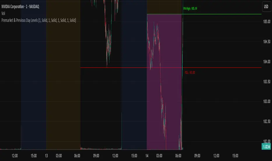
N Pops Premarket & Previous Day LevelsPrevious day high low, premarket high low, higher than previous high and lower than previous low
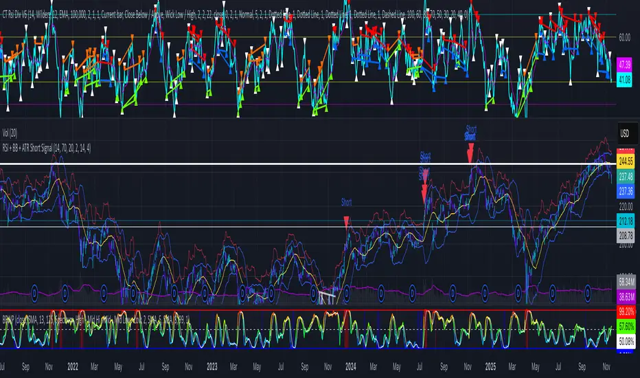
RSI + BB + ATR Short SignalThis indicator highlights potential short setups by combining three conditions:
RSI Overbought – RSI must be above the user-defined level.
Bollinger Band Break – Price must close above the upper Bollinger Band.
Extended Above the 5-Day Low – Price must sit at least X ATR above the recent 5-day low.
When all conditions line up on the same bar, the script plots a red triangle above the candle and triggers an alert so you can act immediately.
To help visualise the setup, the script also plots the full Bollinger Bands (upper, middle, lower) and a line showing the threshold of 5-day-low + ATR × multiplier. You can adjust RSI length and level, Bollinger settings, ATR length, and the ATR multiplier.
EMA Channel EMA Channel
All EMAs in single indicator
Customizable inputs
Clean color scheme
Works for any timeframe
Ideal for trend, pullback & momentum trading
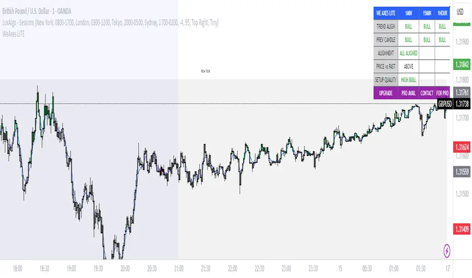
WeAxes MTF Scalper [LITE] WeAxes MTF Scalper
Professional Multi-Timeframe Alignment Tool - LITE Version
What This LITE Version Offers:
3-Timeframe Sync: Monitor 1min, 15min, and 1hr trends simultaneously
Visual Alignment System: Color-coded candles for perfect setups
Quick Setup Recognition: Instant HIGH/MEDIUM/LOW quality ratings
Clean Data Display: Essential alignment information at a glance
Perfect for Scalping:
Green Candles: Perfect bullish alignment across all timeframes
Red Candles: Perfect bearish alignment across all timeframes
Setup Quality: Know immediately if conditions are favorable
Multi-Timeframe Context: Never trade blind again
How to Use:
1. HIGH Quality Setups (Green/Red candles): Highest probability trades
2. MEDIUM Quality: All trends aligned, good for trend following
3. LOW Quality: Mixed signals, better to wait for alignment
PRO Version Includes:
- Advanced volume profiling across all timeframes
- Momentum strength calculations
- Detailed market structure analysis
- Smart Money Concepts integration
- Complete volume analysis
- And much more...
This LITE version gives you a taste of professional multi-timeframe analysis. Contact for PRO version access with full features.
Disclaimer: Use proper risk management. This tool assists analysis but doesn't guarantee profits.
掘金社趋势线
**趋势线**
1. **画法**:连接两个以上连续升高低点(上升线)或连续降低高点(下降线)。
2. **用法**:识别趋势方向、动态支撑/阻力位。价格回测趋势线时是潜在交易机会;有效突破/跌破可能预示趋势反转。
3. **原则**:触点越多越有效;避免强行拟合价格。
**斜率线**
1. **画法**:与趋势线画法相同,但更关注倾斜角度。
2. **用法**:衡量趋势强度。斜率陡峭表强势但可能不稳定;斜率平缓趋势更稳健;斜率放缓(动能背离)是潜在反转信号。
---
### English Version
**Key Uses of Trend Lines & Slope Lines**
**Trend Line**
1. **Drawing**: Connect two or more consecutive higher lows (uptrend) or lower highs (downtrend).
2. **Usage**: Identify trend direction and dynamic support/resistance. A price retest of the line offers a potential trading opportunity; a decisive break signals a potential trend reversal.
3. **Principle**: The more times the price touches the line, the more valid it is; avoid overfitting the price action.
**Slope Line**
1. **Drawing**: Same as a trend line, but with a focus on the angle of inclination.
2. **Usage**: Gauge trend strength. A steep slope indicates strong momentum but may be unsustainable; a gentle slope suggests a more stable trend; a slowing slope (momentum divergence) signals a potential reversal.

掘金社通道线Of course. Here is the English translation of the provided text about Linear Regression Channels.
***
**1. Basic Components of the Linear Regression Channel**
The Linear Regression Channel consists of five parts: the regression line, the upper and lower channel lines, the regression confirmation zone, and the regression forecast zone.
* The **regression line** forms the central axis, created through the linear regression analysis of stock prices.
* The **upper and lower channel lines** indicate the support and resistance levels of the stock price.
* The **confirmation zone** and **forecast zone** are used to determine the start/end distance for analysis and to estimate the future price range, respectively.
**2. How to Draw the Linear Regression Channel**
* Determine two anchor points to define the scope of the time period.
* Within this range, draw a line segment—the regression line—that minimizes the sum of the squared lengths of the perpendicular distances from all price points to the line.
* Draw two lines parallel to the regression line, one passing through the highest price and the other through the lowest price within the selected period, forming the linear regression channel.
* Extend these three parallel lines to the right, typically as dashed lines, to form the complete Linear Regression Channel.
**3. Application Principles of the Linear Regression Channel**
* The length of the regression channel, once determined by the two anchor points, should not be changed arbitrarily. However, when the trend line changes significantly, the channel needs to be redrawn.
* In an **uptrend**:
* When the price breaks above the upper channel line, it is expected to surge and then pull back.
* When the price falls back to the regression line, it is expected to find support and bounce.
* When the price breaks below the regression line, it is a sell signal.
* When the price breaks below the lower channel line, it is a stop-loss signal.
* In a **downtrend**, the application principles are the opposite of those in an uptrend.

Consolidation Tracker🧭 Consolidation Tracker — Visualize Market Reversals in Real Time
The Consolidation Tracker is a minimalist yet powerful tool designed to map the anatomy of market reversals and trend transitions. It highlights the structural evolution of price through four key phases, helping traders anticipate shifts with clarity and confidence.
🔄 The Four Stages of a Market Reversal:
Failure to Displace — Price fails to break beyond recent highs or lows, signaling potential exhaustion of the current trend.
Consolidation (CAMP) — A range-bound phase where price compresses between a dynamic high and low. These zones are shaded gray, representing indecision and balance.
Engulfing (ENGULF) — A decisive candle closes beyond the CAMP high or low, suggesting a directional shift. These are highlighted in orange.
Fair Value Gap (FVG) — A three-candle pattern forms a price imbalance. If this FVG also engulfs the CAMP range, it confirms the reversal and resets the CAMP. Bullish FVGs are shaded green, bearish FVGs in red.
🔁 From Reversal to Trend:
Once a reversal is confirmed via an FVG, the market often transitions into a trend cycle characterized by:
Displacement — Strong directional movement away from the prior range.
Fair Value Gaps — Continuation imbalances that offer high-probability entries on retracements.
🧠 How It Works:
The indicator dynamically tracks CAMP highs and lows, updating only when a candle engulfs the range or a valid FVG forms.
FVGs are detected when a three-candle sequence creates a gap between candle 2 and 0, and the middle candle (candle 1) breaks the CAMP boundary.
CAMP levels are plotted as horizontal lines, while background colors narrate the evolving structure in real time.
This tool is ideal for traders who value market structure, price efficiency, and narrative clarity. Whether you're anticipating reversals or riding trends, the Consolidation Tracker offers a clean, actionable lens into price behavior.
