"bar" için komut dosyalarını ara
Market Info Bar Charts - Was BoredSimple script in a form of a bar chart showing you some market information ;)
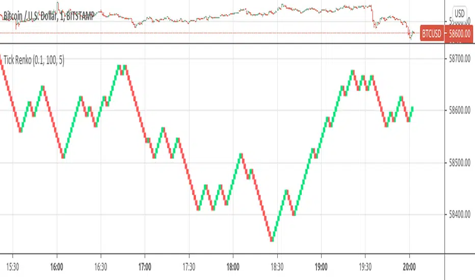
Tick RenkoTick Renko, bars are formed on live chart.
note:there is a issue that creates artifacts while there is not enough history loaded.
Combo Backtest 123 Percent change bar This is combo strategies for get a cumulative signal.
First strategy
This System was created from the Book "How I Tripled My Money In The
Futures Market" by Ulf Jensen, Page 183. This is reverse type of strategies.
The strategy buys at market, if close price is higher than the previous close
during 2 days and the meaning of 9-days Stochastic Slow Oscillator is lower than 50.
The strategy sells at market, if close price is lower than the previous close price
during 2 days and the meaning of 9-days Stochastic Fast Oscillator is higher than 50.
Second strategy
This histogram displays price or % change from previous bar.
WARNING:
- For purpose educate only
- This script to change bars colors.
Combo Backtest 123 Reversal & N Bars Up This is combo strategies for get a cumulative signal.
First strategy
This System was created from the Book "How I Tripled My Money In The
Futures Market" by Ulf Jensen, Page 183. This is reverse type of strategies.
The strategy buys at market, if close price is higher than the previous close
during 2 days and the meaning of 9-days Stochastic Slow Oscillator is lower than 50.
The strategy sells at market, if close price is lower than the previous close price
during 2 days and the meaning of 9-days Stochastic Fast Oscillator is higher than 50.
Second strategy
Evaluates for n number of consecutive higher closes. Returns a value
of 1 when the condition is true or 0 when false.
WARNING:
- For purpose educate only
- This script to change bars colors.

Combo Backtest 123 Reversal & N Bars Down This is combo strategies for get a cumulative signal.
First strategy
This System was created from the Book "How I Tripled My Money In The
Futures Market" by Ulf Jensen, Page 183. This is reverse type of strategies.
The strategy buys at market, if close price is higher than the previous close
during 2 days and the meaning of 9-days Stochastic Slow Oscillator is lower than 50.
The strategy sells at market, if close price is lower than the previous close price
during 2 days and the meaning of 9-days Stochastic Fast Oscillator is higher than 50.
Second strategy
Evaluates for n number of consecutive lower closes. Returns a value
of 1 when the condition is true or 0 when false.
WARNING:
- For purpose educate only
- This script to change bars colors.

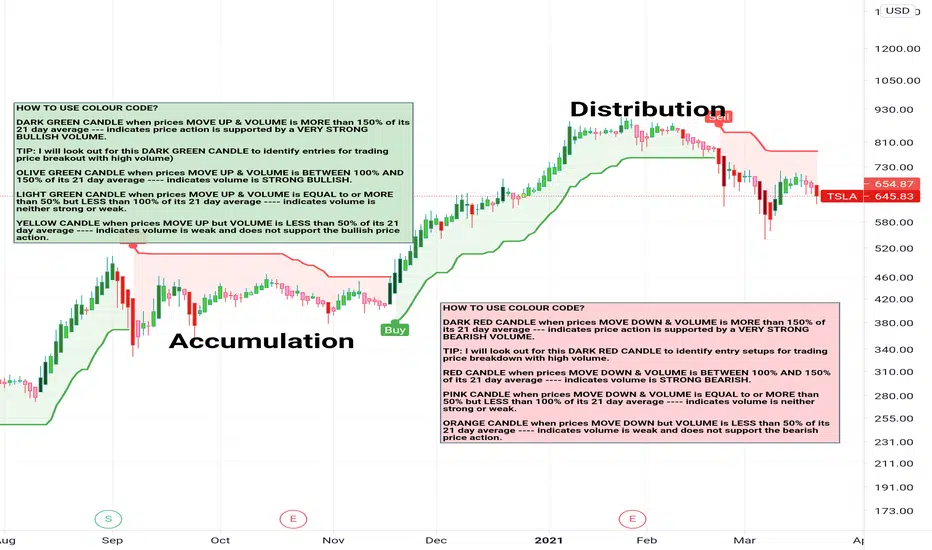
VCCB Stocks - Volume Coloured Candle BarsVCCB Volume Coloured Candle Bars (for Stocks, Indices, ETF, Commodities)
This indicator colour-codes the candlesticks to help traders easily identify if price action is supported by STRONG BULLISH -or- BEARISH VOLUME.
.
.
DARK GREEN CANDLE when prices MOVE UP & VOLUME is MORE than 150% of its 21 day average --- indicates price action is supported by a VERY STRONG BULLISH VOLUME.
TIP: I will look out for this DARK GREEN CANDLE to identify entries for trading price breakout with high volume)
OLIVE GREEN CANDLE when prices MOVE UP & VOLUME is BETWEEN 100% AND 150% of its 21 day average ---- indicates volume is STRONG BULLISH.
LIGHT GREEN CANDLE when prices MOVE UP & VOLUME is EQUAL to or MORE than 50% but LESS than 100% of its 21 day average ---- indicates volume is neither strong or weak.
YELLOW CANDLE when prices MOVE UP but VOLUME is LESS than 50% of its 21 day average ---- indicates volume is weak and does not support the bullish price action.
.
.
DARK RED CANDLE when prices MOVE DOWN & VOLUME is MORE than 150% of its 21 day average --- indicates price action is supported by a VERY STRONG BEARISH VOLUME.
TIP: I will look out for this DARK RED CANDLE to identify entry setups for trading price breakdown with high volume.
RED CANDLE when prices MOVE DOWN & VOLUME is BETWEEN 100% AND 150% of its 21 day average ---- indicates volume is STRONG BEARISH.
PINK CANDLE when prices MOVE DOWN & VOLUME is EQUAL to or MORE than 50% but LESS than 100% of its 21 day average ---- indicates volume is neither strong or weak.
ORANGE CANDLE when prices MOVE DOWN but VOLUME is LESS than 50% of its 21 day average ---- indicates volume is weak and does not support the bearish price action.
.
.
I recommend using this indicator in conjuction with Supertrend Indicator (that provides dynamic levels of support and resistance) to help you identify potential entry/exit points.

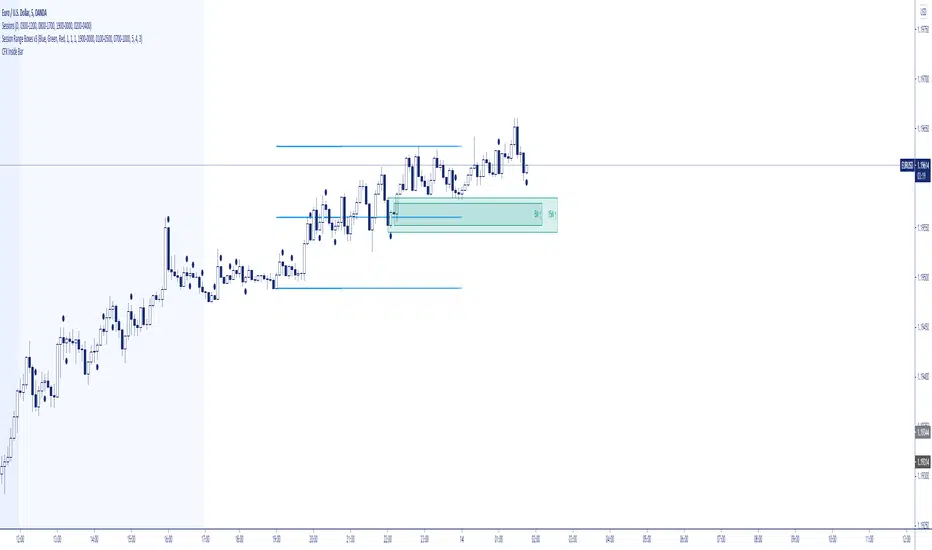
Lyiness_Range-Bar-IdentificationRBI
The indicator shows you the range bar as a channel and automatically draws it on the chart. The indicator adapts automatically to each chart time.
Using the drawing tool, draw the channel from the 4-hour diagram into the chart and switch to the 15-minute diagram to see a breakout there.
this gives you the strongest resistance and the strongest support line in the chart


Both EMA with BarHello Everyone Its indicator base one both EMA
How to work its indicator?
➤ There are two ema if both ema above Low when Long signal Or ema below high when Short signal
Indicator Feature
➤ Long Signal with Alert
➤ Short Long Signal with Alert
➤ Take Profit with Alerts calculated by Long or Short Bar Open You can also choose Percentage or Point by default percent
➤ Trailing Stop Loss with Alerts
Important: This Indicator we are using for Automation Trading if You Want This Indicator Access, Please Contact me PM on Tradingview

low and high X Bars//This script finds High and Low X bars back. Simple pine script, can customize lookback period.
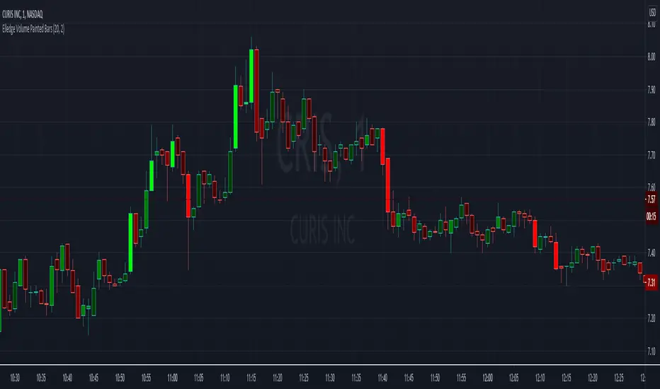
Elledge Volume Painted BarsThis indicator uses the volume and average volume for the given candle to determine the color for the given candle. The brighter the green, the higher the buyer volume. The brighter the red, the higher the seller volume.
The volume average is used to determine the bar's color. Under the average yields a dark color. Over the average yields the middle setting. While over 2x average volume gives the brightest color.
Entry Size 1barCalculates how many lots (100) you should buy/sell for any given bar with a fixed risk in USD and shows if Long (L), Short (S) or wait (w) with a label.
Requires max loss per week, trading days per day and lossing trading per day.

PB Opening Bar RangesPB Opening Bar Ranges identifies the high and low ranges of those market opens and is to be used as an overall strategy with PB Market Opens.
This is different to indicators out there as it is specific to the Market Opens strategy
This indicator identifies opening range for any time frame.
You can use it to trade out of opening ranges after Gold Pit Opens and Stock exchange opens.
For best results, do the following
Gold use the 5 minute time frame
Forex and Currency futures 10 minute time frame.
Indexes use the 15 minute time frame.
This will be available to lease, please private message us to find out more

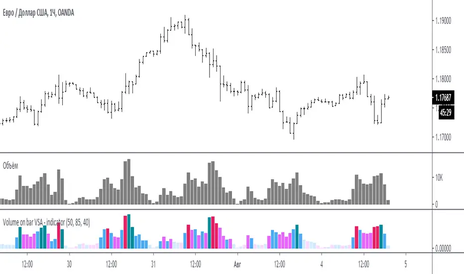
Volume on bar VSA - indicator V2Google translate.
This indicator compares the volume with its average value and tints it depending on whether the tail on the bar is bullish or bearish.
In the settings you can set (sensitivity) for tinting volumes of high and medium
Этот индикатор сравнивает объем со средним его значением и подкрашивает его в зависимости от того какой хвост на баре, бычий или медвежий.
В настройках можно задать (чувствительность) для подкрашивания объемов повышенных и средних
Volume Color Bar (KETT)Highlights important bars with increased volume during the selected period. It is convenient to use for building a trend line or strong levels.

Volume on bar VSA - indicatorЭтот индикатор сравнивает объем со средним его значением и подкрашивает его в зависимости от того какой хвост на баре, бычий или медвежий.
В настройках можно задать сигнальную линию (чувствительность) для подкрашивания объемов, если он превышает эту линию. (на графике красная линия)
Сигнальная линия задаётся в процентах от среднего объема за указанный период.
Серым цветом показан средний объем.
Google translate
This indicator compares the volume with its average value and tints it depending on which tail on the bar is bullish or bearish.
In the settings, you can set a signal line (sensitivity) for tinting volumes, if it exceeds this line. (red line on the chart)
The signal line is set as a percentage of the average volume for the specified period.
Gray indicates the average volume.

ATR% The average true range / close price of previous barThe ATR% is an indicator to measure the increased volatility comparing with the past period.
1. Default is 14 bars, but we can switch to 21 or 7.
2. For the smoothing method, by default using simple moving average, but EMA, WMA and RMA is an option.
3. if over 1.5%, we consider the volatility increased significantly.
4. Combine ATR%, Stock screening (notional and volatility ) with 1-3 min chart, it's very easy to catch the sudden price movement for Japan Equities. hope you find it useful.

Oscillator OB/OS BarsChoose between 3 different oscillators (RSI, MFI, and StochRSI) to show bars when the oscillator is oversold/overbought.
Green = oversold
Red = overbought
Orange = Bearish "Reversal"
Aqua = Bullish "Reversal"
I created this to help determine patterns with other stuff I'm building. Thought others may find it useful for the same purpose, not to trade based off of this.
Used those 3 oscillators cause their OB/OS levels are clear enough (though I put no effort into the stochrsi like I should've but welp)
enjoy zzzzzz

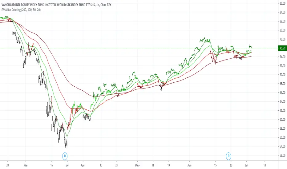
EMA Bar ColoringHi,
This is a simple visualization because I wanted to use tradingview on the cellphone with less Lines and Easy to understand.
There are 4 moving averages for each level of the closing price, the color changes.
The Moving averages can be seen in the option tab.
Also the plot of the closing prices can also be seen.
It works better with bar charts.
Best Regards,
RERS

Engulfing Signal Considering Three Bars BeforeIts a simple analysis using Candle Pattern Technique, Engulfing. The script will find the engulf candle by considering three bars before. For Bullish Engulfing it will be colored by yellow, and for Bearish will be white. I reccomend you for using this script in Daily Time Frame.
Enjoyyyy!!!
