Renko Bar Time by JustUncleLThis indicator in designed to be used with Renko and other price only bars (ie Kagi, LineBreak, Point&Figure) and shows the number of minutes a bar was open before it was confirmed and printed.
NOTE: It will only work on currencies and symbols that are in the 24/5 market, it does account for weekend market close time but does not account for any Forex market holiday close times.
HINTS:
When the BAR TIME is long and the Renko Bricks have wicks, this is an indication of consolidation.
When the BAR TIME is short and the Renko Bricks have no wicks, this is an indication of acceleration.
"bar" için komut dosyalarını ara

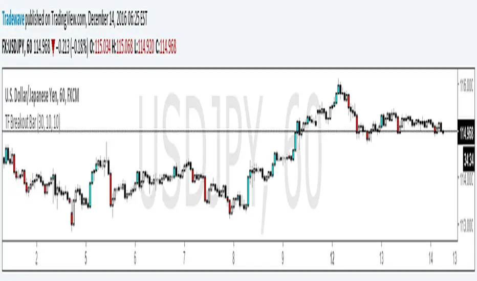
TF Breakout BarIndicator Name: TF Breakout Bar
Creator: Andrew Palladino
Date: 12/14/2016
The TF Breakout Bar allows the user to check for a breakout or a breakdown on a specific time frame regardless of what time frame resolution the current chart is on.
The user can change the following:
Breakout and Breakdown time frame
Lookback bar period for breakouts
Lookback bar period for breakdowns
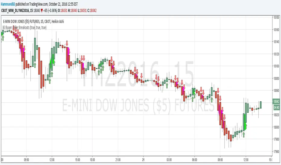
B3 Buyer-Seller BreakoutsB3 Buyer-Seller Breakouts = If a bar is showing that it is moving in a direction with highs lows and close, all of which are >respectively< moving against the open from the bar before, then it prints indicating buyers or sellers bringing momentum. The arrows and cloud carry into the next bar to give lots of awareness of the micro-term momentum. The cloud represents the better price range from which to add to a position.
This study repaints within the bar, most of my indicators do not, but this one is about timing to get an edge on adding to your already in play position, becoming part of the needed momentum to hit profit targets faster. Also, this theory helps you add to winners, and if you never add to losers, you now have statistical odds in your favor. I got the idea for the study reading about turtle trader method and how that statistical edge is really why it works, always adding on every breakout. Keep in mind that I never buy or sell breakouts to initiate trades, only to scale in.
~Cheers!~ ~B3
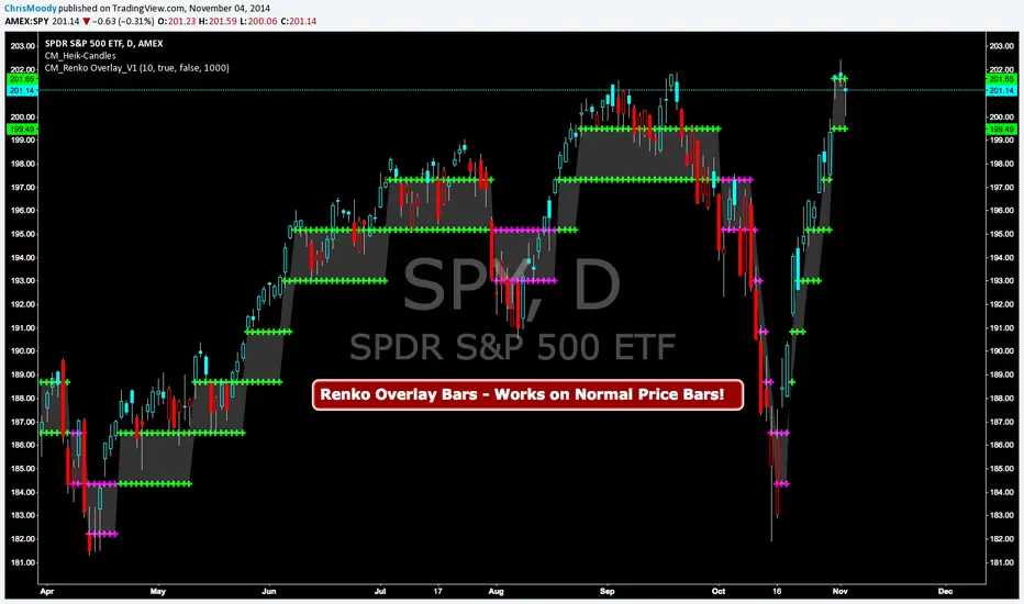
CM Renko Overlay BarsCM_Renko Overlay Bars V1
Overlays Renko Bars on Regular Price Bars.
Default Renko plot is based on Average True Range. Look Back period adjustable in Inputs Tab.
If you Choose to use "Traditional" Renko bars and pick the Size of the Renko Bars the please read below.
Value in Input Tab is multiplied by .001 (To work on Forex)
1 = 10 pips on EURUSD - 1 X .001 = .001 or 10 Pips
10 = .01 or 100 Pips
1000 = 1 point to the left of decimal. 1 Point in Stocks etc.
10000 = 10 Points on Stocks etc.
***V2 will fix this issue.
CM_Stochastic Highlight BarsCM_Stoch Highlight Bars
belgusinc Wanted to Know How To Create Highlight Bars based on Stochastic Bars Being Overbought/Oversold
Basics:
Ability to turn On/Off Crosses Only Above or Below High/Low Lines.
User sets Values Of High/Low lines. (Determines how highlight Bars are plotted, Based on the Value of the High/Low lines.
Ability to turn On/Off All Crosses, Both BackGround Highlights and “B”, “S” Letters.
Ability to turn On/Off BackGround Highlights if Stoch is Above Or Below High/Low Lines.
Ability to All or Any Combination of these Features.
Lower Indicator

Engulfing Bar Paradigm [Blaz]Version 1.0 – Published Jan 2026: Initial release
1. Overview & Purpose
The Engulfing Bar Paradigm (EBP) is a multi-timeframe price-action tool built to help traders identify important engulfing candles on higher timeframes and use them to define daily market bias and structure.
At its core, the indicator detects strong high-timeframe engulfing candles. These are candles where price takes one side of the previous candle’s range and closes beyond its body, suggesting a shift in control. When this happens, it provides a structural reference that traders use to interpret directional context, making these candles useful for setting bias rather than reacting to short-term noise.
Once an EBP forms, the indicator automatically highlights and measures the key parts of that engulfing move. This helps traders understand how price is behaving after the displacement and how structure develops across lower timeframes.
The indicator is designed to work across multiple asset classes and timeframes, allowing traders to align intraday price action with higher-timeframe intent. It does not provide buy or sell signals. Instead, it offers a structured way to read the market, build bias, and make more informed decisions based on price behaviour and context.
2. Core Functionality & Key Features
The Engulfing Bar Play (EBP) is built around a mechanical and rule-based interpretation of engulfing price action, enhanced through multi-timeframe analysis and contextual structure mapping.
2.1. High-Timeframe Engulfing Detection
The indicator monitors a user-selected higher timeframe and automatically identifies valid bullish and bearish engulfing candles. These engulfing moves represent strong participation and often mark areas where control shifts in the market. Each detected EBP acts as a reference point for bias and subsequent price interaction.
2.2. Directional Bias Control
Users can choose to display bullish only, bearish only, or both types of setups. This helps traders stay aligned with their intended market bias and avoid distractions from opposing setups.
2.3. Engulfing Range Mapping
Once an EBP forms, the indicator plots the full engulfing range and divides it into four equal sections (quartiles). These levels help traders understand how price interacts within the range and where reactions are more likely to occur.
2.4. Fair Value Gaps (FVGs) Inside the EBP
The indicator detects Fair Value Gaps created during the engulfing move. These gaps highlight areas of imbalance where price may later react. Traders can choose whether to display mitigated and unmitigated gaps for cleaner analysis.
2.5. Expansion Projections
Optional projection levels extend beyond the engulfing range, helping traders frame potential continuation or expansion once price moves away from the structure. These levels are intended to support expectations, not predictions.
2.6. Session Liquidity Integration
EBPs can be filtered to appear only after session liquidity has been taken, allowing traders to focus on engulfing structures that occur after stop-runs or range sweeps. Multiple session windows are supported, with built-in checks to ensure logical use.
2.7. Advanced HTF Candle Visualisation
To improve clarity, the indicator includes a higher-timeframe candle display, showing multiple HTF candles directly on the chart. This helps traders stay aware of where price is trading within the broader context.
Displayed elements include:
HTF candle bodies and wicks
HTF open
HTF Fair Value Gaps
HTF Volume imbalances
Chosen EBP timeframe label
Clear time labels for orientation
2.8. Built-In Safeguards
The indicator automatically validates timeframe relationships and session settings. If an invalid configuration is detected, features are disabled and a warning is shown, helping traders maintain clean and reliable analysis.
3. How to Use the Indicator
3.1. Select the Higher Timeframe
Begin by choosing a higher timeframe for the EBP (such as Daily or 4H). This timeframe defines where the indicator will look for engulfing structures. The chosen timeframe should be equal to or higher than the chart timeframe.
3.2. Identify the Active Engulfing Structure
When a valid engulfing structure forms on the selected higher timeframe, the indicator highlights the engulfing range on the chart. This structure becomes the reference point for understanding current market conditions and directional bias.
3.3. Establish a Bias
Use the direction of the engulfing structure to frame bias for the session. A bullish engulfing structure suggests bullish intent, while a bearish structure suggests bearish intent. Bias filters can be used to display only the setups that align with your directional view.
3.4. Observe Price Interaction Within the Range
As price develops on lower timeframes, observe how it interacts with the engulfing range, its internal levels and FVGs. This helps traders assess whether price is respecting the structure, consolidating, or expanding away from it.
3.5. Use HTF Context for Intraday Navigation
The higher-timeframe candle display provides additional context by showing where current price sits relative to recent HTF opens, imbalances, and structure. This helps maintain alignment with the broader market narrative throughout the session.
3.6. Combine With Your Existing Execution Model
The EBP indicator can complement your existing strategy or execution model. It provides context and structure, allowing traders to make decisions with higher-timeframe awareness rather than reacting to short-term price fluctuations.
4. Protected Logic & Original Design
The Engulfing Bar Paradigm (EBP) is the result of original development and systematic engineering. While the concept of engulfing candles is widely known in technical analysis, the logic, structure, and implementation used in this indicator are original to this indicator’s design.
This indicator does not rely on simple candlestick comparisons. Instead, it applies a rule-based, multi-timeframe framework that evaluates engulfing behaviour within a broader structural context. The way engulfing structures are detected, filtered, measured, and visualised—along with how internal ranges, imbalances, projections, and higher-timeframe elements are handled—reflects an original design approach developed specifically for this indicator.
5. Disclaimer
This indicator is provided for educational and analytical purposes only. It does not constitute financial advice, investment recommendations, or trading signals. All trading and investment decisions remain solely the responsibility of the user.
Trading financial instruments involves substantial risk of loss. Past performance of any trading methodology or indicator does not guarantee future results. Users should conduct their own research and consider consulting with qualified financial professionals before making trading decisions.
The indicator's pattern detection is based on technical analysis principles and should be used as part of a comprehensive trading approach. No trading tool can guarantee profitable outcomes or eliminate market risk.
By using this indicator, users acknowledge they understand these risks and accept full responsibility for their trading decisions and outcomes.

Timeframe Continuity BarsTimeframe Continuity Bars is a script that is extremely simple for good reason
So please, do not remove this post because it seems 'simple'
Now that's over with. Lets dive in to understand what timeframe continuity IS and what this indicator does.
Timeframe continuity is defined by 4 or more timeframes and it is the relationship of the last price traded to those 4 opening prices. Standard timeframe continuity would be using the M,W,D,60min timeframes.
The reason we use MTF analysis is because of the truth of what price is and how it works.
Price movement is SOLELY caused due to aggressive buying / selling. Some may attempt to refute this however at the end of the day. If the price is at 100.00 it is because a buyer is willing to buy there and a seller is willing to sell there. If those market participants did not want to buy or sell at 100.00 price would go up or down to meet the more aggressive participant.
So what does this look like you may ask...
If an aggressive buyer takes the offer we will see prices go up if they were willing to pay more than the last guy who took the offer.
So price may go from 100.00 to 100.01 because you decided to invest in that stock that day at that time with a market order
This same thing occurs when every other institution creates, adds, reduces, or exits a position. They have to buy or sell and they have to either do it aggressively or do it passively by sitting on the bid / ask and waiting.
So since this is true, we know that the relationship to the opening price is extremely important. This is because if price is above it's open that means buyers were willing to take the offer and buy at higher prices. If price is below it's open it means that sellers were willing to sell at the bid and they sold at lower prices.
So any candlestick chart is simply an aggregation of this aggressive buying/selling that is taking place at all times.
By using the timeframe continuity bars indicator we can measure the distance from the current open across 4 or more timeframes.
By doing this we can identify monthly participation groups, weekly participation groups, daily participation groups, and 60min participation groups.
When all those groups align green or red this is considered full timeframe continuity. Where the monthly weekly daily 60min groups are all taking the offer and buying, or all selling at the bid!
When this aligns this is when price is for CERTAIN going in one direction.
However, It is subject to change every 60 minutes as the 60min determines if those monthly weekly daily buyers are present RIGHT NOW.
So if the 60min changes we go into direct conflict against the month/week/day groups.
If we see the 60min and day align we go into direct conflict against the month/week
if the 60min day and week are red we over-take the monthly group for control. At the time of the week day and 60 being red we have ZERO evidence of the previous monthly buyer/seller that was present.
Now that you understand a little bit about continuity.. Check it out on the chart!
P.S Here is some tips
1) it is not about just all timeframes aligning, we want to see long green / red bars!
2) The opens reset on a cyclical basis. Each day, each week, each month... When the new timeframes open we will see timeframes have the SAME open. When the opens are the same price we have LESS evidence versus having all opens seperate.
3) Investors can use the Y Q M W as their 4 timeframes to see when institutional buying is occurring [go do a case study on AMEX:GLD and AMEX:SLV weekly timeframe with these settings]
4) You need to add 4 separate indicators and change the timeframes. It is ideal to then save this layout!
5) The best way to do price analysis is using #TheStrat across all 4 timeframes instead of one timeframe with this indicator. This is soley a tool we use to show changing of control between participation groups!

PA Bar Count (First Edition)This script is written by FanFan.
It is designed to count price action bars and identify the bar number in a sequence.
The script helps traders track bar structure and improve PA analysis.

Relative Volume: Bull/Bear Bars + Strength IntensityThis indicator:
- Plots volume bars in a separate pane under the ticker's chart.
- Computes and displays RVOL as a decimal (e.g., 1.37), based on current bar volume ÷ average volume over a lookback length (lookback length is customizable).
- Shows the RVOL value in the indicator’s “Values” line (the “ticker” area at the top-left of the pane) by plotting it as a line (and you can also optionally show a label).
- Colors volume bars:
- green on bullish candles
- red on bearish candles
- also reflects RVOL strength via intensity (stronger RVOL = less transparent / more vivid)

Investment Analysis Bar v2What It Does
A comprehensive analysis bar combining fundamental metrics with technical signals, designed for long-term investors who prioritize quality over momentum.
Core Philosophy: Quality companies trading below their 200 EMA in accumulation zones = opportunities, not warnings.
Tier 1 Bar Metrics
Margins: GM, OM, NIM, FCF Margin
Returns: ROCE, ROE
Growth: Revenue YoY, EPS YoY
Valuation: PE TTM, Forward PE, PEG
Zone: Accumulate / Hold / Trim / Exit
Signal: PRIME / BUY / TRIM / SELL / NEUTRAL
Performance: 1W to 1Y returns
Two Strategy Modes
Value Accumulator (Default) - For long-term position building. Treats below-200-EMA as an opportunity when fundamentals are intact. PRIME signals require: RSI bounce + Volume + Accumulate Zone + All Quality Gates Pass + Below 200 EMA.
Trend Follower - Traditional momentum approach. Prefers entries above 200 EMA.
Quality Gates System
Four fundamental checkpoints:
Gross Margin ≥ 40%
ROCE ≥ 15%
Debt/Equity ≤ 50%
SBC/Revenue ≤ 15%
Strong signals require quality confirmation. PRIME signals require ALL gates to pass.
Zone System
Three calculation methods:
52W Range: Accumulate in bottom 25%, Trim in top 25%
Manual Levels: Set your own price targets
ATR-Based: Dynamic zones from EMA ± ATR
Signal Hierarchy (Value Mode)
SignalMeaning
PRIME 💎Optimal entry - all conditions aligned
BUY 🔼Strong accumulation signal
BUY? ↗Decent entry, not ideal zone
ACCUM 🎯In accumulation zone, quality OK
WAIT ⏳Setup forming, no bounce yet
TRIM 📤Consider taking profits
Alerts Included
Zone transitions (Accumulate, Trim, Exit)
PRIME Entry Signal
Strong Buy / Sell signals
Quality Gate failures
Quality Accumulation Setup
Best Used On
US stocks with fundamental data available. Technical features work on all symbols.
Settings
Fully customizable:
Toggle each metric category
Adjust quality gate thresholds
Choose zone calculation method
Configure RSI/volume parameters
Position bar and panel anywhere

Price Action - H/L BarBased on Al Brooks' "Bar by Bar" (Chapter 09A, p.45-50) and "Trends" (p.98-105), this marks H (higher high with close above mid) and L (lower low with close below mid) swings. Marking pauses after each, resuming on pullback. Labels "H" above and "L" below bars for swing counting in trends or ranges. Key: Markets form two legs—use for measured moves or failed breakouts, always in context of prior extremes.

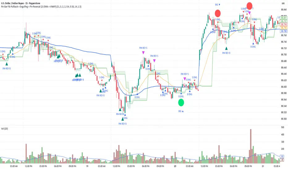
Pin Bar Fib Pullback + Engulfing + Pin Reversal (21 EMA + VWAP)Dear Traders
Pin bar fib pullback continuation (in 0.50–0.618 zone)
Bullish/Bearish engulfing
Pin bar reversals (bottom/top)
Then we ask: did the next candle move at least atrMult × ATR away from the signal close in the right direction?
For a long signal: next high ≥ signal close + ATR * atrMult
For a short signal: next low ≤ signal close − ATR * atrMult
If yes, that signal gets a big circle with text:
BIG ▲ for long
BIG ▼ for short
drawn on the original signal bar (using offset = -1 trick).
You can tune how “big” you want:
Increase ATR length for smoother ATR
Increase ATR * (e.g., from 1.5 → 2.0) to only mark really strong moves.
VIX Calm vs Choppy (Bar Version, VIX High Threshold)This indicator tracks market stability by measuring how long the VIX stays below or above a chosen intraday threshold. Instead of looking at VIX closes, it uses VIX high, so even a brief intraday spike will flip the regime into “choppy.”
The tool builds a running clock of consecutive bars spent in each regime:
Calm regime: VIX high stays below the threshold
Choppy regime: VIX high hits or exceeds the threshold
Calm streaks plot as positive bars (light blue background).
Choppy streaks plot as negative bars (dark pink background).
This gives a clean picture of how long the market has been stable vs volatile — useful for trend traders, breakout traders, and anyone who watches risk-on/risk-off conditions. A table shows the current regime and streak length for quick reference.

Outside & Inside BarOutside & Inside Bar Indicator — highlights and alerts two key candle patterns: outside bars (high–low breakouts) and inside bars (range contractions).
You can independently enable or disable signals, highlights, and arrows for each type.
Includes session filtering, custom colors, and optional alerts for bullish and bearish setups.

Heikin Ashi BarThis is an indicator that displays the Heikin‑Ashi chart simultaneously with candlestick bars. The Heikin‑Ashis are shown on a bar chart, with bullish bars colored green and bearish bars colored orange.
平均足をロウソク足と同時に表示するインジケータです。平均足はバーチャートで表示されます。陽線は緑色、陰線はオレンジ色で表示されます。

EMA Cross + Inside BarWith the EMA Cross + Inside Bar script you can spot inside bars instantly.
Based on the inside bar there is a call and a put trigger to help you find the key areas to look for long/short positions.
It's also possible to show possible target areas based on a multiplier.
The script is highly customizable and will be improved in the future.
If you have questions or feedback just message me via X.
And don't forget: Always do your own research :)
RSI Bars - OnlyFlowThis indicator applies the RSI (Relative Strength Index) to candle coloring so that bar colors reflect momentum conditions instead of a fixed scheme.
RSI Logic: Bars shift color when RSI values move into overbought or oversold regions, with intensity scaled by how far RSI extends beyond the thresholds.
Gradient / Step Mode: Choose between a smooth gradient or a 3-step palette to visualize strength.
Directional Neutral Colors: Neutral zones can follow candle direction for clearer trend context.
Customization: Overbought/oversold levels and color palettes are user-configurable.
Optional RSI Panel: An RSI plot with overbought/oversold lines can be enabled in a separate pane if desired.
This tool is meant to give traders a more intuitive view of RSI conditions directly on price bars, helping to quickly see momentum extremes without needing to glance away from the chart.

Body-Based Inside/Outside Bars (wicks excluded)This indicator shows inside/outside bars EXCLUDING the wicks. The yellow vertical line indicates an inside bar (body only) and the blue vertical line indicates outside bars (candle body only).

[DEM] Parabolic SAR Bars (PSAR Bars) Parabolic SAR Bars is a visual enhancement of the traditional Parabolic SAR indicator that uses dynamic color coding to represent the relative position and momentum of price versus the SAR levels. The indicator calculates the percentage difference between the closing price and the Parabolic SAR value, then applies either a gradient color scheme that transitions from red to blue based on the relative strength within a 20-period range, or a momentum-based coloring system using purple, blue, and red to indicate directional changes. Both the SAR plot points and the price bars themselves are colored according to this system, creating an intuitive visual representation where traders can quickly assess not just whether price is above or below the SAR, but also the strength and momentum of that relationship. This approach transforms the binary nature of traditional Parabolic SAR signals into a more nuanced visual tool that helps identify the intensity of trending conditions and potential momentum shifts before actual SAR reversals occur.

[DEM] Momentum Bars Momentum Bars is designed to color price bars based on a combination of Aroon oscillator analysis and RSI momentum to identify periods of strong directional bias and filter out choppy or indecisive market conditions. The indicator calculates the Aroon Up and Aroon Down values over a configurable period (default 20) to determine which direction has more recent strength, then combines this with RSI analysis using the same period to confirm momentum alignment. Bars are colored green when Aroon Up exceeds Aroon Down (indicating recent highs dominate) and RSI is above 50 (confirming bullish momentum), red when Aroon Down exceeds Aroon Up (indicating recent lows dominate) and RSI is below 50 (confirming bearish momentum), and purple for all other conditions where the Aroon and RSI signals are conflicting or neutral, providing traders with immediate visual feedback about when price momentum and recent high/low activity are aligned versus when market conditions are mixed.

[DEM] Ichimoku Bars Ichimoku Bars is designed to color price bars based on their relationship to the Ichimoku Cloud (Kumo) by comparing the current close price to both Leading Span A and Leading Span B from the traditional Ichimoku system, but with added smoothing modifications. The indicator calculates the standard Ichimoku components using Donchian midlines for the Conversion and Base lines, then creates smoothed versions of Leading Span A (20-period RMA of the average between Conversion and Base lines) and Leading Span B (20-period RMA of the 52-period Donchian midline), both displaced forward by the lagging span period. Bars are colored green when price is above both leading spans (indicating strong bullish conditions above the cloud), red when price is below both leading spans (indicating strong bearish conditions below the cloud), and magenta when price is within the cloud (indicating neutral or transitional conditions), providing traders with immediate visual feedback about price position relative to the Ichimoku equilibrium zone.
AymaN Entry Signal – With HTF + Pin Bar + Multi TP + BE + V1Ayman Entry Signal – Indicator Description
Overview
Ayman Entry Signal – With HTF + Pin Bar + Multi TP + BE + Stats Panel (V1)
This is a professional-grade Pine Script indicator designed for scalping and intraday trading, with full trade management, multi-confirmation logic, and advanced visualization. The tool is ideal for traders focused on XAUUSD (Gold), Forex, and other volatile instruments who seek both precision entries and structured exits with dynamic risk control.
Main Features
Advanced Entry Logic:
- EMA fast/slow crossovers (configurable)
- Optional conditions: Break of Structure (BoS), Order Block (OB), Fair Value Gap (FVG), Liquidity sweeps, Pin Bars
- HTF confirmation using EMA or BoS
- Real-time entry condition display
Trade Management:
- Dynamic calculation of Entry, SL (with ATR buffer), TP1, TP2
- Supports Partial Close and Break Even logic after TP1
- Visual PnL label (dynamic and color-coded)
Statistics Panel:
- Shows total trades, win/loss/breakeven count, cumulative PnL
- Filter by custom date or session
- Fully customizable panel appearance
Trade Visualization:
- Trade box includes all trade levels (Entry, SL, TP1, TP2)
- Visual display of trade conditions and PnL result
- Option to keep previous trades on chart
Alert System:
- Alerts for Buy and Sell entries
- Compatible with webhook automation systems like MT5/MT4
Customization & Inputs
- Capital & risk per trade
- Value per pip/point
- SL buffer (ATR-based)
- Manual EMA override
- Enable/disable: EMA, BoS, OB, FVG, Liquidity, Pin Bars
- HTF: timeframe + confirmation logic
- Trade box/labels visibility
- Full color customization
- PnL label position: top, center, or bottom
Recommended Use
- Ideal for Gold scalping (XAUUSD), also effective for Forex
- Best on 1m–15m charts; use HTF confirmation from 15m–4H
- Pairs well with semi-automated systems using alerts and webhooks
Disclaimer
Note: This is a non-executing indicator. It does not place trades but provides visual and statistical guidance for professional manual or semi-automated trading.

BarUtils: Get Bar Index from DateLibrary "BarUtils"
getBarIndexFromDate(targetTimestamp)
Parameters:
targetTimestamp (int)
**Description**:
This utility provides a reliable way to calculate the `bar_index` of a specific calendar date, regardless of chart resolution. It's especially useful for anchoring scripts to historical events, labeling macroeconomic moments, or marking custom time-based signals that must remain consistent across timeframes.
Unlike hardcoded `bar_index - N` approaches, this function dynamically estimates the number of bars between a given `timestamp()` and the current bar using the actual time-per-bar (`time - time `). It works correctly on intraday, daily, weekly, and monthly charts.
### 💡 **Function Provided**:
import TradeTitan120/BarUtils/1
* `getBarIndexFromDate(int targetTimestamp)`
→ Returns the estimated `bar_index` that aligns with a given timestamp
### ✅ **Use Cases**:
* Marking past events like FOMC meetings, market crashes, or personal signals
* Backtesting entry/exit conditions from specific calendar dates
* Anchoring visual elements (shapes, lines, labels) across resolutions
This tool is simple, fast, and built for accuracy. Use it to enhance multi-timeframe compatibility in any script.