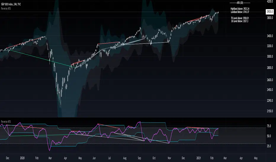
On Chart Reverse RSI cyclic smoothed + DivergenceThis indicator is based on the amazing work of (@whentotrade) Lars von Theinen's RSI cyclic smoothed (cRSI). More information on the original indicator and how to use it can be found below.
The On Chart Reverse cRSI is a visual representational spin of the cRSI or (RSI cyclic smoothed, by Lars von Theinen) you all know and love with the addition of two key features, that in conjunction can be used to greatly assist the end-user in their decision making for entry, exit and risk management.
The first feature is the visual reverse engineered calculations of the HighBand, LowBand, as well as the user defined Upper and Lower Levels (70 & 30 by default), compared to the cRSI Level, in relation to the current price level as the point of divergence, which at a glance can then be used to visually see on the chart the closing price level needed in order to cross the cRSI either under or over the afore mentioned levels.
The second feature is the addition of my advanced On Chart divergence script in order to display regular as well as hidden divergences on the cRSI compared to the price level, in order to help the end-user train their eyes to spot them more accurately.
Divergence colors and description:
-------------------------------------
Green : Regular Bullish Divergence
White : Hidden Bullish Divergence
Red : Regular Bearish Divergence
Orange : Hidden Bearish Divergence
Optional Settings Include:
-----------------------------
1.) Show/Hide Reverse Levels
2.) Change the Reverse Levels Text Size
3.) Change the Reverse Levels Text Color
4.) Change the Reverse Levels Text Left Margin
5.) Change the Reverse Levels Decimal value
6.) Show/Hide the Reverse Levels Currency
7.) Show/hide the cRSI Divergence lines
8.) Change the cRSI Divergence line offset
9.) Show/hide the cRSI Divergence arrows
10.) Change the Regular Bullish Divergence Color
11.) Change the Hidden Bullish Divergence Color
12.) Change the Regular Bearish Divergence Color
13.) Change the Hidden Bearish Divergence Color
14.) Change the cRSI Divergence lookback (No. of bars to lookback)
RSI cyclic smoothed (cRSI)
-----------------------------
The RSI cyclic smoothed (cRSI) indicator is developed by Lars von Theinen and is subject to the terms of the Mozilla Public License 2.0 at mozilla.org Copyright (C) 2017 CC BY, whentotrade / Lars von Thienen. For more details on the cRSI Indicator:
RSI cyclic smoothed v2
The RSI cyclic smoothed (cRSI) is an enhancement of the classic RSI , adding
1) additional smoothing according to the market vibration,
2) adaptive upper and lower bands according to the cyclic memory and
3) using the current dominant cycle length as input for the indicator.
It is much more responsive to market moves than the basic RSI . The indicator uses the dominant cycle as input to optimize signal, smoothing, and cyclic memory. To get more in-depth information on the cyclic-smoothed RSI indicator, please read Decoding The Hidden Market Rhythm - Part 1: Dynamic Cycles (2017), Chapter 4: "Fine-tuning technical indicators." You need to derive the dominant cycle as input parameter for the cycle length as described in chapter 4.
Please PM me to obtain access.
"Cycle" için komut dosyalarını ara
Reverse RSI cyclic smoothed + DivergenceThis indicator is based on the amazing work of (whentotrade) Lars von Theinen's RSI cyclic smoothed (cRSI). More information on the original indicator and how to use it can be found below.
The Reverse cRSI is in essence the same cRSI or (RSI cyclic smoothed, by Lars von Theinen) you all know and love with the addition of two key features, that in conjunction can be used to greatly assist the end-user in their decision making for entry, exit and risk management.
The first feature is a reverse engineered calculation of the HighBand, LowBand, as well as the user defined Upper and Lower Levels (70 & 30 by default), compared to the cRSI Level, in relation to the current price level as the point of divergence, which at a glance can then be used to determine the closing price level needed in order to cross the cRSI either under or over the afore mentioned levels.
The second feature is the addition of my advanced divergence script to display regular as well as hidden divergences on the cRSI, in order to help the end-user train their eyes to spot them more accurately.
Divergence colors and description:
-------------------------------------
Green : Regular Bullish Divergence
White : Hidden Bullish Divergence
Red : Regular Bearish Divergence
Orange : Hidden Bearish Divergence
Optional Settings Include:
-----------------------------
1.) Show/Hide Reverse Levels
2.) Change the Reverse Levels Text Size
3.) Change the Reverse Levels Text Color
4.) Change the Reverse Levels Text Left Margin
5.) Change the Reverse Levels Decimal value
6.) Show/Hide the Reverse Levels Currency
7.) Show/hide the cRSI Divergence lines
8.) Change the cRSI Divergence line offset
9.) Show/hide the cRSI Divergence arrows
10.) Change the cRSI Divergence arrow offset
11.) Change the Regular Bullish Divergence Color
12.) Change the Hidden Bullish Divergence Color
13.) Change the Regular Bearish Divergence Color
14.) Change the Hidden Bearish Divergence Color
15.) Change the cRSI Divergence lookback (No. of bars to lookback)
RSI cyclic smoothed (cRSI)
-----------------------------
The RSI cyclic smoothed (cRSI) indicator is developed by Lars von Theinen and is subject to the terms of the Mozilla Public License 2.0 at mozilla.org Copyright (C) 2017 CC BY, whentotrade / Lars von Thienen.
RSI cyclic smoothed v2
The RSI cyclic smoothed (cRSI) is an enhancement of the classic RSI , adding
1) additional smoothing according to the market vibration,
2) adaptive upper and lower bands according to the cyclic memory and
3) using the current dominant cycle length as input for the indicator.
It is much more responsive to market moves than the basic RSI . The indicator uses the dominant cycle as input to optimize signal, smoothing, and cyclic memory. To get more in-depth information on the cyclic-smoothed RSI indicator, please read Decoding The Hidden Market Rhythm - Part 1: Dynamic Cycles (2017), Chapter 4: "Fine-tuning technical indicators." You need to derive the dominant cycle as input parameter for the cycle length as described in chapter 4.

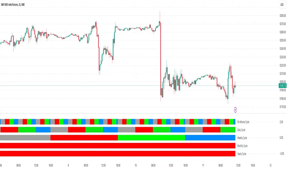
ALI Time Cycles - 2025This tool visually divides the trading day into time cycles.:
Large blocks of 90 minutes are the main work cycle.
Three indoor units with 30 minutes in each 90-minute window.
Each block is automatically stretched:
by time — from the beginning to the end of its period;
by price — from the minimum (Low) to the maximum (High) within this period.
The colors and structure make it easy to distinguish the different phases of the cycle.:
A (Accumulation) is the blue zone.
M (Manipulation) is the red zone.
D (Distribution) is a green area.

Wavemeter [theEccentricTrader]█ OVERVIEW
This indicator is a representation of my take on price action based wave cycle theory. The indicator counts the number of confirmed wave cycles, keeps a rolling tally of the average wave length, wave height and frequency, and displays the statistics in a table. The indicator also displays the current wave measurements as an optional feature.
█ CONCEPTS
Green and Red Candles
• A green candle is one that closes with a high price equal to or above the price it opened.
• A red candle is one that closes with a low price that is lower than the price it opened.
Swing Highs and Swing Lows
• A swing high is a green candle or series of consecutive green candles followed by a single red candle to complete the swing and form the peak.
• A swing low is a red candle or series of consecutive red candles followed by a single green candle to complete the swing and form the trough.
Peak and Trough Prices (Basic)
• The peak price of a complete swing high is the high price of either the red candle that completes the swing high or the high price of the preceding green candle, depending on which is higher.
• The trough price of a complete swing low is the low price of either the green candle that completes the swing low or the low price of the preceding red candle, depending on which is lower.
Historic Peaks and Troughs
The current, or most recent, peak and trough occurrences are referred to as occurrence zero. Previous peak and trough occurrences are referred to as historic and ordered numerically from right to left, with the most recent historic peak and trough occurrences being occurrence one.
Wave Cycles
A wave cycle is here defined as a complete two-part move between a swing high and a swing low, or a swing low and a swing high. As can be seen in the example above, the first swing high or swing low will set the course for the sequence of wave cycles that follow; a chart that begins with a swing low will form its first complete wave cycle upon the formation of the first complete swing high and vice versa.
Wave Length
Wave length is here measured in terms of bar distance between the start and end of a wave cycle. For example, if the current wave cycle ends on a swing low the wave length will be the difference in bars between the current swing low and current swing high. In such a case, if the current swing low completes on candle 100 and the current swing high completed on candle 95, we would simply subtract 95 from 100 to give us a wave length of 5 bars.
Average wave length is here measured in terms of total bars as a proportion as total waves. The average wavelength is calculated by dividing the total candles by the total wave cycles.
Wave Height
Wave height is here measured in terms of current range. For example, if the current peak price is 100 and the current trough price is 80, the wave height will be 20.
Amplitude
Amplitude is here measured in terms of current range divided by two. For example if the current peak price is 100 and the current trough price is 80, the amplitude would be calculated by subtracting 80 from 100 and dividing the answer by 2 to give us an amplitude of 10.
Frequency
Frequency is here measured in terms of wave cycles per second (Hertz). For example, if the total wave cycle count is 10 and the amount of time it has taken to complete these 10 cycles is 1-year (31,536,000 seconds), the frequency would be calculated by dividing 10 by 31,536,000 to give us a frequency of 0.00000032 Hz.
Range
The range is simply the difference between the current peak and current trough prices, generally expressed in terms of points or pips.
█ FEATURES
Inputs
Show Sample Period
Start Date
End Date
Position
Text Size
Show Current
Show Lines
Table
The table is colour coded, consists of two columns and, as many as, nine rows. Blue cells display the total wave cycle count and average wave measurements. Green cells display the current wave measurements. And the final row in column one, coloured black, displays the sample period. Both current wave measurements and sample period cells can be hidden at the user’s discretion.
Lines
For a visual aid to the wave cycles, I have added a blue line that traces out the waves on the chart. These lines can be hidden at the user’s discretion.
█ HOW TO USE
The indicator is intended for research purposes, strategy development and strategy optimisation. I hope it will be useful in helping to gain a better understanding of the underlying dynamics at play on any given market and timeframe.
For example, the indicator can be used to compare the current range and frequency with the average range and frequency, which can be useful for gauging current market conditions versus historic and getting a feel for how different markets and timeframes behave.
█ LIMITATIONS
Some higher timeframe candles on tickers with larger lookbacks such as the DXY , do not actually contain all the open, high, low and close (OHLC) data at the beginning of the chart. Instead, they use the close price for open, high and low prices. So, while we can determine whether the close price is higher or lower than the preceding close price, there is no way of knowing what actually happened intra-bar for these candles. And by default candles that close at the same price as the open price, will be counted as green. You can avoid this problem by utilising the sample period filter.
The green and red candle calculations are based solely on differences between open and close prices, as such I have made no attempt to account for green candles that gap lower and close below the close price of the preceding candle, or red candles that gap higher and close above the close price of the preceding candle. I can only recommend using 24-hour markets, if and where possible, as there are far fewer gaps and, generally, more data to work with. Alternatively, you can replace the scenarios with your own logic to account for the gap anomalies, if you are feeling up to the challenge.
It is also worth noting that the sample size will be limited to your Trading View subscription plan. Premium users get 20,000 candles worth of data, pro+ and pro users get 10,000, and basic users get 5,000. If upgrading is currently not an option, you can always keep a rolling tally of the statistics in an excel spreadsheet or something of the like.

Quarterly Cycles [Dango]Introducing the Comprehensive Quarterly Cycle Indicator, a powerful and original tool designed to enhance your understanding of price action through the lens of quarterly cycles. This innovative script is a novel creation that accurately incorporates the nuances and complexities often overlooked by those who claim to have a quarterly cycle indicator.
Key Features:
- Displays 90-minute, daily, weekly, monthly, and yearly quarterly cycles
- Employs advanced algorithms and a deep understanding of cycle theory to precisely map out cycles
- Accounts for subtle nuances ignored by other indicators
How It Works:
The Comprehensive Quarterly Cycle Indicator meticulously calculates and visualizes various quarterly cycles based on a proprietary algorithm that determines the presence and absence of quarters. This intricate formula takes into account multiple factors and complex relationships between time and price to accurately identify when a quarter is present and when it isn't.
By leveraging this unique approach, the indicator can provide a more precise and reliable representation of quarterly cycles compared to other methods. The advanced algorithms employed by the script go beyond simple trend detection or scalping techniques, offering a comprehensive view of the underlying market rhythms.
The indicator's visual representation of quarterly cycles serves as an invaluable aid in recognizing time-based patterns, turning points, and potential trend shifts. Through the lens of this indicator, traders can gain a deeper understanding of how time influences market dynamics and can make more informed decisions based on this knowledge.
Intended Use:
The Comprehensive Quarterly Cycle Indicator is designed primarily for educational purposes, helping traders develop a keen intuition for interpreting price action through the lens of quarterly cycles. By studying the indicator's output alongside price movements, users can gain valuable insights into market dynamics and timing.
Please note that while this indicator is a powerful learning tool, it should not be considered a standalone trading system. As with any technical analysis tool, it is essential to combine its insights with other forms of analysis and risk management principles.
Limitations:
The indicator's accuracy may be impacted by extreme market volatility or unusual events
Quarterly cycles are one of many factors influencing price action and should not be relied upon in isolation
By offering a novel and accurate representation of quarterly cycles, this indicator aims to empower traders in their journey to understand and navigate the markets effectively. However, as with any trading tool, individual results may vary, and past performance does not guarantee future outcomes.
Disclaimer:
This indicator is provided for educational purposes only and should not be considered financial advice. Always conduct your own due diligence and consult with a financial professional before making any trading decisions.
Privacy of Code
Please note that the underlying logic and specific calculations used in the proprietary algorithm are not disclosed to protect the intellectual property of the script. The main reason for keeping these details hidden is due to the intricate formula used to determine when a quarter is actually present and when it isn't, taking into account various factors and complex relationships between time and price.
The proprietary algorithm is the result of extensive research, testing, and refinement, forming the core of the Comprehensive Quarterly Cycle Indicator's unique approach to identifying and visualizing quarterly cycles. By keeping the specific calculations confidential, the script maintains its competitive edge and ensures the protection of its intellectual property.
Despite not disclosing the exact details, the description aims to provide a clear understanding of the script's functionality, its unique approach to identifying quarterly cycles, and the potential benefits for traders. The information provided offers insights into the key features, general methodology, and advantages of utilizing the Comprehensive Quarterly Cycle Indicator in your trading analysis.
WD Gann: Vertical Lines for Predefined Days/Bars AgoThis Pine Script draws vertical lines on the chart at specific time intervals, inspired by WD Gann’s theories of time cycles . WD Gann, a famous trader, believed that market movements were influenced by predictable time cycles. This script enables traders to visualize these key time cycles on the chart by placing vertical lines at predefined intervals (in bars ago), helping to identify potential turning points in the market.
The time intervals used in this script are inspired by Gann’s work, as well as astrological and numerological principles , which many traders believe influence market behavior . You can customize which time intervals (such as 3, 7, 9, 21, etc.) you want to track by enabling or disabling specific vertical lines on the chart.
Key Features:
Time Cycles Based on Gann’s Theory: Draws vertical lines at significant time intervals such as 3, 7, 9, 21, 27 bars ago, which are commonly used by Gann traders.
Astrological & Numerological Significance: The predefined intervals also align with key numerological and astrological values, allowing for a broader perspective on market cycles.
Customizable Intervals: You can choose which time intervals to display by enabling or disabling checkboxes for each cycle, allowing flexibility in chart analysis.
Visual Labels: Each vertical line is labeled with its corresponding "bars ago" value, providing clear reference points for the selected time cycles.
What Users Can Do:
Track and analyze market movements based on time cycles that are significant to Gann’s theory, as well as numerological and astrological influences.
Enable or disable vertical lines for specific cycles, like the 3-bar cycle, 9-bar cycle, or 365-bar cycle, depending on the intervals that align with your trading strategy.
Combine with other technical analysis tools and Gann techniques (e.g., Gann Angles, Gann Fans, or Square of Nine) for a more comprehensive trading approach.
This tool is designed for traders who believe in the power of time cycles to influence market behavior, and is especially useful for predicting turning points or key price movements based on these cycles.

Financial Astrology Jupiter LongitudeJupiter energy influence the expansion, enthusiasm, joviality, optimism, devotion, administration and judgement. Is associated with people of nobility and good social position: ministers, bishops, religious leaders, judges, bankers, lawyers, merchants, influencers and so forth. This cycle is relevant for the industries of consumer goods, travel, publishing, higher education, banking, gambling and legal.
For most of the crypto-currencies is hard to analyse the impact of the Jupiter transit across different zodiac signs due to the emergent nature of this disrupting financial industry, many coins was launched in 2017 and have not experienced the complete Jupiter cycle. However, in BTCUSD we almost have a complete orbit and through the buy/sell frequency analysis we have observed the following patters: the bullish zodiac signs was Virgo, Libra, Capricorn and Aquarius, the bearish was Leo, and Scorpio. We was not able to obtain price data for the period when Jupiter transited Aries to Cancer so we are pending to analyze the trend direction during those zodiac positions.
This indicator provides Jupiter longitude since 2010 so will be limited to the analysis of 1 cycle, however we noted that the periods of retrogradation and stationary could give interesting trading signals. We encourage you to analyse this zodiac sign / speed phases cycles in different markets and share with us your observations, leave us a comment with your research outcomes. Happy research!
Note: The Jupiter tropical longitude indicator is based on an ephemeris array that covers years 2010 to 2030, prior or after this years the longitude is not available, this daily ephemeris are based on UTC time so in order to align properly with the price bars times you should set UTC as your chart reference timezone.

RSI cyclic smoothed v2Cyclic Smoothed Relative Strength Indicator
The cyclic smoothed RSI indicator is an enhancement of the classic RSI , adding
additional smoothing according to the market vibration,
adaptive upper and lower bands according to the cyclic memory and
using the current dominant cycle length as input for the indicator.
The cRSI is used like a standard indicator. The chart highlights trading signals where the signal line crosses above or below the adaptive lower/upper bands. It is much more responsive to market moves than the basic RSI.
You can also review this short idea where BTC went down from 4300 USD (3 Sept 17) to 3700 USD (15 Sept 17) after the idea was posted and showed the clear short exit with the next low:
The indicator uses the dominant cycle as input to optimize signal, smoothing and cyclic memory. To get more in-depth information on the cyclic-smoothed RSI indicator, please read Chapter 4 "Fine tuning technical indicators" of the book "Decoding the Hidden Market Rhythm, Part 1" available at your favorite book store.
This is the open-source code version of the requested script already published as protected indicator back in 2017 "RSI cyclic smoothed". Now made public as v2. Would love to receive feedback and see your ideas.

Financial Astrology Sun LongitudeFinancial astrology is a branch of mundane astrology that research the correlations of planet cycles with market prices, this indicator developed by the Financial Astrology Research Group provides the visualization of the Sun Tropical Zodiac Longitude to support that astrology traders can study multiple markets within the powerful Trading View UI to detect potential cyclical patterns in price action that are connected with the cosmic rhythm of the Sun.
The Sun have been very relevant cycle among all ancient civilizations such as Maya, Aztec, Inca, this cyclical move is the fundamental frequency of our life's due to the fact that our calendar year is a model from this cycle. Chinese astrologers and W.D. Gann was aware of the powerful predictive power of the solar terms which is a representation of the most relevant weather transitions within the Sun longitude path.
With this indicator we try to ease the research work of the amazing community of astro-traders that prior to this indicators needed to create hundreds of manual annotations on the markets price charts to visualize the Sun zodiac position within a long period of time in order to research potential cycles. That manual work is over. Let's move faster in our cycles research!
We encourage all traders using astrology to continue their research, please share your ideas of astro cycles trading strategies and contribute your experiments at our Github exploration projects: github.com
Note: The Sun longitude is based on an ephemeris array that covers years 2010 to 2030, prior or after this years the longitude is not available, this daily ephemeris are based on UTC time so in order to align properly with the price bars times you should set UTC as your chart reference timezone.
RT-Mayer MultipleThe Mayer Multiple is a simple metric used to gauge whether Bitcoin is overvalued, undervalued, or fairly priced relative to its long term trend. It compares Bitcoin’s current price to its 200 day moving average and expresses that relationship as a single number.
Introduction
The Mayer Multiple was popularized by investor Trace Mayer as a way to track how far Bitcoin has stretched above or below its 200 day moving average (200DMA). The basic idea is:
Mayer Multiple = Current Bitcoin Price / 200 Day Moving Average of Bitcoin
When this ratio is low, price is trading close to or below its long term trend. When it is very high, price is extended well above trend and risk of mean reversion grows.
This script takes that concept and turns it into a set of colored bands around price. Instead of just plotting a single Mayer Multiple line, it maps different ranges of the multiple into visual “zones” so traders can quickly see whether Bitcoin is in a typical range, an accumulation zone, or a historically stretched area.
Behind The Math
In this implementation, the current Mayer Multiple value is computed for each bar and then mapped into band levels that typically span from roughly 0.4 up to the 8.0+ region. Each band represents a different multiple of the 200DMA.
Conceptually:
Values near 1.0 mean price is trading near its 200 day moving average.
Values well below 1.0 highlight periods where price is trading at a discount to long term trend.
Values far above 1.0 highlight periods where price is trading at a large premium to long term trend.
By converting these ranges into layered color zones, the script lets traders see where current price sits in the broader historical distribution of Mayer Multiple values, instead of focusing on a single number. In the chart below, the formula is overlaid in the center of the screen so you can see how the multiple is defined while looking at the bands.
Points Of Interest
Two regions on the Mayer structure tend to attract the most attention: lower “accumulation” areas and higher “distribution” areas.
Accumulation
Historically, many of the best long term accumulation opportunities have occurred when the Mayer Multiple spent time below roughly 0.9. In those zones, price is trading below its 200DMA and the band colors indicate that Bitcoin is at a relative discount compared to its long term trend. In the example chart below, the white arrows highlight past periods where price spent time in the lower bands while the Mayer Multiple was below roughly 0.9.
Distribution
On the other side, readings above roughly 2.0 have often lined up with distribution or profit taking areas, where price is extended well above the 200DMA. These zones have frequently preceded larger drawdowns or multi month cooling periods. In the example chart below, the white arrows highlight periods where price pushed into the upper bands above 2.0, areas that have often preceded larger cooling phases.
The 2.4 Rule
During the original exploration of the Mayer Multiple, backtests suggested that buying when the multiple was already above about 2.4 tended to produce weaker risk adjusted returns. In simple terms, history showed that:
A Mayer Multiple above 2.4 means Bitcoin is trading at more than 240 percent of its 200 day moving average.
Many of the most extreme speculative peaks occurred when the multiple was in or above this zone.
After such peaks, price often reverted back toward the 200DMA with drawdowns in the 30 percent to 80 percent range.
In this script, the 2.4 level is highlighted as a caution band. It does not mean price must reverse immediately, but it marks an area where the balance between upside potential and downside risk has historically shifted. In the chart below, the white arrow marks the 2.4 band that this script highlights as a caution zone.
Why Traders Watch This Zone
There are a few reasons traders and investors watch the upper Mayer bands, especially the 2.4 area:
Historical patterns – Many of Bitcoin’s more extreme tops, such as late 2013, late 2017, and early 2021, occurred when the Mayer Multiple was well above 2.0 and frequently near or above 2.4.
Overheated zone – When price is this far above its long term average, markets are often driven by FOMO and speculative flows rather than steady accumulation.
Mean reversion risk – Over time, price has repeatedly reverted back toward or below the 200DMA after visiting these upper bands.
Risk / reward balance – Above 2.4, the probability of large additional gains tends to shrink relative to the risk of a sharp correction, which is why many longer term participants treat it as a caution area rather than a fresh entry zone.
How Traders Use The Bands
Traders can use the Mayer Multiple bands in different ways depending on their style:
Long term investors may look for accumulation when the multiple is below 1.0 and be more cautious when it moves into higher bands.
Swing traders may use the bands as context when combining this script with structure, volume, or other timing tools.
Cycle focused traders may use the multiple to help frame where Bitcoin could be within a broader four year cycle.
This script is not a timing system by itself. It is intended as a context layer that helps answer “where are we relative to long term trend?” in a visual way.
What Makes This Tool Different
Many resources plot the Mayer Multiple as a single ratio line. This script focuses on turning that ratio into a banded structure around price so traders can see cycle zones on the chart itself:
It computes the Mayer Multiple on each bar and maps the value into multiple color coded bands instead of a single line.
It highlights historically important regions such as deep discounts, mid range trend zones, and high risk extension zones including the 2.4 band.
It is designed specifically for Bitcoin’s long term behavior, but the visual framework can be useful for studying other assets that have strong trend cycles.
Important Note
This indicator is intended to provide additional context around where price sits relative to its long term trend. It is not a standalone signal generator and should always be used together with your own analysis, testing, and risk management. Historical Mayer Multiple behavior does not guarantee future results, and past cycle extremes may not repeat in the same way.
🐋 Tight lines and happy trading!

Elliptic bands
Why Elliptic?
Unlike traditional indicators (e.g., Bollinger Bands with constant standard deviation multiples), the elliptic model introduces a cyclical, non-linear variation in band width. This reflects the idea that price movements often follow rhythmic patterns, widening and narrowing in a predictable yet dynamic way, akin to natural market cycles.
Buy: When the price enters from below (green triangle).
Sell: When the price enters from above (red triangle).
Inputs
MA Length: 50 (This is the period for the central Simple Moving Average (SMA).)
Cycle Period: 50 (This is the elliptic cycle length.)
Volatility Multiplier: 2.0 (This value scales the band width.)
Mathematical Foundation
The indicator is based on the ellipse equation. The basic formula is:
Ellipse Equation:
(x^2) / (a^2) + (y^2) / (b^2) = 1
Solving for y:
y = b * sqrt(1 - (x^2) / (a^2))
Parameters Explained:
a: Set to 1 (normalized).
x: Varies from -1 to 1 over the period.
b: Calculated as:
ta.stdev(close, MA Length) * Volatility Multiplier
(This represents the standard deviation of the close prices over the MA period, scaled by the volatility multiplier.)
y (offset): Represents the band distance from the moving average, forming the elliptic cycle.
Behavior
Bands:
The bands are narrow at the cycle edges (when the offset is 0) and become widest at the midpoint (when the offset equals b).
Trend:
The central moving average (MA) shows the overall trend direction, while the bands adjust according to the volatility.
Signals:
Standard buy and sell signals are generated when the price interacts with the bands.
Practical Use
Trend Identification:
If the price is above the MA, it indicates an uptrend; if below, a downtrend.
Support and Resistance:
The elliptic bands act as dynamic support and resistance levels.
Narrowing bands may signal potential trend reversals.
Breakouts:

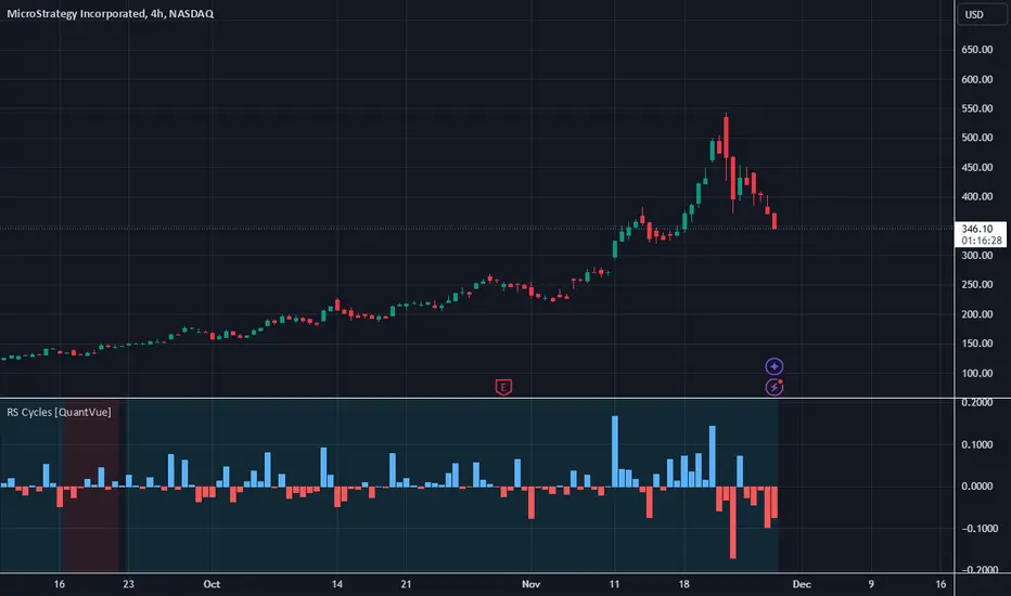
RS Cycles [QuantVue]The RS Cycles indicator is a technical analysis tool that expands upon traditional relative strength (RS) by incorporating Beta-based adjustments to provide deeper insights into a stock's performance relative to a benchmark index. It identifies and visualizes positive and negative performance cycles, helping traders analyze trends and make informed decisions.
Key Concepts:
Traditional Relative Strength (RS):
Definition: A popular method to compare the performance of a stock against a benchmark index (e.g., S&P 500).
Calculation: The traditional RS line is derived as the ratio of the stock's closing price to the benchmark's closing price.
RS=Stock Price/Benchmark Price
Usage: This straightforward comparison helps traders spot periods of outperformance or underperformance relative to the market or a specific sector.
Beta-Adjusted Relative Strength (Beta RS):
Concept: Traditional RS assumes equal volatility between the stock and benchmark, but Beta RS accounts for the stock's sensitivity to market movements.
Calculation:
Beta measures the stock's return relative to the benchmark's return, adjusted by their respective volatilities.
Alpha is then computed to reflect the stock's performance above or below what Beta predicts:
Alpha=Stock Return−(Benchmark Return×β)
Significance: Beta RS highlights whether a stock outperforms the benchmark beyond what its Beta would suggest, providing a more nuanced view of relative strength.
RS Cycles:
The indicator identifies positive cycles when conditions suggest sustained outperformance:
Short-term EMA (3) > Mid-term EMA (10) > Long-term EMA (50).
The EMAs are rising, indicating positive momentum.
RS line shows upward movement over a 3-period window.
EMA(21) > 0 confirms a broader uptrend.
Negative cycles are marked when the opposite conditions are met:
Short-term EMA (3) < Mid-term EMA (10) < Long-term EMA (50).
The EMAs are falling, indicating negative momentum.
RS line shows downward movement over a 3-period window.
EMA(21) < 0 confirms a broader downtrend.
This indicator combines the simplicity of traditional RS with the analytical depth of Beta RS, making highlighting true relative strength and weakness cycles.
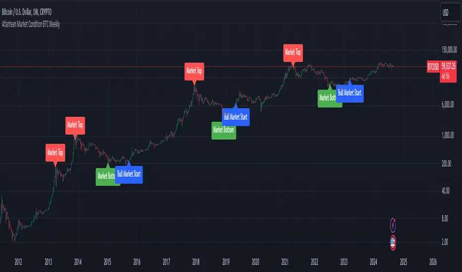
Atlantean Bitcoin Weekly Market Condition - Top/Bottom BTC Overview:
The "Atlantean Bitcoin Weekly Market Condition Detector - Top/Bottom BTC" is a specialized TradingView indicator designed to identify significant turning points in the Bitcoin market on a weekly basis. By analyzing long-term and short-term moving averages across two distinct resolutions, this indicator provides traders with valuable insights into potential market bottoms and tops, as well as the initiation of bull markets.
Key Features:
Market Bottom Detection: The script uses a combination of a simple moving average (SMA) and an exponential moving average (EMA) calculated over long and short periods to identify potential market bottoms. When these conditions are met, the script signals a "Market Bottom" label on the chart, indicating a possible buying opportunity.
Bull Market Start Indicator: When the short-term EMA crosses above the long-term SMA, it signals the beginning of a bull market. This is marked by a "Bull Market Start" label on the chart, helping traders to prepare for potential market upswings.
Market Top Detection: The script identifies potential market tops by analyzing the crossunder of long and short-term moving averages. A "Market Top" label is plotted, suggesting a potential selling point.
Customizable Moving Averages Display: Users can choose to display the moving averages used for detecting market tops and bottoms, providing additional insights into market conditions.
How It Works: The indicator operates by monitoring the interactions between the specified moving averages:
Market Bottom: Detected when the long-term SMA (adjusted by a factor of 0.745) crosses over the short-term EMA.
Bull Market Start: Detected when the short-term EMA crosses above the long-term SMA.
Market Top: Detected when the long-term SMA (adjusted by a factor of 2) crosses under the short-term SMA.
These conditions are highlighted on the chart, allowing traders to visualize significant market events and make informed decisions.
Intended Use: This indicator is best used on weekly Bitcoin charts. It’s designed to provide long-term market insights rather than short-term trading signals. Traders can use this tool to identify strategic entry and exit points during major market cycles. The optional display of moving averages can further enhance understanding of market dynamics.
Originality and Utility: Unlike many other indicators, this script not only highlights traditional market tops and bottoms but also identifies the aggressive start of bull markets, offering a comprehensive view of market conditions. The unique combination of adjusted moving averages makes this script a valuable tool for long-term Bitcoin traders.
Disclaimer: The signals provided by this indicator are based on historical data and mathematical calculations. They do not guarantee future market performance. Traders should use this tool as part of a broader trading strategy and consider other factors before making trading decisions. Not financial advice.
Happy Trading!
By Atlantean
Physics CandlesPhysics Candles embed volume and motion physics directly onto price candles or market internals according to the cyclic pattern of financial securities. The indicator works on both real-time “ticks” and historical data using statistical modeling to highlight when these values, like volume or momentum, is unusual or relatively high for some periodic window in time. Each candle is made out of one or more sub-candles that each contain their own information of motion, which converts to the color and transparency, or brightness, of that particular candle segment. The segments extend throughout the entire candle, both body and wicks, and Thick Wicks can be implemented to see the color coding better. This candle segmentation allows you to see if all the volume or energy is evenly distributed throughout the candle or highly contained in one small portion of it, and how intense these values are compared to similar time periods without going to lower time frames. Candle segmentation can also change a trader’s perspective on how valuable the information is. A “low” volume candle, for instance, could signify high value short-term stopping volume if the volume is all concentrated in one segment.
The Candles are flexible. The physics information embedded on the candles need not be from the same price security or market internal as the chart when using the Physics Source option, and multiple Candles can be overlayed together. You could embed stock price Candles with market volume, market price Candles with stock momentum, market structure with internal acceleration, stock price with stock force, etc. My particular use case is scalping the SPX futures market (ES), whose price action is also dictated by the volume action in the associated cash market, or SPY, as well as a host of other securities. Physics allows you to embed the ES volume on the SPY price action, or the SPY volume on the ES price action, or you can combine them both by overlaying two Candle streams and increasing the Number of Overlays option to two. That option decreases the transparency levels of your coloring scheme so that overlaying multiple Candles converges toward the same visual color intensity as if you had one. The Candle and Physics Sources allows for both Symbols and Spreads to visualize Candle physics from a single ticker or some mathematical transformation of tickers.
Due to certain TradingView programming restrictions, each Candle can only be made out of a maximum of 8 candle segments, or an “8-bit” resolution. Since limits are just an opportunity to go beyond, the user has the option to stack multiple Candle indicators together to further increase the candle resolution. If you don’t want to see the Candles for some particular period of the day, you can hide them, or use the hiding feature to have multiple Candles calibrated to show multiple parts of the trading day. Securities tend to have low volume after hours with sharp spikes at the open or close. Multiple Candles can be used for multiple parts of the trading day to accommodate these different cycles in volume.
The Candles do not need be associated with the nominal security listed on the TV chart. The Candle Source allows the user to look at AAPL Candles, for instance, while on a TSLA or SPY chart, each with their respective volume actions integrated into the candles, for instance, to allow the user to see multiple security price and volume correlation on a single chart.
The physics information currently embeddable on Candles are volume or time, velocity, momentum, acceleration, force, and kinetic energy. In order to apply equations of motion containing a mass variable to financial securities, some analogous value for mass must be assumed. Traders often regard volume or time as inextricable variables to a securities price that can indicate the direction and strength of a move. Since mass is the inextricable variable to calculating the momentum, force, or kinetic energy of motion, the user has the option to assume either time or volume is analogous to mass. Volume may be a better option for mass as it is not strictly dependent on the speed of a security, whereas time is.
Data transformations and outlier statistics are used to color code the intensity of the physics for each candle segment relative to past periodic behavior. A million shares during pre-market or a million shares during noontime may be more intense signals than a typical million shares traded at the open, and should have more intense color signals. To account for a specific cyclic behavior in the market, the user can specify the Window and Cycle Time Frames. The Window Time Frame splits up a Cycle into windows, samples and aggregates the statistics for each window, then compares the current physics values against past values in the same window. Intraday traders may benefit from using a Daily Cycle with a 30-minute Window Time Frame and 1-minute Sample Time Frame. These settings sample and compare the physics of 1-minute candles within the current 30-minute window to the same 30-minute window statistics for all past trading days, up until the data limit imposed by TradingView, or until the Data Collection Start Date specified in the settings. Longer-term traders may benefit from using a Monthly Cycle with a Weekly Time Frame, or a Yearly Cycle with a Quarterly Time Frame.
Multiple statistics and data transformation methods are available to convey relative intensity in different ways for different trading signals. Physics Candles allows for both Normal and Log-Normal assumptions in the physics distribution. The data can then be transformed by Linear, Logarithmic, Z-Score, or Power-Law scoring, where scoring simply assigns an intensity to the relative physics value of each candle segment based on some mathematical transformation. Z-scoring often renders adequate detection by scoring the segment value, such as volume or momentum, according to the mean and standard deviation of the data set in each window of the cycle. Logarithmic or power-law transformation with a gamma below 1 decreases the disparity between intensities so more less-important signals will show up, whereas the power-law transformation with gamma values above 1 increases the disparity between intensities, so less more-important signals will show up. These scores are then converted to color and transparency between the Min Score and the Max Score Cutoffs. The Auto-Normalization feature can automatically pick these cutoffs specific to each window based on the mean and standard deviation of the data set, or the user can manually set them. Physics was developed with novices in mind so that most users could calibrate their own settings by plotting the candle segment distributions directly on the chart and fiddling with the settings to see how different cutoffs capture different portions of the distribution and affect the relative color intensities differently. Security distributions are often skewed with fat-tails, known as kurtosis, where high-volume segments for example, have a higher-probabilities than expected for a normal distribution. These distribution are really log-normal, so that taking the logarithm leads to a standard bell-shaped distribution. Taking the Z-score of the Log-Normal distribution could make the most statistical sense, but color sensitivity is a discretionary preference.
Background Philosophy
This indicator was developed to study and trade the physics of motion in financial securities from a visually intuitive perspective. Newton’s laws of motion are loosely applied to financial motion:
“A body remains at rest, or in motion at a constant speed in a straight line, unless acted upon by a force”.
Financial securities remain at rest, or in motion at constant speed up or down, unless acted upon by the force of traders exchanging securities.
“When a body is acted upon by a force, the time rate of change of its momentum equals the force”.
Momentum is the product of mass and velocity, and force is the product of mass and acceleration. Traders render force on the security through the mass of their trading activity and the acceleration of price movement.
“If two bodies exert forces on each other, these forces have the same magnitude but opposite directions.”
Force arises from the interaction of traders, buyers and sellers. One body of motion, traders’ capitalization, exerts an equal and opposite force on another body of motion, the financial security. A securities movement arises at the expense of a buyer or seller’s capitalization.
Volume
The premise of this indicator assumes that volume, v, is an analogous means of measuring physical mass, m. This premise allows the application of the equations of motion to the movement of financial securities. We know from E=mc^2 that mass has energy. Energy can be used to create motion as kinetic energy. Taking a simple hypothetical example, the interaction of one short seller looking to cover lower and one buyer looking to sell higher exchange shares in a security at an agreed upon price to create volume or mass, and therefore, potential energy. Eventually the short seller will actively cover and buy the security from the previous buyer, moving the security higher, or the buyer will actively sell to the short seller, moving the security lower. The potential energy inherent in the initial consolidation or trading activity between buy and seller is now converted to kinetic energy on the subsequent trading activity that moves the securities price. The more potential energy that is created in the consolidation, the more kinetic energy there is to move price. This is why point and figure traders are said to give price targets based on the level of volatility or size of a consolidation range, or why Gann traders square price and time, as time is roughly proportional to mass and trading activity. The build-up of potential energy between short sellers and buyers in GME or TSLA led to their explosive moves beyond their standard fundamental valuations.
Position
Position, p, is simply the price or value of a financial security or market internal.
Time
Time, t, is another means of measuring mass to discover price behavior beyond the time snapshots that simple candle charts provide. We know from E=mc^2 that time is related to rest mass and energy given the speed of light, c, where time ≈ distance * sqrt(mass/E). This relation can also be derived from F=ma. The more mass there is, the longer it takes to compute the physics of a system. The more energy there is, the shorter it takes to compute the physics of a system. Similarly, more time is required to build a “resting” low-volatility trading consolidation with more mass. More energy added to that trading consolidation by competing buyers and sellers decreases the time it takes to build that same mass. Time is also related to price through velocity.
Velocity = (p(t1) – p(t0)) / p(t0)
Velocity, v, is the relative percent change of a securities price, p, over a period of time, t0 to t1. The period of time is between subsequent candles, and since time is constant between candles within the same timeframe, it is not used to calculate velocity or acceleration. Price moves faster with higher velocity, and slower with slower velocity, over the same fixed period of time. The product of velocity and mass gives momentum.
Momentum = mv
This indicator uses physics definition of momentum, not finance’s. In finance, momentum is defined as the amount of change in a securities price, either relative or absolute. This is definition is unfortunate, pun intended, since a one dollar move in a security from a thousand shares traded between a few traders has the exact same “momentum” as a one dollar move from millions of shares traded between hundreds of traders with everything else equal. If momentum is related to the energy of the move, momentum should consider both the level of activity in a price move, and the amount of that price move. If we equate mass to volume to account for the level of trading activity and use physics definition of momentum as the product of mass and velocity, this revised definition now gives a thousand-times more momentum to a one-dollar price move that has a thousand-times more volume behind it. If you want to use finance’s volume-less definition of momentum, use velocity in this indicator.
Acceleration = v(t1) – v(t0)
Acceleration, a, is the difference between velocities over some period of time, t0 to t1. Positive acceleration is necessary to increase a securities speed in the positive direction, while negative acceleration is necessary to decrease it. Acceleration is related to force by mass.
Force = ma
Force is required to change the speed of a securities valuation. Price movements with considerable force have considerably more impact on future direction. A change in direction requires force.
Kinetic Energy = 0.5mv^2
Kinetic energy is the energy that a financial security gains from the change in its velocity by force. The built-up of potential energy in trading consolidations can be converted to kinetic energy on a breakout from the consolidation.
Cycle Theory and Relativity
Just as the physics of motion is relative to a point of reference, so too should the physics of financial securities be relative to a point of reference. An object moving at a 100 mph towards another object moving in the same direction at 100 mph will not appear to be moving relative to each other, nor will they collide, but from an outsider observer, the objects are going 100 mph and will collide with significant impact if they run into a stationary object relative to the observer. Similarly, trading with a hundred thousand shares at the open when the average volume is a couple million may have a much smaller impact on the price compared to trading a hundred thousand shares pre-market when the average volume is ten thousand shares. The point of reference used in this indicator is the average statistics collected for a given Window Time Frame for every Cycle Time Frame. The physics values are normalized relative to these statistics.
Examples
The main chart of this publication shows the Force Candles for the SPY. An intense force candle is observed pre-market that implicates the directional overtone of the day. The assumption that direction should follow force arises from physical observation. If a large object is accelerating intensely in a particular direction, it may be fair to assume that the object continues its direction for the time being unless acted upon by another force.
The second example shows a similar Force Candle for the SPY that counters the assumption made in the first example and emphasizes the importance of both motion and context. While it’s fair to assume that a heavy highly accelerating object should continue its course, if that object runs into an obstacle, say a brick wall, it’s course may deviate. This example shows SPY running into the 50% retracement wall from the low of Mar 2020, a significant support level noted in literature. The example also conveys Gann’s idea of “lost motion”, where the SPY penetrated the 50% price but did not break through it. A brick wall is not one atom thick and price support is not one tick thick. An object can penetrate only one layer of a wall and not go through it.
The third example shows how Volume Candles can be used to identify scalping opportunities on the SPY and conveys why price behavior is as important as motion and context. It doesn’t take a brick wall to impede direction if you know that the person driving the car tends to forget to feed the cats before they leave. In the chart below, the SPY breaks down to a confluence of the 5-day SMA, 20-day SMA, and an important daily trendline (not shown) after the bullish bounce from the 50% retracement days earlier. High volume candles on the SMA signify stopping volume that reverse price direction. The character of the day changes. Bulls become more aggressive than bears with higher volume on upswings and resistance, whiles bears take on a defensive position with lower volume on downswings and support. High volume stopping candles are seen after rallies, and can tell you when to take profit, get out of a position, or go short. The character change can indicate that its relatively safe to re-enter bullish positions on many major supports, especially given the overarching bullish theme from the large reaction off the 50% retracement level.
The last example emphasizes the importance of relativity. The Volume Candles in the chart below are brightest pre-market even though the open has much higher volume since the pre-market activity is much higher compared to past pre-markets than the open is compared to past opens. Pre-market behavior is a good indicator for the character of the day. These bullish Volume Candles are some of the brightest seen since the bounce off the 50% retracement and indicates that bulls are making a relatively greater attempt to bring the SPY higher at the start of the day.
Infrequently Asked Questions
Where do I start?
The default settings are what I use to scalp the SPY throughout most of the extended trading day, on a one-minute chart using SPY volume. I also overlay another Candle set containing ES future volume on the SPY price structure by setting the Physics Source to ES1! and the Number of Overlays setting to 2 for each Candle stream in order to account for pre- and post-market trading activity better. Since the closing volume is exponential-like up until the end of the regular trading day, adding additional Candle streams with a tighter Window Time Frame (e.g., 2-5 minute) in the last 15 minutes of trading can be beneficial. The Hide feature can allow you to set certain intraday timeframes to hide one Candle set in order to show another Candle set during that time.
How crazy can you get with this indicator?
I hope you can answer this question better. One interesting use case is embedding the velocity of market volume onto an internal market structure. The PCTABOVEVWAP.US is a market statistic that indicates the percent of securities above their VWAP among US stocks and is helpful for determining short term trends in the US market. When securities are rising above their VWAP, the average long is up on the day and a rising PCTABOVEVWAP.US can be viewed as more bullish. When securities are falling below their VWAP, the average short is up on the day and a falling PCTABOVEVWAP.US can be viewed as more bearish. (UPVOL.US - DNVOL.US) / TVOL.US is a “spread” symbol, in TV parlance, that indicates the decimal percent difference between advancing volume and declining volume in the US market, showing the relative flow of volume between stocks that are up on the day, and stocks that are down on the day. Setting PCTABOVEVWAP.US in the Candle Source, (UPVOL.US - DNVOL.US) / TVOL.US in the Physics Source, and selecting the Physics to Velocity will embed the relative velocity of the spread symbol onto the PCTABOVEVWAP.US candles. This can be helpful in seeing short term trends in the US market that have an increasing amount of volume behind them compared to other trends. The chart below shows Volume Candles (top) and these Spread Candles (bottom). The first top at 9:30 and second top at 10:30, the high of the day, break down when the spread candles light up, showing a high velocity volume transfer from up stocks to down stocks.
How do I plot the indicator distribution and why should I even care?
The distribution is visually helpful in seeing how different normalization settings effect the distribution of candle segments. It is also helpful in seeing what physics intensities you want to ignore or show by segmenting part of the distribution within the Min and Max Cutoff values. The intensity of color is proportional to the physics value between the Min and Max Cutoff values, which correspond to the Min and Max Colors in your color scheme. Any physics value outside these Min and Max Cutoffs will be the same as the Min and Max Colors.
Select the Print Windows feature to show the window numbers according to the Cycle Time Frame and Window Time Frame settings. The window numbers are labeled at the start of each window and are candle width in size, so you may need to zoom into to see them. Selecting the Plot Window feature and input the window number of interest to shows the distribution of physics values for that particular window along with some statistics.
A log-normal volume distribution of segmented z-scores is shown below for 30-minute opening of the SPY. The Min and Max Cutoff at the top of the graph contain the part of the distribution whose intensities will be linearly color-coded between the Min and Max Colors of the color scheme. The part of the distribution below the Min Cutoff will be treated as lowest quality signals and set to the Min Color, while the few segments above the Max Cutoff will be treated as the highest quality signals and set to the Max Color.
What do I do if I don’t see anything?
Troubleshooting issues with this indicator can involve checking for error messages shown near the indicator name on the chart or using the Data Validation section to evaluate the statistics and normalization cutoffs. For example, if the Plot Window number is set to a window number that doesn’t exist, an error message will tell you and you won’t see any candles. You can use the Print Windows option to show windows that do exist for you current settings. The auto-normalization cutoff values may be inappropriate for your particular use case and literally cut the candles out of the chart. Try changing the chart time frame to see if they are appropriate for your cycle, sample and window time frames. If you get a “Timeframe passed to the request.security_lower_tf() function must be lower than the timeframe of the main chart” error, this means that the chart timeframe should be increased above the sample time frame. If you get a “Symbol resolve error”, ensure that you have correct symbol or spread in the Candle or Physics Source.
How do I see a relative physics values without cycles?
Set the Window Time Frame to be equal to the Cycle Time Frame. This will aggregate all the statistics into one bucket and show the physics values, such as volume, relative to all the past volumes that TV will allow.
How do I see candles without segmentation?
Segmentation can be very helpful in one context or annoying in another. Segmentation can be removed by setting the candle resolution value to 1.
Notes
I have yet to find a trading platform that consistently provides accurate real-time volume and pricing information, lacking adequate end-user data validation or quality control. I can provide plenty of examples of real-time volume counts or prices provided by TradingView and other platforms that were significantly off from what they should have been when comparing against the exchanges own data, and later retroactively corrected or not corrected at all. Since no indicator can work accurately with inaccurate data, please use at your own discretion.
The first version is a beta version. Debugging and validating code in Pine script is difficult without proper unit testing. Please report any bugs with enough information to reproduce them and indicate why they are important. I also encourage you to export the data from TradingView and verify the calculations for your particular use case.
The indicator works on real-time updates that occur at a higher frequency than the candle time frame, which TV incorrectly refers to as ticks. They use this terminology inaccurately as updates are really aggregated tick data that can take place at different prices and may not accurately reflect the real tick price action. Consequently, this inaccuracy also impacts the real-time segmentation accuracy to some degree. TV does not provide a means of retaining “tick” information, so the higher granularity of information seen real-time will be lost on a disconnect.
TV does not provide time and sales information. The volume and price information collected using the Sample Time Frame is intraday, which provides only part of the picture. Intraday volume is generally 50 to 80% of the end of day volume. Consequently, the daily+ OHLC prices are intraday, and may differ significantly from exchanged settled OHLC prices.
The Cycle and Window Time Frames refer to calendar days and time, not trading days or time. For example, the first window week of a monthly cycle is the first seven days of the month, not the first Monday through Friday of trading for the month.
Chart Time Frames that are higher than the Window Time Frames average the normalized physics for price action that occurred within a given Candle segment. It does not average price action that did not occur.
One of the main performance bottleneck in TradingView’s Pine Script is client-side drawing and plotting. The performance of this indicator can be increased by lowering the resolution (the number of sub-candles this indicator plots), getting a faster computer, or increasing the performance of your computer like plugging your laptop in and eliminating unnecessary processes.
The statistical integrity of this indicator relies on the number of samples collected per sample window in a given cycle. Higher sample counts can be obtained by increasing the chart time frame or upgrading the TradingView plan for a higher bar count. While increasing the chart time frame doesn’t increase the visual number of bars plotted on the chart, it does increase the number of bars that can be pulled at a lower time frame, up to 100,000.
Due to a limitation in Pine Scripts request_lower_tf() function, using a spread symbol will only work for regular trading hours, not extended trading hours.
Ideally, velocity or momentum should be calculated between candle closes. To eliminate the need to deal with price gaps that would lead to an incorrect statistical distributions, momentum is calculated between candle open and closes as a percent change of the price or value, which should not be an issue for most liquid securities.

Bitcoin Price Bottom IndicatorThis Indicator flashes up on bottoms of each Bitcoin market cycle. It’s suggesting, that the price of BTC finds strong support at the 200W SMA . Thats why it’s not flashing up in the first cycle, because there was not enough price data at that moment.
This Indicator uses price data from the weekly timeframe so for the best experience USE WEEKLY TIMEFRAME .

[iQ]PRO Market Sessions+🌐 PRO Market Sessions+: The Architecture of Market Time
Elevate your market analysis with the PRO v1 Time Cycles indicator—a sophisticated, proprietary framework engineered to meticulously map and visualize critical, high-probability time segments across global trading sessions. This tool transcends conventional session highlighting by providing a multi-layered, time-boxed view of market behavior, offering unparalleled clarity on structural shifts and key price levels.
This tool is optimized for professional traders, providing an edge by focusing on the fractal nature of market timing.
⏳ Precision Time Segmentation
The core functionality revolves around the hyper-precise segmentation of the trading day, anchored to the New York (EST) timezone to capture institutional flow.
Global Overlap Coverage: Integrates key Asia and London sessions with the comprehensive New York trading day, allowing for the analysis of transitional volatility and overlap strategies.
Structured Cycles: Deploys a unique system of 270-minute cycles, nested with 90-minute and 30-minute subdivisions. This hierarchical structure reveals how market structure evolves from macro-sessions down to critical, granular pivots.
New York Focus: Features distinct AM and PM 270-minute cycles, further broken down into 90-minute tranches (AM1, AM2, AM3 / PM1, PM2, PM3) and fine-tuned with 30-minute and even 10-minute boxes for exceptional high-resolution analysis.
London Depth: The London session is captured as a 270-minute block, with its own nested 90/30-minute structures, providing a complete view of the European market's structural integrity before the US open.
✨ Dynamic Structural Analysis
Beyond mere visualization, the indicator computes and projects critical structural levels within each time box, acting as dynamic reference points for price action.
Dynamic Price Anchors: Each time-cycle box is calculated to reveal key price metrics, including the Open Price and the Equilibrium (EQ) Level (Mid-Range). These lines serve as potent technical levels, often representing institutional reference points for deviation and reversion.
High/Low Capture: The extreme High and Low of each significant time segment are captured and marked, forming the boundaries of the structural range and identifying potential areas of liquidity draw.
Persistent Levels: Projects Previous Day, Week, and Month High/Low levels. These crucial historical benchmarks act as magnets or barriers to current price movement, providing essential macro-context to intra-day analysis.
🎨 Customizable & Non-Intrusive
The PRO v1 Time Cycles is designed for seamless integration into any chart setup, offering extensive customization without cluttering the price action.
Control over Granularity: Users maintain complete control over which time cycles (270, 90, 30, 10-minute) are displayed, ensuring the chart reflects the specific trading strategy and timeframe required.
Aesthetic Flexibility: Features highly detailed options for color, border styles, text alignment, and line thickness for every major session and nested cycle, allowing for a fully personalized and professional workspace.
This tool is a fundamental component of the iQ PRO suite, providing the essential temporal context required to execute sophisticated, time-based trading strategies. Its robust architecture is built to empower the discerning trader with a clearer, more structured view of the market's inner workings.

52-Week High Drawdown (Events, Freq & Current)52-Week High Drawdown - Events, Freq & Current
OVERVIEW
Track and analyze drawdowns from 52-week highs with comprehensive statistics on drawdown events, frequency, and current market positioning. Perfect for risk management, historical analysis, and understanding volatility patterns.
KEY FEATURES
📊 Real-Time Drawdown Tracking
Visual area chart showing current intraday maximum drawdown from rolling high
Automatically plots depth below zero line for easy interpretation
Color-coded reference lines at -10% and -20% levels
📈 Event-Based Historical Analysis
Automatically categorizes drawdown cycles across four severity zones:
5-10% Drawdowns - Minor corrections
10-15% Drawdowns - Moderate pullbacks
15-20% Drawdowns - Significant corrections
20%+ Drawdowns - Major corrections/bear markets
⏱️ Frequency Metrics
Calculates average time between events for each category, displayed as "Every X months" to understand typical correction patterns.
🎯 Current Cycle Tracking
Real-time display of maximum drawdown depth in the current cycle, helping you gauge present market position.
📅 Smart Timeframe Adaptation
Auto-Adjust Mode: Automatically selects optimal lookback (Daily=252, Weekly=52, Monthly=12)
Manual Mode: Set custom lookback period for specialized analysis
HOW IT WORKS
The indicator identifies drawdown cycles - periods from one high to the next. When price touches a new rolling high, the previous cycle ends and is categorized by its maximum depth.
Cycle Logic:
Tracks deepest point reached since last high
When price touches/exceeds rolling high, cycle completes
Cycle categorized into appropriate drawdown zone
New cycle begins
This provides accurate event counting without double-counting fluctuations within larger drawdowns.
PRACTICAL APPLICATIONS
Risk Management
Understand typical drawdown patterns for position sizing
Set realistic stop-loss levels based on historical norms
Anticipate potential correction depths during bull markets
Market Context
Identify when current drawdowns are extreme vs. typical
Compare across different assets and timeframes
Historical perspective during volatile periods
Strategic Planning
Time entries during typical correction zones
Recognize when drawdowns exceed historical norms
Build resilience strategies based on frequency data
SETTINGS GUIDE
Auto-Adjust Lookback by Timeframe
Checked: Automatically uses appropriate period for chart timeframe
Unchecked: Uses manual lookback value
Manual Lookback Length
Default: 252 (trading days in a year)
Customize for specific analysis periods
Higher values = longer historical perspective
Table Position
Choose from Top Right, Bottom Right, Top Left, or Bottom Left based on your chart layout.
INTERPRETATION TIPS
Frequency data becomes more reliable with longer history (5+ years ideal)
"Never" frequency indicates zero events in available data range
Current Cycle Max shows 0.00% at new highs, otherwise displays deepest point
Compare frequencies across assets to understand relative volatility profiles
BEST USED FOR
Stocks, ETFs, and Indices with sufficient historical data
Long-term investing and swing trading strategies
Portfolio risk assessment and stress testing
Educational purposes - understanding market behavior
Multi-timeframe analysis (daily, weekly, monthly)
TECHNICAL NOTES
Uses ta.highest() for efficient rolling high calculation
Event detection logic prevents double-counting
Frequency calculated from actual data start time to present
All calculations update in real-time with each new bar
💡 Tip: Run this indicator on major indices like SPY or QQQ with maximum available history to build a comprehensive baseline for equity market corrections.
Created to provide institutional-grade drawdown analysis in an accessible format. Free to use and modify.

Dynamic Equalizer [DW]This is an experimental study inspired by techniques primarily utilized in the visual and audio processing worlds.
This study is designed to serve as a pre or post processing filter designer that allows you to shape the frequency spectrum of your data on a more "in-depth" level.
First the data is fed through my Band-Shelf Equalizer function.
The EQ in this script works by dividing the input signal into 6 bands and 2 shelves using a series of roofing filters.
The bands are then gain adjusted recursively (in %) to match source as closely as possible at unity gain.
The recursive adjustment size can be changed using the "Gain Adjustment Increment" input, which will affect how tightly the resulting filter approximates source at unity.
The frequency range of each band is adjustable via the period inputs. In default settings, these are the ranges:
-> Low Shelf : 256+ Samples Per Cycle. This shelf is the largest trend component of the signal. Unlike the other bands and shelf, this shelf is not zero mean unless source data is.
-> Band 1 : 128 - 256 Samples Per Cycle. This band is a moderate trend and low cyclic component of the signal.
-> Band 2 : 64 - 128 Samples Per Cycle. This band is a mild trend and moderate cyclic component of the signal.
-> Band 3 : 32 - 64 Samples Per Cycle. This band is a high cyclic component of the signal.
-> Band 4 : 16 - 32 Samples Per Cycle. This band is a high cyclic component of the signal.
-> Band 5 : 8 - 16 Samples Per Cycle. This band is a moderate cyclic and mild to moderate noise component of the signal.
-> Band 6 : 4 - 8 Samples Per Cycle. This band is a high noise component of the signal.
-> High Shelf : 4- Samples Per Cycle. This shelf is primarily noise.
Each band and shelf can be manually gain adjusted via their respective inputs.
After EQ processing, each band and shelf is then optionally fed through my Peak Envelope Compressor function for dynamics control.
The compressor in this script works by reducing band power by a specified percentage when it exceeds a user defined percentage of the peak envelope.
The peak envelope measures maximum power of the band over its period range multiplied by a user defined integer.
There is an option included to apply Butterworth smoothing to the envelope as well, which will alter the shape of the compressor.
If you want an envelope that quickly responds to power peaks, use little to no smoothing. If you desire something more static, use a large smoothing period.
Attack and release are included in the algorithm to shape the sensitivity of the compressor.
Attack controls how many bars it takes from being triggered for attenuation to reach its target amount.
Release controls how many bars it takes from being un-triggered for attenuation to reach back to 0.
In addition, the compressor is equipped with parallel processing.
The "Parallel Mix" inputs control the amount of compressed vs non-compressed signal presence in the final output.
And of course, the compressor has a post-processing gain input (in %) to fine-tune the presence of the band.
For easy visual tuning, you can view each independent band's magnitude or power by selecting them in the display inputs.
This display setup can also be beneficial analytically if you wish to analyze specific frequency components of the source signal.
The default preset for this script is meant to show how versatile EQ filtering and compression can be for technical analysis.
The EQ preset detrends the data, moderately smooths the data, and emphasizes dominant cyclical ranges.
The compression preset provides fast, moderately heavy shaping to dial in dynamics and reduce transient effects.
The resulting curve is a great filter for responsively analyzing cyclical momentum.
The script is also fully equipped with outputs that can be used externally by other scripts.
You can integrate these external outputs with your own script by using a source input. Simply select the desired output from the dropdown tab on your script.
Multiband filtering and compression are concepts that are not conventionally used in the world of finance.
However, the versatile capabilities of these concepts make this a wonderful tool to have in the arsenal.
By surgically adjusting separate frequency components of a signal, you're able to design a wide variety of filters with unique responses for a vast array of applications.
Play around with the settings and see what kinds of filters you can design!
---------------------------------------------------------
This is a premium script, and access is granted on an invite-only basis.
To gain access, get a copy of the script overview, or for additional inquiries, send me a direct message.
I look forward to hearing from you!
---------------------------------------------------------
General Disclaimer:
Trading stocks, futures, Forex, options, ETFs, cryptocurrencies or any other financial instrument has large potential rewards, but also large potential risk.
You must be aware of the risks and be willing to accept them in order to invest in stocks, futures, Forex, options, ETFs or cryptocurrencies.
Don’t trade with money you can’t afford to lose.
This is neither a solicitation nor an offer to Buy/Sell stocks, futures, Forex, options, ETFs, cryptocurrencies or any other financial instrument.
No representation is being made that any account will or is likely to achieve profits or losses of any kind.
The past performance of any trading system or methodology is not necessarily indicative of future results.
---------------------------------------------------------
NOTE: Unlike standard tools of this nature in other applications, I scaled the signals in % rather than dB, mainly since it's proven so far to be more user-friendly to keep things linear on here.
In addition, no transitions to frequency domain are done in this script. This EQ is an experimental variant that processes in the time domain and relies on a network of roofing filters.
When changing cutoff periods, make sure they are organized in descending order with low shelf as the highest period, and high shelf as the lowest period.
Using non-descending lengths may result in an undesired output.
Lastly, when changing cutoff periods, parts of the spectrum may leak slightly differently between bands, so the "Gain Match Adjustment Increment" may need to be changed as well if you want it to match as closely as possible at unity.
Despite these shortcomings, this tool functions surprisingly well, especially with the default periods, and it's quickly become one of my favorites. I hope you all enjoy it!

Bitcoin MVRV Ratio MomentumBitcoin MVRV Ratio with 365 Day SMA
The Market Value to Realized Value (MVRV) ratio is one of Bitcoin's most powerful on-chain metrics for identifying market cycle extremes and potential reversals. This indicator plots the MVRV ratio alongside its 365-day moving average to help identify market trends and sentiment shifts.
What is MVRV?
MVRV Ratio = Market Cap / Realized Cap
Market Cap: Current price × circulating supply (what the market values Bitcoin at today)
Realized Cap: Sum of all coins valued at the price they last moved on-chain (the aggregate cost basis of all holders)
The MVRV ratio essentially measures whether Bitcoin holders are, on average, in profit or loss, and by how much.
Key Components:
MVRV Ratio - Orange Line
Shows the current Market Value to Realized Value ratio
Values above 1.0 indicate holders are in profit on average
Values below 1.0 indicate holders are in loss on average
More volatile, responds quickly to price changes
365 Day SMA - White Dashed Line
Smooths out short-term volatility
Shows the trend direction of market sentiment
Acts as dynamic support/resistance
Fill Shading Between Lines
Green fill: MVRV is above its 365-day average (bullish momentum)
Red fill: MVRV is below its 365-day average (bearish momentum)
Helps quickly visualize trend strength and momentum shifts
Reference Levels:
1.0 (Gray Dashed): Market Cap = Realized Cap
Holders break even on average
Historically strong support during bear markets
Breaking below suggests capitulation territory
3.7 (Red Dotted): Historical Top Zone
Area where previous cycle tops occurred
Suggests market overheating
Not a precise sell signal, but indicates elevated risk
0.8 (Green Dotted): Historical Bottom Zone
Area where previous cycle bottoms formed
Suggests extreme undervaluation
Historically excellent long-term accumulation zone
Background Shading:
Light Red Background: MVRV > 3.5
Extreme overvaluation zone
Historically near cycle peaks
Consider taking profits or reducing exposure
Light Green Background: MVRV < 1.0
Undervaluation zone
Holders are underwater on average
Historically strong accumulation opportunities
How to Interpret:
Bullish Signals:
MVRV crosses above its 365-day SMA (green fill appears)
MVRV bounces from the 1.0 level
MVRV enters the <1.0 zone (long-term buying opportunity)
Rising 365-day SMA suggests improving market health
Bearish Signals:
MVRV crosses below its 365-day SMA (red fill appears)
MVRV reaches 3.5+ levels (overheated)
Declining 365-day SMA suggests deteriorating market health
MVRV peaks and begins declining from extreme levels
Trend Confirmation:
Extended green fill periods = bull market
Extended red fill periods = bear market
Multiple touches of the 365-day SMA = consolidation/ranging market
Historical Performance:
Looking at past cycles:
2013-2015: MVRV peaked near 6.0, bottomed around 0.8
2017-2018: MVRV peaked near 4.5, bottomed around 0.9
2021-2022: MVRV peaked near 3.7, bottomed around 1.0
Each cycle shows declining peak MVRV ratios (maturing market)
The 365-day SMA has consistently marked trend transitions
Best Practices:
For Long-Term Investors:
Accumulate when MVRV < 1.0 and in green background zone
Be cautious when MVRV > 3.5 with red background
Use 365-day SMA as a macro trend filter
Don't expect perfect timing; these are probabilistic zones
For Active Traders:
Trade crossovers of MVRV and its 365-day SMA
Use the fill color changes as momentum indicators
Combine with price action and other technical indicators
Consider reducing position size as MVRV approaches 3.5+
Risk Management:
MVRV is a lagging indicator; it confirms trends rather than predicts them
Extreme readings can persist longer than expected
Past cycle tops/bottoms are not guaranteed to repeat
Always use proper position sizing and stop losses
Why This Metric Matters:
Unlike pure price-based indicators, MVRV incorporates fundamental on-chain data about holder behavior. It answers the question: "How much profit/loss are Bitcoin holders sitting on?" This makes it particularly useful for:
Identifying when market euphoria reaches unsustainable levels
Spotting capitulation events when holders panic sell at losses
Understanding the psychology driving current price action
Filtering out noise to focus on macro trend shifts
The 365-day moving average addition helps smooth volatility and identify sustained trend changes, making the indicator more actionable for both investors and traders.
Technical Notes:
Uses real on-chain data from CoinMetrics (Realized Cap) and Glassnode (Supply)
Calculations performed on daily timeframe data
Works best on daily, weekly, and monthly chart timeframes
Data availability starts from early Bitcoin history (2010+)
Disclaimer: This indicator is for educational and informational purposes only. Past performance does not guarantee future results. Always conduct your own research and consider your risk tolerance before making investment decisions.

BTC Dynamic Trend Core - Indicator v46🚀 Dynamic Trend Core
The Dynamic Trend Core is a sophisticated, multi-layer trading engine designed to identify high-probability, trend-following opportunities. It offers both a quantitative backtesting engine and a rich, intuitive visual interface.
Its core philosophy is simple: confirmation. The system seeks to filter out market noise by requiring a confluence of conditions—trend, momentum, price action, and volume—to be in alignment before a signal is considered valid.
⚙️ Core Logic Components
Primary Trend Analysis (SAMA): The foundation is a Self-Adjusting Moving Average (SAMA) that determines the underlying market trend (Bullish, Bearish, or Consolidation).
Confirmation & Momentum: Signals are confirmed with a blend of the Natural Market Slope and a Cyclic RSI to ensure momentum aligns with the primary trend.
Advanced Filtering Layers: A suite of optional filters allows for robust customization:
Volume & ADX: Ensure sufficient market participation and trend strength.
Market Regime: Uses the total crypto market cap to gauge broad market health.
Multi-Timeframe (MTF): Aligns signals with the dominant weekly trend.
BTC Cycle Analysis: Uses Halving or Mayer Multiple models to position trades within historical macro cycles.
Delta Zones: An additional filter to confirm signals with recent buy or sell pressure detected in candle wicks.
📊 The On-Chart Command Center
The strategy's real power comes from its on-chart visual feedback system, which provides full transparency into the engine's decision-making process.
Note: For the dashboard to update in real-time, you must enable "Recalculate on every tick" in the script's settings.
Power Core Gauge: Located at the bottom-center, this gauge is the heart of the system. It displays the number of active filter conditions met (e.g., 6/7) and "powers up" by glowing brightly as a signal becomes fully confirmed.
Live Conditions Panel: In the bottom-right corner, this panel acts as a detailed pre-flight checklist. It shows the real-time status of every single filter, helping you understand exactly why a trade is (or is not) being triggered.
Energized Trendline: The main SAMA trendline changes color and brightness based on the strength and direction of the trend, providing immediate visual context.
Halving Cycle Visualization: An optional visual guide to the phases of the Bitcoin halving cycle.
Delta Zone Pressure Boxes: A visual guide that draws boxes around candles exhibiting significant buying or selling pressure.
🛠️ How to Use
Indicator version of BTC DTC Strategy: "Alerts-Only Mode" for generating live signals.
Configure Strategy: Start with the default filters. If a potential trade setup is missed, check the Live Conditions Panel to see exactly which filter blocked the signal. Adjust the filters to suit your specific asset and timeframe.
Manage Risk: Adjust the Risk & Exit settings to match your personal risk tolerance.

CryptoSignalScanner - Pi Cycle - Golden Ratio MultiplierDESCRIPTION:
All credits are going to Philip Swift who has written an article on Medium about the PI Cycle Top and The Golden Ratio Multiplier .
Based on the article this indicator has been created to display and indicate the Bitcoin PI Cycle Top which has historically been effective in picking out the market cycle highs within 3 days. It also displays the Golden Ratio Multiplier which explores Bitcoin's adoption curve and market cycles.
• The PI Cycle Top is based on the 350DMA (Daily Moving Average) multiplied by 2 and the 111DMA (Daily Moving Average)
• The Golden Ratio Multiplier is based on the 350DMA (Daily Moving Average) the The Golden Ratio which is defines as 350DMA * 1.61803398875 and the Fibonacci Sequence which is defined as 350DMA * 2, 350DMA * 3, 350DMA * 5, 350DMA * 8, 350DMA * 13 and 350DMA * 21
HOW TO USE:
• The PI Cycle Top is picking the market cycle tops within 3 days.
When the 350DMA x2 crosses below the 111DMA Bitcoin price peaks in its market cycle. This indicates that the market is overbought and it is time to take profit.
• The Golden Ratio Multiplier pics the top on every market cycle in Bitcoin’s history and forecasts when Bitcoin will top in the coming market cycle.
In 2011 the top was at 350DMA * 21
In 2013 the top was at 350DMA * 13
In 2014 the top was at 350DMA * 8
In 2018 the top was at 350DMA * 5
If we look at the results above the forecast for next top should be at 350DMA * 3
FEATURES:
• You can change the Long Moving Average which is by default 350
• You can change the Short Moving Average which is by default 111
• You can show/hide the Pi Cycle Top labels
• You can show/hide the Pi Cycle Bottom labels
• You can show/hide the Pi Cycle Moving Averages
• You can show/hide the Golden Ratio
• You can show/hide the Fibonacci Sequence
• You can set an alert when the Pi Cycle Top is reached
REMARKS:
• This advice is NOT financial advice.
• We do not provide personal investment advice and we are not a qualified licensed investment advisor.
• All information found here, including any ideas, opinions, views, predictions, forecasts, commentaries, suggestions, or stock picks, expressed or implied herein, are for informational, entertainment or educational purposes only and should not be construed as personal investment advice.
• We will not and cannot be held liable for any actions you take as a result of anything you read here.
• We only provide this information to help you make a better decision.
• While the information provided is believed to be accurate, it may include errors or inaccuracies.
HOW TO GET ACCESS TO THE SCRIPT:
• Access to this script is free of charge
• You can drop me a message to get access to the script
Good Luck,
SEOCO
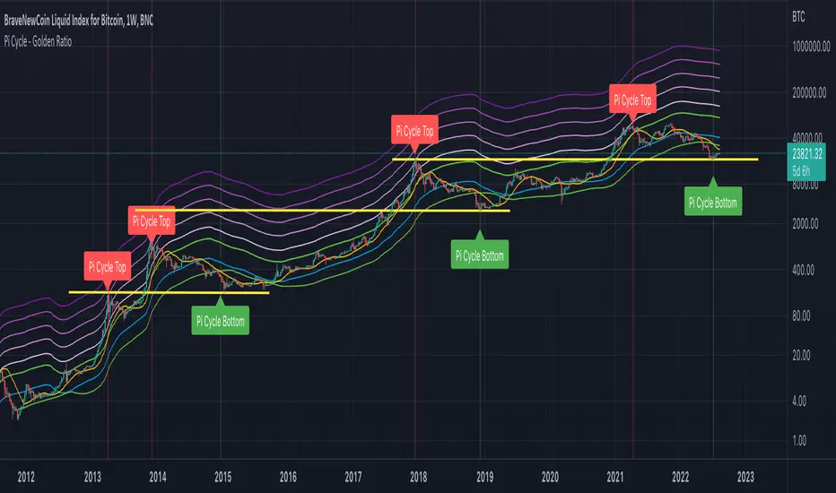
🗓️ FTD Cycle Lite Tracker🗓️ FTD Cycle Lite Tracker (Open Source)This is the simplified, open-source companion to the premium FTD SPIKE PREDICTOR - ML Model.This Lite version focuses purely on time-based cyclic analysis, highlighting the periods when the market is approaching the most well-known FTD-related time windows, based on historical, cyclic patterns.It's the perfect tool for traders who want clean, visual confirmation of anticipated cyclic dates without the complexity or predictive power of a multi-factor model.Key Features of the Lite Version:T+35 Cycle Tracking: Highlights the approximate 49-day calendar cycle (representing 35 trading days) often associated with mandatory Failures-to-Deliver clearing.147-Day Major Cycle: Highlights the long-term institutional cycle commonly observed in assets with complex contract deadlines, anchored from the January 28, 2021 date.Custom Anchor Points: Both cycles allow you to adjust the anchor date to suit different ticker-specific patterns.Visual Windows: Provides clear background shading and shape markers to indicate when the critical 5-day cycle windows are active.👑 Upgrade to the Full Prediction Engine!The open-source Lite version only gives you the calendar dates. The full, proprietary indicator goes far beyond simple calendar counting by telling you how probable a spike is on those dates, and which other factors are confirming the risk.Why Upgrade?FeatureFTD Cycle Lite (Free)FTD SPIKE PREDICTOR (Premium)OutputCalendar Dates0-100% Probability ScoreLogic2 Time Cycles Only7 Weighted Features (ML Model)ConfirmationNoneVolume, Price, Volatility, OPEX, Swap RollConfidenceNone95% Confidence IntervalsSignalsDate MarkersCritical Alerts & Feature BreakdownUnlock the Full PowerYou can get the FTD SPIKE PREDICTOR - ML Model for a one-time fee of $50.00.Since TradingView's invite-only feature is not available, you can contact me directly to gain access:TradingView: Timmy741X.com (Twitter): TimmyCrypto78

BTC Dual Cycle: Stats DashboardOverview
"Price takes the elevator down, but takes the stairs up."
This indicator is a macro-analysis tool designed to visualize the true duration of Bitcoin’s market cycles. Unlike standard oscillators that focus on short-term price action, the Macro Cycle Tracker filters out the noise to answer two fundamental questions:
Are we in a phase of Expansion (Price Discovery)?
Are we in a phase of Recovery (Repairing the damage of a crash)?
It visually separates the market into two distinct regimes based on a configurable drawdown threshold (default: -50%) and provides real-time statistics on how long these phases historically last.
How It Works
The script tracks the All-Time High (ATH) and divides market history into two colored zones:
🟢 The Green Zone (Expansion / Price Discovery)
Trigger: Starts immediately when Bitcoin breaks the previous ATH.
Meaning: The market is healthy, profitable, and exploring new valuation levels.
End: The zone ends when price drops by 50% (configurable) from the cycle top.
🔴 The Red Zone (Recovery / Capitulation)
Trigger: Starts when price drops below the 50% threshold from the peak.
Meaning: The asset is "underwater." This zone remains active persistently—even during relief rallies—until the previous ATH is fully reclaimed.
Philosophy: A cycle is not over until the damage is repaired.
Key Features
Cycle Timer: Displays the exact number of days passed for every historical cycle directly on the chart.
Live Counter: Shows the current duration of the active phase (e.g., "ZONE GREEN: 450 Days...").
Statistical Dashboard: A table in the bottom-right corner automatically calculates the Mean and Median duration (in days) for both Green and Red phases. This allows you to compare the current cycle against historical averages.
How to Use
For Investors (HODLers): Use the Red Zone to understand the "Time Cost" of a bear market. It helps visualize that recovery takes patience and that price action below the old ATH is merely accumulation.
For Analysts: Use the Dashboard statistics to project potential cycle turning points based on historical median durations.
Settings
Drop Percent (%): Default is 50%. This defines the "Crash" threshold. You can adjust this to 20% or 30% for more sensitive cycle detection.
Text Size: Adjust the size of the dashboard text to fit your screen resolution.
Disclaimer: This tool is for educational purposes only and does not constitute financial advice. Past performance is not indicative of future results.
