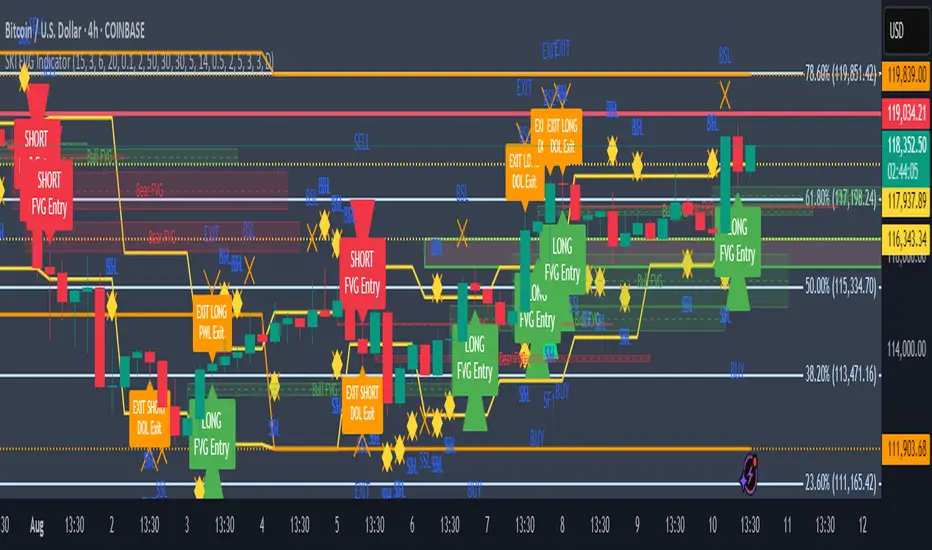
SKI FVG IndicatorIt uses ICT concepts and takes entries and exits. Identifies good FVG and shows an entry to buy or short and also exits at swing high or low , discount areas, primary areas, DOL (draw on liquidity)
Forecasting
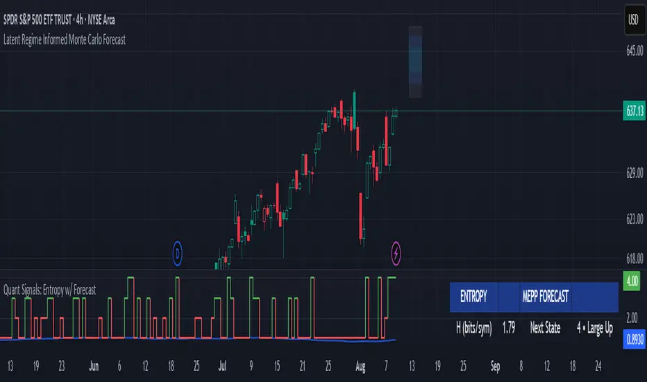
Quant Signals: Entropy w/ ForecastThis is the first of many quantitative signals I plan to create for TV users.
Most technical analysis (TA) tools—like moving averages, oscillators, or chart patterns—are heuristic: they’re based on visually identifiable shapes, threshold crossovers, or empirically chosen rules. These methods rarely quantify the information content or structural complexity of market data. By quantifying market predictability before making a forecast, this method filters out noise and focuses your trading only during statistically favorable conditions—something traditional TA cannot objectively measure.
This MEPP-based approach is quantitative and model-free:
It comes from information theory and measures Shannon entropy rate to assess how predictable the market is at any moment.
Instead of interpreting price formations, it uses a data-compression algorithm (Lempel–Ziv) to capture hidden structure in the sequence of returns.
Forecasts are generated using a principle from statistical physics (Maximum Entropy Production), not historical chart patterns.
In short, this method measures the market's predictability BEFORE deciding a directional forecast is worth trusting. This tool is to inform TA traders on the market's current regime, whether it is smooth and predictable or it is volatile and turbulent.
Technical Introduction:
In information theory, Shannon entropy measures the uncertainty (or information content) in a sequence of data. For markets, the entropy rate captures how much new information price returns generate over time:
Low entropy rate → price changes are more structured and predictable.
High entropy rate → price changes are more random and unpredictable.
By discretizing recent returns into quartile-based states, this indicator:
Calculates the normalized entropy rate as a regime filter.
Uses MEPP to forecast the next state that maximizes entropy production.
Displays both the regime status (predictable vs chaotic) and the forecast bias (bullish/bearish) in a dashboard.
Measurements & How to Use Them
TLDR: HIGH ENTROPY -> information generation/market shift -> Don't trust forecast/strategy
1. H (bits/sym)
Shannon entropy rate of the last μ discrete returns, in bits per symbol (0–2).
Lower → more predictable; higher → more random.
Use as a raw measure of market structure.
2. H_max (log₂Ω)
Theoretical maximum entropy for Ω states. Here Ω = 4 → H_max = 2.0 bits.
Reference value for normalization.
3. Entropy (norm)
H / H_max, scaled between 0 and 1.
< 0.5–0.6 → predictable regime; > 0.6 → chaotic regime.
Main regime filter — forecasts are more reliable when below your threshold.
4. Regime
Label based on Entropy (norm) vs your entThresh.
LOW (predictable) = higher odds forecast will be correct.
HIGH (chaotic) = forecasts less reliable.
5. Next State (MEPP Forecast)
Discrete return state (1–4) predicted to occur next, chosen to maximize entropy production:
Large Down (strong bearish)
Small Down (mild bearish)
Small Up (mild bullish)
Large Up (strong bullish)
Use as your bias direction.
6. Bias
Simplified label from the Next State:
States 1–2 = Bearish bias (red)
States 3–4 = Bullish bias (green)
Align strategy direction with bias only in LOW regime.
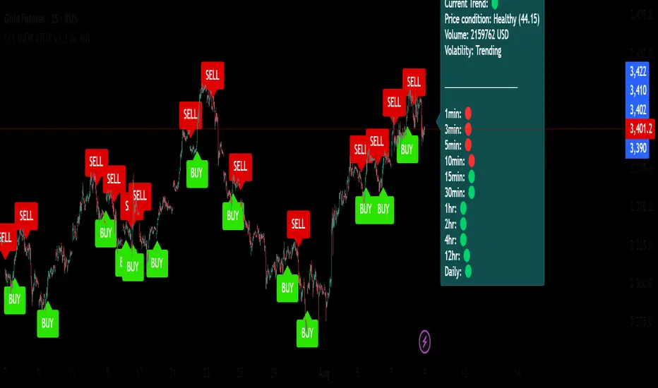
ADR % Meter (NY Filter) Top right boxHelps know daily range to forecast if said today is gonna be choppy

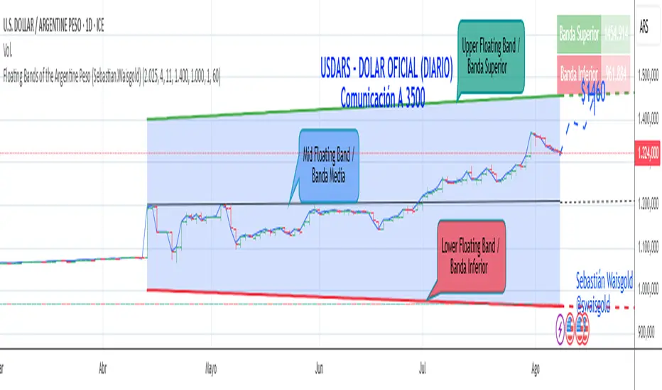
Floating Bands of the Argentine Peso (Sebastian.Waisgold)
The BCRA ( Central Bank of the Argentine Republic ) announced that as of Monday, April 15, 2025, the Argentine Peso (USDARS) will float within a system of divergent exchange rate bands.
The upper band was set at ARS 1400 per USD on 15/04/2025, with a +1% monthly adjustment distributed daily, rising by a fraction each day.
The lower band was set at ARS 1000 per USD on 15/04/2025, with a –1% monthly adjustment distributed daily, falling by a fraction each day.
This indicator is crucial for anyone trading USDARS, since the BCRA will only intervene in these situations:
- Selling : if the Peso depreciates against the USD above the upper band .
- Buying : if the Peso appreciates against the USD below the lower band .
Therefore, this indicator can be used as follows:
- If USDARS is above the upper band , it is “expensive” and you may sell .
- If USDARS is below the lower band , it is “cheap” and you may buy .
It can also be applied to other assets such as:
- USDTARS
- Dollar Cable / CCL (Contado con Liquidación) , derived from the BCBA:YPFD / NYSE:YPF ratio.
A mid band —exactly halfway between the upper and lower bands—has also been added.
Once added, the indicator should look like this:
In the following image you can see:
- Upper Floating Band
- Lower Floating Band
- Mid Floating Band
User Configuration
By double-clicking any line you can adjust:
- Start day (Dia de incio), month (Mes de inicio), and year (Año de inicio)
- Initial upper band value (Valor inicial banda superior)
- Initial lower band value (Valor inicial banda inferior)
- Monthly rate Tasa mensual %)
It is recommended not to modify these settings for the Argentine Peso, as they reflect the BCRA’s official framework. However, you may customize them—and the line colors—for other assets or currencies implementing a similar band scheme.
Painel Técnico — Múltiplos TFs (5m,15m,1h,4h,1D) BrenoGtechnical table with inflection points that help me buy

TAKEPROFITS SECRET SAUCE V4Plots daily 4hr 1kr and 15min levels
adjustable colors
This indicator auto plots for you

CCL INDICATOR V1.2🔷 CCL INDICATOR 1.2 — See the Market with Structure
A powerful mix of mathematical zones, Fibonacci levels, period filters, and session-based logic — all in one clean indicator.
✅ Dynamic support & resistance
✅ Buy/sell signal arrows
✅ Modular: turn features on/off as you like
✅ Alerts, dashboard, and clean visual design
Don’t guess the market — understand it.
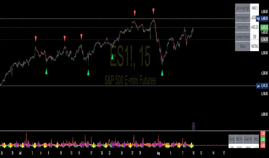
Swing High/Low SignalsSwing High/Low Signals – profit gang
Quickly spot recent market turning points with this clean swing high/low indicator.
Marks swing highs & lows with labels or triangles
Optional connecting lines & background highlights
Alerts when new swings form
Info table showing last swing levels & current price
Fully adjustable lookback period for any timeframe.
Disclaimer: For educational use only. Not financial advice.
Wickless Precision IndicatorThe Wickless Precision Indicator is a powerful tool designed to identify and highlight wickless and tailless candlestick patterns on your TradingView charts. A wickless candle, where the open or close price equals the high or low, signals strong directional momentum and potential support or resistance levels. This indicator automatically detects these unique candles, drawing customizable horizontal lines at their key price levels to help traders spot critical zones for entries, exits, or reversals.
Key Features:
Automatic Wickless Detection: Identifies bullish (no lower wick) and bearish (no upper wick) candles with precision.
Dynamic Line Plotting: Draws horizontal lines at the high or low of wickless candles, extending until price interaction or user-defined conditions.
Customizable Settings: Adjust line styles, colors, and sensitivity thresholds to suit your trading style.
Visual Markers: Highlights wickless candles with distinct shapes (e.g., triangles or crosses) for easy identification.
Alert Integration: Set real-time alerts to stay notified when wickless candles form, ensuring you never miss a potential trading opportunity.
Use Cases:
Pinpoint strong support/resistance zones where price rejection is evident.
Identify high-probability entry or exit points based on momentum-driven candles.
Enhance price action strategies with clear visual cues for market sentiment shifts.
Perfect for traders seeking to capitalize on clean, wickless price movements, the Wickless Precision Indicator simplifies technical analysis and boosts trading confidence.
ML Compressor Enhanced Trading Indicator# 🤖 ML Enhanced Trading Indicator - Advanced Market Analysis
## 📊 Overview
This is a comprehensive Machine Learning Enhanced Trading Indicator that combines multiple advanced analytical techniques to provide high-probability trading signals. The indicator uses artificial intelligence, pattern recognition, anomaly detection, and traditional technical analysis to identify optimal entry and exit points in the market.
## 🚀 Key Features
### 🧠 **Machine Learning Core**
- **Advanced Pattern Recognition**: Uses cosine similarity, Pearson correlation, and Spearman rank correlation to identify historical patterns
- **AI-Powered Predictions**: Implements multiple correlation methods to forecast price movements
- **Anomaly Detection**: Z-score based detection system for unusual market activities
- **Signal Confidence Scoring**: Reliability assessment for each trading signal
### 📈 **Technical Analysis Integration**
- **Multi-Timeframe RSI Analysis**: 14 and 21-period RSI with oversold/overbought detection
- **MACD Momentum**: Enhanced MACD histogram analysis for trend confirmation
- **Bollinger Bands Position**: Dynamic position tracking within BB channels
- **Volume Analysis**: Spike and dry volume detection with ratio calculations
- **Trend Strength Measurement**: EMA-based trend power analysis
### 🎯 **Perfect Zone Detection**
- **Ideal Buy Zone**: Identifies perfect buying opportunities when 7 conditions align:
- ML Score ≥ 0.60
- Bottom proximity detection
- RSI in 20-35 range
- Volume spike confirmation
- Positive price anomaly
- Bullish pattern match
- Positive MACD momentum
### 📊 **Comprehensive Display Table**
- **Real-time ML Analysis**: Complete breakdown of all indicators
- **Perfect Buy Conditions Tracker**: Visual checklist with completion percentage
- **Performance Metrics**: Win rate tracking and P&L analysis
- **Signal Strength Indicators**: Confidence levels for each signal
## 🔧 **Customizable Parameters**
### **ML Settings**
- **ML Lookback Period**: 20-500 bars (default: 100)
- **Anomaly Threshold**: 1.0-5.0 sensitivity (default: 2.0)
- **Pattern Similarity**: 0.5-0.99 matching threshold (default: 0.80)
- **AI Lookback Period**: 20-200 bars (default: 50)
### **AI Prediction Models**
- **Correlation Methods**: Spearman, Pearson, Cosine Similarity
- **Forecast Length**: 15-250 bars (default: 50)
- **Similarity Type**: Price or %Change analysis
### **Visual Options**
- **Table Position**: Top/Bottom Left/Right positioning
- **Table Size**: Small, Normal, Large options
- **Signal Display**: Toggle buy/sell signals on/off
- **AI Visualization**: Optional prediction paths and ZigZag
## 📋 **How to Use**
### **For Beginners**
1. Add the indicator to your chart
2. Look for "PERFECT BUY" signals in the table
3. Wait for completion percentage ≥ 85% for highest probability trades
4. Use the background color changes as visual confirmation
### **For Advanced Traders**
1. Analyze individual ML components in the detailed table
2. Monitor anomaly detection for unusual market conditions
3. Use pattern confidence levels for trade timing
4. Combine with your existing strategy for confirmation
### **Signal Interpretation**
- **🟢 PERFECT BUY**: All 7 conditions met - highest probability reversal
- **🟡 NEAR BOTTOM**: Close to ideal conditions - monitor closely
- **🔴 NOT READY**: Wait for better setup
- **Strong Buy/Sell Signals**: ML score-based entries with high confidence
## ⚠️ **Important Notes**
### **Risk Management**
- This indicator provides analysis and signals, not guaranteed outcomes
- Always use proper risk management and position sizing
- Consider market conditions and fundamental factors
- Backtest the strategy on your preferred timeframes and assets
### **Best Practices**
- Use multiple timeframe analysis for confirmation
- Combine with support/resistance levels
- Monitor volume confirmation for all signals
- Set appropriate stop-losses and profit targets
### **Performance Tracking**
- The indicator tracks its own performance with win rate calculations
- Monitor the "AI Prediction" accuracy percentage
- Use the P&L tracking to assess signal quality over time
## 🔄 **Updates and Improvements**
This indicator is continuously evolving with:
- Enhanced machine learning algorithms
- Improved pattern recognition capabilities
- Additional correlation methods for better accuracy
- Performance optimization for faster calculations
- New visualization features based on user feedback
## 📚 **Technical Details**
### **Machine Learning Implementation**
- **Pattern Matching**: 20-bar normalized price patterns with historical comparison
- **Correlation Analysis**: Mathematical similarity scoring between current and historical patterns
- **Anomaly Detection**: Statistical Z-score analysis across price, volume, and RSI
- **Signal Weighting**: Multi-factor scoring system with optimized weights
### **Algorithm Components**
1. **Feature Extraction**: Price, volume, momentum, volatility, and trend features
2. **Pattern Recognition**: Historical pattern database with similarity matching
3. **Anomaly Detection**: Multi-dimensional Z-score threshold analysis
4. **Signal Generation**: Weighted scoring system with confidence intervals
5. **Performance Tracking**: Real-time win rate and accuracy monitoring
### **Calculation Methods**
- **Trend Strength**: (EMA8 - EMA21) / EMA21 * 100
- **Volume Ratio**: Current Volume / 20-period SMA Volume
- **BB Position**: (Close - BB_Lower) / (BB_Upper - BB_Lower)
- **Anomaly Score**: Average of normalized Z-scores for price, volume, and RSI
## 🎨 **Visual Elements**
### **Background Colors**
- **Light Green**: Perfect buy zone detected
- **Light Red**: Perfect sell zone detected
- **Light Blue**: Near bottom proximity
- **Green/Red Transparency**: Price anomaly detection
### **Signal Shapes**
- **Green Triangle Up**: Strong buy signal
- **Red Triangle Down**: Strong sell signal
- **Aqua Diamond**: Perfect buy zone entry
- **Purple Diamond**: Perfect sell zone entry
### **Table Information**
- **ML Complete Analysis**: 16 comprehensive metrics
- **Perfect Buy Conditions**: 7-point checklist with status indicators
- **Real-time Values**: Live updating of all calculations
- **Color-coded Status**: Green (good), Yellow (moderate), Red (caution)
## 🔍 **Troubleshooting**
### **Common Issues**
- **Table Not Showing**: Enable "Show ML Table" in settings
- **No Signals Appearing**: Check "Show Buy/Sell Signals" option
- **Performance Issues**: Reduce ML Lookback Period for faster calculation
- **Too Many/Few Signals**: Adjust Anomaly Threshold sensitivity
### **Optimization Tips**
- **For Day Trading**: Use lower timeframes (1m, 5m, 15m) with reduced lookback periods
- **For Swing Trading**: Use higher timeframes (1h, 4h, 1D) with standard settings
- **For Scalping**: Enable only strong signals and reduce pattern similarity threshold
- **For Long-term**: Increase all lookback periods and use daily/weekly timeframes
## 📖 **Disclaimer**
This indicator is for educational and informational purposes only. It should not be considered as financial advice. Trading involves substantial risk of loss and is not suitable for all investors. Past performance does not guarantee future results.
### **Risk Warning**
- All trading involves risk of substantial losses
- Never risk more than you can afford to lose
- This indicator does not guarantee profitable trades
- Always use proper risk management techniques
- Consider consulting with a financial advisor
### **Liability**
The creator of this indicator is not responsible for any losses incurred from its use. Users should thoroughly test and understand the indicator before using it with real money.
### **Feature Requests**
- Suggest improvements through TradingView comments
- Report bugs with detailed descriptions
- Share successful strategies using the indicator
- Contribute to community discussions
## 🏆 **Credits and Acknowledgments**
This indicator builds upon various open-source libraries and mathematical concepts:
- TradingView ZigZag library for visualization
- Statistical correlation methods from academic research
- Machine learning concepts adapted for financial markets
- Community feedback and testing contributions
## 📈 **Performance Metrics**
The indicator includes built-in performance tracking:
- **Win Rate Calculation**: Percentage of profitable signals
- **Signal Accuracy**: ML prediction vs actual price movement
- **Drawdown Tracking**: Current unrealized P&L from last signal
- **Completion Percentage**: How many perfect conditions are met
## 🔬 **Mathematical Foundation**
### **Correlation Calculations**
- **Pearson**: Measures linear correlation between patterns
- **Spearman**: Rank-based correlation for non-linear relationships
- **Cosine Similarity**: Vector-based similarity for pattern matching
### **Statistical Methods**
- **Z-Score**: (Value - Mean) / Standard Deviation
- **Pattern Normalization**: Price / Price
- **Volatility Percentile**: Historical ranking of current volatility
- **Momentum Calculation**: Price change over multiple periods
## 🎯 **Trading Strategies**
### **Conservative Approach**
- Wait for Perfect Buy Zone (85%+ completion)
- Use higher timeframes for confirmation
- Set stop-loss at recent swing low
- Take profits at resistance levels
### **Aggressive Approach**
- Trade on Strong Buy/Sell signals
- Use lower completion thresholds (70%+)
- Tighter stop-losses with faster exits
- Higher position sizes with confirmed trends
### **Hybrid Strategy**
- Combine with other indicators for confirmation
- Use different settings for different market conditions
- Scale in/out based on signal strength
- Adjust parameters based on market volatility

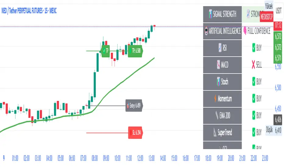
AI-Powered ScalpMaster Pro [By TraderMan]🧠 AI-Powered ScalpMaster Pro How It Works
📊 What Is the Indicator and What Does It Do?
🧠 AI-Powered ScalpMaster Pro is a powerful technical analysis tool designed for scalping (short-term, fast-paced trading) in financial markets such as forex, crypto, or stocks. It combines multiple technical indicators (RSI, MACD, Stochastic, Momentum, EMA, SuperTrend, CCI, and OBV) to identify market trends and generate AI-driven buy (🟢) or sell (🔴) signals. The goal is to help traders seize profitable scalping opportunities with quick and precise decisions. 🚀
Key Features:
🧠 AI-Driven Logic: Analyzes signals from multiple indicators to produce reliable trend signals.
📈 Signal Strength: Displays buy (bull) and sell (bear) signal strength as percentages.
✅ Success Rate: Tracks the performance of the last 5 trades and calculates the success rate.
🎯 Entry, TP, and SL Levels: Automatically sets entry points, take profit (TP), and stop loss (SL) levels.
📏 EMA Zone: Analyzes price movement around the EMA 200 to confirm trend direction.
⚙️ How Does It Work?
The indicator uses a scoring system by combining the following technical indicators:
RSI (14): Evaluates whether the price is in overbought or oversold zones.
MACD (12, 26, 9): Analyzes trend direction and momentum.
Stochastic (%K): Measures the speed of price movement.
Momentum: Checks the price change over the last 10 bars.
EMA 200: Determines the long-term trend direction.
SuperTrend: Tracks trends based on volatility.
CCI (20): Measures price deviation from its normal range.
OBV ROC: Analyzes volume changes.
Each indicator generates a buy (bull) or sell (bear) signal. If 6 or more indicators align in the same direction (e.g., bullScore >= 6 for buy), the indicator produces a strong trend signal:
📈 Strong Buy Signal: bullScore >= 6 and bullScore > bearScore.
📉 Strong Sell Signal: bearScore >= 6 and bearScore > bullScore.
🔸 Neutral: No dominant direction.
Additionally, the EMA Zone feature confirms the trend based on the price’s position relative to a zone around the EMA 200:
Price above the zone and sufficiently distant → Uptrend (UP). 🟢
Price below the zone and sufficiently distant → Downtrend (DOWN). 🔴
Price within the zone → Neutral. 🔸
🖥️ Display on the Chart
Table: A table in the top-right corner shows the status of all indicators (✅ Buy / ❌ Sell), signal strength (as %), success rate, and results of the last 5 trades.
Lines and Labels:
🎯 Entry Level: A gray line at the price level when a new signal is generated.
🟢 TP (Take Profit): A green line showing the take-profit level.
🔴 SL (Stop Loss): A red line showing the stop-loss level.
EMA Zone: The EMA 200 and its surrounding colored zone visualize the trend direction (green: uptrend, red: downtrend, gray: neutral).
📝 How to Use It?
Platform Setup:
Add the indicator to the TradingView platform.
Customize settings as needed (e.g., EMA length, risk/reward ratio).
Monitoring Signals:
Check the table: Look for 📈 STRONG BUY or 📉 STRONG SELL signals to prepare for a trade.
AI Text: Trust signals more when it says "🧠 FULL CONFIDENCE" (success rate ≥ 50%). Be cautious if it says "⚠️ LOW CONFIDENCE."
Entering a Position:
🟢 Buy Signal:
Table shows "📈 STRONG BUY" and bullScore >= 6.
Price is above the EMA Zone (green zone).
Entry: Current price (🎯 entry line).
TP: 2% above the entry price (🟢 TP line).
SL: 1% below the entry price (🔴 SL line).
🔴 Sell Signal:
Table shows "📉 STRONG SELL" and bearScore >= 6.
Price is below the EMA Zone (red zone).
Entry: Current price (🎯 entry line).
TP: 2% below the entry price (🟢 TP line).
SL: 1% above the entry price (🔴 SL line).
Position Management:
If the price hits TP, the trade closes profitably (✅ Successful).
If the price hits SL, the trade closes with a loss (❌ Failed).
Results are updated in the "Last 5 Trades" section of the table.
Risk Management:
Default risk/reward ratio is 1:2 (1% risk, 2% reward).
Always adjust position size based on your capital.
Consider smaller lot sizes for "⚠️ LOW CONFIDENCE" signals.
💡 Tips
Timeframe: Use 1-minute, 5-minute, or 15-minute charts for scalping.
Market Selection: Works best in volatile markets (e.g., BTC/USD, EUR/USD).
Confirmation: Ensure the EMA Zone trend aligns with the signal.
Discipline: Stick to TP and SL levels, avoid emotional decisions.
⚠️ Warnings
No indicator is 100% accurate. Always use additional analysis (e.g., support/resistance).
Be cautious during high-volatility periods (e.g., news events).
The success rate is based on past performance and does not guarantee future results.
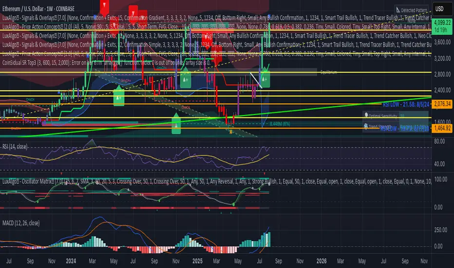
CoinSidual SR Top3What it does
Plots up to 3 Resistance (red) and 3 Support (green) zones using confirmed swing highs/lows. Nearby levels are clustered by tolerance (bps) to avoid duplicates. Lines extend left/right and auto-update.
Inputs
• Swing Length – pivot lookback/forward
• Lookback Bars – analysis window size
• Cluster Tolerance (bps) – merge distance
• Line Extend Bars – label/line span
• Show R/S Labels – toggle labels
Notes
Works on any symbol/timeframe. No alerts. For educational use only.
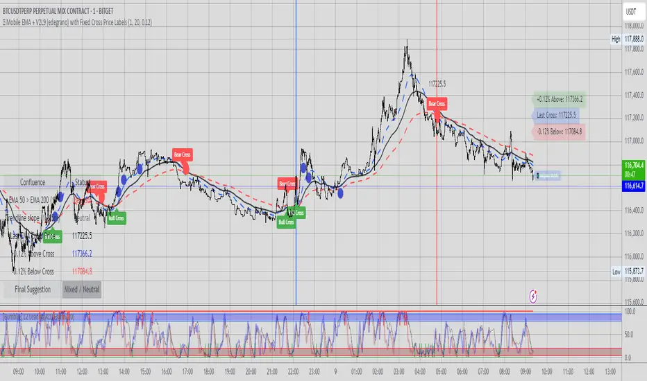
📱 Mobile EMA + V2L5 (edegrano)User Manual: Mobile EMA + V2 (edegrano)
Overview
This TradingView indicator combines EMA bias analysis and multi-timeframe linear regression trendlines with key crossover signals, displayed both on the chart and summarized in a colour-coded table for quick decision-making on mobile devices or desktops.
Inputs
Input Name Description Default
Custom EMA Timeframe Timeframe used to calculate EMA 50, 100, 200 "1" (1m)
Show EMAs on Chart Toggle to plot EMAs (50-blue, 100-black, 200-red) true
Linear Regression Length Period length for linear regression trendlines 20
Show EMA 50 > EMA 200 Bias Show EMA bias row in the table (Bullish/Bearish) true
Show Trendline Slope Bias Show trendline slope bias row in the table true
Price Distance % from Cross Percentage distance used to calculate above/below cross prices in table 2.0
What It Shows
On Chart:
EMA 50 (blue), EMA 100 (black), EMA 200 (red) lines
Vertical lines at EMA 50/200 crossover bars (blue for bullish, red for bearish)
Labels “Bull Cross” or “Bear Cross” on crossover bars
Signal dots (up to 3 consecutive strong buy or sell signals)
Table (bottom-left corner):
Row Description
EMA 50 > EMA 200 Bullish if EMA 50 is above EMA 200, Bearish otherwise (colored green/red text)
Trendline slope Bullish if all 1m, 3m, 5m regression slopes are up, Bearish if all down, Neutral otherwise (green/red/gray text)
Last EMA Cross Price Price where EMA 50 and EMA 200 last crossed (light blue text)
+% Above Cross Price percentage above last EMA cross price (dark orange text)
-% Below Cross Price percentage below last EMA cross price (red text)
Final Suggestion Overall signal: “Strong Buy 💎”, “Strong Sell 💎”, or “Mixed / Neutral” with green/red/gray background
How To Use
Set your preferred timeframe for EMA calculations using the Custom EMA Timeframe input. The default is 1 minute.
Enable or disable EMAs and table rows as you prefer with toggles.
Watch the table for quick bias and trend signals with color-coded text for easy interpretation.
Use the Last EMA Cross Price and the above/below percentage price points to identify key levels for entries, stops, or take profits.
Monitor the chart for EMA crossover vertical lines and labels to confirm signals visually.
Strong Buy or Sell dots indicate good entry opportunities — limited to 3 per consecutive trend.
Tips
Adjust the Price Distance % input to increase/decrease sensitivity of above/below price levels.
Combine this indicator with volume, price action, or other tools for best results.
Use on mobile or desktop with the compact table to stay informed without clutter.
Entropy (Fiedor/Kontoyiannis) - Part 2 of Fiedor's TheoryThis indicator estimates the Shannon entropy of a price series using a Markov chain model of binary returns, following the approach of Fiedor (2014) and Kontoyiannis (1997).
% of Max shows current entropy as a percentage of its theoretical maximum (1 bit for binary up/down moves).
Percentile ranks the current entropy against historical values in the chosen lookback window.
High entropy suggests price movement is less predictable by frequentist models; low entropy implies more structure and predictability.
Use this as an informational oscillator, not a trading signal.
This is a visualization of Part 1 of Fiedor's Theory. The same entropy logic is already embedded in Part 1 however the second pane is a nice reminder of why it works.

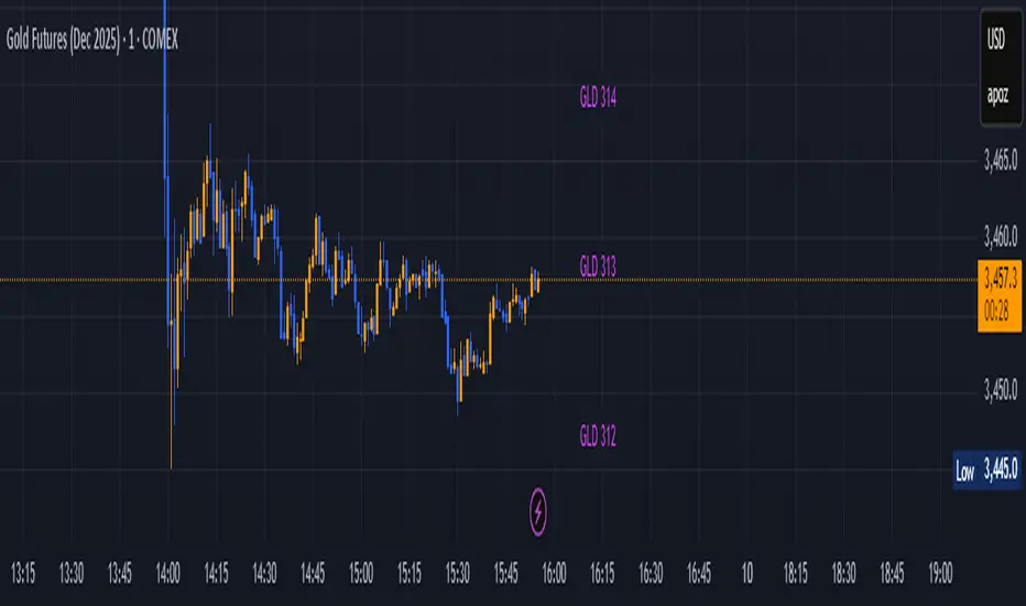
GLD GC Price Converter Its primary function is to fetch the prices of the Gold ETF (ticker: GLD) and Gold Futures (ticker: GC1!) and then project significant price levels from one or both of these assets onto the chart of whatever instrument you are currently viewing.
Core Functionality & Features
Dual Asset Tracking: The script simultaneously tracks the prices of GLD and Gold Futures (GC).
Dynamic Price Level Projection: The script's main feature is its ability to calculate and draw horizontal price levels. It determines a "base price" (e.g., the nearest $100 level for GC) and then draws lines at specified increments above and below it. The key is that these levels are projected onto the current chart's price scale.
On-Chart Information Display:
Price Table: A customizable table can be displayed in any corner of the chart, showing the current prices of GLD and GC. It can also show the daily percentage change for GC, colored green for positive changes and red for negative ones.
Last Price Label: It can show a label next to the most recent price bar that displays the current prices of both GLD and GC.
Extensive Customization: The user has significant control over the indicator's appearance and behavior through the settings panel.
This includes:
Toggling the display for GLD and GC levels independently.
Adjusting the multiplier for the price levels (e.g., show levels every $100 or $50 for GC).
Changing the colors, line styles (solid, dashed, dotted), and horizontal offset for the labels.
Defining the number of price levels to display.
Controlling the text size for labels and the table.
Choosing whether the script updates on every tick or only once per candle close for better performance.
📱 Mobile EMA + Trendline Bias (edegrano)📱 Mobile EMA + Trendline Bias (edegrano) — User Manual
What It Does
This indicator helps you spot strong bullish or bearish trends by combining:
EMA Bias: Using the relationship between EMA 50 and EMA 200 on your chosen timeframe.
Trendline Slope Bias: Using linear regression trendlines on fixed 1-minute, 3-minute, and 5-minute charts.
Signal Dots: Visual buy/sell signals limited to the first 3 occurrences after the last opposite signal to avoid noise.
Summary Table: Shows the current trend bias and final suggestion.
EMA Plots: Shows EMA 50, EMA 100, and EMA 200 lines on your chart.
Tag Label: Displays a small signature tag “📱 edegrano Mobile” on the chart.
Inputs
Input Name Description Default Notes
Custom EMA Timeframe (userTF) Timeframe used to calculate EMAs "1" (1 min) Choose your preferred timeframe (e.g., 1, 3, 5, 15, 60 minutes, etc.)
Show EMAs on Chart (showEMA) Toggle EMA lines visibility true Show or hide EMA 50, 100, and 200 lines
Linear Regression Length (regLen) Length of bars used in regression 20 Adjusts sensitivity of regression trendlines (lower = more responsive)
Show EMA Bias Row (showRowEMA50) Show/hide EMA bias row in the table true Display the EMA 50 > EMA 200 bias status in table
Show Trendline Bias Row (showRowTrend) Show/hide trendline slope row in table true Display the trendline slope bias status in table
How to Use
Set Your Timeframe:
Choose the timeframe for EMA calculations (userTF) depending on your trading style.
Scalpers might use 1-5 minute charts.
Day traders might choose 5-30 minutes.
Swing traders could go 1 hour or more.
Watch the EMA Lines:
EMA 50 (blue), EMA 100 (black), and EMA 200 (red) are plotted on your chart.
These lines help you visualize trend direction and momentum.
Understand the Bias Conditions:
EMA Bias:
Bullish: EMA 50 > EMA 200
Bearish: EMA 50 < EMA 200
Trendline Slope Bias:
Calculated on fixed 1m, 3m, and 5m charts.
Bullish if slope of all 3 regression lines is up (current value > previous).
Bearish if slope of all 3 regression lines is down.
Look for Signal Dots:
Green (lime) dots below bars: Strong Buy signals (first 3 occurrences only after last sell).
Red dots above bars: Strong Sell signals (first 3 occurrences only after last buy).
This limitation helps reduce noise from too many signals.
Check the Table (Bottom Left):
Shows EMA bias and trendline slope status.
Displays overall final suggestion:
Strong Buy 💎
Strong Sell 💎
Mixed / Neutral
Tag Label:
A small label "📱 edegrano Mobile" appears on the chart for easy identification.
Tips & Best Practices
Adjust Regression Length (regLen):
Lower values (e.g., 15-20) react faster but may generate false signals.
Higher values (30-50) smooth noise but react slower — better for longer-term trades.
Combine with Other Indicators:
Use volume, candlestick patterns, or support/resistance to confirm signals.
Don’t Trade Against the Signal:
Avoid entering buy trades during a “Strong Sell” phase and vice versa.
Monitor Multiple Timeframes:
Consider confirming trends on higher timeframes.
Parameter Suggestions by Trading Style
Style EMA Timeframe Regression Length (regLen)
Scalping 1 min 15 - 20
Day Trading 5 - 15 min 20 - 30
Swing Trading 1 hour or higher 30 - 50
Position Trading 4 hour, Daily, Weekly 50 - 100

📱 Mobile EMA + Trendline Bias (edegrano)📱 Mobile EMA + Trendline Bias (edegrano) — User Manual
Purpose
This indicator provides a simplified, mobile-friendly overview of trend bias using EMA and multi-timeframe regression trendline confluences, plus plots EMA lines and a small info table on the chart.
Inputs Explained
Input Name Description
Custom EMA Timeframe The timeframe on which the EMA 50 and EMA 200 calculations are based (e.g., 1, 3, 5 minutes). This lets you choose which timeframe to analyze EMA trend bias.
Show EMAs on Chart Toggle to show or hide EMA 50 (blue) and EMA 200 (red) lines on your chart.
Regression Length The length (number of bars) used for calculating the linear regression trendlines on fixed 1m, 3m, and 5m timeframes. Lower values make trendlines more reactive, higher values smooth out noise.
Show EMA 50 Bias Row Show or hide the EMA 50 vs EMA 200 bias row in the info table.
Show Trendline Slope Row Show or hide the multi-timeframe trendline slope bias row in the info table.
What It Shows
EMA Lines: EMA 50 (blue) and EMA 200 (red) based on your selected timeframe.
Trendline Slopes: Using linear regression on 1-minute, 3-minute, and 5-minute charts to gauge short-term trend direction.
Info Table (Bottom Left):
EMA 50 > EMA 200 status on your selected timeframe (Bullish/Bearish)
Trendline slope bias combining the 3 fixed timeframes (Bullish/Bearish/Neutral)
Final Suggestion showing overall bias:
Strong Buy 💎 if both EMA and trendline biases are bullish
Strong Sell 💎 if both are bearish
Mixed / Neutral otherwise
Tag on Chart Corner: Displays “📱 edegrano Mobile” label for quick identification.
How To Use
Set the Custom EMA Timeframe:
Choose a timeframe that fits your trading style (e.g., 1m for scalping, 5m for day trading).
Adjust Regression Length:
For faster signals, lower the regression length (e.g., 15).
For smoother, less noisy signals, increase it (e.g., 30 or higher).
Toggle EMA Lines Display:
Show or hide EMA lines based on your preference for chart clarity.
Use the Info Table:
Quickly glance at EMA and trendline bias across timeframes for confluence confirmation.
Interpret the Final Suggestion:
Follow “Strong Buy” or “Strong Sell” signals for potential entry points. If “Mixed / Neutral,” wait for stronger confirmation.
Suggested Parameters by Trading Style
Style EMA Timeframe Regression Length Notes
Scalping 1 min 15-20 Responsive, fast reaction to price
Day Trading 3-5 min 20-30 Balanced sensitivity
Swing Trading 15-30 min 30-50 Smoother trend detection
Position Trading 1 hr+ 50-100 Very smooth, low noise
Tips
Combine this indicator with volume or other indicators for stronger confirmation.
Use the EMA lines on chart visually to confirm trend direction.
The info table updates in real-time, making it easy for quick decisions on mobile.
Adjust inputs and observe how the final suggestion changes to tune for your asset and timeframe.

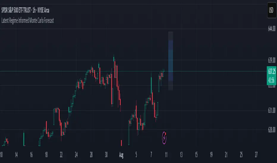
Latent Regime Informed Monte Carlo ForecastThis script uses a Monte Carlo simulation to forecast where price might be a set number of bars into the future (default 6 bars ahead). It generates hundreds of possible future price paths based on an average move (drift) and random shocks (volatility). The result is a distribution of outcomes, displayed as probability zones: the median (most likely), inner bands (50% confidence), and wider bands (80% and 95% confidence). Due to the randomness assumption in Monte Carlo simulations, the paths are not very important so to minimize cluttering on the graphs we only plot bands. These zones help you visualize uncertainty, set stops and targets based on probabilities, and spot when market behavior changes.
The accuracy of any Monte Carlo forecast depends heavily on how well you estimate trend and volatility. By default and no prior information the Monte Carlo simulation gives you a parabolic forecast that assumes absolute randomness. This is where the Kalman filter comes in. The filter (derived from control theory) aims to detect latent (unobservable) traits about the system by continuously updating its transition probabilities to better understand how the latent traits affect the observable measurement (price). With each new observable state we get better and better transition probabilities and enhances our understanding about the latent and unobservable market characteristics like trend and volatility. Both crucial measurements for short term market sentiment.
Extracting these measurements for market sentiment informs us how to better parametrize the Monte Carlo simulation for a better forecast. Each bar, the KF updates its estimates based on how close its last prediction was to reality. In calm periods, it holds estimates steady; in volatile periods, it adapts quickly. This gives you real-time, low-lag measurements of both trend and volatility.
By feeding these adaptive estimates into the Monte Carlo simulation, the forecast becomes much more responsive to current market conditions. In trends, the predicted paths tilt toward the direction of movement; in choppy markets, they spread wider but stay centered; when volatility spikes, the probability zones expand immediately. The result is a dynamic forecast tool that adjusts on every bar, giving you a clearer, probability-based picture of where the market could go next.
This is my very first script and I would love feedback/ideas for different topics.
My background is in economics/mathematics and interests lie in time series analysis/exploring financial features for DS
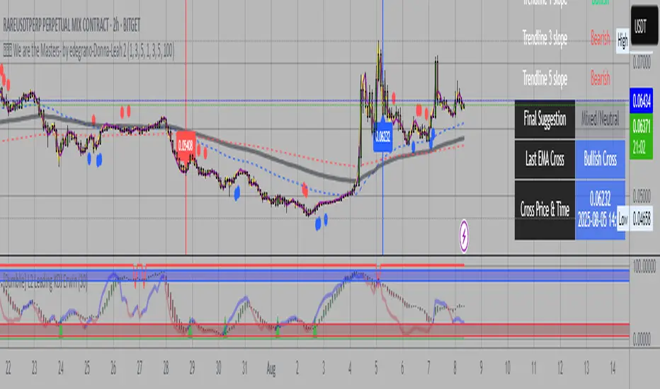
💎💎💎 We are the Masters- by edegrano-Donna-Leah 2How to Use the "💎💎💎 We are the Masters" Script
1. Set Your Timeframes
EMA Timeframes (emaTF1, emaTF2, emaTF3):
Choose 3 different chart timeframes on which you want to analyze the EMA bias. These timeframes will determine how the script evaluates the market trend via EMAs.
Trendline Timeframes (tf1, tf2, tf3):
Choose 3 timeframes for the linear regression trendlines. These smooth out price action and indicate the trend slope.
2. Set Linear Regression Length (regLen)
This controls the length (number of bars) the linear regression trendline uses to calculate the trend.
Smaller values make the trendline more sensitive; higher values smooth out noise but react slower.
3. Interpret the Output
EMA Bias per Timeframe:
Bullish if EMA 50 > EMA 200 on that timeframe.
Bearish if EMA 50 < EMA 200.
Trendline Slope per Timeframe:
Bullish if current regression value > previous regression value (price is trending up).
Bearish if current regression value ≤ previous regression value.
Special Buy Signal:
When all 3 EMA biases are bullish AND all 3 trendline slopes are bullish → Strong Buy Signal (blue dot below bar).
Special Sell Signal:
When all 3 EMA biases are bearish AND all 3 trendline slopes are bearish → Strong Sell Signal (red dot above bar).
EMA Crosses:
The script plots vertical lines and labels on the current timeframe when EMA 50 crosses above (bullish) or below (bearish) EMA 200.
Information Table:
Shows EMA bias and trendline slope status for all timeframes, last EMA cross info, and final overall suggestion.
4. How to Use in Trading
Confirm Trend: Use the EMA bias and trendline slope confluences to confirm the overall trend across multiple timeframes.
Trade Entry: Consider entering long when the special buy signal appears; enter short when the special sell signal appears.
EMA Crosses: Use crosses as secondary confirmation or to detect early momentum shifts.
Trendline Slope: Helps confirm if the price is gaining or losing strength on different timeframes.
Monitor Table: Quickly glance to understand current market bias and confluence.
Suggested Parameters for Different Trading Styles
Style EMA Timeframes Trendline Timeframes Linear Regression Length (regLen)
Scalping 1 min, 3 min, 5 min 1 min, 3 min, 5 min 15 - 20 (responsive, fast)
Day Trading 5 min, 15 min, 30 min 5 min, 15 min, 30 min 20 - 30 (balanced responsiveness)
Swing Trading 1 hr, 4 hr, Daily 1 hr, 4 hr, Daily 30 - 50 (smoother, slower trend)
Position Trading 4 hr, Daily, Weekly 4 hr, Daily, Weekly 50 - 100 (very smooth)
Tips
When using short timeframes, keep the regression length smaller for quicker reaction to price changes.
For longer timeframes, increase regression length to reduce noise and false signals.
Use this script alongside volume or other indicators to improve entry quality.
Avoid trading against the overall confluence bias (e.g., don’t enter longs if final suggestion is “Strong Bearish”).
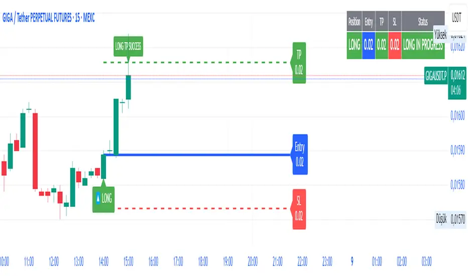
SmartFib Pro [By TraderMan]📊 SmartFib Pro — Smart Fibonacci Support & Resistance + TP/SL + Live Position Tracking
🚀 With SmartFib Pro , automatically track Fibonacci support and resistance levels on your chart!
This indicator dynamically shows long/short entry points, TP (Take Profit), and SL (Stop Loss) levels based on price movements, with easy-to-read lines. You can also monitor your position status live via a table at the top-right of your screen.
⚙️ How It Works?
📈 When price breaks key Fibonacci levels (especially 78.6% and 23.6%), the indicator automatically generates long or short signals.
Entry lines are drawn in blue, TP lines in green, and SL lines in red.
Entry, TP, and SL levels are displayed as labels next to the lines.
Active position lines and labels remain on the chart while the position is open, and past position lines are cleared automatically.
When TP or SL is hit, the indicator instantly notifies on the chart and in the table with “TP SUCCESSFUL” or “STOP HIT.”
🛠️ How to Use?
Add the indicator to your chart.
Adjust Fibonacci high and low lengths (default 50 bars) and line length (default 50 bars) from the inputs.
Long signals are generated when price breaks above the 78.6% level; short signals occur when price breaks below the 23.6% level.
TP is automatically set 3.5% away from the entry line, SL is set 1.5% away.
Follow the blue (entry), green (TP), and red (SL) lines and their labels on the chart.
Monitor your position info live in the top-right table.
When TP or SL triggers, position closes, and lines/labels are cleared for the next signal.
💡 Why SmartFib Pro?
✅ Automated position entry and exit strategy based on Fibonacci levels
✅ Live position tracking and status updates to help your trading decisions
✅ Clear, colorful, and minimalistic chart visuals eliminate clutter
✅ Ideal for both beginners and pros, providing fast and reliable signals
📣 Important Notes:
This indicator generates signals but always use proper risk management according to market conditions!
You can adjust TP/SL percentages to fit your own risk tolerance.
Always support signals with your own analysis.
💬 Catch the trend, manage your risk, and grow your profits with SmartFib Pro!
📈🔵🟢🔴
JOSITOThis indicator marks equal points that XAU will go to reach; it doesn’t work on other pairs, but on XAU it is quite accurate.
Preguntar a ChatGPT
