Seasonality Calculation Tool by Luis TrompeterThe Seasonality Calculation Tool is designed to analyze and evaluate the strength of any seasonal pattern detected by the Seasonality Indicator.
While the Seasonality Indicator displays the historical seasonal curve, this tool goes one step further by examining how reliable and consistent that curve truly is.
The tool checks whether a seasonal pattern is strong, distorted by a few outlier years, or statistically meaningful. It calculates the average return within the selected seasonal window and highlights how accurate or robust the pattern has been over the evaluated period.
To support manual confirmation and deeper analysis, the tool also visualizes the seasonal windows directly on the chart. This allows traders to review past occurrences and backtest the pattern themselves to validate the quality of the signal.
The Seasonality Calculation Tool is an ideal complement to the main Seasonality Indicator, helping traders identify high-quality, data-driven seasonal tendencies and avoid misleading or weak seasonal patterns.
Usage
This script is intended to be used exclusively on the daily timeframe, as all calculations rely on daily candle data.
The settings are intuitive and easy to adjust, allowing users to quickly evaluate any seasonal window displayed by the Seasonality Indicator.
Forecasting

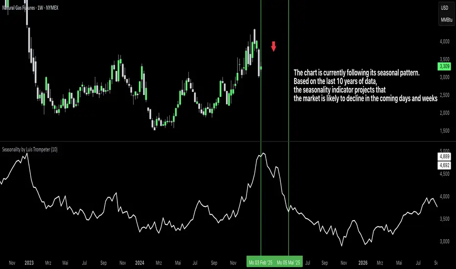
Seasonality by Luis TrompeterThe Seasonality Indicator calculates the average historical performance of the currently selected asset by analyzing a user-defined number of past years (e.g., the last 10 years).
The number of years included in the calculation can be adjusted directly in the settings panel.
Based on this historical window, the indicator creates an average seasonal curve, which represents how the market typically behaved during each part of the year.
This averaged curve acts as a forecast for the upcoming months, highlighting periods where the market has shown a consistent tendency in the past.
Traders can use this seasonal projection to identify times of higher statistical likelihood for upward or downward movement.
The indicator works especially well when combined with the Seasonality Analysis Tool, which helps identify specific historical windows and strengthens overall seasonal decision-making.
Timeframe Requirement
This indicator must be used exclusively on the daily timeframe, as all calculations are based on daily candle data.
Other timeframes will not display accurate seasonal structures.
The Seasonality Indicator provides a clear, data-driven view of recurring annual patterns and allows traders to better understand when historical tendencies may influence future price action.
VaCs, Trade Indic## 🎛 **MAIN PRICE CHART (Primary Panel)**
Overlay on the main candlestick chart:
* 200 EMA + 50 EMA trend ribbons
* Parabolic SAR
* Logarithmic Growth Curves (LGC / LGH)
* Stock-to-Flow (S2F) bands
* Linear, Log, and Polynomial Regression Channels
* Liquidity mapping:
* Buyside liquidity
* Sellside liquidity
* Fair Value Gaps (FVG)
* Order Blocks
* Imbalance Zones
* Smart Money Concepts (SMC):
* HH, HL, LH, LL structure
* BOS (Break of Structure)
* CHOCH (Change of Character)
* Whale Accumulation Layers:
* Wallet cohorts (1–10 / 10–100 / 100–1K / 1K–10K)
* Whale inflow/outflow
* Exchange net positions
* On-chain macro layers:
* NUPL
* MVRV
* SOPR
* Realized price bands
* Miner Position Indicator
* Hash Ribbons
* Market cycle markers:
* Halving cycles
* Accumulation, Markup, Distribution, Markdown phases
* Fundamental macro overlays:
* Fed interest rate events
* CPI releases
* ETF inflow/outflow markers
* Major global news catalysts
---
## 📊 **SUB-PANEL #1 — Momentum Oscillators**
Add a clearly separated lower panel containing:
* MACD (standard)
* RSI (14) **with divergence lines**
* Stochastic RSI
* MFI (Money Flow Index)
This panel must be independent and **not overlayed** on the main chart.
---
## 📊 **SUB-PANEL #2 — Volume & Flow Analytics**
A second independent lower panel showing:
* Volume Profile
* On-Balance Volume (OBV)
* **VWAP** (Volume Weighted Average Price)
* Must be clean, visible, and used for trend confirmation
* Use logic equivalent to TradingView Pine Script v6 **ta.vwap()**
* Represents a stable VWAP line across the full dataset
* Funding Rate
* Open Interest (OI)
* CVD (Cumulative Volume Delta)
---
## 📊 **SUB-PANEL #3 — On-Chain Analytics Panel**
Add a dedicated panel for:
* Exchange inflow/outflow
* Miner flow
* Realized profits vs realized losses
* Stablecoin Supply Ratio (SSR)
* Any high-frequency on-chain volatility signals
---
Auto Seasonality Scanner by Luis TrompeterThe Auto Seasonality Scanner automatically detects seasonal patterns by scanning a user-defined number of past years (e.g., the last 10 years).
Based on this historical window, the indicator identifies the strongest seasonal tendency for the currently selected date range.
The scanner evaluates all valid seasonal windows using two filters:
• Hit Rate – the percentage of profitable years
• Average Return – the highest mean performance across the analyzed period
The best-scoring seasonal setup is displayed directly on the chart, including the exact start and end dates of the identified pattern for the chosen time range.
Users can define the period they want to analyze, and the indicator will automatically determine which seasonal window performed best over the selected history.
Recommended Settings (Standard Use)
For optimal and consistent results, the following settings are recommended:
• Search Window: 20–30
• Minimum Length: 5
• Time Period: from 2015 onward
• US Election Cycle: All Years
These settings provide a balanced and reliable baseline to detect meaningful seasonal tendencies across markets.
This indicator helps traders understand when recurring seasonal patterns typically occur and how they may align with ongoing market conditions.
Timeframe Requirement
This indicator is intended to be used exclusively on the daily timeframe, as all calculations are based on daily candles.
Using it on lower timeframes may result in inaccurate or misleading seasonal readings.

AI Projection LevelsProjection Levels – AI-Driven Volatility Projection Grid
Projection Levels is a quantitative market geometry engine that transforms raw volatility into a structured, multi-layered projection grid.
It is designed to help traders identify natural price reaction corridors, exhaustion zones, and expansion targets using a volatility-normalized mathematical framework.
This is not a random fixed indicator – it behaves like a deterministic, AI-style volatility interpreter that adapts to changing market conditions.
Mathematical Core (Simplified)
The system is built around a Volatility Projection Field (VPF) defined conceptually as:
Px = O + (ATR_prev * M * lambda_x)
Where:
O = session anchor (adaptive open)
ATR_prev = volatility memory from the previous regime
M = projection multiplier
lambda_x = fractal expansion ratios:
{0.25, 0.50, 0.75, 1.00, 1.25, 1.50, 1.75, 2.00}
These ratios behave like probabilistic expansion bands derived from historical volatility clustering in financial time series.
Cluster Stabilization Layer
Markets don’t respect random decimals – they tend to gravitate around liquidity clusters.
To reflect this, the indicator applies a discrete price quantization filter:
Q(x) = round( x / step ) * step
Where:
step = user-defined cluster size (for example: 500 points for index futures)
This compresses prices into liquidity-aligned structural clusters, creating “price magnets” where:
Dealers tend to hedge
Liquidity concentrates
Traps and fakeouts often form
Breakouts can accelerate once clusters are left behind
Why It Feels “AI-Driven”
Pine Script cannot run deep neural networks directly, but this tool emulates AI-like behavior via:
Recursive volatility normalization
Multi-level fractal expansion logic
Cluster-aligned price projections
Dynamic label overlays that tag key expansion zones
Functionally, it behaves like a rule-based inference engine operating on volatility memory and price geometry.
Structure of the System
You get three main “intelligent” layers:
1) Core Projection Zone (±25% to ±100%)
Primary behavioral framework:
Intraday reaction zones
Mean-reversion traps
Session acceptance / rejection areas
2) Expansion Zones (125% to 200%)
Extended volatility bands:
Potential exhaustion territories
Trend continuation “fuel” zones
Breakout overextension regions
Often used by momentum and breakout traders to frame extreme moves.
3) Adaptive Label Tracking
Each level is attached to a moving label that follows the latest bar.
This keeps the projection grid readable, even on fast intraday charts.
Designed For
Futures and index traders
Intraday scalpers and day traders
Volatility-based swing traders
Systematic and rules-driven traders building frameworks
Works especially well on:
SPX, NASDAQ, BTC & major crypto indices, NIFTY and liquid futures contracts.
Philosophy Note
Markets move in alternating phases of volatility expansion and compression.
This indicator does not “predict the future” – it maps probabilistic volatility geometry around the current session anchor.
It is best used to ask questions such as:
Are we in compression or expansion?
Is this zone more likely to act as acceptance or rejection?
Are we approaching a structurally stretched region?
Risk Disclaimer
This indicator is a visual and analytical tool only.
It does not provide direct buy/sell signals, financial advice, or guaranteed outcomes.
Trading and investing in financial markets involves substantial risk, including the risk of losing part or all of your capital.
All projections, levels, and zones shown by this script are based on mathematical and volatility-based calculations and should be treated strictly as decision-support, not a prediction engine.
The creator of this script is not responsible for any trading losses, financial damage, or decisions made using this tool.
By using this script, you agree that you:
Understand the risks of trading
Use this indicator at your own discretion and responsibility
Accept that past behavior of levels does not guarantee future performance
Closed-Source Notice
This script contains proprietary projection logic.
The formulas shown above are conceptual summaries for educational clarity.
Actual internal weighting, smoothing, and normalization methods remain closed-source and protected.

Strict Weekly 50/200 WMA Signals True Weekly Only-Strict Weekly 50/200 WMA Signals True Weekly Only => also on other time frames than weekly (like daily, etc.) always indicates the indicators based on the weekly chart
-especially useful for Crypto
-gives buy and sell signals when the 200 WMA or the 50 WMA are crossed
-typically above the 50 WMA indicates a bull market
-reaching below the 200 WMA indicates a bear market and typically for investors with a longer time frame (>2-4 years) a good entry point

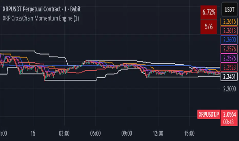
XRP CrossChain Momentum EngineThis is a strategy with stop loss 3% , leverage 4 and no pyramiding. It works great with XRP and other coins with similar price, but i suggest XRP. Profit in 1 year around 900% and profit in 2 years around 2000% as you can see in the pictures. I have initial capital 1000 but it can change.
LockedEye MTF CRT Map SentinelOverview
This script provides a structured multi-timeframe display of market conditions.
It summarizes key elements from M1 up to D1 using five components:
- CRT (Continuation/Reversal Trigger)
- MA6 micro-trend filter
- Candle-close direction
- MA250 macro trend filter
- Sentiment percentage computed from the above signals
The panel is designed to present information at a glance, allowing traders to understand how different timeframes align or disagree.
The purpose is not to merge random indicators. Each row uses a specific rule-based calculation that contributes to an integrated multi-timeframe read. The focus is on market structure, micro-trend, and directional pressure as expressed across several intervals.
How the Script Works
The script does not rely on external indicators. All calculations are performed internally through candle relationships, moving averages, MTF requests, and simple classification logic.
1. CRT Logic (Continuation and Reversal)
CRT identifies two types of behavior in each timeframe:
Continuation: The current candle closes outside the previous candle’s high or low.
Reversal after a sweep: Price takes the previous high or low but closes back inside the range.
A close outside the previous range suggests continuation.
A sweep followed by a close back inside suggests a shift in pressure or reversal .
The CRT row labels these conditions as Bull, Bear, or Wait.
2. MA6 Micro-Trend
The script uses a 6-period simple moving average to understand immediate trend pressure.
Close and open both above the MA6 = Bull
Close and open both below the MA6 = Bear
Mixed = Wait
This gives a quick view of short-term momentum without repainting.
3. Candle-Close Direction
This uses a simple comparison:
Close > Open = Bull
Close < Open = Bear
Equal = Neutral
It is a raw directional signal without interpretation.
4. MA250 Macro Filter
The script applies a 250-period MA to understand the broader trend.
Break above the MA250 = BR (BullRun)
Break below the MA250 = BC(BearCrash)
Inside range = Neutral
This acts as a long-term directional filter .
5. Sentiment Computation
The script aggregates CRT, MA6, and Candle-Close across all timeframes.
Each timeframe contributes a value.
The script then calculates the percentage of bull, bear, and neutral signals.
A short text summary explains whether signals are aligned or mixed.
How to Use the Panel
Multi-Timeframe Alignment
The panel is most useful when interpreting how lower and higher timeframes behave together:
When many timeframes show the same direction, it reflects stronger alignment.
When timeframes disagree, market conditions are more mixed or range-bound.
Users can watch for shifts when multiple rows turn from mixed to aligned.
Trend-Following Context
If higher timeframes (H2–D1) show consistent directional readings in CRT, MA6, and MA250, users may treat that as broader structural context.
Lower timeframes (M1–M15) can then be used to observe pullbacks or shifts within that larger trend.
Counter-Trend Context
If higher timeframes show one direction but lower timeframes show the opposite, this may indicate short-term reactions or pullbacks.
The script does not assume these reactions will continue; it only shows the multi-frame condition so users can decide how to interpret it.
Liquidity Sweep Context
CRT will classify moments when price takes a previous high or low and re-enters the range.
This is included so users can detect areas where the market moves beyond a level and immediately rejects it.
Alerts
The script includes alert conditions for:
CRT Bull or Bear flips on the chart’s timeframe
Multi-timeframe consensus reaching a user-defined threshold
Users can create alerts through the TradingView alert menu once the indicator is added to the chart.
Note:
The script includes a non-repaint mode for alert stability. This mode ensures only confirmed candle closes are used in calculations.
Chart Use
The script displays a fixed panel on the chart.
Users may select the panel’s position to avoid covering price action.
Users are advised to publish with a clean chart where only this script is active, unless pairing is required for explanation.
Toggles:
Close Candle(Non Repaint)
Monitor: BTCUSD along w RSI
Monitor 2: Any Coin
Flip M1-D1
Fast CRT
Final Notes
This script does not forecast future price movement and does not claim accuracy, profitability, or performance results.
It is a diagnostic tool that organizes real-time price behavior across multiple timeframes.
Users should apply their own judgment and risk management.

Tactical Deviation🎯 TACTICAL DEVIATION - Volume-Backed VWAP Deviation Analysis
What Makes This Different?
Unlike basic VWAP indicators, Tactical Deviation combines:
• Multi-timeframe VWAP deviation bands (Daily/Weekly/Monthly)
• Volume spike intelligence - signals only appear with volume confirmation
• Pivot reversal detection at deviation extremes
• Optional multi-VWAP confluence system
• Smart defaults for quality over quantity
This unique combination filters weak setups and identifies high-probability entries at extreme price deviations from fair value.
📊 DEFAULT SETTINGS (Ready to Use)
✅ Daily VWAP with ±2σ deviation bands
✅ Volume spike detection (1.5x average required)
✅ 2σ minimum deviation for signals
❌ Weekly/Monthly VWAPs (enable for multi-timeframe)
❌ Pivot reversal requirement (enable for stronger signals)
❌ Fill zones (optional visual enhancement)
Why: Daily VWAP is most relevant for intraday trading. 2σ bands catch meaningful moves. Volume spikes ensure conviction. Clean chart focuses on what matters.
🚀 HOW TO USE
BASIC USAGE:
• Green triangles (below bars) = Long signals at oversold deviations
• Red triangles (above bars) = Short signals at overbought deviations
SIGNAL QUALITY:
• Normal size, bright colors = Volume spike (best quality)
• Small size, lighter colors = Volume momentum
• Tiny size = No volume confirmation
DEVIATION ZONES:
• ±2σ = Extreme deviation (signals appear here)
• ±1σ to ±2σ = Extended but not extreme
• Within ±1σ = Normal range
TRADING APPROACHES:
Mean Reversion:
→ Enter when price reaches ±2σ with volume spike
→ Target: Return to VWAP or opposite band
→ Stop: Beyond extreme deviation
Trend Continuation:
→ Use bands to identify pullbacks
→ Enter pullback to VWAP in trending market
→ Volume confirms continuation
Reversal Trading:
→ Enable "Require Pivot Reversal" for stronger signals
→ Signals only when deviation + pivot reversal occur
→ Higher probability, fewer signals
⚙️ EXPLORE SETTINGS FOR FULL USE
VWAP SETTINGS:
• Show Weekly/Monthly VWAP = Multi-timeframe context
• Show ±1σ Bands = Normal deviation range
• Show ±3σ Bands = Extreme extremes (rare but powerful)
SIGNAL SETTINGS:
• Min Deviation: 1σ (more signals) | 2σ (default) | 3σ (fewer, extreme only)
• Require Pivot Reversal: OFF (default) | ON (stronger but fewer)
• Volume Spike Threshold: 1.5x (default) | 2.0x+ (major spikes) | 1.2x (more signals)
CONFLUENCE SETTINGS:
• Require Multi-VWAP Confluence: OFF (default) | ON (2+ VWAPs must agree)
• Min VWAPs: 2 (Daily + Weekly/Monthly) | 3 (all must agree)
VISUAL SETTINGS:
• Show Fill Zones = Shaded areas between bands
• Fill Opacity = Transparency adjustment
• Line Widths = Customize thickness
💡 PRO TIPS
1. Start with defaults, then enable features as you learn
2. Volume spike requirement filters weak moves - keep it enabled
3. Enable Weekly/Monthly VWAPs for higher timeframe context
4. Enable confluence for swing trading setups
5. Pivot reversals: ON for reversals, OFF for continuations
6. Check top-right info table for current deviation levels
🎨 VISUAL GUIDE
• Cyan Line = Daily VWAP (fair value)
• Cyan Bands = Daily deviation zones
• Orange Line = Weekly VWAP (if enabled)
• Purple Line = Monthly VWAP (if enabled)
• Green Triangle = Long signal (oversold)
• Red Triangle = Short signal (overbought)
⚠️ IMPORTANT
Educational purposes only. Always use proper risk management. Signals are based on statistical deviation, not guarantees. Volume confirmation improves quality but doesn't guarantee outcomes. Combine with your own analysis.
The unique combination of VWAP deviation analysis, volume profile confirmation, pivot identification, and multi-timeframe confluence in a single clean interface makes Tactical Deviation different from basic VWAP indicators.
Happy Trading! 📈

Classic Dual Momentum – 12-Month Absolute Momentum - AntonacciThis indicator calculates the 12-month absolute momentum exactly as described in Gary Antonacci’s Dual Momentum framework.
It automatically adjusts the lookback period based on the chart’s timeframe:
Daily chart: 252 bars
Weekly chart: 52 bars
Monthly chart: 12 bars
Other timeframes: Estimated automatically using bar time difference
The script computes the 12-month rate of return and displays it as a color-coded column plot:
Green: Positive 12-month momentum
Red: Negative 12-month momentum
A customizable moving average is included to help visualize longer-term trends in the momentum signal.
How It’s Used (from Dual Momentum theory)
This indicator provides the absolute momentum filter used in classic Dual Momentum strategies:
If the 12-month return of an asset is above the risk-free return → trend is positive
If it is below the risk-free return → trend is negative
This absolute momentum check is a key component of the Global Equities Momentum (GEM) model presented in Gary Antonacci’s book Dual Momentum Investing.
Why This Indicator Exists
It gives traders a clean, accurate way to visualize the 12-month trend strength across any timeframe, without the distortions caused by bar length differences.

神奇九转指标 The Enchanting Nine-Step Transformation: The smiling face symbolizes a bearish outlook for 9, while the penguin represents a bullish outlook for 9.

Reversal Candlestick Setups (Doji, Outside, Extreme, Wick)Reversal Candlestick Setups – Doji, Outside, Extreme & Wick
This indicator identifies four high-probability reversal candlestick patterns across all timeframes: Doji Reversals, Outside Reversals, Extreme Reversals, and Wick Reversals. Each setup is based on clearly defined quantitative rules, allowing traders to filter noise and focus on strong reversal signals instead of relying on subjective visual interpretation.
The tool automatically scans every candle, highlights qualifying patterns on the chart, and provides alert options for both bullish and bearish versions of all four setups. This makes it suitable for intraday traders, swing traders, and positional traders seeking early reversal confirmation.
Included Setups
1. Doji Reversal Setup
Identifies candles with extremely small bodies relative to their range, combined with a smaller-than-average bar size. Useful for spotting market indecision before a directional shift.
2. Outside Reversal Setup
Flags candles that engulf the previous candle’s high–low range and exceed the average range by a multiplier. This is designed to capture strong momentum reversals driven by aggressive buying or selling.
3. Extreme Reversal Setup
Highlights large-bodied candles that dominate their overall range and exceed twice the average bar size. These signals aim to catch climactic exhaustion and institutional-level reversals.
4. Wick Reversal Setup
Detects candles with long rejection wicks, small bodies, and closes near an extreme of the range, supported by above-average bar size. Ideal for identifying sharp intrabar rejections.
Key Features
• Automatically detects all four reversal setups
• Works on all timeframes and symbols
• Customizable variables for deeper testing and optimization
• Clear bullish and bearish labels directly on the chart
• Fully integrated alert conditions for real-time notifications
• Suitable for crypto, stocks, indices, forex, and commodities
Who This Indicator Is For
• Traders who want objective, rule-based reversal detection
• Price action traders looking to enhance accuracy
• Systematic traders wanting quantifiable candlestick criteria
• Beginners learning reversal structures with visual guidance
• Professionals integrating reversal patterns into algorithmic or discretionary systems
How to Use
Add the indicator to your chart and enable alerts for the specific setups you want to track (e.g., “Bullish Wick Reversal”). Combine these signals with market structure, trend filters, volume analysis, or momentum indicators for increased conviction.

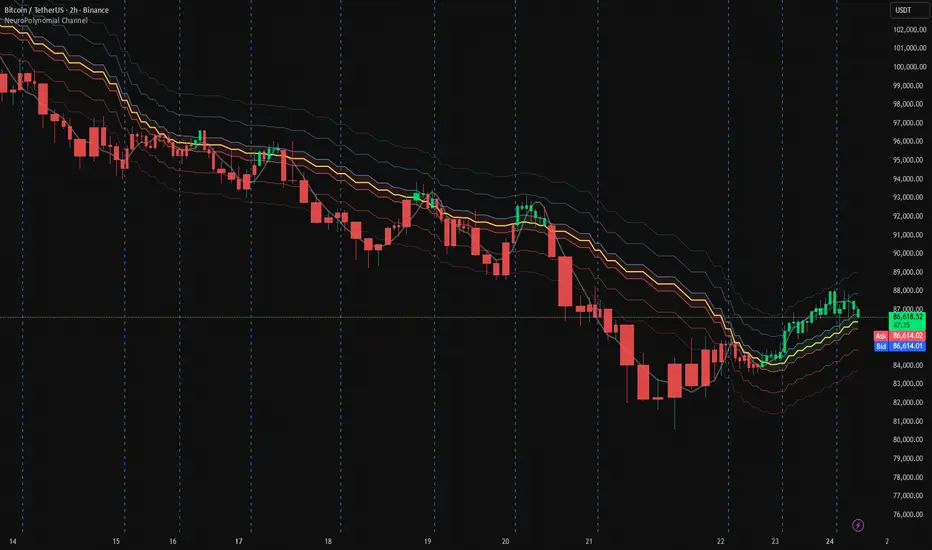
NeuroPolynomial Channel🧠 NeuroPolynomial Channel – AI-Inspired Market Structure Engine
In modern market microstructure analysis, price is no longer treated as a simple line — it is viewed as a continuously evolving signal governed by nonlinear dynamics, volatility deformation, and behavioral state shifts.
The NeuroPolynomial Channel (NPC) is a mathematically structured, AI-inspired indicator designed to approximate this dynamic behavior using a hybrid of:
• Polynomial regression smoothing
• Neural blending functions
• Volatility-adaptive envelopes
• Distribution-based bias levels
While full deep-learning models cannot be directly implemented in Pine Script due to computational and architectural limitations, the NeuroPolynomial Channel brings core AI concepts into TradingView through mathematically constrained approximations, creating an efficient, real-time neural structure model suitable for intraday and swing analysis.
📐 Mathematical Foundation
NPC is not a standard moving average or simple channel system.
It applies a multi-layer non-linear approximation built on four core mathematical components.
1️⃣ NeuroPolynomial Core Line
At the heart of the system lies a recursive polynomial smoothing kernel inspired by neural weighted blending:
K = α · K
+ (1 - α) · P
+ Δx · ( K - K ) / F
Where:
• K = Neuro core estimate
• P = Current price input
• α = Neural morph factor
• F = Flattening constant
• Δx = Position delta (horizontal deformation component)
The recursive references introduce memory similar to RNN-style feedback behavior.
This produces a structurally smooth, non-linear trajectory that adapts to both local and historical price deformation.
.....................................................................................................
2️⃣ Neural Volatility Envelope
Instead of classical standard deviation, NPC uses a cumulative error field:
E = ( Σ | P - K | ) / N
Using this error field, the dynamic envelope bands are constructed as:
Inner Band = K ± E · m1
Mid Band = K ± E · m2
Outer Band = K ± E · m3
Where:
• m1, m2, m3 are probabilistic band multipliers
• E represents actual observed deviation, not synthetic volatility
This creates a probabilistic price container that deforms with real market behavior rather than static statistical assumptions.
The channel automatically adapts its curvature based on current price regime:
trending, compressing, or expanding.
.....................................................................................................
3️⃣ Neural Regression Spine
Alongside the polynomial core, NPC calculates a ridge-regularized regression spine:
y = β · x + α (with L2 regularization)
This acts as a structural bias vector or "neural backbone".
It prevents overfitting and provides directional stabilization during extended trend phases.
......................................................................................................
4️⃣ Neuro Bias Zones (Daily Reset)
NPC also introduces daily volatility-anchored regime thresholds:
Z_levels = Open ± ATR_daily × {0.1, 0.382, 0.618}
These act as:
• Neuro Mid Zones – equilibrium bands
• Neuro Strong Zones – trend activation boundaries
Unlike classical pivot systems, these levels reset daily and expand dynamically based on real volatility.
They approximate probability field boundaries similar to those used in institutional volatility modeling.
.......................................................................................................
🤖 AI Philosophy
While Pine Script cannot host full neural networks, GPU models or multi-layer AI pipelines, NeuroPolynomial Channel introduces AI concepts through mathematical abstraction, including:
• Neural blending mechanics
• Memory-based recursion
• Volatility adaptation
• Bias field modeling
• Structured envelope projection
This creates an AI-style behavior using real-time deterministic mathematics — allowing performance on TradingView while preserving interpretability and stability.
🛠 How To Use
NPC is designed for structure-based interpretation, not random signal chasing.
① Trend Structure
Use the Neural Core Line and channel slope to establish trend direction and regime.
② Compression & Expansion
Observe band width.
Contracting channels signal volatility compression.
Expanding channels signal range expansion.
③ Bias Zones
Neuro Mid and Strong levels act as macro intraday bias framework — especially powerful for session trading and index futures.
⚙️ Settings Overview
• Morph Factor – Controls neural blending strength (higher = smoother, lower = reactive)
• Flatten – Reduces polynomial curvature noise
• Band Multipliers – Adjust envelope thickness
• Neural Bias Levels – ATR-anchored regime zones resetting daily
• Theme & Visual Controls – Dark/Light with pro-grade visibility
........................................................................................................
Companion AI:
I also built a free Trading AI on ChatGPT that reads chart screenshots and enforces a rule-based intraday checklist.
Use with this indicator: chatgpt.com
For educational & decision-support only. Not financial advice.
............................................................................................................
⚠️ Disclaimer
The information contained in my Scripts / Indicators / Ideas / Systems does not constitute financial advice or a solicitation to buy or sell any securities.
All markets carry risk. This tool is for educational and analytical purposes only.
I do not accept liability for any financial loss or damage resulting from direct or indirect use of this script.
Trading decisions must be made independently based on your own risk profile and financial assessment.
[NBK] Cover Buy Sell for BTC Cover Buy Sell for BTC— Engulfing Reversals with EMA/ATR Trend & Quality Filters
{Update for BTC}
What it does
This indicator flags high-quality bullish/bearish reversal candles only when they align with a short-term trend and pass several objective quality filters. It is not a simple mashup: each component serves a distinct role and they work together to keep early/low-quality signals out.
How it works (components & interaction)
Pattern engine (entry candidates)
Bullish side (Cover Buy):
Body Engulf: current green body fully covers the prior red body, or
Piercing (relaxed): prior red → current green closes above the prior body’s midpoint (not beyond prior open).
Bearish side (Cover Sell):
Full-candle Engulf: current red candle (body + wicks) covers the entire prior candle, or
Body Engulf: current red body fully covers the prior body, or
Dark-Cloud (relaxed): prior green → current red closes below the prior body’s midpoint.
Short-term trend gate (non-repainting)
Trend is defined by the EMA slope between bar-1 and bar-2, scaled by ATR to require minimum strength.
Slope < 0 → only bullish candidates pass. Slope > 0 → only bearish candidates pass.
Body-size filter (noise control)
Rejects tiny candles: each body is compared with the lookback average body size.
For bearish candidates an additional ratio check requires current body ≥ a fraction of the prior body (to avoid weak top-ticks).
Peak filters for bearish signals (late, cleaner tops)
Distance above EMA: the high must be at least X × ATR above EMA (avoids mid-range noise).
Near local high: the high of the current bar (or bar-1) must be close to the highest high in a recent window.
Break confirmation: close must break low by at least Y × ATR (filters shallow dark-clouds).
Only when a candidate satisfies the pattern ➝ trend ➝ size ➝ peak sequence is a signal printed/alerted.
Inputs (key parameters)
EMA length, Min EMA slope vs ATR, ATR length: trend strength.
Lookback for average body, Min body vs average, Bear body ratio: body-quality filters.
High distance above EMA (×ATR), Local high lookback, Tolerance to local high (×ATR), Min break of low (×ATR): bearish peak confirmation.
Alerts
Built-in alerts fire on bar close for both Cover Buy and Cover Sell.
How to use
Increase High distance above EMA / Local high lookback / Min break of low to reduce early Cover Sell in ranges.
If you miss good tops, ease those thresholds slightly.
Works across symbols/timeframes; evaluated on bar close; no repaint from the trend gate.
Notes
This tool is a signal screener, not financial advice. For best results, combine with your structure/SR zones, risk management, and execution rules.
13 thg 10
Phát hành các Ghi chú
Cover Buy Sell — Engulfing Reversals with EMA/ATR Trend & Quality/Peak Filters
What this script does
Flags high-quality bullish/bearish engulfing reversals only when short-term trend and price-action quality conditions are met. Signals evaluate on bar close. No promotions, no links, no external calls.
Why this is an original combination (mashup justification)
Raw engulfing patterns are noisy in ranges. This script is a pipeline where each module solves a specific failure mode, not a simple merge of indicators:
Pattern engine (candidates):
Bullish (Cover Buy): body-engulf of prior red body, or relaxed Piercing (close above prior body midpoint, not beyond prior open).
Bearish (Cover Sell): full-candle engulf (body+wicks), body-engulf, or relaxed Dark-Cloud (close below prior body midpoint).
Short-term trend gate (non-repainting):
EMA slope is measured between bar-1 and bar-2 and must exceed an ATR-scaled threshold (slopeAtrPct).
Slope < 0 → only bullish candidates pass.
Slope > 0 → only bearish candidates pass.
Body-size filter (noise control):
Bodies must not be tiny vs the average over lenBodyRef. For bearish candidates, an alternate check allows current body ≥ bearRatioMin × prior body to keep decisive tops.
Bearish peak filters (late, cleaner tops):
High must be far above EMA (≥ emaDistAtrMin × ATR), near the local high (current or prior bar within nearHighLen & nearHighTol × ATR), and the close must break prior low by ≥ breakAtrMin × ATR.
These remove premature Cover Sell flags in chop and keep the later, higher-quality reversal.
Only candidates that pass Pattern → Trend → Size → Peak become signals. This staged design is the core originality.
How to use (practical guidance)
To reduce early Cover Sell in ranges: raise emaDistAtrMin, raise nearHighLen, and/or raise breakAtrMin.
If you miss clean tops: slightly lower those thresholds.
Typical starting points: lenTrend=4–6, slopeAtrPct=0.03–0.06, atrLen=14; adjust to instrument/TF volatility.
Combine with structure/SR zones and your risk rules. This tool is for analysis only and is not investment advice.
Alerts
Two alert conditions are included: Cover Buy and Cover Sell, both evaluated on bar close.
Non-repainting note
The trend gate uses confirmed data (EMA slope from bar-1 vs bar-2). Pattern and filters also use confirmed values; no forward-looking references.
English translations of UI strings (if your on-chart UI uses another language)
“Strict engulf (không cho bằng nhau)” → Strict engulf (no equality)
“EMA length (trend ngắn hạn)” → EMA length (short-term trend)
“Lookback tính thân trung bình” → Lookback for average body size
“Ngưỡng thân tối thiểu vs trung bình” → Min body vs average (ratio)
“Bear: thân hiện tại ≥ rRatio * thân trước” → Bear: current body ≥ rRatio × prior body
“Bear: HIGH cách EMA tối thiểu (x ATR)” → Bear: HIGH distance above EMA (× ATR) min
“Bear: cửa sổ đỉnh cục bộ (bars)” → Bear: local high lookback (bars)
“Bear: dung sai tới đỉnh (x ATR)” → Bear: tolerance to local high (× ATR)
“Bear: mức phá LOW tối thiểu (x ATR)” → Bear: min break of LOW (× ATR)
Compliance notes
English-only title, English appears first in this description; no ads, logos, links, or solicitations.
This is an original, closed-source script with a meaningful explanation of what, how, why, and how to use.
(Vietnamese short summary)
Chỉ báo bắt tín hiệu engulfing chất lượng cao khi có xu hướng EMA ngắn hạn (đo bằng độ dốc/ATR) và vượt qua lọc kích thước thân + điều kiện đỉnh cho tín hiệu bán. Chuỗi xử lý Mẫu → Xu hướng → Kích thước → Đỉnh giúp loại tín hiệu sớm trong vùng đi ngang. Có alert Cover Buy/Sell, đánh giá theo bar close, không quảng cáo/đường link, và không phải khuyến nghị đầu tư.

[NBK] Cover Buy Sell for XAU Cover Buy Sell for XAU — Engulfing Reversals with EMA/ATR Trend & Quality Filters
{Update for XAU}
What it does
This indicator flags high-quality bullish/bearish reversal candles only when they align with a short-term trend and pass several objective quality filters. It is not a simple mashup: each component serves a distinct role and they work together to keep early/low-quality signals out.
How it works (components & interaction)
Pattern engine (entry candidates)
Bullish side (Cover Buy):
Body Engulf: current green body fully covers the prior red body, or
Piercing (relaxed): prior red → current green closes above the prior body’s midpoint (not beyond prior open).
Bearish side (Cover Sell):
Full-candle Engulf: current red candle (body + wicks) covers the entire prior candle, or
Body Engulf: current red body fully covers the prior body, or
Dark-Cloud (relaxed): prior green → current red closes below the prior body’s midpoint.
Short-term trend gate (non-repainting)
Trend is defined by the EMA slope between bar-1 and bar-2, scaled by ATR to require minimum strength.
Slope < 0 → only bullish candidates pass. Slope > 0 → only bearish candidates pass.
Body-size filter (noise control)
Rejects tiny candles: each body is compared with the lookback average body size.
For bearish candidates an additional ratio check requires current body ≥ a fraction of the prior body (to avoid weak top-ticks).
Peak filters for bearish signals (late, cleaner tops)
Distance above EMA: the high must be at least X × ATR above EMA (avoids mid-range noise).
Near local high: the high of the current bar (or bar-1) must be close to the highest high in a recent window.
Break confirmation: close must break low by at least Y × ATR (filters shallow dark-clouds).
Only when a candidate satisfies the pattern ➝ trend ➝ size ➝ peak sequence is a signal printed/alerted.
Inputs (key parameters)
EMA length, Min EMA slope vs ATR, ATR length: trend strength.
Lookback for average body, Min body vs average, Bear body ratio: body-quality filters.
High distance above EMA (×ATR), Local high lookback, Tolerance to local high (×ATR), Min break of low (×ATR): bearish peak confirmation.
Alerts
Built-in alerts fire on bar close for both Cover Buy and Cover Sell.
How to use
Increase High distance above EMA / Local high lookback / Min break of low to reduce early Cover Sell in ranges.
If you miss good tops, ease those thresholds slightly.
Works across symbols/timeframes; evaluated on bar close; no repaint from the trend gate.
Notes
This tool is a signal screener, not financial advice. For best results, combine with your structure/SR zones, risk management, and execution rules.
13 thg 10
Phát hành các Ghi chú
Cover Buy Sell — Engulfing Reversals with EMA/ATR Trend & Quality/Peak Filters
What this script does
Flags high-quality bullish/bearish engulfing reversals only when short-term trend and price-action quality conditions are met. Signals evaluate on bar close. No promotions, no links, no external calls.
Why this is an original combination (mashup justification)
Raw engulfing patterns are noisy in ranges. This script is a pipeline where each module solves a specific failure mode, not a simple merge of indicators:
Pattern engine (candidates):
Bullish (Cover Buy): body-engulf of prior red body, or relaxed Piercing (close above prior body midpoint, not beyond prior open).
Bearish (Cover Sell): full-candle engulf (body+wicks), body-engulf, or relaxed Dark-Cloud (close below prior body midpoint).
Short-term trend gate (non-repainting):
EMA slope is measured between bar-1 and bar-2 and must exceed an ATR-scaled threshold (slopeAtrPct).
Slope < 0 → only bullish candidates pass.
Slope > 0 → only bearish candidates pass.
Body-size filter (noise control):
Bodies must not be tiny vs the average over lenBodyRef. For bearish candidates, an alternate check allows current body ≥ bearRatioMin × prior body to keep decisive tops.
Bearish peak filters (late, cleaner tops):
High must be far above EMA (≥ emaDistAtrMin × ATR), near the local high (current or prior bar within nearHighLen & nearHighTol × ATR), and the close must break prior low by ≥ breakAtrMin × ATR.
These remove premature Cover Sell flags in chop and keep the later, higher-quality reversal.
Only candidates that pass Pattern → Trend → Size → Peak become signals. This staged design is the core originality.
How to use (practical guidance)
To reduce early Cover Sell in ranges: raise emaDistAtrMin, raise nearHighLen, and/or raise breakAtrMin.
If you miss clean tops: slightly lower those thresholds.
Typical starting points: lenTrend=4–6, slopeAtrPct=0.03–0.06, atrLen=14; adjust to instrument/TF volatility.
Combine with structure/SR zones and your risk rules. This tool is for analysis only and is not investment advice.
Alerts
Two alert conditions are included: Cover Buy and Cover Sell, both evaluated on bar close.
Non-repainting note
The trend gate uses confirmed data (EMA slope from bar-1 vs bar-2). Pattern and filters also use confirmed values; no forward-looking references.
English translations of UI strings (if your on-chart UI uses another language)
“Strict engulf (không cho bằng nhau)” → Strict engulf (no equality)
“EMA length (trend ngắn hạn)” → EMA length (short-term trend)
“Lookback tính thân trung bình” → Lookback for average body size
“Ngưỡng thân tối thiểu vs trung bình” → Min body vs average (ratio)
“Bear: thân hiện tại ≥ rRatio * thân trước” → Bear: current body ≥ rRatio × prior body
“Bear: HIGH cách EMA tối thiểu (x ATR)” → Bear: HIGH distance above EMA (× ATR) min
“Bear: cửa sổ đỉnh cục bộ (bars)” → Bear: local high lookback (bars)
“Bear: dung sai tới đỉnh (x ATR)” → Bear: tolerance to local high (× ATR)
“Bear: mức phá LOW tối thiểu (x ATR)” → Bear: min break of LOW (× ATR)
Compliance notes
English-only title, English appears first in this description; no ads, logos, links, or solicitations.
This is an original, closed-source script with a meaningful explanation of what, how, why, and how to use.
(Vietnamese short summary)
Chỉ báo bắt tín hiệu engulfing chất lượng cao khi có xu hướng EMA ngắn hạn (đo bằng độ dốc/ATR) và vượt qua lọc kích thước thân + điều kiện đỉnh cho tín hiệu bán. Chuỗi xử lý Mẫu → Xu hướng → Kích thước → Đỉnh giúp loại tín hiệu sớm trong vùng đi ngang. Có alert Cover Buy/Sell, đánh giá theo bar close, không quảng cáo/đường link, và không phải khuyến nghị đầu tư.

COT Net Positions by Luis TrompeterCOT Net Positions by Luis Trompeter visualizes the net positioning of different trader groups based on the weekly Commitments of Traders (COT) reports published by the CFTC every Friday.
The indicator processes the raw COT data by calculating Long positions minus Short positions for each trader category. This results in the net position of every group per report.
The script then plots these net positions continuously over time, based on every available COT release. This creates a clear and easy-to-read visualization of how different market participants are positioned.
The indicator displays the three primary COT categories:
• Commercials
• Non-Commercials
• Non-Reportables
By observing how these trader groups shift their positioning, traders can better understand market sentiment and identify potential directional biases or changes in underlying market pressure.
This tool is designed to help traders incorporate positioning data into their analysis and to better interpret how institutional and speculative flows evolve over time.
This indicator is intended to be used exclusively on the weekly timeframe.
COT data is published once per week by the CFTC and therefore only updates weekly.
Using this script on lower timeframes may result in misleading visualization or irregular spacing between data points.
For correct interpretation, please apply it on 1W charts only.

IBD Style - EPS & SalesPurpose
Brings MarketSmith/MarketSurge-style fundamentals directly into TradingView.
Designed for growth traders using EPS, sales, and acceleration as core criteria.
Data & Detection
Automatically detects earnings events from TradingView data.
Reconstructs up to 8 quarters of EPS and revenue.
Distinguishes actual vs. standardized EPS, fills missing values, fixes irregularities.
Weekly Earnings Table
Shows EPS, YoY & QoQ growth, EPS surprises, sales, sales growth, margin, ROE.
Dynamically scales revenue (millions/billions).
Alternating row colours + MarketSmith / MarketSurge themes.
Daily HeadBand Table
Condensed view of last 4 quarters.
Shows growth metrics + next earnings date.
Chart Annotations
Optional earnings arrows with EPS% (and sales%).
MarketSmith-style coloring and ±999% limits.
“Digits-only” mode for clean charts.
Data Safeguards
Handles negative EPS cases (#), duplicated values, missing quarters, and reporting irregularities.
Overall
Not a signal tool—an integrated fundamental visualization framework.
Lets traders see earnings acceleration, revenue strength, and profitability without leaving the chart.

BTC Halving Cycle SignalsBTC Halving Cycle Signals
What signals does this script give in real history (2011-2025):
2015 → BUY (bear market bottom)
2019 → BUY (post-2018 bottom)
October 2020 → BUY
November 2023 → BUY
And right now (Nov 2025) → green bottom + price above weekly EMA200 → about to give a buy signal if it breaks $72k strongly.
BUY signal: ~500 days pre-halving + price > weekly EMA200 + monthly RSI <60 (accumulation).
SELL signal: ~1064 days post-halving + RSI >75 or close < SuperTrend (distribution).
Hardcoded halving dates (can be edited). Works on BTCUSD weekly/monthly, gives 1-2 signals per cycle.

15m Open Segments + Live 15m Candle I created this script for so you can add a 15m candle overlay on your lower timeframes, to better view the price action of the 15m candle.
Cloud MasterSwap Between Traditional, Crypto and AI Ichimoko Cloud Settings with one Indicator. You can also input your own custom settings if you're a brainiac.

Market Range OracleMarket Range Oracle is an advanced volatility-adaptive projection tool designed to help traders anticipate future price behaviour, identify probabilistic ranges, and understand how markets historically expand or contract from the price open.
📊 By analysing historical bar-to-bar performance, ATR-filtered volatility, and fast-RSI momentum, the indicator creates a complete forward-looking range map for any timeframe.
📈 What Market Range Oracle Does
Calculates Expected Price Movement From the Open for any selected timeframe, the indicator measures thousands of past bars (or your chosen lookback) to determine:
Average % Gain
Average % Loss
Max Adjusted Gain (ATR-filtered projected peaks)
Max Adjusted Loss (ATR-filtered projected troughs)
Rate of green and red candle closes in the selected lookback period
Projected price levels for all of the above
These projections are then plotted directly on the chart or drawn as offset lines with detailed labels, all the colours, text size, show/hide elements are customisable from the indicator dashboard.
🧠 How does work and how to use it
The indicator computes projections across three independent timeframes:
Plots Timeframe — where visual projection bands are drawn
Lines & Labels Timeframe — creates separate-TF projection levels & labels
Forecast Timeframe — allows forward bar forecasting for the next candle
Forecast projections (when enabled) can be used to show the next future candle of any timeframe.
Example 1: Plots Timeframe set to current timeframe and the Forecast Timeframe option to the same timeframe, this will show an adaptive range moving with the price for current timeframe.
Example 2 : Find the potential Future range long term, the current timeframe is an weekly and we set the Forecast Timeframe to 2 weeks, as want to see potential top and bottom range for the next 2 weeks
Example 3 : Scalping with Market Range Oracle - Set the Bands to current timeframe and set the Projections lines and labels to a higher timeframe (in our case 15 minutes and a 4h)
⚡ Momentum Overlay (Fast RSI Hybrid)
A fast-RSI (RSI-2) colour code system measures short-term momentum and the top and bottom of the ranges display momentum.
Also the middle RSI 50 value equivalent EMA shows directional bias visualized with colour-shifting dashed line on the chart to help traders with clear trend direction.
🔔 Built-In Alert System
Alerts trigger on Price-Level Events and on momentum shift:
Price reaches projected Avg Loss
Price reaches projected Max Gain
Price reaches projected Max Loss
Midpoint Cross Events
Price crosses above mid-range
Price crosses below mid-range
Fast RSI bullish momentum
Fast RSI bearish momentum
Fast RSI strong bullish spike
Fast RSI strong bearish spike
🧩 Market Range Oracle is ideal for scalping, day-trading, swing trading, and position traders.
💬 Notes
Market Range Oracle does not predict future price — it projects statistically probable ranges based on historical behaviour and volatility. It is a decision-support tool to help traders navigate expected expansion from the open.

Multiple Cross Signals (Predictive)The indicator calculates and displays the Golden/Death Cross signals and the buy/sell signals from the following oscillators on the chart:
MACD (Moving Average Convergence Divergence)
RSI (Relative Strength Index)
Stochastic (Stochastic Oscillator)
In addition to the actual cross signals (shown with arrows), it incorporates two key features:
Cross Prediction (Predictive): Identifies when the oscillator lines (MACD, RSI, Stochastic) are very close and converging towards a cross, suggesting that a real signal might occur soon.
False Signal Detection: Attempts to identify when an initial buy/sell signal fails when the low/high of the signal candle is broken within a confirmation period.

