6B1! H1 Stats+6B1! H1 Stats - Detailed Prob & Excursion Indicator
Overview
6B1! H1 Stats - Detailed Prob & Excursion is a specialized statistical overlay indicator for TradingView, tailored for British Pound futures (6B1!) on a 1-hour framework. It provides real-time insights into the probability of price returning to the hourly open after sweeping the previous hour’s high (PHH) or previous hour’s low (PHL), based on historical data segmented by hour (0–23) and 20-minute intervals. The indicator visualizes these sweeps with lines, labels, circles, background fills, and “excursion zones” (also called “Magic Boxes”) that highlight median/mean extensions post-sweep, along with percentile lines (75th / 90th / 95th) for gauging potential “pain” or extreme moves. This tool is designed for intraday British Pound traders focusing on liquidity sweeps and mean-reversion behavior, helping to quantify edge using empirical probabilities and excursion statistics.
The data is hardcoded from extensive historical analysis of 6B1! behavior (e.g., probabilities ranging roughly from ~7% to ~91%, with sample sizes up to 2000+ per segment), making it a backtested reference rather than a dynamic learning model. It emphasizes visual clarity during active hours, with options to filter for Regular Trading Hours (RTH: 09:00–15:59 ET) or high-probability (>70%) events only. Note: This is an educational tool for analyzing market structure; it does not predict future performance or provide trading signals/advice. Past data does not guarantee future results, and users should backtest on current conditions (as of December 2025 data availability) and use at their own risk, in compliance with TradingView’s house rules.
________________________________________
Key Features
• Sweep Detection & Probability Labels: Identifies when price breaks PHH (upside) or PHL (downside), displaying a centered label with probability of returning to the hourly open, sample size (N), time of sweep, and a checkmark (✅) if the open is retested post-sweep.
• Visual Lines & Markers: Draws hourly open (h.o.), PHH, and PHL lines with customizable styles/colors; adds small circles on sweep bars for quick spotting.
• Breakout→Open Background Fill: Shaded zone from sweep bar until price returns to open, visualizing extension duration and retracement.
• Excursion (Pain) Zone - “Magic Box”: Post-sweep box showing median/mean extension percentages, colored dynamically by probability (green high, orange mid, red low); includes dashed lines for 75th/90th/95th percentiles to mark statistical extremes.
• Time-Segmented Data: Probabilities and excursions vary by hour (0–23) and 20-min segments (0–19 min: _0, 20–39: _1, 40–59: _2), capturing intraday nuances (e.g., higher probs in early/late hours).
• Filters for Focus: RTH-only mode hides non-session elements; high-prob-only shows >70% events to reduce noise.
• Alerts: Triggers on PHH/PHL sweeps with messages for chart checks.
________________________________________
How It Works
• Data Foundation: Uses pre-computed maps for probabilities (prob_high_taken/prob_low_taken), sample sizes, and excursions (mean, median, p75/p90/p95 as percentages of open). Data is initialized on the first bar via f_init_high_data() and f_init_low_data(), covering 24 hours with 3 segments each (e.g., key "9_1" for 09:20–09:39). Probabilities represent historical likelihood of price returning to open after sweep; excursions quantify average/rare extensions (e.g., 0.156% mean = 0.156% of open price).
• Period Detection: On new 1H bars (new_period_bar), resets visuals, draws lines for open/PHH/PHL extending 1 hour forward, and labels if enabled. Uses request.security on standard ticker for real OHLC, bypassing chart transformations (e.g., Heikin Ashi).
• Sweep Logic: On each bar, checks if real high > PHH or real low < PHL. If so, fetches segment-specific data (hour + floor(minute/20)), displays probability label centered mid-hour. Skips if filtered (RTH-only or <70% prob).
• Excursion Visualization: If enabled, draws “Magic Box” from 1-min to 58-min into the hour, bounded by mean/median levels (top/bottom adjusted for high/low sweep). Adds percentile lines with labels (e.g., “75%”) at right end. Box color reflects prob strength for quick bias assessment.
• Retest Check: Monitors for open retest post-sweep (high/low cross open, or gap scenarios from prev bar). Adds ✅ to label if hit on subsequent bars (skips sweep bar to avoid false positives). Stops background fill on retest or at 58-min mark.
• Background Fill: Activates on sweep, shades until retest, using user color.
• Cleanup & Performance: Manages labels in arrays, clears on new periods; no excess drawing beyond max counts (500 lines/labels/boxes).
This setup blends statistical backtesting with real-time visualization: hardcoded data provides empirical probabilities/excursions (reducing subjectivity in breakouts), while dynamic elements (lines, fills, boxes) overlay structure on the chart. It helps British Pound traders assess if a sweep is “high-edge” (e.g., >70% probability of reverting) or likely to run (low probability, high excursion), pairing historical context with current price action.
________________________________________
Settings and Customization
Inputs are grouped for ease:
1. Settings:
o Show RTH Only (9:00–15:59): Restricts to main session (default: false; tooltip: for RTH-focused stats).
o Show High Prob Only (>70%): Filters low-prob sweeps visually (default: false; tooltip: highlights confidence).
2. Visuals:
o Show Line Labels: Toggle “h.o.” / “phh” / “phl” (default: true).
o Period Open Line Color: Gray 50% (default).
o Previous High/Low Line Colors: Gray 100% (default).
o Open Line Style/Width: Dotted/1 (default; options: Solid/Dotted/Dashed).
3. Breakout→Open Background:
o Show Breakout→Open Background: Toggle fill (default: true).
o Fill Color: Teal 85% (default).
4. Breakout Circles:
o Show Breakout Circles: Toggle (default: true).
o PHH/PHL Break Circle Colors: White 20% (default).
5. Info Label Style:
o Text Size: Small (default; options: Auto/Tiny/Normal/Large/Huge).
o Label Text Color: White (default).
o Low/Mid/High Probability Colors: Red 20% / Orange 20% / Green 20% (default).
6. Excursion (Pain) Zone:
o Show Excursion Zone: Toggle Magic Box (default: true).
o Excursion Box Color: Gray 75% (default; dynamic overrides).
o 75th/90th/95th Percentile Lines: Orange 30% / Red 30% / Dark Red 100% (default).
No additional tables/plots; all elements are lines/labels/boxes for overlay focus.
________________________________________
Usage Tips
• Breakout Trading: Watch for sweeps with high probability (>70%, green label) as potential fades back to open; low probability (red) may signal runs—use the excursion box for targets (e.g., exit at 90th percentile for extremes).
• Time Awareness: Probabilities often peak in key liquidity windows and drop in quieter hours; segments capture momentum shifts (e.g., _2 often lower prob).
• RTH Focus: Enable for cleaner stats during high-liquidity session hours; disable for a 24-hour view.
• Visual Filtering: Use high-prob-only in volatile conditions to reduce noise; combine with volume or other confluence tools for confirmation.
• Alerts Integration: Set TradingView alerts on sweeps; check label for probability/N before acting.
• Chart Setup: Best on 1H or lower 6B1! charts; adjust text size for readability on smaller screens.
• Backtesting: Manually review historical sweeps against data maps to validate; update hardcoded values if new data emerges (as of 2025).
________________________________________
Limitations
• Fixed Data: Hardcoded stats may not reflect recent market changes (e.g., post-2025 regime shifts); not adaptive.
• Reactive Only: Detects sweeps after they occur; no predictive signals.
• Timeframe Specific: Locked to 1H logic; may not translate to other assets/timeframes without recoding data.
• Visual Clutter: On busy charts, labels/boxes may overlap—toggle selectively.
• No Live Stats: Sample sizes are historical; real-time N/prob not updated.
• Gaps & Extremes: Handles gaps in retest logic, but rare events (e.g., macro news) may exceed the 95th percentile.
________________________________________
Disclaimer
This indicator is for informational and educational purposes only. Trading involves significant risk of loss and is not suitable for all investors. The hardcoded data represents past British Pound futures (6B1!) performance and does not guarantee future outcomes. No claims of profitability are made—results depend on market conditions, user strategy, and risk management. Consult a financial advisor before trading, and backtest extensively. Abiding by TradingView rules, this tool provides no investment recommendations.
Forecasting


SaLaSaLa V6 5m By Aleem MubarakThis strategy uses RSI-MA, Multi-timeframe crossing of RSI, Multi-timeframe crossing of MA and the Crossing of RSI with MA itself on the baseline timeframe (5 minutes), while the alignment timeframes are 15m, 1hr, 4hr.
It uses Bolinger Bands to filter out false breakouts and uses an adjustable step-wise trailing as the exit conditions, so for this reason the strategy has a trailing take profit.
This strategy works best on 5 minutes timeframe for scalpers.
You may find the backtesting result using the tester option on trading view.
Just Integrate your broker on Trading View and make the strategy pick trades automatically and watch your investment grow.
Credit to
Lux Algo, Techno Bloom for their indicators which was used as vision during checks

Advance SMC (Milad Tayefi)Smart money indicator which recognizes market structure and produces buy/sell signals.

Manipulation Candle SystemThis indicator is based on One Candle Scalping Strategy by ProRealAlgos
## **Manipulation Candle System – Simple Explanation**
This indicator helps traders identify **potential market manipulation** during the **US stock market session (New York)** and highlights **key reversal signals**.
---
### **1. Daily ATR (Average True Range)**
* Measures the **average price movement** of the day.
* Helps determine if a move is **normal** or **abnormally large**.
* The indicator calculates **daily ATR** automatically.
* If 15 minute opening candle is more than 25% of Daily ATR, we can call it manipulation is happen .
---
### **2. 15-Minute Opening Candle Box**
* Highlights the **first 15-minute candle** of the US session.
* The box **extends for 2 hours** after the market opens.
* **Color indicates market condition**:
* **Red box** → the opening candle range is bigger than 25% of the daily ATR → potential **manipulation**.
* **Blue box** → the opening candle range is normal → **neutral session**.
* Helps traders visually spot when the market might be trying to **trap traders**.
---
### **3. 5-Minute Reversal Detection**
* Looks for **reversal candle patterns** on the 5-minute chart:
* Bullish engulfing or strong bullish pin → **buy reversal**.
* Bearish engulfing or strong bearish pin → **sell reversal**.
* Only checks during the **US session**, after 15 minute opening candle.
* Helps traders **time entries** in the direction of potential market reversals.
---
### **4. Buy / Sell Signals**
* Shows **triangle markers** on the chart:
* **Green triangle below candle** → buy signal.
* **Red triangle above candle** → sell signal.
* The signal text also indicates:
* `"BUY (Trap Reversal)"` → if the reversal occurs during manipulation.
* `"BUY (Normal Reversal)"` → if the reversal occurs during a neutral session.
* `"SELL (Trap Reversal)"` → if a sell reversal occurs during manipulation.
* `"SELL (Normal Reversal)"` → otherwise.
---
### **5. Info Table**
* Appears at the **top-right** of the chart.
* Shows:
1. Daily ATR value.
2. 15-minute opening candle range.
3. Session condition → `"MANIPULATION"` or `"NEUTRAL"`.
4. Current reversal signal text.
---
### **How a New Trader Can Use It**
1. Look at the **color of the opening box**:
* Red → be cautious, price may trap traders.
* Blue → normal market behavior.
2. Watch for **reversal signals** on the 5-minute chart.
3. Use the **info table** to confirm ATR, session bias, and signals.
4. Combine this with **risk management** before entering trades.


Risk & Order Size Calculatorhello,
this will calculate the risk and you may change the script as per your risk appetite, my advise do not risk more than 2% of your capital.
Thank you

GARCH Adaptive Volatility & Momentum Predictor
💡 I. Indicator Concept: GARCH Adaptive Volatility & Momentum Predictor
-----------------------------------------------------------------------------
The GARCH Adaptive Momentum Speed indicator provides a powerful, forward-looking
view on market risk and momentum. Unlike standard moving averages or static
volatility indicators (like ATR), GARCH forecasts the Conditional Volatility (σ_t)
for the next bar, based on the principle of volatility clustering.
The indicator consists of two essential components:
1. GARCH Volatility (Level): The primary forecast of the expected magnitude of
price movement (risk).
2. Vol. Speed (Momentum): The first derivative of the GARCH forecast, showing
whether market risk is accelerating or decelerating. This component is the
main visual signal, displayed as a dynamic histogram.
⚙️ II. Key Features and Adaptive Logic
-----------------------------------------------------------------------------
* Dynamic Coefficient Adaptation: The indicator automatically adjusts the GARCH
coefficients (α and β) based on the chart's timeframe (TF):
- Intraday TFs (M1-H4): Uses higher α and lower β for quicker reaction
to recent shocks.
- Daily/Weekly TFs (D, W): Uses lower α and higher β for a smoother,
more persistent long-term forecast.
* Momentum Visualization: The Vol. Speed component is plotted as a dynamic
histogram (fill) that automatically changes color based on the direction of
acceleration (Green for up, Red for down).
📊 III. Interpretation Guide
-----------------------------------------------------------------------------
- GARCH Volatility (Blue Line): The predicted level of market risk. Use this to
gauge overall position sizing and stop loss width.
- Vol. Speed (Green Histogram): Momentum is ACCELERATING (Risk is increasing rapidly).
A strong signal that momentum is building, often preceding a breakout.
- Vol. Speed (Red Histogram): Momentum is DECELERATING (Risk is contracting).
Indicates momentum is fading, often associated with market consolidation.
🎯 IV. Trading Application
-----------------------------------------------------------------------------
- Breakout Timing: Look for a strong, high GREEN histogram bar. This suggests
the volatility pressure is increasing rapidly, and a breakout may be imminent.
- Consolidation: Small, shrinking RED histogram bars signal that market energy
is draining, ideal for tight consolidation patterns.

CT Market Fragility & Systemic Risk Monitor v1.0CT ⊕ Market Fragility & Systemic Risk Monitor v1.0
Systemic Stress & Market Regime Monitor
OVERVIEW
Wall Street-grade structural monitoring now open-source.
CT ⊕ Market Fragility & Systemic Risk Monitor v1.0 is a real-time systemic risk tool designed to detect fragility before it hits price. Built by former institutional traders, it delivers structural insight typically reserved for desks inside hedge funds and global macro desks.
This isn’t about finding entries or exits, it’s about understanding the environment you're trading in, and recognizing when it's shifting.
WHAT IT DOES
• Monitors six key market domains: Equities, Rates/Credit, FX (USD stress), Commodities, Crypto, and Macro
• Detects volatility stress, cross-domain coupling, and regime synchronization
• Classifies market structure into Normal → Fragile → Critical
• Shows a live dashboard with scores, coupling levels, and structural state
• Plots event markers (T1, T2, T3) for structural transitions
• Implements hysteresis logic to model post-stress 'memory
• Supports both single-domain ("Local Mode") and system-wide monitoring
HOW IT WORKS
This engine does not rely on traditional TA. No moving averages. No MACD. No patterns. No guesswork.
Instead, it measures how markets are behaving beneath price detecting when stress is:
• Building internally
• Spreading across domains
• Synchronizing into systemic fragility
T1 (🟠) — Early instability: acceleration in market coupling
T2 (🔵) — Fragile regime: multiple domains simultaneously stressed
T3 (🔴) — Critical regime: synchronized, system-wide stress
These are not buy/sell signals. They are structural regime alerts, the same kind used by institutions to cut risk before stress cascades.
WHY IT MATTERS
Most retail tools are reactive. They interpret surface-level patterns after the move.
This tool is different. It’s proactive – measuring pressure before it breaks structure.
Institutions have used structural fragility models like this for years. This script helps close that gap, giving everyday traders the same early warnings that pros use to reduce exposure and sidestep systemic blowups.
It’s not about finding the edge.
It’s about not getting crushed when the system breaks.
Whether you trade crypto, stocks, FX, or macro, this engine helps answer:
• Is the system stable right now?
• Are stress levels rising across markets?
• Is it time to tighten risk?
Institutions don’t wait for breakouts. They monitor structure.
Now, you can too.
KEY FEATURES
• Works on any asset class and any timeframe
• Fully customizable domain selection
• Three-tier structural alert system (T1–T3)
• Real-time dashboard: stress scores, states, and coupling levels
• Hysteresis modeling: post-stress “memory” detection
• Supports single-domain (local) or multi-domain (systemic) monitoring
• PineScript alerts built-in
RECOMMENDED USE
Active traders - all asset classes
Use the dashboard and T1–T3 alerts to stay aware of structural risk in real time.
Track multi-timeframe alignment to detect where risk originates and how it spreads across markets.
Crypto trader s
Monitor upstream domains (Equities, FX, Rates, Macro) to detect pressure before it reaches crypto.
Identify reflexive stress before Bitcoin reacts — and stay ahead of contagion events.
Macro & systematic traders
Use T1–T3 transitions as volatility filters, exposure governors, or dynamic risk overlays.
Build regime-aware models that adapt to shifting systemic conditions.
Examples & Visuals
Question: Would it have helped to know that at 9:30 on October 9th and again at 10:00 on October 10th that critical states were detected in the structural behavior of Bitcoin? Take a look:
30 min chart BTC shows two distinct T3 (critical) regime detections October 9th and 10:30 October 10th
5m BTC chart reveals high frequency instability for the same period, identifying instability, fragility, criticality
The 30minute BTC chart at 16:30 Friday October 10th,, a few hours after first detecting critical systemic risk
RISK DISCLAIMER
This is a structural analysis tool, not a predictive signal. It does not provide financial advice, trade entries, or forecasts. Use at your own risk. Full disclaimer embedded in the script.
Complexity Trading - From Wall St to Main St
No patterns. No repainting. No mysticism. Just logic, math, science and market structure - now made accessible to everyone.
Developer of LPPL Critical Pulse (LPPLCP), the Temporal Phase Model (TPM) and other
other advanced structural and attractor based systems inspired by Sornette’s LPPL framework and other differentiated thinkers.
Note on Methodology
This tool is not predictive, and not designed for academic publication.
It is a real-time structural monitoring system inspired by academically established concepts,
including LPPL attractor dynamics, cross-asset coupling, reflexivity, and phase regime transitions, implemented within the real-time constraints of PineScript, and intended for visual, exploratory, and diagnostic use.


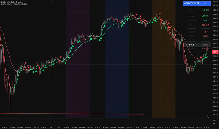
Gold Trend Tracker - TREND TRACKER DG25Gold Trend Tracker - Complete All-In-One Trading System
A professional, institutional-grade trading system specifically optimized for Gold (XAU/USD) that combines multiple technical indicators with session-based filtering and real-time performance tracking. No external indicators required - everything you need is built right in!
🎯 CORE FEATURES
Multi-Layered Confirmation System:
Dynamic EMA trend filter (default 10-period) with color-coded visualization
Optional secondary confirmation EMA (21-period) for stronger validation
3-minute MACD analysis with histogram tracking and direction monitoring
MACD bounce detection for high-probability continuation entries
Built-in Stochastic RSI (K=3, D=3, RSI Length=14, Stochastic Length=14)
Option to connect external Stochastic RSI if preferred
Intelligent Signal Generation:
Clear BUY/SELL triangles plotted directly on price chart
Minimum bars filter to eliminate signal spam and overtrading
Higher timeframe signal overlay (optional) - see 3min signals on 15min chart
Visual Stochastic RSI threshold cross markers (customizable shapes & sizes)
"Show Only First Cross" option to reduce visual clutter
Comprehensive alert system for all signal types
Advanced Session Management:
Pre-configured trading sessions: Asian (1-4am), London (6-9am), NY (12-3pm)
Timezone-aware filtering supporting major financial centers:
Europe/London
America/New_York
America/Chicago
Europe/Paris
Asia/Tokyo
Asia/Dubai
Color-coded session backgrounds (purple/blue/orange)
Individual session toggle switches
24/7 mode for continuous trading (crypto/forex)
Signals only generate during active sessions
Real-Time Performance Tracking:
Live P/L calculation since last signal entry
Customizable lot size for accurate dollar calculations
Pip movement tracking with automatic conversion
Last signal type and duration display
Performance color-coding (green profits, red losses)
Professional Dashboard:
Clean, scalable interface (Small/Medium/Large sizing)
Current time and active session display
Trading status indicator (TRADING/PAUSED/24/7)
Price position relative to Main EMA (ABOVE ↑ / BELOW ↓)
Confirmation EMA status (when enabled)
3-minute MACD color, direction arrow, and bar count
Stochastic RSI value with color-coded status
RSI status: BULLISH/BEARISH/NEUTRAL
Source type indicator (Built-in/External)
Large, clear SIGNAL display: BUY NOW / SELL NOW / WAIT
Performance summary: signal type + price change + dollar value
📊 HOW THE SYSTEM WORKS
BUY Signal Requirements:
✓ Price trading ABOVE main EMA (bullish trend confirmation)
✓ 3-minute MACD crosses above zero OR bounces higher after crossover
✓ Stochastic RSI K-line above bullish threshold (default 50)
✓ Within an active trading session (if session filter enabled)
✓ Confirmation EMA aligned (if secondary EMA enabled)
✓ Minimum bars since last signal met (prevents overtrading)
SELL Signal Requirements:
✓ Price trading BELOW main EMA (bearish trend confirmation)
✓ 3-minute MACD crosses below zero OR bounces lower after crossover
✓ Stochastic RSI K-line below bearish threshold (default 50)
✓ Within an active trading session (if session filter enabled)
✓ Confirmation EMA aligned (if secondary EMA enabled)
✓ Minimum bars since last signal met (prevents overtrading)
Multi-Confirmation Philosophy:
This system requires ALL conditions to align before generating a signal. This drastically reduces false signals and increases win rate by only trading the highest-probability setups where trend, momentum, and volume all confirm direction.
⚙️ BUILT-IN STOCHASTIC RSI
No External Dependencies:
The indicator includes a fully functional Stochastic RSI calculation based on the standard TradingView formula. No need to hunt for compatible indicators or worry about settings mismatches.
Default Settings (Optimized for Gold):
K Smoothing: 3
D Smoothing: 3
RSI Length: 14
Stochastic Length: 14
Bullish Threshold: 50
Bearish Threshold: 50
How It Works:
Calculates RSI on price data
Applies Stochastic formula to RSI values
Smooths result with K-period SMA
Uses K-line (not D-line) for cleaner, faster signals
Compares to your bullish/bearish thresholds
Generates visual cross markers when thresholds breached
Visual Markers:
Multiple shape options: Circle, Diamond, Square, Cross
Four size options: Tiny, Small, Normal, Large
Customizable colors for bullish/bearish crosses
"Show Only First Cross" prevents repetitive markers
Appears below bars (bullish) or above bars (bearish)
Flexibility:
Switch to "External" mode to connect your own Stochastic RSI indicator
Adjust all calculation parameters to match your trading style
Completely disable the filter if you prefer trend + MACD only
🎨 CUSTOMIZATION OPTIONS
Indicators:
Adjust Main EMA length (default 10)
Enable/disable Confirmation EMA (default OFF)
Set Confirmation EMA length (default 21)
Modify MACD parameters (Fast 5, Slow 14, Signal 9)
Enable/disable MACD bounces (default ON)
Set max bounces per trend (1-10, default 2)
Stochastic RSI:
Choose Built-in or External source
Adjust K/D smoothing periods
Modify RSI and Stochastic lengths
Set custom bullish/bearish thresholds
Configure cross marker appearance
Toggle dashboard display
Signals:
Show/hide signal triangles
Set minimum bars between signals (0-50, default 5)
Enable higher timeframe signal overlay
Choose HTF timeframe (e.g., 3min on 15min chart)
Sessions:
Enable/disable session filtering
Select your timezone
Toggle individual sessions (Asian/London/NY)
Customize session start/end hours
Show/hide session background colors
Display:
Choose dashboard size (Small/Medium/Large)
Adjust all visual elements
Customize colors and styling
💡 PRO TRADING TIPS
Session Optimization:
London Session (6-9am): Highest volatility, best for breakout trades
NY Session (12-3pm): Strong trends, ideal for momentum continuation
Avoid Asian Session (1-4am): Lower liquidity, choppier price action
Overlap Period (12-3pm London time): Peak volume, clearest signals
Signal Filtering:
Set 3-5 bars minimum between signals to avoid overtrading
Higher values (7-10 bars) for more conservative, swing-style entries
Lower values (1-3 bars) for aggressive scalping during high volatility
Confirmation EMA Usage:
Enable in choppy/ranging markets for extra validation
Disable during strong trending conditions (adds lag)
Set to 21 for short-term trends, 50 for medium-term
MACD Bounce Strategy:
Bounces occur when MACD histogram changes direction after crossover
Max 2 bounces = optimal (catches first continuation)
Max 1 bounce = conservative (only initial momentum shift)
Max 3-5 bounces = aggressive (catches multiple waves)
Stochastic RSI Thresholds:
50/50 = Balanced (default, works for most conditions)
30/70 = Conservative (fewer but stronger signals)
60/40 = Aggressive (more signals, requires tighter stops)
Adjust based on current market volatility
Risk Management:
Use the performance tracker to trail stops
Exit when dashboard shows opposite signal forming
Monitor MACD direction arrows for momentum shifts
Set profit targets based on average session ranges
🚀 QUICK START GUIDE
For Beginners:
Add indicator to 3-minute Gold (XAU/USD) chart
Leave all default settings (everything is pre-optimized)
Enable London session (6-9am) and NY session (12-3pm)
Set your timezone to your location
Wait for BUY/SELL triangle + "BUY NOW"/"SELL NOW" on dashboard
Enter trade when ALL conditions align
Exit on opposite signal or dashboard status change
For Advanced Traders:
Optimize EMA lengths for your preferred timeframe
Adjust Stochastic RSI thresholds based on backtesting
Fine-tune MACD bounce count for your risk tolerance
Enable Confirmation EMA for extra validation
Use HTF signal overlay for multi-timeframe confluence
Set signal filter to match your trading frequency
Customize session times for your specific market focus
📈 BEST TIMEFRAMES
Primary: 3-minute chart (system is MACD-optimized for 3min)
Alternative: 5-minute, 15-minute (adjust signal filter accordingly)
NOT Recommended: 1-minute (too noisy), 1-hour+ (signals too infrequent)
Chart Setup:
Main Chart: Your preferred timeframe (3min recommended)
MACD: Always references 3-minute data internally
Stochastic RSI: Calculates on current chart timeframe
Session Filter: Works on any timeframe
✅ WHAT MAKES THIS SYSTEM UNIQUE
All-In-One Solution:
✓ No hunting for compatible external indicators
✓ No configuration headaches or version conflicts
✓ One indicator = complete trading system
Session Intelligence:
✓ Only trades during optimal liquidity periods
✓ Automatically pauses during low-volume sessions
✓ Timezone-aware for global traders
Multi-Confirmation:
✓ Trend (EMA) + Momentum (MACD) + Volume (Stochastic RSI)
✓ Drastically reduces false signals
✓ Higher win rate through layered validation
Performance Transparency:
✓ Real-time P/L tracking on every trade
✓ Know your performance immediately
✓ Data-driven decision making
Professional Grade:
✓ Clean, institutional-style dashboard
✓ Customizable for any trading style
✓ Comprehensive alert system
⚠️ IMPORTANT NOTES
This is NOT a "Holy Grail":
No indicator is 100% accurate
Requires proper risk management
Works best during trending conditions
May produce whipsaws in choppy/ranging markets
Risk Disclosure:
Always use stop losses
Never risk more than 1-2% per trade
Past performance doesn't guarantee future results
Practice on demo account first
Optimization:
Default settings are optimized for Gold (XAU/USD)
May require adjustment for other instruments
Backtest on your specific market before live trading
Different session times may work better for your timezone
🔔 ALERTS INCLUDED
BUY Signal Alert
SELL Signal Alert
Stochastic RSI Cross Above Threshold
Stochastic RSI Cross Below Threshold
Alert Setup:
Click "Create Alert" button
Select desired alert condition
Choose notification method (popup/email/SMS/webhook)
Never miss a high-probability setup!
💬 SUPPORT & UPDATES
This indicator is actively maintained and updated based on user feedback. Future updates may include:
Additional timeframe options
More session presets
Enhanced performance analytics
Multi-asset optimization
Tags: Gold Trading, XAU/USD, Trend Following, MACD Strategy, Stochastic RSI, Session Trading, Day Trading, Scalping, London Session, New York Session, EMA System, Multi-Timeframe Analysis, Trading Dashboard, Performance Tracking
EM Levelsstdv levels for you using VIX and VXN for ES and NQ so hopefully it helps you try it out and have fun

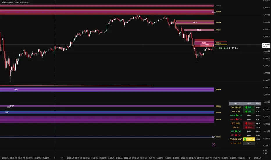
FVG DUAL HTF ALERTS - DG - FVG Dual HTF ALERTS DG - Confluence & Strength
Professional Fair Value Gap (FVG) Trading Indicator with Advanced HTF Analysis
This powerful indicator identifies and tracks Fair Value Gaps across two customizable higher timeframes (HTF), providing traders with precise entry zones, strength ratings, and real-time alerts for high-probability trading setups.
🎯 KEY FEATURES
Dual HTF Analysis
Two independent HTF settings - Analyze FVGs from any timeframe (1min to Daily)
Works on ALL timeframes - View 15min and 60min FVGs on your 1min chart
HTF confluence detection - Automatically highlights when both HTFs align
Customizable colors - Distinct colors for HTF1 and HTF2 zones
Intelligent Strength Scoring (0-10)
Each FVG receives a comprehensive strength rating based on:
Gap size relative to ATR
Volume analysis vs 20-period average
Current timeframe FVG confluence (★ indicator)
Trading session timing (London/NY sessions)
Large gap bonus
HTF confluence bonus
Rating System:
8-10 = 🔥 PREMIUM (Green) - Highest probability setups
5-7 = ✅ GOOD (Yellow) - Quality opportunities
0-4 = ⚠️ WEAK (Gray) - Lower confidence zones
Sweet Spot Inner Boxes
Precision entry zones - 10% inner box (customizable 1-50%)
BUY/SELL labels - Clear directional indicators
Customizable styling - Colors, borders, and text size
Entry optimization - Target the highest probability area within each FVG
Advanced Trading Tools
Automatic Entry/Stop/Target Lines - Up to 3 closest FVGs displayed simultaneously
Risk/Reward calculator - Shows R multiples and dollar values
Customizable position sizing - Micro, mini, or standard lots
Entry offset adjustment - Fine-tune entries ±50 pips from sweet spot center
Smart Fill Detection
HTF candle-based fills - Only checks for fills on HTF candle closes (not every lower TF bar)
Multiple fill methods:
Any Touch - Most sensitive
Midpoint Reached - Balanced
Wick Sweep - Conservative (default)
Body Beyond - Most strict
Touched tracking - Visual feedback when zones are tested
Comprehensive Alert System
8 Individual Alerts:
HTF1: Bullish/Bearish Zone Entry
HTF1: BUY/SELL Sweet Spot Entry
HTF2: Bullish/Bearish Zone Entry
HTF2: BUY/SELL Sweet Spot Entry
4 Combined Alerts:
ANY HTF: Bullish/Bearish Zone Entry
ANY HTF: BUY/SELL Sweet Spot Entry
Plus: Optional alerts for high-strength FVGs (8+)
Information Dashboard
Real-time market context display:
Gold Daily & 1H - Bullish/bearish bias with range in pips
Distance to nearest FVGs - Bull and bear zones
IN ZONE indicator - Shows when price enters sweet spots with strength rating
Optional BTC tracking - Monitor Bitcoin FVGs and bias simultaneously
⚙️ CUSTOMIZATION OPTIONS
Display Settings
Max FVGs to show per type (1-100)
Show only untouched FVGs option
Center line styling (solid/dashed/dotted)
Label visibility and colors
Strength color coding
Trading Parameters
Stop loss (1-100 pips)
Take profit (1-200 pips)
Entry offset adjustment
Lot size (0.01-100)
Dollar value display toggle
Advanced Options
Min strength filter (0-10)
Current TF confluence check
Lookback period (20-200 bars)
Max bars back (1-5000)
Require body close through gap
Test mode: Disable fill removal
💡 IDEAL FOR
Scalpers - 1min/3min charts viewing 5min/15min FVGs
Day Traders - 5min/15min charts viewing 15min/60min FVGs
Swing Traders - 1H/4H charts viewing 4H/Daily FVGs
Gold (XAU/USD) traders - Built-in gold bias indicators
Multi-timeframe analysis - See the bigger picture while trading lower TFs
🎓 HOW TO USE
Add to chart - Works best on 1-5min charts for intraday trading
Set your HTFs - Recommended: 15min + 60min for scalping
Watch for confluence - Green/orange borders indicate HTF alignment
Filter by strength - Focus on 8+ rated zones for best probability
Enter at sweet spots - Wait for price to reach inner boxes
Set alerts - Get notified when price enters high-quality zones
Manage risk - Use provided entry/stop/target lines
📊 BEST PRACTICES
✅ DO:
Focus on 8+ strength FVGs during London/NY sessions
Look for HTF confluence (lime/orange borders)
Wait for sweet spot entries (inner boxes)
Trade in the direction of HTF bias
Use multiple timeframe confirmation
❌ DON'T:
Trade low-strength FVGs (below 5) unless confirmed
Ignore the HTF bias indicators
Chase price - let it come to the zones
Trade without stops
Overtrade - quality over quantity
🔧 TECHNICAL NOTES
Max 500 boxes/lines/labels - Optimized for performance
Lookahead enabled - Accurate HTF data on lower timeframes
No repainting - All signals confirmed on bar close
Compatible with all brokers - Works on any instrument with FVGs
Mobile friendly - Clean display on all devices
📈 PERFORMANCE TIPS
For best results on lower timeframes (1min/3min):
Set "Max Bars Back" to 2000-3000
Set "Max FVGs Per Type" to 20-50
Use "Body Beyond" fill method for longer zone visibility
Enable "Check Current TF FVGs" for additional confluence
🎨 COLOR RECOMMENDATIONS
HTF1 (15min):
Bull: Blue (#2962FF80)
Bear: Red (#f2364580)
HTF2 (60min):
Bull: Purple (#9C27B080)
Bear: Light Red (#FF6B6B80)
Confluence:
Bull: Green (#00FF0060)
Bear: Orange (#FF6B0060)
💬 SUPPORT
Created by DJG9911
For questions, feature requests, or bug reports, please use the TradingView comments section.
Version: 6.0
License: Mozilla Public License 2.0
Last Updated: December 2024
Disclaimer: This indicator is for educational and informational purposes only. Always practice proper risk management and never risk more than you can afford to lose. Past performance does not guarantee future results.
GC1! H1 Stats+GC1! H1 Stats - Detailed Prob & Excursion Indicator
Overview
GC1! H1 Stats - Detailed Prob & Excursion is a specialized statistical overlay indicator for TradingView, tailored for Gold futures (GC1!) on a 1-hour framework. It provides real-time insights into the probability of price returning to the hourly open after sweeping the previous hour’s high (PHH) or previous hour’s low (PHL), based on historical data segmented by hour (0–23) and 20-minute intervals. The indicator visualizes these sweeps with lines, labels, circles, background fills, and “excursion zones” (also called “Magic Boxes”) that highlight median/mean extensions post-sweep, along with percentile lines (75th / 90th / 95th) for gauging potential “pain” or extreme moves. This tool is designed for intraday Gold traders focusing on liquidity sweeps and mean-reversion behavior, helping to quantify edge using empirical probabilities and excursion statistics.
The data is hardcoded from extensive historical analysis of GC1! behavior (e.g., probabilities ranging roughly from ~7% to ~91%, with sample sizes up to 2000+ per segment), making it a backtested reference rather than a dynamic learning model. It emphasizes visual clarity during active hours, with options to filter for Regular Trading Hours (RTH: 09:00–15:59 ET) or high-probability (>70%) events only. Note: This is an educational tool for analyzing market structure; it does not predict future performance or provide trading signals/advice. Past data does not guarantee future results, and users should backtest on current conditions (as of December 2025 data availability) and use at their own risk, in compliance with TradingView’s house rules.
________________________________________
Key Features
• Sweep Detection & Probability Labels: Identifies when price breaks PHH (upside) or PHL (downside), displaying a centered label with probability of returning to the hourly open, sample size (N), time of sweep, and a checkmark (✅) if the open is retested post-sweep.
• Visual Lines & Markers: Draws hourly open (h.o.), PHH, and PHL lines with customizable styles/colors; adds small circles on sweep bars for quick spotting.
• Breakout→Open Background Fill: Shaded zone from sweep bar until price returns to open, visualizing extension duration and retracement.
• Excursion (Pain) Zone - “Magic Box”: Post-sweep box showing median/mean extension percentages, colored dynamically by probability (green high, orange mid, red low); includes dashed lines for 75th/90th/95th percentiles to mark statistical extremes.
• Time-Segmented Data: Probabilities and excursions vary by hour (0–23) and 20-min segments (0–19 min: _0, 20–39: _1, 40–59: _2), capturing intraday nuances (e.g., higher probs in early/late hours).
• Filters for Focus: RTH-only mode hides non-session elements; high-prob-only shows >70% events to reduce noise.
• Alerts: Triggers on PHH/PHL sweeps with messages for chart checks.
________________________________________
How It Works
• Data Foundation: Uses pre-computed maps for probabilities (prob_high_taken/prob_low_taken), sample sizes, and excursions (mean, median, p75/p90/p95 as percentages of open). Data is initialized on the first bar via f_init_high_data() and f_init_low_data(), covering 24 hours with 3 segments each (e.g., key "9_1" for 09:20–09:39). Probabilities represent historical likelihood of price returning to open after sweep; excursions quantify average/rare extensions (e.g., 0.156% mean = 0.156% of open price).
• Period Detection: On new 1H bars (new_period_bar), resets visuals, draws lines for open/PHH/PHL extending 1 hour forward, and labels if enabled. Uses request.security on standard ticker for real OHLC, bypassing chart transformations (e.g., Heikin Ashi).
• Sweep Logic: On each bar, checks if real high > PHH or real low < PHL. If so, fetches segment-specific data (hour + floor(minute/20)), displays probability label centered mid-hour. Skips if filtered (RTH-only or <70% prob).
• Excursion Visualization: If enabled, draws “Magic Box” from 1-min to 58-min into the hour, bounded by mean/median levels (top/bottom adjusted for high/low sweep). Adds percentile lines with labels (e.g., “75%”) at right end. Box color reflects prob strength for quick bias assessment.
• Retest Check: Monitors for open retest post-sweep (high/low cross open, or gap scenarios from prev bar). Adds ✅ to label if hit on subsequent bars (skips sweep bar to avoid false positives). Stops background fill on retest or at 58-min mark.
• Background Fill: Activates on sweep, shades until retest, using user color.
• Cleanup & Performance: Manages labels in arrays, clears on new periods; no excess drawing beyond max counts (500 lines/labels/boxes).
This setup blends statistical backtesting with real-time visualization: hardcoded data provides empirical probabilities/excursions (reducing subjectivity in breakouts), while dynamic elements (lines, fills, boxes) overlay structure on the chart. It helps Gold traders assess if a sweep is “high-edge” (e.g., >70% probability of reverting) or likely to run (low probability, high excursion), pairing historical context with current price action.
________________________________________
Settings and Customization
Inputs are grouped for ease:
1. Settings:
o Show RTH Only (9:00–15:59): Restricts to main session (default: false; tooltip: for RTH-focused stats).
o Show High Prob Only (>70%): Filters low-prob sweeps visually (default: false; tooltip: highlights confidence).
2. Visuals:
o Show Line Labels: Toggle “h.o.” / “phh” / “phl” (default: true).
o Period Open Line Color: Gray 50% (default).
o Previous High/Low Line Colors: Gray 100% (default).
o Open Line Style/Width: Dotted/1 (default; options: Solid/Dotted/Dashed).
3. Breakout→Open Background:
o Show Breakout→Open Background: Toggle fill (default: true).
o Fill Color: Teal 85% (default).
4. Breakout Circles:
o Show Breakout Circles: Toggle (default: true).
o PHH/PHL Break Circle Colors: White 20% (default).
5. Info Label Style:
o Text Size: Small (default; options: Auto/Tiny/Normal/Large/Huge).
o Label Text Color: White (default).
o Low/Mid/High Probability Colors: Red 20% / Orange 20% / Green 20% (default).
6. Excursion (Pain) Zone:
o Show Excursion Zone: Toggle Magic Box (default: true).
o Excursion Box Color: Gray 75% (default; dynamic overrides).
o 75th/90th/95th Percentile Lines: Orange 30% / Red 30% / Dark Red 100% (default).
No additional tables/plots; all elements are lines/labels/boxes for overlay focus.
________________________________________
Usage Tips
• Breakout Trading: Watch for sweeps with high probability (>70%, green label) as potential fades back to open; low probability (red) may signal runs—use the excursion box for targets (e.g., exit at 90th percentile for extremes).
• Time Awareness: Probabilities often peak in key liquidity windows and drop in quieter hours; segments capture momentum shifts (e.g., _2 often lower prob).
• RTH Focus: Enable for cleaner stats during high-liquidity session hours; disable for a 24-hour view.
• Visual Filtering: Use high-prob-only in volatile conditions to reduce noise; combine with volume or other confluence tools for confirmation.
• Alerts Integration: Set TradingView alerts on sweeps; check label for probability/N before acting.
• Chart Setup: Best on 1H or lower GC1! charts; adjust text size for readability on smaller screens.
• Backtesting: Manually review historical sweeps against data maps to validate; update hardcoded values if new data emerges (as of 2025).
________________________________________
Limitations
• Fixed Data: Hardcoded stats may not reflect recent market changes (e.g., post-2025 regime shifts); not adaptive.
• Reactive Only: Detects sweeps after they occur; no predictive signals.
• Timeframe Specific: Locked to 1H logic; may not translate to other assets/timeframes without recoding data.
• Visual Clutter: On busy charts, labels/boxes may overlap—toggle selectively.
• No Live Stats: Sample sizes are historical; real-time N/prob not updated.
• Gaps & Extremes: Handles gaps in retest logic, but rare events (e.g., macro news) may exceed the 95th percentile.
________________________________________
Disclaimer
This indicator is for informational and educational purposes only. Trading involves significant risk of loss and is not suitable for all investors. The hardcoded data represents past Gold futures (GC1!) performance and does not guarantee future outcomes. No claims of profitability are made—results depend on market conditions, user strategy, and risk management. Consult a financial advisor before trading, and backtest extensively. Abiding by TradingView rules, this tool provides no investment recommendations.

True Three Soldiers Method (TTSM) - Breakout ConfirmationIndicator Overview
True Three Soldiers Method (TTSM) - Made in China is a quantifiable evolution beyond traditional candlestick pattern recognition. It replaces subjective visual analysis with an objective, data-driven momentum system featuring smart breakout confirmation.
Core Innovation: Beyond Traditional Pattern Recognition
Traditional three-soldier patterns merely check for three consecutive bullish/bearish candles. TTSM goes much deeper:
Dual Signal System: It identifies both single-candle and three-candle momentum signals, providing earlier warnings of potential trend changes.
Quantifiable Strength Metrics: Each signal must meet customizable thresholds for both absolute price movement (percentage change) and relative efficiency (close-to-open distance relative to total range).
Breakout Confirmation Logic: The real innovation lies in the "True Signal" mechanism. Preliminary signals are tracked, and only when price breaks above the highest high of recent bullish signals (or below the lowest low of recent bearish signals) does it trigger a confirmed entry signal. This eliminates false breakouts and ensures you're trading with confirmed momentum.
Absolute Strength: Quantifies momentum via percentage price change.
Relative Strength: Measures candlestick efficiency (close-to-open vs. total range).
True Signal Validation: A "True" entry signal triggers only after price confirms momentum by breaking above/below a cluster of recent preliminary signals, filtering out false moves.
Dual-Layer Signal System
Key Features
🔴 Amber Signals (Preparation): Single-candle or three-candle patterns that meet strength criteria. These indicate potential momentum building and can be used for preparation or light positioning.
🟢 Green Signals (True Breakout): Triggered only when price breaks above/below the recent signal cluster extremes. These represent confirmed momentum and are ideal for main entries.
🎚 Fully Customizable: Every parameter—absolute/relative strength thresholds, lookback periods, and average calculations—can be adjusted to match your trading style and market conditions.
📊 Clear Visual Feedback: Color-coded labels and reference lines make signal identification instant and intuitive.
Parameter Customization Guide
All parameters are organized in intuitive groups:
Strength Thresholds: Adjust absolute (%) and relative (%) strength requirements for both long and short signals.
First Signal Thresholds: Special thresholds for when a signal is the first in the lookback period.
Lookback & Averages: Control how many bars are considered for signal tracking and moving averages.
Strategic Application
Preparation Signals: Use amber signals to prepare for potential moves, set alerts, or enter with smaller positions.
True Signals: Green/red "True" signals indicate confirmed momentum—ideal for main entries with proper risk management.
Combination Strategy: Pair TTSM with trend indicators (like Supertrend) for higher probability trades—only take True Signals in the direction of the main trend.

SectorRotationRadar ProThe Sector Rotation Radar is a powerful visual analysis tool designed to track the relative strength and momentum of a stock compared to a benchmark index and its associated sector ETF. It helps traders and investors identify where an asset stands within the broader market cycle and spot rotation patterns across sectors and timeframes.
🔧 Key Features:
Benchmark Comparison: Measures the relative performance (strength and momentum) of the current symbol against a chosen benchmark (default: SPX), highlighting over- or underperformance.
Automatic Sector Detection: Automatically links stocks to their relevant sector ETFs (e.g., XLK, XLF, XLU), based on an extensive internal symbol map.
Multi-Timeframe Analysis: Supports simultaneous comparison across the current, next, and even third-higher timeframes (e.g., Daily → Weekly → Monthly), providing a bigger-picture perspective of trend shifts.
Tail Visualization: Displays a "trail" of price behavior over time, visualizing how the asset has moved in terms of relative strength and momentum across a user-defined period.
Quadrant-Based Layout: The chart is divided into four dynamic main zones, each representing a phase in the strength/momentum cycle:
🔄 Improving: Gaining strength and momentum
🚀 Leading: High strength and high momentum — top performers
💤 Weakening: Losing momentum while still strong
🐢 Lagging: Low strength and low momentum — underperformers
Clean Chart Visualization:
Background grid with axis labels
Dynamic tails and data points for each symbol
Option to include the associated sector ETF for context
Descriptive labels showing exact strength/momentum values per point
⚙️ Customization Options:
Benchmark Selector: Choose any symbol to compare against (e.g., SPX, Nasdaq, custom index)
Start Date Control: Option to fix a historical start point or use the current data range
Trail Length: Set the number of previous data points to display
Additional Timeframes: Enable analysis of one or two higher timeframes beyond the current
Sector ETF Display: Toggle to show or hide the related sector ETF alongside the asset
📚 Technical Architecture:
The indicator relies on external modules for:
Statistical modeling
Relative strength and momentum calculations
Chart rendering and label drawing
These components work together to compute and display a dynamic, real-time map of asset performance over time.
🧠 Use Case:
Sector Rotation Radar is ideal for traders looking to:
Spot stocks or sectors rotating into strength or weakness
Confirm alignment across multiple timeframes
Identify sector leaders and laggards
Understand how a symbol is positioned relative to the broader market and its peers
This tool is especially valuable for swing traders, sector rotation strategies, and macro-aware investors who want a visual edge in decision-making.

Bullish Structure (PAID) by @Crypto_alphabitTVC:GOLD
This script is for bullish structure........
___________________________________
to confirm the bullish structure , the price has to confirm the second higher low to confirm the uptrend ( ⬜️ The key level ) then the other levels will be automatic calculated with mathematic formula .
This indicator contains some important levels as below ....
__________________________________________________
🟥Stop Loss / lowest point
This level is the lowest point or 0 level & you can consider it as Stop Loss
🟫Strong support(0)
This level is very strong support and the price may not come back to that price after making the key level
⬜️The key Level
This level is the second higher low so the bullish structure confirmed for uptrend
🟪accumulation level(1) , 🟪accumulation level(2) , 🟪accumulation level(3)
The price is slowly moving between the 3 accumulation levels but if the price crossed the 3 levels with momentum , means we are in a very strong uptrend
🟫Strong Support(1) , 🟫Strong Support(2)
Those 2 levels are very strong support and strong resistance in the same time
⬜️Resistance
This level is very important as if the price closed above it so it is high probability that the price will go to the safe Exit
🟩Safe Exit
This is safest exit
🟨Golden Exit
This level is the golden exit if the price reached
🟦Extra Exit(1) , 🟦Extra Exit(2) , 🟦Extra Exit(3)
The price may or may not reach the 3 extra exit levels , it depends on the chart analysis, Gaps and momentum .
🟦Final Exit
This is the final target for that wave
In this indicator you can change some inputs to make it perfect as below ....
__________________________________________________
* Lookback Period for High/Low
* Line Width
* Show/ Hide Price Labels
* Label Size
* Extend Drawing for X Bars
* Swing Sensitivity ( Very important)
*** To confirm the bullish momentum you can add MACD indicator as a helper ***
*** To confirm the targets you can match the targets with Gaps ***
________________________________________________________________
This script is by @Crypto_alphabit

BTC - ALSI: Altcoin Season Index (Dynamic Eras)Title: BTC - ALSI: Altcoin Season Index (Dynamic Eras)
Overview & Philosophy
The Altcoin Season Index (ALSI) is a quantitative tool designed to answer the most critical question in crypto capital rotation: "Is it time to hold Bitcoin, or is it time to take risks on Altcoins?"
Most "Altseason" indicators suffer from Survivor Bias or Obsolescence. They either track a static list of coins that includes "dead" assets from previous cycles (ghosts of 2017), or they break completely when major tokens collapse (like LUNA or FTT).
This indicator solves this by using a Time-Varying Basket. The indicator automatically adjusts its reference list of Top 20 coins based on historical eras. This ensures the index tracks the winners of the moment—capturing the DeFi summer of 2020, the NFT craze of 2021, and the AI/Meme narratives of 2024/2025.
Methodology
The indicator calculates the percentage of the Top 20 Altcoins that are outperforming Bitcoin over a rolling window (Default: 90 Days).
The "Win" Count: For every major Altcoin performing better than BTC, the index adds a point.
Dynamic Eras: The basket of coins changes depending on the date:
2020 Era (DeFi Summer): Tracks the "Blue Chips" of the DeFi revolution like UNI, LINK, DOT, and early movers like VET and FIL.
2021 Era (Layer 1 Wars): Tracks the explosion of alternative smart contract platforms, adding winners like SOL, AVAX, MATIC, and ALGO.
2022 Era (The Survivors): Filters for resilience during the Bear Market, solidifying the status of established assets like SHIB and ATOM.
2023 Era (Infrastructure & Scale): Captures the rise of "Next-Gen" tech leading into the pre-halving year, introducing TON, APT (Aptos), and ARB (Arbitrum).
2024/25 Era (AI & Speed): Tracks the current Super-Cycle leaders, focusing on the AI narrative (TAO, RNDR), High-Performance L1s (SUI), and modern Memes (PEPE).
Chart Analysis & Strategy ( The "Alpha" )
As seen in the chart above, there is a strong correlation between ALSI Peaks and local tops in TOTAL3 (The Crypto Market Cap excluding BTC & ETH).
The Entry (Rotation): When the indicator rises above the neutral 50 line, it signals that capital is beginning to rotate out of Bitcoin and into Altcoins. This has historically been a strong confirmation signal to increase exposure to high-beta assets.
The Exit (Saturation): When the indicator hits 100 (or sustains in the Red Zone > 75), it means every single Altcoin is beating Bitcoin. Historically, this extreme exuberance often marks a local top in the TOTAL3 chart. This is the zone where smart money typically sells into strength, rather than opening new positions.
How to Read the Visuals
🚀 Altcoin Season (Red Zone > 75): Strong Altcoin dominance. The market is "Risk On."
🛡️ Bitcoin Season (Blue Zone < 25): Bitcoin dominance. Alts are bleeding against BTC. Historically, this is a defensive zone to hold BTC or Stablecoins.
Data Dashboard: A status table in the bottom-right corner displays the live Index Value, current Regime, and a System Check to ensure all 20 data feeds are active.
Settings
Lookback Period: Default 90 Days. Lowering this (e.g., to 30) makes the index faster but noisier.
Thresholds: Adjustable zones for Altcoin Season (Default: 75) and Bitcoin Season (Default: 25).
Credits & Attribution
This open-source indicator is built on the shoulders of giants. I acknowledge the original creators of the concept and the pioneers of its implementation on TradingView:
Original Concept: BlockchainCenter.net. - They established the industry standard definition: 75% of the Top 50 coins outperforming Bitcoin over 90 days = Altseason..
TradingView Implementation: Adam_Nguyen - He implemented the "Dynamic Era" logic (updating the coin list annually) on TradingView. Our code structure for the time-based switching is inspired by his methodology. See also his implementation in the chart. ( Altcoin Season Index - Adam) .
Comparison: Why use ALSI | RM?
While inspired by the above, ALSI introduces three key improvements:
Open Source: Unlike other popular TradingView versions (which are closed-source), this script is fully transparent. You can see exactly which coins are triggering the signal.
Sanitized History (Anti-Fragile): Historical Top 20 snapshots are not blindly used. "Dead" coins (like LUNA and FTT) from previous eras are manually filtered out. A raw index would crash during the Terra/FTX collapses, giving a false "Bitcoin Season" signal purely due to bad actors. The curated list preserves the integrity of the market structure signal.
Narrative Relevance: The 2024/25 basket was updated to include TAO (Bittensor) and RNDR, ensuring the index captures the dominant AI narrative, rather than tracking fading assets from the previous cycle.
You can compare the ALSI indicator with other available tradingview indicators in the chart: Different indicators for the same idea are shown in the 3 Pane window below the BTC and Total3 chart, whereas ALSI is the top pane indicator.
Important Note on Coin Selection Baskets are highly curated: Dead/irrelevant coins (FTT, LUNA, BSV) are excluded for clean signals. This prevents historical breaks and ensures Era T5 captures current narratives (AI, Memes) via TAO/RNDR. See above. Users are free to adjust the source code to test their own baskets.
Disclaimer
This script is for research and educational purposes only. Past correlations between ALSI and TOTAL3 do not guarantee future results. Market regimes can change, and "Altseasons" can be cut short by macro events.
Tags
bitcoin, btc, altseason, dominance, total3, rotation, cycle, index, alsi, Rob Maths

Bollinger Bands Forecast with Signals (Zeiierman)█ Overview
Bollinger Bands Forecast with Signals (Zeiierman) extends classic Bollinger Bands into a forward-looking framework. Instead of only showing where volatility has been, it projects where the basis (midline) and band width are likely to drift next, based on recent trend and volatility behavior.
The projection is built from the measured slopes of the Bollinger basis, the standard deviation (or ATR, depending on the mode), and a volatility “breathing” component. On top of that, the script includes an optional projected price path that can be blended with a deterministic random walk, plus rejection signals to highlight failed band breaks.
█ How It Works
⚪ Bollinger Core
The script first computes standard Bollinger Bands using the selected Source, Length, and Multiplier:
Basis = SMA(Source, Length)
Band width = Multiplier × StDev(Source, Length)
Upper/Lower = Basis ± Width
This remains the “live” (non-forecast) structure on the chart.
⚪ Trend & Volatility Slope Estimation
To project forward, the indicator measures directional drift and volatility drift using linear regression differences:
Basis slope from the Bollinger basis
StDev slope from the Bollinger deviation
ATR slope for ATR-based projection mode
These slopes drive the forecast bands forward, reflecting the market’s recent directional and volatility regime.
⚪ Projection Engine (Forecast Bands)
At the last bar, the indicator draws projected basis, upper, and lower lines out to Forecast Bars. The projected basis can be:
Trend (straight linear projection)
Curved (ease-in/out transition toward projected endpoints)
Smoothed (extra smoothing on projected basis/width)
⚪ Price Path Projection + Optional Random Walk
In addition to projecting the bands, the script can draw a price forecast path made of a small number of zigzag swings.
Each swing targets a point offset from the projected basis by a multiple of the projected half-width (“width units”).
Decay gradually reduces swing size as the forecast deepens.
The Optional Random Walk Blend adds a deterministic drift component to the zigzag path. It’s not true randomness; it’s a stable pseudo-random sequence, so the drawing doesn’t jump around on refresh, while still adding “natural” variation.
⚪ Rejection Signals
Signals are based on failed attempts to break a band:
Bear Signal (Down): price tries to push above the upper band, then falls back inside, while still closing above the basis.
Bull Signal (Up): price tries to push below the lower band, then returns back inside, while still closing below the basis.
█ How to Use
⚪ Forward Support/Resistance Corridors
Treat the projected upper/lower bands as a future volatility envelope, not a guarantee:
The upper projection ≈ is likely a resistance level if the regime persists
The lower projection ≈ is likely a support level if the regime persists
Best used for trade planning, targets, and “where price could travel” under similar conditions.
⚪ Regime Read: Trend + Volatility
The projection shape is informative:
Rising basis + expanding width → trend with increasing volatility (needs wider stops / more caution)
Flat basis + compressing width → contraction regime (often precedes expansion)
⚪ Signals for Mean-Reversion / Failed Breakouts
The rejection markers are useful for fade-style setups:
A Down signal near/after upper-band failure can imply rotation back toward the basis.
An Up signal near/after lower-band failure can imply snap-back toward the basis.
With MA filtering enabled, signals are constrained to align with the broader bias, helping reduce chop-driven noise.
█ Related Publications
Donchian Predictive Channel (Zeiierman)
█ Settings
⚪ Bollinger Band
Controls the live Bollinger Bands on the chart.
Source – Price used for calculations.
Length – Lookback period; higher = smoother, lower = more reactive.
Multiplier – Bandwidth; higher = wider bands, lower = tighter bands.
⚪ Forecast
Controls the forward projection of the Bollinger Bands.
Forecast Bars – How far into the future the bands are projected.
Trend Length – Lookback used to estimate trend and volatility slopes.
Forecast Band Mode – Defines projection behavior (linear, curved, breathing, ATR-based, or smoothed).
⚪ Price Forecast
Controls the projected price path inside the bands.
ZigZag Swings – Number of projected oscillations.
Amplitude – Distance from basis, measured in bandwidth units.
Decay – Shrinks swings further into the forecast.
⚪ Random-Walk
Adds controlled randomness to the price path.
Enable – Toggle random-walk influence.
Blend – Strength of randomness vs. zigzag.
Step Size – Size of random steps (band-width units).
Decay – Reduces randomness as the forecast deepens.
Seed – Changes the (stable) random sequence.
⚪ Signals
Controls rejection/mean-reversion signals.
Show Signals – Enable/disable signal markers.
MA Filter (Type/Length) – Filters signals by trend direction.
-----------------
Disclaimer
The content provided in my scripts, indicators, ideas, algorithms, and systems is for educational and informational purposes only. It does not constitute financial advice, investment recommendations, or a solicitation to buy or sell any financial instruments. I will not accept liability for any loss or damage, including without limitation any loss of profit, which may arise directly or indirectly from the use of or reliance on such information.
All investments involve risk, and the past performance of a security, industry, sector, market, financial product, trading strategy, backtest, or individual's trading does not guarantee future results or returns. Investors are fully responsible for any investment decisions they make. Such decisions should be based solely on an evaluation of their financial circumstances, investment objectives, risk tolerance, and liquidity needs.

Chartology Strategy+🔍 Chartology Strategy+
This tool provides a comprehensive way for users to analyze trend levels and access other Matrix features across selected tickers and timeframes. Results can be tailored by strategy, with the option to filter displayed tickers based on custom user‑defined rules.
Bullish & Bearish Entry Signal (Safe & Scalping).
Entry Level, SL, T-SL & Two TP Levels (Based on Possible Movement).
Dashboard Table for Easy Presentation of All Levels.
Timeframe Scanner for Current Signal (Trend) on Different Timeframes.
Gap Up & Gap Down for Untraded Price Marking.
Institutional Candles for High Volume and Big Price Movement.
Neutral Candle for Low Volume and Small Price Movement.
Supply Demand (Based on Swing High & Low).
Mega Trend Band (Based on HMA) for Overall Trend.
🟢 Bullish & Bearish Entry Signals
Shows the expected direction of the symbol. It shows Bullish and Bearish direction mark on Chart. Entry Level is Closing of the Candle.
Input Settings
Signal Type: Safe
Appears after a proper trend confirmation.
Low frequency, fewer signals, but more reliable.
Best for swing traders who want strong confirmation before entering.
Signal Type: Scalping
Appears frequently during small downward moves.
High frequency, quick signals for short-term trades.
Best for intraday
Traders who want multiple opportunities in small movements.
🎯 Entry Level, SL, T-SL & TP Levels
Generated based on price movement and trend range.
Levels on Chart
Entry Level: Closing price of the candle where the signal appears.
SL (Stop Loss): Maximum risk allowed for the trade.
TSL (Trailing SL): Dynamic SL to reduce risk and lock profits.
Level 01: First TP level with 1:1 risk-reward ratio. Used for partial booking.
Level 02: Final TP level for full exit.
Input Settings
Levels: You can Increase or Decrease Level Amount for the Level 2.
Risk: You can Increase or Decrease Stop Loss (SL).
📊 Dashboard Table for Easy Presentation of All Levels.
Displays all key levels and metrics in one place:
Metrics
Symbol Name Shows the name of the current chart (e.g., NIFTY, BANKNIFTY).
Bar Age Displays the How many candles (Bars) before Latest signal appears.
Entry Shows the entry level where the latest bullish or bearish signal was generated.
Level 1 (TP1) First target level, based on 1:1 risk-reward ratio. Used for partial booking to secure profits.
Level 2 (TP2) Final target level where you can exit the remaining position.
SL (Stop Loss) Shows the maximum risk limit for the trade. Helps you control losses.
MTM (Mark to Market) Shows the difference between CMP and Entry Level. Helps track how far price has moved since entry.
P&L (Profit & Loss) Shows the difference between Entry and Target Level achieved. Helps measure actual gain or loss.
Date & Time Displays when the latest bullish or bearish signal was generated. Helps check how old or fresh the signal is.
Timeframe Scanner or Current Signal (Trend) on Different Timeframes. Shows the current signal across multiple timeframes.
Row 1 Fixed signals for 1M and 3M.
Row 2 Any 2 Custom Timeframes chosen in input settings.
Traders use this to confirm signals across different timeframes before entering trades. Example If the Day trend is bullish but the 15M chart shows bearish, many traders avoid that trade.
🚦 Gap Up & Gap Down for Untraded Price Marking.
Marks untraded price zones where price may react.
Gap Up & Down Flag Mark
Gap Up: Bullish Bias, Marked Green flag, plotted when candle opens above previous high.
Gap Down: Bearish Bias, Marked as Red flag, plotted when candle opens below previous low.
Input Settings
Enable / Disable from Chart
Threshold: Minimum gap size Threshold to detect
🟡 Institutional Candles for High Volume and Big Price Movement
Indicate strong price movement with high volume.
Marking
Displayed as Yellow Body Candles
Helps identify zones where big players are active.
Input Settings
Enable / Disable from Chart
Body %: Compare of Open & Close with High & Low
Size %: Compare Total Candle Size from Past Range
Volume %: Compare Total Candle Volume from Past Range
⚪ Neutral Candle for Low Volume and Small Price Movement
Shows low volume and minimal price movement.
Marking
Displayed as Hollow Body Candles
Traders usually avoid trading during these candles.
Input Settings
Enable / Disable from Chart.
Candle %: Compare Size of candles.
Volume %: Compare Volume of Candles from Previous Range.
🟥🟩 Supply Demand Zones (Based on Swing High & Low).
Based on swing highs and lows to identify possible reversals.
Zones
🟥Supply Zone: Near swing high, marked with Light Red Zone.
🟩Demand Zone: Near swing low, marked with Light Green Zone.
Input Settings:
Bars Left: How many past Bars Swing will Calculate.
Bars Right: After How many Bars, Zone will plot.
Max Zones: Number of Supply or Demand Zone want to plot on Chart
Delete Breaked Zones: Want to see Disappeared Zone, Uncheck it.
Extend Right: Want to see till End of the Chart, Uncheck it.
📈 Mega Trend Band (Based on HMA) for Overall Trend
Based on HMA (Hull Moving Average) to show overall trend and Help in Filters out trades against the main trend.
Working
Price above band → Bullish trend
Price below band → Bearish trend
Input Setting
Enable / Disable from Chart
HMA Period Setting: 45
👓 How to Use All together for Better Confidence.
🔍Watch for the New Entry icon on the chart.
Find New Signals with help of Automated Alerts.
Check Entry Level, SL, Level 1 and Level 2 (TP2).
Verify Date & Time → how fresh the signal is. Signal not too old.
🧭 Signal is not Self Sufficient for Good Accuracy. So, we suggest a few rules.
Cross‑Check Current Signal with Timeframe Scanner. Trade only when smaller timeframe aligns with bigger trend. (e.g., If Day = Bullish ▲ but 15M = Bearish ▼, avoid entry. Trend may not be stronger.)
Validate with Market Context of Gap. (e.g., If new signal came on Gap Up / Gap Down, avoid entry. Price may reverse.)
Zone Awareness Use Supply Demand zones to refine entries/exits and avoid false signals. (e.g., Entry: If any zone is available between Entry and Level 01, Avoid trade until Zone breaked, Exit: If Zone create between the trade, modify SL according to T-SL and wait.
Trend Filter of overall direction. (e.g., If Mega Trend Band Bullish and Trend is Bearish, Avoid the Trade.)
🕵🏻 Quick Checklist Before Trade
Bullish or Bearish signal?
Dashboard Table shows fresh entry?
SL defined and acceptable risk?
Timeframe Scanner aligned?
No Neutral candle interference?
Institutional candle or Gap supports move?
Supply/Demand zone not against trade?
✅ All Okay - Go for the ENTRY
Set a Proper Entry Point
Always respect SL, Good Trader Never avoid it.
Book partial profits at Level 1, It secure your Trade.
Keep Modifying your SL, According to T-SL Level.
On Level 2, Exit remaining All position for full profit.
📊 Healthy Trading Tips
Risk Small: Never risk more than 1–2% per trade.
Size Smart: Adjust position size to volatility and account size.
Diversify: Don’t put all money in one asset/sector.
Plan Ahead: Set entry, exit, and stop‑loss before trading.
Trade Less: Focus on quality setups, avoid overtrading.
Use Both Analyses: Combine technical charts with fundamental news/events.
Control Emotions: Stick to strategy, avoid fear/greed.
Journal Trades: Record reasons, outcomes, and lessons.
Stay Informed: Track economic calendars and global events.
Take Breaks: Step away after wins/losses to reset.
🎯 Advanced Discipline
Partial Exit: Book profits in stages (e.g., 50% at 1:1, 50% at Final Level).
Check News: Avoid trading during major announcements.
No Tweaks: Don’t change plan mid‑trade; wait for SL/TP.
Fixed Rules: Trade with fixed risk, fixed gains.
No Averaging Losses: Close bad trades, don’t add more.
Keep Learning: Evolve strategy with market changes.
Believe: Trust your plan and process.
Backtest: Practice setups until they’re second nature.
Daily Routine: Pre‑market Preparation, post‑market review.
Optimize Setup: Clean workspace, fast platform, no distractions.
Track Metrics: Win rate, average reward, expectancy, time of day, setup performance.
Trader Identity: Follow rules; money is a byproduct.
Liquidity Check: Avoid low‑volume instruments.
Respect Trend: Trade with momentum, not against it.
Avoid Over‑Leverage: Keep leverage low, avoid margin unless planned.
Risk Disclaimer
This content, including any tools, software, datafeeds, indicators, or scanners, is provided strictly for charting, educational, informational, and paper‑trading purposes only. It does not constitute investment advice, buy/sell recommendations, or real‑money trading strategies.
Not Advisors: We are not registered as investment advisors or research analysts.
Charting Only: Use is limited to testing strategies and evaluation; any application to real trading is at the user’s sole risk.
No Liability: No liability is accepted for financial loss, trading loss, or damages arising from use of the tools or data.
Data Limitations: Market data may be delayed, inaccurate, or incomplete. Past or hypothetical performance is not indicative of future results.
Signals Disclaimer: Automated signals are for evaluation only and should not be treated as accurate or real trading instructions.
High Risk: Trading and investing involve substantial risk and can result in losses beyond the initial capital.
Independent Judgment: Users must exercise independent judgment and consult licensed professionals before making financial decisions
⚠️ Final Note: Trading is speculative and may not be suitable for all investors. Use only risk capital and never invest money you cannot afford to lose.
✅ Always remember🧠 my 3R Rule💡: If the money💰 is yours then, RISK⚖️, REWARD🏆 and REGRET😔 are solely yours. 🔥

RRG 1 stockThis Pine Script combines Relative Rotation Graph (RRG) analysis with Supertrend-based trend confirmation to identify momentum shifts and potential trade entries in a single stock relative to a benchmark (e.g., NIFTY). Here’s a detailed description you can use:
Description – RRG + Supertrend Indicator (1 Stock)
The RRG 1 Stock indicator blends relative strength analysis with trend-following confirmation to help traders pinpoint when a stock is outperforming or underperforming its benchmark and to align entries with trend direction.
Core logic:
Benchmark-relative strength (RS-Ratio and RS-Momentum):
Calculates relative strength (RS) of the selected stock versus a benchmark (default: NIFTY).
Applies double smoothed Weighted Moving Averages (WMA) to derive normalized RS-Ratio and RS-Momentum, similar to Julius de Kempenaer’s RRG framework.
Classifies each bar into one of four RRG quadrants:
Leading – strong and improving relative performance
Weakening – losing momentum after leadership
Lagging – underperforming the benchmark
Improving – rebounding from underperformance
The chart background color dynamically reflects the current quadrant.
Supertrend filters (Trend confirmation):
Uses two Supertrend overlays with different multipliers (Factor1, Factor2) to judge trend strength.
Potential long setups occur when the stock is in the Leading quadrant and price is above both Supertrends.
Potential short setups occur when in the Lagging quadrant and price lies below both Supertrends.
Velocity and momentum signals:
Measures RRG “velocity” — the speed of movement across the RS-Ratio/RS-Momentum plane.
Flags unusually strong rotations (high velocity) with a diamond marker when momentum accelerates.
Statistical bands & entry modes:
Standard-deviation bands on RS-Ratio (±2σ by default) can be used for mean-reversion entries if you select STDDEV mode instead of QUADRANT.
Shows fast RS moving average (9-period) as a smoother for momentum confirmation.
Custom time markers:
You can define a specific date (day, month, year) to analyze RRG values at that time and display the difference in bar count since that point.
Visualization:
Plots RS-Ratio (green) and RS-Momentum (blue) with a 100 baseline.
Benchmark and stock closing prices appear in the status line.
Chart background colors shift to reflect RRG quadrant and trend direction.
Usage:
Ideal for relative strength rotation analysis or as a systematic entry trigger in momentum-based strategies. It helps confirm trend continuation or reversals based on both relative momentum and technical trend strength.

Future Ichimoku Cloud - HorizonIchimoku Horizon is an advanced Ichimoku indicator that projects future cloud formations and component lines, giving traders unprecedented visibility into potential support/resistance zones before they form.
1. Future Ichimoku Projections
Project Ichimoku components forward in time using simulated price evolution based on rolling Tenkan/Kijun windows
Manual forecast periods up to 125 bars (all 4 components) or 500 bars (cloud only)
Smart limit management automatically adjusts to TradingView's drawing object limits while maximizing visible projections
2. Preset & Custom Ichimoku Configurations
Choose from multiple common Ichimoku presets or fully customize your own
3. Multi-Timeframe Display & Projections
Display Ichimoku from higher/lower timeframes directly on your current timeframe chart
Automatic scaling adjusts Ichimoku periods correctly across timeframes
Intelligent handling of 24/7 markets (crypto/forex) vs traditional session-based markets
Built-in detection of problematic timeframe combinations with optional MTF cloud fetching for accuracy
Automatic notifications when future projections are unavailable due to MTF constraints
4. Tenkan & Kijun Range Windows
Visual range windows that display the exact high/low range used for Tenkan and Kijun calculations
Optional High/Low markers placed at the exact bars they occur
Optional countdown labels show how many bars remain until the current High/Low expires from the rolling window
Range windows scale up and down dynamically to match display timeframe
5. Comprehensive Alert Suite
Built-in alerts for all major Ichimoku events: TK crosses, E2E entires, Kumo breakouts, etc.
All alerts are cloud-aware and displacement-correct.
How It Works
The indicator uses the traditional Donchian channel method to calculate Ichimoku components, then extends this logic forward by simulating future price action within the calculation windows (no new highs or lows). This creates a forward-looking projection of where support and resistance zones will form.
The range display feature helps traders understand why the lines are where they are by showing the exact high/low points and countdown timers for when these points will expire from the calculation.
Who This Indicator Is For:
Ichimoku traders who want future-aware context
Multi-timeframe analysts seeking correctly aligned clouds
Traders who want to understand Tenkan/Kijun mechanics
Users who need precision without manual recalculation
Notes:
Maximum 500 drawing objects limit managed automatically
Due to Pinescript/TradingView limitations, future Tenkan/Kijun line width is only modifiable in the source code.

CD + NX (with CD Bottom Alert)It combines custom bands with optional buy & sell signals, making it easier to spot potential entry and exit opportunities across multiple timeframes.
梯子NX指标,显示长短周期趋势
the buy & sell signals is no repaint or using the future functionality.
cd指标,无未来函数 repaint的抄底卖出指标
after buying, I will provide a PDF and more information for how to use this one.
添加抄底警报,详细用法/打法付费后会有详细教程
