The 'Qualified' POI Scorer [PhenLabs]📊 The “Qualified” POI Scorer (Q-POI)
Version: PineScript™ v6
📌 Description
The “Qualified” POI Scorer helps intermediate traders overcome "analysis paralysis" by filtering Smart Money Concepts (SMC) structures based on their probability. Instead of flooding your chart with every possible Order Block, this script assigns a proprietary “Quality Score” (0-100) to each zone. It analyzes the strength of the displacement, the presence of imbalances (FVG), and liquidity mechanics to determine which zones are worth your attention. It is designed to clean up your charts and enforce discipline by visually fading out low-quality setups.
🚀 Points of Innovation
Dynamic “Glass UI” Transparency that automatically fades weak zones based on their score.
Proprietary Scoring Algorithm (0-100) based on three distinct institutional factors.
Visual Icon System that prints analytical context (💧— 🚀/🐌—🧱) directly on the chart.
Automated Mitigation Tracking that changes the visual state of zones after they are tested.
Displacement Velocity calculation using ATR to verify institutional intent.
🔧 Core Components
Liquidity Sweep Engine: Detects if a pivot point grabbed liquidity from the previous X bars before reversing.
FVG Validator: Checks if the move away from the zone created a valid Fair Value Gap.
Momentum Scorer: Calculates the size of the displacement candle relative to the Average True Range (ATR).
🔥 Key Features
Quality Filtering: Automatically hides or dims zones that score below 50 (user configurable).
State Management: Zones turn grey when mitigated and delete themselves when invalidated.
Visual Scorecard: Displays the exact numeric score on the zone for quick decision-making.
Time-Decay Logic: Keeps the chart clean by managing the lifespan of old zones.
🎨 Visualization
High Score Zones (80-100): Display as bright, semi-solid boxes indicating high probability.
Medium Score Zones (50-79): Display as translucent “glass” boxes.
Low Score Zones (<50): Display as faint “ghost” boxes or are completely hidden.
Rocket Icon (🚀): Indicates high momentum displacement.
Snail Icon (🐌): Indicates low momentum displacement.
Drop Icon (💧): Indicates the zone swept liquidity.
Brick Icon (🧱): Indicates the zone is supported by an FVG.
📖 Usage Guidelines
Swing Structure Length (Default: 5): Controls the sensitivity of the pivot detection; lower numbers create more zones, higher numbers find major swing points.
ATR Length (Default: 14): Determines the lookback period for calculating relative momentum.
Minimum Quality Score (Default: 50): The threshold for which zones are considered “valid” enough to be fully visible.
Bullish/Bearish Colors: Fully customizable colors that adapt their own transparency based on the score.
Show Weak Zones (Default: False): Toggles the visibility of zones that failed the quality check.
✅ Best Use Cases
Filtering noise during high-volatility sessions by focusing only on Score 80+ zones.
Confirming trend continuation entries by looking for the Rocket (🚀) momentum icon.
Avoiding “stale” zones by ignoring any box that has turned grey (Mitigated).
⚠️ Limitations
The indicator is reactive to closed candles and cannot predict news-driven spikes.
Scoring is based on technical structure and does not account for fundamental drivers.
In extremely choppy markets, the ATR filter may produce lower scores due to lack of displacement.
💡 What Makes This Unique
It transforms subjective SMC analysis into an objective, quantifiable score.
The visual hierarchy allows traders to assess chart quality in milliseconds without reading data.
It integrates three separate SMC concepts (Liquidity, Imbalance, Structure) into a single tool.
🔬 How It Works
Step 1: The script identifies a Swing High or Low based on your length input.
Step 2: It looks backward to see if that swing swept liquidity, and looks forward to check for an FVG and displacement.
Step 3: It calculates a weighted score (30pts for Sweep, 30pts for FVG, 40pts for Momentum).
Step 4: It draws the zone with a transparency level designated by the score and appends the relevant icons.
💡 Note:
For the best results, use this indicator on the timeframe you execute trades on (e.g., 15m or 1h). Do not use it to find entries on the 1m chart if your analysis is based on the 4h chart.
Destek ve Direnç

RSI HunterConcept and Methodology This indicator is an advanced technical tool that "reverse engineers" J. Welles Wilder’s standard Relative Strength Index (RSI).
While a standard RSI takes price data and outputs an oscillator value (0-100), this script performs the inverse operation. It calculates exactly what Price the current candle must reach to generate a specific RSI value (e.g., RSI 74 or RSI 26). By projecting these price levels onto the chart, traders can visualize Overbought and Oversold zones in real-time, turning the RSI from a lagging confirmation tool into a leading price-target system.
Key Features
1. Multi-Timeframe (MTF) Projection The indicator allows you to map RSI levels from a higher timeframe onto your current chart. For example, you can view the 3-Hour RSI "Overbought" price levels while trading on a 5-minute chart. This creates distinct "stepped" support and resistance lines that remain valid for the duration of the higher timeframe's candle.
2. Dual Zone Logic The script projects two distinct bands of resistance and support:
Inner Zone (Early Warning): Defaults to RSI 69 / 31. This represents the initial threshold of over-extension.
Outer Zone (Extreme): Defaults to RSI 74 / 26. This represents statistical extremes where mean reversion probabilities are higher.
Zone Shading: The area between the Inner and Outer lines is shaded (Red for Resistance, Green for Support) to visually identify the "Reversal Zone."
3. Smart Wick & Rejection Filter (New) This version introduces a robust filtration system designed to reduce false signals during strong trending moves (often referred to as "falling knives").
How it works: The signal logic is Intra-bar Aware. It continuously asks two questions:
Did the price touch the zone? (Did the High/Low breach the Inner line?)
Did the price reject? (Did the candle Close back inside the neutral channel?)
The Result: Signals are generated only when the price tests the level but closes safely back inside the range. This captures both long-tail wick rejections (single bar) and trend reversals, while suppressing signals when the candle closes deep inside the Overbought/Oversold zones.
How to Interpret
Stepped Lines: These are the dynamic resistance (Red) and support (Green) levels based on the selected Timeframe's RSI.
Large Arrows (Deep Red / Lime Green): Triggered when price touches the Outer (Extreme) band and rejects/closes back below the Inner band.
Small Arrows (Standard Red / Green): Triggered when price touches the Inner (Early) band and rejects/closes back, but did not reach the Outer extreme.
Settings & Defaults
RSI Length: 23
Timeframe: 3 Hours (180 minutes)
Targets: 74/26 (Outer) and 69/31 (Inner)
Filter: "Wait for Confirmed Exit" is ON by default.
Disclaimer This tool is for informational and educational purposes only. RSI projections are mathematical calculations based on historical price averages and do not guarantee future market movements. Always use proper risk management.

NAS Oracle AlgoThe NAS Oracle Algo is a powerful and versatile daily trading indicator designed to provide clear, automated support and resistance levels for both long and short trading strategies. By calculating a dynamic range based on the previous day's price action, it projects key entry points, stop-losses, and up to six profit targets onto your chart, giving you a complete roadmap for the trading day.
Key Features:
Dual-Sided Strategy: Generates independent levels for BUY and SELL setups, making it effective for both directional and range-bound markets.
Customizable Reference Point: Choose between using the current day's "Open" or the previous day's "Pre Close" as the base for all calculations.
Comprehensive Levels:
Entry Level: The price level to execute a trade.
Stop Loss: A predefined level to limit potential losses.
Profit Targets (1-6): Six incremental take-profit levels, allowing for partial profit-taking strategies.
Multiple Display Options:
Visual Levels & Labels: Clean horizontal lines and text labels are drawn directly on the chart for easy price reference.
Information Table: A highly customizable data table that summarizes all key levels, which can be positioned at the Top or Bottom of the chart and resized.
Flexible Configuration: Toggle the visibility of levels and choose to show either 3 or 6 profit targets to suit your trading style and avoid chart clutter.
How to Use:
Add the Indicator: Apply the "NAS Oracle Algo" to your chart. It works best on daily and intraday timeframes.
Configure Settings: In the indicator's settings, choose your preferred Option (Open/Pre Close), toggle levels and the table on/off, and adjust their position and size.
Interpret the Signals:
BUY Setup: When the price moves above the green "Buy Above" level, consider a long entry.
Stop Loss: Place your stop loss at the BUY_SL level.
Take Profit: Scale out of your position at the six progressively higher target levels (T1 to T6).
SELL Setup: When the price moves below the red "Sell Below" level, consider a short entry.
Stop Loss: Place your stop loss at the SELL_SL level.

Opening Prices by RiseOpening Prices by Rise - Multi-Timeframe Key Level Tracker
This comprehensive indicator identifies and displays critical opening price levels across multiple timeframes and customizable time-based intervals, providing traders with essential reference points for intraday and swing trading strategies.
The indicator systematically tracks opening prices from various market sessions and timeframe candles, creating persistent horizontal reference levels that extend forward on the chart. These levels represent institutional positioning points and psychological price zones where significant market reactions frequently occur.
Following level establishment, the indicator provides extensive visualization tools including customizable line styles, colors, widths, and optional vertical session markers. Advanced configuration options allow traders to display historical levels from previous trading days, implement custom time-based levels, and track higher timeframe candle opens—all within a single, streamlined interface.
This powerful solution delivers unmatched functionality for traders seeking to identify and monitor key opening price levels across multiple dimensions. Unlike basic session markers that display only current day levels, this indicator combines three distinct tracking systems—pre-configured key times, dynamic higher timeframe candle opens, and fully customizable time-based levels—into one cohesive tool. With its robust customization engine, historical multi-day tracking, and industry-leading custom level creation system, it provides capabilities that dramatically surpass conventional opening price indicators by offering complete control over every visual and functional aspect.
What are Opening Price Levels?
Opening prices represent the first traded price at the beginning of a specific time period. These levels are critical reference points because they often act as support or resistance zones throughout the trading session. The indicator tracks three primary categories:
Key Time-Based Opens
Pre-configured opening prices at strategically important times:
Daily Open -> The first price when the trading day begins
Midnight Open (00:00) -> Session start in 24-hour markets
New York Open (09:30) -> Major market session beginning
Higher Timeframe Candle Opens
Opening prices from larger timeframe candles that provide multi-timeframe context:
Monthly Open -> Beginning of each monthly candle
Weekly Open -> Start of each weekly period
4-Hour Open -> Intraday structural reference points
Each timeframe level can display multiple historical opens, allowing traders to see how price interacts with previous period opening levels.
Custom Time Levels
This indicator features a revolutionary custom level system that allows users to define unlimited time-based opening prices with complete control over styling and display options. Unlike other indicators with rigid preset times, this text-area based system provides unparalleled flexibility—simply add new levels using an intuitive comma-separated format. Each custom level has independent control over display type, line style, color, and width, making this the most versatile opening price tracking system available.
Historical Display
The indicator provides optional historical tracking, displaying opening price levels from previous trading days. This feature is invaluable for identifying recurring support/resistance zones and understanding how current price action relates to prior session opens. Most competing indicators only show current day levels, limiting their analytical value.
What Makes This Indicator Different?
Unified Multi-System Approach -> Combines time-based, candle-based, and custom levels in one indicator instead of requiring multiple tools
Advanced Historical Tracking -> Display previous days of opening levels, unlike competitors limited to current day only
Intelligent Timeframe Detection -> Automatically prevents display issues on incompatible chart timeframes for clean visualization
Industry-Leading Custom System -> Text-area based custom level creation with full parameter control per level—unmatched flexibility
Dual Display Options -> Every level can show horizontal price lines, vertical time markers, or both simultaneously
Complete Style Control -> Individual color, style, width, and text formatting for each level type
Multi-Timeframe Candle Tracking -> Display multiple previous opens from any timeframe (show last 1-5 occurrences)
Professional Label System -> Customizable text display with font, size, format, and alignment options
Smart Extension Logic -> Configurable forward extension with automatic endpoint detection
Dual Display Mode
Each opening level can be displayed as:
Horizontal price line showing the opening level
Vertical time marker indicating when the open occurred
Both simultaneously for complete context
Input Settings:
This tool offers extensive customizable options, which could be overwhelming to some users. Below you will find an in-depth definition of every input's purpose to complement the tooltips that can be found directly in the indicator's settings.
Historical 📜
Number of previous trading days to display opening levels for (0-50). Setting this to 25 or higher displays all available historical data. When set to 0, only the current day's levels are shown.
Offset 📏
Amount of bars to extend horizontal price lines past the current bar (0-50). This creates forward-looking reference levels that extend beyond the most recent price action.
Key Levels 🔑
Pre-configured opening times with individual controls for each level:
Daily -> Trading day open (typically midnight or session start)
00:00 -> Midnight open for 24-hour markets
09:30 -> New York market open
For each key level:
Checkbox -> Enable/disable this level
Type -> Display as "Open Price" (horizontal line), "Vertical Line" (time marker), or "Both"
Color -> Custom color selection
Style -> Line style (Solid, Dashed, or Dotted)
Width -> Line thickness (1-3)
Candle Levels 🕯️
Higher timeframe candle opening prices with enhanced controls:
Checkbox -> Enable/disable this timeframe
Name -> Custom label text for the level
Timeframe -> Select any timeframe (1M, 1W, 240, etc.)
Show Last -> Number of previous timeframe opens to display (1-5)
Type -> Display mode (Open Price, Vertical Line, or Both)
Color -> Custom color selection
Style -> Line style (Solid, Dashed, or Dotted)
Width -> Line thickness (1-3)
Text ✏️
Label configuration for all displayed levels:
Label -> Display "Time" (HH:mm format), "Name" (custom text), or "None"
Size -> Text size (Tiny, Small, Normal, Large, or Huge)
Font -> Font style (Default or Monospace)
Format -> Text formatting (Default, Bold, or Italic)
Align -> Vertical positioning (Top, Middle, or Bottom) and horizontal alignment (Left, Center, or Right)
Custom Levels ⚙️
Advanced custom level creation system using comma-separated parameters:
Format:
HHmmss,Label Text,Type,Style,Color,Width
Parameters:
Time -> HHmmss format (e.g., 060000 for 6:00 AM)
Text -> Custom label for this level
Type -> "Open Price", "Vertical Line", or "Both"
Style -> "Solid", "Dotted", or "Dashed"
Color -> "Red", "Green", "Blue", "Yellow", "Orange", "Purple", "Pink", "White", or "Black"
Width -> Line thickness (1-3)
Example:
060000, ,Open Price,Dotted,Blue,1
083000, ,Both,Solid,Green,2
140000, ,Vertical Line,Dashed,Orange,1
Each custom level must be on a separate line. The text area accepts multiple custom levels for maximum flexibility.
Use Cases:
Identify key support and resistance levels from session opens
Track institutional positioning zones across multiple timeframes
Establish reference points for range-bound trading strategies
Monitor previous day opens for gap trading opportunities
Create custom session markers for specific trading strategies
Analyze price reactions at higher timeframe opening levels
Build systematic entry and exit strategies around opening prices
This indicator is for educational and informational purposes only. Past performance and historical patterns do not guarantee future results. Trading involves substantial risk of loss and is not suitable for all investors. Always conduct your own analysis and consider your financial situation before making any trading decisions. The identification of patterns does not constitute trading advice.
For any additional questions and/or feedback related to this indicator, users can comment below!

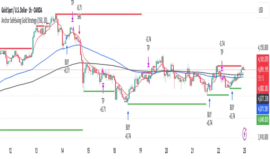
Anchor SafeSwing Gold StrategyOverview:
The Anchor SafeSwing Gold Strategy is designed for users who prefer structured, rule-based swing trading on XAUUSD. It focuses on identifying high-quality trade setups rather than frequent entries.
This strategy analyzes the market using multiple technical indicators and methods—including trend analysis, multi-chart confirmation, and support/resistance evaluation—to identify potential swing points. It also incorporates a dynamic approach to risk management through adaptive stop-loss and take-profit logic.
How the Strategy Works
1. Multi-Chart & Trend Analysis:
The strategy evaluates trend direction using several indicators and multiple charts. This helps determine whether the trend favors long or short setups.
2. Buy/Sell Conditions:
a. Buy Conditions: When the broader trend is identified as bullish, the strategy waits for the formation of a strong support zone before considering a long position.
b. Sell Conditions: When the trend is bearish, it waits for a confirmed resistance zone before initiating short positions.
3. Dynamic Take-Profit Logic
The strategy uses adaptive take-profit behavior based on evolving market conditions. It monitors new support/resistance structures and various overbought/oversold signals to dynamically exit trades.
4. Dynamic and Configurable Stop-Loss:
A flexible stop-loss system adjusts according to volatility and market structure.
Users can modify the stop-loss threshold in the settings based on their own risk tolerance and account size.
Trading Frequency :
This strategy focuses on select, high-quality setups. As a result, trade frequency is relatively low and may vary depending on market conditions. Backtesting may show roughly several trades per month, but actual live performance can differ.
Important Notes
All trading involves risk, and users should evaluate the strategy and adjust settings according to their own risk management preferences.
[MTX] Weekly Support & Resistance Weekly Support & Resistance
Overview
Discover key market structure with this all-in-one indicator:
Weekly Support & Resistance (SR) levels , Fair Value Gap (FVG) detection , and Automatic Fibonacci retracements .
Designed for MTX traders, it plots non-repainting weekly highs/lows/opens/closes, highlights unmitigated FVGs for potential imbalances, and auto-draws Fib levels, Perfect for swing/day traders on XAUUSD.
🚀 Key Features
- Weekly SR Levels : Plots previous week's High (resistance), Low (support), Open, and Close. Optional historical levels (Week -2/-3).
- SR Zones : Customizable % zones around levels for dynamic support/resistance bands. Fill colors for easy visualization.
- FVG Detection : Identifies bullish (green) and bearish (red) Fair Value Gaps on your chart timeframe.
- buy/sell Signals :
- Trend Filter : Optional EMA/SMA to filter signals
- Auto Fibonacci : auto-retracement with 20+ levels (0%, 23.6%, 38.2%, 50%, 61.8%, 100%, extensions to 423.6%, negatives). Custom colors, labels, and background fills.
- Alerts: Built-in for FVG creation/mitigation + all buy/sell signals. Set up once for real-time notifications.
⚠️ Important Disclaimer
This indicator is for educational and analysis purposes only. It provides visual tools and signals based on historical price action— not financial advice. Past performance ≠ future results. Trading involves risk; use proper risk management. Backtest thoroughly. No guarantees of profitability. Consult a financial advisor.
#tradingview #smc #MTX #fvg #fibonacci #supportresistance

JokaBAR
This script combines my own liquidity/liq-levels engine with open-source code from BigBeluga’s Volumatic indicators:
• “Volumatic Variable Index Dynamic Average ”
• “Volumatic Support/Resistance Levels ”
The original code is published under the Mozilla Public License 2.0 and is reused here accordingly.
What this script does
Joka puts Volumatic trend logic, dynamic support/resistance and a custom liquidation-levels module into a single overlay. The idea is to give traders one clean view of trend direction, key reactive zones and potential liquidation areas where leveraged positions can be forced out of the market.
Volumatic logic is used to build a dynamic average and adaptive levels that react to volume and volatility. On top of that, the script plots configurable liquidation zones for different leverage tiers (e.g. 5x, 10x, 25x, 50x, 100x).
How to use it
Apply the script on pairs where leverage is actually used (perpetual futures / margin).
Use the Volumatic average as a trend filter (above = long bias, below = short bias).
Treat Volumatic support/resistance levels as key reaction zones for entries, partials and stops.
Read the liquidation levels as context: clusters show where forced liquidations can fuel strong moves and bounces.
Keep the chart clean — this tool is designed to be used without stacking extra indicators on top.
The script is published as open-source in line with TradingView House Rules so that other traders can study, tweak and build on it.
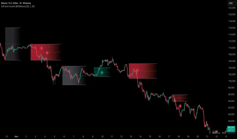
Support & Resistance Zone Hunter [BOSWaves]Support & Resistance Zone Hunter - Dynamic Structural Zones with Real-Time Breakout Intelligence
Overview
The Support & Resistance Zone Hunter is a professional-grade structural mapping framework designed to automatically detect high-probability support and resistance areas in real time. Unlike traditional static levels or manually drawn zones, this system leverages pivot detection, range thresholds, and optional volume validation to create dynamic zones that reflect the true structural architecture of the market.
Zones evolve as price interacts with their boundaries. The first touch of a zone determines its bias - bullish, bearish, or neutral - and the system tracks the full lifecycle of each zone from formation, testing, and bias establishment to potential breakout events. Diamond-shaped breakout signals highlight structurally significant price expansions while filtering noise using a configurable cooldown period.
By visualizing market structure in this way, traders gain a deeper understanding of price behavior, trend momentum, and areas where liquidity and reactive forces are concentrated.
Theoretical Foundation
The Support & Resistance Zone Hunter is built on the premise that meaningful structural zones arise from two core principles:
Pivot-Based Turning Points : Only significant highs and lows that represent actual swings in price are considered.
Contextual Validation : Zones must pass minimum range criteria and optional volume thresholds to ensure their relevance.
Markets naturally generate numerous micro-pivots that do not carry predictive significance. By filtering out minor swings and validating zones against volume and range, the system isolates levels that are more likely to attract future price interaction or act as catalysts for breakout moves.
This framework captures not only where price is likely to react but also the direction of potential pressure, providing a statistically grounded, visually intuitive representation of market structure.
How It Works
The Support & Resistance Zone Hunter constructs zones through a multi-layered process that blends pivot logic, range validation, and real-time bias determination:
1. Pivot Detection Core
The indicator identifies pivot highs and pivot lows using a configurable lookback period. Zones are only considered valid when both a top and bottom pivot are present.
2. Zone Qualification Engine
Prospective zones must satisfy two conditions:
Range Threshold : The distance between pivot high and low must exceed the minimum percentage set by the user.
Volume Requirement : If enabled, the current volume must exceed the 50-period moving average.
Only zones meeting these criteria are drawn, reducing noise and emphasizing high-probability structural levels.
3. Zone Lifecycle
Once a valid top and bottom pivot exist:
The zone is created starting from the pivot formation bar.
Zones remain active until both boundaries have been touched by price.
The first boundary touched establishes bias: resistance first → bullish bias ,support first → bearish bias, neither → neutral.
Inactive zones stop expanding but remain visible historically to maintain a clear structural context.
4. Visual Rendering
Active zones are displayed as filled boxes with color corresponding to their bias. Top, bottom, and midpoint lines are drawn for reference. Once a zone becomes inactive, its lines are removed while the filled box remains as a historical footprint.
5. Breakout Detection
Breakout signals occur when price closes above the top boundary or below the bottom boundary of an active zone. The system applies a cooldown period and requires price to return to the zone since the previous breakout to prevent signal spam. Bullish and bearish breakouts are visually represented by diamond-shaped markers with configurable colors.
Interpretation
The Support & Resistance Zone Hunter provides a structural view of market balance:
Bullish Zones : Form when resistance is tested first, indicating upward pressure and potential continuation.
Bearish Zones : Form when support is tested first, reflecting downward pressure and continuation risk.
Neutral Zones : Fresh zones that have not yet been interacted with, representing undiscovered liquidity.
Breakout Diamonds : Highlight significant structural price expansions, helping traders identify confirmed continuation moves while filtering noise.
Zones do not simply indicate past levels; they dynamically reflect the evolving battle between buyers and sellers, providing actionable context for both trend continuation and reversion strategies.
Strategy Integration
The Support & Resistance Zone Hunter is versatile and can be applied across multiple trading approaches:
Trend Continuation : Use bullish and bearish zones to confirm directional bias. Breakout diamonds indicate structural continuation opportunities.
Reversion Entries : Neutral zones often act as magnets in ranging markets, allowing for high-probability mean-reversion setups.
Breakout Trading : Diamonds mark true structural expansions, reducing false breakout risk and guiding stop placement or momentum entries.
Liquidity Zone Alignment : Combining the indicator with order block, breaker, or volume-based tools helps validate zones against broader market participation.
Technical Implementation Details
Pivot Engine : Two-sided pivot detection based on configurable lookback.
Zone Qualification : Minimum range requirement and optional volume filter.
Bias Logic : Determined by the first boundary touched.
Zone Lifecycle : Active until both boundaries are touched, historical visibility retained.
Breakout Signals : Diamond markers with cooldown filtering and price-return validation.
Visuals : Transparent filled zones with live top, bottom, and midpoint lines.
Suggested Optimal Parameters
Pivot Lookback : 10 - 30 for intraday, 20 - 50 for swing trading.
Minimum Range % : 0.5 - 2% for crypto or indices, 1 - 3% for metals or forex.
Volume Filter : Enable for assets with inconsistent liquidity; disable for consistently liquid markets.
Breakout Cooldown : 5 - 20 bars depending on volatility.
These suggested parameters should be used as a baseline; their effectiveness depends on the asset and timeframe, so fine-tuning is expected for optimal performance.
Performance Characteristics
High Effectiveness:
Markets with clear pivot structure and reliable volume.
Trending symbols with consistent retests.
Assets where zones attract repeated price interaction.
Reduced Effectiveness:
Random walk markets lacking structural pivots.
Low-volatility periods with minimal price reaction.
Assets with irregular volume distribution or erratic price action.
Integration Guidelines
Use zone color as contextual bias rather than a standalone signal.
Combine with structural tools, order blocks, or volume-based indicators for confluence.
Validate zones on higher timeframes to refine lower timeframe entries.
Treat breakout diamonds as confirmation of continuation rather than independent triggers.
Disclaimer
The Support & Resistance Zone Hunter provides structural zone mapping and breakout analytics. It does not predict price movement or guarantee profitability. Success requires disciplined risk management, proper parameter calibration, and integration into a comprehensive trading strategy.
Volume Matrix Pro [ChartNation]Volume Matrix Pro is a comprehensive volume profile indicator that combines delta-colored volume distribution analysis with adaptive pivot detection and automated volume node identification. The indicator visualizes where institutional volume accumulated at specific price levels, providing traders with precise entry zones backed by actual trading data.
KEY FEATURES:
Delta-Colored Volume Profile: Displays volume distribution across price bins with automatic delta coloring - green bins show buyer dominance, red bins show seller control at each price level
High Volume Nodes (HVN) Detection: Automatically identifies and marks price levels with ≥80% of POC volume using yellow diamond markers - these act as magnetic support/resistance zones where institutions built positions
Low Volume Nodes (LVN) Detection: Marks thin volume areas with gray diamond markers - zones where price moves quickly with minimal friction, ideal for breakout targets
Adaptive Smart Pivots: ATR-based pivot detection that automatically adjusts length based on market volatility - catches more swings in low volatility, filters to major reversals in high volatility
Point of Control (POC) Line: Identifies the price level with maximum traded volume - the market's center of gravity. Line colors by delta: green when buyers dominated, red when sellers controlled the level
Value Area Lines: Dotted lines marking the 70% value area (configurable 50-98%) with delta-based coloring showing cumulative buyer/seller pressure within the range
Circle Pivot Markers: Clean visual markers at confirmed pivot points with translucent horizontal lines extending to current bar
Extend-Until-Touch: Pivot lines automatically retract when price touches them, keeping charts clean and showing active levels only
Dual Profile Modes: Left-side profile (default) or right-pinned bars ahead of price with fully customizable width and padding
Volume-Filtered Pivots: Only displays pivots with significant volume backing (≥20% of POC by default) - institutional turning points, not noise
HOW IT WORKS:
The indicator divides the lookback range (default 200 bars) into volume bins (default 50) and calculates total volume and delta (buying vs selling pressure) at each price level. Each bin is colored green if buyers dominated (close > open majority) or red if sellers controlled (close < open majority).
High Volume Nodes mark price levels where the most trading occurred - these become magnetic support/resistance zones. The Point of Control identifies the single price with maximum volume, acting as the market's gravitational center.
Smart Pivots use ATR to adapt to changing volatility, then filter against the volume profile. Only pivots with substantial volume backing are displayed, ensuring you see institutional turning points, not random noise.
RECOMMENDED SETTINGS:
Scalping (1-5 min): 100 lookback bars, 40 bins, 5-7 pivot length
Day Trading (15 min - 1 hour): 200 lookback bars, 50 bins, 10 pivot length (default)
Swing Trading (4 hour - Daily): 300-500 lookback bars, 60 bins, 15-20 pivot length
USAGE TIPS:
Enter long when price touches green HVN zones with adaptive pivot confirmation
Enter short when price reaches red HVN zones with pivot confirmation
Use POC as first target when entering below it, or as support backup when entering above
Watch for LVN zones as potential breakout acceleration areas
Combine green delta bins + HVN + pivot for highest-probability setups
WHAT MAKES THIS DIFFERENT:
Unlike traditional volume profiles, Volume Matrix Pro colors each bin individually by delta, giving granular insight into buyer/seller control at every price level. The adaptive pivot system adjusts automatically to volatility, while volume-filtering ensures only institutionally-backed turning points are displayed. High/Low Volume Node detection is fully automated with visual markers.
IMPORTANT NOTES:
This is a volume analysis tool - use with trend analysis and risk management
High Volume Nodes show where volume accumulated historically, not future support/resistance guarantees
Adaptive pivots adjust to volatility automatically but can still produce false signals in choppy markets
Best used as confirmation alongside price action, not as a standalone system
Profile recalculates on each bar to reflect current lookback range

Scaling_mastery:Free TrendlinesScaling_mastery Trendlines is a clean, trading-ready smart trendline tool built for the Scaling_mastery community.
It automatically finds swing highs/lows and draws dynamic trendlines or channels that stay locked to price, on any symbol and any timeframe.
🔧 Modes
Trendline type
Wicks – classic trendlines anchored on candle wicks (high/low).
Bodies – trendlines anchored on candle bodies (open/close), great for closing structure.
Channel – 3-line channel:
outer lines form a band around price
middle line runs through the centre of the channel
thickness is adjustable (Small / Medium / Large).
Trend strength
Controls how strong the pivots must be to form a line.
Weak → more lines, reacts faster.
Medium → balanced, good for most pairs.
Strong → only the cleanest swings, higher-probability trendlines.
🎨 Visual controls
Max support / resistance lines – cap how many lines are kept on chart.
Show broken lines – hide broken trendlines or keep them for structure history.
Extend lines – None / Right / Both.
Support / Resistance colors – separate colors for active vs broken.
Channel thickness – Small / Medium / Large (0.5% / 1% / 2% of price).
Channel outer lines – color for channel edges.
Channel middle line – color + style (dotted / dashed / solid).
Broken lines are automatically faded + dotted, so you can instantly see what’s still respected and what’s already been taken out.
🧠 How to use
Add the indicator to any chart.
Start with:
Trendline type: Wicks
Trend strength: Strong
Max lines: 1–2 for both support & resistance
Once you like the behavior, experiment with:
Switching between Wicks / Bodies / Channel
Adjusting Channel thickness and Trend strength
Use the lines as a visual confluence tool with your own strategy:
HTF trend direction
LTF entries / retests
Liquidity grabs around broken lines
This script doesn’t generate entries or risk management – it’s designed to give you clean, reliable structure so you can execute your own edge.
⚠️ Disclaimer
This tool is for educational and visual purposes only and is not financial advice.
Always do your own research and manage risk.

Advanced Custom Volume Profile [KRUTO]⚠️ LANGUAGE NOTICE: This script features a SLOVAK (SK) user interface (settings and tooltips).
This is a highly customizable and versatile Volume Profile indicator designed for precise market analysis. It separates itself from standard tools by offering dynamic anchoring modes, advanced HVN/LVN detection logic, and a "Smart Lines" feature that keeps your chart clean.
Key Features
1. Three Dynamic Anchoring Modes:
Fixed Range (Na čiare výberu): Define exact Start and End times manually. Includes vertical dashed lines to visualize the range.
Anchor to Last Candle (Na poslednej sviečke): Calculates volume from a specific start time up to the current live price. The profile is always anchored to the most recent bar.
Visible Range (Visible - Viditeľné sviečky): Dynamically calculates the profile based only on the candles currently visible on your screen. As you scroll or zoom, the profile updates automatically.
2. HVN & LVN Detection:
HVN (High Volume Nodes): Automatically highlights areas of high consolidation (Green zones). Includes a "merge tolerance" setting to group nearby nodes.
LVN (Low Volume Nodes): Highlights areas of low liquidity/rejection (Red zones).
3. Key Levels & Visuals:
Displays POC (Point of Control), VAH (Value Area High), and VAL (Value Area Low) with extendable lines.
Smart Offset: Keeps the profile at a fixed distance from the latest candle (or right edge) to prevent chart clutter.
Clean Look: Vertical range lines automatically disappear when not in "Fixed Range" mode.
Translation Guide (Slovak -> English)
Since the settings are in Slovak, here is a quick guide for English users:
Zdroj dát profilu (Source):
Na čiare výberu = Fixed Time Range
Na poslednej sviečke = Fixed Start to Current Bar
Visible = Visible Range
Počet úrovní (Bins): Resolution of the histogram (e.g., 160).
Value Area (%): Percentage of volume considered as value (Standard 70%).
Začiatočný / Koncový čas: Start / End Time.
Offset: Distance of the profile from the price action.
Zobraziť HVN / LVN: Show High/Low Volume Nodes.
Credits: Custom logic developed for advanced volume analysis with anti-overlap algorithms for node visualization.
Enjoy the script! 🚀

Kalman Trend Sniper# KALMAN TREND SNIPER
## ORIGINALITY STATEMENT
The Kalman Trend Sniper combines adaptive trend detection with precision entry validation to identify high-probability trading opportunities. Unlike static moving averages that use fixed parameters, this indicator adapts to changing market volatility through ATR-based gain adjustment and distinguishes trending from ranging markets using ADX regime detection.
The indicator's unique contribution is its three-phase entry validation system: signals must hold for three bars, undergo a pullback test to the signal level, and receive confirmation through price action before generating an entry. This structured approach helps traders enter established trends at favorable retracement levels rather than chasing momentum.
---
## TECHNICAL METHODOLOGY
### Kalman Filter Implementation
This indicator implements an Alpha-Beta variant of the Kalman filter, a recursive algorithm that estimates trend from noisy price data:
1. Prediction: kf = kf + velocity
2. Error calculation: error = price - kf
3. Correction: kf = kf + gain * error
4. Velocity update: velocity = velocity + (gain * error) / 2
The gain parameter determines filter responsiveness. Higher gain values track price more closely but increase noise sensitivity, while lower values provide smoother output but lag price changes.
### Adaptive Gain Mechanism
The indicator adjusts gain dynamically based on volatility:
Volatility Factor = Current ATR / Long-term ATR
Adaptive Gain = Base Gain * (0.7 + 0.6 * Volatility Factor)
This ATR ratio increases responsiveness during high-volatility periods and reduces sensitivity during consolidations, addressing the fixed-parameter limitation of traditional moving averages. The volatility factor is bounded between configurable minimum and maximum values to prevent extreme adjustments.
### Regime Detection
The indicator uses the Average Directional Index (ADX) to distinguish market conditions:
- Trending markets (ADX above threshold): Full gain applied, signals generated
- Ranging markets (ADX below threshold): Gain reduced 25%, fewer signals
This regime awareness helps reduce whipsaw signals during sideways consolidation periods.
### Signal Line Validation System
When the Kalman line changes direction in trending conditions, the indicator draws a horizontal signal line at the low (for long signals) or high (for short signals) of the signal candle. This line represents a potential support or resistance level.
The validation system then monitors three phases:
Phase 1 - Hold Period: Price must remain above (long) or below (short) the signal line for three consecutive bars. This requirement filters weak signals where price immediately violates the signal level.
Phase 2 - Test: After the hold period, the system waits for price to pull back and touch the signal line, with configurable tolerance for volatile instruments.
Phase 3 - Confirmation: Within eight bars of the test, a confirmation candle must close above (long) or below (short) the test candle's body, demonstrating renewed momentum. If confirmation does not occur within eight bars, the validation attempt expires.
Successful validation generates an R label at the entry point. This three-phase structure helps identify entries where trend direction and support/resistance validation align.
---
## USAGE INSTRUCTIONS
### Signal Interpretation
Triangle Signals:
- Upward triangle (teal): Kalman line turns bullish in trending market (ADX above threshold)
- Downward triangle (red): Kalman line turns bearish in trending market
Signal Lines (horizontal):
- Teal line: Potential long support level at signal candle low
- Red line: Potential short resistance level at signal candle high
- Gray line: First opposite-color candle after signal (initial reversal pressure)
R Labels (optional, disabled by default):
- Green R below price: Validation complete for long entry
- Red R above price: Validation complete for short entry
Stop Levels:
- Red dots: Long stop level (Kalman line minus ATR multiplier)
- Teal dots: Short stop level (Kalman line plus ATR multiplier)
### Dashboard Information
The dashboard displays real-time indicator state:
- Trend: Current Kalman direction (BULL/BEAR)
- Regime: Market classification (Trending when ADX exceeds threshold, Ranging otherwise)
- Gain: Current adaptive gain value
- Vol Factor: Volatility ratio (current ATR / long-term ATR)
- ADX: Trend strength (higher values indicate stronger trends)
- Z-Score: Standard deviation distance from Kalman line (when enabled)
- Stop Dist: Current ATR-based stop distance
- Lines: Number of active signal lines displayed
- R-Status: Validation system state (Idle / Waiting / Testing)
### Trading Applications
Trend Following Approach:
1. Wait for triangle signal in trending market (ADX above threshold)
2. Enter immediately at signal candle close or wait for pullback
3. Place stop at displayed stop level
4. Trail stop using Kalman line as dynamic support/resistance
Validation Entry Approach (conservative):
1. After triangle signal, observe three-bar hold period
2. Wait for pullback to signal line (test phase)
3. Enter on R label confirmation
4. Place stop below/above signal line
5. Provides higher probability entries but reduces trade frequency
Z-Score Mean Reversion (when enabled):
1. Watch for Z-Score exceeding entry threshold (default +/-2.0)
2. Consider counter-trend entries when price touches Kalman line
3. Target return to Kalman line (Z-Score near zero)
4. Use Z-Score threshold as stop level for extreme continuation
### Optimal Conditions
The indicator performs optimally in clearly trending markets where ADX consistently exceeds the threshold. Performance degrades in sideways, choppy conditions.
Recommended timeframes:
- 1-5 minute charts: Use Crypto_1M preset (faster adaptation)
- 15-60 minute charts: Use Crypto_15M preset (balanced)
- Hourly charts: Use Forex preset (smoother)
- Daily charts: Use Stocks_Daily preset (long-term trends)
Market conditions:
- High volatility (Vol Factor above 1.5): Expect faster adaptation, wider stops needed
- Normal volatility (Vol Factor 0.7-1.5): Standard behavior
- Low volatility (Vol Factor below 0.7): Expect slower adaptation, tighter stops possible
---
## PARAMETER DOCUMENTATION
### Kalman Filter Settings
Preset Mode: Select optimized configuration for specific markets
- Custom: Manual parameter control
- Crypto_1M: Base Gain 0.05, ATR 7 (fast response for 1-5 minute crypto charts)
- Crypto_15M: Base Gain 0.03, ATR 14 (balanced for 15-60 minute crypto charts)
- Forex: Base Gain 0.02, ATR 14 (standard for forex pairs)
- Stocks_Daily: Base Gain 0.01, ATR 20 (smooth for daily stock charts)
Base Gain (0.001-0.2): Core Kalman filter responsiveness parameter. Higher values increase sensitivity to price changes. Low values (0.01-0.02) provide smooth output with fewer whipsaws but slower trend changes. High values (0.06-0.08) offer fast response with more signals but increased whipsaw risk.
Adaptive (checkbox): When enabled, automatically adjusts gain based on ATR ratio. Recommended to keep enabled for dynamic volatility adaptation.
ATR (5-50): Short-term Average True Range period for current volatility measurement. Default 14 is industry standard. Lower values respond faster to volatility changes.
Long ATR (20-200): Long-term ATR period for baseline volatility comparison. Default 50 provides stable reference. The ratio between ATR and Long ATR determines adaptive adjustment magnitude.
Regime Filter (checkbox): Enables ADX-based trending/ranging detection. When enabled, reduces gain by 25 percent during ranging markets to minimize false signals.
ADX Period (7-30): Period for ADX calculation. Default 14 is standard. Lower values respond faster to trend strength changes.
Threshold (15-40): ADX level distinguishing trending from ranging markets. Default 25. Above threshold: trending (generate signals normally). Below threshold: ranging (reduce sensitivity).
Min Vol / Max Vol (0.3-3.0): Bounds for volatility factor adjustment. Prevents extreme gain changes during unusual volatility spikes or quiet periods. Default minimum 0.5, maximum 2.0.
Stop ATR x (1.0-3.0): Multiplier for ATR-based stop loss distance. Default 2.0 places stops two ATRs from Kalman line. Use 1.5 for tight stops (intraday), 2.5-3.0 for wide stops (swing trading).
Show Signals (checkbox): Displays triangle signals when Kalman changes direction in trending markets. Disable to use indicator purely as dynamic support/resistance without signals.
Z-Score (checkbox): Enables mean-reversion signal generation based on statistical deviation from Kalman line.
Period (10-100): Lookback period for Z-Score standard deviation calculation. Default 20 bars. Longer periods produce smoother, less sensitive readings.
Entry (1.5-3.5): Standard deviation threshold for Z-Score signals. Default 2.0 generates signals at plus/minus two standard deviations (approximately 95th percentile moves).
Bull / Bear Colors: Customize Kalman line colors for uptrend (default teal) and downtrend (default red).
Fill (checkbox): Shows semi-transparent fill between price and Kalman line for visual trend emphasis.
### Signal Line System Settings
Signal Lines (checkbox): Displays horizontal signal lines at low (long) or high (short) of signal candles. These function as dynamic support/resistance levels.
Reverse Lines (checkbox): Shows gray horizontal lines at first opposite-colored candle after signal. Helps identify initial resistance points in new trends.
Max Lines (0-20): Maximum number of signal lines to display simultaneously. Older lines are removed as new signals appear. Use 1-2 for clean charts, 3-5 for recent support/resistance history.
Style (Solid/Dotted/Dashed): Visual style for signal and reverse lines. Dotted provides subtle appearance, solid is most prominent.
Line % / Label % (0-100): Transparency percentage for lines and labels. Zero is fully opaque, 100 is invisible.
R Labels (checkbox): Shows R labels when validation confirmation occurs. Default disabled. Enable if you want visual confirmation of successful pullback entries.
Tolerance % (0-1.0): Price deviation tolerance for test candle detection. Zero requires exact touch. 0.5 allows 0.5 percent deviation for volatile instruments.
### Dashboard Settings
Show Dashboard (checkbox): Toggles visibility of information panel. Disable for clean chart presentation.
Position: Choose dashboard location from nine positions (Top/Middle/Bottom combined with Left/Center/Right).
---
## LIMITATIONS AND WARNINGS
This indicator is a technical analysis tool that processes historical price data. It does not predict future price movements.
Inherent limitations:
1. Lagging nature: Like all trend indicators, the Kalman filter lags price. Signals occur after trend changes begin, not before.
2. Ranging markets: Generates fewer signals and reduced performance when ADX falls below threshold. Not optimized for sideways consolidation.
3. Whipsaw risk: In choppy, indecisive markets near ADX threshold, signals may reverse quickly despite regime filtering.
4. Parameter sensitivity: Inappropriate Base Gain settings can cause over-trading (too high) or missed trends (too low).
5. Validation requirement: The three-phase confirmation system provides higher accuracy but significantly reduces trade frequency. Not all trends produce valid pullback entries.
Not suitable for:
- Scalping strategies requiring instant signals (Kalman filter has intentional smoothing)
- Ultra-high frequency trading (indicator updates once per bar close)
- Markets with extreme overnight gaps (stops may be exceeded)
- Strategies requiring signals on Heikin Ashi, Renko, Kagi, Point and Figure, or Range charts
Risk management requirements:
This indicator provides trend direction and signal levels but does not incorporate position sizing, risk management, or account balance considerations. Users must implement appropriate position sizing, maximum daily loss limits, and portfolio diversification. Past performance does not indicate future results.
Optimal usage:
- Works optimally in clearly trending markets where ADX consistently exceeds threshold
- Performance degrades in sideways, choppy conditions
- Designed for swing trading and position trading timeframes (15-minute and above)
- Requires confirmation from price action or additional technical analysis
---
## NO REPAINT GUARANTEE
This indicator operates on bar close confirmation only. All signals, signal lines, and validation labels appear exclusively when candles close. Historical signals remain exactly where they appeared. This makes the indicator suitable for automated trading and reliable backtesting. What you see in historical data matches what appeared in real-time.
---
## ALERTS
The indicator provides eight alert conditions:
1. Kalman Buy Signal: Fires when upward triangle appears (bullish trend change in trending market)
2. Kalman Sell Signal: Fires when downward triangle appears (bearish trend change in trending market)
3. Trend Change to Bullish: Fires whenever Kalman line changes to bullish (regardless of ADX)
4. Trend Change to Bearish: Fires whenever Kalman line changes to bearish (regardless of ADX)
5. SCT-R Long Retest Confirmed: Fires when green R label appears for long validation
6. SCT-R Short Retest Confirmed: Fires when red R label appears for short validation
7. SCT Test Long Detected: Fires when test candle appears for long signal (before confirmation)
8. SCT Test Short Detected: Fires when test candle appears for short signal (before confirmation)
Alert messages include context about bar close confirmation and current price levels.
---
## CALCULATION TRANSPARENCY
While complete proprietary optimization methodology is not disclosed, the core technical approach is fully explained: Alpha-Beta Kalman filter with ATR-based adaptive gain adjustment and ADX regime detection. The signal line validation system uses a three-phase structure (hold, test, confirmation) with configurable parameters. Users can understand indicator functionality and make informed decisions about application.
---
## DISCLAIMER
This indicator is provided as a technical analysis tool. It does not constitute financial advice, trading recommendations, or performance guarantees. All trading decisions carry risk. Users are responsible for their own trading decisions and risk management. Past results do not indicate future performance.

Trend Line Proximity Meter (Improved v2 with Recent Touches)Overview
Trend Line Proximity Meter (Improved v2 with Recent Touches) is a powerful overlay tool that transforms any manually-defined trend line (via two configurable points) into a live analytical instrument. It draws the line, auto-detects whether it currently acts as support or resistance, and calculates real-time metrics: % deviation, absolute distance, projected price, slope, historical touch count, and — new in v2 — recent touch count within a user-defined lookback. All data appears in a clean, color-coded dashboard that updates instantly as price moves. Perfect for traders who draw their own channels or trend lines and want objective, quantitative feedback without clutter.
Core Mechanics
Trend Line Creation: Define two points by "bars back" and price type (High/Low/Close/Open/Custom). The script builds the line from those coordinates and optionally extends it as a ray.
Dynamic Role Detection: Automatically classifies the line as Support (price above), Resistance (price below), or Neutral. Auto-colors the line and dashboard accordingly when enabled.
Proximity Engine:
% Deviation: ((close – line price) / line price) × 100
Absolute Distance: close – line price
Projected Price: Exact line value at current bar
Slope: Price change per bar
Touch Counting (v2 Enhancement):
Historical Touches: Total times any candle’s range intersected the line within its drawn/extended segment.
Recent Touches: Same logic but limited to the last N bars (default 50) — instantly shows if the level is “hot” right now.
Tolerance % (default 0.2%) accounts for wicks and minor breaches.
Dashboard: Fully configurable position/size. Displays all metrics with intuitive color coding:
Green/Yellow/Red proximity zones (user-defined thresholds)
Support (green) / Resistance (red) auto-highlighting
Recent vs Historical touch split for quick context
Why This Adds Value & Originality
Most trend line tools only draw lines. This is the only public script that turns a single user-drawn trend line into a full analytical dashboard with real-time deviation %, projected price, slope, and dual touch counters (historical + recent). The recent-touch feature instantly reveals whether a level is currently respected or ignored — information no other indicator provides automatically. Clean, efficient code (no lookahead, no repainting) and smart proximity coloring make it uniquely practical for discretionary traders who rely on hand-drawn lines but want objective data.
How to Use
Draw Your Line:
Set Point 1 (e.g., 100 bars back → Low)
Set Point 2 (e.g., 50 bars back → High)
Adjust style, width, and whether to extend.
Interpret the Dashboard:
Line Type: “SUPPORT” (green) or “RESISTANCE” (red)
Proximity %: +0.4% = price 0.4% above line (green zone = very close)
Recent Touches (Last 50): 4 → level is active now
Historical Touches: 12 → proven significance
Trade Ideas:
Price near line + high recent touches → watch for bounce/rejection
Break with low recent touches → potential trend change
Use alerts for “Price Near Trend Line” or crossovers
Best Practice: Use on 1H–Daily charts; combine with volume or order flow for confluence.
Limitations & Disclaimer
Line is based on two fixed historical points — moving markets may require occasional re-adjustment. Touch detection uses a small tolerance zone (adjustable). No automatic multi-line support (one line per instance). Not financial advice — use with proper risk management. Past performance ≠ future results. Questions? Comment below!

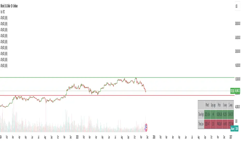
ATH/ATL/DaysThis indicator displays the All-Time High (ATH) and All-Time Low (ATL) — or more precisely, the highest and lowest price within the last N days. It works on any timeframe and uses only local chart data (no security() calls), ensuring stable and accurate results.
It plots horizontal lines for both the ATH and ATL and includes a clean, compact table showing:
Date of the extreme
Days since it occurred
Price
% distance from current price
$ distance from current price
A reliable tool for identifying local extremes, spotting market structure shifts, and tracking short-term price ranges.
Yest/PreMkt H/LI published this Tradingview script to allow you to see pre-market and previous day highs/lows for directional trading. This works with stocks, ETFs and indexes. To see pre-market highs/lows, you MUST enable "extended" session in the TV charts. You can change colors to your liking. Enjoy!

Smart Money Concepts [Riz]Smart Money Concepts is a comprehensive technical analysis tool for identifying institutional trading patterns and market structure. This indicator combines Smart Money Concepts (SMC), ICT methodology, and Wyckoff principles into one professional tool.
✨ KEY FEATURES
📊 VOLUMETRIC ORDER BLOCKS
• Visual representation of supply/demand zones with volume distribution
• Horizontal volume bars showing buy/sell composition inside each Order Block
• Automatic mitigation tracking
• Breaker Block detection (invalidated OBs acting as reversal zones)
• Strength rating system: ★ Weak, ★★ Medium, ★★★ Strong
• ATR-based size filtering to show only significant zones
📈 MARKET STRUCTURE DETECTION
• Break of Structure (BOS) and Change of Character (CHoCH) identification
• Higher Highs (HH), Higher Lows (HL), Lower Highs (LH), Lower Lows (LL) labels
• Internal structure pivots (iH/iL) for intraday analysis
• Auto-adjusting swing length based on timeframe
• Configurable confirmation methods (Close vs Wick-based)
💎 FAIR VALUE GAPS (FVG)
• Automatic detection of bullish and bearish imbalances
• Configurable mitigation percentage (default 50%)
• Visual tracking until gaps are filled
• Separate color schemes for clarity
💧 LIQUIDITY ANALYSIS
• Buy Side Liquidity (BSL) identification at swing highs
• Sell Side Liquidity (SSL) identification at swing lows
• Automatic sweep detection with visual confirmation
• Real-time alerts when liquidity is taken
⚖️ PREMIUM & DISCOUNT ZONES
• Dynamic range calculation based on configurable lookback period
• Equilibrium (EQ) level identification
• Previous Day High (PDH) and Previous Day Low (PDL) levels
• Helps identify favorable entry zones
📊 REAL-TIME DASHBOARD
• Live statistics on all detected patterns
• Active Order Blocks and FVGs count
• BOS/CHoCH occurrence tracking
• Liquidity sweep counters
• Recent market activity indicators
• Current trend bias display
• Fully customizable position and size
⚙️ CUSTOMIZATION OPTIONS
All aspects are fully customizable:
• Swing Length (1-50 bars) with auto-adjust for timeframe
• Max Active Order Blocks (10-100)
• Volume bar position (Left/Right) with mirror option
• Volume bar width percentage (10-50%)
• ATR size filter for Order Blocks
• Strength rating method (Touches/Age/Distance/Volume/Combined)
• All colors and transparency levels
• Dashboard position (9 locations available)
• Comprehensive alert system for all events
🎓 HOW IT WORKS
ORDER BLOCKS: Identified at the last candle before a Break of Structure. These represent institutional supply and demand zones. Volume is estimated based on candle characteristics and displayed as horizontal bars.
MARKET STRUCTURE: Tracks pivot highs and lows to determine if price is making Higher Highs/Higher Lows (bullish structure) or Lower Highs/Lower Lows (bearish structure). BOS indicates trend continuation, while CHoCH signals potential trend reversal.
LIQUIDITY: Swing highs represent Buy Side Liquidity where short positions have their stop losses. Swing lows represent Sell Side Liquidity where long positions have stop losses. The indicator tracks when these levels are "swept" by price.
FAIR VALUE GAPS: Three-candle patterns where the current candle's range doesn't overlap with the candle two bars ago, creating price imbalances that often get filled later.
📚 BEST PRACTICES
• Use on all timeframes - Auto-adjust feature optimizes settings automatically
• Look for confluence - Best setups occur when multiple concepts align (e.g., Order Block + liquidity sweep + discount zone)
• Consider risk/reward - Use Premium/Discount zones to identify favorable entry areas
• Respect market context - Order Blocks in the direction of overall trend tend to be more reliable
• Volume matters - Higher volume percentages in the expected direction may indicate stronger zones
⚠️ IMPORTANT NOTES
EDUCATIONAL TOOL: This indicator is designed for analysis and education, not as trading signals or investment advice.
VOLUME ESTIMATION: Buy/sell volume distribution is estimated based on candle characteristics since true buy/sell volume data is not available in Pine Script.
NO GUARANTEES: Past performance is not indicative of future results. All trading involves substantial risk.
RISK MANAGEMENT: Always use proper risk management and seek additional confirmation before making trading decisions.
OBJECT LIMITS: On very fast timeframes (1m, 5m) in highly volatile markets, the indicator may approach Pine Script's 500-object limit. Reduce max OBs/FVGs in settings if needed.
🔧 TECHNICAL SPECIFICATIONS
• Pine Script Version: v6
• Indicator Type: Overlay (displays on price chart)
• Maximum Objects: Optimized to stay within Pine Script limits
• Performance: Efficient rendering with configurable history management
• Updates: Real-time on every bar close
📖 METHODOLOGY
This indicator combines concepts from:
• Inner Circle Trader (ICT) methodology
• Smart Money Concepts (SMC) framework
• Wyckoff market analysis principles
• Order flow and volume spread analysis
⚖️ DISCLAIMER
This indicator is for educational and informational purposes only. It is not financial advice. Trading financial instruments carries substantial risk and may not be suitable for all investors. Past performance is not indicative of future results. Always conduct your own research and consult with a licensed financial advisor before making any investment decisions. The author assumes no responsibility for any losses incurred from using this indicator.

区间顶底|超级趋势|增强版中文介绍 (English description follows)
【脚本概述】 本指标是一个多功能的综合交易系统,旨在通过结合趋势跟踪、动量反转、关键支撑阻力位以及成交量分析,为交易者提供高胜率的决策辅助。它将多个复杂的分析模块融合在一个简洁的图表中,适合日内交易及波段交易。
【核心功能与计算逻辑】
1. 智能支撑与阻力区间 (Support & Resistance Zones)
原理:基于自定义长度(默认130周期)的高低点回溯,结合ATR(平均真实波幅)计算出的动态顶底区间。
视觉:紫色区域为阻力区(潜在卖点),绿色区域为支撑区(潜在买点)。
信号:当价格触及这些区域并出现反转K线结构时,会给出相应的箭头提示。
2. 超级趋势 (SuperTrend)
原理:基于ATR(10周期,3倍乘数)的经典趋势跟踪算法。
用途:作为主要的趋势过滤器。背景颜色会随趋势变化(绿色为多头趋势,红色为空头趋势),帮助交易者顺势操作。
3. EMA均线系统
配置:包含EMA 144、169、233三条均线。
用途:用于判断长期趋势方向。当价格位于均线组上方时,主要寻找做多机会;反之则寻找做空机会。
4. 增强型RSI反转信号
红色倒三角 (R):RSI下穿超买线(70),提示顶部回归风险。
蓝色正三角 (R):RSI上穿超卖线(30),提示底部回归机会。
此信号仅作为辅助确认,建议结合支撑阻力位使用。
5. 爆量K线高亮 (Volume Anomalies)
原理:当单根K线的成交量大于过去30根K线平均成交量的2.5倍时,系统会将其判定为“爆量”。
视觉:K线实体会被染成明黄色,提示主力资金介入或情绪剧烈波动。
6. 多周期趋势面板 (Dashboard)
位置:图表右上角。
功能:实时监控从15分钟到日线级别的SuperTrend趋势方向以及成交量状态,帮助交易者进行多周期共振分析。
【使用策略建议】
顺势交易:主要依据SuperTrend背景色和EMA均线方向操作。
反转交易:关注价格进入紫色/绿色区间,且同时出现RSI三角形信号或爆量黄色K线时的反转机会。
止损设置:建议设置在支撑阻力区间的边缘外侧。
免责声明:本脚本仅用于技术交流和辅助分析,不构成任何投资建议。市场有风险,交易需谨慎。
English Summary
This is an "All-in-One" enhanced trading system that combines Trend, Momentum, and Volume analysis.
Key Features:
Dynamic Support & Resistance: Auto-detected zones based on Pivot High/Low and ATR volatility.
SuperTrend: Classic ATR-based trend following (Period 10, Multiplier 3) with background highlighting.
RSI Confirmation: Identifies Overbought/Oversold mean reversions (marked with Triangles).
Volume Highlight: Highlights candles with volume > 2.5x the 30-period average (Yellow candles).
Multi-Timeframe Dashboard: Monitors trend direction and volume status across 15m to 1D timeframes.

Automated Intraday Key LevelsThis indicator is designed for day traders who focus on price action and key support/resistance levels. It automates the morning routine of marking up charts by instantly plotting critical levels from the Previous Day, the Premarket Session, and the Current Live Session.
Instead of manually drawing lines every morning, this script dynamically calculates and anchors these levels to the market open, extending them across the trading day for a clean, professional workspace.
Key Features
1. Previous Day Context (Static - White Lines) Before the market opens, it is crucial to know where price closed and traded yesterday.
Prev High & Low: Major support/resistance boundaries.
Prev Close: A magnetic level often used for "Gap Fill" strategies.
Prev Open: Provides context on yesterday's directional sentiment.
2. Premarket Session (Static - Orange Lines) The script fetches data from the Extended Trading Hours session (04:00 – 09:30 EST) to identify the overnight range.
PM High & Low: A breakout above the PM High or breakdown below the PM Low often signals the start of a trend day.
PM Midpoint (Dashed): Represents the overnight equilibrium. Staying above this level indicates early bullish strength.
3. Current Day Stats (Dynamic - Blue Lines) Once the Regular Trading Hours (RTH) begin, the script tracks live price action.
Day High (HOD) & Low (LOD): These lines update in real-time as price pushes new extremes. They are thicker to denote their importance as immediate liquidity zones.
Day Midpoint (Dashed): Calculated as (High + Low) / 2. This is a dynamic trend filter; price holding above the daily midpoint suggests buyers are in control, while trading below suggests seller dominance.
Visual Guide
To keep the chart clean and readable, the levels are color-coded:
🟦 Solid Blue (Width 2): Current Day High / Low (The most active levels).
🟦 Dashed Blue: Current Day Midpoint (50% Retracement level).
🟧 Solid Orange: Premarket High / Low.
🟧 Dashed Orange: Premarket Midpoint.
⬜ Solid White: Previous Day Open, High, Low, Close.
All lines are anchored to the 09:30 EST start time to keep the pre-market area of your chart uncluttered.

Swing High/Low with Trend & BOSSwing High/Low Indicator with Multi-Timeframe Trend Analysis
This indicator identifies swing highs and swing lows on the chart with visual labels and connecting lines, plus provides trend analysis across multiple timeframes.
FEATURES:
- Swing High Detection: Green "H" labels mark pivot highs with customizable lookback periods
- Swing Low Detection: Red "L" labels mark pivot lows with customizable lookback periods
- Connection Lines: Visual lines connect consecutive swing points for easy trend visualization
- Multi-Timeframe Panel: Displays trend direction (Bullish/Bearish) for 1H and 4H timeframes
- Break of Structure (BOS): Shows whether price has recently broken key levels on higher timeframes
SETTINGS:
- Left Bars: Number of bars to the left for pivot detection (default: 10)
- Right Bars: Number of bars to the right for pivot detection (default: 10)
- Show Connection Lines: Toggle to show/hide lines connecting swing points
USAGE:
Use this indicator to identify key swing points for support/resistance levels, trend analysis, and potential reversal zones. The multi-timeframe panel helps confirm trend direction across different time horizons.
NOTES:
- Works best on active markets with sufficient price movement
- Swing points are confirmed after the specified number of right bars
- BOS detection uses EMA crossovers and recent high/low breaks

Gabbie - LiquidityGabbie – Liquidity identifies high-probability liquidity pools on your current trading timeframe. It detects swing highs/lows that fail to meaningfully break prior highs/lows, marking areas where liquidity is most likely resting.
It also plots:
Asia Session High / Low as a key liquidity and mean-reversion zone
Support & Resistance zones derived from recent swing behavior on the active timeframe
This indicator is designed to support discretionary traders who model liquidity, sessions, and structure.
Settings
Adjust the font size of the liquidity labels ($$$).
All other features are optimized to work on default settings.
Limitations / reminder
Liquidity levels are probabilistic. Use alongside confirmation tools and always apply your own risk management.

Gabbie - FVG/OBGabbie – FVG-OB plots Fair Value Gaps (FVGs) and Order Blocks (OBs) to help visualize price imbalances and institutional reaction zones.
Fair Value Gaps
Bullish FVGs and Bearish FVGs are marked automatically.
The indicator also shows when an FVG is mitigated (price returns to fill the imbalance).
If price wicks into an FVG without a full body close through it, the FVG remains valid under this model.
Order Blocks / Breaker Blocks
Bullish OBs are marked in green
Bearish OBs are marked in red
Breaker Blocks are marked in yellow
Use these zones for confluence with your market structure and liquidity framework.
Settings
Choose the timeframe source for OB/BB detection.
Adjust the number of active FVGs displayed. Defaults are designed for immediate use.
Limitations / reminder
Zones are plotted from historical price action and are not trade guarantees. Always confirm with structure, liquidity, and risk rules.

Swing High-Low Line ConnectorSwing High-Low Line Connector is a simple and intuitive tool that automatically detects swing highs and swing lows using fractal-style pivot logic and connects them with clean, continuous lines. This indicator helps traders visualize market structure, trend shifts, and swing-based support/resistance levels at a glance.
The script identifies each confirmed swing point based on a user-defined lookback window (left/right bars). When a new swing is confirmed, the indicator updates the previous leg or creates a new one, effectively drawing the classic “zigzag-style” connections used in discretionary trading and price-action analysis.
A dynamic tail extension is included to show the most recent swing extending toward the current price. By default, the tail follows a ZigZag-style logic—extending upward after a swing low and downward after a swing high—but users can also anchor it to Close, High, Low, or HL2.
Features
Automatic detection of swing highs and swing lows
Clean line connections between swings (similar to discretionary market-structure mapping)
Proper consolidation handling: weaker highs/lows are ignored
Optional ZigZag-style dynamic tail extension
Fully customizable lookback window, line color, and line width
Works on any market and timeframe
Use Cases
Identifying market structure (HH, HL, LH, LL)
Visualizing trend transitions
Spotting breakout levels and swing-based support/resistance
Aiding discretionary swing trading, trend following, or pattern recognition
This indicator keeps the logic simple and visual—ideal for traders who prefer clean chart structure without unnecessary noise.

Malaysian SNR Levels - Fixed Range# Malaysian SNR Levels - Fixed Range
This indicator displays support and resistance levels based on Malaysian SnR methodology, but calculates levels exclusively from a **user-defined time range** instead of a fixed number of bars lookback.
## What is Malaysian SnR?
Malaysian SnR defines Support and Resistance not as areas but as precise levels based on a line chart's peaks and valleys. There are three types of horizontal levels:
### Level Types
**A-Level**: Located at the peak of the line chart, shaped like the letter "A"
**V-Level**: Located at the valley of the line chart, shaped like the letter "V"
**Gap Level**: Located at the Close/Open gap between two candles of the same color
## Fresh vs. Unfresh Levels
What makes Malaysian SnR unique is the **Fresh/Unfresh state** of levels:
- **Fresh Level** (solid line): Has not been tested by a wick yet, or has been crossed by a candle body since the last wick touch
- **Unfresh Level** (dashed line): Has been touched by a wick
Fresh levels are considered more significant as they have a higher probability of causing price reactions.
## Fixed Range Innovation
Unlike the standard Malaysian SNR indicator that uses a bars lookback period, this **Fixed Range version** allows you to:
- Select a specific **Start Time** and **End Time** to define your analysis period
- Calculate levels exclusively from bars within this time range
- Analyze historical periods precisely (e.g., "levels from Q1 2024")
- Study how levels from specific market phases perform
- Visualize the selected time range with a transparent background overlay
This is particularly useful for:
- Analyzing levels from specific market events or sessions
- Studying quarterly or monthly ranges
- Backtesting level significance from defined periods
- Forward-testing levels formed during key accumulation/distribution phases
## Parameters
### TIME RANGE SELECTION
- **Start Time**: Beginning of the time range for level calculation
- **End Time**: End of the time range for level calculation
- **Extend Levels Right**: Extend levels to the right edge of the chart
### LEVEL SETTINGS
- **Display Gap Levels**: Show/hide gap levels
- **Display Opening Gaps**: Show/hide gap visualization boxes
- **Display Fresh Levels Only**: Hide unfresh/tested levels
- **Display Break Count**: Show how many times each level has been broken
- **Evaluate Current Bar**: Use the current bar to evaluate level freshness
### LEVEL DISPLAY
- **Level Regions**: Calculate levels relative to current Price or bar's High/Low
- **Levels Above**: Number of closest levels to display above price/high
- **Levels Below**: Number of closest levels to display below price/low
- **Max Level Breaks**: Hide levels broken more than this number of times
### VISUAL SETTINGS
- **Line Color**: Color of the level lines
- **Line Width**: Thickness of level lines
- **Show Time Zone Background**: Display transparent background for selected range
- **Zone Background Color**: Customize background color and transparency
- **Timeframe**: The timeframe used for calculating SNR levels
## Trading Applications
### Example Strategy:
1. Select a significant time range (e.g., a major accumulation zone)
2. Identify fresh levels from that period
3. Wait for price to approach these levels on a higher timeframe
4. Switch to lower timeframe to confirm price reaction
5. Fresh support + bullish reaction = potential buy signal
6. Fresh resistance + bearish reaction = potential sell signal
### Use Cases:
- **Session Analysis**: Study levels from Asian/European/US sessions
- **Event-Based Levels**: Analyze levels formed during specific news events
- **Quarterly Ranges**: Track levels from previous quarters
- **Accumulation Zones**: Identify key levels from consolidation periods
## Visual Features
- **Solid lines** = Fresh levels (untested or re-validated)
- **Dashed lines** = Unfresh levels (tested by wicks)
- **Numbers on levels** = Break count (how many times broken)
- **Transparent boxes** = Opening gaps between same-colored candles
- **Background shading** = Selected time range visualization
## Notes
- The indicator processes only bars within the selected time range
- Levels are tested for freshness using all available bars (including those outside the range)
- Break count shows how many times the level has been broken by candle bodies
- The background helps visualize which time period was used for level formation
---
**Tip**: Combine this with the standard Malaysian SNR indicator to compare recent levels (bars lookback) with historical levels (fixed range) for comprehensive multi-timeframe analysis.
