STM APEX Pro📊 STM APEX Pro - SMC + ICT + SOM Combined Indicator
The ULTIMATE Smart Money trading tool that combines three powerful concepts into ONE indicator:
━━━━━━━━━━━━━━━━━━━━━━━━━━━━━━
🔷 SMC (Smart Money Concepts)
- Order Blocks (Supply & Demand)
- Fair Value Gaps (FVG/Imbalance)
- Break of Structure (BOS)
- Change of Character (CHoCH)
- Liquidity Sweeps (BSL/SSL)
🔷 ICT (Inner Circle Trader)
- Kill Zones (London, New York, Asia)
- Premium & Discount Zones
- Optimal Trade Entry (OTE)
- Equilibrium Line
🔷 SOM (Swing of MACD)
- MACD Swing Detection
- Multi-Timeframe Confirmation
- Momentum Analysis
━━━━━━━━━━━━━━━━━━━━━━━━━━━━━━
✅ KEY FEATURES:
📌 Smart Signal System
- 4 Signal Modes: Confluence, Custom, Aggressive, Conservative
- Confluence scoring (1-6) for signal quality
- Customizable entry requirements
📌 Advanced SL/TP
- Structure-based (Swing High/Low)
- ATR-based
- Fixed Risk:Reward
- Hybrid method
📌 Real-time Dashboard
- Trend direction
- Premium/Discount zone
- Kill Zone status
- Confluence score
- Multi-TF confirmation
📌 Full Customization
- Every feature can be toggled ON/OFF
- Adjustable colors and styles
- Mobile-friendly mode
━━━━━━━━━━━━━━━━━━━━━━━━━━━━━━
⚙️ SETTINGS GUIDE:
Signal Mode:
- Confluence: Signal when X conditions are met
- Custom: Define your own requirements
- Aggressive: Quick signals (BOS + SOM)
- Conservative: High-quality signals only (4+ confluence)
Recommended Timeframes: M15, H1, H4
Best Pairs: XAUUSD, EURUSD, GBPUSD, US30
━━━━━━━━━━━━━━━━━━━━━━━━━━━━━━
📱 Works on both Desktop and Mobile
🔔 Alert Conditions included for:
- Buy/Sell Signals
- BOS/CHoCH
- Liquidity Sweeps
━━━━━━━━━━━━━━━━━━━━━━━━━━━━━━
⚠️ DISCLAIMER:
This indicator is for educational purposes. Past performance does not guarantee future results. Always use proper risk management.
━━━━━━━━━━━━━━━━━━━━━━━━━━━━━━
💬 Support:
Tags: SMC, ICT, Smart Money, Order Block, FVG, BOS, CHoCH, Liquidity, Kill Zone, MACD
Destek ve Direnç

RVol based Support & Resistance ZonesDescription:
This indicator is designed to help traders identify significant price levels based on institutional volume. It monitors two higher timeframes (defined by the user) simultaneously. When a candle on these higher timeframes exhibits unusually high volume—known as high Relative Volume (RVol)—the indicator automatically draws a "Zone of Interest" box on your current chart.
These zones are defined by:
Up candle : from candle open to low of candle
Down candle : from candle open to high of candle
Key Features:
Multi-Timeframe Monitoring: You can trade on a lower timeframe (e.g., 5-minute) while the indicator monitors the 30-minute and 1-hour charts for volume spikes.
RVol Boxes: Automatically draws boxes extending from high-volume candles.
Up Candles: Box covers Low to Open.
Down Candles: Box covers High to Open.
Live Dashboard: A neat, color-coded table displays the current Volume, Average Volume, and RVol percentage for your watched timeframes.
Real-Time vs. Confirmed: Choose whether to see boxes appear immediately as volume spikes (Live) or only after the candle has closed and confirmed the volume (Candle Close).
Settings Guide:
1. General Settings
Relative Volume Length: The number of past candles used to calculate the "Average Volume." (Default is 20).
Max Days Back to Draw: To keep your chart clean, this limits how far back in history the script looks for high-volume zones. (e.g., set to 5 to only see zones created in the last 5 days).
Draw Mode:
- Live (Real-time): Draws the box immediately if the current developing candle hits the volume threshold. (Note: The box may disappear if the volume average shifts before the candle closes).
- Candle Close: The box only appears once the candle has finished and permanently confirmed the volume spike.
2. Table Settings
Show Info Table: Toggles the dashboard on or off.
Text Size & Position: Customise where the table appears on your screen and how large the text is.
Colours: Fully customisable colours for the Table Header (Top row) and Data Rows (Bottom rows).
3. Timeframe 1 & 2 Settings
You have two identical sections to configure two different timeframes (e.g., 30m and 1H).
Timeframe: The chart interval to monitor (e.g., "30" for 30 minutes, "60" for 1 Hour, "240" for 4 Hours).
Threshold %: The "Trigger" for drawing a box based on relative candle volume in that timeframe.
Example:
100% = Candle Volume is equal to the average volume for the specified timeframe.
200% = Candle Volume is 2x the average volume for the specified timeframe.
300% = Candle Volume is 3x the average volume for the specified timeframe.
Box & Edge Colour: Distinct colours for each timeframe so you can easily tell which timeframe created the zone.

IDWM Master StructureExecutive Summary
The IDWM Master Structure is a Multi-Timeframe (MTF) trading tool designed to force discipline by aligning traders with the "Parent" trend. It functions by locking onto the "Completed Auction" of a higher timeframe candle (like a Daily or Weekly bar) and projecting that structure onto your lower timeframe chart. Its primary goal is to define the "Dealing Range"—the hard boundaries where value was previously established—so you don't get lost in the noise of smaller price movements.
1. The Principle of Completed Auctions (Hierarchy)
Most technical indicators curve dynamically with every price tick. This script acts differently because it relies on "Settled Arguments." A closed Daily candle represents a finished battle between buyers and sellers; the High and Low are the historical results of that battle.
To enforce this, the script automatically selects a "Parent" timeframe based on your view:
Scalping (charts below 15 minutes) uses the 4-Hour Auction.
Intraday trading (15 minutes to 4 Hours) uses the Daily Auction.
Swing trading (Daily chart) uses the Weekly Auction.
2. Liquidity Pools & The Sticky Range
The High and Low lines drawn by the indicator are not just support and resistance; they represent Liquidity Pools. In market theory, stop-losses (Sell Stops below Lows, Buy Stops above Highs) accumulate at these edges.
Smart money often pushes price just past these lines to grab this liquidity (a "Stop Hunt") before reversing direction. To account for this, the script uses a "Sticky Range" mechanism. It refuses to redraw the box simply because price touched the line. Instead, it uses an Average True Range (ATR) Buffer. A new structure is only formed if the candle closes decisively outside the range plus this volatility buffer. This ensures you are trading real breakouts, not liquidity sweeps.
3. Internal Range Mechanics (Premium vs. Discount)
Inside the Master Box, the script applies Equilibrium Theory to help with trade location.
The most important internal line is the Equilibrium (EQ), which marks the exact 50% point of the range.
Premium Zone (Above EQ): Price is mathematically "expensive" relative to the recent range. Algorithms generally look to establish Short positions here.
Discount Zone (Below EQ): Price is considered "cheap." Algorithms generally look to establish Long positions here.
It also plots the Master Open, which acts as a "Line in the Sand." If price is currently trading above the Master Open, the higher timeframe candle is Green (Bullish), suggesting longs have a higher probability. If below, the candle is Red (Bearish).
4. Wick Theory (Failed Auctions)
The script places special emphasis on the wicks of the Master Candle because a wick represents a "Failed Auction"—a price level the market tried to explore but ultimately rejected.
The indicator highlights the background of the wick area (from the High to the Body). On a retest, these zones often act as supply or demand blocks because the market remembers the previous failure.
It also calculates the "Consequent Encroachment," which is the 50% midpoint of the wick. The rule of thumb here is that if a candle body can close past 50% of a wick, the rejection is nullified, and price will likely travel to fill the entire wick.
5. Energy Expansion (Breakout Targets)
Market energy transfers from Consolidation (inside the box) to Expansion (the breakout). When the price finally breaks the "Sticky Range" (confirming via the ATR buffer), the script projects where that energy will go.
It uses the height of the previous range to calculate Fibonacci extensions. Specifically, it targets the 1.618 Extension, often called the "Golden Ratio." This is a statistically significant level where expansion moves tend to exhaust themselves and reverse.
6. Safety Protocol: Live Detection
A dashboard monitors the state of the parent candle. If the text turns Magenta with a warning symbol, it means the Higher Timeframe candle is "Live" (still forming).
Trading off a live structure is considered higher risk because the "Auction" isn't finished—the High or Low can still shift. The safest approach is to trade when the dashboard indicates a standard, locked, historical structure.

Flow Dynamics Pro [ChartNation]Flow Dynamics Pro - Institutional Order Flow Zones
Detect high-probability institutional rejection zones with advanced volume analysis and confluence scoring.
Flow Dynamics Pro identifies institutional order flow zones where smart money enters and defends positions. Unlike traditional order blocks or supply/demand indicators, this tool combines multiple confirmation factors into a single confluence score, helping you focus on the highest-quality setups.
🎯 KEY FEATURES
Institutional Zone Detection
Volume spike analysis (customizable threshold)
Rejection wick detection (upper/lower wick ratios)
Market structure validation (swing high/low alignment)
Multi-factor confluence scoring (0-100 scale)
Visual Volume Distribution
Bull/bear volume split displayed inside each zone
See the exact buying vs selling pressure at institutional levels
Percentage breakdowns for quick analysis
Toggle on/off based on preference
Smart Zone Management
Automatic zone invalidation when broken with volume
Zone test tracking (shows how many times zones held)
Visual strengthening (borders thicken after successful tests)
Overlap prevention (maintains minimum spacing between zones)
Maximum zone limit (keeps chart clean)
Confluence Scoring System
Zones are scored 0-100 based on:
Volume Strength (30 points) - How significant was the volume spike
Market Structure (25 points) - Alignment with swing points
Zone Quality (25 points) - Wick ratio and pressure imbalance
Size Quality (20 points) - Optimal zone size relative to ATR
Zones are categorized as:
⚡ PREMIUM (80+) - Highest quality setups
🔥 STRONG (60-79) - Solid institutional zones
✓ MODERATE (40-59) - Valid but lower confluence
Timeframe Adaptive
Automatically adjusts detection sensitivity based on timeframe:
On 1H and lower: Stricter requirements (reduces noise)
On 4H and higher: Standard sensitivity (catches major zones)
Works on all timeframes from 1-minute to Monthly
Multi-Timeframe Context
Display higher timeframe zones for broader market context
Customizable HTF timeframe selection
Dashed visualization to distinguish from current timeframe zones
Comprehensive Alerts
Premium zone created (score 80+)
Price entering zone
Price exiting zone
Zone tested successfully
Zone invalidated
⚙️ SETTINGS OVERVIEW
Detection Settings
Volume Spike Threshold (default: 1.2x)
Minimum Wick Ratio (default: 0.3)
Structure Validation toggle
Detection Lookback period
Invalidation Settings
Require volume for invalidation (toggle)
Invalidation volume threshold (default: 1.2x)
Customizable to match your trading style
Display Settings
Maximum zones to display (default: 8)
Show/hide labels
Show/hide volume data
Volume distribution toggle
Label size adjustment (Small/Normal/Large)
Minimum zone spacing % (prevents overlaps)
Minimum confluence score filter (default: 55)
Visual Customization
Bullish zone color and opacity
Bearish zone color and opacity
Border colors
Multi-timeframe zone colors
📊 HOW TO USE
For Swing Traders (4H, Daily)
Focus on PREMIUM zones (score 80+)
Look for zones with multiple successful tests
Enter on retests with confirmation
Use HTF zones for broader context
For Intraday Traders (1H, 15m)
Use higher confluence minimum (60-65)
Increase zone spacing to reduce clutter
Focus on zones with clear volume distribution
Combine with price action for entries
Zone Test Interpretation
Tested 0x: Fresh zone, untested
Tested 1-2x: Gaining strength
Tested 3+x: Highly defended level (thicker borders)
Volume Distribution Guide
80%+ on one side: Strong directional bias
60-70% dominance: Moderate bias
50-50 split: Contested area, use caution
🔧 BEST PRACTICES
Combine with trend: Trade zones in direction of higher timeframe trend
Wait for confirmation: Don't enter blindly at zone touch
Respect invalidation: When zones break with volume, they're done
Use confluence scores: Prioritize scores 70+ for highest win rate
Manage spacing: Adjust spacing % if chart feels cluttered
Check timeframe: Lower timeframes may need stricter settings
🎓 UNDERSTANDING THE INDICATOR
What are Institutional Zones?
Areas where large players (institutions, market makers, smart money) have entered positions and actively defend them. These show up as:
High volume rejection wicks
Multiple tests that hold
Clear buying/selling pressure imbalance
Why Confluence Scoring?
Not all zones are equal. The 0-100 scoring system helps you quickly identify which zones have the most confirmation factors aligned, saving time and improving trade selection.
Why Zone Spacing Matters
Too many overlapping zones create analysis paralysis. The spacing filter ensures you see only distinct, meaningful levels.
📈 TECHNICAL DETAILS
Indicator Type: Overlay
Max Boxes: 500
Max Labels: 500
Pine Script Version: 6
Real-time Updates: Yes
Alerts: 5 types available
Repainting: Zones finalize on bar close
🚀 GET STARTED
Add indicator to chart
Adjust confluence minimum (55-65 recommended)
Set volume threshold for your instrument (1.2-1.5)
Customize colors to match your theme
Enable alerts for your preferred signals
Trade with proper risk management
💡 TIPS
Start with default settings and adjust based on results
Higher timeframes = more reliable zones
Premium zones (80+) have best risk/reward
Tested zones (3+) show strong institutional defense
Use zone invalidation as stop-loss reference
Flow Dynamics Pro is part of the ChartNation indicator suite - delivering institutional-grade tools for serious traders.

Multi-Tool VWAP + EMAs (Multi-Timeframe) + Key LevelsDescription
This indicator combines several commonly used technical analysis tools into a single script, especially useful for traders using the free version of TradingView or anyone looking to reduce the number of indicators on their chart.
The goal is to provide clear visual references for trend, structure, and key levels—without generating buy/sell signals or automated trading functions.
Included Features
1. VWAP (session-anchored)
Source: HLC3
Purple line, thickness 2
Useful as a reference for daily institutional average price.
2. EMAs of the current timeframe
EMA 200 (red, thickness 3)
EMA 9 (green, thickness 1)
These EMAs help visualize long-term trend and short-term momentum.
3. Dynamic EMAs (MTF – Multi-Timeframe)
The indicator displays the 200 EMA from higher timeframes as dynamic horizontal levels:
5 minutes
15 minutes
30 minutes
1 hour
4 hours
1 day
Each level includes a descriptive label such as “15 min EMA 200”.
These EMAs serve as reference points for potential support/resistance areas coming from higher timeframes.
4. Automatic Key Levels
The indicator plots several important price levels:
Previous day:
PDH (Previous Day High)
PDL (Previous Day Low)
Previous Day 50% Fibonacci level
Pre-market (04:00–09:30 exchange time):
PMH (Pre-Market High)
PML (Pre-Market Low)
Current session:
Open (session opening price)
Previous Close (prior day’s closing price)
Purpose and Scope
This script is designed to provide basic visual reference points to support discretionary analysis.
It does not generate signals or trading suggestions, and it is not intended to predict future price movements.
How to Use It
Enable or disable each block in the Inputs section according to your analysis style.
Observe how the levels, EMAs, and VWAP interact with market structure.
Use it as a visual complement to your personal technical analysis.
Limitations
This indicator is not a trading system and does not guarantee results.
It does not include alerts, backtesting, or entry/exit logic.
Some values (such as PMH/PML) depend on the symbol’s exchange trading hours.
Credits
Designed as an educational and analytical tool for traders seeking to simplify their charts without losing key information.

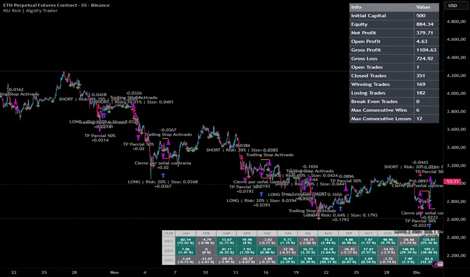
RSI Risk | AlgoFy TraderRSI Risk | AlgoFy Trader
Overview
The RSI Risk | AlgoFy Trader is a trading system that combines RSI-based entry signals with automated capital management. This strategy identifies potential momentum shifts while controlling risk through calculated position sizing.
Key Features
Dynamic Risk Management:
Fixed Risk Per Trade: Users set maximum risk percentage per trade.
Automatic Position Sizing: Calculates position size based on stop-loss distance.
Capital Protection: Limits each trade's risk to user-defined percentage.
RSI Entry System:
Momentum Detection: Uses RSI crossovers above/below defined thresholds.
Clear Signals: Provides long/short entries on momentum transitions.
Multiple Exit Layers:
Dynamic Stop Loss: Stop based on recent price structure.
Fixed Safety Stop: Optional percentage-based stop loss.
Partial Take Profit: Optional early profit-taking.
Trailing Stop: Optional dynamic profit protection.
Performance Tracking:
Trade Statistics: Tracks win/loss streaks and performance metrics.
Monthly Dashboard: Shows monthly/yearly P&L with equity views.
Trade Details: Displays risk percentage and position size.
How It Works
Signal Detection: Monitors RSI for crossover events.
Risk Calculation: Determines stop-loss based on recent volatility.
Position Sizing: Calculates exact position to match risk percentage.
Example:
Account: $10,000 | Risk: 2% ($200 max)
Stop loss at 4% distance
Position size: $5,000
Result: 4% loss on $5,000 = $200 (2% of account)
Recommended Settings
Risk: 1-2% per trade
Enable fixed stop at 3-4%
Consider trailing stop activation
This script provides disciplined RSI trading with automated risk control, adjusting exposure while maintaining strict risk limits.
Smart Gap Projection MTF Smart Gap Projection MTF
## Brief Description
Professional indicator for projecting US Dollar Index (DXY) gaps onto the traded instrument with multi-timeframe analysis support and advanced visualization.
---
## Originality and Uniqueness
**Smart Gap Projection MTF** is a unique development that solves the specific task of correlation analysis between the Dollar Index (DXY) and currency pairs, cryptocurrencies, or other dollar-dependent assets.
### What makes this indicator original:
1. **Inter-market gap projection** - the indicator doesn't just display gaps on the current instrument, but projects gaps from the DXY index onto your asset's chart, creating unique trading levels
2. **Dual confirmation system** - uses a mechanism of waiting N candles after a gap appears on DXY to filter false signals
3. **Intelligent lifecycle tracking** - each projected level is tracked until price touch or gap closure on DXY, with automatic visualization changes
4. **Multi-Timeframe extension** - ability to simultaneously display gaps from a lower timeframe of the current instrument to identify intraday opportunities
5. **Adaptive visualization (Heatmap)** - line intensity and width automatically change depending on gap size, helping to visually identify the most significant levels
---
## How the Indicator Works
### Core Operating Principle
The indicator analyzes the US Dollar Index (DXY) price movement in real-time and identifies gaps (price breaks) between candle closes and opens. When a gap forms on DXY, the indicator:
1. **Determines gap type** - bullish (price opened above previous close) or bearish (price opened below)
2. **Checks gap size** - filters insignificant gaps by absolute size (in points) and percentage value
3. **Waits for confirmation** - after detecting a gap, the indicator waits for a specified number of candles (default 3) to confirm that the gap didn't close immediately
4. **Projects the level** - after confirmation, a horizontal line is drawn on the current instrument's chart at the High level (for bullish DXY gap) or Low level (for bearish DXY gap) of the candle where the gap formed
5. **Tracks status** - the indicator continuously monitors:
- Price touching the projected level (line becomes more transparent)
- Gap closure on DXY itself (line changes color to orange)
### Conceptual Foundation
The methodology is based on the observation that:
- Gaps on the Dollar Index often lead to synchronous movements on correlated assets
- Price levels at the moment of DXY gap formation become price magnets
- Gap closure on DXY often coincides with trend reversal on dependent instruments
---
## How to Use the Indicator
### Basic Setup
1. **Add the indicator to the chart** of any asset correlated with the dollar (EUR/USD, GBP/USD, Bitcoin, Gold, etc.)
2. **Configure main parameters:**
- `DXY Symbol` - leave as "TVC:DXY" (standard Dollar Index ticker)
- `Minimum gap size` - minimum gap size in points (0.0001-0.001 for DXY)
- `Confirmation candles` - number of confirmation candles (recommended 3-5)
3. **Set up visualization:**
- Choose colors for bullish and bearish gaps
- Set desired transparency for each gap type
- Enable/disable `Use heatmap` for adaptive visualization
### Timeframe Recommendations
- **Scalping (M1-M5):** use MTF gaps from M1 timeframe, confirmationCandles = 2-3
- **Intraday (M15-H1):** standard settings, can add MTF M5-M15
- **Swing trading (H4-D1):** increase confirmationCandles to 5-10, MTF H1-H4
### Use with Other Instruments
The indicator is universal and works on:
- **Forex:** EUR/USD, GBP/USD, USD/JPY, AUD/USD and other dollar pairs
- **Cryptocurrencies:** BTC/USD, ETH/USD (direct dollar dependency)
- **Commodities:** Gold (XAU/USD), Silver (XAG/USD), Oil
- **Indices:** SPX, NDX, especially during dollar movements
---
## Configuration Parameters
### Main Settings
- **DXY Symbol** - Dollar Index symbol (default TVC:DXY)
- **Minimum gap size** - minimum gap size in points for filtering
- **Minimum gap size (%)** - minimum percentage size (0 = disabled)
- **Confirmation candles** - number of candles for confirmation (1-10)
- **Maximum gaps on chart** - maximum number of displayed projections
### Multi-Timeframe
- **Enable MTF gaps** - enable/disable MTF gaps
- **Timeframe for gaps** - select lower timeframe for search
- **Max MTF gaps** - maximum number of MTF lines (5-2000)
- **Min MTF gap size** - minimum MTF gap size
- **MTF lines color** - MTF lines color
- **MTF lines style** - line style (Solid/Dashed/Dotted)
- **MTF lines width** - MTF lines width (1-3)
### Visualization
- **Extend lines right** - extend lines to the right
- **Use heatmap** - use adaptive visualization (width/brightness from gap size)
- **Stop lines when DXY gap closes** - stop lines when gap closes on DXY
### Colors
- **Bullish gap color** - color of bullish DXY gap lines
- **Bullish Transparency** - transparency of bullish lines (0-90)
- **Bearish gap color** - color of bearish DXY gap lines
- **Bearish Transparency** - transparency of bearish lines (0-90)
- **Line style** - style of all projection lines
### Alerts
- **Alert on new gap** - notification when new gap is confirmed
---
## Features and Advantages
✅ **Inter-market analysis** - uses correlation between DXY and traded asset
✅ **Automatic filtering** - excludes insignificant and quickly closing gaps
✅ **Multi-timeframe analysis** - combines signals from different time periods
✅ **Visual hierarchy** - heatmap automatically highlights most significant levels
✅ **Lifecycle tracking** - each level is monitored until touch or gap closure
✅ **Universality** - works on any dollar-correlated assets
✅ **Non-repainting** - all levels are fixed historically and don't change
✅ **Customizable visualization** - full control over colors, styles and transparency
---
## Limitations and Important Notes
⚠️ **Indicator is not a trading system** - it's a technical analysis tool requiring confirmation by other methods
⚠️ **Works only on assets correlated with DXY** - on instruments without dollar correlation, signals will be ineffective
⚠️ **Requires understanding of inter-market relationships** - recommended to study correlations between DXY and your instrument
⚠️ **DXY data quality** - ensure your data provider supplies correct TVC:DXY history
⚠️ **MTF data** - when using very low MTF timeframes, delays in updates are possible
---
## Who This Indicator Is For
👨💼 **Forex traders** - analyzing macroeconomic dollar movements
📈 **Crypto traders** - considering dollar influence on Bitcoin and altcoins
🥇 **Commodity market traders** - trading gold, silver, oil
📊 **Intraday scalpers** - using MTF for precise entries
📉 **Swing traders** - looking for medium-term entry points at key levels
---
## Disclaimer
This indicator is intended solely for educational and informational purposes. It is not financial advice or a recommendation to act. All trading decisions you make at your own risk. Past results do not guarantee future performance. Always use proper risk management.

Signal Algo - Elephant EdgeDescription
Signal Algo - Advance Elephant Edge is a rule-based, intraday detection system that combines candle-pattern logic with session-driven support and resistance zones. creating a clean confluence-based signal that removes noise.
This tool is designed for traders who prefer structured rules over subjective drawing, and want clear, event-driven alerts without unrealistic promises or over-optimized behavior.
What This Script Does (Short & Simple)
1. Hammer-Type Candle Detection
The script looks for long-wick hammer or inverted hammer candles using your wick-ratio setting. It also checks candle size, body size, and doji conditions so that only clean and meaningful rejection candles are highlighted.
2. Session-Based Percentile Support & Resistance
The indicator calculates percentile levels from previous sessions and plots up to four upper and lower S/R lines around the daily open. These levels act as dynamic zones where price often reacts.
3. Optional Strike-Price Zones
For symbols that move around round numbers or strike intervals, the script can draw strike-based S/R lines (like 50 or 100 points) You can choose solid or dotted lines and select how many zones to show.
4.Higher-Timeframe Trend Background
A light green or red background shows the overall trend direction. Green = bullish bias, Red = bearish bias.
🔶 USAGE & EXAMPLES Elephant Support & Resistance
Elephant Support & Resistance creates intraday support and resistance levels using percentile data from previous sessions. Instead of drawing lines manually, calculates how far price usually moves above and below previous sessions. and then plots those levels automatically.
Each percentile pair (Level 1–4) gives one upper line and one lower line. These lines represent price zones where the market has reacted many times in the past. When price reaches these levels, it often pauses, reverses, or shows rejection candles.
🔶USAGE & EXAMPLES Strike Price Support & Resistance
Strike Price Zones are plotted because most markets naturally react around fixed strike levels. Every index, stock, or international market has its own commonly traded strike prices. These levels attract large traders and institutions, who often build positions around them.
When price moves toward one of these strike levels, big players frequently defend or reject that zone. As a result, price may pause, reverse, or show strong reactions at or near these strikes.
Because of this behavior, Strike Price Zones work as practical intraday support and resistance levels. They help traders see where important reactions can occur, where momentum may slow down, and where potential reversals may form.
These zones are not buy/sell signals by themselves, but they provide a simple, objective roadmap of key levels that the market respects during the session.
🔷 FEATURES
1. Hammer-Based Rejection Signals
2. Candle Size Filtering
3. Elephant Percentile Support & Resistance
4. Strike Price Support & Resistance Zones
5. Combined Confluence Logic
6. Higher-Timeframe Trend Background
7. Clean Visual Layout
8. Yellow Highlight Candle
9. Intraday Session Handling
10. Built-In Alerts
11. Fully Customizable Inputs
12. Lightweight & Rule-Driven Design
🔴 RISK DISCLAIMER
Trading is risky & most day traders lose money. All content, tools, scripts, articles, & education provided by Signal Algo are purely for informational & educational purposes only. Past performance does not guarantee future results.

SPY SRX S&R Levels - Premium EditionSRX SPY Predictive Support & Resistance Levels
SRX is not a typical TradingView support/resistance indicator.
These levels are not calculated on TradingView at all . Instead, every morning after market open, nearly 20,000 data points are analyzed externally to determine where SPY is statistically most likely to react.
This produces support and resistance levels that are hyper-accurate, mathematically derived, and consistently respected intraday , not hand-drawn guesses or generic indicator outputs.
On top of that, SRX plots dynamic volatility-based zones around each major level so you can catch moves that don’t hit the level penny-perfect.
SRX also generates Buy/Sell Arrows during trending conditions and Buy/Sell Circles during non-trending or early-trend conditions.
Arrows = higher-probability trend-aligned setups.
Circles = lower-confidence ideas that can often be scalped on 1m–3m charts.
This tool is built for traders who want clarity, precision, and the ability to anticipate key reactions on SPY with confidence.
Features:
Externally Calculated SRX Levels: Nearly 20,000 data points analyzed daily to produce statistically significant support & resistance levels.
Dynamic Volatility Zones: Capture moves that don’t hit levels perfectly with automatically adjusting upper/lower zones.
Expected Daily Range: Session high/low projections based on historical and current volatility.
Support Levels (S1–S4): Up to four graduated support zones for precision planning.
Resistance Levels (R1–R4): Up to four graduated resistance zones built from the same predictive model.
Premarket High/Low (PMH/PML): Toggleable levels from premarket session.
Previous Day High/Low (PDH/PDL): Quickly mark the prior day’s key reaction points.
Previous Day Open/Close (PDO/PDC): Additional contextual levels (toggle on/off).
Buy/Sell Arrows: Trigger when price interacts with both the EMA and an SRX level/zone in trending conditions.
Buy/Sell Circles: Trigger in non-trending environments — lower confidence but often scalp-friendly.
EMA Overlay: Adjustable EMA used for signal confirmation (default length 8).
Runway Filter: Optional filter that improves signal quality by measuring available “runway” before the next SRX level.
Near EMA Touch Logic: Helps detect momentum shifts and avoid false signals.
Bias Filter: Determines whether the market is trending up, trending down, or neutral — off by default but extremely powerful.
Historical Data Section: View previous SRX levels for backtesting and strategy review.
Customizable Appearance: Colors, transparency, labels, arrows, zone styling and more.
Built-In Alerts:
Zone/Level Touch or Cross
PMH/PML Touch or Cross
PDH/PDL Touch or Cross
PDO/PDC Touch or Cross
Max-Range High/Low Reached
Buy/Sell Arrow Signals
How to Use:
Copy the daily SRX data string from the official Discord channel.
Paste it into the “SRX Levels Input” field inside the indicator settings.
Customize colors, zones, EMA, signals, and filters to match your trading style.
Use SRX support/resistance levels as the foundation for intraday setups.
Use Arrows when the market is trending and the bias is clear.
Use Circles cautiously during choppy or unconfirmed conditions (often great for scalp entries on 1m/3m).
Optionally enable alerts for level reactions or signal prints.
Ideal For:
Intraday traders who rely on precise support/resistance
SPY scalpers seeking high-probability reaction zones
Momentum traders catching breakouts or bounces
Traders who want statistical structure, not subjective drawings
Important Notes:
SRX levels are calculated externally using proprietary models.
This indicator requires a paid subscription to access the daily SRX support/resistance data.
Daily levels are delivered through our private Discord.
Without the SRX daily data string, the indicator will not display levels.
You can join here to get access to the SRX Levels feed:
stockalertsreviewed.clickfunnels.com
SRX currently works exclusively with SPY (as of Dec 2025). We plan to expand to additional tickers in 2026.
Buy/Sell signals are trade ideas — always confirm with market context.

Discipline Box Trader — by chaitu50cDiscipline Box Trader — by chaitu50c is a rule-based price action tool built around alternating candle structures.
For each session, the indicator detects FIRST key alternating zone, marks it as a gray “Discipline Box”, and then tracks how price breaks and rotates through that zone with clear green/red segments.
The idea is simple:
The script continuously looks for alternating candle sequences:
Red → Green → Red → Green …
or
Green → Red → Green → Red …
When the sequence reaches your minimum required length (Min candles in alternate combo), it:
Finds the highest high and lowest low of that entire alternation combo.
Draws a gray rectangular box from the start of the combo to its end.
This gray region is named the “Discipline Box”.
After this Discipline Box is created:
Upside breakout → close > box high
Downside breakout → close < box low
For example if, Upside Breakout → Green Regime Segment
The gray box is visually closed at the previous bar.
A new green box segment starts from the breakout bar.
Box fill, border, and center line all turn green.
This green segment extends to the right until another breakout flips the regime.
There is a small visible gap between the gray box and the new coloured segment, clearly showing where the breakout actually occurred.
Within the same session, price may:
Break up → green segment.
Later break down through the same band → red segment.
Possibly flip again.
All of this happens inside the one original Discipline Box, giving a clean visual map of who is in control now without creating new zones.
Reset Mode
None
No automatic reset; box can persist across all data.
New Day
At each new trading day:
Current box and center line are closed.
All internal counters reset.
A completely fresh Discipline Box can form for the new day.
Gap Minutes
If time between candles exceeds Gap Threshold (minutes):
Treat this as a session break.
Close the current box and restart detection after the gap.
This ensures clarity and separation between sessions and prevents overlapping “old” structure from dominating new market conditions.
Trading Framework: 2 Trades per Discipline Box
⚠️ This is not financial advice. This is a structured usage idea to support discipline.
A suggested trading framework to pair with this indicator:
Trade 1 — First Breakout Trade
Wait for the first body-based breakout from the Discipline Box:
Upside breakout → consider a single long trade.
Downside breakout → consider a single short trade.
Use the box high, low, and midline as reference points for:
Stop placement, partial exits, or risk-reward zones.
Trade 2 — Opposite Regime Flip
If price later breaks the opposite side of the same box:
Consider exactly one more trade in the new direction (a failed breakout / reversal play).
Example: green regime first, later broken down into red → potential short trade.
After these maximum 2 trades per Discipline Box, you can:
Skip additional trades inside that session’s structure.
Wait patiently for the next session and next Discipline Box to form.
This hard rule helps avoid over-trading, revenge trades, and emotional interference — staying faithful to the “Discipline” theme.
The indicator has a built-in alert condition: Discipline Box Detected
Triggers Whenever a new gray Discipline Box is created (i.e., the first valid alternation zone for that session).
Practical Notes & Disclaimer
The indicator does not tell you when to buy or sell; it simply:
Marks a disciplined structure zone.
Shows live regime shifts (green/red).
Supports a clear “max 2 trades per box” framework.
Use on a demo first, adapt to your style, and always remember:
Your discipline matters more than the indicator.

DWM HLOC, Mid & WicksSimple, yet effective.
1. Automatically calculate and projects key price levels from a previous period (Yesterday, OR Last Week / Month) onto the current trading session. It acts as an immediate Support & Resistance map based on historical price action.
2. Multi-Timeframe Logic
Modes --
Daily Mode: Projects yesterday's data onto today.
Weekly Mode: Projects last week's data onto the current week.
3. Key Levels Visualized The script calculates seven distinct price levels:
OHLC: Previous Open, High, Low, and Close.
Equilibrium (Mid): The exact 50% mark between the previous High and Low.
Wick Midpoints (New):
Upper Wick 50%: The midpoint between the High and the top of the body.
Lower Wick 50%: The midpoint between the Low and the bottom of the body.
4. Smart "Gap" Visualization The script uses unique starting points to help traders visualize market gaps:
Standard Levels (High, Low, Open, Mids): These lines originate from the Previous Period's Open, showing the full context of the level relative to time.
Close Level: This line originates from the Current Period's Open. This visually highlights the "Gap" (the jump in price between where the market closed previously and where it opened today).
5. Full Customization
Aesthetics: Every line can be individually toggled on/off.
Styling: Users can independently change the color, line style (Solid, Dotted, Dashed), and thickness for every specific level.

Ultimate_Price_Action_Tool_V2 by chaitu50cUltimate_Price_Action_Tool_V2 by chaitu50c — Session-Based SR Box Engine
This indicator builds clean, session-aware support and resistance “zones” from pure price action. It is designed for intraday and positional traders who want objective, rule-based zones instead of manual drawing.
Core Logic
Price-action based MAIN zones
Detects bullish and bearish breakouts using a strict body-structure:
Single-candle and double-candle breakout patterns.
Breakouts are confirmed only when closes break beyond previous highs/lows.
From each valid breakout, the tool builds a MAIN Support or MAIN Resistance box:
For bullish breaks, the zone is created from a combined low to the nearest open/close in the breakout combo.
For bearish breaks, the zone is created from a combined high to the nearest open/close in the breakout combo.
Optional first-box logic:
Can create the very first MAIN zone in a session from a simple opposite-color pair (without a full breakout), if enabled.
SUB zones on break
When price breaks a MAIN Support downwards with a red candle, the MAIN box is removed/frozen and:
A new SUB Resistance box is created above, using the current bar’s structure.
When price breaks a MAIN Resistance upwards with a green candle:
A new SUB Support box is created below.
SUB zones are optional and can be fully disabled if the user prefers a clean MAIN-only view.
Session Handling
The script is fully session-aware and can work in different market structures:
Session Mode options
Clock Session
Uses a fixed time window (e.g., 09:15–15:30).
Zones can be shown only inside the session or kept visible outside, depending on settings.
New Day
Each new trading day is treated as a fresh session.
Auto Gap
A new session starts whenever the time gap between candles exceeds a user-defined threshold (in minutes).
Session IDs and history
Each new session gets its own ID.
You can display zones for the last N sessions (including current).
Older sessions fade out visually but remain internally tracked to control visibility.
Main Features & Options
Initial Right Offset
Every new zone is projected to the right by a configurable number of bars.
All active boxes continuously extend with this offset, keeping zones clearly projected into the future.
Single MAIN per side (per session)
Optional constraint to have only:
One active MAIN Support and
One active MAIN Resistance
per session on the chart.
This prevents overcrowding and focuses on the most recent key structure.
MAIN vs SUB Overlap Control
When a new MAIN zone overlaps an existing SUB zone, you can choose:
Suppress MAIN (ignore the new MAIN if it clashes with a SUB),
Remove SUB (delete overlapping SUB zones and keep the new MAIN), or
Allow Both (plot everything and let the trader decide).
Vertical overlap is evaluated using a configurable minimum overlap percentage.
SUB suppression under MAIN
SUB boxes that overlap strongly with active MAIN zones can be auto-suppressed to avoid redundant clutter.
This suppression uses the same percent-based overlap logic.
Broken MAIN box handling
When a MAIN zone is broken:
Option 1: Fully delete it (classic behavior).
Option 2: Convert it into a 1-bar “marker” box at its origin, so you still see where the original zone formed without extending into the future.
Break candle coloring
The candle that breaks a MAIN zone can be optionally painted:
Red when breaking support.
Green when breaking resistance.
Helps visually confirm genuine breaks vs. simple intrabar tests.
Visual & Styling Controls
Separate style controls for:
MAIN Support / MAIN Resistance
Independent fill and border colors.
SUB Support / SUB Resistance
Independent fill and border colors.
Opacity and border colors are internally managed so that:
Recent sessions are clearly visible.
Older sessions are softly faded to maintain context without noise.
Typical Use Cases
Intraday traders looking for:
Clean, rule-based supply and demand zones.
Zones that respect actual session structure (clock, daily, or gap-based).
Swing traders who:
Want to track how current price reacts to the most recent 1–N sessions’ zones.
Price action traders who:
Prefer breakout-based zones rather than indicator-driven levels.
Need automatic zone management (creation, extension, break handling, and suppression).
This tool is built to be modular and configurable: you can run it minimal (only MAIN zones, single side per session) or fully featured (MAIN + SUB, multi-session history, overlap handling, and break paints). All logic is strictly price-action based with no dependency on volume or external indicators.

OHLC for future# OHLC for Futures
## Overview
This indicator helps traders identify key price levels from previous trading sessions. It displays the previous session's High, Low, Close, and the current session's Open as reference points on your chart.
I believe the day's opening price is crucial, while yesterday's opening price is irrelevant.
I haven't found a suitable OHLC indicator for futures trading, so I spent some time developing this one myself. As I'm currently migrating my trading from other platforms to TradingView, I need to create many indicators. Due to time constraints, there might be some bugs. If you encounter any issues or have suggestions for improvement, feel free to leave a comment or send me a private message.
## Key Features
- Displays previous session OHLC levels as dot markers
- Supports Sunday evening session start for futures markets
- Automatically handles half-day trading and weekend gaps
- Optional display of current session's developing High/Low
- Works on any timeframe
### Gap Detection
The indicator automatically handles:
- Half-day trading when market closes early
- Weekend gaps from Friday to Monday
- Any unexpected day changes during active sessions
## Settings
### Time Configuration
**Start Weekday Session**: Enter time in HHMM format (example: 830 for 8:30 AM)
- Used for Monday through Saturday
**Start Sunday Session**: Enter time in HHMM format (example: 1700 for 5:00 PM)
- Used for Sunday evening sessions
**End Session**: Enter time in HHMM format (example: 1515 for 3:15 PM)
- When the trading session officially ends
**Important**: Recommended to set chart timezone to "Exchange" for best results.
## Setup Examples
### ES or NQ Futures
```
Start Weekday Session: 830
Start Sunday Session: 1700
End Session: 1515
Chart Timezone: America/Chicago
```
## Common Trading Applications
**Support and Resistance**
Previous High and Low often act as key levels where price may reverse or pause.
**Opening Range**
The opening price frequently serves as a pivot point during the trading session.
**Gap Trading**
Compare current Open to previous Close to identify gap situations.
**Range Analysis**
Use previous day's range to assess current volatility and potential targets.
## Tips for Best Results
1. Set your chart timezone to match the exchange timezone
2. Use 5-minute or 15-minute timeframes for clear visibility
3. Verify session times match your futures contract specifications
## Version Information
Current Version: 1.0
## Future Development
Planned enhancements:
- Alert system for price crossing OHLC levels
- Trading system integration with entry/exit signals
- Additional statistical analysis tools
## Notes
- This indicator is designed specifically for futures markets
## Disclaimer
This indicator is for educational and informational purposes only. Always conduct your own analysis and implement proper risk management before trading.
---
For questions, suggestions, or bug reports, please leave a comment below.


SPY Daily Expected Move • Manual VIXSPY Daily Expected Move • Manual VIX — Description 📈🔥
This indicator calculates the daily expected move (EM) for SPY using a manual VIX input, then draws the projected high and low boundaries for the trading session.
It automatically retrieves the previous day’s closing price (or today’s open if you choose), then applies a volatility-based formula to estimate the range SPY is statistically likely to remain within. 📊
How the Expected Move Is Calculated 🧮
This indicator uses a simplified institutional volatility model:
\text{Expected % Move} = \frac{\text{VIX}}{\sqrt{252}}
This daily percentage is multiplied by your chosen baseline price:
📘 Previous Close (recommended — most accurate)
🌅 Today’s Open
✏️ Custom Price
And the script automatically plots:
🔼 Expected High
🔽 Expected Low
🏷️ Optional labels + info panel
Choosing the Correct Baseline 🎯
The baseline is one of the most important components of the expected move calculation.
Previous Day’s Close (Strongly Recommended) ✔️
Used by:
🏦 Market makers
🎛️ Options market makers
📐 Institutional volatility models
Expected move represents full-day implied volatility, making the previous close the mathematically correct anchor for SPY.
Using the VIX Input 🌡️
Enter the current VIX, taken from /VX futures or the ^VIX index.
⬆️ Higher VIX = larger expected move
⬇️ Lower VIX = tighter expected move
This lets you align SPY’s session range with real-time volatility conditions.
Recommended VIX-Based Multiplier Adjustments 🔧
The multiplier input allows you to fine-tune the expected move in different volatility regimes.
VIX Level Market Condition Recommended Multiplier
🟦 < 13 Very low volatility 0.9 — tight EM
🟩 13–18 Normal conditions 1.0 (default)
🟨 18–25 Elevated volatility 1.05 – 1.1
🟧 25–35 High volatility 1.2 – 1.3
🟥 > 35 Extreme volatility 1.4 – 1.6
These adjustments reflect how SPY’s actual intraday range stretches during higher volatility periods.
Why This Indicator Matters for SPY Traders 🚀
SPY is the most heavily traded ETF in the world, and market makers heavily rely on expected move to price options.
Because of that:
🧲 EM levels often act as dynamic support/resistance
📛 Breaks above/below EM can trigger gamma-driven trend days
🔄 Sweeps around EM frequently produce high-probability reversal zones
This indicator provides a statistically grounded framework that helps traders anticipate where SPY is most likely to:
move
stall
reverse
expand beyond expected range
All with clean, auto-updating levels that adjust daily based on your input of previous close price and the current VIX opening price.⚡📘

QQQ Daily Expected Move • Manual VIXQQQ Daily Expected Move • Manual VIX — Description 📈⚡
This indicator calculates the daily expected move (EM) for QQQ using a manual VIX input, then draws the projected high and low boundaries for the session.
It automatically pulls the previous day’s closing price (or today’s open if selected) and applies a volatility-based formula to estimate the range QQQ is statistically likely to stay within. 📊
How the Expected Move Is Calculated 🧮
The formula uses a simplified volatility model:
\text{Expected % Move} = \frac{\text{VIX}}{\sqrt{252}}
This percentage is then applied to your selected baseline price:
📘 Previous Close (recommended — most accurate)
🌅 Today’s Open
✏️ Custom Price
The indicator automatically plots:
🔼 Expected High
🔽 Expected Low
🏷️ Optional labels + info panel for quick reference
Choosing the Correct Baseline 🎯
The baseline matters — a lot. Using the correct anchor improves accuracy dramatically.
Previous Day’s Close (Best Practice) ✔️
This is the institutional standard used by:
🏦 Market makers
📉 Options desks
📚 Professional volatility models
Because EM reflects full-day volatility, the prior close is mathematically the most accurate anchor.
Using the VIX Input 🌡️
Enter the current VIX manually (from /VX or ^VIX).
⬆️ When VIX rises → EM widens
⬇️ When VIX falls → EM tightens
Suggested VIX-Based Adjustments 🔧
Use the multiplier to fine-tune the expected move.
VIX Level Market Condition Recommended Multiplier
🟦 < 13 Very low volatility 0.9 – slightly tighter EM
🟩 13–18 Normal conditions 1.0 (default)
🟨 18–25 Elevated volatility 1.05 – 1.1
🟧 25–35 High volatility 1.2 – 1.3
🟥 > 35 Extreme volatility 1.4 – 1.6
Multipliers help the EM adapt to different volatility regimes so the ranges remain realistic.
Why This Indicator Matters 🚀
Market makers price daily options around the expected move.
Because of this:
🧲 EM boundaries often behave like dynamic support & resistance
📛 Breaks of EM commonly trigger gamma-driven trend days
🔄 Sweeps around EM often create high-probability reversals
This tool gives traders a statistically grounded framework to anticipate where QQQ is most likely to move, stall, reverse, or expand, with clean auto-updating levels every trading day.
Adjusting the previous day’s close, opening price, and VIX input lets you model the market like a volatility desk — but in a simple, transparent format. 📘✨

HTF Candle overlayOverview
This Pine Script indicator overlays three separate Mini Charts onto the right side of your main chart area. These mini charts display price action from Higher Timeframes (HTF), allowing traders to monitor multi-timeframe market structure and trends without switching screens. Each mini chart is overlaid with up to 5 customizable EMA (Exponential Moving Average) Clouds.
Key Features
1. Three Independent Mini Charts
Users can select three distinct higher timeframes (e.g., 1 Hour, 4 Hours, 1 Day).
The script automatically checks to ensure the selected timeframe is higher than the current chart's timeframe.
Displays up to 10 historical candles per mini chart (limited to optimize Pine Script drawing resources).
2. Smart Data Handling (RTH vs. ETH)
Daily, Weekly, Monthly: For timeframes of 1 Day or higher, the script forces Regular Trading Hours (RTH) data. This ensures daily candles look standard and aren't distorted by pre/post-market low volume ticks.
Intraday (e.g., 1H, 4H): For timeframes below 1 Day, the script uses Extended Trading Hours (ETH) data, ensuring you see the full picture of pre-market and after-hours moves.
Ticker Cleaning: The script automatically sanitizes ticker IDs to prevent "Symbol Resolve Errors" when used on charts with complex session settings.
3. Comprehensive EMA Clouds
5 Customizable Clouds: Each mini chart can display up to 5 different EMA Clouds (pairs of Short and Long Moving Averages).
Full Color Control: Users can individually customize:
Line Colors: Distinct colors for Short and Long EMA lines.
Cloud Fill: Distinct colors and transparency for Bullish and Bearish trends.
Toggle Visibility: Each of the 5 clouds can be turned On or Off via settings.
Source Selection: Users can calculate EMAs based on Close, Open, High, Low, HL2, HLC3, or OHLC4.
4. Custom Visuals & Positioning
Candle Aesthetics: Users can define Bull/Bear candle colors, transparency, and Candle Width (thickness).
Positioning:
Horizontal Offset: Shift the entire dashboard left or right to avoid overlapping with current price action.
Spacing: Adjust the gap between the three mini charts.
Assistance Lines: Optional Support/Resistance lines (Fibonacci or Range High/Low) can be drawn extending from the mini charts.
How it Works (Technical Summary)
The script utilizes request.security to fetch OHLC data and Moving Average data from the specified higher timeframes. It stores this data in Matrices and Arrays to manage history. It then uses Pine Script's line.new and label.new functions to manually draw the candles and EMA lines onto the main chart canvas, relative to the current bar_index. It includes logic to handle dynamic array resizing and garbage collection to stay within Pine Script's execution limits.

UpDown Advanced [DivineTrade]English version below
Описание индикатора UpDown Advanced (Pump & Damp Strategy)
UpDown Advanced это улучшенная версия индикатора для поиска резких импульсных движений цены, известных как Pump & Dump. Индикатор анализирует состояние рынка на выбранном таймфрейме и формирует сигналы, когда цена совершает аномальное движение за короткий промежуток времени и одновременно выполняет фильтры, указанные пользователем.
Короткое резюме
UpDown Advanced помогает:
• находить резкие импульсы на графике
• фильтровать их по RSI, тренду и таймфреймам
• контролировать частоту сигналов
• выстраивать собственные сценарии под любую стратегию
Подробное описание
Индикатор идеально подходит для Pump & Dump логики, но может использоваться и как универсальный детектор импульсных движений.
Основная логика работы
1. Анализ выбранного таймфрейма
Индикатор работает строго на том таймфрейме, который открыт на графике.
Все расчёты, сигналы и фильтры привязаны именно к текущему ТФ.
2. Поиск импульса каждые N свечей
В настройке Bars for pump / damp указывается количество последних свечей, в пределах которых индикатор будет искать резкий скачок цены.
Например:
Bars for pump/damp = 5
→ индикатор проверяет, на сколько % цена изменилась за последние 5 свечей.
3. Пороговый размер пампа/дампа
Параметр Signal trigger, % задаёт нужное изменение цены для возникновения сигнала.
Если изменение цены превышает указанное значение, этот критерий считается выполненным.
4. Система фильтров по таймфреймам
Индикатор поддерживает несколько независимых фильтров, каждый из которых включает:
• выбор таймфрейма
• длину RSI
• верхнюю/нижнюю границу RSI
• анализ тренда (вверх / вниз / оба варианта)
Все таймфреймы, отмеченные галочками, используются для фильтрации сигнала.
Сигнал появится только если выполнены условия по каждому выбранному фильтру.
Это позволяет создавать сложные сценарии, например:
• RSI перегрет на 1ч и 4ч
• тренд совпадает
• памп на основном ТФ составляет +7%
• импульс произошёл в пределах заданного окна свечей
5. Контроль частоты сигналов
Чтобы индикатор не спамил уведомлениями, есть два механизма:
1. Alerts frequency: once per bar close — сигнал формируется только по закрытию свечи.
2. Interval between signals, minutes — минимальный промежуток между сигналами.
Например:
Интервал = 30 минут → повторный сигнал появится не раньше, чем через 30 минут после предыдущего.
Пример настройки №1 (сигнал на 5-минутный памп)
Цель:
Получать сигнал, если:
• памп +7%
• произошёл за последние 5 свечей
• RSI перегрет на 1ч и 4ч (83+)
• сигнал не чаще 1 раза в 30 минут
Настройки:
• Alerts frequency: once per bar close
• Interval between signals: 30
• Bars for pump/damp: 5
• Signal trigger: 7%
Timeframe #1:
• RSI Length: 14
• Timeframe: 1H
• RSI Upper Band: 83
• RSI Lower Band: 0
• Trend: Both
Timeframe #2:
• RSI Length: 14
• Timeframe: 4H
• RSI Upper Band: 83
• RSI Lower Band: 0
• Trend: Both
Пример настройки №2 (сигнал на 15-минутный памп)
Всё как выше, но:
• Bars for pump/damp: 15
Индикатор позволяет создавать столько фильтров, сколько нужно под стиль трейдера.
__________________________________________________________________________________
English version
UpDown Advanced (Pump & Damp Strategy) – Indicator Description
UpDown Advanced is an improved version of the indicator designed to detect sharp impulsive price movements, commonly known as Pump & Dump events. The indicator analyzes the market on the currently opened timeframe and generates signals when a strong price impulse appears within a short period, while simultaneously meeting all user-defined filters.
Summary
UpDown Advanced allows traders to:
• detect sharp pump/dump movements
• filter signals using RSI, trend, and multi-timeframe conditions
• control alert frequency
• build custom scenarios for any trading style
It is ideal for Pump & Dump trading logic but also works as a universal impulse-detection tool.
Core Logic
1. Analysis of the selected timeframe
The indicator works strictly on the timeframe opened on the chart.
All calculations, triggers, and filters are tied to this timeframe.
2. Searching for impulses every N bars
The setting Bars for pump / damp defines how many recent bars the indicator evaluates for a rapid price move.
Example:
Bars for pump/damp = 5
→ the indicator checks how much the price changed over the last 5 bars.
3. Pump/Dump threshold
The parameter Signal trigger, % sets the minimum percentage change required to trigger a signal.
If the price movement exceeds this value, the first condition is met.
4. Multi-timeframe filter system
The indicator supports multiple independent filters, each including:
• chosen timeframe
• RSI length
• RSI upper/lower bands
• trend direction filter (up / down / both)
Only timeframes with checkmarks enabled are used for filtering.
A signal will appear only if ALL selected filters pass.
This allows building advanced logic, such as:
• RSI strongly overheated on 1H and 4H (83+)
• trend confirmation
• pump of +7% on the main timeframe
• impulse detected within N bars
• signals limited to a specific time interval
5. Signal frequency control
To prevent excessive alerts, the indicator provides:
1. Alerts frequency: once per bar close – signals only on candle close
2. Interval between signals (minutes) – minimum time gap between alerts
Example:
Interval = 30 minutes → the next signal will not appear earlier than 30 minutes after the previous one.
Example Setup #1 (5-bar pump detection)
Goal:
Receive a signal if:
• pump = +7%
• within the last 5 bars
• RSI overheated on 1H and 4H (83+)
• no more than 1 signal every 30 minutes
Settings:
• Alerts frequency: once per bar close
• Interval between signals: 30 minutes
• Bars for pump/damp: 5
• Signal trigger: 7%
Timeframe #1:
• RSI Length: 14
• Timeframe: 1H
• RSI Upper Band: 83
• RSI Lower Band: 0 (long signals disabled for now)
• Trend: Both
Timeframe #2:
• RSI Length: 14
• Timeframe: 4H
• RSI Upper Band: 83
• RSI Lower Band: 0
• Trend: Both
Example Setup #2 (15-bar pump detection)
All settings remain the same, but:
• Bars for pump/damp: 15
The indicator allows creating any number of filter combinations to match your trading logic.

Session Opening Range Breakout (ORBO)This strategy automates a classic Opening Range Breakout (ORBO) approach: it builds a price range for the first minutes after the market opens, then looks for strong breakouts above or below that range to catch early directional moves.
Concept
The idea behind ORBO is simple:
The first minutes after the session open are often highly informative.
Price forms an “opening range” that acts as a mini support/resistance zone.
A clean breakout beyond this zone can lead to high-momentum moves.
This script turns that logic into a fully backtestable strategy in TradingView.
How the strategy works
Opening Range Session
Default session: 09:30–09:50 (exchange time)
During this window, the script tracks:
orHigh → highest high within the session
orLow → lowest low within the session
This forms your Opening Range for the day.
Breakout Logic (after the window ends)
Once the defined session ends:
Long Entry:
If the close crosses above the Opening Range High (orHigh),
→ strategy.entry("OR Long", strategy.long) is triggered.
Short Entry:
If the close crosses below the Opening Range Low (orLow),
→ strategy.entry("OR Short", strategy.short) is triggered.
Only one opening range per day is considered, which keeps the logic clean and easy to interpret.
Daily Reset
At the start of a new trading day, the script resets:
orHigh := na
orLow := na
A fresh Opening Range is then built using the next session’s 09:30–09:50 candles.
This ensures entries are always based on today’s structure, not yesterday’s.
Visuals & Inputs
Inputs:
Opening range session → default: "0930-0950"
Show OR levels → toggle visibility of OR High / Low lines
Fill range body → optional shaded zone between OR High and OR Low
Chart visuals:
A green line marks the Opening Range High.
A red line marks the Opening Range Low.
Optional yellow fill highlights the entire OR zone.
Background shading during the session shows when the range is currently being built.
These visuals make it easy to see:
Where the OR sits relative to current price
How clean / noisy the breakout was
How often price respects or rejects the opening zone
Backtesting & Optimization
Because this is written as a strategy():
You can use TradingView’s Strategy Tester to view:
Win rate
Net profit
Drawdown
Profit factor
Equity curve
Ideas to experiment with:
Change the session window (e.g., 09:15–09:45, 10:00–10:30)
Apply to different:
Markets: indices, FX, crypto, stocks
Timeframes: 1m / 5m / 15m
Add your own:
Stop Loss & Take Profit levels
Time filters (only trade certain days / times)
Volatility filters (e.g., ATR, range size thresholds)
Higher-timeframe trend filter (e.g., only take longs above 200 EMA)

AliceTears GridAliceTears Grid is a customizable Mean Reversion system designed to capitalize on market volatility during specific trading sessions. Unlike standard grid bots that place blind limit orders, this strategy establishes a daily or session-based "Baseline" and looks for price over-extensions to fade the move back to the mean.
This strategy is best suited for ranging markets (sideways accumulation) or specific forex sessions (e.g., Asian Session or NY/London overlap) where price tends to revert to the opening price.
🛠 How It Works
1. The Baseline & Grid Generation At the start of every session (or the daily open), the script records the Open price. It then projects visual grid lines above and below this price based on your Step % input.
Example: If the Open is $100 and Step is 1%, lines are drawn at $101, $102, $99, $98, etc.
2. Entry Logic: Reversal Mode This script features a "Reversal Mode" (enabled by default) to filter out "falling knives."
Standard Grid: Buys immediately when price touches the line.
AliceTears Logic: Waits for the price to breach a grid level and then close back inside towards the mean. This confirms a potential rejection of that level before entering.
3. Exit Logic
Target Profit: The primary target is the previous grid level (Mean Reversion).
Trailing Stop: If the price continues moving in your favor, a trailing stop activates to maximize the run.
Stop Loss: A manual percentage-based stop loss is available to prevent deep drawdowns in trending markets.
⚙️ Key Features
Visual Grid: Automatically draws entry levels on the chart for the current session, helping you visualize where the "math" is waiting for price.
Timezone & Session Control: Includes a custom Timezone Offset tool. You can trade specific hours (e.g., 09:30–16:00) regardless of your chart's UTC setting.
Grid Management: Independent logic for Long and Short grids with pyramiding capabilities.
Safety Filters: Options to force-close trades at the end of the session to avoid overnight gaps.
⚠️ Risk Warning
Please Read Before Using: This is a Counter-Trend / Grid Strategy.
Pros: High win rate in sideways/ranging markets.
Cons: In strong trending markets (parabolic pumps or crashes), this strategy will add to losing positions ("catch a falling knife").
Recommendation: Always use the Stop Loss and Date Filter inputs. Do not run this on highly volatile assets without strict risk management parameters.
Settings Guide
Entry Reversal Mode: Keep checked for safer entries. Uncheck for aggressive limit-order style execution.
Grid Step (%): The distance between lines. For Forex, use lower values (0.1% - 0.5%). For Crypto, use higher values (1.0% - 3.0%).
UTC Offset: Adjust this to align the Session Hours with your target market (e.g., -5 for New York).
This script is open source. Feel free to use it for educational purposes or modify it to fit your trading style.

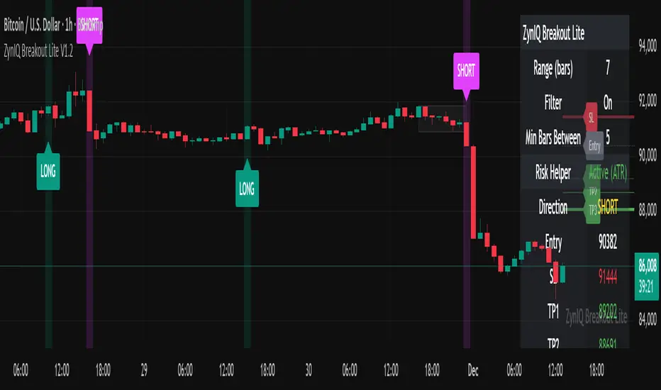
ZynIQ Breakout Lite v1.2 - (Lite Pack)Overview
ZynIQ Breakout Lite v1.2 provides a streamlined breakout framework designed to highlight expansion moves from short-term consolidation. It focuses on clarity and simplicity, making it suitable for intraday and swing trading.
Key Features
• Breakout range detection based on a configurable lookback period
• Optional minimum candle-range filter
• Simple signal spacing to reduce clustered signals
• Direction-aware breakout triggers (non-repainting)
• Optional ZynIQ Risk Helper for structured SL/TP planning
• Optional HUD panel showing current settings and breakout context
Use Cases
• Identifying range breakouts
• Highlighting directional shifts
• Quickly assessing breakout structure with lightweight visuals
Notes
This tool assists with breakout structure and risk planning. It is not a trading system by itself. Use with your preferred confirmation tools and risk management.
Diff Price (Future - Spot)Diff Line (Future – Spot) plots a grid of spot-price levels derived from the current futures price.
It rounds the current futures price up to the nearest price block (e.g. every 25 points), then subtracts a user‑defined Diff (Future – Spot) to find the main spot level and draws that as the central line. Additional lines are plotted above and below at equal block distances, with labels showing both Future and Spot values (e.g. 4250 (4215)), plus a compact diff info box for quick reference.

APEX-SIGNAL PRO STMDescription:
APEX-SIGNAL PRO is a comprehensive trading system designed for traders who prioritize consistency and risk management. Unlike traditional indicators, APEX integrates Smart Money Concepts (SMC), Liquidity Sweeps, and Volatility analysis into a single, clean interface.
The core philosophy of this system is the "No-Ruin Protocol" — a built-in risk engine that ensures you never over-leverage, helping you survive in the market long-term while capturing high R:R setups.
Key Features:
💎 Snipe Mode (Tier A): High-probability entry signals based on Liquidity Sweeps + Reversal Candles.
🌊 Flow Mode (Tier B): Trend-following logic for capturing momentum.
🛡️ No-Ruin Dashboard: Real-time position sizing and risk calculator displayed directly on your chart.
📊 Smart Structure: Automatically identifies Supply/Demand zones and Order Blocks.
🚫 100% Non-Repaint: All signals are permanent once the candle closes. No disappearing arrows.
How to Use:
Identify Trend: Use the dashboard to check the current market bias (Bullish/Bearish).
Wait for Signal: Look for the GREEN (Buy) or RED (Sell) labels.
Confirm Structure: Ensure the price is reacting to a valid Supply/Demand zone shown on the chart.
Manage Risk: Follow the TP/SL levels and Lot Size recommended by the dashboard.
⚠️ Disclaimer: Trading financial markets involves risk. This tool is designed to assist in analysis and does not guarantee profits. Past performance is not indicative of future results.
🔓 Access: This is an Invite-Only script. To request access, stm29112025@gmail.com
