Dual MACD CrossWhat Is This Indicator?
This indicator is a visual tool for reading changes in market momentum.
Instead of giving buy or sell orders, it helps you see when the market’s short-term behavior starts to differ from its underlying direction. Think of it as a way to observe shifts in mood rather than make automatic decisions.
What Do the Lines Mean?
You will see three visual elements:
The thin green line represents the market’s short-term momentum.
It reacts quickly to recent price changes and shows what the market is doing right now.
The thicker white line represents the market’s reference trend.
It moves more slowly and reflects the broader, more stable direction of the market.
The yellow dotted line is the zero baseline.
It does not generate signals. Its only purpose is to help you visually judge whether momentum is generally positive (above zero) or negative (below zero).
How Should This Indicator Be Read?
The key is the relationship between the green and white lines.
When the green line is above the white line, short-term momentum is stronger than the market’s reference trend.
When the green line is below the white line, short-term momentum is weaker.
The indicator is not concerned with how high or low the lines are by themselves.
What matters is how they interact.
What Do the Triangle Markers Mean?
The small triangle markers highlight moments of transition.
An upward triangle appears when the green line crosses above the white line.
This suggests that short-term momentum is beginning to outperform the broader trend.
A downward triangle appears when the green line crosses below the white line.
This suggests that momentum is weakening relative to the broader trend.
These markers are attention points, not commands. They indicate potential change, not certainty.
Why Is the Zero Line Important?
The zero line provides context.
A crossover that happens above the zero line occurs while the market is already in a relatively strong state.
A crossover below the zero line happens in a weaker environment and may represent a failed move or an early attempt at reversal.
The same crossover can mean very different things depending on its position relative to zero.
What Is This Indicator Best Used For?
This indicator is best used to:
Observe early signs of trend changes
Compare short-term momentum versus underlying direction
Confirm what you are already seeing in price action or other indicators
It is not designed to:
Predict tops or bottoms precisely
Act as a standalone buy/sell system
Measure overbought or oversold conditions
A Simple Analogy
Imagine driving a car.
The green line is how hard you are pressing the accelerator.
The white line is your current speed.
The yellow zero line is the difference between moving forward or backward.
The triangles mark moments when acceleration begins to change the car’s actual movement.
The indicator helps you notice when effort starts to translate into direction.
The Right Way to Use It
This indicator does not tell you what to do.
It encourages you to ask better questions:
Is momentum starting to lead or lag?
Is this change supported by price structure?
Does the broader context confirm or contradict this signal?
Used this way, it becomes a tool for awareness, not prediction.
If you’d like, I can also provide:
A one-paragraph version for documentation
A training script for beginners
Or a minimal tooltip-style explanation for sharing with others
Grafik Desenleri

NQ Pro Dashboard (Master Fix)This indicator is a "Head-Up Display" designed specifically for trading NQ (Nasdaq-100 Futures). It aggregates data from the broader market (volatility) and the specific stocks that drive the Nasdaq index (The "Magnificent 7") to give you a single Trend Power Score.
Here is a breakdown of how the logic works under the hood:
1. The Inputs (Data Feed)
The script watches 9 specific assets in real-time (daily timeframe data):
Fear Gauges:
VIX: The volatility index for the S&P 500.
VXN: The volatility index specifically for the Nasdaq-100.
The Engine (Mag 7):
NVDA, AAPL, MSFT, AMZN, GOOGL, META, TSLA.
2. The Logic: "Weighted" Market Strength
Instead of treating every stock equally, the script applies a Weighting Multiplier to the Mag 7 stocks based on their approximate impact on the Nasdaq-100 index.
Heavyweights (1.5x): NVDA, AAPL, MSFT (These move the market the most).
Middleweights (1.0x): AMZN, GOOGL, META.
Lightweight (0.7x): TSLA (Has the least pull of the group).
It calculates a single percentage number (MAG 7 (W)) representing the combined push or pull of these stocks.
3. The "Trend Power" Score (0-100)
This is the core signal. It starts at a neutral 50 and adds/subtracts points based on market conditions.
Fear Factor:
If VIX or VXN drops > 2% (Fear dying), it adds points (Bullish).
If VIX or VXN spikes > 2% (Fear rising), it subtracts points (Bearish).
Stock Strength:
If the Weighted Mag 7 Average is > 1.0% (Strong Rally), it adds a massive 30 points.
If it's negative (Sell-off), it subtracts points.
The Score Breakdown:
80 - 100 (Green): STRONG BULL. The engines are firing (stocks up) and the brakes are off (VIX down). Do not short.
0 - 20 (Red): STRONG BEAR. Panic selling is occurring. Do not buy.
40 - 60 (Orange): CHOP / RANGE. Conflicting signals (e.g., stocks are up but VIX is also up). Be careful.
4. The "Exhaustion" Meter (ATR)
The RANGE row tells you if the market has "gas left in the tank."
It compares Today's Range (High - Low) to the 14-Day Average Range (ATR).
< 50% (Yellow): Compressed. The market hasn't moved much yet. Expect a breakout soon.
> 120% (Purple): Extended. The market has moved massive amounts today. A reversal or pause is statistically likely (mean reversion).
5. The Visuals (Leaders Row)
The bottom row gives you a quick visual scan of the individual stocks:
N▲ (Green): Nvidia is up.
T▼ (Red): Tesla is down.
This helps you spot "divergences"—for example, if the Trend Score is high but NVDA is Red, the rally might be fragile.

BTC - RVPM: Run Velocity & Probability MapBTC – RVPM: Run Velocity & Probability Map | RM
Strategic Context: Understanding Price Runs
A "Price Run" (also known as a streak or consecutive sessions) is a foundational concept in time-series analysis that measures the duration of a price movement without a significant counter-signal. While common indicators like RSI or MACD measure magnitude or momentum, they often ignore the Persistence of the trend. Historically, markets move through cycles of expansion and mean-reversion. A Price Run represents a period of "Unidirectional Flow" — a fingerprint of institutional accumulation or systematic distribution. However, standard "run-counting" is often too simplistic for the volatile crypto markets.
What Makes RVPM Special?
Most community run-counters are binary; they simply tell you if X days were green or red. The RVPM distinguishes itself through three proprietary layers:
• The Intensity Filter: It doesnt just count days; it counts effort . By ignoring "flat" days through a percentage-return threshold, it filters out noise that would otherwise skew the statistical probability.
• Dynamic Benchmarking: Instead of using an arbitrary number (like "7 days"), the RVPM looks back at 200 bars of history to find the local "Persistence Ceiling." It adapts to the current volatility regime of Bitcoin.
• The Velocity Score: It transform simple counts into a -100 to +100 histogram, allowing traders to see momentum "decaying" (e.g., dropping from 90 to 70) even if the price continues to rise.
The 3 Pillars of the Engine
1. Velocity Mapping (Persistence Histogram)
The histogram calculates the density of directional effort within a defined window. It functions as the "Pulse" of the trend, mapping market behavior into three distinct zones:
• High Velocity Zone (> 80 or < -80): Institutional Expansion. This identifies a "clean" move where one side of the market possesses total structural control. In this zone, the trend is efficient, and counter-signals are immediately absorbed.
• The Neutral Zone (Near Zero): Momentum Equilibrium. When the histogram fluctuates near the zero line, the market is in a "Recharge Phase." Neither bulls nor bears are achieving persistent dominance. Tactically, this is the "Waiting Room" where range-bound chop is likely, and traders should wait for a new "Expansion" spike before committing.
• Velocity Decay: The Exhaustion Warning. Velocity Decay occurs when the indicator moves from an extreme (e.g., +95) back toward the zero line (e.g., +50) while the price is still rising. This is a "Persistence Divergence." It tells you that while the trend is still moving, the consistency of the bars is fragmenting. The "fuel" is being depleted, and the trend is transitioning from an "Institutional Expansion" into a "Speculative Exhaustion."
2. n-of-m Consistency (The Pips)
The "Pips" (Circles) mark when a specific consistency threshold is met (e.g., 5 out of 7 bars in one direction). This identifies "Leaky Trends" that are still statistically dominated by one side of the ledger.
3. Statistical Exhaustion (The Arrows)
The Dark Red (Top) and Dark Green (Bottom) triangles represent the engine's "Mean-Reversion Signal." The calculation is based on a Relative Maximum Streak (RMS) logic: the script tracks the current linear, consecutive bar count (ignoring bars that fail the Intensity Filter) and continuously benchmarks this against the highest streak recorded over the last 200 bars ( ta.highest(streak, 200) ). The triangles are triggered specifically when the current run reaches 80% of this historical record (the "Anomaly Threshold"). Mathematically, this identifies a move that is statistically pushing against its half-year limit. By using this dynamic threshold rather than a fixed number, the "Extreme" signal automatically tightens during low-volatility regimes and expands during high-volatility expansions, ensuring the signal only appears when the "statistical rubber band" is at a true breaking point.
Operational Interface: The RVPM Dashboard
The Status Dashboard (Top Right) serves as a real-time monitor for momentum health, providing a clean summary of the underlying persistence data:
• Current STREAK: The active, consecutive count of bars meeting the Intensity Filter. It is dynamically color-coded (Cyan/Bullish or Red/Bearish) to provide an instant read on trend seniority.
• WINDOW Consistency: Measures the Momentum Density (the n-of-m value). A value of "6" in a "7-bar" window indicates a high-conviction regime that is successfully absorbing pullbacks without losing its primary trajectory.
Tactical Playbook: The Mean-Reversion Rule
Price action typically follows a "Rubber Band" effect. The further it is stretched without a break, the more "unstable" the trend becomes as the pool of available buyers or sellers is depleted.
• The Setup: Wait for the Triangle Arrows to appear.
• The Logic: The move has reached a 200-day anomaly. A "Liquidity Vacuum" is forming on the opposite side.
• The Action: This is a high-probability Mean-Reversion signal. It is a tactical time to take profits or look for a sharp snap-back move toward the 20-period moving average or the "Institutional Mean."
Settings & Parameters
• Window Length (m): The lookback window used to calculate the Velocity Score.
• Required Days (n): The minimum number of directional bars needed within the window to trigger a "Consistency Pip."
• Intensity Filter (%): The minimum % change required for a bar to be counted toward a run.
• Lookback Period: The historical window (Default: 200 bars) used to calculate the "Maximum Streak" records for exhaustion alerts.
Timeframe Recommendation
The RVPM is best viewed on the Daily (1D) timeframe. This filters out intraday noise and provides the most reliable statistical mapping for macro exhaustion points.
Credits & Verification
The RVPM logic aligns with institutional "Persistence" models and Glassnode's Price Stretch benchmarks. By benchmarking against a rolling 200-day window, the indicator automatically adapts to changing market volatility.
Risk Disclaimer & No Financial Advice
The information, data, and analytical models provided in this publication are for educational and informational purposes only. This script does not constitute financial, investment, or trading advice. Trading cryptocurrencies and other financial instruments carries a high degree of risk, and statistical anomalies or "Extreme Runs" do not guarantee future price action. Past performance is never indicative of future results. Every trader is responsible for their own due diligence and risk management. Rob Maths and the associated entities are not liable for any financial losses incurred through the use of this tool. Always consult with a certified financial professional before making significant investment decisions.
Tags:
bitcoin, btc, persistence, streaks, price-runs, momentum, mean-reversion, exhaustion, Rob Maths

Candle 2 Closure [LuxAlgo]The Candle 2 Closure tool detects a specific reversal pattern on the chart spanning four bars. The first bar trades into a key price level. The second bar trades outside the first bar's range, but closes inside, indicating a reversal. The third bar closes outside the second bar's range, in the direction of the reversal, creating a price expansion. The fourth bar is a continuation of prices in that same direction.
This tool features key levels, equilibrium zones, and real-time alarms upon confirmation of the second and third candles of the pattern.
This specific part of the more complete Fractal model by TTrades was requested by a lot of you. We are happy to bring it to you and wish you a merry Christmas!
🔶 USAGE
This pattern is a TTrades concept: a reversal setup that is very easy to understand. It occurs when the current bar trades outside of the previous bar's range, but closes inside it. In other words, traders try to push prices outside of the previous bar's range, but fail. This is considered a reversal, meaning that traders encountered opposing forces that overwhelmed them. Thus, the expectation is that prices will trade in the new direction, changing the market bias from bullish to bearish, or vice versa.
Let's look at the example in the chart, where the four candles of this setup are marked. Note that we have selected a perfect setup, where all conditions are met.
Candle 1: This bar traded into a key price area at the top of the range, spanning several months.
Candle 2: This bar traded outside the range of Candle 1, but failed to close outside. This is the reversal.
Candle 3: The wick of this bar formed at or below the equilibrium zone of Candle 2, and it closed outside the range of Candle 2. This is the expansion.
Candle 4: At this point, the setup is complete, and the expectation for this candle is that it will trade in the same direction. The top of the candle is at or below the equilibrium zone of Candle 3. This is the continuation.
In a strong setup, the top or bottom of the next bar will form inside the equilibrium zone defined by the highlighted areas on candles 2 and 3.
This is a perfect bearish setup, featuring all elements. Not all setups will be like this, but when this setup occurs, it is important for traders to be aware of it.
The tool is highly customizable from the settings panel and features real-time alerts at candle 2 and 3 confirmations.
Now, let's take a broader view of the same chart. We have disabled the display of candle 2 and filtered the setups with a length of 50.
As we can see, most of the last 17 setups found on the EUR/USD daily chart lead to multi-day or multi-month price movements.
🔹 Filtering Reversals
The tool features a reversals filter that is disabled by default. This filter allows us to filter out minor reversals and display only those that are important.
Traders can adjust the length parameter to display reversals only at the top or bottom of the last N specified bars. We can see some examples in the chart.
🔹 Wick Threshold
From the settings panel, traders can fine-tune the equilibrium zone for candle 2.
If the wick exceeds the threshold expressed as a percentage of the total bar range, the equilibrium zone will be calculated based only on the wick. In all other cases, the full bar range will be used.
🔶 SETTINGS
Candle 2 (Reversal): Enable or disable Candle 2 reversals.
Candle 3 (Expansion): Enable or disable Candle 3 expansions.
Reversals Filter: Filter reversals as the highest or lowest of the last N bars.
Wick Threshold %: Filter wicks as percentage of total bar range.
🔹 Style
Bullish Color: Select bullish color.
Bearish Color: Select bearish color.
Transparency: Select the transparency level. 0 is solid and 100 is fully transparent.
Levels: Enable or disable the horizontal levels.
Candle 2 Zone: Enable or disable the Candle 2 equilibrium zones.
Candle 3 Zone: Enable or disable the Candle 3 equilibrium zones.
🔹 Alerts
Candle 2 Alerts: Enable or disable Candle 2 alerts.
Candle 3 Alerts: Enable or disable Candle 3 alerts.

Wickless Candle Revisit TrackerWickless Candle Revisit Tracker
Identifies wickless candles (strong momentum candles) and tracks whether price revisits their opening level, providing statistical insights into price behavior patterns.
WHAT ARE WICKLESS CANDLES?
• Green wickless: Open = Low (no lower wick) - opened at the low and moved only upward
• Red wickless: Open = High (no upper wick) - opened at the high and moved only downward
These candles represent strong directional momentum, and their opening levels often act as support/resistance zones that price may revisit.
KEY FEATURES:
• Automatic Detection: Identifies wickless candles with configurable tolerance for broker spread
• Real-time Tracking: Monitors each wickless candle until price revisits its opening level
• Visual Indicators:
- Labels show "WL↑" or "WL↓" with bars count when revisited (or "N/A" if pending)
- Horizontal lines mark price levels (gray dashed = pending, green solid = revisited)
• Comprehensive Statistics Table:
- Total wickless candles detected
- Revisit rate percentage
- Min/Max/Average bars until revisit
- Pending count
• History Limit: Configure how far back to analyze (default: 500 bars)
• Customizable: Adjust colors, toggle labels/lines/table, reposition statistics
USE CASES:
• Identify potential support/resistance levels from momentum candles
• Measure how often price fills "fair value gaps" or inefficiencies
• Track mean reversion patterns after strong momentum moves
• Backtest the reliability of wickless candle levels as trading zones
SETTINGS:
• Wick Tolerance: Allow small wicks due to broker spread (e.g., 0.0001 for forex)
• History Limit: Number of bars to analyze (older candles are hidden)
• Visual Controls: Toggle labels, lines, and statistics table
• Color Customization: Adjust line colors for pending/revisited states
ALERTS:
Built-in alerts for wickless candle detection (green, red, or both).
Perfect for traders analyzing price inefficiencies, fair value gaps, and momentum-based support/resistance levels.

RSI Ladder TP Strategy v1.0 Overview
This strategy is an RSI-based reversal entry system with a ladder-style take-profit mechanism.
It supports Long-only, Short-only, or Both directions and provides optional Average Entry Price, Stop Loss, and Take Profit reference lines on the chart.
Entry Rules
Long Entry: RSI crosses above the Oversold level (default: 20).
Short Entry: RSI crosses below the Overbought level (default: 80).
Optional: If enabled, the script will close the current position when an opposite signal appears before opening a new one.
Exit Rules (Ladder Take Profit)
Take profit is placed as a ladder using tpLevels and tpStepPct.
Example (default tpStepPct = 1%, tpLevels = 10):
TP1 at +1%, TP2 at +2%, … TP10 at +10% (relative to current average entry price).
Each TP level closes tpClosePct of the remaining position, meaning it scales out geometrically:
If tpClosePct = 50% → remaining position becomes 50%, then 25%, then 12.5%, etc.
Stop Loss
Optional stop loss is placed at slPct (%) away from the average entry price:
Long: avg * (1 - slPct%)
Short: avg * (1 + slPct%)
Visual Lines
Average Entry Price Line: current strategy.position_avg_price
Stop Loss Line: based on slPct
Next TP Line: shows the estimated next TP level based on current profit%
All TP Lines: optional (can clutter the chart)
==============================================================
Recommended Use
This strategy is best used on markets with strong mean-reversion behavior.
For exchanges/bots that do not support hedge mode in a single strategy, run two separate instances:
One set to Long Only
One set to Short Only

15M Swing Sweep Lines + SMT (ES vs NQ)15M Swing Sweep Lines (NY Killzones)Visualize liquidity sweeps of 15-minute swing highs/lows exclusively during high-impact London & New York killzones.This ICT-inspired indicator detects when price sweeps (wicks beyond) the most recent confirmed 15-minute swing high or low — classic signs of liquidity raids or stop hunts — but only if the sweep happens during key "killzone" sessions where institutional activity is typically highest.Key Features15M Swing Detection: Uses confirmed pivot highs/lows (length 2) on the 15-minute timeframe for reliable structure points.
Killzone Filters (New York time):London Killzone: 3:00 AM – 4:59 AM
New York Killzone: 9:30 AM – 10:59 AM (captures the high-volatility NY open overlap)
Sweep Visualization:Bearish Sweep (high > last 15M swing high): Thick red horizontal line from the swing point to the sweep bar.
Bullish Sweep (low < last 15M swing low): Thick green horizontal line from the swing point to the sweep bar.
Lines use xloc.bar_time for precise placement and extend only to the bar where the sweep occurs.
No duplicates: Prevents multiple lines for the same swing sweep.
Non-repainting logic with lookahead_off for clean, trustworthy signals.
Why Killzones MatterMany ICT/SMC traders focus on these windows because they often feature aggressive manipulation, equal highs/lows sweeps, and the setup for strong directional moves. This tool helps you instantly spot when buy-side or sell-side liquidity has been raided on the 15M structure during these prime times.Ideal ForConfirming potential reversals or inducements after liquidity grabs.
Adding confluence to entries during London or NY sessions.
Futures traders (ES, NQ, etc.) looking for clean visual cues of smart money engineering.
Lightweight, overlay-friendly, and focused — add it to your chart for clearer insight into 15M liquidity sweeps when it matters most. Perfect companion for killzone-based strategies!

Box Theory [Interactive Zones] PyraTimeThis script combines Nicholas Darvas’s "Box Theory" with modern Supply and Demand (Premium/Discount) concepts. It automatically identifies the most recent Swing High and Swing Low to delineate the current trading range.
The purpose of this tool is to visualize market structure and help traders identify when price is relatively expensive (Premium) or cheap (Discount) within a defined range.
Visual Guide: What You Are Seeing
The Box: Represents the active trading range defined by the most recent significant Swing High and Swing Low.
Red Zone (Premium): The top 25% of the range. Mathematically, prices here are considered "expensive" relative to the current structure.
Green Zone (Discount): The bottom 25% of the range. Prices here are considered "cheap" relative to the current structure.
Grey Zone (Equilibrium): The middle 50% of the range. This is the area of fair value where price often consolidates.
Dashed Line (EQ): The exact 50% midpoint of the range.
Tutorial: How to Trade Using This Indicator
Method 1: Mean Reversion (Range Trading) This method applies when the market is moving sideways.
Identify Structure: Wait for a box to form.
Wait for Extremes: Do not trade when price is in the middle (Grey/White area). Wait for price to enter the Red or Green zones.
Entry Trigger:
Shorts: When price enters the Red Zone, look for a rejection (wicks leaving the zone) or a lower timeframe breakdown. Target the EQ (Midline) as your first take profit.
Longs: When price enters the Green Zone, look for support formation. Target the EQ (Midline) as your first take profit.
Method 2: Trend Continuation (Breakouts) This method applies when the market is trending strongly.
Breakout: Monitor the alerts. A close outside the box indicates a potential shift in market structure.
Retest: After a breakout up, the old "Red Zone" (Resistance) often flips to become new Support. Wait for price to pull back to the top of the old box before entering.
Configuration Guide (Settings)
Pivot Left/Right Bars (Sensitivity):
Default (20/20): Best for Swing Trading. It filters out market noise and only draws boxes based on major structural points.
Lower (5/5): Best for Scalping. It will create smaller, more frequent boxes but increases the risk of false signals.
Zone Percentage:
Default (25%): Standard deviation for Supply/Demand zones.
Alternative (15%): Use this for "sniping" entries at the absolute extremes of the range.
Multi-Timeframe (MTF):
Enable "Use Higher Timeframe" to see Daily or Weekly ranges while trading on lower timeframes (like the 15m or 1H). This helps keep your intraday trades aligned with the major trend.
Technical Note on "Lag" This indicator uses Pivots to draw the box. A pivot is only confirmed after a certain number of bars have passed (the "Pivot Right Bars" setting).
Example: If "Pivot Right Bars" is set to 20, the box will update 20 bars after the actual high or low occurred. This is necessary to confirm that the point was indeed a Swing High/Low. Do not treat the box lines as predictive; they are reactive to confirmed structure.

RegimeLens [JOAT]RegimeLens — Market Regime Detection and Classification
RegimeLens identifies whether the market is in a Trending, Ranging, or Volatile state using a proprietary combination of trend strength analysis, volatility measurement, and percentile-based classification. Understanding the current market regime helps traders adapt their approach to current conditions—because the strategy that works in a trend will fail in a range.
Why This Script is Protected
This script is published as closed-source to protect the proprietary regime classification algorithm and the specific threshold calibration methodology from unauthorized republishing. The unique combination of ADX analysis, Bollinger Band width percentiles, ATR percentile ranking, and the transition zone logic represents original work that goes beyond standard regime detection approaches.
What Makes This Indicator Unique
Unlike simple trend indicators, RegimeLens:
Classifies markets into four distinct regimes, not just "trending" or "not trending"
Uses percentile-based volatility analysis for more adaptive classification
Includes a transition zone logic to prevent rapid regime flip-flopping
Tracks regime duration and strength for additional context
Provides visual regime changes with on-chart labels
What This Indicator Does
Classifies market into four regimes: Trend Up, Trend Down, Ranging, or Volatile
Displays Bollinger Bands colored according to current regime
Marks regime changes with on-chart labels
Colors price bars according to detected regime
Tracks regime duration and strength metrics
Provides comprehensive dashboard with all regime metrics
Core Methodology
The indicator analyzes multiple market dimensions to determine the current regime:
Trend Strength Analysis (ADX) — Measures directional movement strength regardless of direction. High ADX indicates trending; low ADX indicates ranging.
Directional Bias (DI+ vs DI-) — Determines whether bullish or bearish forces dominate when a trend is detected.
Volatility Expansion/Contraction (BB Width) — Tracks Bollinger Band width relative to historical norms using percentile ranking.
ATR Percentile Ranking — Compares current ATR to its historical distribution to identify abnormally high volatility conditions.
Regime Definitions
Trend Up (Green) — ADX above trending threshold with DI+ > DI- and price above basis. Strong directional movement with bullish bias confirmed.
Trend Down (Red) — ADX above trending threshold with DI- > DI+ and price below basis. Strong directional movement with bearish bias confirmed.
Ranging (Yellow) — ADX below ranging threshold indicating sideways consolidation. Low directional strength suggests mean-reversion strategies may work better.
Volatile (Purple) — Both ATR percentile AND BB width percentile above the high volatility threshold. Indicates unstable, potentially dangerous conditions where normal strategies may fail.
The classification uses a priority system where high volatility conditions take precedence, followed by trend strength evaluation, with ranging as the default state for low-activity periods.
Regime Strength Calculation
Each regime has an associated strength score (0-100%) that indicates how firmly the market is in that state:
For trends: Based on ADX relative to threshold plus BB percentile
For ranging: Based on inverse ADX plus inverse BB percentile
For volatile: Based on ATR percentile
This helps identify when regime transitions may be approaching—declining strength often precedes regime changes.
Visual Features
Regime-Colored Bollinger Bands — Upper, basis, and lower bands all colored by current regime
Band Fill — 85% transparent fill between bands in regime color
Background Highlighting — Optional 90% transparent background in regime color
Regime Change Labels — On-chart markers when regime changes (arrows for trends, diamond for range, X for volatile)
Bar Coloring — Optional price bar coloring by regime
Color Scheme
Trend Up Color — Default: #00C853 (bright green)
Trend Down Color — Default: #FF1744 (bright red)
Range Color — Default: #FFD600 (yellow)
Volatile Color — Default: #AA00FF (purple)
Dashboard Information
The on-chart table (top-right corner) displays:
Current regime name with color coding
ADX value (highlighted if above trend threshold)
DI+ / DI- comparison with directional coloring
Bollinger Band width percentage
Volatility percentile (highlighted if above volatile threshold)
Regime strength percentage
Duration in bars since last regime change
Inputs Overview
Detection Settings:
ADX Length — Period for ADX/DI calculation (default: 14, range: 5-50)
BB Length — Period for Bollinger Bands (default: 20, range: 10-100)
BB Multiplier — Standard deviation multiplier (default: 2.0, range: 1.0-4.0)
ATR Length — Period for ATR calculation (default: 14, range: 5-50)
Thresholds:
Trending ADX Threshold — ADX level above which market is considered trending (default: 25, range: 15-50)
Ranging ADX Threshold — ADX level below which market is considered ranging (default: 20, range: 10-40)
High Volatility Percentile — Percentile above which volatile regime is triggered (default: 75, range: 50-95)
Visual Settings:
Trend Up/Down/Range/Volatile Colors — Fully customizable color scheme
Show Background — Toggle regime-colored background
Show Regime Bands — Toggle Bollinger Bands display
Show Dashboard — Toggle the information table
Color Price Bars — Toggle bar coloring by regime
How to Use It
Strategy Selection:
Trend Up/Down — Use trend-following strategies (breakouts, pullbacks, moving average systems)
Ranging — Use mean-reversion strategies (support/resistance bounces, oscillator extremes)
Volatile — Reduce position size, widen stops, or stay flat until conditions stabilize
For Regime Change Trading:
Watch for regime change labels as potential entry points
Trend regime starting often signals breakout opportunity
Ranging regime starting after trend may signal consolidation before continuation
Volatile regime is a warning to be cautious
For Risk Management:
Increase position size during strong trend regimes
Decrease position size during volatile or ranging regimes
Use regime strength to gauge conviction
Monitor duration—very long regimes may be due for change
Alerts Available
MRD Trend Up — Market regime changed to trending bullish
MRD Trend Down — Market regime changed to trending bearish
MRD Ranging — Market regime changed to sideways consolidation
MRD Volatile — Market regime changed to high volatility state
MRD Any Change — Notification on any regime transition
Best Practices
Don't fight the regime—adapt your strategy to current conditions
Volatile regime is a warning sign, not a trading signal
Use regime strength to gauge how established the current state is
Combine with other indicators appropriate for the detected regime
This indicator is provided for educational purposes. It does not constitute financial advice. Past performance does not guarantee future results. Always conduct your own analysis and use proper risk management before making trading decisions.
— Made with passion by officialjackofalltrades

Inducement [Kodexius]Inducement is a market structure overlay indicator designed to help you contextualize liquidity driven pullbacks inside an established structural trend. Rather than treating every sweep or wick as equal, it frames “inducement” as a selective event that tends to appear after structure has shifted and price is engineering a retracement to attract late participants, clear nearby liquidity, and create fuel for continuation.
At a high level, the script separates price action into two layers:
External (macro) structure to define meaningful swing points and detect structural shifts (Break of Structure).
Internal (micro) structure to locate the more subtle swing levels that are commonly targeted during retracements.
Once a valid structural break establishes directional context, the indicator looks for a characteristic internal level raid that occurs without invalidating the broader structure (i.e., structure remains “protected”). When that raid is followed by evidence of intent/continuation (displacement style behavior), the event is marked as an inducement and plotted directly on the chart.
The result is a clean, rules based way to highlight high probability “pullback bait” zones helping you distinguish between random noise and a retracement that is more consistent with structured continuation behavior.
🔹 Features
🔸 Dual Layer Swing Engine (Internal vs External)
Internal and external swing detection work together to separate micro structure from macro structure. Internal swings capture nearer term pivot behavior, while external swings define the larger structural framework. Sensitivity can be tuned through swing length inputs, and historical depth can be managed to keep the chart clean and performance stable.
🔸 Break of Structure (BOS) Context Filter
BOS acts as a context gate that defines the active directional regime. Rather than generating signals in isolation, inducement evaluation is tied to structural context, enabling cleaner interpretation of “what matters now” versus what is simply historical noise.
🔸 Structure Protection (Invalidation Awareness)
A key differentiator is the emphasis on structure staying intact. Inducement candidates are only considered while the relevant macro framework remains protected. This helps filter out pullback like events that are actually part of a reversal or breakdown sequence, keeping attention aligned with continuation friendly conditions.
🔸 Inducement Detection With Optional Sweep Strictness
Inducements are derived from internal levels that form around post break retracement behavior levels that are commonly “targeted” during pullbacks. You can choose a stricter interpretation (e.g., close confirmation) for stronger validation, or a more permissive interpretation if you prefer to capture wick based raids while still requiring follow through behavior.
🔸 Intent / Displacement Confirmation (Volatility Aware)
To reduce false positives from shallow noise, the script incorporates a volatility aware confirmation layer. This helps ensure the marked event is not just a minor sweep, but is followed by behavior more consistent with directional commitment improving selectivity across different assets and market conditions.
🔸 Clean On Chart Visualization (BOS + IDM Levels)
The overlay is designed to be readable and practical: BOS levels are presented clearly, and inducements are marked with distinct level styling and labeling (bullish vs bearish). The visual output aims to support fast decision making without overwhelming the chart.
Bullish IDM:
Bearish IDM:
🔸 Chart Hygiene Controls (Limit Visible History)
You can limit how many historical inducements remain visible to prevent clutter especially helpful on lower timeframes or long sessions. This keeps focus on the most relevant, recent structural narrative.
🔸 Designed for Confluence Based Trading Workflows
This indicator is best used as a context + trigger assistant, not a standalone entry system. It integrates naturally with higher timeframe bias, session logic, supply/demand mapping, execution models, and risk planning providing structure aligned pullback references you can combine with your own confirmations.

SMC Market Structure Analysis Indicator v1.0SMC Market Structure Analysis Indicator v1.0
OVERVIEW
A Pine Script v6 indicator implementing Smart Money Concepts (SMC) for automated market structure analysis. Designed to identify institutional trading patterns through systematic detection of structure breaks, inducement sweeps, and price imbalances.
CORE FEATURES
Market Structure Detection
- BOS (Break of Structure): Trend continuation signal triggered when close price breaks confirmed structure points
- CHoCH (Change of Character): Trend reversal signal triggered when close price breaks protection levels
- Swing Point Labels: Automatic labeling of HH, HL, LL, LH
Inducement (IDM)
- Detects liquidity sweeps to confirm valid structure points
SMC Structure Lines
- Connects confirmed swing points to visualize market waves
Fair Value Gap (FVG)
- Detects price imbalances with Inside Bar filtering
- Tracks fill status with automatic extension stop
Potential Levels
- Displays pending BOS/CHoCH trigger levels as dashed lines
TECHNICAL SPECIFICATIONS
Pine Script Version: v6
Confirmation Method: Close-based (No Repainting)
Inside Bar Filtering: Global
ADVANTAGES
- No Repainting: All confirmations based on close prices
- Noise Filtering: Inside Bars globally ignored
- Fully Configurable: Every visual element can be customized

neeson btc bitcoin CSP-Pro+Comprehensive Description: Crypto Sentiment Pro Plus Indicator
Originality & Unique Value Proposition
Crypto Sentiment Pro Plus is an innovative, multi-dimensional sentiment analysis system that stands out from conventional market indicators through several key innovations:
Holistic 10-Factor Sentiment Model: Unlike single-dimensional indicators (RSI, MACD), this system integrates ten distinct market dimensions, providing a comprehensive view of market psychology beyond simple price action.
Advanced Machine Learning Integration: The indicator incorporates simulated neural network processing and Kalman filtering to dynamically adjust sentiment weighting, creating an adaptive model that learns from market patterns.
Multi-Market Dimension Analysis: The system uniquely combines traditional technical analysis with simulated market microstructure data (liquidity, market breadth) and social sentiment proxies, offering insights typically requiring multiple specialized indicators.
Sentiment State Machine: Implements a sophisticated state-based approach to market psychology, tracking not just current sentiment but also transition patterns, duration effects, and consistency across timeframes.
What It Does & Implementation Methodology
Primary Function: Generates a Composite Sentiment Index (0-100) representing market psychology across ten analytical dimensions, with advanced signal detection and risk management features.
Implementation Architecture:
10-Module Sentiment Engine:
Momentum Sentiment: Combines RSI, MACD, Stochastic, and Price Acceleration metrics
Volume Sentiment: Analyzes volume profiles, OBV trends, and price-volume divergence
Volatility Sentiment: Assesses ATR, Bollinger Band width, and intraday ranges
Market Structure: Evaluates moving average alignment, trend strength (ADX/DMI), and support/resistance positioning
Cycle Analysis: Incorporates seasonal and intraday temporal patterns
Extreme Detection: Identifies overbought/oversold conditions and volatility extremes
Pattern Recognition: Analyzes candlestick formations and breakout patterns
Market Breadth: Simulates advance/decline and new high/low dynamics
Liquidity Assessment: Models bid-ask spreads and order book depth
Social Sentiment: Proxies social media activity through volume and price change relationships
Advanced Processing Layer:
Neural Network Simulation: Applies weighted optimization across modules (0.12 momentum, 0.11 volume, 0.10 volatility, etc.)
Kalman Filter: Continuously refines sentiment estimation with a 0.7 gain factor
Adaptive Weighting: Dynamically adjusts module influence based on market state (extreme conditions increase weighting by 20%)
Signal Detection System:
Multi-Confirmation Framework: Requires volume, trend, and module consistency confirmation
Divergence Analysis: Detects price-sentiment divergences across multiple timeframes (20/40 periods)
Strength Grading: Classifies signals as Strong (3), Normal (2), or Weak (1) based on confirmation criteria
Core Computational Philosophy
Underlying Principle: Market sentiment is a multi-factorial psychological state that manifests across different market dimensions simultaneously. True sentiment extremes occur when multiple independent factors converge, while conflicting signals indicate market transition phases.
Key Philosophical Tenets:
Dimensional Convergence: Significant market moves require alignment across multiple sentiment dimensions. The system measures this through module consistency scoring (bullish/bearish module counts).
Asymmetric Response: The model applies greater weighting during extreme market states (greed/fear zones), recognizing that psychological factors dominate during market extremes.
Temporal Layering: Different sentiment factors operate on different timeframes—momentum (short-term), structure (medium-term), cycles (long-term). The system synthesizes these into a coherent picture.
Mean Reversion vs. Momentum Balance: The indicator dynamically balances between identifying trend continuation (momentum alignment) and reversal opportunities (extreme readings with divergence).
Practical Application for Traders
Specific Trading Methodologies Supported:
Sentiment-Based Trend Following:
Method: Combines momentum confirmation (RSI>50, MACD positive) with structural alignment (MA ordering)
Entry: When sentiment index crosses above 50 with volume confirmation and >3 bullish modules
Exit: On sentiment divergence or when extreme readings (>85) suggest exhaustion
Mean Reversion Trading:
Method: Focuses on extreme sentiment readings (<15 or >85) with technical divergence
Entry: Extreme sentiment + price-sentiment divergence + volume spike confirmation
Risk Management: Position sizing based on sentiment risk score (higher risk = smaller position)
Breakout Confirmation:
Method: Uses pattern and structure modules to validate breakout authenticity
Application: Breakout signals require >60 sentiment score and volume >120% of average
Filter: Rejects breakouts during low sentiment volatility (<5) suggesting false moves
Multi-Timeframe Sentiment Analysis:
Method: Compares daily vs. weekly sentiment for convergence/divergence
Application: Daily-weekly alignment provides high-probability directional bias
Signal: Only take positions when both timeframes agree (both >50 or both <50)
Specific Signal Types Generated:
Strong Buy/Sell Signals: Require basic signal + volume confirmation + module consistency + trend alignment + momentum confirmation
Divergence Signals: Price makes new high/low but sentiment doesn't confirm
Crossover Signals: Sentiment index crosses key thresholds (20, 30, 50, 70, 80)
Extreme Event Alerts: Sentiment reaches >90 or <10 levels indicating potential capitulation
Risk Management Integration:
Dynamic Position Sizing: Recommends 100% position at <15 sentiment, 0% at >85 sentiment
Comprehensive Risk Score: Combines sentiment risk, confidence score, and sentiment volatility
State Duration Tracking: Measures how long market remains in current sentiment state
Practical Usage Guidelines:
Primary Use: As a confirming indicator alongside price action analysis
Best Timeframes: 1-hour to daily charts for optimal signal-to-noise ratio
Market Conditions: Particularly effective during high-volatility periods and trend transitions
Pairing Suggestions: Combine with volume profile analysis and key support/resistance levels
Avoid: Using as a standalone system; always confirm with price structure and market context
This system provides traders with a nuanced understanding of market psychology across multiple dimensions, offering specific, actionable signals based on convergence/divergence principles rather than single indicator readings.

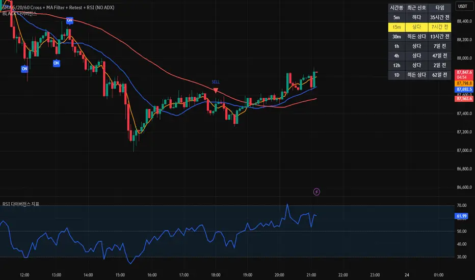
[BLACK] DivergenceDivergence
RSI Filter
EMA Filter
Unconfirmed Divergence Display
Confirmed Unconfirmed Alerts
Boards by Timeframe
다이버전스
RSI필터 EMA필터
미확정 다이버전스 표시
확정 미확정 얼러트
각 시간봉 다이버전스 보드
4MA / 4MA[1] Forward Projection with 4 SD Forecast Bands4MA / 4MA Projection + 4 SD Bands + Cross Table is a forward-projection tool built around a simple moving average pair: the 4-period SMA (MA4) and its 1-bar lagged value (MA4 ). It takes a prior MA behavior pattern, projects that structure forward, and wraps the projected mean path with four Standard Deviation (SD) bands to visualize probable future price ranges.
This indicator is designed to help you anticipate:
Where the MA structure is likely to travel next
How wide the “expected” future price corridor may be
Where a future MA4 vs MA4 crossover is most likely to occur
When the real (live) crossover actually prints on the chart
What you see on the chart
1) Live moving averages (current market)
MA4 tracks the short-term mean of price.
MA4 is simply the previous bar’s MA4 value (a 1-bar lag).
Their relationship (MA4 above/below MA4 ) gives a clean, minimal read on trend alignment and directional bias.
2) Projected MA path (forward curve)
A forward “ghost” of the MA structure is drawn ahead of price. This projected curve represents the indicator’s best estimate of how the moving average structure may evolve if the market continues to rhyme with the selected historical behavior window.
3) 4 Standard Deviation bands (predictive future price ranges)
Surrounding the projected mean path are four SD envelopes. Think of these as forecast corridors:
Inner bands = tighter “expected” range
Outer bands = wider “stress / extreme” range
These bands are not a guarantee—rather, they’re a structured way to visualize “how far price can reasonably swing” around the projected mean based on observed volatility.
4) Vertical projection lines (most probable cross zone)
Within the projected region you’ll see vertical lines running through the bands. These lines mark the most probable zone where MA4 and MA4 are expected to cross in the projection.
In plain terms:
The projected MAs are two curves.
When those curves are forecasted to intersect, the script marks the intersection region with a vertical line.
This gives you a forward “timing window” for a potential MA shift.
5) Cross Table (top-right)
The table is your confirmation layer. It reports:
Current MA4 value
Current MA4 value
Whether MA4 is above or below MA4
The most recent BUY / SELL cross event
When a real, live crossover happens on the actual chart:
It registers as BUY (MA4 crosses above MA4 )
Or SELL (MA4 crosses below MA4 )
…and the table updates immediately so you can confirm the event without guessing.
How to use it
Practical workflow
Use the projected SD bands as future range context
If price is projected to sit comfortably inside inner bands, the market is behaving “normally.”
If price reaches outer bands, you’re in a higher-volatility / stretched scenario.
Use vertical lines as a “watch zone”
Vertical lines do not force a trade.
They act like a forward “heads-up”: this is the most likely window for an MA crossover to occur if the projection holds.
Use the table for confirmation
When the crossover happens for real, the table is your confirmation signal.
Combine it with structure (support/resistance, trendlines, market context) rather than trading it in isolation.
Notes and best practices
This is a projection tool: it helps visualize a structured forward hypothesis, not a certainty.
SD bands are best used as forecast corridors (risk framing, range planning, and expectation management).
The table is the execution/confirmation layer: it tells you what the MAs are doing now.

Squeeze + ADX + TTM [V6]Execution speed: The TradingView engine processes v6 scripts much faster.
Stability: By using standard functions like ta.sma or ta.linreg, the indicator is less prone to calculation errors on lower timeframes.
Clarity: I've reorganized the ADX calculation within a function to make it more readable if you decide to modify it later.
Option ScalperUpdate: A good indicator must be able to detect what type of current market is: trending, range bound, or whipsawing. Based upon market type, signals should be either short living, long lasting or avoided at all. This is what this current updated version does best.
