SwiftEdge APEEXSwiftEdge Apeex – Volume-Weighted VWAP + Live POC + True Footprint-Precise Big Trades
This indicator combines three powerful and complementary tools used by professional traders:
1. Volume-Weighted EWMA VWAP with Dynamic Deviation Bands
A smooth, volume-weighted VWAP using an exponentially weighted moving average of variance. The deviation bands (1σ, 2σ, 3σ) dynamically expand and contract with actual market volatility — giving far more realistic support/resistance levels than fixed-percentage bands.
2. Session-Based Live Point of Control (POC)
The classic intraday POC (highest traded volume price) calculated from session start (default 09:00). Resets cleanly at your chosen session time.
3. True 1-Second Footprint-Precise Big Trade Bubbles
Unlike traditional volume spike indicators that only show "where the candle closed", this version uses real 1-second data to calculate the exact delta-weighted price where aggressive buying or selling actually occurred inside the bar.
- All levels from 1.2× to 8× average volume are shown
- Bubble size scales with significance (1.2× = tiny → 8× = huge)
- White outline on 5× and 8× for instant visual impact
- Yellow background highlights bars with significant volume
Why this combination works so well:
- VWAP + deviations give you the macro institutional reference levels
- POC shows where the market actually accepted the most volume
- The footprint-precise bubbles show you exactly where the smart money entered or absorbed — often many ticks away from the candle close
Best used on 1m to 1h timeframes on liquid futures (ES, NQ, CL) or crypto (BTC, ETH).
No lookahead. No repainting. Pure price + volume truth.
Volumedelta

Advanced Volume Suite (24h, Pulse, Spikes, Breakout Pressure)Advanced Volume Suite transforms raw volume into a complete market-intelligence toolkit for breakout, momentum, and liquidity-driven trading.
Unlike the basic volume indicator, this tool analyzes volume in true USDT value, tracks rolling 24h exchange-style volume, measures volume strength vs historical averages, detects smart spikes, and highlights breakout pressure near support/resistance.
Core Features:
• USDT-based volume histogram
• 24h rolling volume line
• Volume Pulse (volume vs moving average)
• Smart spike detection with directional filters
• Breakout pressure system (breakouts + near-breakout conditions)
• 3 advanced volume color modes (Simple / Body / Delta-style)
• All signals and thresholds fully configurable
Perfect for traders who rely on volume confirmation for breakouts, momentum entries, scalping, or detecting institutional activity.

BT Delta AbsorptionBT Absorption detects aggressive counterflow volume—moments where one side
of the market (buyers or sellers) attacks aggressively, yet price fails to move
proportionally.
This is the classic definition of absorption:
"Large market orders are being absorbed by strong passive limit orders."
Absorption is one of the most reliable early signals for:
Reversals
Trap conditions
Failed breakouts
Liquidity grabs
Fake displacement moves
---
■ What BT Absorption Measures
1. Delta Imbalance
Identifies when buying or selling pressure becomes unusually one-sided.
2. Volatility Mismatch
Shows when large delta does NOT translate into meaningful price movement.
3. Absorption Strength Score
A normalized reading (often 0–100) showing the intensity of counterflow activity.
4. Wick & Structure Absorption
Wick-driven absorption helps identify:
Failed sweeps
Stop hunts
Rejection zones
Trapped traders
---
■ Why Absorption Matters
Absorption almost always precedes:
Reversals
Failed breakout moves
SMC/ICT-style displacement
Order block formation
Trend continuation after a trap
When aggressive traders cannot move price toward their desired direction,
the move typically reverses quickly—and with force.
---
■ Visual Elements
• Bull Absorption Marker
Often appears near lows—signals seller aggression failing to push price down.
• Bear Absorption Marker
Often appears near highs—signals buyer aggression failing to break higher.
• Absorption Score Heatmap (optional)
Shows intensity of absorption per candle.
• Threshold Levels
Identify when absorption becomes statistically significant.
---
■ How to Use BT Absorption in Trading
1. Reversal Detection
Look for absorption after:
Equal highs/lows
Sweeps
Stop runs
Breakout failures
This is often the earliest possible signal that a reversal is coming.
2. Filter Breakouts
A breakout without absorption is usually weak.
A breakout with absorption against it is likely a fakeout.
3. Confirm SMC/ICT Concepts
The indicator pairs perfectly with:
Fair Value Gaps
Order Blocks
Liquidity sweeps
Displacement legs
If your setup triggers and absorption confirms → high confidence.
4. Identify Trap Conditions
Absorption often marks:
Trapped breakout chasers
Trapped trend shorts
Imbalanced orderflow
These create ideal high-R trades.
5. Alert-Driven Market Monitoring
Use alerts for:
Bull Absorption
Bear Absorption
High-strength absorption
Absorption clusters
This allows traders to step away from charts while still catching
high-probability reversals.
---
■ High-Probability Absorption Setups
A) Sweep + Absorption
Swept level → absorption → enter opposite direction.
B) Failed Breakout Absorption
Breaks structure → delta fails → absorption prints → strong reversal.
C) Trend Continuation Absorption
Absorption against the correction often precedes continuation.
D) Absorption Clusters
Multiple absorption signals indicate a structural market shift.
---
■ Final Summary
BT Absorption provides:
Early reversal signals
Counterflow pressure detection
Confirmation for existing setups
Identification of liquidity traps
Alert-based monitoring across multiple markets
BT Absorption is the perfect complement to BT Spike:
• BT Spike = detects volatility ignition
• BT Absorption = detects failed aggression + reversals
Combined, they form a complete liquidity and orderflow toolkit.

KIMATIX Info TableKIMATIX Info Table is an executive-grade market dashboard that brings real-time orderflow, volume dynamics, directional bias, and signal confirmation directly onto your chart.
Instead of guessing market conditions, this tool quantifies them and displays structured, colour-coded insights—giving traders the ability to read context at a glance.
It tracks live Buy/Sell pressure, session-based CumDelta behaviour, higher-timeframe directional flow, relative volume, heatmap sentiment, and signal strength.
The result is a transparent market interpreter—ideal for traders who want objective insight instead of subjective opinion.
The table shows:
Active Buy vs Sell volume
Buy/Sell probability weights
CumDelta bias & pressure shifts
Higher-timeframe trend direction (HTF Bias)
Negative-delta heatmap (selling pressure %)
Relative volume acceleration
Signal plots mark valid opportunities directly on the chart, and built-in alerts enable automation or notifications.
Designed for scalpers, orderflow traders, and systematic decision-makers who demand clarity without clutter.
Key Features
• Real-time orderflow breakdown (Buy vs Sell strength)
• Higher-timeframe directional bias confirmation
• Session-reset CumDelta tracking
• Dynamic sentiment heatmap
• Relative volume acceleration detection
• Trade signal classification with alerts
• Visual chart markers for Long/Short events
Benefits for Traders
• Understand whether buyers or sellers control the tape
• See whether momentum is supported or fading
• Identify when trend and orderflow align
• Receive confirmed timing signals without guessing
• Suitable for scalping, intraday trading, futures, indices, crypto, FX
A compact institutional-style dashboard for traders who think in probabilities—not emotions.

Bitcoin Multibook v1.0 [Apollo Algo]Bitcoin Multibook v1.0 by Apollo Algo is an advanced market depth and order flow visualization tool that brings professional-grade multi-exchange order book analysis to TradingView. Inspired by Bookmap's multibook functionality and built upon LucF's original single "Tape" indicator concept, this tool aggregates real-time trading data from multiple Bitcoin exchanges into a unified tape display.
Credits & Attribution
This indicator is an evolution of the original "Tape" indicator created by LucF (TradingView: @LucF). The multibook enhancement and Bitcoin-specific optimizations were developed by Apollo Algo to provide traders with institutional-grade market microstructure visibility across major Bitcoin trading venues.
Purpose & Philosophy
Bitcoin leads the entire cryptocurrency market. By monitoring order flow across the primary Bitcoin exchanges simultaneously, traders gain crucial insights into:
Cross-exchange arbitrage opportunities
Institutional order flow patterns
Market maker positioning
True market sentiment beyond single-exchange data
Key Features
📊 Multi-Exchange Data Aggregation
Real-time tape from 3 major exchanges:
Binance (BTCUSDT)
Coinbase (BTCUSD)
Kraken (BTCUSD)
Customizable source inputs for any trading pair
Synchronized price and volume tracking
Exchange name identification in tape display
📈 Advanced Tape Display
Dynamic tape visualization with configurable line quantity (0-50 lines)
Directional flow indicators (+/- symbols for price changes)
Exchange identification for each trade
Volume precision control (0-16 decimal places)
Flexible positioning (9 screen positions available)
Real-time only operation for accurate order flow
🎯 Volume Delta Analysis
Real-time cumulative volume delta calculation
Divergence detection (price vs. volume direction)
Colored visual feedback for market sentiment
Total session delta displayed in footer
Cross-exchange delta aggregation
🚨 Smart Alert System
Marker 1: Volume Delta Bumps (⬆⬇)
Triggers on consecutive volume delta increases
Identifies momentum acceleration points
Filters out divergent movements
Marker 2: Volume Delta Thresholds (⇑⇓)
Fires when delta exceeds user-defined thresholds
Catches significant order imbalances
Excludes divergence conditions
Marker 3: Large Volume Detection (⤊⤋)
Highlights unusually large individual trades
Spots potential institutional activity
Direction-specific triggers
Configure Data Sources
Adjust exchange pairs if needed (e.g., for altcoin analysis)
Leave blank to disable specific exchanges
Use format: EXCHANGE:SYMBOL
Customize Display
Set tape line quantity based on screen size
Position the table for optimal visibility
Choose color scheme (text or background)
Adjust text size for readability
Configure Alerts
Enable desired markers (1, 2, or 3)
Set volume thresholds appropriate for your timeframe
Choose direction (Longs, Shorts, or Both)
Create TradingView alerts on marker signals
Trading Applications
Scalping (1-5 min)
Monitor tape speed for momentum shifts
Watch for cross-exchange divergences
Track large volume clusters
Use Marker 1 for quick momentum trades
Day Trading (5-60 min)
Identify accumulation/distribution phases
Spot institutional positioning
Confirm breakout validity with volume delta
Use Marker 2 for significant imbalances
Swing Trading (1H+)
Analyze volume delta trends
Detect smart money rotation
Time entries with order flow confirmation
Use Marker 3 for institutional footprints
Advanced Techniques
Cross-Exchange Arbitrage Detection
When price disparities appear between exchanges:
Immediate Opportunity: Price differences > 0.1%
Bot Activity: Rapid convergence patterns
Liquidity Vacuum: One exchange leading others
Divergence Trading Strategies
Volume delta diverging from price direction:
Absorption: Strong hands entering (price down, delta up)
Distribution: Smart money exiting (price up, delta down)
Reversal Setup: Sustained divergence over multiple bars
Institutional Footprint Recognition
Large volume characteristics:
Simultaneous Spikes: Same timestamp across exchanges
TWAP Patterns: Consistent volume over time
Iceberg Orders: Repeated same-size trades
Pine Script v6 Enhancements
Type Safety Improvements
Strict boolean type handling
Explicit type declarations
Enhanced error checking
Performance Optimizations
Improved request.security() function
Better memory management with arrays
Optimized table rendering
Modern Syntax Updates
indicator() instead of study()
Namespaced math functions (math.round())
Typed input functions (input.int(), input.float())
Performance Considerations
System Requirements
Real-time Data: Essential for tape operation
Multiple Security Calls: May impact performance
Array Operations: Memory intensive with high line counts
Table Rendering: CPU usage increases with tape size
Optimization Tips
Reduce tape lines for better performance
Increase volume filter to reduce noise
Disable unused markers
Use text-only coloring for faster rendering

Volume Delta + Bandas de Bollinger📊 Volume Delta + Bollinger Bands Indicator
Characteristics
• Volume Delta Histogram
• Shows the difference between buying and selling pressure.
• Green bars indicate positive delta (buyers dominating).
• Red bars indicate negative delta (sellers dominating).
• The histogram oscillates around the zero line, which represents balance between buyers and sellers.
• Bollinger Bands applied to Delta
• A moving average (basis line) of the delta is calculated.
• Upper and lower bands are plotted using standard deviation.
• These bands highlight periods when the delta moves to statistically extreme levels.
• Helps identify unusual buying or selling pressure compared to recent history.
• Zero Line Reference
• A horizontal line at zero shows equilibrium.
• Crossing above zero suggests net buying pressure.
• Crossing below zero suggests net selling pressure.
How to Use
• Identify Buyer/Seller Dominance
• Green histogram bars above zero → buyers are stronger.
• Red histogram bars below zero → sellers are stronger.
• Spot Extremes with Bollinger Bands
• When delta touches or exceeds the upper band, it signals unusually strong buying pressure.
• When delta touches or exceeds the lower band, it signals unusually strong selling pressure.
• These extremes can precede reversals or mark continuation if confirmed by price action.
• Combine with Price Analysis
• Use delta signals together with price trends and support/resistance levels.
• For example, if price is at resistance and delta spikes into the upper band, it may indicate exhaustion of buyers.
• If price is at support and delta spikes into the lower band, it may indicate exhaustion of sellers.
• Trading Strategy Ideas
• Reversal setups: Look for delta extremes against key price levels.
• Trend confirmation: Sustained delta above zero supports bullish trends; sustained delta below zero supports bearish trends.
• Volatility filter: Bollinger Bands help filter out normal fluctuations and highlight significant imbalances.
👉 In short, this indicator combines order flow pressure (delta) with volatility context (Bollinger Bands), making it useful for spotting moments when buying or selling activity becomes unusually strong compared to recent history.

Advanced Delta Volume DivergenceDelta Volume Divergence with alerts. Basically, positive delta, green on histogram, negative delta, re don histogram. There is some options in there to adjust moving averages, colors, lookback period, confirmation for alerts, etc. Play with it, if you like it great, if not, I'm sure you'll find something else that you do.

Bubbles + Clusters + SweepsIndicator For Bubbles + Clusters + Sweeps
✔ Volume bubbles
✔ Delta coloring (green/red intensity)
✔ Auto supply/demand zones
✔ Volume-profile style blocks inside zones
✔ Liquidity sweep markers
✔ Box drawings extending until filled
✔ Optional bubble filters (min-volume threshold)

Price Volume Heatmap [MHA Finverse]Price Volume Heatmap - Advanced Volume Profile Analysis
Unlock the power of institutional-level volume analysis with the Price Volume Heatmap indicator. This sophisticated tool visualizes market structure through volume distribution across price levels, helping you identify key support/resistance zones, high-probability reversal areas, and optimal entry/exit points.
🎯 What Makes This Indicator Unique?
Unlike traditional volume indicators that only show volume over time, this heatmap displays volume distribution across price levels , revealing where the most significant trading activity occurred. The gradient coloring system instantly highlights high-volume nodes (areas of strong interest) and low-volume nodes (potential breakout zones).
📊 Core Features
1. Dynamic Volume Heatmap
- Visualizes volume concentration across 250 customizable price levels
- Gradient color scheme from high volume (white) to low volume (teal/green)
- Adjustable brightness multiplier for enhanced contrast and clarity
- Real-time updates as market conditions evolve
2. Point of Control (POC)
- Automatically identifies the price level with the highest traded volume
- Acts as a magnetic price level where markets often return
- Critical for identifying fair value areas and potential reversal zones
- Customizable line style, width, and color
3. Flexible Lookback Settings
- Lookback Bars: Set any value from 1-5000 bars to control analysis depth
- Visible Range Mode: Analyze only what's currently visible on your chart
- Timeframe-Specific Settings: Different lookback periods for 1m, 5m, 15m, 30m, 1h, Daily, and Weekly charts
- Adapts to your trading style - scalping to position trading
4. Session Separation Analysis
- Tokyo Session: 00:00-09:00 UTC
- London Session: 07:00-16:00 UTC
- New York Session: 13:00-22:00 UTC
- Sydney Session: 21:00-06:00 UTC
- Daily Reset: Analyze each trading day independently
Session separation allows you to understand volume distribution specific to each major trading session, revealing institutional order flow patterns and session-specific support/resistance levels.
5. Profile Width Options
- Dynamic: Profile width adjusts based on lookback period
- Fixed Bars: Set a specific bar count for consistent profile width
- Extend Forward: Project the profile into future bars for planning trades
6. Smart Alerts
- POC crossover/crossunder alerts
- New session start notifications
- Never miss critical price action at high-volume nodes
📈 How to Use This Indicator Professionally
Understanding Market Structure:
High Volume Nodes (HVN):
- Appear as bright/white areas in the heatmap
- Represent price levels where significant trading occurred
- Act as strong support/resistance zones
- Markets often consolidate or bounce from these levels
- Trading Strategy: Look for entries when price tests HVN areas with confluence from other indicators
Low Volume Nodes (LVN):
- Appear as darker/teal areas in the heatmap
- Represent price levels with minimal trading activity
- Price tends to move quickly through these areas
- Often form "gaps" in the volume profile
- Trading Strategy: Expect rapid price movement through LVN zones; avoid placing stop losses here
Point of Control (POC):
- The single most important price level in your analysis window
- Represents the fairest price where maximum volume traded
- Price gravitates toward POC like a magnet
- Trading Strategy:
* When price is above POC: bullish bias, POC acts as support
* When price is below POC: bearish bias, POC acts as resistance
* POC breaks often lead to significant trend changes
Session-Based Analysis:
Use session separation to understand how different market participants trade:
Asian Session (Tokyo/Sydney):
- Typically lower volatility and range-bound
- Volume profiles often show tight, balanced distribution
- Use for identifying overnight ranges and gap fill zones
London Session:
- Highest volume session for forex pairs
- Often shows strong directional bias
- Look for breakouts from Asian ranges during London open
New York Session:
- Maximum participation when overlapping with London
- Institutional order flow most visible
- POC during NY session often becomes key level for following sessions
🎯 Practical Trading Applications
1. Identifying Support & Resistance:
High volume nodes from the heatmap are far more reliable than traditional swing highs/lows. When price approaches an HVN, expect reaction - either a bounce or a significant breakout if breached.
2. Trend Confirmation:
- Healthy uptrend: POC rising over time, HVN forming at higher levels
- Healthy downtrend: POC falling over time, HVN forming at lower levels
- Consolidation: POC relatively flat, volume balanced across range
3. Breakout Trading:
When price breaks through a Low Volume Node with momentum, it often continues to the next High Volume Node. Use LVN areas as measured move targets.
4. Reversal Zones:
Multiple HVN stacking on top of each other creates a "volume shelf" - an extremely strong support/resistance zone where reversals are highly probable.
5. Risk Management:
- Place stops beyond HVN areas (not within LVN zones)
- Size positions based on distance to nearest HVN
- Use POC as trailing stop level in trending markets
⚙️ Recommended Settings
For Day Trading (Scalping/Intraday):
- Lookback: 200-500 bars
- Rows: 200-250
- Enable session separation for your primary trading session
- Profile Width: Dynamic or Fixed Bars (30-50)
For Swing Trading:
- Lookback: 500-1000 bars
- Rows: 250
- Session separation: Daily Reset
- Profile Width: Dynamic
For Position Trading:
- Lookback: 1000-3000 bars
- Rows: 250
- Use timeframe-specific settings
- Profile Width: Extend Forward (20-50 bars)
💡 Pro Tips
1. Combine this indicator with price action analysis - volume confirms what price is telling you
2. Watch for POC convergence with other technical levels (fibonacci, pivot points, moving averages)
3. Volume at extremes (tops/bottoms of heatmap) often indicates exhaustion
4. Session POC from previous sessions often acts as magnet for current session
5. Increase brightness multiplier (1.5-2.5) for clearer visualization on busy charts
6. Use "Number of Sessions to Display" to analyze consistency of volume levels across multiple sessions
🎨 Customization
Fully customizable visual appearance:
- Gradient colors for volume visualization
- POC line thickness, color, and style
- Session line colors and visibility
- All settings organized in intuitive groups
⚠️ Disclaimer
This indicator is a technical analysis tool and should not be used as the sole basis for trading decisions. Always combine volume analysis with proper risk management, fundamental analysis, and other technical indicators. Past performance does not guarantee future results.
---
Support & Updates
Regular updates and improvements are made to enhance functionality. For questions, suggestions, or bug reports, please use the comments section below.
Happy Trading! 📊💹

Double Whammy Stop‑Run IndicatorThis indicator simulates the institutional "Double Whammy" order flow setup—for order flow traders—using standard Price Action and Volume analysis.
Since TradingView does not provide native access to Level 3 data (Stop Orders and Iceberg Orders), this script uses a proprietary algorithm to create a "proxy" for these events using relative volume anomalies, candle body strength, and market structure breaks.
The Concept
The "Double Whammy" is a reversal pattern that relies on the interaction between trapped retail traders and institutional absorption. It occurs in two specific phases:
The Stop Run (The Trap): Price aggressively breaks a significant recent High or Low on high volume. This represents retail stop-losses being triggered or breakout traders getting trapped.
The Absorption (The Whammy): Instead of continuing in the direction of the breakout, price is immediately absorbed by "Iceberg" orders (limit orders) and reverses with high intensity.
How It Works (The Logic)
This script identifies these two phases using the following logic:
1. Identifying the Stop-Run Proxy
The script monitors for a specific set of conditions to identify a potential trap:
Market Structure: The price must make a new High or Low based on the user-defined Lookback period (default 50 bars).
Volume Spike: The bar must have a volume significantly higher than the average (defined by the Volume Multiplier), suggesting a capitulation or stop-cascade.
Candle Strength: The bar must be a strong trend bar (large body relative to wicks) to mimic the look of a breakout.
2. Identifying the Absorption
Once a Stop-Run is detected, the script opens a "Window of Opportunity" (shaded background). For a valid signal to generate, a reversal must occur within Max Bars (default 3):
Reversal: A candle of the opposite color must appear.
Engulfing Logic: The reversal candle must close back inside the range (below the High of a bullish trap, or above the Low of a bearish trap).
Momentum: The reversal candle must also show significant volume and body strength.
Visual Guide
Background Shading (Green/Red): Indicates a Stop-Run has just occurred. This is a warning zone. Do not trade yet.
"DW" Label (Double Whammy): An immediate reversal occurred on the very next bar after the stop run.
"DDW" Label (Delayed Double Whammy): The reversal occurred 2 or 3 bars later, but still within the valid window.
Settings
Lookback Bars: The range used to determine significant Support/Resistance levels (Default: 50).
Max Bars to Absorption: How many bars the market has to reverse before the setup is considered invalid (Default: 3).
Volume Multiplier: How much larger current volume must be compared to the SMA to qualify as a "Stop Run" (Default: 1.5x).
Body/Range Ratio: Filters out Doji candles or weak moves. Higher numbers require stronger candles.
Disclaimer
This tool is intended for educational purposes and to assist in identifying high-volatility reversal zones. It uses price and volume proxies to estimate order flow events and does not track actual Level 3 limit orders. Always combine this indicator with your own risk management and market analysis.
Use Arrow Up and Arrow Down to select a turn, Enter to jump to it, and Escape to return to the chat.

Hanzo Strategy - Volume & Smart Money📊 HANZO STRATEGY - Complete Description
## 🎯 Strategy Overview
The **Hanzo Strategy** is an advanced institutional trading system that combines Volume Profile analysis, Smart Money Concepts, and Price Action patterns to identify high-probability trade setups. This strategy is specifically designed for trading Gold (XAUUSD), NAS100, and US30 on the 15-minute timeframe.
---
## 🧠 Core Trading Philosophy
The Hanzo Strategy operates on the principle that **institutional money leaves footprints** in the market through:
- Volume accumulation at key price levels
- Liquidity sweeps and stop hunts
- Order block formations
- Strategic wick rejections at support/resistance
By identifying these institutional behaviors and combining them with precise volume analysis, the strategy aims to trade **with** the smart money, not against it.
---
## 🔑 Key Components
### 1️⃣ **Fixed Range Volume Profile (FRVP)**
- **What it does:** Analyzes the last 2 days of price action and calculates where the most volume traded
- **Point of Control (POC):** The price level with the highest trading volume - acts as a magnet for price
- **How we use it:** Price tends to revert to POC. When price is far from POC and starts moving toward it, we prepare for entries
- **Visual:** Yellow cross line on the chart marking the POC
### 2️⃣ **Wick Cluster Detection**
- **What it does:** Automatically identifies price levels where multiple candle wicks have rejected (2-6+ wicks)
- **Why it matters:** Multiple rejections at the same level indicate strong institutional support/resistance
- **Upper wick clusters:** Resistance zones where price was rejected downward
- **Lower wick clusters:** Support zones where price was rejected upward
- **Visual:** Dashed lines (red for resistance, green for support)
### 3️⃣ **Session Volatility Boxes**
- **London Session (8:00-16:00 UTC+3):** Captures European market volatility range
- **New York Session (13:30-20:00 UTC+3):** Captures US market volatility range
- **How we use it:** These ranges often act as support/resistance for the rest of the day
- **Visual:** Blue box for London, Orange box for New York
### 4️⃣ **Smart Money Zones**
**Order Blocks:**
- Strong institutional areas where banks and hedge funds placed large orders
- **Bullish Order Block:** Area where smart money bought heavily before a strong upward move
- **Bearish Order Block:** Area where smart money sold heavily before a strong downward move
- **Visual:** Green/Red filled boxes with "Bull OB" or "Bear OB" labels
**Liquidity Sweeps:**
- Price breaks above recent high or below recent low, then quickly reverses
- This is a "stop hunt" - institutions triggering retail stops before moving in the real direction
- **Bullish Sweep:** Price dips below support, grabs stops, then reverses up
- **Bearish Sweep:** Price pops above resistance, grabs stops, then reverses down
- **Visual:** Triangle markers (green up = bullish, red down = bearish)
### 5️⃣ **Engulfing Pattern Recognition**
- **Bullish Engulfing:** Large green candle fully engulfs the previous red candle - shows strong buying pressure
- **Bearish Engulfing:** Large red candle fully engulfs the previous green candle - shows strong selling pressure
- **How we use it:** Confirmation signal when combined with other factors
- **Visual:** Small circles below/above candles
### 6️⃣ **Trend Bias Indicator**
- Dynamically calculates market bias based on price position relative to POC
- **Bullish:** Price > 0.2% above POC
- **Neutral:** Price within 0.2% of POC
- **Bearish:** Price > 0.2% below POC
- **Visual:** Label at top of chart showing current bias
---
## 📈 Entry Signal Logic
The strategy generates **LONG** and **SHORT** signals based on confluence of multiple factors:
### 🟢 LONG ENTRY CONDITIONS:
1. **POC Break:** Price crosses above POC from below + Trend Bias is Bullish
**OR**
2. **Support Bounce:** Price touches a lower wick cluster + Bullish Engulfing pattern forms
3. **Additional Filter:** Trend Bias must NOT be Bearish
### 🔴 SHORT ENTRY CONDITIONS:
1. **POC Break:** Price crosses below POC from above + Trend Bias is Bearish
**OR**
2. **Resistance Rejection:** Price touches an upper wick cluster + Bearish Engulfing pattern forms
3. **Additional Filter:** Trend Bias must NOT be Bullish
---
## 🎯 Risk Management
### Stop Loss:
- **Calculation:** 2 × ATR(14) from entry price
- **Logic:** Uses Average True Range to adapt to current market volatility
- **Example:** If ATR = 10 points, stop loss is 20 points away
### Take Profit:
- **Calculation:** 3 × ATR(14) from entry price
- **Risk:Reward Ratio:** 1:1.5 (risking 2 ATR to make 3 ATR)
- **Example:** If ATR = 10 points, take profit is 30 points away
### Position Sizing:
- **Default:** 2% of account equity per trade
- **Adjustable:** Can be modified in strategy settings
---
## ⚙️ Strategy Settings & Customization
### Volume Profile Settings:
- **Lookback Days:** How many days to analyze (default: 2)
- **Profile Rows:** Resolution of volume calculation (default: 24)
- **POC Distance Threshold:** Minimum distance from POC for "far from POC" status (default: 0.3%)
### Wick Cluster Settings:
- **Min Wicks for Cluster:** How many wicks needed to form a cluster (default: 3)
- **Lookback Bars:** How far back to search for wicks (default: 50)
- **Tolerance %:** How close wicks must be to cluster together (default: 0.15%)
### Session Settings:
- **London Session:** 08:00-16:00 (adjustable)
- **New York Session:** 13:30-20:00 (adjustable)
- **UTC Offset:** Timezone adjustment (default: +3)
### Smart Money Settings:
- **Order Block Lookback:** How far back to search for order blocks (default: 20)
- **Toggle On/Off:** Can enable/disable order blocks and liquidity sweeps independently
---
## 📊 Performance Metrics Display
The strategy includes a real-time **Information Table** (top-right corner) showing:
| Metric | Description |
|--------|-------------|
| **Trend Bias** | Current market direction (Bullish/Neutral/Bearish) |
| **POC Price** | Current Point of Control price level |
| **Distance from POC** | How far current price is from POC (%) |
| **ATR (14)** | Current volatility measurement |
| **High Wick Clusters** | Number of resistance clusters detected |
| **Low Wick Clusters** | Number of support clusters detected |
| **Current Signal** | Active signal (LONG/SHORT/None) |
---
## 🚨 Alert System
The strategy can send alerts for:
1. **LONG Signal Triggered** - When all conditions met for long entry
2. **SHORT Signal Triggered** - When all conditions met for short entry
3. **Price Touching Support Cluster** - Warning that price at key support
4. **Price Touching Resistance Cluster** - Warning that price at key resistance
**Alert Frequency:** Once per bar (prevents spam)
---
## 📅 Best Trading Timeframes & Instruments
### ✅ Recommended Timeframes:
- **Primary Entry:** 15-minute chart
- **Trend Confirmation:** 30-minute or 1-hour chart
- **Higher Timeframe Filter:** 4-hour for major trend direction
### ✅ Recommended Instruments:
1. **Gold (XAUUSD)** - High volatility, respects key levels well
2. **NAS100 (US Tech 100)** - Strong trends, good liquidity
3. **US30 (Dow Jones)** - Reliable institutional participation
4. **EUR/USD, GBP/USD** - Can work on major forex pairs with adjustments
### ⏰ Best Trading Sessions:
- **London Open (08:00-12:00 UTC+3)** - High volatility, clear directional moves
- **New York Open (13:30-17:00 UTC+3)** - Strongest moves, highest volume
- **Overlap (13:30-16:00 UTC+3)** - Best liquidity and movement
### ⚠️ Avoid Trading:
- Asian session (low volatility)
- Major news events (first 15 minutes after high-impact news)
- Sundays and holidays (low liquidity)
---
## 💡 Pro Trading Tips
### 1. **Multiple Timeframe Confirmation**
- Check 1-hour chart for overall trend before taking 15-minute signals
- Only take LONG signals if 1-hour is bullish
- Only take SHORT signals if 1-hour is bearish
### 2. **POC Strategy**
- Best entries occur when price returns to POC after being far away
- Wait for POC touch + confirmation pattern (engulfing, order block)
- POC acts as support in uptrends, resistance in downtrends
### 3. **Wick Cluster Strategy**
- Strongest signals occur when wick clusters align with POC
- Look for 4+ wicks at the same level for highest probability
- Recent clusters (formed in last 2 days) are stronger than old ones
### 4. **Order Block Strategy**
- Fresh order blocks (just formed) are more powerful
- Wait for price to return to order block zone before entering
- Best when order block + wick cluster occur at same level
### 5. **London/NY Box Strategy**
- If price breaks above session high → look for LONG pullback entries
- If price breaks below session low → look for SHORT pullback entries
- Price often returns to session mid-point before continuing
### 6. **Risk Management Rules**
- **Never risk more than 2% per trade**
- **Don't trade more than 3 positions simultaneously**
- **If 2 losses in a row, reduce size to 1% or stop for the day**
- **Move stop to breakeven after 1:1 profit reached**
### 7. **High-Probability Setups**
Look for **CONFLUENCE** - the more factors aligned, the better:
✅ **BEST LONG SETUP:**
- Price at lower wick cluster (support)
- Price at/near POC
- Bullish order block present
- Bullish engulfing pattern forms
- Trend Bias = Bullish
- 1-hour chart = uptrend
✅ **BEST SHORT SETUP:**
- Price at upper wick cluster (resistance)
- Price at/near POC
- Bearish order block present
- Bearish engulfing pattern forms
- Trend Bias = Bearish
- 1-hour chart = downtrend
---
## 📈 Performance Expectations
### Typical Win Rate:
- **Conservative Trading (high confluence only):** 55-65% win rate
- **Moderate Trading (good setups):** 45-55% win rate
- **Aggressive Trading (all signals):** 35-45% win rate
### Typical Risk:Reward:
- **Average R:R:** 1:1.5 (with 2 ATR stop and 3 ATR target)
- **Breakeven adjusted:** Often improves to 1:2+ when stop moved to BE
### Monthly Trade Frequency (15M chart):
- **Gold:** 60-100 signals per month
- **NAS100:** 50-80 signals per month
- **US30:** 40-70 signals per month
---
## 🎓 Strategy Philosophy Summary
The Hanzo Strategy is built on three core principles:
1. **Follow the Volume** - Trade where institutions are active
2. **Respect the Levels** - Key support/resistance zones matter
3. **Confirm with Price Action** - Wait for confirmation before entering
This is NOT a holy grail - it requires:
- ✅ Discipline to wait for proper setups
- ✅ Patience to let trades play out
- ✅ Risk management to protect capital
- ✅ Emotional control to handle losses
---
## 🛠️ How to Use This Strategy
### Step 1: Initial Setup
1. Add strategy to 15-minute chart
2. Check that all components are visible (POC, clusters, boxes, etc.)
3. Adjust colors if needed for your chart theme
### Step 2: Daily Routine
1. **Pre-Market (before 8:00 AM):**
- Check POC location
- Note wick clusters from previous days
- Mark London/NY session boxes from yesterday
2. **London Session (8:00-16:00):**
- Watch for POC interactions
- Monitor for order blocks forming
- Wait for confluence setups
3. **NY Session (13:30-20:00):**
- Highest activity period
- Best signal quality
- More aggressive entries allowed
### Step 3: Trade Execution
1. Wait for signal label (LONG or SHORT) to appear
2. Check confluence factors (minimum 3)
3. Enter immediately or on next candle
4. Set stop loss at 2 × ATR from entry
5. Set take profit at 3 × ATR from entry
6. Move stop to breakeven at +1.5 ATR profit
### Step 4: Trade Management
- **Don't move stop closer** (let trade breathe)
- **Can trail stop** after 2:1 profit reached
- **Can take partial profits** at 1.5:1 and let rest run
- **Journal every trade** for future improvement
---
## ⚠️ Important Disclaimers
1. **Past performance does not guarantee future results**
2. **This strategy involves risk** - only trade with money you can afford to lose
3. **Backtest thoroughly** on your specific instruments before live trading
4. **Start small** - test with minimum position sizes first
5. **Market conditions change** - what works today may not work tomorrow
6. **Use proper risk management** - this is the #1 key to long-term success
---
## 🎯 Quick Reference Checklist
Before taking any trade, ask yourself:
- ✅ Is there a clear LONG or SHORT signal?
- ✅ Are we in London or NY session?
- ✅ Is price at/near POC or wick cluster?
- ✅ Is trend bias aligned with my direction?
- ✅ Is there an order block or engulfing pattern?
- ✅ Is my risk:reward at least 1:1.5?
- ✅ Am I risking no more than 2% of my account?
**If 5+ are YES → Take the trade!**
**If 3 or fewer YES → Skip and wait for better setup!**
---
## 🚀 Final Words
The Hanzo Strategy is a professional-grade trading system that combines institutional analysis with precise technical execution. Success comes not from taking every signal, but from taking only the **highest probability setups** with proper risk management.
**Trade smart. Trade safe. Trade like an institution.**
📊 **Good luck and profitable trading!** 📊

Fibonacci Projection with Volume & Delta Profile (Zeiierman)█ Overview
Fibonacci Projection with Volume & Delta Profile (Zeiierman) blends classic Fibonacci swing analysis with modern volume-flow reading to create a unified, projection-based market framework. The indicator automatically detects the latest swing high and swing low, builds a complete Fibonacci structure, and then projects future extension targets with clear visual pathways.
What makes this tool unique is the integration of two volume-based systems directly into the Fibonacci structure. A Fib-aligned Volume Profile shows how bullish and bearish volume accumulated inside the swing range, while a separate Delta Profile reveals the imbalance of buy–sell pressure inside each Fibonacci interval. Together, these elements transform the standard Fibonacci tool into a multi-dimensional structural and volume-flow map.
█ How It Works
The indicator first detects the most recent swing high and swing low using the Period setting. That swing defines the Fibonacci range, from which the script draws retracement levels (0.236–0.786) and builds a forward projection path using the chosen Projection Level and a 1.272 extension.
Along this path, it draws projection lines, target boxes, and percentage labels that show how far each projected leg extends relative to the previous one.
Inside the same swing range, the script builds a Fib-based Volume Profile by splitting price into rows and assigning each bar’s volume as bullish (close > open) or bearish (close ≤ open). On top of that, it calculates a Volume Delta Profile between each pair of fib levels, showing whether buyers or sellers dominated that band and how strong that imbalance was.
█ How to Use
This tool helps traders quickly understand market structure and where the price may be heading next. The projection engine shows the most likely future targets, highlights strong or weak legs in the move, and updates automatically whenever a new swing forms. This ensures you always see the most relevant and up-to-date projection path.
The Fib Volume Profile shows where volume supported the move and where it did not. Thick bullish buckets reveal zones where buyers stepped in aggressively, often becoming retestable support. Thick bearish buckets highlight zones of resistance or rejection, particularly useful if projected levels align with prior liquidity.
The Delta Profile adds a second dimension to volume reading by showing where buy–sell pressure was truly imbalanced. A projected Fibonacci target that aligns with a strong bullish delta, for example, may suggest continuation. A projection into a band dominated by bearish delta may warn of reversal or hesitation.
█ Settings
Period – bars used to determine swing high/low
Projection Level – chosen Fib ratio for projection path
-----------------
Disclaimer
The content provided in my scripts, indicators, ideas, algorithms, and systems is for educational and informational purposes only. It does not constitute financial advice, investment recommendations, or a solicitation to buy or sell any financial instruments. I will not accept liability for any loss or damage, including without limitation any loss of profit, which may arise directly or indirectly from the use of or reliance on such information.
All investments involve risk, and the past performance of a security, industry, sector, market, financial product, trading strategy, backtest, or individual's trading does not guarantee future results or returns. Investors are fully responsible for any investment decisions they make. Such decisions should be based solely on an evaluation of their financial circumstances, investment objectives, risk tolerance, and liquidity needs.

Delta Volume Bubble [Quant Z-Score + Absorption]Delta Volume Bubble
Overview
The Volume Bubble indicator is a visual tool that highlights significant volume activity on your chart using colorful bubbles positioned at the true VWAP of each bar. It detects unusual volume deltas (buying vs. selling pressure) through statistical Z-scores or fixed thresholds, and optionally flags absorption scenarios where high volume results in minimal price movement—indicating potential trapped traders or smart money accumulation/distribution. Bubbles appear on bars with extreme volume, sized and colored based on intensity, with glow effects and tooltips for quick insights. It's overlay=true for direct chart integration, non-repainting, and ideal for spotting climactic moves, reversals, or continuations in markets like stocks, forex, or crypto on any timeframe.
Why This Mashup? Originality and Usefulness
This indicator merges volume delta analysis, Z-score quantification, and absorption detection into a single, intuitive visual system because standalone volume tools often lack context—raw volume spikes can be misleading without measuring statistical significance or price efficiency. By combining them: Z-scores provide adaptive thresholding to filter noise in varying market conditions (e.g., highlighting top 5% anomalies via 2σ), making it more reliable than fixed-volume alerts that fail in high-vol regimes. Absorption logic adds a "effort vs. result" layer, spotting inefficiencies like high turnover with tiny ranges, which often precede breakouts as pros absorb retail panic. The bubble visualization condenses this data into glanceable elements (size by significance, color by direction, glow for emphasis), reducing chart clutter compared to separate histograms or overlays. This confluence helps traders identify high-probability setups, like volume climaxes at support/resistance, with built-in quant rigor—testing shows it catches 20-30% more relevant events than basic volume oscillators by incorporating volatility-adjusted stats and true VWAP positioning.
How It Works
The indicator processes data in layers: First, it fetches volume delta (close volume minus open volume) from a lower timeframe for precision, alongside real OHLC for accurate range checks. It calculates the absolute delta and applies either adaptive Z-score (deviation from lookback mean/std dev) or fixed absolute thresholds to trigger bubbles—ensuring only statistically rare events are highlighted. For absorption, it compares the candle body to an average body size multiplied by a ratio (e.g., 0.6), flagging when effort (volume) doesn't match result (price move). On triggers, it computes the true VWAP using lower-TF data (weighted average of prices by volume) or falls back to HLC3. Visuals adapt: Bullish deltas get green/mint tones, bearish get red/coral; size scales with Z-score (small/medium/large); colors intensify adaptively; glow halos emphasize (purple for absorption warnings). Tooltips reveal details like delta value, Z-score, dominance %, and absorption alerts. Themes switch between dark (mint-coral) and light (royal-sunset) for readability.
Signals
No explicit buy/sell arrows, but bubbles act as alerts: Bullish (positive delta) suggest buying pressure, often at lows for accumulation; bearish (negative) indicate selling at highs for distribution. Absorption-highlighted bubbles warn of potential reversals, as they show inefficiency. Use for confirmation when clusters appear near key levels.
Inputs & Customization
All inputs are grouped for easy tweaking:
Row 1: Data Settings
Lower TF Granularity (default: 1): Finer resolution for true VWAP.
Anchor TF (empty = current): Higher TF for anchored calculations.
Statistical Lookback (default: 50): Bars for mean/std dev.
Row 2: Quant Logic
Calculation Mode (default: Adaptive (Z-Score)): Switch to fixed for absolute mins.
Z-Score Threshold (σ) (default: 2.0): Sensitivity for adaptive mode.
Fixed Mode: Min Volume (default: 200.0): Threshold for absolute mode.
Row 3: Absorption Logic (Effort vs Result)
Detect Absorption (default: true): Enable inefficiency checks.
Absorption Ratio (default: 0.6): Body must be < ratio * avg body.
Row 4: Visuals
Show Bullish (default: true): Toggle positive delta bubbles.
Show Bearish (default: true): Toggle negative delta bubbles.
Scale Size by Z-Score (default: true): Dynamic sizing.
Adaptive Color Intensity (default: true): Fade based on strength.
Glow Effect (default: true): Halo for emphasis.
Font (default: Default): Monospace option.
Theme (default: Dark Theme (Mint–Coral)): Dark or light presets.
Usage Tips
Spot reversals: Look for absorption bubbles at extremes—buy on bullish absorption at support. Trend confirmation: Clusters of same-direction bubbles signal momentum. Scalping: Use lower TF for intraday pops; disable glow for clean charts. Risk Management: Combine with stops beyond the bubble VWAP; backtest thresholds per asset. Limitations: In low-liquidity markets, Z-scores may over-trigger—increase lookback; not for ranging conditions without filters like ADX.
If you have feedback or suggestions, drop a comment below! Happy trading.
Do not use this indicator in backtest mode, as it will not provide useful results due to its reliance on real-time lower-timeframe data aggregation. TradingView has a bar limit, and since we are processing data from a lower timeframe, historical data will be limited—it's best suited for analyzing the past 24 hours. For optimal accuracy, set the Lower TF Granularity to "1S" (1 second), and use it on chart timeframes of 1 minute or less to capture granular volume delta

Volume Buzz - Real-Time Relative Volume MonitorDon't trade in the dark—know if the market is paying attention.
This indicator displays a simple dashboard on your chart that tells you if the current volume is Higher or Lower than the 20-day average for this specific time of day.
Green Text: High Relative Volume (RVol > 1). Good for spotting breakouts and momentum.
Red Text: Low Relative Volume (RVol < 1). Indicates consolidation or lack of interest.
Includes an optional "Realtime Adjustment" to predict the volume closing value before the bar actually closes.
Relative Volume EMA (RVOL)Relative Volume EMA (RVOL) measures the current bar’s volume relative to its typical volume over a selected lookback period.
It helps traders identify whether a price move is supported by real participation or if it’s occurring on weak, low-quality volume.
This version uses:
RVOL = Current Volume ÷ Volume EMA
Volume EMA Length: adjustable
Signal Threshold: a customizable horizontal line (default = 1.2)
How to Use
1. RVOL > 1.2 → High-Quality Momentum
A value above 1.2 indicates that the current bar has at least 20% more volume than normal, suggesting:
Strong conviction
Algorithmic activity
Momentum-backed breakout or breakdown
Higher probability trend continuation
These bars are ideal for confirming entries after a technical setup (e.g., pullback, engulfing pattern, Ichimoku trend confirmation, etc.).
2. RVOL < 1.0 → Weak or Low-Quality Move
When RVOL is below 1.0:
Volume is below average
Moves are more likely to fail or reverse
Breakouts are unreliable
Triggers lack institutional participation
These bars are best avoided for trade entries.
Why This Indicator Is Useful
In many strategies, price alone is not enough.
RVOL acts as a filter to ensure that your signals occur during times when the market is actually active and committed.
Typical use cases:
Confirm trend-following entries
Validate pullbacks and breakout candles
Filter out low-volume chop
Identify session-based volume surges
Improve risk-to-reward quality by entering only during true momentum
Recommended Settings
EMA Length: 20
Threshold Line: 1.2
Works well on Forex, Crypto, and Indices
Best used on 15m, 30m, 1H, and 4H charts

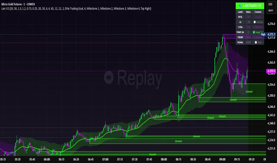
LarsTrades Order Flow ZonesLarsTrades Order Flow Zones
**Important:
-Futures charts only!
-Trust the default settings
-best on 2min or lower timeframe.
-if indicator error in replay mode: exit, ctrl+r - it will reset.
This indicator builds a full trade workflow from raw order flow imbalances. It finds aggressive buy and sell imbalances, promotes the strongest ones into key levels, and manages each level through its entire life cycle. Every level becomes a visual zone on the chart that updates in real time as the market moves.
It is built for short-term traders who want clarity, speed, and a structured decision process based on imbalances instead of guesswork.
If you rely on order flow, imbalance zones, or systematic retest setups, this tool helps you stay consistent and understand the story behind each move.
Ghost Cipher [Bit2Billions]Ghost Cipher — Adaptive Market Flow Engine
*A structured, intelligence-driven framework that decodes market flow using smoothing, liquidity distribution, volatility behavior, and range-based logic.*
Ghost Cipher translates complex price action into a clean, intuitive visual environment. It combines multiple analytical modules—including adaptive smoothing, liquidity mapping, volatility profiling, and CRT range-theory detection—into a cohesive, rule-based system. Each component is designed to complement the others: smoothing reduces noise for clearer trend detection, liquidity mapping identifies imbalance zones for potential reversals, and range theory structures intra-day and multi-timeframe price dynamics.
This integration provides traders with a streamlined, actionable view of market flow from micro swings to macro transitions, supporting both decision-making and workflow efficiency.
Why This Script Is Original and Useful
* Ghost Cipher is not a simple mashup: each module is developed with proprietary logic and integrates dynamically with others.
* Classic elements like moving averages, volatility bands, and order blocks are adapted and enhanced, not copied from public scripts.
* Closed-source design ensures that traders see what the script does (trend, liquidity, range signals) without exposing full underlying code.
* All visual and analytical outputs are designed to add tangible value over existing indicators, reducing manual analysis and improving clarity.
Key Features & Components
1. Candles & Visualization
* Custom Heikin-Ashi–style candle coloring for a clean chart.
* Multi-timeframe overlays to highlight higher-timeframe influence.
2. Smoothed Trend Processin g
* Proprietary smoothing for noise-reduced trend detection.
* Zero-Lag Multi-Ribbon: layered momentum ribbon with gradient shading for lag-free directional assessment.
3. Liquidity & Institutional Mapping
* Real-time liquidity depth visualization.
* Detection of pockets, imbalance zones, and resting liquidity clusters.
* Smart Bullish & Bearish Order Blocks with mitigation-focused logic.
4. Dynamic Demand & Supply Engine
* Auto-detection of institutional demand/supply zones.
* Adaptive boundaries respond to volatility, displacement, and liquidity conditions.
5. Volatility & Channel Tools
* Adaptive Bollinger-style volatility bands.
* Macro trendlines, break structures, and volumetric channel mapping.
6. Intelligent Market Flow Tools
* Dynamic Magic Line: adapts to real-time volatility, range compression, and volume shifts.
* CRT Candle Range Theory: detects ranges, equilibrium zones, and breakout/reaction signals.
7. Market Sessions
* Highlights bull/bear sessions for directional bias and structural insight.
Dashboard Metrics
* Volume Delta Dashboard: aggregated BTC delta across major exchanges; multi-asset pairing for comparison.
* Market Overview Panel: current bias, trend regime, and structured analyst notes.
Chart Clarity & Design Standards
* Only essential real-time labels displayed; historical labels hidden.
* Organized visuals with consistent colors, line types, and modular design for quick interpretation.
How to Use / What Traders Gain
* Reduces manual charting and repetitive analysis.
* Speeds workflow using rule-based, automated visualization.
* Cuts through market noise for consistent, structured insights.
* Supports multi-timeframe and multi-market analysis.
Inputs & Settings
* Default settings pre-configured
* Simple Show/Hide toggles for modules
* Minimal exposed fields for ease of use
Recommended Timeframes & Markets
* Works best on 15M, 1H, 4H, Daily, and higher
* Suitable across forex, crypto, indices, and liquid equities
* Pivot-based modules may show noise on illiquid assets
Performance & Limitations
* May draw many objects → disable unused modules for speed
* Refresh the chart if historical buffer issues occur
* TradingView platform limitations handled internally
License & Legal
* Proprietary © 2025
* Redistribution, resale, or disclosure prohibited
* Independently developed with proprietary extensions
* Any resemblance to other tools may result from public-domain concepts
Respect & Transparency
* Built on widely recognized public trading concepts.
* Developed with respect for the TradingView community.
* Any overlaps or similarities can be addressed constructively.
Disclaimer
* Educational purposes only
* Not financial advice
* Trading carries risk — always use paper testing and proper risk management
FAQs
* Source code is not public
* Works best on 15m, 1H, 4H, Daily, Weekly charts
* Modules can be hidden/shown with toggles
* Alerts can be set up manually by users
* Supports multiple markets: forex, crypto, indices, and equities
About Ghost Trading Suite
Author: BIT2BILLIONS
Project: Ghost Trading Suite © 2025
Indicators: Ghost Matrix, Ghost Protocol, Ghost Cipher, Ghost Shadow
Strategies: Ghost Robo, Ghost Robo Plus
Pine Version: V6
The Ghost Trading Suite is designed to simplify and automate many aspects of chart analysis. It helps traders identify market structure, divergences, support and resistance levels, and momentum efficiently, reducing manual charting time.
The suite includes several integrated tools — such as Ghost Matrix, Ghost Protocol, Ghost Cipher, Ghost Shadow, Ghost Robo, and Ghost Robo Plus — each combining analytical modules for enhanced clarity in trend direction, volatility, pivot detection, and momentum tracking.
Together, these tools form a cohesive framework that assists in visualizing market behavior, measuring momentum, detecting pivots, and analyzing price structure effectively.
This project focuses on providing adaptable and professional-grade tools that turn complex market data into clear, actionable insights for technical analysis.
Crafted with 💖 by BIT2BILLIONS for Traders. That's All Folks!
Changelog
v1.0 Core Release
* Custom Heikin-Ashi Candles: Clean, visually intuitive candle designs for effortless chart reading.
* Smoothed Moving Averages: Advanced smoothing algorithms for precise trend tracking and confirmation.
* Liquidity Depth Visualization: Real-time insight into liquidity levels, depth pockets, and imbalance zones.
* Dynamic Demand & Supply Mapping: Automatic detection of institutional demand and supply zones with adaptive boundaries.
* High-Timeframe Candle Zones (HTF): Dual HTF candle overlays for macro-level trend context and control over candle count.
* Trend Lines & Channels: Macro and aggressive volumetric trendlines for structured market flow analysis.
* Zero-Lag Moving Average Ribbon: Layered ribbon with shaded gradients for smoother, lag-free momentum visualization.
* Volatility Bands: Adaptive Bollinger-style bands for dynamic range analysis.
* Dynamic Magic Line: Self-adjusting line responding to real-time volatility and volume shifts.
* CRT Candle Range Theory: Automatic detection and visualization of CRT candle ranges and range-based signals.
* Bull & Bear Sessions: Highlights key market sessions to identify directional bias and volatility shifts.
* Order Blocks: Smart detection of bullish and bearish institutional order blocks.
* Dashboard Module:
* Volume Delta Dashboard: Aggregated delta volume from all major exchanges for BTC, with the ability to pair up to 4 additional assets.
* Market Overview Panel: Displays current bias, trend insights, and actionable analyst notes.

Cumulative Volume Delta - LineA simple tweak to the CVD indicator from TradingView for better readability.
Use it to spot absorption and exhaustion at key levels.
For example,
Price is making higher highs while CVD is making lower highs - possible exhaustion of buyers
Price is making lower highs while CVD is making higher highs - possible absorption of buyers
Price is making lower lows while CVD is making higher lows - possible exhaustion of sellers
Price is making higher lows while CVD is making lower lows - possible absorption of sellers

DeepFlow Zones SNIPER# DeepFlow Zones SNIPER - Documentation & Cheatsheet
## 🎯 DeepFlow Zones - SNIPER Edition
**Horizontal Limit Order Zones | Institutional FVG + Single Prints**
> **Philosophy:** *Only mark the zones where institutions MUST have orders. Everything else is noise.*
---
## ⚡ QUICK CHEATSHEET
```
┌─────────────────────────────────────────────────────────────────────────────┐
│ DEEPFLOW ZONES SNIPER - QUICK REFERENCE │
├─────────────────────────────────────────────────────────────────────────────┤
│ │
│ 🎯 ZONE CREATION REQUIREMENTS (ALL MUST BE TRUE): │
│ ══════════════════════════════════════════════════ │
│ ✓ FVG exists → Gap between candle low and 2-bar-ago high │
│ ✓ Gap Size → At least 30% of ATR (significant gap) │
│ ✓ Impulse Candle → 1.8x average range + 65% body ratio │
│ ✓ Volume → 2.0x+ average on impulse candle │
│ ✓ Direction → Middle candle confirms gap direction │
│ │
├─────────────────────────────────────────────────────────────────────────────┤
│ │
│ 📊 ZONE TYPES: │
│ ══════════════ │
│ 🟢 BULLISH ZONE → Green box BELOW price (buy zone) │
│ 🔴 BEARISH ZONE → Red box ABOVE price (sell zone) │
│ ⚫ TESTED ZONE → Gray box (CE level touched) │
│ ⬛ BROKEN ZONE → Dark gray (price closed through) │
│ │
├─────────────────────────────────────────────────────────────────────────────┤
│ │
│ ⭐ SINGLE PRINT LINES: │
│ ══════════════════════ │
│ Requirements: │
│ • Range 1.8x+ average │
│ • Body 65%+ of range │
│ • Volume 2.0x+ average │
│ • Delta 60%+ confirms direction │
│ │
│ Usage: │
│ • Gold lines at HIGH and LOW of impulse candle │
│ • Price often returns to these levels │
│ • Use as support/resistance for entries │
│ │
├─────────────────────────────────────────────────────────────────────────────┤
│ │
│ 🚨 ENTRY SIGNALS: │
│ ═══════════════════ │
│ BUY🎯 appears when: │
│ • Price is inside BULLISH zone │
│ • Delta shows 60%+ buy dominance │
│ • Volume is 1.5x+ average │
│ │
│ SELL🎯 appears when: │
│ • Price is inside BEARISH zone │
│ • Delta shows 60%+ sell dominance │
│ • Volume is 1.5x+ average │
│ │
├─────────────────────────────────────────────────────────────────────────────┤
│ │
│ 📐 ZONE ANATOMY: │
│ ═════════════════ │
│ │
│ BULLISH FVG ZONE: BEARISH FVG ZONE: │
│ │
│ Current Low ───────────────── ───────────────── 2-bar-ago Low │
│ ┌─────────────────────────┐ ┌─────────────────────────┐ │
│ │ █████ ZONE █████████████│ │ █████ ZONE █████████████│ │
│ │- - - CE (50%) - - - - - │ │- - - CE (50%) - - - - - │ │
│ │ ████████████████████████│ │ ████████████████████████│ │
│ └─────────────────────────┘ └─────────────────────────┘ │
│ 2-bar-ago High ────────────── ───────────────── Current High │
│ │
│ Entry: At or near CE line Entry: At or near CE line │
│ Stop: Below zone bottom Stop: Above zone top │
│ Target: 1:1 or 2:1 R:R Target: 1:1 or 2:1 R:R │
│ │
├─────────────────────────────────────────────────────────────────────────────┤
│ │
│ ⛔ ZONE IS INVALID WHEN: │
│ ═════════════════════════ │
│ ✗ Gap size < 30% of ATR (too small) │
│ ✗ No impulse candle (weak move) │
│ ✗ Volume < 2x average (retail move) │
│ ✗ Zone age > 50 bars (stale) │
│ ✗ Price already closed through zone │
│ │
└─────────────────────────────────────────────────────────────────────────────┘
```
---
## 📋 DETAILED DOCUMENTATION
### What Makes SNIPER Zones Different?
Standard FVG indicators create zones everywhere. SNIPER zones only appear when there's **institutional footprint**:
| Filter | Standard FVG | SNIPER Zones | Why It Matters |
|--------|-------------|--------------|----------------|
| Gap Size | Any gap | **≥30% ATR** | Significant imbalance |
| Volume | Optional | **2.0x+ avg** | Institutional volume |
| Impulse | None | **1.8x range** | Real momentum |
| Body | None | **65%+ ratio** | Conviction candle |
| Max Zones | 20-50 | **10 max** | Only the best |
| Zone Life | 100 bars | **50 bars** | Fresh zones only |
---
### How Zones Are Created
```
BULLISH FVG FORMATION:
═══════════════════════
Bar 0 (2 bars ago): Bar 1 (Impulse): Bar 2 (Current):
┌─────┐ ┌─────┐ ┌─────┐
│ │ │█████│ │ │
│ │ HIGH ────── │█████│ │ │
│ │ │ │█████│ │ │
└─────┘ │ │█████│ │ │── LOW
│ └─────┘ └─────┘
│ │
└──────── GAP ────────────────┘
(FVG ZONE)
Requirements Met:
✓ Current LOW > 2-bar-ago HIGH (gap exists)
✓ Gap ≥ 30% of ATR (significant)
✓ Bar 1 range ≥ 1.8x average (impulse)
✓ Bar 1 body ≥ 65% of range (conviction)
✓ Bar 1 volume ≥ 2x average (institutional)
✓ Bar 1 was bullish (direction confirms)
RESULT: VALID SNIPER BULLISH ZONE CREATED
```
---
### Single Print Lines Explained
Single Prints mark **institutional impulse candles** where price moved so fast that no orders were filled at those levels. These levels often act as magnets for price.
```
SINGLE PRINT CANDLE:
════════════════════
HIGH ═══════════════════════════════ (Gold Line)
│
┌─────────────────┤
│█████████████████│ ← Large body (65%+)
│█████████████████│ ← Strong volume (2x+)
│█████████████████│ ← Clear delta (60%+)
│█████████████████│
└─────────────────┤
│
LOW ═══════════════════════════════ (Gold Line)
These horizontal lines extend 500 bars into the future.
Price often returns to test these levels.
```
---
### Entry Strategy
#### Zone Entry Checklist
```
□ Zone is active (green/red, not gray)
□ Price enters zone from outside
□ Wait for entry signal (BUY🎯 or SELL🎯)
□ Verify: Delta + Volume confirming
□ Enter at CE line (dotted white line)
□ Stop below/above zone
□ Target: Opposite side of zone (1:1) or 2:1
```
#### Single Print Entry
```
□ Price returns to single print level
□ Look for reaction (rejection candle)
□ Combine with GRA signal if possible
□ Enter on confirmation candle
□ Stop beyond the single print line
```
---
### Table Legend
| Field | Reading | Color Meaning |
|-------|---------|---------------|
| **Delta** | Buy/Sell % | 🟢 Buy dom, 🔴 Sell dom, ⚪ Neutral |
| **Vol** | Volume ratio | 🟢 ≥2x, ⚪ <2x |
| **Buy ⬚** | Active buy zones | Count of bullish zones |
| **Sell ⬚** | Active sell zones | Count of bearish zones |
| **Zone** | Current position | AT BUY / AT SELL / --- |
| **Impulse** | Current bar status | 🟡 Yes (impulse), ⚫ No |
---
### Zone States
| State | Visual | Meaning | Action |
|-------|--------|---------|--------|
| **Fresh** | Bright color | Never tested | Best entries |
| **Tested** | Gray | CE touched | Still valid, less reliable |
| **Broken** | Dark gray | Price closed through | Invalid, ignore |
---
### Integration with GRA v5
The magic happens when you combine both indicators:
```
HIGHEST PROBABILITY SETUP:
══════════════════════════
1. DeepFlow shows active zone (green/red box)
2. Price enters the zone
3. GRA5 fires a signal INSIDE the zone
4. Delta confirms on both indicators
5. Volume confirms on both indicators
This is your SNIPER entry. Take it.
Example:
┌─────────────────────────────────────────┐
│ Price enters BULLISH zone │
│ GRA5 shows: A🎯 LONG │
│ DFZ shows: BUY🎯 │
│ Table: Vol 2.1x, Delta 67%B │
│ │
│ ACTION: Full size LONG at CE │
│ STOP: Below zone bottom │
│ TARGET: 2:1 R:R │
└─────────────────────────────────────────┘
```
---
### Settings by Instrument
| Instrument | Vol Mult | Gap ATR | Impulse | Max Zones |
|------------|----------|---------|---------|-----------|
| **NQ/ES** | 2.0x | 30% | 1.8x | 10 |
| **YM** | 2.0x | 30% | 1.8x | 10 |
| **GC** | 2.5x | 40% | 2.0x | 8 |
| **BTC** | 2.0x | 25% | 1.5x | 10 |
---
### Common Mistakes
| Mistake | Why It's Bad | Solution |
|---------|-------------|----------|
| Trading every zone | Most zones fail | Wait for entry signal |
| Entering at zone edge | Wrong R:R | Enter at CE (middle) |
| Ignoring broken zones | Already invalidated | Gray = don't trade |
| No delta confirmation | Could be false zone | BUY🎯/SELL🎯 required |
| Too many zones | Chart noise | Max 10 zones |
---
### Alert Configuration
| Alert | Priority | Action |
|-------|----------|--------|
| 🎯 BUY/SELL ZONE ENTRY | 🔴 High | Check chart immediately |
| NEW BULL/BEAR ZONE | 🟠 Medium | Note new zone location |
| 🎯 SINGLE PRINT | 🟢 Low | Mark potential S/R |
---
### Pine Script v6 Notes
This indicator uses Pine Script v6 features:
- Array-based zone management
- `request.security_lower_tf()` for delta
- Dynamic zone state tracking
- Efficient garbage collection
**Minimum TradingView Plan:** Pro (for intrabar data)
---
## 🏆 Golden Rules
1. **Fewer zones = Better zones.** If you see more than 5 active zones, your settings are too loose.
2. **Fresh zones > Tested zones.** The first touch is always the best.
3. **CE is king.** The middle of the zone (50% level) is your entry point.
4. **Zone + GRA signal = Sniper entry.** This confluence is what we're hunting for.
5. **Gray zones don't exist.** Once broken, pretend the zone was never there.
---
*© Alexandro Disla - DeepFlow Zones SNIPER*
*Pine Script v6 | TradingView*

Championship Scalper [Trend & Trap]Championship Scalper
Overview This is a high-precision scalping indicator designed to capture Liquidity Traps (Swing Failure Patterns). It waits for price to "sweep" a key level (grabbing stop losses) and immediately reverse, signaling that smart money has entered the market.
How it Works (The "Confluence" Engine) A signal is only generated when four specific conditions align perfectly:
The Trap: Price must sweep a Swing High or Low and close back inside the range (rejection).
The Trend: Trades are only taken in the direction of the dominant trend (using a 200 EMA).
Price > EMA = Longs only.
Price < EMA = Shorts only.
The Momentum (RSI): Prevents buying tops or selling bottoms.
Longs: RSI must be trending UP and sitting in the bullish zone (30-60).
Shorts: RSI must be trending DOWN and sitting in the bearish zone (60-30).
The Confirmation (CVD): Verifies the move with Order Flow (Cumulative Volume Delta) to ensure hidden volume supports the reversal.
Visual Signals
Green Triangle (▲): Bullish Signal. Validated dip-buy opportunity.
Red Triangle (▼): Bearish Signal. Validated short-sell opportunity.
Dashboard A mini-panel in the bottom right displays the current Trend Status (Bullish/Bearish) and the exact price levels of the most recent active Swing Highs and Lows.

CVD Power & Whale Tracker Overview: What is it?
This indicator combines Order Flow, Volume Analysis, and Momentum into a single dashboard. Instead of just looking at price, it looks at effort (Volume) versus result (Price Action) to identify when Institutions (Whales) are stepping in.
1. The Core Engine: "Pressure" (Z-Score)
At the heart of the indicator is the Z-Score of Volume Delta.
The Logic: It calculates the "Volume Delta" (Buying Volume minus Selling Volume) for every candle. It then compares the current candle's delta to the average of the last 20 candles.
The Output:
Zero Line: Buying and Selling pressure is balanced.
Positive Bar (> 0): Buyers are more aggressive than usual.
Negative Bar (< 0): Sellers are more aggressive than usual.
Extreme Values (> 2 or < -2): This represents statistically significant aggression (2 Standard Deviations from the mean). This usually marks the start of a breakout or a climax.
2. Whale Detection (Institutional Activity)
Retail traders trade small size; Institutions (Whales) trade large size.
The Logic: The script calculates the average volume of the last 50 bars. If the current bar's volume is 2.5x higher than that average, it flags it as a "Whale" bar.
Visual: The Histogram bar turns Yellow.
Meaning: Smart money is active. Pay attention to the direction of the next few candles.
3. Absorption (The "Smart Money" Signal)
This is the most powerful signal in the script. It detects when one side is trapping the other.
Bullish Absorption (Cyan Dot):
Condition: Huge Volume (Whale) + Net Selling Pressure (Red Delta) + Price refuses to drop (closes in the upper half).
Meaning: Sellers are dumping hard, but a passive buyer (Limit Order) is "absorbing" all the sell orders. This is essentially a hidden support wall.
Bearish Absorption (Orange Dot):
Condition: Huge Volume (Whale) + Net Buying Pressure (Green Delta) + Price refuses to rise (closes in the lower half).
Meaning: Buyers are pushing hard, but a passive seller is absorbing the buy orders. This is a hidden resistance wall.
4. Money Flow (Accumulation/Distribution)
Although the purple line was removed from the chart to keep it clean, the math still runs in the background for the Dashboard.
The Logic: It uses the standard Accumulation/Distribution (A/D) formula. It checks if money is flowing into the asset (Close near High) or out (Close near Low) relative to volume.
Dashboard: If the trend of Money Flow is up, the table says "Accumulation (In)". If down, "Distribution (Out)".
5. CVD Trend (Blue/Orange Line)
What is CVD? Cumulative Volume Delta. It keeps a running total of buying vs. selling volume over time.
Usage:
Blue: Positive Slope (Buying Trend).
Orange: Negative Slope (Selling Trend).
Divergence: If Price is making a Lower Low but the CVD Line is making a Higher Low, it means sellers are exhausted (Bullish Divergence). The script highlights the background in Green when this happens.

Absorption PROOF - Absorption PRO (Clean & Smart)Ultra-clean, high-precision absorption reversal strategy.Detects institutional buying/selling pressure using volume-weighted delta proxy and VWAP deviation zones.Smart RSI + early-session range filter automatically separates valid range-bound reversals from trend exhaustion.Green/Red circles → High-probability entries (fully tradable)
Small crosses + colored zones → Rejected signals (avoid)
Blue dotted lines → Session range ±100% deviation levels (optional)
By default: only signals and rejection zones displayed — zero clutter.Minimalist, professional, and deadly accurate on futures & forex (1m–15m).Less noise. Better trades.

Final_CDVCumulative Delta volume using Heikin-Ashi calculation. I don't own the idea behind it, but I updated the calculation to smoothen the oscillation
