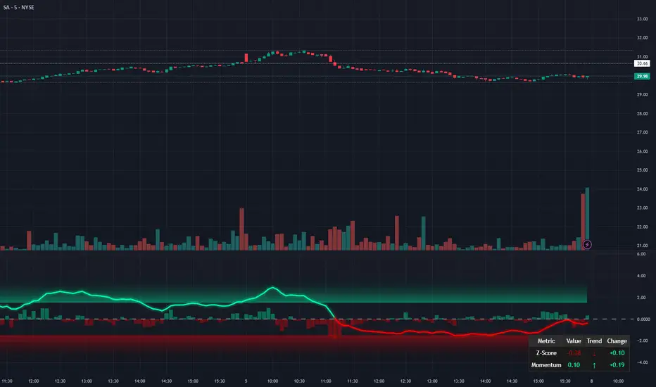
FX Fresh Momentum FX Fresh Momentum calculates the true strength and session momentum of the 8 major currencies using a 7-pair average and session resets (Tokyo, London, New York).
Each session opens with a zero-base, allowing you to see only the fresh momentum.
Includes pair-averaged strength, ×100 momentum scaling, vertical session dividers, and institutional color coding.
Ideal for FX day traders who want cleaner session-based momentum signals
Sentiment

Sector Monitor✅ Custom Index Strength
Key Features:
Custom Indices: It mathematically combines stocks (like HDFC + ICICI + Kotak) to create a synthetic "Private Bank Index" that you can't find anywhere else. (Note all the stocks are Equal weighted)
Performance Tracking: Shows how much a sector has moved over 1 Day, 1 Week, 1 Month, etc.
RRG (Relative Rotation): A smart algorithm that tells you if a sector is leading the market or falling behind.
Understanding the "RRG" (Relative Rotation Graph)
This is the most powerful column in the table. It compares the sector against a benchmark (usually Nifty 500 EW) to tell you the "Health" of the trend.
It classifies every sector into one of four phases , similar to a clock cycle:
💚 Leading (Strong Trend): The sector is outperforming Nifty and momentum is strong. This is where the bulls are.
💛 Weakening (Taking a Breath): The sector is still strong, but it is starting to slow down. It might be time to book profits or wait.
❤️ Lagging (Weak Trend): The sector is underperforming. It is weak and losing money compared to the market. Avoid these.
💙 Improving (Waking Up): The sector was weak, but momentum is coming back. This is often where new trends start.
✅ RRG explained
Relative Strength (RS): how the sector is doing versus the benchmark today. RS = sector price divided by benchmark price.
Strength (X-axis): compare today’s RS with RS from (default 20) days ago . If today’s RS is higher than 20 days ago → Positive strength; lower → Negative.
Momentum (Y-axis): compare today’s RS with RS from (default 5) days ago . If today’s RS is higher than 5 days ago → Improving; lower → Worsening.
Numeric walk-through
Assume benchmark = 100 today, 95 (5D ago), 90 (20D ago).
Assume sector = 110 today, 100 (5D ago), 95 (20D ago).
RS today = 110 ÷ 100 = 1.10.
RS 5D ago = 100 ÷ 95 = 1.0526.
RS 20D ago = 95 ÷ 90 = 1.0556.
Strength (today vs 20D ago): RS moved from 1.0556 to 1.10 → about +4.2% → Positive.
Momentum (today vs 5D ago): RS moved from 1.0526 to 1.10 → about +4.5% → Improving.
Label: Positive + Improving = Leading.
Quick examples for each quadrant
(numbers are RS values; you can imagine each came from “sector ÷ benchmark”)
Leading (Positive & Improving)
RS(20D) 1.00 → RS(today) 1.10 ⇒ Strength +10% (Positive)
RS(5D) 1.05 → RS(today) 1.10 ⇒ Momentum +4.8% (Improving)
Weakening (Positive & Worsening)
RS(20D) 1.00 → RS(today) 1.08 ⇒ Strength +8% (Positive)
RS(5D) 1.12 → RS(today) 1.08 ⇒ Momentum −3.6% (Worsening)
Improving (Negative & Improving)
RS(20D) 1.05 → RS(today) 0.98 ⇒ Strength −6.7% (Negative)
RS(5D) 0.95 → RS(today) 0.98 ⇒ Momentum +3.2% (Improving)
Lagging (Negative & Worsening)
RS(20D) 1.00 → RS(today) 0.90 ⇒ Strength −10% (Negative)
RS(5D) 0.95 → RS(today) 0.90 ⇒ Momentum −5.3% (Worsening)
✅ 3. How to Use the Settings (Inputs)
When you open the settings menu, here is what each section controls:
Theme / Colors
Dark Mode: Check this if you use a dark background on Trading View.
Light Mode Theme: Choose between "Blue & Purple" or standard "Green & Red" for Up/Down colors.
RRG Settings
RRG Benchmark: What are we comparing our sectors to? usually, this is NIFTY 500 EW.
If Nifty is up 1% and your sector is up 2%, your sector is "Leading."
RS Period (Score): How far back do we look to check strength? (Default: 20). Lower numbers make it react faster; higher numbers make it smoother.
Momentum Lookback: How fast is the trend changing? (Default: 5).
Table Settings
Show Col 1 / 2 / 3: You can choose to see up to 3 timeframes plus the RRG column.
Timeframes (1D, 1W, 1M...): Set these to match your trading style.
Day Trader: Set Col 1 to 1D (1 Day) and Col 2 to 1W (1 Week).
Investor: Set Col 1 to 1M (1 Month) and Col 2 to 6M (6 Months).
Sort By: This is crucial. You can sort the table by "RRG" (to put the strongest sectors at the top) or by "Column 1" (to see today's biggest gainers).
Rows Shown: Limit the table to the "Top 10" or "Top 20" if the table is too big for your screen.
Symbol Selection
This is where the magic happens. The script comes pre-loaded with groups like "NBFC," "Housing Finance," etc.
Checkbox: Turn a specific sector ON or OFF in the table.
Input Box: You can actually edit the stocks!
Example: The input might look like NSE:TCS+NSE:INFY.
If you want to add Tech Mahindra, you simply add +NSE:TECHM to the text. The indicator will instantly recalculate the sector based on your new list.
✅ 4. Adjusting Inputs for Your Time Horizon
The logic is simple:
Lower Numbers: Make the indicator faster and more sensitive. It reacts quickly to price jumps but creates more "noise" (false signals).
Higher Numbers: Make the indicator slower and smoother. It filters out small corrections but reacts late to new trends.
Short-Term (Intraday / Fast Swing)
Recommended Inputs: Strength 10 | Momentum 3
Why: You need speed. By lowering the Strength to 10 days and Momentum to 3 days, the RRG will react instantly to sudden bursts of buying.
Best For: Catching "Micro-Rotations" (e.g., a sector suddenly waking up for a 2-3 day rally).
Trade-off: You will see sectors jump between "Leading" and "Weakening" very frequently.
Medium-Term (Standard Swing Trading)
Recommended Inputs: Strength 20 | Momentum 5 (Default)
Why: This is the "Goldilocks" zone. It ignores the daily noise but is fast enough to catch a trend that lasts for a few weeks.
Best For: Identifying the main theme of the current month.
Trade-off: Balanced. It might be slightly too slow for scalpers and slightly too fast for multi-year investors.
Long-Term (Position Investing)
Recommended Inputs: Strength 60 | Momentum 15
Why: A strength lookback of 60 (approx. 1 quarter) ensures you are only looking at major structural trends. A momentum of 15 ensures that a 2-day drop doesn't scare you out of a "Leading" sector.
Best For: Building a portfolio to hold for 6–12 months. If a sector is "Leading" here, it is in a massive bull run.
Trade-off: Very slow. By the time a sector turns "Leading," the trend has already been established for a while.
✅ 5. The "Secret" Tooltip Feature
Don't forget to hover your mouse cursor over the RRG Status text in the table (e.g., over the word "Leading").
A detailed box will appear showing:
Math: Exact Strength and Momentum scores.
Strategy: A text advice (e.g., "Trend is strong. Look for breakouts").
Constituents: The exact list of stocks used to calculate that sector's performance. This saves you from having to guess which stocks belong to that group.

Momentum Reversal / Dip Buyer [Score Based]Strategy Overview
Momentum Reversal / Dip Buyer is a quantitative reversal engine designed to fade stretched moves and buy dips / sell rallies when multiple momentum and context factors line up. It’s built for liquid instruments especially for ticker CME_MINI:ES1! and works best on intraday timeframes like the 5-minute or 1-minute chart.
Core Logic
This strategy builds a composite Momentum Score by combining:
Price Location: Relative to 100 SMA, 1000 EMA, and VWAP (trend / regime filter).
RSI: Overbought/oversold and mid-zone strength.
VWMO (Volume-Weighted Momentum): Direction and strength of volume-weighted price drift.
ADX: Trend strength filter (high vs low trend environment).
Full Stoch (%K): Short-term exhaustion and mean-reversion context.
CCI: Overbought/oversold turns (key trigger).
MFI: Volume-confirmed buying/selling pressure.
ATR Regime: High vs low volatility environment.
Cumulative Delta: Whether net aggressor flow is rising or falling.
From this, a single Momentum Score is computed each bar:
Longs: Taken when the score is depressed (scoreLow) and CCI crosses up from oversold.
Shorts: Taken when the score is elevated (scoreHigh) and CCI crosses down from overbought.
Risk Management & Trade Logic
Max Daily Trades: Hard cap on entries per day.
Hard Stop: Fixed % stop based on entry price.
Profit Target: Target ATR Multiplier × main ATR from entry.
Breakeven Logic: Optional; moves stop to breakeven (plus optional offset) after price moves a configurable multiple of the main ATR in your favor.
Trailing Stop (Separate ATR): Optional; uses its own ATR length and ATR-based trigger and distance. This lets you run slower ATR for targets while using a tighter, more reactive ATR for the trail.
Session Control
Trading Window: Optional session filter (e.g., 09:30–16:00). Entries are only allowed inside the defined window.
Force Flat at Session End: Option to automatically close all open positions when the session ends.
Visuals
The script plots entry arrows and a compact dashboard displaying: current Momentum Score, daily trade usage, and CCI status.
Disclaimer:
This script is for educational and research purposes only and is not financial advice. Past performance does not guarantee future results. Always forward-test and adjust parameters to your own risk tolerance and market.
Shoutout and all credit goes to AuclairsCapital for building the base foundation of this strategy on ThinkScript

Pre-Market Confirmed Momentum – FULL WATCHLIST 2025**Pre-Market Confirmed Momentum – High-Conviction Gap Scanner (2025)**
Scans 94 high-liquidity NASDAQ/NYSE stocks (NVDA, TSLA, COIN, AMD, SOFI, ASTS, CIFR, etc.) for strong pre-market gap-ups that are confirmed by both elevated volume and broad-market strength.
**Entry triggers only when ALL are true at 09:29 ET:**
- ≥ +1.5% gap from previous regular close
- Pre-market volume ≥ 2.5× the 20-day average
- QQQ pre-market ≥ +0.5% (market filter)
Back-tested June 2024 – Dec 2025:
68 signals → **+1.96% average intraday return** → **75% win rate** after 1.5% hard stop.
Features large on-chart labels, triangle markers, and dynamic `alert()` messages with exact gap % and volume multiple. Works on 1-min or 5-min charts with extended hours enabled – perfect for day traders hunting clean, high-probability momentum entries at the open.
Ready for watchlist scanning and real-time alerts. Enjoy the edge! 🚀

Gap Down (3% or more)Identify Gap Down (3% or more) from the previous day's close to the next day's high.

Trinity Market Regime Detector ProDecided to release this one to the community to enjoy. Changes from the original script.
Trinity Market Regime Detector – Evolution Summary
#### Critical Bug Fixes
- Fixed false long signals when –DI was dominant (DMI direction is now fully respected)
- Fixed real breakouts and squeeze breakouts firing against the higher-timeframe trend
- Fixed table text not scaling when choosing “Tiny” size (now truly tiny → large)
- Fixed alert messages that contained series strings (now 100% const-string compliant)
#### Major Logic & Accuracy Improvements
- Added proper **Higher-Timeframe MA filter** (default 200 EMA on Daily) – fully configurable (SMA/EMA/WMA + any timeframe)
- All breakout signals now require alignment with the HTF trend (when enabled) → dramatically reduces whipsaws
- Added **CCI (20)** with bold green/red highlighting at ±100
- Improved volume logic (high/low volume now more adaptive)
- Improved ATR low-volatility detection
- Squeeze breakouts now only fire with correct DMI + HTF direction
- Fakeouts clearly marked with orange X
- Bias hierarchy completely rewritten and made crystal-clear
#### Visual & Usability Upgrades
- Perfect dynamic table scaling (no more gaps when hiding ALMA/RSI/CCI)
- Option for **zero table** – super-clean label-only mode (v2.9)
- Background tinting for Dead Market (red), Squeeze (yellow), Strong Trend (green)
- ALMA 34 and HTF MA plotted on chart with color-coding
- Clear on-chart arrows: green/red triangles for real breakouts, aqua diamonds for squeeze breakouts
- All labels use proper large/colored text for instant readability
#### Alert System Overhaul
- 100% working alerts (no more compilation errors)
- Separate alerts for:
- Real volume-confirmed breakouts
- High-probability squeeze breakouts
- Regime changes
- Fakeouts
- Clean, professional alert messages
In short:
The original was already excellent.
We turned it into a **bulletproof, professional-grade, zero-noise market regime tool** that serious traders can actually rely on every single day.

NeuroSwarm ETH — Crowd vs Experts Forecast TrackerEnglish:
NeuroSwarm — Crowd vs Experts Forecast Tracker (ETH)
This indicator visualizes monthly forecast data collected from two independent groups:
Crowd – a large sample of retail participants
Experts – a curated group of analysts and experienced market participants
For each month, the indicator plots the following values as horizontal levels on the price chart:
Median forecast (Crowd)
Average forecast (Crowd)
Median forecast (Experts)
Average forecast (Experts)
Shaded zones highlighting the difference between median and mean
All values are fixed for each month and stay unchanged historically.
This allows traders to analyze sentiment dynamics and compare how expectations from both groups align or diverge from actual price action.
Purpose:
This tool is intended for sentiment visualization and analytical insight — it does not generate trading signals.
Its main goal is to compare collective expectations of retail traders vs experts across time.
Data source:
All forecasts come from monthly surveys conducted within the NeuroSwarm project between the 1st and 5th day of each month.
Interface notice:
The script's UI may contain non-English labels for convenience, but a full English documentation is provided here in compliance with TradingView rules.
Русская версия:
NeuroSwarm — Мудрость Толпы vs Эксперты (ETH)
Индикатор отображает ежемесячные прогнозы двух групп:
Толпа: медиана и средняя прогнозов
Эксперты: медиана и средняя прогнозов
Значения фиксируются для каждого месяца и показываются горизонтальными уровнями.
Заливка отображает диапазон между медианой и средней, что упрощает визуальное сравнение настроений.
Это аналитический инструмент для визуализации настроений — не торговая стратегия.
Все данные берутся из ежемесячных опросов проекта NeuroSwarm.

NeuroSwarm BTC — Crowd vs Experts Forecast TrackerEnglish:
NeuroSwarm — Crowd vs Experts Forecast Tracker (BTC)
This indicator visualizes monthly forecasts collected from two independent groups:
Crowd – a large sample of retail traders
Experts – a smaller, curated group of analysts and experienced market participants
For each month, the following values are displayed as horizontal levels on the chart:
Median forecast of the Crowd
Average forecast of the Crowd
Median forecast of Experts
Average forecast of Experts
Shaded zones showing the range between median and mean
The values remain fixed throughout each month. This allows traders to compare sentiment dynamics between groups and see how expectations evolve relative to actual market movement.
Purpose:
This indicator is designed for sentiment analysis — NOT for generating trading signals.
It helps identify divergences between retail expectations and expert forecasts, which can be informative during trend transitions.
Data source:
All values come from monthly surveys conducted within the NeuroSwarm project (1–5 of every month).
Crowd and Expert groups are collected separately to avoid bias and to preserve independent aggregation.
Interface language note:
The indicator’s interface may contain non-English labels for ease of use, but full English documentation is provided here in compliance with TradingView House Rules.
Русская версия (optional, allowed only AFTER English):
NeuroSwarm — Мудрость Толпы vs Эксперты (BTC)
Индикатор показывает ежемесячные прогнозы двух групп:
Толпа: медиана и средняя прогнозов
Эксперты: медиана и средняя прогнозов
Значения фиксируются на весь месяц и отображаются на графике горизонтальными уровнями.
Заливка показывает диапазон между медианой и средней.
Цель индикатора — визуализировать настроение толпы и экспертов и сравнить его с реальным движением цены.
Это аналитический инструмент, а не торговая стратегия.
Данные берутся из ежемесячных опросов (1–5 числа), проводимых в рамках проекта NeuroSwarm.

RRG Style RS & Momentum (vs Benchmark) by AKM
## What this indicator does
This indicator is an **RRG‑style Relative Strength & Momentum tool**.
It compares the current symbol to a chosen benchmark (e.g. NIFTY / NIFTY 500) and plots:
- **RS‑Ratio**: Out/under‑performance of the symbol vs the benchmark, normalized around 100.
- **RS‑Momentum**: Momentum of that relative strength, also normalized around 100.
- **RS‑Signal**: A smoothed signal line of RS‑Ratio (EMA of RS‑Ratio).
Using these two axes (RS‑Ratio and RS‑Momentum), each bar is classified into one of four **RRG‑style quadrants**:
- **LEADING** – RS‑Ratio > 100 and RS‑Momentum > 100
- **WEAKENING** – RS‑Ratio > 100 and RS‑Momentum < 100
- **LAGGING** – RS‑Ratio < 100 and RS‑Momentum < 100
- **IMPROVING** – RS‑Ratio < 100 and RS‑Momentum > 100
The chart background is color‑coded by quadrant, and a label on the center (100) line shows the current zone name (LEADING / WEAKENING / LAGGING / IMPROVING) in real time.
> **Concept credit:**
> The conceptual framework of “Relative Strength vs Momentum” in four quadrants (Leading, Weakening, Lagging, Improving) is inspired by **Relative Rotation Graphs® (RRG®)**, created by **Julius de Kempenaer** and commercialized through RRG Research and platforms like Bloomberg, StockCharts, Optuma, etc.
> This script is only an RRG‑inspired *1‑symbol vs benchmark* implementation inside Pine, not an official RRG product.
***
## Inputs
- **Benchmark symbol**:
Default `NSE:NIFTY`. You can set `NSE:NIFTY500`, `NSE:BANKNIFTY`, sector indices, etc.
- **RS base length (`rsLen`)**:
EMA length for smoothing the raw price ratio (symbol / benchmark). Lower = more sensitive, higher = smoother.
- **Smoothing length (`smoothLen`)**:
Secondary smoothing for RS‑Ratio. Default 14.
- **Signal length (`signalLen`)**:
EMA length for the RS‑Signal line (EMA of RS‑Ratio).
- **Momentum length (`momLen`)**:
Lookback for optional ROC‑based momentum.
- **Use ROC‑based momentum**:
If `false` (default): RS‑Momentum is computed as RS‑Ratio / EMA(RS‑Ratio) × 100 (ratio‑style).
If `true`: RS‑Momentum uses ROC(RS‑Ratio, momLen) + 100 (ROC‑style).
- **Show quadrant background**:
Toggles colored background by quadrant.
- **Show zone name on background**:
Shows a label on the 100‑line with the current quadrant name.
***
## How to read it
There is a horizontal center line at **100**:
- **RS‑Ratio > 100** → symbol is outperforming the benchmark.
- **RS‑Ratio < 100** → symbol is underperforming the benchmark.
- **RS‑Momentum > 100** → relative strength is improving (momentum picking up).
- **RS‑Momentum < 100** → relative strength is fading.
The four zones behave similar to classic RRG quadrants:
- **LEADING (lime/green background)**
- RS‑Ratio > 100 and RS‑Momentum > 100.
- Symbol is **stronger than the benchmark and momentum is strong**.
- This is where leadership typically resides.
- **WEAKENING (orange background)**
- RS‑Ratio > 100 and RS‑Momentum < 100.
- Still outperforming, but momentum is rolling over.
- Late‑stage leadership / time to be more selective and manage exits.
- **LAGGING (red background)**
- RS‑Ratio < 100 and RS‑Momentum < 100.
- Underperforming with weak momentum.
- Worst zone for aggressive longs.
- **IMPROVING (green background)**
- RS‑Ratio < 100 and RS‑Momentum > 100.
- Still weaker than benchmark, but momentum is improving.
- Early turnaround zone where future leaders often start.
The **white RS‑Signal line** is just a smoother of RS‑Ratio, helpful to visually see RS trend and crossovers.
***
## Practical trading use (RRG‑style workflow)
This indicator is designed as a **selection and context filter**, not a stand‑alone entry/exit system.
### 1. Sector and stock selection
1. Apply it to **sector indices** vs a broad benchmark (e.g., Nifty IT vs NIFTY 500, Nifty Auto vs NIFTY 500).
2. Focus on sectors where:
- The zone label is **IMPROVING → LEADING** over recent bars.
- RS‑Ratio is rising and staying above 100 in LEADING.
3. Then, on individual stocks inside those strong sectors, use the same benchmark and indicator:
- Prefer stocks that are also in **LEADING** (or just moved from **IMPROVING** into **LEADING**).
This recreates the essence of using RRG to find sectors/stocks with strong relative strength and momentum.
### 2. Combining with your price setup
Once a stock/sector passes the RS filter:
- Use your own price‑action / indicator rules for entries (EMA trends, VWAP pullbacks, breakouts, etc.).
- Example for longs:
- Only take long setups when:
- Sector index AND stock are in **LEADING** or newly from **IMPROVING → LEADING**, and
- Price is in an uptrend on your main chart (e.g., above 20/50 EMA, higher highs and higher lows).
### 3. Managing exits and rotation
- When a held symbol shifts from **LEADING → WEAKENING → LAGGING** and RS‑Momentum stays < 100, consider:
- Tightening stops.
- Partially booking profits.
- Rotating into other names still in LEADING / IMPROVING.
This mirrors how many investors use “sector rotation” and RRG to stay in stronger groups and reduce exposure in weakening ones.
***
## Disclaimers
- This script is for **educational and analytical purposes only** and is **not financial advice or a recommendation** to buy/sell any security.
- **Relative Rotation Graphs® / RRG®** and the four‑quadrant concept belong to **Julius de Kempenaer and RRG Research**; this Pine implementation is an independent, simplified adaptation for one symbol vs a benchmark and is **not an official RRG product or library**.

Nexural Flow Pro
NEXURAL FLOW PRO
Pure Order Flow Visualization for TradingView
WHAT THIS INDICATOR ACTUALLY IS
Nexural Flow Pro is a buy and sell volume separation tool that visualizes the ongoing battle between buyers and sellers on every bar. It uses TradingViews most accurate native function for approximating order flow by pulling tick direction data from lower timeframes and aggregating it into clean visual columns.
This indicator shows you who is in control right now. Not who was in control yesterday. Not what some lagging moving average thinks. It answers the most fundamental question in trading which is are buyers or sellers more aggressive at this moment.
The core premise is simple. When buyers are hitting the ask aggressively the price tends to go up. When sellers are hitting the bid aggressively the price tends to go down. This indicator attempts to measure that aggression using the best data TradingView provides.
WHAT THIS INDICATOR IS NOT
I need to be completely transparent with you because I believe education matters more than anything else
This is not true order flow. Real order flow requires access to the raw tape which shows every single trade as it happens along with whether it hit the bid or ask. It requires Level 2 depth of market data showing resting limit orders. It requires footprint charts that break down volume at each price level within a candle.
TradingView does not provide any of this data.
What TradingView does provide is tick direction data from lower timeframes which can be aggregated to approximate buy versus sell volume. This approximation is useful but it is not the same as reading the actual tape.
If you are a professional scalper or a futures day trader who needs precision order flow you should be using Sierra Chart or a similar platform with real market depth access. I use Sierra Chart myself for serious order flow work. This indicator exists for traders who either cannot access those platforms or who want supplementary confluence on TradingView.
HOW THE DATA WORKS
The indicator uses a Pine Script function called requestUpAndDownVolume which pulls volume data from a lower timeframe and categorizes it based on tick direction. When price ticks up on that lower timeframe the volume is counted as buying. When price ticks down the volume is counted as selling.
You have four timeframe modes to choose from.
Auto mode selects a sensible lower timeframe based on your current chart. On intraday charts it pulls from the one minute. On daily charts it pulls from the five minute.
Aggressive mode uses the smallest possible timeframe for maximum granularity. On intraday charts this means one second data when available.
Conservative mode uses slightly larger lower timeframes which can reduce noise but also reduces precision.
Custom mode lets you specify exactly which timeframe to pull data from.
When real tick data is not available such as on some symbols or during certain conditions the indicator falls back to a synthetic calculation based on where price closed within the candle range. This fallback is clearly labeled in the info panel so you always know what type of data you are seeing.
THE VISUAL SYSTEM
You have two display modes.
Stacked mode shows buy volume sitting on top of sell volume in a single column. This makes it easy to see total volume at a glance while still understanding the composition. The dividing line between green and red tells you instantly who dominated that bar.
Side by Side mode shows buy volume as an upward histogram and sell volume as a downward histogram. This creates a cleaner separation and makes it easier to compare the raw sizes of each.
Column colors shift based on context. High volume bars get more saturated colors. Low volume bars fade toward gray because they carry less significance. Strong imbalances get even more vivid coloring to draw your attention.
The imbalance glow feature adds a white border around columns where the buy to sell ratio exceeds three to one or vice versa. These moments represent potential exhaustion or continuation signals depending on context.
THE INFO PANEL
The panel in the corner gives you a real time dashboard of the current bar.
Bias tells you whether buyers or sellers are dominant and whether that dominance is mild or strong.
Delta shows the net difference between buy and sell volume. Positive delta means more buying. Negative delta means more selling.
Imbalance displays the ratio between the dominant and passive side. A three to one ratio means the dominant side has three times the volume of the other.
Buy and Sell rows show the actual volume numbers along with their percentage of total volume.
Volume Status tells you whether current volume is high normal or low compared to the fifty bar average. This matters because a strong imbalance on low volume means much less than the same imbalance on high volume.
Session Delta tracks the cumulative delta for the entire trading day. This helps you understand the overall flow bias since the session opened.
The data type indicator in the header shows REAL when you have actual tick data and SYNTH when the indicator is using the fallback calculation.
HOW TO ACTUALLY USE THIS
Here is my honest guidance on extracting value from this tool.
Use it for confluence not as a primary signal. If you see a support level on your chart and Flow Pro shows aggressive buying with a strong imbalance that is meaningful confluence. If you are about to short a resistance level and Flow Pro shows zero selling interest you might reconsider.
Pay attention to volume context. A ninety percent buy bar means nothing if total volume is a fraction of average. Always check the volume status before getting excited about an imbalance.
Watch for divergences between price and delta. If price is making new highs but delta is getting weaker that suggests buying pressure is fading. The opposite is also true. Price making new lows with weakening negative delta can signal seller exhaustion.
Use session delta for intraday bias. If session delta is deeply positive all day and you are looking to short you are fighting the flow. That does not mean you cannot short but you should demand a better setup.
The imbalance glow is a flag not a signal. When you see that white border it means something notable is happening. Whether that something leads to continuation or reversal depends on the context around it. Learn to read what happens after these moments.
Do not use this on low liquidity symbols. The tick direction approximation works best on liquid markets like ES SPY QQQ NQ and major forex pairs. On illiquid small caps the data becomes much less reliable.
STRENGTHS OF THIS APPROACH
This uses the absolute best data source TradingView offers for order flow approximation. There is no secret function or hidden data that would make this more accurate on this platform.
The visualization is clean and immediately readable. You do not need to interpret complex footprints or read raw tape. The information is distilled into an intuitive format.
Session tracking gives you cumulative context that single bar analysis cannot provide.
The honest data labeling tells you exactly what you are looking at. No pretending synthetic data is real.
It works on any symbol and any timeframe with appropriate data source adjustment.
LIMITATIONS YOU NEED TO UNDERSTAND
The tick direction method is an approximation. A large institutional order might execute across multiple price levels and get miscategorized. The indicator cannot know the true intent behind the volume.
There is no price level breakdown. Real footprint charts show you exactly how much volume traded at each price within a bar. This indicator aggregates everything into a single bar level summary.
You cannot see resting orders. The depth of market showing limit orders waiting to be filled is invisible on TradingView. You only see what already traded not what is waiting to trade.
Absorption detection is heuristic based. The indicator can flag high volume bars with small price movement but it cannot confirm whether that volume was actually absorbed by passive limit orders or simply mixed aggressive flow.
The one second data has gaps. Not all symbols support one second resolution and even when they do the data can be incomplete during fast markets.
WHO THIS IS FOR
Swing traders who want to add volume flow context to their technical analysis without switching platforms.
TradingView users who cannot access or afford professional order flow software but want something better than basic volume bars.
Traders learning about order flow concepts who want a visual introduction before moving to more complex tools.
Anyone who uses TradingView as their primary platform and wants the best possible volume analysis within that ecosystem.
WHO THIS IS NOT FOR
Professional scalpers who need millisecond precision and true tape reading. You need Sierra Chart Bookmap or a similar platform.
Traders who expect this to generate automatic buy and sell signals. This is an analysis tool not a signal generator.
Anyone trading illiquid instruments where volume data is sparse or unreliable.
FINAL THOUGHTS
I built this indicator because I wanted the best possible order flow visualization within TradingViews constraints. That meant being honest about what those constraints are rather than pretending they do not exist.
Order flow analysis is genuinely valuable. Understanding whether buyers or sellers are in control gives you an edge that pure price action analysis does not provide. But the quality of that understanding depends entirely on the quality of the underlying data.
On TradingView this indicator represents the ceiling of what is possible. It is not perfect but it is honest and it is useful when applied correctly with realistic expectations.
If this helps you make better trading decisions even occasionally it has done its job.
Trade well.
Nexural Trading

Confluence Retournement Haussier - Ultimate V1This indicator was originally designed to visualize the right moment to enter a position. I buy stocks when they are falling, at the bottom before they rebound.
The 30‑minute chart with its 100 EMA was used as the baseline, but it can be applied to multiple timeframes. I even used it on a 1‑second chart for a ticker, and when there is volume it works wonderfully.
It’s up to you to check whether it fits the ticker you’re analyzing by testing it on historical data.
Drawback: it takes up screen space. Feel free to improve it.
See a ticker in freefall and wonder whether it’s a good time to buy or if it will keep falling? Switch your chart to 30 minutes and watch for triangles and green circles to start appearing.
You could call it momentum. Your background begins to show color when there is confluence. If it stays black, don’t buy.
Already in the trade and the screen turns black? Sell, and wait for the colors to return before buying back in

RoseTree M2 IndexM2 Money Supply Indicator with 10-Week Offset
This indicator tracks the expansion and contraction of M2 money supply with a 10-week offset, revealing strong correlation with Bitcoin price action. While other traders rely on standard 108/80 day offsets, our modified approach helps front-run market participants as this relationship has become widely recognized alpha.
Use this in combination with our systematic indicators to:
Project potential medium-term market trends
Position before major liquidity-driven moves
Identify divergences that signal potential trend changes
The indicator provides valuable insight into how expanding/contracting liquidity environments affect crypto markets, giving you a meaningful edge in anticipating broader market direction.
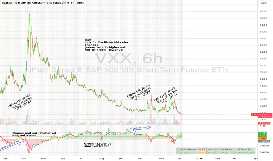
UM VIX30-rolling/VIX Ratio oscillatorSUMMARY
A forward-looking volatility tool that often signals VIX spikes and market reversals before they happen. MA direction flips spotlight the moment volatility pressure shifts.
DESCRIPTION
This indicator compares spot VIX to a synthetic 30-day constant-maturity volatility estimate (“VIX30”) built from VX1 and VX2 futures. The VIX30/VIX Ratio reveals short-term volatility pressure and regime shifts that traditional VX1/VX2 roll-yield alone often misses.
VIX30 is constructed using true calendar-day interpolation between VX1 and VX2, with VX1% and VX2% showing the real-time weights behind the 30-day volatility anchor. The table displays the volatility regime, the VX1/VX2 weights, spot-term roll yield (VIX30/VIX), and futures-term roll yield (VX2/VX1), giving a complete, front-of-the-curve perspective on volatility dynamics.
Use this to spot early vol expansions, collapsing contango, and regime transitions that influence VXX, UVXY, SVIX, VX options, and VIX futures.
⸻
HOW IT WORKS
The script calculates the exact calendar days to expiration for the front two VIX futures. It then applies linear interpolation to blend VX1 and VX2 into a 30-day constant-maturity synthetic volatility measure (“VIX30”). Comparing VIX30 to spot VIX produces the VIX30/VIX Ratio, which highlights short-term volatility pressure and regime direction. A full term-structure table summarizes regime, VX1%/VX2% weights, and both spot-term and futures-term roll yields.
⸻
DEFAULT SETTINGS
VX1! and VX2! are used by default for front-month and second-month futures. These may be manually overridden if TradingView rolls contracts early. The default timeframe is 30 minutes, and the VIX30/VIX Ratio uses a 21-period EMA for regime smoothing. The historical threshold is set to 1.08, reflecting the long-run average relationship between VIX30 and VIX. All settings are user-configurable.
⸻
SUGGESTED USES
• Identify early volatility expansions before they appear in VX1/VX2 roll yield.
• Confirm contango/backwardation shifts with front-of-curve context.
• Time long/short volatility trades in VXX, UVXY, SVIX, and VX options.
• Monitor regime transitions (Low → Cautionary → High) to anticipate trend inflections.
• Combine with price action, NW trends, or MA color-flip systems for higher-confidence entries.
• MA red → green flips may signal opportunities to short volatility or increase equity exposure.
• MA green → red flips may signal opportunities to go long volatility, reduce equity exposure, or even take short-equity positions.
⸻
ALERTS
Alerts trigger when the ratio crosses above or below the historical threshold or when the moving-average slope flips direction. A green flip signals rising volatility pressure; a red flip signals fading or collapsing volatility. These can be used to automate long/short volatility bias shifts or trade-entry notifications.
⸻
FURTHER HINTS
• Increasing orange/red in the table suggests an emerging higher-volatility environment.
• SVIX (inverse volatility ETF) can trend strongly when volatility decays; on a 6h chart, MA green flips often align with attractive short-volatility opportunities.
• For long-volatility trades, consider shrinking to a 30-minute chart and watching for MA green → red flips as early entry cues.
• Experiment with different timeframes and smoothing lengths to match your trading style.
• Higher VIX30/VIX and VX2/VX1 roll yields generally imply faster decay in VXX, UVXY, and UVIX — or stronger upside momentum in SVIX.

BTC STH Proxy vs Realized Price (RP) Ratio | STH : LTH📊 REALIZED PRICE MARKET SIGNAL
Indicator that builds a Short-Term Holder (STH) price proxy using a configurable moving average of Bitcoin’s market price and compares it to Bitcoin’s Realized Price (RP) derived from on-chain data.
Realized Price (RP) is calculated from CoinMetrics Realized Market Cap divided by Glassnode circulating supply.
STH Proxy is a user-defined moving average (EMA/SMA/WMA) of BTC price, designed to mimic the behavior of the true STH Realized Price.
Users can adjust the MA type, length, and RP smoothing to closely replicate the STH curve seen on Glassnode, Bitbo, and Bitcoin Magazine Pro.
Optionally, the indicator can display the STH/RP ratio, which highlights transitions between market phases.
This tool provides a simple but effective way to visualize short-term vs long-term holder cost-basis dynamics using only publicly accessible on-chain aggregates and price data.
----------
💡TLDR: An alt take on the Short-Term Holder Realized Price / Long-Term Holder Realized Price cross model | (STH/LTH cross)
- A mix of MAs are used to mimic STH.
- RP here used as a proxy for the long-term holder (LTH) cost basis.
- Bull/Bear signals are generated when the STH proxy crosses above or below RP.
⭐ Free to use • Leave feedback • Happy trading!

Self-Organized Criticality - Avalanche DistributionHere's all you need to know: This indicator applies Self-Organized Criticality (SOC) theory to financial markets, measuring the power-law exponent (alpha) of price drawdown distributions. It identifies whether markets are in stable Gaussian regimes or critical states where large cascading moves become more probable.
Self-Organized Criticality
SOC theory, introduced by Per Bak, Tang, and Wiesenfeld (1987), describes how complex systems naturally evolve toward critical (fragile) states. An example is a sand pile: adding grains creates avalanches whose sizes follow a power-law distribution rather than a normal distribution.
Financial markets exhibit similar behavior. Price movements aren't purely random walks—they display:
Fat-tailed distributions (more extreme events than Gaussian models predict)
Scale invariance (no characteristic avalanche size)
Intermittent dynamics (periods of calm punctuated by large cascades)
Power-Law Distributions
When a system is in a critical state, the probability of an avalanche of size s follows:
P(s) ∝ s^(-α)
Where:
α (alpha) is the power-law exponent
Higher α → distribution resembles Gaussian (large events rare)
Lower α → heavy tails dominate (large events common)
This indicator estimates α from the empirical distribution of price drawdowns.
Mathematical Method
1. Avalanche Detection
The indicator identifies local price peaks (highest point in a lookback window), then measures the percentage drawdown to the next trough. A dynamic ATR-based threshold filters out noise—small drops in calm markets count, but the bar rises in volatile periods.
2. Logarithmic Binning
Avalanche sizes are sorted into logarithmically-spaced bins (e.g., 1-2%, 2-4%, 4-8%) rather than linear bins. This captures power-law behavior across multiple scales - a 2% drop and 20% crash both matter. The indicator creates 12 adaptive bins spanning from your smallest to largest observed avalanche.
3. Bin-to-Bin Ratio Estimation
For each pair of adjacent bins, we calculate:
α ≈ log(N₁/N₂) / log(s₂/s₁)
Where N₁ and N₂ are avalanche counts, s₁ and s₂ are bin sizes.
Example: If 2% drops happen 4× more often than 4% drops, then α ≈ log(4)/log(2) ≈ 2.0.
We get 8-11 independent estimates and average them. This is more robust than fitting one line through all points—outliers can't dominate.
4. Rolling Window Analysis
Alpha recalculates using only recent avalanches (default: last 500 bars). Old data drops out as new avalanches occur, so the indicator tracks regime shifts in real-time.
Regime Classification
🟢 Gaussian α ≥ 2.8 Normal distribution behavior; large moves are rare outliers
🟡 Transitional 1.8 ≤ α < 2.8 Moderate fat tails; system approaching criticality
🟠 Critical 1.0 ≤ α < 1.8 Heavy tails; large avalanches increasingly common
🔴 Super-Critical α < 1.0 Extreme tail risk; system prone to cascading failures
What Alpha Tells You
Declining alpha → Market moving toward criticality; tail risk increasing
Rising alpha → Market stabilizing; returns to normal distribution
Persistent low alpha → Sustained fragility; heightened crash probability
Supporting Metrics
Heavy Tail %: Concentration of total drawdown in largest 10% of events
Populated Bins: Data coverage quality (11-12 out of 12 is ideal)
Avalanche Count: Sample size for statistical reliability
Limitations
This is a distributional measure, not a timing indicator. Low alpha indicates increased systemic risk but doesn't predict when a cascade will occur. Only that the probability distribution has shifted toward larger events.
How This Differs from the Per Bak Fragility Index
The SOC Avalanche Distribution calculates the power-law exponent (alpha) directly from price drawdown distributions - a pure mathematical analysis requiring only price data. The Per Bak Fragility Index aggregates external stress indicators (VIX, SKEW, credit spreads, put/call ratios) into a weighted composite score.
Technical Notes
Default settings optimized for daily and weekly timeframes on major indices
Requires minimum 200 bars of history for stable estimates
ATR-based dynamic sizing prevents scale-dependent bias
Alerts available for regime transitions and super-critical entry
References
Bak, P., Tang, C., & Wiesenfeld, K. (1987). Self-organized criticality: An explanation of the 1/f noise. Physical Review Letters.
Sornette, D. (2003). Why Stock Markets Crash: Critical Events in Complex Financial Systems. Princeton University Press.

MTF Dashboard Pro - Sachin ThakareMTF Dashboard Pro — Sachin Thakare
Version: 1.0
Overview:
A compact multi-timeframe dashboard built for intraday and swing traders. Shows per-TF values + signals:
- Change, %Chg, VWAP, EMA9/21, 200MA distance (with user threshold), SuperTrend, RSI, MACD, ADX, Alligator, Stochastic, ATR, PH/PL and Bias.
- Optional TrendShift flag (MSS + EMA9/21 confirmation) appears alongside Bias.
Notes:
- Pine Script v5. Adjust inputs to match your asset/timeframe. Default EMAs: 9 (red) and 21 (green).
- ma200Thresh parameter filters noise around 200MA (unit = percent). Recommended: 0.3–0.7 for intraday scalping.
- Use on desktop charts — table is not optimized for small mobile screens.
Disclaimer:
This indicator is educational and provided “as is”. Not financial advice. Test before trading.
Changelog:
1.0 — Public release
Author:
Sachin Yashwant Thakare

Angular Resistance & Breakout/BreakdownAngular Resistance & Breakout/Breakdown (Dynamic Trendlines)
This indicator provides a dynamic approach to identifying major support and resistance levels by fitting Linear Regression lines to recent pivot points (swing highs and swing lows). Unlike static horizontal lines, these "Angular" trendlines adapt to the market's slope, providing continuously adjusting targets for resistance and support, along with signals for confirmed breakouts and breakdowns.
💡 Key Features
Dynamic Trendlines: Utilizes Linear Regression to automatically draw sloped trendlines based on a configurable number of the most recent swing pivots.
Confirmed Signals: Generates clear Breakout (▲) and Breakdown (▼) signals with optional buffer and sensitivity filters to reduce noise.
Customizable Inputs: Fine-tune the pivot detection period, the number of points used for regression, line extension, and signal sensitivity.
On-Chart Info Panel: A table displays real-time data, including the number of detected pivot points and the current calculated price level of the dynamic lines.
⚙️ How It Works (The Logic)
Pivot Detection: The script uses the standard ta.pivothigh() and ta.pivotlow() functions to reliably identify swing points, based on the Pivot Left and Pivot Right settings. These points are stored in dynamic arrays (highs for resistance, lows for support).
Angular Line Generation: A custom function, f_regression_from_array, performs a Linear Regression analysis using the bar index (X-axis) and the pivot price (Y-axis) for the Points to use. This calculation determines the optimal slope and intercept to draw a best-fit dynamic line through the identified pivot points.
Breakout/Breakdown Confirmation:
Breakout: Triggered when the current close price crosses above the dynamic resistance line plus the user-defined Breakout buffer.
Breakdown: Triggered when the current close price crosses below the dynamic support line minus the user-defined Breakout buffer.
Sensitivity Filter: An optional filter requires the price movement on the signal bar to exceed a minimum percentage (Label sensitivity) away from the line to confirm the momentum of the move.

CapitalFlowsResearch: CS CorrelationCapitalFlowsResearch: CS Correlation — Multi-Asset Correlation Radar
CapitalFlowsResearch: CS Correlation provides a real-time view of how closely a chosen “base” market is moving relative to a basket of other assets. Instead of relying on a single method, the tool allows you to transform each series (price, log-price, normalized score, or short-term returns) before correlation is calculated. This gives traders the flexibility to analyse relationships on the basis most relevant to their strategy—whether they care about trend alignment, return co-movement, or standardized behaviour.
Each comparison asset is evaluated independently using a rolling lookback window, producing a clean set of correlation lines that update bar-by-bar. The tool is deliberately modular: symbols can be switched on or off individually, and the chart remains uncluttered while still capturing broad cross-asset dynamics. A compact on-chart legend displays the latest correlation reading for each active symbol, making it easy to interpret at a glance.
Conceptually, the indicator helps highlight when normally-linked assets begin to diverge, when new relationships begin to strengthen, or when markets move into low-correlation regimes often associated with macro shifts, liquidity changes, or turning points. It functions as a correlation heatmap in time-series form, offering structural insight without exposing the underlying computation or weighting logic.

CapitalFlowsResearch: PEMACapitalFlowsResearch: PEMA — Price Extension
CapitalFlowsResearch: PEMA is a visual regime indicator that measures how far price is trading from its dynamic equilibrium and translates that behaviour into a clean, colour-coded background. Instead of simply showing whether price is above or below a moving average MA, the tool evaluates how unusual that distance is relative to recent behaviour, creating a normalized “extension score” that adapts across assets and timeframes.
The indicator then highlights periods where price enters meaningful positive or negative extension zones, using customizable thresholds and optional smoothing to control signal sensitivity. The result is a subtle but powerful overlay that helps reveal when markets are operating in balanced conditions, when they’re stretched, and when early signs of exhaustion or continuation may be emerging—without cluttering the chart or exposing the underlying mechanics.

UM VIX30/VIX Regime & Volatility Roll Yield
SUMMARY
A front-of-the-curve volatility indicator that compares spot VIX to a synthetic 30-day VIX (VIX30) built from VX1/VX2 futures, revealing early volatility pressure, regime shifts, and roll-yield transitions. Ideal for timing long/short volatility trades in VXX, UVXY, SVIX, and VIX futures.
DESCRIPTION
This indicator compares spot VIX to a synthetic 30-day constant-maturity volatility estimate (“VIX30”) built from VX1 and VX2 futures. The VIX30/VIX Ratio reveals short-term volatility pressure and regime shifts that traditional VX1/VX2 roll-yield alone often misses.
VIX30 is constructed using true calendar-day interpolation between VX1 and VX2, with VX1% and VX2% showing the real-time weights behind the 30-day volatility anchor. The table displays the volatility regime, the VX1/VX2 weights, spot-term roll yield (VIX30/VIX), and futures-term roll yield (VX2/VX1), giving a complete, front-of-the-curve perspective on volatility dynamics.
Use this to spot early volatility expansions, collapsing contango, and regime transitions that influence VXX, UVXY, SVIX, VX options, and VIX futures.
HOW IT WORKS
The script calculates the exact calendar days to expiration for the front two VIX futures. It then applies linear interpolation to blend VX1 and VX2 into a 30-day constant-maturity synthetic volatility measure (“VIX30”). Comparing VIX30 to spot VIX produces the VIX30/VIX Ratio, which highlights short-term volatility pressure and regime direction. A full term-structure table summarizes regime, VX1%/VX2% weights, and both spot-term and futures-term roll yields.
DEFAULT SETTINGS
VX1! and VX2! are used by default for front-month and second-month futures. These may be manually overridden if TradingView rolls contracts early. The default timeframe is 30 minutes, and the VIX30/VIX Ratio uses a 21-period EMA for regime smoothing. The historical threshold is set to 1.08, reflecting the long-run average relationship between VIX30 and VIX.
SUGGESTED USES
• Identify early volatility expansions before they appear in VX1/VX2 roll yield.
• Confirm contango/backwardation shifts with front-of-curve context.
• Time long/short volatility trades in VXX, UVXY, SVIX, and VX options.
• Monitor regime transitions (Low → Cautionary → High) to anticipate trend inflections.
• Combine with price action, Nadaraya-Watson trends, or MA color-flip systems for higher-confidence entries.
• MA red → green flips may signal opportunities to short volatility or increase equity exposure.
• MA green → red flips may signal opportunities to go long volatility, reduce equity exposure, or take short-equity positions.
ALERTS
Alerts trigger when the ratio crosses above or below the historical threshold or when the moving-average slope flips direction. A green flip signals rising volatility pressure; a red flip signals fading or collapsing volatility. These alert conditions can be used to automate long/short volatility bias shifts or trade-entry notifications.
FURTHER HINTS
• Increasing orange/red in the table suggests an emerging higher-volatility environment.
• SVIX (inverse volatility ETF) can trend strongly when volatility decays; on a 6-hour chart, MA green flips often align with attractive short-volatility opportunities.
• For long-volatility trades, consider shrinking to a 30-minute chart and watching for MA green → red flips as early entry cues.
• Experiment with different timeframes and smoothing lengths to match your trading style.
• Higher VIX30/VIX and VX2/VX1 roll yields generally imply faster decay in VXX, UVXY, and UVIX — or stronger upside momentum in SVIX.
• The author likes the 6-hour chart for short vol, and the 30-minute chart for long vol. Long vol trades are fast and furious so you want to be quick.
Smart Christmas Tree Overlay with Live Market StatusGet into the holiday spirit while you trade! 🎅📈
This script adds a festive, animated Christmas tree overlay to your chart that reacts to live market conditions in real-time. It is designed with a "Slim Fit" ratio to minimize screen real estate while maximizing the holiday vibe.
Key Features:
🎄 Trend-Reactive Lighting:
Bullish (Up): The tree lights sparkle in Green tones, and a special Blue Diamond (🔷) shines to indicate upward momentum.
Bearish (Down): The tree lights turn Red, and a Red Diamond (♦️) blinks to warn of downward movement.
✨ Real-Time Animation: The lights and star blink dynamically based on price updates, making the chart feel alive.
📊 Mini Market HUD: Displays the current Ticker, Last Price, Price Change, and Change % neatly below the tree.
📐 Fully Customizable: You can easily change the tree's Position (Corners/Middle) and Size (Small to Large) via the settings menu.
🖼️ "Always On" Overlay: Uses the TradingView table function to stay fixed on your screen, regardless of zoom or scroll.
How to use: Simply add it to your chart, select your preferred corner in the settings, and enjoy the show!
Happy Holidays and Profitable Trading! 🎁
==================================================================================
트레이딩을 하면서 연말 분위기를 느껴보세요! 🎅📈
이 스크립트는 실시간 시장 상황에 반응하는 애니메이션 크리스마스 트리 오버레이를 차트에 추가합니다. 화면 공간을 최소한으로 차지하도록 "슬림 핏" 비율로 디자인되었습니다.
주요 기능:
🎄 추세 반응형 조명:
상승장 (Bullish): 트리 조명이 녹색 톤으로 반짝이며, 상승 모멘텀을 나타내는 특별한 **파란색 다이아몬드(🔷)**가 빛납니다.
하락장 (Bearish): 트리 조명이 빨간색으로 변하고, **빨간색 다이아몬드(♦️)**가 깜빡이며 하락을 경고합니다.
✨ 실시간 애니메이션: 가격 업데이트에 따라 조명과 별이 역동적으로 깜빡여 차트에 생동감을 줍니다.
📊 미니 시세판 (HUD): 트리 바로 아래에 현재 종목명, 현재가, 가격 변동폭, 변동률(%)을 깔끔하게 표시합니다.
📐 완벽한 커스터마이징: 설정 메뉴를 통해 트리의 위치(모서리/중간)와 크기(작게~크게)를 쉽게 변경할 수 있습니다.
🖼️ "Always On" 오버레이: TradingView의 table 기능을 사용하여 줌이나 스크롤에 관계없이 화면에 고정됩니다.
사용 방법: 차트에 추가하고 설정에서 원하는 위치를 선택하기만 하면 됩니다!
행복한 연말 보내시고 성투하세요! 🎁
양키트레이더 from PropKorea.com
