Smart Money Proxy IndexOverview
The Smart Money Proxy Index (SMPI) is an educational tool that attempts to identify potential institutional-style behavior patterns using publicly available market data. This comprehensive tool combines multiple institutional analysis techniques into a single, easy-to-read 0-100 oscillator.
Important Disclaimer
This is an educational proxy indicator that analyzes volume and price patterns. It cannot identify actual institutional trading activity and should not be interpreted as tracking real "smart money." Use for educational purposes and combine with other analysis methods.
Inspiration & Methodology
This indicator is inspired by MAPsignals' Big Money Index (BMI) methodology but uses publicly available price and volume data with original calculations. This is an independent educational interpretation designed to teach smart money concepts to retail traders.
What It Analyzes
SMPI tracks potential "smart money" activity by combining:
Block Trading Detection - Identifies unusual volume surges with significant price impact
Money Flow Analysis - Volume-weighted price pressure using Money Flow Index
Accumulation/Distribution Patterns - Modified On-Balance Volume signals
Institutional Control Proxy - End-of-day positioning and control analysis
Key Features
– Multi-Component Analysis - Combines 4 different institutional detection methods
– BMI-Style 0-100 Scale - Familiar oscillator range with clear extreme levels
– Professional Visualization - Dynamic colors, gradient fills, and clean data table
– Comprehensive Alerts - Buy/sell signals plus divergence detection
– Fully Customizable - Adjust all parameters, colors, and display options
– Non-Repainting Signals - All alerts use confirmed data for reliability
– Educational Focus - Designed to teach institutional flow concepts
How to Interpret
Above 80: Potential smart money distribution phase (bearish pressure)
Below 20: Potential smart money accumulation phase (bullish opportunity)
Signal Generation: Buy signals when crossing above 20, sell signals when crossing below 80
Divergences: Price vs SMPI divergences can signal potential trend changes
Volume Confirmation: Higher volume ratios strengthen signal reliability
Best Practices
Timeframes: Works best on higher timeframes for institutional behavior analysis
Confirmation: Combine with other technical analysis tools and market context
Volume: Pay attention to volume confirmation in the data table
Context: Consider overall market conditions and fundamental factors
Risk Management: Not recommended as standalone trading system
Customizable Parameters
Block Volume Threshold: Sensitivity for unusual volume detection (default: 2.5x average)
SMPI Smoothing Period: Index calculation smoothing (default: 25 bars)
Extreme Levels: Overbought/oversold thresholds (default: 80/20)
Money Flow Length: MFI calculation period (default: 14)
Visual Options: Colors, signals, and display preferences
Available Alerts
Buy Signal: SMPI crosses above oversold level (20)
Sell Signal: SMPI crosses below overbought level (80)
Extreme Levels: Alerts when reaching overbought/oversold zones
Divergence Detection: Bullish and bearish price vs SMPI divergences
Educational Purpose & Limitations
This indicator is designed as an educational proxy for understanding institutional flow concepts. It analyzes publicly available price and volume data to identify potential smart money behavior patterns.
Cannot access actual institutional transaction data
Signals may be slower than day-trading indicators (intentionally designed for institutional timeframes)
Should be used in conjunction with other analysis methods
Past performance does not guarantee future results
What Makes This Different
Unlike simple volume or momentum indicators, SMPI combines multiple institutional analysis techniques into one comprehensive tool. The multi-component approach provides a more robust view of potential smart money activity.
Göstergeler ve stratejiler

AI BUY AND SELL BGThe Gk fundamental is a next gen level ai powered BUY and SELL system engineered for big market moves, it runs an embedded algorithm within a algorithm to detect breakout points before they happen giving traders insane results
works best and only 2h and 4h

SulLaLuna — HTF M2 x Ultimate BB (Fusion) 🌕 **SulLaLuna — HTF M2 x Ultimate BB (Fusion)** 🚀💵
**By SulLaLuna Trading**
(Portions of the Bollinger Band logic adapted with permission/credit from the *Ultimate Buy & Sell Indicator* by its original author — thank you for the brilliance!)
---
🧭 **What This Is**
This is not just another price-following tool.
This is **a macro liquidity detector** — a **Daily Higher Timeframe Hull Moving Average of the Global M2 Money Supply**, smoothed via lower timeframe candles (default 5m, 48 Hull length), overlaid with **Ultimate-style double Bollinger Bands** to reveal *over-extension & mean reversion zones*.
It doesn’t chase candles.
It watches the tides beneath the market — the **money supply currents** that have a **direct correlation** to asset price behavior.
When liquidity expands → risk-on assets tend to rise.
When liquidity contracts → risk-off waves hit.
We ride those waves.
---
🔍 **What It Does**
* **Tracks Global M2** across major economies, FX-adjusted, and scales it to your chart’s price.
* **HTF Hull MA** (Daily, smoothed via 5m base) → gives you the macro liquidity trend.
* **Ultimate BB logic** applied to the HTF M2 Hull → inner/outer bands for volatility envelopes.
* **Pivot Labels** → ideal entry/exit zones on macro turns.
* **Over-Extension Alerts** → when HTF M2 Hull pushes outside the outer bands.
* **Re-Entry Alerts** → mean reversion triggers when liquidity moves back inside the range.
* **Background Paint** from chart TF M2 slope → for confluence on your entry timeframe.
---
📜 **Suggested How-To**
1. **Choose your execution chart** — e.g., 1–15m for scalps, 1H–4H for swings.
2. **Use the background paint** as your *local tide check* (chart TF M2 slope).
3. **Trade in the direction of the HTF M2 Hull** — green line = liquidity rising, red line = liquidity falling.
4. **Watch pivot labels** — these are potential “macro inflection” points.
5. **Confluence stack** — pair with ZLSMA, WaveTrend divergences, VWAP volume, or your favorite price-action setups.
6. **Size down** when HTF M2 Hull is flat/gray (chop zone).
7. **Scale in/out** on over-extension + re-entry alerts for higher probability swings.
---
⚠️ **Important Note**
This indicator **does not predict price** — it tracks macro liquidity flows that *influence* price.
Think of it as your market’s **tide chart**: when the water’s coming in, you can swim out; when it’s going out, you’d better be ready for the undertow.
---
📢 **Alerts Available**
* HTF Pivot HIGH / LOW
* Over-Extension (HTF Hull outside outer BB)
* Re-Entry (return from overbought/oversold)
---
🤝 **Join the SulLaLuna Tribe**
If this indicator helps you capture better entries, follow & share so more traders can learn to trade *math, not emotion*.
We rise together — **and we’ll meet you on the Moon** 🌕🚀💵.

Minimal S/R Zones with Volume StrengthHow it works
Pivot Detection
A pivot high is a candle whose high is greater than the highs of a certain number of candles before and after it.
A pivot low is a candle whose low is lower than the lows of a certain number of candles before and after it.
Parameters like Pivot Left Bars and Pivot Right Bars control how sensitive the pivots are.
Zone Creation
Pivot High → creates a Resistance zone.
Pivot Low → creates a Support zone.
Each zone is defined as a price range (top and bottom) and drawn horizontally for a given lookback length.
Volume Strength Filter
Volume Strength (%) = (Volume at Pivot / Volume SMA) × 100.
If the strength is below the minimum threshold (Min Strength %), the zone is ignored.
This ensures only pivots with significant trading activity create zones.
Zone Management
The indicator stores zones in arrays.
Max Zones per side prevents too many zones from being displayed at once.
Older zones are removed when new ones are added beyond the limit.
Visuals
Support zones → green label with Volume Strength %.
Resistance zones → red label with Volume Strength %.
Zones have semi-transparent boxes so price action remains visible.

Buy and Sell Signals Based on Price Channel BreakoutsThis indicator generates clear Buy and Sell signals by detecting breakouts from a price channel defined by the highest highs and lowest lows over a user-defined period.
A Buy signal triggers when the price closes above the previous bar’s channel high, indicating potential upward momentum.
A Sell signal triggers when the price closes below the previous bar’s channel low, signaling potential downward momentum.
The indicator maintains the position until an opposite breakout occurs, reducing noise and false signals common in scalping strategies.
Ideal for intraday scalpers using 1-minute or 5-minute charts who want to trade breakout momentum with simple, visual signals.
Includes alert conditions for Buy and Sell signals to keep you notified in real-time.

Global Bond Yields Monitor [MarktQuant]Global Bond Yields Monitor
The Global Bond Yields Monitor is designed to help users track and compare government bond yields across major economies. It provides an at-a-glance view of short- and long-term interest rates for multiple countries, enabling users to observe shifts in global fixed-income markets.
Key Features:
Multi-Country Coverage: Includes major advanced and emerging economies such as the United States, China, Japan, Germany, United Kingdom, Canada, Australia, and more.
Multiple Maturities: Displays yields for the 2-year, 5-year, 10-year, and 30-year maturities (20-year for Russia).
Dynamic Yield Data: Plots real-time yields for the selected country directly from TradingView’s data sources.
Weekly Change Tracking: Calculates and displays the yield change from one week ago ( ) for each maturity.
Table Visualization: Option to display a compact data table showing current yields and weekly changes, color-coded for easier interpretation.
Visual Yield Curve Comparison: Plots yield lines for short- and long-term maturities, with shaded areas between curves for visual clarity.
Customizable Display: Choose table placement and whether to show or hide the weekly change table.
Use Cases
This script is intended for analysts, traders, and investors who want to monitor shifts in sovereign bond markets. Changes in yields can reflect adjustments in monetary policy expectations, inflation outlook, or broader macroeconomic trends.
❗Important Note❗
This indicator is for market monitoring and educational purposes only. It does not generate trading signals, and it should not be interpreted as financial advice. All data is sourced from TradingView’s available market feeds, and accuracy may depend on the source data.

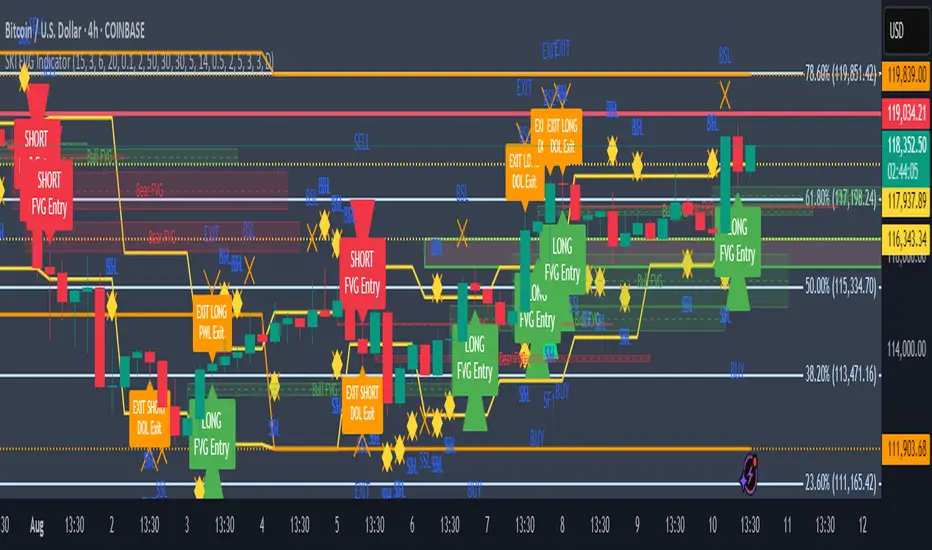
SKI FVG IndicatorIt uses ICT concepts and takes entries and exits. Identifies good FVG and shows an entry to buy or short and also exits at swing high or low , discount areas, primary areas, DOL (draw on liquidity)
Engulfing + Sweep (Confirmed Only) v6 — bars onlyMarks bullish/bearish engulfing candles with liquidity sweeps and confirms them on the next candle — no repaint.
✳️ Features:
• 🟩 Bullish Engulfing + Low Sweep
• 🟥 Bearish Engulfing + High Sweep
• 🎛 Require opposite-color previous candle (optional)
• 📏 Min body-to-range filter
• 🔔 Alerts on confirmation candle
🎯 Best for:
• Price action & reversal traders
• Liquidity sweep confluence setups

RSI-Adaptive T3 [ChartPrime] — Strategy (Long Only, 1D)This trade has been successfully converted from an individual setup to a full strategy, and the results are truly outstanding. I’m currently testing this for Tesla options trading on the 1-day chart, and it appears to be working extremely well.
A special thanks to ChartPrime for creating such a beautifully designed indicator — it’s performing impressively in these tests.
If anyone would like to try it out, feel free to download and see the results for yourself. Thank you!

Swing High/Low SignalsSwing High/Low Signals – profit gang
Quickly spot recent market turning points with this clean swing high/low indicator.
Marks swing highs & lows with labels or triangles
Optional connecting lines & background highlights
Alerts when new swings form
Info table showing last swing levels & current price
Fully adjustable lookback period for any timeframe.
Disclaimer: For educational use only. Not financial advice.
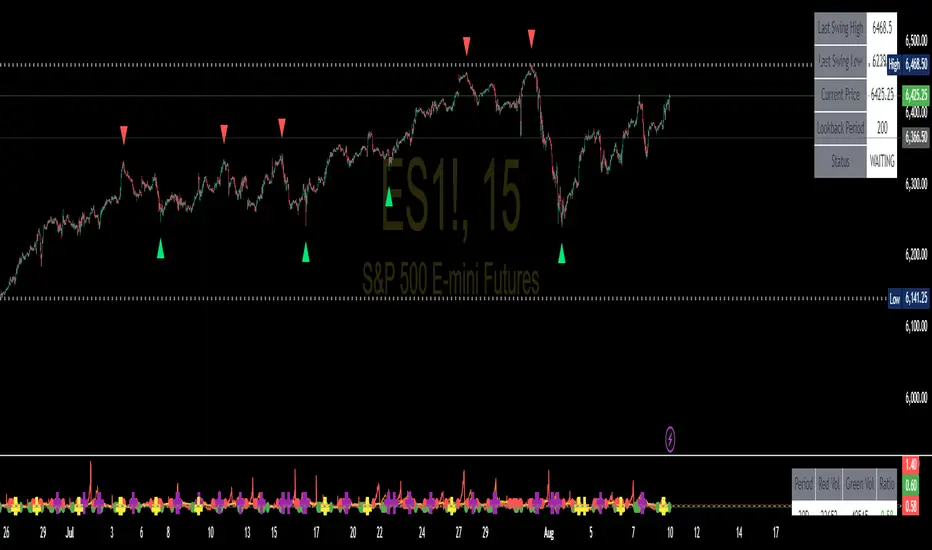
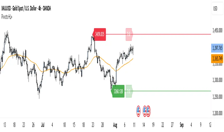
Pivot Points HL DetailedThis indicator marks important turning points in the market, showing you the most recent swing high and swing low as horizontal lines across the chart. Each pivot line has a price label where it formed and a small counter that updates whenever the market touches that level again. The line’s color reflects the prevailing trend, determined by an EMA filter, so you can quickly see if the level is likely acting as support or resistance in the current market environment.
It works by scanning recent bars for points where price made a local high higher than several bars to its left and right, or a local low lower than several bars to its left and right. These pivots are calculated directly from price action using the ta.pivothigh and ta.pivotlow functions. Once identified, the level is tracked in real time, counting every time price crosses it. The EMA provides context: if price is above the EMA, the market is considered in an uptrend and the pivots are colored to match; if price is below, they’re marked as part of a downtrend.
For traders, this offers a clean way to see where the market has turned before and whether those levels are still relevant. Strong levels often show multiple touches, which can be used for entries, exits, or risk management. The built-in alert system can notify you when price approaches either the most recent swing high or swing low, so you can react quickly.
This tool can be applied in almost any market — forex, stocks, indices, commodities, or crypto — because price tends to respect recent swing points regardless of the asset class. It tends to be most effective in liquid markets, where many traders see and react to the same key levels, and it’s valuable in both trending and ranging conditions, though the EMA trend filter adds extra clarity when the market is moving directionally.
Institutional level Indicator V5Smart money concept indicator with added VWAP for better understanding for fair price with relation to movement of price.

Multi-Timeframe RSIRSI Divergence (Time-Based Engine)
This script is a powerful and highly customizable tool designed to automatically detect and display RSI divergences from up to three independent, user-defined timeframes directly on your chart. It eliminates the need to manually switch between timeframes to find these critical trading signals, allowing you to see long-term and short-term divergences all in one place.
The engine is built to be flexible, supporting both regular (reversal) divergences and hidden (trend-continuation) divergences. It's designed for traders who rely on divergence analysis as a core part of their strategy.
Key Features
Multi-Timeframe (MTF) Analysis: Configure and display divergences from up to three different timeframes simultaneously (e.g., show 4-Hour, Daily, and Weekly divergences on your 1-Hour chart). Each timeframe operates independently with its own settings.
Regular & Hidden Divergence: The script can detect both standard regular divergences that signal potential reversals and hidden divergences that suggest a trend may continue.
Configurable Pivot Strength: You have full control over the sensitivity of pivot detection. The 'Left Strength' and 'Right Strength' settings allow you to define what qualifies as a significant price pivot, filtering out market noise.
Bar Count Filter: Refine your signals by setting the minimum and maximum number of bars allowed between two pivots. This ensures you only see divergences that fit your specific strategic timeframe.
Dedicated Alerts: Each of the three timeframes has its own "Enable Alerts" toggle. When a new divergence line is drawn on the chart for a specific timeframe, a corresponding alert can be triggered, ensuring you never miss a potential setup.
Full Visual Customization: Tailor the look and feel of the indicator to your preference. Each timeframe has unique color settings for its bullish and bearish lines, allowing for easy visual identification. You can also toggle the visibility of various chart markers to keep your view clean.
How to Use
1. Add the indicator to your chart.
2. Open the Settings panel.
3. For each timeframe you wish to use (1, 2, or 3), check the "Enable Timeframe" box.
4. Select the desired Timeframe, RSI Length, and Pivot Strength for each active engine.
5. Adjust the Min/Max Bars filter to match your trading style.
6. If you want to receive notifications, check the "Enable Alerts" box for the desired timeframe(s). Then, create an alert using TradingView's alert manager, selecting the indicator and choosing the "Any alert() function call" option.

Range Detector- LEMAZZEIt looks like you've shared a Pine Script code for a "Range Detector" indicator. This indicator identifies price ranges on a chart and visually represents them with boxes and lines. Here's a breakdown of what it does:
Key Features:
Range Detection:
Uses a moving average (SMA) and ATR (Average True Range) to define price ranges
A range is identified when price stays within ± (ATR × multiplier) of the SMA for a specified length of bars
Visual Elements:
Draws boxes around the detected ranges
Plots a dotted midline within the range
Changes color when the range is broken (up/down)
User Inputs:
Adjustable minimum range length
Range width multiplier
ATR length for volatility calculation
Color customization for different states (broken upward, broken downward, unbroken)
Dynamic Behavior:
Extends ranges if new price action continues within bounds
Changes color when price breaks out of the range
Can merge adjacent ranges if they overlap
How to Use:
When price consolidates within a range, you'll see a box with a dotted midline
If price breaks above, the box turns green (upward break)
If price breaks below, the box turns red (downward break)
The unbroken range remains blue
This indicator could be useful for identifying consolidation periods and potential breakout opportunities in price action trading. The ATR-based range width makes it adaptive to current market volatility.

Source-indicatorsSource Indicators – A premium TradingView tool combining automated support/resistance levels, dynamic trendlines, and breakout alerts.
Perfect for spotting key market zones and trend shifts in real-time.
Engulfing & Pin Bar Breakout StrategyOverview
This strategy automates a classic, powerful trading methodology based on identifying key candlestick reversal patterns and trading the subsequent price breakout. It is designed to be a complete, "set-and-go" system with built-in risk and position size management.
The core logic operates on the 1-Hour timeframe, scanning for four distinct high-probability reversal signals: two bullish and two bearish. An entry is only triggered when the market confirms the signal by breaking a key price level, aiming to capture momentum following a potential shift in market sentiment.
The Strategy Logic
The system is composed of two distinct modules: Bullish (Long) and Bearish (Short).
🐂 Bullish (Long) Setup
The script initiates a long trade based on the following strict criteria:
Signal: Identifies either a Hammer or a Bullish Engulfing pattern. These patterns often indicate that sellers are losing control and buyers are stepping in.
Confirmation: Waits for the very next candle after the signal.
Entry Trigger: A long position is automatically opened as soon as the price breaks above the high of the signal candle.
Stop Loss: Immediately set just below the low of the signal candle.
Take Profit: A fixed target is placed at a 1:5 Risk/Reward Ratio.
🐻 Bearish (Short) Setup
The script initiates a short trade based on the following strict criteria:
Signal: Identifies either a Shooting Star or a Bearish Engulfing pattern. These patterns suggest buying pressure is fading and sellers are taking over.
Confirmation: Waits for the very next candle after the signal.
Entry Trigger: A short position is automatically opened as soon as the price breaks below the low of the signal candle.
Stop Loss: Immediately set just above the high of the signal candle.
Take Profit: A fixed target is placed at a 1:4 Risk/Reward Ratio.
Key Feature: Automated Risk Management
This strategy is designed for disciplined trading. You do not need to calculate position sizes manually.
Fixed Risk: The script automatically calculates the correct position size to risk exactly 2% of your total account equity on every single trade.
Dynamic Sizing: The position size will adjust based on the distance between your entry price and your stop loss for each specific setup, ensuring a consistent risk profile.
How To Use
Apply the script to your chosen chart (e.g., BTC/USD).
Crucially, set your chart's timeframe to 1-Hour (H1). The strategy is specifically calibrated for this interval.
Navigate to the "Strategy Tester" tab below your chart to view backtest results, including net profit, win rate, and individual trades.
Disclaimer: This script is provided for educational and informational purposes only. It is not financial advice. All trading involves substantial risk, and past performance is not indicative of future results. Please use this tool responsibly and at your own risk.

Non-Repainting Buy/Sell Oscillator B Dadasaheb//@version=5
indicator("Non-Repainting Buy/Sell Oscillator", overlay=false, max_labels_count=500)
// Inputs
fastLen = input.int(9, "Fast EMA Length", minval=1)
slowLen = input.int(21, "Slow EMA Length", minval=1)
// EMA Calculation
fastEMA = ta.ema(close, fastLen)
slowEMA = ta.ema(close, slowLen)
// Non-Repaint Conditions: Check crossover on previous bar
buySignal = ta.crossover(fastEMA , slowEMA )
sellSignal = ta.crossunder(fastEMA , slowEMA )
// Oscillator value: 1 for buy, -1 for sell
oscValue = fastEMA > slowEMA ? 1 : fastEMA < slowEMA ? -1 : 0
// Colors
oscColor = oscValue > 0 ? color.green : oscValue < 0 ? color.red : color.gray
// Plot Oscillator
plot(oscValue, title="Buy/Sell Oscillator", color=oscColor, linewidth=2, style=plot.style_histogram)
hline(0, "Zero Line", color=color.gray)
hline(1, "Buy Zone", color=color.green, linestyle=hline.style_dotted)
hline(-1, "Sell Zone", color=color.red, linestyle=hline.style_dotted)
// Buy/Sell Labels (non-repainting)
plotshape(buySignal, title="Buy Label", location=location.bottom, style=shape.labelup, text="BUY", color=color.green, textcolor=color.white, size=size.tiny)
plotshape(sellSignal, title="Sell Label", location=location.top, style=shape.labeldown, text="SELL", color=color.red, textcolor=color.white, size=size.tiny)
// Alerts
alertcondition(buySignal, title="Buy Alert", message="BUY: Fast EMA crossed above Slow EMA (confirmed)")
alertcondition(sellSignal, title="Sell Alert", message="SELL: Fast EMA crossed below Slow EMA (confirmed)")

Fibo Channel + MFI LabelOVERVIEW
Fibo Channel + MFI Label plots a logarithmic regression channel with Fibonacci bands and adds a live Money Flow Index (MFI) marker + value at the channel’s right edge. It helps you see where price sits inside the channel while reading volume-weighted momentum from MFI in one glance.
Clean dotted Fibo bands across the log channel (0, 0.236, 0.382, 0.5, 0.618, 0.786, 1.0).
Auto labels for each band with % and price.
MFI dot + label that you can offset to the right to keep the chart clear.
PRINCIPLES
Log Regression Channel: Fits price on a log scale and projects a channel that adapts to trend slope.
Fibonacci Bands: Seven equidistant lines between channel bottom/top for quick context of extension/mean reversion.
MFI Overlay: MFI (0–100) is clamped to a 30–70 working band, then mapped vertically inside the right edge of the channel—so momentum is visual, not hidden in a subpane.
HOW TO USE
Context: Treat fibo lines as dynamic zones—reaction near 0.382/0.618 often signals minor pullbacks; 0/1 extremes = stretched.
Momentum Check: The MFI dot gives instant read—rising toward top of the channel with MFI > 50 supports trend continuation; fading toward mid/low warns of loss of pressure.
Clarity: Use the offset inputs to push the dot/label right of the last candle so they don’t overlap price.
FEATURES
Real-time Fibo lines with percentage + price labels.
Adaptive color for the channel (Up/Down) based on regression slope.
Separate X-offsets for the MFI circle and the text label.
Lightweight: no tables, no repainting tricks, just lines + labels.
Fibo line color changes automatically with channel trend direction.
SETTINGS
MFI Length – period for Money Flow Index.
LogReg Lookback / Channel Length / Channel Width – shape and span of the channel.
Up/Down Colors – channel palette.
Fibo Label X Offset – move fibo labels horizontally.
MFI Circle X Offset – move the dot horizontally.
MFI Label X Offset – move the MFI text horizontally.
NOTES
Best on symbols with reliable volume.
MFI is clamped to 30–70 before mapping inside the channel for cleaner placement.
Requires at least Channel Length bars before drawing.
SUMMARY
Fibo Channel + MFI Label combines a logarithmic regression channel with Fibonacci levels and an on-chart Money Flow Index marker. The channel provides dynamic support/resistance zones based on price’s log-scale trend, while the fibo bands give clear percentage retracement levels. The MFI dot and label display live volume-weighted momentum directly on the price chart, with adjustable offsets for optimal visibility. This tool is designed for traders who want quick visual confirmation of trend direction, price location, and momentum strength without switching between multiple indicators.
DISCLAIMER
For educational purposes only. This is not financial advice. Trading involves risk.

S/R Clouds Overview
The S/R Clouds Indicator is a sophisticated TradingView tool designed to visualize support and resistance levels through dynamic cloud formations. Built on the principles of Keltner Channels, it employs a central moving average enveloped by volatility-based bands to highlight potential price reversal zones. This indicator enhances chart analysis with customizable aesthetics and practical alerts, making it suitable for traders across various strategies and timeframes.
Key Features
Dynamic Bands: Calculates upper and lower bands using a configurable moving average (SMA or EMA) offset by multiples of the average true range (derived from high-low ranges), capturing volatility deviations for precise S/R identification.
Cloud Visualization: Renders semi-transparent clouds between primary and extended bands, providing a clear, layered view of support (lower) and resistance (upper) areas.
Trend Detection: Incorporates a trend state logic based on price position relative to bands and moving average direction, aiding in bullish/bearish market assessments.
Customization Options:
Select from multiple color themes (e.g., Neon, Grayscale) or use custom colors for bands.
Enable glow effects for enhanced visual depth and adjust opacity for chart clarity.
Volatility Insights: Monitors band width to detect squeezes (low volatility) and expansions (high volatility), signaling potential breakouts.
Alerts System: Triggers notifications for price crossings of bands, trend changes, and other key events to support timely decision-making.
How It Works
At its core, the indicator centers on a user-defined period moving average. Volatility is measured via an exponential moving average of the high-low range, multiplied by adjustable factors to form the bands. This setup creates adaptive clouds that expand/contract with market volatility, offering a more responsive alternative to static S/R lines. The result is a clean, professional overlay that integrates seamlessly with other technical tools.
This high-quality indicator prioritizes usability and visual appeal, ensuring traders can focus on analysis without distraction.

IU Indicators DashboardDESCRIPTION
The IU Indicators Dashboard is a comprehensive multi-stock monitoring tool that provides real-time technical analysis for up to 10 different stocks simultaneously. This powerful indicator creates a customizable table overlay that displays the trend status of multiple technical indicators across your selected stocks, giving you an instant overview of market conditions without switching between charts.
Perfect for portfolio monitoring, sector analysis, and quick market screening, this dashboard consolidates critical technical data into one easy-to-read interface with color-coded trend signals.
USER INPUTS
Stock Selection (10 Configurable Stocks):
- Stock 1-10: Customize any symbols (Default: NSE:CDSL, NSE:RELIANCE, NSE:VEDL, NSE:TCS, NSE:BEL, NSE:BHEL, NSE:TATAPOWER, NSE:TATASTEEL, NSE:ITC, NSE:LT)
Technical Indicator Parameters:
- EMA 1 Length: First Exponential Moving Average period (Default: 20)
- EMA 2 Length: Second Exponential Moving Average period (Default: 50)
- EMA 3 Length: Third Exponential Moving Average period (Default: 200)
- RSI Length: Relative Strength Index calculation period (Default: 14)
- SuperTrend Length: SuperTrend indicator period (Default: 10)
- SuperTrend Factor: SuperTrend multiplier factor (Default: 3.0)
Visual Customization:
- Table Size: Choose from Normal, Tiny, Small, or Large
- Table Background Color: Customize dashboard background
- Table Frame Color: Set frame border color
- Table Border Color: Configure border styling
- Text Color: Set text display color
- Bullish Color: Color for positive/bullish signals (Default: Green)
- Bearish Color: Color for negative/bearish signals (Default: Red)
LOGIC OF THE INDICATOR
The dashboard employs a multi-timeframe analysis approach using five key technical indicators:
1. Triple EMA Analysis
- Compares current price against three different EMA periods (20, 50, 200)
- Bullish Signal: Price above EMA level
- Bearish Signal: Price below EMA level
- Provides short-term, medium-term, and long-term trend perspective
2. RSI Momentum Analysis
- Uses 14-period RSI with 50-level threshold
- Bullish Signal: RSI > 50 (upward momentum)
- Bearish Signal: RSI < 50 (downward momentum)
- Identifies momentum strength and potential reversals
3. SuperTrend Direction
- Utilizes SuperTrend with configurable length and factor
- Bullish Signal: SuperTrend direction = -1 (uptrend)
- Bearish Signal: SuperTrend direction = 1 (downtrend)
- Provides clear trend direction with volatility-adjusted signals
4. MACD Histogram Analysis
- Uses standard MACD (12, 26, 9) histogram values
- Bullish Signal: Histogram > 0 (bullish momentum)
- Bearish Signal: Histogram < 0 (bearish momentum)
- Identifies momentum shifts and trend confirmations
5. Real-time Data Processing
- Implements request.security() for multi-symbol data retrieval
- Uses barstate.isrealtime logic for accurate live data
- Processes data only on the last bar for optimal performance
WHY IT IS UNIQUE
Multi-Stock Monitoring
- Monitor up to 10 different stocks simultaneously on a single chart
- No need to switch between multiple charts or timeframes
Highly Customizable Interface
- Full color customization for personalized visual experience
- Adjustable table size and positioning
- Clean, professional dashboard design
Real-time Analysis
- Live data processing with proper real-time handling
- Instant visual feedback through color-coded signals
- Optimized performance with smart data retrieval
Comprehensive Technical Coverage
- Combines trend-following, momentum, and volatility indicators
- Multiple timeframe perspective through different EMA periods
- Balanced approach using both lagging and leading indicators
Flexible Configuration
- Easy symbol switching for different markets (NSE, BSE, NYSE, NASDAQ)
- Adjustable indicator parameters for different trading styles
- Suitable for both swing trading and position trading
HOW USERS CAN BENEFIT FROM IT
Portfolio Management
- Quick Portfolio Health Check: Instantly assess the technical status of your entire stock portfolio
- Diversification Analysis: Monitor stocks across different sectors to ensure balanced exposure
- Risk Management: Identify which positions are showing bearish signals for potential exit strategies
- Rebalancing Decisions: Spot strongest performers for potential position increases
Market Screening and Analysis
- Sector Rotation: Compare different sector stocks to identify rotation opportunities
- Relative Strength Analysis: Quickly identify which stocks are outperforming or underperforming
- Market Breadth Assessment: Gauge overall market sentiment by monitoring diverse stock selections
- Trend Confirmation: Validate market trends by observing multiple stock behaviors
Time-Efficient Trading
- Single-Glance Analysis: Get complete technical overview without chart-hopping
- Pre-Market Preparation: Quickly assess overnight changes across multiple positions
- Intraday Monitoring: Track multiple opportunities simultaneously during trading hours
- End-of-Day Review: Efficiently review all watched stocks for next-day planning
Strategic Decision Making
- Entry Point Identification: Spot stocks showing bullish alignment across multiple indicators
- Exit Signal Recognition: Identify positions showing deteriorating technical conditions
- Swing Trading Opportunities: Find stocks with favorable technical setups for swing trades
- Long-term Investment Guidance: Use 200 EMA signals for long-term position decisions
Educational Benefits
- Pattern Recognition: Learn how different indicators behave across various market conditions
- Correlation Analysis: Understand how stocks move relative to each other
- Technical Analysis Learning: Observe multiple indicator interactions in real-time
- Market Sentiment Understanding: Develop better market timing skills through multi-stock observation
Workflow Optimization
- Reduced Chart Clutter: Keep your main chart clean while monitoring multiple stocks
- Faster Analysis: Complete technical analysis of 10 stocks in seconds instead of minutes
- Consistent Methodology: Apply the same technical criteria across all monitored stocks
- Alert Integration: Easy visual identification of stocks requiring immediate attention
This indicator is designed for traders and investors who want to maximize their market awareness while minimizing analysis time. Whether you're managing a portfolio, screening for opportunities, or learning technical analysis, the IU Indicators Dashboard provides the comprehensive overview you need for better trading decisions.
DISCLAIMER :
This indicator is not financial advice, it's for educational purposes only highlighting the power of coding( pine script) in TradingView, I am not a SEBI-registered advisor. Trading and investing involve risk, and you should consult with a qualified financial advisor before making any trading decisions. I do not guarantee profits or take responsibility for any losses you may incur.

Fractal/Imbal/Fvg with RSI Dashboard - LEMAZZEIt looks like you've shared a Pine Script code for a TradingView indicator called "Fractal/Imbal/Fvg with RSI Dashboard - LEMAZZE". This indicator combines several technical analysis concepts:
RSI Dashboard: Shows the RSI (Relative Strength Index) value in a table at the top right, colored green when between 30-70 and red otherwise.
Fractals: Identifies fractal patterns (high and low points) with customizable settings for:
Showing fractals
Showing market structure breakouts
Break type (Wick+Body or Body only)
Periods (default 4)
Line styles and colors
Imbalances/Fair Value Gaps (FVG): Detects price imbalances with options to:
Show breakout imbalances
Show other imbalances
Hide filled gaps
Customize colors
Order Blocks: Shows order blocks with customization options for colors and visibility.

super super123//@version=5
indicator("Supertrend", overlay=true, timeframe="", timeframe_gaps=true)
atrPeriod = input(11, "ATR Length")
factor = input.float(2.0, "Factor", step = 0.01)
= ta.supertrend(factor, atrPeriod)
bodyMiddle = plot((open + close) / 2, display=display.none)
upTrend = plot(direction < 0 ? supertrend : na, "Up Trend", color = color.green, style=plot.style_linebr)
downTrend = plot(direction < 0? na : supertrend, "Down Trend", color = color.red, style=plot.style_linebr)
fill(bodyMiddle, upTrend, color.new(color.green, 90), fillgaps=false)
fill(bodyMiddle, downTrend, color.new(color.red, 90), fillgaps=false)
atr_2 = input(10, "ATR Length 2")
factor_2 = input.float(1.0, "Factor 2", step = 0.01)
= ta.supertrend(factor_2, atr_2)
bodyMiddle_2 = plot((open + close) / 2, display=display.none)
upTrend_2 = plot(direction_2 < 0 ? supertrend_2 : na, "Up Trend", color = color.green, style=plot.style_linebr)
downTrend_2 = plot(direction_2 < 0? na : supertrend_2, "Down Trend", color = color.red, style=plot.style_linebr)
fill(bodyMiddle_2, upTrend_2, color.new(color.green, 90), fillgaps=false)
fill(bodyMiddle_2, downTrend_2, color.new(color.red, 90), fillgaps=false)
atrPeriod_3 = input(12, "ATR Length 3")
factor_3 = input.float(3.0, "Factor 3", step = 0.01)
= ta.supertrend(factor_3, atrPeriod_3)
bodyMiddle_3 = plot((open + close) / 2, display=display.none)
upTrend_3 = plot(direction_3 < 0 ? supertrend_3 : na, "Up Trend", color = color.green, style=plot.style_linebr)
downTrend_3 = plot(direction_3 < 0? na : supertrend_3, "Down Trend", color = color.red, style=plot.style_linebr)
fill(bodyMiddle_3, upTrend_3, color.new(color.green, 90), fillgaps=false)
fill(bodyMiddle_3, downTrend_3, color.new(color.red, 90), fillgaps=false)

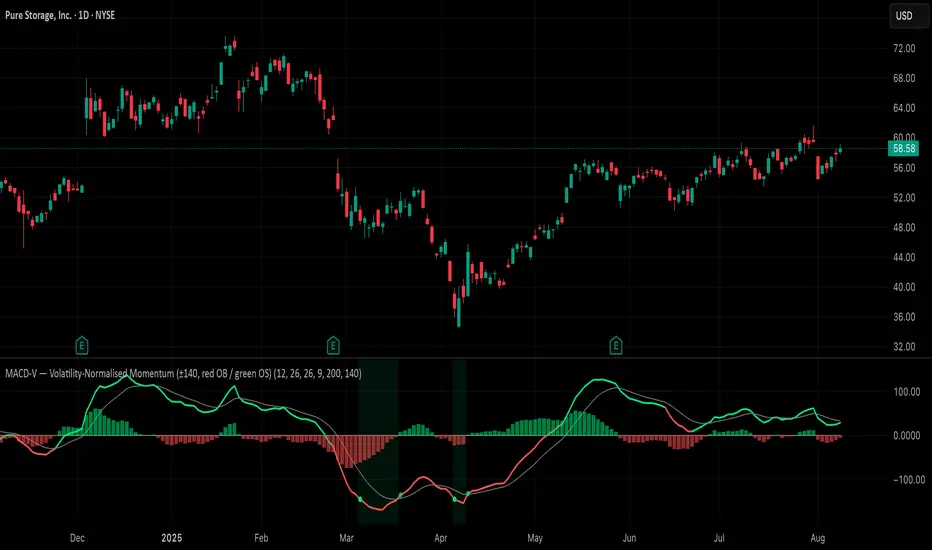
MACD-V (Volatility-Normalised Momentum) — Spiroglou, 2022Volatility-normalized MACD per Alex Spiroglou (2022):
MACD-V = (EMA12 − EMA26) / ATR26 × 100, so momentum is expressed in ATR units and stays comparable across assets/timeframes.
What you get
• Trend-colored line: green when price ≥ EMA200, red otherwise.
• Guides: ±50 / ±100 / 0; Extremes: ±140 (editable).
• Regime shading: OB ≥ +140 shaded red; OS ≤ −140 shaded green.
• Clean, on-curve markers: small circles on the MACD-V line at the four edge events — OB (enter ≥ +threshold), OBX (cross back down), OS (enter ≤ −threshold), OSX (cross back up).
• Text labels are off by default; optional toggle only for OB/OBX.
• Signal & histogram: EMA(9) of MACD-V and (MACD-V − Signal) columns.
• Alerts: OB/OS entries & exits included.
How to use
• Favor longs when MACD-V > 0 (ideally > +50); respect OB for possible exhaustion.
• Favor shorts when MACD-V < 0 (ideally < −50); respect OS for possible exhaustion.
• Because it’s ATR-normalized, thresholds transfer well across symbols and timeframes.