CJ - EMA Cross Scanner
EMA Cross Scanner
Fast EMAs: 33, 55 (red, blue lines)
Slow EMAs: 100, 200 (cloud)
When the Slow EMAs cross up, cloud turns green (bullish trend).
When the Slow EMAs cross down, cloud is red (bearish trend).
Strategy:
"Bullish Under/Over"
- Price deviates below the Fast EMAs
- Finds support into the Green Cloud
- Reclaims Fast EMAs
- Ignore this signal when the cloud is red.
"Bearish Over/Under"
- Price deviates above the Fast EMAs
- Finds resistance into the Red Cloud
- Closes back below Fast EMAs
- Ignore this signal when the cloud is green.
Göstergeler ve stratejiler

✅ TrendSniper Pro✅ SPNIPER ENTRY – Precision Trend Reversal Signals
The SPNIPER ENTRY is a smart trend-following and reversal indicator designed for traders who want timely entries, clear trend confirmation, and clean visuals.
Key Features:
✅ Triple TEMA Trend Confirmation (21, 50, 200): Ensures you're entering only when all moving averages agree on direction.
🎯 Dip/Top Detection: Uses pivot analysis and ATR proximity to detect ideal pullback entries in the prevailing trend.
📉 Stop Loss & Take Profit Zones: ATR-based dynamic SL/TP levels plotted automatically.
📛 False Signal Filter: Avoids multiple entries by maintaining a position until an opposite signal occurs.
📊 Clean Chart Coloring: Candles turn green for confirmed uptrend and red for downtrend—easy to follow.
🔔 Built-in Alerts: Be notified when conditions align perfectly for a high-probability trade.
👁️ Optional TEMA Display: Toggle visibility of trend components for deeper insight.
How it Works:
A buy signal occurs only when:
All 3 TEMA slopes are positive
Price pulls back near a recent pivot low (dip)
A valid uptrend is in place
A sell signal occurs only when:
All 3 TEMA slopes are negative
Price nears a recent pivot high (top)
A confirmed downtrend is active
This indicator is ideal for swing traders, intraday traders, and scalpers who want precise entries based on structure, slope, and volatility.

Volume Spectrum Grid – Liquidity Mapping Engine[mark804]🔷 Volume Spectrum Grid – Liquidity Mapping Engine
The Volume Spectrum Grid is a professional-grade indicator built to help traders identify hidden liquidity zones, volume concentration areas, and potential support/resistance levels with precise visual cues. Whether you trade Forex, Gold, Indices, or Crypto, this tool provides a powerful edge by combining volume profile analysis and real-time volume bubble visualization in a single framework.
Key Features
1 Volume Profile Grid: Automatically scans the last X bars (adjustable via LookBack) to map horizontal volume bins, highlighting areas where the most volume has been traded.
2 Volume Bubbles: Plots dynamic bubbles at each candle, scaling their size and color based on real-time volume intensity (using standard deviation logic).
2 Liquidity Zones (POC Lines): Detects and marks high-volume clusters (Point of Control zones) with adaptive lines, helping traders anticipate areas of strong support/resistance.
3 High/Low Anchors: Automatically labels the highest high and lowest low in the lookback period to define structural extremes.
4 Gradient-Based Visuals: Uses color gradients to indicate buy-side (bullish) and sell-side (bearish) pressure based on current price action and volume.
How It Works
1. Volume Normalization: Uses 200-period standard deviation to measure whether current volume is small, average, or exceptionally large.
2. Grid Binning: Breaks down the price range into 100 equally spaced bins and accumulates volume for each.
3. Box Plotting: If enabled, volume boxes are drawn where volume clusters exist — visually showing zones of interest.
4. POC Line Drawing: Liquidity levels are drawn over high-volume bins to serve as dynamic SR zones.
5. Bubble Plotting: Displays a volume bubble at each bar based on intensity level, scaling from tiny to huge.
Why Use This Tool?
Helps identify institutional-level liquidity zones before price reacts.
Perfect for Smart Money Concepts (SMC), Volume Profile Analysis, and Order Flow Strategy.
Visually clean and optimized for performance even with high data density.
Fully customizable colors and toggle switches to turn ON/OFF bubbles, profile, and liquidity levels.

Confluence AVWAP Breakout RibbonThis advanced indicator overlays up to five Anchored VWAPs—Daily Session, Weekly, Monthly, Prior Swing High, and Prior Swing Low—directly onto your chart. It highlights a "confluence ribbon" between these levels, visually mapping the real-time price zone where institutional activity may cluster. The ribbon is colored dynamically so you can instantly spot which side of value price is breaking towards.
How it works:
• The script automatically recalculates each selected VWAP anchor in real time.
• For swing-high and swing-low anchors, it starts a new VWAP every time a new price swing is confirmed.
• You can enable or disable any anchor via the script’s Inputs panel to suit your trading style or asset.
Entry Signals:
• A long breakout (green up-arrow) triggers only on the first candle that closes above all active VWAP anchors.
• A short breakout (red down-arrow) triggers only on the first close below all active anchors.
• These signals help confirm when price makes a decisive move out of a key value zone, filtering out false or weak breakouts.
How to use:
Add the indicator to any chart or timeframe.
In the Inputs, choose which VWAP anchors to activate.
Watch for the ribbon color and width: a wider ribbon means more confluence between price zones.
Trade signals (arrows) are only painted on the first candle to break out above or below all anchors, making them easy to see and avoiding repaint.
Optional: Set up alerts using the built-in TradingView alerts for each breakout direction.
Customization:
• Toggle each anchor on/off for your preferred strategy.
• Adjust the swing length for pivots.
• Change ribbon opacity for better chart visibility.
Why it’s unique:
• Most VWAP scripts only plot a single line, or show basic session anchors.
• This indicator lets you stack up to five important VWAP anchors and requires consensus: price must clear all active anchors in one move to signal a breakout.
• The live ribbon and dynamic visuals provide clear confluence zones and breakout cues that go beyond traditional VWAP use.
Best practices:
• Works well on all major assets (stocks, crypto, FX, indices) and all chart timeframes.
• For highest reliability, use two or more anchors at a time.
• Consider using alongside your preferred trend or volatility filter.
For educational and research purposes only. This is not financial advice or a recommendation to buy or sell. Always use proper risk management and test before live trading.

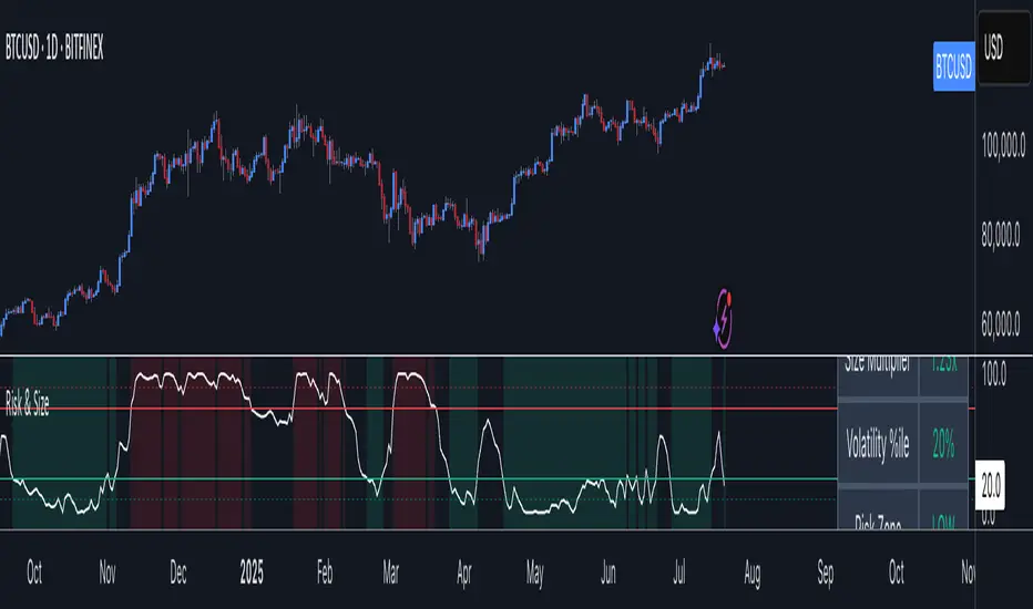
Risk Context + Position SizingWhat This Indicator Does (And Doesn't Do)
This is NOT a buy/sell signal indicator. Instead, it's a risk management tool that helps you understand two critical things:
How volatile the market is right now (compared to recent history)
How much you should risk on your next trade based on that volatility
The Core Problem It Solves
Imagine you always risk the same amount on every trade - say $100. But sometimes the market is calm and predictable, other times it's wild and unpredictable. This indicator says: "Hey, the market is going crazy right now - maybe only risk $70 instead of your usual $100."
How It Works
Measures Market "Nervousness"
Uses ATR (Average True Range) to measure how much prices typically move each day
Compares today's volatility to the past 100 days
Shows you a percentile (0-100%) - higher = more volatile
Categorizes Risk Environment
LOW (green): Market is calm, you can size up slightly
NORMAL: Standard conditions, use your normal position size
HIGH (red): Market is jumpy, reduce your position size
EXTREME (dark red): Market is in chaos, significantly reduce size
Important Disclaimers
This doesn't predict price direction - it only measures current market stress
You still need a trading strategy - this just helps you size it properly
Past volatility doesn't guarantee future volatility
Always combine with proper stop losses and risk management
SQV Indicator Bridge# SQV Indicator Bridge - Quick Guide
## What is SQV Indicator Bridge?
A simple connector that validates your indicator's signals using SQV Lite before displaying them on the chart. Only high-quality signals pass through.
## How It Works
```
Your Indicator → Generates Signals → SQV Lite → Validates Quality → Bridge → Shows Only Valid Signals
```
## Quick Setup (3 Steps)
### Step 1: Prepare Your Indicator
Add these lines to export your signals:
```pinescript
// At the end of your indicator code
plot(longCondition ? 1 : 0, "Long Signal", display=display.none)
plot(shortCondition ? 1 : 0, "Short Signal", display=display.none)
```
### Step 2: Add to Chart (in order)
1. Your indicator
2. SQV Lite
3. SQV Indicator Bridge
### Step 3: Connect Sources
In Bridge settings:
- **Long Signal Source** → Select: YourIndicator: Long Signal
- **Short Signal Source** → Select: YourIndicator: Short Signal
- **SQV Long Valid** → Select: SQV Lite: SQV Long Valid
- **SQV Short Valid** → Select: SQV Lite: SQV Short Valid
- **SQV Score** → Select: SQV Lite: SQV Score
## Visual Settings
| Setting | Description | Default |
|---------|-------------|---------|
| Show Labels | Display BUY/SELL labels | On |
| Label Offset | Distance from candles (0-5 ATR) | 0 |
| Label Size | Tiny, Small, or Normal | Small |
| Long Color | Color for buy signals | Green |
| Short Color | Color for sell signals | Red |
## What You'll See
- **Green "LONG" labels** - When your buy signal passes SQV validation
- **Red "SHORT" labels** - When your sell signal passes SQV validation
- **No label** - When signal quality is too low
## Common Issues & Solutions
### No labels appearing?
1. Check "Use External Signals" is ON in SQV Lite
2. Verify source connections are correct
3. Lower minimum score in SQV Lite (try 60)
4. Test your indicator separately to ensure it generates signals
### Too many/few signals?
- Adjust "Minimum Quality Score" in SQV Lite
- Default is 65, lower for more signals, higher for fewer
### Wrong signals showing?
- Check Trading Mode in SQV Lite matches your strategy (Long Only/Short Only/Both)
## Example Integration
### Simple MA Cross Indicator
```pinescript
//@version=6
indicator("MA Cross with SQV", overlay=true)
// Your logic
fast = ta.sma(close, 20)
slow = ta.sma(close, 50)
longSignal = ta.crossover(fast, slow)
shortSignal = ta.crossunder(fast, slow)
// Plot MAs
plot(fast, color=color.blue)
plot(slow, color=color.red)
// Export for SQV Bridge (REQUIRED!)
plot(longSignal ? 1 : 0, "Long Signal", display=display.none)
plot(shortSignal ? 1 : 0, "Short Signal", display=display.none)
```
## Tips
✅ **DO**:
- Test in "Autonomous Mode" first (SQV Lite setting)
- Use clear signal names in your plots
- Keep signals binary (1 or 0)
❌ **DON'T**:
- Forget to add `display=display.none` to signal plots
- Use values other than 0 and 1 for signals
- Leave "Use External Signals" OFF in SQV Lite
## Alert Setup
1. Enable "Enable Alerts" in Bridge settings
2. Create alert on Bridge (not your indicator)
3. Alert message includes SQV score
Example alert: `"Long Signal Validated | Score: 85"`
## Complete Bridge Code
```pinescript
//@version=6
indicator("SQV Indicator Bridge", overlay=true)
// From your indicator
longSignal = input.source(close, "Long Signal Source", group="Signal Sources")
shortSignal = input.source(close, "Short Signal Source", group="Signal Sources")
// From SQV Lite
sqvLongValid = input.source(close, "SQV Long Valid", group="SQV Sources")
sqvShortValid = input.source(close, "SQV Short Valid", group="SQV Sources")
sqvScore = input.source(close, "SQV Score", group="SQV Sources")
// Settings
showLabels = input.bool(true, "Show Labels", group="Visual")
labelOffset = input.float(0.0, "Label Offset (ATR)", minval=0.0, maxval=5.0, step=0.5, group="Visual")
labelSize = input.string("small", "Label Size", options= , group="Visual")
longColor = input.color(color.green, "Long Color", group="Visual")
shortColor = input.color(color.red, "Short Color", group="Visual")
enableAlerts = input.bool(false, "Enable Alerts", group="Alerts")
// Logic
atr = ta.atr(14)
offset = labelOffset > 0 ? atr * labelOffset : 0
hasValidLong = longSignal > 0 and sqvLongValid > 0 and barstate.isconfirmed
hasValidShort = shortSignal > 0 and sqvShortValid > 0 and barstate.isconfirmed
// Show labels
if showLabels
if hasValidLong
label.new(bar_index, low - offset, "LONG",
style=label.style_label_up,
color=longColor,
textcolor=color.white,
size=labelSize == "tiny" ? size.tiny :
labelSize == "small" ? size.small : size.normal)
if hasValidShort
label.new(bar_index, high + offset, "SHORT",
style=label.style_label_down,
color=shortColor,
textcolor=color.white,
size=labelSize == "tiny" ? size.tiny :
labelSize == "small" ? size.small : size.normal)
// Alerts
if enableAlerts
if hasValidLong
alert("Long Signal Validated | Score: " + str.tostring(sqvScore, "#"), alert.freq_once_per_bar_close)
if hasValidShort
alert("Short Signal Validated | Score: " + str.tostring(sqvScore, "#"), alert.freq_once_per_bar_close)
```
---
**Need help?** Check the full SQV documentation or contact through TradingView messages.

Pure Price Action ICT Tools+SIGNALS v4[LEGENDFX AI]ict + ob and signals buy/sell enhanced of market structure

Z Clean: SMA + Supertrend + Breakout + IntradaySMA+ST. if both green buy, or else sell, Trail SL when ST turns red on buy or green on Sell. MA will help to filter the chart when its sideways, i have see max 4/t trades on side days, but loss will be less as ST will change colour. I have kept the ATR close for fast entry and exit.

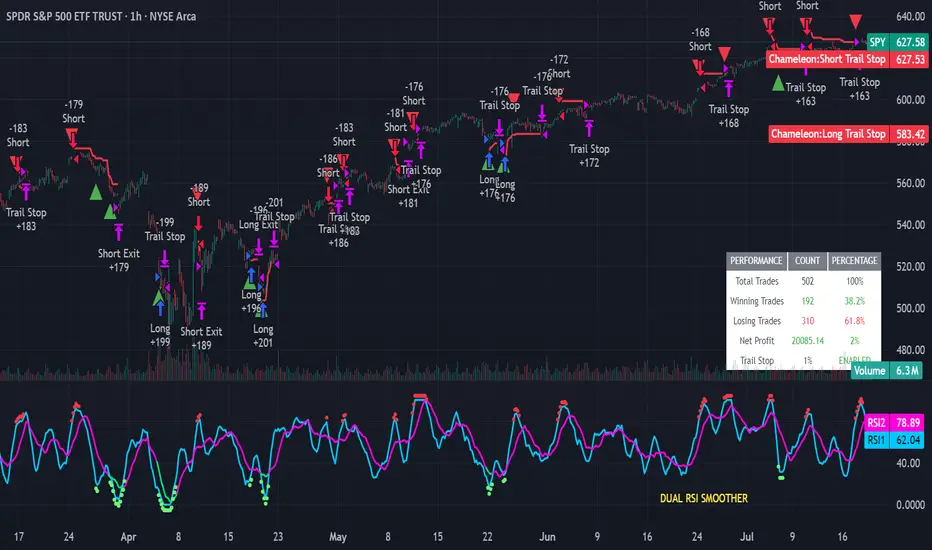
Strategy Chameleon [theUltimator5]Have you ever looked at an indicator and wondered to yourself "Is this indicator actually profitable?" Well now you can test it out for yourself with the Strategy Chameleon!
Strategy Chameleon is a versatile, signal-agnostic trading strategy designed to adapt to any external indicator or trading system. Like a chameleon changes colors to match its environment, this strategy adapts to match any buy/sell signals you provide, making it the ultimate backtesting and automation tool for traders who want to test multiple strategies without rewriting code.
🎯 Key Features
1) Connects ANY external indicator's buy/sell signals
Works with RSI, MACD, moving averages, custom indicators, or any Pine Script output
Simply connect your indicator's signal output to the strategy inputs
2) Multiple Stop Loss Types:
Percentage-based stops
ATR (Average True Range) dynamic stops
Fixed point stops
3) Advanced Trailing Stop System:
Percentage trailing
ATR-based trailing
Fixed point trailing
4) Flexible Take Profit Options:
Risk:Reward ratio targeting
Percentage-based profits
ATR-based profits
Fixed point profits
5) Trading Direction Control
Long Only - Bull market strategies
Short Only - Bear market strategies
Both - Full market strategies
6) Time-Based Filtering
Optional trading session restrictions
Customize active trading hours
Perfect for day trading strategies
📈 How It Works
Signal Detection: The strategy monitors your connected buy/sell signals
Entry Logic: Executes trades when signals trigger during valid time periods
Risk Management: Automatically applies your chosen stop loss and take profit levels
Trailing System: Dynamically adjusts stops to lock in profits
Performance Tracking: Real-time statistics table showing win rate and performance
⚙️ Setup Instructions
0) Add indicator you want to test, then add the Strategy to your chart
Connect Your Signals:
imgur.com
Go to strategy settings → Signal Sources
1) Set "Buy Signal Source" to your indicator's buy output
2) Set "Sell Signal Source" to your indicator's sell output
3) Choose table position - This simply changes the table location on the screen
4) Set trading direction preference - Buy only? Sell only? Both directions?
imgur.com
5) Set your preferred stop loss type and level
You can set the stop loss to be either percentage based or ATR and fully configurable.
6) Enable trailing stops if desired
imgur.com
7) Configure take profit settings
8) Toggle time filter to only consider specific time windows or trading sessions.
🚀 Use Cases
Test various indicators to determine feasibility and/or profitability.
Compare different signal sources quickly
Validate trading ideas with consistent risk management
Portfolio Management
Apply uniform risk management across different strategies
Standardize stop loss and take profit rules
Monitor performance consistently
Automation Ready
Built-in alert conditions for automated trading
Compatible with trading bots and webhooks
Easy integration with external systems
⚠️ Important Notes
This strategy requires external signals to function
Default settings use 10% of equity per trade
Pyramiding is disabled (one position at a time)
Strategy calculates on bar close, not every tick
🔗 Integration Examples
Works perfectly with:
RSI strategies (connect RSI > 70 for sells, RSI < 30 for buys)
Moving average crossovers
MACD signal line crosses
Bollinger Band strategies
Custom oscillators and indicators
Multi-timeframe strategies
📋 Default Settings
Position Size: 10% of equity
Stop Loss: 2% percentage-based
Trailing Stop: 1.5% percentage-based (enabled)
Take Profit: Disabled (optional)
Trade Direction: Both long and short
Time Filter: Disabled
BTC Spot-Volume-Sum(Top40 CEX)Top 40 CEX's total Bitcoin-Spot-Trading volume in one chart.
Including BTC-USD, BTC-USDT and BTC-USDC.
You can change your favorite CEX's trading pairs in the source code!

Weighted Multi-Mode Oscillator [BackQuant]Weighted Multi‑Mode Oscillator
1. What Is It?
The Weighted Multi‑Mode Oscillator (WMMO) is a next‑generation momentum tool that turns a dynamically‑weighted moving average into a 0‑100 bounded oscillator.
It lets you decide how each bar is weighted (by volume, volatility, momentum or a hybrid blend) and how the result is normalised (Percentile, Z‑Score or Min‑Max).
The outcome is a self‑adapting gauge that delivers crystal‑clear overbought / oversold zones, divergence clues and regime shifts on any market or timeframe.
2. How It Works
• Dynamic Weight Engine
▪ Volume – emphasises bars with exceptional participation.
▪ Volatility – inverse ATR weighting filters noisy spikes.
▪ Momentum – amplifies strong directional ROC bursts.
▪ Hybrid – equal‑weight blend of the three dimensions.
• Multi‑Mode Smoothing
Choose from 8 MA types (EMA, DEMA, HMA, LINREG, TEMA, RMA, SMA, WMA) plus a secondary smoothing factor to fine‑tune lag vs. responsiveness.
• Normalization Suite
▪ Percentile – rank vs. recent history (context aware).
▪ Z‑Score – standard deviations from mean (statistical extremes).
▪ Min‑Max – scale between rolling high/low (trend friendly).
3. Reading the Oscillator
Zone Default Level Interpretation
Bull > 80 Acceleration; momentum buyers in control
Neutral 20 – 80 Consolidation / no edge
Bear < 20 Exhaustion; sellers dominate
Gradient line/area automatically shades from bright green (strong bull) to deep red (strong bear).
Optional bar‑painting colours price bars the same way for rapid chart scanning.
4. Typical Use‑Cases
Trend Confirmation – Set Weight = Hybrid, Smoothing = EMA. Enter pullbacks only when WMMO > 50 and rising.
Mean Reversion – Weight = Volatility, reduce upper / lower bands to 70 / 30 and fade extremes.
Volume Pulse – Intraday futures: Weight = Volume to catch participation surges before breakout candles.
Divergence Spotting – Compare price highs/lows to WMMO peaks for early reversal clues.
5. Inputs & Styling
Calculation: Source, MA Length, MA Type, Smoothing
Weighting: Volume period & factor, Volatility length, Momentum period
Normalisation: Method, Look‑back, Upper / Lower thresholds
Display: Gradient fills, Threshold lines, Bar‑colouring toggle, Line width & colours
All thresholds, colours and fills are fully customisable inside the settings panel.
6. Built‑In Alerts
WMMO Long – oscillator crosses up through upper threshold.
WMMO Short – oscillator crosses down through lower threshold.
Attach them once and receive push / e‑mail notifications the moment momentum flips.
7. Best Practices
Percentile mode is self‑adaptive and works well across assets; Z‑Score excels in ranges; Min‑Max shines in persistent trends.
Very short MA lengths (< 10) may produce jitter; compensate with higher “Smoothing” or longer look‑backs.
Pair WMMO with structure‑based tools (S/R, trend lines) for higher‑probability trade confluence.
Disclaimer
This script is provided for educational purposes only. It is not financial advice. Always back‑test thoroughly and manage risk before trading live capital.

📊 Bollinger Band Strategy v1.1
首先,衷心感谢昨天支持我 Bollinger Band Strategy v1.0 的八位朋友,来自世界各地的你们让我更加坚信构建这套系统的意义。今天,我顺利完成了 v1.1 的开发,并同步推出了 UI 优化后的 v1.1.2 升级版本。
🚀 本次更新亮点
✅ RSI 趋势过滤系统
v1.1 加入了 RSI 指标用于方向判断,极大提升了突破信号的准确性。超买区(RSI > 70)背景转为绿色,超卖区(RSI < 30)则为红色,帮助你一眼识别强动能行情与潜在背离。
✅ 智能“蓄力区”识别(Squeeze)
新增布林带带宽监测机制,当波动性低于阈值时,会显示橙色圆圈,代表市场可能正处于能量压缩状态,即将突破。默认阈值为 11%,适用于日线。
你可以根据所用周期(如 1 小时)灵活调整此值,具体修改参数如下(已用 * 标注):
squeeze_thresh = input.float(11.0, title="Squeeze Threshold (%)")
✅ 假突破识别系统
十字标记逻辑:当上一个K线突破布林带、而当前K线迅速回落时,会显示紫色或蓝色十字,提示潜在假突破或反转信号,辅助你避免被“假动作”诱多/诱空。
💡使用建议
- 周期切换建议:日线为主,中短线可调参数适配 1H/4H(如降低 squeeze 阈值)
- 做突破时一定要把多个指标重合对比,如在上涨行情中布林带收窄,价格跌破布林带并显示反转信号,而且突破前高点回调站立,RSI已背离过,这些信号如果同时出现胜率将大大提升。
- 当 布林带收窄 → 价格突破 → RSI 背离 → 回踩站稳前高/前低,且出现突破信号(绿色/红色三角)(用支撑阻力位判断也可以),这是你极可能抓住主升浪/主跌段的黄金时机。
⚙️ 模型优势
✅ 过滤震荡区,无动能不进场
✅ 可视化简洁,兼容币圈、美股、港股、期货等
✅ 完全开源,支持二次开发,适配多策略系统
✅ 可无缝扩展 EMA / VWAP / MACD 等指标融合使用
适用场景介绍
这个模型可以用于波段交易,主要多个指标配合建仓。还可以做区间,用加突破信号建仓(紫色和蓝色十字信号)。代码是开源代码,欢迎复制再创作,修改参数可以适用于更多交易场景。
再次感谢所有支持这个项目的朋友,欢迎你加入使用 Bollinger Band Strategy v1.1 的行列,从信号中捕捉趋势,在纪律中积累胜率。
EN⸻
📢 Bollinger Band Strategy v1.1.2 Release Notes
First of all, I want to extend my heartfelt thanks to the eight friends from around the world who supported version 1.0 of the Bollinger Band Strategy. Your encouragement has strengthened my belief in building this system. Today, I’m excited to announce the release of version 1.1, along with an updated and cleaner UI in v1.1.2.
⸻
🚀 What’s New in This Update
✅ RSI Trend Filter System
v1.1 introduces RSI-based directional filtering to significantly improve the accuracy of breakout signals. Background turns green when RSI > 70 (bullish) and red when RSI < 30 (bearish), helping you quickly identify momentum and potential divergence zones.
✅ Smart Squeeze Zone Detection
We now track Bollinger Band width in real time. When the bandwidth drops below a certain threshold (default: 11%), an orange dot appears to indicate a low-volatility “squeeze” zone—often a precursor to major breakouts.
👉 You can adjust this threshold depending on your trading timeframe (e.g. 1H or 4H). Use the following line to tweak it:
squeeze_thresh = input.float(11.0, title="Squeeze Threshold (%)")
✅ Fake Breakout Reversal Detection
The strategy now identifies potential fake breakouts. If the previous candle closed outside the bands but the current one quickly pulls back inside, a purple or blue cross appears—flagging a likely reversal zone and warning against chasing price.
✅ Cleaner Visual Experience
You can now choose to hide all visual lines and rely only on key signals and a minimalist top-left value panel—giving you a clean, clutter-free chart.
💡 Usage Tips
- Breakout Setup: Watch for the orange dot → wait for RSI confirmation → trade the breakout signal (green/red triangle).
- Reversal Setup: A purple or blue cross signals a potential fake breakout and reversal.
- Timeframe Recommendations: Best used on the daily chart; adjust squeeze threshold if trading shorter timeframes (1H, 4H, etc).
- Confluence is key: Stack signals for better entries—e.g. squeeze zone + breakout + RSI divergence + support/resistance retest.
- 📈 When the bands contract → price breaks out → RSI diverges → retest of previous highs/lows → and a breakout signal appears (triangle), you are likely entering a prime move.
⚙️ Strategy Advantages
✅ Filters out choppy zones—no momentum, no entry
✅ Clean visuals, compatible with crypto, stocks, futures, etc.
✅ Fully open-source and modular—ready for integration into complex systems
✅ Easily extendable with EMA, VWAP, MACD, and other popular indicators
🎯 Use Cases
- Swing Traders: Ideal for catching strong trend moves after low-volatility consolidation.
- Breakout Traders: Detect both clean breakouts and fakeouts for better entries/exits.
- Developers: Modular design allows easy integration into your own Pine Script strategy.
- Learners: Clear annotations make this script a great learning tool for beginners exploring Pine Script and technical logic.
Once again, thank you to everyone who has supported this project. I welcome you to explore Bollinger Band Strategy v1.1, where trend signals meet disciplined execution.
Let this tool help you see through noise, spot the move, and trade with clarity.

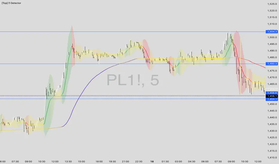
[Top] Unified Divergence DetectorThe Unified Divergence Detector (UDD) is a powerful tool designed to identify both regular and hidden divergences across multiple oscillators—RSI, CCI, and Stochastic—in a single unified indicator.
Unlike other divergence tools that focus on one source at a time, this script cross-checks multiple indicators simultaneously and consolidates the results into a single signal. Labels appear only when at least one divergence is detected, with optional color-coding to distinguish the number and type of divergences:
🐂 Bullish Divergence: Signals a potential reversal or continuation to the upside.
🐻 Bearish Divergence: Signals a potential reversal or continuation to the downside.
The script lets users configure:
Whether to detect regular, hidden, or both types of divergence.
Pivot lookback parameters and divergence detection range.
Separate label colors for 1, 2, or 3+ confirmations from different indicators.
Tooltips are dynamically generated and offer guidance on interpreting each signal based on the oscillator sources involved and the divergence type. Labels are intelligently placed to avoid clutter and display only the strongest, most relevant signals.
⸻
Potential Uses
Trend Reversals: Spot early signs of exhaustion and prepare for a trend change.
Trend Continuations: Confirm existing trends via hidden divergence signals.
Multi-Timeframe Confirmation: Combine this indicator with higher timeframe trend tools to validate entries or exits.
Custom Strategy Building: Integrate into more complex strategies involving price action or volume filters.
⸻
This indicator is ideal for traders who value confirmation from multiple sources and prefer clear, high-confidence signals over constant alerts. It works well across all timeframes and asset classes.

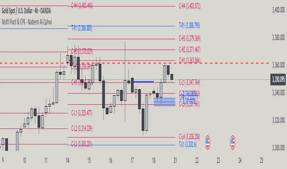
Multi Pivot Point & Central Pivot Range - Nadeem Al-QahwiThis indicator combines four advanced trading modules into one flexible and easy-to-use script:
Traditional Pivot Points:
Calculates classic support and resistance levels (PP, R1–R5, S1–S5) based on previous session data. Ideal for identifying key turning points and mapping out the daily, weekly, or monthly structure.
Camarilla Levels:
Provides six upper and lower pivot levels (H1–H6, L1–L6) derived from volatility and closing price formulas. Especially effective for intraday reversal, mean reversion, and finding overbought/oversold extremes.
Central Pivot Range (CPR):
Plots the median, top, and bottom of the value area each session. CPR width instantly highlights whether the market is likely to trend (narrow CPR) or remain range-bound (wide CPR).
Developing CPR projects the evolving range for the current period—essential for real-time analysis and pre-market planning.
Dynamic Zone Levels (DZL):
Automatically detects and highlights clusters of pivots to reveal high-probability support/resistance zones, filtering out market “noise.”
DZL alerts notify you whenever price breaks or retests these key areas, making it easier to spot momentum trades and avoid false signals.
Key Features:
Multi-timeframe flexibility: Use with daily, weekly, monthly, yearly, or custom timeframes—even rare ones like biyearly and decennial.
Modular design: Activate or hide any system (Traditional, Camarilla, CPR, DZL) as you need.
Bilingual interface: Every setting and label is shown in both English and Arabic.
Full customization: Control visibility, color, style, and placement for every level and label.
Historical depth: Plot up to 5,000 pivot/zones back for deep analysis and backtesting.
Smart alerts: Get instant notifications on true S/R breakouts or retests (from DZL).
How to Use:
Trend Trading:
Watch for a very narrow CPR to identify potential trending days—trade in the breakout direction above/below the CPR.
Range Trading:
When CPR is wide, expect sideways movement. Fade reversals at R1/S1 or within the CPR boundaries.
Breakouts:
Use DZL alerts to capture momentum as price breaks or retests dynamic support/resistance zones.
Multi-Timeframe Confluence:
Combine CPR and pivot levels from multiple timeframes for higher-probability entries and exits.
All calculations and logic are fully open.

Combined: Strat Dashboard + FVG + M&E StarsSTRAT MIX + VECTOR + SUPPORT
In financial markets, support and resistance are fundamental concepts in technical analysis used to identify price levels where an asset's price tends to pause or reverse. They are essentially areas on a chart where buying or selling pressure is expected to be strong enough to temporarily halt or reverse the prevailing price trend.
Here's a breakdown:
* Support: This is a price level where an asset's downward movement is expected to stop due to increased buying interest. Think of it as a "floor" where demand is strong enough to prevent the price from falling further. When the price approaches a support level, buyers tend to step in, leading to a potential bounce or reversal upwards. The more times a price level has held as support in the past, the stronger it's generally considered.
* Resistance: This is a price level where an asset's upward movement is expected to stop due to increased selling interest. It acts like a "ceiling" where supply is strong enough to prevent the price from rising higher. When the price approaches a resistance level, sellers tend to step in, leading to a potential pullback or reversal downwards. Similar to support, the more times a price level has acted as resistance, the more significant it's often seen.
Key characteristics:
* Supply and Demand: Support and resistance levels are a reflection of the continuous interplay between supply (sellers) and demand (buyers) in the market.
* Dynamic Nature: These levels are not fixed lines but rather zones. They can also "flip roles"; if a resistance level is broken and the price moves above it, that former resistance can then become a new support level, and vice-versa.
* Psychological Importance: These levels often derive their strength from collective market psychology, as many traders and investors recognize and react to the same price points.

机器学习1. 策略说明
本策略仅供学习、研究和回测使用,不构成任何投资建议。市场有风险,投资需谨慎。
2. 风险提示
本策略基于历史数据回测,不保证未来表现。
实际交易中可能受滑点、手续费、流动性等因素影响,导致与回测结果不符。
任何交易决策均需结合个人风险承受能力,建议在模拟账户测试后再考虑实盘。
3. 责任限制
开发者及代码提供者不对任何交易损失负责。
使用者需自行承担所有交易风险,并确保理解策略逻辑。
4. 使用条款
本策略代码可自由使用,但禁止用于商业用途。
未经授权,不得修改代码后声称原创发布。
5. 法律声明
金融市场交易涉及高风险,请在充分了解相关风险后谨慎操作。
Disclaimer
1. Strategy Description
The Lorentzian Classification strategy is provided for educational, research, and backtesting purposes only and does not constitute investment advice. Trading involves risks; proceed with caution.
2. Risk Disclosure
This strategy is based on historical data and does not guarantee future performance.
Real trading may be affected by slippage, commissions, liquidity, and other factors, leading to deviations from backtest results.
Any trading decisions should consider personal risk tolerance. Testing on a demo account is strongly recommended before live trading.
3. Limitation of Liability
The developer and code provider are not responsible for any trading losses.
Users assume all trading risks and must fully understand the strategy logic before implementation.
4. Terms of Use
This strategy code is free to use but prohibited for commercial purposes.
Unauthorized modification and redistribution as original work is not permitted.
5. Legal Notice
Financial market trading carries significant risks. Ensure full awareness of associated risks before engaging in any transactions.
📌 Important Notice: It is strongly advised to test the strategy on a demo account for at least 3 months before live trading and to strictly manage position sizing.
(Customize as needed and include in strategy description or chart notes.)

Big Trade % Heatmap### Big Trade % Heatmap
**Quick overview**
This indicator highlights where “whale” activity is clustered by showing what fraction of the recent candles contained *large‑value trades*. A candle is considered “big” when its notional volume (`volume × close`) exceeds your chosen USD threshold. You instantly see:
* **Percent of big candles** in the last *N* bars, refreshed at the cadence you pick.
* **On‑chart labels & markers** every refresh, so the chart stays clean.
* **Optional heat‑map background** that turns orange (>20 %) or green (>50 %) when big‑trade concentration spikes.
* **Ready‑made alert** when big‑trade dominance crosses 50 %.
---
#### How it works
1. **Trade size per candle** – Calculates `close × volume` to estimate dollars traded.
2. **Threshold filter** – Flags candles whose value is above *Big Trade Threshold (\$)*.
3. **Look‑back window** – Counts what percentage of the last *Lookback Window (X Candles)* were “big.”
4. **Refresh interval** – Repeats the measurement only every *Refresh Interval (Every X Candles)* to avoid label spam.
5. **Visuals** –
* A small blue ▼ above the bar + a text label such as `35.00 % > $25 000`.
* Background shading (green/orange) for quick, at‑a‑glance sentiment.
---
#### Inputs
| Input | Purpose | Default |
| -------------------------------------- | ----------------------------------------------------- | ------- |
| **Lookback Window (X Candles)** | How many recent bars to sample for the % calculation. | 20 |
| **Refresh Interval (Every X Candles)** | How often to display a new label/marker. | 5 |
| **Big Trade Threshold (\$)** | Minimum USD value for a candle to count as “big.” | 10 000 |
Tune these to the symbol and timeframe you trade (e.g., raise the threshold for BTC‑USDT 1‑h, lower it for micro‑caps).
---
#### Alerts
Enable **“High Big Trade %”** to get notified the moment more than half of the last *N* candles qualify as big trades—handy for spotting sudden accumulation or distribution.
---
#### Typical use cases
* **Breakout confirmation** – A surge in big‑trade % just before price escapes a range can validate the move.
* **Whale spotting** – Detect hidden accumulation on pullbacks or aggressive selling into rallies.
* **Filter noise** – Combine with your favorite trend indicator; only act when both align.
---
> *Built with Pine Script v6. Always back‑test before trading live; this tool is for educational purposes and not financial advice.*

Indian Stocks Daily, Weekly, Monthly, All-Time High-LowDaily high, low, last week high low, current week high low, current month high low.

[Top] LHAMA Consolidation DetectorIntroducing the Low-High Adaptive Moving Average (LHAMA 🦙), a powerful tool designed to help traders visually distinguish between trending and consolidating market phases. Unlike traditional moving averages that can produce false signals in choppy markets, the LHAMA is engineered to flatten out during periods of consolidation and become more responsive when a clear trend emerges.
This indicator's primary function is to act as a "Consolidation Detector." When the LHAMA line goes flat and adopts its "Flat Color," it serves as a clear visual cue that the market is range-bound. Conversely, when the line begins to slope and changes to its Bullish or Bearish color, it signals a potential breakout or the start of a new trend.
How It Works
The LHAMA is a type of adaptive moving average. Its adaptiveness is derived from a unique calculation that measures market "trendiness." It does this by tracking whether new highs or new lows are being made within a specified lookback period.
In a Trending Market: When the price consistently makes new highs or lows, the indicator's responsiveness increases, causing the LHAMA to track the price much more closely and responsively.
In a Consolidating Market: When the price is range-bound and fails to make new highs or lows, the responsiveness decreases significantly. This causes the LHAMA to flatten out and become less sensitive to minor price fluctuations, effectively filtering out market noise.
Key Features
Adaptive Calculation: The core engine of the indicator, which automatically adjusts its smoothing based on trend strength.
Slope-Based Coloring: The line's color dynamically changes based on its slope, providing an at-a-glance view of market conditions: bullish, bearish, or flat.
Multi-Line & Multi-Timeframe (MTF): You can enable up to six fully customizable LHAMA lines. Each line can be configured with its own length, colors, and can even be set to a different timeframe, allowing for comprehensive multi-timeframe analysis on a single chart.
Volatility Clouds: Each LHAMA can display an optional cloud around it. The cloud's width is based on your choice of either the Average True Range (ATR) or Standard Deviation (StdDev), offering a visual representation of volatility.
Volume Weighting: An option to incorporate volume into the adaptive calculation, making the LHAMA even more responsive during high-volume price movements.
How to Use
Identify Consolidation: The primary use case. A flat and consistently colored LHAMA line is a strong indication of a sideways or consolidating market. This can help traders avoid taking trend-following trades in choppy conditions.
Confirm Trends: When the LHAMA begins to slope upwards or downwards and changes to its trend color, it can be used to confirm the direction and strength of a new trend. The steeper the slope, the stronger the momentum, and more solid the directional color.
Dynamic Support & Resistance: Like other moving averages, the LHAMA can act as a dynamic level of support in an uptrend or resistance in a downtrend. The optional cloud can further define these zones.
Multi-MA Ribbon Strategy: By enabling multiple LHAMAs with different lengths (e.g., Fibonacci sequence like 14, 21, 34, 55), you can create a ribbon. The expansion of the ribbon indicates a strong trend, while its contraction signals a weakening trend or consolidation.
Settings Explained
Enable 🦙 Line: A simple checkbox to turn each of the six LHAMA lines on or off.
Length: The lookback period for the LHAMA calculation. Shorter lengths are more responsive, while longer lengths are smoother.
Timeframe: Set a specific timeframe for each LHAMA. Leave blank to use the chart's current timeframe.
Volume Weight: If checked, adds volume weighting to make the LHAMA more responsive to high-volume moves.
Colors (Bullish, Bearish, Flat): Customize the colors for each market state. To only see the line during consolidation, set the Bullish and Bearish colors to 100% transparency. To hide the line during consolidation, set the Flat color to 100% transparency.
Color Sensitivity: This is a crucial setting. Because price scales (tick sizes) vary widely between symbols, this setting allows you to adjust the sensitivity of the slope detection. A lower value requires a steeper slope to trigger a trend color, while a higher value is more sensitive.
Recommended settings are provided in the input tooltip as a starting point:
$5 Tick: 0.25 Sensitivity
$1 Tick: 0.75 Sensitivity
$0.25 Tick: 3 Sensitivity
$0.01 Tick: 50 Sensitivity
$0.005 Tick: 100 Sensitivity
Cloud Settings:
Show Cloud: Toggles the visibility of the volatility cloud around the LHAMA.
Width Based On: Choose between "ATR" or "StdDev" to calculate the cloud's width.
Cloud Length & Width: Set the lookback period and multiplier for the ATR/StdDev calculation to control the size of the cloud.
No Supply No Demand (NSND) – Volume Spread Analysis ToolThis indicator is designed for traders utilizing Volume Spread Analysis (VSA) techniques. It automatically detects potential No Demand (ND) and No Supply (NS) candles based on volume and price behavior, and confirms them using future price action within a user-defined number of lookahead bars.
Confirmed No Demand (ND): Detected when a bullish candle has volume lower than the previous two bars and is followed by weakness (next highs swept, close below).
Confirmed No Supply (NS): Detected when a bearish candle has volume lower than the previous two bars and is followed by strength (next lows swept, close above).
Adjustable lookahead bars parameter to control the confirmation window.
This tool helps identify potential distribution (ND) and accumulation (NS) areas, providing early signs of market turning points based on professional volume logic. The dot appears next to ND or NS.

Combined Volume with Buy/Sell PressureCombined Volume with Buy/Sell Pressure
This indicator combines raw volume analysis with an estimation of buy/sell pressure to provide a more detailed view of market activity.
Settings
Volume: On
Smaller Volume: Off
Moving Average: Off
Background Color: Off
Table: On

Support/Resistance LevelsThis indicator automatically detects the most relevant support and resistance levels based on recent pivot points.
Main Features:
✅ Automatic detection of support and resistance zones
✅ Fully customizable: line style, thickness, and colors
✅ Optional support/resistance zones (based on percentage)
✅ High/Low zone fill for recent extremes
✅ Auto-labeling of S/R levels on the chart
✅ Configurable line extension (right side only or both sides)
⚙️ Custom Settings:
Toggle S/R levels on or off
Choose line style (solid, dotted, dashed)
Set support/resistance colors
Adjust line width
Enable/disable zone display
Set zone width as a percentage
🔎 Use Cases:
Quickly identify key price levels
Trade with confidence around bounces and breakouts
Works on any market and any timeframe
