Smart WaveTrend Crossover█ OVERVIEW
Smart WaveTrend Crossover is an indicator based on WaveTrend crossovers, designed to reduce the number of false signals typically produced by classic oscillator crossovers.
Instead of triggering a signal immediately at the line crossover, the indicator requires additional confirmation in the form of a price breakout from a box, created at the moment of the WaveTrend signal.
The script also includes:
- a trend filter based on a separate WaveTrend
- “fog” visualization
- candle coloring based on trend direction
- fully configurable entry signals
- automatic Take Profit / Stop Loss levels
- a real-time TP/SL table
█ CONCEPTS
Classic WaveTrend crossovers often generate noise, especially during consolidation.
Smart WaveTrend Crossover attempts to address this issue using a breakout confirmation mechanism:
- at the moment WT1 crosses WT2, a horizontal price box is created
- a trade signal is generated only when price closes outside the box
- an optional trend filter limits signals to the dominant market direction
The trend filter is built on a WaveTrend crossover using larger, slower parameters, independent from the signal-generating WaveTrend.
This allows short-term momentum to be separated from the broader market direction, and all trend filter parameters can be freely adjusted.
WaveTrend signal settings are not identical to the original / classic values.
They are configured to generate a higher number of signals, which works better in combination with breakout boxes and confirmation logic.
Signal sensitivity can be easily adjusted by modifying channel length and averaging parameters.
By default, show_only_matching is enabled:
- bullish crossover → bullish breakout only (BUY)
- bearish crossover → bearish breakout only (SELL)
█ FEATURES
WaveTrend (Signals & Trend):
- two independent WaveTrend setups:
- one for signal generation
- one for trend determination
- signal parameters configured more aggressively than classic defaults
- trend filter based on a slower WaveTrend crossover
- trend direction visualized using directional fog, not a histogram
WaveTrend Input Explanation:
- Channel Length – controls WaveTrend reaction speed (shorter = more signals)
- Average Length – smoothing of the main WT1 line
- MA Length – smoothing of the signal line WT2
- Source – price source used in calculations (default: hlc3)
Fog (Visualization):
- visual representation of market pressure in the direction of the trend
- fog height based on average candle size × offset_mult
- adjustable transparency or fully disableable
Breakout Boxes:
- a box is created on every WaveTrend direction change
- default height based on the signal candle range
- optional box expansion using average candle size × box_multiplier
Signals:
- triangles or “BUY / SELL” labels
- direction matching filter (show_only_matching)
- option to display all breakouts regardless of crossover direction
- built-in BUY and SELL alerts
Visual Settings:
- candle coloring based on WaveTrend trend direction
- full control over bullish and bearish colors
Risk Management – TP / SL:
- automatic TP1, TP2, TP3 and SL levels
- two calculation modes:
- Candle Multiplier – based on average candle range
- Percentage – percentage from entry price
- separate parameters for each level
- TP/SL lines drawn on the chart
- real-time TP/SL price table
█ HOW TO USE
Add the indicator to your TradingView chart → Indicators → search “Smart WaveTrend Crossover”
Key settings:
- WaveTrend Settings for Signals – signal sensitivity
- WaveTrend Settings for Trend – market direction filter
- Signal Settings – signal type and box logic
- Fog – pressure visualization
- Risk Management – TP/SL configuration
Signal meaning:
- BUY → upward breakout from a box after a bullish crossover
- SELL → downward breakout from a box after a bearish crossover
- visible boxes → breakout watch zones
- fog and candle color → current market direction
█ APPLICATIONS
Standalone entry system
- entering directly on BUY / SELL signals
- or entering on trend color change
Filter for price-action strategies
- using WaveTrend signals as directional confirmation
- e.g. level breakout + WaveTrend confirmation = entry
Trend indicator
- trading other tools only in the direction of the WaveTrend trend
- e.g. RSI breaks above 50 while WaveTrend trend is bullish
█ NOTES
- Default settings are a starting point and may require adjustment
- The indicator works best as part of a broader trading system
Osilatörler

BE-Synergistic RSI Fusion Strategy█ Overview of the Script:
The Synergistic RSI Fusion Strategy is a sophisticated technical analysis tool designed to detect market turning points (reversals) and high-momentum breakouts. Unlike standard indicators that simply tell you to "Buy" or "Sell" based on a crossed line or overbought/oversold levels, this script builds a structural trade setup using zones. It waits for price action to confirm the signal before acting.
█ Why "Synergistic RSI Fusion"?:
The core engine of the indicator makes it all:
Fusion : Standard RSI only looks at the closing price relative to the previous closing price. This script calculates a comprehensive RSI that incorporates the candle's Highs and Lows.
Why is this more powerful? Imagine a "Hammer" candle where price drops significantly during the session but recovers to close near the open. A standard RSI sees almost no change because the Close is near the Open. However, Fusion RSI captures the full volatility of that dip and recovery, recognizing the massive "effort" and hidden battle between buyers and sellers that standard RSI completely misses.
Synergy : It combines this advanced momentum reading with ATR (Average True Range) to define volatility-based entry and exit zones. It blends momentum (RSI) with market structure (Price Action Zones).
█ How it Stands Unique:
The Core engine: Capturing the true efforts of the movement in price.
Multi-Peak Divergence: Instead of simple A-to-B divergence, this script uses a state machine to track local peaks by filtering out weak signals and waits for a significant disagreement between price and momentum.
The Zone System: It doesn't plot signals blindly. When divergence is found, it draws two "waiting rooms" (Green and Red zones). The trade is only taken if the candle closes inside one of these zones.
█ Divergence Trades: The Two-Way Setup:
A unique feature of this script is that when a Divergence signal appears, it generates two potential entry zones: a Bullish zone and a Bearish zone.
The Rational Behind the Two-Way Approach:
New traders often assume a Divergence means "Reversal." However, experienced traders know that Divergence simply means "Tension is building."
Scenario A (The Reversal): The RSI is screaming that momentum is dying, but price is pushing higher. If price respects the divergence, it will drop into the reversal zone. This is the standard divergence trade.
Scenario B (The Failure/Trap): sometimes, momentum is so strong that it blows through the divergence. If price ignores the RSI warning and breaks into the continuation zone, it signals that the trend is incredibly powerful.
Why Trade Both Ways?
By placing zones on both sides, the script essentially says: " I know a big move is coming because of the tension (Divergence), but I will let the market prove direction first. " This prevents you from " catching a falling knife " by trying to pick the exact top or bottom.
The Counter-Trading Logic (The Trap):
The script includes advanced logic for failed trades. If you enter a trade and the Stop Loss is hit immediately (a "fake-out"), the script adjusts the opposing zone by considering the liquidity of that particular candle.
Why? If the market traps Long traders and hits their stops, that selling pressure often fuels a massive move downwards. This logic allows the script to flip bias instantly and join the real move.
█ Continuation Trends: Why Price Runs After TP:
You may notice that often, after the Take Profit (TP) is hit, the price continues to run in that direction for a long time.
The "Breakout" Effect:
The Take Profit levels in this script are calculated using ATR (Average True Range). This is a conservative target based on recent average volatility.
Structural Breaks: The entry zones are usually positioned at key structural pivots. When price has enough energy to enter the zone and hit 100% of the ATR target, it effectively confirms a Break of Structure.
Momentum Release: The Divergence phase acts like a coiled spring. When that spring finally snaps (the trade entry), the release of energy is often far greater than just one ATR unit.
Psychology: When the TP is hit, it confirms the analysis was correct. This draws in other traders and algorithms who missed the initial entry, adding fuel to the fire and extending the trend.
█ Major Support & Resistance Zone:
The untested zones are typically the safe haven to place your SLs, which definitely act as Support & Resistance once the price approaches these zones.

KAMA Oscillator | IkkeOmarThis script transforms the Kaufman Adaptive Moving Average (KAMA) into an oscillator format, designed to visualize trend direction with reduced noise sensitivity. It operates in two modes: a Raw mode that tracks price levels directly, and a Normalized mode that bounds the oscillator between -1 and +1 for easier comparison across assets.
The calculations are the same as for the Normalized KAMA Oscillator, but I added a few features that users of the old version wouldn't necessarily want.
How it works
Efficiency Ratio (ER): The script calculates the "efficiency" of price movement by comparing the net direction of price to the total volatility over a set period.
Adaptive Smoothing:
When volatility is high but direction is unclear (choppy), the KAMA slows down to filter noise.
When price trends clearly, the KAMA speeds up to track the move.
Normalization (Optional): If enabled, the script takes the raw KAMA value and scales it relative to its highest and lowest points over the Normalization lookback period. The result oscillates between -1 (extreme low) and +1 (extreme high).
The SMA Signal Logic
The script allows you to overlay an SMA (Simple Moving Average) on the oscillator. This serves as a dynamic baseline for the oscillator's momentum.
Signal Generation: A signal is generated when the KAMA Oscillator crosses its SMA.
Bullish: Oscillator crosses above the SMA.
Bearish: Oscillator crosses below the SMA.
Lag vs. Noise Trade-off:
Advantage (Reduced Lag): Crossing the SMA often triggers a signal earlier than waiting for the oscillator to change color (slope change) or cross the zero line. It identifies when immediate momentum is outperforming the recent average.
Risk (Increased Noise): During consolidation, the oscillator will hover close to the SMA line. This increases the probability of "whipsaws" (false signals) where the line crosses back and forth rapidly without a sustained trend. This signal is aggressive and should be used with trend filters.

Rachev Regime AnalyzerRachev Regime Analyzer ~ GForge
What It Does
Measures the ratio of extreme gains to extreme losses to identify whether markets favor bulls or bears. When your best moves are bigger than your worst moves, conditions are bullish. When the opposite is true, conditions are bearish.
Simple Interpretation:
Ratio > 1.2 → Bullish regime (tail gains exceed tail losses)
Ratio < 0.8 → Bearish regime (tail losses exceed tail gains)
Between → Neutral/transitional
Key Features
Two Modes:
Single Asset: Analyze current chart
Multi-Asset: Aggregate regime across 5 assets with custom weights (great for gauging overall crypto/market conditions)
Customizable:
Lookback period (20-200 bars)
Tail percentile (what counts as "extreme")
Bullish/bearish thresholds
6 color schemes
Optional MA smoothing
Visual Signals:
Buy/sell markers at threshold crosses
Background regime coloring
Info table with current values and confidence score
Configurable alerts
How to Use
Choose lookback period based on your timeframe (40-60 bars is a good start)
Watch for threshold crosses - these mark regime changes
Check confidence score - higher = more reliable
Use multi-asset mode to see if entire market is shifting (not just one coin)
Best combined with: Trend indicators, support/resistance, volume analysis
Parameters
Lookback: More bars = smoother, less responsive
Alpha (0.10): Defines extreme events - lower = more extreme
Thresholds: Adjust based on asset volatility
Return Type: Log returns recommended for most assets
What Makes It Useful
Unlike simple volatility measures, this shows asymmetry - whether extreme moves favor upside or downside. A ratio of 1.5 means your extreme gains are 50% larger than extreme losses - that's actionable information about risk-reward dynamics.
Multi-asset aggregation is particularly powerful for crypto traders wanting to gauge if BTC, ETH, SOL, etc. are all showing similar regime characteristics.
Disclaimer
Educational tool only. Not financial advice. Use proper risk management. No indicator works in isolation - always consider broader market context.
Developed by GForge
Comments and feedback welcome! 👍

Advanced Power Index (GGE)# Advanced Power Index (GGE)
## Overview
The Advanced Power Index is a momentum oscillator that provides faster and more responsive signals compared to traditional RSI indicators. It uses direct summation calculations instead of exponential smoothing, making it particularly effective for short to medium-term trading.
## Key Features
- **Faster Response**: Reacts more quickly to price changes than standard RSI
- **Clearer Signals**: Provides sharper, more defined momentum shifts
- **Customizable Levels**: Overbought (68) and Oversold (32) zones
- **Visual Alerts**: Color-coded plot and background highlighting for critical zones
- **Adaptive**: Works well in both trending and ranging markets
## How It Works
The indicator calculates the ratio between positive and negative price changes over a specified period, converting this into a 0-100 scale oscillator. Unlike traditional RSI which uses Wilder's smoothing method, this approach delivers more immediate signals for momentum changes.
## Trading Applications
### 1. Overbought/Oversold Strategy
- **Oversold (< 32)**: Potential buying opportunity when indicator rises back above 32
- **Overbought (> 68)**: Potential selling opportunity when indicator falls back below 68
### 2. Midline Crossovers
- **Above 50**: Bullish momentum, consider long positions
- **Below 50**: Bearish momentum, consider short positions
### 3. Divergence Trading
- **Bullish Divergence**: Price makes lower lows while indicator makes higher lows
- **Bearish Divergence**: Price makes higher highs while indicator makes lower highs
### 4. Trend Following
- In uptrends: Use pullbacks to the 50 level as entry points
- In downtrends: Use rallies to the 50 level as exit/short points
## Color Coding
- **Green**: Strong bullish momentum (> 68)
- **Red**: Strong bearish momentum (< 32)
- **Yellow**: Neutral zone (32-68)
## Settings
- **Period**: Default 14, adjustable based on your trading timeframe
- **Price Type**: Close, Open, High, Low, or custom source
- **Highlight Zones**: Toggle background highlighting for critical levels
## Best Timeframes
- Most effective on 5-minute to 4-hour charts
- Ideal for day trading and scalping strategies
- Can be combined with trend indicators for confirmation
## Tips for Use
- Don't use in isolation - combine with volume, support/resistance levels
- Works best in liquid, actively traded markets
- Consider using alongside moving averages or MACD
- Always implement proper risk management and stop-losses
## Advantages Over Standard RSI
✓ Faster signal generation
✓ Less lag in volatile markets
✓ Better suited for short-term trading
✓ Clearer momentum shifts
✓ More responsive to sudden price changes
---
**Note**: No indicator is perfect. Always use proper risk management and combine multiple forms of analysis before making trading decisions.
**Disclaimer**: This indicator is for educational and informational purposes only. Past performance does not guarantee future results. Trading involves substantial risk of loss.

SCOTTGO - MOMO RVOL Trend Painter V2 (Elite Pro)SCOTTGO - MOMO RVOL Trend Painter V2 (Elite Pro)
This professional-grade trend-following indicator identifies high-probability "Elite" entry points by combining Relative Volume (RVOL) with strict trend alignment and momentum filters. It is designed to filter out market noise and highlight only the most significant institutional moves.
Core Features
Elite Signal Logic: Triggers only when high RVOL (default >2.0x) aligns with a confirmed trend (Price vs. VWAP & 9EMA) and positive momentum (RSI & MACD).
Dynamic Bar Coloring: Instantly paints bars Green (Bullish) or Red (Bearish) when all "Elite" criteria are met.
Smart Labeling: Labels are corner-anchored to the left of the signal bar. This prevents visual clutter and ensures labels never obstruct new price action.
Detailed Tooltips: Hover over any "Elite" flag to see a comprehensive breakdown of the specific metrics (RVOL value, Trend status, RSI, and MACD) that triggered the signal.
Key Components
RVOL Threshold: Adjustable sensitivity to volume spikes.
Trend Filter: Optional requirement for price to stay above/below VWAP and the 9EMA.
Momentum Filters: Integrated RSI and MACD confirmation to avoid "exhaustion" trades.
Visual Customization: Full control over label spacing, colors, and opacity.
How to use: Look for the ⭐ ELITE flags as confirmation for trend continuation or high-volume breakouts. Use the triangles for precise candle entry points.
Disclaimer: Technical analysis tools are for informational purposes only. Trading involves significant financial risk.

BTC - StableFlow: Pit-Stop & Refuel EngineBTC – StableFlow: Pit-Stop & Refuel Engine | RM
Strategic Context: The Institutional Gas Station In the high-speed race of the crypto markets, Stablecoins (USDT, USDC, DAI) represent the Fuel, and Bitcoin is the Race Car. Most traders only look at the car's speed (Price), but they ignore the gas tank. The StableFlow Engine is a telemetry dashboard designed to monitor the "Fuel Pressure" within the ecosystem, identifying exactly when the car is being refueled and when it is running on empty.
The Telemetry Logic: How to Read the Race
The indicator operates on a Relative Velocity model. We aren't just looking at how many Stablecoins exist; we are measuring the Acceleration of Stablecoin Market Cap relative to the Acceleration of BTC Price.
1. The Fuel Reservoir (The Histogram)
• Cyan Zones (Refuel): The gas station is open. Institutional "Dry Powder" is flowing into stables faster than it is being spent on BTC. The tank is filling up.
• Orange Zones (Exhaust): The "Overdrive." The car is driving faster than the gas can be pumped. Price is outperforming the stablecoin supply—this is unsustainable and usually precedes a stall.
2. Lap Transitions (The Grey Lines)
These vertical markers signify a Regime Shift . They trigger the moment the momentum crosses the zero-axis, visually distinguishing the transition between a "Net-Refueling" period and a "Net-Exhaustion" period. While not used as direct entry signals, they define the Macro Lap we are currently in.
Operational Playbook: The Pit-Stop Signals
We don't just buy because the tank is full; we buy when the car exits the pits and begins to accelerate. This is captured by our proprietary Pit-Stop Pips.
• Blue Pip (Pit-Stop Buy): Triggered when the Refuel momentum has peaked and is now rotating back into the market. The refuel is complete; the car is rejoining the race with a full tank.
• Red Pip (Exhaust Sell): Triggered when the price acceleration has overextended relative to its fuel source and begins to "roll over." The tank is near empty; time for a tactical pull-back.
Settings & Calibration: The Pit Wall Dashboard
Signal Mode & Logic The engine features a dual-mode signaling system to adapt to different market conditions (or your personal preferred logic):
• Consecutive Mode: Best for high-velocity trends. Fires a pip after n bars of momentum reversal (Default: 2 bars).
• Percentage (%) Mode: Best for structural fades. Fires a pip when the momentum retraces by a specific percentage (e.g., 15%) from its local peak, regardless of the bar count.
Recommended Calibration
While the engine is versatile across various timeframes, the Weekly (1W) chart is the preferred setting for identifying high-conviction macro signals. Lower timeframes provide tactical speed, but the 1W frame offers significantly cleaner signals by filtering out the daily market noise.
Weekly (1W) — The Macro Signal (Preferred): * Velocity Lookback: 20 | Smoothing: 5.
Peak Lookback: 25 (Represents roughly half a year of telemetry data). This is a good starting point for identifying major cycle rotations.
Daily (1D) — The Tactical Pulse: * Velocity Lookback: 20 | Smoothing: 5.
Peak Lookback: 25 (Represents one trading month of telemetry). Useful for active swing traders looking for entry/exit timing within an established macro trend.
Technical Documentation
Data Sourcing & Aggregation The script utilizes request.security to aggregate a "Big Three" Stablecoin Market Cap (USDT + USDC + DAI). This prevents "False Exhaustion" signals caused by capital simply migrating between different stablecoin assets.
Mathematical Foundation The core engine calculates the Rate of Change (ROC) for the Aggregate Stablecoin Supply and BTC Price over a synchronized lookback window.
Formula Logic: Fuel Pressure = EMA ( ROC(Stables) - ROC(BTC) )
The Pit-Stop Pips utilize a local peak-finding algorithm via ta.highest and ta.lowest within a rolling 25-bar window to calculate the Relative Retracement Magnitude . This ensures signals are mathematically tied to the volatility of the current market regime.
The Dual-Fuel Framework: StableFlow x Liquisync
The StableFlow Engine is designed to function as the tactical counterpart to the Liquisync: Macro Pulse Engine . While Liquisync monitors the Global Supply Line (the "Tanker Truck" of M2 Liquidity moving from Central Banks toward the track with a 60-day lead), StableFlow measures the Immediate Fuel Pressure (the "Dry Powder" already in the pit lane, ready to be pumped into the car).
By using both indicators in tandem, you can follow the Dual-Fuel Strategy: Liquisync identifies the fundamental macro regime, while StableFlow identifies the specific "Refuel" and "Exhaustion" pivots within that regime. We will be providing a comprehensive breakdown of this synchronized telemetry in our upcoming Substack Masterclass: The Dual-Fuel Architecture.
Risk Disclaimer & Credits
The StableFlow is a thematic macro tool tracking on-chain liquidity proxies. Stablecoin data is subject to exchange reporting delays. This is not financial advice; it is a telemetry model for institutional education. Rob Maths is not liable for losses incurred via use of this model.
Tags:
indicator, bitcoin, btc, stablecoins, usdt, flow, liquidity, macro, refuel, institutional, robmaths, Rob Maths

Custom Sector Comparison Index (CSCI)Compare any stock against a custom basket of its true peers.
Most traders compare stocks to broad indexes like the S&P 500 (SPY) or the Nasdaq (QQQ). But if you are analyzing a niche sector—like Residential REITs, Gold Miners, or AI Semis—broad indexes are too noisy.
This indicator allows you to build your own Custom Equal-Weight Index made up of up to 12 specific symbols. It then plots the performance of the stock you are currently viewing against that custom index, starting from a specific "Anchor Date" of your choosing.
Why use this?
Standard relative strength tools force you to compare against a single symbol (like SPY). But if you want to know if Centerspace (CSR) is lagging its direct competitors, comparing it to SPY (which contains Tech and Healthcare) is useless. Comparing it to VNQ (which contains Cell Towers and Malls) is also imperfect.
With this tool, you can create a "Pure Residential REIT" index and see exactly how your stock is performing against the group.
Key Features:
Fully Configurable: Input up to 12 different symbols to build your custom index.
Smart Filtering: Automatically ignores blank slots. You can build a basket of 3 stocks or 12 stocks without breaking the math.
Custom Anchor Date: Set the specific start date for the comparison (e.g., YTD, Q3 start, or a specific market event).
Visual Performance Gap: Green shading indicates your stock is outperforming the basket; Red shading indicates underperformance.
Example Use Case: Residential REITs
I developed this to analyze the "Residential REIT" sector. I wanted to see if Invitation Homes (INVH) was trading at a discount due to fundamentals or if the whole sector was down.
I configured the basket with 9 of its closest peers:
NYSE:VRE, NYSE:UDR, NYSE:MAA
NYSE:EQR, NYSE:CSR, NYSE:ESS
NYSE:CPT, NYSE:AVB, NYSE:AMH
The Result: The indicator draws a gray line representing the average return of those 9 "Big Boys." I can then load CSR on the chart and immediately see if it is lagging the pack (a potential value buy) or leading it.
How to Use:
Add the indicator to your chart.
Open Settings (Double-click the line).
Start Date: Set the date you want the "race" to begin (where all returns reset to 0%).
Symbols: Type in the tickers for your custom basket (e.g., NVDA, AMD, INTC). Leave unused slots blank.
Analyze:
Gray Line: The average performance of your basket.
Blue Line: The performance of the current symbol on your chart.
Pro Tip: You can save different "Presets" in the indicator settings for different sectors (e.g., save one preset as "Semis" and another as "Oil Majors") so you don't have to re-type symbols every time.

Elite Cumulative Volume Delta OscillatorOverview
The Elite CVD+ is a premium-grade, session-resettable Cumulative Volume Delta indicator designed exclusively for professional futures and volume-profile traders. By focusing on the cleaner and more actionable Line-Focused mode, it transforms raw order flow data into a precise decision engine that reveals institutional buying/selling pressure, absorption, exhaustion, and high-probability reversal/continuation zones.
Unlike standard CVD tools that accumulate indefinitely or reset awkwardly, this version resets cleanly at your chosen anchor period (default daily) while pulling granular delta from lower timeframes when desired. The result: a smooth, non-repainting line that highlights real-time shifts in aggressive participation without the noise of perpetual accumulation.
Why This Indicator Is Elite-Level Useful
True Institutional Footprint
Cumulative Volume Delta measures the net aggressive buying (bid hits) vs. selling (ask hits). Sustained positive CVD = buyers in control; negative = sellers dominating. When price makes new highs on weakening CVD → classic bearish divergence signaling distribution. The session reset prevents old data from distorting current conviction, making divergences far more reliable than perpetual CVD.
Early Reversal Detection via Absorption & Extremes
Absorption highlighting flags scenarios where heavy delta pushes against price but price refuses to follow (e.g., massive selling into lows yet price holds or closes higher) — textbook trapping/retail stop-hunting.
Session CVD extremes with dynamic test zones pinpoint where aggressive flow is exhausted. Price returning to test these levels often produces high-R:R reversals.
Confluence-Rich Signals
Dual EMAs provide trend/filter context (crossovers, zero-line bounces). Dynamic coloring instantly shows momentum strength. Extreme single-bar delta highlights climax buying/selling. Built-in regular + hidden divergences align order flow with price structure.
Multi-Timeframe Consistency
Optional custom lower-TF delta fetch ensures the same granular data regardless of chart timeframe — critical for traders who switch between 1-min execution charts and 15-min/1H analysis charts.
Clean, Low-Lag Visuals
Thick CVD line with intelligent coloring, subtle backgrounds, persistent extreme lines, and optional labels keep the pane readable even during fast markets. No clutter from inferior candle representations.
How Professional Traders Use Elite CVD+ Most Successfully
Primary Setup Framework
Use on futures with reliable volume delta (ES, NQ, YM, CL, GC, etc.). Best timeframes: 3–15 minutes for intraday, 1H–4H for swing. Combine with price action structure (order blocks, fair value gaps, market profile highs/lows).
Practical Tips for Maximum Edge
Anchor Period: '1D' for regular session trading (resets at 00:00 exchange time). Use '1W' for weekly bias or '4H' for London/NY session-specific flow.
Lower Timeframe Delta: Enable custom and set to '1' or '3' for maximum granularity on indices. Leave disabled on higher charts for smoother read.
Absorption Tuning: Raise threshold to 80–90 on volatile instruments (NQ) to filter noise; lower to 70 on quieter ones (CL, GC).
Divergences: Most powerful on 15M+. Disable hidden on very low TFs if too noisy.
Alerts: Use the master “Any Event” alert for push/email/webhook notifications of zero crosses or new extremes — perfect for mobile monitoring.
Combination Tools: Pair with session VWAP, volume profile (fixed range at highs/lows), or psychological levels for triple confluence.

Confluence Strength Meter (Bull/Bear) [v6]This indicator provides a quantified "Strength Score" (0-5) for price action setups by measuring the confluence of five key technical drivers. It features a Strategy Mode toggle, allowing traders to instantly switch between Bullish (Long) and Bearish (Short) scoring logic.
How it Works: The script analyzes the following factors to build a Confluence Score:
Trend Direction: Price relation to the Slow EMA (50).
EMA Stack: Fast EMA (20) vs. Slow EMA (50) alignment.
Volume Sentiment: Price relation to the Intraday VWAP.
Momentum: MACD vs. Signal line crossover.
RSI Health: Checks for momentum in the correct direction while filtering out extreme exhaustion (Overbought/Oversold).
Features:
Visual Histogram: Color-coded bars (Green/Red for strong setups, Orange for moderate, Gray for weak) make it easy to spot high-confluence zones.
Dual Modes: Input setting to switch the entire logic engine between Bullish and Bearish detection.
Alerts: Pre-configured alert conditions for both Long and Short setups, ready for webhook integration.
Usage: Look for a score of 4 or 5 (brightly colored bars) to confirm high-probability entries in the direction of your selected trend.

BB Squeeze - HighQToolsBBW Squeeze — HighQTools
As always, if anyone has any tips or additional features they'd like to see, feel free to reach out!
Overview
The BBW Percentile Squeeze highlights periods of exceptionally compressed volatility by measuring Bollinger Band Width (BBW) and ranking it within a rolling historical percentile. When BBW falls into the lowest portion of its own distribution, price is statistically “tight” relative to recent history—a condition that often precedes volatility expansion.
Instead of plotting an oscillator in a separate pane, this tool expresses information directly on the price chart by changing bar colors during squeeze conditions, keeping charts clean and execution-focused.
How It Works
Standard Bollinger Bands are calculated using a configurable length and standard deviation.
Band width is normalized and evaluated against a rolling lookback window.
The current width is converted into a percentile rank (0–100):
Lower percentile = tighter volatility
Higher percentile = expanded volatility
When the percentile drops below the user-defined threshold, the market is considered to be in a squeeze.
An optional RTH-only mode allows the percentile calculation to consider Regular Trading Hours bars only, which is especially useful for futures traders who want to ignore overnight volatility distortions.
Visual Signals
Squeeze Bars
Bars are recolored when BBW percentile falls below the selected threshold, indicating extreme compression.
Release Bar (optional)
The first bar exiting the squeeze can be highlighted separately, marking the resolution of compression.
No oscillator, no bands, no shapes—only context applied directly to price.
How to Use It
The squeeze itself is not a trade signal.
Squeeze conditions indicate stored energy—expect range expansion, not direction.
Focus on:
Market structure
Higher-timeframe context
Volume, delta, or acceptance/rejection
The release from squeeze often provides the best opportunity, especially when aligned with directional bias or structural breaks.
For best results, use this tool as a context filter alongside execution setups rather than as a standalone entry signal.
Recommended Settings
BB Length: 10
Std Dev: 2.0
Percentile Lookback: 200–300 bars
Squeeze Threshold: 5-10 percentile
RTH-only: Enabled for index futures
Disclaimer
This indicator is designed to provide context, not predictions. Always combine volatility information with sound risk management and a complete trading plan.

Williams %R Smoothed (EMA colour & bar toggle)From TradingView's description:
Williams %R (%R) is a momentum-based oscillator used in technical analysis, primarily to identify overbought and oversold conditions. The %R is based on a comparison between the current close and the highest high for a user defined look back period. %R Oscillates between 0 and -100 (note the negative values) with readings closer to zero indicating more overbought conditions and readings closer to -100 indicating oversold. Typically %R can generate set ups based on overbought and oversold conditions as well overall changes in momentum.
What's special?
This indicator adds two additional EMA lines to the original Williams %R indicator. Default EMA lengths are 5 and 13. The result is 2 smoother average lines, which are easier to read.
This indicator includes:
- signals for EMA crosses. EMA crosses can help indicate confirmed trend changes. Default colors are green and red
- signals for trend reversals on the faster EMA line. Default colors are blue and orange
Alerts available for bullish/bearish crossovers and reversals.

Stochastic RSI (adjustable fast line color)Definition
The Stochastic RSI indicator (Stoch RSI) is essentially an indicator of an indicator. It is used in technical analysis to provide a stochastic calculation to the RSI indicator. This means that it is a measure of RSI relative to its own high/low range over a user defined period of time. The Stochastic RSI is an oscillator that calculates a value between 0 and 1 which is then plotted as a line. This indicator is primarily used for identifying overbought and oversold conditions.
History
The Stochastic RSI (Stoch RSI) indicator was developed by Tushard Chande and Stanley Kroll. They introduced their indicator in their 1994 book The New Technical Trader.
Calculation
In this example, a very common 14 Period Stoch RSI is used.
Stoch RSI = (RSI - Lowest Low RSI) / (Highest High RSI - Lowest Low RSI)
Here are some approximate benchmark levels:
14 Day Stoch RSI = 1 when RSI is at its highest level in 14 Days.
14 Day Stoch RSI = .8 when RSI is near the high of its 14 Day high/low range.
14 Day Stoch RSI = .5 when RSI is in the middle of its 14 Day high/low range.
14 Day Stoch RSI = .2 when RSI is near the low of its 14 Day high/low range.
14 Day Stoch RSI = 0 when RSI is at its lowest level in 14 Days.
The basics
It is important to remember that the Stoch RSI is an indicator of an indicator making it two steps away from price. RSI is one step away from price and therefore a stochastic calculation of the RSI is two steps away. This is important because as with any indicator that is multiple steps away from price, Stoch RSI can have brief disconnects from actual price movement. That being said, as a range bound indicator, the Stoch RSI's primary function is identifying crossovers as well as overbought and oversold conditions.
What to look for
Overbought/Oversold
Overbought and Oversold conditions are traditionally different than the RSI. While RSI overbought and oversold conditions are traditionally set at 70 for overbought and 30 for oversold, Stoch RSI are typically .80 and .20 respectively. When using the Stoch RSI, overbought and oversold work best when trading along with the underlying trend.
During an uptrend, look for oversold conditions for points of entry.
During a downtrend, look for overbought conditions for points of entry.
Summary
When using Stoch RSI in technical analysis, a trader should be careful. By adding the Stochastic calculation to RSI, speed is greatly increased. This can generate many more signals and therefore more bad signals as well as the good ones. Stoch RSI needs to be combined with additional tools or indicators in order to be at its most effective. Using trend lines or basic chart pattern analysis can help to identify major, underlying trends and increase the Stoch RSI's accuracy. Using Stoch RSI to make trades that go against the underlying trend is a dangerous proposition.
Inputs
K
The time period to be used in calculating the %K. 3 is the default.
D
% D = Percent of Deviation between price and the average of previous prices (Momentum). The time period to be used in calculating the %D. 3 is the default.
RSI Length
The time period to be used in calculating the RSI
Stochastic Length
The time period to be used in calculating the Stochastic
RSI Source
Determines what data from each bar will be used in calculations. Close is the default.

3D Isometric MFI (Christmas Edition) [Kodexius]3D Isometric MFI (Christmas Edition) is a visual-first interpretation of the classic Money Flow Index, rendered as a projected 3D-style ribbon using an isometric mapping. Instead of plotting a standard oscillator line, the script reconstructs recent MFI history as a depth-aware ribbon that moves from back to front, producing a layered perspective effect that helps you read momentum shifts, regime transitions, and relative strength changes as a continuous structure.
This Christmas Edition was also built for fun and as a creative seasonal experiment. The goal is to keep the underlying indicator logic familiar, while presenting it in a playful, “3D showroom” style that looks great in a separate oscillator panel.
The indicator is designed for presentation quality and chart readability. It uses controlled object management (lines, polylines, labels) and renders only the most recent portion of the MFI history (user-defined depth). A decorative snow background effect adds atmosphere.
🔹 Features 🎄
🔸 Isometric 3D Projection Engine
The ribbon is produced by projecting 3D points (time offset, MFI value, depth) into 2D chart coordinates.
- X represents bar offset into history
- Y represents the MFI value
- Z introduces depth and perspective
Angle controls the projection direction, and Vertical Zoom scales the perceived amplitude.
🔸 Depth-Limited Ribbon Rendering (Back to Front)
Only the most recent History Depth values are drawn to keep performance and readability stable.
- Each segment connects two consecutive MFI values
- A top edge, bottom edge, and filled face are drawn to simulate thickness
- Older segments fade into the background
🔸 Dynamic Gradient Coloring + Depth Fade
Ribbon color follows a value-based gradient:
- Lower values lean red (risk-off pressure)
- Higher values lean green (risk-on pressure)
- Mid values blend naturally
Transparency increases with depth so older history is less dominant but still readable.
🔸 Tip Label (Value + Candy Marker) 🍭🍬
The most recent ribbon tip displays current MFI value.
A candy symbol that switches based on the 50 midpoint
The label is offset so it does not cover the ribbon tip.
🔸 Projected Reference Grid (80, 50, 20)
A projected grid is drawn at classic MFI reference levels to improve orientation:
- 80 Overbought reference
- 50 Midpoint reference
- 20 Oversold reference
These grid lines use the same projection math, so they stay aligned at any angle or zoom.
🔸 Seasonal Snow Background Effect ❄️
Randomized snow is rendered behind the ribbon using lightweight labels. This is purely decorative and does not alter MFI values or logic.
🔸 Object Lifecycle Management
Because 3D-style drawing uses many objects, the script manages them explicitly by storing references in arrays, deleting old objects, and redrawing on the last bar. This helps prevent visual stacking artifacts and keeps the panel clean.
🔹 Calculations
1) Money Flow Index Computation
The script separates “positive” and “negative” money flow based on the direction of change in the selected source, then converts their ratio into the standard 0 to 100 oscillator. Classic MFI Calculations.
calc_mfi(int length, float source) =>
float upper = math.sum(volume * (ta.change(source) <= 0 ? 0 : source), length)
float lower = math.sum(volume * (ta.change(source) >= 0 ? 0 : source), length)
float mfi = 100.0
if lower != 0
float r = upper / lower
mfi := 100 - (100 / (1 + r))
mfi
Interpretation:
upper accumulates volume-weighted source values on up moves
lower accumulates volume-weighted source values on down moves
if lower is zero, MFI defaults to 100 to avoid division errors
otherwise, MFI is computed from the ratio transform
2) History Buffer Management
The current MFI value is pushed into the front of an array every bar. The array is trimmed to History Depth so rendering stays bounded.
array.unshift(ctx.history_val, mfi_curr)
if ctx.history_val.size() > depth
ctx.history_val.pop()
3) 3D Point Model and Ribbon Thickness
Each segment is built from four projected points to form a filled face (a simple quad). A small thickness is applied to create the “ribbon” look, and depth is used to simulate perspective.
4) Isometric Projection to Chart Coordinates
3D points are mapped into chart coordinates with an angle rotation and scaling for zoom and depth.
method project(Point3 p, int anchor_bar, float angle_rad, float zoom, float z_scale) =>
float x_world = -float(p.x) * 2.0
float z_val = p.z * z_scale
float screen_x_offset = (x_world * math.cos(angle_rad)) - (z_val * 1.0)
float screen_y_offset = (p.y * zoom) + (x_world * math.sin(angle_rad)) * 0.5
int final_x = anchor_bar + int(math.round(screen_x_offset))
float final_y = screen_y_offset
chart.point.from_index(final_x, final_y)
5) Gradient and Depth Transparency
Color is derived from MFI value via a gradient, and transparency increases with segment depth so recent data remains dominant while older context stays visible.
6) Projected Reference Grid Construction
The 80, 50, 20 levels are drawn as dotted segments across the same historical span, using the same projection and depth fade logic for consistent alignment.
🎆 Wishing you a great year ahead 🎄✨
May your charts be clear, your risk be controlled, and your next year be filled with health, peace, and good trades. Happy Holidays and Happy New Year.

VIX Percentile OscillatorWhat is this script?
This is a trading tool that helps you decide when to buy or sell options based on market volatility. Think of it as a "fear meter" for the stock market.
What is VIX?
VIX = Volatility Index (also called the "fear index")
When VIX is HIGH → Market is scared/volatile → Options are EXPENSIVE
When VIX is LOW → Market is calm → Options are CHEAP
What does "Percentile" mean?
Instead of just showing VIX price, this script shows where VIX is compared to history.
Example: If VIX Percentile = 85%
This means VIX is higher than 85% of all past readings
Only 15% of the time was VIX higher than now
Translation: Volatility is unusually HIGH
The 5 Trading Zones
The script divides the market into 5 zones:
🔴 EXTREME SELLING ZONE (90-100%)
VIX is in the top 10% historically
Action: AGGRESSIVELY SELL OPTIONS (collect big premiums)
Market panic = expensive options = profit for sellers
🟠 SELLING ZONE (80-89%)
VIX is elevated but not extreme
Action: SELL OPTIONS (good premiums available)
⚪ NEUTRAL ZONE (20-79%)
VIX is normal
Action: WAIT or use other strategies
🟢 BUYING ZONE (10-19%)
VIX is low
Action: BUY OPTIONS (they're cheap)
🟢 EXTREME BUYING ZONE (0-9%)
VIX is in the bottom 10% historically
Action: AGGRESSIVELY BUY OPTIONS (bargain prices)
Market complacency = cheap options = opportunity
Understanding the Chart
Main Line (Blue/Red/Green):
Shows current VIX percentile
Color changes based on zone
Thick line = easy to see
Histogram (Background bars):
Red bars = above 50% (high volatility)
Green bars = below 50% (low volatility)
Purple Momentum Line:
Shows if VIX is rising or falling
Helps you catch trends early
Background Colors:
Light red/orange = Selling zones
Light green = Buying zones
Triangle Markers:
Appear when entering new zones
"EXTREME" label = strongest signals
The Statistics Table (Top Right)
VIX Price: Current VIX value (e.g., 16.50)
Percentile: Where VIX ranks (0-100%)
Z-Score: Statistical measure
Above +2 or below -2 = extreme
Red text = unusually high/low
Momentum: Rate of change
Red = rising (volatility increasing)
Green = falling (volatility decreasing)
Avg VIX: Average VIX over lookback period
Current Zone: Which zone you're in right now
Bars in Zone: How long you've been in this zone
Simple Trading Rules
FOR OPTION SELLERS (Premium Collectors):
✅ SELL when: Percentile > 80% (especially > 90%)
High premiums available
Examples: Sell covered calls, cash-secured puts, credit spreads
FOR OPTION BUYERS (Hedgers/Speculators):
✅ BUY when: Percentile < 20% (especially < 10%)
Cheap options available
Examples: Buy protective puts, long calls, debit spreads
Key Settings You Can Adjust
Lookback Period (default: 252)
How far back to compare (252 = 1 year of trading days)
Longer = smoother, more stable
Shorter = more sensitive to recent changes
Smoothing Period (default: 3)
Reduces noise/wiggling
Higher = smoother line
Lower = more responsive
Zone Thresholds:
Extreme Sell: 90%
Sell: 80%
Buy: 20%
Extreme Buy: 10%
You can customize these!
Real-World Example
Scenario: VIX Percentile jumps to 92%
What this means:
VIX is higher than 92% of all past readings
Market is in panic mode
Option premiums are INFLATED
Trading Action:
✅ Sell covered calls on stocks you own
✅ Sell cash-secured puts on stocks you want to buy
✅ Sell credit spreads
❌ DON'T buy expensive options right now
Why it works: When fear is extreme, it usually calms down eventually. You profit as premiums deflate.
Important Reminders
⚠️ This is a TIMING tool, not a crystal ball
It tells you WHEN premiums are expensive/cheap
It doesn't tell you WHICH options to trade
You still need proper risk management
⚠️ Works on ALL timeframes
Daily charts = swing trading
Weekly charts = position trading
Intraday charts = day trading volatility
⚠️ Best for:
Option sellers during high VIX (>80%)
Option buyers during low VIX (<20%)
Portfolio hedging decisions
Volatility trading strategies
Bottom Line: This script helps you buy options when they're cheap and sell options when they're expensive. It's like shopping for sales, but for volatility!
DISCLAIMER: This information is provided for educational purposes only and should not be considered financial, investment, or trading advice. Please do boost if you like it. Happy Trading.

Buying Opportunity Score V2.2Buying Opportunity Indicator V2.2
What This Indicator Does
This indicator identifies potential buying opportunities during market fear and pullbacks by combining multiple technical signals into a single composite score (0-100). Higher scores indicate more fear/oversold conditions are present simultaneously.
Why These Components?
Market bottoms typically occur when multiple fear signals align. This indicator combines five complementary measurements that each capture different aspects of market stress:
1. VIX Level (30 points) - Measures implied volatility/fear. VIX spikes during selloffs as traders buy protection. Thresholds based on historical percentiles (VIX 25+ is ~85th percentile historically).
2. Price Drawdown (30 points) - Distance from 52-week high. Larger drawdowns create better risk/reward for mean reversion entries. A 10%+ drawdown from highs historically presents better entry points than buying at all-time highs.
3. RSI 14 (12 points) - Classic momentum oscillator measuring oversold conditions. RSI below 30 indicates short-term selling exhaustion.
4. Bollinger Band Position (13 points) - Statistical measure of price extension. Price below the lower band (2 standard deviations) indicates statistically unusual weakness.
5. VIX Timing (15 points) - Bonus points when VIX is declining from a recent peak. This helps avoid catching falling knives by waiting for fear to subside.
How The Score Works
- Each component contributes points based on severity
- Components are weighted by predictive value from historical analysis
- Score of 70+ means multiple fear signals are present
- Score of 80+ means extreme fear across most components
How To Use
1. Apply to SPY, QQQ, or IWM on daily timeframe
2. Monitor the Current Score in the statistics table
3. Scores below 50 = normal conditions, no action needed
4. Scores 60-69 = elevated fear, monitor closely
5. Scores 70+ = consider entering long positions
6. Scores 80+ = strongest historical entry points
Important Limitations
- This is a research tool, not financial advice
- Past patterns may not repeat in the future
- Signals are infrequent (typically 2-4 per year reaching 70+)
- Works best on broad market ETFs; not validated for individual stocks
- Always use proper position sizing and risk management
- The indicator identifies conditions that have historically been favorable, but cannot predict future returns
Statistics Table
The table shows:
- Current Score with context message
- Chart Results: Rolling 1Y/3Y/5Y statistics from your loaded chart data
Alerts
Multiple alert options available for different score thresholds.
Open Source
Code is fully visible for review and educational purposes.

RS Rating Multi-Timeframe v2RS Rating Multi-Timeframe
A relative strength rating indicator modeled after IBD's proprietary RS Rating system. This indicator measures a stock's price performance relative to the S&P 500 (or any benchmark you choose) and converts it to a 1-99 rating scale.
How It Works
The indicator calculates weighted performance ratios across four timeframes:
40% weight: 63-day (3-month) performance
20% weight: 126-day (6-month) performance
20% weight: 189-day (9-month) performance
20% weight: 252-day (12-month) performance
This weighting emphasizes recent performance while still accounting for longer-term strength—the same methodology used by leading growth stock research services.
Rating Scale
90-99: Elite relative strength (top 10% of stocks)
80-89: Strong relative strength (top 20%)
50-79: Average performance
30-49: Below average
1-29: Weak relative strength (bottom 30%)
Features
Customizable benchmark index (default: S&P 500)
Optional moving average overlay (EMA or SMA)
Visual zones with color-coded backgrounds
Signal markers when RS crosses key thresholds (80 and 30)
Info table showing current rating, daily change, MA value, and raw score
Built-in alerts for threshold crossovers
Pine Screener Compatible
This indicator includes state-based plots specifically designed for TradingView's Pine Screener. You can screen watchlists for:
RS Above 90, 80, 70, or 50
RS Below 50 or 30
RS Above/Below its moving average
Custom thresholds using the raw RS Rating value
In the Pine Screener, select the "Screener RS Above 80" output and set it to "True" (or equals 1) to find all stocks currently above 80—not just those crossing on that bar.
Usage Tips
Growth investors typically look for stocks with RS Ratings above 80, indicating the stock is outperforming 80% of the market. Combining high RS Rating with other technical signals (breakouts, volume, moving averages) can help identify leading stocks.

ChromaFlows Momentum Index | LUPENIndicator Guide: ChromaFlows Momentum Index
Overview
The ChromaFlows Momentum Index is a next-generation momentum oscillator designed to filter out market noise and visualize pure trend strength. Unlike traditional indicators that often give conflicting signals, ChromaFlows uses a Consensus Algorithm. It simultaneously analyzes three distinct engines—RSI, Fast Stochastic, and Slow Stochastic—and only lights up when they all agree on the market direction.
The result is a fluid, glowing "Wave" that provides an immediate visual read on market sentiment:
Green Glow: Strong Bullish Consensus (Safe to buy/hold).
Red Glow: Strong Bearish Consensus (Safe to sell/short).
Gray/Neutral: Indecision or Choppy Market (Stay out or tread carefully).
Key Visual Components
1. The Gradient Wave (Main Oscillator)
This is the heartbeat of the indicator. It is usually based on the Slow Stochastic (customizable in settings) but its color is determined by the Consensus Logic.
How to read it: The higher the wave, the more overbought; the lower, the more oversold. However, pay attention to the Glow Intensity. A bright, solid color indicates all underlying indicators are aligned.
2. The SMI Line (Gold Line)
Overlaid on the wave is the SMI (Stochastic Momentum Index) Blau line. This acts as a fast-moving "Signal Line".
Usage: Watch for how this line interacts with the main wave. It leads price action and often signals reversals before they happen.
3. Signal Arrows (Triangles on the Wave)
▲ Cyan Triangle: SMI Crossover UP. This occurs when the Main Wave crosses above the SMI Signal line. This is a potential Long Entry.
▼ Magenta Triangle: SMI Crossover DOWN. This occurs when the Main Wave crosses below the SMI Signal line. This is a potential Short Entry.
4. Hull Trend Markers (Circles/Shapes at Edges)
Located at the very top and bottom of the indicator panel are the Hull Moving Average (HMA) filters.
Bottom Blue/Green Marker: The longer-term Hull Trend is UP.
Top Orange/Red Marker: The longer-term Hull Trend is DOWN.
How to Trade Strategy
✅ The "Flow" Setup (High Probability)
This strategy focuses on taking trades with the momentum consensus.
Wait for the Glow: Look for the Wave to turn Neon Green (Bullish) or Neon Red (Bearish). This confirms momentum is present.
Check the Filter: Ensure the Hull Trend Marker (at the top/bottom) matches the wave color (e.g., Blue marker + Green Wave).
The Trigger: Enter when a Triangle Signal Arrow appears in the direction of the color.
Example: Wave is Green + Cyan Triangle appears = STRONG BUY.
⚠️ The "Reversal" Setup (Aggressive)
Divergence: Price makes a new high, but the ChromaFlows Wave makes a lower high.
Color Shift: The wave changes from Green to Gray (Neutral), indicating momentum is dying.
The Trigger: Wait for a Magenta Triangle (Cross Down) to confirm the reversal.
⛔ The "No-Trade" Zone
When the Wave is Gray and hovering near the zero line, the markets are ranging or the indicators are conflicting. It is statistically safer to stand aside until the "ChromaFlow" (Green or Red color) returns.
Settings Configuration
Wave Source: Choose which oscillator drives the main wave (Default: Stochastic_2).
Consensus Sensitivity: Adjust the periods of the RSI and Stochastics to make the "Glow" appear faster (more signals) or slower (more filtering).
Visuals: All colors are fully customizable via Hex codes to match your chart theme.

SD-Range Oscillator | QuantEdgeBSD-Range Oscillator | QuantEdgeB
🔍 Overview
SD-Range Oscillator | QuantEdgeB (SDRO) is a normalized momentum oscillator that compresses a low-lag trend core into a 0–100 style range using standard-deviation (SD) bands. It builds a smooth baseline from a fast triple-smoothed average, wraps it with ±2×SD volatility bounds, then normalizes the core value inside that envelope. Clear Long/Short regimes trigger when the normalized value crosses user-defined thresholds, with optional labels, regime-colored candles, and intuitive filled zones.
✨ Key Features
1.⚡ Low-Lag Core (Triple-Smooth Engine)
- Uses a fast, low-lag triple-smoothed average as the oscillator’s primary signal input.
- Helps keep momentum readings responsive while filtering noise.
2. 📏 SD Volatility Envelope (±2×SD)
- Builds a volatility channel around a smoothed baseline using standard deviation.
- Automatically adapts to changing market turbulence.
3. 🧮 Normalized Range Output
- Converts the core signal into a normalized value by mapping it between the upper/lower SD bounds.
- Makes readings consistent across assets and timeframes.
4. 🎯 Threshold-Based Regimes
- Long when the normalized value exceeds the Long threshold.
- Short when it falls below the Short threshold.
- Includes an additional safety filter to reduce “forced” longs when price is already extended near the upper envelope.
5. 🎨 Visual Clarity & Zones
- Regime-colored oscillator line and candles.
- Filled SD bands around the baseline for quick volatility context.
- Optional highlight fills between the oscillator and thresholds to show active long/short phases.
- Extra OB/OS background zones for quick overextension awareness.
6. 🔔 Signals & Alerts
- Optional “Long/Short” labels on confirmed regime flips.
- Alert conditions fire on long/short regime crossovers.
💼 Use Cases
• Momentum Confirmation: Validate breakouts by requiring SDRO to hold above the Long threshold.
• Mean-Reversion Awareness: Watch for extreme normalized readings near upper/lower bounds.
• Regime Filtering: Use SDRO state (Long/Short/Neutral) to filter trades from other systems.
• Cross-Market Comparison: Normalization makes it easier to compare momentum across different tickers.
🎯 For Who
• Trend traders who want a clean momentum filter with adaptive volatility context.
• System builders needing a simple regime variable (1 / -1 / neutral) to gate entries.
• Discretionary traders who like visual confirmation (fills, candle coloring, threshold zones).
• Multi-asset traders who benefit from normalized, comparable oscillator readings.
⚙️ Default Settings
• TEMA Period: 7
• Base Length (SMMA): 25
• Long Threshold: 55
• Short Threshold: 45
• SD Multiplier: 2× (fixed in code)
• Color Mode: Alpha
• Color Transparency: 60
• Labels: Off by default
📌 Conclusion
SD-Range Oscillator | QuantEdgeB blends a low-lag triple-smoothed core with an adaptive SD envelope to produce a normalized, easy-to-read momentum signal. With clear threshold regimes, volatility-aware context, and strong visuals (fills + candle coloring), SDRO helps separate meaningful momentum shifts from noise across any asset or timeframe.
🔹 Disclaimer: Past performance is not indicative of future results. Always backtest and align settings with your risk tolerance and objectives before live trading.
🔹 Strategic Advice: Always backtest, optimize, and align parameters with your trading objectives and risk tolerance before live trading.

Momentum Echo Oscillator [Community Edition]Concept: The Momentum Echo Oscillator (MEO) is a modern take on classical momentum oscillators. Most indicators only look at the "now". MEO introduces the concept of Momentum Echoes—historical momentum harmonics that are weighted and blended back into the current price velocity.
Why use MEO? Standard momentum tools (like ROC or RSI) can be very "jittery" or noisy. By integrating historical echoes, MEO provides a smoother, more rhythmic representation of price flow, making it easier to spot genuine trend reversals.
Key Elements:
Primary Momentum: The immediate speed of price.
Echo Harmonics: Two adjustable lookback points that act as a "memory" for the indicator, filtering out false breakouts.
Dynamic Histogram: Visualizes the gap between the Echo Engine and the Trigger Line, highlighting acceleration and deceleration.
Settings:
Echo Weight: Adjust how much "memory" you want the indicator to have.
Smoothing: Clean up the signals for higher timeframes.
This is an open-source tool for the TradingView community. Enjoy!

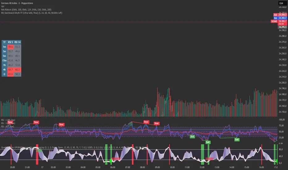
RSI Dashboard Multi-TF This script displays RSI values from multiple timeframes in a compact dashboard directly on the chart.
It is designed for traders who want to quickly identify whether the market is overbought, oversold, or neutral across different timeframes, without constantly switching chart intervals.
The dashboard shows the RSI simultaneously for the following timeframes:
- 1 minute
- 3 minutes
- 5 minutes
- 15 minutes
- 1 hour
- 4 hours
- Daily
Typical use cases:
- Scalping & intraday trading
- Multi-timeframe analysis at a glance
- Entry confirmation (e.g. pullbacks, breakouts)
- Avoiding trades against overbought or oversold market conditions
- Complementing EMA, VWAP, or price action strategies
⚙️ Notes
This dashboard is an analysis tool, not an automated trading system.
No repainting (uses request.security).
Suitable for indices, forex, crypto, and commodities.
This RSI dashboard provides a fast, clear, and visually clean market overview across multiple timeframes, making it an ideal tool for active traders who want to make efficient and well-structured trading decisions.
RSI Divergence + MTF Table FinalThis is a professional, high-impact English description for your RSI Divergence + MTF Table Final script, designed to attract users on TradingView by highlighting its institutional-grade features.
Institutional RSI Divergence & MTF Confluence Heatmap
Overview
The Institutional RSI Divergence & MTF Confluence Heatmap is a professional-grade analytical tool designed for high-precision traders. It combines Automated RSI Divergence Detection with a Multi-Timeframe (MTF) Heatmap Table, allowing you to monitor market momentum across 8 different timeframes (from 1-minute to 1-day) without ever switching charts.
Key Features
🔍 Automated Divergence Detection: Instantly identifies Regular Bullish and Bearish divergences on the RSI oscillator, marking them with clear "Bull" and "Bear" labels.
📊 MTF Heatmap Grid: A real-time monitoring table that tracks RSI values across: 1m, 5m, 15m, 30m, 1h, 4h, 12h, and 1D.
🎨 Dynamic "Institutional" Color Logic: The table uses a sophisticated color-coded system to highlight extreme exhaustion and momentum:
Ultra Overbought (RSI > 90): Bright Red (Extreme Reversal Zone).
Overbought (RSI > 80): Orange (High Momentum/Caution).
Oversold (RSI < 26): Lime Green (Potential Accumulation).
Neutral: Gray (Consolidation).
🛠️ Flexible Layout Engine: Toggle between Vertical or Horizontal layouts to fit your chart workspace perfectly.
🚀 Pine Script v6 Optimized: Built with the latest TradingView engine for ultra-fast performance and minimal lag.
Trading Strategy: The Power of Confluence
Cross-Timeframe Confirmation: The strongest reversals occur when multiple timeframes (e.g., 15m, 1h, and 4h) all turn Orange/Red or Lime simultaneously. This represents a massive momentum exhaustion.
Divergence Validation: Use the table to see if a detected "Bull" divergence on your current timeframe is backed by "Oversold" conditions on higher timeframes.
Institutional Sniping: Combined with Demand/Supply zones, this script helps you "snipe" entries at the exact moment market momentum peaks or bottoms out.
Settings & Customization
Toggle Compact Mode: Display a minimal version of the table for a cleaner interface.
Custom Thresholds: Modify RSI levels to suit your specific trading style (Scalping vs. Swing Trading).
Table Position: Move the heatmap to any corner of your screen (Top Right, Bottom Left, etc.).

MACD-v Bullish/Bearish DivergenceMACD-v Bullish/Bearish Divergence
Overview This indicator is a specialized divergence detector based on the MACD-v (Volatility Normalized Momentum) concept. Unlike standard MACD which uses absolute price differences, MACD-v normalizes values against volatility (ATR), allowing for fixed, universal Overbought/Oversold thresholds across all assets and timeframes.
Recommendation: This script is highly effective when paired with the original MACD-v by Alex Spiroglou. While this indicator focuses on identifying and visualizing divergence entries, using the original oscillator alongside it provides the best visual context for the overall momentum structure.
How It Works
This tool uses a dual-signal mechanism (Raw Line + Signal Smooth) to identify specific divergence setups:
Setup (Yellow/Blue Dots): Identifies when price momentum has extended significantly into extreme zones (Overbought/Oversold).
Trigger (Red/Green Dots): Fires when price fails to make a new momentum extreme despite price action (classic divergence/failure swing).
Active State (Background Color): Once a trigger fires, the background highlights (Red for Bearish, Green for Bullish) to indicate an active divergence play.
Reset (Exit): The signal state clears when momentum returns to the neutral "safe zone."
Important Note: Momentum Washout
The colored background persists as long as the divergence trade remains valid. Traders should note the concept of "Momentum Washout":
Signal End: The background color turns off when the MACD returns to the neutral range, indicating the primary high-velocity impulse is over.
Performance Continuation: Significant positive or negative price performance can often continue even after the background signal ends. This period allows the remaining momentum to "wash out" or drift before the next major impulse.
Strategy Tip: The indicator is designed to capture the high-volatility portion of the reversal. Do not assume the end of the signal is the absolute top or bottom of the trend; it simply marks the normalization of momentum.
Strategy Recommendation: Multi-Timeframe Analysis
Divergence signals are most powerful when confirmed across timeframes. It is highly recommended to look for alignment before taking a trade:
Trend Confirmation: If you see a signal on a lower timeframe (e.g., 5m or 15m), check a higher timeframe (e.g., 1H or 4H). A bullish divergence on the 5m is significantly more reliable if the 1H momentum is already bullish or oversold.
Signal Stacking: Valid signals often appear sequentially—first on the 1m, then the 5m, and finally the 15m. Waiting for this "cascade" can filter out false reversals.
Visual Guide
🔵 Blue Dot: Bullish Divergence Setup (Watch for entry).
🟢 Green Dot: Bullish Divergence Trigger (Long Entry).
🟡 Yellow Dot: Bearish Divergence Setup (Watch for entry).
🔴 Red Dot: Bearish Divergence Trigger (Short Entry).
Background Color: Indicates an active trade (Red = Bearish / Green = Bullish).
Settings
Auto-Detect: Automatically switches between Scalping settings (tighter thresholds) for low timeframes and Swing settings for high timeframes.
Strict Invalidation: If enabled, cancels a setup if momentum pushes too far in the opposite direction before triggering.
Active Signal Multiplier: Dynamically smooths the signal line only when a trade is active to prevent premature exits during choppy corrections.
Disclaimer: This tool is for educational purposes and trend analysis only. Always manage your risk appropriately.
