YinYang RSI Volume Trend StrategyThere are many strategies that use RSI or Volume but very few that take advantage of how useful and important the two of them combined are. This strategy uses the Highs and Lows with Volume and RSI weighted calculations on top of them. You may be wondering how much of an impact Volume and RSI can have on the prices; the answer is a lot and we will discuss those with plenty of examples below, but first…
How does this strategy work?
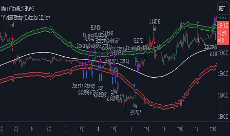
It’s simple really, when the purchase source crosses above the inner low band (red) it creates a Buy or Long. This long has a Trailing Stop Loss band (the outer low band that's also red) that can be adjusted in the Settings. The Stop Loss is based on a % of the inner low band’s price and by default it is 0.1% lower than the inner band’s price. This Stop Loss is not only a stop loss but it can also act as a Purchase Available location.
You can get back into a trade after a stop loss / take profit has been hit when your Reset Purchase Availability After condition has been met. This can either be at Stop Loss, Entry or None.
It is advised to allow it to reset in case the stop loss was a fake out but the call was right. Sometimes it may trigger stop loss multiple times in a row, but you don’t lose much on stop loss and you gain lots when the call is right.
The Take Profit location is the basis line (white). Take Profit occurs when the Exit Source (close, open, high, low or other) crosses the basis line and then on a different bar the Exit Source crosses back over the basis line. For example, if it was a Long and the bar’s Exit Source closed above the basis line, and then 2 bars later its Exit Source closed below the basis line, Take Profit would occur. You can disable Take Profit in Settings, but it is very useful as many times the price will cross the Basis and then correct back rather than making it all the way to the opposing zone.
Longs:
If for instance your Long doesn’t need to Take Profit and instead reaches the top zone, it will close the position when it crosses above the inner top line (green).
Please note you can change the Exit Source too which is what source (close, open, high, low) it uses to end the trades.
The Shorts work the same way as the Long but just opposite, they start when the purchase source crosses under the inner upper band (green).
Shorts:
Shorts take profit when it crosses under the basis line and then crosses back.
Shorts will Stop loss when their outer upper band (green) is crossed with the Exit Source.
Short trades are completed and closed when its Exit Source crosses under the inner low red band.
So, now that you understand how the strategy works, let’s discuss why this strategy works and how it is profitable.
First we will discuss Volume as we deem it plays a much bigger role overall and in our strategy:
As I’m sure many of you know, Volume plays a huge factor in how much something moves, but it also plays a role in the strength of the movement. For instance, let’s look at two scenarios:
Bitcoin’s price goes up $1000 in 1 Day but the Volume was only 10 million
Bitcoin’s price goes up $200 in 1 Day but the Volume was 40 million
If you were to only look at the price, you’d say #1 was more important because the price moved x5 the amount as #2, but once you factor in the volume, you know this is not true. The reason why Volume plays such a huge role in Price movement is because it shows there is a large Limit Order battle going on. It means that both Bears and Bulls believe that price is a good time to Buy and Sell. This creates a strong Support and Resistance price point in this location. If we look at scenario #2, when there is high volume, especially if it is drastically larger than the average volume Bitcoin was displaying recently, what can we decipher from this? Well, the biggest take away is that the Bull’s won the battle, and that likely when that happens we will see bullish movement continuing to happen as most of the Bears Limit Orders have been fulfilled. Whereas with #2, when large price movement happens and Bitcoin goes up $1000 with low volume what can we deduce? The main takeaway is that Bull’s pressured the price up with Market Orders where they purchased the best available price, also what this means is there were very few people who were wanting to sell. This generally dictates that Whale Limit orders for Sells/Shorts are much higher up and theres room for movement, but it also means there is likely a whale that is ready to dump and crash it back down.
You may be wondering, what did this example have to do with YinYang RSI Volume Trend Strategy? Well the reason we’ve discussed this is because we use Volume multiple times to apply multiplications in our calculations to add large weight to the price when there is lots of volume (this is applied both positively and negatively). For instance, if the price drops a little and there is high volume, our strategy will move its bounds MUCH lower than the price actually dropped, and if there was low volume but the price dropped A LOT, our strategy will only move its bounds a little. We believe this reflects higher levels of price accuracy than just price alone based on the examples described above.
Don’t believe us?
Here is with Volume NOT factored in (VWMA = SMA and we remove our Volume Filter calculation):
Which produced -$2880 Profit
Here is with our Volume factored in:
Which produced $553,000 (55.3%)
As you can see, we wen’t from $-2800 profit with volume not factored to $553,000 with volume factored. That's quite a big difference! (Please note previous success does not predict future success we are simply displaying the $ amounts as example).
Now how about RSI and why does it matter in this strategy?
As I’m sure most of you are aware, RSI is one of the leading indicators used in trading. For this reason we figured it would only make sense to incorporate it into our calculations. We fiddled with RSI for quite awhile and sometimes what logically seems to be the right way to use it isn’t. Now, because of this, our RSI calculation is a little odd, but basically what we’re doing is we calculate the RSI, then turn it into a percentage (between 0-1) that can easily be multiplied to the price point we need. The price point we use is the difference between our high purchase zone and our low purchase zone. This allows us to see how much price movement there is between zones. We multiply our zone size with our RSI multiplication and we get the amount we will add +/- to our basis line (white line). This officially creates the NEW high and low purchase zones that we are actually using and displaying in our trades.
If you found that confusing, here are some examples to why it is an important calculation for this strategy:
Before RSI factored in:
Which produced 27.8% Profit
After RSI factored in:
Which produced 553% Profit
As you can see, the RSI makes not only the purchase zones more accurate, but it also greatly increases the profit the strategy is able to make. It also helps ensure an relatively linear profit slope so you know it is reliable with its trades.
This strategy can work on pretty much anything, but you should tweak the values a bit for each pair you are trading it with for best results.
We hope you can find some use out of this simple but effective strategy, if you have any questions, comments or concerns please let us know.
HAPPY TRADING!
Wave
[volfgang] WAVE ScannerThe Wave Scanner helps you make more informed decisions about when to buy and sell.
This indicator operates on a series of inputs and global variable declarations. Based on the same parameters as the WAVE Indicator. It uses different parameters such as the closing price, Stochastic Momentum Index, and smoothing factors such as the EMA to calculate the potential trade signals.
The scanner allows you to adjust the thresholds for bullish and bearish counts, which can be tailored to your personal trading strategy.
The minimum value is 4 and maximum is 8.
In total you can use 8 different timeframes for your signals from the following;
3D
1D
12h
8h
4h
1h
15m
5m
The scanner's unique ability to scan across multiple timeframes is what makes this indicator unique. This multi timeframe analysis can be incredibly useful for identifying broader trends in the market.
The Wave Scanner settings also includes inputs for you to enter risk management settings, including your total capital and the risk percentage you are willing to take per trade. It uses this information to display data in a label on the chart including;
Position Size
Stop Loss Level
Potential Profit
Risk Reward Ratio
On your chart, the WAVE Scanner will plot the ideal Entry Levels, Stop Loss and Take Profit Levels by calculating Fibonacci Levels, which is a popular tool for identifying potential support and resistance levels.
These are marked as follows;
GREEN Lines: Entry Levels
PINK Line: Stop Loss (can be customized in the settings)
GREY Line: Breakeven Level (move SL to breakeven at this level)
BLUE Line: Take Profit Level
So, if you're a trader looking to level up your strategy, the Wave Scanner is a tool you won't want to miss out on.
[volfgang] WAVEA compass to the financial charts.
The Volfgang WAVE Indicator helps you to decode complex market trends and make informed decisions in your trading.
Quick Summary
The WAVE has a signal line which alternates between Red or Blue.
Red is bearish and Blue is bullish.
It turns Blue when the WAVE line crosses above the signal and holds for 1 bar.
it turns Red when the WAVE line crosses below the signal and holds for 1 bar.
(You can change the signal line’s length in the settings, the default is 3 which is suited towards Day Trading – For Swing Traders I recommend 4 or 5 – For Investors 6 to 9).
The WAVE line will change colour to alert you when price is potentially pivoting.
When the WAVE is WHITE, the trend is currently Bearish but could flip bullish soon.
When the WAVE is GREEN, the trend is Bullish and there is strong Bullish momentum.
When the WAVE is ORANGE, it means trend is bullish but there is danger of a Bearish Reversal.
When the WAVE is PINK it means there is strong Bearish Momentum.
WAVETrend Scanner
The WAVETrend Scanner can be enabled in the settings and gives you a quick overview of the current trend across 8 potential timeframes:
You can use this to make sure the trades you are taking on lower timeframes align with the current bias on higher term timeframes, thus ensuring a higher chance of success.
WAVE Colours
The background colour of the WAVE also changes according to the current trend across multiple timeframes. The scanner is constantly measuring the current trend across 7 timeframes;
When 4 timeframes line up Bullish, the WAVE is LIGHT BLUE (Cyan)
When 5 timeframes line up Bullish, the WAVE is DARK BLUE (Navy)
When 6+ timeframes line up Bullish, the WAVE is GREEN
When 4 timeframes line up Bearish, the WAVE is ORANGE
When 5 timeframes line up Bearish, the WAVE is RED
When 6+ timeframes line up Bearish, the WAVE is PINK
Divergence Checker & Buy/Sell Signals
The BUY and SELL Signals are represented by a BLUE or RED Histogram line that extends from the WAVE to the 0 Line.
A BUY signal shows when a Crossover occurs & there is a Bullish Diversion Present within the last 50 bars.
A SELL signal appears when a Crossunder occurs & there is Bearish Diversion present within the last 50 bars.
You can change the length of the Divergence Checker in the settings, default is 50 bars.
Under The Hood
The WAVE pulls information from multiple sources within a set period such as;
Close Price
Highest Price
Lowest Price
EMA
The script applies a set of complicated algebraic equations. Which essentially measures the and of recent price action.
Then it uses EMA's to measure from the and , whilst applying more weight to recent price action.
The functions then calculate more averages which measure the difference from and .
Next, it uses all of these calculated averages to create a value that represents the current WAVE condition. This calculation will determine whether the WAVE is in a bullish or bearish trend.
This sum is then smoothed out to get one more value, which is used to display the info box content that allows us to see exactly at what price the WAVE will keep rising or keep falling.
One final calculation also predicts the point at which the WAVE will flip trend. It uses similar calculations to the "Keep Rising/Falling" prediction function, but its aim is to predict the exact price at which the WAVE will cross.
What gives the WAVE indicator an edge over most Stochastic Indicators, is how it uses Pinescript's "request.security" function to pull information from multiple timeframes in order to generate plots, info data and colours to add much more relevant information to the chart which you can use to make informed trading decisions. This is what allows the WAVETrend Scanner to work.
The WAVE indicator is designed to work with all markets and asset types.

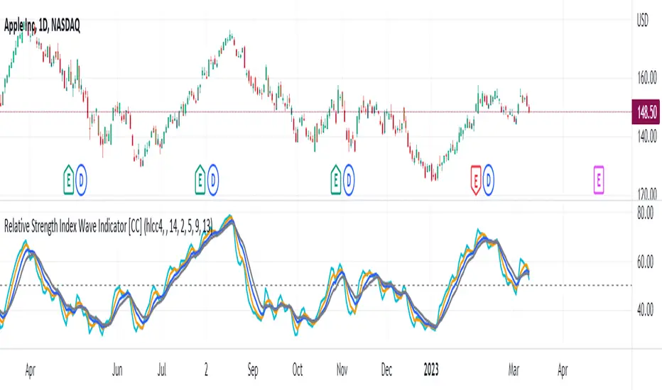
Relative Strength Index Wave Indicator [CC]The Relative Strength Index Wave Indicator was created by Constance Brown (Technical Analysis for the Trading Professional), and this is a unique indicator that uses the weighted close formula, but instead of using the typical price values, it uses the RSI calculated from the various prices. It then creates a rainbow by smoothing the weighted RSI with four different lengths. As far as the buy or sell signals with this indicator go, I did change things from the original source, so feel free to experiment and let me know if anything works better for you. I decided to do a variation of the original source and create buy and sell signals based on crossovers, but my version only uses the first and second smoothed RSI lines. You could also average all of the lines and buy when the average is rising and sell when it starts to fall. I have used my typical buy and sell signals to use darker colors for strong signals and lighter colors for normal signals. Because of the rainbow effect from the wave, the color changes will only appear for the bar itself when you enable that setting.
Let me know if there is any other script you would like to see me publish! I will have plenty more RSI scripts to publish in the next week. Let me know if you like this indicator series.
Elliott Wave [LuxAlgo]The Elliott Wave indicator allows users to detect Elliott Wave (EW) impulses as well as corrective segments automatically on the chart. These are detected and displayed serially, allowing users to keep track of the evolution of an impulse or corrective wave.
Fibonacci retracements constructed from detected impulse waves are also included.
This script additionally allows users to get alerted on a wide variety of trigger conditions (see the ALERTS section below).
🔶 SETTINGS
🔹 Source
• "high" -> options high, close, maximum of open/close
• "low" -> options low, close, minimum of open/close
🔹 ZigZag
• The source and length are used to check whether a new Pivot Point is found.
Example:
• source = high/low, length = 10:
• There is a new pivot high when:
- previous high is higher than current high
- the highs of 10 bars prior to previous high are all lower
• These pivot points are used to form the ZigZag lines, which in their turn are used for pattern recognition
🔶 USAGE
The basic principles we use to identify Elliott Wave impulses are:
• A movement in the direction of the trend ( Motive/Impulse wave ) is divided in 5 waves (Wave 1 -> 5)
• The Corrective Wave (against the trend) is divided in 3 waves (Wave A -> C)
• The waves can be subdivided in smaller waves
• Wave 2 can’t retrace more than the beginning of Wave 1
• Wave 4 does not overlap with the price territory of Wave 1
Here we see an example:
Let's look at the development:
• 1 bar after point (5) a confirmed 5 Motive Wave pattern is found (1 -> 5; The 5 Waves can also be seen as one large Wave 1 ).
• Next, the script draws a set of Fibonacci lines, which are area's where the Corrective Wave potentially will bounce.
Here we see the fifth wave is getting larger, the previous highest point is updated, and the Wave 5 is larger than Wave 3 :
(At this point, the pattern is invalidated, and it display as dotted)
Further progression in time:
At this point, a confirmed " 3 Corrective Wave pattern " is found (a -> c)
When a new high has developed, a circle is drawn (in the same color of the lines)
However, when the bottom of the drawn box has breached, a red cross will be visualized.
Further progression:
Later on, a bearish confirmed " 5 Motive Wave pattern " is found (1 -> 5):
When a Corrective Wave becomes invalidated, the ABC pattern will display as dashed (not dotted):
🔶 TECHNIQUES
Pine Script™ introduces methods!
• More information can be found here:
• Pine Script™ v5 User Manual 👉 Methods
• Pine Script™ language reference manual 👉 method
🔶 ALERTS
Dynamic alerts are included in the script, you only need to set 1 alert to receive following messages:
• When a new EW Motive Pattern is found (Bullish/Bearish )
• When a new EW Corrective Pattern is found (Bullish/Bearish )
• When an EW Motive Pattern is invalidated (Bullish/Bearish )
• When an EW Corrective Pattern is invalidated (Bullish/Bearish )
• When possible, a start of a new EW Motive Wave is found (Bullish/Bearish )
• Here is information how you can set these alerts()

TWA - SurgeWith the TWA Surge indicator we make price and volume impulses easy to read.
Ideally if you are looking to go long look for a red surge and if your looking to go short look for a green surge.
Volume traders out there always wonder if its a bull rush or a falling knife and not sure when that push of volume and momentum will slow down. That's where the borders of the surge come in when a green surge gets a red border forming or a red surge gets a green border forming that means it's show time.
Lastly the surge has exhausted volume built in as well so when you see a different color in your red or green surges you will be able to get further confirmation that the team you are trading against needs to take a break and your team is at full strength ready to take them down.
Under the hood the surge impulses are calculated using a proprietary algorithm involving the amount of standard deviations price deviates from an average, and accumulations of volume for both above and below average volume .
Similarly the exhausted volume looks for strong deviations from the average amount of volume . Standard deviations of price measure the amount of variation or dispersion among price values. Looking at price and volume through the lens of standard deviations it can be seen when price and/or volume are outside of their statistical norm, hence as outliers or extremes they become more likely to reverse and return to a statistical norm.
This increased tendency for a reversal makes the surges on the TWA Surge a useful tool for finding trade opportunities.
The indicator provides many elements to create confluence for trade set-ups. The border of the surge histogram changes color to visually signal when momentum is changing direction. A trade set-up of this would be seeing a red surge form followed by the border turning green. Other elements include horizontal line meters that change colors to show the story of price and momentum.
The uppermost horizontal line meter uses an algorithm to compare price to its recent ranges over multiple times to determine trend direction.
The 2nd horizontal line meter measures the directional efficiency of the movement of price to determine direction in the market.
The 3rd horizontal line meter calculates buying and selling pressure by separating volume that moves price up from volume that moves price down, and comparing that to the total volume .
The 4th horizontal line meter uses an algorithm combining the volatility of recent candles with the statistical likeliness of price to return to its mean in order to determine direction, and if that direction is strengthening or weakening.

Sinusoidal High Pass Filter (SHPF)Sinusoidal High Pass Filter
This script implements a sinusoidal high pass filter, which is a type of digital filter that is used to remove low frequency components from a signal. The filter is defined by a series of weights that are applied to the input data, with the weights being determined by a sinusoidal function. The resulting filtered signal is then plotted on a chart, allowing the user to visualize the effect of the filter on the original signal.
The script begins by defining the sinusoidal_hpf function, which takes three arguments: _series, _period, and _phase_shift. The _series argument is the input data series that will be filtered, and the _period argument determines the length of the filter. The _phase_shift argument is an optional parameter that allows the user to adjust the phase of the sinusoidal function that is used to calculate the filter weights.
The function then initializes a variable ma to 0.0, and loops through each data point in the input series, starting from the most recent and going back in time for the specified _period number of points. For each data point, the function calculates a weight using a sinusoidal function, and adds the weighted data point to the ma variable. Finally, the function returns the average of the weighted data points by dividing ma by the _period.
The script also includes user input fields for the Length and Phase Shift parameters, which allows the user to customize the filter according to their specific needs. The filtered signal is then plotted on a chart, along with a reference line at 0.
Overall, this script provides a useful tool for analyzing and processing financial data, and can be easily customized to fit the needs of the user.

Waves CorrectionsWave theory tool for tracking waves relations and their corrections. It filters out a sets of formations and count how often correction from them are reaching characteristic correction levels marked on the chart as CL1, CL2, CL3.
It supports 2 rulesets/wave variants:
Low - Based on more sensitive trend detection.
Medium - Based on less sensitive trend detection.
Script settings:
| SCANNER |
Trend type - Trend used by scanner to detect sets of waves.
L - Low
M - Medium
<= W1/W2 * 100% <= - Tresholds describing proportions between 1 and 2 wave in the set.
<= W3/W1 * 100% <= - Tresholds describing proportions between 3 and 1 wave in the set.
<= W3/W2 * 100% <= - Tresholds describing proportions between 3 and 2 wave in the set.
Show potencial areas - Showing underway sets
Show Arrows - Showing arrows with possible correction on underway set.
Correction from trend UP - Background and border colors for found sets in up trends
Correction from trend Down - Bakcground and border colors for found sets in down trends.
History - Showing sets in historic data.
Stats - Type of statistic table shown on the screen:
H - Hide
% - Statistics with normal font
%s - Statistics with small font
Wn n= - Picking how many waves are taken into account when calculating statistics .
| TREND VISUALIZATION |
Type - Trend visualization types:
H - Hidden
L - Low
M - Medium
B - Both
Alfred - AI assistant that informs about wave confirmation or trend changes (With "Both" type Alfred will monit only Medium wave).
Shadow - Showing second reprezentation of the trend with drawing with the use of minimal and maximal values. It's usefull to determine the delay between the peak and a wave change signal.
Low/Med Line width/color - Width/color of drawn line. Separate setting for Low and Medium trend type.
| IMPULS VISUALIZATION |
Impuls - Drawing impuls modes:
H - Hidden
F - First
S - Second
A - Auto
Impuls color - Color of the first bullish arrow.
Draw arrow - Drawing arrow at the end of the first bullish arrow.
Troubleshooting:
In case of any problems, send error details to the author of the script.

Waves + TrendsTrend visualization tool in Wave theory. This script allows to observe wave directions (trends) at 3 higher intervals.
For each candle, 3 rectangles are shown with their color, showing the current trend in a given interval/timeframe. By default, green is an uptrend and red is a downtrend.
Currently it supports 2 rulesets/wave variants:
Low - More sensitive (trend will change more ofter).
Meddium - Less sensitive ( trend will change less ofter).
Simultaneous observation of multiple timeframes reduces the time needed for analysis and facilitates making investment decisions.
Script with limited access, contact author to get authorization
Script settings:
Type – Specify which wave type should be used in trend visualization:
L(ow) – Low level waves
M(edium) – Medium level waves
Top trend timeframe – Timeframe and color mapping of the visualization top row.
Middle trend timeframe – Timeframe and color mapping of the visualization middle row.
Bottom trend timeframe – Timeframe and color mapping of the visualization bottom row.


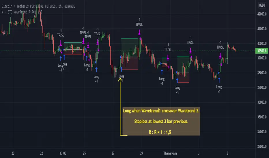
BTC WaveTrend R:R=1:1.5In this strategy, I used Wavetrend indicator (Lazy Bear).
It is very simple and easy to understanding: Long when Wavetrend1 crossover Wavetrend2 and they are less than a limit value (not buy when price overbought). Stoploss at lowest 3 bar previous. R:R = 1:1,5.
About other shortterm strategies for crypto market, you can view my published strategies.
RSI Wave SignalsQuick Description: Smoothed RSI with optimized trailing moving average. Look for cross above or cross under signals for buy and sell orders respectively.
VIDYA moving average of RSI incorporated with "optimized trend tracker" system. Thanks to kivancozbilgic and anilozeksi for implementing this great idea on Tradingview. The indicator adds "1,000" to the RSI MA values for more natural and accurate percentage trailing.
Settings:
- Period MA is the moving average length of the blue line
- Trailing Percentage of MA adjusts the percentage (sort of) trailing level of the moving average.
- RSI Length adjusts the rsi length in calculation.
Trading Tips:
- System might be enhanced by taking signals only on "oversold" or "overbought" territories (i.e <~1020 or >~1080)
- Adjust position size of by 4 times of atr(length=14)
- Take 50% of position as profit when position reaches the 4*atr TP Level (breakeven)
- Let the rest ride.
- Best performing on short frequencies such as 1, 3, 5 mins.

SpyGuyTrendTrackerWorking on official documentation at the moment!
As soon as I have that ready I will update this description to incorporate that information.
Basic knowledge:
The clouds are differentiated by EMA lengths and distortion values
Yellow: Short Term
Red: Mid Term
Blue Long Term
I will get finalized documentation ASAP, until then, have fun backtesting and creating your own strategies / ideas while using this indicator!

Wave Chart v1##Wave Chart v1##
For analyzing Neo-wave theory
Plot the market's highs and lows in real-time order.
Then connect the highs and lows
with a diagonal line. Next, the last plot of one day (or bar) is connected with a straight line to the
first plot of the next day (or bar).
##How To Use##
if you want a weekly chart you drop the time frame to the daily chart.
Then you set the range to 7(if the market opens 7 days per week).
Then you click "highlight the bar that runs to plot" and you must shift the highlight to the last day that the weekly chart bar close(Sunday / Friday)
##Example 1
Weekly chart BTCUSDT on BINANCE
first open daily chart, set range = 7 and Bars_shift = 3 (shift highlight to Sunday)
##Example 2
Weekly chart XAUUSD on FXOPEN
first open daily chart, set range = 5 (market open 5 days per week) and Bars_shift = 1 (shift highlight to Friday)
##Note##
If the market has a special holiday Wave Chart may be inaccurate.

Ultimate HODL WaveThe basis for this indicator is the HODL Wave (> 1 Year) developed by Unchained Capital. This represents the percentage of coins that have not been moved for at least a year.
The Hull MA perfectly tracks the HODL Wave and provides an easy bull/bear trend in the mid-term.
The long-term and more macro bull/bear trend is decided by if the Hull MA is above or below the base MA.
I have purposefully chosen the 365 day length for the Hull MA and the 730 day for the base MA on the daily timeframe since they represent 1 year and 2 years respectively.

Neowave Chart PlotterThis Indicator is applicable to plot wave charts as per the NeoWave method (Neely Extension of Wave Theory). NeoWave is a scientific, objective and revolutionary style of Elliott Wave Theory that was invented by Glenn Neely in 1990 in the “Mastering Elliott Wave” book.
To start analyzing with this method, we need a particular chart called the Wave Chart or Cash Data chart. This is the first step for a good wave analysis. To draw this chart, Highs and Lows should be plotted in the order that they occurred. This could be a very challenging and time-consuming task to do for any symbol on any Timeframe.
This Indicator can accurately Find High and low in each Period and draw them in the order that they occurred. for any Symbol on any Timeframe automatically and in real-time.
For example on Monthly timeframe, indicator separates each year and find high and low on the period. Then it recognizes which occurred early and plot them in order that occurred. this called "Yearly Wave Chart" and you can start to analysis it, base on Neowave method.
Important : This Indicator Works on All Type of Accounts
Some features of this Expert Adviser are:
- Draw Wave Chart on yearly, monthly, weekly, daily, hourly and minutely timeframes
- Draw Wave Chart on any integer multiples of above timeframes
- Switch between Wave Chart and Candlestick Chart simultaneously
- Online auto updating Wave Charts
- Possibility of putting watermarks
- Show Monowaves count
- Show Suspicions Monowave (where high and low occur on same Bar)
- Show Triple Monowave (where high or low occur twice on a period)
- Show Monowaves count
- plotting wave chart base on Calendar and bar count
- Show Monowaves count
- plotting wave chart on Equal distances

[Herif's] Wolfe WavesWolfe Waves™
This indicator draws wolfe wave patterns.
Some patterns need to be validated by the user.
When detecting Wolfe waves, two triangles are formed.
A target line is drawn from the origin of one of these triangles to the apex or trough of the other.
Bullish patterns are indicated by green triangles and bearish patterns by red triangles. The target line is black.
Care bullish wolfe wave rules
Understanding Wolfe Waves
Wolfe Wave patterns were first identified by Bill Wolfe and his son, Brian. According to Wolfe, they occur naturally in all markets. To recognize them, traders must identify a series of price oscillations that correspond to specific criteria:
-The waves must cycle at a consistent time interval.
-The third and fourth waves must stay within the channel created by the first and second waves.
-The third and fourth waves must show symmetry with the first and second waves.
-In a Wolfe Wave pattern, the fifth wave breaks out of the channel. According to the theory behind the pattern, a line drawn from the point at the beginning of the first wave and passing through the beginning of the fourth wave predicts a target price for the end of the fifth wave. If a trader properly identifies a Wolfe Wave as it forms, the beginning of the fifth wave represents an opportunity to take a long or short position. The target price predicts the end of the wave, and therefore the point at which the trader aims to profit off the position.

Wave Trend OscillatorThis is a very standard version of the Wave Trend Oscillator.
The Channel and Average values are displayed as lines, most people display them as areas.
The Channel and Average difference is displayed as a histogram, most people display it as a tiny noisy area.
I was unable to find a standard version of the Wave Trend Oscillator.
The colorful hyped up versions of this indicator made me feel like a clown while using them.
I have essentially copied the style of the MACD with this indicator, to keep things professional.
With this WTO, you can change the timeframe and source.
You can also change the histogram average length and multiplier, making it usable.
The typical way that people display the histogram is completely unusable and just for appearance.
Now it does a decent job showing when the momentum of the WTO's downward movement is slowing down, just like how the MACD histogram works.
This indicator is essentially a normalized MACD, though they are calculated differently.
The Wave Trend Oscillator is useful for spotting/monitoring changed in mid-trend momentum.
In my experience, divergence in this indicator is a strong signal.
If the MACD is too slow for you, then this is a great alternative; without all the extra fluff people usually add to it.

test - wave collapseexperimental:
translates a gaussian wave to collapse from high/low peaks, slice of a pun intended to the cat in the box :)

Chirped Sine Wave GeneratorINTRODUCTION:
The title pretty much sums up what this tool is, but not what it's for. It's NOT an indicator, just a chirped sine wave generator intended as a developer tool. Basically it sweeps from a very high frequency near the "Nyquist frequency" by chosen starting, step, and repetition rates to an ever decreasing lower frequency. This is typically viewed best on ALL, 5Y, or 1Y charts starting at bar_index==0 onward. Also, with the chart interval being intraday, you may use (ALT + SHIFT + ◀) keyboard shortcuts to jump back to barstate.isfirst. I will say, to witness a much broader scope of the sweep, having 4K is better for viewing it with the highest detailed resolution when making comparisons.
VISUAL AIDS:
When a frequency steps to another frequency a label displays the cycle period of the new frequency. This may be disabled to remove it's obstruction of view when overlaying indicators on top of it. I also included RMS levels that may be enabled.
USAGE:
As you can see above, I sourced TV built-in indicators to the "cSine Wave" plot, having varying results across the varying frequencies generated. Oscillating indicators and filters (ema, sma, etc...) of all sorts can be applied to it to inspect lag, amplitudes, or anomalies that render across the flux on the sweeping sine wave. Keep in mind market data has near infinite frequencies existing at any given time that can pop up or disappear instantly, so performance in theory on this swept synthetic waveform does not equate to performance on ANY ticker. It's gives you "ONE" totally different perspective to evaluate novel indicators.
OBSERVATIONS:
Witnessing the antiquated RSI on higher short frequencies, you will see it has a few issues, hmm. The amplitude is clamped near 50 at the Nyquist frequency growing with increasing amplitude in a funnel like shape. That doesn't imply it's a bad indicator, only there could be room for improvements... potentially. Wilder was calculating the RSI on paper basically, and the calculations were made as simple as possible in late 1970's. With advances in modern computing, many exotic permutations of RSI now exist attempting to improve upon it's original characteristics. EMA sourced to this tool appears in similar fashion to the RSI with it's own peculiarities. I suspect this occurs because EMA and RSI both use an IIR filter. CCI has a better representation across the spectral flux in this case, but that doesn't imply it's a perfect indicator on market data either. CCI could be improved as well...
REVELATIONS:
The chirped sine wave is only revealing a partial story about RSI's, EMA's, and CCI's attributes. In conclusion, how various frequencies affect our indicators, can be a bit more visually obvious using this tool, but it doesn't reveal all. For example, a 3D-RSI tells a different story when viewed in that perspective. Using a chirped sine wave, observations of ringing, weird frequency excitations, or no plot (na) may elude to more serious issues with an algorithm. In many cases, I often move the testing indicator pane to overlay the chirped sine wave pane for a more direct and precise inspection on 4K. I hope that gives you a better idea of this developer tool's intention and it's potentially limited but profound usage. I will be employing this upon nearly indicator fit for evaluation that I can utilize, upgrade, or invent in the future...

Cash Data Chart (Wave Chart)This Indicator is applicable to plot Cash Data Chart in tradingview and it will be very useful for traders who analyze with NEoWave method.
NEoWave analysis method was invented by Glenn Neely and it is a revolutionary style of Elliott Wave Theory.
For analyzing with NEoWave method, we need a particular chart called Wave Chart or Cash Data chart. Wave charts provide a very accurate representation of the Wave movement of the market and allow for much better Wave analysis as a result. To draw this chart, Highs and Lows should be plotted in the order that they occurred. This could be a very challenging and time-consuming task to do for any symbol on any Timeframe. This indicator can calculate and plot Cash Data Charts fast and accurately.
Cash Data Chart is not only useful for people who want to analyze with the NEoWave method, but can also can have a wide range of research areas and can be used in other research and analytical methods.
Some features of this indicator:
- Draw the chart in the desired time frame fast and accurately
- Detect intervals with two duplicate highs or two duplicate lows
- View wave chart and Candlestick chart simultaneously or separately
- Draw charts automatically or draw a chart with the desired interval length and desired start time
- Auto updating Cash Data Charts
- Draw charts on logarithmic and linear price scales
special thanks to www.tradingview.com

Original Wave AnalyzerThis can be applied to Forex, Stocks, and Crypto.
Understanding it
When the buy or sell signal align with the wave, it means the price is heading in the direction of alignment.
This indicator is intended to be used as a confirmation indicator for other algorithms for the best result.
Indicators with specifically tested and chosen settings have been shown to work on a number of timeframes.
How to use on a buy
When you receive a buy signal if it's within the wave or above the wave, it's an indication the market is about to continue that direction. You could aim for 20-50 pips depending on the pair.
When to sell
When you receive a sell signal if it's within the wave or below the wave, it's an indication the market is about to continue that direction. You could aim for 20-50 pips depending on the pair.
When to exit
You can set our indicator to alert you when it's a good time to exit the trade.
How to Access
Gain access to FX Social Entry Finder for your TradingView account by being a active member of FX Social.

Volume Pump WaveThis indicator displays volume as a pump wave. Can be useful for chart analysis and easy detection of anomalies/trends.
