Kurtosis with Skew Crossover Focused OscillatorDescription:
This indicator highlights Skewness/Kurtosis crossovers for short-term trading:
Green upward arrows: Skew crosses above Kurtosis → potential long signal.
Red downward arrows: Skew crosses below Kurtosis → potential short signal.
Yellow upward arrows: Extreme negative skew (skew ≤ -1.7) → potential oversold/reversal opportunity.
Oscillator Pane:
Orange = Skewness (smoothed)
Blue = Kurtosis (adjusted, smoothed)
Zero line = visual reference
Usage:
Primarily for 2–5 minute charts, highlighting statistical anomalies and potential short-term reversals that can be used in conjunction with OBV and/or CVD
Arrows signal potential entries based on skew/kurt dynamics.
Potential ideas???????
---------------------------------------
Add Supporting Market Context
---------------------------------------
Currently, signals are purely based on skew/kurt crossovers. Adding supporting indicators could improve reliability:
Volume / CVD: Identify when crossovers occur with real buying/selling pressure.
Wick Imbalance: Detect forced moves in price structure.
Volatility Regime (Parkinson / ATR): Filter signals during high volatility spikes or compressions.
Experimentation: Try weighting these supporting signals to dynamically confirm or filter skew/kurt crossovers and see if false signals decrease on 2–5 minute charts.
--------------------------------------
Dynamic Thresholds & Scaling
--------------------------------------
Right now, the extreme skew signal is triggered at a fixed level (skew ≤ -1.7). Future improvements could include:
Adaptive thresholds: Scale extreme skew levels based on recent standard deviation or intraday volatility.
Kurtosis thresholds: Introduce a cutoff for kurtosis to identify “fat-tail” events.
Experimentation: Backtest different adaptive thresholds for both skew and kurt, and see how it affects the precision vs. frequency of signals.
--------------------------------------------------
Multi-Timeframe or Combined Oscillator
--------------------------------------------------
Skew/kurt signals could be combined across multiple intraday timeframes (e.g., 1-min, 3-min, 5-min) to improve confirmation.
Create a composite oscillator that blends short-term and slightly longer-term skew/kurt values to reduce noise.
Experimentation: Compare a single timeframe approach vs multi-timeframe composite, and measure signal reliability and lag.
I'm leaving this open so anyone can experiment with it as this project may be on the backburner, but these are my thoughts so far
Statistics

FX Global Strength — Interpretation & Trading FrameworkFX Global Currency Strength — Interpretation & Trading Framework
Enhance your market reading with real-time global strength lines for all major currencies.
Use this tool to confirm breakout validity, detect early divergences, and understand money flow dynamics across FX pairs.
Tip: I strongly recommend backtesting each technique on your preferred market conditions.
COMPONENTS
• Global Strength Lines
Show the relative performance of each major currency calculated across all their pairs.
You can apply the indicator on any timeframe — M1 to Monthly — and the strength is recalculated based on the selected period.
• Strength Difference (Base vs Quote)
Automatically computes which currency is stronger on the chart pair you are trading.
• Interactive Legend
Clear color-coded layout to instantly recognize each currency’s strength line.
HOW TO READ & INTERPRET
1. Global Currency Strength Lines
Higher line = stronger currency, gaining value across the market.
Lower line = weaker currency, losing value across pairs.
Quickly identify which currencies are being bought or sold globally.
Avoid low-quality setups: when both currencies of a pair are equally strong or equally weak, price tends to range or give false signals.
2. Risk-On / Risk-Off Context
Strength clustering reveals market sentiment:
Risk-On: high-beta currencies (AUD, NZD, GBP) strengthening together while safe havens (JPY, CHF) weaken.
Risk-Off: JPY/CHF strengthening while AUD/NZD/GBP weaken.
This helps confirm trend reliability and reduces the chance of trading against global flows.
3. Breakout Confirmation Using Strength
Before trading a breakout on your chart:
Check if the base currency is rising and the quote currency is dropping.
A breakout is more valid when price action + global strength move in the same direction.
If the chart breaks out but strength lines do not confirm the move, consider it a high probability of a false breakout.
4. Divergence Detection
Global strength lines provide early warnings:
If price makes new highs but base currency strength does not, momentum is fading.
If price makes new lows but quote currency weakens slower, a reversal may form.
This acts like an advanced RSI-style divergence, but measured across the entire FX market, not just one pair.
5. Money Flow Insight
Because the indicator aggregates data across all major pairs:
You can clearly see where capital is flowing across the FX market.
This helps you choose the best pairs to trade, not just the direction.
Example:
If USD is the strongest and JPY is the weakest → USDJPY typically offers strong, clean directional movement.
SUMMARY — Why This Indicator Helps
✓ Confirms your breakout trades
✓ Avoids weak or noisy chart conditions
✓ Catches early divergence before price reverses
✓ Shows market sentiment (risk-on / risk-off)
✓ Helps select the cleanest, most directional currency pairs
✓ Works on any timeframe, adapting to your trading style (scalping, swing, or position trading)

Student Wyckoff volume background levels
**STUDENT WYCKOFF Volume Background Levels**
This indicator colors volume bars according to how large or small the current volume is relative to the recent background. Instead of looking at “raw” volume, it shows whether today’s activity is *extreme, high, normal, low or ultra-low* compared to what is usual for this market and timeframe.
### Concept
* The script calculates a **background average volume** over a user-defined number of bars (background window).
* For each bar it computes the ratio:
> `Volume Ratio = Current Volume / Average Volume`
* Depending on how big this ratio is, the volume bar is assigned to one of five categories and colored accordingly.
This makes it very easy to see where real effort (unusual activity) appears and where the market is quiet.
### Color scheme and thresholds (default)
All thresholds are defined as a multiple of the average volume:
* **Extreme volume** – **purple**
`volume ≥ Extreme * average` (default 3.0×)
Very rare, climactic activity. Often associated with buying/selling climaxes, stopping volume or very aggressive participation.
* **High volume** – **light red**
`volume ≥ High * average` (default 1.5×)
Clearly above-average volume. Important bars in trends or near key support/resistance.
* **Normal volume** – **gray**
Around the background average. Regular market activity.
* **Low volume** – **light yellow**
`volume ≤ Low * average` (default 0.7×)
Below-average activity. In Wyckoff/VSA context this can support ideas like No Demand / No Supply (together with spread and result).
* **Ultra-low volume** – **bright green**
`volume ≤ Ultra Low * average` (default 0.3×)
Very quiet market. Often marks zones of complete disinterest, late phases of trends, or calm periods before new campaigns.
All multipliers and colors are user-adjustable.
### How to use it
This is **not a standalone buy/sell signal**, but a visual tool to support Wyckoff/VSA reading:
* Highlight **climactic or stopping bars** by looking for purple (extreme) and light-red (high) volume around important price levels.
* Confirm **No Demand / No Supply** ideas by checking for low or ultra-low volume while price is drifting.
* Study how volume background changes between phases of a trading range, mark-up and mark-down.
The indicator works on any symbol and timeframe, uses only closed bars (no repainting) and is intended for educational and analytical purposes. Always combine it with your own price action reading, risk management and trading plan.

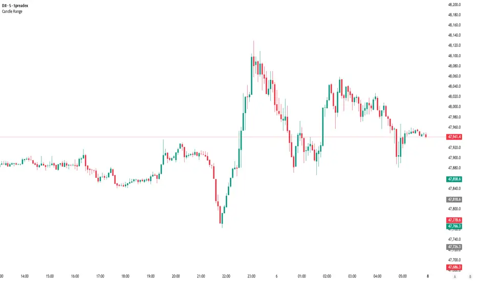
Candle RangeCandle Range
Displays the total range of each candle (high – low) in pips or ticks. The value appears in the status line and updates as you hover over candles. No bars, labels, or chart clutter — just a clean numeric view of candle volatility. Customize text color and decimal precision. Works for Forex, indices, commodities, and other markets.
80% EDGE Rule - TPO Based═════════════════════════════════════════════════════════════
80% EDGE RULE - TPO BASED
═════════════════════════════════════════════════════════════
█ OVERVIEW
The 80% Edge Rule is a high-probability Market Profile concept that identifies when price is likely to traverse the prior session's Value Area. This indicator automates the detection, confirmation, and tracking of 80% EDGE Rule setups using true TPO (Time Price Opportunity) calculations—not volume profile.
When price opens outside the previous day's Value Area and then re-enters and is "accepted" back inside, there is an 80% statistical probability that price will travel to the opposite side of the Value Area. This indicator does all the heavy lifting: calculating the prior session's Value Area, detecting valid setups, confirming acceptance, and tracking progress toward the target.
█ THE 80% EDGE RULE EXPLAINED
The 80% Edge Rule is based on Market Profile theory developed by J. Peter Steidlmayer at the Chicago Board of Trade. The rule states:
❶ If price OPENS OUTSIDE the prior day's Value Area...
❷ And then ENTERS and is ACCEPTED back into the Value Area...
❸ There is an 80% chance price will rotate to the OTHER SIDE of the Value Area.
"Acceptance" is defined as price spending TWO OR MORE TPO periods (typically 30-minute blocks) inside the Value Area. This indicates that the market has accepted these prices as fair value, and the auction process will likely continue through to the opposite boundary.
BULLISH SETUP: Price opens BELOW the prior VAL → Enters and is accepted → Target is VAH
BEARISH SETUP: Price opens ABOVE the prior VAH → Enters and is accepted → Target is VAL
█ HOW THIS INDICATOR WORKS
This indicator performs several automated functions:
1. TPO VALUE AREA CALCULATION
• Analyzes the prior RTH (Regular Trading Hours) session
• Builds a true TPO distribution using 30-minute time blocks
• Each price level receives +1 TPO for each period it was touched
• Calculates POC (Point of Control) as the price with highest TPO count
• Expands from POC using the CME/CBOT standard "two-price" method until 70% of TPOs are captured
• This defines VAH (Value Area High) and VAL (Value Area Low)
2. SETUP DETECTION
• Monitors the RTH open (default 9:30 AM ET)
• Detects if price opened outside the prior Value Area
• Determines setup direction (Bullish or Bearish)
3. ACCEPTANCE MONITORING
• Tracks TPO blocks where price remains inside the Value Area
• Confirms setup when required number of blocks is reached (default: 2)
• Resets count if price exits VA before confirmation
4. TARGET & INVALIDATION TRACKING
• Monitors for target completion (opposite VA boundary)
• Monitors for invalidation (price moves beyond entry VA boundary + buffer)
• Visual feedback on outcome
█ VISUAL ELEMENTS
PRIOR VALUE AREA LINES (Dashed)
• RED DASHED LINE: Prior Day VAH (Value Area High)
• GREEN DASHED LINE: Prior Day VAL (Value Area Low)
• PURPLE DOTTED LINE: Prior Day POC (Point of Control)
TRADE LINES (Solid)
• YELLOW LINE: Entry price (where setup was confirmed)
• CYAN LINE: Target price (opposite VA boundary)
• GREEN LINE: Entry line turns green when target is hit
• GRAY LINES: Both lines turn gray if setup is invalidated
STATUS LABEL
• Floating label showing current setup state
• ORANGE "WATCHING": Setup detected, monitoring for acceptance
• YELLOW "CONFIRMED": Setup confirmed, tracking toward target
• GREEN "TARGET HIT ✓": Target successfully reached
• RED "INVALIDATED ✗": Setup failed, price moved against
DASHBOARD (Top Right Corner)
• Prior VAH: Yesterday's Value Area High
• Prior VAL: Yesterday's Value Area Low
• Prior POC: Yesterday's Point of Control
• Open Price: Today's RTH opening price
• Direction: BULLISH ↑ or BEARISH ↓
• Status: Current setup state
█ CONFIGURABLE SETTINGS
┌────────────────────────────────────────────────────────────
│ TPO SETTINGS
├────────────────────────────────────────────────────────────
│ Tick Size (Default: 0.25) │ • Price increment for TPO calculations
│ • ES/MES: 0.25
│ • NQ/MNQ: 0.25
│ • YM/MYM: 1.0
│ • RTY: 0.1 │ • CL/MCL: 0.01
│ • GC/MGC: 0.1
│
│ Value Area % (Default: 70)
│ • Percentage of TPOs to include in Value Area
│ • Standard is 70% (one standard deviation)
│ • Can adjust 50-90% based on preference
│
│ TPO Block Duration (Default: 30 minutes)
│ • Length of each TPO period
│ • Standard Market Profile uses 30-minute periods
│ • Adjust if using non-standard TPO settings
└────────────────────────────────────────────────────────────
┌────────────────────────────────────────────────────────────
│ 80% EDGE RULE SETTINGS
├────────────────────────────────────────────────────────────
│ TPO Blocks Required for Acceptance (Default: 2)
│ • Number of 30-min periods price must stay inside VA
│ • Standard rule requires 2 periods for acceptance
│ • More conservative: Increase to 3
│ • More aggressive: Reduce to 1 (not recommended)
│
│ Invalidation Distance (Default: 10 points)
│ • Buffer beyond VA boundary before setup is invalidated
│ • Bullish: Invalidates if LOW goes below VAL minus this distance
│ • Bearish: Invalidates if HIGH goes above VAH plus this distance
│ • Adjust based on product volatility and your risk tolerance
│
│ Fade Delay (Default: 5 minutes)
│ • How long entry/target lines stay visible after outcome
│ • Lines and floating label disappear after this delay
│ • Dashboard retains the outcome status until next session
└────────────────────────────────────────────────────────────
┌────────────────────────────────────────────────────────────
│ SESSION SETTINGS
├────────────────────────────────────────────────────────────
│ RTH Session (Default: 0930-1600)
│ • Regular Trading Hours window
│ • This determines which bars are used for TPO calculation
│ • Also determines when RTH "open" is detected
│
│ PRODUCT-SPECIFIC RTH SESSIONS:
│ • Equity Index Futures (ES, NQ, YM, RTY): 0930-1600
│ • Crude Oil (CL): 0900-1430 (pit session)
│ • Gold (GC): 0820-1330 (pit session)
│ • Treasury Bonds/Notes: 0720-1400
│ • Forex Futures: Varies by product
│
│ Timezone (Default: America/New_York)
│ • Timezone for session calculations
│ • Options: New York, Chicago, Los Angeles, UTC
│ • Use exchange timezone for accurate session detection
└────────────────────────────────────────────────────────────
┌────────────────────────────────────────────────────────────
│ VISUAL SETTINGS
├────────────────────────────────────────────────────────────
│ Show Prior VA Lines: Toggle VAH/VAL/POC lines on/off
│ Show Entry/Target Lines: Toggle trade-related lines on/off
│ VAH Color: Color for Value Area High line
│ VAL Color: Color for Value Area Low line
│ POC Color: Color for Point of Control line
│ Entry Line Color: Color for entry price line
│ Target Line Color: Color for target price line
│ Target Hit Color: Color when target is reached (default: green)
│ Line Width: Thickness of all lines (1-5)
└────────────────────────────────────────────────────────────
┌────────────────────────────────────────────────────────────
│ DEBUG SETTINGS
├────────────────────────────────────────────────────────────
│ Show Debug Info: Displays additional diagnostic information
│ • Session High/Low of prior day
│ • Current RTH status
│ • Current TPO block number
│ • Outcome timestamp
│ • Useful for troubleshooting or verifying calculations
└────────────────────────────────────────────────────────────
█ ALERTS
This indicator includes three configurable alerts:
① SETUP CONFIRMED
• Triggers when acceptance criteria is met
• Includes entry price and target price in alert message
② TARGET HIT
• Triggers when price reaches the opposite VA boundary
• Confirms successful completion of the 80% Rule setup
③ INVALIDATED
• Triggers when price moves beyond the invalidation threshold
• Signals that the setup has failed
To enable alerts:
1. Ensure "Enable Alerts" is checked in indicator settings
2. Right-click on the indicator → "Add Alert"
3. Select the condition you want to be alerted on
4. Configure notification method (popup, email, webhook, etc.)
█ RECOMMENDED USAGE
TIMEFRAME:
• Best used on 5-minute, 15-minute, or 30-minute charts
• The chart timeframe should divide evenly into 30 minutes
• Ensure sufficient historical bars are loaded for prior session calculation
BEST PRACTICES:
• Wait for full confirmation (2 TPO blocks inside VA) before considering entry
• Use the target line as your profit objective
• Consider the invalidation level for stop-loss placement
• Monitor the dashboard for real-time setup status
• Combine with other confluence factors (order flow, support/resistance, etc.)
IMPORTANT NOTES:
• This indicator calculates TRUE TPO-based Value Area, not volume profile
• Prior day VA is recalculated at each new session
• The 80% Rule is a statistical tendency, not a guarantee
• Always use proper risk management
█ ADJUSTING FOR DIFFERENT PRODUCTS
This indicator defaults to Equity Index Futures (ES, NQ, etc.) with:
• RTH Session: 0930-1600
• Timezone: America/New_York
• Tick Size: 0.25
FOR OTHER PRODUCTS, ADJUST:
CRUDE OIL (CL/MCL):
• RTH Session: 0900-1430
• Tick Size: 0.01
GOLD (GC/MGC):
• RTH Session: 0820-1330
• Tick Size: 0.10
TREASURY FUTURES (ZB, ZN):
• RTH Session: 0720-1400
• Tick Size: 0.03125 (ZB) or 0.015625 (ZN)
E-MINI DOW (YM/MYM):
• RTH Session: 0930-1600
• Tick Size: 1.0
RUSSELL 2000 (RTY):
• RTH Session: 0930-1600
• Tick Size: 0.10
Always verify the RTH session times and tick sizes for your specific product and exchange.
█ DISCLAIMER
This indicator is provided for educational and informational purposes only. It is not financial advice and should not be construed as a recommendation to buy or sell any financial instrument. Trading futures and other leveraged products involves substantial risk of loss and is not suitable for all investors.
Past performance is not indicative of future results. The 80% Edge Rule is a statistical observation based on Market Profile theory and does not guarantee any specific outcome. Always conduct your own analysis and use proper risk management.

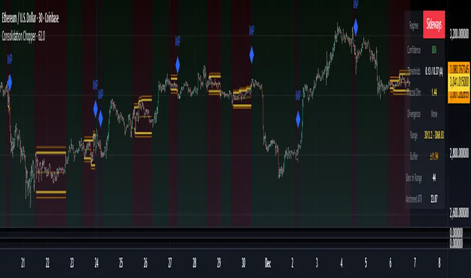
Consolidation Chopper█ OVERVIEW
Consolidation Chopper is a regime detection indicator designed to identify whether the market is currently in a consolidation (sideways) phase or a trending phase. The indicator uses a proprietary multi-timeframe approach to analyze price action across different windows, providing a more robust classification than single-timeframe methods.
The indicator features an impulse override system that can detect sudden breakouts from consolidation ranges, allowing for faster regime transitions when significant price movement occurs.
█ FEATURES
Three-State Regime Detection
• Sideways — Market is consolidating with no clear directional bias
• Breakout — An impulse move has been detected, signaling a potential regime change
• Trending — Market is exhibiting directional movement
Adaptive Thresholds
The indicator can self-calibrate its detection thresholds based on the instrument's historical behavior, making it adaptable across different markets and asset classes without manual tuning.
Dynamic Range Tracking
During consolidation periods, the indicator tracks the evolving range boundaries:
• Yellow lines show the current range high and low
• Orange lines show the buffered boundaries used for impulse detection
• Range continuously updates as price action develops
Impulse Override System
Multiple configurable conditions can trigger an early exit from consolidation:
• Bar body relative to range size
• Bar range relative to volatility
• Close beyond buffered range boundaries
• Multi-bar cumulative movement
Each condition can be independently enabled or disabled.
Confirmation Layers
Optional confirmation metrics provide additional confidence scoring for the current regime classification. The info panel displays confidence percentage and confirmation status.
Cooldown System
Prevents rapid regime oscillation by enforcing a minimum duration after breakout events before allowing return to sideways classification.
█ HOW TO USE
1 — Add the indicator to your chart. The background color indicates the current regime.
2 — During sideways regimes, observe the yellow range lines to understand the current consolidation boundaries.
3 — Watch for IMP markers which indicate impulse-triggered breakouts.
4 — Use the info panel (top right) to monitor:
Current regime and confidence level
Range boundaries and buffer values
Cooldown status
5 — Adjust impulse detection parameters based on your instrument's volatility characteristics.
Higher values = fewer triggers (more conservative)
Lower values = more triggers (more sensitive)
█ SETTINGS
Threshold Settings
Control the sensitivity of regime classification. Adaptive mode auto-calibrates based on historical data tuned for your instrument.
Impulse Override
Configure which conditions trigger early breakout detection and their respective thresholds.
Multi-Bar Impulse
Settings for detecting breakouts that occur over multiple bars rather than a single impulse candle.
Range Tracking
Configure the establishment period and buffer zone for consolidation range detection.
Cooldown
Set the minimum bars required after a breakout before returning to sideways classification.
█ LIMITATIONS
• The indicator requires sufficient historical data to establish adaptive thresholds.
Initial bars may show less reliable classifications.
• Like all regime detection methods, there is going to be inherent lag in identifying transitions, but this method minimizes it.
The impulse override system helps mitigate this but cannot eliminate it entirely.
• Performance may vary across different timeframes and instruments.
Some parameter tuning is recommended for optimal results.
█ NOTES
This indicator is designed as a filter or context tool to be used alongside other analysis methods. It does not generate trade signals directly but provides market structure context that can inform trading decisions. Typically once a range breaks you can expect directional movement/impulses or higher volatility regimes.
Trinity Market Regime Detector ProDecided to release this one to the community to enjoy. Changes from the original script.
Trinity Market Regime Detector – Evolution Summary
#### Critical Bug Fixes
- Fixed false long signals when –DI was dominant (DMI direction is now fully respected)
- Fixed real breakouts and squeeze breakouts firing against the higher-timeframe trend
- Fixed table text not scaling when choosing “Tiny” size (now truly tiny → large)
- Fixed alert messages that contained series strings (now 100% const-string compliant)
#### Major Logic & Accuracy Improvements
- Added proper **Higher-Timeframe MA filter** (default 200 EMA on Daily) – fully configurable (SMA/EMA/WMA + any timeframe)
- All breakout signals now require alignment with the HTF trend (when enabled) → dramatically reduces whipsaws
- Added **CCI (20)** with bold green/red highlighting at ±100
- Improved volume logic (high/low volume now more adaptive)
- Improved ATR low-volatility detection
- Squeeze breakouts now only fire with correct DMI + HTF direction
- Fakeouts clearly marked with orange X
- Bias hierarchy completely rewritten and made crystal-clear
#### Visual & Usability Upgrades
- Perfect dynamic table scaling (no more gaps when hiding ALMA/RSI/CCI)
- Option for **zero table** – super-clean label-only mode (v2.9)
- Background tinting for Dead Market (red), Squeeze (yellow), Strong Trend (green)
- ALMA 34 and HTF MA plotted on chart with color-coding
- Clear on-chart arrows: green/red triangles for real breakouts, aqua diamonds for squeeze breakouts
- All labels use proper large/colored text for instant readability
#### Alert System Overhaul
- 100% working alerts (no more compilation errors)
- Separate alerts for:
- Real volume-confirmed breakouts
- High-probability squeeze breakouts
- Regime changes
- Fakeouts
- Clean, professional alert messages
In short:
The original was already excellent.
We turned it into a **bulletproof, professional-grade, zero-noise market regime tool** that serious traders can actually rely on every single day.

Bayesian Order Flow Predictor📌 Bayesian Order Flow Predictor — Advanced Probability Engine for Nasdaq and Futures
This indicator is a next-generation probabilistic forecasting system designed for Nasdaq traders who rely on Order Flow, Auction Market Theory, Value Area dynamics, market structure, DOM imbalance, and Bayesian probability models.
It combines 7 professional-grade factors (DOM, CVD, RSI, EMA trend, ATR volatility, Market Structure, Value Area positioning) into a unified Bayesian probability panel that outputs a clean bullish/bearish probability curve with high-confidence reversal and trend-continuation signals.
Engineered for scalpers, day traders, futures traders, and ICT-style order flow technicians, it delivers real-time directional probability, session-aware signals, and optional news-filter exclusion.
⭐ Features
Bayesian Probability Model (0–100%)
DOM imbalance scoring across dynamic depth levels
Cumulative Volume Delta (CVD) scoring
Market structure detection (HH/LL micro-trend shifts)
RSI momentum and overbought/oversold scoring
EMA directional bias + ATR-normalized deviation
Value Area positioning (VAH / VAL / POC) with optional previous-session mode
Session filtering (only signals during active hours)
Automated news filter (exclude signals around scheduled macro events)
Bull/Bear probability zones with background coloring
Anti-repetition system (no double signals in same direction)
Designed for future scalping, futures order flow, and high-precision timing
🧠 Bayesian Probability Engine — How It Works
The model evaluates 7 independent market factors simultaneously:
DOM imbalance
CVD pressure
Market structure
RSI deviation
EMA trend
Value Area position
ATR volatility shift
Each factor is transformed into a normalized score, multiplied by its weighting parameter, and aggregated into a global score.
This score is then passed through a Bayesian logistic function to convert uncertainty into a smooth probability curve, giving traders a clean, mathematically stable, and noise-resistant forecast.
📈 Buy & Sell Signal Logic
Signals trigger when:
Bullish Probability crosses above the user threshold
Bearish Probability crosses below the opposite threshold
Session is active
No protected news event is occurring
This avoids noise, prevents over-signaling, and focuses only on high-confidence inflection points.
🎯Fully compatible with the indicator: ➡️ AI Probabilistic Orderflow scalper
Both indicators synchronize perfectly when used together:
Bayesian panel → trend probability
Scalper v1 → timing + TP/SL engine
Together they create a complete probability-driven revenue management system for scalping Future.
📘 How to Use
Add the indicator to your chart
Set your trading session (e.g., 09:30–16:00 EST)
Adjust weights depending on your style (Order Flow / Momentum / Value Area)
Watch the probability curve:
Above threshold → bullish bias
Below threshold → bearish bias
Take signals when the curve crosses thresholds, not when flat
Combine with "AI Probabilistic Orderflow scalper" indicator for execution timing
Avoid high-impact news using the News Filter
💎 Advantages
Professional-grade Bayesian model
Works in all volatility regimes
Noise-resistant and smoother than traditional oscillators
Integrates Order Flow + Auction Theory + Momentum + Volatility
Perfect for NQ scalpers seeking an AI-style probability dashboard
Reduces emotional decision-making
Compatible with any execution strategy
Optimized for high winrate scalping and sniper entries

Percent Change Histogram + MACandle Percent Move Columns with Optional Moving Average
Description:
This indicator calculates the percentage move of each candle over a specified number of bars and displays it as upward-facing columns, regardless of the candle direction. Each column is color-coded based on the candle’s direction—green for bullish, red for bearish. An optional moving average can be overlaid on the percentage values to help visualize trends and smooth out volatility.
Features:
Shows each candle’s percentage move as a column facing upward.
Columns are colored according to candle direction.
Adjustable input for the number of bars used in calculation.
Optional moving average overlay that can be added or removed.
Helps quickly assess volatility and trend strength in percentage terms.
Use Case:
Ideal for traders who want a clear visual representation of individual candle movements in percentage terms, making it easier to spot trends, pullbacks, and volatility patterns across different timeframes.

Fabio-Style Order Flow SystemFabio-Style Order Flow System — LVN • Delta • Big Trades • FVG • Order Blocks • Liquidity • Volume Profile
This indicator brings together all major components of Fabio Valentino’s order-flow strategy in one unified tool. It visualizes where smart money is active, where inefficiencies form, and where price is likely to react next.
🔍 FEATURES
1. Order Flow & Delta
Smoothed delta to show true market imbalance
Background color shifts to bullish/bearish delta dominance
Alerts for delta spikes & order-flow flips
2. Big Trade Detection
Highlights Big Buy and Big Sell prints (relative to average volume)
Helps identify institutional aggression on both sides
3. Low Volume Nodes (LVNs)
Automatically detects low-volume zones
Flags retests of LVNs for high-probability reactions
Uses dynamic volume thresholds for accuracy
4. Volume Profile (Lightweight)
Bucket-based intrabar profile across user-defined lookback
Highlights volume distribution without heavy TradingView CPU load
Auto-scales bucket density & transparency
5. Fair Value Gaps (FVGs)
Detects both bullish & bearish three-bar imbalances
Marks gaps visually using colored boxes
Updates dynamically with a user-set lookback
6. Order Blocks (OBs)
Identifies valid displacement bars and their origin OB
Plots clean, minimalist rectangles around key OB zones
Uses ATR-based impulse filtering
7. Liquidity Grabs
Detects wick-based liquidity sweeps
Highlights both equal high/low and stop-run type wicks
Useful for spotting reversals & trap setups
8. Strategy Dashboard
Shows real-time order flow state
Displays delta strength, big trades, LVNs, and last directional impulse
Auto-positions in all corners
🎯 PERFECT FOR
Traders who use:
Order Flow
Smart Money Concepts (SMC)
ICT / FVG / Liquidity models
Market Structure + Volume
Fabio Valentino-style analysis
⚙️ PERFORMANCE
All elements optimized
Uses automatic box-clearing to avoid array overload
Works on all timeframes & markets (crypto, FX, indices, stocks)

Annual Lump Sum: Yearly & CompoundedAnnual Lump Sum Investment Analyzer (Yearly vs. Compounded)
Overview
This Pine Script indicator simulates a disciplined "Lump Sum" investing strategy. It calculates the performance of buying a fixed dollar amount (e.g., $10,000) on the very first trading day of every year and holding it indefinitely.
Unlike standard backtesters that only show a total percentage, this tool breaks down performance by "Vintage" (the year of purchase), allowing you to see which specific years contributed most to your wealth.
Key Features
Automated Execution: Automatically detects the first trading bar of every new year to simulate a buy.
Dual-Yield Analysis: The table provides two distinct ways to view returns:
Yearly %: How the market performed specifically during that calendar year (Jan 1 to Dec 31).
Compounded %: The total return of that specific year's investment from the moment it was bought until today.
Live Updates: For the current year, the "End Price" and "Yields" update in real-time with market movements.
Portfolio Summary: Displays your Total Invested Capital vs. Total Current Value at the top of the table.
Table Column Breakdown
The dashboard in the bottom-right corner displays the following:
Year: The vintage year of the investment.
Buy Price: The price of the asset on the first trading day of that year.
End Price: The price on the last trading day of that year (or the current price if the year is still active).
Yearly %: The isolated performance of that specific calendar year. (Green = The market ended the year higher than it started).
Compounded %: The "Diamond Hands" return. This shows how much that specific $10,000 tranche is up (or down) right now relative to the current price.
How to Use
Add the script to your chart.
Crucial: Set your chart timeframe to Daily (D). This ensures the script correctly identifies the first trading day of the year.
Open the Settings (Inputs) to adjust:
Annual Investment Amount: Default is $10,000.
Table Size: Adjust text size (Tiny, Small, Normal, Large).
Max Rows: Limit how many historical years are shown to keep the chart clean.
Use Case
This tool is perfect for investors who want to visualize the power of long-term holding. It allows you to see that even if a specific year had a bad "Yearly Yield" (e.g., buying in 2008), the "Compounded Yield" might still be massive today due to time in the market.

NeuroSwarm ETH — Crowd vs Experts Forecast TrackerEnglish:
NeuroSwarm — Crowd vs Experts Forecast Tracker (ETH)
This indicator visualizes monthly forecast data collected from two independent groups:
Crowd – a large sample of retail participants
Experts – a curated group of analysts and experienced market participants
For each month, the indicator plots the following values as horizontal levels on the price chart:
Median forecast (Crowd)
Average forecast (Crowd)
Median forecast (Experts)
Average forecast (Experts)
Shaded zones highlighting the difference between median and mean
All values are fixed for each month and stay unchanged historically.
This allows traders to analyze sentiment dynamics and compare how expectations from both groups align or diverge from actual price action.
Purpose:
This tool is intended for sentiment visualization and analytical insight — it does not generate trading signals.
Its main goal is to compare collective expectations of retail traders vs experts across time.
Data source:
All forecasts come from monthly surveys conducted within the NeuroSwarm project between the 1st and 5th day of each month.
Interface notice:
The script's UI may contain non-English labels for convenience, but a full English documentation is provided here in compliance with TradingView rules.
Русская версия:
NeuroSwarm — Мудрость Толпы vs Эксперты (ETH)
Индикатор отображает ежемесячные прогнозы двух групп:
Толпа: медиана и средняя прогнозов
Эксперты: медиана и средняя прогнозов
Значения фиксируются для каждого месяца и показываются горизонтальными уровнями.
Заливка отображает диапазон между медианой и средней, что упрощает визуальное сравнение настроений.
Это аналитический инструмент для визуализации настроений — не торговая стратегия.
Все данные берутся из ежемесячных опросов проекта NeuroSwarm.

Daily Dollar Cost Averaging (DCA) Simulator & Yearly PerformanceThis indicator simulates a "Daily Dollar Cost Averaging" strategy directly on your chart. Unlike standard backtesters that trade based on signals, this script calculates the performance of a portfolio where a fixed dollar amount is invested every single day, regardless of price action.
Key Features:
Daily Accumulation: Simulates buying a specific dollar amount (e.g., $10) at the market close every day.
Yearly Breakdown Table: A detailed dashboard displayed on the chart that breaks down performance by year. It tracks total invested, average entry price, total holdings, current value, and PnL percentage for each individual year.
Global Stats: The bottom row of the table summarizes the total performance of the entire strategy since the start date.
Breakeven Line: Plots a yellow line on the chart representing your "Global Average Price." When the current price is above this line, the total strategy is in profit.
How to Use:
Add to chart (Works best on the Daily (D) timeframe).
Open settings to adjust your Daily Investment Amount and Start Year.
The table will automatically update to show how a daily investment strategy would have performed over time.

NeuroSwarm BTC — Crowd vs Experts Forecast TrackerEnglish:
NeuroSwarm — Crowd vs Experts Forecast Tracker (BTC)
This indicator visualizes monthly forecasts collected from two independent groups:
Crowd – a large sample of retail traders
Experts – a smaller, curated group of analysts and experienced market participants
For each month, the following values are displayed as horizontal levels on the chart:
Median forecast of the Crowd
Average forecast of the Crowd
Median forecast of Experts
Average forecast of Experts
Shaded zones showing the range between median and mean
The values remain fixed throughout each month. This allows traders to compare sentiment dynamics between groups and see how expectations evolve relative to actual market movement.
Purpose:
This indicator is designed for sentiment analysis — NOT for generating trading signals.
It helps identify divergences between retail expectations and expert forecasts, which can be informative during trend transitions.
Data source:
All values come from monthly surveys conducted within the NeuroSwarm project (1–5 of every month).
Crowd and Expert groups are collected separately to avoid bias and to preserve independent aggregation.
Interface language note:
The indicator’s interface may contain non-English labels for ease of use, but full English documentation is provided here in compliance with TradingView House Rules.
Русская версия (optional, allowed only AFTER English):
NeuroSwarm — Мудрость Толпы vs Эксперты (BTC)
Индикатор показывает ежемесячные прогнозы двух групп:
Толпа: медиана и средняя прогнозов
Эксперты: медиана и средняя прогнозов
Значения фиксируются на весь месяц и отображаются на графике горизонтальными уровнями.
Заливка показывает диапазон между медианой и средней.
Цель индикатора — визуализировать настроение толпы и экспертов и сравнить его с реальным движением цены.
Это аналитический инструмент, а не торговая стратегия.
Данные берутся из ежемесячных опросов (1–5 числа), проводимых в рамках проекта NeuroSwarm.

TCT - Daylight Saving TimeVisualize Daylight Saving Time (DST) transitions on your charts. This indicator marks the spring forward (2nd Sunday of March) and fall back (1st Sunday of November) dates with vertical lines and optional labels.
Features:
Automatic DST detection for US time zones
Customizable line color, width, and style (solid, dashed, dotted)
Optional date labels on transition days
Multiple timezone support: US Eastern, Central, Mountain, Pacific, London, Paris, Tokyo, Sydney
Extends lines across the chart
Memory-efficient (manages up to 100 lines/labels)
Use Cases:
Identify potential market behavior shifts around DST transitions
Track time changes that may affect trading sessions
Plan trades around known time adjustments
Historical analysis of DST impact on price action
Perfect for traders who want to see when clocks change and how it might affect market dynamics. Customize the appearance to match your chart style.

6-9 session & levels6-9 Session & Levels - Customizable Range Analysis Indicator
Description:
This indicator provides comprehensive session-based range analysis designed for intraday traders. It calculates and displays key levels based on a customizable session period (default 6:00-9:00 AM ET).
Core Features:
Session Tracking
Monitors user-defined session times with timezone support
Displays session open, high, and low levels
Highlights session range with optional box visualization
Shows previous day RTH (Regular Trading Hours: 9:30 AM - 4:00 PM) levels
Range Levels
25%, 50%, and 75% range levels within the session
Range deviations at 0.5x, 1.0x, and 2.0x multiples
Fibonacci extension levels (customizable, default 1.33x and 1.66x)
Optional fill zones between Fibonacci levels
Time Zone Highlighting
Marks the 9:40-9:50 AM period as a potential reversal zone
Vertical lines with shading to identify key time windows
Statistical Analysis
Calculates mean and median extension levels based on historical sessions
Displays statistics table showing current range, average range, range difference, and z-score
Customizable sample size (1-100 sessions) for statistical calculations
Option to anchor extensions from either session open or high/low points
Input Settings Explained:
Session Settings
Levels Session Time: Define your session window in HHMM-HHMM format (default: 0600-0900)
Time Zone: Choose from UTC, America/New_York, America/Chicago, America/Los_Angeles, Europe/London, or Asia/Tokyo
Anchor Settings
Show Session Anchor: Toggle the session anchor line (marks session open price at 6:00 AM)
Anchor Style/Color/Width: Customize appearance (Solid/Dashed/Dotted, color, 1-4 width)
Show Anchor Label: Display price label for the anchor
Session Open Line: Similar options for the session open reference line
Range Box Settings
Show Range Box: Display a shaded rectangle highlighting the session high-to-low range
Range Box Color: Set the box background color and transparency
Range Levels (25%/50%/75%)
Show Range Levels: Toggle all three intermediate levels on/off
Individual Level Styling: Each level (25%, 50%, 75%) has its own color, style, and width settings
Show Range Level Labels: Display price labels for each level
Range Deviations
Show Range Deviations: Toggle deviation levels on/off
0.5x/1.0x/2.0x Settings: Each deviation multiplier can be customized with its own color, line style (Solid/Dashed/Dotted), and width
Show Range Deviation Labels: Display labels showing the deviation price levels
Previous Day RTH Levels
Show Previous RTH Levels: Display yesterday's regular trading hours high and low
RTH High/Low Styling: Separate color, style, and width settings for each level
Show Previous RTH Labels: Toggle price labels for RTH levels
Time Zones
Show 9:40-9:50 AM Zone: Highlight this specific time period with vertical lines and shading
Zone Color: Set the background fill color for the time zone
Zone Label Color/Text: Customize the label appearance and text
Fibonacci Extension Settings
Show Fibonacci Extensions: Toggle Fib levels on/off
Fib Extension Color/Style/Width: Customize line appearance
Show Fib Extension Labels: Display price labels
Fib Ext Level 1/2: Set custom multipliers (default 1.33 and 1.66, range 0-5 in 0.1 increments)
Show Fibonacci Fills: Display shaded zones between Fib levels
Fib Fill Color: Customize the fill color and transparency
Session High/Low Settings
Show Session High/Low Lines: Display the actual session extremes
Style/Color/Width: Customize line appearance
Show Labels: Toggle price labels for high/low levels
Extension Stats Settings
Show Statistical Levels on Chart: Display mean and median extension levels based on historical data
Extension Anchor Point: Choose whether to anchor from "Open" or "High/Low" of the session
Number of Sessions for Statistics: Set sample size (1-100, default 60) for calculating averages
Mean/Median High Extension: Separate styling for each statistical level (color, style, width)
Mean/Median Low Extension: Separate styling for downside statistical levels
Tables
Show Statistics Table: Display a summary table with current range, average range, difference, z-score, and sample size
Table Position: Choose from 9 positions (Bottom/Middle/Top + Center/Left/Right)
Table Text Size: Select from Auto, Tiny, Small, Normal, Large, or Huge
Display Settings
Projection Offset: Number of bars to extend lines forward (default 24)
Label Size: Choose from Tiny, Small, Normal, or Large
Price Decimal Precision: Set decimal places for price labels (0-6)
How It Works:
The indicator tracks the specified session period and calculates the session's open, high, low, and range. At the end of the session (9:00 AM by default), it projects all configured levels forward for the trading day. The statistical features analyze the last N sessions (you choose the number) to calculate typical extension behavior from either the session open or the session high/low points.
The z-score calculation helps identify whether the current session's range is normal, expanded, or contracted compared to recent history, allowing traders to adjust expectations for the rest of the day.
Use Case:
This indicator helps traders identify key support and resistance levels based on early session price action, understand current range context relative to historical averages, and spot potential reversal zones during specific time periods.
Note: This indicator is for informational purposes only and does not constitute investment advice. Always perform your own analysis before making trading decisions.

Auto Seasonality Scanner by Novatrix CapitalThe Auto Seasonality Scanner analyzes historical daily price data to identify recurring seasonal patterns in the market. It highlights periods over the last 10 years where certain price movements have historically occurred. This indicator is designed for the DAILY (1D) timeframe only.
Key Features:
Visualizes historical entry and exit points for Long and Short patterns using vertical lines.
Option to exclude specific years (e.g., 2020) from the analysis.
Optional filter by US election cycles.
Calculates average returns, win rates, trade lengths, and number of trades for each pattern.
Displays results in a customizable table with color-coded Long and Short patterns.
This tool is for educational and informational purposes only. It provides a visual guide to potential recurring seasonal trends and does not constitute financial advice or trading recommendations.

AI Probabilistic OrderFlow Scalper⭐ Description:
📌 AI Probabilistic OrderFlow Scalper
This script combines Order Flow, Auction Market Theory, Volume Imbalance, Market Structure (HH/LL), RSI bias filtering, and a probability-based direction model inspired by AI and statistics.
It produces high-precision scalping entries designed for fast markets such as Futures, while remaining compatible with all markets (indices, crypto, forex, metals).
This is not a typical indicator — it is a probabilistic predictive model engineered to provide sniper entries, a tick-based Take Profit, a volatility-adaptive ATR Stop Loss, and optional Value Area levels (VAH/VAL/POC).
⭐ Main Features:
🔥 Directional probability model (AI-style weighted scoring)
📊 Order Flow imbalance (delta-like logic)
📈 HH/LL market structure detection
🎯 Smart RSI bias filter
🚀 One signal per trend shift (anti-spam)
🎯 Tick-based Take Profit (perfect for NQ / futures)
🛡️ ATR-based dynamic Stop Loss
📉 Value Area display: VAH, VAL, POC
🔊 Volume confirmation filter
📡 Directional probability plot
✔️ Works for Futures, Crypto, Forex, Indices
🧠 Probabilistic AI Approach
The model uses a 3-factor scoring system:
Order Flow imbalance
Market structure (HH/LL)
RSI trend bias
Each validated condition = 1 point.
The total score is converted into Buy/Sell probabilities, and the higher-probability direction is selected.
When probability exceeds the threshold (e.g. 80%), the system triggers a high-confidence sniper signal.
This mirrors Revenue Management logic:
→ Only take a decision when probability of success is maximized.
🎯 Buy/Sell Signals (Sniper Entries)
🔵 Green triangle under the candle = high-probability Buy
🔴 Red triangle above the candle = high-probability Sell
✔️ Only one signal per directional shift
✔️ Signals appear only when all strict filters are satisfied
📌 Automatic TP / SL
TP: fixed tick-based (e.g. 100 ticks for NQ scalping)
SL: ATR-based, adapts to volatility
TP/SL display can be enabled or disabled
Perfectly calibrated for high-speed scalping.
📘 How to Use
Use on every timeframe
Adjust probability threshold (75–90 recommended)
Enable strict mode for maximum precision
Let the model filter entries automatically
Choose a TP suitable for your market
Optionally display VAH/VAL/POC for Auction Theory context
Always test using backtesting before going live
🏆 Advantages
Extremely fast for scalping
High win-rate potential via probabilistic filtering
Clean signals (no noise or spam)
Combines the strongest trading frameworks:
Order Flow
Market Structure
Statistical modeling
Volume profiling
Automated risk management

AI Probabilistic OrderFlow Scalper⭐ Main Name
AI Probabilistic OrderFlow Scalper
⭐Description:
📌 AI Probabilistic OrderFlow Scalper — Predictive Auction Theory Model for Futures
This script combines Order Flow, Auction Market Theory, Volume Imbalance, Market Structure (HH/LL), RSI bias filtering, and a probability-based direction model inspired by AI and Revenue Management.
It produces high-precision scalping entries designed for fast markets such as Nasdaq Futures (NQ), while remaining compatible with all markets (indices, crypto, forex, metals).
This is not a typical indicator — it is a probabilistic predictive model engineered to provide sniper entries, a tick-based Take Profit, a volatility-adaptive ATR Stop Loss, and optional Value Area levels (VAH/VAL/POC).
⭐ Main Features
🔥 Directional probability model (AI-style weighted scoring)
📊 Order Flow imbalance (delta-like logic)
📈 HH/LL market structure detection
🎯 Smart RSI bias filter
🚀 One signal per trend shift (anti-spam)
🎯 Tick-based Take Profit (perfect for NQ / futures)
🛡️ ATR-based dynamic Stop Loss
📉 Value Area display: VAH, VAL, POC
🔊 Volume confirmation filter
📡 Directional probability plot
✔️ Works for Futures, Crypto, Forex, Indices
🧠 Probabilistic AI Approach
The model uses a 3-factor scoring system:
Order Flow imbalance
Market structure (HH/LL)
RSI trend bias
Each validated condition = 1 point.
The total score is converted into Buy/Sell probabilities, and the higher-probability direction is selected.
When probability exceeds the threshold (e.g. 80%), the system triggers a high-confidence sniper signal.
This mirrors Hight probability decision:
→ Only take a decision when probability of success is maximized.
🎯 Buy/Sell Signals (Sniper Entries)
🔵 Green triangle under the candle = high-probability Buy
🔴 Red triangle above the candle = high-probability Sell
✔️ Only one signal per directional shift
✔️ Signals appear only when all strict filters are satisfied
📌 Automatic TP / SL
TP: fixed tick-based (e.g. 100 ticks for NQ scalping)
SL: ATR-based, adapts to volatility
TP/SL display can be enabled or disabled
Perfectly calibrated for high-speed scalping.
📘 How to Use
Use any timeframe
Adjust probability threshold (75–90 recommended)
Enable strict mode for maximum precision
Let the model filter entries automatically
Choose a TP suitable for your market
Optionally display VAH/VAL/POC for Auction Theory context
Always test using backtesting before going live
🏆 Advantages
Extremely fast for scalping
High win-rate potential via probabilistic filtering
Clean signals (no noise or spam)
Combines the strongest trading frameworks:
Order Flow
Market Structure
Statistical modeling
Volume profiling
Automated risk management

Position Size Calculator - Fixed Risk Per BarThis indicator calculates the max contracts allowed per bar based on your determined fixed risk.

Dual Account Position Size CalculatorA quick and easy to use position sizing calculator for use on the daily TF only. inputs for two different account sizes and risk %. Calculates risk to low of day (plus a small buffer which can be changed based on ATR). Shows # of shares to buy, stop loss, portfolio %.
Will show on smaller timeframes , but be aware that the stop level will no longer be low of day, so it will not calculate properly. Always use on the daily.

Dynamic Breakout Odds [RayAlgo]█ OVERVIEW
Dynamic Breakout Odds is a probability-based breakout tool that uses ATR and pattern matching to estimate how likely price is to expand up or down from the current candle.
Instead of guessing, the indicator scans historical candles that look like the current one and measures how often price broke above or below by a volatility-based amount.
It then projects those probabilities forward as clean levels and a bias dashboard on your chart.
Use it to quickly answer:
• “Is the next move statistically more likely up or down?”
• “How far does price typically travel from here, in ATR terms?”
█ CONCEPTS
Candle Profile Matching
The script builds a “profile” of the current setup using two elements:
• The color of the previous candle (bullish close vs bearish close)
• The trend environment (above/below EMA, if the filter is enabled)
Only historical candles with the same profile are used for statistics. This keeps the probabilities specific to the current context instead of mixing all market conditions together.
ATR-Based Expansion
For every matching historical candle, the script checks how far price moved away from the open using ATR:
• Upward move thresholds
• Moderate expansion (≈ 0.5 ATR above the open)
• Stronger expansion (≈ 1.0 ATR above the open)
• Downward move thresholds
• Moderate expansion (≈ 0.5 ATR below the open)
• Stronger expansion (≈ 1.0 ATR below the open)
It counts how often each expansion happened, then converts those counts into probabilities.
Normalized Probability Scores
The indicator doesn’t just show raw percentages; it normalizes them so that all scenarios together form a consistent probability set.
Internally it tracks four outcomes for similar candles:
• Chance of a moderate move upward
• Chance of a strong move upward
• Chance of a moderate move downward
• Chance of a strong move downward
These are then normalized so the total is roughly 100%. From this, two main metrics are derived:
• Bullish Strength = combined normalized odds of upside moves
• Bearish Strength = combined normalized odds of downside moves
Whichever side has the higher score defines the current directional bias .
█ WHAT YOU SEE ON THE CHART
1. Breakout Projection Levels
Four horizontal levels are projected around the open of the current bar:
• Two upside levels
• Nearer upside expansion (~0.5 ATR above the open)
• Further upside expansion (~1.0 ATR above the open)
• Two downside levels
• Nearer downside expansion (~0.5 ATR below the open)
• Further downside expansion (~1.0 ATR below the open)
Each line extends a configurable number of bars into the future, so you visually see a breakout “corridor” above and below price.
2. Probability Labels
At the right edge of each line, you’ll see a label such as:
• “X% – near upside”
• “Y% – further downside”
These labels tell you how frequently similar candles in the chosen lookback reached that expansion. You immediately know which scenario has been more common historically.
3. Breakout Zones
Between the paired upside lines and the paired downside lines, shaded “probability zones” can be shown:
• The upper shaded band highlights the typical upside expansion range
• The lower shaded band highlights the typical downside expansion range
These zones visually group probable target areas instead of just single lines.
4. Background Tint
The background behind price is softly tinted towards:
• Bullish color when Bullish Strength > Bearish Strength
• Bearish color when Bearish Strength > Bullish Strength
The stronger the statistical imbalance between the two, the more pronounced the tint. This gives you an instant feel for whether conditions lean more Long, more Short, or are nearly Neutral.
5. Directional Bias Arrow
On the last bar the script can plot a clean arrow:
• Up-arrow below price when bullish odds dominate
• Down-arrow above price when bearish odds dominate
The arrow is positioned beyond all projection lines, making it easy to see even on cluttered charts and reminding you of the current statistical bias without text.
6. Origin Marker
A small horizontal mark is drawn at the open of the current candle.
This acts as the “starting point” from which all ATR-based expansions above and below are measured.
7. Dashboard Panel
A compact dashboard is drawn in a corner of the chart (location configurable). It displays:
• Bullish Strength – combined normalized probability for upside expansions
• Bearish Strength – combined normalized probability for downside expansions
• Bias – “Long Bias”, “Short Bias”, or “Neutral”
• Trend Filter – shows whether EMA-based filtering is ON or OFF and which length is used
This gives you a quick, text-based summary of the current statistical environment.
█ SETTINGS
Analysis Lookback Period
• Controls how many historical bars the script inspects when searching for similar candles.
• Larger values = more history, smoother statistics, slower adaptation.
• Smaller values = faster adaptation, but more noise and less stability.
ATR Length
• The period used to compute ATR volatility.
• Defines how “big” 0.5 ATR and 1.0 ATR moves are on your current symbol and timeframe.
Trend Filter (EMA)
• Filter by Trend?
• When ON, only historical candles in a similar trend regime are used.
• When OFF, all past candles with similar color are considered, regardless of trend.
• Trend EMA Length
• EMA period used to classify trend.
• Price above EMA → uptrend environment.
• Price below EMA → downtrend environment.
This filter helps you separate behavior in uptrends from downtrends, which can significantly change breakout dynamics.
Visual Settings
• Projection Width (bars)
• How far the lines and zones extend into the future.
• Show Probability Zones
• Toggle shaded bands between each pair of levels.
• Label Size
• Choose smaller or larger text for the probability labels on the right.
• Tint Background by Bias
• Turn the bias-based background on or off.
• Show Bias Marker on Last Candle
• Toggle the up/down arrow marker.
• Dashboard Location
• Select top/bottom left/right corner for the panel.
█ HOW TO USE IT
1. Start With the Dashboard
Look at Bullish Strength vs Bearish Strength:
• If bullish is clearly larger → environment statistically favors upside expansion.
• If bearish is clearly larger → environment statistically favors downside expansion.
• If they are close → treat the situation as Neutral; consider reducing position size or waiting for more clarity.
2. Use Levels as Dynamic Targets
The projected lines and zones can serve as:
• Profit targets based on typical expansion distance
• Logical regions for scaling out
• Areas where you expect price behavior to change (e.g., loss of momentum)
Short-term traders often focus on the nearer expansion levels, while swing traders may use the farther levels as extended targets.
3. Align With Trend (Optional)
With the trend filter ON:
• Prefer Long setups when price is above the EMA and bullish probabilities dominate.
• Prefer Short setups when price is below the EMA and bearish probabilities dominate.
With the filter OFF, you get pure color-plus-pattern statistics across the whole lookback, which can be useful if you deliberately trade counter-trend or range conditions.
4. Combine With Your Existing System
Dynamic Breakout Odds is best used as a confirmation and targeting layer :
• Combine it with structure (support/resistance, supply/demand, order blocks).
• Combine it with volume or orderflow tools if you use them.
• Use the probability zones to validate whether your planned target is realistic relative to recent volatility.
It is not designed to be a standalone “buy/sell” signal generator, but a statistical map around your entries.
█ PRACTICAL EXAMPLES
Example A – Bullish, Moderate Expansion Frequently Hit
• Bullish Strength significantly higher than Bearish Strength.
• The nearer upside level shows a strong historical hit rate.
Interpretation: similar setups often produce at least a moderate push upward before failing.
Use case: trade pullbacks in the direction of the bias, targeting the nearer upside projection as an initial take-profit.
Example B – Bearish, Deeper Downside Often Reached
• Bearish Strength clearly dominant.
• Both the nearer and farther downside levels show decent probabilities.
Interpretation: similar conditions historically saw follow-through to the downside.
Use case: use rallies against the direction of the bias to position into shorts, planning partial exits around the first downside projection and runners toward the second.
Example C – Neutral, Balanced Probabilities
• Bullish and Bearish Strength scores are close.
• Background tint is very light or absent.
Interpretation: the market is statistically indecisive; expansions up or down are similarly likely.
Use case: consider range trading tactics, mean-reversion ideas, or simply standing aside until a clearer skew develops.
█ BEST PRACTICES
• Use on liquid symbols and reasonable timeframes to avoid distorted ATR behavior.
• Don’t overfit lookback length to a single instrument; test across markets.
• Let the indicator provide context, not absolute certainty.
• Always combine with proper risk management (position sizing, max loss per trade, etc.).
• Be cautious with very small sample sizes (e.g., very short lookbacks on low-volume assets).
█ LIMITATIONS & NOTES
• All probabilities are based on historical behavior ; markets can change regime.
• ATR distances are relative to recent volatility and may shrink/expand over time.
• The script intentionally does not guarantee any direction or target; it only reports what has been most common in similar past situations.
█ DISCLAIMER
This tool is for educational and informational purposes only.
It does not constitute financial advice or a guarantee of performance.
Always do your own research, test on demo or historical data, and use appropriate risk management when trading live capital.
Monthly DCA & Last 10 YearsThis Pine Script indicator simulates a Monthly Dollar Cost Averaging (DCA) strategy to help long-term investors visualize historical performance. Instead of complex timing, the script automatically executes a hypothetical fixed-dollar purchase (e.g., $100) on the first trading day of every month. It visually marks entry points with green "B" labels and plots a dynamic yellow line representing your Global Break-Even Price, allowing you to instantly see if the current price is above or below your average cost basis. To provide deep insight, it generates a detailed performance table in the bottom-right corner that breaks down metrics year-by-year—including total capital invested, shares/coins accumulated, and Profit/Loss percentage—along with a grand total summary of the entire investment period.
