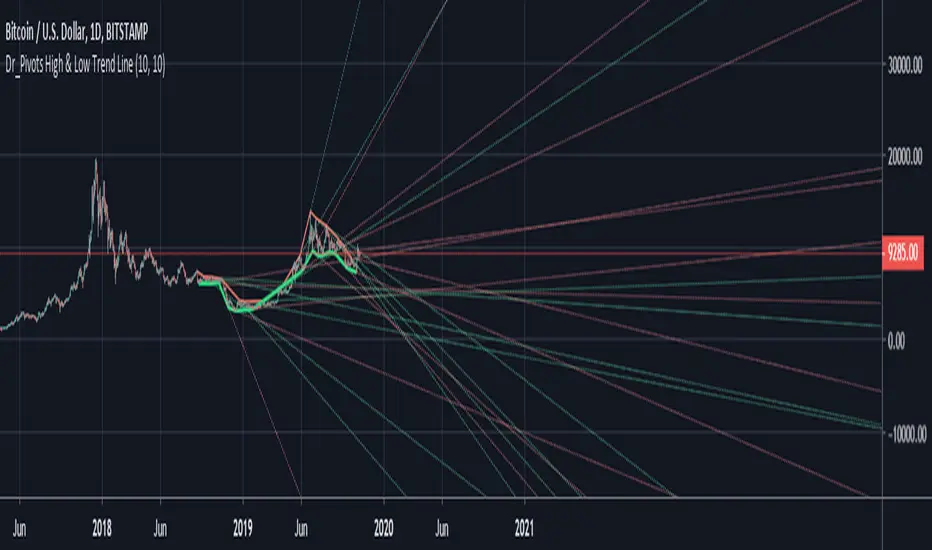
Profit Accumulator Trend IndicatorTREND INDICATOR (PATC)
This is a support indicator to the Main Indicator which has also been published.
This indicator uses a number of tools to assess for trend direction and where to place Take Profit and Stop Loss points. There are no alerts with this indicator.
I've been using this successfully on the one hour FX charts, but seems to work equally as well on higher or lower time frames (not less than 15min).
This indicator has a number of tools in the settings that can be used to assist with trading. This includes
Multi-Timeframe Support and Resistance points. The thicker the line is, the greater the timeframe that youre dealing with. In the 1hr chart on this script, the S&R is set at 1hr, 4hr and 1D time periods.
Trend Direction points. Note that these have a massive tendency to repaint, however when used with something like Bollinger Bands (as in the Main Indicator) you can identify turning points (i.e. when the close of the candle is at the upper or lower boundary levels).
Risk Management provides a high level tool for managing money based on relative ATR multiplier points.
The other indicators which are part of the suite are shown on the website which is highlighted in my signature at the bottom of the page. Purchase of the main indicator gives access to the full suite of eight indicators. I use the other indicators to confirm the direction of the trade and to determine if I want to trade or not. I use it along with the 2min, 15min and 4hr timeframes to identify the best entry window and how long I'm likely to be in the trade.
Support can be provided via private message or in the comments below.
The links are provided below for access to the indicator.
"trend" için komut dosyalarını ara

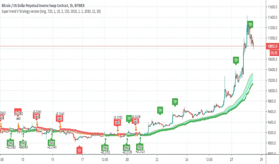
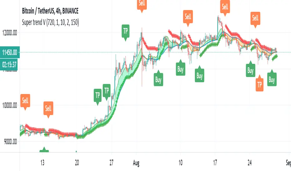
Super trend V Strategy versionThis is the strategy of Super trend V indicator
it not calculating the TP points which can make it much more proftible in theory
just the buy and sell of the super trend
youy can choose long only
short only
or both directions
Victory Trend (V20200718)VT Trend Ver 20200718
Description of VT Trend's items
VT Trend indicator is formed by Green & Red Main Trend Band , 4 days HLC Black color line , Mid Term line (Purple & Gray Color Line and Long Term Blue line . Green up arrow with "Buy" text and Red Down Arrow with "sell" text for alert the potential entry chances.
1) Green color Up Trend Main Trend Band with solid line : form by 2 moving average lines and in green color when fast moving average is above slow moving average line
2) Red Color Down Trend Main Trend Band with solid line form by 2 moving average lines and in red color when fast moving average is below slow moving average line
3) Green Up arrow with "buy" text appear : When red color down Trend Main Trend Band with solid line turn from red color to green color, mean potential buy entry
4) Red down arrow with "Sell" text appear : When green color up Trend Main Trend Band with solid line turn from Green color to red color, mean potential Sell entry
5) Black color line = 4 days HLC line
6) Mid term line = Purple color (when up) and gray color (when down)
7) Long term line = Coastal (Light blue) color
8) Stronger Up trend start = When Mid term line cross up Long term line
9) Stronger down trend start = When Mid term line cross down Long term line
10)Background color which represent the Up/down trend and stronger Up/down trend ,
a) lighten Green = Main trend in uptrend but Main trend's slow moving average line haven't cross up mid term line
b) Green =Main trend in uptrend and Main trend's slow moving average line had cross up mid term line
c) lighten Red = Main trend in down trend but Main trend's slow moving average line haven't cross down mid term line
d) Red = Main trend in down trend and Main trend's slow moving average line had cross down mid term line
Buy entry strategy No.1:
When Green arrow with "Buy" text appear and wait for the candlestick closed, and enter buy position on next candlestick .
Cut Loss exit: When Main trend turn into red color with Red down Arrow with "sell" text appear.
Target price no.1 : For hold over night. To close position When for Main trend turn into red color band and Red down Arrow with "sell" text appear.
Target price no.2 : For Intraday trade. To close position When price close below the black line
Buy entry strategy No.2:
After green up arrow appear and to add more position when Mid term purple line cross up Long term Blue line.
Cut Loss exit: When Main trend turn into red color with Red down Arrow with "sell" text appear.
Target price no.1 : For hold over night. To close position When for Main trend turn into red color band and Red down Arrow with "sell" text appear.
Target price no.2 : For Intraday trade. To close position When price close below the black line
Sell entry strategy No.1:
When Red arrow with "Sell" text appear and wait for the candlestick closed, and enter sell position on next candlestick .
Cut Loss exit: When Main trend turn into green color with green Up Arrow with "buy" text appear.
Target price no.1 : For hold over night. To close position When for Main trend turn into green color band and green Up Arrow with "Buy" text appear.
Target price no.2 : For Intraday trade. To close position When price close up the black line
Sell entry strategy No.2:
After Red Down arrow appear and to add more position when Mid term Gray color line cross down Long term Blue line.
Cut Loss exit: When Main trend turn into green color with green Up Arrow with "buy" text appear.
Target price no.1 : For hold over night. To close position When for Main trend turn into green color band and green Up Arrow with "Buy" text appear.
Target price no.2 : For Intraday trade. To close position When price close up the black line
"Use the link below to contact Owner for obtain access to this indicator"

Stock Algorithm Trend AnalysisThis algorithm is meant to be used on stocks but also works well with cryptocurrencies, forex pairs and indexes. This software helps traders take advantage of momentum trading and by riding trends. It works best when playing the underlying symbol in a bullish sense when the algorithm says "likely to rise" and in a bearish sense when the algorithm says "likely to fall".
Send me a private message on TradingView to gain access.

price trendshello :
this is my first indicator
to plot the trends automatically, you have 2 parameter in this indicator
1- DELTA is the scale used by indicator
2- offset : define the offset of the drawn line
Super trend VJust attempt to make the super trend to work better
buy and sell are shown also alerts
it attempt to improve super trend vpt that i put earlier , maybe i need to add more things to make it better? but i think it ok
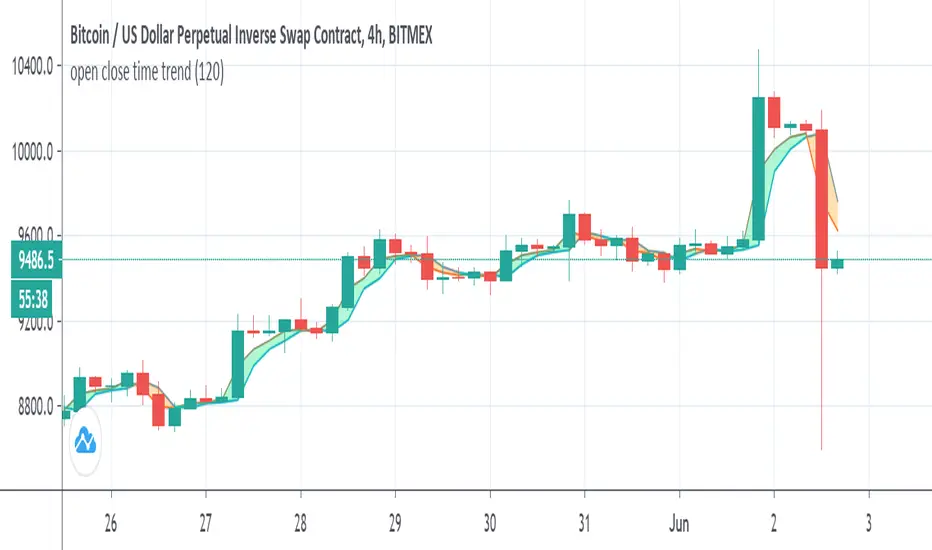
open close time trendSo this indicator show the relation between open and close acording to time length
why it intresting? since the distance is realtion of min compare to the regular way we calculate the distance. in this way we can see how open and close state are related. in this indicator when close above open it buy signal seen as lime and vice versa seen as orange. since the distance is in min we can set the min to be above the chart that we use or to see the distance in min bellow the chart time frame that we use . as in this example it set to 120 min on 4 hour chart. you can go even lower to 60 min on 4 hour chart . this reduce the lag that normaly we have with our indicator. on the other hand we can set it above the time frame that we use in order to see longer trend.
i put signal as options for the crossing of the close and open
there is no repaint here
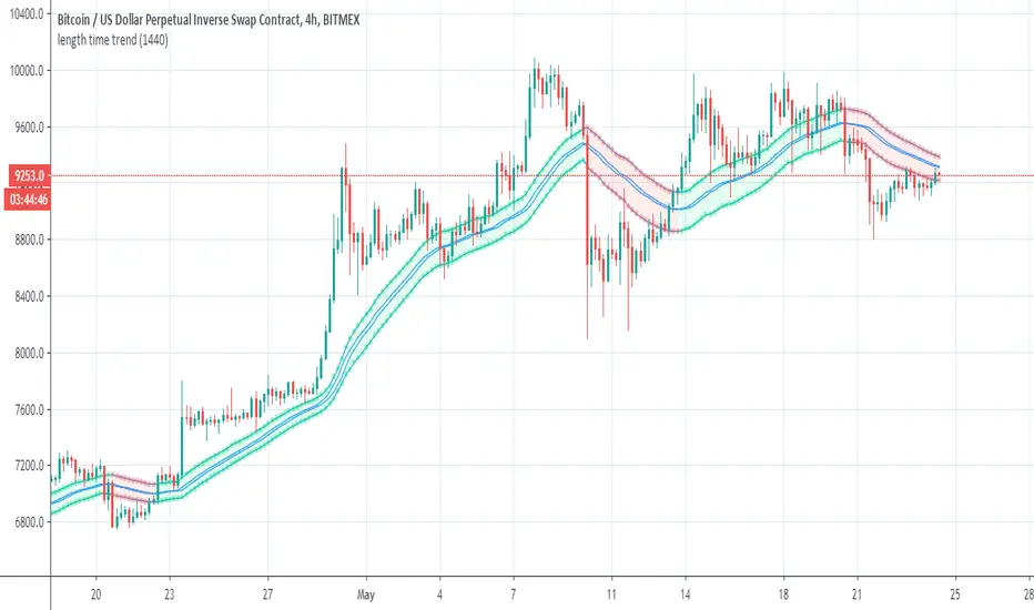
length time trendSo this is simple way to make trend by function of length that is based on min time (in this case 1440)
so i take the close'open' high and low and convert them by this function
then similar to how we build MTF candles I just make this one
you can change the tf to anything you like/ no repaint here as no security
i hope you like it
red is bearish
lime is bullish
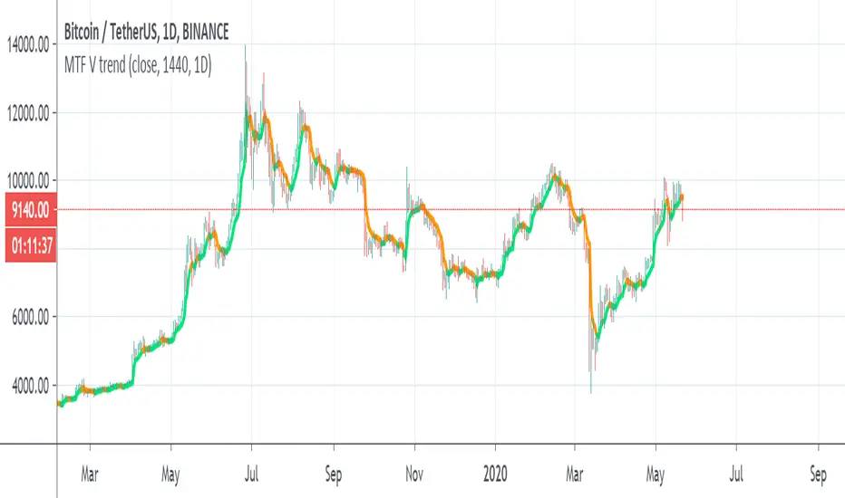
MTF V trendSo i try to make this trend line based on MA volume that i created in the past
orange is downtrend, lime is uptrend
you have MTF function so you can put it on which time frame you want
if you want it to be exact on the candles then fix the tf to time in min
for example : on 4 hour candles put 240 and MTF of 4 hour
Super Trend-adxJust hybrid of Super trend and ADX
above zero=bullish=blue
bellow zero=bearish=red
nice way to see trends

Talinvest Trend Follow v1PThis indicator measures market volatility and detects changes in the trend.
As complementary information it also provides ressistance and support levels for easily defining take profit & stop loss.
You can also check the indicator effectiveness by looking at the "ideas" published in my profile.
Happy trading !
Talinvest

MN TrendThis is a indicator for trend analysis. The smaller trend (the current time frame) is indicated by color blue and red. The color blue indicate uptrend and color red indicate downtrend. But don't take trade blindly. confirm with the higher time frame trend line, indicated by the color green and pink. green means uptrend and pink means downtrend. if the higher trend is in uptrend, focus only on uptrend part of smaller trend line and ignore the downtrend part. Going with the larger trend increases your success by large extent.
This indicator applies to all stocks, indexes, Forex, commodities.
In this image you can see BataIndia, the higher time frame shows downtrend, indicated by pink line. So in the smaller time frame, only the downtrend part should be considered for trading, indicated by red lines.
Hope you like this indicator.. enjoy!

Previous Day Breakout Trend FollowingStop and reverse system for trend following based on simple previous day high and low

Hull Trend AssistHull developed his MA to move quickly but still be a smooth movement with little noise. In doing so, he created a strong trend analysis tool.
This indicator allows you to take advantage of the Hull trend direction on the timeframe of your choice. If you choose to use the timeframe you are looking at, you can do so. But you can also adjust it to view a higher timeframe trend such as the 4H, Daily, Weekly or Monthly.

MAKO Trend IdentifierMako is a trend identifier looking to locate bullish or bearish zones on the 1h BTC/USD chart
The background color of the zone defines which direction the trade should be placed green for long, red for short.

Trade Trend IndicatorThe Trade Trend Indicator (indicator) has been the brain child of 23 years of trading experience rolled into a simple to understand all market setup alert system based solely on 5 high probability trade set ups with a 6th high risk. The hope is to provide something that is can assist traders in building confidence in their trades with a little assistance from the indicator.
This like any and all indicators is not a be all and end to trading, yes while back tested the indicator has produced fantastic profitable results; past performance is not a guarantee of future but which with human intervention can increase the return result exponentially.
You need to be able to chart simple candle sticks and you need to have an understanding of support and resistance areas to make sense of what you are doing in trading otherwise even this indicator won't help you.
While this may alert buy or sell / long or short entrance these are to be taken as educational points of reference and if you wish to trade you are understanding that you enter and exit at your own risk. Not many indicators will alert you to the possibility of a rogue wave spike / dump or both, this will but everything is perspective of the time frame you are on.
The indicator is designed for the 4hour time frame with trade entry on the 15min and managed on the 30min time frame. Alot can happen within these time frame but as we know not every trader can sit in front of a screen for hours at a time and this let's one trade for swings. Once you have your entry you place your exits and you set your stops. If you wait for the alert to exit you are in a draw down this should never reach that point pay yourself for being right.
The set ups are simple:
1. Trend change from bearish to bullish buys are dip interim support entries.
2. Trend change from bullish to bearish sells are top interim resistance exits.
3. Blue buy is an entry position for a trade.
4. Blue long is an add position for a trade.
5. Red short is just that a short trade idea. (this is advanced and requires a manual cover target),
6. Green buy is a break out over the next candle to print above (highest risk)
All trades are based on a 5% to 10% of capital entry with no more than 40% ever in 1 trade goal is many consistent trade wins while limiting the losses and size.
Certain set ups such as longs over the Moving Averages but below the cloud can lead to strong rally returns as well as short in a bearish trend just above the Moving Averages can give prolonged selling pressure.
Pay attention to the golden dump line as it rises the closer to the candle it gets the higher the risk of the trade lacking continuation.
None of this is to be taken as investment advice but rather Edutainment and infotainment

Super Trend LineThe classic and simple Super Trend Line. Enjoy it and have a nice trading
Hashtag_binary ;D
Super trend fractalsThanks to just uncle for his script
So I took the super trend VPT and hybrid it with just uncle fractals system of RSI , seems nice

G-Channel Trend DetectionHere we are demonstrating a different approach to trend analysis using AlexGrover's G-Channel. Using this method of trend detection, we will consider the asset bullish if it breaks through the upward bounds of the channel at any time, and consider it bearish once it breaks downwards.
We have also simplified coloring: If we're in an uptrend, we're only drawing from the upwards part of the channel to the midline. And if we're in a downtrend we're only drawing from the downward part of the channel to the midline.
Created by AlexGrover

Vidar - Trend Cipher (AUTO) / AlertsHi guys, todays indicator comes from the original Odin but has seen some hefty modifications to make it far more accurate based on some recent indicators and learnings. The name comes from Vidar that avenged Odin (fitting as its predecessor).
Vidar has two gears (pawn/king) to help you understand the probability and size of the trade. Kings crowns are weighted to have a larger upside and is intended to inform the trader that a larger position can be taken if he wanted too. Pawns are more "scalp" like signals and should be treated with smaller trades or top up positions between King's crowns.
The indicator also has a simple EMA ribbon to help with trend identification as well as a manipulation trigger to help understand price action outside of signals generated. Green diamonds are bullish closes and red diamonds are very bearish closes.
This is the automated version of Vidar and contains 4 different triggers to help you split your strategy between the strength of each signal.
As always if you want to discuss some TA or come chat about the indicators, or just hang out and chat crypto.

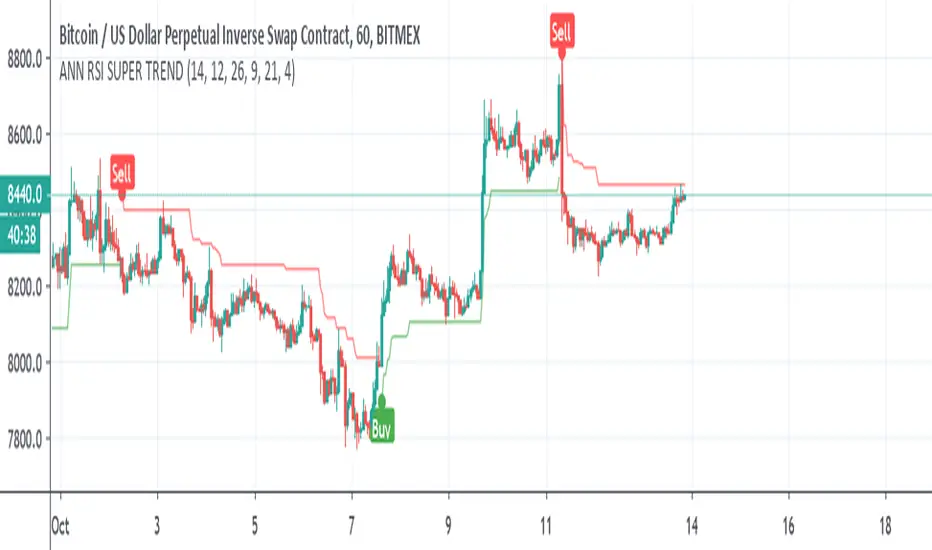
ANN RSI SUPER TRENDSo I was bored and I made this Hybrid
ANN taken from
and alex super trend ,
instead of normal ATR for the supertrend I use RSI and the ANN combination
alerts included