"mtf" için komut dosyalarını ara

MTF SMAThis script overcomes the issues with TV multitimeframe being wrong due to its bugs. It generates higher timeframe SMA on a lower timeframe chart. Enter the number of minutes of the higher timeframe as a setting.
MTF Deviation - Mtrl_ScientistHi everyone,
There are a lot of possible ways to look at markets and find valid patterns.
This time, I've looked at how shorter time frames deviate from the overall price consensus.
What you're seeing here is a range-bound difference of the lowest time frame from the overall price consensus (baseline), represented as blue line.
When lower time frames agree with the baseline, the difference becomes 0.
Logically, this difference cannot deviate too much from the baseline, and to quantify that, I've added fib-levels based on a deviation percentage that depends on price volatility and can be adjusted in the settings.
How it works:
First of all, you need to switch to the 1min time frame to get access to the lowest time frame data.
Look at how the blue line follows the support/resistance fib levels.
Oversold conditions are usually given by entering the lowest red band, whereas overbought conditions are given by entering the upper red band.
However, there are also extreme cases, where the blue line exceeds the set fib levels. In that case, price will reverse with very high likelihood.
Alternatively you can also ping-pong between two fib levels for frequent small trades.
Note that this indicator doesn't use any security functions to access time frame data. Instead, I found a different way to avoid repainting.
At the moment I'm just playing around with this to see how I can improve it. Feedback is very welcome!

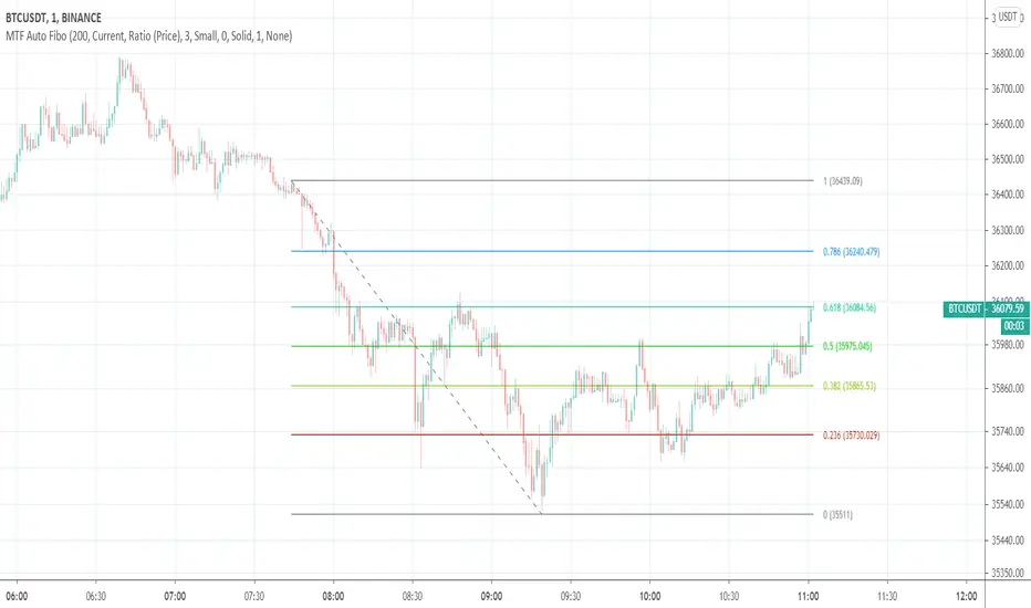
MTF Auto Fibonacci LevelsDear traders,
It is time to diversify and to "fibonaccify" my developer experience.
On the preview you can see the daily chart with fibo levels from 3h timeframe.
Features
24 Fibonacci levels
24 timeframes
Ability to customize levels
Ability to specify a preferred timeframe
Supported levels
0
0.236
0.382
0.5
0.618
0.786
1
1.272
1.414
1.618
2
2.272
2.414
2.618
3
3.272
3.414
3.618
4
4.236
4.272
4.414
4.618
4.764
Supported resolutions
"1"
"3"
"5"
"10"
"15"
"30"
"45"
"60"
"120"
"180"
"240"
"300"
"360"
"420"
"480"
"540"
"600"
"660"
"720"
"D"
"2D"
"3D"
"W"
"M"
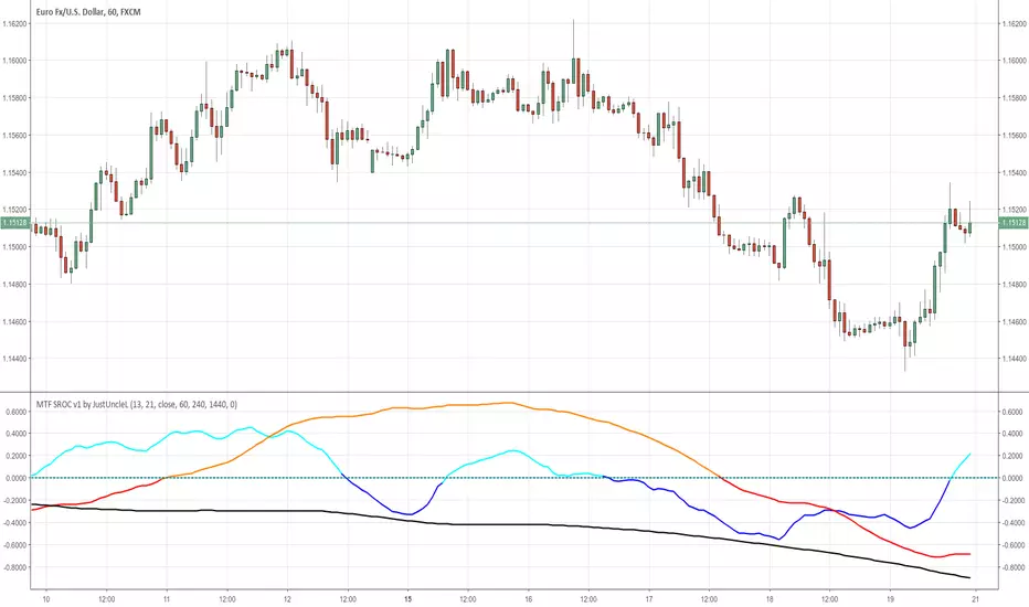
MTF SROC v1 by JustUncleLDescription:
This study plots Smoothed Rate of Change (SROC) indicators for up to 4 different time frames. The indicator does not use higher time frame data, so will not re-paint. The SROC is a momentum indicator and can be used in ranging or trending markets, please refer to the reference for further details of how to use the indicators.
References:
www.incrediblecharts.com

MTF MAA multi timeframe version of the SMA.
You can select one of the proposed timeframes in the input box or you can modify the code at line 5 :
>>>
>>> tf = input("D", title = "TimeFrame", type = resolution)
>>>
Change the D by your desired timeframe => 1, 7, 555 (minutes up to 1440) => D, 2D... => W, 2W... => M, 2M....


MTF EMA Combo with Background ColorDaily/Weekly EMA combo for longer term trend direction, with combo background color for varying trend direction.
MTF Polarity Grid [DW]This is an experimental study designed to track directional polarities across multiple timeframes and express them as a simple two color grid.
The polarity in this calculation is determined by divergence between a fast and slow McGinley Dynamic.
Your current resolution's polarity is the top row, the rows below are are for higher timeframes of your choice.

MTF EMAExponential Moving Average indicator that can be configured to display different timeframe EMA's.
Timeframe is set in minutes. Max timeframe currently is the daily (1440 minutes). Any value higher than 1440 will result in no plot.
Examples:
Daily 50 EMA plotted on 4H chart
4H 50 EMA and Daily 50 EMA plotted on 1H chart
Can also work in reverse if needed.
Example, Daily 50 EMA plotted on Weekly Chart
MTF EMAExponential Moving Average indicator which can be configured to plot different timeframe EMA's on the one chart.
For example, Daily 50 EMA plotted on 4H chart
4H 50 EMA plotted on 1H chart
Max timeframe available is the daily (1440 minutes). Any value higher than this will not work.

MTF CCI_8_34_5m_30minThis indicator is used in NimblrTA for plotting the following:
CCI-8 on 5 minutes
CCI-34 on 5 minutes
CCI-34 on 30 minutes interval on 5 minutes

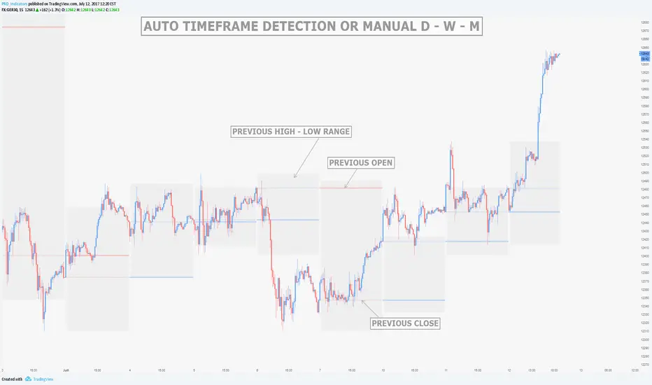
MTF Previous Open/Close/RangeThis indicator will simply plot on your chart the Daily/Weekly/Monthly previous candle levels.
The "Auto" mode will allow automatic adjustment of timeframe displayed according to your chart.
Otherwise you can select manually.
Indicator plots the open/close and colors the high-low range area in the background.
Hope this simple indicator will help you !
You can check my indicators via my TradingView's Profile : @PRO_Indicators