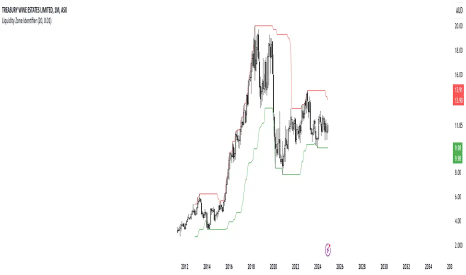
RShar Liquidity Zone Identifier Description of the Liquidity Zone Identifier Indicator
The **Liquidity Zone Identifier** is a TradingView indicator designed to highlight key liquidity zones on a price chart. Liquidity zones represent areas where the price is likely to encounter significant resistance or support, making them critical for technical analysis and trading decisions.
Key Features:
1. **Dynamic Resistance and Support Levels**:
- The indicator calculates the highest high and lowest low over a user-defined period (`length`) to identify potential resistance and support levels.
- Sensitivity can be adjusted using the `zoneSensitivity` parameter, which defines a percentage buffer around these levels to expand the zones.
2. **Visual Representation**:
- Resistance zones are highlighted in **red**, indicating areas where the price may face selling pressure.
- Support zones are highlighted in **green**, representing areas where the price may find buying interest.
- The zones are displayed as shaded regions using the `fill` function, making them visually distinct and easy to interpret.
3. **Customizable Inputs**:
- **Zone Length** (`length`): Determines the number of candles considered for calculating highs and lows.
- **Zone Sensitivity** (`zoneSensitivity`): Sets the percentage margin around the calculated levels to define the liquidity zones.
- **Zone Colors**: Users can customize the colors for resistance and support zones to suit their preferences.
- **Toggle Fill**: The `showFill` option allows users to enable or disable shaded zone visualization.
4. **Alerts for Trading Opportunities**:
- Alerts are triggered when:
- The price enters the **resistance zone** (current high is greater than or equal to the resistance zone).
- The price enters the **support zone** (current low is less than or equal to the support zone).
- These alerts help traders stay informed of critical market movements without constantly monitoring the chart.
#### How It Works:
1. **Calculation of Zones**:
- The highest high and lowest low over the specified `length` are calculated to define the primary levels.
- A buffer zone is added around these levels based on the `zoneSensitivity` percentage, creating a margin of interaction for price movements.
2. **Plotting the Zones**:
- The top and bottom boundaries of the resistance and support zones are plotted as lines.
- The area between these boundaries is shaded using the `fill` function to enhance visualization.
3. **Alerts for Key Events**:
- Traders are notified when price action interacts with the zones, enabling quick decision-making.
#### Use Case:
The Liquidity Zone Identifier is ideal for:
- Identifying areas of potential price reversal or consolidation.
- Spotting high-probability trading setups near resistance and support zones.
- Complementing other technical indicators in a trading strategy.
By effectively highlighting critical price levels, this indicator provides traders with a powerful tool to navigate the markets with greater precision.
Komut dosyalarını "liquidity" için ara
M2 Global Liquidity Index
The M2 Global Liquidity Index calculates a composite index reflecting the aggregate liquidity provided by the M2 money supply of five major currencies: Chinese Yuan (CNY), US Dollar (USD), Euro (EUR), Japanese Yen (JPY), and British Pound (GBP). The M2 money supply includes cash, checking deposits, and easily convertible near money. By incorporating exchange rates (CNY/USD, EUR/USD, JPY/USD, GBP/USD), the script adjusts each country's M2 supply to a common base (USD) and sums them up to produce a global liquidity metric. This metric, plotted on a daily timeframe, provides an overview of the total liquidity available in these five significant economies.
Understanding the M2 money supply is crucial for assessing liquidity because it represents the amount of money readily available in an economy for spending and investment. Higher M2 levels generally indicate more liquidity, suggesting easier access to capital for businesses and consumers, potentially leading to economic growth. Conversely, lower M2 levels can signify tighter liquidity conditions, possibly resulting in constrained spending and investment.

Unmitigated Liquidity Imbalances [AlgoAlpha]🎉 Introducing the Unmitigated Liquidity Imbalance Indicator by AlgoAlpha! 🎉
Dive into the depths of market analytics with our "Unmitigated Liquidity Imbalance" indicator. This tool harnesses unique algorithms to detect liquidity imbalances between bulls and bears, helping traders spot trends and potential entry and exit points with greater accuracy. 📈🚀
🔍 Key Features:
🌟 Advanced Analysis : Analyses candle direction and length to forecast market peaks and valleys.
🎨 Customizable Visuals : Tailor the chart with your choice of bullish green or bearish red to reflect different market conditions.
🔄 Real-Time Updates : Continuously updates to reflect live market changes.
🔔 Configurable Alerts : Set up alerts for key trading signals such as bullish and bearish reversals, as well as trend shifts.
📐 How to Use:
🛠 Add the Indicator : Add the indicator to your favourites and customize the settings to suite your needs.
📊 Market Analysis : Monitor the oscillator threshold; readings above 0.5 suggest bullish sentiment, while below 0.5 indicate bearish conditions. And reversal signals are displayed to show potential entry points.
🔔 Set Alerts : Enable notifications for reversal conditions or trend changes to seize trading opportunities without constant chart watching.
🧠 How It Works:
The core mechanism of the indicator is based on detecting changes in candlestick size and direction to identify bullish and bearish liquidity levels from the peak & valley indicator's logic. By comparing the length of a current candle to the previous one and checking the change in direction, it pinpoints moments where market sentiment could be shifting, indicating if the liquidity at that point is bullish or bearish. The script then looks at what percentage of the past few unmitigated levels are bullish or bearish based on a customizable lookback and determines the liquidity imbalance which can then be interpreted as trend.
Empower your trading with the Unmitigated Liquidity Imbalance indicator and navigate the markets with confidence and precision. 🌟💹
Happy trading, and may your charts be ever in your favour! 🥳✨
💎 Related Indicator

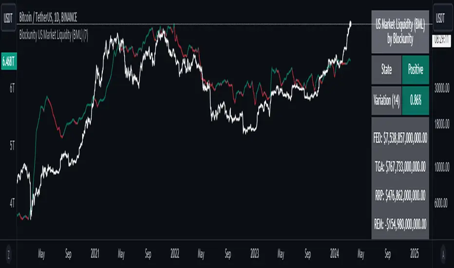
Blockunity US Market Liquidity (BML)Get a clear view of US market liquidity and monitor its status at a glance to anticipate movements on risky assets.
The Idea
The BML aggregates and analyzes total USD market liquidity in trillions of dollars. It is used to monitor the liquidity of the USD market. When liquidity is good, all is well. If liquidity is low, the US will maneuver and sell treasury bills (debt) to replenish its treasury, which can lead to bearish pressure on markets, particularly those considered risky, such as Bitcoin.
How to Use
The indicator is very easy to use, there's nothing special about it. This tool is mainly intended to be used as fundamental information, and not for active trading.
Elements
The US Market Liquidity has several distinct components:
FED Balance Sheet
The Fed credits member banks’ Fed accounts with money, and in return, banks sell the Fed US Treasuries and/or US Mortgage-Backed Securities. This is how the Fed “prints” money to juice the financial system.
US Treasury General Account
The US Treasury General Account (TGA) balances with the NY Fed. When it decreases, it means the US Treasury is injecting money into the economy directly and creating activity. When it increases, it means the US Treasury is saving money and not stimulating economic activity. The TGA also increases when the Treasury sells bonds. This action removes liquidity from the market as buyers must pay for their bonds with dollars.
Overnight Reverse Repurchase Agreements
A reverse repurchase agreement (known as Reverse Repo or RRP) is a transaction in which the New York Fed under the authorization and direction of the Federal Open Market Committee sells a security to an eligible counterparty with an agreement to repurchase that same security at a specified price at a specific time in the future.
Earnings Remittances Due to the Treasury
The Federal Reserve Banks remit residual net earnings to the US Treasury after providing for the costs of operations, payment of dividends, and the amount necessary to maintain each Federal Reserve Bank’s allotted surplus cap. Positive amounts represent the estimated weekly remittances due to the US Treasury. Negative amounts represent the cumulative deferred asset position, which is incurred during a period when earnings are not sufficient to provide for the cost of operations, payment of dividends, and maintaining surplus.
Settings
Several parameters can be defined in the indicator configuration. You can:
Choose the smoothing and timeframe to be used in the plot.
Set the EMA lookback period and display it or not. This affects the color of the main plot.
Set the period to be taken into account when calculating the variation rate in the table.
Select the data to be taken into account in the calculation.
Activate or not the barcolor.
Lastly, you can modify all table parameters.
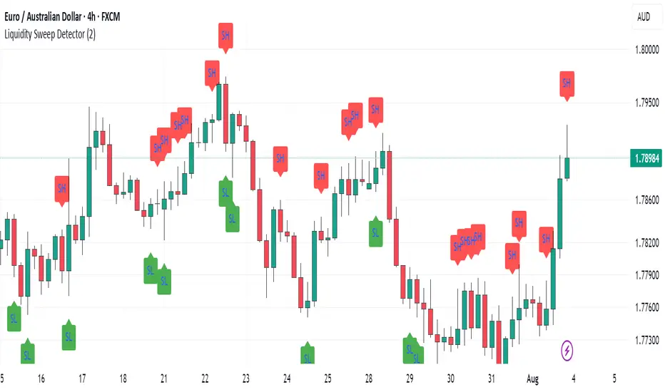
Williams %R Liquidity Sweeps [UAlgo]🔶Description:
The "Williams %R Liquidity Sweeps " designed to identify potential liquidity sweeps based on the Williams %R oscillator. The indicator helps traders spot areas where liquidity may be accumulating or dispersing rapidly, which can signal potential buying or selling opportunities or confluence/confirmation your decisions.
🔶Key Features:
Williams %R Oscillator: The indicator utilizes the Williams %R oscillator, a momentum indicator that measures overbought and oversold levels.
Liquidity Sweep Detection: It identifies liquidity sweeps by detecting pivot highs and lows within the Williams %R oscillator ( Sweeps only occur in Overbought/Oversold zones ).
Customizable Parameters: Traders can adjust various parameters such as oscillator length, overbought/oversold levels, pivot length, and maximum lines to suit their trading preferences.
Visual Representation: Liquidity sweeps are visually represented on the chart with labels and points that waiting for sweep (green and red lines default) are can be used as support and resistance zones. The indicator dynamically manages the display of support and resistance lines. Removing outdated lines to maintain relevance.
Example for Oscillator Liquidity Sweep:
Disclaimer:
This indicator is provided for informational and educational purposes only and should not be considered financial advice. Trading involves risks, and past performance is not indicative of future results. Users are encouraged to conduct their own research and consult with a qualified financial advisor before making any investment decisions based on this indicator.
The effectiveness of the indicator may vary depending on market conditions, trading strategies, and other factors. Traders should exercise caution and practice proper risk management techniques when using this or any other trading tool.

Blockunity Stablecoin Liquidity (BSL)Monitor the liquidity of the crypto market by tracking the capitalizations of the major Stablecoins.
Stablecoin Liquidity (BSL) is an ideal tool for visualizing data on major Stablecoins. The number of Stablecoins in circulation is one of the best indices of liquidity within the crypto market. It’s an important metric to keep an eye on, as an increase in the number of Stablecoins in circulation offers a great opportunity to see cryptoasset prices rise. The tool’s multiple on-board display modes enable analysis of its data in the best possible conditions.
The Idea
The goal is to provide the community with the ideal tool to visualize the liquidity of the crypto market, via the state of the market capitalizations of the major Stablecoins.
How to Use
The tool is very easy to use and interpret. First of all, let's distinguish two main elements:
The chart as 3 distinct display modes to let you observe data in the best possible conditions.
There is a panel that summarizes the market capitalizations of the main Stablecoins.
Display Mode: Cumulative
In Cumulative mode (default), the different capitalizations are displayed one on top of the other with colored bands.
You can see that when the number of Stablecoins in circulation increases, crypto asset prices enter an uptrend. And if the liquidity of Stablecoins dries up, the trend will become bearish.
Display Mode: Aggregated
Aggregated mode displays a single line, which is the sum of the different capitalizations, varying between green and red depending on the state of this data according to its moving average declared in the 'Aggregated MA Lengh' field.
You can thus easily see trend changes and therefore opportunities to enter or exit the crypto market.
Display Mode: Independent
The Independent mode also displays the different capitalizations, but detached from each other with labels.
This display mode is particularly interesting for studying transfers from one Stablecoin to another, as can be seen below.
Other Settings
You can choose whether or not to include each of the Stablecoins data, and configure their display color. Note that in 'Cumulative' display mode, the data is taken into account even if the box is unchecked.
How it Works
The tool works in a simple way: We take the market capitalization data of the Stablecoins that interest us, then we process them according to the different display modes.
Let us know if you would like other ways of visualizing this data!

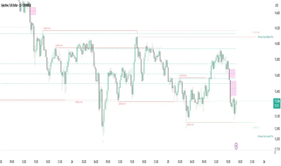
Strong Demands & Supplies + Liquidity | Zonas de Compra e VendaThis indicator is inspired on the Smart Money Concepts indicator (Credits to @LuxAlgo) and it was optimized to show only the most relevant demand and supply zones (premium) on every time frame - but on higher time frames (1H and above) the zones are more relevant and stronger, meaning these zones can handle the price for longer time.
I've added a new feature that includes the Liquidity lines in order to add more confluence and importance to a demand or supply zone: when a demand or supply zone has strong liquidity (like weekly or monthly) next to it means that zone can be a strongest price target.
- Blue Line: Daily liquidity
- Yellow Line: Weekly Liquidity
- Purple Line: Monthly Liquidity
Main Features:
- Displays the most relevant demand and supply zones (green and red boxes) and which ones are strong and weak
- Displays the relevant change of character and break of structure
- Displays the previous day highest price and previous day lowest price
- Display imbalances between sell and buy orders (purple boxes)
- Displays the liquidity areas with lines on each point.
- It works for Forex and Cryptocurrency as well.
Portuguese:
Este indicador é inspirado no Smart Money Concepts (Créditos para @LuxAlgo) e foi otimizado para mostrar apenas as zonas de procura e oferta mais relevantes em cada time frame - mas em time frames maiores as zonas são mais relevantes e mais fortes.
Adicionei uma nova funcionalidade que inclui as linhas de Liquidez de forma a adicionar mais confluência e importância a uma zona de procura ou oferta: quando uma zona de procura ou oferta tem forte liquidez (como semanal/linha amarela ou mensal/linha roxa) junto a ela significa que aquela zona pode ser um alvo de preço mais forte.
- Linha Azul: Liquidez diária
- Linha Amarela: Liquidez Semanal
- Linha Roxa: Liquidez Mensal
Principais características:
- Exibe as zonas de procura e oferta mais relevantes (zonas a verde e zonas a vermelho) e quais delas são fortes e fracas
- Exibe a mudança relevante de caráter e quebra de estrutura
- Exibe o preço mais alto do dia anterior e o preço mais baixo do dia anterior
- Exibe as imbalances entre as ordens de venda e compra (zonas a roxo)
- Exibe as zonas de maior liquidez através de linhas no gráfico
- Funciona tanto para Forex como para Criptomoedas
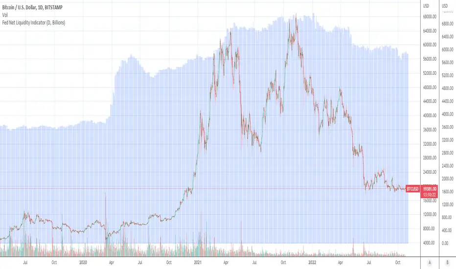
Fed Net Liquidity Indicator (24-Oct-2022 update)This indicator is an implementation of the USD Liquidity Index originally proposed by Arthur Hayes based on the initial implementation of jlb05013, kudos to him!
I have incorporated subsequent additions (Standing Repo Facility and Central Bank Liquidity Swaps lines) and dealt with some recent changes in reporting units from TradingView.
This is a macro indicator that aims at tracking how much USD liquidity is available to chase financial assets:
- When the FED is expanding liquidity, financial asset prices tend to increase
- When the FED is contracting liquidity, financial asset prices tend to decrease
Here is the current calculation:
Net Liquidity =
(+) The Fed’s Balance Sheet (FRED:WALCL)
(-) NY Fed Total Amount of Accepted Reverse Repo Bids (FRED:RRPONTTLD)
(-) US Treasury General Account Balance Held at NY Fed (FRED:WTREGEN)
(+) NY Fed - Standing Repo Facility (FRED:RPONTSYD)
(+) NY Fed - Central Bank Liquidity Swaps (FRED:SWPT)
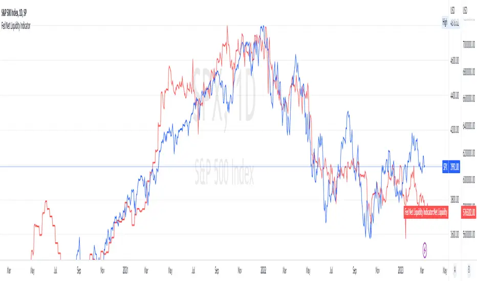
Fed Net Liquidity Indicator v2Updated script for jlb05013's original Fed Net Liquidity Indicator. TradingView was bringing in the FRED data in different units than they used to. This code fixes it.
This indicator aims to present a "Net Liquidity" indicator comprised of the Fed Balance sheet , less the TGA account and Overnight Reverse REPO agreements.
Net Liquidity = Fed Balance Sheet - ( TGA + Reverse REPO)
This is an overlay that can be added to stock or other charts (like SPY ) to see how the market may appear correlated to Net Liquidity - injection of liquidity into the markets.
This was hypothesized by Max Anderson, this is just a script realizing that posting.
New updates include a resolution feature, and an option to offset backwards by 2 days per original intent.

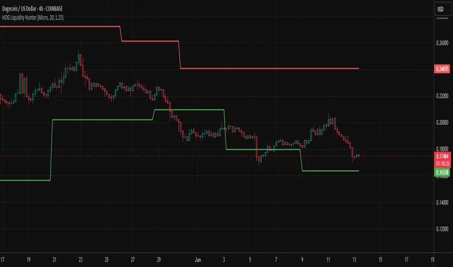
HOG Liquidity HunterHOG Liquidity Hunter – Pivot‑Based Liquidity Zones
📌 Overview
Plots dynamic support and resistance zones on swing pivots with an ATR‑based buffer. Anchored only when pivots are confirmed, the zones stay close to current price levels—ideal for spotting liquidity runs or traps.
🔧 How It Works
Detects swing highs and lows using ta.pivothigh() / ta.pivotlow() with a user‑defined lookback.
After a pivot is confirmed, calculates BSL/SSL zone = pivot ± (ATR * margin).
Zones update only on confirmed pivots—no repainting on open bars.
⚙️ Inputs
Lookback: bars to confirm pivots (e.g. 10–20).
ATR Margin Multiplier: buffer width (e.g. 1.25).
✅ Benefits
Structure‑focused: Zones align with real swing points.
Responsive yet stable: Tight ATR margin keeps zones precise, only updating on valid pivots.
Clean visuals: Two uncluttered zones—easy to interpret.
🛠 How to Use
Detect near‑zone bounce entries or exits on 4H/1D charts.
Combine with trend or volume indicators for stronger setups.
Use zones to identify potential stop‑run, liquidity re‑tests, or range turns.
⚠️ Notes & Disclaimers
Zones base off historical pivots; may lag until confirmed.
No future-looking data—relying entirely on closing bar confirmation.
Use alongside a complete trading framework; this is not a standalone signal.
Excess Liquidity IndicatorExcess Liquidity Indicator
This script visualizes excess liquidity trends in relation to risk assets. It estimates excess liquidity by combining various macroeconomic factors such as WW M2 money supply, central bank balance sheets, and interest rates, oil, and the dollar index, and it substracts WW GDP. The tool helps traders analyze liquidity-driven market trends in a structured manner.
Note: This script is for research purposes only and does not provide financial advice.
I cannot point names cause I get banned but work is inspired by others...

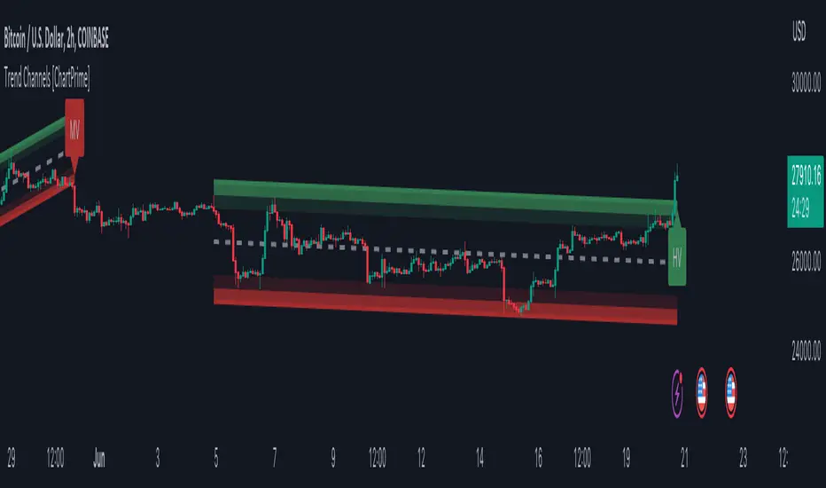
Trend Channels With Liquidity Breaks [ChartPrime]Trend Channels
This simple trading indicator is designed to quickly identify and visualize support and resistance channels in any market. The primary purpose of the Trend Channels with Liquidity Breaks indicator is to recognize and visualize the dominant trend in a more intuitive and user-friendly manner.
Main Features
Automatically identifies and plots channels based on pivot highs and lows
Option to extend the channel lines
Display breaks of the channels where liquidity is deemed high
Inclusion of volume data within the channel bands (optional)
Market-friendly and customizable colors and settings for easy visual identification
Settings
Length: Adjust the length and lookback of the channels
Show Last Channel: Only shows the last channel
Volume BG: Shade the zones according to the volume detected
How to Interpret
Trend Channels with Liquidity Breaks indicator uses a combination of pivot highs and pivot lows to create support and resistance zones, helping traders to identify potential breakouts, reversals or continuations of a trend.
These support and resistance zones are visualized as upper and lower channel lines, with a dashed center line representing the midpoint of the channel. The indicator also allows you to see the volume data within the channel bands if you choose to enable this functionality. High volume zones can potentially signal strong buying or selling pressure, which may lead to potential breakouts or trend confirmations.
To make the channels more market-friendly and visually appealing, Trend Channels indicator also offers customizable colors for upper and lower lines, as well as the possibility to extend the line lengths for further analysis.
The indicator displays breaks of key levels in the market with higher volume.
Fed Net Liquidity IndicatorThis indicator aims to present a "Net Liquidity" indicator comprised of the Fed Balance sheet , less the TGA account and Overnight Reverse REPO agreements.
Net Liquidity = Fed Balance Sheet - ( TGA + Reverse REPO)
This is an overlay that can be added to stock or other charts (like SPY ) to see how the market may appear correlated to Net Liquidity - injection of liquidity into the markets.
This was hypothesized by Max Anderson, this is just a script realizing that posting.
New updates include a resolution feature, and an option to offset backwards by 2 days per original intent.
Liquidity Grab Entry Signals [Daily Enhanced]Liquidity Grab Entry Signals is a powerful tool designed to detect intraday reversal opportunities around daily high/low liquidity zones.
Core features: – Plots current daily high/low levels
– Identifies price interaction with these key zones
– Confirms rejection via strong engulfing candles
– Plots real-time long/short entry signals directly on chart
– Includes alerts for both long and short setups
This script is ideal for scalpers and intraday traders looking to exploit stop hunts, liquidity sweeps, and false breakouts.
Optimized for instruments like US30, NAS100, Gold, BTC and more.
Customize the sensitivity buffer to suit your asset and timeframe.
Use this in combination with VWAP, FVG or Smart Money concepts for enhanced confirmation.
---
Built for: 1s–15m charts
Includes: Alerts + Custom Settings
Type: Non-repainting
Trade with clarity around the most manipulated price levels of the day.

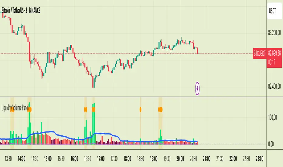
Liquidity Volume Panel Liquidity Volume Panel – Precision Tool for Scalpers & Intraday Traders
This panel is designed to help traders quickly identify volume-driven moves, liquidity events, and fair-value zones. It combines classic volume analysis with enhanced tools like RVOL and VWAP deviation bands, making it ideal for scalping, momentum trading, and intraday strategies.
🔍 Included Features:
✅ Relative Volume (RVOL) Indicator
Displays current volume in relation to its 20-period average – excellent for spotting low-activity zones or high-pressure breakouts.
✅ Dynamic Volume Coloring & Spike Detection
Color-coded volume logic highlights normal, strong, and extremely high volume, with visual markers for volume spikes (>200% of average).
✅ VWAP with ±1σ & ±2σ Bands
Industry-standard deviation bands show overbought/oversold conditions and dynamic support/resistance based on volume-weighted pricing.
✅ Background Highlighting
Subtle orange background alerts you when volume surges beyond extreme levels – making liquidity clusters instantly recognizable.
Usage:
Use this panel as a decision-making tool for entries, reversals, or breakouts – especially in fast-moving markets.
Best used on lower timeframes for precision scalping.
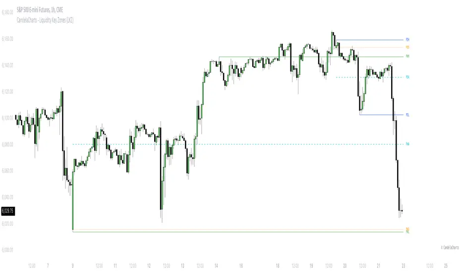
CandelaCharts - Liquidity Key Zones (LKZ)📝 Overview
The Liquidity Key Zones indicator displays the previous high and low levels for daily, weekly, monthly, quarterly, and yearly timeframes. These levels serve as crucial price zones for trading any market or instrument. They are also high-probability reaction zones, ideal for trading using straightforward confirmation patterns.
Each of these levels plays a significant role in determining whether the market continues its momentum or reverses its bias. I like to think of these levels as dual magnets—they simultaneously attract and repel price. You might wonder how having opposing views can be useful. The key is to remain neutral about direction and establish your own rules to identify when these zones are likely to attract or repel price. I have my own set of rules, and you can develop yours.
📦 Features
MTF
Styling
⚙️ Settings
Day: Shows previous day levels
Week: Shows previous week levels
Month: Shows previous month levels
Quarter: Shows previous quarter levels
Year: Shows previous year levels
Show Average: Shows previous level average price
Show Open: Shows previous level open price
⚡️ Showcase
Daily
Weekly
Monthly
Quarterly
Yearly
Average
Open
📒 Usage
When the price breaks through a significant level, such as a daily, weekly, or monthly high or low, it often signals a potential reversal in market direction. This occurs because these levels represent key areas of support or resistance, where traders anticipate heightened activity, including profit-taking, stop-loss orders, or new positions being initiated.
Once the price breaches these levels, it may trigger a sharp reaction as market participants adjust their strategies, leading to a reversal. Monitoring price action and volume around these levels can provide valuable confirmation of such reversals.
Another effective approach to utilizing these pivot points is by incorporating them into a structured trading strategy, such as the X Model, which leverages multiple timeframes and technical tools to refine trade entries and exits.
X Model conditions:
(D1) Previous Day High (ERL)
(H1) Bullish FVG/IFVG/OB (IRL)
(m15) MSS / SMT
Only Short Above 00:00
By combining these elements, the X Model offers a comprehensive framework for leveraging pivot levels effectively, emphasizing confluence between liquidity zones, time-based rules, and multi-timeframe analysis to enhance trading accuracy and consistency.
🚨 Alerts
This script provides alert options for all signals.
Bearish Signal
A bearish signal is generated when the price breaks below the previous low level.
Bullish Signal
A bullish signal is generated when the price breaks above the previous low level.
⚠️ Disclaimer
Trading involves significant risk, and many participants may incur losses. The content on this site is not intended as financial advice and should not be interpreted as such. Decisions to buy, sell, hold, or trade securities, commodities, or other financial instruments carry inherent risks and are best made with guidance from qualified financial professionals. Past performance is not indicative of future results.
Liquidity ZonesLiquidity Zones Indicator
The Liquidity Zones indicator is a custom Pine Script™ tool designed to identify significant price levels where high trading volume has occurred. These zones often act as support or resistance levels, providing valuable insights for traders.
Key Features:
Window Size: The number of bars to consider for calculating the moving averages and identifying peaks.
Tolerance: The allowable percentage difference to consider peaks as unique.
Number of Peaks: The maximum number of significant peaks to identify.
Minimum Volume: The minimum volume threshold relative to the average volume to consider a peak.
Minimum Range: The minimum price range to consider a peak.
How It Works:
Input Parameters: The user can customize the window size, tolerance, number of peaks, minimum volume, and minimum range.
Moving Averages: The script calculates the simple moving average (SMA) of the volume and closing prices over the specified window.
Peak Identification:
For each bar, the script identifies the bar with the highest volume within the window.
It checks if the volume exceeds the minimum volume threshold.
It determines the peak price based on whether the bar closed higher or lower than it opened.
It ensures the price range of the bar exceeds the minimum range.
It checks if the peak is above the SMA of the closing prices.
It verifies the peak is unique within the specified tolerance.
Plotting Peaks: The identified peaks are plotted on the chart with lines and labels, color-coded based on whether the bar closed higher (green) or lower (red).
This indicator helps traders visualize key liquidity zones, aiding in making informed trading decisions.
Session LiquidityThe “Session Liquidity” TradingView indicator by Infinity Trading creates dynamic horizontal lines at the high and low points of a specified time span within the trading day. This indicator gives the user control of three separate time spans so the user can dynamically see the highs and lows of their favorite daily time spans.
Purpose
This indicator is similar to my TradingView indicator “Futures Exchange Sessions 3.0”. In that indicator the user gets control of dynamic price boxes. For me, these boxes made it difficult to spot ICT’s Orderblocks. So instead of boxes I made independently controllable lines and now I can spot ICT Orderblocks and easily identify Liquidity Pools.
Inputs and Style
Everything about the three dynamic lines can but independently configured. Start & End Times, Line Color, Line Style, Line Width, Text Characters, Text Size, Text Color can all be adjusted. The high and low lines as well as their text labels can be individually toggled on or off for maximum control.
Timezone
All of the start and end times are in EST. Additionally, each time span line needs a specific start of each day. This is controlled by a setting called “Line Start Day Timezone” where the user sets a timezone that corresponds with the start time. In general if a timespan resides within a particular Session pick the corresponding timezone. If the users line fits in the Asian Session then choose Asia/Shanghai. If the line is within the London Session then choose Europe/London. And the same goes for the New York Session.
Special Notes
If the Line Start Time is within one candle of the Start Day Timezone in the Settings, then the line/box won’t display. So choose the previous timezone
Lines only display when the timeframe is <= 30 minute
Gallery

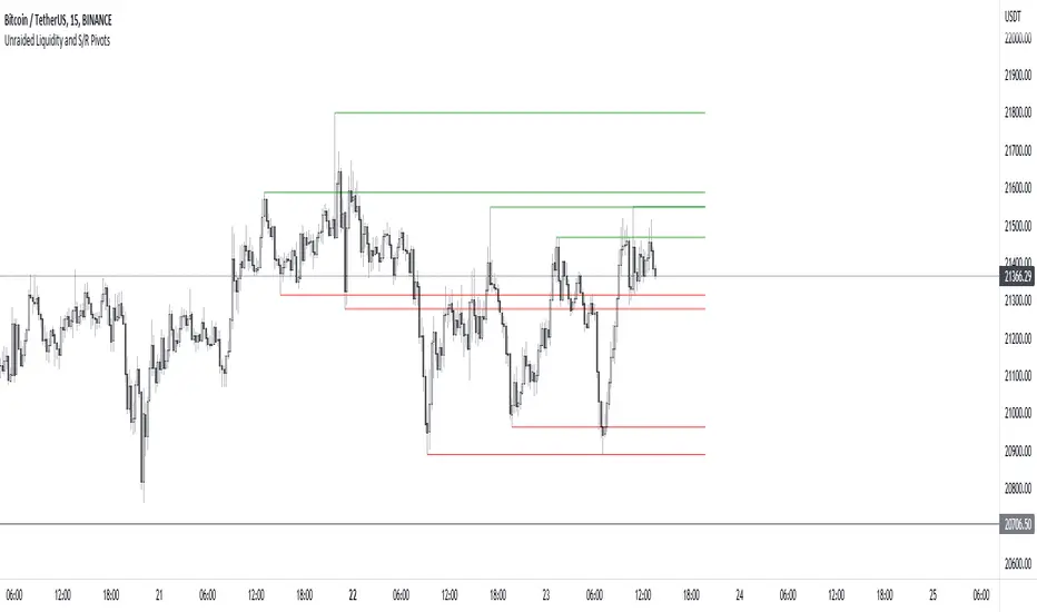
Unraided Liquidity and S/R PivotsThis indicator is designed to show key pivot points, also known as levels, which could provide good trade entries.
Utilising liquidity concepts, untested pivot levels can be a good place to enter a trade after the pivot is tested, liquidity is taken and the direction reverses.
Alternatively, utilising the option of viewing already tested levels, you can easily see the key support and resistance areas that price is likely to have a strong reaction to, whether it wants to go toward or bounce away from these levels.
The indicator does not give buy and sell signals, it is up to you to use the levels to form your trading plan.
Oorah.
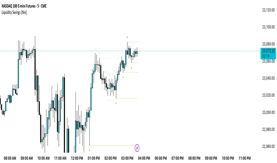
Liquidity Swings [Nix]Liquidity Swings Indicator!
It marks recent swing highs and lows on the chart using lines and labels.
Another great feature is that it tracks whether those swing levels are SWEPT (price crosses them again) and either:
Removes swept levels, or
Fades them to indicate they’ve been taken.
You can customize:
Number of swings shown.
Colors, styles, and visibility of lines/labels.
Whether to show highs, lows, or both.
Useful for liquidity analysis.
Usually when these special swings are swept, you can consider moving stops to BE. This is because there should be enough stop losses at the swing points to liquidate others and give more fuel to your trade direction!
GLOBAL LIQUIDITY (Simple Proxy)I know there are many global liquidity indicators out there similar to this one.
This one just adds a little bit of more options for visualize different central banks and either stack data, see year over year changes, or visualize separate unstacked data.

Swing Levels and Liquidity - By LeviathanThis script will plot pivot points (swing highs and lows) in the form of lines, boxes or labels to help you identify market structure, “liquidity” areas, swing failure patterns, etc. You are also able to see the volume traded at each pivot point, which will help you compare their significance.
Bars Left-Right
A pivot high (swing high) is a bar in a series of bars that has a higher value than the bars around it and a pivot low (swing low) is a bar in a series of bars that has a lower value than the bars surrounding it. The Bars Left and Bars Right parameters are used to define the number of bars on the left and right sides of a pivot point that the function should consider when identifying pivot highs and lows in a time series. For example, if Bars Left is set to 5 and Bars Right is set to 6, the function will look for a pivot point by comparing the value of the current bar with the values of the 5 bars to its left and the 6 bars to its right. If the value of the current bar is higher than all of these bars, it is considered a pivot high point. These parameter can be used to adjust the sensitivity of the script (lowering the Bars Left and Bars Right parameters will give you more swing points and increasing the Bars Left and Bars Right parameters will give you fewer swing points).
”Show Boxes” - This will draw a box above the swing high and a box below the swing low to help you visualise a large area of interest around swing points. Additional box types and the width of the box can be adjusted in Appearance settings below.
”Show Lines” - This will draw a horizontal line at the level of each swing high and swing low.
”Show Labels” - This will plot a circle at the high point of each swing high and at the low point of each swing low.
”Show Volume” - This will display the amount of volume traded in a given swing point candle. It can help you identify the significance of a given swing point by comparing it to the volumes of other swing points.
”Extend Until Filled” - This will extend the swing point levels until they are mitigated by the price. Turning it off will continue plotting the levels just a few more bars after a swing point occurs.
”Appearance” - You can show/hide swing points, choose the colors of labels, lines and boxes, choose the size and positioning of the text, choose line and box appearance (adjust the Box Width when switching between timeframes!) and more.
More updates coming soon (MTF, more data…)