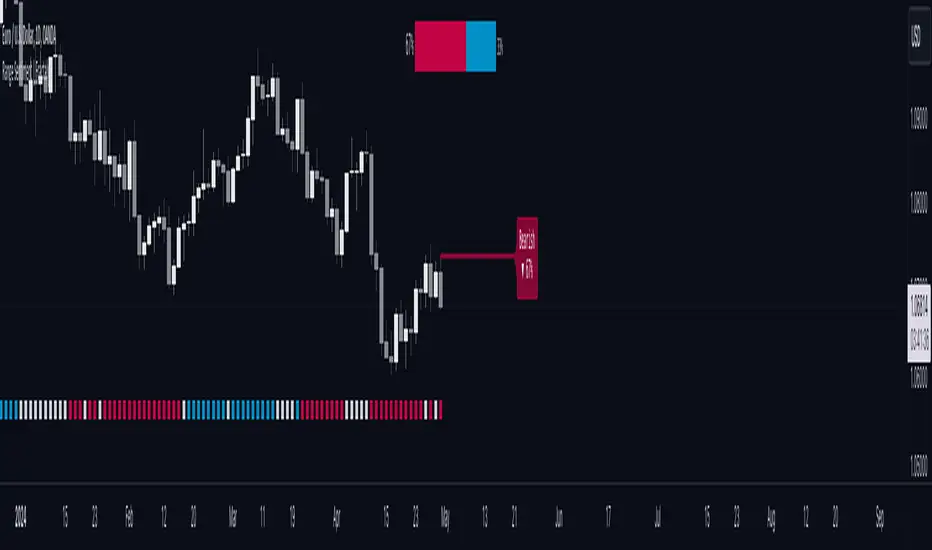
Force Index with Fast Turtle and StochasticBull and Bear force/power indicator with price action signal at Oversold or Overbought Area.
GREEN Bar indicates Bull is in control
RED Bar indicates Bear is in control.
LENGTH of the bar indicate the strength of Bull or Bear.
Example of BUY
Usage#1 :
Potential BUY if the RED bar turned GREEN. (Best to Long if RED turn GREEN happen at Support)
Potential SELL if the GREEN bar turned RED.
Usage#2 :
Potential BUY if the RED bar turned BLUE (above 0) with BoD signal appears. (BEST Buy On Dip strategy)
Potential RISK BUY if the RED bar turned BLUE (below 0) with BoD signal appears (RISKY Buy on Dip where price might not have enough strength to move up)
Komut dosyalarını "bear" için ara
Elder impulse system with double exponential moving average dema
This version of impulse uses the double exponential moving average instead of the typical ema both to calculate macd and the moving slow and fast moving average that are plotted.
The impulse system :
The Impulse System combines two simple but powerful indicators.
One measures market inertia, the other its momentum. When both
point in the same direction, they identify an impulse worth following.
We get an entry signal when both indicators get in gear.
The Impulse System uses an exponential moving average to find
uptrends and downtrends. When the EMA rises, it shows that inertia
favors the bulls. When EMA falls, inertia works for the bears. The sec-
ond component is MACD-Histogram, an oscillator whose slope reflects
changes of power among bulls or bears. When MACD-Histogram rises,
it shows that bulls are becoming stronger. When it falls, it shows that
bears are growing stronger.
The Impulse System flags those bars where both the inertia and the
momentum point in the same direction. When both the EMA and
MACD-Histogram rise, they show that bulls are roaring and the uptrend
is accelerating.
MACD Zero lag impulse systemThis version of impulse uses the double exponential moving average instead of the typical ema.
The impulse system :
The Impulse System combines two simple but powerful indicators.
One measures market inertia, the other its momentum. When both
point in the same direction, they identify an impulse worth following.
We get an entry signal when both indicators get in gear.
The Impulse System uses an exponential moving average to find
uptrends and downtrends. When the EMA rises, it shows that inertia
favors the bulls. When EMA falls, inertia works for the bears. The sec-
ond component is MACD-Histogram, an oscillator whose slope reflects
changes of power among bulls or bears. When MACD-Histogram rises,
it shows that bulls are becoming stronger. When it falls, it shows that
bears are growing stronger.
The Impulse System flags those bars where both the inertia and the
momentum point in the same direction. When both the EMA and
MACD-Histogram rise, they show that bulls are roaring and the uptrend
is accelerating.
Elder impulse system with barcolor + Safezone stops + emasThe impulse system :
The Impulse System combines two simple but powerful indicators.
One measures market inertia, the other its momentum. When both
point in the same direction, they identify an impulse worth following.
We get an entry signal when both indicators get in gear.
The Impulse System uses an exponential moving average to find
uptrends and downtrends. When the EMA rises, it shows that inertia
favors the bulls. When EMA falls, inertia works for the bears. The sec-
ond component is MACD-Histogram, an oscillator whose slope reflects
changes of power among bulls or bears. When MACD-Histogram rises,
it shows that bulls are becoming stronger. When it falls, it shows that
bears are growing stronger.
The Impulse System flags those bars where both the inertia and the
momentum point in the same direction. When both the EMA and
MACD-Histogram rise, they show that bulls are roaring and the uptrend
is accelerating.
The SafeZone Stop :
Once in a trade, where should you put your stop? This is one of the
hardest questions in technical analysis. After answering it, you’ll face
an even harder one—when and where to move that stop with the pas-
sage of time. Put a stop too close and it’ll get whacked by some mean-
ingless intraday swing. Put it too far, and you’ll have very skimpy
protection.
The Parabolic System, described in Trading for a Living, tried to
tackle this problem by moving stops closer to the market each day,
accelerating whenever a stock or a commodity reached a new extreme.
The trouble with Parabolic was that it kept moving even if the market
stayed flat and often got hit by meaningless noise.
SafeZone trails prices with stops tight enough to protect
capital but remote enough to keep clear of most random fluctuations.
Engineers design filters to suppress noise and allow the signal to come
through. If the trend is the signal, then the countertrend motion is the
noise. When the trend is up, we can define noise as that part of each
day’s range that protrudes below the previous day’s low. When the trend
is down, we can define noise as that part of each day’s range that pro-
trudes above the previous day’s high. SafeZone measures market noise
and places stops at a multiple of noise level away from the market.
We can make our lookback period 100 days or so if we want to aver-
age long-term market behavior.
SafeZone offers an original approach to placing stops. It monitors
changes in prices and adapts stops to the current levels of activity. It
places stops at individually tailored distances rather than at obvious
support and resistance levels.
TradePro BTradePro B is a combination of a momentum oscillator, a signal filter, and a volume indicator that give a total of 6 indications, 3 bullish, and 3 bearish.
It works great for finding the highest peaks, and lowest valleys of a markets volatility, as well as price traps.
The Gray and White Waves show the Momentum Oscillator which plots bullish and bearish momentum.
The Blue Waves representing the Volume Indicator, measures the positive and negative change in volume of a security over a longer-period of time,
and is a handy tool to spot divergences.
TradePro B plots visual signals for easy identification of trends. The Volume Indicator plots a Green Dot for a longer-term positive change in volume,
and a Red Dot for a longer-term negative change in volume. It also plots a Green Diamond to mark the possible end to a bearish rally, and a Red Diamond
for a possible bullish rally end, as well as Green and Red Flags for bull traps and bear traps.
A custom algorithm filters the noise, creating color coded signals that are a bright Red and Green for a stronger signal, and a faded Red and Green for a weaker signal,
giving traders an edge in identifying the momentum strength of the surrounding candles.
TradePro B is the second part of the TradePro package. Use it with TradePro B to create Trade-Hands, much like Poker-Hands, and find the perfect entry best used for
scalping and day-trading.
For more information, visit the TradePro Discord.
Link to Discord: discord.gg
TradePro ATradePro A is a combination of 9 different EMAs, two momentum indicators, and two oscillators. This combination gives off 12 indications, 6 bullish and 6 bearish.
The indicators and signals they output are as follows..
1) 9 Different Exponential Moving Averages (EMA's) plots the Golden and Death Crosses as well as the Bull and Bear Crosses
2) MACD plots a - sign to indicate Bullish and Bearish crosses.
3) Stochastic RSI plots a down triangle and up triangle to indicate an overbought or oversold RSI value.
4) The Money Flow Indicator plots a $ sign for a positive or negative flow of money into and out of a security over a shorter period of time.
5) The Momentum Trend Indicator is used to plot Bull Flags and Bear Flags, which hints at a trend direction.
Using TradePro A does not work well unless used with TradePro B. Together, this indicator pair calls every top and every bottom, and is a powerful tool for scalping and day-trading.
For more information, visit the TradePro Discord.
Link to Discord: discord.gg
DBT MoMo v.4DBT MOMO
Introduction: The MoMo is a TradingView indicator designed to evaluate momentum and give the user signals according to momentum shifts, strength, extensions, traps, and divergence. It’s an all in one oscillator that will make reading price action near term and long term much easier.
Part One: Strength
The MoMo consist of two major parts. A 3-candle back formula and a 24-candle back formula. The 3-candle back is called the Price Line (the histogram on the MoMo). The 24-candle back is called the Trend Line (the line on the MoMo). Both lines are placed into a range from 20 to -20. It can go higher than 20 or lower than -20, but this is extremely rare and short lived.
A positive number indicates a bullish bias, a negative number indicates a bearish bias. When the Price or Trend line are ascending while below 0 this indicates that the bearish momentum is weakening. When the Price or Trend line are descending while above 0 this indicates that the bullish momentum is weakening.
In a strong trend the Trend Line will likely flatten out around 15 or -15. While the Trend Line is flat the Price Line will likely shift rapidly, this can lead to bull and bear traps, we will discuss this in the Trap section.
A rare, but powerful signal from the MoMo is when the Price and Trend Lines “pinch” and begin to move in the same direction. If this is happening the trader should be looking to follow the direction of these lines.
Part Two: Extensions
When both Price and Trend Lines are above 10 or below -10 this will begin to signal an extension.
Purple: Indicates the bears are extended to the downside and a pullback or trend reversal upward is likely.
Gold: Indicates the bulls are extended to the upside and a pullback or trend reversal downward is likely.
When only the Trend Line is above 10 the MoMo will shade the upper range red. This indicates the Trend is becoming bullish or entering an extension. If the Trend Line cannot maintain above 10 for long and breaks below 10 this indicates it’s an extension and trend will most likely continue downward.
When only the Trend Line is below -10 the MoMo will shade the upper range green. This indicates the Trend is becoming bearish or entering an extension. If the Trend Line cannot maintain below -10 for long and breaks above -10 this indicates it’s an extension and trend will most likely continue upward.
When the green or purple shading have turned off take the lowest point, this is considered a support level or a local bottom.
When the red or gold shading have turned off take the highest point, this is considered a resistance level or a local top.
The trader can preemptively trade the purple or gold warnings but be warned these warnings can go on for a long time if the trend is very strong. It is the same mentality of an overbought or oversold RSI, except the MoMo extensions have a much higher strike rate.
To avoid preemptively trading these extensions the trader should wait for confirmation on the Price Line and on price action. The Price Line (histogram) should be moving upward during a purple extension to begin showing a bottom. The Price Line (histogram) should be moving downward during the gold extension to begin showing a top.
Part Three: Traps
The relation between the Price Line and Trend Line can create trading signals for bull and bear traps. When the Trend Line is flattened out around 15 or -15, indicating a strong trend is in place, and the Price Line is rapidly moving towards the midline this may indicate a trap is forming.
When the Trend Line is flat around 15 and the Price Line begins moving towards 0, if the Price Line reaches 0 or close to 0 and the Trend Line is still flat, a trap has begone. Once the Price Line shifts from decreasing (red) to increasing (green) the trap is playing out. Therefore, the trader should look to exit short positions or enter long positions.
When the Trend Line is flat around -15 and the Price Line begins moving towards 0, if the Price Line reaches 0 or close to 0 and the Trend Line is still flat, a trap has begone. Once the Price Line shifts from increasing (green) to decreasing (red) the trap is playing out. Therefore, the trader should look to exit long positions or enter short positions.
Part Four: Divergences
The MoMo is exceptional at finding divergences with the Price Line and occasionally the Trend Line.
To find a divergence with the MoMo the trader must look for when the histogram is not following price action completely.
Bullish Divergence: Price makes a lower low, MoMo makes a higher low.
Bearish Divergence: Price makes a higher high, MoMo makes a lower high.
Hidden Bull Divergence: Price makes a higher low, MoMo makes a lower low.
Hidden Bear Divergence: Price makes a lower high, MoMo makes a higher high.
For Access or Questions: Private message us. Thank you.
Absolute Strength MTF IndicatorIntroduction
The non-signal version of the absolute strength indicator from fxcodebase.com requested by ernie76 . This indicator originally from mt4 aim to estimate the bullish/bearish force of the market by using various methods.
The Indicator
Two lines are plotted, a bull line (blue) representing the bullish/buying force and a bear one (red) representing the bearish/selling force, when the bull line is greater than the bear line the market is considered to be strongly bullish, else strongly bearish.
The indicator use various method, Rsi, stochastic, adx. The Rsi method is the one by default.
The stochastic method is less reactive but smoother
The Adx method is way different, while the other two methods make the bull and bear lines somewhat uncorrelated, the adx method focus more on the overall market strength than individual buyer/seller strength.
The smoothing method use 3 different filters, SMA, EMA and LSMA, LSMA is more reactive than the two previous one while EMA is just more computer efficient.
It is possible to use price data of different time frames for the calculation of the indicator.
Stochastic method with 4 hour price close as source.
Conclusion
A classic indicator who can be derived into a lot of ways using a more adaptive architecture or recursion. Hope you find it a use :)
A big thanks to ernie76 for the request and the support/testing of the indicator
Feel free to pm me for any request.
10/5 Weekly/Daily EMAs with ConfirmationsPlots Daily and Weekly 10 & 5 EMAs (but fully customizable to your own).
In addition to plotting the EMAs it color coordinates trend bias and has cross confirmation signals.
Philosophy and how to read:
I use this indicator when trading strictly on the daily timeframe. I have not tested it on other timeframes.
In my trade system I start with both the monthly and weekly charts to define overall bias.
Here’s the general rule of thumb.
10 EMA is direction (bias) and 5 EMA is price.
If 5EMA is below 10EMA there is a bear bias. If 5EMA is above 10EMA there is a bull bias.
This indicator will plot both the daily and weekly 10 & 5 EMAs.
It will also color code the background based on how these EMAs relate to each other.
Light red typically is just the daily is confirmed bear (typically because it could be either or)
Dark red, both daily and weekly in confirmed bear.
Light green, typically just daily is confirmed bull (typically because it could be either or)
Dark green, both daily and weekly in confirmed bull.
In addition to background highlight there is confirmation crosses.
The daily confirmation cross is default yellow triangle.
Down triangle is 5 crossing the 10 downward.
Up triangle is the 5 crossing the 10 upward.
The weekly confirmation is the same only is aqua color.
Generally, on a color change you want to see one or both confirmation in the direction of the bias change.
If you only want to plot the daily bias in the options unclick the setting: Include Weekly Background Plotting. Unclicking this will remove the background coloring for the weekly bias. This might be helpful if you only want to see the strength of what the weekly timeframe is telling you.
Also, I’m primarily a trend trader but I also do have a reversal system I trade with lower R:R parameters.
A good reversal confirmation signal I’ve noticed is the instrument that you are trading should go through a cycle of light color to dark color.
You could also create alerts with this indicator based on just signals. When the signal fires the value will be 1.
Future Updates:
I want to find some way to correlate the distance between these EMAs to enhance the signal. Also to include a velocity component. Plus a few more things.
If you like this indicator please like and leave a comment down below.
Absolute Strength HistogramThe Absolute Strength Histogram
Absolute Strength Histogram is composed of two separate signals - Bulls and Bears. Both signals are plotted on the same graph. By doing so we can see the strength of the buyers and sellers in comparison to one another. When the Bulls Signal is above the Bears Signal, the histogram is blue and the market tends to be trending up (go long). When the Bears Signal is above the Bulls Signal, the Histogram turns red and the market tends to be trending down (go short).
There are two methods for calculation, the RSI and the Stochastic, and both have their merits.
There are also several smoothing algorithms added that you can select from the drop-down. Note that higher smoothing will notify you of trend changes later. Lower smoothing will give you quicker signals at the cost of more errors (false signals or noise).
Happy Trading :)
Extremely Powerful Libra [Eric]This Indicator helps understand the Power shift between Bulls and Bears:
1. The volume is separated into bulls and bears power. For example, when we see a doji, we can check it for more inner information about who actually control the market.
2. The background is a prediction algo that predict the trending direction.
If you guys meet the:
Extremely Powerful Libra (3): Internal server study error
or Loop error,
Just check this button then switch my TF to 5 or bigger, normally 3 works well, but sometime the data is way too much that the server will reject to compile it.
prnt.sc
EdgeAnalysisGroup: Yume Wave 2.0This is a upgraded version of the wave with modified parameters for a higher success rate. 3 New Lengths and 75 more lines of code added to the overall algorithm. Also included are 2 sublevel signals based on the Fib MA and pattern trading.
The Wave:
+ The Yume is the Fast length
+ The Akume is the Slow length
+ The Miaku is a median weighted length
+ The Upper Limit is an overbought asset indication
+ The Lower Limit is an oversold asset indication
+ The Wave is the spread between Yume and Miaku
Bullish Indications:
+ The Yume is above the Akume
+ The Yume is above the Miaku
+ The Yume is below the Lower Limit
Bearish Indications:
+ The Yume is below the Akume
+ The Yume is below the Miaku
+ The Yume is above the Upper Limit
Signal Strength Weights:
+ 50 = Yume Wave crossed a Limit Line
+ 100 = Yume Wave crossed a Limit Line + Close to a Fib Moving Average
+ 100 = Edge's Market Bottom/Top Algorithm is marked 'True'
Setting up Signals (Based on a 100 Signal Height):
+ Set the "Bull Signal" to be at 50 or 100
+ Set the "Bear Signal" to be at 50 or 100
+ 50 is Agressive, 100 is Conservative.
+ Bull/Bear are separate so you can play conservative bull with aggressive bear.
Taintalicious IndicatorThis indicator gathers data from the Weis Wave indicator (thanks to @LazyBear for the original code), and coverts it to something like a VPCI or a Chaikin Oscillator. This indicator is quite versatile. It can be ran with Weis Wave turned on and the Bands + MA turned on together, though I find the scaling becomes an issue. If it is the only indicator you're using, scaling isn't a problem as long as you enlarge it. I prefer to run the Bands + MA + Long MA as one setup, and flip to Weis Wave when I need to see the raw data underneath. You can use this indicator to spot momentum shifts, the strength of bullish or bearish moves, bull/bear divergences, trend reversals, consolidation/squeezes, and even Wyckoff springs. It will take some getting used to though.
Tips for interpretation:
--Bearish/Bearish Divergence: TI diverges from price. TI is making lower highs or higher lows while price is making higher highers or higher lows. You can turn on the setting to highlight some of these divergences, but I find it easier to simply look for them.
--As an Oscillator: TI crossing zero can indicate a shift in momentum. The deeper the initial rise or fall past zero, the stronger the momentum shift.
--Overbought/Oversold: When TI breaches the bands while they are wide--indicating high volatility in the same way Bollinger Bands do--this can be viewed as an overbought or oversold signal. Begin looking for an entry once TI forms a "v" shape, and begins moving back towards the bands. The best entry is typically when TI breaks back into the bands. These breaches are highlighted with either green or red.
--Long MA: This can be used for bull/bear divergence as well as a leading indicator for trend reversals or momentum shifts. TI crossing above or below the Long MA is one signal. Whether the Long MA is above or below zero indicates the market sentiment/trend over the last 100 periods--above zero being bullish and below zero being bearish.
Best setting for Trend Detection Length is 4
Feel free to contact me on Twitter if you have questions: @TheFeralTaint
MWho is in ControlWho is in Control.
This study shows who is in control by showing just the Bull side, the Bear side or a combined view. This study follows the same philosophy of simplicity I try to use as much as possible in my studies. The least number of parameters and as understandable as possible.
Len : length of the period
Signal : Signal to show change of trend
Disp Bull : Display/Hide Bull Side
Disp Bear : Display/Hide Bear Side
Disp Differential : Display/Hide the differential between Bulls and Bears.
: Volume Zone Oscillator & Price Zone Oscillator LB Update JRMThis is a simple update of Lazy Bear's " Indicators: Volume Zone Indicator & Price Zone Indicator" Script. PZO plots on the same indicator. The horizontal plot lines are taken primarily from two articles by Wahalil and Steckler "In The Volume Zone" May 2011, Stocks and Commodities and "Entering The Price Zone"June 2011, Stocks and Commodities. With both indicators on the same plot it is easier to see divergences between the indicators. I did add a plot line at 80 and -80 as well because that is getting into truly extreme price/volume territory where one might contemplate a close your eyes and sell or cover particularly if confirmed at a higher time frame with the expectation of some type of corrective move..
The inputs and plot lines can be edited as per Lazy Bear's original script and follows the original format. Many thanks to Lazy Bear.
Retail Herd Index (RSI + MACD + Stoch) [mqsxn]The Retail Herd Index is a sentiment-style indicator that tracks how many of the “classic retail indicators”: RSI, MACD, and Stochastic are screaming the same thing at once.
Instead of following each tool separately, this script unifies them into a single index score ranging from strongly bearish to strongly bullish. The more they agree, the stronger the signal.
This gives you an immediate snapshot of when retail-favorite signals are aligned (high probability of “herd” behavior), versus when they’re mixed and uncertain.
-----
🔎 How It Works
RSI contributes bullish when it’s oversold (and optionally rising), bearish when it’s overbought (and optionally falling).
MACD contributes bullish when MACD is above Signal (and optionally histogram > 0), bearish when MACD is below Signal (and optionally histogram < 0).
Stochastic contributes bullish on a %K > %D cross in the oversold zone, bearish on a %K < %D cross in the overbought zone.
Each module can be weighted individually, disabled, or tuned with custom thresholds. The total is combined into the Herd Index, plotted as columns above/below zero. Extreme zones can trigger bar coloring, labels, and alerts.
-----
⚙️ Inputs & Settings
Modules
Use RSI / Use MACD / Use Stochastic → Toggle each component on or off.
RSI
RSI Length → Period length for RSI calculation.
RSI Overbought / Oversold → Thresholds that trigger bearish/bullish conditions.
RSI Slope Confirmation → Requires RSI to be rising when oversold or falling when overbought.
RSI Source → Input price source for RSI.
MACD
MACD Fast / Slow / Signal → Standard MACD settings.
Require MACD hist above/below zero → Adds an extra filter: bullish only if histogram > 0, bearish only if histogram < 0.
Stochastic
%K Length / Smoothing / %D Length → Standard stochastic parameters.
Overbought / Oversold → Band levels for extreme signals.
Only count crosses inside bands → Restricts signals to crosses that occur fully inside the OB/OS zones.
Weights
Weight: RSI / MACD / Stoch → Adjust each module’s importance. Setting a weight to 0 disables its contribution.
Display
Color Bars By Herd Index → Colors candles when index is extreme.
Show Extremes Labels → Labels bars when the Herd Index reaches extreme bullish or bearish.
Extreme Threshold → Absolute value at which the index is considered “extreme” (default = 2).
Trend Shift Histogram By Clarity ChartsTrend Shift Histogram – A Brand New Formula by Clarity Charts
The Trend Shift Histogram is a brand-new mathematical formula designed to capture market momentum shifts with exceptional clarity.
Unlike traditional histograms, this indicator focuses on detecting early changes in market direction by analyzing underlying trend strength and momentum imbalances.
Key Features:
New Formula – Built from scratch to highlight momentum reversals and hidden trend shifts.
Visual Clarity – Green and red histogram bars make it easy to identify bullish and bearish phases, and grey area as trend reversal or sideways zone.
Trend Detection – Helps traders spot when the market is about to shift direction, often before price reacts strongly.
Scalable Settings –
Use smaller lengths for scalping and short-term trades.
Use larger lengths for swing trading and longer trend analysis.
Every Timeframe Ready – Whether you’re scalping on 1m or analyzing weekly charts, the histogram adapts seamlessly.
Power of Combining with the Fear Index
The Trend Shift Histogram becomes even more powerful when combined with Fear Index by Clarity Charts :
Fear Index by Clarity Charts
Together:
Fear Index highlights market fear & exhaustion levels, showing when traders are capitulating.
Trend Shift Histogram confirms the direction of the new trend once fear has peaked.
How to Use:
📈 Long Entry Condition
A long position is triggered when the following conditions align:
The Fear Index Bulls are showing upward momentum, indicating strengthening bullish sentiment.
The Fear Index Bears are simultaneously declining, signaling weakening bearish pressure.
The Trend Shift Histogram transitions from a short bias to a long bias, confirming a structural shift in market direction.
When all three conditions occur together, it provides a strong confluence to initiate a long trade entry.
📉 Short Entry Condition
A short position is triggered when the opposite conditions align:
The Fear Index Bears are showing upward momentum, indicating strengthening bearish sentiment.
The Fear Index Bulls are simultaneously declining, signaling weakening bullish pressure.
The Trend Shift Histogram transitions from a long bias to a short bias, confirming a structural shift in market direction.
When all three conditions occur together, it provides a strong confluence to initiate a short trade entry.
🔄 Bullish Trend Cycle
During a bullish phase as per the Fear Index, you can capture the entire cycle by:
Entry: Taking entries when the Trend Shift Histogram begins printing green bars, which mark the start of a bullish trend shift.
Exit: Closing the position when the histogram transitions to grey bars, signaling exhaustion or a potential pause in the bullish cycle.
This approach allows you to ride the bullish momentum effectively while respecting market cycle shifts.
🔻 Bearish Trend Cycle
During a bearish phase as per the Fear Index, you can capture the entire cycle by:
Entry: Taking entries when the Trend Shift Histogram begins printing red bars, which mark the start of a bearish trend shift.
Exit: Closing the position when the histogram transitions to grey bars, signaling exhaustion or a potential pause in the bearish cycle.
This approach ensures that bearish trends are traded with precision, avoiding late entries and capturing maximum move potential.
Watch for histogram color changes (green = bullish, red = bearish, grey = sideways).
Adjust length settings based on your style:
Small = intraday & scalping precision.
Large = swing & positional confidence.
Combine signals with Fear Index peaks for high-probability reversal zones.
Apply across any timeframe for flexible strategy building.
Who Can Use This
Scalpers – Catch quick intraday shifts.
Swing Traders – Ride bigger moves with confidence.
Long-Term Investors – Spot early warning signs of market trend reversals.
Contact & Support
For collaboration, premium indicators, or custom strategy building:
theclaritycharts@gmail.com
Inside Candle DivergenceStudy Material: Inside Candle Divergence Indicator (aiTrendview)
1. Introduction
The Inside Candle Divergence Indicator is a custom tool built on TradingView using Pine Script. It is designed to help traders identify potential reversal points or trend continuations using a mix of candlestick analysis, RSI (Relative Strength Index), VWAP (Volume Weighted Average Price), Pivot Points, and Volume analytics. The tool also provides a dashboard table on the chart, summarizing all key values in a single glance for traders and analysts.
This indicator is not just a signal generator but also an educational framework—explaining how different concepts in technical analysis combine to build a systematic approach for market entries and exits.
________________________________________
2. Core Concepts Behind the Tool
A. Inside Candle Pattern
An Inside Candle forms when the current candle’s high is lower than or equal to the previous candle’s high, and the low is higher than or equal to the previous candle’s low.
• This means the entire price action of the current candle is "inside" the range of the previous candle.
• A bullish inside candle occurs when the close is higher than the open.
• A bearish inside candle occurs when the close is lower than the open.
This pattern shows market indecision but also sets up potential breakouts or trend reversals.
________________________________________
B. RSI (Relative Strength Index)
The indicator calculates RSI using the formula from the ta.rsi() function in TradingView. RSI helps measure momentum in the market.
• A low RSI (below 25) signals an oversold zone → possible buy.
• A high RSI (above 75) signals an overbought zone → possible sell.
By combining RSI with the Inside Candle, the indicator ensures that signals are triggered only when momentum and price patterns confirm each other.
________________________________________
C. Buy & Sell Signals
• Buy Signal: Triggered when RSI < Buy Level (default 25) and a bullish inside candle forms.
• Sell Signal: Triggered when RSI > Sell Level (default 75) and a bearish inside candle forms.
When triggered, the chart displays a BUY (green label below candle) or SELL (red label above candle) marker. The indicator also saves the entry price and signal bar for future reference inside the dashboard.
________________________________________
D. VWAP (Volume Weighted Average Price)
VWAP is calculated using the typical price (H+L+C)/3 and weighting it by volume.
• VWAP shows the average trading price weighted by volume, widely used by institutions.
• The tool calculates the distance of price from VWAP in % terms.
• If price is far above VWAP, the market may be overheated (overbought). If far below, it may be undervalued (oversold).
________________________________________
E. Volume Analysis
The tool splits volume into Buy Volume and Sell Volume:
• Buy Volume: If close > open.
• Sell Volume: If close ≤ open.
• Cumulative totals are maintained, and percentages are calculated to show what proportion of total market volume is bullish vs bearish.
• A progress bar style visual (using blocks █) shows the dominance of buyers or sellers.
This allows traders to quickly measure whether buyers or sellers are controlling the market trend.
________________________________________
F. Daily Pivot Points
Pivot Points are calculated using the previous day’s high, low, and close:
• Pivot = (High + Low + Close) / 3
• R1, S1, R2, S2, R3, S3 levels are derived from this pivot.
• These levels act as support and resistance zones.
The script plots Pivot, R1, and S1 lines on the chart for easy reference.
________________________________________
G. Trend Direction
The indicator checks where the price is compared to R1 and S1:
• If price > R1 → Bullish Trend
• If price < S1 → Bearish Trend
• Otherwise → Neutral Trend
The trend direction is displayed in the dashboard with arrows (↑, ↓, →).
________________________________________
H. Price Change Calculation
The tool calculates:
• Price Change = Current Close – Previous Close
• Percentage Change = (Change / Previous Close) × 100
• Displays ▲ (green upward) or ▼ (red downward) with the exact percentage.
This gives traders a quick snapshot of intraday price movement.
________________________________________
I. Dashboard Table
One of the most powerful features is the real-time dashboard table shown on the chart. It contains:
1. Symbol & Price Info (Current ticker, price, change %)
2. RSI Reading (with color coding: green for oversold, red for overbought)
3. VWAP and Distance from VWAP
4. Volume Analysis with Progress Bar (Buy vs Sell %)
5. Pivot Levels (Pivot, R1, S1)
6. Trend Direction (Bullish, Bearish, Neutral)
7. Signal Status (Last Buy/Sell signal with entry price)
This reduces the need for multiple indicators and gives traders a command-center view directly on the chart.
________________________________________
J. Alerts
The tool generates alerts whenever a Buy or Sell condition is met. Traders can set up TradingView alerts to be notified instantly when:
• Buy Signal Alert → RSI oversold + Bullish inside candle
• Sell Signal Alert → RSI overbought + Bearish inside candle
This ensures no opportunity is missed even if you’re not actively monitoring the chart.
________________________________________
K. Background Highlights
The chart background also changes faintly (light green or light red) when a Buy or Sell condition is triggered. This gives traders visual confirmation along with signals and alerts.
________________________________________
3. Practical Use of This Tool
• Scalpers & Intraday Traders can use it for quick momentum-based entries.
• Swing Traders can use the RSI + Inside Candle + Pivot Points to find medium-term reversals.
• Analysts can use the dashboard for real-time summaries in reports.
• Volume Analysis helps understand institutional activity.
Remember: This is not a standalone holy grail. It must be used with proper risk management and confirmation from higher timeframes.
________________________________________
4. Strict Disclaimer (aiTrendview)
⚠️ Disclaimer from aiTrendview:
This indicator is designed for educational and analytical purposes only. It is not financial advice or a guaranteed trading strategy. Markets are inherently risky and unpredictable; past performance of indicators does not ensure future results. Trading involves risk of financial loss, and traders must use proper risk management, stop-loss, and independent judgment.
aiTrendview strictly follows TradingView.com rules and compliance guidelines.
Any misuse of this tool, its code, or analytical features for unauthorized commercial purposes, false promises, or misleading activities is strictly discouraged. The creators of this script and aiTrendview will not be responsible for any losses, damages, or misuse arising from its application. Always trade responsibly and only with money you can afford to lose.
________________________________________
Nexus Trend OS - Confluence Dashboard v1.2 by IndicatorEdgeStop trading blind with single indicators. The Nexus Trend OS is a professional-grade, institutional-style dashboard that acts as the central "Operating System" for your trend analysis. Specifically designed for the dynamic crypto market, it synthesizes over a dozen critical data points—from multi-timeframe technicals to your own fundamental research—into a single, actionable Confluence Score.
This isn't just an indicator; it's a decision-support framework that provides a complete, 360-degree view of the market, helping you trade with clarity and conviction.
Key Features ("10/10" Upgrades)
🏆 Dynamic Confluence Score: The heart of the OS. Instead of a simple "bull" or "bear" signal, the script calculates a numerical score based on the alignment of all factors. A high positive score indicates strong bullish confluence; a high negative score signals strong bearish confluence.
🎯 Actionable On-Candle Signals: Get clear "BULL" and "BEAR" signals plotted directly on your chart the moment the Confluence Score crosses your custom-defined threshold.
📐 Robust Market Structure Engine: Forget simplistic single-bar analysis. The OS uses a proper swing-point (pivot) engine to identify true market structure, telling you if the market is making Higher Highs/Higher Lows (Uptrend) or Lower Lows/Lower Highs (Downtrend).
💯 100% Non-Repainting: All multi-timeframe data is fetched from confirmed historical bars, providing a stable and reliable dashboard that you can trust for your analysis and alerts.
🧠 Hybrid Analysis Model: This is what sets Nexus OS apart. It seamlessly blends quantitative technical data with your own qualitative research. Manually input your bias on:
💡 Fundamentals
⛓️ On-Chain Data
💬 Market Sentiment
🌐 Macro/Regulatory News
...and watch it instantly update your overall Confluence Score!
🔧 Fully Modular & Customizable Dashboard: You are in complete control. Use the settings to show or hide any technical indicator from the dashboard, creating a clean workspace focused only on the data you care about.
🤖 Automation-Ready Alerts: Create alerts that trigger when the Confluence Score crosses your bullish or bearish threshold, perfect for staying on top of the market or integrating with third-party automation tools.
How to Use the Nexus Trend OS
Assess the Confluence Score: Your primary guide is the score at the top of the dashboard. A score of +5 or higher suggests strong bullish alignment, while -5 or lower suggests strong bearish alignment. Scores in between indicate neutrality or chop.
Wait for Signals: Use the on-candle "BULL" / "BEAR" signals as your primary call to action. These signals appear only when a significant shift in confluence occurs.
Use as a Confirmation Tool: The best way to use this OS is to confirm your own trading ideas. For example, if you identify a key support level and then see a "BULL" signal appear as price tests it, your trade has a much higher degree of confluence.
Update Your External Research: Regularly update the "External Market Factors" in the settings. If a major bullish news event occurs, set "Fundamental Analysis" to "Bullish" and see how it impacts the overall score.
Disclaimer: This tool is for educational and analytical purposes only. All trading involves substantial risk. The author, IndicatorEdge By SG, is not liable for any financial losses incurred. Past performance is not indicative of future results. Please trade responsibly.
BOS FVG IndicatorBOS FVG Indicator (Smart Market Structure Tool)
🔎 Overview
The BOS FVG Indicator is a smart price-action–based tool that combines Break of Structure (BOS), Change of Character (CHoCH), Fair Value Gaps (FVG), Supertrend, and ADX strength into one powerful indicator.
It helps traders identify market structure shifts, imbalances, and high-probability trade setups while also highlighting no-trade zones (NTZ) where the market is choppy or lacks trend strength.
This indicator is designed for intraday and swing traders who follow ICT-style concepts or price-action based trading.
⚡ Key Features
Break of Structure (BOS) & CHoCH Detection
Labels bullish BOS (📈 BOS↑) and bearish BOS (📉 BOS↓).
Highlights structure shifts for trend confirmation.
Fair Value Gaps (FVG)
Auto-detects bullish and bearish FVGs.
Draws transparent boxes with labels where imbalances appear.
Supertrend Confirmation
Adaptive supertrend line with dynamic coloring (green = bullish, red = bearish).
No Trade Zone (NTZ)
Automatically shades background gray when ADX is weak or no BOS detected.
Helps avoid false signals in sideways/choppy markets.
Multi-Timeframe Context
Previous 4H candle range plotted as a dotted yellow box.
Useful for intraday traders tracking HTF liquidity zones.
Signal Strength
Regular and Strong Buy/Sell signals based on ADX confirmation.
Labels include entry info, RR (2:1), and trend strength.
Market Info Dashboard
Table on chart showing ADX strength, current trend, and trade zone status.
🛠 How to Use
Add to Chart → Apply the indicator to any timeframe (works best on 5m–1H for intraday, 4H–Daily for swing).
Choose Mode
Indicator Mode → Shows visual signals, BOS, FVG, NTZ zones, and dashboard.
Strategy Mode → Displays trade entry labels with RR info for backtesting setups.
Filters
Only trade signals when ADX > threshold and NTZ is inactive.
Confirm with Supertrend direction + BOS + FVG alignment.
Entries & Exits
Long Entry → Bullish BOS + Bullish FVG + Trend bullish.
Short Entry → Bearish BOS + Bearish FVG + Trend bearish.
Stop Loss: Recent swing high/low.
Take Profit: Auto-suggested 2:1 RR.
🔔 Alerts
Set alerts to never miss key signals:
✅ Bullish / Bearish BOS
✅ Bullish / Bearish FVG
✅ Strong Buy / Sell
✅ Regular Buy / Sell
✅ Long / Short Entries
✅ No Trade Zone active
Alerts are pre-configured with clear messages (📈, 📉, 🚀, 🟢, 🔴, ⚪).
📌 Best Use Cases
ICT-style liquidity and FVG traders.
Intraday traders filtering strong vs weak signals.
Swing traders using multi-timeframe confirmation.
Traders who want an all-in-one market structure toolkit.
👉 This script is not financial advice. Always backtest before using in live markets.
ICT HTF Candles + CISD + FVG, by AlephxxiiICT HTF Candles + CISD + FVG
A practical, friendly overlay for ICT-style trading
This indicator gives you three things at once—right on your chart:
HTF Candles Panel (context):
Compact candles from higher timeframes (e.g., 5m, 15m, 1H, 4H, 1D, 1W) appear to the right of price so you always see the higher-timeframe story without switching charts. It includes labels, remaining time for the current HTF candle, and optional open/high/low/close reference lines.
CISD Levels (bias flips):
Automatically plots +CISD and -CISD lines. When price closes above +CISD, the indicator considers bullish delivery. When price closes below -CISD, it considers bearish delivery. An on-chart table (optional) shows the current bias at a glance.
FVG (Fair Value Gaps):
Highlights inefficiency zones (gaps) on your current timeframe and/or a selected higher timeframe. You can choose to mark a gap “filled” when price hits the midpoint (optional).
Quick start (2 minutes)
Add to chart and keep your normal trading timeframe (e.g., 1–5m).
In settings → HTF 1..6, pick the higher timeframes you want to see (e.g., 5m, 15m, 1H, 4H, 1D, 1W).
Turn on FVG (current, HTF or both).
Watch +CISD / -CISD lines and the Current State table.
Close above +CISD → Bullish bias
Close below -CISD → Bearish bias
Trade with the bias and use FVGs as areas to refine entries or targets.
How to read it (the simple way)
Bias (CISD):
Bullish once price closes above the active +CISD level.
Bearish once price closes below the active -CISD level.
The small table (if enabled) says Bullish or Bearish right now.
HTF panel:
Shows higher-timeframe candles next to your current chart.
Labels show the timeframe (e.g., 1H) and a countdown for the current candle.
Optional traces draw HTF Open/High/Low/Close levels—great “magnets” for price.
FVGs:
Shaded boxes = potential inefficiency areas.
If Midpoint Fill is on, a touch of the midline counts as filled.
You can display current TF, HTF, or both.
Suggested workflow (popular ICT-style intraday)
Define bias with CISD
Only look for longs if Bullish, shorts if Bearish.
Check HTF context
Are you trading into a large HTF FVG or key HTF O/H/L/C level? That can be a target or a headwind.
Refine entries with FVGs
On your entry TF (1–5m), use fresh FVGs in the direction of the bias. Avoid fading straight into big HTF imbalances.
Key settings you’ll actually use
HTF 1..6: toggle each strip, select timeframe, and how many candles to show.
Style & layout: adjust offset, spacing, and width of the right-side panels.
Labels & timers: show/hide HTF name and remaining time; place labels at Top/Bottom/Both.
Custom daily open (NY): set the 1D candle to start at Midnight, 08:30, or 09:30 (America/New_York).
Trace lines: optional HTF O/H/L/C lines (style, width, anchor TF).
FVG module (extra): choose Current TF / HTF / Both, enable Midpoint Fill, auto-delete on fill, and show timeframe labels.
CISD lines: customize color, style (solid/dotted/dashed), thickness, and forward extension.
Table: enable/disable and choose its position.
Alerts
When a CISD completes, the script fires an alert (e.g., “Bullish CISD Formed” or “Bearish CISD Formed”).
Tip: Set your TradingView alert once on the indicator, then choose the alert message you want to receive.
Notes & limitations (read me)
“VI” label: The “Volume Imbalance” option marks price imbalances (body non-overlap). It does not read volume data.
Timezone: Daily logic and timers use America/New_York, which aligns with US indices/equities and common ICT practice.
Performance: This tool draws many boxes/lines/labels. If your chart feels heavy, reduce the number of HTFs or candles shown, or narrow panel width.
Repainting: HTF panels are designed to avoid future leakage; FVG logic follows standard 3-bar checks. As usual, wait for candle closes for confirmations.
Level cleanup: If Keep old CISD levels is OFF (default), the script keeps only the current active CISD to reduce clutter.
Liquidity Sweep Pro (HTF + Confirmation) — patchedHow it works (in brief)
Bearish Sweep: High > (PDH/PWH + tolerance) and close < level, plus the selected confirmation.
Bullish Sweep: Low < (PDL/PWL − tolerance) and close > level, plus the selected confirmation.
Confirmation:
ATR: Candlestick range ≥ atrMult × ATR and candlestick direction matching.
MSS: Micro-structure shift: Bear → close below the most recent mini-low, Bull → close above the most recent mini-high.
ATR+MSS (default): both conditions must be met.
Optional session filter: Signals are only generated within the selected time period (exchange time period).
No repainting - no Lookahead: request.security(..., lookahead=barmerge.lookahead_off)
No repainting - no intrabar flutter: Signals only at candle close via barstate.isconfirmed (own _close signals for plot & alerts)
Use Previous Day High/Low
Activates PDH/PDL (previous day's high/low) as external liquidity levels.
These values come from the previous day's completed candlestick (no lookahead).
Use Previous Week High/Low
Activates PWH/PWL (previous week's high/low) as additional, "heavier" liquidity levels.
Also from the previous week's completed candlestick (no lookahead).
Sweep Tolerance (Ticks)
"Safety margin" in ticks around one level to filter out micro-wicks/spread noise.
Internal: tickSize = syminfo.mintick * tickTol.
Guidelines:
FX (majors, H1–H4): 1–5 ticks
Indices (M5–H1): 1–3 ticks
CFDs/volatile/smaller TFs: 5–10 ticks
Crypto: 5–50 ticks depending on the symbol
Larger = stricter (fewer, cleaner sweeps).
ATR Length
Period for ATR (volatility measure). The standard 14 is acceptable; 10–20 depends on the instrument.
Displacement Factor
Minimum "power" of the sweep candle relative to the current ATR.
Internal: rangeRatio = (High–Low)/ATR and we check rangeRatio > atrMult.
Guidelines:
0.6–0.8 → sensitive (more signals)
0.9–1.2 → stricter (only strong candles)
Micro-Structure Shift Lookback
Depth for the MSS check (structural break in the sweep direction):
Bear sweep: close < lowest(low, mssLen)
Bull sweep: close > highest(high, mssLen)
This ensures that we use the completed micro-structure as a reference (stable).
Guidelines: 3–8 (shorter = more, longer = stricter).
Confirmation Mode
None – only sweep at the level (wick back through the level + close).
ATR – sweep + candle must be "large enough" (rangeRatio > atrMult) and close appropriately (bearish/bullish).
MSS – Sweep + small structural break (MSS) in sweep direction.
ATR+MSS (recommended) – both conditions; very clean, but fewer signals.
Only trigger in session
Signals only within the specified session window.
Session Time (Exchange TZ)
Time window in the symbol's exchange time zone, not your local time.
FX/Indices: e.g., 8:00–17:00 (London/NY core time).
Crypto: often deactivated, as it operates 24/7.
Plot HTF Levels
Displays PDH/PDL/PWH/PWL as lines (for visual orientation).
Color Settings
PDH/PDL Color – Color of the daily levels.
PWH/PWL Color – Color of the weekly levels.
Bull/Bear Sweep Marker – Color of the sweep markers (shapes).
Best Practice Recommendations
Backtest setting: Alerts set to "Once per bar close" – your script will ultimately only generate bar close signals → 1:1 consistency.
Filter more strictly: Increase atrMult (e.g., 1.0–1.2) and mssLen 6–8.
More signals: atrMult 0.6–0.7, mssLen 3–4, but don't leave the tick tolerance too small (false sweeps!).
Instrument-specific:
FX H4/Session trading: Session on, tickTol 1–5, atrMult 0.8–1.0, mssLen 5–6.
Crypto: Session off, atrMult slightly higher (0.9–1.1), tickTol higher depending on the symbol.
Indices: Session on, tickTol 1–3, atrMult 0.8–1.0.
The additional filters
Min Body % / Max Wick %
filter out "pin candles" with a mini body and a large wick. These sweeps are often noise-oriented (stop clears without a real shift) → fewer false positives.
Min Close Distance from Level
requires that the closing price noticeably returns to the range. A close "close" to the level is often indecisive → even fewer false signals.