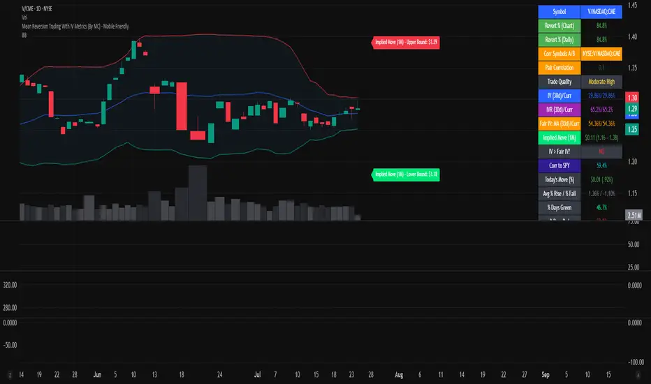
Mean Reversion Trading With IV Metrics (By MC) - Mobile FriendlyThis script is a comprehensive toolkit for traders who want to combine price mean reversion analysis with advanced volatility metrics, including Implied Volatility Rank (IVR), Implied/“Fair” Volatility projections, and real-time market volatility indicators. It is optimized for both desktop and mobile use, providing a detailed statistics table directly on the chart, and is suitable for stocks, ETFs, indices, and even paired asset analysis.
Key Features & How They Work Together
1. Mean Reversion Probability & Z-Score
Mean Reversion Analysis: Calculates z-scores and statistical probabilities that the asset’s price will revert to its mean, using customizable lookback windows (e.g., 10-60 bars). This helps traders spot potentially overbought or oversold conditions.
Strong & Moderate Signals: Highlights strong and moderate reversion opportunities based on user-defined probability thresholds, providing clear visual cues for timing entries and exits.
2. Paired Asset Correlation
Pairs Trading Support: Allows comparison of two symbols (e.g., SPY vs TLT). It computes the ratio, rolling mean, standard deviation, and correlation, helping traders identify divergence/convergence opportunities in pairs trading.
3. Volatility Metrics & Projections
Historical & Implied Volatility: Estimates implied volatility (IV) using historical price data, calculates IVR (the asset’s IV relative to its own history), and provides user-customized percentile bands (e.g., 20th/80th percentiles).
Fair IV Calculation: Offers three methods to compute “fair” volatility:
Market-Aware (relative to VIX/SPX HV)
SMA of historical volatility
SMA of VIX Traders can choose the method that best fits current market conditions.
Future Projections: Projects IV, “Fair” IV, and IVR for a user-defined future period, giving insight into potential volatility trends.
4. Implied Move Range
Implied Move Calculation: Shows the expected price range (upper/lower bounds) for the forecast period based on the current IV, making risk management and target setting more objective.
Dynamic Labels: Automatically updates labels with the latest projected moves and bounds, keeping traders informed in real time.
5. Market Volatility Dashboard
Broad Market Indicators: Displays real-time values and daily changes for VIX, VIX1D, VVIX, MOVE (bond volatility), GVZ (gold volatility), and OVX (oil volatility). Color-coded thresholds help traders gauge market stress across asset classes.
Correlation to SPY: Shows how closely the asset moves with SPY, aiding in diversification and hedging decisions.
6. Performance Metrics
Daily Move Analysis: Tracks today’s price move (absolute and percentage), average rises/falls, and the percentage of green/red days over a custom period.
Trade Quality Assessment: Ranks trade opportunities (High/Moderate/Low/Very Low) based on mean reversion probability.
7. Highly Customizable Table
Mobile Friendly: The stats table can be placed anywhere on the chart, toggled between compact/full/extra modes, and resized for readability on any device.
Visual Cues: Color coding and dynamic labels make interpretation easy and fast.
8. Alert Conditions
Built-in alerts for strong/moderate mean reversion, IV crossing above/below “Fair” IV, allowing proactive trade management.
9. VIX-Based Expected Move Bands
Optionally plots ±1, 2, 3 standard deviation bands using VIX-based expected move, helping to visualize potential price extremes.
How These Features Help Traders
Unified Trading Dashboard: All key mean reversion and volatility insights are available at a glance, reducing the need to switch between multiple indicators or screens.
Informed Entries & Exits: By combining mean reversion probabilities, IV projections, and market volatility, traders can time trades more confidently and avoid false signals.
Risk Management: The implied move bounds and volatility levels support realistic stop-loss and target setting, adapting dynamically to market conditions.
Cross-Asset Awareness: Market-wide volatility metrics and asset correlation to SPY provide context, helping traders avoid surprises from macro shocks.
Pairs Trading: Direct support for ratio and correlation analysis streamlines pairs strategies.
Customization & Clarity: The flexible UI and color-coded stats make the tool accessible for both beginners and advanced users.
Mean Reversion, Correlation value & interpretation:
For Meant Reversion % Probability:
Lookback Period to use:
| Trading Horizon | Lookback Period (Length) | Rationale |
| 5–10 days | 10–20 bars | More sensitive, good for quick reversals |
| 10–20 days | 20–30 bars | Standard for short swing |
| 20–40 days | 40–60 bars | More stable mean for longer swing |
Interpretation Guide:
Only consider trades if Correlation ≥ 0.6 or Reversion % ≥ 75%.
Avoid trades with Reversion % < 20%.
Correlation and Reversion % together form a powerful trade quality filter.
| Reversion % | Correlation | Signal Strength | Action |
| ≥ 75% | ≥ 0.4 | High Probability | Consider full position |
| ≥ 50% | ≥ 0.6 | Moderate Probability | Trade with standard size |
| ≥ 75% | < 0.4 | Uncorrelated Edge | Trade small or hedge carefully |
| < 50% | Any | Weak | Avoid |
| Any | < 0.3 | Low Coherence | Avoid unless extreme Reversion |
| Correlation Value | Interpretation |
| +1.0 | Perfect positive correlation (price of both move in the same direction)|
| +0.7 to +0.9 | Strong positive correlation |
| +0.4 to +0.6 | Moderate positive correlation |
| 0 | No correlation (independent) |
| -0.4 to -0.6 | Moderate negative correlation |
| -0.7 to -0.9 | Strong negative correlation |
| -1.0 | Perfect negative correlation (price both move in the opposite direction)|
Summary:
This script empowers traders to navigate markets with a robust, data-driven approach, seamlessly blending mean reversion analytics with deep volatility insight—all in a mobile-friendly, customizable dashboard.
Disclaimer
This tool is for informational and educational purposes only. It does not provide financial advice or trading signals. Always do your own research and consult a professional before making investment decisions.
Regressionanalysis
NexAlgo AI with Dynamic TP/SLThe NexAlgo Indicator combines a Gaussian kernel regression engine with adaptive volatility thresholds to generate clear, data‑driven trade signals and built‑in risk levels. It predicts the next bar’s price relative to a simple moving average, then measures the average deviation between actual and forecasted values to form dynamic bands. Breakouts beyond these bands, aligned with the prediction’s direction, produce buy or sell signals directly on your chart.
How It Works & What You’ll See
Kernel Regression Forecast: A rolling “lookback” window builds a Gaussian similarity matrix of recent prices. This matrix is used to project the next price, smoothing around a moving average.
Adaptive Volatility Bands: The indicator computes the mean absolute error between actual and predicted prices, multiplies it by your chosen volatility factor, and plots upper and lower bands.
Signal Triggers: When price closes above the upper band while the prediction is rising, a green “BUY” label appears; when price closes below the lower band as the forecast falls, a red “SELL” label is shown.
Automatic SL/TP Levels: After each signal, the script scans recent swing highs/lows and applies an ATR buffer. Stop‑loss is set conservatively at the more protective of these levels, while take‑profit is calculated by your reward‑to‑risk ratio and capped near the opposite swing extreme.
Customizable Inputs
Lookback Period & Smoothing: Adjust how many bars the regression and volatility calculations use, and tune the noise regularization to suit fast or slow markets.
Volatility Multiplier: Widen or tighten the adaptive bands to control signal frequency and confidence.
Swing Lookback & ATR Options: Define how far back the indicator searches for swing points, and choose between ATR calculation methods.
Reward‑to‑Risk Ratio: Set your preferred multiple of stop‑loss distance for take‑profit targets.
What Makes NexAlgo Different
Hybrid Statistical Approach: Unlike fixed‑period moving averages or standard regression, the Gaussian kernel adapts locally to evolving price patterns and regimes.
Self‑Adjusting Thresholds: Volatility bands derive from prediction errors—so they expand in choppy markets and contract in trending conditions.
Integrated Risk Controls: Automatically calculated stop‑loss and take‑profit levels remove manual guesswork, yet remain grounded in both ATR and price structure.
Trader‑Driven Flexibility: Every parameter—from lookback length to risk ratio—can be dialed in for scalping, swing trading, or longer‑term strategies.
Getting Started
• Apply NexAlgo to your preferred timeframe (5–15 min for intraday scalps, 1 h–4 h for swings, daily for position plays).
• Begin with default settings and gradually adjust lookback and smoothing to balance responsiveness versus noise.
• Experiment with volatility multipliers: tighten in strong trends, widen when markets churn.
• Backtest different ATR buffers and reward ratios to discover your ideal risk‑reward profile.

Leavitt Convolution ProbabilityTechnical Analysis of Markets with Leavitt Market Projections and Associated Convolution Probability
The aim of this study is to present an innovative approach to market analysis based on the research "Leavitt Market Projections." This technical tool combines one indicator and a probability function to enhance the accuracy and speed of market forecasts.
Key Features
Advanced Indicators : the script includes the Convolution line and a probability oscillator, designed to anticipate market changes. These indicators provide timely signals and offer a clear view of price dynamics.
Convolution Probability Function : The Convolution Probability (CP) is a key element of the script. A significant increase in this probability often precedes a market decline, while a decrease in probability can signal a bullish move. The Convolution Probability Function:
At each bar, i, the linear regression routine finds the two parameters for the straight line: y=mix+bi.
Standard deviations can be calculated from the sequence of slopes, {mi}, and intercepts, {bi}.
Each standard deviation has a corresponding probability.
Their adjusted product is the Convolution Probability, CP. The construction of the Convolution Probability is straightforward. The adjusted product is the probability of one times 1− the probability of the other.
Customizable Settings : Users can define oversold and overbought levels, as well as set an offset for the linear regression calculation. These options allow for tailoring the script to individual trading strategies and market conditions.
Statistical Analysis : Each analyzed bar generates regression parameters that allow for the calculation of standard deviations and associated probabilities, providing an in-depth view of market dynamics.
The results from applying this technical tool show increased accuracy and speed in market forecasts. The combination of Convolution indicator and the probability function enables the identification of turning points and the anticipation of market changes.
Additional information:
Leavitt, in his study, considers the SPY chart.
When the Convolution Probability (CP) is high, it indicates that the probability P1 (related to the slope) is high, and conversely, when CP is low, P1 is low and P2 is high.
For the calculation of probability, an approximate formula of the Cumulative Distribution Function (CDF) has been used, which is given by: CDF(x)=21(1+erf(σ2x−μ)) where μ is the mean and σ is the standard deviation.
For the calculation of probability, the formula used in this script is: 0.5 * (1 + (math.sign(zSlope) * math.sqrt(1 - math.exp(-0.5 * zSlope * zSlope))))
Conclusions
This study presents the approach to market analysis based on the research "Leavitt Market Projections." The script combines Convolution indicator and a Probability function to provide more precise trading signals. The results demonstrate greater accuracy and speed in market forecasts, making this technical tool a valuable asset for market participants.
Logarithmic Regression Channel-Trend [BigBeluga]
This indicator utilizes logarithmic regression to track price trends and identify overbought and oversold conditions within a trend. It provides traders with a dynamic channel based on logarithmic regression, offering insights into trend strength and potential reversal zones.
🔵Key Features:
Logarithmic Regression Trend Tracking: Uses log regression to model price trends and determine trend direction dynamically.
f_log_regression(src, length) =>
float sumX = 0.0
float sumY = 0.0
float sumXSqr = 0.0
float sumXY = 0.0
for i = 0 to length - 1
val = math.log(src )
per = i + 1.0
sumX += per
sumY += val
sumXSqr += per * per
sumXY += val * per
slope = (length * sumXY - sumX * sumY) / (length * sumXSqr - sumX * sumX)
average = sumY / length
intercept = average - slope * sumX / length + slope
Regression-Based Channel: Plots a log regression channel around the price to highlight overbought and oversold conditions.
Adaptive Trend Colors: The color of the regression trend adjusts dynamically based on price movement.
Trend Shift Signals: Marks trend reversals when the log regression line cross the log regression line 3 bars back.
Dashboard for Key Insights: Displays:
- The regression slope (multiplied by 100 for better scale).
- The direction of the regression channel.
- The trend status of the logarithmic regression band.
🔵Usage:
Trend Identification: Observe the regression slope and channel direction to determine bullish or bearish trends.
Overbought/Oversold Conditions: Use the channel boundaries to spot potential reversal zones when price deviates significantly.
Breakout & Continuation Signals: Price breaking outside the channel may indicate strong trend continuation or exhaustion.
Confirmation with Other Indicators: Combine with volume or momentum indicators to strengthen trend confirmation.
Customizable Display: Users can modify the lookback period, channel width, midline visibility, and color preferences.
Logarithmic Regression Channel-Trend is an essential tool for traders who want a dynamic, regression-based approach to market trends while monitoring potential price extremes.

CoffeeShopCrytpo Dynamic PPIIn the financial world, the Producer Price Index (PPI) is often used to measure how domestic products are performing over time, indicating the health of the market. Domestic products refer to goods and services that are produced within a specific country’s borders. However, in this indicator, we’ve taken that idea and applied it directly to financial assets, allowing traders to see how an asset is performing relative to its own base value over a given period of time.
Here, the asset’s base value is represented as 100%. When the asset performs above 100%, it's considered to be in a buyer's market—indicating strength and demand. Conversely, if the value dips below 100%, it's operating below its base value, signaling a potential seller's market.
Why This Matters:
This indicator not only converts an asset’s performance into a PPI-style calculation, but it also visualizes price movements as price candles. This dual perspective is crucial, because even if the asset’s performance is over 100%, the closing price might still fall below that threshold—adding nuance to your understanding of market conditions.
Key Features of the Indicator:
Bullish and Bearish Convergence Levels: These levels show whether the market leans bullish or bearish. If the Bullish Convergence level is higher than the Bearish one, the market is bullish, and vice versa. Importantly, these levels can signal shifts in market strength, regardless of where the PPI candles are positioned.
If Bullish Convergence is rising below Bearish, the bearish market is weakening and bullish pressure is growing. Conversely, if Bearish Convergence is falling above Bullish, the bearish side is losing ground.
Market Strength Visualizations:
Strong Bullish Market: Bullish Convergence is higher than Bearish, and it’s still rising.
Strong Bearish Market: Bearish Convergence is above Bullish, and it's climbing.
Weak Bullish Market: Bullish Convergence is above Bearish, but the PPI closes below Bullish Convergence.
Weak Bearish Market: Bearish Convergence is above Bullish, but the PPI closes above Bullish Convergence
Pullbacks:
Bullish Pullback: In a strong bullish market, the PPI shows lower closes below the Bullish Convergence.
Bearish Pullback: In a strong bearish market, the PPI shows higher closes above the Bullish Convergence.
Divergences:
Higher Price, Lower or Flat PPI: This indicates that while the asset’s price is rising, its underlying performance (relative to the PPI’s 100% base level) is not keeping up. Essentially, the asset is reaching new price highs, but its strength or "efficiency" of growth is weakening.
The PPI is designed to show the "return" of an asset's performance relative to its historical movement, so when it lags behind price, it suggests that the price rise may not be sustainable.
When you observe the first high of the PPI level above the bullish convergence level, followed by a second high of the PPI below the bullish convergence level in a bullish market, this creates a divergence.
Example of Divergence in image:
1. First High of PPI Above the Bullish Convergence Level:
This suggests strong bullish momentum. The asset’s performance, as measured by the PPI, is in line with or even outperforming price expectations, indicating the market is experiencing a robust bullish trend. The fact that the PPI level is above the bullish convergence line means that the asset is operating well above its base performance (above 100%) and bullish momentum is clearly dominant.
2. Second High of PPI Below the Bullish Convergence Level:
This marks a potential weakening of the bullish momentum. Although the market is still in a bullish state (since bullish convergence remains above bearish), the PPI failing to reach the bullish convergence level suggests that the asset’s performance is not keeping pace with price action or is underperforming relative to its earlier high.
The fact that this occurs while the market is still bullish (bullish convergence is greater than bearish) can signal a possible pullback or a temporary consolidation phase within the larger bullish trend.
What does a divergence mean:
Momentum Weakening: The second high of the PPI being below the bullish convergence line suggests that while prices may still be increasing, the strength behind the move is fading. The asset is not performing as strongly as it did during the first high, and the market’s confidence or momentum might be softening.
Potential Bullish Pullback: This could indicate that a pullback or correction within the larger bullish trend is underway. Traders might be taking profits, or buyers could be losing enthusiasm, causing the asset to stall temporarily. However, because the overall market remains bullish, this doesn’t necessarily mean a full reversal—just a cooling off period.
Caution in New Long Positions: If you see this divergence, it could be a sign to be more cautious about opening new long positions. It suggests that the asset may need to consolidate or correct before resuming its upward trend, and it’s worth waiting for confirmation of renewed momentum before jumping back in.
ATR Settings
Youll notice there are two ATR settings. One for short term and one for long term.
These values are based on your preferential strategy for what you consider to be long and short term.
The final ATR values are calculated against eachother and applied to the Volatility Label at the end of price.
This label shows you the current ATR as well as the previous candle ATR.
Why this is important:
If the short term ATR is greater than the long term ATR, then volatility is rising in the short term greater than the long term.
This gives your label a value greater than 1.0. This means the short term trend is about to move.
If the long term ATR is greater than the short term ATR, there is no volatility in the short term and only long term exists.
This gives you a value of less than 1.0. This means no volatility or ranging market in the short term.
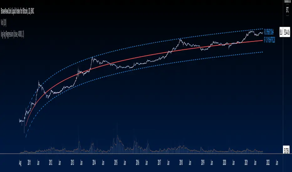
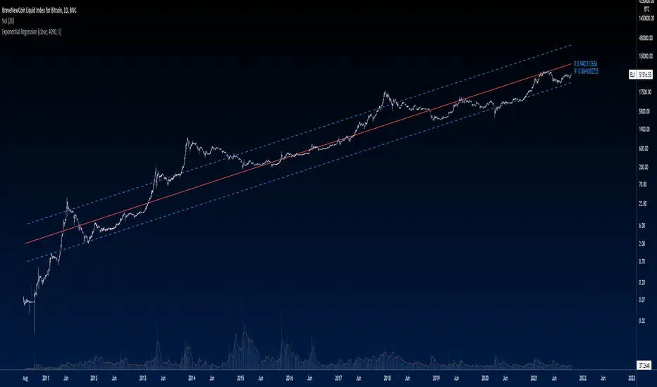
Bitcoin wave modelBitcoin wave model is based on the logarithmic regression model and the sinusoidal waves, induced by the halving events.
This chart presents the outcome of an in-depth analysis of the complete set of Bitcoin price data available from October 2009 to August 2023.
The central concept is that the logarithm of the Bitcoin price closely adheres to the logarithmic regression model. If we plot the logarithm of the price against the logarithm of time, it forms a nearly straight line.
The parameters of this model are provided in the script as follows: log (BTCUSD) = 1.48 + 5.44log(h).
The secondary concept involves employing the inherent time unit of Bitcoin instead of days:
'h' denotes a slightly adjusted time measurement intrinsic to the Bitcoin blockchain. It can be approximated as (days since the genesis block) * 0.0007. Precisely, 'h' is defined as follows: h = 0 at the genesis block, h = 1 at the first halving block, and so forth. In general, h = block height / 210,000.
Adjustments are made to account for variations in block creation time.
The third concept revolves around investigating halving waves triggered by supply shock events resulting from the halvings. These halvings occur at regular intervals in Bitcoin's native time 'h'. All halvings transpire when 'h' is an integer. These events induce waves with intervals denoted as h = 1.
Consequently, we can model these waves using a sin(2pih - a) function. The parameter determining the time shift is assessed as 'a = 0.4', aligning with earlier expectations for halving events and their subsequent outcomes.
The fourth concept introduces the notion that the waves gradually diminish in amplitude over the progression of "time h," diminishing at a rate of 0.7^h.
Lastly, we can create bands around the modeled sinusoidal waves. The upper band is derived by multiplying the sine wave by a factor of 3.1*(1-0.16)^h, while the lower band is obtained by dividing the sine wave by the same factor, 3.1*(1-0.16)^h.
The current bandwidth is 2.5x. That means that the upper band is 2.5 times the lower band. These bands are forming an exceptionally narrow predictive channel for Bitcoin. Consequently, a highly accurate estimation of the peak of the next cycle can be derived.
The prediction indicates that the zenith past the fourth halving, expected around the summer of 2025, could result in prices ranging between 200,000 and 240,000 USD.
Enjoy the mathematical insights!
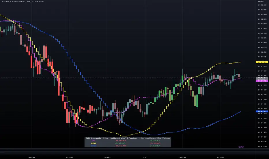
Triple Quadratic Regression - Supplementary UnderlayThis indicator is supplementary to our Triple Quadratic Regression overlaid indicator (which includes three step lines - a fast (fuchsia), a medium (yellow), and a slow (blue) quadratic regression line to help the user obtain a clearer picture of current trends).
Quadratic regression is better suited to determining (and predicting) trend than linear regression ; y = ax^2 + bx + c is better to use than a simple y = ax + b. Calculating the regression involves five summation equations that utilize the bar index (x1), the price source (defaulted to ohlc4), the desired lengths, and the square of x1. Determining the coefficient values requires an additional step that factors in the simple moving average of the source, bar index, and the squared bar index.
Instead of overlaying the three quadratic regression lines themselves, this underlaid indicator is used to show the normalized (-1 to +1) values of ax^2 and bx. The color of the lines and histogram match the associated lines on our overlaid indicator. Here, the solid fuchsia line is the fast QR's normalized ax^2 value, the solid yellow line is the mid QR's normalized ax^2 value, and the solid blue line is the slow QR's normalized ax^2 value. The histograms reflect the normalized bx values. In addition to these, the momentum of the ax^2 values was calculated and represented as a dotted line of the same colors.
Bar color is influenced by the values of ax^2 and bx of the fast and medium length regressions. If ax^2 and bx for both the fast and medium lengths are above 0, the bar color is green. If they are both under 0, the bar color is red. Otherwise, bars are colored gray.
When combined with our overlaid Triple Quadratic Regression indicator and the Triple Quadratic Regression Macro Score strategy (part of the LeafAlgo Premium Macro Strategies) to gather all of the information possible, your chart should look like this:

Triple Quadratic Regression (w/ Normalized Value Table)This indicator draws three step lines - a fast (fuchsia), a medium (yellow), and a slow (blue) quadratic regression line to help the user obtain a clearer picture of current trends. Quadratic regression is better suited to determining (and predicting) trend than linear regression; y = ax^2 + bx + c is better to use than a simple y = ax + b. Calculating the regression involves five summation equations that utilize the bar index (x1), the price source (defaulted to ohlc4), the desired lengths, and the square of x1. Determining the coefficient values requires an additional step that factors in the simple moving average of the source, bar index, and the squared bar index.
In addition to the plotted lines, a change in bar color and a table were added. The bar color is influenced by the values of ax^2 and bx of the fast and medium length regressions. If ax^2 and bx for both the fast and medium lengths are above 0, the bar color is green. If they are both under 0, the bar color is red. Otherwise, bars are colored gray. In the table, located at the bottom of the chart (but can be moved), the ax^2 and bx values for each regression length are shown. The option to view normalized (scale of -1 to +1) values or the standard values is included in the indicator settings menu. By default, the normalized values are shown.
Nadaraya-Watson: Envelope (Non-Repainting)Due to popular request, this is an envelope implementation of my non-repainting Nadaraya-Watson indicator using the Rational Quadratic Kernel. For more information on this implementation, please refer to the original indicator located here:
What is an Envelope?
In technical analysis, an "envelope" typically refers to a pair of upper and lower bounds that surrounds price action to help characterize extreme overbought and oversold conditions. Envelopes are often derived from a simple moving average (SMA) and are placed at a predefined distance above and below the SMA from which they were generated. However, envelopes do not necessarily need to be derived from a moving average; they can be derived from any estimator, including a kernel estimator such as Nadaraya-Watson.
How to use this indicator?
Overall, this indicator offers a high degree of flexibility, and the location of the envelope's bands can be adjusted by (1) tweaking the parameters for the Rational Quadratic Kernel and (2) adjusting the lookback window for the custom ATR calculation. In a trending market, it is often helpful to use the Nadaraya-Watson estimate line as a floating SR and/or reversal zone. In a ranging market, it is often more convenient to use the two Upper Bands and two Lower Bands as reversal zones.
How are the Upper and Lower bounds calculated?
In this indicator, the Rational Quadratic (RQ) Kernel estimates the price value at each bar in a user-defined lookback window. From this estimation, the upper and lower bounds of the envelope are calculated based on a custom ATR calculated from the kernel estimations for the high, low, and close series, respectively. These calculations are then scaled against a user-defined multiplier, which can be used to further customize the Upper and Lower bounds for a given chart.
How to use Kernel Estimations like this for other indicators?
Kernel Functions are highly underrated, and when calibrated correctly, they have the potential to provide more value than any mundane moving average. For those interested in using non-repainting Kernel Estimations for technical analysis, I have written a Kernel Functions library that makes it easy to access various well-known kernel functions quickly. The Rational Quadratic Kernel is used in this implementation, but one can conveniently swap out other kernels from the library by modifying only a single line of code. For more details and usage examples, please refer to the Kernel Functions library located here:

KernelFunctionsLibrary "KernelFunctions"
This library provides non-repainting kernel functions for Nadaraya-Watson estimator implementations. This allows for easy substitution/comparison of different kernel functions for one another in indicators. Furthermore, kernels can easily be combined with other kernels to create newer, more customized kernels. Compared to Moving Averages (which are really just simple kernels themselves), these kernel functions are more adaptive and afford the user an unprecedented degree of customization and flexibility.
rationalQuadratic(_src, _lookback, _relativeWeight, _startAtBar)
Rational Quadratic Kernel - An infinite sum of Gaussian Kernels of different length scales.
Parameters:
_src : The source series.
_lookback : The number of bars used for the estimation. This is a sliding value that represents the most recent historical bars.
_relativeWeight : Relative weighting of time frames. Smaller values result in a more stretched-out curve, and larger values will result in a more wiggly curve. As this value approaches zero, the longer time frames will exert more influence on the estimation. As this value approaches infinity, the behavior of the Rational Quadratic Kernel will become identical to the Gaussian kernel.
_startAtBar : Bar index on which to start regression. The first bars of a chart are often highly volatile, and omitting these initial bars often leads to a better overall fit.
Returns: yhat The estimated values according to the Rational Quadratic Kernel.
gaussian(_src, _lookback, _startAtBar)
Gaussian Kernel - A weighted average of the source series. The weights are determined by the Radial Basis Function (RBF).
Parameters:
_src : The source series.
_lookback : The number of bars used for the estimation. This is a sliding value that represents the most recent historical bars.
_startAtBar : Bar index on which to start regression. The first bars of a chart are often highly volatile, and omitting these initial bars often leads to a better overall fit.
Returns: yhat The estimated values according to the Gaussian Kernel.
periodic(_src, _lookback, _period, _startAtBar)
Periodic Kernel - The periodic kernel (derived by David Mackay) allows one to model functions that repeat themselves exactly.
Parameters:
_src : The source series.
_lookback : The number of bars used for the estimation. This is a sliding value that represents the most recent historical bars.
_period : The distance between repititions of the function.
_startAtBar : Bar index on which to start regression. The first bars of a chart are often highly volatile, and omitting these initial bars often leads to a better overall fit.
Returns: yhat The estimated values according to the Periodic Kernel.
locallyPeriodic(_src, _lookback, _period, _startAtBar)
Locally Periodic Kernel - The locally periodic kernel is a periodic function that slowly varies with time. It is the product of the Periodic Kernel and the Gaussian Kernel.
Parameters:
_src : The source series.
_lookback : The number of bars used for the estimation. This is a sliding value that represents the most recent historical bars.
_period : The distance between repititions of the function.
_startAtBar : Bar index on which to start regression. The first bars of a chart are often highly volatile, and omitting these initial bars often leads to a better overall fit.
Returns: yhat The estimated values according to the Locally Periodic Kernel.
Logarithmic Trend ChannelThis indicator automatically draws a regression channel plotted on logarithmic scale from the first quotation.
This model is useful for the long term series data (such as 10 or 20 years time span).
The Pearson correlation measures the strength of the linear relationship between two variables. It has a value between to 1, with a value of 0 meaning no correlation, and + 1 meaning a total positive correlation.
Logarithmic price scales are a type of scale used on a chart, plotted such that two equivalent price changes are represented by the same vertical changes on the scale.
They differ from linear price scales because they display percentage points and not dollar price increases for a stock.
Technical issues
*The user have to pan over the chart from the beginning to the end of the study range (such as 10 years of bars) so the pine script could generate those lines on the chart.
*If on the chart the number of bar is less than the lookback period, it won't generate any lines as well.

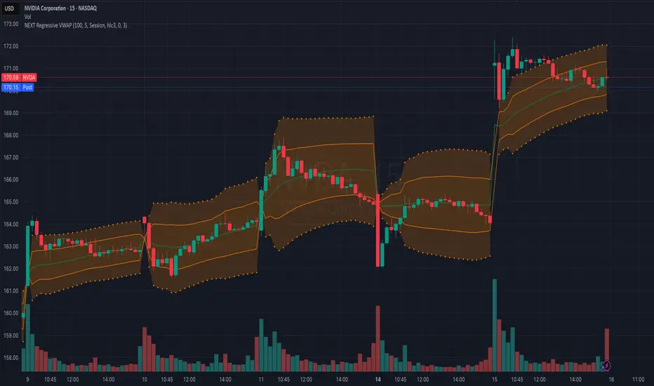
NEXT Regressive VWAPOverview:
This version of the Volume-Weighted Average Price (VWAP) indicator features an extended algorithm, which, in addition to volume and price, also incorporates regression analysis. The result is a more responsive, often leading VWAP slope with a degree of statistical predictability built in. Just like with the original VWAP, NEXT Regressive VWAP offers two optional Standard Deviation bands that parallel it. These can be set to any deviation level, with the default being 1 and -1, indicating one standard deviation above and one below Regressive VWAP, respectively.
Below is a screenshot comparing NEXT Regressive VWAP (green) to the original VWAP (blue) on CME_MINI:ES1! M3 chart.
Application and Strategy Ideas:
Price above NEXT Regressive VWAP is interpreted to have a bullish bias, and below, bearish. You can use TradingView's native Set Alert functionality to be notified, in real-time, when price crosses Regressive VWAP, and/or any of its standard deviation bands. Another popular "probability play" strategy is to scalp price when it crosses under the upper band (short) and crosses over the lower band (long). The screenshot below visualizes such a strategy on NASDAQ:QQQ M1 chart:
Input Parameters:
There are 3 groups of input.
Regression Settings
Length - controls the length of time (in bars) for regression analysis with higher values yielding smoother, more responsive values.
Regression Weighting - controls the degree of regression analysis incorporated into VWAP, with 5 being average, 0-4 less, 6-10 more. The higher the value, the more responsive the Regressive VWAP curve.
VWAP Settings
Anchor Period - controls the origin of VWAP calculations, start of session being the default.
Source - data used for calculating the VWAP, typically HLC/3, but can be used with other price formats and data sources as well.
Offset - shifting of the VWAP line forward (+) or backward (-).
Standard Deviation Bands Settings
Calculate Bands - checking this will add 2 bands, each equidistant (by the amount of Multiplier) from the NEXT Regressive VWAP line.
Bands Multiplier - standard deviation multiplier, with 1 being the default
Signals and Alerts:
Here is how to set price (close) crossing NEXT Regressive VWAP alerts: open a chart, attach NEXT Regressive VWAP, and right-click on chart -> Add Alert. Condition: Symbol e.g. ES (close) >> Crossing >> Regressive VWAP >> VWAP >> Once Per Bar Close.
log-log Regression From ArraysCalculates a log-log regression from arrays. Due to line limits, for sets greater than the limit, only every nth value is plotted in order to cover the entire set.
Exponential Regression From ArraysCalculates an exponential regression from arrays. Due to line limits, for sets greater than the limit, only every nth value is plotted in order to cover the entire set.
Standard Error of the Estimate -Jon Andersen- V2Original implementation idea of bands by:
Traders issue: Stocks & Commodities V. 14:9 (375-379):
Standard Error Bands by Jon Andersen
Standard Error Bands are quite different than Bollinger's.
First, they are bands constructed around a linear regression curve.
Second, the bands are based on two standard errors above and below this regression line.
The error bands measure the standard error of the estimate around the linear regression line.
Therefore, as a price series follows the course of the regression line the bands will narrow , showing little error in the estimate. As the market gets noisy and random, the error will be greater resulting in wider bands .
Thanks to the work of @glaz & @XeL_arjona
In this version you can change the type of moving averages and the source of the bands.
Add a few studies of @dgtrd
1- ADX Colored Directional Movement Line
Directional Movement (DMI) (created by J. Welles Wilder ) consists of the Average Directional Index ( ADX ), to define whether or not there is a trend present, and Plus Directional Indicator (+D I) and Minus Directional Indicator (-D I) serve the purpose of determining trend direction
ADX Colored Directional Movement Line is custom interpretation of Directional Movement (DMI) with aim to present all 3 DMI indicator components with SINGLE line and ability to be added on top of the price chart (main chart)
How to interpret :
* triangle shapes:
▲- bullish : diplus >= diminus
▼- bearish : diplus < diminus
* colors:
green - bullish trend : adx >= strongTrend and di+ > di-
red - bearish trend : adx >= strongTrend and di+ < di-
gray - no trend : weekTrend < adx < strongTrend
yellow - week trend : adx < weekTrend
* color density:
darker : adx growing
lighter : adx falling
2- Volatility Colored Price/MA Line
Custom interpretation of the idea “Prices high above the moving average (MA) or low below it are likely to be remedied in the future by a reverse price movement”. Further details can be found under study “Price Distance to its MA by DGT”
How to interpret :
-▲ – Bullish , Price Action above Moving Average
-▼ – Bearish , Price Action below Moving Average
-Gray/Black - Low Volatility
-Green/Red – Price Action in Threshold Bands
-Dark Green/Red – Price Action Exceeds Threshold Bands
3- Volume Weighted Bar s
Volume Weighted Bars, a study of Kıvanç Özbilgiç, aims to present whether volume supports price movements. Volume Weighted Bars are calculated based on volume moving average.
How to interpret :
-Volume high above the volume moving average be displayed with red/green colors
-Average volume values will remain as they are and
-Volume low below the volume moving average will be indicated with darker colors
4- Fear & Greed index value, using technical anlysis approach calculated based on :
⮩1 - Price Momentum : Price Distance to its Moving Average
⮩2 - Strenght : Rate of Return, price movement over a period of time
⮩3 - Money Flow : Chaikin Money Flow, quantify changes in buying and selling pressure. CMF calculations is based on Accumulation/Distribution
⮩4 - Market Volatility : CBOE Volatility Index ( VIX ), the Volatility Index, or VIX , is a real-time market index that represents the market's expectation. It provides a measure of market risk and investors' sentiments
⮩5 -Safe Haven Demand: in this study GOLD demand is assumed
KINSKI Volume Regression TrendRegression trends are typically used to determine when a price is unusually far from its baseline. The script calculates the linear regression of volume and price to determine the trend direction and strength. This can be used to determine the volume support for upward/downward trends.
As a special feature, this indicator allows you to choose from three (as of 07/20/2021) templates with special presets.
The following templates are available:
"Precise" (Period: 4, Smoothing Factor Type: "DISABLED", Smoothing Factor Length = 1).
"Smooth" (Period: 4, Smoothing Factor Type: "RMA", Smoothing Factor Length = 2)
"Long Term (Period: 20, Smoothing Factor Type: "DISABLED", Smoothing Factor Length = 1)
In the selection for templates, the option "DISABLED" can also be selected. Then the user-defined settings selectable under it take effect. There are the following setting options.
"Length": Adjustable period
"Smoothing Factor: Type": Type of moving average
"Smoothing Factor: Length": Adjustable period
Other setting options are:
Color codes: The color codes are explained in the settings
Display types: "Columns", "Histogram", "Area", "Line", "Stepline"

Linear Regression (All Data)The tool plots a linear regression line using the entire history of an instrument on chart. There are may be issues on intraday timeframes less then 1h. On daily, weekly and monthly charts it works without problem.
If an instrument has a lot of data points, you may not see the line (this is TV feature):
To fix that you need to scroll your chart to the left and find the starting point of the line:
And then do an auto-scroll to the last bar:

Dynamic Regression Bandings (Base10)Dynamic Regression Bandings (Base10) is designed to provide a statistical range of outlier pricing within an established trend. Instead of calculations being performed on a linear scale, spot price is adjusted logarithmically, allowing for regression to be performed over longer periods without compound movement creating abnormal behaviour.
The range is set through user input of a minimum and maximum values; from which the script identifies the backward length (candle count) with the greatest correlation to price. This process is performed for each candle, so the regression length may change dynamically across time. By doing this, we are able to look at the current candle for its probability of being an outlier compared to the mean of the regression. If the spot price is outside the range of the expected deviation (e.g. +/- 2 standard deviations from the mean); a buy or sell signal is triggered.
IMPORTANT: This does not aim to validate the volatility of a trend, so the user must identify the historical fit. It is recommended to use the replay functionality to make these adjustments with historical data in order to avoid over fitting the model to the data; which will create long term issues with performance.
When a trend is found in the specified range; it is assumed that the white noise (movement +/- to the trend) happens in a normal & unbiased way. In a fair market; the buyers and sells should balance themselves out in such a way that there is no inherent bias outside of the trend. As such, we can assume that almost all movement within the trend will be within +/- 3 standard deviations. So if the selected deviation range is greater than that; it is likely that the model is being over fit to account for extreme volatility.
Below are examples of the indicator on different charts:
USDAUD
BTCUSD
AMZN
A2M

Linear Regression ++Due to public demand
Linear Regression Formula
Scraped Calculation With Alerts
Here is the Linear Regression Script For traders Who love rich features
Features
++ Multi time frame -> Source Regression from a different Chart
++ Customized Colors -> This includes the pine lines
++ Smoothing -> Allow Filtered Regression; Note: Using 1 Defaults to the original line. The default is 1
++ Alerts On Channel/Range Crossing
Usage
++ Use this for BreakOuts and Reversals
++ This Script is not to be used Independently
Risks
Please note, this script is the likes of Bollinger bands and poses a risk of falling in a trend range.
Signals may Keep running on the same direction while the market is reversing.
Requests
If you have any feature requests, comment below or dm me. I will answer when i can.
Feel free to utilize this on your chart and share your ideas
For developers who want to use this on their chart, Please use this script
The original formula for calculation is posted there
❤❤❤ I hope you love this. From my heart! ❤❤❤
Regression Channel [DW]This is an experimental study which calculates a linear regression channel over a specified period or interval using custom moving average types for its calculations.
Linear regression is a linear approach to modeling the relationship between a dependent variable and one or more independent variables.
In linear regression, the relationships are modeled using linear predictor functions whose unknown model parameters are estimated from the data.
The regression channel in this study is modeled using the least squares approach with four base average types to choose from:
-> Arnaud Legoux Moving Average (ALMA)
-> Exponential Moving Average (EMA)
-> Simple Moving Average (SMA)
-> Volume Weighted Moving Average (VWMA)
When using VWMA, if no volume is present, the calculation will automatically switch to tick volume, making it compatible with any cryptocurrency, stock, currency pair, or index you want to analyze.
There are two window types for calculation in this script as well:
-> Continuous, which generates a regression model over a fixed number of bars continuously.
-> Interval, which generates a regression model that only moves its starting point when a new interval starts. The number of bars for calculation cumulatively increases until the end of the interval.
The channel is generated by calculating standard deviation multiplied by the channel width coefficient, adding it to and subtracting it from the regression line, then dividing it into quartiles.
To observe the path of the regression, I've included a tracer line, which follows the current point of the regression line. This is also referred to as a Least Squares Moving Average (LSMA).
For added predictive capability, there is an option to extend the channel lines into the future.
A custom bar color scheme based on channel direction and price proximity to the current regression value is included.
I don't necessarily recommend using this tool as a standalone, but rather as a supplement to your analysis systems.
Regression analysis is far from an exact science. However, with the right combination of tools and strategies in place, it can greatly enhance your analysis and trading.
Dorsey InertiaThis indicator was originally developed by Donald Dorsey (Stocks & Commodities, V.13:9 (September, 1995): "Refining the Relative Volatility Index").
Inertia is based on Relative Volatility Index (RVI) smoothed using linear regression.
In physics, inertia is the tendency of an object to resist to acceleration. Dorsey chose this name because he believes that trend and inertia are related and that it takes more effort and energy to reverse the direction of a stock or market than to keep it in the same direction. He argues that the volatility is the simplest and most accurate measure of inertia.
When the indicator is below 50, it signals bearish market sentiment and when the indicator is above 50 it signals a bullish trend.
Good luck!

Shark K-Bands — SharkCIAInspired by everget's implementation of Kirshenbaum Bands.
This indicator was originally developed by Paul Kirshenbaum, a mathematician with a Ph .D. in economics from New York University.
It uses the standard error of linear regression lines of the closing price to determine band width. This has the effect of measuring volatility around the current trend, rather than measuring volatility for changes in trend.
Prior art:
Check out everget's scripts here: www.tradingview.com

Kirshenbaum BandsThis indicator was originally developed by Paul Kirshenbaum, a mathematician with a Ph.D. in economics from New York University.
It uses the standard error of linear regression lines of the closing price to determine band width. This has the effect of measuring volatility around the current trend, rather than measuring volatility for changes in trend.
Good luck!
