X-Trend Macro Command CenterX-Trend Macro Command Center (MCC) | Institutional Grade Dashboard
📝 Description Body
The Invisible Engine of the Market Revealed.
Traders often focus solely on Price Action, ignoring the massive underwater currents that actually drive trends: Global Liquidity, Inflation, and Central Bank Policy. We created X-Trend Macro Command Center (MCC) to solve this problem.
This is not just an indicator. It is a fundamental heads-up display that bridges the gap between technical charts and macroeconomic reality.
💡 The Idea & Philosophy
Markets don't move in a vacuum. Bull runs are fueled by M2 Money Supply expansion and negative real yields. Crashes are triggered by liquidity crunches and aggressive rate hikes. X-Trend MCC was built to give retail traders the same "Macro Awareness" that institutional desks possess. It aggregates fragmented economic data from Federal Reserve databases (FRED) directly onto your chart in real-time.
🚀 Application & Logic
This tool is designed for Trend Traders, Crypto Investors, and Macro Analysts.
Identify the Regime: Instantly see if the environment is "RISK ON" (High Liquidity, Low Real Rates) or "RISK OFF" (Monetary Tightening).
Validate the Trend: Don't buy the dip if Liquidity (M2) is crashing. Don't short the rally if Real Yields are negative.
Multi-Region Analysis: Switch instantly between economic powerhouses (US, China, Japan) to see where the capital is flowing.
📊 Dashboard Metrics Explained
Every row in the Command Center tells a specific story about the economy:
Interest Rate: The "Gravity" of finance. Higher rates weigh down risk assets (Stocks/Crypto).
Inflation (YoY): The erosion of purchasing power. We calculate this dynamically based on CPI data.
Real Yield (The "Golden" Metric): Calculated as Interest Rate - Inflation.
Green: Real Yield is low/negative. Cash is trash, assets fly.
Red: Real Yield is high. Cash is King, assets struggle.
US Debt & GDP: Fiscal health indicators formatted in Trillions ($T). Watch the Debt-to-GDP ratio—if it spikes >120%, expect currency debasement.
M2 Money Supply: The fuel tank of the market. Tracks the total amount of money in circulation.
↗ Trend: Liquidity is entering the system (Bullish).
↘ Trend: Liquidity is drying up (Bearish).
🧩 The X-Trend Ecosystem
X-Trend MCC is just the tip of the iceberg. This module is part of the larger X-Trend Project — a comprehensive suite of algorithmic tools being developed to quantify market chaos. While our Price Action algorithms (Lite/Pro/Ultra) handle the Micro, the MCC handles the Macro.
Technical Note:
Data Sources: Direct connection to FRED (Federal Reserve Economic Data).
Zero Repainting: Historical data is requested strictly using closed bars to ensure accuracy.
Open Source: We believe in transparency. The code is open for study under MPL 2.0.
Build by Dev0880 | X-Trend © 2025
Portföy Yönetimi

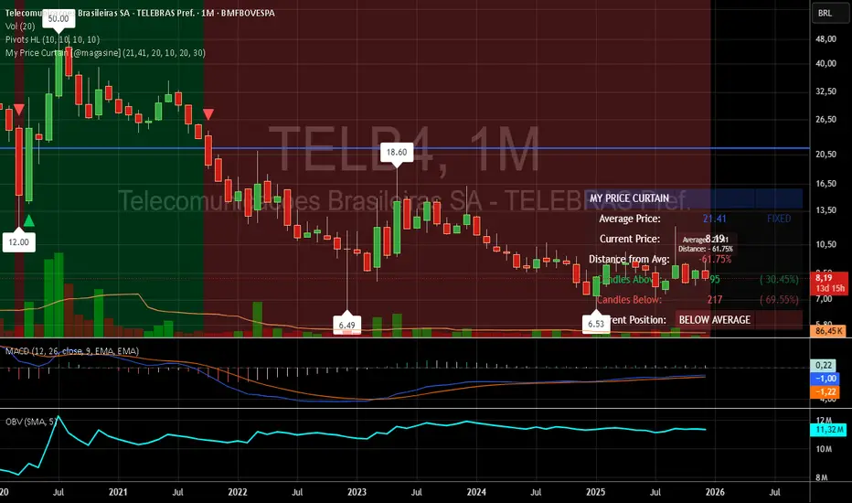
My Price Curtain by @magasine - v20251217**My Price Curtain by @magasine - v20251217**
This is a highly visual and practical TradingView overlay indicator designed to help traders quickly assess price position relative to a reference average (either a dynamic Simple Moving Average or a user-defined fixed price, such as a personal average entry cost).
### Key Features & Value for Traders:
- **Dynamic Price Curtain Background**
The entire chart background is lightly tinted green when price is above the average, red when below, or gray when at parity. This instant color feedback provides an immediate sense of bullish/bearish bias without needing to interpret lines or oscillators.
- **Deviation Zones (Optional)**
When enabled, semi-transparent horizontal bands appear above (green) and below (red) the average price, sized according to a user-defined percentage deviation (default 5%). These zones act as visual "fair value" corridors, highlighting over-extension or potential mean-reversion areas.
- **Persistent Horizontal Reference Lines**
- Solid blue line: the current average price (SMA or fixed)
- Dotted lines: upper and lower deviation zone boundaries
- Thin trailing line (when using SMA): connects previous SMA values for smoother trend visualization
- **Real-Time Information Panel**
A clean table in the bottom-right corner displays:
- Current average price and type (SMA(length) or FIXED)
- Latest close price
- Percentage distance from the average
- Total candles above/below the average (with percentages)
- Current position status (ABOVE/BELOW/AT AVERAGE) with color-coded highlighting
- **Additional Visual Cues**
- Small triangle markers on crossovers/crossunders of the average price
- Floating label on the last bar showing the average and current % deviation
- **Optional Cross Alerts**
Configurable alerts fire when price crosses above or below the reference average, including price, average, and deviation details.
### Why Traders Love It:
- Perfect for position traders monitoring performance relative to their average cost
- Great for mean-reversion or range-bound strategies using the deviation zones
- Excellent contextual awareness tool on any timeframe or asset
- Clean, non-cluttered design that enhances rather than overwhelms price action
In short, My Price Curtain transforms a simple moving average into a powerful, intuitive "price sentiment dashboard" that delivers instant visual context and actionable information at a glance.
Donations: linktr.ee
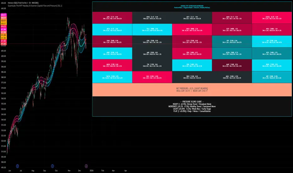
QuantLabs The MTF Nasdaq 30 Scanner [Capital Flow and Pressure]Trading the QQQ (Nasdaq) without knowing what the Generals (Apple, Nvidia, Microsoft) are doing is like driving at night with your headlights off. You might see the road right in front of you, but you'll miss the turn coming up.
The QuantLabs MTF Nasdaq 30 Scanner is not just a trend indicator, it is a professional-grade Market Dashboard that visualizes the heartbeat of the entire Nasdaq 100.
Why You Need This
Standard indicators lag. They tell you what happened after the move. This Heatmap tracks the Real-Time Capital Flow of the Top 30 companies that actually move the index ($Trillions in Market Cap).
Key Features
1. The "Spectacular" Precision Heatmap
Organized by Market Cap Size (AAPL/NVDA first).
Instantly spot divergent behavior. Is the market rallying, or is it just Nvidia holding everything up? The Heatmap reveals the truth instantly.
Colors: Neon Cyan (Bullish) vs Hot Pink (Bearish).
2. Triple Spectrum Technology (3-in-1 Timeframes) Why look at one timeframe when you can see three? Every cell in the dashboard displays the trend distance for:
8h (Fast): For scalping entries.
16h (Mid): For swing trends.
24h (Slow): For the major "Big Picture" bias.
Values denote % distance from the Flux Ribbon.
3. The "Net Pressure" Gauge (The Speedometer) A predictive summary footer that calculates the Weighted Pressure of the entire market.
HEAVY (> 0.5%): Strong Trend / Breakout Mode.
MODERATE (0.2% - 0.5%): Healthy, sustained move.
FLAT: Chop / Noise. Stay out.
It also shows exactly how much Capital ($Trillions) is sitting Bullish vs Bearish.
How to Trade with It
Check the "Net Pressure": If it says MODERATE BULLISH, you are looking for Longs only.
Scan the Top Row: Are the "Big 5" (AAPL, NVDA, MSFT...) aligned with the pressure?
Wait for Alignment: If the 8h, 16h, and 24h metrics all turn Cyan, that is a "Quantum Lock"—a high probability breakout signal.
Simple. Powerful. Neon. Add it to your chart and stop guessing the direction.
Credits: Built with 💜 by David James @ QuantLabs
Market Internal Overlay - Skew and Put/Call RatioTracks both the CBOE:SKEW and INDEX:CPC and will highlight when certain thresholds are met.
Blue candle = skew is below 125 (low relative levels of hedging occurring)
Gray candle = skew is above 150 (higher relative levels of hedging occurring)
Red candle = 10 DMA of the put/call ratio is above 1.0 (signaling potential overbought territory)
Green candle = 10 DMA of the put/call ratio is below 0.80 (signaling potential oversold territory)
Purple candle = Both signals are occurring (in either direction)
To view the candle overlay, either switch the price data off, or change the colors to be darker and more transparent.

Yield Curve Inversion Indicator Will track the TVC:US10Y and TVC:US03MY spread, often followed for the "yield curve inversion" trade/indicator.
When an inversion occurs, which lasts a minimum of the defined days (default 10) the indicator will paint forward a warning period (default is 365 days).
The yield curve being inverted is not the signal, the REVERSION back to a positive curve is the associated signal, namely the following 12 months after a reversion. This is often used as an early warning of trouble in markets.
Hope this helpful for those who follow macro/internal warning signals.

RS High Beta Exposure | QuantLapseRS High Beta Exposure | QuantLapse
Conceptual Foundation and Innovation
The RS High Beta Exposure indicator from QuantLapse is a comprehensive multi-asset allocation and momentum-ranking system that integrates beta and trend analysis, pairwise relative strength comparison, and volatility-adjusted filtering.
Its objective is to identify dominant crypto assets while dynamically reallocating High Beta exposure based on a calculated relative strength. The objective is to integrate trend analysis along with volatility filtering to these pairs to determine its relative strength.
At its core, RS High Beta Exposure indicator measures the systematic (β) performance of each asset relative to other assets provided combining these measures with inter-asset ratio trends to determine which assets exhibit superior strength and momentum relative to the other assets.
This integration of relative strength comparison, and trend and filtering analysis represents a quantitative evolution of traditional relative strength analysis, designed for adaptive asset rotation across major cryptocurrencies.
Technical Composition and Calculation
The indicator is structured around three major analytical layers:
1. Beta and Alpha Analysis
-Each asset’s return is decomposed into systematic components relative to the other assets by using a trend based, volatility filtering model.
-Assets with the highest point on a relative strength basis above the median are considered outperformers and eligible for allocation.
2. Pairwise Ratio Momentum
-Every asset is compared against all others through a ratio-trend, where momentum based trend scores quantify the directional momentum between each pair.
-In addition, we filter any false signals with volatility adjusted trends in which ensure high quality signals.
3. High Confidence Ranking
-Using the Pairwise Momentum signals, the RS High Beta Exposure scores them. If the asset comparison is given a signal, the RS High Beta Exposure scores points for each asset.
-If the total points of an asset is 5, its given the rank the dominant asset and is most likely to outperform.
By combining these layers, RS High Beta Exposure determines not only which assets is the strongest but also which assets to be invested.
User Inputs and Feature Adaptability
The indicator includes set of customizable parameters to support portfolio and risk management preferences:
Start Date Filter – Defines the beginning of live strategy evaluation.
Display Options – Able to change the location of the RS Table, Background and equity color.
Asset Selection – Modify or replace up to six crypto assets in the ranking matrix
asset1 = input.symbol("CRYPTO:XRPUSD", title ="Asset 1")
asset2 = input.symbol("CRYPTO:BNBUSD", title ="Asset 2")
asset3 = input.symbol("CRYPTO:ADAUSD", title ="Asset 3")
asset4 = input.symbol("CRYPTO:DOGEUSD", title ="Asset 4")
asset5 = input.symbol("CRYPTO:XLMUSD", title ="Asset 5")
asset6 = input.symbol("CRYPTO:LINKUSD", title ="Asset 6")
Each module operates cohesively to maintain analytical transparency while allowing user-level control over system sensitivity and behavior.
Real World, Practical Applications
The RS High Beta Exposure indicator is designed for systematic traders and quantitative portfolio managers who seek a disciplined framework for dynamic crypto asset rotation.
Key applications include:
High-Beta Asset Identification: Systematically identify crypto assets exhibiting relative dominance and stronger momentum characteristics versus peers within the comparison set.
Rule-Based Portfolio Rotation: Reallocate exposure toward leading assets using objective pairwise signals, reducing emotional decision-making and FOMO-driven trades.
Trend-Aligned Risk Participation: Employ the pairwise relative strength model to maintain exposure only during favorable momentum conditions, helping avoid prolonged participation in weak or deteriorating trends.
By combining relative strength comparisons with trend-aware filtering, this framework bridges quantitative finance and market regime analysis, providing a structured, data-driven approach to crypto asset allocation.
Advantages and Strategic Value
RS High Beta Exposure goes beyond conventional relative strength tools by integrating multi-asset comparison, ratio-based dominance scoring, and volatility-aware regime filtering into a single coherent framework.
By employing a three-layer confluence model — combining trend integrity, relative performance attribution, and volatility-state confirmation — the system improves the reliability of rotation and trend-following decisions.
The model is particularly valuable for traders seeking to:
Mitigate drawdowns while participating in higher-beta assets through regime-aware exposure control.
Identify persistent outperformers early in emerging market trends.
Maintain capital exposure only when statistical and momentum conditions signal elevated confidence.
The inclusion of visual allocation tables and a dynamic alert system makes RS High Beta Exposure both transparent and actionable, supporting discretionary analysis as well as systematic or automated trading workflows.
Alerts and Visualization
The script delivers clear, intuitive visual cues and alert-based feedback to support real-time decision-making:
Color-coded background states visually indicate the current allocation regime.
Allocation labels and summary tables display the dominant asset and its relative strength in real time.
An integrated alert system automatically notifies users whenever allocation states change (e.g., “100% XRP” or “100% CASH”).
Together, these visualization and alert features make RS High Beta Exposure both analytically rigorous and easy to interpret, even in fast-moving live market conditions.
Summary and Usage Tips
RS High Beta Exposure is an advanced interpretation of relative strength analysis, blending pairwise momentum comparisons, multi-asset dominance scoring, and adaptive volatility filters into a disciplined framework for crypto asset rotation.
By combining cross-asset selection with systematic allocation logic, the indicator helps traders determine when to be exposed, which asset demonstrates leadership, and when to step aside during unfavorable conditions. The model is best applied on the 1D timeframe, where its structure is optimized for identifying sustained leadership rather than short-term price noise. For broader context and confirmation, it can be used alongside other QuantLapse systematic models at the portfolio level.
Note: Past performance does not guarantee future results. This indicator is intended for research and educational use within TradingView.

Futures Sizing Calculator (NQ,MGC,MES)Clean simple, risk indicator that will allow you to see risk before entering trade. This will allow you to use it on MES, MGC and MNQ.
For any ideas or improvements, don't hesitate to contact me.

CoreHedge : Pivots(Main) + Manual RR Monitor
You can fInd Mainly Target Point of Support and Resistance
1. Finding Tipping Point
2. Strategy Build
3. RR Caculator

Momentum Table View (Bar-Based)// NOTE:
// This script uses bar-based lookbacks instead of calendar months.
// Approximate conversions for daily charts:
// - 21 bars ≈ 1 month
// - 63 bars ≈ 3 months
// - 252 bars ≈ 1 year
// For other timeframes, adjust accordingly for different time periods and needs.
// For hourly I have it set at 24*5, 24*5*4 and then finally 24*5*4 to give the same,
// daily, weekly and monthly aggregate returns but on the hourly scale.
// Of course you can split it anyway you like as well depends on the expected needs you have.
Running idea so there will likely be revisions to the z scoring to possibly a different method and the atan angle represented in the code will also likely be changed at some point as to maybe a regression method. These changes will take time as this is only a secondary platform for me not the main source of data. In saying that the table has the data representing the log returns of an asset of n bars which I decided on over the original more accurate daily, weekly and monthly close points which the user can always specify using this method if wanting to be more accurate with the standard method of momentum returns factor.

Student Wyckoff Relative StrengthSTUDENT WYCKOFF Relative Strength compares one instrument against another and plots their relative performance as a single line.
Instead of asking “is this chart going up or down?”, the script answers a more practical question: “is THIS asset doing better or worse than my benchmark?”
━━━━━━━━━━
1. Concept
━━━━━━━━━━
The indicator builds a classic relative strength (RS) line:
• Main symbol = the chart you attach the script to.
• Benchmark symbol = any symbol you choose in the settings (index, ETF, sector, another coin, etc.).
RS is calculated as:
RS = Price(main symbol) / Price(benchmark)
If RS is rising, your symbol outperforms the benchmark.
If RS is falling, your symbol underperforms the benchmark.
You can optionally normalize RS from the first bar (start at 1 or 100) to clearly see how many times the asset has outperformed or lagged behind over the visible history.
This is not a “buy/sell” indicator. It is a **context tool** for rotation, selection and Wyckoff-style comparative analysis.
━━━━━━━━━━
2. How the RS line is built
━━━━━━━━━━
Inputs:
• Source of main symbol – default is close, but you can choose any OHLC/HL2/typical price etc.
• Benchmark symbol – ticker used as reference (index, sector, futures, Bitcoin, stablecoin pair, etc.).
• Benchmark timeframe – by default the current chart timeframe is used, or you can force a different TF.
The script uses `request.security()` with `lookahead_off` and `gaps_off` to pull benchmark prices **without look-ahead**.
A small epsilon is used internally to avoid division by zero when the benchmark price is very close to 0.
Normalization options:
• Normalize RS from first bar – if enabled, the very first valid RS value becomes “1” (or 100), and all further values are expressed relative to this starting point.
• Multiply RS by 100 – purely cosmetic; makes it easier to read RS as a “percentage-like” scale.
━━━━━━━━━━
3. Smoothing and color logic
━━━━━━━━━━
To help read the trend of relative strength, the script calculates a simple moving average of the RS line:
• RS MA length – period of smoothing over the RS values.
• Show RS moving average – toggle to display or hide this line.
Color logic:
• When RS is above its own MA → the line is drawn with the “stronger” color.
• When RS is below its MA → the line uses the “weaker” color.
• When RS is close to its MA → neutral color.
Optional background shading:
• When RS > RS MA → background can be tinted softly green (phase of relative strength).
• When RS < RS MA → background can be tinted softly red (phase of relative weakness).
This makes it easy to read the **trend of strength** at a glance, without measuring every small swing.
━━━━━━━━━━
4. How to interpret it
━━━━━━━━━━
Basic reading rules:
• Rising RS line
– The main symbol is outperforming the benchmark.
– In Wyckoff terms, this can indicate a leader within its group, or a sign of accumulation relative to the market.
• Falling RS line
– The main symbol is underperforming the benchmark.
– Can point to laggards, distribution, or simply an asset that is “dead money” compared to alternatives.
• Flat or choppy RS line
– No clear edge versus the benchmark; performance is similar or rotating back and forth.
With normalization on:
• RS > 1 (or > 100) – the asset has grown more than the benchmark since the starting point.
• RS < 1 (or < 100) – it has grown less (or fallen more) than the benchmark over the same period.
The RS moving average and colored background highlight whether this outperformance/underperformance is a **temporary fluctuation** or a more sustained phase.
━━━━━━━━━━
5. Practical uses
━━━━━━━━━━
This indicator is useful for:
• **Selecting stronger assets inside a group**
– Compare individual stocks vs an index, sector, or industry ETF.
– Compare altcoins vs BTC, ETH, or a crypto index.
– Prefer charts where RS is in a sustained uptrend rather than just price going “up on its own”.
• **Monitoring sector and rotation flows**
– Attach the script to sector ETFs or major coins and switch the benchmark to a broad market index.
– See where capital is rotating: which areas are gaining or losing strength over time.
• **Supporting Wyckoff-style analysis**
– Use RS together with volume, structure, phases and trading ranges.
– A breakout or SOS with rising RS vs the market tells a different story than the same pattern with falling RS.
• **Portfolio review and risk decisions**
– When an asset shows a long period of relative weakness, it may be a candidate to reduce or replace.
– When RS turns up from a long weak phase, it can signal the start of potential leadership (not an entry by itself, but a reason to study the chart deeper).
━━━━━━━━━━
6. Notes and disclaimer
━━━━━━━━━━
• Works on any symbol and timeframe available on TradingView.
• The last bar can change in real time as new prices arrive; this is normal behaviour for all indicators that depend on current close.
• There are no built-in alerts or trading signals – this tool is meant to support your own analysis and trading plan.
This script is published for educational and analytical purposes only.
It does not constitute financial or investment advice and does not guarantee any performance. Always test your ideas, understand the logic of your tools and use proper risk management.

Alpha Net Stop Loss & Take Profit % 🔒 Invite-only Script: Alpha Net SL/TP %
An automated system that plots fixed-percentage Stop Loss and Take Profit zones using EMA 5/32 cross signals. It captures entries, plots TP/SL zones with colored fills, and tracks trade state.
📌 Features:
- EMA 5/32 cross-based entry signals.
- Auto-reset on SL/TP hit.
- Alerts for entry/exit.
- Clean zone visuals.
The code is protected to preserve proprietary logic. Please contact the author to request access.

Trade Assistant by thedatalayers.comThe Trade Assistant by DataLayers.com is designed to bridge the gap between futures-based trade ideas and their precise execution on CFD instruments.
Many traders identify high-quality setups on futures markets but execute their trades on CFDs due to broker access, margin efficiency, or position sizing flexibility.
This tool ensures that the price levels, risk parameters, and position sizing from the futures contract are translated accurately to the selected CFD.
The indicator supports inverted instruments and differing quote conventions.
For example, it can accurately convert trades from a futures contract such as USD/CAD Future to an inverted CFD like CAD/USD, even when price scales and quotation formats differ.
Users can define custom scaling factors to ensure correct price mapping across instruments with different decimal structures or broker-specific pricing models.

Index Construction Tool🙏🏻 The most natural mathematical way to construct an index || portfolio, based on contraharmonic mean || contraharmonic weighting. If you currently traded assets do not satisfy you, why not make your own ones?
Contraharmonic mean is literally a weighted mean where each value is weighted by itself.
...
Now let me explain to you why contraharmonic weighting is really so fundamental in two ways: observation how the industry (prolly unknowably) converged to this method, and the real mathematical explanation why things are this way.
How it works in the industry.
In indexes like TVC:SPX or TVC:DJI the individual components (stocks) are weighted by market capitalization. This market cap is made of two components: number of shares outstanding and the actual price of the stock. While the number of shares holds the same over really long periods of time and changes rarely by corporate actions , the prices change all the time, so market cap is in fact almost purely based on prices itself. So when they weight index legs by market cap, it really means they weight it by stock prices. That’s the observation: even tho I never dem saying they do contraharmonic weighting, that’s what happens in reality.
Natural explanation
Now the main part: how the universe works. If you build a logical sequence of how information ‘gradually’ combines, you have this:
Suppose you have the one last datapoint of each of 4 different assets;
The next logical step is to combine these datapoints somehow in pairs. Pairs are created only as ratios , this reveals relationships between components, this is the only step where these fundamental operations are meaningful, they lose meaning with 3+ components. This way we will have 16 pairs: 4 of them would be 1s, 6 real ratios, and 6 more inverted ratios of these;
Then the next logical step is to combine all the pairs (not the initial single assets) all together. Naturally this is done via matrices, by constructing a 4x4 design matrix where each cell will be one of these 16 pairs. That matrix will have ones in the main diagonal (because these would be smth like ES/ES, NQ/NQ etc). Other cells will be actual ratios, like ES/NQ, RTY/YM etc;
Then the native way to compress and summarize all this structure is to do eigendecomposition . The only eigenvector that would be meaningful in this case is the principal eigenvector, and its loadings would be what we were hunting for. We can multiply each asset datapoint by corresponding loading, sum them up and have one single index value, what we were aiming for;
Now the main catch: turns out using these principal eigenvector loadings mathematically is Exactly the same as simply calculating contraharmonic weights of those 4 initial assets. We’re done here.
For the sceptics, no other way of constructing the design matrix other than with ratios would result in another type of a defined mean. Filling that design matrix with ratios Is the only way to obtain a meaningful defined mean, that would also work with negative numbers. I’m skipping a couple of details there tbh, but they don’t really matter (we don’t need log-space, and anyways the idea holds even then). But the core idea is this: only contraharmonic mean emerges there, no other mean ever does.
Finally, how to use the thing:
Good news we don't use contraharmonic mean itself because we need an internals of it: actual weights of components that make this contraharmonic mean, (so we can follow it with our position sizes). This actually allows us to also use these weights but not for addition, but for subtraction. So, the script has 2 modes (examples would follow):
Addition: the main one, allows you to make indexes, portfolios, baskets, groups, whatever you call it. The script will simply sum the weighted legs;
Subtraction: allows you to make spreads, residual spreads etc. Important: the script will subtract all the symbols From the first one. So if the first we have 3 symbols: YM, ES, RTY, the script will do YM - ES - RTY, weights would be applied to each.
At the top tight corner of the script you will see a lil table with symbols and corresponding weights you wanna trade: these are ‘already’ adjusted for point value of each leg, you don’t need to do anything, only scale them all together to meet your risk profile.
Symbols have to be added the way the default ones are added, one line : one symbol.
Pls explore the script’s Style setting:
You can pick a visualization method you like ! including overlays on the main chart pane !
Script also outputs inferred volume delta, inferred volume and inferred tick count calculated with the same method. You can use them in further calculations.
...
Examples of how you can use it
^^ Purple dotted line: overlay from ICT script, turned on in Style settings, the contraharmonic mean itself calculated from the same assets that are on the chart: CME_MINI:RTY1! , CME_MINI:ES1! , CME_MINI:NQ1! , CBOT_MINI:YM1!
^^ precious metals residual spread ( COMEX:GC1! COMEX:SI1! NYMEX:PL1! )
^^ CBOT:ZC1! vs CBOT:ZW1! grain spread
^^ BDI (Bid Dope Index), constructed from: NYSE:MO , NYSE:TPB , NYSE:DGX , NASDAQ:JAZZ , NYSE:IIPR , NASDAQ:CRON , OTC:CURLF , OTC:TCNNF
^^ NYMEX:CL1! & ICEEUR:BRN1! basket
^^ resulting index price, inferred volume delta, inferred volume and inferred tick count of CME_MINI:NQ1! vs CME_MINI:ES1! spread
...
Synthetic assets is the whole new Universe you can jump into and never look back, if this is your way
...
∞

Asset Rotation System[Sahebson]Asset Rotation System
Overview
Asset Rotation System is a sophisticated cross-sectional momentum strategy designed to dynamically rotate capital among a customizable selection of assets. The system continuously evaluates the relative strength of multiple assets using proprietary alpha scoring methodology, automatically positioning your portfolio in the strongest-performing asset at any given time.
This indicator provides a complete portfolio management solution for traders seeking to maximize returns through systematic asset rotation while maintaining full transparency with comprehensive performance metrics, trade history, and visual feedback.
Key Features
1. Dynamic Asset Rotation
The system continuously monitors up to 10 customizable assets across any market—stocks, crypto, forex, or commodities. Using cross-sectional analysis, it identifies the asset demonstrating the strongest relative momentum and automatically signals rotation when leadership changes.
Supports any tradable asset available on TradingView
Real-time alpha scoring for each asset
Automatic rotation signals when market leadership shifts
2. Flexible Asset Selection
Each asset slot includes an enable/disable checkbox, allowing traders to:
Quickly toggle assets in and out of the rotation universe
Test different asset combinations without reconfiguring
Adapt to changing market conditions by excluding underperforming sectors
3. Adaptive Rolling Window Strategy
The system offers four pre-configured rolling window strategies that automatically adjust based on your chart timeframe:
Conservative: Strategy Behavior Best For Conservative Very stable, fewer trades Long-term investors seeking minimal turnover
Optimal: Balanced approach Most traders seeking good trend capture with filtered noise
Aggressive: More responsive Active traders wanting to catch trends early
Very Aggressive: Highly responsive Short-term traders comfortable with higher turnover
Manual override option available for advanced users who prefer custom settings.
4. Comprehensive Performance Metrics
Real-time calculation and display of institutional-grade performance ratios:
Sharpe Ratio: Risk-adjusted returns relative to total volatility
Sortino Ratio: Downside risk-adjusted returns (penalizes only negative volatility)
Omega Ratio: Probability-weighted ratio of gains vs. losses
Maximum Drawdown: Largest peak-to-trough decline
Average Holding Period: Mean bars held per position
5. Portfolio vs. Benchmark Comparison
Side-by-side comparison of your rotating portfolio against a customizable benchmark index:
Separate equity curves for visual comparison
Color-coded metrics showing outperformance/underperformance
Real-time tracking of both portfolio and benchmark returns
6. Buy & Hold Comparison Table
Instantly compare your portfolio's performance against buy-and-hold returns for each individual asset:
See which assets would have outperformed the rotation strategy
Validate the effectiveness of dynamic allocation
Identify periods where rotation adds or subtracts value
7. Detailed Trade History
Complete trade log with:
Date and time of each rotation
Sell asset and price
Buy asset and price
P&L % per trade
Holding period (bars) for each position
Configurable display (0-30 trades)
8. Visual Chart Feedback
Rotation Signals: Triangle markers with asset name when rotations occur
Portfolio Label: Current position, equity value, and return percentage
Benchmark Label: Benchmark name, equity value, and return percentage
Top Asset Box: Prominent display of current holding with alpha score
9. Flexible Back testing
Custom start date and time
Optional end date for specific period testing
Configurable starting capital
Adjustable risk-free rate for ratio calculations
Choice of 252 or 365 trading days for annualization
10. Real-Time Alerts
Automatic notifications when rotation occurs:
Alert includes sell asset, sell price, buy asset, and buy price
Compatible with TradingView's alert system
Never miss a rotation signal
************************************************************************
How to Use for Optimal Returns:
Step 1: Select Your Asset Universe
Choose assets that are:
Uncorrelated or negatively correlated: Diversification improves rotation effectiveness
Liquid: Ensures you can execute rotations without slippage
From different sectors/markets: Increases probability of finding strong performers
Step 2: Choose Your Rolling Window Strategy
Conservative, Optimal (default),Aggressive, Very Aggressive
Step 3: Set Your Timeframe
The rolling window automatically adapts to your chart timeframe:
Higher timeframes (Daily, Weekly): Smoother signals, fewer rotations, lower transaction costs
Lower timeframes (1H, 4H): More responsive, more rotations, higher potential but more noise
Recommendation: Start with Daily timeframe and Optimal strategy for most balanced results.
Step 4: Configure Backtest Period
Set start date to include various market conditions (bull, bear, sideways)
Ensure sufficient history for statistical significance (minimum 1 year recommended)
Compare metrics across different time periods to assess consistency
Step 5: Evaluate Performance
Look for:
Sharpe Ratio > 1.0: Acceptable risk-adjusted returns
Sharpe Ratio > 2.0: Very good risk-adjusted returns
Sortino Ratio > Sharpe Ratio: Strategy handles downside well
Omega Ratio > 1.5: Favorable gain/loss distribution
Portfolio Return > Benchmark: Strategy adds value vs. passive holding
Step 6: Monitor and Execute
Enable alerts for rotation notifications
Execute trades promptly when signals occur
Review trade history periodically to understand rotation patterns
Adjust asset universe if certain assets consistently underperform
Best Practices
DO:
✅ Include assets from different sectors or markets
✅ Use higher timeframes for fewer, more reliable signals
✅ Start with Conservative or Optimal strategy
✅ Backtest across multiple market conditions
✅ Consider transaction costs in your evaluation
✅ Monitor the Average Holding metric—longer holds generally mean lower costs
DON'T:
❌ Include highly correlated assets (reduces rotation benefit)
❌ Over-optimize on historical data
❌ Use Very Aggressive on low timeframes without understanding risks
❌ Ignore Maximum Drawdown—high returns with extreme drawdowns may not be sustainable
❌ Chase the highest returning backtest—consistency matters more
Performance Metrics Explained
Metric: What It Measures
Good Value Return Total: percentage gain/loss Positive
Benchmark Max DD Worst peak-to-trough decline: < 20% ideal, < 30% acceptable
Sharpe: Return per unit of total risk> 1.0 good, > 2.0 excellent
Sortino: Return per unit of downside risk> 1.5 good, > 2.5 excellent
Omega: Gain/loss probability ratio> 1.5 good, > 2.0 excellent
Avg Holding: Mean bars per position, Higher = lower turnover costs
***************************************************************************************************
Final Thoughts
Asset Rotation System provides a systematic, data-driven approach to portfolio management. By dynamically allocating capital to the strongest-performing asset among your selected universe, the strategy aims to capture momentum while avoiding underperformers.
The comprehensive metrics suite allows you to evaluate not just returns, but risk-adjusted performance, ensuring you understand the true quality of your results. Whether you're managing a stock portfolio, crypto holdings, or a diversified cross-asset allocation, this indicator provides the tools needed to implement a disciplined rotation strategy.
Remember: Past performance does not guarantee future results. Always validate the strategy across multiple market conditions and consider your personal risk tolerance before trading.

Ichimoku Trading Checklist - 5 Rules🧠 Description
This indicator implements a rule-based checklist built on Ichimoku Kinko Hyo, complemented with RSI and price structure, designed to help traders objectively evaluate whether a bullish setup is valid or not.
⚠️ This indicator does NOT generate buy or sell signals.
⚠️ It is NOT a trading system or financial advice.
The core philosophy is discipline and consistency:
If there is no setup, there is no trade.
________________________________________
✅ The 5 Rules Evaluated
1. Chikou Span above price (26 bars back)
Confirms that current price is above historical price, validating a bullish context.
2. Bullish TK Cross (Tenkan-sen > Kijun-sen)
Measures bullish momentum within the Ichimoku framework.
3. Bullish divergence or convergence between RSI and price
Evaluates relative strength using recent RSI pivots and price structure.
4. Kumo breakout followed by a valid pullback
Requires a bullish cloud breakout and a pullback that respects the structure.
5. Bullish Kumo (green cloud / twist)
Confirms that the Ichimoku cloud supports a bullish bias.
________________________________________
🚦 Decision Traffic Light (Final Row)
The last row of the table provides a traffic-light style summary:
• 🟢 5/5 rules met → Valid setup
• 🟡 1–4 rules met → Incomplete setup
• 🔴 0 rules met → No trade
Core message displayed: “No setup, No trade!” 🚫
________________________________________
🎨 Customization
Through the Inputs panel, users can customize:
• Header, body, and footer background colors
• Traffic-light colors and icons (🟢 🟡 🔴)
• Text alignment (left / center / right)
• Optional rule counter (x/5)
⚠️ Tables do not use TradingView’s Style tab; all customization is handled via Inputs.
________________________________________
⏱️ Timeframe
The indicator is timeframe-agnostic, but it was designed and tested primarily on the 1H timeframe, where Ichimoku and RSI structure tend to be more consistent.
________________________________________
⚠️ Disclaimer
This script is provided for educational and informational purposes only.
It does not constitute financial advice or a recommendation to buy or sell any asset.
Trading involves risk, and all decisions remain the sole responsibility of the user.
Remember that every strategy is based on probabilities and scenarios that you have already tested in hundreds of trades.
________________________________________
👤 Author
© Yesid Correa Cano
Pine Script v6
License: Mozilla Public License 2.0 (MPL-2.0)

Volatility Targeting: Single Asset [BackQuant]Volatility Targeting: Single Asset
An educational example that demonstrates how volatility targeting can scale exposure up or down on one symbol, then applies a simple EMA cross for long or short direction and a higher timeframe style regime filter to gate risk. It builds a synthetic equity curve and compares it to buy and hold and a benchmark.
Important disclaimer
This script is a concept and education example only . It is not a complete trading system and it is not meant for live execution. It does not model many real world constraints, and its equity curve is only a simplified simulation. If you want to trade any idea like this, you need a proper strategy() implementation, realistic execution assumptions, and robust backtesting with out of sample validation.
Single asset vs the full portfolio concept
This indicator is the single asset, long short version of the broader volatility targeted momentum portfolio concept. The original multi asset concept and full portfolio implementation is here:
That portfolio script is about allocating across multiple assets with a portfolio view. This script is intentionally simpler and focuses on one symbol so you can clearly see how volatility targeting behaves, how the scaling interacts with trend direction, and what an equity curve comparison looks like.
What this indicator is trying to demonstrate
Volatility targeting is a risk scaling framework. The core idea is simple:
If realized volatility is low relative to a target, you can scale position size up so the strategy behaves like it has a stable risk budget.
If realized volatility is high relative to a target, you scale down to avoid getting blown around by the market.
Instead of always being 1x long or 1x short, exposure becomes dynamic. This is often used in risk parity style systems, trend following overlays, and volatility controlled products.
This script combines that risk scaling with a simple trend direction model:
Fast and slow EMA cross determines whether the strategy is long or short.
A second, longer EMA cross acts as a regime filter that decides whether the system is ACTIVE or effectively in CASH.
An equity curve is built from the scaled returns so you can visualize how the framework behaves across regimes.
How the logic works step by step
1) Returns and simple momentum
The script uses log returns for the base return stream:
ret = log(price / price )
It also computes a simple momentum value:
mom = price / price - 1
In this version, momentum is mainly informational since the directional signal is the EMA cross. The lookback input is shared with volatility estimation to keep the concept compact.
2) Realized volatility estimation
Realized volatility is estimated as the standard deviation of returns over the lookback window, then annualized:
vol = stdev(ret, lookback) * sqrt(tradingdays)
The Trading Days/Year input controls annualization:
252 is typical for traditional markets.
365 is typical for crypto since it trades daily.
3) Volatility targeting multiplier
Once realized vol is estimated, the script computes a scaling factor that tries to push realized volatility toward the target:
volMult = targetVol / vol
This is then clamped into a reasonable range:
Minimum 0.1 so exposure never goes to zero just because vol spikes.
Maximum 5.0 so exposure is not allowed to lever infinitely during ultra low volatility periods.
This clamp is one of the most important “sanity rails” in any volatility targeted system. Without it, very low volatility regimes can create unrealistic leverage.
4) Scaled return stream
The per bar return used for the equity curve is the raw return multiplied by the volatility multiplier:
sr = ret * volMult
Think of this as the return you would have earned if you scaled exposure to match the volatility budget.
5) Long short direction via EMA cross
Direction is determined by a fast and slow EMA cross on price:
If fast EMA is above slow EMA, direction is long.
If fast EMA is below slow EMA, direction is short.
This produces dir as either +1 or -1. The scaled return stream is then signed by direction:
avgRet = dir * sr
So the strategy return is volatility targeted and directionally flipped depending on trend.
6) Regime filter: ACTIVE vs CASH
A second EMA pair acts as a top level regime filter:
If fast regime EMA is above slow regime EMA, the system is ACTIVE.
If fast regime EMA is below slow regime EMA, the system is considered CASH, meaning it does not compound equity.
This is designed to reduce participation in long bear phases or low quality environments, depending on how you set the regime lengths. By default it is a classic 50 and 200 EMA cross structure.
Important detail, the script applies regime_filter when compounding equity, meaning it uses the prior bar regime state to avoid ambiguous same bar updates.
7) Equity curve construction
The script builds a synthetic equity curve starting from Initial Capital after Start Date . Each bar:
If regime was ACTIVE on the previous bar, equity compounds by (1 + netRet).
If regime was CASH, equity stays flat.
Fees are modeled very simply as a per bar penalty on returns:
netRet = avgRet - (fee_rate * avgRet)
This is not realistic execution modeling, it is just a simple turnover penalty knob to show how friction can reduce compounded performance. Real backtesting should model trade based costs, spreads, funding, and slippage.
Benchmark and buy and hold comparison
The script pulls a benchmark symbol via request.security and builds a buy and hold equity curve starting from the same date and initial capital. The buy and hold curve is based on benchmark price appreciation, not the strategy’s asset price, so you can compare:
Strategy equity on the chart symbol.
Buy and hold equity for the selected benchmark instrument.
By default the benchmark is TVC:SPX, but you can set it to anything, for crypto you might set it to BTC, or a sector index, or a dominance proxy depending on your study.
What it plots
If enabled, the indicator plots:
Strategy Equity as a line, colored by recent direction of equity change, using Positive Equity Color and Negative Equity Color .
Buy and Hold Equity for the chosen benchmark as a line.
Optional labels that tag each curve on the right side of the chart.
This makes it easy to visually see when volatility targeting and regime gating change the shape of the equity curve relative to a simple passive hold.
Metrics table explained
If Show Metrics Table is enabled, a table is built and populated with common performance statistics based on the simulated daily returns of the strategy equity curve after the start date. These include:
Net Profit (%) total return relative to initial capital.
Max DD (%) maximum drawdown computed from equity peaks, stored over time.
Win Rate percent of positive return bars.
Annual Mean Returns (% p/y) mean daily return annualized.
Annual Stdev Returns (% p/y) volatility of daily returns annualized.
Variance of annualized returns.
Sortino Ratio annualized return divided by downside deviation, using negative return stdev.
Sharpe Ratio risk adjusted return using the risk free rate input.
Omega Ratio positive return sum divided by negative return sum.
Gain to Pain total return sum divided by absolute loss sum.
CAGR (% p/y) compounded annual growth rate based on time since start date.
Portfolio Alpha (% p/y) alpha versus benchmark using beta and the benchmark mean.
Portfolio Beta covariance of strategy returns with benchmark returns divided by benchmark variance.
Skewness of Returns actually the script computes a conditional value based on the lower 5 percent tail of returns, so it behaves more like a simple CVaR style tail loss estimate than classic skewness.
Important note, these are calculated from the synthetic equity stream in an indicator context. They are useful for concept exploration, but they are not a substitute for professional backtesting where trade timing, fills, funding, and leverage constraints are accurately represented.
How to interpret the system conceptually
Vol targeting effect
When volatility rises, volMult falls, so the strategy de risks and the equity curve typically becomes smoother. When volatility compresses, volMult rises, so the system takes more exposure and tries to maintain a stable risk budget.
This is why volatility targeting is often used as a “risk equalizer”, it can reduce the “biggest drawdowns happen only because vol expanded” problem, at the cost of potentially under participating in explosive upside if volatility rises during a trend.
Long short directional effect
Because direction is an EMA cross:
In strong trends, the direction stays stable and the scaled return stream compounds in that trend direction.
In choppy ranges, the EMA cross can flip and create whipsaws, which is where fees and regime filtering matter most.
Regime filter effect
The 50 and 200 style filter tries to:
Keep the system active in sustained up regimes.
Reduce exposure during long down regimes or extended weakness.
It will always be late at turning points, by design. It is a slow filter meant to reduce deep participation, not to catch bottoms.
Common applications
This script is mainly for understanding and research, but conceptually, volatility targeting overlays are used for:
Risk budgeting normalize risk so your exposure is not accidentally huge in high vol regimes.
System comparison see how a simple trend model behaves with and without vol scaling.
Parameter exploration test how target volatility, lookback length, and regime lengths change the shape of equity and drawdowns.
Framework building as a reference blueprint before implementing a proper strategy() version with trade based execution logic.
Tuning guidance
Lookback lower values react faster to vol shifts but can create unstable scaling, higher values smooth scaling but react slower to regime changes.
Target volatility higher targets increase exposure and drawdown potential, lower targets reduce exposure and usually lower drawdowns, but can under perform in strong trends.
Signal EMAs tighter EMAs increase trade frequency, wider EMAs reduce churn but react slower.
Regime EMAs slower regime filters reduce false toggles but will miss early trend transitions.
Fees if you crank this up you will see how sensitive higher turnover parameter sets are to friction.
Final note
This is a compact educational demonstration of a volatility targeted, long short single asset framework with a regime gate and a synthetic equity curve. If you want a production ready implementation, the correct next step is to convert this concept into a strategy() script, add realistic execution and cost modeling, test across multiple timeframes and market regimes, and validate out of sample before making any decision based on the results.

USOIL BOS Retest Strategy 2.0 This is generating 4.73% return nothing wow but will form the base of my trading engine

Pair Creation🙏🏻 The one and only pair construction tech you need, unlike others:
Applies one consistent operation to all the data features (not only prices). Then, the script outputs these, so you can apply other calculations on these outputs.
calculates a very fast and native volatility based hedge ratio, that also takes into account point value (think SPY vs ES) so you can easily use it in position sizing
Has built-in forward pricing aka cost of carry model , so you can de-drift pairs from cost of carry, discover spot price of oil based on futures, and ofc find arbitrage opportunities
Also allows to make a pair as a product of 2 series, useful for triangular arbitrage
This script can make a pair in 2 ways:
Ratio, by dividing leg 1 by leg 2
Product, by multiplying leg 1 by leg 2
The real mathematically right way to construct a pair is a ratio/product (Spreads are in fact = 2 legged portfolio, but I ain't told ya that ok). Why? Because a pair of 2 entities has a mathematically unique beauty, it allows direct comparisons and relationship analysis, smth you can't do directly with 3 and more components.
Multiplication (think inversions like (EURUSD -> USDEUR), and use cases for triangular arbitrage) is useful sometimes too.
...
Quickguide:
First, "Legs" are pair components: make a pair of related assets. Don’t be guided exclusively by clustering, cointegrations, mutual information etc. Common sense and exogenous info can easily made them all Forward pricing model: is useful when u work with spot vs futures pairs. Otherwise: put financing, storage and yield all on zeros, this way u will turn it off and have a pure ratio/product of 2 legs.
Look at the 2 numbers on the script’s status line: the first one would always be 1), and the second one is a variable.
First number (always 1) is multiplier for your position size on leg 1
The second number is the multiplier for your position size on leg 2 in the opposite direction.
If both legs are related, trading your sizes with these multipliers makes you do statistical arbitrage -> trading ~ volatility in risk free mode, while the relationship between the assets is still in place.
Also guys srsly, nobody ‘ever’ made a universal law that somewhy somehow for whatever secret conspiracy reason one shall only trade pairs in mean reverting style xd. You can do whatever you want:
Tilt hedge ratio significantly based on relative strength of legs
Trade the pair in momentum style
Ignore hedge ratio all together
And more and more, the limit is your imagination, e.g.:
Anticipate hedge ratio changes based on exogenous info and act accordingly
Scalp a pair just like any other asset
Make a pair out of 2 pairs
Like I mean it, whatever you desire
About forward pricing model:
It’s applied only to leg 2;
Direct: takes spot price and finds out implied futures price
Inverse: takes futures price and finds out implied spot price (try on oil)
Pls read online how to choose parameters, it’s open access reliable info
About the hedge ratio I use:
You prolly noticed the way I prefer to use inferred volumes vs the “real” ones. In pairs it’s especially meaningful, because real volumes lose sense in pair creation. And while volumes are closely tied to volatility, the inferred volumes ‘Are’ volatility irl (and later can be converted to currency space by using point value, allowing direct comparisons symbol vs symbol).
This hedge ratio is a good example of how discovering the real nature of entities beats making 100s of inventions, why domain knowledge and proper feature engineering beats difficult bulky models, neural networks etc. How simple data understanding & operations on it is all you need.
This script simply does this:
Takes inferred volume delta of both assets, makes a ratio, normalizes it by tick sizes and points values of both legs, calculates a typical value of this series.
That’s it, no step 2, we’re done. No Kalman filters, no TLS regression, no vine copulas, or whatever new fancy keywords you can come up with etc.
...
^^ comparing real ES prices vs theoretical ones by forward-pricing model. Financing: 0.04, yield 0.0175
^^ EURUSD, 6E futures with theoretical futures price calculated with interest rate differential 0.02 (4% USD - 2% EUR interest rates)
^^4 different pairs (RTY/ES, YM/ES, NQ/ES, ES/ZN) each with different plot style (pick one you like in script's Style settings)
^^ YM/RTY pair, each plot represents ratio of different features: ratio of prices, ratio of inferred volume deltas, ratio of inferred volumes, ratio of inferred tick counts (also can be turned on/off in Style settings)
...
How can u upgrade it and make a step forward yourself:
On tradingview missing values are automatically fixed by backfilling, and this never becomes a thing until you hit high frequency data. You can do better and use Kalman filter for filling missing values.
Script contains the functions I use everywhere to calculate inferred volume delta, inferred volume, and inferred tick count.
...
∞

DAX-30 ATRXVersion 1 of DAX-30 ATRX algo.
Revised versions may be available in future.
To be used on the 45 minute timeframe only.
Algorithm is also profitable on the NAS100 - but use with caution.
Optimized Settings:
Higher-TF for trend bias - 4 hours
HTF EMA length - 5
Min HA body size (pts) - 0.5
RSI length - 14
RSI threshold for longs - 40
Fisher length - 11
Volume MA length - 20
Volume spike multiplier - 1.2
ATR length - 14
ATR-mean length - 80
Min ATR / ATR_mean multiplier - 0.8
Max ATR / ATR_mean multiplier - 2.5
SL = ATR x - 0.9
TP = ATR x - 2.1
NY Session ON
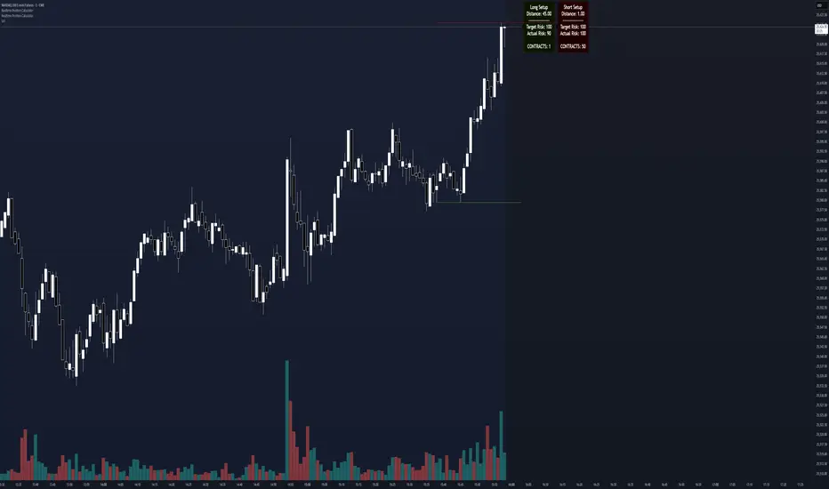
Max trades per day - 1

Realtime Position CalculatorRisk management is the single most important factor in trading success. This indicator automates the process of position sizing in real-time based on your account risk and a dynamic technical Stop Loss. It eliminates the need for manual calculations and helps you execute trades faster while adhering to strict risk management rules.
How it Works
The indicator visually places a Stop Loss line based on recent market structure (Highs/Lows) and instantly calculates the required position size (Contracts/Lots) to match your defined monetary risk.
1. Dynamic Stop Loss : It identifies the highest high (for Shorts) or lowest low (for Longs) over a user-defined lookback period.
2. Position Calculation : It calculates the distance between the current price and the Stop Loss level.
3. Formula : Contract Size = Risk Amount / (Distance * Point Value)
4. Actual vs. Target Risk : Because of the rounding, the script calculates and displays the Actual Risk (e.g., $95) alongside your Target Risk (e.g., $100), so you know exactly what is at stake.
Key Features
Real-time Calculation : Updates instantly as price moves.
Copy Trading Support : Includes an "Account Multiplier" setting. If you trade 10 accounts via a copy trader, set the multiplier to 10. The indicator will show the total contract size needed across all accounts.
Point Value Support : Works for Stocks/Crypto (Point Value = 1) and Futures (e.g., ES = 50, NQ = 20).
Customizable UI : Toggle specific data on/off in the label (e.g., hide price, show only contracts). Adjustable label offset to keep the chart clean.
Settings Guide
Trade Direction : Toggle between Long and Short setups. Add the indicator two times and set another for Longs and another for Shorts so you can see both direction at the same time.
Risk Amount : Your max risk in currency (e.g., $100).
Lookback : How many bars back to look for the SL pivot (e.g., 10 bars).
Point Value : Crucial for Futures. Use 1.0 for Crypto/Stocks. Use tick value/point value for futures (e.g., 50 for ES).
Account Multiplier : Multiply the position size for multiple accounts.
Label Offset : Move the information label to the right to avoid overlapping with price action.
Disclaimer
This tool is for informational and educational purposes only. Always verify calculations manually before executing trades. Past performance is not indicative of future results.
Global M2 YoY % Change (USD) 10W-12W LEADthe base script is from @dylanleclair I modified it slightly according to the views on liquidity by professionals — average estimated lead time to price of btc, leading 10-12 weeks. liquidity and bitcoin’s price performance track pretty close and so it’s a cool tool for phase recognition, forward guidance and expectation management.

ETH UU Reversion Strategy Strategy Overview
The "ETH UU Reversion Strategy" is a sophisticated mean-reversion trading system designed to capture price reversals at standard deviation extremes. Unlike typical strategies that enter trades immediately at market price, this script employs a proprietary **Limit Order Execution Mechanism** combined with volatility filtering to optimize entry prices and reduce slippage.
Originality & Key Features
This script addresses the common pitfalls of standard Bollinger Band strategies by introducing advanced order management logic:
1. Limit Order Execution:** Instead of market orders, the strategy calculates an optimal entry price based on ATR offsets. This allows traders to capitalize on "wicks" and secure better risk-reward ratios.
2. Smart Timeout Logic:To prevent "catching a falling knife," pending orders are automatically cancelled if not filled within a customizable number of bars (default: 15). This ensures orders do not remain active when market structure shifts.
3. Dynamic Risk Recalculation:** Stop Loss (SL) and Take Profit (TP) levels are recalculated at the exact moment of execution using the real-time ATR, ensuring risk parameters adapt to current market volatility.
How to Use
1. Setup: Apply the strategy to ETH/USDT (or other crypto pairs) on 15m or 1h timeframes.
2. Configuration:
* Adjust `BB Length` and `RSI Length` to fit your timeframe.
* Set `Order Timeout` to define how long a pending order should remain active.
* Toggle `Use ADX Filter` to avoid trading against strong trends.
3. *Visuals: The chart displays distinct labels for pending orders (Gray), active entries (Blue/Red), and cancellations, providing full transparency of the strategy's logic.
Risk Disclaimer
This script is for educational and quantitative analysis purposes only. Past performance regarding backtesting or live trading does not guarantee future results. Cryptocurrency trading involves high risk and high volatility. Please use proper risk management and trade at your own discretion.
-------------------------------------------------------------
Chinese Translation (中文说明)
策略概述
“ETH UU 均值回归策略”是一个旨在捕捉标准差极端位置价格反转的交易系统。与立即以市价入场的典型策略不同,本策略采用独特的**挂单执行机制**结合波动率过滤,以优化入场价格并减少滑点。
原创性与核心功能
本脚本通过引入高级订单管理逻辑,解决了普通布林带策略的常见缺陷:
1. 挂单交易模式: 策略不使用市价单,而是根据 ATR 偏移计算最佳入场价(Limit Orders)。这允许交易者捕捉K线的“影线”,获得更好的盈亏比。
2. 智能超时撤单: 为了防止“接飞刀”,如果挂单在指定K线数内(默认15根)未成交,系统会自动撤单。这确保了当市场结构发生变化时,旧的挂单不会被错误触发。
3. 动态风控重算: 止损和止盈在成交的瞬间根据实时 ATR 重新计算,确保风控参数始终适应当前的市场波动率。
风险提示
本脚本仅供教育和量化分析使用。回测或实盘的过往表现并不预示未来结果。加密货币交易具有极高的风险和波动性,请务必做好仓位管理,并自行承担使用本策略的风险。

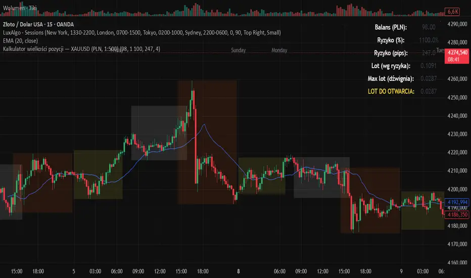
Kalkulator pozycji XAUUSD PLN, 1:500, 1100 to 100 kontaPosition calculator based on the number of pips that you quickly enter from the tool, this device will select the appropriate lot for you and you can quickly take a position