strongResistanceActually it is education purpose. This indicator is designed to help traders clearly identify strong Support & Resistance (SNR) levels along with high-probability Buy & Sell..
The indicator works smoothly on lower timeframes for binary trading.
Göstergeler ve stratejiler

Selected Days Indicator V3-TrDoes the stock drop every Wednesday? Do March months always move similarly? Does the 1st week of the month behave differently?
Do you ever say "it always makes this move in these months"? Don't you want to see more clearly whether it actually makes this move or not? Don't you want to see and test periodically repeating price patterns?
Hisse her Çarşamba düşüyor mu? Mart ayları hep benzer mi hareket ediyor? Ayın 1. haftası farklı mı davranıyor?
Bazen "bu aylarda hep bu hareketi yapıyor" dediğiniz oluyor mu? Gerçekten de bu hareketi yapıp yapmadığını daha net görmek istemez misiniz? Periyodik tekrarlayan fiyat kalıplarını görmek ve test etmek istemiyor musunuz?
1. Problem
Some stocks or crypto assets exhibit systematic behaviors on certain days, weeks, or months. But it's hard to see - everything is mixed together on the chart. This indicator isolates the days/weeks/months you want and shows only them. Hides everything else.
2. How It Works
Three-layer filter: Day (Monday, Tuesday...), Week (1st, 2nd, 3rd week of the month), Month (January, February...). Select what you want, let the rest disappear. Example: Show only Thursdays of March-June-September. Or compare every 1st week of the month. View as candlestick, line, or column chart.
3. What's It Good For?
Test "end-of-month effect". Find "day-of-the-week anomaly". Analyze crypto volatility by days. See seasonality in commodities. Discover patterns specific to your own strategy. Past data doesn't guarantee the future but provides statistical advantage.

Market + Direction + Entry + Hold + Exit v1.5 FINALOverview
This script is a complete trend-based trading framework designed to filter market conditions, determine directional bias, detect high-quality pullback entries, manage active trades, and identify trend-weakening exit points.
It is optimized for NQ futures, Gold (XAUUSD), and Bitcoin, with adaptive parameters for each asset.
The logic focuses on trading only when conditions are favorable, aligning entries with the primary trend, and avoiding low-probability setups.
1. Market Condition Filter
Before any signal appears, the script checks whether the market is active using three conditions:
ATR compared to ATR moving average (volatility condition)
Volume compared to average volume (liquidity condition)
Price distance from VWAP (suppression of mean-reversion environments)
A trade environment is considered active when at least two of these three conditions are positive.
2. Trend Direction Filter
Directional bias is defined by:
EMA21 relative to EMA55
Price relative to VWAP
Heikin-Ashi structure
When these conditions align, the script switches into long-only or short-only mode.
No counter-trend signals are displayed.
3. Entry Logic (L, L2, L3 and S, S2, S3)
The system identifies pullback entries within a confirmed trend.
Long entries require:
Uptrend confirmation
Price dipping toward EMA21 or EMA55
A constructive Heikin-Ashi candle
Market environment active
Short entries mirror the same structure in bearish conditions.
Re-entries (L2, L3, S2, S3) are given only if the trend remains intact after the first entry.
4. Hold Logic
A hold signal appears if momentum remains aligned with the trend.
Momentum is evaluated using the Stochastic indicator (K and D lines).
5. Exit Logic
An exit signal appears when:
The recent structural low (for longs) or high (for shorts) is broken, and
The EMA slope indicates weakening trend strength
This combination identifies high-probability trend exhaustion.
How to Use
Add the script to your chart.
Select an asset preset (NQ, GOLD, BTC).
Wait for the market to be active.
Follow the entry signals (L, L2, L3 or S, S2, S3).
Hold signals help confirm continuation.
Exit signals indicate potential trend reversal or weakness.
Feature Summary
Market environment filter
Trend direction filter
Pullback-based entry system
Multi-stage re-entry framework
Momentum-based hold signal
Structure-based exit
Asset-adaptive parameters
Clean chart visualization
Disclaimer
This script is for research and educational use.
It does not constitute financial advice.
Always backtest before using in live markets.
개요
이 스크립트는 시장 상태 필터링, 추세 방향 판단, 고품질 눌림목 진입, 보유 판단, 추세 약화 기반 청산까지 모두 포함하는 완전한 트레이딩 프레임워크입니다.
NQ, 골드(XAUUSD), 비트코인에 맞게 최적화되어 있습니다.
1. 시장 필터
다음 세 가지 중 두 가지 이상이 충족될 때만 매매 환경을 ‘활성’으로 판단합니다.
ATR 기준 변동성 체크
거래량 활성도 체크
가격의 VWAP 거리 체크
2. 방향(추세) 필터
다음 조건을 기반으로 상승·하락 추세를 결정합니다.
EMA21 vs EMA55
가격 vs VWAP
Heikin-Ashi 구조
이 조건이 일치할 때만 롱 전용 또는 숏 전용 모드로 진입합니다.
3. 진입 로직
추세가 유지되는 상태에서 EMA21 또는 EMA55까지 눌림이 나올 때
L 또는 S 신호를 제공합니다.
추세가 유지되면 L2/L3, S2/S3 재진입 신호가 추가로 발생합니다.
4. 보유(Hold)
모멘텀이 추세 방향과 일치할 때 보유 신호를 제공합니다.
5. 청산(Exit)
다음 두 조건이 동시에 나타날 때 청산 신호가 표시됩니다.
직전 구조(스윙)가 붕괴될 때
EMA 기울기가 약화될 때
사용 방법
차트에 스크립트를 추가합니다.
자산 프리셋(NQ, GOLD, BTC)을 선택합니다.
시장이 활성일 때만 신호를 참고합니다.
L/S 진입 신호와 보유/청산 신호를 활용해 매매 흐름을 관리합니다.

Universe_Super MA [MTF & Multi-Type]**Overview**
"Universe_Super MA" is a comprehensive trend analysis tool designed to overcome indicator limits. Instead of adding 4 separate moving averages, this script allows you to monitor 4 distinct Moving Averages within a single indicator slot.
It features full **Multi-Timeframe (MTF)** capabilities, meaning you can view higher timeframe trends (e.g., Daily 200 SMA) while trading on lower timeframes (e.g., 15-minute chart).
**Default Configuration (Institutional Setup)**
The indicator comes pre-loaded with a powerful institutional trend setup:
1. **50 Period (Green):** Short-term trend and dynamic support.
2. **99 Period (Orange):** Medium-term trend filter.
3. **200 Period (Red):** The classic institutional dividing line between Bull and Bear markets.
4. **389 Period (Blue):** A long-term "Deep Trend" baseline used to identify major market cycles and heavy support/resistance levels.
**Key Features**
* **fully Customizable:** You can change the Length, Color, and Width of each line.
* **Multi-Timeframe (MTF):** Select any timeframe for any MA. (e.g., Keep MA1 on the "Chart" timeframe, but lock MA4 to the "Daily" timeframe).
* **6 MA Types:** Choose between SMA, EMA, WMA, HMA (Hull), RMA, and VWMA for each line independently.
* **Clean Interface:** Toggle any line On/Off via settings without removing the indicator.
**Usage & Interpretation**
* **Trend Identification:** The 200 (Red) and 389 (Blue) lines are designed to visualize the long-term market bias. In technical analysis, price action sustaining above these levels is generally considered a bullish context, while price below suggests a bearish context.
* **Crossover Monitoring:** The script facilitates the observation of interactions between short-term and long-term averages (e.g., the 50 crossing the 200), allowing users to easily spot common technical patterns like the "Golden Cross".
* **Dynamic Levels:** The 99 and 200-period lines act as dynamic levels that may align with technical support or resistance zones during market retracements.
**Settings**
* **Timeframe:** Leave empty to use the current chart's timeframe, or select a specific one (e.g., "1D" or "4H").
* **Type:** Select your preferred calculation method (SMA is default).
**Disclaimer**
This tool is for educational purposes and trend visualization only. Always manage your risk.

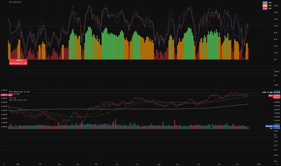
NSE Swing Breadth NSE Swing Breadth – Market Health Dashboard (0–200, % from Neutral)
Overview
NSE Swing Breadth – Market Health Dashboard is a market-wide health and regime indicator designed to track internal strength and participation across Large-, Mid-, and Small-cap indices in the Indian equity market.
Instead of focusing on price alone, this tool measures how strongly each segment is behaving relative to its own swing trend, normalizes those movements, and combines them into a single Market Health score. The result is a clean, objective dashboard that helps traders identify Risk-On, Caution, and Risk-Off regimes.
This indicator is best used for position sizing, exposure control, and timing aggressiveness, rather than individual stock entries.
Data Used
The indicator internally tracks three broad NSE indices:
Large Caps → NIFTY100EQUALWEIGHT
Mid Caps → NIFTYMIDCAP150
Small Caps → NIFTYSMLCAP250
Using equal-weighted and broad indices ensures the signal reflects true market participation, not just index heavyweights.
Core Logic
1. Swing Strength Model
For each index, the script calculates normalized swing strength:
Price is compared to its EMA swing baseline
The deviation from the EMA is normalized using the EMA of absolute deviations
This creates a volatility-adjusted strength value, allowing fair comparison across market regimes
This answers the question:
Is this segment pushing meaningfully above or below its recent trend?
2. Strength Converted to % from Neutral (Baseline = 100)
Each segment’s strength is converted into percentage-style points around a neutral baseline of 100:
100 = Neutral
+15 = +15% strength above neutral
–20 = –20% weakness below neutral
These values are plotted as three smooth lines:
Blue → Large Caps
Orange → Mid Caps
Purple → Small Caps
This makes relative leadership and divergence immediately visible.
3. Market Health Score (0–100)
The indicator combines all three segments into a single Market Health score:
Large Caps → 40% weight
Mid Caps → 35% weight
Small Caps → 25% weight
Extreme values are clamped to avoid distortion, and the final score is normalized to a 0–100 scale:
70–100 → Strong, broad participation
40–69 → Mixed / unstable participation
0–39 → Weak, risk-off conditions
Visual Components
📊 Market Health Histogram
A vertical histogram displays Market Health (0–100) with enhanced visibility:
🟢 Green (≥ 70) → Strong Risk-On regime
🟠 Orange (40–69) → Caution / Transition
🔴 Red (< 40) → Risk-Off regime
The histogram is visually compact and designed to reflect true market health, not exaggerated spikes.
📈 Strength Lines (Baseline = 100)
Three strength lines show % deviation from neutral:
Above 100 → Positive internal strength
Below 100 → Internal weakness
These lines help identify:
Leadership (which segment is driving the market)
Early deterioration (small/mid caps weakening first)
Broad confirmation (all segments rising together)
Dashboard Tables
📌 Market Regime Table (Bottom-Left)
Displays the current market regime:
🟢 RISK ON
🟡 CAUTION
🔴 RISK OFF
Along with the exact Market Health score (0–100).
📌 Strength Table (Top-Right)
Shows Large / Mid / Small cap strength as % from neutral, for example:
+18% → 18% above neutral
–12% → 12% below neutral
This avoids misleading interpretations and keeps values intuitive and actionable.
How to Use This Indicator
Risk-On (Green)
Favor full position sizes, trend-following strategies, and broader participation trades.
Caution (Orange)
Reduce leverage, tighten stops, and be selective. Expect choppiness.
Risk-Off (Red)
Prioritize capital protection, reduce exposure, and avoid aggressive longs.
This indicator is not an entry signal — it is a market environment filter.
⚠️ Important Style Setting (Required)
For correct visualization:
Settings → Style → Uncheck “Labels on price scale”
This prevents the indicator’s internal 0–200 model scale from interfering with the chart’s price scale and keeps the pane clean and readable.
Summary
NSE Swing Breadth – Market Health Dashboard provides a clear, objective view of market internals, helping traders align their risk with the true underlying condition of the market — not just price movement.
It is especially effective for:
Market regime identification
Exposure management
Avoiding false breakouts in weak breadth environments

Pivot Points High LowGaneshA Pivot Points High/Low indicator that:
Detects swing highs (ta.pivothigh) and swing lows (ta.pivotlow) using configurable left/right bar lengths.
Draws labels at the confirmed pivot points:
Down labels at pivot highs (potential resistance).
Up labels at pivot lows (potential support).
Lets you customize text color and label fill color separately for highs and lows.
It’s designed for overlay (on-price chart), with max_labels_count=500 to allow many labels.
H1 Bias Rhythmic Lite Public V1.0 by SRTH1 Bias Rhythmic Lite Public V1.0 by SRT
Version: 1.0 (Public Lite)
Author: SRT
Platform: TradingView / Pine Script v6
Overlay: Yes (works directly on price chart)
Purpose: Provide H1 directional bias with D1 alignment and basic rhythm signals. Perfect for traders looking for clean bias visualization without clutter.
💡 Key Features
H1 Bias (Primary Engine)
Uses EMA7, EMA40, SMA150, and SMA200 for H1 directional bias.
Clearly identifies bullish, bearish, and neutral conditions.
Stack-based logic ensures consistency and reliability.
D1 Bias Alignment
Pulls higher timeframe (daily) EMA40, SMA150, SMA200.
Confirms H1 bias alignment with daily trend.
Helps filter trades in the direction of the larger trend.
Flush Detection
H1 flushes: Price fully “flushed” beyond EMA7 for bullish/bearish setups.
D+H1 flush: Aligns H1 flush with D1 bias for stronger context.
Visual dots with configurable sizes and colors indicate flush levels.
Price Action Signals
Engulfing (EB) detection with ATR filtering and body % thresholds.
Long Tail Body (LTB) detection with optional body % filter for precise swing points.
Both EB and LTB signals show clear labels above/below the candle for instant recognition.
ATR-Based Dynamic Offsets
Uses ATR (configurable length) to scale labels and flush dot offsets dynamically.
Ensures signals are proportionate to volatility.
Daily Pivot & Session Lines
Daily pivot plotted automatically.
Option to show daily session high-low lines and day labels.
Easily configurable label sizes and colors.
Bias Summary Table
Top-right table shows:
D1 bias
H1 bias
LTB allowed (Yes/No)
Color-coded for easy reference: green = Bull, red = Bear, gray = Neutral.
Alerts
H1 flush and D+H1 flush alerts.
LTB active alerts when bias is aligned.
Perfect for keeping an eye on actionable swings.
⚙️ User Inputs
Moving Average Lengths: EMA7, EMA40, SMA150, SMA200
Show/Hide MAs: Toggle to declutter the chart
ATR Settings: Length and % threshold for EB/LTB sizing
Signal Toggles: Show/Hide EBull, EBear, LTB Bull, LTB Bear, Flush Dots
Daily Pivot & Label Settings: Toggle visibility, label size, line/text colors
✅ Advantages for Users
Lightweight and fast — minimal lag on H1 charts.
Clear visualization of market bias and swing points.
Free access to core H1 Bias Rhythmic methodology.
Serves as a learning tool for traders who want to upgrade later.
⚠️ Limitations
No automatic entries, stops, or take profits (manual trade execution required).
Lite version only offers simplified signals and bias visualization.
Advanced rhythm and multi-timeframe alerts are reserved for the Premium version.
📢 Short Promo for Premium
For traders who want full power, check out H1 Bias Rhythmic Premium V1.0 by SRT — complete multi-phase alerts, advanced LTB & EB filters, EMA/SMA flip confirmations, and professional-level rhythm signals. Upgrade to premium for the full H1 trading experience.

Hybrid Strategy: Trend/ORB/MTFHybrid Strategy: Trend + ORB + Multi-Timeframe Matrix
This script is a comprehensive "Trading Manager" designed to filter out noise and identify high-probability breakout setups. It combines three powerful concepts into a single, clean chart interface: Trend Alignment, Opening Range Breakout (ORB), and Multi-Timeframe (MTF) Analysis.
It is designed to prevent "analysis paralysis" by providing a unified Dashboard that confirms if the trend is aligned across 5 different timeframes before you take a trade.
How it Works
The strategy relies on the "Golden Trio" of confluence:
1. Trend Definition (The Setup) Before looking for entries, the script analyzes the immediate trend. A bullish trend is defined as:
Price is above the Session VWAP.
The fast EMA (9) is above the slow EMA (21). (The inverse applies for bearish trends).
2. The Signal (The Trigger) The script draws the Opening Range (default: first 15 minutes of the session).
Buy Signal: Price breaks above the Opening Range High while the Trend is Bullish.
Sell Signal: Price breaks below the Opening Range Low while the Trend is Bearish.
3. The Confirmation (The Filter) A signal is only valid if the Higher Timeframe (default: 60m) agrees with the direction. If the 1m chart says "Buy" but the 60m chart is bearish, the signal is filtered out to prevent false breakouts.
Key Features
The Matrix Dashboard A zero-lag, real-time table in the corner of your screen that monitors 5 user-defined timeframes (e.g., 5m, 15m, 30m, 60m, 4H).
Trend: Checks if Price > EMA 21.
VWAP: Checks if Price > VWAP.
ORB: Checks if Price is currently above/below the Opening Range of that session.
D H/L: Warns if price is near the Daily High or Low.
PD H/L: Warns if price is near the Previous Daily High or Low.
Visual Order Blocks The script automatically identifies valid Order Blocks (sequences of consecutive candles followed by a strong explosive move).
Chart: Draws Green/Red zones extending to the right, showing where price may react.
Dashboard: Displays the exact High, Low, and Average price of the most recent Order Blocks for precision planning.
Risk Management (Trailing Stop) Once a trade is active, the script plots Chandelier Exit dots (ATR-based trailing stop) to help you manage the trade and lock in profits during trend runs.
Visual Guide (Chart Legend)
⬜ Gray Box: Represents the Opening Range (first 15 minutes). This is your "No Trade Zone." Wait for price to break out of this box.
🟢 Green Line: The Opening Range High. A break above this line signals potential Bullish momentum.
🔴 Red Line: The Opening Range Low. A break below this line signals potential Bearish momentum.
🟢 Green / 🔴 Red Zones (Boxes): These are Order Blocks.
🟢 Green Zone: A Bullish Order Block (Demand). Expect price to potentially bounce up from here.
🔴 Red Zone: A Bearish Order Block (Supply). Expect price to potentially reject down from here.
⚪ Dots (Trailing Stop):
🟢 Green Dots: These appear below price during a Bullish trend. They represent your suggested Stop Loss.
🔴 Red Dots: These appear above price during a Bearish trend.
🏷️ Buy / Sell Labels:
BUY: Triggers when Price breaks the Green Line + Trend is Bullish + HTF is Bullish.
SELL: Triggers when Price breaks the Red Line + Trend is Bearish + HTF is Bearish.
Settings
Session: Customizable RTH (Regular Trading Hours) to filter out pre-market noise.
Matrix Timeframes: 5 fixed slots to choose which timeframes you want to monitor.
Order Blocks: Adjust the sensitivity and lookback period for Order Block detection.
Risk: Customize the ATR multiplier for the trailing stop.
Disclaimer
This tool is for educational purposes only. Past performance does not guarantee future results. Always manage your risk properly.

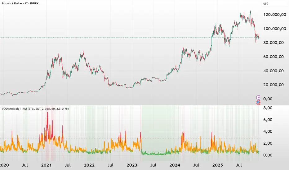
BTC - VDD Multiple (Approx)Overview & Philosophy
⚠️ Note: This indicator is optimized for the Daily (1D) Timeframe. Please switch your chart to 1D for accurate signal reading.
The BTC – VDD Multiple (Approx) is an advanced oscillator designed to identify market overheating and cycle tops by analyzing the velocity of value moving through the market.
In traditional On-Chain Analysis, Value Days Destroyed (VDD) is a premier metric for spotting macro tops. It multiplies the coin age (how long a coin was held) by the price at which it was moved. When old coins (HODLer money) move at high prices, VDD spikes, signaling massive profit-taking.
The Problem: Real "Coin Days Destroyed" (CDD) data is typically locked behind institutional paywalls or unavailable on standard TradingView plans.
The Solution: This script calculates a Deterministic Proxy. By analyzing the relationship between Exchange Volume, Price, and a Dormancy Constant, we can approximate the structure of the VDD Multiple without needing a premium data feed.
Methodology
The VDD Multiple works by comparing short-term market velocity against a long-term baseline.
1. The Proxy Calculation
Since we cannot directly access the age of coins on TradingView, we model the economic weight of the move:
Proxy Value = Exchange Volume * Price * Dormancy Factor
This creates a synthetic representation of "Value Throughput."
2. The Multiple
We compare the immediate heat of the market against the yearly trend:
• Short-Term MA (2 Days): Captures flash spikes and sudden liquidity exit events.
• Long-Term MA (365 Days): Represents the baseline "hum" of network activity.
VDD Multiple = Short Term MA / Long Term MA
How to Read the Chart
The indicator plots the Multiple as a line and uses background highlighting to signal extreme regimes.
🔴 The Red Zone (Overheated > 2.9)
Meaning: Current value transfer is ~3x higher than the yearly average.
Interpretation: Historically, sharp spikes into the Red Zone correlate with Local or Cycle Tops. This indicates that massive volume is changing hands at high prices—typically a sign of "Smart Money" distributing into "Dumb Money" FOMO.
Note: In strong bull runs, price can push higher even after a VDD spike, but the risk/reward ratio is extremely poor here.
🟢 The Green Zone (Undervalued < 0.75)
Meaning: Market activity is quiet and below the yearly baseline.
Interpretation: These are periods of apathy or accumulation. Historically, extended time spent in the Green Zone (the "flatline") has offered the best asymmetric buying opportunities.
🟠 The Orange Line (Neutral)
Meaning: The market is in transition or equilibrium.
Strategy & Context
This indicator is best used as a Macro Cycle Tool, not a day-trading signal.
• Exit Strategy: Look for "Clusters" of Red Spikes. A single spike often marks a local correction, but a cluster of intense spikes while price makes new highs (Divergence) is a strong Cycle Top warning.
• Entry Strategy: Historically the best entries occur when the indicator flattens out in the Green Zone for weeks or months. This suggests sellers are exhausted and the market has reached a floor.
Credits
This script is an approximation of the original VDD Multiple concept. Full credit for the underlying on-chain theory goes to the pioneers of this metric:
• Concept: The original Value Days Destroyed metric was popularized by Hans Hauge and Glassnode.
• The Multiple: The specific application of a Short/Long MA Multiple on VDD is widely attributed to analysts like TXMC and Bitbo.
This script adapts these concepts for the free TradingView environment using exchange volume proxies.
Settings
• Data Source: Defaults to BINANCE:BTCUSDT to capture high-volume liquidity.
• Short MA: Default is 2 Days to capture rapid velocity spikes.
• Long MA: Default is 365 Days to track the annual trend.
Disclaimer
This tool is an approximation based on exchange volume, not raw blockchain data. While exchange volume and on-chain volume are highly correlated during cycle extremes, they are not identical. This script is for educational and research purposes only. Past performance does not guarantee future results.
Tags
bitcoin, btc, onchain, vdd, cdd, valuation, cycle, top, bottom, Rob Maths
Candle LeverageTechnical indicator that calculates and visually displays the mathematical leverage factor of each individual candle.
FORMULA:
• Bullish Candle: Close ÷ (Close - Low)
• Bearish Candle: Close ÷ (High - Close)
VISUAL REPRESENTATION:
• Green labels above bullish candles with prefix "Lx"
• Red labels below bearish candles with prefix "Sx"
• The displayed number represents the calculated leverage value
TIME FRAME COMPATIBILITY:
• Works on ALL time frames (1 minute to monthly charts)
• Real-time calculation on each candle close
• Consistent behavior across all chart intervals
INTERPRETATION:
• Higher values indicate candles with smaller shadow proportion
• Lower values suggest candles with larger shadow proportion
• Purely quantitative analysis of candle structure
FEATURES:
• Purely mathematical calculation
• No predictions or trading signals
• Non-intrusive chart display
• Decimal places configuration available
• Compatible with any trading instrument (stocks, forex, crypto, etc.)
UTILITY:
For objective technical analysis of candle formations across any time frame, useful when combined with other analysis tools.
DISCLAIMER:
This indicator is provided for educational and research purposes only. It does not constitute financial advice. Trading involves significant risk of loss.

NY LONDON LUNCH AUTO**NY London Lunch Auto** is a precision session-anchor indicator designed for traders who focus on institutional timing and liquidity behavior.
This script automatically marks the **high and low of three key 15-minute New York session candles**:
• **3:00 AM NY** — London session expansion
• **8:00 AM NY** — New York open / kill zone
• **2:00 PM NY** — NY lunch / power hour transition
Each time one of these candles prints on the **15-minute chart**, the script captures its exact high and low and extends them forward as horizontal levels.
The levels remain **locked and unchanged** until the next key session candle appears, ensuring clean, non-repainting reference zones.
### Key Features
• Works **exclusively on the 15-minute timeframe**
• Automatically updates at **3AM, 8AM, and 2PM NY time**
• Levels stay fixed — no drifting or recalculation
• Clean, minimal design with customizable colors
• Ideal for liquidity sweeps, displacement, and ICT-style execution models
This indicator is built for traders who want **clarity, patience, and structure**, not clutter. It pairs seamlessly with liquidity sweep, displacement, and fair value gap strategies.

Stochastic RSI + RSI/ADX Stochastic RSI with RSI/ADX Display
DESCRIPTION:
Advanced momentum oscillator combining Stochastic RSI with Ehlers SuperSmoother filter for reduced noise and cleaner signals. Includes real-time RSI and ADX value displays for complete market analysis.
KEY FEATURES:
- Stochastic RSI applied to logarithmic price for normalized movements
- Ehlers SuperSmoother filter reduces lag while eliminating false signals
- Second derivative (curvature) analysis filters out low-probability setups
- Real-time RSI and ADX boxes with color-coded thresholds
- Buy/Sell signals only trigger with confirmed momentum and curvature alignment
COMPONENTS:
1. K Line (Blue): Smoothed Stochastic RSI
2. D Line (Orange): Signal line (SMA of K)
3. RSI Box: Green above 50, Red below 50
4. ADX Box: Green above 25 (trending), Red below 25 (ranging)
SIGNAL LOGIC:
BUY: K crosses above D + positive curvature + below midpoint (50)
SELL: K crosses below D + negative curvature + above midpoint (50)
PARAMETERS:
- K Smoothing: 10 (Ehlers filter period)
- D Smoothing: 3 (Signal line)
- RSI

UNDETECTED FX - 250 Pip LevelsIndicator Description – UNDETECTED FX: 250-Pip Psychological Levels
This indicator automatically plots major 250-pip psychological levels on XAUUSD and highlights the price zones around them. These levels act as strong reaction points where liquidity, reversals, and institutional activity commonly occur.
What the Indicator Does
✔ Plots every 250-pip level starting from a user-defined base (e.g., 4050 → 4075 → 4100 → 4125 → …)
✔ Each level is represented by a thick black horizontal line for maximum visual clarity
✔ Around every 250-pip level, the indicator draws a liquidity zone
Top of zone: +200 pips
Bottom of zone: –200 pips
(configured as ± zoneHalf in settings)
✔ Uses extend: both, so levels stretch across the entire chart and stay fixed, no matter how far you scroll
✔ Zones are filled with a customizable color for clear premium/discount visualization
✔ The indicator never repaints and requires no updates after drawing — all levels are fixed on their price coordinates
Why It’s Useful
🔹 Helps quickly identify institutional levels where gold often reacts
🔹 Acts as a framework for scalping, intraday trading, and swing bias
🔹 Makes it easy to spot liquidity sweeps, rejections, and premium/discount areas
🔹 Clearly shows market structure breaks around key psychological levels
🔹 Forces discipline by creating predefined, fixed levels for trading decisions
Best Use Case
XAUUSD scalpers
Intraday traders who rely on precision entries
Traders who use psychological levels, liquidity grabs, or smart-money concepts
Anyone wanting a clean, non-cluttered chart with high-impact levels only

Multi-TF RSI+EMA+Clean S/R v6Visual Confirmation (What You'll See)
✅ EMAs: Blue (9) + Red (21) lines
✅ Pivot Points: Red circles (high) + Green circles (low)
✅ S/R Lines: Red resistance + Green support
✅ MTF Table: Top-right corner (RSI/ADX values)
✅ Signals: 🚀 STRONG BUY / 🔻 STRONG SELL labels
✅ Background: Green/Red tint during strong trends

EMA 8 / 20 / 200Created to easily use the 8/20/200 strategy.
This indicator is designed to give a clear, multi-timeframe view of trend, momentum, and structure using three exponential moving averages.
1. Trend direction (EMA 200 – pink)
The 200 EMA acts as the long-term trend filter.
Price above the 200 EMA suggests a bullish market bias.
Price below the 200 EMA suggests a bearish market bias.
Many traders avoid taking trades against this higher-timeframe direction.
2. Momentum and trade bias (EMA 20 – blue)
The 20 EMA reflects short-term momentum.
When price respects the 20 EMA in an uptrend, pullbacks often provide continuation entries.
In downtrends, the 20 EMA frequently acts as dynamic resistance.
3. Entry timing (EMA 8 – yellow)
The 8 EMA is a fast reaction line used for precise timing.
Crosses of the 8 EMA over the 20 EMA can signal momentum shifts.
Strong trends often show price holding above (or below) the 8 EMA during impulse moves.
4. Confluence and trade filtering
The indicator works best when the EMAs are aligned:
Bullish alignment: EMA 8 > EMA 20 > EMA 200
Bearish alignment: EMA 8 < EMA 20 < EMA 200
Misaligned EMAs usually indicate consolidation or low-probability conditions.
5. Risk management context
EMAs can act as dynamic support and resistance:
Stops are often placed beyond the 20 EMA or 200 EMA depending on trade horizon.
Loss of EMA structure is a warning sign that the trend may be weakening.
In short, the indicator is a trend-first, momentum-second framework that helps you decide when to trade, in which direction, and when to stay out.

Expectativa de Juros (Fed)An indicator that measures future expectations for US interest rates, measured by the difference between the Fed's interest rate and pricing on the CME.

Liquidity Vacuum DetectorThis indicator identifies liquidity vacuum zones—price areas where the market previously moved quickly with little resistance. These zones often allow price to travel faster once re-entered, which is favorable for intraday options trading.
Vacuum zones are created during strong, clean impulse moves (large range, low overlap, thin participation). When price later enters a stored vacuum zone with volume expansion, the indicator prints a directional triangle to highlight a potential high-speed move.
Optional filters include VWAP directional bias and regular trading hours (RTH).
Designed as a trade filter and acceleration tool, not a predictive signal.
Best used in combination with key levels (PMH/PML, ORH/ORL, VWAP) and volume confirmation.

SigmaFlowSigmaFlow is a professional signal management connector designed to work with the SigmaFlow app. This indicator allows traders to structure trade setups (Entry, Stop Loss, TP1, TP2) on TradingView and send them into the SigmaFlow platform, where signals are managed, tracked, and delivered to Telegram.
Professional signal management — from TradingView to Telegram.
How SigmaFlow Works:
Sends trade data from TradingView to Telegram via the SigmaFlow platform.
SigmaFlow handles signal management, organization, history tracking, performance metrics, and Telegram delivery.
What It Does NOT Do:
Does not generate trading signals
Does not provide investment advice
Does not execute trades
Requirements:
TradingView plan with webhook alerts*
Active SigmaFlow account*
Disclaimer
SigmaFlow is a signal management and delivery tool only. All trade ideas are created manually by users. Trading involves risk and past performance does not guarantee future results.

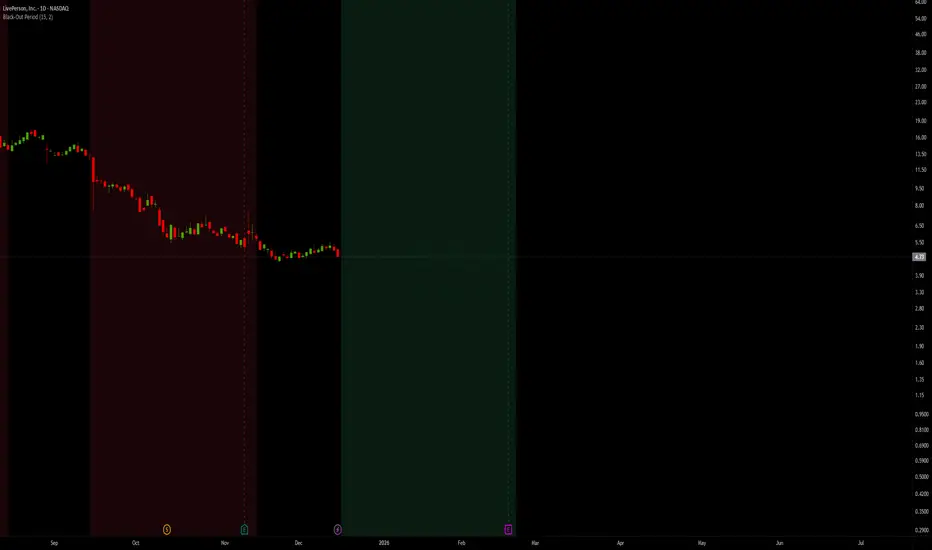
Black-Out PeriodYou'll need to input the black-out logic of the company you are analyzing manually. For example Liveperson, Insider trading and disclosure policy can be found here:
www.sec.gov
Under paragraph nr 12 we find:
"12.Black-Out Period. During the end of each fiscal quarter and until public disclosure of the financial results for that quarter, persons subject to this Policy may possess material nonpublic information about the expected financial results for the quarter. Even if you don’t actually possess any such information, any trades by you during that period may give the appearance that you are trading on inside information. Accordingly, the Company has designated a regularly-scheduled quarterly “black-out period” on trading beginning with the close of business on the 15th day of the last month of each fiscal quarter (or the close of business on the last day on which The Nasdaq Global Select Market is open prior to such 15th day, in the event that the Nasdaq Global Select Market is not open on such 15th day) and ending at the close of the second full trading day (day on which the relevant stock market is open) after public disclosure of the quarter’s financial results."
So we put in the values "15" and "2"
Note that other rules than those specific dates around earnings applies, and not all employees are subject to the same rules.
Ehlers ITL, Adaptive Alpha,Regime,PhaseThis indicator is an advanced extension of John Ehlers’ Instantaneous Trendline (ITL),
designed to provide market context rather than direct entry signals.
Instead of relying on simple crossovers, the script models market state using:
• Adaptive ITL (alpha adjusts to dominant cycle length)
• Hilbert-based phase analysis
• Cycle vs trend regime detection
• Phase locking to reduce noise and signal repetition
• Directional confirmation via ITL slope
The plotted markers represent phase shifts (context changes), not trade entries.
They indicate when bullish or bearish conditions become statistically favorable,
allowing traders to align discretionary or systematic strategies
(e.g. SMC, market structure, pullbacks, or execution models) with the dominant market phase.
This tool is intended for contextual analysis and decision support.
It does not predict price, does not repaint signals,
and should be used as a directional and regime filter, not as a standalone system.
© 2025 — All rights reserved.
Unauthorized redistribution or commercial use is prohibited.

Dynamic Multi-Timeframe SMAs (Brian Shannon Style)Overview : This indicator implements the logic of Brian Shannon's "Multi-Timeframe Analysis" on intraday charts. It automatically calculates the correct length for the 5-Day and 50-Day Simple Moving Averages (SMA), regardless of the timeframe (e.g., 5m, 15m, 1h) you are viewing.
How it works Standard SMAs only count bars. A "50 SMA" on a 5-minute chart only looks back ~4 hours. This script dynamically calculates how many bars represent full trading days.
Features:
Asset Class Selector : Choose between Crypto (24/7) and Stocks (6.5h US Session) to ensure correct minute-per-day calculations.
Info Table : Displays exactly how many bars are being used for the calculation in real-time.
