Ortalama Gerçek Aralık (ATR)
Golden Ladder – Louay Joha (Wave & Gann Hi/Lo + ATR R-Levels)Overview
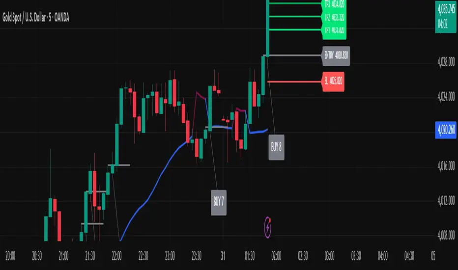
Golden Ladder is a momentum-and-structure tool that detects three-bar ladder waves and filters them with a Gann Hi/Lo regime guide (SMA-based). When a valid wave aligns with the current Hi/Lo bias and passes optional market filters (ADX, RSI, and proximity to recent extremes), the script prints BUY/SELL n labels (n = wave index) and draws a complete Entry / SL / TP1–TP4 ladder using ATR-based risk units (R) or fixed caps—configured for clarity and consistency. The script also keeps the chart clean: the last trade remains fully drawn while historical groups are trimmed to compact “ENTRY-only” stubs.
Why these components together (originality)
Three-bar ladder captures short-term momentum structure (progressively higher highs/lows for buys; the reverse for sells).
Gann Hi/Lo (SMA of highs/lows with a directional state) acts as a regime filter, reducing counter-trend ladders.
ATR-based R ladder turns signals into an actionable plan: a volatility-aware SL and TP1–TP4 that scale across instruments/timeframes.
Smart Entry filters (ADX strength, RSI extremes, and distance from recent top/bottom using ATR buffers) seek to avoid low-quality, stretched entries.
Slim history keeps only a short ENTRY stub for prior groups, so the signal you just got is always the most readable.
This is not a mere mashup; each layer constrains the others to produce fewer, clearer setups.
How it works (high-level logic)
Regime (Gann Hi/Lo):
Compute SMA(high, HPeriod) and SMA(low, LPeriod).
Direction state HLv flips when the close crosses above/below its track; one unified Hi/Lo guide is plotted.
Ladder signal (structure + confirmation):
BUY ladder: three consecutive green bars with rising highs and rising lows and HLv == +1.
SELL ladder: mirror conditions with HLv == -1.
Signals evaluate intrabar and are controlled by Smart Entry filters (ADX/RSI/extreme checks).
Risk ladder (R-based or capped):
Default: risk = ATR(atr_len) × SL_multiple and TPs in R.
Optional fixed caps by timeframe (e.g., M1/M5) using USD per point.
Longs: SL = entry – risk; TPi = entry + (Ri × risk).
Shorts: SL = entry + risk; TPi = entry – (Ri × risk).
All levels auto-reflow to the right as bars print.
Chart hygiene:
The latest trade shows ENTRY/SL/TP1–TP4 fully.
Older trades are automatically trimmed (only a short ENTRY line remains, with optional label).
Alerts:
BUY – Smart Entry (Tick) & SELL – Smart Entry (Tick) fire on live-qualified signals.
You can connect alerts to your automation, respecting your broker’s risk controls.
Inputs (English summary of UI)
Label settings: label size; ATR-based vs fixed-tick offsets; leader line width/transparency; horizontal label shift.
Gann Hi/Lo: HIGH Period (HPeriod), LOW Period (LPeriod).
Market filters: ADX (length, smoothing, minimum), RSI (length + caps), recent extremes (lookback + ATR buffer).
Entry/SL/TP Levels: TP1–TP4 (R), label right-shift, show last-trade prices on labels.
Fixed SL Caps: per-timeframe caps (M1/M5) via USD per point.
How to use
Apply on your instrument/timeframe; tune H/L periods and filters to your market (e.g., XAUUSD on M1/M5).
Favor signals aligned with the Hi/Lo regime; tighten filters (higher ADX, stricter RSI caps) to reduce noise.
Choose ATR-Risk or fixed caps depending on your preferences.
The drawing policy ensures the most recent trade remains front-and-center.
Notes & limitations
Signals can evaluate intrabar; MA-based context is inherently lagging.
ATR-based ladders adapt to volatility; extreme spikes can widen risk.
This is a technical analysis tool, not financial advice.
ATR x Trend x Volume SignalsATR x Trend x Volume Signals is a multi-factor indicator that combines volatility, trend, and volume analysis into one adaptive framework. It is designed for traders who use technical confluence and prefer clear, rule-based setups.
🎯 Purpose
This tool identifies high-probability market moments when volatility structure (ATR), momentum direction (CCI-based trend logic), and volume expansion all align. It helps filter out noise and focus on clean, actionable trade conditions.
⚙️ Structure
The indicator consists of three main analytical layers:
1️⃣ ATR Trailing Stop – calculates two adaptive ATR lines (fast and slow) that define volatility context, trend bias, and potential reversal points.
2️⃣ Trend Indicator (CCI + ATR) – uses a CCI-based logic combined with ATR smoothing to determine the dominant trend direction and reduce false flips.
3️⃣ Volume Analysis – evaluates volume deviations from their historical average using standard deviation. Bars are highlighted as medium, high, or extra-high volume depending on intensity.
💡 Signal Logic
A Buy Signal (green) appears when all of the following are true:
• The ATR (slow) line is green.
• The Trend Indicator is blue.
• A bullish candle closes above both the ATR (slow) and the Trend Indicator.
• The candle shows medium, high, or extra-high volume.
A Sell Signal (red) appears when:
• The ATR (slow) line is red.
• The Trend Indicator is red.
• A bearish candle closes below both the ATR (slow) and the Trend Indicator.
• The candle shows medium, high, or extra-high volume.
Only one signal can appear per ATR trend phase. A new signal is generated only after the ATR direction changes.
❌ Exit Logic
Exit markers are shown when price crosses the slow ATR line. This behavior simulates a trailing stop exit. The exit is triggered one bar after entry to prevent same-bar exits.
⏰ Session Filter
Signals are generated only between the user-defined session start and end times (default: 14:00–18:00 chart time). This allows the trader to limit signal generation to active trading hours.
💬 Practical Use
It is recommended to trade with a fixed risk-reward ratio such as 1 : 1.5. Stop-loss placement should be beyond the slow ATR line and adjusted gradually as the trade develops.
For better confirmation, the Trend Indicator timeframe should be higher than the chart timeframe (for example: trading on 1 min → set Trend Indicator timeframe to 15 min; trading on 5 min → set to 1 hour).
🧠 Main Features
• Dual ATR volatility structure (fast and slow)
• CCI-based trend direction filtering
• Volume deviation heatmap logic
• Time-restricted signal generation
• Dynamic trailing-stop exit system
• Non-repainting logic
• Fully optimized for Pine Script v6
📊 Usage Tip
Best results are achieved when combining this indicator with additional technical context such as support-resistance, higher-timeframe confirmation, or market structure analysis.
📈 Credits
Inspired by:
• ATR Trailing Stop by Ceyhun
• Trend Magic by Kivanc Ozbilgic
• Heatmap Volume by xdecow
SuperTrend Cyan — Split ST & Triple Bands (A/B/C)SuperTrend Cyan — Split ST & Triple Bands (A/B/C)
✨ Concept:
The SuperTrend Cyan indicator expands the classical SuperTrend logic into a split-line + triple-band visualization for clearer structure and volatility mapping.
Instead of a single ATR-based line, this tool separates SuperTrend direction from volatility envelopes (A/B/C), providing a layered view of both regime and range compression.
✨ The design goal:
Preserve the simplicity of SuperTrend
Add volatility context via multi-band envelopes
Provide a compact MTF (Multi-Timeframe) summary for broader trend alignment
✨ How It Works
1. SuperTrend Core (Active & Opposite Lines)
Uses ATR-based bands (Factor × ATR-Length).
Active SuperTrend is plotted according to current regime.
Opposite SuperTrend (optional) shows potential reversal threshold.
2. Triple Band System (A/B/C)
Each band (A, B, C) scales from the median price (hl2) by different ATR multipliers.
A: Outer band (wider, long-range context)
B: Inner band (mid-range activity)
C: Core band (closest to price, short-term compression)
Smoothness can be controlled with EMA.
Uptrend fills are lime-toned, downtrend fills are red-toned, with adjustable opacity (gap intensity).
3. Automatic Directional Switch
When the regime flips from up → down (or vice versa), the overlay automatically switches between lower and upper bands for a clean transition.
4. Multi-Timeframe SuperTrend Table
Displays SuperTrend direction across 5m, 15m, 1h, 4h, and 1D frames.
Green ▲ = Uptrend, Red ▼ = Downtrend.
Useful for checking cross-timeframe trend alignment.
✨ How to Read It
Green SuperTrend + Lime Bands
- Uptrend regime; volatility expanding upward
Red SuperTrend + Red Bands
- Downtrend regime; volatility expanding downward
Narrow gaps (A–C)
- Low volatility / compression (potential squeeze)
Wide gaps
- High volatility / active trend phase
Opposite ST line close to price
- Early warning for regime transition
✨ Practical Use
Identify trend direction (SuperTrend color & line position).
Assess volatility conditions (band width and gap transparency).
Watch for MTF alignment: consistent up/down signals across 1h–4h–1D = strong structural trend.
Combine with momentum indicators (e.g., RSI, DFI, PCI) for confirmation of trend maturity or exhaustion.
✨ Customization Tips
ST Factor / ATR Length
- Adjust sensitivity of SuperTrend direction changes
Band ATR Length
- Controls overall smoothness of volatility envelopes
Band Multipliers (A/B/C)
- Define how wide each volatility band extends
Gap Opacity
- Affects visual contrast between layers
MTF Table
- Enable/disable multi-timeframe display
✨ Educational Value
This script visualizes the interaction between trend direction (SuperTrend) and volatility envelopes, helping traders understand how price reacts within layered ATR zones.
It also introduces a clean MTF (multi-timeframe) perspective — ideal for discretionary and system traders alike.
✨ Disclaimer
This indicator is provided for educational and research purposes only.
It does not constitute financial advice or a trading signal.
Use at your own discretion and always confirm with additional tools.
───────────────────────────────
📘 한국어 설명 (Korean translation below)
───────────────────────────────
✨개념
SuperTrend Cyan 지표는 기존의 SuperTrend를 확장하여,
추세선 분리(Split Line) + 3중 밴드 시스템(Triple Bands) 으로
시장의 구조적 흐름과 변동성 범위를 동시에 시각화합니다.
단순한 SuperTrend의 강점을 유지하면서도,
ATR 기반의 A/B/C 밴드를 통해 변동성 압축·확장 구간을 직관적으로 파악할 수 있습니다.
✨ 작동 방식
1. SuperTrend 코어 (활성/반대 라인)
ATR×Factor를 기반으로 추세선을 계산합니다.
현재 추세 방향에 따라 활성 라인이 표시되고, “Show Opposite” 옵션을 켜면 반대편 경계선도 함께 보입니다.
2. 트리플 밴드 시스템 (A/B/C)
hl2(중간값)를 기준으로 ATR 배수에 따라 세 개의 밴드를 계산합니다.
A: 외곽 밴드 (가장 넓고 장기 구조 반영)
B: 중간 밴드 (중기적 움직임)
C: 코어 밴드 (가격에 가장 근접, 단기 변동성 반영)
EMA 스무딩으로 부드럽게 조정 가능.
업트렌드 구간은 라임색, 다운트렌드는 빨간색 음영으로 표시됩니다.
3. 자동 전환 시스템
추세가 전환될 때(Up ↔ Down), 밴드 오버레이도 자동으로 교체되어 깔끔한 시각적 구조를 유지합니다.
4. MTF SuperTrend 테이블
5m / 15m / 1h / 4h / 1D 프레임별 SuperTrend 방향을 표시합니다.
초록 ▲ = 상승, 빨강 ▼ = 하락.
복수 타임프레임 정렬 확인용으로 유용합니다.
✨ 해석 방법
초록 SuperTrend + 라임 밴드
- 상승 추세 및 확장 구간
빨강 SuperTrend + 레드 밴드
- 하락 추세 및 확장 구간
밴드 폭이 좁음
- 변동성 축소 (스퀴즈)
밴드 폭이 넓음
- 변동성 확장, 추세 강화
반대선이 근접
- 추세 전환 가능성 높음
✨ 활용 방법
SuperTrend 색상으로 추세 방향을 확인
A/B/C 밴드 폭으로 변동성 수준을 판단
MTF 테이블을 통해 복수 타임프레임 정렬 여부 확인
RSI, DFI, PCI 등 다른 지표와 함께 활용 시, 추세 피로·모멘텀 변화를 조기에 파악 가능
✨ 교육적 가치
이 스크립트는 추세 구조(SuperTrend) 와 변동성 레이어(ATR Bands) 의 상호작용을
시각적으로 학습하기 위한 교육용 지표입니다.
또한, MTF 구조를 통해 시장의 “위계적 정렬(hierarchical alignment)”을 쉽게 인식할 수 있습니다.
✨ 면책
이 지표는 교육 및 연구 목적으로만 제공됩니다.
투자 판단의 책임은 사용자 본인에게 있으며, 본 지표는 매매 신호를 보장하지 않습니다.

Directional Flow Index (DFI) — v2.4Directional Flow Index (DFI) — v2.4
✨ 1) What DFI measures (conceptual)
DFI aims to quantify directional flow —i.e., whether trading activity is skewed toward buying (supportive pressure) or selling (resistive pressure) —and then present it as a normalized oscillator that is easy to compare across symbols and timeframes. It is designed to highlight high-confidence thrusts within a prevailing trend and to detect fatigue as momentum decays.
Positive DFI (> 0) : net buy-side pressure dominates.
Negative DFI (< 0) : net sell-side pressure dominates.
Magnitude reflects intensity after de-trending and Z-score normalization.
While multiple “flow” proxies exist, this version emphasizes a True Volume Delta (TVD) workflow (default) that tallies buy vs. sell volume from a lower timeframe (LTF) inside an anchor timeframe bar, producing a more realistic per-bar delta when supported by the symbol’s data.
✨ 2) Core pipeline (how it works)
Flow construction (TVD default).
Using ta.requestVolumeDelta(LTF, Anchor), the script approximates up-volume vs. down-volume inside each anchor bar.
A per-bar delta is derived (with a reset on anchor switches to avoid jumps).
If TVD is unsupported on the symbol, DFI can fall back to synthetic proxies (e.g., Synthetic Delta Volume: (close-low)/(high-low) × vol), but TVD is the intended default.
CVD-style accumulation.
Per-bar delta is cumulatively summed into a running flow line (CVD-like), providing temporal context to the net pressure.
High-pass de-trending + smoothing.
A high-pass step (EMA-based) removes slow drifts (trend bias) from the CVD line.
A short EMA smoothing reduces noise while preserving thrust.
Z-score normalization.
The de-trended series is standardized (rolling mean/std), so DFI readings are comparable across markets/timeframes.
The Signal line is an EMA of DFI and is used for momentum cross checks.
SuperTrend (regime filter).
A lightweight SuperTrend (ATR len=5, factor=6 by default) provides up/down regime.
DFI coloring and alerts can be conditioned on the regime (optional).
Fatigue % (0–100).
Tracks energy (EMA of |DFI|) vs. peak energy (with adaptive half-life decay).
When energy stays far below the decaying peak, Fatigue% rises, suggesting momentum exhaustion.
The decay rate adapts to DFI volatility and regime alignment, so decay is faster when thrusts are misaligned with trend, slower when aligned and orderly.
Gradient highlight (confidence shading).
Histogram color transparency blends three ingredients:
DFI strength (|DFI| vs user-set bands)
Low fatigue (fresher thrusts score higher)
Regime alignment (DFI sign vs SuperTrend direction)
Result: darker bars indicate higher confidence in thrust quality; faint bars warn of weaker, stale, or misaligned pushes.
✨ 3) Interpreting the plots
DFI histogram (columns):
Green above zero for buy-side thrust, Red below zero for sell-side thrust.
Opacity encodes confidence (darker = stronger alignment & lower fatigue).
Signal (line): EMA of DFI used for momentum regime checks.
Zero line: structural reference for thrust crossovers.
Fatigue Table (optional): shows Fatigue%, SuperTrend regime, and selected Flow Method.
✨ 4) Alerts (examples)
Long Thrust: DFI crosses above zero while in Up regime.
Short Thrust: DFI crosses below zero while in Down regime.
Loss of Momentum (Up): DFI crosses below Signal while DFI > 0 (warns of weakening long thrust).
Loss of Momentum (Down): DFI crosses above Signal while DFI < 0 (warns of weakening short thrust).
✨ 5) How to set the TVD Lower TF (important)
TVD needs a sensible LTF/Anchor ratio for balanced accuracy and performance. As a rule of thumb, aim for ~30–120 LTF bars inside one anchor bar:
1h chart → 1–2m LTF (if seconds not available).
4h → 3–5m.
1D → 15–30m.
1W → 1–2h.
1M → 4h–1D.
Notes: Some symbols/exchanges do not provide seconds. Too small an LTF can be heavy/noisy; too large becomes coarse/laggy.
✨ 6) Practical usage patterns
Trend-following entries:
Look for DFI > 0 in Up regime (green) with low Fatigue%, and DFI crossing above zero or above its Signal.
Prefer darker (higher-confidence) histogram bars.
Trend-following exits / de-risking:
Rising Fatigue% toward your high threshold (e.g., 80–90) suggests exhaustion.
DFI vs Signal crosses against your position can be used to scale down.
Avoid chop:
When DFI oscillates around zero with faint bars and Fatigue% rises quickly, quality is low—be selective.
✨ 7) Inputs (summary)
Flow Method: default True Volume Delta (LTF scan); synthetic fallbacks available.
Processing: Detrend length, smoothing EMA, Z-score window, Signal EMA.
Regime: SuperTrend ATR length & factor (default 5 & 6).
Fatigue%: EMA length, base half-life, adaptive volatility coupling (enable/disable, sensitivity).
UI Highlight: strength thresholds, fatigue cap, alignment weights, opacity range.
Table: toggle Fatigue table, decimals, position.
✨ 8) Compatibility & performance notes
TVD requires supported data for the symbol; if unavailable, DFI can switch to synthetic deltas.
Smaller LTFs increase request load and may introduce noise; prefer a balanced ratio.
The indicator is designed to be self-contained; no other overlays are needed to read the outputs.
✨ 9) Limitations and good practice
This is an oscillator, not a price predictor. Extreme values can persist in strong trends.
Normalization (Z-score) makes values comparable, but distributions differ across assets/timeframes.
Always combine with risk management and position sizing; avoid interpreting any single condition as a guarantee.
✨ 10) Disclaimer
This script is for educational purposes only and does not constitute financial advice. Trading involves risk, including possible loss of principal.
---------------------------------------------------------------------------------------------------------------------
한국어 번역 / Korean version below
✨DFI란 무엇인가?
DFI는 시장의 매수·매도 우위를 Flow(흐름) 형태로 분석하여
그 에너지를 정규화된 오실레이터로 표현하는 지표입니다.
가격의 단순 변동이 아니라, “얼마나 일관성 있는 압력(Flow)이 유지되는가”를 보여줍니다.
DFI > 0: 매수세 우위 (상방 압력)
DFI < 0: 매도세 우위 (하방 압력)
값의 크기: 모멘텀의 강도 (Z-score 기반 정규화)
기본 방식인 True Volume Delta (TVD) 는 상위 봉(Anchor) 내부의 하위 타임프레임(LTF) 데이터를 스캔해
실제 매수/매도 체결량 차이를 계산합니다.
이로써 단순 가격 변화가 아닌 실제 체결 흐름의 방향성을 반영합니다.
✨DFI의 계산 과정 (개념적 흐름)
1. Flow 계산 (TVD 또는 대체 방식)
ta.requestVolumeDelta()를 사용하여 상·하위 TF간 볼륨 델타를 계산합니다.
TVD 미지원 심볼은 자동으로 Synthetic Delta Volume 등 대체 방식으로 전환됩니다.
2. 누적(CVD) 구성
Flow를 CVD처럼 누적하여 순매수/순매도 압력을 누적 추적합니다.
3. 고역통과(High-pass) 필터
누적 흐름(CVD)에서 장기 추세 성분을 제거하여 순수한 변동 에너지만 남깁니다.
4. Z-score 정규화
평균과 표준편차로 표준화해 DFI의 크기를 **일정한 스케일(0 중심)**로 만듭니다.
다른 종목·시간대 간 비교가 용이합니다.
5. SuperTrend 레짐(추세 상태) 인식
ATR 기반 ST(기본: Length=5, Factor=6)를 통해 시장이 상승/하락/중립 중 어디에 있는지를 감지합니다.
DFI 컬럼 색상 및 알림은 이 ST 방향에 따라 동작합니다
6. Fatigue% (피로도 지수)
최근 에너지 평균과 역사적 피크(감쇠)를 비교해 0~100%로 “신선도”를 표현합니다.
높을수록 피로한 상태, 낮을수록 신선한 추세.
또한 변동성과 정렬 여부에 따라 Adaptive Half-Life로 감쇠 속도가 자동 조정됩니다.
7. 그라디언트 하이라이트 (Gradient Highlight)
DFI 강도(|DFI|), Fatigue%, 레짐 정렬 상태를 종합해 히스토그램의 투명도를 연속적으로 변화시킵니다.
강하고 신선하며 정렬된 추세일수록 더 진하게 표시, 반대로 약하거나 피로한 구간은 흐리게 표시됩니다.
✨DFI 차트 해석법
DFI 히스토그램 (컬럼):
위로 향한 초록색 = 매수 우위,
아래로 향한 빨강색 = 매도 우위.
진할수록 “신뢰도 높은 흐름(Aligned + Low Fatigue)”
흐릴수록 “노이즈성 움직임 / 피로 구간”
Signal 선:
DFI의 EMA.
DFI와의 교차는 모멘텀 전환 신호로 사용.
Zero 선:
추세 전환의 기준선.
Fatigue Table:
Fatigue%, Regime, Flow Method 정보를 실시간 표시.
✨알림 조건 (Alerts)
DFI Long Thrust: 상승 레짐에서 DFI가 0 위로 돌파.
DFI Short Thrust: 하락 레짐에서 DFI가 0 아래로 돌파.
Loss of Momentum (Up): DFI>0 상태에서 Signal 아래로 하락.
Loss of Momentum (Down): DFI<0 상태에서 Signal 위로 상승.
TVD (True Volume Delta) 설정 가이드
TVD는 Anchor:LowerTF = 약 30~120배 비율이 가장 효율적입니다.
1시간봉 -> 30초~2분
4시간봉 -> 2~8분
일봉(1D) -> 12~48분
주봉(1W) -> 1~4시간
월봉(1M) -> 4시간~ 1일
참고:
일부 거래소는 초 단위를 지원하지 않습니다 → 분 단위로 대체.
너무 짧은 LTF → 과부하/노이즈,
너무 긴 LTF → 신호 지연/정밀도 저하.
✨활용 전략 예시
추세 추종 (Trend-following):
Up Regime에서 DFI>0 & Fatigue% 낮을 때 롱 신호 우선.
DFI가 Signal 위로 돌파하는 시점이 thrust 시작점.
리스크 축소 (De-risking):
Fatigue%가 80~90 이상이면 추세 과열로 간주.
DFI가 Signal을 역방향으로 교차 시 포지션 축소 고려.
횡보 회피:
DFI가 0선 부근에서 얕게 진동하며 흐릿하게 표시될 때는
방향성이 약한 구간 → 진입 회피.
✨한계 및 권장 사용법
TVD는 심볼/거래소의 지원 여부에 따라 제한될 수 있습니다.
Z-score 정규화로 수치 간 비교는 용이하지만, 자산마다 분포 특성이 달라 절대값 해석은 주의 필요.
Fatigue%는 “모멘텀 신선도” 개념이지, 반전 타이밍이 아닙니다.
리스크 관리 및 전략적 컨텍스트 안에서 사용하세요.
✨면책 (Disclaimer)
이 스크립트는 교육용 도구(Educational purpose)이며,
투자 조언(Financial advice)이 아닙니다.
모든 트레이딩에는 손실의 위험이 있으며,
DFI의 신호나 수치가 수익을 보장하지 않습니다.
✨정리
DFI는 단순한 “추세 오실레이터”가 아니라,
에너지의 흐름 + 피로도 + 레짐 정렬이라는 3요소를 결합해
“지속 가능한 방향성”을 시각적으로 표현하는 지표입니다.
즉, 단순한 ‘방향’이 아니라 “추세의 질(Quality)”을 보여주는
새로운 형태의 Flow 분석 도구입니다.

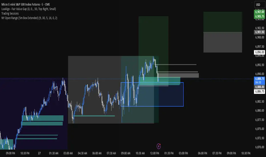
NY Open 5 minute Range (5m Box Extended)Draws a box around the first 5 minute candle for the New York session.
THAIT Moving Averages Tight within # ATR EMA SMA convergence
THAIT(tight) indicator is a powerful tool for identifying moving average convergence in price action. This indicator plots four user-defined moving averages (EMA or SMA). It highlights moments when the MAs converge within a user specified number of ATRs, adjusted by the 14-period ATR, signaling potential trend shifts or consolidation.
A convergence is flagged when MA1 is the maximum, the spread between MAs is tight, and the price is above MA1, excluding cases where the longest MA (MA4) is the highest. The indicator alerts and visually marks convergence zones with a shaded green background, making it ideal for traders seeking precise entry or exit points.

Kalman Exponential SuperTrendThe Kalman Exponential SuperTrend is a new, smoother & superior version of the famous "SuperTrend". Using Kalman smoothing, a concept from the EMA (Exponential Moving Average), this script leverages the best out of each and combines it into a single indicator.
How does it work?
First, we need to calculate the Kalman smoothed source. This is a kind of complex calculation, so you need to study it if you want to know how it works precisely. It smooths the source of the SuperTrend, which helps us smooth the SuperTrend.
Then, we calculate "a" where:
n = user defined ATR length
a = 2/(n+1)
Now we calculate the ATR over "n" period. Classical calculation, nothing changed here.
Now we calculate the SuperTrend using the Kalman smoothed source & ATR where:
kalman = kalman smoothed source
ATR = Average True Range
m = Factor chosen by user.
Upper Band = kalman + ATR * m
Lower Band = kalman - ATR * m
Now we just smooth it a bit further using the "a" and a concept from the EMA.
u1 = Upper Band a bar ago
l1 = Lower Band a bar ago
u = Upper Band
l = Lower Band
Upper = u1 * (1-a) + u * a
Lower = l1 * (1-a) + u * a
When the classical (not Kalman) source crosses above the Upper, it indicates an uptrend. When it crosses below the Lower, it indicates a downtrend.
Methodology & Concepts
When I took a look at the classical SuperTrend => It was just far too slow, and if I made it faster it was noisy as hell. So I decided I would try to make up for it.
I tried the gaussian, bilateral filter, but then I tried kalman and that worked the best, so I added it. Now it was still too noisy and unconsistent, so I revisited my knowledge of concepts and picked the one from the EMA, and it kinda solved it.
In the core of the indicator, all it does is combine them in a really simple way, but if you go more deeply you see how it fits the puzzlé really well.
It is not about trying out random things´=> but about seeking what it is missing and trying to lessen its bad side.
That is the entire point of this indicator => Offer a unique approach to the SuperTrend type, that lessen the bad sides of it.
I also added different plotting types, this is so everyone can find their favorite
Enjoy Gs!

EdgeBox: MA DistanceEdgeBox: MA Distance adds a clean HUD showing the percentage distance from the current close to your selected moving averages (default: SMA 100/150/200/250). Values are positive when MAs are above price and negative when below. Also includes ATR% (volatility) and RSI(14). Fully customizable: corner position, font sizes, and text/background colors. A fast context panel for trend and volatility at a glance.

ATR Trailing Stop with Entry Date & First-Day MultiplierATR based trailing stop based on a X post of Aksel Kibar.

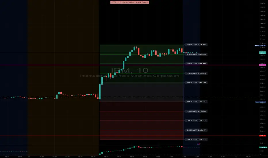
DTR & ATR with live zonesThis indicator is designed to help traders gauge the day's volatility in real-time. It compares the current Daily True Range (DTR)—the distance between the session's high and low—to the historical Average True Range (ATR).
The main purpose is to project potential price levels where the market might reach based on its average volatility. These levels (100% ATR, 150%, 200%, etc.) can be used as price targets. For instance, if you're in a long trade, you might consider taking partial or full profits as the price approaches these upper ATR extension levels. The indicator is highly customisable, allowing you to control the appearance of the ATR lines, zones, and labels to fit your charting preferences.
Core Concepts: ATR and DTR
To use this indicator effectively, it's important to understand its two main components:
Average True Range (ATR): This is a classic technical analysis indicator that measures market volatility. It calculates the average range of price movement over a specific period (e.g., 14 days). A higher ATR means the price is, on average, moving more, while a low ATR indicates less volatility. This script uses a higher timeframe ATR (e.g., Daily) to establish a stable volatility baseline for the current trading day.
Daily True Range (DTR): This is simply the difference between the current trading session's highest high and lowest low (session high - session low). It tells you how much the price has actually moved so far today.
The indicator's logic revolves around comparing the live, unfolding DTR to the historical, baseline ATR. An on-screen table conveniently shows this comparison as a percentage, to show how volatile the day has been.
How It Works: The Dynamic & Locked Mechanism
The most clever part of this indicator is how it draws the ATR levels. It operates in two distinct phases during the trading session:
Phase 1: Dynamic Expansion (Before DTR meets ATR)
At the start of the session, the DTR is small. The indicator calculates the remaining range needed to "complete" the 100% ATR level (difference = avg_atr - dtr). It then adds this remaining amount to the session high and subtracts it from the session low. This creates a "floating" 100% ATR range that expands dynamically as the session high or low is extended.
Phase 2: The Lock-in (After DTR meets or exceeds ATR)
Once the day's range (DTR) becomes equal to or greater than the avg_atr, the day has met its "expected" volatility. At this point, the levels lock in place. The indicator intelligently determines the anchor point for the locked range.
Once this primary 100% ATR range is established (either dynamically or locked), the script projects the other levels (150%, 200%, 250%, and 300%) by adding or subtracting multiples of the avg_atr from this base.
How to Use It for Trading
The primary use of this indicator is to set logical, volatility-based price targets.
Setting Profit Targets: If you enter a long position, the upper ATR levels (100%, 150%, 200%) serve as excellent areas to consider taking profits. A move to the 200% or 250% level often signifies an overextended or "exhaustion" move, making it a high-probability exit zone. For short positions, the lower ATR levels serve the same purpose.
Assessing Intraday Momentum: The on-screen table tells you how much of the expected daily range has been used. If it's early in the session and the DTR is only at 30% of the ATR, you can anticipate more significant price movement is likely to come. Conversely, if the DTR is already at 150% of ATR, the bulk of the day's move may already be complete.
Mean Reversion Signals: If the price pushes to an extreme level (e.g., 250% ATR) and shows signs of stalling (e.g., bearish divergence on an oscillator), it could signal a potential reversal or pullback, offering an opportunity for a counter-trend trade.
Key Settings
ATR Length & Smoothing Type: These settings control how the baseline ATR is calculated. The default 14 period and RMA smoothing are standard, but you can adjust them to your preference.
Session Settings: This is crucial. You must set the Market Session and Time Zone to match the primary trading hours of the asset you are analysing (e.g., "0930-1600" for the NYSE session).
Show Lines / Show Labels / Show Zones: The script gives you full control over the visual display. You can toggle each ATR level's lines, labels, and background zones individually to avoid a cluttered chart and focus only on the levels that matter to your strategy.
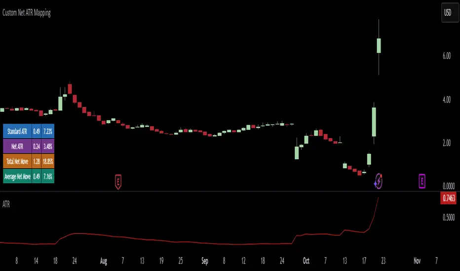
Custom Net ATR Mapping - NateThis indicator measures how much an asset actually moves — both on average and across full periods — so traders can compare short-term volatility with longer-term net momentum.
It displays four key metrics in a simple color-coded table:
Standard ATR – the average daily (or per-bar) range, showing typical volatility.
Net ATR – the average open-to-close move, revealing how much price tends to travel directionally within each bar.
Total Net Move – the total distance price has moved from the start to the end of the most recent measurement window.
Average Net Move – the typical size of that full-period move, averaged across multiple recent windows.
Together these readings help you see whether recent price action is choppy but contained (high ATR, low net move) or sustained and directional (high net move relative to ATR) — useful for spotting trend strength, breakout potential, or range-bound conditions.
Quantum Reservoir Computing⚛ Quantum Reservoir Computing - Multi-Scale Market Analysis
OVERVIEW
This indicator combines three structural analysis kernels (Energy, Resonance, Topology) with a 6-spin reservoir computing network to provide multi-dimensional market state monitoring. It is designed to detect structural shifts, coherence alignment, and potential entry timing through visual analytics and optional signal markers.
WHAT MAKES IT ORIGINAL
Unlike single-indicator approaches, QRC fuses complementary analysis methods and uses a reservoir computing layer (coupled oscillator network) to capture temporal market structure. The system uses entropy-compensated signal logic to maintain directional alignment across kernels with inverted mathematical properties.
HOW IT WORKS (Technical Details)
1. ENERGY KERNEL
Measures compression state through two components:
• Entropy: Volatility-normalized return distribution, inverted (low volatility = high compression energy)
• ATR Compression: Short-period ATR divided by longer-period baseline ATR
• Final Energy: Weighted average of both components, ranging 0 to 1
2. RESONANCE KERNEL
Calculates cross-timeframe coherence using:
• 6 exponential moving averages (periods: 9, 14, 20, 30, 48, 84)
• Slope calculation for each EMA
• Amplitude weighting based on user-selected mode (Close/ATR/StDev)
• Coherence Index (CI): Measures directional agreement across all timeframes
• Mode Persistence: Stability of CI over 20 bars
3. TOPOLOGY KERNEL
Analyzes path geometry through:
• Turn density: Rate of price directional changes
• Curvature: Second-order price differences normalized by ATR
• Combined into a 0-1 topology change metric
4. RESERVOIR COMPUTING (6-Spin Network)
Six coupled state variables (spins) arranged in a ring topology:
• Drive signal combines directional consensus, price z-score, volume, and ATR regime
• Each spin updates via hyperbolic tangent activation with neighbor coupling
• Psi (Ψ): Coherence measure (average pairwise spin correlation)
• Spin Direction: Signed average of all spins
• Pulse detection: Positive changes in Ψ, z-scored to detect energy releases
5. FUSION & SCORING
• Magnitude: Weighted combination of all kernels (0 to 1 scale)
• Direction: Blend of EMA slope consensus, basis slope, and spin direction (-1 to 1)
• ScoreSigned: Direction multiplied by Magnitude (drives visuals)
• GateScore: Amplified score used only for signal threshold checks
• Heat: Entanglement measure combining Ψ, CI, and Magnitude
SIGNAL LOGIC (Important: Entropy-Compensated Inversion)
Because the entropy kernel naturally inverts (low volatility = bullish compression), signal logic compensates to maintain directional alignment:
• LONG signals fire when GateScore crosses below the short threshold (bearish GateScore + bullish structure)
• SHORT signals fire when GateScore crosses above the long threshold (bullish GateScore + bearish structure)
This inversion has been visually validated through metric plotting and maintains correct alignment with Resonance and Topology kernels.
Signal gates require:
• Two-of-three pass: CI ≥ minimum, Mode Persistence ≥ minimum, Ψ ≥ minimum
• Heat ≥ minimum threshold
• OR recent pulse window active (ΔΨ edge within N bars)
• Minimum bar spacing between signals (prevents clustering)
VISUAL COMPONENTS
1. Contained Ribbon (Recommended Mode)
• Center line: Basis EMA
• Edge: Positioned by ScoreSigned value
• Fill color: Green (bullish) or Red (bearish)
• Width: ATR-adaptive with configurable floor/ceiling
2. Quantum Aurora (Multi-Layer Energy Bands)
• 5-8 harmonic layers with phase-driven oscillations
• Colors shift with Heat level (cool blue at low Heat, warm orange/magenta at high Heat)
• Creates visual texture that reflects market state dynamics
3. Interference Mesh
• Subtle oscillating overlay modulated by CI and ScoreSigned
• Provides depth perception without visual clutter
4. Resonance Cloud
• Width proportional to Coherence Index
• Wide cloud = strong cross-timeframe alignment
• Narrow cloud = weak structural coherence
5. Energy Particles
• Floating micro-dots with density mapped to Magnitude
• Color-coded by Heat level (gold/cyan/gray)
• Provides continuous conviction feedback
6. Regime Atmosphere
• Background tint indicating market mode:
- Green: Coherent trend (CI>0.65, Ψ>0.55)
- Red: Choppy regime (CI<0.45, Ψ<0.40)
- Purple: Transition state
DASHBOARDS
1. Main Dashboard (Moveable, Resizable)
• Regime indicator with color-coded status
• Horizontal meter gauges for Ψ, CI, Heat, Magnitude
• Signal strength bars for Score and Gate
• Status indicators (dots) for ΔΨ, Heat, CI health
• Directional arrows and bars-since-signal counter
• Size options: Tiny, Small, Normal, Large
• Position: All four corners available
2. Heat HUD (Entanglement Matrix)
• Multi-row gradient display of last N bars (configurable 10-120)
• Metrics: Heat, Psi, CI, Magnitude, Pulse Z-score, Gate proximity
• Color-coded blocks show metric intensity over time
• Live footer with current values
• Resizable and moveable
HOW TO USE
Step 1: Monitor Regime and Structure
• Check Dashboard regime indicator (Trend/Chop/Transition)
• Observe Aurora flow (smooth = stable, erratic = unstable)
• Wide Resonance Cloud indicates strong multi-timeframe alignment
Step 2: Watch Entanglement Heat
• Heat HUD shows persistent structure as amber/red runs
• Green status dots indicate healthy metrics
• Rising Heat + rising Ψ suggests mode-locking
Step 3: Confirm Gate Conditions
• Dashboard displays effective thresholds (dynamically relaxed after dry periods)
• Two-of-three gate (CI/ModePersistence/Ψ) must pass OR recent pulse active
• Strength bars show conviction level
Step 4: Interpret Signals
• Enable "Show Diagnostic Plots" to verify metric behavior on your symbols
• Signals appear as tiny triangles (green below bars = long, red above = short)
• Best confluence: Heat rising + fresh pulse cluster + strong CI
Step 5: Risk Management
• Place stops beyond opposite ribbon edge plus 0.5 ATR buffer
• Trail stops following basis ± ATR fraction while Heat/Psi remain elevated
• Exit early if CI or Ψ collapse (status dots turn yellow/red)
CUSTOMIZATION
Extensive settings available:
• Core: EMA length, ATR length, pulse thresholds, heat minimum
• Signals: Mode (Aggressive/Normal/Conservative), thresholds, spacing, gain
• Visuals: Ribbon mode, Aurora layers, particle density, all show/hide toggles
• Dashboards: Size, position for both main dashboard and heat HUD
• Diagnostics: Optional metric plots for validation
IMPORTANT DISCLAIMERS
• This indicator does not predict future price movements
• Signals use entropy-compensated inversion (explained above); verify on your symbols
• Always backtest on your specific markets and timeframes before live trading
• Past performance does not guarantee future results
• Heavy visuals may impact performance on lower-end devices (use Performance toggles)
• Designed for liquid markets (major indices, forex, crypto); may underperform on illiquid symbols
• Complex system with learning curve; read full guide embedded in code
DIAGNOSTIC MODE
Enable "Show Diagnostic Plots" in settings to verify metric behavior:
• Heat, Psi, CI, Magnitude plotted in lower pane
• ScoreSigned and GateScore normalized to 0-1 scale
• Reference lines at 0.25, 0.5, 0.75 for threshold context
• Observe metric alignment with price action on YOUR symbols
METHODOLOGY NOTE
The "Quantum" terminology refers to the reservoir computing methodology (coupled oscillator network), not actual quantum mechanics. The 6-spin network uses hyperbolic tangent activation functions to model temporal market structure. This is a deterministic mathematical model, not a quantum computing system.
BEST SUITED FOR
• Liquid markets: Major indices (ES, NQ), forex majors (EUR/USD, GBP/USD), large-cap crypto (BTC, ETH)
• Timeframes: 5-minute through daily (works on all, but designed for intraday to swing)
• Trading styles: Structure-based entries, multi-timeframe confluence, visual state monitoring
• Experience level: Intermediate to advanced (complex system with learning curve)
PERFORMANCE CONSIDERATIONS
• Heavy calculations (6 spins, 6 EMAs, Aurora layers, particles) may lag on lower-end devices
• Use "Dashboard Size: Tiny" and reduce "Aurora Layers" to 2-3 for better performance
• Consider disabling "Energy Particles" on mobile devices
• Script is optimized with array capping and label recycling, but complexity remains high
SUPPORT & UPDATES
• Questions about usage or settings? Send me a message - I respond within 24 hours
• Feature requests are welcome for consideration in future updates
• Bug reports appreciated and addressed promptly
• Script will be maintained and updated as needed
FINAL REMINDERS
• This is an analytical tool, not a trading system
• Always backtest on YOUR symbols and timeframes before live use
• Use proper risk management - stops, position sizing, etc.
• Past performance does not guarantee future results
• Start with demo/paper trading to learn the system
— Dskyz, Trade with insight. Trade with anticipation.

ATR(21)% EMA Next to CandleATR, or Average True Range, is a technical analysis indicator that measures market volatility by calculating the average price movement of an asset over a set period. It does not indicate price direction but shows how much a market is fluctuating. A rising ATR indicates higher volatility, while a falling ATR suggests lower volatility.
Trader Mike Webster, known for his work with the growth-focused CANSLIM strategy developed by William O'Neil, has created his own indicator called the Webby RSI, which incorporates ATR. In this application, the ATR is used to scale a stock's movement relative to its 21-day exponential moving average (EMA). In this case it is based on a percentage.

MACD AI Flux Pro Dashboard V. 2Acknowledgment
This indicator is built upon the MACD-V (Volatility-Normalized MACD) methodology originally created by Alex Spiroglou, CMT, whose research (2015–2022) introduced the principle of normalizing MACD momentum by volatility (MACD/ATR). Full acknowledgment and credit are hereby given to Mr. Spiroglou as the original author of the MACD-V concept and framework.
Indicator Overview — MACD-V Flux Pro Dashboard V.2
The MACD-V Flux Pro Dashboard advances Spiroglou’s volatility-normalized foundation into a comprehensive multi-system architecture that unifies momentum, trend, volatility, and compression analytics in one visual framework. It is engineered for precision decision-making in both intraday and swing-trading environments.
Key Dashboard Features:
Dynamic Probability Engine: Calculates real-time long and short probabilities by weighting momentum, slope, compression, and volume pressure components into a composite score.
Multi-Timeframe Confirmation (HTF Tiles): Displays live directional agreement across fast, mid, and slow timeframes for confidence filtering and signal validation.
Regime Detection System: Automatically classifies the market as Trend Up, Trend Down, Compression, or Transition, applying background color cues for instant context.
Risk and News Filters: Integrates ATR-based risk gating and customizable “mute windows” to block trade signals during high-volatility or scheduled news events.
VWAP and Adaptive Bands: Plots VWAP with configurable ATR or standard-deviation bands to highlight over-extension and pullback zones.
Trend-Day and Opening-Range Logic: Monitors RTH (Regular Trading Hours) price behavior to identify potential trend-day conditions.
Smart Entry Arrows: Generates visual long/short signals only when multiple subsystems confirm direction, slope strength, and proximity to VWAP within defined thresholds.
On-Chart Dashboard Panel: Presents live metrics including probability bias, regime state, ATR level, risk status, and news filters with adaptive color-coding and optional emoji cues for intuitive interpretation.
Chart Display Summary:
All elements are presented directly on the main chart, combining price structure, VWAP bands, EMAs, and regime background shading with the real-time dashboard panel. The design eliminates the need for a secondary pane, offering a consolidated and context-rich view of market dynamics

ATR DAILY PROGRESSION)Indicator: ATR Daily Progression — Final Compact Edition
1. Indicator Objective
The ATR Daily Progression indicator measures the progression of intraday volatility as a percentage of the daily Average True Range (ATR).
It provides a quick visual overview of whether the market has reached or exceeded its average daily range of movement.
This helps traders avoid entering low-probability continuation trades once the day’s ATR is already completed.
2. Visual Presentation
Horizontal bar ranging from 0% to 150% of the ATR.
Green color up to 100%, then red beyond that point.
Main ticks: 0, 25, 50, 75, 90, 100, and 150%.
Full-height white vertical lines at 0%, 100%, and 150%.
A floating badge displaying the current ATR completion percentage, always visible.
Compact Height mode enabled by default for optimal visual integration.
3. Key Features
Function Description
Precise alignment The transition from green to red occurs exactly after the 100% tick.
Audio & visual alerts Triggered at 75%, 90%, 100%, and 150%.
Session flash effects The filled bar blinks when the ATR is reached (100%) or exceeded (150%).
Dynamic badge Displays the current ATR %, green before 100%, red after.
Compact layout Three-line table format for better chart integration.
4. Recommended Settings
ATR Length (Daily): 14
Bar width (steps): 32–40 (depending on chart size)
Always green below 100%: enabled
Show floating % badge: enabled
Compact Height: enabled by default
Flash at 75% and 90%: enabled
Flash at 100% and 150%: enabled
5. Strategic Use
The ATR Done Today is a visual discipline tool designed to help traders:
Identify when the market has likely completed its daily move.
Avoid late-session counter-trend trades.
Visualize volatility compression or expansion.
Determine optimal times to take profits or pause trading.

Order Blocks & Breaker Blocks Plus [SunanLabs]🟦 Order Blocks & Breaker Blocks Plus V1.0
© SunanLabs — Creative Commons Attribution 4.0 International (CC BY 4.0)
Version: 1.0 – Breaker Marker Build
Pine Script Version: v6 (Fully Compliant)
Category: Technical Analysis → Smart Money Concepts / Supply & Demand
🧭 Overview
Order Blocks & Breaker Blocks Plus is a precision-engineered visualization tool designed for institutional-style Smart Money Concepts (SMC) trading.
It automatically detects, plots, and updates Order Blocks (OBs) and Breaker Blocks (BBs) in real time — with full control over transparency, marker shape, and size, directly from the TradingView UI.
Built for both professional traders and educational use, it visually clarifies how structure shifts occur when liquidity is swept and rebalanced by market makers.
⚙️ Core Features
✅ Real-Time Order Block Detection
• Bullish and Bearish OBs automatically marked based on swing structure.
• Uses either wicks or candle bodies (configurable).
✅ Breaker Block Tracking
• When an OB fails, a dashed breaker line is drawn at the exact invalidation point.
• Perfect for visualizing liquidity flips or structural breaks.
✅ Marker System (Customizable)
• Choose between two styles: "▲ / ▼" or "⇑ / ⇓", or disable markers completely.
• Marker sizes from tiny → huge for all chart styles and resolutions.
✅ Fully Reactive Colors
• Direct opacity control via TradingView color picker (no hardcoded alpha).
• Separate color sets for OBs and Breaker Blocks.
✅ Built-in Alerts
• Automatic alerts when new OBs form or when a Breaker Block triggers.
• Alerts include symbol, timeframe, and current price context.
✅ Ultra-Stable Build
• Pine v6 compliant (no line continuations, undeclared variables, or runtime warnings).
• Modular, efficient, and built for expansion.
🧩 Usage Guide
1. Swing Lookback – Controls sensitivity: higher = stronger, fewer OBs; lower = more reactive zones.
2. Show Last Bullish/Bearish OB – Limits how many zones are displayed for visual clarity.
3. Use Candle Body – Toggles between wick-based and body-based zone boundaries.
4. Marker Style – Select from:
▲ / ▼ traditional solid arrows
⇑ / ⇓ arrowhead-with-tail style
none to disable markers
5. Marker Size – Choose from tiny, small, normal, large, or huge.
6. Colors – All opacity levels controlled directly through the color configuration UI.
📚 Concept Notes
• Order Block (OB): The last bullish/bearish candle before a strong opposing move; represents institutional order placement zones.
• Breaker Block (BB): A former OB invalidated by price; it flips polarity and often acts as support/resistance.
• Swing Lookback: Determines how the indicator identifies local highs/lows for OB anchoring.
⚠️ Disclaimer
This indicator is provided for educational and research purposes only.
It does not constitute financial advice or a guarantee of trading performance.
Always test indicators thoroughly in simulation before live trading.
🧾 License
This script is released under the
Creative Commons Attribution 4.0 International License (CC BY 4.0).
You are free to use, modify, and share it for any purpose —
with proper credit to “SunanLabs.”
🧠 Attribution
Developed and maintained by SunanLabs
Part of the SunanLabs Smart Money Concepts Suite
Built to the SunanLabs PineScript Standards for reliability, modularity, and clarity.
MACD-V Adaptive FluxProMACD-V Adaptive FluxPro
Type: Multi-Factor Volatility-Normalized Momentum & Regime Framework
Overlay: ✅ Yes (on price chart)
Purpose: Detect high-probability trend continuation or reversal zones through volatility-adjusted momentum, VWAP structure, and adaptive filters.
🧩 Concept Overview
MACD-V Adaptive FluxPro is a next-generation, multi-factor analytical framework that merges the principles of Linda Raschke’s 3-10-16 MACD with modern volatility normalization and adaptive filtering.
Instead of generating raw buy/sell signals, it builds a probability-driven environment model — showing when price action, volatility, and structure align for high-confidence trades.
The “V” in MACD-V stands for Volatility Normalization: every MACD component is divided by ATR to stabilize amplitude across fast or slow markets.
This enables the indicator to remain consistent across timeframes, instruments, and volatility regimes.
⚙️ Core Components
1️⃣ Volatility-Normalized MACD (MACD-V)
A traditional MACD built on Linda Raschke’s 3-10-16 structure, but adjusted by ATR to create a volatility-invariant momentum profile.
You can toggle to alternative presets (Scalp / Swing / Trend) for faster or slower environments.
2️⃣ Dynamic Regime Detection
A slope-based classifier that identifies whether the market is:
Trend Up 🟢
Trend Down 🔴
Compression / Squeeze 🟧
Transition / Neutral ⚫
The background color updates dynamically as momentum, volatility, and slope shift between these states.
3️⃣ VWAP Structure Bands
Adaptive VWAP with inner and outer ATR-scaled envelopes.
These act as short-term mean-reversion and breakout zones.
The indicator can optionally gate entries to occur only within defined VWAP proximity.
4️⃣ EMAs for Micro-Trend Confirmation
Includes 9-EMA and 21-EMA, color-configurable for visual crossovers and short-term momentum bias.
5️⃣ Multi-Timeframe Confirmation Tiles
Top-center dashboard tiles display directional bias from higher timeframes (e.g., 15m / 1h / 4h).
When all align, it confirms multi-frame trend coherence.
6️⃣ Adaptive Probability Engine
All subsystems — MACD-V, slope, compression, volume z-score, and VWAP distance — feed into a logistic scoring model that outputs a real-time AOI Probability (0-100%).
When conditions align, probabilities rise above 60% (long bias) or drop below 40% (short bias).
These are your high-probability “Areas of Interest.”
7️⃣ Dashboard HUD
The top-right status console provides a one-glance view of system state:
Field Meaning
AOI Prob Long Real-time probability of bullish bias
Regime Market state (Trend, Transition, Compression)
Risk Gate ATR-based volatility filter
News Mute Manual toggle for event-risk suppression
ATR (≈ risk) Real-time volatility readout
Status ✅ Trading OK / 🧱 Risk Gate / 🔇 News Mute / 🟧 Compression
🎯 Interpretation Guide
Visual Meaning
🟢 Green background Confirmed uptrend regime
🔴 Red background Confirmed downtrend regime
🟧 Orange background Volatility compression (squeeze forming)
⚫ Gray background Transitional / indecisive structure
Teal % (AOI Prob Long) Bullish probability > 60%
Arrows Optional: appear only when all gates align (rare, filtered signals)
🧮 Mathematical Notes
MACD-V = (EMA_fast(src) − EMA_slow(src)) / ATR(n)
Normalized score is smoothed, scaled 0–100 via logistic curve
Slope = Δ(EMA(src, n)) / ATR(n)
Probabilities gated by:
Minimum slope magnitude (minAbsSlope)
VWAP proximity (maxVWAPDistATR)
Multi-TF agreement
Cooldown interval (cooldownBars)
ATR-based risk gate
No repainting — all calculations use barstate.isconfirmed.
⚡ Use Cases
✅ Identify trend regime changes before major expansions
✅ Filter breakout vs. compression setups
✅ Quantify volatility conditions before entries
✅ Confirm multi-timeframe alignment
✅ Serve as a visual regime map for automated systems or discretionary traders
🧠 Recommended Presets
Market Type Setting Preset Behavior
Index Futures (ES/NQ) LBR 3-10-16 SMA (default) Classic swing/momentum balance
Scalping (1m–5m) Fast Adaptive Higher frequency, shorter cooldown
Swing Trading (1h–4h) Smooth ATR Broader, trend-only signals
Trend-Following Futures Wide ATR Bands Filters noise, favors strong continuation
⚠️ Notes
Non-repainting, bar-confirmed calculations
Signal arrows are optional and rare — intended for precision setups
ATR and slope thresholds should be tuned per instrument
Compatible with all TradingView markets and resolutions
🏁 Summary
“MACD-V Adaptive FluxPro” is not a simple MACD — it’s a volatility-normalized market state engine that adapts to changing conditions.
It fuses Linda Raschke’s timeless MACD logic with modern volatility, slope, and multi-timeframe analytics — giving you a live market dashboard that tells you when not to trade just as clearly as when you should.

SFC Bollinger Band and Bandit概述 (Overview)
SFC 布林通道與海盜策略 (SFC Bollinger Band and Bandit Strategy) 是一個基於 Pine Script™ v6 的技術分析指標,結合布林通道 (Bollinger Bands)、移動平均線 (Moving Averages) 以及布林海盜 (Bollinger Bandit) 交易策略,旨在為交易者提供多時間框架的趨勢分析與進出場訊號。該腳本支援風險管理功能,並提供視覺化圖表與交易訊號提示,適用於多種金融市場。
This script, written in Pine Script™ v6, combines Bollinger Bands, Moving Averages, and the Bollinger Bandit strategy to provide traders with multi-timeframe trend analysis and entry/exit signals. It includes risk management features and visualizes data through charts and trading signals, suitable for various financial markets.
功能特點 (Key Features)
布林通道 (Bollinger Bands)
提供可調整的標準差參數 (σ1, σ2),支援多層布林通道顯示。
進場訊號基於價格穿越布林通道上下軌,並結合連續K線確認機制。
Provides adjustable standard deviation parameters (σ1, σ2) for multi-layer Bollinger Bands display.
Entry signals are based on price crossing the upper/lower bands, combined with a consecutive bar confirmation mechanism.
移動平均線 (Moving Averages)
支援簡單移動平均線 (SMA) 或指數移動平均線 (EMA),可自訂快、中、慢線週期。
Supports Simple Moving Average (SMA) or Exponential Moving Average (EMA) with customizable fast, medium, and slow line periods.
布林海盜策略 (Bollinger Bandit Strategy)
基於變動率 (ROC) 與布林通道動態止損,提供做多與做空訊號。
包含動態止損均線與平倉天數設定,增強交易靈活性。
Utilizes Rate of Change (ROC) and Bollinger Bands with dynamic stop-loss for long and short signals.
Includes dynamic stop-loss moving average and liquidation days for enhanced trading flexibility.
多時間框架分析 (Multi-Timeframe Analysis)
支援六個時間框架 (5分、15分、1小時、4小時、日線、週線) 的趨勢分析。
通過表格顯示各時間框架的連續上漲/下跌趨勢,輔助交易決策。
Supports trend analysis across six timeframes (5m, 15m, 1h, 4h, daily, weekly).
Displays consecutive up/down trends in a table to aid decision-making.
風險管理 (Risk Management)
提供基於 ATR 或布林通道的停利/停損設定。
自動計算交易手數,根據報價貨幣匯率調整風險敞口。
Offers take-profit/stop-loss settings based on ATR or Bollinger Bands.
Automatically calculates trading lots, adjusting risk exposure based on quote currency exchange rates.
視覺化與提示 (Visualization and Alerts)
繪製布林通道、移動平均線、海盜策略動態止損線及交易訊號。
提供多時間框架趨勢表格、交易手數標籤及浮水印。
支援交易訊號快訊,方便即時監控。
Plots Bollinger Bands, Moving Averages, Bandit strategy stop-loss lines, and trading signals.
Includes multi-timeframe trend tables, trading lot labels, and watermark.
Supports alert conditions for real-time trade monitoring.
使用說明 (Usage Instructions)
設置參數 (Parameter Setup)
布林通道 (Bollinger Bands): 可調整週期 (預設21)、標準差 (σ1=1, σ2=2) 及停利/停損依據 (ATR 或 BAND)。
移動平均線 (Moving Averages): 可選擇顯示快線 (10)、中線 (20)、慢線 (60),並切換 SMA/EMA。
布林海盜 (Bollinger Bandit): 調整通道週期 (50)、平倉均線週期 (50) 及 ROC 週期 (30)。
時間框架 (Timeframes): 自訂六個時間框架,預設為 5分、15分、1小時、4小時、日線、週線。
Adjust Bollinger Band period (default 21), standard deviations (σ1=1, σ2=2), and take-profit/stop-loss basis (ATR or BAND).
Configure Moving Averages (fast=10, medium=20, slow=60) and toggle SMA/EMA.
Set Bollinger Bandit parameters: channel period (50), liquidation MA period (50), ROC period (30).
Customize six timeframes (default: 5m, 15m, 1h, 4h, daily, weekly).
交易訊號 (Trading Signals)
買入訊號 (Buy): 價格穿越下軌且滿足連續K線條件。
賣出訊號 (Sell): 價格穿越上軌且滿足連續K線條件。
海盜策略訊號: 基於 ROC 與布林通道穿越,結合動態止損。
Buy signal: Price crosses below lower band with consecutive bar confirmation.
Sell signal: Price crosses above upper band with consecutive bar confirmation.
Bandit strategy signals: Based on ROC and band crossings with dynamic stop-loss.
視覺化 (Visualization)
布林通道以不同顏色顯示上下軌與中軌。
移動平均線以快、中、慢線區分顏色。
趨勢表格顯示各時間框架的趨勢狀態 (🔴上漲, 🟢下跌, ⚪中性)。
海盜策略顯示動態止損線與交易狀態。
Bollinger Bands display upper, lower, and middle bands in distinct colors.
Moving Averages use different colors for fast, medium, and slow lines.
Trend table shows timeframe trends (🔴 up, 🟢 down, ⚪ neutral).
Bandit strategy displays dynamic stop-loss and trading status.

Risk ModuleThis indicator provides a visual reference for position sizing and approximate stop and target placement. It supports trade planning by calculating equalized risk per trade and maintaining consistent exposure across different markets.
For more information about the concept, see the post Position Sizing and Risk Management .
Fixed Fractional Risk
The indicator calculates the number of shares that can be traded to maintain consistent monetary risk. The formula is based on the distance between the current price and stop reference, adjusting position size proportionally. A closer stop results in a larger position size, while a wider stop results in a smaller one.
Position Size = (Account Size × Risk %) ÷ (Entry Price – Stop Price)
Stop and Target
Stop placement is derived from volatility using the Average True Range (ATR). The target is plotted as a multiple of the stop distance, defining the risk-to-reward relationship in R units.
Stop = Price ± ATR × Multiplier
Target = Price ± (R × Risk Distance)
Chart Elements
The stop and target levels are plotted above and below the current price, with the stop marked by a red dot and the target by a green dot. The information table displayed on the chart shows the number of shares to trade, stop level, and target level.
Setup and Configuration
This configuration only needs to be set once, but can be adjusted later if preferred.
1. Start by setting the account size and risk percentage per trade to define the monetary amount risked on each trade. These values form the basis for position size calculation.
2. Set the ATR multiplier to determine stop distance, common values range between 1 and 3 ATR. Lower values place stops closer to price, increasing sensitivity but risking short-term noise. Higher values widen the stop, which reduces noise impact but extends time in risk.
3. Set the R-multiple to determine target distance relative to the stop. A value of 1 represents a 1:1 risk-to-reward relationship. Lower values reduce potential reward but tend to increase win rate, whereas higher values increase potential reward but tend to reduce win rate. The selection depends on system characteristics and trade expectancy.
When the parameters are defined, the indicator displays the stop, target, and calculated position size on the chart. All that remains is to enter the trade with the number of shares shown in the table and place bracket orders at the plotted stop and target levels.
Settings Overview
Account Size / Risk %: Defines account capital and per-trade exposure.
ATR Multiplier: Adjusts stop distance relative to volatility.
R Multiple: Sets target distance relative to stop (risk-reward ratio).
Position: Choose Long or Short direction.
Table Position: Controls information table placement and scale.

ATR StopThe Stoploss based on ATR indicator sets dynamic stop levels using market volatility measured by the Average True Range (ATR).
When volatility increases, the stop widens; when it decreases, the stop tightens.
Upper line = High + ATR × Multiplier → stop for shorts
Lower line = Low - ATR × Multiplier → stop for longs
Use
- Volatility-based stoploss: adjusts automatically to market conditions.
- Trailing stop: moves in the direction of the trend.

Dynamic ATR BandsDescription:
The Dynamic ATR Bands indicator visualizes ATR-based stop-loss, take-profit, and trailing levels. Bands can be drawn relative to a fixed entry price or dynamically relative to the current price. It is ideal for trend-following, swing trading, and hybrid strategies, especially on volatile or noisy instruments.
Key Features:
Base ATR Bands:
Plots ATR-based bands above and below a reference price.
Acts as initial stop-loss or target guidance.
Adjustable multiplier (default 1× ATR).
Extra ATR Band:
Add an additional ATR band at a custom multiplier.
Position it above or below the reference price.
Useful for trailing stops or extended profit targets.
Hybrid Entry Mode:
Use Fixed Entry Price: bands are drawn relative to your entry and remain fixed.
Dynamic Mode: bands behave like standard ATR bands, moving with the current price.
Allows visualization of hybrid ATR stop-loss and trailing strategies.
Clean Visuals:
Color-coded bands differentiate base (solid) from extra (semi-transparent).
How to Use:
Set ATR length and multipliers according to your strategy.
Toggle hybrid entry mode and input your entry price, or leave off for dynamic bands.
Set the extra band multiplier and choose its position (upper/lower).
Use the bands as visual guides for stop-loss, take-profit, and trailing levels.
Inputs:
ATR Length: number of periods for ATR calculation
Base ATR Multiplier: distance of base bands from reference price
Extra ATR Multiplier: distance for the additional band
Extra Band Position: choose Upper or Lower
Use Fixed Entry Price: toggle hybrid entry mode
Entry Price: specify entry price if hybrid mode is enabled
Note:
This script is visual only; it does not place trades. It is designed to help plan ATR-based stop-loss, take-profit, and hybrid trade management visually on the chart.

Volatilidad Multi-TF📊 Multi-Timeframe Volatility (ATR%)
Description
Indicator that displays the current asset's volatility across multiple timeframes simultaneously. It uses the ATR (Average True Range) normalized as a percentage of price, allowing for objective volatility comparison across different timeframes.
✨ Key Features
- Multi-Timeframe Analysis: Visualize volatility across 5 different timeframes (1H, 4H, D, W, M)
- Normalized Volatility: ATR expressed as a percentage of price for accurate comparison
- Compact Table: Clean and easy-to-read interface in the corner of your chart
- Auto-Update: Automatically adapts to the asset you're viewing
- No Additional Plots: Only displays essential information in table format
🎯 How to Use
1. Add the indicator to your chart
2. The table will automatically display the current asset's volatility
3. Percentage values allow you to quickly identify:
- Which timeframe has higher/lower volatility
- Divergences between timeframes
- High or low volatility zones to adjust your strategies
⚙️ Configurable Parameters
- ATR Period: Default 14, adjust according to your strategy
📈 Practical Applications
- Risk Management: Adjust position sizing based on current volatility
- Asset Selection: Identify assets with suitable volatility for your profile
- Entry Timing: Detect volatility expansions/contractions
- Timeframe Analysis: Compare volatility across different time periods
💡 Technical Notes
- Normalized ATR allows volatility comparison between assets with different prices
- Useful for both intraday trading (1H, 4H) and swing/positional trading (D, W, M)
- Compatible with any market: cryptocurrencies, forex, stocks, indices
⚠️ Disclaimer
This indicator is a technical analysis tool. It does not constitute financial advice. Conduct your own analysis and risk management before trading.
