STATEMAP | QuantEdgeB
🔍 Overview
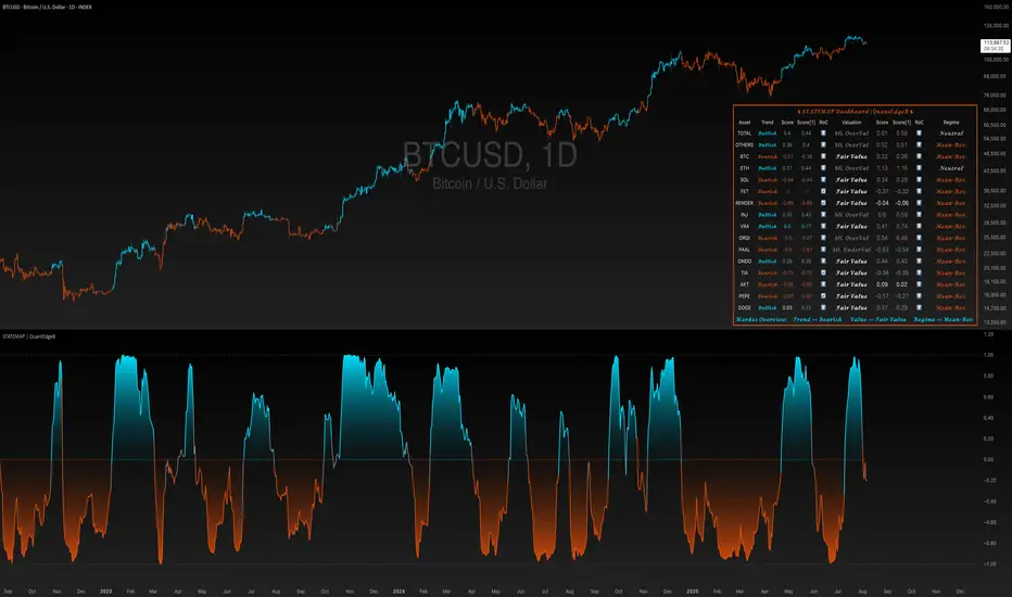
STATEMAP | QuantEdgeB is a holistic Trend & Valuation dashboard for 16 key crypto and index assets. It distills each asset’s momentum regime and valuation state into two live averages—trend average and valuation average—and presents them via color-coded candles, dynamic plots, and a comprehensive bottom-right table. Switch effortlessly between Trend and Valuation views to spot regime shifts across the market.
✨ Key Features
• 🧭 Trend vs. Valuation Toggle
Flip between viewing the overall market’s trend average or its valuation average with a single input.
• 📊 Trend Average
Aggregates each asset’s directional bias (bullish vs. bearish) into one composite gauge that flags risk-on vs. risk-off regimes.
• 💎 Valuation Average
Blends each asset’s statistical valuation score to highlight extreme under-/over-valued conditions.
• 🎨 Color-Coded Visualization
Candles turn blue for bullish, red for bearish, and gray for neutral; fills and horizontal bands reinforce regime thresholds.
• 🗺️ Live Asset Matrix
A 16×8 table shows for each symbol:
• Current Trend (Bullish/Bearish)
• Score & Prior Score with direction arrows (⬆️/⬇️/🔄)
• RoC (momentum change)
• Valuation State label (e.g. “Strong UnderValued”)
• Valuation value & prior value with change indicator
• 🚦 Market Stage Banner
A top-row line combines both averages into a concise “Market Stage” message (e.g. “Trend ⟹ Bullish Value ⟹ Sli. OverValued”).
⚙️ How It Works
• Universal Trend Assessment
Uses a library of trend-following logic to classify each asset as bullish or bearish, then averages those signals into the trend average.
• Adaptive Valuation Mapping
Evaluates each asset’s statistical valuation band, maps it into intuitive labels (under-/fair-/over-valued), and averages into the valuation average.
• Regime Thresholds
• Trend average above +0.1 ⇒ risk-on (bullish); below –0.1 ⇒ risk-off (bearish); otherwise neutral.
• Valuation average buckets assign six states from “Strong UnderValued” to “Strong OverValued.”
• Dynamic Visualization
Color-coded candlesticks and filled plot areas highlight when the market crosses key levels, making regime changes immediately apparent.
🎯 Who Should Use It
• Systematic Traders looking for a unified regime filter across multiple assets
• Portfolio Managers wanting a pulse on market momentum vs. valuation before reallocations
• Swing & Position Traders confirming cross-asset alignment or spotting divergences
• Risk Managers monitoring broad contractions (trend bearish) vs. expansions (trend bullish) alongside valuation extremes
🧬 Default Settings
• View Mode: Trend
• Bar color: Yes
• Assets Covered: TOTAL market cap, TOTAL OTHERS, BTC, ETH, SOL, FET, RNDR, INJ, VRA, ORDI, PAAL, ONDO, TIA, AKT, PEPE, DOGE
📌 Conclusion
STATEMAP | QuantEdgeB delivers a clear, emoji-tagged map of where the crypto market stands in both momentum and valuation space. With an easy toggle and a rich dashboard, it empowers you to make regime-aware trading and allocation decisions at a glance.
🔹 Disclaimer: Past performance is not indicative of future results. No trading strategy can guarantee success in financial markets.
🔹 Strategic Advice: Always backtest, optimize, and align parameters with your trading objectives and risk tolerance before live trading.
Yalnızca davetli komut dosyası
Bu komut dosyasına yalnızca yazar tarafından onaylanan kullanıcılar erişebilir. Kullanmak için izin istemeniz ve almanız gerekir. Bu genellikle ödeme yapıldıktan sonra verilir. Daha fazla ayrıntı için aşağıdaki yazarın talimatlarını izleyin veya doğrudan QuantEdgeB ile iletişime geçin.
TradingView, yazarına tamamen güvenmediğiniz ve nasıl çalıştığını anlamadığınız sürece bir komut dosyası için ödeme yapmanızı veya kullanmanızı TAVSİYE ETMEZ. Ayrıca topluluk komut dosyalarımızda ücretsiz, açık kaynaklı alternatifler bulabilirsiniz.
Yazarın talimatları
whop.com/basetrustcapital 💎
🔹 Unlock our free toolbox:
tradinglibrary.carrd.co/ 🛠️
Disclaimer: All resources and indicators provided are for educational purposes only
Feragatname
Yalnızca davetli komut dosyası
Bu komut dosyasına yalnızca yazar tarafından onaylanan kullanıcılar erişebilir. Kullanmak için izin istemeniz ve almanız gerekir. Bu genellikle ödeme yapıldıktan sonra verilir. Daha fazla ayrıntı için aşağıdaki yazarın talimatlarını izleyin veya doğrudan QuantEdgeB ile iletişime geçin.
TradingView, yazarına tamamen güvenmediğiniz ve nasıl çalıştığını anlamadığınız sürece bir komut dosyası için ödeme yapmanızı veya kullanmanızı TAVSİYE ETMEZ. Ayrıca topluluk komut dosyalarımızda ücretsiz, açık kaynaklı alternatifler bulabilirsiniz.
Yazarın talimatları
whop.com/basetrustcapital 💎
🔹 Unlock our free toolbox:
tradinglibrary.carrd.co/ 🛠️
Disclaimer: All resources and indicators provided are for educational purposes only