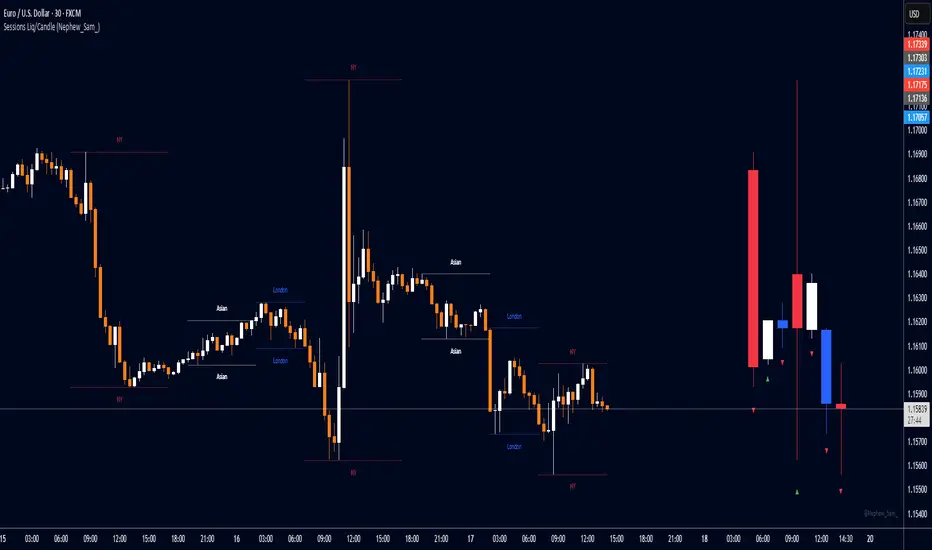
Session HL + Candles + AMD (Nephew_Sam_)Session HL + Candles + AMD (Nephew_Sam_)
This indicator marks out intraday sessions summarized into single candles, with an additional option to mark out the HL of each session. Perfect for understanding AMD within a glance (accumulation-manipulation-distribution)
Features:
Session High/Low lines with customizable colors and labels
Optional session candles displayed on the right side of the chart
Timezone support for global traders
Customizable bull/bear candle colors
Works on timeframes up to 1 hour
Perfect for:
Identifying session liquidity levels
Tracking session ranges and breakouts
Multi-timeframe session analysis
ICT methodology traders
Settings:
Choose your timezone for accurate session detection
Toggle session candles and HL lines independently
Customize colors, line styles, and labels
Set maximum timeframe (up to 1 hour)
Dönemler
Ultra BUY SELL//@version=5
indicator("Ultra BUY SELL", overlay = false)
// Inputs
src = input(close, "Source", group = "Main settings")
p = input.int(180, "Trend period", group = "Main settings", tooltip = "Changes STRONG signals' sensitivity.", minval = 1)
atr_p = input.int(155, "ATR Period", group = "Main settings", minval = 1)
mult = input.float(2.1, "ATR Multiplier", step = 0.1, group = "Main settings", tooltip = "Changes sensitivity: higher period = higher sensitivty.")
mode = input.string("Type A", "Signal mode", options = , group = "Mode")
use_ema_smoother = input.string("No", "Smooth source with EMA?", options = , group = "Source")
src_ema_period = input(3, "EMA Smoother period", group = "Source")
color_bars = input(true, "Color bars?", group = "Addons")
signals_view = input.string("All", "Signals to show", options = , group = "Signal's Addon")
signals_shape = input.string("Labels", "Signal's shape", options = , group = "Signal's Addon")
buy_col = input(color.rgb(0, 255, 8), "Buy colour", group = "Signal's Addon", inline = "BS")
sell_col = input(color.rgb(255, 0, 0), "Sell colour", group = "Signal's Addon", inline = "BS")
// Calculations
src := use_ema_smoother == "Yes" ? ta.ema(src, src_ema_period) : src
// Source;
h = ta.highest(src, p)
// Highest of src p-bars back;
l = ta.lowest(src, p)
// Lowest of src p-bars back.
d = h - l
ls = ""
// Tracker of last signal
m = (h + l) / 2
// Initial trend line;
m := bar_index > p ? m : m
atr = ta.atr(atr_p)
// ATR;
epsilon = mult * atr
// Epsilon is a mathematical variable used in many different theorems in order to simplify work with mathematical object. Here it used as sensitivity measure.
change_up = (mode == "Type B" ? ta.cross(src, m + epsilon) : ta.crossover(src, m + epsilon)) or src > m + epsilon
// If price breaks trend line + epsilon (so called higher band), then it is time to update the value of a trend line;
change_down = (mode == "Type B" ? ta.cross(src, m - epsilon) : ta.crossunder(src, m - epsilon)) or src < m - epsilon
// If price breaks trend line - epsilon (so called higher band), then it is time to update the value of a trend line.
sb = open < l + d / 8 and open >= l
ss = open > h - d / 8 and open <= h
strong_buy = sb or sb or sb or sb or sb
strong_sell = ss or ss or ss or ss or ss
m := (change_up or change_down) and m != m ? m : change_up ? m + epsilon : change_down ? m - epsilon : nz(m , m)
// Updating the trend line.
ls := change_up ? "B" : change_down ? "S" : ls
// Last signal. Helps avoid multiple labels in a row with the same signal;
colour = ls == "B" ? buy_col : sell_col
// Colour of the trend line.
buy_shape = signals_shape == "Labels" ? shape.labelup : shape.triangleup
sell_shape = signals_shape == "Labels" ? shape.labeldown : shape.triangledown
// Plottings
// Signals with label shape
plotshape(signals_shape == "Labels" and (signals_view == "All" or signals_view == "Buy/Sell") and change_up and ls != "B" and not strong_buy, "Buy signal" , color = colour, style = buy_shape , location = location.belowbar, size = size.normal, text = "BUY", textcolor = color.white, force_overlay=true)
// Plotting the BUY signal;
plotshape(signals_shape == "Labels" and (signals_view == "All" or signals_view == "Buy/Sell") and change_down and ls != "S" and not strong_sell, "Sell signal" , color = colour, style = sell_shape, size = size.normal, text = "SELL", textcolor = color.white, force_overlay=true)
// Plotting the SELL signal.
plotshape(signals_shape == "Labels" and (signals_view == "All" or signals_view == "Strong") and change_up and ls != "B" and strong_buy, "Strong Buy signal" , color = colour, style = buy_shape , location = location.belowbar, size = size.normal, text = "STRONG", textcolor = color.white, force_overlay=true)
// Plotting the STRONG BUY signal;
plotshape(signals_shape == "Labels" and (signals_view == "All" or signals_view == "Strong") and change_down and ls != "S" and strong_sell, "Strong Sell signal" , color = colour, style = sell_shape, size = size.normal, text = "STRONG", textcolor = color.white, force_overlay=true)
// Plotting the STRONG SELL signal.
// Signal with arrow shape
plotshape(signals_shape == "Arrows" and (signals_view == "All" or signals_view == "Buy/Sell") and change_up and ls != "B" and not strong_buy, "Buy signal" , color = colour, style = buy_shape , location = location.belowbar, size = size.tiny, force_overlay=true)
// Plotting the BUY signal;
plotshape(signals_shape == "Arrows" and (signals_view == "All" or signals_view == "Buy/Sell") and change_down and ls != "S" and not strong_sell, "Sell signal" , color = colour, style = sell_shape, size = size.tiny, force_overlay=true)
// Plotting the SELL signal.
plotshape(signals_shape == "Arrows" and (signals_view == "All" or signals_view == "Strong") and change_up and ls != "B" and strong_buy, "Strong Buy signal" , color = colour, style = buy_shape , location = location.belowbar, size = size.tiny, force_overlay=true)
// Plotting the STRONG BUY signal;
plotshape(signals_shape == "Arrows" and (signals_view == "All" or signals_view == "Strong") and change_down and ls != "S" and strong_sell, "Strong Sell signal" , color = colour, style = sell_shape, size = size.tiny, force_overlay=true)
// Plotting the STRONG SELL signal.
barcolor(color_bars ? colour : na)
// Bar coloring
// Alerts
matype = input.string(title='MA Type', defval='EMA', options= )
ma_len1 = input(title='Short EMA1 Length', defval=5)
ma_len2 = input(title='Long EMA1 Length', defval=7)
ma_len3 = input(title='Short EMA2 Length', defval=5)
ma_len4 = input(title='Long EMA2 Length', defval=34)
ma_len5 = input(title='Short EMA3 Length', defval=98)
ma_len6 = input(title='Long EMA3 Length', defval=45)
ma_len7 = input(title='Short EMA4 Length', defval=7)
ma_len8 = input(title='Long EMA4 Length', defval=11)
ma_len9 = input(title='Short EMA5 Length', defval=11)
ma_len10 = input(title='Long EMA5 Length', defval=15)
ma_offset = input(title='Offset', defval=0)
//res = input(title="Resolution", type=resolution, defval="240")
f_ma(malen) =>
float result = 0
if matype == 'EMA'
result := ta.ema(src, malen)
result
if matype == 'SMA'
result := ta.sma(src, malen)
result
result
htf_ma1 = f_ma(ma_len1)
htf_ma2 = f_ma(ma_len2)
htf_ma3 = f_ma(ma_len3)
htf_ma4 = f_ma(ma_len4)
htf_ma5 = f_ma(ma_len5)
htf_ma6 = f_ma(ma_len6)
htf_ma7 = f_ma(ma_len7)
htf_ma8 = f_ma(ma_len8)
htf_ma9 = f_ma(ma_len9)
htf_ma10 = f_ma(ma_len10)
//plot(out1, color=green, offset=ma_offset)
//plot(out2, color=red, offset=ma_offset)
//lengthshort = input(8, minval = 1, title = "Short EMA Length")
//lengthlong = input(200, minval = 2, title = "Long EMA Length")
//emacloudleading = input(50, minval = 0, title = "Leading Period For EMA Cloud")
//src = input(hl2, title = "Source")
showlong = input(false, title='Show Long Alerts')
showshort = input(false, title='Show Short Alerts')
showLine = input(false, title='Display EMA Line')
ema1 = input(true, title='Show EMA Cloud-1')
ema2 = input(true, title='Show EMA Cloud-2')
ema3 = input(true, title='Show EMA Cloud-3')
ema4 = input(true, title='Show EMA Cloud-4')
ema5 = input(true, title='Show EMA Cloud-5')
emacloudleading = input.int(0, minval=0, title='Leading Period For EMA Cloud')
mashort1 = htf_ma1
malong1 = htf_ma2
mashort2 = htf_ma3
malong2 = htf_ma4
mashort3 = htf_ma5
malong3 = htf_ma6
mashort4 = htf_ma7
malong4 = htf_ma8
mashort5 = htf_ma9
malong5 = htf_ma10
cloudcolour1 = mashort1 >= malong1 ? color.rgb(0, 255, 0) : color.rgb(255, 0, 0)
cloudcolour2 = mashort2 >= malong2 ? #4caf4f47 : #ff110047
cloudcolour4 = mashort4 >= malong4 ? #4caf4f52 : #f2364652
cloudcolour5 = mashort5 >= malong5 ? #33ff0026 : #ff000026
//03abc1
mashortcolor1 = mashort1 >= mashort1 ? color.olive : color.maroon
mashortcolor2 = mashort2 >= mashort2 ? color.olive : color.maroon
mashortcolor3 = mashort3 >= mashort3 ? color.olive : color.maroon
mashortcolor4 = mashort4 >= mashort4 ? color.olive : color.maroon
mashortcolor5 = mashort5 >= mashort5 ? color.olive : color.maroon
mashortline1 = plot(ema1 ? mashort1 : na, color=showLine ? mashortcolor1 : na, linewidth=1, offset=emacloudleading, title='Short Leading EMA1', force_overlay=true)
mashortline2 = plot(ema2 ? mashort2 : na, color=showLine ? mashortcolor2 : na, linewidth=1, offset=emacloudleading, title='Short Leading EMA2', force_overlay=true)
mashortline3 = plot(ema3 ? mashort3 : na, color=showLine ? mashortcolor3 : na, linewidth=1, offset=emacloudleading, title='Short Leading EMA3', force_overlay=true)
mashortline4 = plot(ema4 ? mashort4 : na, color=showLine ? mashortcolor4 : na, linewidth=1, offset=emacloudleading, title='Short Leading EMA4', force_overlay=true)
mashortline5 = plot(ema5 ? mashort5 : na, color=showLine ? mashortcolor5 : na, linewidth=1, offset=emacloudleading, title='Short Leading EMA5', force_overlay=true)
malongcolor1 = malong1 >= malong1 ? color.green : color.red
malongcolor2 = malong2 >= malong2 ? color.green : color.red
malongcolor3 = malong3 >= malong3 ? color.green : color.red
malongcolor4 = malong4 >= malong4 ? color.green : color.red
malongcolor5 = malong5 >= malong5 ? color.green : color.red
malongline1 = plot(ema1 ? malong1 : na, color=showLine ? malongcolor1 : na, linewidth=3, offset=emacloudleading, title='Long Leading EMA1', force_overlay=true)
malongline2 = plot(ema2 ? malong2 : na, color=showLine ? malongcolor2 : na, linewidth=3, offset=emacloudleading, title='Long Leading EMA2', force_overlay=true)
malongline3 = plot(ema3 ? malong3 : na, color=showLine ? malongcolor3 : na, linewidth=3, offset=emacloudleading, title='Long Leading EMA3', force_overlay=true)
malongline4 = plot(ema4 ? malong4 : na, color=showLine ? malongcolor4 : na, linewidth=3, offset=emacloudleading, title='Long Leading EMA4', force_overlay=true)
malongline5 = plot(ema5 ? malong5 : na, color=showLine ? malongcolor5 : na, linewidth=3, offset=emacloudleading, title='Long Leading EMA5', force_overlay=true)
fill(mashortline1, malongline1, color=cloudcolour1, title='MA Cloud1', transp=45)
fill(mashortline2, malongline2, color=cloudcolour2, title='MA Cloud2', transp=65)
fill(mashortline4, malongline4, color=cloudcolour4, title='MA Cloud4', transp=65)
fill(mashortline5, malongline5, color=cloudcolour5, title='MA Cloud5', transp=65)
leftBars = input(15, title='Left Bars ')
rightBars = input(15, title='Right Bars')
volumeThresh = input(20, title='Volume Threshold')
//
highUsePivot = fixnan(ta.pivothigh(leftBars, rightBars) )
lowUsePivot = fixnan(ta.pivotlow(leftBars, rightBars) )
r1 = plot(highUsePivot, color=ta.change(highUsePivot) ? na : #FF0000, linewidth=3, offset=-(rightBars + 1), title='Resistance', force_overlay=true)
s1 = plot(lowUsePivot, color=ta.change(lowUsePivot) ? na : #00ff0d, linewidth=3, offset=-(rightBars + 1), title='Support', force_overlay=true)
//Volume %
short = ta.ema(volume, 5)
long = ta.ema(volume, 10)
osc = 100 * (short - long) / long
//For bull / bear wicks
// This Pine Script™ code is subject to the terms of the Mozilla Public License 2.0 at mozilla.org
// © divudivu600
// Developer By ALCON ALGO
//telegram : @harmonicryptosignals
//@version = 5
//indicator(shorttitle='Oscillator Vision', title='Alcon Oscillator Vision', overlay=false)
n1 = input(10, 'Channel length')
n2 = input(21, 'Average length')
reaction_wt = input.int(defval=1, title='Reaction in change of direction', minval=1)
nsc = input.float(53, 'Levels About Buys', minval=0.0)
nsv = input.float(-53, 'Levels About Sells', maxval=-0.0)
Buy_sales = input(true, title='Only Smart Buy Reversal')
Sell_sales = input(true, title='Only Smart Sell Reversal')
Histogram = input(true, title='Show Histogarm')
//Trendx = input(false, title='Show Trendx')
barras = input(true, title='Divergence on chart(Bars)')
divregbull = input(true, title='Regular Divergence Bullish')
divregbear = input(true, title='Regular Divergence Bearish')
divhidbull = input(true, title='Show Divergence Hidden Bullish')
divhidbear = input(true, title='Show Divergence Hidden Bearish')
Tags = input(true, title='Show Divergence Lable')
amme = input(false, title='Activar media movil Extra para WT')
White = #FDFEFE
Black = #000000
Bearish = #e91e62
Bullish = #18e0ff
Strong_Bullish = #2962ff
Bullish2 = #00bedc
Blue1 = #00D4FF
Blue2 = #009BBA
orange = #FF8B00
yellow = #FFFB00
LEZ = #0066FF
purp = #FF33CC
// Colouring
tf(_res, _exp, gaps_on) =>
gaps_on == 0 ? request.security(syminfo.tickerid, _res, _exp) : gaps_on == true ? request.security(syminfo.tickerid, _res, _exp, barmerge.gaps_on, barmerge.lookahead_off) : request.security(syminfo.tickerid, _res, _exp, barmerge.gaps_off, barmerge.lookahead_off)
ha_htf = ''
show_ha = input.bool(true, "Show HA Plot/ Market Bias", group="HA Market Bias")
ha_len = input(7, 'Period', group="HA Market Bias")
ha_len2 = input(10, 'Smoothing', group="HA Market Bias")
// Calculations {
o = ta.ema(open, ha_len)
c = ta.ema(close, ha_len)
h1 = ta.ema(high, ha_len)
l1 = ta.ema(low, ha_len)
haclose = tf(ha_htf, (o + h1 + l1 + c) / 4, 0)
xhaopen = tf(ha_htf, (o + c) / 2, 0)
haopen = na(xhaopen ) ? (o + c) / 2 : (xhaopen + haclose ) / 2
hahigh = math.max(h1, math.max(haopen, haclose))
halow = math.min(l1, math.min(haopen, haclose))
o2 = tf(ha_htf, ta.ema(haopen, ha_len2), 0)
c2 = tf(ha_htf, ta.ema(haclose, ha_len2), 0)
h2 = tf(ha_htf, ta.ema(hahigh, ha_len2), 0)
l2 = tf(ha_htf, ta.ema(halow, ha_len2), 0)
ha_avg = (h2 + l2) / 2
// }
osc_len = 8
osc_bias = 100 *(c2 - o2)
osc_smooth = ta.ema(osc_bias, osc_len)
sigcolor =
(osc_bias > 0) and (osc_bias >= osc_smooth) ? color.new(Bullish, 35) :
(osc_bias > 0) and (osc_bias < osc_smooth) ? color.new(Bullish2, 75) :
(osc_bias < 0) and (osc_bias <= osc_smooth) ? color.new(Bearish, 35) :
(osc_bias < 0) and (osc_bias > osc_smooth) ? color.new(Bearish, 75) :
na
// }
nsc1 = nsc
nsc2 = nsc + 5
nsc3 = nsc + 10
nsc4 = nsc + 15
nsc5 = nsc + 20
nsc6 = nsc + 25
nsc7 = nsc + 30
nsc8 = nsc + 35
nsv1 = nsv - 5
nsv2 = nsv - 10
nsv3 = nsv - 15
nsv4 = nsv - 20
nsv5 = nsv - 25
nsv6 = nsv - 30
nsv7 = nsv - 35
nsv8 = nsv - 40
ap = hlc3
esa = ta.ema(ap, n1)
di = ta.ema(math.abs(ap - esa), n1)
ci = (ap - esa) / (0.015 * di)
tci = ta.ema(ci, n2)
wt1 = tci
wt2 = ta.sma(wt1, 4)
direction = 0
direction := ta.rising(wt1, reaction_wt) ? 1 : ta.falling(wt1, reaction_wt) ? -1 : nz(direction )
Change_of_direction = ta.change(direction, 1)
pcol = direction > 0 ? Strong_Bullish : direction < 0 ? Bearish : na
obLevel1 = input(60, 'Over Bought Level 1')
obLevel2 = input(53, 'Over Bought Level 2')
osLevel1 = input(-60, 'Over Sold Level 1')
osLevel2 = input(-53, 'Over Sold Level 2')
rsi = ta.rsi(close,14)
color greengrad = color.from_gradient(rsi, 10, 90, #00ddff, #007d91)
color redgrad = color.from_gradient(rsi, 10, 90, #8b002e, #e91e62)
ob1 = plot(obLevel1, color=#e91e6301)
os1 = plot(osLevel1, color=#00dbff01)
ob2 = plot(obLevel2, color=#e91e6301)
os2 = plot(osLevel2, color=#00dbff01)
p1 = plot(wt1, color=#00dbff01)
p2 = plot(wt2, color=#e91e6301)
plot(wt1 - wt2, color=wt2 - wt1 > 0 ? redgrad : greengrad, style=plot.style_columns)
// fill(p1,p2,color = wt2 - wt1 > 0 ? redgrad: greengrad) // old
fill(p1,p2,color = sigcolor)
// new
fill(ob1,ob2,color = #e91e6350)
fill(os1,os2,color = #00dbff50)
midpoint = (nsc + nsv) / 2
ploff = (nsc - midpoint) / 8
BullSale = ta.crossunder(wt1, wt2) and wt1 >= nsc and Buy_sales == true
BearSale = ta.crossunder(wt1, wt2) and Buy_sales == false
Bullishh = ta.crossover(wt1, wt2) and wt1 <= nsv and Sell_sales == true
Bearishh = ta.crossover(wt1, wt2) and Sell_sales == false
plot(BullSale ? wt2 + ploff : na, style=plot.style_circles, color=color.new(Bearish, 0), linewidth=6, title='BuysG')
plot(BearSale ? wt2 + ploff : na, style=plot.style_circles, color=color.new(Bearish, 0), linewidth=6, title='SellsG')
plot(Bullishh ? wt2 - ploff : na, style=plot.style_circles, color=color.new(Strong_Bullish, 0), linewidth=6, title='Buys On Sale')
plot(Bearishh ? wt2 - ploff : na, style=plot.style_circles, color=color.new(Strong_Bullish, 0), linewidth=6, title='Sells on Sale')
//plot(Histogram ? wt1 - wt2 : na, style=plot.style_area, color=color.new(Blue2, 80), linewidth=1, title='Histograma')
//barcolor(barras == true and Bullishh == true or barras == true and Bearishh == true ? Bullish2 : na)
//barcolor(barras == true and BullSale == true or barras == true and BearSale == true ? Bearish : na)
/////// Divergence ///////
f_top_fractal(_src) =>
_src < _src and _src < _src and _src > _src and _src > _src
f_bot_fractal(_src) =>
_src > _src and _src > _src and _src < _src and _src < _src
f_fractalize(_src) =>
f_top_fractal(_src) ? 1 : f_bot_fractal(_src) ? -1 : 0
fractal_top1 = f_fractalize(wt1) > 0 ? wt1 : na
fractal_bot1 = f_fractalize(wt1) < 0 ? wt1 : na
high_prev1 = ta.valuewhen(fractal_top1, wt1 , 0)
high_price1 = ta.valuewhen(fractal_top1, high , 0)
low_prev1 = ta.valuewhen(fractal_bot1, wt1 , 0)
low_price1 = ta.valuewhen(fractal_bot1, low , 0)
regular_bearish_div1 = fractal_top1 and high > high_price1 and wt1 < high_prev1 and divregbear == true
hidden_bearish_div1 = fractal_top1 and high < high_price1 and wt1 > high_prev1 and divhidbear == true
regular_bullish_div1 = fractal_bot1 and low < low_price1 and wt1 > low_prev1 and divregbull == true
hidden_bullish_div1 = fractal_bot1 and low > low_price1 and wt1 < low_prev1 and divhidbull == true
col1 = regular_bearish_div1 ? Bearish : hidden_bearish_div1 ? Bearish : na
col2 = regular_bullish_div1 ? Strong_Bullish : hidden_bullish_div1 ? Strong_Bullish : na
//plot(title='Divergence Bearish', series=fractal_top1 ? wt1 : na, color=col1, linewidth=2, transp=0)
//plot(title='Divergence Bullish', series=fractal_bot1 ? wt1 : na, color=col2, linewidth=2, transp=0)
plotshape(regular_bearish_div1 and divregbear and Tags ? wt1 + ploff * 1 : na, title='Divergence Regular Bearish', text='Bear', location=location.absolute, style=shape.labeldown, size=size.tiny, color=color.new(Bearish, 0), textcolor=color.new(White, 0))
plotshape(hidden_bearish_div1 and divhidbear and Tags ? wt1 + ploff * 1 : na, title='Divergence Hidden Bearish', text='H Bear', location=location.absolute, style=shape.labeldown, size=size.tiny, color=color.new(Bearish, 0), textcolor=color.new(White, 0))
plotshape(regular_bullish_div1 and divregbull and Tags ? wt1 - ploff * 1 : na, title='Divergence Regular Bullish', text='Bull', location=location.absolute, style=shape.labelup, size=size.tiny, color=color.new(Strong_Bullish, 0), textcolor=color.new(White, 0))
plotshape(hidden_bullish_div1 and divhidbull and Tags ? wt1 - ploff * 1 : na, title='Divergence Hidden Bullish', text='H Bull', location=location.absolute, style=shape.labelup, size=size.tiny, color=color.new(Strong_Bullish, 0), textcolor=color.new(White, 0))
/////// Unfazed Alerts //////
////////////////////////////////////////////////-MISTERMOTA MOMENTUM-/////////////////////////////////////
source = input(close)
responsiveness = math.max(0.00001, input.float(0.9, minval=0.0, maxval=1.0))
periodd = input(50)
sd = ta.stdev(source, 50) * responsiveness
var worm = source
diff = source - worm
delta = math.abs(diff) > sd ? math.sign(diff) * sd : diff
worm += delta
ma = ta.sma(source, periodd)
raw_momentum = (worm - ma) / worm
current_med = raw_momentum
min_med = ta.lowest(current_med, periodd)
max_med = ta.highest(current_med, periodd)
temp = (current_med - min_med) / (max_med - min_med)
value = 0.5 * 2
value *= (temp - .5 + .5 * nz(value ))
value := value > .9999 ? .9999 : value
value := value < -0.9999 ? -0.9999 : value
temp2 = (1 + value) / (1 - value)
momentum = .25 * math.log(temp2)
momentum += .5 * nz(momentum )
//momentum := raw_momentum
signal = nz(momentum )
trend = math.abs(momentum) <= math.abs(momentum )
////////////////////////////////////////////////-GROWING/FAILING-//////////////////////////////////////////
length = input.int(title="MOM Period", minval=1, defval=14, group="MOM Settings")
srcc = input(title="MOM Source", defval=hlc3, group="MOM Settings")
txtcol_grow_above = input(#1a7b24, "Above Grow", group="MOM Settings", inline="Above")
txtcol_fall_above = input(#672ec5, "Fall", group="MOM Settings", inline="Above")
txtcol_grow_below = input(#F37121, "Below Grow", group="MOM Settings", inline="Below")
txtcol_fall_below = input(#be0606, "Fall", group="MOM Settings", inline="Below")
ma(source, length, type) =>
switch type
"SMA" => ta.sma(source, length)
"EMA" => ta.ema(source, length)
"SMMA (RMA)" => ta.rma(source, length)
"WMA" => ta.wma(source, length)
"VWMA" => ta.vwma(source, length)
typeMA = input.string(title = "Method", defval = "SMA", options= , group="MA Settings")
smoothingLength = input.int(title = "Length", defval = 5, minval = 1, maxval = 100, group="MA Settings")
smoothingLine = ma(delta, smoothingLength, typeMA)
deltaText=(delta > 0 ? (delta > delta ? " MOM > 0 and ▲ Growing, MOM = " + str.tostring(delta , "#.##") :" MOM > 0 and ▼ Falling, MOM = " + str.tostring(delta , "#.##") ) : (delta > delta ? "MOM < 0 and ▲ Growing, MOM = " + str.tostring(delta , "#.##"): " MOM < 0 and ▼ Falling, MOM = " + str.tostring(delta , "#.##")))
oneDay = 24 * 60 * 60 * 1000
barsAhead = 3
tmf = if timeframe.ismonthly
barsAhead * oneDay * 30
else if timeframe.isweekly
barsAhead * oneDay * 7
else if timeframe.isdaily
barsAhead * oneDay
else if timeframe.isminutes
barsAhead * oneDay * timeframe.multiplier / 1440
else if timeframe.isseconds
barsAhead * oneDay * timeframe.multiplier / 86400
else
0
angle(_src) =>
rad2degree = 180 / 3.14159265359
//pi
ang = rad2degree * math.atan((_src - _src ) / ta.atr(14))
ang
emae = angle(smoothingLine)
emaanglestat = emae > emae ? "▲ Growing": "▼ Falling"
deltaTextxxx = "MOM MA/ATR angle value is " + str.tostring(emae, "#.##") + "° and is " + emaanglestat
deltacolorxxx = emae >0 and emae >=emae ? txtcol_grow_above : txtcol_fall_below
// Label
label lpt1 = label.new(time, -30, text=deltaTextxxx , color=deltacolorxxx, xloc=xloc.bar_time, style=label.style_label_left, textcolor=color.white, textalign=text.align_left, size=size.normal)
label.set_x(lpt1, label.get_x(lpt1) + tmf)
label.delete(lpt1 )
txtdeltaColors = (delta > 50 ? (delta < delta ? txtcol_grow_above : txtcol_fall_above) : (delta < delta ? txtcol_grow_below : txtcol_fall_below))
label ldelta1 = label.new(time, 30, text=deltaText , color=txtdeltaColors, xloc=xloc.bar_time, style=label.style_label_left, textcolor=color.white, textalign=text.align_left, size=size.normal)
label.set_x(ldelta1, label.get_x(ldelta1) + tmf)
label.delete(ldelta1 )

Intraday Spark Chart [AstrideUnicorn]The Intraday Spark Chart (ISC) is a minimalist yet powerful tool designed to track an asset’s performance relative to its daily opening price. Inspired by Nasdaq’s real-time analytics analog dashboards. It visualizes intraday percentage changes as a color-coded sparkline, helping traders quickly gauge momentum and session bias.
Ideal for: Day traders, scalpers, and multi-asset monitors.
Best paired with: 1m to 4H timeframes (auto-warns on higher TFs).
Key metrics:
Real-time % change from daily open.
Final daily % change (updated at session close).
Daily open price labels for orientation.
HOW TO USE
Visual Guide
Sparkline Plot:
A green area/line indicates price is above the daily open (bullish).
A red area/line signals price is below the daily open (bearish).
The baseline (0%) represents the daily open price.
Session Markers:
The dotted vertical lines separate trading days.
Gray labels near the baseline show the exact daily open price at the start of each session.
Dynamic Labels:
The labels in the upper left corner of each session range display the current (or final) daily % change. Color matches the trend (green/red) for instant readability.
Practical Use Cases
Opening Range Breakouts: Spot early momentum by observing how price reacts to the daily open.
Multi-Asset Screening: Compare intraday strength across symbols by applying the indicator to multiple charts.
Session Close Prep: Anticipate daily settlement by tracking the final % change (useful for futures/swing traders).
SETTINGS
Asset (Input Symbol): Defaults to the current chart symbol. Switch to monitor other assets.

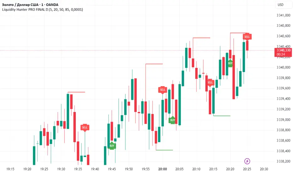
Liquidity Hunter PRO FINAL ✅Liquidity Hunter PRO ✅ is a smart tool designed for traders who want to spot key liquidity sweeps and hunt stop runs with precision.
🔑 How it works:
Automatically plots significant swing highs and lows (liquidity levels) using pivots.
Monitors these levels in real-time and detects when price sweeps above highs or below lows.
Draws clear lines, boxes, and sweep zones to visualize where liquidity was grabbed.
Highlights BUY/SELL opportunities after stop hunts with clean triangle markers and labels.
Fully customizable: set pivot lookback, maximum levels, line age, buffer zone, and visual style.
📌 Features:
✔️ Automatic swing high/low detection
✔️ Dynamic liquidity sweep boxes
✔️ BUY/SELL labels and triangle signals
✔️ Alerts for sweeps above highs and below lows
✔️ Adjustable buffer and line lifetime
✔️ Lightweight, clear and easy to use
💡 Idea: This script helps traders follow Smart Money Concepts (SMC) by showing where the market hunts liquidity before reversals. Combine with your own confluence and strategy for powerful entries.
⚠️ Reminder: Always use this tool with proper risk management — it does not guarantee entries by itself.
Sessions HH/LLSessions HH and LL everything marked with lines, sessions start and finish, compatible with every timeframe and you can hide whole sessions or just little parts of them.

Asian Session + Break & Retest Helperbrake and retest helper, it helps to see what levels are goin to break to the up or downside etc.

RLMC TMAS ALPHABOT by SAMOEDEFIferas gang
made by samoedefi
for rlmcrew
ict concepts with bos breaks


DNAMain array blue is used for break and retest entries, driver array is used for retest entries after retracement. The arrays signify dynamic liquidity pools where price reacts from. Timeframe confluence is needed to make everything work well.

Momentum & stoch rsimomentum and stochastic rsi indicator ideal for day trading. momenum is set to 80 for a smooth and safe analysis.

Price PivotsThis indicator tracks price pivots and displays the high / low value.
You can select the number of candles to look back.
You can select how many candles range before the next pivot is printed.
Text size and colours are user defined.

Top Crypto Above 28-Day AverageDescription
The “Top Crypto Above 28-Day Average” (CRYPTOTW) script scans a selectable universe of up to 120 top-capitalization cryptocurrencies (divided into customizable 40-symbol batches), then plots the count of those trading above their own 28-period simple moving average. It helps you gauge broad market strength and identify which tokens are showing momentum relative to their recent trend.
Key Features
• Batch Selection: Choose among “Top40,” “Mid40,” or “Low40” market-cap groups, or set a custom batch size (up to 40 symbols) to keep within the API limit.
• Dynamic Plot: Displays a live line chart of how many cryptos are above their 28-day MA on each bar.
• Reference Lines: Automatic horizontal lines at 25%, 50%, and 75% of your batch to provide quick visual thresholds.
• Background Coloration: The chart background shifts green/yellow/red based on whether more than 70%, 50–70%, or under 50% of the batch is above the MA.
• Optional Table: On the final bar, show a sortable table of up to 28 tickers currently above their 28-day MA, including current price, percent above MA, and “Above” status color-coding.
• Alerts:
• Strong Batch Performance: Fires when >70% of the batch is above the MA.
• Weak Batch Performance: Fires when <10 cryptos (i.e. <25%) are above the MA.
Inputs
• Show Results Table (show_table): Toggle the detailed table on/off.
• Table Position (table_position): Select one of the four corners for your table overlay.
• Max Cryptos to Display (max_display): Limit the number of rows in the results table.
• Current Batch (current_batch): Pick “Top40,” “Mid40,” or “Low40.”
• Batch Size (batch_size): Define the number of symbols (1–40) you want to include from the chosen batch.
How to Use
1. Add the CRYPTOTW indicator to any chart.
2. Select your batch and size to focus on the segment of the crypto market you follow.
3. Watch the plotted line to see the proportion of tokens with bullish momentum.
4. (Optional) Enable the results table to see exactly which tokens are outperforming their 28-day average.
5. Set alerts to be notified when the batch either overheats (strong performance) or cools off significantly.
Why It Matters
By tracking the share of assets riding their 28-day trend, you gain a macro-level view of market breadth—crucial for spotting emerging rallies or early signs of broad weakness. Whether you’re swing-trading individual altcoins or assessing overall market mood, this tool distills complex data into an intuitive, actionable signal.


Session Backgrounds (Asia, London, US) - Weekdays Onlythis is to mark asia, london, us session so we can easily see what is current session while trading

SCPEM - Socionomic Crypto Peak Model (0-85 Scale)SCPEM Indicator Overview
The SCPEM (Socionomic Crypto Peak Evaluation Model) indicator is a TradingView tool designed to approximate cycle peaks in cryptocurrency markets using socionomic theory, which links market behavior to collective social mood. It generates a score from 0-85 (where 85 signals extreme euphoria and high reversal risk) and plots it as a blue line on the chart for visual backtesting and real-time analysis.
#### How It Works
The indicator uses technical proxies to estimate social mood factors, as Pine Script cannot fetch external data like sentiment indices or social media directly. It calculates a weighted composite score on each bar:
- Proxies derive from price, volume, and volatility data.
- The raw sum of factor scores (max ~28) is normalized to 0-85.
- The score updates historically for backtesting, showing mood progression over time.
- Alerts trigger if the score exceeds 60, indicating high peak probability.
Users can adjust inputs (e.g., lengths for RSI or pivots) to fine-tune for different assets or timeframes.
Metrics Used (Technical Proxies)
Crypto-Specific Sentiment
Approximated by RSI (overbought levels indicate greed).
Social Media Euphoria
Based on volume relative to its SMA (spikes suggest herding/FOMO).
Broader Social Mood Proxies
Derived from ATR volatility (high values signal uncertain/mixed mood).
Search and Cultural Interest Proxied by OBV trend (rising accumulation implies growing interest).
Socionomic Wildcard
Uses Bollinger Band width (expansion for positive mood, contraction for negative).
Elliott Wave Position
Counts recent price pivots (more swings indicate later wave stages and exhaustion).

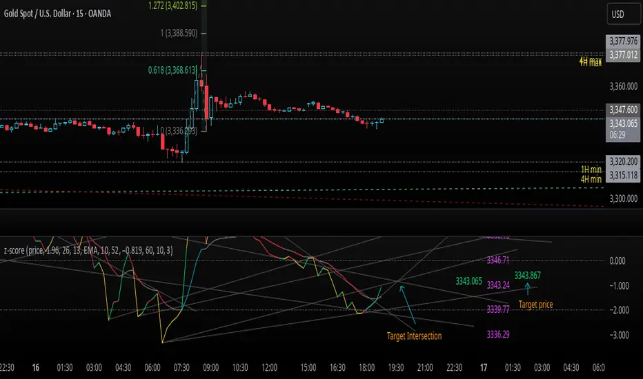
z-score-calkusi-v1.143z-scores incorporate the moment of N look-back bars to allow future price projection.
z-score = (X - mean)/std.deviation ; X = close
z-scores update with each new close print and with each new bar. Each new bar augments the mean and std.deviation for the N bars considered. The old Nth bar falls away from consideration with each new historical bar.
The indicator allows two other options for X: RSI or Moving Average.
NOTE: While trading use the "price" option only.
The other two options are provided for visualisation of RSI and Moving Average as z-score curves.
Use z-scores to identify tops and bottoms in the future as well as intermediate intersections through which a z-score will pass through with each new close and each new bar.
Draw lines from peaks and troughs in the past through intermediate peaks and troughs to identify projected intersections in the future. The most likely intersections are those that are formed from a line that comes from a peak in the past and another line that comes from a trough in the past. Try getting at least two lines from historical peaks and two lines from historical troughs to pass through a future intersection.
Compute the target intersection price in the future by clicking on the z-score indicator header to see a drag-able horizontal line to drag over the intersection. The target price is the last value displayed in the indicator's status bar after the closing price.
When the indicator header is clicked, a white horizontal drag-able line will appear to allow dragging the line over an intersection that has been drawn on the indicator for a future z-score projection and the associated future closing price.
With each new bar that appears, it is necessary to repeat the procedure of clicking the z-score indicator header to be able to drag the drag-able horizontal line to see the new target price for the selected intersection. The projected price will be different from the current close price providing a price arbitrage in time.
New intermediate peaks and troughs that appear require new lines be drawn from the past through the new intermediate peak to find a new intersection in the future and a new projected price. Since z-score curves are sort of cyclical in nature, it is possible to see where one has to locate a future intersection by drawing lines from past peaks and troughs.
Do not get fixated on any one projected price as the market decides which projected price will be realised. All prospective targets should be manually updated with each new bar.
When the z-score plot moves outside a channel comprised of lines that are drawn from the past, be ready to adjust to new market conditions.
z-score plots that move above the zero line indicate price action that is either rising or ranging. Similarly, z-score plots that move below the zero line indicate price action that is either falling or ranging. Be ready to adjust to new market conditions when z-scores move back and forth across the zero line.
A bar with highest absolute z-score for a cycle screams "reversal approaching" and is followed by a bar with a lower absolute z-score where close price tops and bottoms are realised. This can occur either on the next bar or a few bars later.
The indicator also displays the required N for a Normal(0,1) distribution that can be set for finer granularity for the z-score curve.This works with the Confidence Interval (CI) z-score setting. The default z-score is 1.96 for 95% CI.
Common Confidence Interval z-scores to find N for Normal(0,1) with a Margin of Error (MOE) of 1:
70% 1.036
75% 1.150
80% 1.282
85% 1.440
90% 1.645
95% 1.960
98% 2.326
99% 2.576
99.5% 2.807
99.9% 3.291
99.99% 3.891
99.999% 4.417
9-Jun-2025
Added a feature to display price projection labels at z-score levels 3, 2, 1, 0, -1, -2, 3.
This provides a range for prices available at the current time to help decide whether it is worth entering a trade. If the range of prices from say z=|2| to z=|1| is too narrow, then a trade at the current time may not be worth the risk.
Added plot for z-score moving average.
28-Jun-2025
Added Settings option for # of Std.Deviation level Price Labels to display. The default is 3. Min is 2. Max is 6.
This feature allows likelihood assessment for Fibonacci price projections from higher time frames at lower time frames. A Fibonacci price projection that falls outside |3.x| Std.Deviations is not likely.
Added Settings option for Chart Bar Count and Target Label Offset to allow placement of price labels for the standard z-score levels to the right of the window so that these are still visible in the window.
Target Label Offset allows adjustment of placement of Target Price Label in cases when the Target Price Label is either obscured by the price labels for the standard z-score levels or is too far right to be visible in the window.
9-Jul-2025
z-score 1.142 updates:
Displays in the status line before the close price the range for the selected Std. Deviation levels specified in Settings and |z-zMa|.
When |z-zMa| > |avg(z-zMa)| and zMa rising, |z-zMa| and zMa displays in aqua.
When |z-zMa| > |avg(z-zMa)| and zMa falling, |z-zMa| and zMa displays in red.
When |z-zMa| <= |avg(z-zMa)|, z and zMa display in gray.
z usually crosses over zMa when zMa is gray but not always. So if cross-over occurs when zMa is not gray, it implies a strong move in progress.
Practice makes perfect.
Use this indicator at your own risk
Trajectory Channel (VWAP Highs/Lows) [Euler-Inspired]This script identifies and visualizes key price trajectories by connecting recent pivot highs and lows on the weekly timeframe using either VWAP or Heikin-Ashi closes. It draws fully extended trend lines between the two most recent qualifying pivot highs (in red) and lows (in green), allowing traders to interpret natural directional channels—similar to manual trajectory plotting.
Inspired by Euler’s method of approximating paths, this tool avoids clutter by selectively connecting pivots that align with structural movement, providing traders with long-term support and resistance trajectories.
Use the sensitivity input to control how strictly pivots are defined, and toggle between VWAP-based or Heikin-Ashi-based pivots depending on your strategy.

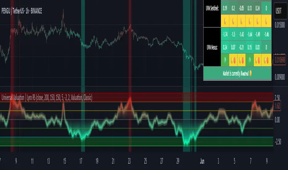
Universal Valuation | Lyro RSUniversal Valuation
⚠️Disclaimer: This indicator is a tool for technical analysis and does not provide guaranteed results. It should be used in conjunction with other analysis methods and proper risk management practices. The creators of this indicator are not responsible for any financial decisions made based on its signals.
Overview
The Universal Valuation indicator helps identify whether the market is undervalued/cheap or overvalued/expensive. And another mode this indicator offers is This cutting-edge tool works flawlessly ACROSS ALL TIMEFRAMES & TICKERS/CHARTS.
By combining regular TradingView indicators & some of our valuation indicators basic/simple with advanced statistical functions, this indicator offers a powerful, universal valuation tool.
Key Features
INPUTS: The Universal Valuation indicator offers flexibility through its customizable input sections. The "Indicator Settings" let you adjust lengths for the raw indicators and statistical functions. The "Signals" section defines thresholds for background color changes, helping you visually spot key market moments. The "Colors" section allows you to pick from pre-defined schemes or personalize colors for better clarity. Lastly, the "Tables" section gives you full control over the UV table’s size and positioning, including options to overlay it on the chart or place it in the allocated space.
A DEEPER INSIGHT: This indicator is built around three distinct categories: "UVM Andromeda," "UVM Sentinel," and "UVM Nexus." Each category has three different drivers. The statistical function powering this indicator is the Z-score. The Z-score is an incredibly powerful tool that helps determine if the market is overvalued/expensive or undervalued/cheap, offering critical insights for traders."
Plotting: The plotted value represents the average of all the drivers. In other words, it is the combined average of all 9 Z-scored indicators, providing a balanced and comprehensive market valuation.
What is Z-score? & Why does this system use it?
Z-score is an advanced statistical function used to measure how far a value deviates from the average in a data set. The formula for Z-score is: (x - h) / o, where x is the observed value, h is the average (mean) of the data set, and o is the standard deviation.
This system uses the Z-score because it helps determine whether the market is overvalued or undervalued based on historical data and how we apply the calculation. By measuring how far a value deviates from the average, the Z-score provides a clearer and more objective valuation of market conditions. In our case, a Z-score of -3 indicates an undervalued market, while a Z-score of 3 signals an overvalued market.
UVM Andromeda:
UVM stands for Universal Valuation Model, which is the core of this indicator. Andromeda, one of the most stunning galaxies in the universe, inspired by its name. We chose this name because a powerful indicator should not only be effective but also visually appealing.
You might be wondering what drives UVM Andromeda. The three key drivers are Price, RSI, and ROC. These indicators are pre-defined, while the "Indicator Settings" allow you to adjust the length of the Z-score calculation, refining how the model analyzes market conditions.
UVM Sentinel:
Sentinel, refers to a guard or watchman, someone or something that keeps watch and provides protection. In our case this name refers to a model that actively observes market conditions, acting as a vigilant tool that signals important shifts in valuation.
Wondering what drives UVM Sentinel? The three key drivers are BB%, CCI, and Crosby. While these indicators are simple on their own, applying our Z-score function elevates them to a whole new level, enhancing their ability to detect market conditions with greater accuracy.
UVM Nexus:
We chose the name Nexus simply because it sounds cool—there’s no deeper meaning behind it for us. However, the word itself does have a meaning; it refers to a connection or link between multiple things.
The three key drivers for UVM Nexus are the Sharpe, Sortino, and Omega ratios. These are all asset performance metrics, but by applying the Z-score, we transform them into powerful valuation indicators/drivers, giving you a deeper insight into market conditions.
Why do we use 9 different indicators instead of 1?
That's a great question, and the answer is quite simple. Think of it like this: if you have one super soldier, and they miss a shot, it’s game over. But if you have many soldiers, even if one misses, the others can step in and take the shot. The strength of using multiple indicators lies in their collective power – if one misses, the others still provide valuable insights, making the overall system more reliable.
Final Thoughts:
In our Universal Valuation indicator, you have the flexibility to customize it however you like using our inputs. The system is divided into three distinct categories, with each category containing three indicators. The value plotted on the chart is the average of all nine indicators. We apply the Z-score, an advanced statistical function, to each of these nine indicators. The final plotted average is the average of all the Z-scores, giving you a comprehensive and refined market valuation. This indicator can work on any timeframe & chart ticker.

Z-Score Multi-Model ClusteringA price/volume clustering framework combining three market behavior models into a single indicator. Designed to help identify emerging trend strength, turning points, and volatility-driven entries or exits.
🔍 How It Works
This indicator classifies market states by comparing normalized price/volume behavior (via Z-Score) to different types of statistical or geometric "cluster centers." You can choose from three clustering approaches:
🧠 Clustering Models
1. Percentile (Z+CVD) – Trend Momentum Bias
Uses volume Z-Score + Cumulative Volume Delta (CVD).
Detects institutional pressure by clustering volume surges with directional delta.
Best for: Breakouts, momentum trades, volume-led reversals.
Cluster Colors:
🔹 Green triangle = Strong bullish confluence
🔻 Red triangle = Bearish divergence (bull trap risk)
⚪ Gray = Neutral/low conviction
2. Euclidean (Z+Slope) – Swing Mean-Reversion
Measures the angle of recent Z-score slope and compares it to directional cluster centers.
Helps detect early directional shifts or exhaustion.
Best for: Swing entries, pullback setups, exit timing
3. Hilbert Phase – Turn Detection via Signal Phase
Applies Hilbert Transform to the Z-Score, measuring the phase difference between trend and oscillator components.
Ideal for anticipating turns or detecting cyclical inflection points.
Useful for: Scalping, top/bottom spotting, volatility fades
✅ Features
Auto-updating cluster logic based on current data
Tooltips and clean user interface
Optional cluster bar coloring (can be toggled off)
Signal-only plotting keeps candlesticks readable
Clear entry/exit logic with triangle markers
Supports trend, swing, and oscillation-based systems
🛠️ Suggested Use Cases
Combine with VWAP, Session High/Low, or Liquidity Zones to confirm entry conditions.
Use Cluster 2 (strong bullish) on pullbacks to trend structure for add-on entries.
Use Cluster 1 in strong trends to watch for potential traps or exits.
Toggle models based on your strategy: e.g., Hilbert for scalping, Percentile for macro trend breaks.
🧪 Best Timeframes
Works across all markets and timeframes
For Percentile (Z+CVD), use intraday TF with 1m–5m CVD source
Hilbert and Euclidean preferred on 5m–1h for accurate slope/phase signals
⚠️ Notes
Clusters do not generate trade signals alone; use them in context with structure, VWAP, or trend filters.
Marker signals are filtered with a magnitude threshold to reduce noise.

ICT Time CaptureICT 8am High/Low + 9am Capture (NY Time) — Fixed 1H
This indicator marks the High and Low of the 8am candle on the 1-hour timeframe fixed to New York time (America/New_York timezone). It also draws a line for the 9am candle open and indicates if the 9am candle “captured” (broke above or below) the 8am High or Low.
Key Features:
Always uses 1-hour data fixed on New York timezone, regardless of the chart’s current timeframe.
Draws horizontal lines for the 8am High and Low, with configurable colors, styles (solid/dashed), thickness, and extension length.
Draws a horizontal line for the 9am open price with customizable style.
Shows labels with price values explaining the lines.
Shows a capture label when the 9am candle breaks above the 8am high or below the 8am low.
Allows full customization of label text colors, line colors, line styles, thickness, and label distances from line start.
How to use:
Use this indicator to monitor key ICT timeframes (8am and 9am NY time) for intraday price action clues.
The capture labels help identify when price breaks key levels from the 8am candle during the 9am candle.
The configurable style options let you customize the indicator to your chart style.

TrendZoneTrendZone - Fibonacci Trendline Indicator
TrendZone is a custom Pine Script indicator that automatically draws fibonacci-based trendlines between key pivot points on your chart.
Key Features:
3 Pivot Points: Set start point, major pivot (reversal), and end point
Dual Trendlines: First trendline (Point 1 → 2) and second trendline (Point 2 → 3)
Fibonacci Levels: Automatically draws 25%, 50%, and 100% fibonacci levels for each trendline
Auto Trend Detection: Automatically identifies bullish/bearish trends and adjusts colors accordingly
Customizable: Full control over colors, line styles, and widths for each fibonacci level
How it Works:
The indicator uses your selected pivot points to create two connected trendline systems. Point 2 serves as the major pivot where the first trend ends and the reversal begins. Each trendline system includes fibonacci retracement levels that extend to the right, helping identify potential support/resistance zones.
Use Cases:
Identifying trend reversals at key pivot points
Finding potential support/resistance levels using fibonacci projections
Visualizing market structure changes between different time periods
Planning entries/exits based on fibonacci trendline interactions
Perfect for traders who use fibonacci analysis combined with trend structure to identify high-probability trading zones.

Global Liquidity vs BitcoinGlobal liquidity vs Bitcoin/dollar, per Grok. This combines M2 with US credit data - reverse repos, Fed assets, etc. My aim was to approximate Raoul Pal's Global Liquidty indicator from inside his GMI membership. That membership is probably beyond my skillset, but an indicator like this is useful as it close-to-mirrors Bitcoin price.
