X-trend Liquidation Heatmap 🔥 X-TREND Liquidation Heatmap: Market Fuel Visualization
Stop trading blindly. X-Trend Liquidation Heatmap is an institutional-grade analytical tool designed to reveal what remains hidden from most retail traders: where the crowd's money is located.
The market always moves from liquidity to liquidity. This script transforms your chart into a professional heatmap, highlighting the specific price zones where stop-losses and liquidation levels of leveraged traders (10x, 25x, 50x, 100x) are concentrated. These are not just support and resistance lines—they are magnets for price action.
💎 WHAT YOU SEE ON THE CHART:
🟣 Liquidity Gradient Heatmap: Our unique algorithm visualizes the "density" of resting orders.
Faint Zones: Liquidation levels of low leverage positions (10x-25x).
Bright Neon Zones: Dense clusters of high leverage liquidations (50x-100x). Price often spikes through these zones to "sweep" the liquidity.
🟡 Gold Zones (Tested Liquidity): Areas of maximum interest that price has touched but not broken. These represent critical defense levels protected by market makers.
📊 Market Pressure Dashboard: A built-in panel analyzes Buyer/Seller pressure across all timeframes (LTF, MTF, HTF) + BTC Correlation. You get a clear numerical view of market sentiment (e.g., "Total 92% Long Pressure").
HOW TO USE IT? Stop placing your stop-losses where everyone else does. Use these zones as targets for Take Profit (exit into the crowd's liquidity) or look for reversal patterns when price "sweeps" a bright zone.
🚀 Perfect Synergy: Use the Heatmap to define your TARGETS, and use X-Trend Reversal (PRO) to pinpoint the exact ENTRY.
🔒 HOW TO GET ACCESS (INVITE-ONLY)
This script is a closed-source proprietary tool. Access is granted exclusively through our official channels.
⛔ NOTE: We do NOT respond to access requests in the comment section below. Please use the links above for instant support and license activation.
Hacim

Breadth-Force Oscillator (BFO)Welcome to the Breadth-Force Oscillator! This is a measure of the cumulative volume index relative to price action, and is used for swing trading.
How to read:
This indicator is read primarily through divergences in price, when the BFO is going down that is indicative of an uptrend and when it is going up that is indicative of a downtrend. Changes in the BFO direction give foresight towards shifts in trends.
Features:
This indicator is highly adjustable, and depending on how you adjust it, it may change the results of how you interpret it. This indicator includes multiple smoothing options to reduce noise on smaller time frames and gain more foresight to macro-trends in a given market, and other adjustable features which can be used to further customize.

X-Trend reversal (PRO) 👑 X-TREND REVERSAL (PRO): Institutional Order Flow Analysis
Look at the results above. This is not luck. This is mathematics. X-Trend PRO is the flagship algorithm of our ecosystem, engineered for traders who have outgrown standard technical analysis. While the Lite version identifies trends, the PRO version sees where the money is.
Unlike 99% of indicators that focus solely on price action, X-Trend PRO analyzes Market Liquidity and Volume Delta (CVD). We have fused market structure with an X-ray view of institutional activity.
💎 EXCLUSIVE PRO FEATURES:
📊 Volume & CVD Fusion: The indicator detects Cumulative Volume Delta divergences. It warns you of reversals when price is still rising, but buyers have already left the market.
📍 Dynamic POC (Point of Control): Automatically identifies "fair price" levels and institutional accumulation zones. You trade from levels defended by market makers.
🛡 Zero Repaint Guarantee: The signal is locked permanently upon bar close. The history you see is the actual real-time performance of the algorithm.
🧠 Smart Filtering: The system filters out "noise" in ranging markets, generating signals only when Trend, Momentum, and Volume align perfectly.
⚠️ IMPORTANT: SYSTEM SYNERGY
While X-Trend PRO is a powerful standalone tool, the author does not recommend using it in isolation. To achieve the "Sniper Efficiency" shown in the screenshots and to ensure deep market confluence, this tool is engineered to work ideally in synergy with the X-Trend Dashboard PRO. Combining these modules provides the ultimate confirmation system.
🔒 HOW TO GET ACCESS (INVITE-ONLY)
This script is a closed-source proprietary tool. Access is granted exclusively through our official channels.
⛔ NOTE: We do NOT respond to access requests in the comment section below. Please use the links above for instant support and license activation.

Gann Volume Swing (GVS)## **Gann Volume Swing (GVS) Indicator**
*Professional Hybrid Volume-Gann Reversal Detector*
### **Core Concept & Purpose**
The Gann Volume Swing (GVS) indicator is a sophisticated trading tool designed to identify high-probability reversal points by integrating three key market dimensions: **volume dynamics**, **geometric price levels**, and **momentum confirmation**. Developed for serious technical traders, GVS addresses the common challenge of distinguishing meaningful breakouts/reversals from temporary noise.
The indicator operates on the principle that **significant volume expansions** at **precise geometric support/resistance levels** (derived from Gann theory) often precede substantial price movements. By combining these elements with traditional momentum filters (RSI, MACD), GVS provides a multi-factor approach to market timing.
### **Theoretical Foundation**
The methodology synthesizes:
1. **Wyckoff's Volume-Price Relationship**: Volume precedes and confirms price action
2. **Gann's Geometric Trading**: Price moves in predictable angular patterns from swing points
3. **Modern Momentum Filters**: Additional confirmation from established oscillators
This creates a robust framework that respects both classical technical analysis and contemporary trading psychology.
---
## **TECHNICAL ARCHITECTURE**
### **1. Volume Engine Module**
```
Inputs:
• Volume MA Period (20): Smoothing window for volume baseline
• Volume Multiplier (2.0): Threshold for "abnormal" volume detection
Calculation Logic:
Current Volume > AND
Current Volume >
Output: Boolean flag signaling institutional-grade participation
```
### **2. Gann Geometry Module**
```
Pivot Detection:
• Swing Highs: PivotHigh(25,25) - Identifies significant peaks
• Swing Lows: PivotLow(25,25) - Identifies significant troughs
Line Generation:
• 1x1 Lines: Base angular lines from pivots (45-degree equivalents)
• 2x1 Lines: Secondary steeper/flatter lines (dynamic angles)
Key Parameter:
• Gann Sensitivity (0.5): Controls line steepness (0.1=flat, 1.0=steep)
```
### **3. Signal Generation Logic**
```
Long Signal =
+ + + +
Short Signal =
+ + + +
Anti-Whipsaw Protection:
• 5-bar cooldown between same-direction signals
• Proximity threshold: 0.5×ATR from Gann lines
```
### **4. Visualization System**
```
Primary Elements:
• Real-time Gann lines (4 colors, 2 styles)
• Signal markers (▲/▼ triangles)
• Bar coloring (lime/red highlights)
Display Control:
• Toggle Gann lines on/off
• Adjust transparency levels
• Custom alert configurations
```
---
## **QUICK REFERENCE CARD**
**GANN VOLUME SWING (GVS)**
*Volume-Powered Geometric Reversal Indicator*
### **🔧 PARAMETER SETTINGS**
**VOLUME GROUP**
`Volume MA Period`: 20 (14-30 range)
`Volume Multiplier`: 2.0 (1.5-2.5 optimal)
**GANN GROUP**
`Swing Period`: 50 bars (pivot sensitivity)
`Gann Sensitivity`: 0.3-0.5 (adjust for market type)
**FILTERS GROUP**
`RSI Period`: 14 (standard)
`Use Filters`: ON (recommended)
**DISPLAY GROUP**
`Show Gann Levels`: ON
`Cooldown Bars`: 5 (prevents signal flooding)
### **🎯 SIGNAL INTERPRETATION**
**LONG SETUP (Green ▲)**
- Volume spike (2× average) + Price at Gann support + Bullish candle
- Entry: Close of signal bar
- SL: 1.5×ATR below support line
- TP: Next Gann resistance or 2:1 R/R
**SHORT SETUP (Red ▼)**
- Volume spike + Price at Gann resistance + Bearish candle
- Entry: Close of signal bar
- SL: 1.5×ATR above resistance line
- TP: Next Gann support or 2:1 R/R
### **📊 VISUAL ELEMENTS KEY**
**LINES**
- `Solid Green`: 1x1 Support (primary)
- `Solid Red`: 1x1 Resistance (primary)
- `Blue Dots`: 2x1 Support (secondary)
- `Orange Dots`: 2x1 Resistance (secondary)
**MARKERS**
- `▲ Below Bar`: Long signal
- `▼ Above Bar`: Short signal
- `Bar Coloring`: Confirmation highlight
### **⚙️ OPTIMIZATION GUIDE**
**TRENDING MARKETS**
- Sensitivity: 0.2-0.3 (shallower angles)
- Volume Multiplier: 1.8-2.0
- Filters: Strict (RSI 65/35)
**RANGING MARKETS**
- Sensitivity: 0.6-0.8 (steeper angles)
- Volume Multiplier: 2.2-2.5
- Filters: Moderate (RSI 70/30)
**HIGH VOLATILITY**
- Increase ATR multiplier to 0.7-1.0
- Extend cooldown to 7-10 bars
- Require stronger volume confirmation
### **🚫 LIMITATIONS & NOTES**
**KNOWN CONSTRAINTS**
- Less effective in extremely choppy markets
- Requires adequate historical data (200+ bars)
- Volume reliability varies by asset class
- Gann lines repaint as new pivots form
**BEST PRACTICES**
- Combine with higher timeframe trend analysis
- Use on 1H+ charts for reliability
- Wait for close confirmation before acting
- Track win rate by market condition
**ALERT CONFIGURATION**
- Enable both Long/Short alerts
- Set to "Once Per Bar Close"
- Include ATR distance in alert message
- Log all signals for performance review
---
## **TRADING SYSTEM INTEGRATION**
### **Recommended Confluence Factors**
1. **Trend Alignment** (Higher timeframe direction)
2. **Market Structure** (Support/Resistance clusters)
3. **Economic Context** (News event proximity)
4. **Session Timing** (High-volume trading hours)
### **Risk Management Protocol**
- Maximum risk: 1% per trade
- Correlation limit: 2 simultaneous GVS signals
- Daily loss cap: 3% of portfolio
- Weekly review of signal accuracy
### **Performance Metrics to Track**
- Signal-to-Noise ratio (profitable signals/total)
- Average Reward/Risk achieved
- Best/worst market conditions
- Optimal parameter sets per asset
---
## **SUMMARY**
The **Gann Volume Swing** indicator represents a sophisticated approach to technical analysis, blending time-tested principles with modern computational techniques. By focusing on the confluence of **unusual volume**, **geometric price levels**, and **momentum confirmation**, it provides traders with a structured framework for identifying high-quality setups.
**Ideal User Profile**: Intermediate to advanced traders comfortable with multi-factor analysis, geometric concepts, and disciplined risk management.
**Disclaimer**: This tool generates probabilities, not certainties. Always combine with comprehensive market analysis and strict risk control measures.
---
**Version**: 5.0
**Category**: Volume + Geometric Analysis
**Complexity**: Advanced
**Best Timeframe**: 1H - Daily
**Recommended Assets**: Liquid stocks, major Forex pairs, indices

Normalized Volume Dynamics [NVD]Concept & Overview
**Normalized Volume Dynamics (NVD)** is a volume analysis indicator designed to reduce time-of-day noise and highlight unusual volume behavior relative to historical conditions.
Most standard volume indicators compare current volume to a rolling average, which can lead to misleading readings during naturally active periods.
**NVD** addresses this by using a time-normalized volume baseline, comparing the current bar’s volume to volume observed at the same intraday bar position across prior sessions, rather than to a generic moving average.
This approach helps distinguish expected activity from statistically abnormal volume.
**Market Suitability**
The time-normalized logic depends on consistent intraday data structure.
**Crypto (24/7 Markets):**
Continuous trading provides consistent intraday alignment, making normalization most reliable.
**Futures:**
Continuous futures contracts with minimal session gaps generally work well.
**Stocks & Forex:**
Session gaps, holidays, and irregular trading hours may introduce minor baseline drift. While the indicator remains functional, continuous markets are preferred for best accuracy.
**How the Indicator Works**
NVD combines three core components:
**1. Time-Normalized Volume Baseline**
Current volume is compared against the average volume of the same intraday bar position over prior sessions.
* Filters out predictable time-based volume patterns
* Highlights volume that exceeds what is historically typical for that point in the session
* Automatically falls back to a smoothed volume average on non-intraday charts or limited history
**2. Efficiency Oscillator (Lower Panel)**
The histogram evaluates the relationship between price movement and volume effort, showing how efficiently price is moving.
Color interpretation:
* **Green Columns:** Buying pressure with high efficiency (Trend is healthy).
* **Red Columns:** Selling pressure with high efficiency.
* **Yellow Columns:** Volume Spike. Abnormal volume detected (2x average) indicating a potential breakout or exhaustion.
* **Grey Columns:** Absorption/Churn. Volume is present but price is not moving significantly. This often happens before a violent move
**3. Informational Flow Signals (Main Chart)**
The indicator can mark candles where unusual volume coincides with price rejection. These markers are informational and require multiple conditions:
* Volume exceeds the selected baseline by a user-defined multiplier
* Price makes a new local high or low but closes back within the candle range, indicating rejection
* Optional Money Flow Index (MFI) filter confirms an overbought or oversold condition
**Dashboard Overview**
An optional dashboard provides a compact summary of the indicator’s internal states for quick reference.
The dashboard displays:
**Trend State (ADX)**
* Uses ADX to classify conditions as **TRENDING** or **RANGING**
* Helps contextualize whether volume behavior is occurring in a directional environment
**Flow Bias**
* Derived from the Efficiency Oscillator and VWAP relationship
* Displays:
**BUYING**
**SELLING**
**ABSORPTION** (low efficiency / churn)
* An arrow indicates whether price is positioned above or below VWAP
**Volume Status**
* Indicates whether current volume qualifies as a high-volume condition relative to the selected baseline
* Matches the logic used for histogram coloring and informational markers
**Multi-Timeframe Support**
* The dashboard can optionally run on a separate timeframe
* Users may choose to sync the histogram with the dashboard timeframe or keep it on the chart timeframe
*Note: The dashboard summarizes internal calculations and does not generate independent trade signals. All values update on confirmed bars.*
**How to Trade: "INFO" Signals**
The chart arrows are labeled **INFO BUY** and **INFO SELL** to emphasize that these are informational warnings of stopping volume, not blind entry signals.
**INFO BUY (Green Arrow):**
* **The Logic:** Sellers pushed price to a low, but massive volume entered to absorb the sell pressure, forcing a close in the upper range. This is a "Bear Trap" or Liquidity Sweep.
* **Usage:** If you are Short, this is a warning to tighten stops. If looking for Longs, wait for price to break the high of the signal candle for confirmation.
**INFO SELL (Red Arrow):**
* **The Logic:** Buyers pushed price to a high, but massive volume entered to block the move, forcing a close in the lower range. This is a "Bull Trap."
* **Usage:** If you are Long, this indicates overhead resistance/supply. If looking for Shorts, wait for price to break the low of the signal candle.
**Features & Settings**
* Time-Normalized or Recent-Average volume calculation modes
* Efficiency histogram with absorption and volume spike detection
* Optional MFI filter for informational signals
* VWAP-based contextual filter
* Dashboard showing trend state, flow bias, and volume status
* Non-repainting alerts triggered on bar close
**Recommended Usage**
* Higher timeframes (5m and above) generally provide clearer structure
* On lower timeframes, increasing the analysis period can help reduce noise
* Designed to be used as a supporting analysis tool, not a standalone system
**Disclaimer**
*This indicator is provided strictly for educational and informational purposes. It does not constitute financial, investment, trading, or other professional advice.*
*All calculations, visualizations, and signals produced by this indicator are derived solely from historical price and volume data. No representation is made that the indicator can predict future market behavior or outcomes. Any interpretations drawn from its output are the sole responsibility of the user.*
*Trading and investing involve substantial risk, including the possible loss of all or more than the initial capital. Market conditions can change rapidly, and past market behavior, patterns, or indicator performance do not guarantee similar results in the future.*
*The informational markers, alerts, dashboard readings, and histogram values generated by this indicator are not trade recommendations and should not be used as the sole basis for making trading decisions. Users are encouraged to combine this tool with their own analysis, risk management, and confirmation methods.*
*The author assumes no responsibility or liability for any trading decisions, losses, or damages resulting directly or indirectly from the use of this indicator. By using this script, you acknowledge that you are solely responsible for your trading decisions and outcomes.*
*Use at your own risk.*

Triple VWAP: Anchored# Triple VWAP: Anchored + Last 2 Sessions
## 📊 Overview
**Triple VWAP** is a professional-grade Volume Weighted Average Price (VWAP) indicator designed for serious traders who need multi-timeframe volume analysis on a single chart. This indicator combines three powerful VWAP calculations: a custom **Anchored VWAP** from any historical date, a real-time **Current Session VWAP**, and **Previous Session VWAP** reference levels—all with configurable standard deviation bands.
Perfect for intraday traders, swing traders, and institutional-level analysis on Indian markets (Nifty, BankNifty) and global instruments.
***
## ✨ Key Features
### 🎯 Three Independent VWAP Calculations
**📍 Anchored VWAP (Long-term Reference)**
- Anchor VWAP from any specific date and time (year, month, day, hour, minute)
- Ideal for tracking price action from significant market events, earnings, or trend reversals
- Maintains accumulation from your chosen anchor point throughout the entire timeframe
**📅 Current Session VWAP (Real-Time)**
- Automatically resets at the start of each trading day
- Calculates dynamically as new bars form during the session
- Shows institutional trading levels and intraday fair value
**📆 Previous Session VWAP (Reference Levels)**
- Displays yesterday's final VWAP as horizontal reference lines
- Helps identify support/resistance zones from prior session
- Useful for gap analysis and opening range strategies
### 📐 Standard Deviation Bands
Each VWAP calculation includes optional standard deviation bands:
- **±1 SD** - Identifies normal price deviation zones
- **±2 SD** - Marks extreme price movements (high probability reversal zones)
- **±3 SD** - Ultra-extreme levels (rare price extensions)
Configure which SD levels to display for each VWAP type independently.
### 🎨 Customizable Visual Settings
- **Independent Color Schemes**: Assign unique colors to each VWAP type and its SD bands
- **Adjustable Line Widths**: Configure VWAP and SD line thickness (1-5 for VWAP, 1-3 for SD)
- **Plot Styles**: Previous session plots use cross-style for clear differentiation from real-time plots
- **Background Zones**: Optional colored zones when price extends beyond ±2 SD levels
- **Session Labels**: Automatic date labels marking each VWAP anchor point
### 📊 Information Dashboard
Real-time statistics table displaying:
- Current VWAP values for all three calculations
- Live standard deviation values
- ±1 SD levels for quick reference
- Distance from price to each VWAP (percentage format)
- Session tracking counter
- Color-coded proximity indicators
***
## 🔧 How to Use
### For Intraday Trading
1. **Current Session VWAP** acts as dynamic support/resistance—price above VWAP indicates bullish bias, below indicates bearish bias
2. Use **±1 SD bands** for profit targets and stop-loss placement
3. **±2 SD touches** often signal mean reversion opportunities
4. **Previous Session VWAP** provides overnight gap reference levels
### For Swing Trading
1. **Anchored VWAP** from significant events (breakouts, earnings, trend changes) shows institutional cost basis
2. Price trading consistently above/below anchored VWAP confirms trend strength
3. SD band rejections provide high-probability entry zones
### For Multi-Timeframe Analysis
1. Combine all three VWAPs to identify confluence zones
2. When current session VWAP aligns with previous session and anchored VWAP, expect strong support/resistance
3. Monitor distance percentage to gauge overextension
***
## ⚙️ Input Parameters
**📍 Anchored VWAP Configuration**
- `Enable Anchored VWAP` - Toggle on/off
- `Year, Month, Day, Hour, Minute` - Set your custom anchor point (requires confirmation)
**📅 Session VWAP Toggles**
- `Enable Current Session VWAP` - Toggle real-time daily VWAP
- `Enable Previous Session VWAP` - Toggle yesterday's reference VWAP
**General Settings**
- `VWAP Source` - Choose calculation source (default: HLC3)
- `Show ±1/2/3 SD` - Enable/disable each standard deviation level
**Visual Customization**
- Individual color pickers for each VWAP type and SD bands
- Line width adjustments
- `Show VWAP Labels` - Date labels at anchor points
- `Show Info Table` - Statistics dashboard toggle
- `Show SD Zones` - Background coloring beyond ±2 SD
***
## 💡 Trading Applications
✅ **Mean Reversion Trades**: Enter when price touches ±2 SD with reversal confirmation
✅ **Trend Following**: Trade in direction when price holds above/below VWAP
✅ **Institutional Levels**: Anchored VWAP reveals where large players accumulated positions
✅ **Gap Trading**: Use previous session VWAP to gauge gap fill probability
✅ **Volume Profile Analysis**: VWAP represents fair value based on actual volume traded
✅ **Support/Resistance Confluence**: Multiple VWAP alignment creates high-probability zones
***
## 🎓 Understanding VWAP
VWAP is the average price weighted by volume—representing the true average price paid by all market participants during a specific period. Unlike simple moving averages, VWAP gives more weight to price levels with higher trading volume, making it particularly valuable for:
- Institutional traders executing large orders
- Algorithmic trading systems
- Identifying fair value and overextended prices
- Minimizing market impact on large trades
***
## 📈 Chart Setup Recommendations
**Best Timeframes**: 1-minute to 15-minute charts for intraday; 1-hour to 4-hour for swing trading
**Compatible Markets**: Stocks, Indices (Nifty 50, Bank Nifty), Futures, Forex, Crypto
**Session Settings**: Works with standard daily sessions; automatically detects trading days (not calendar days)
***
## 🚀 What Makes This Indicator Unique
Unlike standard VWAP indicators that only show current session data, **Triple VWAP** provides:
- **Multi-session analysis** on a single chart without clutter
- **Historical anchoring** capability for event-driven analysis
- **Professional-grade statistics** dashboard
- **Independent customization** for each VWAP type
- **Optimized calculations** for real-time performance
***
## ⚠️ Important Notes
- **Anchored VWAP** requires manual date input (use significant market events like breakouts, earnings, trend reversals)
- **Session detection** based on daily timeframe changes—works on all chart timeframes
- **Previous Session VWAP** displays as static horizontal lines (reference only, not recalculated)
- **Standard Deviations** calculated using volume-weighted variance formula
- Works best on instruments with **consistent volume data**
***
## 📝 Credits & License
This indicator is published under **TradingView House Rules**. Code is original and follows Pine Script v6 best practices for performance and maintainability.
***
## 🤝 Support & Feedback
If you find this indicator valuable, please:
- ⭐ **Like** this publication
- 💬 **Comment** with your feedback or questions
- 🔔 **Follow** for updates and new releases
***
**Disclaimer**: This indicator is for educational and informational purposes only. Past performance does not guarantee future results. Always use proper risk management and combine with your own analysis before making trading decisions.
***

VWAP Market FlowVWAP Flow Model
VWAP Flow Model is a VWAP-anchored market context indicator designed to help traders understand how price is behaving relative to fair value.
It evaluates the interaction between price, VWAP (Volume-Weighted Average Price), volatility, and momentum to classify prevailing market conditions such as trend continuation, expansion, mean reversion, and momentum decay.
Rather than issuing trade signals, the indicator focuses on identifying market state and execution quality.
Core framework:
-Adaptive VWAP with slope-based colouring
-VWAP acts as the central fair-value reference.
The VWAP line dynamically changes colour based on its slope:
-Rising VWAP → bullish pressure
-Falling VWAP → bearish pressure
-Flattening VWAP → balance, compression, or rotation
This allows traders to quickly assess directional bias and determine whether price movement is supported by underlying flow or occurring in a lower-quality environment.
Signal labels:
The indicator annotates key behavioural transitions to support visual interpretation of market state:
-IGN (Ignition) — Momentum expansion emerging from compression or balance, often marking the start of a directional move.
-CON (Continuation) — Price sustaining directional behaviour in alignment with VWAP slope.
-REV (Reversion) — Mean-reversion behaviour as price returns toward VWAP after extension.
-EXH (Exhaustion) — Loss of momentum or absorption after an extended move, often preceding rotation or regime change.
-MON (Displacement) — High-energy expansion bars indicating strong participation and structural shift.
These labels describe market behaviour, not trade instructions, and should be interpreted within the broader VWAP context.
Market behaviour classification:
The model continuously evaluates how price interacts with VWAP to determine whether the market is:
-directional and trending
-rotating around fair value
-accelerating away from value (expansion)
-losing momentum or showing signs of exhaustion
Classifications are derived from price displacement, volatility conditions, and momentum quality, rather than simple crossovers.
Filtering and control logic:
-Trend / Volatility Filter
Conditions market-state classification on the prevailing volatility and structural regime, helping prevent unstable or low-quality environments from producing misleading context shifts.
-Cooldown Filter
Enforces a minimum number of bars between classification updates to reduce rapid state-flipping in choppy conditions and keep context stable.
-Minimum Bars Between Signals
Controls the strictness of the cooldown logic.
Lower values increase responsiveness; higher values favour cleaner, more stable context changes.
-Tape Dominance Requirement (IGN)
Optional confirmation that requires directional signed-volume pressure to align with price behaviour before ignition-style classifications are allowed, helping distinguish genuine impulsive moves from weak or mechanically driven spikes.
-Tape Dominance Lookback
Defines the evaluation window used by the tape dominance filter.
Shorter lookbacks react faster; longer lookbacks require sustained participation.
Sensitivity and session controls:
Sensitivity modes adjust how responsive the model is to changing conditions:
-Aggressive — faster, more reactive (lower timeframes)
-Balanced — default intraday calibration
-Sniper — stricter thresholds, fewer but higher-quality classifications
Optional session filters allow the model to operate only during selected trading sessions, helping traders focus on higher-liquidity periods and avoid low-efficiency hours.
How to use it:
VWAP Flow Model is used as a context and confirmation layer, not a signal generator:
-Trade in the direction of VWAP slope during directional phases
-Expect mean reversion when price extends far from VWAP in balanced conditions
-Treat strong acceleration away from VWAP as expansion rather than chop
-Use flattening VWAP as an early warning of rotation or momentum loss
It integrates naturally with price action, structure-based analysis, and volume-aware workflows.
Indicator scope:
VWAP Flow Model provides objective market context and behavioural classification.
It does not generate direct trade signals and is designed to support discretionary decision-making.
Important notes:
Market classifications are probabilistic, not guarantees
Past behaviour does not imply future results
This indicator is a decision-support tool, not an automated trading system

Absorption BubblesSUMMARY
This indicator visualizes absorption events by plotting bubbles on candle wicks where volume activity suggests one side of the market is absorbing the other’s pressure. Instead of raw volume, the script normalizes activity against a rolling standard deviation defined by the Lookback Period. Bubbles appear on upper or lower wicks depending on whether buyers or sellers are absorbing pressure. The goal is to highlight whether aggressive orders are being accepted or absorbed at key price points.
METHODOLOGY
Absorption occurs when one side of the market absorbs aggressive orders from the other, preventing continuation. The script measures normalized volume against a user‑defined threshold to filter out weaker signals.
Green bubbles on upper wicks → Selling absorption (buyers push price up, sellers absorb the buying).
Red bubbles on lower wicks → Buying absorption (sellers push price down, buyers absorb the selling).
Red‑colored bars highlight candles where large volume is concentrated inside the body, signifying aggressive selling activity.
Green‑colored bars highlight candles where large volume is concentrated inside the body, signifying aggressive buying activity.
The Lookback Period controls how many bars are used to calculate the rolling standard deviation of volume, letting traders adjust sensitivity to recent vs. longer‑term activity. Optional significant volume lines extend forward, marking areas where absorption was strongest.
FUNCTIONS
Normalized volume detection using rolling standard deviation
Adjustable Lookback Period for volume normalization
Dynamic bubble plotting on candle wicks (size scales with absorption strength)
Separate visualization for buying vs. selling absorption
Alerts for buying absorption, selling absorption, or any absorption event (only at bar close)
Bar coloring when large absorption occurs inside candle bodies
APPLICATION
Setup: Add the script to any chart and timeframe. Adjust the Absorption Threshold to filter out weaker bubbles and the Lookback Period to control how volume normalization is calculated. Red bubbles highlight buying absorption, often signalling potential price pivots - price can often go upwards from this. Green bubbles mark selling absorption, reflecting resistance to upward moves - price may go downwards from this.
Interpretation:
Green bubbles on upper wicks = sellers absorbing buying pressure.
Red bubbles on lower wicks = buyers absorbing selling pressure.
Larger bubbles = stronger absorption relative to recent volume.
Settings & Use:
Raising the Absorption Threshold filters out smaller bubbles, leaving only significant absorption events.
Changing the Lookback Period alters how “normal” volume is defined — shorter periods make the script more sensitive, longer periods smooth out noise.
Alerts can be set for buying absorption, selling absorption, or any absorption event, and they only trigger at bar close to avoid noise.

Volume Orderblock Breakout v3.6this is indicator that shows long short siganl and tp lines can be checked.
you can get profit by this forever.
we can win over whales
keep going don't give up!!!

VolumeTradingView made the default "Volume" script and I found it very bland because it only displayed volume.
This script is more than just about volume. It also includes:
- A comparison between price increase between the last candle of the post-market hours and first candle of the pre-market hours.
- Relative volume label of that sequence.
- Explicit pre-market, RTH, and post-market hours labels.

INSTITUTIONAL VOLUME PROFILE + FIBONACCI + ENHANCED SIGNALS🎯 INSTITUTIONAL VOLUME PROFILE + FIBONACCI + ENHANCED SIGNALS
A professional-grade indicator combining Volume Profile analysis, Fibonacci retracements, Anchored VWAP, and intelligent signal filtering to identify high-probability institutional positioning and trade setups.
📊 CORE FEATURES
▸ Volume Profile with POC (Point of Control)
- Visualizes where institutional volume accumulated
- Identifies High Volume Nodes (HVN) as key support/resistance
- Shows Value Area (70% volume zone) for market equilibrium
▸ Dynamic Fibonacci Levels
- Auto-detects swing high/low for retracement levels
- Golden Pocket (0.618-0.65) highlight zone
- Bull/bear direction recognition
▸ Anchored VWAP
- Anchored to swing range start
- Institutional mean reversion baseline
- Real-time trend bias indicator
▸ Graded Signal System (A+/B/C)
- A+ Signals: High probability setups (VWAP cross + POC alignment)
- B Signals: Above-average quality (VWAP cross above POC)
- C Signals: Lower probability (counter-trend setups)
🎮 DISPLAY MODES
⚡ TRADING LIVE MODE
- Clean chart showing only A+ signals
- Minimal visual noise for active trading
- Perfect for intraday execution
📈 FULL OVERVIEW MODE
- Complete analysis with all zones visible
- Volume Profile + Fibonacci + Value Area
- All signal grades displayed
- Statistics dashboard
🔬 ADVANCED SIGNAL FILTERS
✓ Volume Confirmation
- Requires above-average volume on signals
- Filters out weak institutional participation
- Configurable volume multiple (default 1.2x)
✓ Momentum Filter
- Ensures price momentum aligns with signal direction
- Prevents counter-trend entries
- Configurable lookback period
✓ SR Proximity Upgrade ⭐ GAME CHANGER
- Automatically upgrades B/C signals to A+ when near key levels
- Detects proximity to POC and HVN zones
- Combines technical confluence for best setups
🔔 SMART ALERTS
▸ Configurable alerts for A+, B, or C signals
▸ Real-time notifications to your device
▸ No need to watch charts constantly
▸ "Once per bar close" prevents repainting
💡 HOW TO USE
FOR DAY TRADING:
1. Switch to "Trading Live" mode
2. Enable only A+ alerts
3. Set filters: Volume 1.5x, Momentum ON, Proximity 0.3%
4. Trade only A+ signals at key levels
FOR SWING TRADING:
1. Use "Full Overview" mode
2. Analyze Value Area and Fibonacci confluence
3. Set filters: Volume 1.2x, Momentum ON, Proximity 0.8%
4. Enter on A+ signals with multi-timeframe confirmation
FOR ANALYSIS:
1. Full Overview mode with all visuals enabled
2. Disable filters to see all raw signals
3. Study how institutions positioned at key zones
4. Plan trades around POC and Value Area
⚙️ RECOMMENDED SETTINGS
5-15 MIN CHARTS (Scalping):
- Lookback: 200-300 bars
- Volume: 1.5x, Momentum: 5 bars, Proximity: 0.3%
- Trading Live mode + A+ alerts only
1 HOUR CHARTS (Intraday):
- Lookback: 300 bars
- Volume: 1.3x, Momentum: 3 bars, Proximity: 0.5%
- Full Overview or Trading Live
4 HOUR CHARTS (Swing):
- Lookback: 300-500 bars
- Volume: 1.2x, Momentum: 3 bars, Proximity: 0.8%
- Full Overview mode
DAILY CHARTS (Position):
- Lookback: 300-500 bars
- Volume: 1.1x, Momentum: 2 bars, Proximity: 1.0%
- Full Overview mode
📈 KEY CONCEPTS
POC (Point of Control): Price level with highest volume - acts as magnet
Value Area: Zone containing 70% of volume - equilibrium range
HVN: High Volume Nodes - institutional accumulation zones
AVWAP: Anchored VWAP - institutional average entry price
Golden Pocket: 0.618-0.65 Fib zone - highest probability reversal area
🎯 TRADING STRATEGY TIPS
1. Wait for A+ signals - quality over quantity
2. Best setups occur at POC or Value Area boundaries
3. Use multiple timeframes for confirmation
4. Combine with your own risk management rules
5. Signals are high probability, not guaranteed - always use stops

GARCH Volume Volatility [MarkitTick]Title: GARCH Volume Volatility
Description
Overview
The GARCH Volume Volatility (GV) indicator is a sophisticated quantitative tool designed to analyze the rate of change in market participation. While the vast majority of technical indicators focus on Price Volatility (how much price moves), this script focuses on Volume Volatility (how unstable the participation is).
Market volume is rarely distributed evenly; it tends to cluster. Periods of high activity are often followed by more high activity, and periods of calm tend to persist. This behavior is known as "heteroskedasticity." This script utilizes an Exponentially Weighted Moving Average (EWMA) model—a core component of Generalized Autoregressive Conditional Heteroskedasticity (GARCH) frameworks—to model these changing variance regimes.
By isolating volume volatility from raw volume data, this tool helps traders distinguish between sustainable liquidity flows and erratic, unsustainable volume shocks that often precede market reversals or breakouts.
Methodology and Calculations
1. Logarithmic vs. Percentage Returns
The foundation of this indicator is the calculation of "Volume Returns"—the period-over-period change in volume.
- The script defaults to Logarithmic Returns. In financial statistics, log returns are preferred because they normalize data that can vary wildly in magnitude (such as cryptocurrency volume spikes), providing a more symmetric view of changes.
- Users can opt for standard percentage changes if they prefer a linear approach.
2. Variance Proxy (Squared Returns)
To measure volatility, the direction of the volume change (up or down) matters less than the magnitude. The script squares the returns to create a "Variance Proxy." This ensures that a massive drop in volume is treated with the same statistical weight as a massive spike in volume—both represent a significant change in the volatility of participation.
3. GARCH-Style Smoothing (EWMA)
Standard Moving Averages (SMA) treat all data points in the lookback period equally. However, volatility is dynamic. This script uses an EWMA model with a tunable "Lambda" (Decay Factor).
- The Recursive Formula: The current calculation relies on a weighted average of the current variance and the previous period's smoothed variance.
- Memory Effect: This allows the indicator to "remember" recent volatility shocks while gradually letting their influence fade. This mimics the GARCH process of conditional variance.
4. Dynamic Statistical Thresholds
The final output is the Volatility (square root of variance). To make this data actionable, the script calculates a dynamic upper and lower limit based on the standard deviation (Z-Score) of the volatility itself over a user-defined lookback period.
How to Use
The indicator plots a histogram that categorizes the market into four distinct volatility regimes:
1. High Volatility (Red Histogram)
Trigger: Volatility > High Band (Upper Standard Deviation).
Interpretation: This signals an extreme anomaly in volume stability. This is not just "high volume," but "erratic volume behavior." This often occurs at:
- Capitulation bottoms (panic selling).
- Euphoric tops (blow-off tops).
- Major news events or earnings releases.
2. Elevated Volatility (Maroon Histogram)
Trigger: Volatility > Mean Average.
Interpretation: The market is in an active state. Participation is changing rapidly, but within statistically normal bounds. This is common during healthy, trending moves where new participants are entering the market steadily.
3. Normal/Low Volatility (Green Histogram)
Trigger: Volatility is within the lower bands.
Interpretation: The market volume is stable. There are no sudden shocks in participation. This is typical of consolidation phases or "creeping" trends where the price drifts without significant volume conviction.
4. Extremely Low Volatility (Bright Green/Transparent)
Trigger: Volatility < Low Band.
Interpretation: The "calm before the storm." When volume volatility collapses to near-zero, it implies that the market has reached a state of equilibrium or disinterest. Historically, volatility is cyclical; periods of extreme compression often lead to violent expansion.
Settings and Configuration
Core Settings
- Use EWMA: When checked (Default), uses the recursive GARCH-style calculation. If unchecked, it reverts to a simple SMA of variance, which is less sensitive to recent shocks but more stable.
- Log Returns: Uses natural log for calculations. Highly recommended for assets with exponential growth or large volume ranges.
- Length: The baseline period for the calculation.
- Threshold Lookback: The number of bars used to calculate the Mean and Standard Deviation bands.
- EWMA Lambda: The decay factor (0.0 to 1.0). A value of 0.94 is standard for risk metrics.
-- Higher Lambda (e.g., 0.98): The indicator reacts slower and is smoother (long memory).
-- Lower Lambda (e.g., 0.80): The indicator reacts very fast to new data (short memory).
Visuals
- Show Thresholds: Toggles the visibility of the statistical bands on the chart.
- High Band (StdDev): The multiplier for the upper warning zone. Default is 1.5 deviations. Increasing this to 2.0 or 3.0 will filter for only the most extreme events.
Disclaimer This tool is for educational and technical analysis purposes only. Breakouts can fail (fake-outs), and past geometric patterns do not guarantee future price action. Always manage risk and use this tool in conjunction with other forms of analysis.

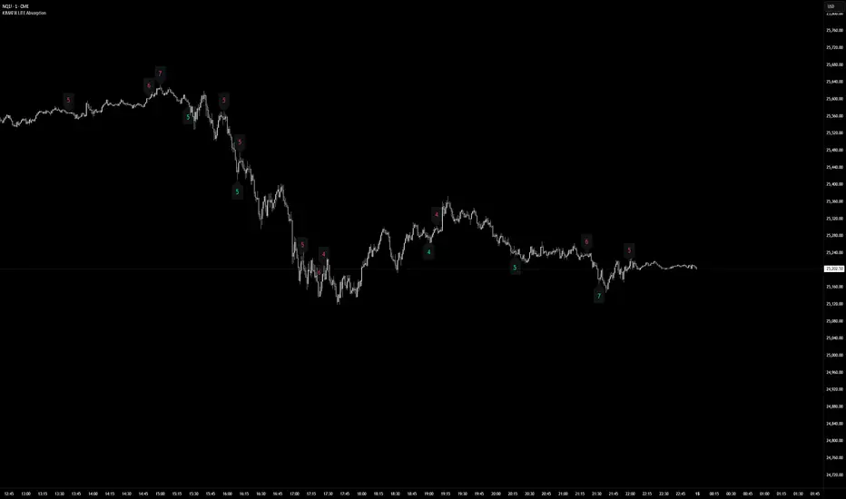
KIMATIX LITE AbsorptionThis indicator highlights absorption intensity directly on the chart using numeric sigma values only.
It is a deliberately reduced, signal-agnostic visualization designed to expose where significant absorption occurs, without adding levels, lines, or trade logic.
What you see
Numeric sigma values on candles
Each number represents the strength of absorption measured in standard deviations (σ).
Color-coded context
Green numbers below price → sell-side absorption
Red numbers above price → buy-side absorption
Only values that exceed the Minimum Sigma threshold are displayed.
No lines, zones, triangles, or alerts are shown — only the raw absorption magnitude.
How it works (LITE Version)
Absorption is derived from volume relative to candle structure
Values are normalized and filtered using:
A fixed statistical lookback
Wick dominance rules to avoid noise
Only statistically significant events (σ ≥ threshold) are visualized
All other calculations run silently in the background.
Intended use
This Lite version is meant to:
Identify areas of aggressive participation or defense
Spot potential absorption during trends or ranges
Provide context for liquidity, exhaustion, or hidden interest
It is not a trading system and does not generate entries or exits.
Use it as a contextual layer alongside your own execution logic.
The full version is distributed separately.
More information can be found here:
whop.com
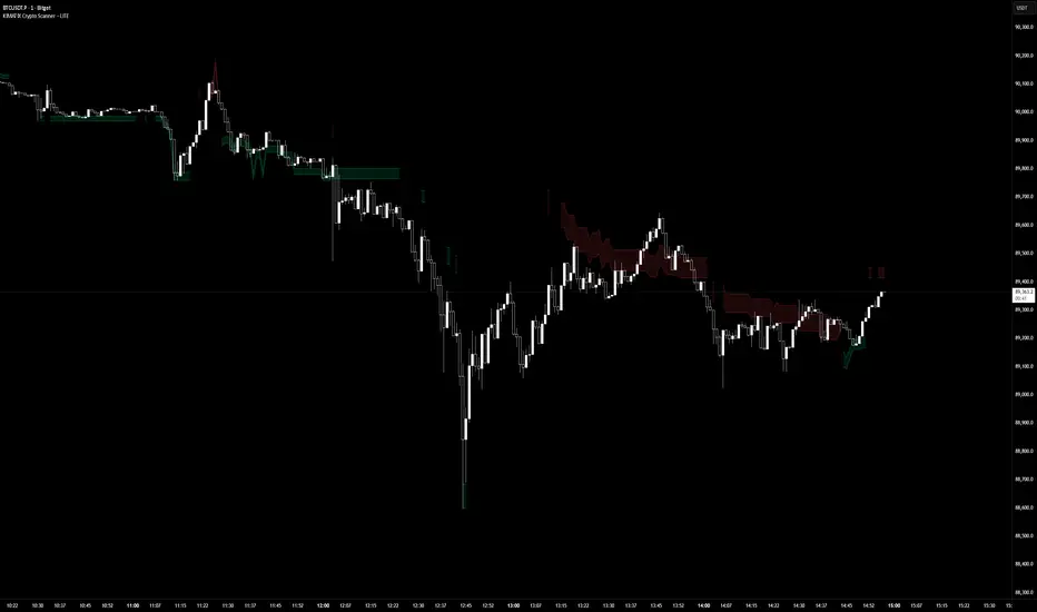
KIMATIX LITE Delta ProfileThis indicator provides a clean, market-structure view of where participation concentrates and which side is in control across price levels.
The Lite version is intentionally reduced to focus on context over execution while keeping the visual identity of the full profile.
What is shown
Sentiment Profile (right side)
Displays directional dominance at each price level:
Bullish rows when buying pressure dominates
Bearish rows when selling pressure dominates
Point of Control (POC)
Value Area High / Low (VAH / VAL)
Lite Version
No left-side volume profile
No delta labels or historical delta tracking
No lower-timeframe or orderflow proxy
No alerts or event notifications
No visible-range logic or advanced controls
All calculations run on the chart timeframe only, making this version lighter and suitable for public use while preserving structural relevance.
Intended use
This indicator is designed to:
Identify high-interest price zones
Assess directional pressure at each level
Support bias and location decisions
Complement other execution or confirmation tools
It is not an entry or signal system and does not provide trade timing.
The full version is distributed separately.
More information can be found here:
whop.com

TrendSurfer Pro
TrendSurfer Pro 🚀 - Advanced Multi-Signal Trading Indicator
TrendSurfer Pro is a comprehensive all-in-one trading system that combines multiple proprietary algorithms and technical indicators to identify high-probability trading opportunities across all timeframes.
**Key Features:**
🔹 **Master Trend System** - Identifies major trend reversals using a combination of EMAs, RSI, and custom filters
🔹 **Smart Money Analysis** - Order Blocks detection with Z-Score impulse identification and rejection signals
🔹 **Session-Based Trading** - Tokyo, London, and New York session analysis with automatic breakout/rejection detection
🔹 **IFVG Detection** - Institutional Fair Value Gap identification for precision entries
🔹 **Multi-Timeframe Signals** - Triangle signals with volume analysis and VWAP proximity filtering
🔹 **KCandle/Boost System** - Advanced engulfing pattern detection with golden area projections
🔹 **CCI Signals** - Commodity Channel Index crosses with MACD confirmation filter
🔹 **Take Profit System** 🎯 - Advanced exit system combining 8 technical indicators (RSI, MACD, Stochastic, Bollinger Bands, Supertrend, CCI, EMA Cross, Price Action) with customizable confirmation requirements
**Unique Advantages:**
✅ Yellow Box Filter - Proprietary reversal zone detection
✅ Time Filters - Trade only during your preferred hours
✅ VWAP Integration - All signals respect price position relative to VWAP
✅ Customizable Alerts - Get notified for every signal type
✅ Visual Dashboard - Real-time trend confirmation table
Perfect for day traders, swing traders, and scalpers seeking precise entries and optimal exits! 🚀

KIMATIX LITE Crypto ScannerKIMATIX Crypto Scanner
This indicator visualizes institutional demand and supply zones based on an automated volume profile calculation.
The Lite version is designed for context and market structure only:
Displays dynamic long and short zones
Helps identify high-interest price areas
Intended for bias and location, not execution
No signals, alerts, confirmations, or execution logic are included.
All advanced filters, timing logic, probability validation,
and trade management are reserved for the full version.
Use this tool to understand where price matters — not when to trade.
The full version is distributed separately.
More information can be found here:
whop.com
VP + Fib + AVWAP + Graded Signals An indicator for the discretionary trader
Avwap, Fib and VP is all you need.
Graded signals for conviction.

RSI WMA Crossover Momentum w/ HighlightRSI WMA Crossover Momentum
This is a momentum indicator that tracks the RSI. Its principle is to use the WMA line to determine the trend of the RSI, and from the RSI, the price trend can be determined.

Fed Balance Sheet vs GDP RatioThis indicator tracks the size of the Federal Reserve’s Balance Sheet relative to the total US Economy (Nominal GDP). It serves as a primary gauge for systemic liquidity and the extent of monetary intervention in the markets.
How it Works: The script calculates the ratio between:
Fed Total Assets (FRED:WALCL) - The total amount of bonds and assets held by the Fed.
US Nominal GDP (FRED:GDP) - The annualized economic output of the US.
How to Read the Levels: I have plotted historical reference lines to help contextualize the current cycle:
🔴 35% (Pandemic Peak): The absolute high of monetary stimulus (2020–2022). This represents maximum liquidity, where the Fed "printed" massive amounts of money to support the economy.
🟠 ~20% (The "Danger Zone"): This was the range established after the 2008 Financial Crisis (2014–2019). Watch this level closely. In late 2019, when the Fed tried to push the ratio below ~18%, the banking plumbing broke (the Repo Crisis), forcing them to restart QE. We are currently approaching this level again.
⚪ 6% (Pre-2008 Normal): The historical baseline before the era of Quantitative Easing (QE) began.
Why This Matters:
Rising Ratio: Suggests the Fed is expanding liquidity (QE) faster than the economy is growing. Historically, this is a tailwind for risk assets (Stocks, Crypto).
Falling Ratio: Suggests the Fed is tightening (QT) or the economy is outgrowing the money supply. This represents a headwind for liquidity and risk assets.
Methodology Note:
Data Source: Federal Reserve Economic Data (FRED).
Calculation: No manual annualization is applied to GDP, as FRED:GDP is already reported as a Seasonally Adjusted Annual Rate (SAAR).

NY Session Vol Entries (RB Trading)NY Session Vol Entries (RB Trading)
NY Session Vol Entries is an intraday analysis script designed to evaluate price behavior during U.S. market hours on the one hour chart. It focuses on the interaction between relative volume expansion, adaptive volatility structure, and directional momentum alignment to help users interpret active market conditions.
The script is intended specifically for liquid U.S. equities during the New York session and is not designed for use outside this context.
Intended Usage and Scope
• Timeframe: 1 hour only
• Market hours: New York session
• Asset class: U.S. equities with consistent volume
• Style: Intraday structure and momentum evaluation
• Alerts: Available for all signal types
Core Framework
The script evaluates market behavior through three interdependent components that must align before a setup is displayed:
Relative volume behavior
Volatility expansion and contraction
Directional momentum context
This structure helps filter low-participation periods and reduce noise.
Relative Volume Analysis
The script compares current volume to a rolling 14-period average to identify periods where participation meaningfully deviates from typical conditions.
Elevated volume often occurs during session opens or active repricing phases. When volume remains muted, the script suppresses signals to avoid low-quality environments.
Adaptive Volatility Structure
Volatility bands are calculated using an 8-period true range measurement. These bands adjust dynamically based on recent volatility rather than remaining static.
During elevated participation, the bands compress to reflect tighter price acceptance. As volatility expands, the bands trail price to help visualize directional structure.
Directional Momentum Context
Directional context is determined using a dual moving average relationship.
• When short-term momentum is above longer-term momentum, the script allows only bullish evaluations
• When short-term momentum is below longer-term momentum, the script allows only bearish evaluations
This alignment reduces counter-directional signals and helps maintain structural consistency. The filter can be disabled if users wish to study range behavior.
Signal Classification
The script displays two types of informational labels:
Volume-Aligned Signals
These appear only when directional momentum and relative volume expansion align at candle close.
Momentum Rotation Signals
These indicate directional shifts regardless of volume and are intended to provide context rather than standalone triggers.
All signals are confirmed only after the candle closes. No intrabar logic is used.
Stop and Target Reference Plotting
When conditions align, the script plots visual reference levels:
• A stop reference positioned beyond the momentum structure
• A projected target reference calculated using a fixed 2R multiple relative to the stop distance
These levels are provided for consistency and planning. They are not forecasts or guarantees.
Session and Timing Considerations
The script is designed specifically for New York market hours. Liquidity and participation outside this window often distort volume and volatility behavior.
Earnings sessions should be treated with caution, as event-driven price action can override normal structural behavior.
Opening Range Consideration
The first one hour candle of the New York session can display elevated volatility due to initial repricing. Allowing additional candles to form may provide clearer structural information before evaluating signals.
Why One Hour and New York Session
The one hour timeframe balances structure and responsiveness while reducing lower-timeframe noise. New York trading hours provide the most reliable volume profile for U.S. equities, making relative volume analysis more meaningful.
Settings Overview
• Volatility period: 8
• Volatility multiplier: 3.0
• Volume average period: 14
• Momentum averages: 8 and 21
• Trend filter: Enabled by default
• Alerts available for all signal types
Chart Usage Guidelines
• Use the script on a clean chart
• Avoid stacking additional momentum or volume indicators
• Drawings should only be used when they help interpret structure
Important Notes
This script analyzes historical price and volume behavior. It does not predict future price movement or ensure outcomes. Users should test the tool, understand its logic, and apply independent risk management.

4HR JRSX Swing Bias (RB Trading)4HR JRSX Swing Bias (RB Trading)
The 4HR JRSX Swing Bias is a higher timeframe swing analysis script designed to evaluate directional pressure, momentum decay, and price acceptance on the four hour chart. It is built specifically for GBPUSD and EURUSD and is not intended for use on other markets or timeframes.
It highlights conditions where directional pressure weakens, rotates, and is then confirmed by price behavior.
Intended Use and Scope
• Timeframe: 4 hour only
• Markets: GBPUSD and EURUSD
• Style: Swing bias and rotation analysis
• Signal frequency: Intentionally low, typically 10 to 15 setups per year per pair
• Alerts: Available for confirmed setups
• Not designed for Asia session conditions
Core Framework
The script operates through a sequential three-stage process. A setup can only appear when all stages align.
Directional pressure evaluation
Momentum exhaustion and rotation
Candle-based price confirmation
This structure prevents signals from appearing during noise or low-quality market conditions.
Directional Pressure Evaluation
The first stage measures directional pressure across multiple four hour candles using a smoothed strength calculation. This step evaluates whether bullish or bearish participation is dominant over time rather than reacting to isolated price spikes.
When directional pressure is unclear or neutral, the script remains inactive.
Momentum Exhaustion and Rotation
Once directional pressure is established, the script monitors for loss of momentum. Exhaustion is identified when pressure fails to expand despite continued price movement.
This decay often appears near the later stages of a directional move and signals increased probability of rotation rather than continuation.
Price Acceptance and Confirmation
The final stage requires price to confirm the rotation through candle behavior. No intrabar logic is used.
• Buy confirmation requires either
– a bullish candle close following downside pressure exhaustion
– or a pinbar showing strong rejection of lower prices
• Sell confirmation requires either
– a bearish candle close following upside pressure exhaustion
– or a pinbar showing strong rejection of higher prices
A setup is only confirmed after the four hour candle has fully closed.
Stop and Target Reference Plotting
When a setup is confirmed, the script plots visual reference levels:
• A stop reference beyond the exhaustion zone where the setup would be invalidated
• A projected target reference calculated using a fixed 4R multiple relative to the stop distance
These levels are provided for structural planning and consistency. They do not represent predictions or guarantees.
Why the Four Hour Chart Is Required
The pressure and exhaustion calculations are tuned to higher-timeframe behavior. On lower timeframes, momentum cycles occur too rapidly and lead to frequent false rotations.
The four hour chart provides the balance required for meaningful pressure, decay, and acceptance to develop.
Session Considerations
The script is not intended for Asia session evaluation. Reduced liquidity during those hours can distort momentum behavior and reduce signal quality. Best evaluation occurs during or after London and New York participation.
Chart Presentation Guidelines
• Use the script on a clean chart
• Avoid stacking other oscillators or momentum tools
• If drawings are used, they should be limited to swing structure or key price levels
All visual elements should support understanding of the script output.
Important Notes
This script analyzes historical price behavior to identify structural swing conditions. It does not predict future price movement or ensure outcomes. Users should test the tool, understand its confirmation rules, and apply independent risk management.

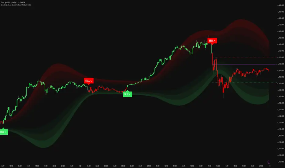
ChartSignals.AIChartSignals.AI is an overlay indicator designed to simplify chart reading by highlighting potential trade opportunities and providing optional visual context tools.
WHAT YOU’LL SEE
• Buy/Sell signals displayed directly on the chart
• Optional trade level guides (Entry / Take Profit / Stop Loss) to help structure a plan
• Optional trend and zone overlays to help interpret market conditions
• Optional key levels and breakout markers for additional context
• Dynamic candle coloring to help visualize momentum vs. quieter conditions
HOW TO USE (SIMPLE)
• Add ChartSignals.AI to your chart
• Choose a Signal Mode (controls how frequently signals appear)
• Enable/disable the optional overlays you want
• Use signals as chart assistance and confirm with your own analysis and risk management
ALERTS
This script includes alert conditions for:
• Buy, Sell, general signal notifications, and key level break events (when enabled).
DISCLAIMER
For educational and charting purposes only. Not financial advice. Trading involves risk and you are responsible for your own decisions.
Momentum Pulse Pro [MTF]# Momentum Pulse Pro
## What It Does
Detects when price momentum is stretched to extremes. The indicator analyzes momentum and highlights when the market is overextended — either too hot or too cold.
- **Green background** = Low momentum, potential bounce ahead
- **Red background** = High momentum, potential reversal ahead
- **Stronger color** = Stronger signal
## The Panel
Displays a Momentum Index from 0-100:
- **Below 30** = Stretched to the downside
- **30-70** = Neutral zone
- **Above 70** = Stretched to the upside
## How to Use
1. Wait for the background to change color
2. Stronger color = higher probability setup
3. Use as a filter for your strategy — don't trade it alone
## Settings
- **Colors** — Customize green/red
- **Transparency** — Background visibility
- **Confluence Intensity** — How fast color intensifies
- **Panel Position** — Move the info panel
## Alerts
- Momentum enters extreme zone
- Momentum strengthens or weakens inside extreme zone
## Good to Know
- Non-repainting
- Works on any market
- Best on 4H chart or lower
