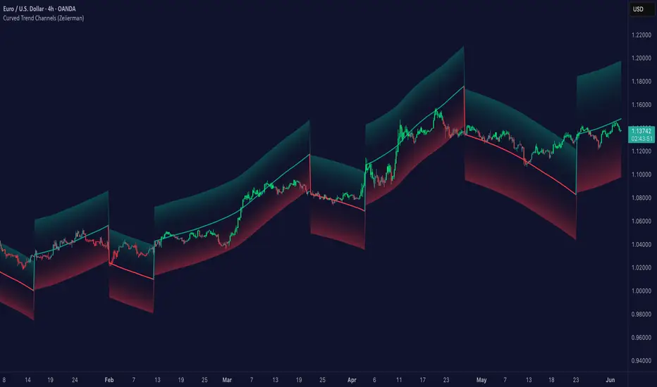
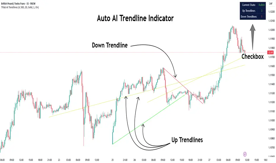
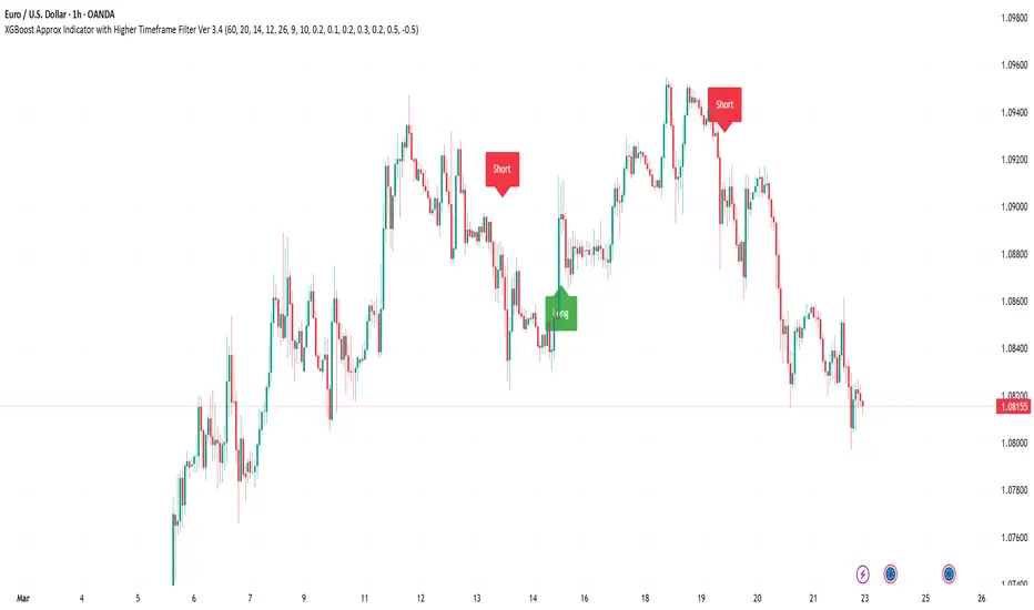
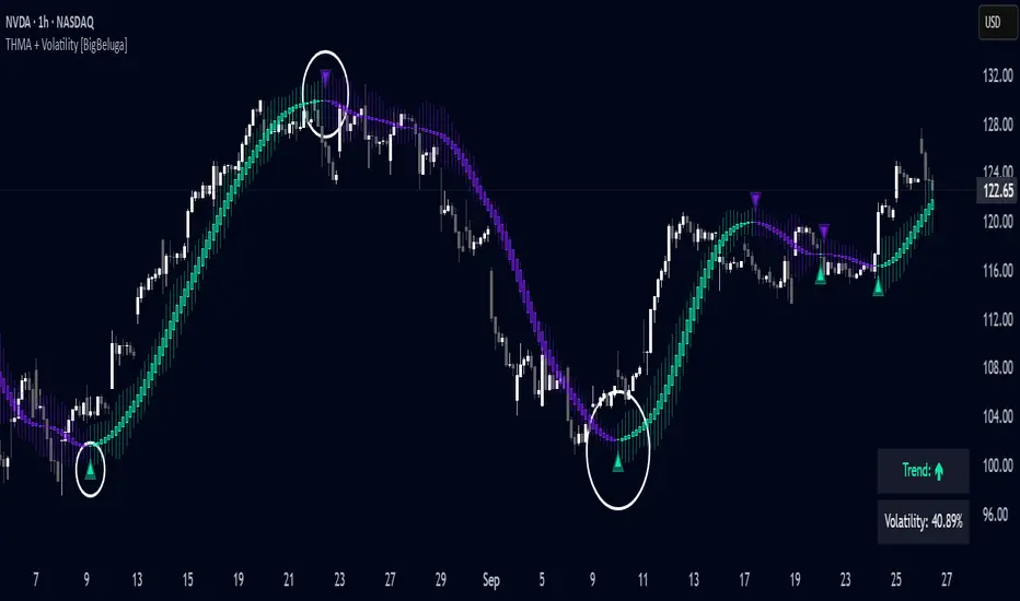
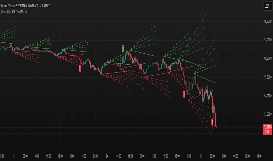
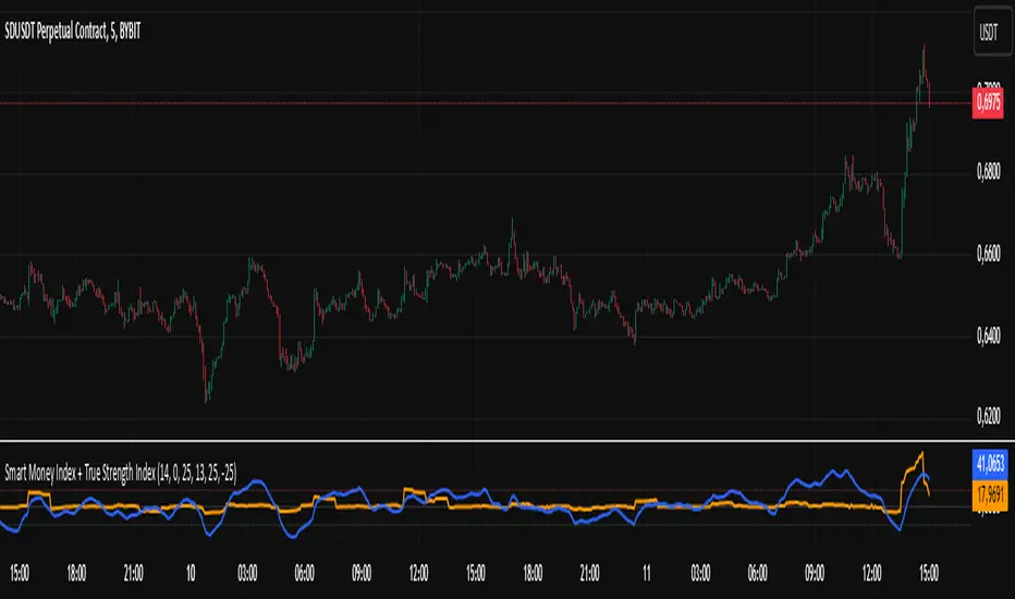
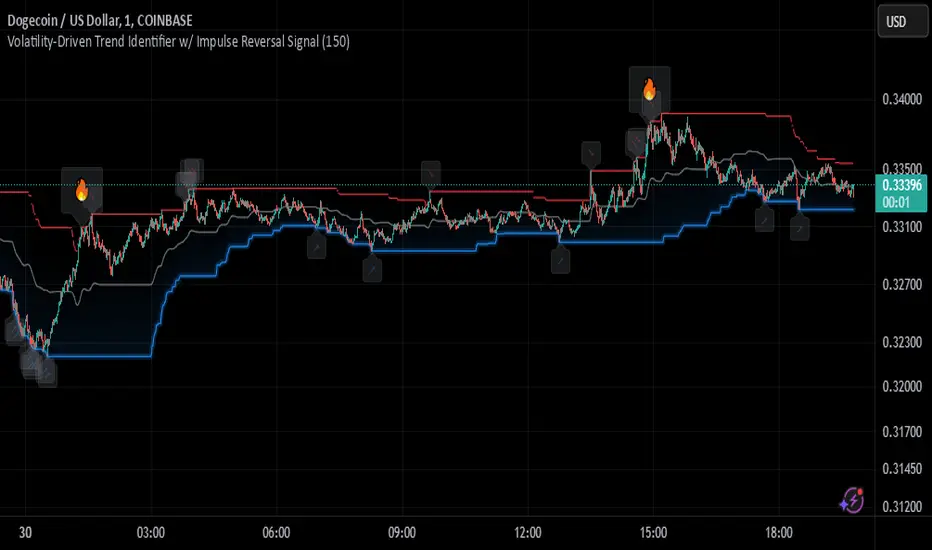
Supertrend + Fibonacci OTE Grid & Bands [BigBeluga]🔵 OVERVIEW
The Supertrend + Fibonacci OTE Grid & Bands is an advanced technical analysis indicator designed by BigBeluga to combine trend-following Supertrend mechanics with dynamic Fibonacci retracement grids and volatility-based channel bands directly on the chart. Traditional Supertrend systems rely solely on stop lines, often missing optimal retracement zones (OTE) during trend pullbacks. To solve this limitation, this script integrates dual operating modes—anchored OTE grids that project Fibonacci levels across active trend swings, and continuous Fibonacci channel bands scaled by Average True Range (ATR).
The indicator visualizes trend direction, dynamic stop losses, shaded OTE zones, and proximity-highlighted grid levels. The core calculations track trend swings using customizable ATR lookbacks, compute proportional Fibonacci levels (0.0 to 1.0), and dynamically adjust line widths and colors when price approaches specific thresholds. Custom color palettes, bar/candle color toggles, and label configurations allow traders to fine-tune visual settings across various timeframes and asset classes.
🔵 HOW IT WORKS
The system operates through an integrated architecture where each component dynamically influences chart behavior:
1 — Supertrend Trend & Swing Engine
Stop Loss Line & Fills: Computes volatility-scaled Supertrend lines using ATR parameters, plotting colored stop-loss streams with gradient area fills.
Trend Extreme Tracking: Automatically tracks trend highs and lows upon trend direction flips to anchor structural Fibonacci calculations.
2 — Dual Fibonacci Modes (OTE Grid & Bands)
OTE Grid Mode: Projects an anchored Fibonacci retracement grid (0.0, 0.236, 0.382, 0.500, 0.618, 0.705, 0.786, 1.000) across the active trend swing, complete with a shaded Optimal Trade Entry (OTE) zone between the 0.618 and 0.786 levels.
Fibonacci Bands Mode: Plots continuous, ATR-scaled channel bands extending outward from the Supertrend line using proportional ratio offsets.
3 — Proximity Highlight & Styling Engine
Price Proximity Detection: Measures distance between price and individual grid levels using ATR multipliers to dynamically highlight active levels with distinct colors and thicker line widths.
Visual Customization: Supports bar and custom candle coloring by trend, adjustable line styles (Solid, Dotted, Dashed), and dynamic right-edge price labels.
🔵 HOW TO USE
Apart from serving as a comprehensive trend and retracement mapping tool, the indicator can be applied in several ways:
Follow Trend Momentum: Stay aligned with prevailing market direction by monitoring the Supertrend line color and trend-colored candles/bars.
Identify OTE Retracement Zones: In OTE Grid mode, monitor the shaded zone between the 0.618 and 0.786 Fibonacci levels for potential trend continuation entries during pullbacks.
Track Key Level Interactions: Watch for automatic color highlights and width changes on grid levels as price approaches critical Fibonacci thresholds.
🔵 SETTINGS
The indicator includes several customizable configuration groups to tailor calculations and visual styling to your trading style:
General Settings: Select between OTE Grid and Fibonacci Bands modes, toggle right-edge price/ratio labels, choose grid line styles (Solid, Dotted, Dashed), adjust grid highlight distance thresholds via ATR multipliers, and enable dimming for non-OTE levels.
Supertrend Parameters: Configure the ATR Period and Multiplier to adjust the sensitivity and distance of the core stop-loss line.
Fibonacci Bands Parameters: Define the ATR period and outer band multiplier specifically used when operating in Fibonacci Bands mode.
Main Styling & Colors: Set bullish and active price highlight colors, and toggle bar/candle coloring based on the active trend direction.
Fibonacci Level Settings: Enable or disable individual Fibonacci ratios (0.000, 0.236, 0.382, 0.500, 0.618, 0.705, 0.786, 1.000) and customize their individual display colors.
🔵 NOTES
Why this implementation is unique:
It merges classic Supertrend stop mechanics with both anchored OTE grids and continuous Fibonacci channel bands.
Features dynamic price proximity highlighting and custom linefill engines optimized for Pine Script version 6.
Provides extensive modular inputs for styling, level visibility, and operational mode switching.
Gösterge

Pivot Channel TrendLines [BigBeluga]🔵 OVERVIEW
The Pivot Channel TrendLines is an advanced technical analysis indicator designed by BigBeluga to automatically map structural pivot points, project dynamic trendline channels, and track directional breakout signals directly on the chart. Traditional manual trendline drawing is often subjective and time-consuming, while standard indicators fail to account for slope progression and volatility filters. To solve this limitation, this script combines an automated pivot detection engine with ATR-filtered extension lines and real-time breakout triggers.
The indicator visualizes key market highs and lows, dotted projection channels, and directional signals. The core calculations identify confirmed pivot extremes using configurable lookback periods, compute slope values between successive pivots, and filter out insignificant structures using Average True Range thresholds. Customizable color palettes, line styles, and extension lengths allow traders to fine-tune the geometric mappings across various asset classes and timeframes.
🔵 HOW IT WORKS
The system operates through an integrated architecture where each component dynamically influences chart behavior:
1 — Automated Pivot Detection Engine
Lookback Scanning: Evaluates bar ranges using user-defined lookback criteria to identify significant swing highs and lows.
ATR Filtering: Compares successive pivot price differentials against Average True Range thresholds to ensure only meaningful structural shifts generate active channels.
2 — Dynamic Trendline Projection & Channels
Confirmed Trendlines: Connects historical pivot points with solid boundary lines to map ongoing trend channels.
Dotted Extensions: Projects sloping extension lines forward by a user-defined bar length to monitor future support and resistance interactions.
3 — Directional Breakout & Price Dash System
Breakout Triggers: Monitors active extension lines in real time, plotting directional labels ("Up" or "Down") whenever price closes beyond expected threshold boundaries.
Last Pivot Dashes: Renders customizable horizontal dashed or dotted lines alongside precise price level tags for the latest identified high and low pivots.
🔵 HOW TO USE
Apart from serving as an automated structural mapping tool, the indicator can be applied in several ways:
Identify Trend Channels: Follow the solid and dotted trendlines connecting major pivot highs and lows to track prevailing market direction and channel boundaries.
Catch Structural Breakouts: Monitor the chart for Up or Down directional labels indicating when price has successfully broken through active projected extension lines.
Track Recent Reference Prices: Use the last pivot price dashes to quickly reference key support and resistance boundaries established by the most recent market swings.
🔵 NOTES
Why this implementation is unique:
It automates complex pivot channel mapping and slope projections directly on the chart.
Features integrated ATR volatility filters to eliminate insignificant structural noise.
Fully optimized for high-performance rendering under Pine Script version 6 standards.
Gösterge

Dynamic Grid Indicator [BigBeluga]🔵 OVERVIEW
The Dynamic Grid Indicator is an advanced technical indicator created by BigBeluga to map volatility-based grid channels across price charts while simultaneously plotting a synchronized multi-level oscillator pane. Traditional envelope indicators often use static standard deviation bands that fail to adjust to shifting trend momentum or localized price congestion. In order to provide a solution to this problem, this indicator combines a Hull Moving Average (HMA) central baseline with Average True Range (ATR) multiplier steps, automatically fading channel lines and generating precise crossover signals when price interacts with structural grid borders.
The indicator aims to visualize volatility expansion, compression, and overextended momentum zones. The core element of its calculation involves measuring price distance from the central baseline scaled by volatility steps defined as:
centerLine = ta.hma(close, hmaLength)
oscValue = atrVal != 0 ? (close - centerLine) / atrVal : 0.0
where centerLine acts as the adaptive trend anchor, and oscValue normalizes deviations into standardized grid units. Higher values of numLevels and ATR multipliers allow the indicator to filter out localized market noise and isolate major overbought or oversold structural extremes.
🔵 FEATURES
The system utilizes a multi-layered matrix structure to provide actionable market intelligence:
1 — Dynamic HMA & ATR Grid Engine
Central Baseline Momentum: Tracks trend direction and baseline elasticity using customizable Hull Moving Average lengths via ta.hma(close, hmaLength)
Volatility Multiplier Steps: Projects up to 5 multi-tiered grid levels above and below the baseline scaled dynamically by ATR volatility.
2 — Proximity Fade & Edge Label Management
Smart Proximity Hiding: Automatically hides chart grid line segments when price approaches a level within a set percentage threshold using diff <= proxDist .
Right-Edge Price Tags: Automatically renders live numerical price tags and oscillator labels on the right edge of the chart using custom label management functions.
3 — Synchronized Oscillator Pane & Position Dashboard
Multi-Level Oscillator Fill: Projects a synchronized sub-pane oscillator complete with gradient fills and crossover signal annotations.
Position Scale Dashboard: Features an interactive table displaying real-time level states and oscillator positioning across the grid.
🔵 HOW TO USE
Apart from the basic visualization of volatility channels, this tool can also act in alternative ways to support decision-making:
Identify Channel Extremes: Monitor the outer grid levels (+3 to +5 / -3 to -5) to spot overextended market conditions where price is likely to revert or consolidate.
Trade Grid Crossovers: Look for confirmed crossover signals and direction labels (▲/▼) when price breaks across key grid boundaries to catch trend continuations.
Track Momentum via Oscillator: Observe the sub-pane oscillator line and gradient fill to gauge the strength of the current move relative to the volatility baseline.
🔵 NOTES
Why this implementation is unique:
It combines an overlay price grid with a synchronized, volatility-normalized oscillator pane in a single unified script.
The proximity fade engine keeps the chart clean by automatically removing line clutter directly under active price action.
The script is fully optimized for Pine Script version 6, utilizing advanced conditional plotting, multi-timeframe safety filters, and dynamic dashboard tables.
Gösterge

Keltner Channel Trend + SMC Liquidity Sweep [BigBeluga]🔵 OVERVIEW
The Keltner Channel Trend + SMC Liquidity Sweep is an advanced technical indicator created by BigBeluga to map volatility channels alongside Smart Money Concepts (SMC) liquidity pools and structural sweep zones. Traditional momentum strategies often fail to account for institutional liquidity resting above swing highs and below swing lows. In order to provide a solution to this problem, this indicator combines Keltner Channel trend metrics with dynamic Buyside Liquidity (BSL) and Sellside Liquidity (SSL) box tracking, identifying high-probability liquidity sweeps and trend continuation triggers directly on the chart.
The indicator aims to visualize volatility expansion, structural liquidity pools, and stop-hunt reversal zones. The core element of its calculation involves evaluating Keltner Channel moving average basis lines and Average True Range offset bands alongside swing pivot extremes.
The system establishes a dynamic trend envelope using exponential moving averages and volatility multipliers, while swing pivot detection locates key structural high and low levels. Higher values of length and multiplier settings allow the indicator to filter market noise and isolate major institutional liquidity zones.
🔵 FEATURES
The system utilizes a multi-layered matrix structure to provide actionable market intelligence:
1 — Keltner Channel Trend Engine
Adaptive Basis Midline: Computes an Exponential Moving Average basis line that dynamically changes color based on its slope.
Volatility Bands: Projects upper and lower ATR-based channel bands with a background fill to gauge volatility expansion and contraction.
2 — SMC Liquidity Pool Tracking
Buyside & Sellside Zones: Automatically plots dynamic BSL and SSL range boxes when swing pivots form outside the Keltner Channel boundaries.
Extended Box Projections: Continuously updates and extends active liquidity boxes forward until price interacts with the structural levels.
3 — Liquidity Sweep & Mitigation Detection
Sweep Reversals: Detects when price wicks past a liquidity level (BSL/SSL) but fails to close beyond it, signaling an institutional sweep and triggering entry labels.
Structural Break Handling: Automatically terminates and restyles liquidity boxes into dashed gray zones when candles close cleanly past the levels.
🔵 HOW TO USE
Apart from the basic visualization of trend channels, this tool can also act in alternative ways to support decision-making:
Spot Institutional Liquidity Sweeps: Monitor the chart for SSL sweep or BSL sweep labels occurring when price wicks past BSL or SSL boxes outside the Keltner bands.
Trade Trend Reversals from Sweeps: Use bullish SSL sweep signals as potential long entries following a sell-side liquidity grab, and bearish BSL sweep signals as short entries after a buy-side sweep.
Track Trend Momentum via Midline: Observe the color transitions of the Keltner Channel basis line to align trades with the prevailing higher-timeframe trend direction.
🔵 NOTES
Why this implementation is unique:
It bridges traditional volatility-based Keltner Channels with advanced Smart Money Concepts liquidity pooling and sweep detection.
The dynamic box engine automatically manages box extensions, terminations, and mitigation styling.
The script is fully optimized for performance, utilizing advanced box rendering, custom styling parameters, and strict bar confirmation logic for high-precision execution.
Gösterge

Multi-Confirmation Swing IndicatorMulti-Confirmation Swing Indicator is a multi-confirmation technical analysis indicator designed for traders who want to analyze trend direction, momentum, support/resistance, breakouts and potential swing entries from one chart.
Instead of relying on a single indicator, the system combines several independent components to provide a broader view of market structure.
The indicator combines:
EMA trend structure
RSI momentum confirmation
Smoothed Heikin Ashi
Dynamic trendlines with breakout detection
Volume-based support and resistance zones
Zone Shift trend detection
Trend initiation and retest levels
Impulse MACD
Swing BUY/SELL signals
Support/resistance breakout and hold signals
The objective is not to predict every market move, but to help traders determine whether multiple pieces of technical evidence are aligned.
How to Read the Indicator
The easiest way to use the indicator is to think of it as a confirmation system.
Don't treat every individual marker as a trade signal.
Instead, look for confluence.
🟢 Bullish Environment
A stronger bullish setup occurs when several of the following are aligned:
EMA 21 > EMA 55
Price is above the EMA structure.
EMA 21 and EMA 55 are rising.
RSI is above the bullish threshold.
Smoothed Heikin Ashi is bullish.
Zone Shift indicates an upward trend.
Price breaks above a resistance/trendline.
Former resistance begins behaving as support.
Impulse MACD confirms positive momentum.
A BUY signal appears after the above conditions align.
The more confirmations that agree, the stronger the overall technical picture.
🔴 Bearish Environment
A stronger bearish setup occurs when:
EMA 21 < EMA 55
Price is below the EMA structure.
EMA 21 and EMA 55 are falling.
RSI is below the bearish threshold.
Smoothed Heikin Ashi is bearish.
Zone Shift indicates a downward trend.
Price breaks below support/trendline.
Former support begins behaving as resistance.
Impulse MACD confirms negative momentum.
A SELL signal appears after the above conditions align.
Again, the objective is confirmation rather than prediction.
Understanding the Main Components
1. EMA Trend Structure
The EMA component uses three moving averages:
Fast EMA — 9
Trend EMA — 21
Major Trend EMA — 55
The basic interpretation is:
Bullish
Price > EMA 9 > EMA 21 > EMA 55
Bearish
Price < EMA 9 < EMA 21 < EMA 55
This helps identify whether short-, medium- and longer-term momentum are aligned.
The EMA settings can be adjusted from the indicator inputs.
2. RSI Confirmation
RSI is used as a momentum filter.
Default thresholds:
Bullish: RSI > 55
Bearish: RSI < 45
The purpose isn't to simply buy when RSI is high or sell when RSI is low.
Instead, RSI helps answer:
"Is momentum supporting the current trend?"
3. Smoothed Heikin Ashi
The Smoothed Heikin Ashi component attempts to reduce some of the noise present in normal candles.
It can help visually identify:
bullish phases
bearish phases
trend transitions
continuation periods
A series of bullish Smoothed Heikin Ashi candles together with bullish EMA structure provides stronger trend confirmation than either component alone.
Likewise for bearish conditions.
4. Dynamic Trendlines
The trendline component identifies swing highs and swing lows and creates dynamic trendlines from them.
It can identify:
Upward breakout
Price breaks through a descending resistance trendline.
Downward breakout
Price breaks through an ascending support trendline.
The B markers represent detected trendline breaks.
These are useful for identifying potential changes in short-term market structure.
5. Volume-Based Support & Resistance
The support/resistance component identifies potential zones around significant pivot areas while incorporating volume information.
The zones can help traders identify:
potential support
potential resistance
support breaks
resistance breaks
resistance becoming support
support becoming resistance
Example
If resistance is broken:
Resistance → Support
A subsequent successful retest of that level can provide additional bullish confirmation.
Similarly:
Support → Resistance
can provide bearish confirmation after a downside break.
6. Zone Shift
Zone Shift provides another view of the broader trend.
It uses a combination of:
EMA
HMA
price range/distance
trend initiation level
The indicator can switch between bullish and bearish states.
It also identifies potential retests of the trend initiation level.
This can be particularly useful for swing traders because it provides context beyond a single candle.
7. Impulse MACD
Impulse MACD provides an additional momentum layer.
It helps identify:
positive momentum
negative momentum
momentum expansion
momentum contraction
It should not be interpreted independently as a buy/sell system.
Instead, use it as another confirmation layer.
BUY Signal
The BUY signal is designed to appear when the primary swing-trend conditions become bullish.
The underlying logic considers factors such as:
EMA trend
EMA alignment
EMA slope
price position relative to the fast EMA
two-bar confirmation
RSI momentum
The system also prevents repeated BUY labels while the same bullish condition remains continuously active.
Ideal interpretation
Trend + momentum + structure + confirmation = stronger setup
Not:
"BUY label = guaranteed buy."
SELL Signal
The SELL signal works in the opposite direction.
It considers:
bearish EMA trend
bearish EMA alignment
declining EMA structure
price below the fast EMA
two-bar confirmation
RSI weakness
Repeated SELL signals are also filtered.
How I Recommend Using It
Rather than trading every signal, use a 3-stage approach.
Stage 1 — Identify the Trend
First ask:
Is the market bullish, bearish or unclear?
Look at:
EMA 21/55
EMA stacking
Zone Shift
Smoothed Heikin Ashi
If these disagree significantly, consider the market unclear.
Stage 2 — Look for Structure
Once the trend is identified, look for:
support/resistance
trendline breakout
breakout/retest
resistance becoming support
support becoming resistance
This helps avoid entering simply because an indicator changed color.
Stage 3 — Look for Momentum Confirmation
Finally check:
RSI
Impulse MACD
EMA slope
BUY/SELL confirmation
A setup where multiple components agree is generally more interesting than an isolated signal.
Example Bullish Setup
A potential swing-long setup could look like:
1. EMA 21 > EMA 55
↓
2. Price > EMA 9 > EMA 21
↓
3. Zone Shift turns bullish
↓
4. Resistance/trendline breaks
↓
5. Price retests the broken resistance
↓
6. RSI remains above bullish threshold
↓
7. Impulse MACD supports bullish momentum
↓
8. BUY signal appears
This creates a confluence-based setup rather than relying on one indicator.
Example Bearish Setup
The reverse:
EMA 21 < EMA 55
↓
Price < EMA 9 < EMA 21 < EMA 55
↓
Zone Shift bearish
↓
Support/trendline breaks
↓
Retest fails
↓
RSI below bearish threshold
↓
Impulse MACD bearish
↓
SELL signal
Again, this is a framework for analysis—not a guarantee of future price movement.
Best Use Cases
The indicator is primarily designed for:
Swing Trading
Good fit for traders holding positions for several candles to several weeks.
Trend Following
Useful when markets establish clear directional movement.
Breakout Trading
The trendline and support/resistance components can help identify structural breaks.
Breakout Retests
Useful for watching former resistance become support or former support become resistance.
Trend Confirmation
Useful when traders want multiple technical factors visible on a single chart.
What This Indicator Is NOT
This is important for the TradingView publication.
This indicator does not guarantee profitable trades or predict future prices.
It should not be treated as:
financial advice
a standalone automated trading system
a guarantee of trend continuation
a guaranteed entry/exit system
a substitute for risk management
Signals can fail, particularly during:
sideways markets
low-volume markets
sudden news events
high volatility
false breakouts
Always combine the indicator with appropriate position sizing and risk management. Gösterge

XauLabs Liquidity LevelsENGLISH
What it does
Most tools draw every swing high and low the same way. This one counts. A level touched four times without being broken is not the same object as a level touched once, and the script says so on the chart: line thickness and shading grow with the number of touches, and the count is written next to each zone. It also draws the diagonal along which lows keep rising — the sloping counterpart of a horizontal level — and marks the places where the two meet.
How it works (full method)
Confirmed pivots only. A swing is registered when it dominates a set number of bars on both sides (8 by default). The right-hand bars are what make the tool non-repainting: a level appears with that delay and never moves afterwards. The dashboard states the delay in plain sight.
Grouping into zones. Each new pivot is compared to existing levels. If it falls within a tolerance expressed in ATR (0.12 by default), it counts as the same zone and the counter increases. The zone is drawn as a band spanning the actual spread between its touches — equal highs and equal lows are rarely exactly equal, and the band shows the real width.
Weight by touches. Border, shading and the printed count all scale with the number of touches. Two touches is a pair of equal highs; four is a wall the market keeps returning to. By default only zones with at least two touches are displayed — single pivots are noise.
Sweeps are marked, not erased. When price wicks beyond a zone and closes back inside, the zone turns dotted grey and is labelled swept. It stays on the chart: what happened is part of the reading. Single-touch levels are never labelled swept — that is an ordinary break of structure, not a liquidity event.
Liquidity trendline. The script searches all pairs of confirmed pivots for the ascending line that the most lows have respected, with a tolerance of its own (0.5 ATR by default) because a diagonal spanning hours cannot hug prices to the cent. A low sitting above the line is not a violation — only a low clearly beneath it invalidates the line. Where several candidates tie, the oldest anchor wins, so the line starts at the origin of the move. The touch count is printed at its right end.
Confluence. When the projected diagonal reaches a horizontal zone, both are recoloured and marked. That intersection is where a horizontal cluster and a sloping one arrive together.
Recovery. If price closes below the diagonal, the script frames the area between the break and the current low, and names it: the diagonal and the equal lows have to be reworked.
Housekeeping. Zones further than a set distance from price, or older than a set number of bars, are removed. Beyond the display cap, the least-touched zones go first — an accumulation zone far from price outranks an isolated pivot nearby.
On what "liquidity" means here
The script measures touches, which is observable. The idea that stop orders accumulate behind repeatedly defended levels is an interpretation of that measurement, and a common one, but it is not something a chart can prove. The distinction matters: what you see counted is real, what it implies about resting orders is a reading.
No repainting
Pivots are confirmed by the right-hand bars and never revised. Zones extend forward as bars close; sweeps are evaluated on closed bars only. The diagonal is recomputed on the last bar because new pivots can extend it, which is stated here rather than hidden.
Settings
Pivot width, equality tolerance, minimum touches, maximum zones, distance and age filters, sweep marking and quota, diagonal tolerance, anchor depth, projection length, confluence and recovery marking, colours, dashboard and text size.
Educational structural tool. It gives no buy or sell signals and makes no performance claim. Trading involves substantial risk of loss.
FRANÇAIS
Ce que fait l'indicateur
La plupart des outils dessinent tous les sommets et creux de la même façon. Celui-ci compte. Un niveau touché quatre fois sans être franchi n'est pas le même objet qu'un niveau touché une fois, et le script le dit sur le graphique : l'épaisseur et l'intensité augmentent avec le nombre de touches, et le compte est écrit à côté de chaque zone. Il trace aussi la diagonale le long de laquelle les creux montent — l'équivalent en pente d'un niveau horizontal — et marque les endroits où les deux se rejoignent.
Comment il fonctionne (méthode complète)
Uniquement des pivots confirmés. Un pivot est enregistré quand il domine un nombre fixé de bougies de chaque côté (8 par défaut). Ce sont les bougies de droite qui rendent l'outil non-repainting : un niveau apparaît avec ce délai et ne bouge plus ensuite. Le tableau de bord affiche ce délai en clair.
Regroupement en zones. Chaque nouveau pivot est comparé aux niveaux existants. S'il tombe dans une tolérance exprimée en ATR (0,12 par défaut), c'est la même zone et le compteur augmente. La zone est tracée comme une bande couvrant l'écart réel entre ses touches — des equal highs ne sont presque jamais exactement égaux, et la bande montre la largeur véritable.
Le poids vient des touches. Bordure, intensité et compte affiché suivent le nombre de touches. Deux touches, c'est une paire d'equal highs ; quatre, c'est un mur où le marché revient sans cesse. Par défaut, seules les zones à deux touches minimum s'affichent — un pivot isolé est du bruit.
Les balayages sont marqués, pas effacés. Quand le prix dépasse une zone en mèche et clôture en deçà, elle passe en gris pointillé avec la mention « balayé ». Elle reste au graphique : ce qui s'est passé fait partie de la lecture. Un niveau à une seule touche n'est jamais marqué balayé — c'est une cassure de structure ordinaire, pas un événement de liquidité.
Diagonale de liquidité. Le script examine toutes les paires de pivots confirmés pour retenir la droite ascendante que le plus de creux ont respectée, avec une tolérance qui lui est propre (0,5 ATR par défaut) : une diagonale qui traverse plusieurs heures ne peut pas coller au centime. Un creux situé au-dessus de la droite n'est pas une violation — seul un creux nettement dessous l'invalide. À égalité, l'ancrage le plus ancien gagne : la droite part de l'origine du mouvement. Le nombre de touches est écrit à son extrémité.
Confluence. Quand la diagonale projetée rejoint une zone horizontale, les deux sont recolorées et signalées. C'est l'endroit où un amas horizontal et un amas en pente arrivent ensemble.
Récupération. Si le prix clôture sous la diagonale, le script encadre la zone entre la cassure et le plus bas atteint depuis, et la nomme : la diagonale et les equal lows sont à retravailler.
Entretien. Les zones trop éloignées du prix ou trop anciennes disparaissent. Au-delà du plafond d'affichage, ce sont les moins touchées qui partent en premier — une zone d'accumulation lointaine vaut mieux qu'un pivot isolé tout proche.
Sur le mot « liquidité »
Le script mesure des touches, ce qui est observable. L'idée que des ordres stop s'accumulent derrière les niveaux défendus plusieurs fois est une interprétation de cette mesure, très répandue, mais qu'un graphique ne peut pas démontrer. La distinction compte : ce que vous voyez compté est réel, ce que cela suppose des ordres en attente est une lecture.
Aucun repaint
Les pivots sont confirmés par les bougies de droite et ne sont jamais révisés. Les zones s'étendent vers l'avant à mesure que les bougies clôturent ; les balayages sont évalués sur bougies closes uniquement. La diagonale est recalculée sur la dernière bougie parce que de nouveaux pivots peuvent la prolonger — c'est écrit ici plutôt que caché.
Réglages
Largeur de pivot, tolérance d'égalité, touches minimum, zones maximum, filtres de distance et d'âge, marquage et quota de balayages, tolérance de la diagonale, profondeur d'ancrage, longueur de projection, marquage des confluences et des récupérations, couleurs, tableau de bord et taille du texte.
Outil structurel à but éducatif. Il ne donne aucun signal d'achat ou de vente et ne formule aucune promesse de performance. Le trading comporte un risque de perte important. Gösterge

DMI Spread Dashboard ,5m 30m 1hDMI Spread Dashboard is a multi-timeframe directional-momentum monitor built around the Directional Movement Index (DMI) and Average Directional Index (ADX). It calculates the complete DMI structure independently on the 5-minute, 30-minute, and 1-hour timeframes, then organizes the results into one compact chart dashboard.
The indicator is designed to answer four separate questions:
1. Which side currently has directional control?
2. How large is the difference between positive and negative directional movement?
3. Is that directional difference expanding or contracting?
4. Is the underlying directional movement strong enough to be meaningful according to ADX?
Instead of displaying only a DMI crossover or a single ADX value, the dashboard separates direction, directional separation, trend strength, and momentum development. This helps users distinguish an established directional move from a weak crossover or a move that is losing participation.
HOW THE CALCULATIONS WORK
The script uses the traditional Directional Movement framework associated with J. Welles Wilder Jr.
For every selected timeframe, the script first compares the current high and low with those of the previous bar:
• Positive directional movement measures qualifying upward movement in the high.
• Negative directional movement measures qualifying downward movement in the low.
• When both sides move, only the qualifying dominant directional movement is retained according to the standard DMI comparison.
Positive and negative directional movement are smoothed using Wilder’s moving average method. Each smoothed value is then normalized by a Wilder-smoothed True Range and multiplied by 100 to produce +DI and -DI.
The script calculates ADX from the smoothed absolute difference between +DI and -DI relative to their combined value. ADX measures the strength of directional movement, not its direction. A high ADX can therefore occur during either bullish or bearish conditions.
The indicator then calculates its central measurement:
DMI Spread = +DI - -DI
A positive spread means +DI is greater than -DI and upward directional movement is dominant. A negative spread means -DI is greater than +DI and downward directional movement is dominant. A spread near zero indicates that neither side has established meaningful separation.
WHAT MAKES THE DASHBOARD DIFFERENT
The script does more than place standard DMI values from several timeframes into a table. It converts the relationship between +DI and -DI into a signed spread and then measures the bar-to-bar change in that spread.
This creates two separate forms of information:
• Direction identifies which side is currently dominant.
• Spread development identifies whether that dominance is expanding or contracting.
For a positive spread, an increase in the spread is classified as EXPANDING because bullish directional separation is increasing. A decrease is classified as CONTRACTING because bullish separation is weakening.
For a negative spread, a further decrease below zero is classified as EXPANDING because bearish directional separation is increasing. Movement back toward zero is classified as CONTRACTING because bearish separation is weakening.
This distinction is important because a market can remain technically bullish while its bullish DMI spread contracts. It can also remain technically bearish while bearish separation begins to weaken. The dashboard makes those changes visible without requiring users to compare multiple DMI plots manually.
The 5-minute, 30-minute, and 1-hour calculations are performed independently using each timeframe’s own price data. The 5-minute row can be used for short-term execution context, the 30-minute row for intermediate intraday structure, and the 1-hour row for broader directional context.
DASHBOARD COLUMNS
TIME
Identifies the independently calculated 5-minute, 30-minute, or 1-hour dataset.
+DI
Shows the magnitude of positive directional movement after Wilder smoothing and True Range normalization.
-DI
Shows the magnitude of negative directional movement after Wilder smoothing and True Range normalization.
SPREAD
Shows +DI minus -DI. Positive values indicate bullish directional dominance, while negative values indicate bearish directional dominance. The magnitude describes the separation between the two DMI components.
DIRECTION
Displays BULLISH when the spread is above zero, BEARISH when it is below zero, and NEUTRAL when the two values are equal.
ADX
Displays the Average Directional Index for the corresponding timeframe. ADX measures directional strength and does not determine whether the direction is bullish or bearish.
STRENGTH
Classifies ADX as STRONG or WEAK using the user-defined ADX Strength Threshold. The default threshold is 25. This threshold is a filter and should be adjusted when appropriate for the instrument and trading method.
STATUS
Displays one of four conditions:
• BULL CROSS: +DI has crossed above -DI.
• BEAR CROSS: +DI has crossed below -DI.
• EXPANDING: the prevailing directional spread is moving farther away from zero.
• CONTRACTING: the prevailing directional spread is moving toward zero or is no longer expanding.
When a new DMI cross is detected, the cross message temporarily takes priority over the expanding or contracting classification.
INTERPRETING MULTI-TIMEFRAME ALIGNMENT
Broad bullish alignment is present when all three spreads are positive. The alignment has stronger directional confirmation when the spreads are also expanding and ADX is above the selected threshold.
Broad bearish alignment is present when all three spreads are negative. The alignment has stronger directional confirmation when the negative spreads are expanding and ADX is above the selected threshold.
Mixed readings indicate timeframe disagreement. For example, a bullish 5-minute reading against bearish 30-minute and 1-hour readings may represent a short-term rebound within a broader bearish structure. It does not automatically confirm a larger bullish reversal.
A contracting spread should not automatically be interpreted as a reversal. It only indicates that the existing separation between +DI and -DI is narrowing. A crossover or additional price confirmation is required before directional control has formally changed under this model.
SUGGESTED WORKFLOW
1. Begin with the 1-hour row to identify the broader directional condition.
2. Use the 30-minute row to determine whether intermediate momentum agrees with or opposes the 1-hour condition.
3. Use the 5-minute row to monitor shorter-term changes, contractions, expansions, and DMI crosses.
4. Give greater weight to a setup when direction, spread development, and ADX strength agree across multiple timeframes.
5. Confirm dashboard readings with price structure, support and resistance, liquidity, volume, or another independent execution method.
The dashboard can be moved to the top-right, top-left, bottom-right, or bottom-left corner through the Dashboard Position input.
INPUTS
DI Length controls the smoothing period used to calculate +DI and -DI. The default is 14.
ADX Smoothing controls the smoothing period used for ADX. The default is 14.
ADX Strength Threshold determines when the dashboard labels ADX as STRONG. The default is 25.
Dashboard Position controls where the table appears on the chart.
ALERTS
The script provides separate bullish and bearish DMI cross alert conditions for the 5-minute, 30-minute, and 1-hour timeframes.
For confirmation-based use, alerts should normally be configured as “Once Per Bar Close.” Alerts notify users that a DMI relationship has changed; they are not automatic trade signals.
LIMITATIONS
This indicator does not predict future price direction and does not generate entries, exits, profit targets, or stop-loss levels.
DMI and ADX are derived from historical price movement and are lagging measurements. Crosses can occur after a move has already begun, and repeated crosses may occur during sideways or low-volatility markets.
ADX measures directional strength, not direction. A STRONG reading can accompany either bullish or bearish movement.
EXPANDING and CONTRACTING describe changes in the DMI spread. They do not guarantee price continuation or reversal.
Values from an open timeframe can change while that timeframe’s bar is still developing. A 30-minute or 1-hour reading is not final until its corresponding bar closes. Using “Once Per Bar Close” helps avoid acting on an unfinished alert condition, but users should still understand which timeframe is being evaluated.
When the indicator is used on a chart timeframe above five minutes, TradingView’s standard lower-timeframe request behavior may not reproduce every intermediate 5-minute event. For the most dependable observation of 5-minute changes and alerts, use the indicator on a 5-minute or lower chart.
The script should be used as a directional-context and confirmation tool rather than as a standalone trading system.
ORIGINALITY AND PURPOSE
DMI and ADX are established technical-analysis calculations. This script does not claim ownership of those underlying formulas.
The script’s contribution is its purpose-built interpretation and presentation layer: independently calculated 5-minute, 30-minute, and 1-hour DMI structures; a signed DMI spread; spread-expansion and contraction classification; timeframe-specific ADX strength; cross-state prioritization; configurable dashboard placement; and separate alert conditions.
These components are organized to help users evaluate directional control, separation, strength, and multi-timeframe agreement from one chart interface instead of manually comparing three separate DMI indicators.
Open-source users can inspect the calculations, adjust the parameters, and study how the multi-timeframe dashboard converts standard DMI components into a structured directional framework.
Gösterge

Automatic Wedge & Channel Detector
Automatic Wedge & Channel Detector identifies developing price structures directly on the chart, helping traders recognize where price is compressing, expanding, or moving within established boundaries.
Instead of requiring trendlines to be drawn manually, the indicator analyzes confirmed pivot highs and lows, tests multiple boundary combinations, and selects the structure that best fits recent price action. It can detect parallel channels, converging wedges, symmetrical triangles, ascending or descending triangle-style formations, and expanding structures.
The goal is not simply to draw two lines. The indicator evaluates how well price respects both boundaries by considering touches, spacing, violations, structural width, balance between the upper and lower sides, and the age of the pattern. This helps reduce arbitrary trendlines and prioritize structures that are better supported by actual price behavior.
KEY FEATURES
Automatic Structure Detection
Auto Mode searches recent confirmed pivots and selects the highest-scoring upper and lower boundary combination.
Manual Structure Selection
Manual Mode allows advanced users to choose which historical pivots anchor each boundary.
Multiple Pattern Types
Recognizes parallel channels, converging wedges, symmetrical triangles, ascending and descending triangle/wedge structures, and expanding formations.
Dynamic Support and Resistance Zones
Optional shaded regions highlight the areas near each boundary where price may be more likely to react.
Middle No-Trade Zone
An optional neutral zone identifies the center of the structure, where entries may offer less favorable positioning compared with trades near the boundaries.
Centerline
The midpoint of the structure can be displayed as an additional reference for equilibrium, potential reactions, and profit management.
Confirmed Breakout Detection
A breakout is recognized only after price closes beyond the structure by a configurable ATR-based distance for the required number of confirmation bars. This helps filter minor boundary breaches and wick-only moves.
Breakout Alerts
Alerts are available for confirmed upside and downside structural breaks.
Breakout and Reclaim Logic
If price returns inside the structure for the required number of bars, the previous breakout is treated as reclaimed.
Structure Lifecycle Management
The indicator tracks whether a formation is active, approaching its apex, broken, reclaimed, or expired. Broken structures can remain visible temporarily so traders can review the breakout and watch for possible retests.
Late-Stage Recognition
Converging formations change color when price approaches the apex or when the remaining width becomes unusually narrow. This warns that the structure may be mature and increasingly vulnerable to a breakout.
Volatility-Adjusted Analysis
Touch tolerance, boundary violations, minimum width, breakout distance, and late-stage conditions are measured relative to ATR so the logic can adapt across markets and timeframes.
HOW TO USE IT
For range or mean-reversion setups, traders can watch for reactions near the lower support zone or upper resistance zone while the structure remains active. The center of the formation is marked as a potential no-trade area because entries taken there often have less room to the next boundary and weaker risk-to-reward characteristics.
For breakout setups, traders can wait for a confirmed close beyond a boundary rather than reacting to the first wick through the line. A broken boundary may later become an area of support or resistance during a retest.
Converging wedges and triangles can also be used to identify volatility compression. As the boundaries narrow and price approaches the apex, traders can prepare for expansion without assuming the breakout direction in advance.
AUTO MODE VS. MANUAL MODE
Auto Mode is designed for traders who want the indicator to continuously identify the strongest recent structure.
Manual Mode is intended for traders who prefer greater control over which pivots define the pattern. Pivot #0 represents the most recently confirmed pivot, Pivot #1 is the previous pivot, and so on.
CUSTOM SOURCE
By default, the upper boundary is calculated from pivot highs and the lower boundary from pivot lows. Enabling Use Custom Source applies the selected source to both pivot calculations. This can be useful for traders who prefer structures based on closing prices or another custom data series rather than candle extremes.
IMPORTANT NOTES
Pivot-based detection requires future bars to confirm a swing. Pivot markers are placed on the original pivot bars after confirmation, so structures are not identified at the exact moment the pivot first forms.
In Auto Mode, the selected structure may update when new pivots are confirmed or when a different combination earns a better score. This is expected behavior for a continuously adapting market-structure tool.
Wedges and channels provide context—not certainty. A boundary touch does not guarantee a reversal, and a confirmed break does not guarantee continuation. Traders should combine the indicator with their own trend analysis, price-action confirmation, volume analysis, risk management, and broader market context.
Automatic Wedge & Channel Detector is designed to make complex chart structure easier to see while preserving the discretion required to trade it intelligently.
Gösterge

STRAT Trap & VWAP Engine [WillyAlgoTrader]📊 STRAT Trap & VWAP Engine is an overlay toolkit that reads every candle through the lens of The STRAT methodology, detects failed-breakout "trap" candles, and turns them into fully managed trade plans — entry, structural stop, three R-multiple targets, break-even automation and webhook alerts — filtered by a volatility regime engine and accompanied by a pivot-anchored VWAP trail.
The core insight: the most information-dense candle on any chart is the one that breaks a prior extreme and then closes against its own break. The market went hunting for liquidity, found it, and failed to follow through. This indicator classifies every bar the STRAT way, catches exactly those divergence candles, and manages the resulting trade for you — while a regime filter keeps you out of chop and an anchored VWAP shows where the volume-weighted crowd is positioned inside the current trend leg.
Works on all markets (crypto, forex, stocks, indices, futures) and all timeframes.
📚 THE STRAT IN 60 SECONDS (for beginners)
The STRAT is a price-action methodology popularized by veteran floor trader Rob Smith. Its power is its simplicity: every candle on every chart is one of only three types, defined purely by its relationship to the previous candle's range:
— 1 (Inside bar) : the candle's entire range fits inside the previous candle (high <= prior high AND low >= prior low). The market is in equilibrium — nobody won.
— 2 (Directional bar) : the candle breaks ONE side of the previous candle. 2U breaks the prior high only; 2D breaks the prior low only. One side won.
— 3 (Outside bar) : the candle breaks BOTH sides (high > prior high AND low < prior low). Maximum disagreement — both sides were swept.
Sequences of these numbers form repeatable patterns. A 2D-2U is a reversal (sellers pushed down, buyers answered). A 2-1-2 is a pause-and-go. A 3-1-2 is compression after chaos resolving into direction. Because the classification is purely mechanical, there is zero subjectivity — two traders looking at the same chart will always count the same sequence.
The second pillar of The STRAT is Full Timeframe Continuity (FTC) : checking whether the higher timeframes (hourly, daily, weekly, monthly) are all trading in the same direction as your entry. When the 15-minute, hourly and daily candles are all green, a long is swimming with the current, not against it.
This indicator automates all of it — and then adds the twist that gives it its name.
🧩 WHY THESE COMPONENTS WORK TOGETHER
A STRAT pattern tells you a structure formed — but not whether the breakout that follows is genuine. A trap detector spots failed breakouts — but without structural context it fires in the middle of chop. A regime filter knows trend from range — but generates no entries by itself. A VWAP shows positioning — but a session VWAP resets at midnight regardless of what the trend is doing. None of these alone produces a complete, managed trade.
Bar classification → pattern matrix → trigger FSM → trap detection → regime + volume + FTC filters → trade engine (SL/TP1-3/BE) → anchored VWAP context
The classifier turns raw candles into STRAT numbers. The pattern matrix scans the sequence for tradeable combinations and arms a setup with exact trigger and stop levels. The trigger FSM waits for a confirmed break — or the Trap engine fires instead when a candle breaks an extreme and closes against it. Every prospective entry then passes through three independent gates (PVTE regime, volume confirmation, FTC alignment) before the trade engine takes over: structural stop, three R-multiple targets, automatic break-even, and a webhook alert at every stage. The anchored VWAP restarts at each confirmed structural pivot inside the regime, showing the volume-weighted average of the current leg — the reference institutional participants care about.
Remove any link and the chain breaks: patterns without triggers are just decoration; traps without a regime filter fade every wiggle; a trade engine without structural stops places arbitrary lines; a VWAP without pivot anchoring measures the wrong leg.
🔍 WHAT MAKES IT ORIGINAL
1️⃣ Mechanical STRAT classifier with a data-driven pattern matrix.
Every bar is classified exhaustively:
— Inside (1): high <= high and low >= low
— Outside (3): high > high and low < low
— 2U: high > high and low >= low
— 2D: low < low and high <= high
Patterns are not hardcoded if-chains — they live in a priority-ordered matrix scanned longest-first, so a 2-2-2 continuation (Extended mode) outranks the 2-2 it contains, and overlapping patterns resolve deterministically. Core set: 2-2 Rev/Cont, 3-2, 3-2-2, 2-1-2 Rev/Cont, 3-1-2, 1-2-2 RevStrat. Extended (opt-in): 2-2-2, 2-2-2-2 "Randy Jackson", 1-bar 3 RevStrat (outside bar closing beyond the prior bar's range).
2️⃣ Three-stage trigger FSM: SETUP → PENDING → TRIGGERED.
When a pattern completes on a confirmed close, the engine arms: trigger = the final pattern bar's high (bull) or low (bear), stop = the opposite side. A wick break of the trigger level on a later confirmed bar fires TRIGGERED. An adverse CLOSE beyond the stop side invalidates. No break within Setup Expiry bars (default 3) expires the setup. On an outside bar that pierces both sides, the adverse close wins — the conservative read, because the intrabar touch order is unknowable.
3️⃣ Trap Bar entry engine — the headline feature (default mode).
A trap bar is a candle whose body color contradicts its STRAT direction:
— Red 2U : broke the prior high, closed below its open → buyers were trapped above the break → SHORT
— Green 2D : swept the prior low, closed above its open → sellers were trapped below → LONG
Entry = trap bar close; stop = beyond the sweep extreme (the trap bar's own high/low) + 0.25×ATR buffer, with a 0.5×ATR minimum distance always enforced. Dojis (close == open) never qualify. Three Entry Modes: Trap Bar (default), STRAT Trigger (classic breakout entries), Both — where a trap candle on a trigger bar overrides the trigger's direction, because the failed breakout IS the trade.
4️⃣ Structural stop anchoring, four modes.
For trigger entries the SL Anchor input chooses: Trigger Level (default — just beyond the broken high/low; price trading back through the broken level means the breakout failed), Setup Bar (opposite side of the setup bar — wider, fully structural), Wick-Anchored (beyond the entry bar's own wick), or ATR (close ± SL Multiplier × ATR). All structural modes use:
stop_long = min(anchor − 0.25×ATR, close − 0.5×ATR)
which simultaneously applies the buffer and guarantees the minimum distance. A Max Risk cap (default 3×ATR, 0 = off) skips entries whose structural risk is too wide — outside-bar setups are the usual offenders.
5️⃣ Full trade management with honest intrabar accounting.
TP1/TP2/TP3 are R-multiples of the actual entry→stop distance (Risk Presets: Conservative 1R/2R/4R with 2.5×ATR stop, Balanced 1R/2R/3R, Aggressive, Scalping, or Custom). After TP1 is touched the stop moves to entry ( break-even ) — and a BE moved on a bar cannot stop that same bar out (the SL check uses the bar-start stop). When SL and a first TP1/TP3 touch land on the same bar, the TP registers and blocks the SL — an optimistic intrabar model, disclosed openly : the true touch order inside one bar is unknowable without tick data. A trade closes only at TP3, SL, or a BE stop-out. Win = TP1 was touched.
6️⃣ PVTE Regime Filter — two-threshold hysteresis, ON by default.
A 3-state regime engine (BULL / BEAR / NEUTRAL) built on a selectable basis kernel (EMA default, DEMA, HMA, KAMA; length 21) and ATR bands (length 100):
outer band = basis ± ATR × 3.0
inner band = basis ± ATR × (3.0 − 1)
Regime is entered on a confirmed close through an outer band and exits to NEUTRAL only on a close through the OPPOSITE inner band — the two-threshold gap kills flip-flopping in chop. Longs pass only in BULL, shorts only in BEAR; NEUTRAL blocks both by default (Allow mode available). Every entry — trap or trigger — must pass this gate, which converts the naturally counter-trend trap fade into a trend-continuation tool: only sweeps AGAINST the regime get faded, in the regime's direction.
7️⃣ Pivot-anchored VWAP trail.
Inside an active regime, the VWAP anchors at each confirmed structural pivot (Pivot Length 13 bars each side) in the regime direction, backfills from the pivot bar in one pass, then accumulates incrementally:
aVWAP = Σ(price × volume) / Σ(volume), from the anchor bar
It re-anchors on every new in-regime pivot and hard-resets on regime change — so the dotted trail always represents the current leg's volume-weighted average, not a stale session artifact. Pivot confirmation is honest lag: the swing is only KNOWN Pivot Length bars after it forms; the trail is drawn from the confirmed pivot forward. Delayed confirmation, not repainting.
8️⃣ FTC strip and FTC Alignment filter.
A top-center strip shows every timeframe above your chart (15m → Quarter): green/red for the current higher-TF candle direction, with ·I / ·O flags when that candle is inside/outside its predecessor. The optional Min FTC Aligned filter (default 0 = off) requires N visible higher timeframes to agree with your entry direction. Honesty note, stated in the tooltip as well: continuity is a live-state concept, so the strip and this filter read the FORMING higher-TF candles — the only reload-unstable element in the indicator; everything else is confirmed-close based.
9️⃣ Volume confirmation gate.
Optional filter requiring entry-bar volume > SMA20 × threshold (default 1.2), automatically bypassed on instruments without volume data. Applies to both entry sources.
🔟 Bot-grade alert architecture.
Every event emits a structured JSON webhook (or human-readable text): setup_bull/bear, trigger_bull/bear, trap_long/short, be, tp1_hit, tp2_hit, tp3_close, sl_hit. Entry payloads carry pattern, price, entry, sl, tp1-3, the PVTE regime (−1/0/1) and a compact FTC string like "1H+4H+D-W+". Closure payloads carry the result (win/loss) and a be_stop flag — built from pre-reset snapshots so same-bar event collisions can never produce NaN fields. Alerts follow a fixed intrabar chronology (management → closures → entries → setups) and five category toggles let a bot mute any stream it doesn't act on. Nine static alertcondition entries cover the TV alert dialog.
⚙️ HOW IT WORKS — CALCULATION FLOW
Step 1 — Classify: On every bar the STRAT type (1 / 2U / 2D / 3) is computed and, on confirmed close, appended to the sequence.
Step 2 — Match: The pattern matrix scans the sequence newest-first, longest patterns first; the first match arms a setup with trigger/stop at the final pattern bar's extremes.
Step 3 — Resolve: A pending setup is checked each confirmed bar: adverse close → invalidated; wick break of the trigger → TRIGGERED; expiry (default 3 bars) → expired. Setup lines freeze and dim on any resolution.
Step 4 — Detect traps: Independently, every confirmed bar is tested for the trap condition (2U closing red / 2D closing green).
Step 5 — Filter: The prospective entry (trap first in Both mode) must pass PVTE regime, volume and FTC gates, then the Max Risk cap.
Step 6 — Open & manage: Entry at close; SL/TP1-3 computed; each later confirmed bar checks TP touches (TP priority), moves BE after TP1, and closes on TP3/SL/BE stop-out. Lines project forward, extend while active, persist after close as a record, and recolor teal on TP hits.
Step 7 — Track context: The PVTE regime FSM updates on closes; the anchored VWAP accumulates, re-anchors on new pivots, resets on regime change.
Step 8 — Report: Dashboard sections refresh (sequence, setup state, trade, session stats), and the alert engine emits events in fixed chronological order.
📖 HOW TO USE
🎯 Quick start:
1. Add the indicator to a clean chart. Defaults are ready to observe: Trap Bar entries, PVTE filter ON, regime bands and anchored VWAP visible.
2. Watch the numbers under the candles: 1 = pause, 2 = direction, 3 = sweep of both sides. This alone teaches you The STRAT faster than any book.
3. Wait for a LONG · Trap 2D or SHORT · Trap 2U label — the indicator found a failed break aligned with the regime and opened a managed plan.
4. Follow the plan on the chart: dotted entry line, solid red stop, dashed green targets. Watch TP1 turn teal and the entry label switch to "→ SL (BE)".
5. Once comfortable, create ONE TradingView alert with condition "Any alert() function call" and paste your webhook URL — every event now reaches your phone or bot in JSON.
👁️ Reading the chart:
— Numbers 1/2/3 under bars = STRAT types (amber, green/red, magenta)
— 🟢 LONG · / 🔴 SHORT · labels = trade entries with the source pattern; the tooltip shows entry, SL, TP1-3 and risk
— ▲ / ▼ labels = STRAT triggers that did NOT open a trade (engine busy or filtered) — still valid signals for manual traders
— Solid/dotted horizontal pairs after a pattern = pending trigger (colored) and stop (muted); they dim if invalidated or expired
— Small triangles = hammer (below) / shooter (above), wick-dominant candles by the Actionable Wick fraction (default 0.75)
— Colored bands = PVTE regime envelope; dotted trail = anchored VWAP of the current leg
— Dashed horizontal levels = previous Day/Week/Month high/low with price tags (lookahead-safe)
— Top-center strip = Full Timeframe Continuity at a glance
📊 Dashboard fields:
— Seq: the last four confirmed STRAT types, oldest left
— Setup: pending pattern, direction and bars-waited/expiry — or "idle"
— Levels: the pending trigger (T) and stop (S) prices
— Candle: Hammer / Shooter / Inside on the current bar (informational)
— PVTE: current regime — BULL / BEAR / NEUTRAL / Off
— Trade section: entry, stop (with "BE @" after break-even), TP1-3 with ✓ marks, R:R at TP1, stop distance in %
— Stats section: trades, wins, losses, win rate with gauge, and the ▰▱ form strip of the last 10 — for the selected period (24H / 30D / All-Time)
🔧 Tuning guide:
— Too few trades: switch In NEUTRAL Regime to Allow, or set Entry Mode to Both, or raise Max Risk
— Too many shallow trades in chop: keep NEUTRAL = Block, raise the PVTE ATR Multiplier (wider regime bands), or add Min FTC Aligned = 2
— Stops feel too tight: change SL Anchor to Setup Bar (structural, wider) — targets scale with the wider risk automatically
— Stopped out by noise at breakeven: that is the cost of the BE rule; disable Break-Even After TP1 if you prefer to let trades breathe
— Chart too busy: Setup Labels, Trigger Labels and bar coloring are already off by default; Regime Bands and the VWAP trail have their own toggles
— Learning mode: turn Setup Labels and Trigger Labels ON and Trade Engine OFF — the chart becomes a pure STRAT trainer
⚙️ KEY SETTINGS
🎨 Appearance: Theme (Auto/Dark/Light — the palette adapts, signals stay readable on white and black), watermark, bar coloring (off), bar numbers (on), Signal Label Size.
📐 Pattern Engine: Extended Patterns (off), Setup Labels (off), Max Pattern Drawings (60, FIFO).
🎯 Trigger Engine: Setup Expiry (3 bars), Trigger/Stop Lines (on), Trigger Labels (off).
🛡️ Risk Management: Trade Engine (on), Entry Mode (Trap Bar), Risk Preset (Balanced), SL Anchor (Trigger Level), SL Buffer (0.25×ATR), ATR Length (14), TP1/2/3 multipliers (Custom preset), Max Risk (3×ATR), Break-Even After TP1 (on), line styles, label toggles, % distance on labels.
🔍 Filters: Volume Confirmation (off, ×1.2 SMA20), Min FTC Aligned (0 = off).
🌊 PVTE Regime Filter: filter toggle (on), Basis Kernel (EMA), Basis Length (21), ATR Length (100), ATR Multiplier (3.0), NEUTRAL behavior (Block), Regime Bands (on), Anchored VWAP (on), VWAP Pivot Length (13), VWAP Source (Close).
🕯️ Actionable Candles: hammer/shooter marks (on), Min Wick Fraction (0.75).
📊 Dashboard: position, size (Small-Huge), Market/Trade/Stats section toggles, Win Rate Period.
🔔 Alerts: master Enable, JSON/Text format, five category toggles (Entries, TP/BE, SL, Filtered Triggers, Setups).
🔔 ALERTS
— 🟢 trigger_bull / trap_long — entry with pattern, price, entry, sl, tp1-3, regime, ftc
— 🔴 trigger_bear / trap_short — mirrored short payload
— 🎯 tp1_hit / tp2_hit — target touches with level and entry
— 🛡️ be — stop moved to break-even
— 🏆 tp3_close — final target, result "win"
— 🛑 sl_hit — stop-out with be_stop flag and win/loss result
— 📐 setup_bull / setup_bear — a pattern armed with its trigger/stop levels
— Plain trigger alerts for signals that did not open a trade (filters/engine busy)
All fire on confirmed bar close. One alert covers everything: condition "Any alert() function call". Nine static alertcondition entries are also available in the TV dialog.
⚠️ IMPORTANT NOTES
— 🚫 No repainting of signals. Classification is fixed on bar close; all setups, triggers, traps, entries and closures are evaluated on barstate.isconfirmed only; pivots for the VWAP anchor use equal left/right lookback (delayed confirmation, drawn forward from the confirmed bar). One disclosed exception by design: the FTC strip and the optional FTC Alignment filter read the FORMING higher-timeframe candles, because timeframe continuity is a live-state concept — an entry allowed live can look filtered after a reload. That filter is OFF by default.
— 📐 Optimistic intrabar model. When SL and a first TP touch share one bar, the TP is credited (TP priority). Session statistics use this model and the "win = TP1 touched" definition; they reset on chart reload and are NOT a backtest — no commissions, slippage or position sizing.
— ⚖️ Trap entries are regime-gated fades. With the PVTE filter off, the trap engine will fade every divergence candle, including mid-range noise. The default configuration (NEUTRAL = Block) is intentional.
— 🛠️ This is an analysis tool, not an automated bot. It provides classification, signals, trade plans and alerts — trade decisions remain yours.
— 🌐 Works on all markets and timeframes. Instruments without volume data: the VWAP falls back to the price source and the volume filter bypasses automatically.
— 📚 The STRAT is a public price-action methodology popularized by Rob Smith. This is an original clean-room implementation: no third-party code is reused, and the pattern engine, trap logic, trade management and regime integration are built from scratch as described above. Gösterge

Volatility Cone & Analog Path ProjectionVolatility Cone & Analog Path Projection — Forward Price Envelope with Fractal Replay and Terminal Probability Distribution
Overview
Nearly every overlay on TradingView describes the past: where price has been, where volume traded, where structure broke. This tool points in the other direction. It builds a forward projection zone from the current bar using three independent layers — a realized-volatility cone, a replay of the historically most similar price fractals, and a terminal probability profile that combines both into a distribution of possible outcomes at the projection horizon.
The result is not a forecast. It is a bounded expectation: a visual answer to "given how this instrument has actually been moving, what range is normal over the next N bars, and where has price historically ended up after conditions that looked like this?"
Conceptual Framework
Price uncertainty grows with the square root of time, not linearly. A 24-bar projection is not 24 times as wide as a 1-bar projection — it is roughly 4.9 times as wide. Traders who size targets and stops on a straight-line mental model consistently misjudge what is achievable in a given number of bars.
The cone makes that curvature visible. Its width at each future bar is sigma * sqrt(t), where sigma is the standard deviation of log returns over the volatility window. Three nested bands are drawn, so you can immediately see which targets sit inside the ordinary range, which sit at the statistical edge, and which would require an exceptional move.
The Gaussian model alone, however, is a poor description of real markets: returns have fat tails, and volatility clusters. The analog layer addresses this by ignoring models entirely and asking an empirical question instead — what actually happened, historically, after the market printed this exact shape?
How It Works
Volatility estimation. Log returns are computed bar to bar. Their standard deviation over the volatility window gives the per-bar sigma; their mean gives the drift. Drift can be included or excluded from the cone's centerline.
Cone construction. For each future bar t from 1 to the horizon, the upper and lower bounds are close * exp(drift*t ± k*sigma*sqrt(t)) for each of the three band multipliers. Each band is rendered as a closed polygon with layered transparency, producing depth from the centerline outward.
Fingerprint extraction. The most recent N bars of log returns are z-scored — mean removed, divided by their own standard deviation. This makes the pattern scale-invariant: the same shape is recognised whether it happened during a quiet range or a volatile expansion, and at any price level.
Historical scan. Every candidate window inside the scan depth is z-scored the same way and compared to the current fingerprint by summed squared difference. Lower distance means a closer shape match. Candidates that overlap an already-selected match without improving on it are rejected, so the top results are not five copies of the same event shifted by one bar.
Forward replay. For each of the top matches, the bars that followed it are converted into a relative path and re-anchored to the current close. The path each analog is drawing forward is exactly the move that occurred after that historical fingerprint — nothing is fitted or optimised. Paths ending above the current price are drawn bullish, below bearish, and a thick median line traces the bar-by-bar median across all analogs.
Terminal probability profile. At the projection horizon a horizontal distribution is built across the cone's full range. Each row's density blends the Gaussian probability implied by the volatility model with an empirical kernel centred on each analog's endpoint. The Model Weight input controls that mix: 1.0 is purely theoretical, 0.0 is purely historical, and the default sits between them. The widest row — the mode of the blended distribution — is marked as the most probable zone.
Interpretation
Cone bands define what is statistically ordinary. A target beyond the outer band within the horizon is not impossible, it is simply rare — treat it accordingly when planning holding time.
Cone width itself is information. A narrow cone means compressed volatility, which historically resolves into expansion. A wide cone means the market is already moving; chasing inside it carries a worse risk profile.
Analog dispersion matters more than analog direction. Five paths that fan out in all directions means the current shape carried no historical edge. Five paths clustering in one direction is the meaningful configuration.
Best Match Quality in the panel scores how closely the nearest historical fingerprint resembles the present one. Below roughly 60%, treat the analog layer as noise and rely on the cone alone.
The most probable zone is where the blended distribution peaks. It is a magnet-style reference, not a target — the distribution is wide by construction.
Volatility Regime compares short-window volatility to the full window. Expanding means the cone is likely to understate near-term movement; contracting means the opposite.
Settings
Setting Effect
Projection Horizon Bars projected forward. Also the endpoint of the profile
Volatility Window Sample size for sigma and drift. Longer = smoother, slower to adapt
Include Drift Tilts the cone with the window's mean return
Inner / Mid / Outer Band Sigma multipliers for the three layers
Fingerprint Length Bars compared for similarity. Shorter = more matches, less specific
Scan Depth How far back to search for analogs
Number of Analogs How many historical paths to replay
Profile Rows / Width Resolution and horizontal size of the terminal distribution
Model Weight Gaussian versus empirical blend in the distribution
Redraw on Bar Close Only Recommended on. The scan is heavy; this runs it once per bar
Limitations — read this
This is not a prediction and must not be traded as one. The cone describes a statistical range under an assumption of stable volatility. Real volatility is not stable, and returns have fatter tails than the Gaussian model implies, so moves outside the outer band occur more often than the model suggests.
Analog matching is weak evidence. A few dozen bars of shape similarity is a small sample; markets are non-stationary and a pattern that resolved one way in the past carries no obligation to repeat. The paths are historical context, not a probability statement about the future.
Nothing repaints, but the whole projection is recomputed each bar. Yesterday's cone is not preserved — the drawing always reflects current data only. It is anchored to the last bar by design.
On low-volume, illiquid, or heavily gapped instruments the return distribution is distorted and both layers degrade.
No entries, no stops, no targets, no signals. This is a context tool for sizing expectations and holding time. Gösterge

Auto Trendlines [AFD]Traders!
If this draws fewer lines than the last auto-trendline script you tried, that is not a bug.
Almost every free entrant in this category will connect any two points and call the result a trendline, including points price has already traded straight through. This one will not draw that line at all.
WHAT IT DOES
Two confirmed same-side pivots define a diagonal line - two swing highs for a descending line, two swing lows for an ascending one. Before it is drawn, the pair has to pass four checks, all required:
Same side. Never one high paired with one low.
Progressive. The second pivot has to be lower than the first on a descending line, higher on an ascending one.
No pierce. No bar between the two anchors may have traded through the line.
Still intact now. No bar since the second anchor may have violated it either.
The third check is the one almost everyone in this category skips, and the fourth closes the gap right behind it - a pivot needs time to confirm, so without the fourth check a line could pass the first three and still be dead on arrival, already traded through in the bars since its own anchor. Of every pair that clears all four, the one nearest current price is the one drawn.
It keeps three lines per side by default - one at your Swing Strength setting, and two more at longer multiples of it - so a short, a medium and a long trendline can all be live on the same side at once, each resting on a different swing rather than three readings of the same one.
HOW A LINE LIVES AND DIES
A live line is maintained, not redrawn - its right edge follows price, and its label counts how many bars have touched it within your tolerance. It is retired, dimmed and kept on the chart, never silently deleted, for exactly one of two reasons: price violated it, or its anchor aged past your Bars to Apply setting. A retired line's colour, width and style are yours to set - the defaults reproduce a plain grey dotted line, but a violated line and an aged-out line both use the same styling, because both are "no longer live" and neither claims anything about what happens next.
When a side has nothing to show, an optional note names the refusal directly instead of leaving a blank chart that reads as broken - something like "No valid ascending line - recent pivot pairs failed the validity rule." It disappears the moment a line forms on that side.
THE TWO ALERTS
One alert per side, on one event: a line was violated and retired, on the bar that just closed. That is the whole alert surface.
It does not fire on a developing bar - only once a bar closes.
It does not fire when a line is retired for age. An aged line was not violated, and an alert saying it was would be a false statement about your chart.
It does not tell you what to do next. It names the event and points at the settings that produced it.
There is no alert for a line forming, for a touch, or for price approaching a line.
SETTINGS WORTH KNOWING FIRST
Swing Strength sets how many bars either side of a pivot must confirm it - higher means steadier, later pivots; lower means more of them, sooner and noisier. Pivots Searched sets how many recent pivots each length keeps in its pool to test pairs from. Pierce Tolerance and Touch Tolerance are both a multiple of ATR: Pierce is how far price may travel through a line before it counts as pierced or violated, and Touch is the separate band used only for counting touches. Bars to Apply bounds how old a line's anchor may get before it ages out - 0 means no limit.
Minimum Touches is worth reading twice, because it does not do what it sounds like. Requiring touches before a line can be drawn does not find a better line - it defers the same line's appearance into a later, shorter-lived part of its own life, since touches accrue before the line is drawn, not after. What it actually buys is recency: the lines that survive it are the ones price is currently working on.
Label position offers "Right of line" (default, floats along the line's own slope) or "Below, centered" (sits directly under the line's tip). Either way the label is a plain box with no pointer.
WHAT IT WILL NOT DO
It is not a signal tool. It does not grade a line's strength, does not rank one line against another, and does not name a target, a breakout, or a bounce - each of those is a claim about the bar after the one that just closed, and this script has no view on that. A touch count is a count of what already happened, shown with the tolerance that produced it, nothing more.
WHAT IS DISCLOSED RATHER THAN HIDDEN
A line appears late by design - its anchors are confirmed pivots, so a line shows up Swing Strength bars after the bar that anchors it. That lag is the price of not drawing lines that vanish a bar later.
Whether this script repaints has not been observed on a replay and is not claimed here either way. Its behaviour on a logarithmic price scale is likewise unobserved and unclaimed.
Zero request.*() calls of any kind - every calculation reads the chart's own series.
Open source under the Mozilla Public License 2.0. Gösterge

Reactive Trail System [WillyAlgoTrader]📊 Reactive Trail System (RTS) is an overlay trend-following indicator that combines a momentum-adaptive trailing stop, a dual volatility engine, a 0–100 signal quality score, and a complete trade-management layer (Entry / SL / TP1–TP3 / break-even) — all tracked live on a sectioned dashboard with win-rate statistics.
The core insight: a trailing stop should not have a fixed width. When momentum is strong, price moves cleanly and the trail can hug price to lock in profit. When momentum fades, price gets noisy and the trail must widen to survive the chop. RTS measures momentum every bar and reshapes the trail width automatically — up to 40% tighter in strong moves — so one setting adapts to changing conditions instead of being permanently too tight or too loose.
If you are new to trailing stops: think of the trail as a colored line that follows price from below in an uptrend (green) and from above in a downtrend (red). As long as price stays on the right side of the line, the trend is alive. When price closes through the line, the trend flips — and RTS turns that flip into a fully managed trade idea with a stop-loss and three targets drawn on the chart for you.
Works on all markets (crypto, forex, stocks, indices, commodities) and all timeframes.
🧩 WHY THESE COMPONENTS WORK TOGETHER
A classic supertrend-style trail has three chronic problems. First, its width is fixed — the same multiplier that protects you in chop gives back too much profit in a strong trend. Second, a raw trail flip says nothing about signal quality — a flip in dead, low-volume conditions looks identical to a flip with real participation. Third, a flip is not a trade — you still have to decide where the stop goes, where the targets go, and when to move to break-even.
RTS solves all three with one integrated pipeline:
Baseline MA (6 engines) → Dual volatility measure (ATR + StDev) → RSI momentum engine → Adaptive trail width → Ratcheting trail state machine → HTF bias + volume filters → 0–100 signal score → Wick-anchored SL + TP1/TP2/TP3 → Break-even automation → Trade outcome statistics
The baseline MA defines the anchor the trail hangs from. The volatility engine defines the raw distance. The RSI momentum engine then compresses that distance when momentum is strong — this is what makes the trail "reactive" rather than static. The ratcheting state machine guarantees the trail only ever tightens in the trade's favor (it never backs away from price). The HTF and volume filters decide whether a flip is allowed to become a trade. The scoring engine grades every entry so you can tell an A-setup from a C-setup at a glance. The risk engine converts the signal into concrete levels anchored to real market structure (the signal bar's wick), and the trade engine tracks every touch, break-even move, stop-out and reversal — feeding honest statistics back to the dashboard.
Remove any link and the chain breaks: without momentum adaptation the trail is just another supertrend; without filters every flip fires; without the wick-anchored stop the levels ignore structure; without outcome tracking you never learn how the system actually behaves on your market.
🔍 WHAT MAKES IT ORIGINAL
1️⃣ Momentum-adaptive trail width — the trail breathes with the market.
Instead of a fixed multiplier, RTS computes a momentum distance from the smoothed RSI and uses it to compress the trail:
— momDist = min(|RSI_smoothed − 50| / 50, 1.0) — 0 means dead-center momentum, 1 means extreme
— effectiveMultiplier = TrailMultiplier × (1 − Adaptivity × momDist × 0.4)
— trailOffset = volatility × effectiveMultiplier
With default Trail Multiplier 2.0 and Adaptivity 1.0, the trail runs at full width in neutral conditions and tightens by up to 40% when RSI pushes toward extremes. Set Adaptivity to 0 and you get a classic fixed-width trail; the default 1.0 gives maximum adaptation. RSI length 13 with EMA smoothing 3 keeps the width changes calm instead of jittery.
Why this matters: strong momentum = clean price movement = you can afford a tight trail that protects open profit. Weak momentum = noise = the trail widens automatically so you don't get shaken out.
2️⃣ Dual volatility engine — ATR, StDev, or a stabilized Hybrid.
Trail distance can be measured three ways (Volatility Length default 13):
— ATR: classic bar-range volatility
— StDev: close-to-close dispersion
— Hybrid (default): (ATR + StDev) / 2
ATR reacts to wicks and gaps; StDev reacts to closing dispersion. Averaging them dampens the weakness of each — a single wild wick inflates ATR but barely moves StDev, so the Hybrid stays stable where a pure-ATR trail would suddenly balloon.
3️⃣ Six baseline engines including KAMA and T3 — with a volume-safety fallback.
The trail anchors to a baseline MA selectable from HMA, ALMA (default, length 21), KAMA, T3, VWMA and EMA. KAMA and T3 are computed from their full formulas internally (Kaufman efficiency-ratio smoothing constant sc = (ER × (fast − slow) + slow)², and Tillson's six-stage EMA cascade with a = 0.7). If you pick VWMA on an instrument whose data feed reports no volume (common on some forex feeds), RTS silently falls back to EMA instead of plotting garbage.
4️⃣ Ratcheting trail state machine — the stop never retreats.
In a bull regime the trail is trail = max(previous trail, baseline − offset): it can only rise. In a bear regime it can only fall. A flip requires a full bar close beyond the trail — intrabar wicks through the line do not flip the trend. This one-way ratchet is what makes the line usable as an actual trailing stop rather than a wavy band.
5️⃣ Non-repainting HTF bias filter.
Optional filter: longs only when the higher timeframe (default 240 = 4H) closes above its 50 EMA, shorts only below. The HTF request uses the last closed HTF bar (index with lookahead), so the bias never changes retroactively — what you see in a live chart is what a backtest would have seen.
6️⃣ Signal quality score 0–100 — every entry is graded, not just fired.
Each entry gets a transparent confluence score:
— Momentum component (0–40): min(momDist / 0.6, 1) × 40
— Volume component (0–30): participation vs the 20-bar volume SMA, clamped; fixed 15 when the feed has no volume
— HTF alignment (10 or 30): 30 when the higher timeframe agrees with the trade direction, 10 when it doesn't
The score is shown in the BUY/SELL label tooltip, in the dashboard "Last signal" row, and in every entry alert. A 90-score long (strong momentum, heavy volume, HTF agrees) and a 45-score long are both valid flips — but you instantly know which one deserves full size.
7️⃣ Wick-anchored stop-loss — structure-aware risk, not a blind ATR offset.
Default SL mode anchors the stop to the signal bar's actual wick:
— Long SL = min(low − 0.25 × ATR, close − 0.5 × ATR)
— Short SL = max(high + 0.25 × ATR, close + 0.5 × ATR)
The 0.25 × ATR buffer sits the stop just beyond the wick (where stop-hunts reach), and the 0.5 × ATR minimum distance prevents absurdly tight stops on small-bodied signal bars. A classic fixed ATR mode (SL = entry ± multiplier × ATR, ATR length 14) is available too. Targets are pure R-multiples of the actual risk: TP = entry ± risk × multiplier.
Four one-click risk presets: Conservative (SL 2.5×ATR, TP 1R/2R/4R), Balanced (default: 1.5×ATR, 1R/2R/3R), Aggressive (1.0×ATR, 1.5R/2.5R/4R), Scalping (0.8×ATR, 0.8R/1.5R/2R), plus a fully manual Custom preset with input validation (TP1 < TP2 < TP3 enforced).
8️⃣ Full trade lifecycle engine with honest intrabar rules.
RTS doesn't just draw levels — it tracks the trade like a journal:
— Hits are checked only on confirmed bars, and never on the entry bar itself (entry-bar guard)
— TP-priority model: if a bar touches both a TP and the SL, the TP touch registers first (this optimistic assumption is disclosed right in the dashboard tooltip)
— Break-even automation: once TP1 is touched, the stop moves to entry; a BE moved this bar cannot stop you out on the same bar
— Opposite confirmed signal reverses the position (closes the old trade, opens the new one)
— Win definition is fixed and transparent: a trade counts as a WIN once TP1 has been touched (TP3 close, BE stop-out after TP1, or reversal after TP1); closed before TP1 = loss
9️⃣ Persistent trade visualization.
Entry (subtle dotted), SL (solid, prominent) and TP1/TP2/TP3 (dashed) lines extend with the live trade. When a TP is touched, its line turns solid teal with a ✓ on the label. When break-even activates, the original SL line dims to a record and the entry label is annotated "→ SL (BE)". After the trade closes, the drawing persists as a record until the next entry replaces it — you can scroll back and see exactly how each trade resolved.
🔟 Dashboard 2.0 with period-filtered statistics.
A sectioned panel (Market / Trade / Stats — each toggleable, position and font size configurable):
— Market: trend direction, trend age in bars, HTF bias, smoothed RSI, last signal with score and bars-ago
— Trade: entry, SL (with "BE @" marker), TP1–TP3 with ✓ checkmarks, R:R at TP1, SL distance in % — collapses to one row when flat
— Stats: closed trades, wins, losses, win rate with a ▰▱ gauge, and a "Form" strip of the last 10 results
The win-rate window is selectable: last 24 Hours, last 30 Days, or All-Time — computed from timestamped trade closures kept in a rolling 31-day buffer. Statistics reset on chart reload, and this is disclosed directly in the dashboard tooltips.
📖 HOW IT WORKS — CALCULATION FLOW
Step 1 — Baseline: the selected MA engine (ALMA 21 by default) is computed as the trail anchor.
Step 2 — Volatility: ATR and StDev over 13 bars are combined per the selected engine into one volatility measure.
Step 3 — Momentum: RSI(13) is EMA-smoothed(3); its distance from 50 (normalized 0–1) compresses the trail multiplier by up to 40%.
Step 4 — Trail update: the ratcheting state machine raises the trail in bull regimes / lowers it in bear regimes; a confirmed close through the trail flips the regime.
Step 5 — Filtering: the flip becomes an entry signal only if it passes the optional HTF bias and volume-confirmation filters, on a confirmed bar, after the warm-up period.
Step 6 — Scoring: the entry is graded 0–100 from momentum, volume participation and HTF alignment.
Step 7 — Risk placement: SL is anchored to the signal bar's wick (or fixed ATR), TP1–TP3 are projected as R-multiples of the actual risk per the active preset.
Step 8 — Trade tracking: every confirmed bar is checked for TP touches, break-even activation, stop-out or reversal; outcomes update the win/loss statistics and the Form strip.
📖 HOW TO USE
🎯 Quick start:
1. Add the indicator to your chart. Defaults (ALMA 21, Hybrid volatility, Balanced preset) are ready to use.
2. Wait for a ▲ BUY or ▼ SELL label — hover it to see the score, RSI, SL and TP1.
3. Check the dashboard: score of the last signal, HTF bias, and current R:R.
4. Prefer high-score signals (70+) where the HTF bias agrees with the trade direction.
5. Manage by the drawn levels: partial at TP1 (stop moves to break-even automatically), remainder toward TP2/TP3 or until the trail flips.
👁️ Reading the chart:
— 🟢 Green trail line below price = bull regime; it can only rise
— 🔴 Red trail line above price = bear regime; it can only fall
— ▲ BUY / ▼ SELL labels = filtered, confirmed entries (tooltip shows score and levels)
— Dotted line = entry reference · solid red = stop-loss · dashed green = TP1/TP2/TP3
— Teal solid TP line with ✓ = target reached · dimmed SL + "→ SL (BE)" = stop moved to entry
— Optional: soft trend fill between trail and baseline, and regime-colored candles
📊 Dashboard fields:
— Trend / Age: current regime and bars since the last flip
— HTF Bias: higher-timeframe direction (Off when the filter is disabled)
— RSI: the smoothed momentum value driving trail width
— Last signal: direction · score (bars ago)
— Entry / SL / TP1–TP3 / R:R / SL Dist: full live trade card
— Trades / Wins / Losses / Win rate: statistics for the selected period (24H / 30D / All-Time)
— Form: last 10 results, ▰ = win, ▱ = loss, newest on the right
🔧 Tuning guide:
— Too many flips / whipsaws: raise Trail Multiplier toward 2.5–3.0, raise Baseline Length toward 34–55, or enable the HTF Bias Filter
— Exits feel too late: lower Trail Multiplier toward 1.8, or keep Adaptivity at 1.0 so strong momentum tightens the trail
— Trail width feels jumpy: lower Momentum Adaptivity to 0.4–0.6 or raise Momentum Smoothing to 5–8
— Too few signals: disable the volume filter, or shorten Baseline Length toward 13–21
— Stops too tight on your market: switch the preset to Conservative, or use ATR mode with a higher SL multiplier
— Scalping lower timeframes: Scalping preset + Volatility Length 10 + consider HMA baseline
⚙️ KEY SETTINGS
⚙️ Main:
— Baseline MA Type (default ALMA): trail anchor engine — HMA / ALMA / KAMA / T3 / VWMA / EMA
— Baseline Length (default 21): higher = smoother, fewer flips
— Momentum (RSI) Length (default 13) and Smoothing (default 3): the adaptive-width driver
— Volatility Engine (default Hybrid) and Length (default 13)
— Trail Multiplier (default 2.0): base trail distance in volatility units
— Momentum Adaptivity (default 1.0): 0 = fixed width, 1 = up to 40% tightening
🔍 Filters:
— HTF Bias Filter (default off) + Higher Timeframe (default 240): trade only with the bigger trend
— Volume Confirmation (default off) + Threshold (default 1.2 × SMA20): require real participation; auto-bypassed on no-volume feeds
🛡️ Risk Management:
— Risk Preset (default Balanced): Conservative / Balanced / Aggressive / Scalping / Custom
— SL Mode (default Wick-Anchored): structure-based stop or fixed ATR
— ATR Length (default 14), SL / TP1 / TP2 / TP3 multipliers (Custom preset)
— Break-Even After TP1 (default on)
— SL/TP lines, labels, % distance and per-line styles are all configurable
🎨 Visual:
— Theme Auto / Dark / Light (auto-detects chart background), trail / baseline / fill / labels / candle-coloring toggles, font sizes, bull & bear colors
📊 Dashboard:
— Show/hide the panel and each section, position (4 corners), font size, Win Rate Period (24 Hours / 30 Days / All-Time)
🔔 ALERTS
— 🟢 LONG / 🔴 SHORT — entry with price, SL, TP1–TP3, R:R and score; plain text or JSON webhook payload for bot integration
— 🎯 TP1 HIT / 🎯🎯 TP2 HIT — target touches
— 🏆 TP3 HIT — final target, trade closed
— 🛑 SL HIT / 🛡️ BE STOP-OUT — stop-outs with entry and stop price
— 🛡️ BREAK-EVEN — stop moved to entry after TP1
— 🔄 REVERSAL — opposite signal closed the trade and opened the other direction
— ▲ / ▼ FLIP (optional, informational) — trail flipped but the entry was blocked by filters
All alerts fire once per confirmed bar close. Set up a single alert with "Any alert() function call" and toggle the categories you want in the settings.
⚠️ IMPORTANT NOTES
— 🚫 No repainting. Signals require barstate.isconfirmed; a flip needs a full bar close through the trail; the HTF filter reads only the last closed higher-timeframe bar; all alerts use bar-close frequency. What you see on historical bars is what the live chart produced.
— 📐 Intrabar assumption disclosed. When a single bar touches both a TP and the SL, the TP registers first (optimistic model). This is stated in the dashboard tooltip so the statistics are interpreted correctly.
— 📐 Statistics are session-based. Win/loss counts and the Form strip are computed from the loaded chart history and reset on chart reload. Past performance does not guarantee future results.
— ⚖️ Scope. RTS is a trend-following system — like any trail-based approach it performs best in trending conditions and will flip more often in tight ranges. Use the HTF and volume filters and the score to skip low-quality environments.
— 🛠️ This is an analysis tool, not an automated trading bot. It identifies trend regimes, grades entries, and draws structured risk levels — trade decisions remain yours.
— 🌐 Works on all markets and timeframes. Instruments without volume data are handled automatically (VWMA falls back to EMA, the volume filter bypasses, scoring uses a neutral volume component).
The indicator is completely free. Gösterge

Auto-ATR Volatility Spike & Trend Tracker [BigBeluga]Auto-ATR Volatility Spike & Trend Tracker is an institutional-grade algorithmic trend-following terminal engineered for TradingView. It is specifically built to isolate high-momentum breakout anomalies (spikes) from ordinary noise and anchor a dynamic, risk-managed trailing stop-loss directly to the underlying structural expansion.
By merging volumetric price momentum with an adaptive Average True Range (ATR) detection framework, this indicator completely redefines how breakout traders enter and manage trends. Instead of reacting blindly to standard moving average crosses, the system utilizes an execution state machine that locks onto systemic market expansion, tracks trend health via dynamic midpoint lines, and protects capital with a trailing protection line.
🔵 CHANNELS & ARCHITECTURAL CORE ENGINE FEATURES
1. Dual-Mode Spike Detection System
Auto ATR Volatility Engine: Automatically adapts to varying market conditions. By cross-referencing incoming candle structures against an ATR Length multiplier baseline, the indicator filters out flat consolidation periods and flags abnormal, high-liquidity volume expansions that signify true institutional participant footprints.
Fixed Percentage Breakout Mode: For traders operating in highly structured assets with predictable daily limits, this module locks onto absolute price change thresholds ( Fixed Spike Threshold % ), isolating momentum moves that pierce predefined parameters.
Wick-to-Body Range Toggle: Allows you to switch calculations to run from either the raw candle body (Open to Close) or the full extreme range ( Calculate From Wicks (High/Low) ). This isolates clean structural closes while adjusting to high-volatility liquidity sweeps.
2. Predictive Mid-Level Benchmarks & Spacing Visuals
Dynamic Mid Level Dash Lines: When a valid trend spike is verified, the engine immediately draws a horizontal midpoint line extending from the center of the candle ( Display Mid Level Dash Line ). This centerline serves as an immediate structural macro floor or ceiling; as long as price retains this boundary, the primary breakout impulse remains historically intact.
Measurement Arrow Guides & Measurement Labels: Automatically draws measurement arrow guides along with real-time text percentage indicators directly over the breakout candle ( Display Size % Labels & Arrow Lines ). This gives you instant clarity on the volatility profile without needing to use manual drawing tools.
3. Algorithmic State Machine & Trailing Protection
Volatility-Adjusted Trailing Stops: Once a breakout trend is established, the indicator deploys a step-calculated trailing line based on your Trailing ATR Multiplier . This line is engineered to trail tightly beneath bullish expansions or above bearish flushes, keeping you safely in the macro trend while mitigating downside variance.
Trend Interlock Protection: The underlying state machine features built-in trigger restrictions that lock execution while a trend is dominant. This prevents counter-trend false entries or premature reversals, keeping your focus strictly on the dominant structural path.
Theme Overwrite Candlesticks: Completely recolors the active layout chart workspace bars using vivid, customized hex-theme presets ( Bullish/Bearish Theme Colors ) the exact moment an abnormal spike is validated.
4. Persistent Macro Statistics Dashboard Matrix
Top-Right Analytics HUD Table: Instantly maps out a high-performance database grid showing critical data points from the most recent historical market expansions.
Real-Time Metrics Monitoring: Explicitly stores and displays the precise directional Spike Type , Size (%) , and exact entry execution Price for both bullish and bearish cycles, providing a reliable quantitative snapshot of the asset's structural strength.
🔵 SYSTEMATIC EXECUTION STRATEGIES & RISK INTERPRETATION
Midpoint Re-test Accumulation Plays: When a powerful up-spike forces a market breakout, do not chase the initial overextended move. Instead, wait for a constructive pullback toward the extended dynamic dashed midline. If price builds a base and prints a clean rejection candle at this level, it signals a premium, low-risk continuation entry aligned with institutional order flow.
Trailing ATR Invalidation Exits: The trailing stop-loss line acts as your absolute trend line invalidation boundary. In a powerful bullish expansion, the indicator will continuously trail and lock in accrued profit beneath the recent low points. A clean daily close crossing beneath this line confirms an official trend termination, signaling an immediate exit to protect your capital.
Breakout Sizing Divergences: Cross-reference the live metrics dashboard data to spot exhausting trends. If an asset is pressing higher but newly generated bullish spikes show smaller percentage sizes compared to the historical records on your HUD table, it exposes fading momentum—frequently warning of an impending reversal or structural distribution phase.
🔵 INTERFACE CONFIGURATION AND PARAMETERS
Detection Mode Controls: Choose between Auto ATR or Fixed % settings and specify lookback periods to customize the indicator to match any asset class, volatility cycle, or execution chart timeframe.
Visibility Filters Overrides: Independently toggle midlines, trailing stops, background cloud color fills, or measurement labels to maintain a clean, distraction-free charting interface.
Theme Personalization Modifiers: Fully adjust color properties for upward spikes, downward spikes, buy/sell arrows, and trailing lines to blend seamlessly into your dark or light workspace layout themes.
Transform your charting workspace from speculative guessing into an automated, volatility-tracked breakout environment with the Auto-ATR Volatility Spike & Trend Tracker terminal. Gösterge

Adaptive Regression Breakout Map | GainzAlgoThe Adaptive Regression Breakout Map (ARBM) is an advanced volatility and trend-tracking system designed to identify periods of extreme market compression and automatically map out high-probability breakout trades.
Rather than relying on traditional lagging indicators, ARBM utilizes a continuous statistical baseline to measure market "squeezes." Once a breakout is confirmed, the indicator shifts from analysis into execution mode, drawing a dynamic visual map on your chart that outlines precise Entry, Stop Loss, and Take Profit (TP1, TP2, TP3) levels, complete with automated trailing stop logic and a live performance dashboard.
How It Works
At its core, the ARBM operates on a dual-engine architecture:
Statistical Compression (The Squeeze): The script calculates a rolling linear regression baseline and wraps it in standard deviation bands. It continuously measures the width of this channel and compares it to a historical lookback period. When the bandwidth drops into a historically low percentile, the bands change color, signaling that the market is in a "squeeze" and building energy for a move.
Auto-Trendlines: Alongside the statistical bands, the script plots dynamic, auto-trendlines across recent pivot highs (cyan) and lows (magenta). These holographic lines track geometric compression and leave a visual history on the chart.
The Breakout Trigger: A signal is generated when the price violently escapes either the statistical standard deviation bands or the geometric auto-trendlines while the market is in a confirmed contraction state.
Dynamic Trade Mapping: Upon a breakout, the script calculates targets based on the volatility (bandwidth) at the time of the breakout. It plots the trade directly on your chart and actively trails the stop loss as targets are hit.
The Settings and Selections
The indicator is highly customizable, divided into four primary control groups:
Regression Model:
Regression Length: The lookback period for the linear regression baseline.
Deviation Multiplier: The width of the statistical bands (similar to Bollinger Bands).
Contraction Metrics:
Lookback Period: How far back the script looks to determine if the current channel is historically narrow.
Contraction Threshold %: The percentile the bandwidth must drop below to trigger a "squeeze" state.
Target Architecture:
TP1, TP2, TP3 Multipliers: Determines how far away your take profit targets are, dynamically scaled by multiplying the width of the channel at the time of the breakout.
Trendlines Overlay:
Show Holographic Trendlines: Toggle the geometric trendlines on or off.
Pivot Length: Determines how sensitive the script is when identifying the swing highs and lows used to draw the trendlines.
How to Use It
Trading with the ARBM is highly visual and systematic:
Wait for the Squeeze: Watch the regression channel. When the bands turn gray, volatility has compressed, and the market is consolidating.
Wait for the Signal: Look for a "Breakout, Long" or "Breakout, Short" label to appear. This confirms price has broken structure with momentum.
Follow the Map: The script will immediately draw your Entry (Blue), Stop Loss (Red), and three Take Profit targets (Green dashed lines).
Manage the Trade: The indicator handles trade management visually.
When TP1 is hit, the Stop Loss line automatically moves to your Entry price (Breakeven), and a label confirms the trail.
When TP2 is hit, the Stop Loss trails to TP1.
The trade closes entirely if TP3 or the trailing stop is hit. (Note: Hitting TP1 secures a win for the system's tracking, even if the remainder is stopped out at breakeven).
Monitor Performance: A stylized dashboard in the top right corner tracks the total number of signals, the historical Win Rate, and the Trade-by-Trade Sharpe Ratio, allowing you to quickly validate the settings for any given asset or timeframe.
Final Thoughts
The Adaptive Regression Breakout Map removes the guesswork from breakout trading. By combining continuous statistical volatility tracking with futuristic geometric trendlines, it mathematically identifies when a market is ready to move. Furthermore, by drawing the exact risk-to-reward parameters on the chart and tracking its own historical performance, it forces strict risk management and objective trade execution.
Gösterge

Adaptive Trend Rails [NICK789]Adaptive Trend Rails
OVERVIEW
Adaptive Trend Rails is a market-structure and break-and-retest framework built around one shared price channel. It is designed to answer four practical questions:
1. Which direction currently controls the chart?
2. What exact price level would confirm continuation or a trend change?
3. Is pressure building against the active trend before that change is confirmed?
4. Has price completed a valid breakout, retest and rejection sequence that can be turned into a structured trade plan?
This is not a collection of unrelated indicators placed on the same chart. The rail engine is the foundation of the script, and every additional component—equilibrium, reversal pressure, trend-change quality, multi-timeframe context and the break-and-retest plan—uses information derived from that same structure.
CORE RAIL ENGINE
The script builds an upper and lower rail from the highest high and lowest low of an adaptive lookback. The lookback changes according to the chart timeframe, while the user-selected Narrow, Medium or Wide setting adjusts how quickly the rails react.
A bullish break occurs when price crosses above the previous upper rail. A bearish break occurs when price crosses below the previous lower rail.
The script then classifies each break according to the existing trend state:
• A break in the current direction is treated as continuation.
• A break against the current direction is treated as a trend change.
Because the decision level is taken from the previous rail value rather than the rail currently expanding with price, users can see the actual level that must be crossed. The live “Continue?” and “Trend Change?” guides therefore act as decision levels, not predicted targets.
ADAPTIVE EQUILIBRIUM
The centre line is not a simple midpoint or fixed moving average.
First, the script measures where price is positioned between the active upper and lower rails. That normalized position is then smoothed using EMA and volume-weighted information, with a WMA fallback when volume-weighted data is unavailable. The accepted position is shifted toward the centre and constrained so the equilibrium cannot sit directly on the outer rails.
The resulting line represents an adaptive accepted-value area inside the current structure.
Equilibrium is used throughout the script:
• Its slope helps determine whether internal momentum is rising or falling.
• Its curl helps identify a possible change in pressure.
• Retest plans require price to remain on the correct side of equilibrium.
• Optional entry filtering can require equilibrium to slope in the proposed trade direction.
• A pending retest is cancelled when price loses the required equilibrium relationship.
For this reason, equilibrium is part of the calculation engine and not merely a decorative average.
REVERSAL-PRESSURE WARNINGS
The yellow reversal dots are early warnings, not reversal signals.
While a trend is active, the script measures opposing pressure using a weighted combination of:
• Candle closing location
• Upper or lower wick rejection
• Directional candle-body strength
• Relative volume participation
• Relative candle-range expansion
• Equilibrium slope or curl
• Price location within the rail structure
A bearish warning is only considered while the rail trend is bullish and price is positioned in the upper portion of the structure. A bullish warning is only considered while the rail trend is bearish and price is positioned in the lower portion.
The warning means pressure is building against the current trend. It does not change the trend by itself. Price must still close through the displayed Trend Change level before the rail state is considered reversed.
A cooldown is applied to prevent repeated warning dots from being printed on every nearby candle.
TREND-CHANGE QUALITY
When a confirmed trend change occurs, the script assigns a compact quality reading based on the breakout candle.
The score combines:
• Relative volume
• Relative candle range
• Directional body strength
• Closing location in the breakout direction
The resulting label is shown as Weak, Moderate, Good or Strong.
The tooltip also describes the character of the breakout, such as Clean Break, Expansion, Absorption, Weak Close or Low Participation. This is intended to provide context, not to guarantee that a strong-rated break will continue.
MULTI-TIMEFRAME CONTEXT
The horizontal trend strip rebuilds the same rail-state method across nine timeframes:
1 minute, 5 minutes, 15 minutes, 30 minutes, 1 hour, 2 hours, 4 hours, 1 day and 1 week.
This is important because the table is not mixing unrelated moving-average or oscillator definitions. Every timeframe is evaluated with the same upper-rail/lower-rail breakout method used on the chart.
The script also assigns a practical paired timeframe to the active chart—for example, a 1-minute chart is paired with 5 minutes, a 5-minute chart with 15 minutes, and a 15-minute chart with 1 hour.
Paired-timeframe information is warning-only. It does not silently block, delay or change an entry. When a plan triggers against the paired rail trend, the table and dedicated alert identify that conflict so the trader can make the final decision.
BREAK-AND-RETEST PLAN
The optional trade-plan engine does not enter immediately when a rail breaks.
Its sequence is:
1. Price closes through a continuation or trend-change level.
2. The exact broken rail level is stored.
3. Price must return on a later candle and touch or sweep that level.
4. The candle must reject the level and close back through it in the breakout direction.
5. Price must remain on the correct side of equilibrium.
6. Optional filters check equilibrium slope and whether the rail structure is wide enough relative to the configured stop distance.
All confirmed setups are labelled simply as “RETEST” to avoid implying that one setup carries a guaranteed grade or outcome. The tooltip still identifies whether the retest followed a Trend Change or a Continuation break.
The user may enable both setup types or restrict the engine to trend changes, continuations, longs or shorts.
Pending setups expire after the selected number of bars. They are also cancelled when the rail trend changes or price invalidates the required equilibrium relationship. This prevents an old breakout level from remaining armed after its original context has disappeared.
RISK AND PLAN DISPLAY
When a retest entry is confirmed, the script can display:
• Entry level
• ATR-adaptive or fixed-tick stop
• Reward/risk or fixed-tick target
• Active-plan direction
• Target-hit or stop-hit result
The default ATR Adaptive method scales the stop to current volatility and calculates the target from the selected reward/risk ratio. This makes the plan transferable across forex, metals, crypto, stocks and futures even when their price increments differ. A Fixed Ticks mode remains available for traders who intentionally use exchange tick distances on instruments such as futures. All values remain examples and must be adjusted for the instrument, timeframe and personal risk limits.
The tool is an indicator, not an automated strategy. It does not calculate position size, brokerage fees, commissions, spread or slippage, and it does not place orders.
HISTORICAL REVIEW
Historical plans and review statistics are optional and disabled by default.
The review panel counts completed target and stop outcomes visible in the loaded chart data and reports the net result in R-multiples. Replaced plans are excluded. If both the target and stop are touched within the same ordinary chart candle, the script records the stop first because the true intrabar sequence cannot be known from standard OHLC data.
Win rate is hidden until a minimum sample is available. These statistics are intended for chart review and configuration comparison only. They are not a full strategy backtest and should not be presented as expected future performance.
HOW TO USE
A simple workflow is:
1. Select Narrow, Medium or Wide rails according to the desired reaction speed.
2. Read the active rail colour to identify the current structural direction.
3. Use the Continue and Trend Change levels as the prices that would confirm the next structural event.
4. Treat reversal dots as preparation warnings only.
5. Use the quality label to inspect the participation and candle character of a confirmed trend change.
6. Check the multi-timeframe strip for broader alignment or conflict.
7. Enable the Break & Retest Plan when structured retest signals, ATR-adaptive or fixed-tick levels and review tools are required.
8. Adjust stop and target ticks for the traded symbol rather than assuming the defaults fit every market.
DEFAULT DISPLAY
The default view focuses on the rails, adaptive equilibrium, live decision levels, trend-change quality and multi-timeframe context.
Candle colouring, the trade-plan engine, historical plans and review statistics are optional so users can keep the chart clean and enable only the tools relevant to their workflow.
ALERTS
Alerts are provided for:
• Bullish and bearish continuation
• Bullish and bearish trend change
• Bullish and bearish reversal pressure
• Long and short break-and-retest entries
• Entries against the paired timeframe
• Replacement of an unresolved plan by an opposite valid setup
• Target hit
• Stop hit
Confirmed continuation, trend-change and retest-entry alerts are intended for candle-close use. Reversal-pressure warnings are intentionally earlier and should always be treated as unconfirmed until the relevant Trend Change level is closed through.
LIMITATIONS
Adaptive Trend Rails is a structure and planning tool, not a prediction engine.
Rail breaks can fail, strong breakout candles can reverse, and multi-timeframe alignment does not guarantee continuation. ATR-based distances expand and contract with recent volatility, while fixed-tick distances behave differently across instruments and feeds. Historical review results are displayed in R-multiples and depend on the loaded chart, selected settings and available OHLC data.
Users should combine the tool with their own risk management, market-session awareness and execution rules.
ORIGINAL CONTRIBUTION
The original purpose of this script is to turn one adaptive rail structure into a complete decision sequence:
current trend → live confirmation level → opposing-pressure warning → confirmed structural break → quality context → multi-timeframe comparison → delayed retest validation → risk-plan display → optional historical review.
Each component exists to explain or validate another part of that sequence. The script is therefore designed as one integrated framework rather than a mashup of independent indicators. Gösterge

Trendline Architect [Quantum Algo]Trendline Architect
====================================================
🔶 OVERVIEW
Trendline Architect is an automatic trendline indicator that does what most trendline tools skip: it validates every line before drawing it, makes each line earn its status through real touches, grades every breakout by quality, and then automates the break-and-retest sequence that trendline traders normally track by hand. Lines are born as dotted candidates, promoted to solid confirmed trendlines only after the market validates them with a third touch, graded on breakout, kept on a retest watch after they break, and paired into parallel channels automatically — all with a deliberately quiet chart: one-letter signals whose full context lives in hover tooltips.
The problem this script solves is trendline spaghetti and trendline noise. Automatic trendline tools typically draw every pivot-to-pivot connection and alert on every violation. This engine rejects invalid lines at birth, refuses duplicates, caps how many lines can exist per side, silences the breaks of unproven lines by default, and filters weak breakouts by grade — so what remains on the chart is only what the market has actually respected.
🔶 WHAT IS A TRENDLINE BREAK AND RETEST?
A trendline connects successive swing points and acts as dynamic support or resistance while price respects it. A breakout occurs when price closes decisively through the line. The retest is what disciplined traders wait for next: price returning to the broken line from the other side and rejecting — old support acting as new resistance, or old resistance reclaimed as support. That return-and-reject is one of the most traded patterns in classical charting, and this engine detects the entire sequence automatically: validated line, graded break, watch window, confirmed retest.
🔶 WHY THIS SCRIPT IS ORIGINAL
1. Geometric validity at birth. A candidate line is rejected before it is ever drawn if any candle close violated the segment between its two anchor pivots. Lines that were never respected never reach the chart.
2. Touch-earned lifecycle. Every line starts as a dotted, untagged candidate. Each validated touch — a wick into tolerance with a close that respects the line — is counted, and only at the configured touch count is the line promoted: solid, thicker, fully colored, with a live ×N touch tag. The chart itself shows which lines the market obeys.
3. Anti-spaghetti engineering. Duplicate candidates with similar slope and position are refused, each side is capped at a configurable number of active lines with the weakest evicted first, and stale lines expire by age. The chart stays readable on every timeframe.
4. Breakout quality grading. Every breakout is scored from three observable components — volume z-score, penetration depth in Average True Range units, and breakout candle body ratio — into grades A, B, and C. Grade A signals highlight in the accent color.
5. A retest engine. Broken lines are not deleted; they turn into gray watch lines for a configurable window. A return to the broken line with a rejecting close prints the Retest signal — the classic polarity flip, automated.
6. Silence by default, depth on demand. Signals print as single letters — B for breakout, R for retest — with the full context (direction, grade, volume, penetration) in the hover tooltip. Two noise filters ship enabled: breaks of unconfirmed lines retire silently, and breakouts below a minimum grade stay off the chart and out of the alerts.
7. Automatic channel detection. When an active support line and resistance line run parallel within a slope tolerance, the engine fills the channel between them and reports it on the dashboard.
8. A live architecture dashboard. Active support and resistance counts, the nearest line with its distance in Average True Range units, a trend read derived from confirmed line slopes, the last break grade, the retest watch count, and channel status — in a compact, fully themeable panel.
🔶 HOW IT WORKS
Line construction: Confirmed swing pivots anchor every candidate line. Each new pivot is paired with the previous same-side pivot, the segment is checked for historical violations, duplicates are rejected, and side capacity is enforced before the line is created.
Touch validation: A touch counts only when the wick enters the tolerance band around the line and the close still respects it. Touches accumulate on the line's tag; the confirming touch promotes the line and, from that point, validated touches are marked with dots.
Breakouts: A close through the line beyond the buffer triggers the break. Confirmed lines produce graded signals; forming lines retire silently when the default filter is on. The broken line converts to a gray dashed watch line.
Retests: Within the watch window, a return to the broken line with a rejecting close prints R — upward reclaim of broken resistance, or downward rejection at broken support. Watch lines that see no retest expire quietly.
Channels: Active opposite-side lines are compared by slope; the closest parallel pair within tolerance is filled as a channel.
Non-repainting: Pivots require confirmation, and all touches, promotions, breaks, and retests are evaluated on closed bars only. Once printed, nothing moves.
Chart hygiene: Completed lines, touch dots, and signals are all capped by input, keeping the chart clean and the auto-scale anchored to current price.
🔶 HOW TO USE IT
1. Works on any market — cryptocurrency, forex, gold, indices, stocks, futures — and any timeframe. Raise the pivot length for larger structures.
2. Trust the visual hierarchy: dotted lines are candidates, solid lines with ×N tags are market-validated, gray dashed lines are broken and on retest watch.
3. Treat B signals as regime information: grade A breakouts with volume and penetration carry far more weight than the minimum-grade ones, and the grade is one hover away.
4. The R signal is the classic entry location: the broken line has flipped roles and price has confirmed the flip. Stops belong on the far side of the retested line.
5. Use the dashboard's Nearest row to know how far price is from the closest active line in Average True Range units before it gets there.
6. If you want the raw, unfiltered feed, disable the two noise filters in Signals — the engine detects everything either way.
🔶 SETTINGS
- Detection: pivot length, maximum anchor span, active lines per side, line expiry, completed lines to keep.
- Touches, breaks and retests: touch tolerance, touches to confirm, breakout buffer, retest watch window.
- Signals: breakout and retest toggles, confirmed-lines-only filter, minimum breakout grade.
- Channel detection with slope similarity tolerance.
- Full color customization, extension length, touch dots toggle.
- Themeable dashboard: position, four text sizes, title band, background, frame, grid, and three text colors.
🔶 ALERTS
- Trendline Confirmed — a line collected its confirming touch.
- Bullish / Bearish Trendline Breakout — a qualified close through a line, honoring the grade filter.
- Bullish / Bearish Retest Confirmed — a broken line was retested and rejected.
- Parallel Channel Detected — an active support and resistance pair is running as a channel.
🔶 FREQUENTLY ASKED QUESTIONS
Does the indicator repaint? No. Anchors are confirmed pivots and every touch, break, and retest is evaluated at bar close. Pivot confirmation introduces intentional lag equal to the pivot length.
Why do I see so few lines? By design. Between geometric validation, duplicate rejection, side caps, and expiry, only lines with genuine market respect survive. Raise the per-side cap or lower the confirmation count for a busier chart.
What do B and R mean? B is a graded breakout and R is a confirmed retest of the broken line. Hover either label for direction, grade, volume, and penetration details.
Why did a breakout print no signal? Either the line was still unconfirmed while the confirmed-only filter is on, or the break graded below your minimum. The line still changed state; only the signal was filtered.
What makes a grade A breakout? Elevated volume, deep penetration beyond the line in Average True Range terms, and a strong-bodied breakout candle — all three together.
🔶 CREDITS
Trendline analysis, breakout trading, and the break-and-retest pattern are classical charting techniques in the public domain, refined by generations of technicians. This script gratefully acknowledges that shared lineage. The geometric validity engine, touch-earned lifecycle, breakout grading model, retest watch engine, channel detection, noise-filtering architecture, and all code in this script are original work — no third-party or open-source script code was reused.
🔶 LIMITATIONS
Trendlines are geometry, not guarantees: valid lines break and graded breakouts fail. Pivot confirmation delays anchor recognition by design. Volume grading is less meaningful on symbols with unreliable volume reporting. Channel detection reports the closest parallel pair, not every possible channel. No indicator replaces independent analysis.
🔶 DISCLAIMER
This script is provided strictly for educational and informational purposes. It is not financial advice, an investment recommendation, or a solicitation to buy or sell any financial instrument. Past behavior of any trendline, breakout, or retest does not guarantee future results. Trading involves substantial risk. Always do your own research and manage risk independently.
Gösterge

AlgoZ Pro Price ActionAlgoZ Pro Price Action is a clean price action based forex indicator built to help traders identify potential Buy, Sell, and Exit areas using a combination of market structure, trend filtering, volatility logic, and dynamic trade management.
This indicator is designed around the idea that not every trade needs to have a high win rate to be useful. Instead of only looking for quick scalp targets, AlgoZ Pro Price Action is built to manage trades with a runner-style approach. The goal is to cut weak trades faster, protect trades that start moving in the right direction, and allow stronger moves to continue when momentum is present.
The default settings are best suited for 1-minute EUR/USD forex trading. Other forex pairs and timeframes may work differently and should be tested before use.
The indicator uses market structure breaks to identify possible directional shifts. When price breaks key internal support or resistance levels, the script checks multiple filters before plotting a signal. These filters are designed to reduce low-quality signals during chop, weak momentum, or overextended conditions.
AlgoZ Pro Price Action includes Buy, Sell, and Exit labels directly on the chart. Buy signals are shown in teal, Sell signals are shown in pink, and Exit signals are shown in a neutral color. The bars can also be colored based on the active signal direction so it is easier to visually track the current market bias.
One of the main parts of this indicator is the trend lock system. The trend lock helps prevent the indicator from flipping back and forth too quickly during noisy market conditions. It uses EMA trend structure, slope behavior, and confirmation bars to decide whether the market is currently favoring Buy-side or Sell-side continuation. Countertrend signals must be stronger before they are allowed through, which helps reduce random reversal signals during an active move.
The indicator also includes automatic forex pair adjustment. It detects whether the chart is a JPY pair or a non-JPY forex pair and automatically adjusts pip size calculations. This helps prevent issues where a stop or exit calculation is too tight or too wide because of the symbol’s price format. The script also includes auto volatility tuning, which uses ATR-based logic to scale stop size, runner triggers, trailing stop distance, dead-trade protection, and cooldown behavior based on the current pair’s movement.
Trade management is handled through a dynamic exit engine. Instead of using only fixed take profit levels, the indicator uses runner logic. Once a trade moves far enough in profit, the trade can enter runner mode. From there, the script can move the stop, protect profit, and trail the trade if the move continues. This allows stronger trades to breathe while still giving the indicator a way to exit when momentum fades.
AlgoZ Pro Price Action also includes dead-trade protection. If a trade has been open for a certain number of bars and has failed to make meaningful progress, the script can plot an Exit signal. This is designed to help remove weak trades that are not moving enough to justify staying in them.
The indicator includes several optional filters and controls, including EMA trend filtering, ADX strength filtering, chop filtering, candle body quality filtering, minimum EMA separation, price distance from the slow EMA, overextension protection, post-exit cooldown, and emergency protection logic.
Main features include:
• Buy, Sell, and Exit labels
• Teal and pink AlgoZ Pro visual theme
• Price action and market structure based signals
• Internal support and resistance break logic
• Optional BOS / CHoCH structure markings
• EMA trend filtering
• ADX trend strength filter
• Chop and range filter
• Candle quality filter
• Trend lock system
• Countertrend signal protection
• Auto pip size detection
• Auto adjustment for JPY and non-JPY forex pairs
• ATR-based auto pair tuning
• Dynamic stop logic
• Runner-style trade management
• Breakeven / profit lock logic
• Trailing stop logic for stronger moves
• Dead-trade exit protection
• Optional bar coloring
• Optional entry and stop lines
• Optional status table
Recommended default use:
1-minute EUR/USD forex chart.
Other forex pairs and timeframes may require adjustment depending on spread, volatility, session, and market conditions. Gösterge

SmartTraders Research Labs -Geometric Trend Lines - GTLGEOMETRIC TREND LINES (GTL)
GTL is a research indicator that studies the geometry of price structures. It freezes structural anchors in the past, stretches two right-triangles between those anchors and the live candle, and reads their angles inside a dimensionless coordinate space — then learns from every completed structure to estimate, with calibrated statistics, which way the current one is leaning. It is a structural analysis and research tool, not a trading system.
█ STEP OUT OF THE CHART PLANE
Every trader has drawn a trendline and called it steep. Steep compared to what? Stretch the chart window and the angle flattens. Jump from Bitcoin to a quiet blue-chip stock and a "45-degree rally" becomes a completely different animal. The chart plane mixes two quantities that were never meant to share axes — price and time — so any angle drawn on it is a property of your zoom level, not of the market.
My standard, before any geometry begins, is to take the shape out of the chart plane entirely. GTL maps every point into an Isotropic Coordinate System (ICS) where both axes are pure numbers:
y = log(price) / σ
x = bars / lookback
Price is expressed in units of the instrument's own volatility (σ, estimated with the Yang-Zhang method over 500 bars), and time in units of the analysis window. Nothing on either axis carries dollars, lira, satoshis or minutes anymore.
In this space, a degree finally means something. The angle
θ = atan(Δy / Δx) × 180 / π
is intrinsic: a 60° ceiling angle on gold's 30-minute chart describes the same geometric event as a 60° ceiling angle on a 3-minute meme-coin chart. The instrument's personality — its price level, its tick size, its temperament — has been normalized away, and what remains is pure trajectory. Everything else in this indicator stands on that ground.
The same rally, two zoom levels, two different angles — and on the right, the dimensionless ICS home where θ finally becomes a property of the market, not of your screen.
█ THE TRIANGLE — A SHAPE THAT CARRIES DATA
Of all the shapes humanity has leaned on, the triangle is the one that never let us down. It raised the pyramids, it holds every bridge truss and roof frame you have ever walked under, and it is the only polygon that cannot be deformed without changing the length of a side. Engineers call that property rigidity. I read it as trustworthiness — a triangle does not lie about its geometry.
That is why I chose it as the measuring instrument. On every structure, GTL constructs two right-triangles inside ICS:
The ceiling triangle — from the frozen HH anchor to the live candle's high.
The floor triangle — from the frozen LL anchor to the live candle's low.
Each triangle is not a drawing; it is a container. Four measurements live inside it at every bar:
θ — the signed angle of the hypotenuse, the indicator's core reading
Δy — the signed magnitude of the move in volatility units
area — the geometric surface the structure has swept
centroid — the shape's center of mass in ICS
While price grinds below a frozen ceiling, the ceiling angle sinks degree by degree into negative territory. When price presses up from a frozen floor, the floor angle climbs. Two triangles breathe with the market — one watching from above, one from below — and their angles are the raw language everything downstream of this indicator speaks.
One triangle watches from above, one from below — and θ, Δy, area and centroid live inside each of them.
█ AN ANCHOR IN THE PAST — MEASURING FROM CALM WATER
Picture a storm at sea, and two people trying to measure the waves. One stands on the shore. One sits in a boat, right among them. The observer on the shore, feet on solid ground, reads the height of every wave with precision — however wild the water gets, the ground beneath him does not move. The observer in the boat rises and falls with the very thing he is trying to measure; every number he writes down is contaminated by his own motion.
Most swing-based tools are the observer in the boat. Their reference points — the latest swing high, the latest swing low — are redefined by the market again and again, so any angle or distance measured from them mixes two movements at once: the price's, and the reference's own.
GTL plants its observer on the shore. At the birth of every structure, the highest high and the lowest low of the lookback window are frozen — locked to a fixed bar in the past — and from that moment they do not move. Every angle is measured from calm, settled water toward the storm of the live candle. The reading stays pure: when θ changes, it is because price moved, and for no other reason.
The anchors hold until price closes beyond one of them. That close is the break — the moment the structure completes, is archived with its full geometry, and a fresh pair of anchors freezes for the next chapter.
One naming note, so the chart reads correctly: what GTL labels HH and LL are these frozen anchor levels, not the traditional trailing swing highs and lows.
Solid ground measures the storm precisely; a boat measures mostly itself — GTL is the observer on the shore, and the frozen box below is exactly that shore.
█ WHY 23 — A PRIME WINDOW
The lookback window — the number of bars GTL scans before freezing a new pair of anchors — defaults to 23. The choice is arithmetic, not aesthetic.
23 is prime: its only divisors are 1 and itself. Stated as a condition,
gcd(23, k) = 1 for every k < 23
For a rolling window, that matters mechanically. If a periodic component of length k shorter than the window is present in the data, the window boundary does not keep meeting that component at the same phase. Because 23 and k are coprime, the alignment steps through all k possible phase offsets before it repeats. A composite window gives that protection away: 24 divides cleanly by 2, 3, 4, 6, 8 and 12, so components at those lengths can meet repeated window boundaries at the same phase, allowing anchor placement to inherit regularity from the measuring frame itself.
Engineering solved the same problem with hunting-tooth gear design: tooth counts are chosen coprime so each tooth eventually meshes with every counterpart, instead of the same pairs meeting forever and wearing a repeated pattern into the metal. Periodical cicadas offer a biological analogy — 13- and 17-year emergence cycles, both prime, reduce overlap with shorter recurring cycles.
This is a design principle stated in number theory, not a performance claim. A prime window does not make GTL better by itself, and it does not prove anything about future price. It simply reduces one avoidable source of arithmetic resonance, so repetition in the readings is less likely to be created by the measuring window. The lookback remains a user input; 23 is the default I stand behind.
Every window from 20 to 25 shares a divisor with at least one shorter cycle length — 23 is the only empty row, which is exactly why it is the default.
█ HOW THIS SERIES IS BUILT — CSV OUT, ANALYSIS IN
This episode follows a working method I now treat as the standard for the whole series: nothing ships on intuition alone. The indicator exports its own internal life — every angle, every structure, every break — as plain columns in the Data Window, ready for CSV export. Before publication, those exports were analyzed with AI assistance across a deliberately diverse panel:
7 instruments × 2 timeframes = 14 datasets
gold, Bitcoin, Tesla, Brent crude, Turkish Airlines, Dogecoin, Saudi Aramco
30-minute and 3-minute bars — roughly 550,000 bars, ~30,000 completed structures
What came back from that study entered the code as design decisions, not as promises. Exactly five constants in the learning layer are hard-coded. They are not presented as universal truths or performance guarantees; they are documented design constants selected from the development study and kept fixed so the live model remains transparent and reproducible:
CAL_LAMBDA = 0.999 — fading-factor decay for the calibration counters
CAL_JUMPTH = 2.0 — empirical jumpiness threshold between steady and choppy estimates
CAL_MINW = 30 — minimum effective sample weight before a calibration cell is trusted
CAL_ROLL = 20 — length of the live recent-record window
JUMP_WIN = 5 — bars used for the short-term stability measurement
The methods behind the layer are standard enough to be named — fading-factor prequential counting for online calibration, adaptive Gaussian KDE for local probability estimation, and Kish-style effective sample size for weighted evidence — and the next section walks through each of them with its reference. The fixed values above are GTL's calibrated defaults from that study, not claims that these numbers are optimal for every market, symbol, or timeframe. Everything else the statistics need — bandwidth, confidence, significance — is computed live from the chart's own history.
Two honest disclosures. First, this analysis is development documentation, not an independent audit, and this description makes no accuracy claims from it. Second, the same door is open to you: every column used in that study is exported by the script itself, so you can pull the CSV from your own chart and put the same questions to any tool you trust.
The build loop of this series: the script exports its own life as CSV, analysis turns it into five documented design constants, and the same door stays open to every user.
█ FROM GEOMETRY TO STATISTICS — THE MATH, WITH ITS REFERENCES
An angle is a measurement; an estimate is a statement. Moving from one to the other honestly requires statistics. GTL does not present this layer as a private invention. It combines established statistical components, named here with their sources, and applies them to one specific object: the geometry of frozen price structures.
Volatility normalization. The σ in the ICS y-axis comes from the Yang-Zhang volatility estimator (Yang & Zhang, Journal of Business, 2000). It uses open, high, low and close data, including overnight, open-to-close and Rogers-Satchell-style range components. In GTL, this is what lets angles be measured in volatility-normalized space instead of raw price units.
Local probability. While a structure is alive, its current angle pair (θC, θF) is compared with archived breaks. Each historical break receives a Gaussian weight that decays with distance in angle space. This is a Gaussian KDE-style local weighting scheme. Its bandwidth follows Silverman's rule-of-thumb logic for two dimensions, h = σ̂ · n^(−1/6), recomputed from the chart's own history. Nothing is manually tuned.
Honest sample size. Weighted evidence can look larger than it really is: many tiny weights are not the same as many strong neighbors. GTL therefore uses the Kish effective sample size (Kish, Survey Sampling, 1965),
n_eff = (Σw)² / Σw²
to estimate how much effective evidence the weighted neighborhood actually contains.
Probability with humility. The weighted up/down vote is passed through a Beta(1,1) posterior, using n_eff as the effective evidence scale. The label only speaks when the posterior mean clears a one-sided 95% normal-approximation check against the 50/50 baseline. When that threshold is not met, the label does not force a call; it simply says the structure is too close to call.
Verification. The principle that probability forecasts must be scored against what actually happened goes back to Brier's 1950 paper in Monthly Weather Review, "Verification of Forecasts Expressed in Terms of Probability." In GTL, every estimate is graded when the break reveals the outcome.
Online calibration. Graded outcomes update fading-factor prequential counters, following the stream-learning evaluation framework of Gama, Sebastião and Rodrigues (Machine Learning, 2013). Fresh evidence receives more weight, while older evidence decays with λ = 0.999. The display can therefore show both the raw estimate and how estimates of the same kind have behaved on the current chart.
Stability. GTL also tracks estimate "jumpiness": the population standard deviation of the last five probability readings. The term and the general idea come from ensemble-forecast consistency research, especially Zsóter, Buizza and Richardson (Monthly Weather Review, 2009). GTL uses a chart-specific adaptation of that idea: a steady estimate and a choppy estimate are labeled differently, because a choppy estimate may still flip.
Nothing in this chain is exotic, and none of it is a performance guarantee. The original part is where the chain is pointed: at frozen structural geometry, measured inside a dimensionless coordinate space.
█ WHAT YOU SEE ON THE CHART
Frozen anchors. Two dashed horizontal lines mark the frozen HH and LL of the current structure, each with its exact level, and a dotted vertical line marks the anchor bar in the past where the freeze happened. These lines do not trail price — that is the whole point.
Geometric trend lines. Two solid lines run from the anchors to the live candle: ceiling from HH to the current high, floor from LL to the current low. They are the triangle hypotenuses. When the two lines converge, they stop at their intersection instead of crossing. The live θC and θF values sit as labels at the anchor.
Structure boxes. Every completed structure is archived as a box: one border color for structures that broke up, another for structures that broke down, and a dashed box for the structure still being built. How many past boxes you see is your choice.
Angle map. A table sorts the recent breaks by their break angles — ceiling side and floor side, each with direction and duration. An arrow row shows where the current live reading ranks among them, so you can literally see where "now" sits in the break history. The footer row carries the up/down estimate; once the calibration cell has enough samples, it shows two numbers, raw → calibrated.
Estimate label. A label floats ahead of the last candle and speaks in sentences: which direction the odds favor, what signals of this kind have actually done on this chart (or the estimated odds while calibration is still warming up), whether the signal is steady or choppy, and a living record — how many of the last 20 estimates were right. It only takes a side when the significance check passes; otherwise it says, honestly, that the structure is too close to call.
The pending phase. Between a break and the next freeze, preview anchors appear as dotted gray lines, the table shows an hourglass, and the estimate quietly switches to a second model trained on pending-phase angles to estimate the direction of the NEXT structure's break.
One disclosure that matters: on the live bar, angles and estimates can change until the candle closes. Everything the indicator learns from — and every alert it fires — reads confirmed bars only.
█ UNDER THE CHART — 29 EXPORTED COLUMNS
Everything drawn above is only a rendering. The numbers underneath are all exported to the Data Window, which means TradingView's "Export chart data" hands you a complete CSV audit trail:
Live geometry & estimate, every bar:
Ceiling θ / Floor θ — the two live angles in ICS
Probability UP / Probability DOWN — the per-bar estimate (these two are also plots, so you can build threshold alerts on them directly)
Log Jump Bar — the stability (jumpiness) of the estimate
Log Cell Bar — which calibration cell this bar fell into
Structure snapshot, printed on every break bar:
Str Duration — how many bars the structure lived
Str Frozen HH / Str Frozen LL — the anchor levels
Str Max High / Str Min Low — the extremes reached inside
Str θ Ceil @Max / Str θ Floor @Min — the angles at those extremes
Str Break Dir — +1 up, −1 down
Estimate audit trail, on birth and break events:
Log Event — 1 = birth, 2 = break, 3 = both on one bar
Log θC Birth / Log θF Birth / Log P Birth / Log Sig Birth / Log nEff Birth — the forecast made the moment the structure was born
Log θC Pend / Log θF Pend / Log P Pend / Log Sig Pend / Log nEff Pend — the pending-phase forecast carried into this break
Log Hit Birth / Log Hit Pend — each forecast graded 1 or 0 against the actual break
Log Acc Birth / Log Acc Pend — the running accuracy of each estimate type
This is the same door the development study walked through. Export the CSV from your own chart, open it in a spreadsheet, in Python, or hand it to an AI assistant — and audit every sentence the label has ever told you.
█ SETTINGS THAT STAY OUT OF YOUR WAY
The settings menu is deliberately small: the lookback window, a few visual choices — colors, transparency, border style, table position, label size and offset, how many past boxes to show — and simple on/off toggles. That is the whole surface, because everything statistical is computed live from the chart itself: the KDE bandwidth from Silverman's rule, the effective sample size from Kish's formula, significance from the posterior, the calibrated rate from the fading counters, the pending-phase model switching in and out on its own. There is nothing to tune, and that is by design. The five documented constants from the development study are the only fixed numbers in the machine.
█ ALERTS
Three alerts cover the estimate's life cycle: Signal turns up, Signal turns down, and Signal gets choppy. Each fires once, on entering its state, and reads only confirmed bars — so what fired is what you will still see on the closed candle. For custom thresholds, Probability UP and Probability DOWN are exposed as plots: build Crossing Up or Greater Than alerts on them directly in TradingView's alert dialog, at any level you like, as many as you like. Recommended frequency: Once Per Bar Close.
█ SEVENTEEN LANGUAGES
The angle map, the anchor labels and the estimate label speak 17 languages: English, Türkçe, Deutsch, Italiano, Français, Español, Bahasa Indonesia, Bahasa Melayu, Ελληνικά, Русский, 中文, 日本語, 한국어, हिन्दी, العربية, فارسی and עברית. Right-to-left scripts — Arabic, Persian, Hebrew — mirror the table layout automatically. One honest limitation: input settings and alert messages stay in English, because Pine requires compile-time constant strings there.
█ WHAT THIS IS — AND WHAT IT IS NOT
GTL is a research and structural analysis tool. It measures the geometry of frozen price structures, keeps honest statistics about its own estimates, and shows you both — the raw number and the track record, side by side. It is not a trading system, its estimates are not trade signals, and nothing in this script or this description is financial advice. The calibrated rates describe what has already happened on your chart's own history; they are not a promise about the next bar. On the live candle, readings can change until the close — confirmed statistics and learning update on closed bars only.
Read it the way it was built to be read: as an instrument standing on the shore, measuring the storm. Gösterge

Universal Scalper SystemThe Universal Scalper System is a powerful technical indicator designed specifically for intraday scalping on lower timeframes like 1-minute and 5-minute charts. It provides a streamlined approach to trading by combining trend identification with essential market data.
Key Features:
9 EMA Crossover: Generates clear, actionable Buy and Sell signals the moment the price crosses and closes beyond the 9-period Exponential Moving Average (EMA).
Live Market Dashboard: Includes a fully customizable dashboard that displays:
Current Chart Timer: Countdown until the current candle closes.
15-Minute Timeframe Timer: Tracks the closure of the 15-minute candle for higher-timeframe context.
Real-time Candle Info: Shows if the current candle is Bullish or Bearish along with live volume data.
Highly Customizable: Traders can easily adjust EMA settings, dashboard colors, text sizes, and dashboard positioning directly through the settings panel to fit their unique workspace.
Built-in Alerts: Features integrated alert conditions for both Buy and Sell signals, ensuring you never miss a trading opportunity.
This system is perfect for traders who prioritize speed, clean visuals, and real-time data at their fingertips.
Tags: Scalping, EMA, CrossOver, Dashboard, TradingSystem, PriceAction, TechnicalAnalysis, Indicator, Scalper, LiveTimer Gösterge

AUTO TRENDLINE PROauto trendline pro
auto trendline pro is an automatic trendline indicator designed to display multiple degrees of market structure at the same time: live trendlines, confirmed trendlines, and higher timeframe trendlines.
the purpose of the tool is to help traders identify dynamic support and resistance lines, projected levels, confirmed breaks, and higher timeframe structure directly on the chart.
the indicator uses pivot points, wick or body anchors, atr-based validation, touch detection, duplicate filtering, forward projection, optional channels, and a dashboard for fast market reading.
it can be used for scalping, intraday trading, swing trading, and macro analysis depending on the selected settings.
---
inputs guide
degrees
live degree
enables live trendlines. this mode reacts faster to recent price action, but it can repaint because the pivots are still developing. it is useful for short-term market reading and early structure detection.
confirmed degree
enables confirmed trendlines. this mode is more stable because it uses confirmed pivots. it is recommended for cleaner analysis and more reliable structural levels.
htf degree
enables higher timeframe trendlines. this mode brings larger market structure into the current chart and helps identify major dynamic support and resistance levels.
anchor source
selects how the trendline anchors are calculated.
wick uses candle highs and lows.
body uses candle open and close extremes.
wick is more aggressive and reacts to full price extremes. body is cleaner and can reduce noise.
---
pivot strength
live pivot l/r
controls the strength of live pivots. a lower value creates more reactive trendlines. a higher value creates fewer but cleaner lines.
confirmed pivot l/r
controls the strength of confirmed pivots. a higher value makes the confirmed trendlines more selective and more structural.
htf pivot l/r
controls the pivot strength used on the higher timeframe. higher values create more macro-level lines.
---
htf source
htf timeframe
selects the higher timeframe used for htf trendlines. examples: 4h, 1d, 1w. higher timeframes provide stronger macro structure.
htf ath/atl window
defines the lookback window used to detect higher timeframe highs and lows. a larger value allows the indicator to anchor lines to more important historical extremes.
anchor htf line at ath / atl
allows htf lines to be anchored from the highest high or lowest low inside the selected htf window. this is useful for long-term trendlines and cycle analysis.
htf compute in log space
calculates htf trendlines using logarithmic logic. this is useful for assets with large percentage moves, such as crypto, because it gives a more balanced macro structure.
---
structure and validation
lines per side chart degrees
defines how many chart-degree lines are displayed per side. increasing this value shows more trendlines but can make the chart busier.
lines per side htf
defines how many higher timeframe lines are displayed per side. a lower value keeps the chart cleaner. a higher value gives more macro context.
new-anchor candidates
defines how many recent pivots are tested as possible new anchors. higher values test more combinations.
older-anchor window
defines how many older pivots can be used with a recent pivot to create a valid trendline.
min bars between anchors
defines the minimum distance between two trendline anchors. a low value creates shorter lines. a higher value creates more meaningful structural lines.
allowed pierces
defines how many times price is allowed to pierce a line during validation. zero means strict validation.
pierce tolerance atr
defines the atr-based tolerance used when checking if price has pierced a line. a lower value is stricter. a higher value allows more flexibility.
touch tolerance atr
defines the atr-based tolerance used to count touches on a trendline. a higher value detects more touches. a lower value keeps only precise touches.
dedupe distance atr
filters trendlines that are too close to each other. a higher value removes more duplicate lines.
max validation span
defines the maximum number of bars used when validating a trendline. this prevents the indicator from validating lines across an excessive historical distance.
---
channels, break and extension
show channels
enables channels around the dominant trendline. channels help visualize the reaction area around a trendline instead of focusing only on a single line.
break = n consecutive closes beyond
defines how many consecutive candle closes are required to confirm a break. a value of 1 is faster. a value of 2 or more is stricter.
forward projection bars
defines how far the trendlines are projected into the future.
infinite extension
extends the lines continuously to the right. this is useful when using trendlines as ongoing dynamic support and resistance.
---
display
price projection label
shows the projected price at the end of a trendline. this helps identify the current reaction level quickly.
show trendline labels
enables or disables labels on trendlines. keeping this off gives a cleaner chart.
strength rating
shows a visual strength rating based on the number of valid touches. more touches generally mean a more important line.
show dashboard
enables the dashboard. the dashboard summarizes confirmed support, confirmed resistance, htf support, htf resistance, htf extremes, and validation status.
dashboard position
selects the position of the dashboard on the chart.
---
aesthetics
support
sets the color of support trendlines.
resistance
sets the color of resistance trendlines.
htf glow / accent
sets the accent color used for higher timeframe emphasis.
broken
sets the color used when a trendline is broken.
atr length
defines the atr length used for tolerances, validation, touch detection, break detection, and duplicate filtering.
---
how to use the indicator
start by using confirmed degree and htf degree. these two modes give the cleanest structure.
live degree is useful for faster market reading, but beginners should understand that live pivots can repaint while they are forming.
support lines are usually below price and can act as dynamic reaction zones.
resistance lines are usually above price and can act as dynamic rejection zones.
when price approaches a confirmed or htf trendline, watch how it reacts. price can reject the line, break through it, or compress near it before a stronger move.
a break is cleaner when price closes beyond the line. this is why the break confirmation input is important.
---
beginner tutorial
1. choose your trading timeframe, such as 15m, 1h, 4h, or 1d.
2. enable confirmed degree to display stable trendlines.
3. enable htf degree to display higher timeframe structure.
4. keep live degree enabled only if you want more reactive lines.
5. wait for price to approach a support or resistance trendline.
6. observe the candle reaction near the line.
7. a rejection can indicate that the line is still respected.
8. a confirmed close beyond the line can indicate a structural break.
9. use the dashboard to monitor the main confirmed and htf levels.
10. never use a trendline alone as a full trade signal. combine it with market structure, volume, candles, liquidity, and risk management.
---
simple beginner setup
live degree: off
confirmed degree: on
htf degree: on
anchor source: wick
confirmed pivot l/r: 10
htf pivot l/r: 8
allowed pierces: 0
break = n consecutive closes beyond: 2
show channels: on
show trendline labels: off
show dashboard: on
this setup keeps the chart clean and focuses on confirmed structure.
---
scalping setup
live degree: on
confirmed degree: on
htf degree: on
live pivot l/r: 3 to 5
confirmed pivot l/r: 8 to 12
break = n consecutive closes beyond: 1 to 2
forward projection bars: 10 to 30
show trendline labels: off
this setup gives faster signals and more reactive structure, but it should be used with more caution.
---
swing trading setup
live degree: off
confirmed degree: on
htf degree: on
confirmed pivot l/r: 10 to 20
htf pivot l/r: 8 to 15
htf timeframe: 1d or 1w
htf compute in log space: on for crypto
break = n consecutive closes beyond: 2 or 3
infinite extension: on
this setup focuses on larger trendlines and reduces short-term noise.
---
dashboard guide
conf resist
shows the main confirmed resistance trendline level.
conf support
shows the main confirmed support trendline level.
htf resist
shows the main higher timeframe resistance trendline level.
htf support
shows the main higher timeframe support trendline level.
htf ath / atl
shows the higher timeframe extreme levels used for macro context.
validation
shows that the lines are built using structure and validation logic.
---
important notes
a trendline is not an automatic buy or sell signal.
a trendline is a decision zone.
the more clean touches a line has, the more important it becomes.
a close beyond a line is usually more important than a wick through the line.
higher timeframe lines should always be respected because they represent larger market structure.
this tool is designed to organize chart structure, but risk management remains essential.
Gösterge

Hurst Regime Sentinel [JOAT]HURST REGIME SENTINEL
A proper R/S Hurst-exponent regime classifier — the single most respected statistical test for "is this market trending, mean-reverting, or random?". On top of the textbook R/S analysis, the Sentinel adds a five-class regime taxonomy (Strong MR, MR, Random, Trend, Strong Trend), a confirmation-bars filter to suppress flicker, a right-side floating Hurst badge, a regime-tinted background, and — uniquely — a Suggested JOAT Indicator dashboard row that names the best-fit companion script in the JOAT suite for the current regime.
The Hurst exponent, properly
The Hurst exponent H is a number between 0 and 1 that characterises the long-run persistence of a time series:
H < 0.5 — anti-persistent / mean-reverting. The series tends to reverse its recent direction.
H = 0.5 — random walk (Brownian motion). No memory.
H > 0.5 — persistent / trending. The series tends to continue its recent direction.
The classical estimator is R/S analysis (rescaled range): split the window into sub-segments, compute the range of cumulative deviations from each sub-mean, normalise by the sub-stdev, average, and fit a log-log slope. This script implements that estimator over a configurable lookback (default 100, the canonical value), with optional log-return source for theoretical correctness, and an EMA smoother on top of the raw H series to give a stable regime read.
Five-class regime taxonomy
The Sentinel does not just classify into trend/MR/random — it sub-classifies the trend and MR sides:
Strong MR — H below the strong-MR boundary (default 0.30). Severely anti-persistent. Aggressive reversion regime.
MR — H between strong-MR and the MR upper (default 0.40). Mean-reverting.
Random — H between MR upper and trend lower (default 0.55). No statistical edge from persistence assumptions.
Trend — H above trend lower. Trending.
Strong Trend — H above the strong-trend boundary (default 0.65). Strongly persistent. Aggressive momentum regime.
A Minimum-bars-to-confirm filter (default 3 bars) suppresses regime flicker; a change must persist this many bars before it is committed.
Suggested JOAT Indicator row (unique)
The dashboard exposes a Suggested Indicator row that names the best-fit companion script from the JOAT suite for the current regime. The user can pick which suggestions appear (defaults: Volatility Reversion Bands Pro for MR, Quantum Trend Matrix for Trend, Liquidity Magnet Pro for Random — but every other JOAT indicator is selectable). This converts the abstract regime read into a concrete next action: when the regime changes, the script tells you which other tool in the suite to put on the chart.
Visual system
Right-side floating label — anchored N bars to the right of the latest bar with current H value, regime, and sub-class.
Regime-change labels — drawn at the bar where a confirmed regime change occurs.
Background tint by regime — violet for MR, teal for Trend, untinted for Random. Strong sub-classes use a stronger (lower-transparency) alpha than mild sub-classes. Both alphas are configurable.
Optional Hurst line companion — when enabled, plots the H series scaled to a configurable fraction of the visible price range. Use to visually track H movement over time. Off by default for a clean chart.
Optional reference levels at 0.40 / 0.50 / 0.55 when the line is shown.
A locked Mystic palette (teal trend / violet MR / white random on a midnight-blue ground) gives the chart a distinctive structural identity.
Dashboard
Monospaced table positionable to any of nine corners. Surfaces:
Current H value (raw and smoothed).
Regime classification with glyph.
Sub-class (Strong MR / MR / Random / Trend / Strong Trend).
Bars in current regime.
Distance from H to nearest threshold.
Suggested JOAT Indicator row (toggleable).
Source series in use (Close / HL2 / HLC3 / OHLC4 / Log Returns).
Alerts
Multiple alert conditions, each independently controllable:
Regime changed to MR / Random / Trend
Sub-class changed to Strong MR / Strong Trend
H crosses 0.50 (random-walk centre)
How to read it
Three reads, in order of conviction:
Sub-class entry (Strong MR or Strong Trend) — the highest-conviction read. The market has decisively committed to a persistence regime; the suggested companion indicator becomes high-conviction.
Regime change confirmed (after the minimum-bars filter) — meaningful enough to switch toolkits. If you were trading momentum and the script now reads MR, your edge has just rotated.
H crossing 0.50 — the structural fault line. Above, persistence is positive; below, it is negative. Even without a sub-class entry, a clean cross of 0.50 is a regime warning.
Suggested settings
Defaults (lookback 100, EMA smoothing 14, MR upper 0.40, trend lower 0.55, strong boundaries 0.30 / 0.65) are tuned for daily and 4H charts on liquid markets — the timeframes where R/S analysis is statistically most meaningful. For 1H and below the indicator works but the H estimate becomes noisier; raise the EMA smoother to compensate. For very long horizons (1W+) increase lookback to 200.
Originality / what's reused
The R/S Hurst estimator is the textbook 1951 method — public-domain statistics, implemented from the original Hurst paper. The implementation here — the bounded-loop R/S computation with sub-segment averaging, the five-class regime taxonomy with strong sub-classes, the confirmation-bars regime-change filter, the regime-driven background tint with mild/strong alpha tiers, the optional scaled Hurst-line overlay, the right-side floating badge, and the suggested-JOAT-indicator dashboard row — is JOAT-original. No third-party code reused.
Open source
Published open-source under the default Mozilla Public License 2.0. The R/S loop, the regime classifier, the suggested-indicator router, and the dashboard are isolated modules. Forks welcome with credit.
Limitations
Hurst R/S is statistical — it describes the recent past, it does not predict the future. The estimator carries the natural noise of finite-sample R/S; the EMA smoother is there to suppress flicker but cannot eliminate underlying noise on short lookbacks. The "Suggested JOAT Indicator" row is a heuristic mapping from regime to tool, not a prediction that any specific signal from that tool will fire — it tells you which corner of the toolkit to look at; the tool itself tells you when to act.
—
-made with passion by jackofalltrades
Gösterge

Gösterge

Multi-TimeFrame Multi-Indicator Dashboard🚀 Multi-Timeframe Multi-Indicator Market Structure Dashboard
🟢 Overview
The **Multi-Timeframe Multi-Indicator Dashboard** is an all-in-one market scanner designed to give traders an immediate, high-level view of an asset's trend across multiple layers of time. Instead of constantly flipping between charts or cluttering your workspace with dozens of indicators, this script compiles key moving averages, momentum oscillators, and volatility indicators into a single, highly readable table directly on your primary workspace.
This tool is optimized for **Equities, Forex, Crypto, Indices, and Commodities traders** who rely on multi-timeframe confluence to confirm high-probability trade setups and eliminate analysis paralysis.
---
🛠️ Key Features
**Multi-Timeframe Confluence Matrix:** Instantly track market structure across 6 default timeframes: **5M, 15M, 1H, Daily, Weekly, and Monthly**.
**8 Integrated Technical Metrics:**
**Trend Identification:** SMA 9, SMA 20, SMA 50, SMA 100, and SMA 200.
**Momentum & Volatility:** Relative Strength Index (RSI 50-line crossover), MACD Histogram (bullish/bearish momentum shifts), and SuperTrend.
**Fully Customizable Layout:** Toggle specific timeframes or indicators on/off via the user inputs menu to perfectly match your trading style. You can also change the table position (e.g., top-right, bottom-left) and text size.
**Smart Alert Engine:** Configure the script to send real-time alerts the exact moment an indicator shifts states (Bullish $\leftrightarrow$ Bearish) on your primary timeframes.
---
🎛️ Settings & Customization
1. **Dashboard Display:** Control the visibility, positioning anchor (top-right, bottom-right, top-left, bottom-left, middle-right, middle-left), and text scaling of the canvas table.
2. **Timeframes to Display:** Toggle individual columns to focus strictly on scalping or macro swing horizons.
3. **Indicators to Display:** Strip out unnecessary lines to match your personal strategy components.
4. **SuperTrend Settings:** Manually adjust the ATR Length and Multiplier inputs for tighter or wider trend bands.
---
📝 Disclaimer
This indicator is built purely for analytical visualization and informational purposes. It does not constitute financial advice. Always practice strict risk management and combine dashboard confirmation with your own broader trading plan. Gösterge