Trend Analizi

Multi Timeframe 50EMA CloudDescription:
The Multi Timeframe 50EMA Cloud is a powerful tool for multi-timeframe trend analysis. This indicator allows you to display the 50-period Exponential Moving Average (EMA) and its volatility "cloud" from several higher timeframes directly on any chart.
Features:
* See the 50EMA cloud from multiple timeframes at once: 15m, 1H, 4H, and 1D.
* Flexible controls: Easily turn each timeframe’s cloud on or off in the settings - overlay as many as you want.
* Distinct colors: Each timeframe has customizable colors for its EMA line, cloud and borders to keep your chart clear and organized.
* Universal perspective: Great for identifying higher timeframe support and resistance, confluence zones and market structure without switching charts.
How it works:
Each enabled EMA cloud is plotted with a band above and below the EMA line, showing ± one-quarter standard deviation (stdev) of price. This "cloud" highlights short-term volatility around the higher timeframe EMA, making it easier to spot dynamic support, resistance and trend strength.
Best for:
* Day traders and swing traders who want to track key EMAs from multiple timeframes on a single chart
* Identifying multi-timeframe confluence, trend direction and volatility zones
Tip:
Try overlaying the 15m, 1H, and 4H EMA clouds on lower timeframe charts (e.g., 1m, 5m, or 15m) for deeper market insight and better trade timing.
⚠️ Important Notice
This tool is provided for educational and informational purposes only . It is designed to assist in technical analysis learning and visual chart study.
It is not intended to be used as financial advice, a buy/sell signal, or any form of investment recommendation .
By using this indicator, you acknowledge that all actions you take are your own and you assume full responsibility for any decisions made.

Kyber Cell's – TTM Squeeze Pro
Kyber Cell's TTM Squeeze Pro is an all-in-one overlay that rebuilds John Carter’s TTM Squeeze, then layers on two extra confirmation tools—ALMA trend and a scroll-aware VWAP—so you can track contraction, momentum, trend and value without stacking indicators.
⸻
What each visual means
• Candles = Momentum histogram
Instead of a separate lower pane, every bar is tinted by a linear-regression slope:
• Rising & above zero → aqua→blue (bullish strength)
• Falling & below zero → yellow→red (bearish strength)
• Dots above the bars = Squeeze status
I’ve modernized Carter’s original black→red→orange→green sequence (it didn't feel natural to me):
• Blue “Cool” – bands wide apart, no compression yet
• Orange “Warming” – loose compression building
• Red “Ready” – tightest compression, watch for release
• Green “GO!” – first bar the squeeze fires (breakout begins)
• I added a Red/Green Backdrop that tracks the squeeze so you can easily identify the entry and exit based on the squeeze momentum. Appears only after a squeeze fires. Stays green while momentum remains > 0, red while it is < 0. Clears when momentum flips or a new squeeze starts.
• ALMA ribbon
A 50-period Arnaud Legoux moving average (user-tunable).
Price and ribbon rising above it → bullish tilt; price under a falling ribbon → bearish tilt.
• VWAP with optional σ bands
Anchored to the left-most visible bar every time you pan/zoom, so it always reflects the range on your screen. Staying above VWAP supports longs; below supports shorts.
• Entry labels
A triangle ▲/▼ or arrow ↑/↓ (your choice) prints on the exact bar a squeeze fires. Color, size and ATR padding are adjustable.
Key inputs you can adjust
• Squeeze length, Bollinger σ, three Keltner multipliers (High/Mid/Low).
• ALMA length, offset (0 = fast, 1 = smooth) and sigma.
• VWAP on/off, deviation-band σ (set to 0 to hide bands).
• Marker shape, size, colours and vertical padding in ATR multiples.
Typical workflow
1. Watch dot color: blue → orange → red.
2. When the dot flips green, momentum bar confirms aqua/blue (bull) or yellow/red (bear).
3. Enter in the direction of the bar color if price is also on the supportive side of ALMA and/or VWAP.
4. Trail until momentum changes side, the backdrop disappears, or your target is hit.
Disclaimer — This script is for educational purposes only and is not financial advice. Test thoroughly and manage risk before live trading.

50/100 EMA Crossover with Candle Confirmation📘 **50/100 EMA Crossover with Candle Confirmation – Strategy Description**
The **50/100 EMA Crossover with Candle Confirmation** is a trend-following strategy designed to filter high-probability entries by combining exponential moving average (EMA) crossovers with strong price action confirmation. This strategy aims to reduce false signals commonly associated with EMA-only systems by requiring a **candle close confirmation in the direction of the trend**, making it more reliable for intraday or swing trading across Forex, crypto, and stock markets.
---
### 🔍 **Core Logic**
* The strategy is based on the interaction of the **50 EMA** (fast-moving average) and the **100 EMA** (slow-moving average).
* **Trend direction** is determined by the crossover:
* **Bullish Trend**: When the 50 EMA crosses **above** the 100 EMA.
* **Bearish Trend**: When the 50 EMA crosses **below** the 100 EMA.
* To **filter out false breakouts**, a **candle confirmation** is used:
* For a **Buy signal**: After a bullish crossover, wait for a strong bullish candle (e.g., full-body green candle) to **close above both EMAs**.
* For a **Sell signal**: After a bearish crossover, wait for a strong bearish candle to **close below both EMAs**.
---
### ✅ **Entry Conditions**
**Buy Entry:**
* 50 EMA crosses above 100 EMA.
* Latest candle closes **above both EMAs**.
* Candle must be bullish (green/full body preferred).
**Sell Entry:**
* 50 EMA crosses below 100 EMA.
* Latest candle closes **below both EMAs**.
* Candle must be bearish (red/full body preferred).
---
### 🛑 **Exit or Take-Profit Options**
* **Fixed TP/SL**: 1:2 or 1:3 risk-reward.
* **Trailing Stop**: Based on recent swing highs/lows or ATR.
* **EMA Exit**: Exit trade when the candle closes on the opposite side of 50 EMA.
---
### ⚙️ **Best Settings**
* **Timeframes**: 5M, 15M, 1H, 4H (works well on most).
* **Markets**: Forex, Crypto (e.g., BTC/ETH), Indices (e.g., NASDAQ, NIFTY50).
* **Recommended filters**:
* Use with RSI divergence or volume confirmation.
* Avoid using during high-impact news (especially on lower timeframes).
---
### 🧠 **Why This Works**
The 50/100 EMA crossover provides a **medium-term trend signal**, reducing noise seen in fast EMAs (like 9 or 21). The candle confirmation adds a **momentum filter**, ensuring price supports the directional bias. This makes it suitable for traders who want a balance of trend and entry precision without overcomplicating with too many indicators.
---
### 📈 **Advantages**
* Simple yet effective for identifying trends.
* Filters out fakeouts using candle confirmation.
* Easy to automate in Pine Script or other trading bots.
* Can be combined with support/resistance or SMC zones for better confluence.
---
### ⚠️ **Limitations**
* May lag slightly in ranging markets.
* Late entries possible due to confirmation candle.
* Works best with additional volume or volatility filter.

📊 Bollinger Band Strategy v1.0这份 Bollinger Band 工具脚本用于在图表上可视化布林带结构,并识别市场即将爆发的「低波动压缩区」(squeeze)、上下轨突破时机以及潜在的假突破反转信号。用户在 TradingView 图表中加载该脚本后,可以通过观察橙色小圆圈(表示布林带带宽低于阈值)、绿色/红色三角(价格突破上/下轨)以及紫色/青色叉号(free bar 回归)来辅助判断入场、出场或规避信号,从而提高波段交易的胜率与风控能力。适合结合 RSI、MACD 等动能指标进一步增强信号有效性。
// This Bollinger Band tool script is designed to visualize the Bollinger Band structure on a chart,
// identify potential "low volatility squeeze zones", breakout opportunities, and false breakout reversal signals.
// Once loaded in a TradingView chart, the user can monitor:
// - Orange circles: indicate that the Bollinger Band bandwidth has dropped below the defined threshold (squeeze signal),
// - Green/Red triangles: signal when price breaks above or below the Bollinger Bands,
// - Purple/Cyan crosses: suggest a possible fake breakout where price reverts back inside the band (free bar).
// These visual cues help traders better time entries and exits, avoid traps, and improve overall win rate in swing trading.
// This script is best used in combination with momentum indicators such as RSI and MACD to further increase accuracy.

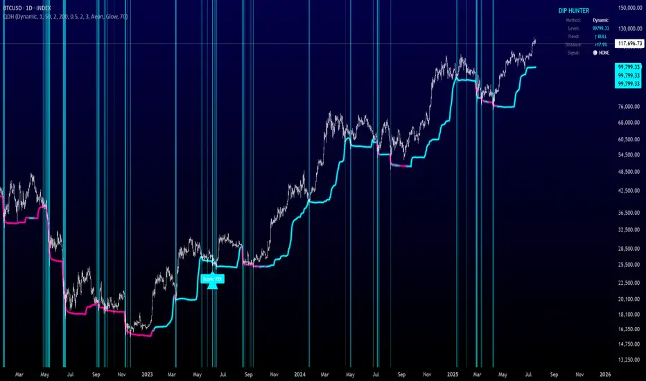
Quantum Dip Hunter | AlphaNattQuantum Dip Hunter | AlphaNatt
🎯 Overview
The Quantum Dip Hunter is an advanced technical indicator designed to identify high-probability buying opportunities when price temporarily dips below dynamic support levels. Unlike simple oversold indicators, this system uses a sophisticated quality scoring algorithm to filter out low-quality dips and highlight only the best entry points.
"Buy the dip" - but only the right dips. Not all dips are created equal.
⚡ Key Features
5 Detection Methods: Choose from Dynamic, Fibonacci, Volatility, Volume Profile, or Hybrid modes
Quality Scoring System: Each dip is scored from 0-100% based on multiple factors
Smart Filtering: Only signals above your quality threshold are displayed
Visual Effects: Glow, Pulse, and Wave animations for the support line
Risk Management: Automatic stop-loss and take-profit calculations
Real-time Statistics: Live dashboard showing current market conditions
📊 How It Works
The indicator calculates a dynamic support line using your selected method
When price dips below this line, it evaluates the dip quality
Quality score is calculated based on: trend alignment (30%), volume (20%), RSI (20%), momentum (15%), and dip depth (15%)
If the score exceeds your minimum threshold, a buy signal arrow appears
Stop-loss and take-profit levels are automatically calculated and displayed
🚀 Detection Methods Explained
Dynamic Support
Adapts to recent price action
Best for: Trending markets
Uses ATR-adjusted lowest points
Fibonacci Support
Based on 61.8% and 78.6% retracement levels
Best for: Pullbacks in strong trends
Automatically switches between fib levels
Volatility Support
Uses Bollinger Band methodology
Best for: Range-bound markets
Adapts to changing volatility
Volume Profile Support
Finds high-volume price levels
Best for: Identifying institutional support
Updates dynamically as volume accumulates
Hybrid Mode
Combines all methods for maximum accuracy
Best for: All market conditions
Takes the most conservative support level
⚙️ Key Settings
Dip Detection Engine
Detection Method: Choose your preferred support calculation
Sensitivity: Higher = more sensitive to price movements (0.5-3.0)
Lookback Period: How far back to analyze (20-200 bars)
Dip Depth %: Minimum dip size to consider (0.5-10%)
Quality Filters
Trend Filter: Only buy dips in uptrends when enabled
Minimum Dip Score: Quality threshold for signals (0-100%)
Trend Strength: Required trend score when filter is on
📈 Trading Strategies
Conservative Approach
Use Dynamic method with Trend Filter ON
Set minimum score to 80%
Risk:Reward ratio of 2:1 or higher
Best for: Swing trading
Aggressive Approach
Use Hybrid method with Trend Filter OFF
Set minimum score to 60%
Risk:Reward ratio of 1:1
Best for: Day trading
Scalping Setup
Use Volatility method
Set sensitivity to 2.0+
Focus on Target 1 only
Best for: Quick trades
🎨 Visual Customization
Color Themes:
Neon: Bright cyan/magenta for dark backgrounds
Ocean: Cool blues and teals
Solar: Warm yellows and oranges
Matrix: Classic green terminal look
Gradient: Smooth color transitions
Line Styles:
Solid: Clean, simple line
Glow: Adds depth with glow effect
Pulse: Animated breathing effect
Wave: Oscillating wave pattern
💡 Pro Tips
Start with the Trend Filter ON to avoid catching falling knives
Higher quality scores (80%+) have better win rates but fewer signals
Use Volume Profile method near major support/resistance levels
Combine with your favorite momentum indicator for confirmation
The pulse animation can help draw attention to key levels
⚠️ Important Notes
This indicator identifies potential entries, not guaranteed profits
Always use proper risk management
Works best on liquid instruments with good volume
Backtest your settings before live trading
Not financial advice - use at your own risk
📊 Statistics Panel
The live statistics panel shows:
Current detection method
Support level value
Trend direction
Distance from support
Current signal status
🤝 Support
Created by AlphaNatt
For questions or suggestions, please comment below!
Happy dip hunting! 🎯
Not financial advice, always do your own research
Multiple EMAs (Chart Timeframe)This indicator plots six customizable EMAs based on the current chart timeframe.
It automatically adapts to the timeframe you're viewing — whether it's 5 minutes, 1 hour, 4 hours, or daily.
- Up to 6 EMA lines with user-defined lengths
- No manual timeframe selection required
- Clean, minimal setup for trend analysis across any timeframe
- Ideal for traders who want to monitor multiple EMAs without switching indicators or manually adjusting timeframes.

Top Crypto Above 28-Day AverageDescription
The “Top Crypto Above 28-Day Average” (CRYPTOTW) script scans a selectable universe of up to 120 top-capitalization cryptocurrencies (divided into customizable 40-symbol batches), then plots the count of those trading above their own 28-period simple moving average. It helps you gauge broad market strength and identify which tokens are showing momentum relative to their recent trend.
Key Features
• Batch Selection: Choose among “Top40,” “Mid40,” or “Low40” market-cap groups, or set a custom batch size (up to 40 symbols) to keep within the API limit.
• Dynamic Plot: Displays a live line chart of how many cryptos are above their 28-day MA on each bar.
• Reference Lines: Automatic horizontal lines at 25%, 50%, and 75% of your batch to provide quick visual thresholds.
• Background Coloration: The chart background shifts green/yellow/red based on whether more than 70%, 50–70%, or under 50% of the batch is above the MA.
• Optional Table: On the final bar, show a sortable table of up to 28 tickers currently above their 28-day MA, including current price, percent above MA, and “Above” status color-coding.
• Alerts:
• Strong Batch Performance: Fires when >70% of the batch is above the MA.
• Weak Batch Performance: Fires when <10 cryptos (i.e. <25%) are above the MA.
Inputs
• Show Results Table (show_table): Toggle the detailed table on/off.
• Table Position (table_position): Select one of the four corners for your table overlay.
• Max Cryptos to Display (max_display): Limit the number of rows in the results table.
• Current Batch (current_batch): Pick “Top40,” “Mid40,” or “Low40.”
• Batch Size (batch_size): Define the number of symbols (1–40) you want to include from the chosen batch.
How to Use
1. Add the CRYPTOTW indicator to any chart.
2. Select your batch and size to focus on the segment of the crypto market you follow.
3. Watch the plotted line to see the proportion of tokens with bullish momentum.
4. (Optional) Enable the results table to see exactly which tokens are outperforming their 28-day average.
5. Set alerts to be notified when the batch either overheats (strong performance) or cools off significantly.
Why It Matters
By tracking the share of assets riding their 28-day trend, you gain a macro-level view of market breadth—crucial for spotting emerging rallies or early signs of broad weakness. Whether you’re swing-trading individual altcoins or assessing overall market mood, this tool distills complex data into an intuitive, actionable signal.

Kaufman Profit (Slope Based) + ATR FilterSlope based moving average profit ranking trend system with a ATR filter and adjustment

مقارنة السعر مع تاريخ محدد + Table محمد الشمري✅ الهدف الأساسي من المؤشر:
عرض نسبة التغير في السعر بين:
السعر الحالي
وسعر سهم معين في تاريخ تحدده بنفسك داخل إعدادات المؤشر
ويتم عرض هذه النسبة في شكل مربع ثابت (Table) في أعلى يمين الشارت، بلون يعبر عن اتجاه التغير.
✅ Main Purpose of the Indicator:
The indicator titled:
"Price Change Compared to Specific Date + Table – Mohammad Al-Shammari"
Is designed to:
Display the percentage change in price between:
The current price.
And the price on a specific date you choose in the indicator settings.
This percentage is shown as a fixed table (box) in the top-right corner of the chart with a color that reflects the price movement direction.

20-Day SMA BIAS%20-day Bias is a commonly used indicator in technical analysis. It is used to measure the gap between the stock price and its 20-day moving average to determine whether the stock price deviates from the normal state and whether there is an overbought or oversold phenomenon.
How to calculate the 20-day deviation value:
The calculation formula of the deviation rate is: ((closing price of the day - 20-day moving average price) / 20-day moving average price) * 100%.
Interpretation of 20-day deviation value:
Positive deviation rate:
Indicates that the stock price is higher than the 20-day moving average, which means that the stock price is high and may face correction pressure.
Negative deviation rate:
Indicates that the stock price is lower than the 20-day moving average, which means that the stock price is low and there may be a rebound opportunity.
Absolute value of the deviation rate:
The larger the absolute value, the higher the deviation of the stock price, and the higher the degree of overbought or oversold.
Apply the deviation rate to determine the buying and selling opportunities:
Positive deviation rate is too large:
When the positive deviation rate of the stock price from the 20-day moving average is too large, and the stock price is already at a high level, this may be a sell signal.
Negative deviation rate is too large:
When the negative deviation rate of the stock price from the 20-day moving average is too large, and the stock price is already at a low level, this may be a buy signal.
Stock price fluctuates around the moving average:
Stock price usually fluctuates around the moving average and adjusts after over-rising or over-falling.
Practical operation suggestions:
The standards of the market and individual stocks are different:
When the positive and negative deviation rate of the market and the quarterly line is greater than 5%, there is a greater chance of correction; large-cap stocks are between 5% and 10%; small and medium-sized stocks may be above 15% to 20%.
Combined with other indicators:
The deviation rate is only one of the technical analysis indicators. It is recommended to combine it with other indicators, such as KD indicators, RSI, etc., to make a comprehensive judgment and improve accuracy.
Reference to historical experience:
You can refer to the situation where the deviation rate of the stock was too large in the past to determine whether the current deviation rate is also too large.
Summary:
The 20-day deviation value is an indicator to determine whether the stock price is overbought or oversold, which can help investors determine the timing of buying and selling, but it needs to be combined with other indicators and historical data, and adjusted according to market conditions.

Apex Edge - RSI Trend LinesThe Apex Edge - RSI Trend Lines indicator is a precision tool that automatically draws real-time trendlines on the RSI oscillator using confirmed pivot highs and lows. These dynamic trendlines track RSI structure in motion, helping you anticipate breakout zones, reversals, and hidden divergences.
Every time a new pivot forms, the indicator automatically re-draws the RSI trendline between the two most recent pivots — giving you an always-current view of momentum structure. You’ll instantly see when RSI begins compressing or expanding, long before price reacts.
Key Features: • Dynamic RSI trendlines drawn from the last 2 pivots
• Auto re-draws in real-time as new pivots form
• Optional "Full Extend" or "Pivot Only" modes
• Slope color-coded: green = support, red = resistance
• Built-in dotted RSI levels (30/70 default)
• Alert conditions for RSI trendline breakout signals
• Ideal for spotting divergence, compression, and early SMC confluence
This is not your average RSI — it’s a fully reactive momentum edge overlay designed to give you clarity, structure, and timing from within the oscillator itself. Perfect for traders using Smart Money Concepts, divergence setups, or algorithmic trend tracking.
⚔️ Built for precision. Built for edge. Built for Apex.

Multi-Timeframe Trend TableDetects the trend on multi-timeframe using cross over of 20 and 50 Exponential Moving Average (EMA)

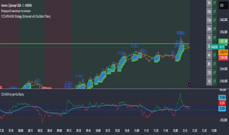
🏹 CCI+RSI+EMA Strategy (Enhanced with Oscillator Filters)This script is a multi-indicator trading strategy that combines trend-following and momentum signals using CCI, RSI, and EMA, enhanced with MACD and Stochastic filters for more reliable entries.
🧠 Core Concept
The strategy aims to:
Identify the trend using EMA(50) and a long-term comparison of EMA 35 vs EMA 169;
Spot momentum using CCI and RSI;
Filter entries through MACD and Stochastic confirmations to avoid false signals.
📌 Buy Conditions:
✅ Price is above EMA
✅ RSI is above a set threshold (default: 45)
✅ CCI is above a set threshold (default: 0)
✅ Uptrend confirmed by EMA 35 > EMA 169
✅ CCI has recently reached oversold levels (e.g. below -100)
✅ MACD shows bullish crossover
✅ Stochastic confirms exit from oversold zone
📌 Sell Conditions:
✅ Price is below EMA
✅ RSI is below a set threshold (default: 55)
✅ CCI is below 0
✅ Downtrend confirmed by EMA 35 < EMA 169
✅ CCI has recently reached overbought levels (e.g. above 100)
✅ MACD shows bearish crossover
✅ Stochastic confirms exit from overbought zone
🎯 Features:
Fully customizable inputs — adapt to your own trading style.
Trend background shading — green for uptrend, red for downtrend.
Enhanced entry logic — filters out weak signals.
CCI Cross and Trigger markers — additional confirmation tools.
🔔 Alerts
You can set alerts for ENHANCED BUY and ENHANCED SELL to never miss a quality signal.
📈 Use Case:
This tool is suitable for:
Manual trading entries and exits
Being a component of a broader trading system
Semi-automation with alert-based strategies
⚠️ Disclaimer:
This script is for educational and testing purposes only. It is not financial advice. Always backtest and demo trade before using on a live account.
Hull Moving Average (HMA)# Hull Moving Average (HMA) - Technical Indicator
## Overview
The Hull Moving Average (HMA) is an advanced technical indicator developed by Alan Hull that solves the main problem of traditional moving averages: **lag**. This indicator provides a unique combination of **speed** and **smoothness**, virtually eliminating lag in trend change detection.
## What HMA Does
### Primary Function
HMA calculates a moving average that reacts **much faster** to price changes than classic moving averages (SMA, EMA, WMA), while maintaining **superior smoothing** that eliminates market noise.
### Mathematical Calculation
HMA uses a three-step formula:
1. **WMA1** = WMA(price, period/2) × 2
2. **WMA2** = WMA(price, period)
3. **HMA** = WMA(WMA1 - WMA2, √period)
This complex formula allows the indicator to "anticipate" price movements rather than follow them with delay.
## Key Advantages
### 1. **Lag Elimination**
- Reacts 2-3 bars earlier than EMA
- Detects trend changes almost instantaneously
- Ideal for active trading on short timeframes
### 2. **Superior Smoothing**
- Eliminates false market noise
- Reduces false signals (whipsaws)
- Provides clear trend direction visualization
### 3. **Versatility**
- Works on all timeframes (1min - monthly)
- Compatible with all markets (forex, stocks, crypto, commodities)
- Combines excellently with other indicators
## How to Interpret HMA
### Trend Signals
- **Green/Rising line** = Bullish trend (buy)
- **Red/Falling line** = Bearish trend (sell)
- **Color change** = Potential trend reversal
### Trading Strategies
- **Entries on HMA color change**
- **Pullbacks to HMA** in trending markets
- **Price vs HMA crossovers** for confirmations
### Confluences
HMA works excellently when combined with:
- **Support/Resistance** levels
- **Stochastic** for timing
- **RSI** for momentum confirmation
- **Volume** for move validation
## Recommended Settings
### Standard Period
- **21** - Optimal speed/accuracy balance
- **14** - Faster for scalping
- **50** - Slower for swing trading
### Ideal Timeframes
- **1-5 minutes** - Scalping with HMA(14)
- **15-30 minutes** - Day trading with HMA(21)
- **1-4 hours** - Swing trading with HMA(50)
## Limitations
### Sideways Markets
HMA can generate false signals in markets without clear trend. Use additional filters in these conditions.
### Extreme Volatility
In periods of very high volatility, even HMA may have minor delays.
### Parameter Dependency
Performance depends on correct period selection based on trading style.
## Conclusion
Hull Moving Average is one of the most advanced trend indicators available, offering an elegant solution to the lag problem of traditional moving averages. It's ideal for traders who want **fast reaction** without sacrificing **signal accuracy**.
**Recommended for:** Day trading, scalping, short-term swing trading
**Level:** Intermediate - Advanced
**Combinations:** Excellent with oscillators (Stochastic, RSI), volume indicators, and support/resistance levels

HA + HMA + VWAP🔍 Script Overview
This indicator blends Heikin-Ashi smoothing, Hull Moving Average (HMA), and Volume Weighted Average Price (VWAP) to help traders identify trend direction and potential trade setups. The script provides buy/sell signals based on price action relative to HMA while anchoring the view to volume with VWAP.
📈 What It Does and How
- Heikin-Ashi Calculations: Reduces noise by averaging candle structure, revealing clearer trend direction.
- Hull Moving Average (HMA): A fast, smooth-moving average applied to Heikin-Ashi close prices, tuned to respond quickly to shifts in momentum.
- VWAP Line: Acts as a dynamic fair-value reference, balancing price against volume over time.
- Signal Logic: Generates visual Buy/Sell signals when the Heikin-Ashi close crosses the HMA.
🧠 Recommended Enhancements Using RSI + ATR
For more refined entries and exits, use this indicator alongside Relative Strength Index (RSI) and Average True Range (ATR):
- RSI for Momentum Confirmation: Ensure the buy signals align with upward momentum—RSI climbing from oversold zones adds conviction.
- ATR for Volatility Awareness: Use ATR to size stops and evaluate risk. Avoid trades during volatility spikes or when ATR exceeds typical thresholds.
- Three-Leg Alignment: When HA/HMA signal agrees with RSI momentum and ATR shows stable conditions, you get high-quality trade setups with better timing and risk control.
This fusion helps discretionary traders filter noise and make confident decisions rooted in price action, volume, momentum, and volatility.
⚙️ Chart Display
- HMA: red line
- VWAP: gray line
- Buy/Sell labels: green below bars for buys, red above bars for sells
- Clean layout optimized for visual clarity
This script is open-source and does not use future data or issue caution warnings. It’s designed to assist manual trading strategies, not provide automated trading decisions.

📊 TREND Indicator by Yogesh Mandloi 📊This custom-built TradingView indicator provides a visual and logic-based trend analysis dashboard using 4-hour RSI and EMA/SMA conditions, combined with entry/exit signals, alerts, and a toggle-controlled condition table.
🔍 Core Logic
The strategy uses 4-hour timeframe data to identify potential bullish or bearish trends based on:
RSI (14):
Buy: RSI > 48
Sell: RSI < 52
EMA/SMA (Trend Filters):
Buy: EMA 21 > SMA 55 High → uptrend confirmation
Sell: EMA 21 < SMA 55 Low → downtrend confirmation
Buy Signal = RSI > 48 AND EMA21 > SMA55 High
Sell Signal = RSI < 52 AND EMA21 < SMA55 Low
It only signals on first bar of condition (no repetitive signals) and gives exit alerts when the condition ends.
📈 Features
✅ Signal Plotting
Green "BUY" arrows below bars when buy setup forms
Red "SELL" arrows above bars when sell setup forms
Gray "EXIT" markers when the trend condition invalidates
✅ Real-Time Alerts
Entry alerts for both BUY and SELL signals
Exit alerts to close positions
✅ Dynamic Visual Table
An on-screen signal table shows the live status of each condition with color-coded clarity:
✅ Green: Condition met
❌ Red: Condition not met
🟧 Orange: Warning (bearish potential forming)
✅ Toggle Switches for Sections
Users can control the visibility of each table section:
Buy Conditions ✔️
Sell Conditions 🔻
Signal Summary 📌
Indicator Values 📊
This makes it easier to focus on relevant sections or declutter the chart view.
✅ Customizable Table Position
You can change the table location:
top_left, top_right, bottom_left, bottom_right
✅ Background Highlights
Light Green background when buy conditions are active
Light Red background when sell conditions are active

PCR tableOverview
This indicator displays a multi-period table of forward-looking price projections. It combines normalized directional momentum (Positive Change Ratio, PCR) with volatility (ATR) and presents a forecast for upcoming time intervals, adjusted for your local UTC offset.
Concepts & Calculations
Positive Change Ratio (PCR):
((total positive change)/(total change)-0.5)*2, producing a value between –100 and +100.
Synthetic ATR: Calculates average true range over the same lookbacks to capture volatility.
PCR × ATR: Forms a volatility-weighted directional forecast, indicating expected move magnitude.
Future Price Projection: Adds PCR × ATR value to current close to estimate future price at each lookahead interval.
Table Layout
There are 12 forecast horizons—1× to 12× the chart timeframe (e.g., minutes, hours, days). Each row displays:
1. Future Time: Timestamp of each projection (adjustable via UTC offset)
2. PCR: Directional bias per period (–1 to +1)
3. PCR × ATR: E xpected move magnitude
4. Future Price: Close + (PCR × ATR)
High and low PCR×ATR rows are highlighted green for minimum value in the price forecast (buy signal) or red for maximum value in the price forecast (sell signal).
How to Use
1. Set UTC offset to your time zone for accurate future timestamps.
2. View PCR to assess bullish (positive) or bearish (negative) momentum.
3. Use PCR × ATR to estimate move strength and direction.
4. Reference Future Price for potential levels over upcoming intervals, and for buy and sell signals.
Limitations & Disclaimers
* This model uses linear extrapolation based on recent price behavior. It does not guarantee future prices.
* It uses only current bar data and no lookahead logic—compliant with Pine Script rules.
* Designed for analytical insight, not as an automated signal or trade executor.
* Best used on standard bar/candle charts (avoid non-standard types like Heikin‑Ashi or Renko).

Intraday Spark Chart [AstrideUnicorn]The Intraday Spark Chart (ISC) is a minimalist yet powerful tool designed to track an asset’s performance relative to its daily opening price. Inspired by Nasdaq’s real-time analytics analog dashboards. It visualizes intraday percentage changes as a color-coded sparkline, helping traders quickly gauge momentum and session bias.
Ideal for: Day traders, scalpers, and multi-asset monitors.
Best paired with: 1m to 4H timeframes (auto-warns on higher TFs).
Key metrics:
Real-time % change from daily open.
Final daily % change (updated at session close).
Daily open price labels for orientation.
HOW TO USE
Visual Guide
Sparkline Plot:
A green area/line indicates price is above the daily open (bullish).
A red area/line signals price is below the daily open (bearish).
The baseline (0%) represents the daily open price.
Session Markers:
The dotted vertical lines separate trading days.
Gray labels near the baseline show the exact daily open price at the start of each session.
Dynamic Labels:
The labels in the upper left corner of each session range display the current (or final) daily % change. Color matches the trend (green/red) for instant readability.
Practical Use Cases
Opening Range Breakouts: Spot early momentum by observing how price reacts to the daily open.
Multi-Asset Screening: Compare intraday strength across symbols by applying the indicator to multiple charts.
Session Close Prep: Anticipate daily settlement by tracking the final % change (useful for futures/swing traders).
SETTINGS
Asset (Input Symbol): Defaults to the current chart symbol. Switch to monitor other assets.

10/20 MA Coil: Progressive Colors & Multi-Day BreakoutThis indicator detects price “coil” setups and highlights potential breakout or breakdown opportunities using moving average alignment and volatility compression.
Features:
• Coil Detection:
• Identifies consolidation when:
• The 10 and 20 MAs are tightly aligned (within user-defined tolerance)
• Price is above both MAs and within 1.5x ADR of them
• The 50 MA is rising
• Progressive Coil Coloring:
• Coil candles are colored in progressively darker orange as the streak continues
• Bullish Breakout Signal:
• Triggers when a green candle follows a coiled bar
• The candle’s body must be greater than or equal to 1 ATR
• Colored lime green
• Bearish Breakdown Signal:
• Triggers when a red candle follows a coiled bar
• The candle’s body must be greater than or equal to 1 ATR to the downside
• Colored black
• Custom Candle Rendering:
• Candle body color represents coil or breakout state
• Wick and border are red or green to reflect price direction
• Optional Debug Tools:
• Coil streak, ATR, and distance from MAs can be plotted for deeper analysis
This script is designed for traders looking to spot price compression and prepare for high-probability moves following low-volatility setups.
XRP Trend & Signal Strategy V2This is a simple yet effective script that plots the closing price of the selected asset directly on the chart. Useful for visualizing raw price action without additional indicators, this script serves as a clean base for further customization and strategy development.

DA Cloud - DynamicDA Cloud - Dynamic | Detailed Overview
🌟 What Makes This Indicator Special
The DA Cloud - Dynamic is an advanced technical analysis tool that creates adaptive support and resistance zones that expand and contract based on market volatility. Unlike traditional static indicators, this cloud system "breathes" with the market, providing dynamic levels that adjust to changing market conditions.
📊 Core Components
1. Multi-Layered Cloud Structure
Resistance Cloud (Red): Three dynamic resistance levels (RL1, RL2, RL3) with intermediate channels (RC1, RC2)
Support Cloud (Green): Three dynamic support levels (SL1, SL2, SL3) with intermediate channels (SC1, SC2)
Trend Cloud (Blue): Five trend lines (TU2, TU1, TM, TL1, TL2) that flow through the center
Confirmation Line (Purple): A fast-reacting line that confirms trend changes
2. Forward Displacement Technology
The entire cloud system is projected 21 bars into the future (Fibonacci number), allowing traders to see potential support and resistance levels before price reaches them. This predictive element is inspired by Ichimoku Cloud theory but enhanced with modern volatility dynamics.
🔬 How It Works (Without Revealing the Secret Sauce)
Volatility-Responsive Design
The indicator continuously measures market volatility across multiple timeframes
During high volatility periods (like major breakouts), clouds expand dramatically
During consolidation, clouds contract and tighten around price
This creates a "breathing" effect that adapts to market conditions
Multi-Timeframe Analysis
Incorporates Fibonacci sequence periods (3, 13, 21, 34, 55) for calculations
Blends short-term responsiveness with long-term stability
Creates smooth, flowing lines that filter out market noise
Dynamic Level Calculation
Levels are not fixed percentages or static bands
Each level adapts based on current market structure and volatility
Channel lines (RC1, RC2, SC1, SC2) provide intermediate support/resistance
🎯 Key Features
1. Touch Point Detection
Colored dots appear when price touches key levels
Red dots = resistance touch
Green dots = support touch
Blue dots = trend median touch
2. Entry/Exit Signals
"Cloud Entry" labels when confirmation line crosses above SL1
"Cloud Exit" labels when confirmation line crosses below RL1
Background color changes based on bullish/bearish bias
3. Information Table
Real-time display of key levels (RL1, TM, SL1)
Current bias indicator (BULLISH/BEARISH)
Updates dynamically as market moves
⚙️ Customization Options
Main Controls:
Sensitivity (5-50): How responsive clouds are to price movements
Smoothing (1-50): Controls the flow and smoothness of cloud lines
Forward Displacement (0-50): How many bars to project the cloud forward
Advanced Volatility Settings:
Volatility Lookback (50-1000): Period for establishing volatility baseline
Volatility Smoothing (1-50): Reduces spikes in volatility expansion
Expansion Power (0.1-2.0): Controls how dramatically clouds expand
Range Divisor (1.0-20.0): Master control for overall cloud width
Level Spacing:
Individual multipliers for each resistance and support level
Allows fine-tuning of cloud structure to match different markets
Trend Spacing:
Separate controls for inner and outer trend bands
Customize the trend cloud density
📈 Trading Applications
1. Trend Identification
Price above TM (Trend Median) = Bullish bias
Price below TM = Bearish bias
Cloud color and width indicate trend strength
2. Support/Resistance Trading
Use RL1/SL1 as primary targets and reversal zones
RC1/RC2 and SC1/SC2 provide intermediate levels
RL3/SL3 mark extreme levels often seen at major tops/bottoms
3. Volatility Analysis
Expanding clouds signal increasing volatility and potential big moves
Contracting clouds indicate consolidation and potential breakout setup
Cloud width helps with position sizing and risk management
4. Multi-Timeframe Confirmation
Works on all timeframes from 1-minute to monthly
Higher timeframes show major market structure
Lower timeframes provide precise entry/exit points
🎓 Best Practices
Combine with Volume: High volume at cloud levels increases reliability
Watch for Touch Clusters: Multiple touches at a level indicate strength
Monitor Cloud Expansion: Sudden expansion often precedes major moves
Use Multiple Timeframes: Confirm signals across different time periods
Respect the Trend Median: This is often the most important level
⚡ Performance Notes
Optimized for up to 2000 bars of historical data
Smooth performance with 500+ lines and labels
Works on all markets: Crypto, Forex, Stocks, Commodities
📝 Version Info
Current Version: 1.0
Dynamic volatility expansion system
Full customization suite
Touch point detection
Entry/exit signals
Forward displacement projection
Relative Strength RSI with LevelsThis is a relative Strength Indicator used for comparing the performance of the Stock analyzed with the SPX, with a single line moving above or below a midline signaling over- or underperformance when compared to S&P500 SPX Index
