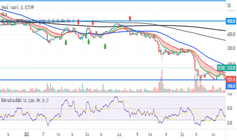
The Zone Trades v1.0The Zone v.1.0
The Zone is mention in New Trading Dimensions by Bill Williams,PhD. The Zone is used for Entry Signal of Both Long and Short side.
Green Zone are painting Green Bars when Awesome Oscillator (AO) and Accelerater/Decelerator (AC) are both increasing.
Red Zone are painting Red Bars when Awesome Oscillator (AO) and Accelerater/Decelerator (AC) are both decreasing.
Gray Zone are painting Gray Bars AO and AC in difference changing. Gray Zone are indicate the indecision between bulls and bears.
Bill Williams, PhD. mention that Green Zone or Red Zone usually happen 6-8 bars Continuously.
The First Bar that change to be Green or Red color is the Signal Bar.
Entry Signal is the second bar in the same color as the Signal bar happen with Volume
Price go higher the high of previous Green Bar is Buy Signal. Entry Buy (Long) and place Stop at 1 tick lower the Low of previous bar.
Price go ;ower the Low of previous Red Bars is Sell Signal. Entry Sell (Short) and place Stop at 1 tick higher the High of previous bar.
Do not Entry if Green Bars or Red Bars completed 5 bars continuously.
"zone" için komut dosyalarını ara

: Volume Zone Oscillator & Price Zone Oscillator LB Update JRMThis is a simple update of Lazy Bear's " Indicators: Volume Zone Indicator & Price Zone Indicator" Script. PZO plots on the same indicator. The horizontal plot lines are taken primarily from two articles by Wahalil and Steckler "In The Volume Zone" May 2011, Stocks and Commodities and "Entering The Price Zone"June 2011, Stocks and Commodities. With both indicators on the same plot it is easier to see divergences between the indicators. I did add a plot line at 80 and -80 as well because that is getting into truly extreme price/volume territory where one might contemplate a close your eyes and sell or cover particularly if confirmed at a higher time frame with the expectation of some type of corrective move..
The inputs and plot lines can be edited as per Lazy Bear's original script and follows the original format. Many thanks to Lazy Bear.

BTC -50% Crash to Recovery ZoneGeneral Overview This is a macro-analysis tool designed to visualize the true duration of Bitcoin’s "Suffering & Recovery Cycles." Unlike standard oscillators that only signal oversold conditions, this script highlights the entire timeline required for the market to flush out leverage and return to All-Time Highs (ATH).
Operational Logic The algorithm tracks Bitcoin’s historical All-Time High (ATH).
The Trigger: It activates automatically when the price drops 50% below the last recorded ATH.
The "Recovery Zone": Once triggered, the chart background turns red (indicating a "Drawdown" state). This zone remains active persistently, even during intermediate relief rallies.
The Reset: The zone deactivates only when the price breaks above the previous ATH, marking the official start of a new Price Discovery phase.
How to Read It
Red Background: We are officially in a Bear Market or Recovery Phase. The asset is technically "underwater." For the long-term investor with a low time preference, this visually defines the accumulation window.
Red Horizontal Line: Indicates the "Target." This is the exact price level of the old ATH that Bitcoin must reclaim to close the bearish cycle.
No Background Color: We are in Price Discovery. The market is healthy and pushing for new highs.
The Financial Lesson This indicator visually demonstrates a fundamental market truth: "Price takes the elevator down, but takes the stairs up." It shows that after a halving of value (-50%), Bitcoin may take months or years to recover previous levels, helping investors filter out the noise of short-term pumps that fail to break the macro-bearish structure.

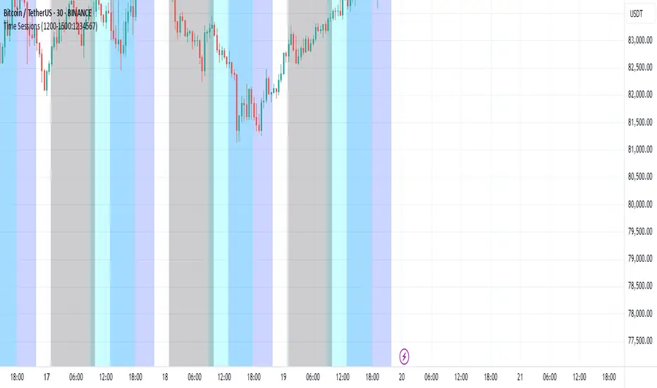
Kill Zone GridCaca Poo-Poo Kill Zone (12pm–4pm) — Avoid the Death Hours
This indicator highlights the worst trading window of the day — the midday chop zone where liquidity dies, algo volume disappears, spreads widen, and your account slowly bleeds out from boredom and paper cuts.
From 12pm to 4pm (New York Time) the script:
• Shades the background with a bold kill-zone color
• Adds red gridline stripes to visually scream “STOP TRADING, YOU DONKEY”
• Makes the entire chart look hostile so you avoid revenge trading, boredom trading, and all forms of midday stupidity
Perfect for scalpers and trend traders who only want the clean morning moves and want a visual reminder to step away, go outside, touch grass, eat lunch, or hit the gym instead of forcing trades in garbage hours.
If you trade futures, options, or zero-day anything — this script will save you money, sanity, and years off your life.

Multi-Symbol Fib Zone Signal Scanner NSEMulti-Symbol Fib Zone Signal Scanner NSE
this indicator will suggest to buy or sell basis fib retracement
it is for educational purpose only.

Awesome SuperTrend Zone Dynamic Alerts// created by © OmegaTools, upgrade to v6 and alert condition added
//@version=6
Awesome SuperTrend Zone Alerts with dynamic alerts

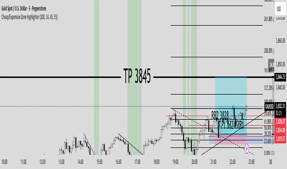
Cheap/Expensive Zone Highlighter V.2 Publicindicator Cheap/Expensive Zone Highlighter Ver2
Uptrend = Based on price> EMA200 (O+H+L+C)/4
Cheap zone = RSI<45
Dowtrend = Based on price< EMA200 (O+H+L+C)/4
Expensive Zone= RSI>55
Cheap/Expensive Zone Highlighter V.2 indicator Cheap/Expensive Zone Highlighter Ver2
Uptrend = Based on price> EMA200 (O+H+L+C)/4
Cheap zone = RSI<45
Dowtrend = Based on price< EMA200 (O+H+L+C)/4
Expensive Zone= RSI>55

RSI(7) + MACD ZoneTitle: RSI(7) + MACD Zone Combo
Description:
This indicator combines RSI (7) and MACD (12,26,9) into a single panel with a unified scale for easier analysis.
RSI (7) is plotted in white and automatically turns red when the market reaches overbought (>70) or oversold (<30) conditions.
MACD is normalized to align with the RSI scale (0–100).
A value of 50 represents MACD = 0.
Above 50 (teal) indicates positive momentum.
Below 50 (red) indicates negative momentum.
This combination allows traders to quickly identify when short-term RSI conditions align with overall momentum shifts from MACD.
How to use:
Look for potential buy opportunities when RSI is oversold (<30) and MACD is above 50 (positive momentum).
Look for potential sell opportunities when RSI is overbought (>70) and MACD is below 50 (negative momentum).
Use in conjunction with price action and risk management — not as a standalone signal.

UpDownBow + BullBear ZoneUpDownBow + BullBear UpDownBow + BullBear ZoneUpDoUpDownBow + BullBear ZoneUpDownBow + BullBear ZoneUpDownBow + BullBear ZoneUpDownBow + BullBear ZoneUpDownBow + BullBear ZonewnBow + BullBear ZoneUpDownBow + BullBear UpDownBow + BullBear ZoneUpDoUpDownBow + BullBear ZoneUpDownBow + BullBear ZoneUpDownBow + BullBear ZoneUpDownBow + BullBear ZoneUpDownBow + BullBear ZonewnBow + BullBear ZoneUpDownBow + BullBear UpDownBow + BullBear ZoneUpDoUpDownBow + BullBear ZoneUpDownBow + BullBear ZoneUpDownBow + BullBear ZoneUpDownBow + BullBear ZoneUpDownBow + BullBear ZonewnBow + BullBear ZoneUpDownBow + BullBear UpDownBow + BullBear ZoneUpDoUpDownBow + BullBear ZoneUpDownBow + BullBear ZoneUpDownBow + BullBear ZoneUpDownBow + BullBear ZoneUpDownBow + BullBear ZonewnBow + BullBear ZoneUpDownBow + BullBear UpDownBow + BullBear ZoneUpDoUpDownBow + BullBear ZoneUpDownBow + BullBear ZoneUpDownBow + BullBear ZoneUpDownBow + BullBear ZoneUpDownBow + BullBear ZonewnBow + BullBear ZoneUpDownBow + BullBear UpDownBow + BullBear ZoneUpDoUpDownBow + BullBear ZoneUpDownBow + BullBear ZoneUpDownBow + BullBear ZoneUpDownBow + BullBear ZoneUpDownBow + BullBear ZonewnBow + BullBear ZoneUpDownBow + BullBear UpDownBow + BullBear ZoneUpDoUpDownBow + BullBear ZoneUpDownBow + BullBear ZoneUpDownBow + BullBear ZoneUpDownBow + BullBear ZoneUpDownBow + BullBear ZonewnBow + BullBear ZoneUpDownBow + BullBear UpDownBow + BullBear ZoneUpDoUpDownBow + BullBear ZoneUpDownBow + BullBear ZoneUpDownBow + BullBear ZoneUpDownBow + BullBear ZoneUpDownBow + BullBear ZonewnBow + BullBear Zone

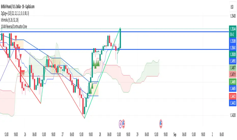
10 AM Reversal/Continuation Zone BY DAN GESPlots the high and low between 9.30 - 10:00am ET
Colours the zone between those two levels.
Highlights when price breaks above or below that zone after 10:00am
RSI (14) with Auto Zone Colors — Overbought/Oversold HighlighterThis indicator plots the Relative Strength Index (RSI 14) with dynamic color changes for instant visual clarity:
✅ Green line in overbought zone (≥70)
✅ Red line in oversold zone (≤30)
✅ White line in neutral range (30–70)
Includes reference lines at 70, 50, and 30 for quick decision-making. Perfect for spotting momentum extremes, divergences, and potential reversal points without squinting at numbers. Works on any timeframe.

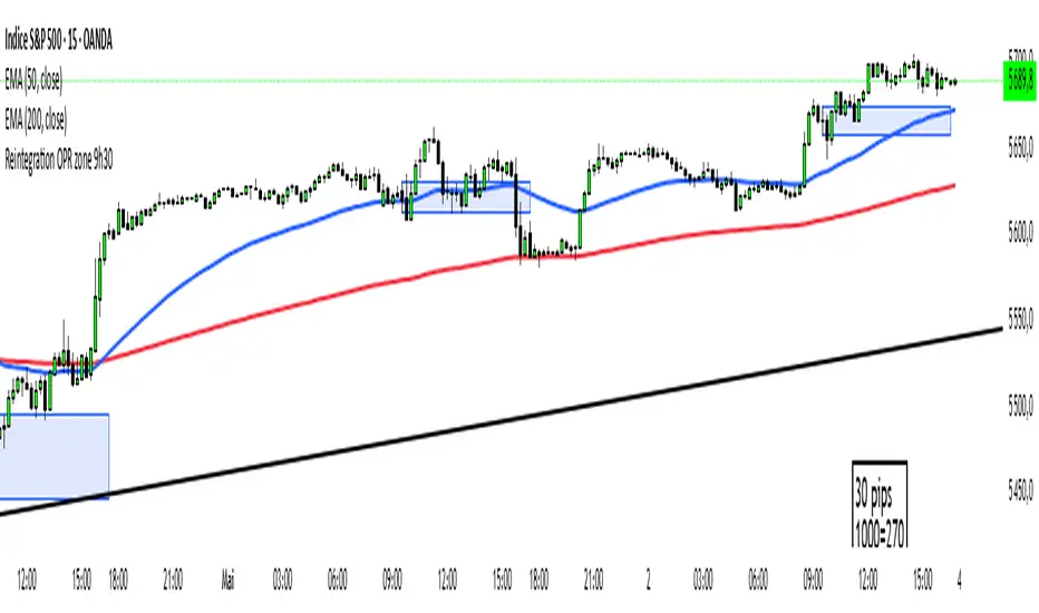
Reintegration OPR zone 9h30📝 Indicator Description (for TradingView):
Name: Reintegration OPR Zone – 9:30 AM EST (UTC-4)
Purpose:
This indicator is designed for US indices like NAS100, US30, or SPX500. It helps identify potential false breakouts or retests by tracking when the price re-enters the Opening Price Range (OPR) after an initial breakout.
🔍 How it works:
At 9:30 AM New York time (UTC-4), the script captures the high and low of the first 15-minute candle (which is key for the US session open).
It then draws a horizontal box (rectangle) from the high to the low of that candle.
The box extends horizontally for 7 hours (28 candles on a 15-minute chart).
The script tracks if price:
Breaks above or below the OPR zone
Then re-enters the zone (a potential "fakeout" or "retest" signal)
No label or text is displayed on the chart (you requested it to be hidden).
🕒 Timeframe:
Designed for the 15-minute chart (M15)
Assumes New York session open at 9:30 AM EST (UTC-4)
Ben Adaji Time Zone CheckerIf you are trading from Nigeria, you need to set your TradingView timezone to West Africa Time (WAT, UTC+1). This ensures that your charts, market sessions, and time-based indicators align correctly with your local time.
To set this up on TradingView:
Click on the gear icon (Chart Settings).
Navigate to the Time Zone section.
Select UTC+1:00 West Africa Time (WAT) from the list.
This adjustment helps you track market movements accurately in sync with your local trading hours.
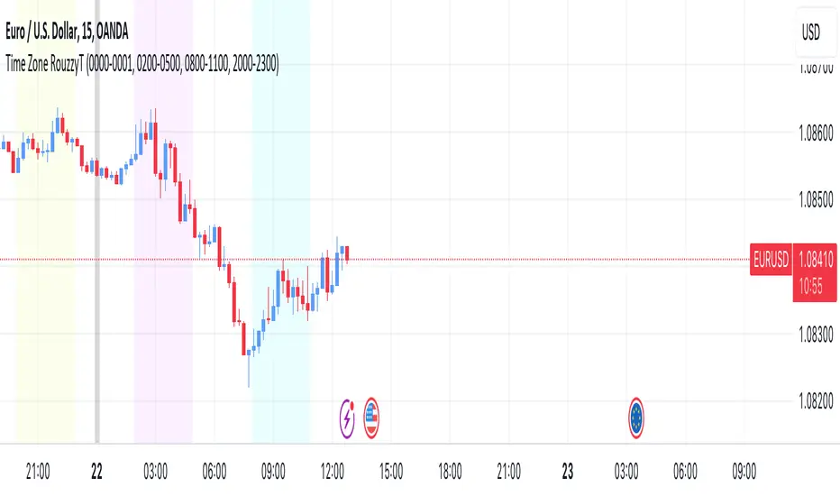
Time Zone RouzzyTNYC , London & Asia section
Each time-zone has a different color to be able to distinguish which section we are in at the moment.
These sessions have been identified to operate the EURUSD, apart from that it also works with the DXY.
London is identified with the color light purple.
NYC is identified with the color turquoise blue.
Asia is identified with the color yellow.
The beginnings of each Day are identified with the color gray.
London is from 2am to 5am
NYC from 8am to 11am
Asia from 8pm to 11pm
OANDA:EURUSD
FX:EURUSD
TVC:DXY
Optics Alert ZoneOptics Alert Zone shows price ranges for prices 17 days and 40 days ago. These can be adjusted based on asset class and volatility.
Bullish is when price is above 17 and 40 day.
Bearish is when price is below 17 and 40 day.

Simple Chop ZoneThe original Chop Zone indicator by Trading View is good, but has a few limitations which I've addressed in this one
Too many colors which confuse and/or overwhelm users like me
Inability to change the EMA period
This one has just 3 customizable colors for
Uptrend - default = Turquoise
Downtrend - default = red
Everything else - default = lime
And you can set your own EMA length. The default is 34 as per the original Chop Zone indicator

[JL] Supertrend Zone Pivot Point with zigzag fibThis is an open-source Pine script that generates a Supertrend Zone Pivot Point with Zigzag Fib indicator for TradingView. The indicator displays the Supertrend Zone, pivot points, and Fibonacci levels on the chart.
One of the unique features of this indicator is that it uses a Zigzag that does not repaint, ensuring accurate high and low points for the pivot points.
Another feature is that when the Supertrend is in an uptrend, only the highest points are taken as pivot points, and when it's in a downtrend, only the lowest points are taken as pivot points.
The Fibonacci levels are calculated based on the previous high and low pivot points, with labels displaying the corresponding levels on the chart.
The indicator also includes options to show/hide the Zigzag and Fibonacci levels.
Overall, this indicator is useful for identifying key pivot points and Fibonacci levels in the Supertrend Zone, providing valuable information for traders to make informed decisions.
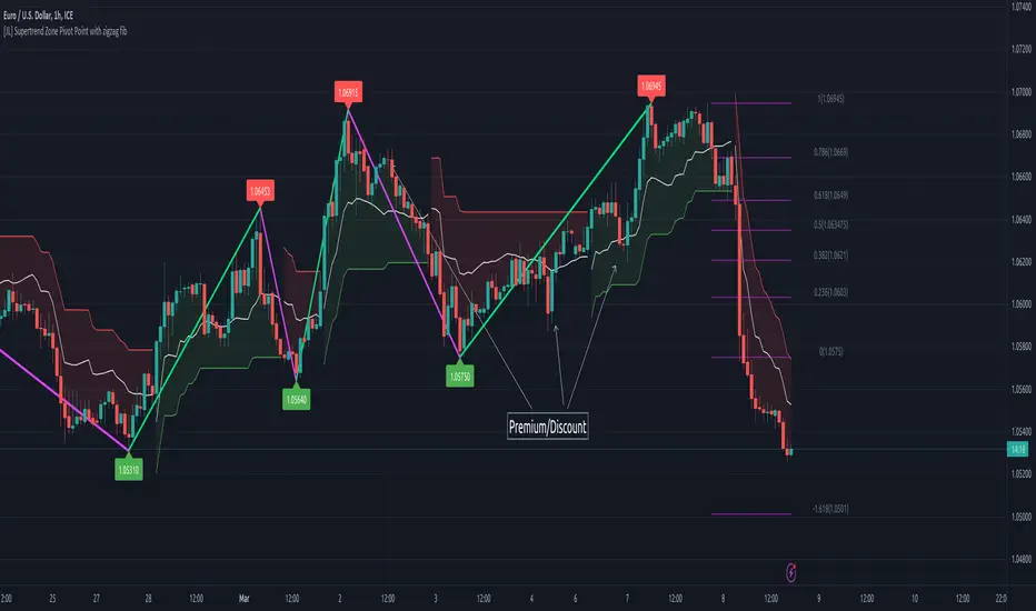
Premium/Discount Zone Buy/Sell Indicator JMJThis indicator calculates whether the opening price is in a premium or discount zone, based on the specified premiumThreshold and discountThreshold values. A premium zone is defined as when the difference between the high price and the opening price divided by the opening price is greater than or equal to premiumThreshold. A discount zone is defined as when the difference between the opening price and the low price divided by the opening price is less than or equal to discountThreshold. The premium and discount signals are plotted as green and red triangles, respectively.

Trading Guidance institutional ZoneThis is the institutional zone indicator. it used in 5 Minute Timmeframe.

High volume zone█ OVERVIEW
Show high volume zone in a lower timeframe.
█ CONCEPTS
1- Choose an amount of volume (1 000 by default)
2- Choose a timeframe (1 minute by default)
3- It highlight every zone where volume was > 1000 in less than one minute
█ OTHER SECTIONS
Limitation:
- Unfortunately, I didn't find a way to make it in a lower timeframe than 1 minute with Pinescript
- It is truncate by minute so a high volume between two lower tf candles may not be count
If you have a solution for these, glad to hear it.

CDC Action Zone + 3MA Edited by Chayo// Edit from CDC Action Zone V3 2020
// Thanks you very much piriya33