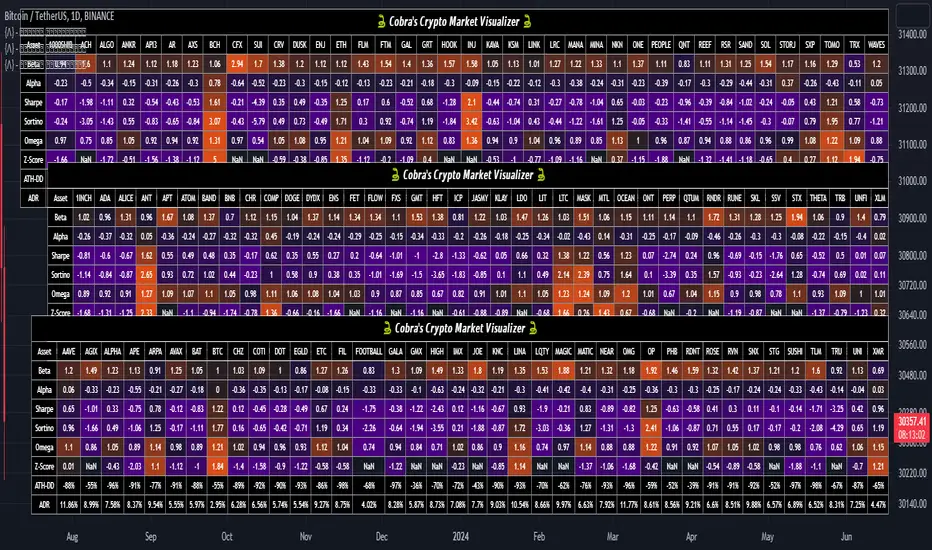
Cobra's CryptoMarket VisualizerCobra's Crypto Market Screener is designed to provide a comprehensive overview of the top 40 marketcap cryptocurrencies in a table\heatmap format. This indicator incorporates essential metrics such as Beta, Alpha, Sharpe Ratio, Sortino Ratio, Omega Ratio, Z-Score, and Average Daily Range (ADR). The table utilizes cell coloring resembling a heatmap, allowing for quick visual analysis and comparison of multiple cryptocurrencies.
The indicator also includes a shortened explanation tooltip of each metric when hovering over it's respected cell. I shall elaborate on each here for anyone interested.
Metric Descriptions:
1. Beta: measures the sensitivity of an asset's returns to the overall market returns. It indicates how much the asset's price is likely to move in relation to a benchmark index. A beta of 1 suggests the asset moves in line with the market, while a beta greater than 1 implies the asset is more volatile, and a beta less than 1 suggests lower volatility.
2. Alpha: is a measure of the excess return generated by an investment compared to its expected return, given its risk (as indicated by its beta). It assesses the performance of an investment after adjusting for market risk. Positive alpha indicates outperformance, while negative alpha suggests underperformance.
3. Sharpe Ratio: measures the risk-adjusted return of an investment or portfolio. It evaluates the excess return earned per unit of risk taken. A higher Sharpe ratio indicates better risk-adjusted performance, as it reflects a higher return for each unit of volatility or risk.
4. Sortino Ratio: is a risk-adjusted measure similar to the Sharpe ratio but focuses only on downside risk. It considers the excess return per unit of downside volatility. The Sortino ratio emphasizes the risk associated with below-target returns and is particularly useful for assessing investments with asymmetric risk profiles.
5. Omega Ratio: measures the ratio of the cumulative average positive returns to the cumulative average negative returns. It assesses the reward-to-risk ratio by considering both upside and downside performance. A higher Omega ratio indicates a higher reward relative to the risk taken.
6. Z-Score: is a statistical measure that represents the number of standard deviations a data point is from the mean of a dataset. In finance, the Z-score is commonly used to assess the financial health or risk of a company. It quantifies the distance of a company's financial ratios from the average and provides insight into its relative position.
7. Average Daily Range: ADR represents the average range of price movement of an asset during a trading day. It measures the average difference between the high and low prices over a specific period. Traders use ADR to gauge the potential price range within which an asset might fluctuate during a typical trading session.
Utility:
Comprehensive Overview: The indicator allows for monitoring up to 40 cryptocurrencies simultaneously, providing a consolidated view of essential metrics in a single table.
Efficient Comparison: The heatmap-like coloring of the cells enables easy visual comparison of different cryptocurrencies, helping identify relative strengths and weaknesses.
Risk Assessment: Metrics such as Beta, Alpha, Sharpe Ratio, Sortino Ratio, and Omega Ratio offer insights into the risk associated with each cryptocurrency, aiding risk assessment and portfolio management decisions.
Performance Evaluation: The Alpha, Sharpe Ratio, and Sortino Ratio provide measures of a cryptocurrency's performance adjusted for risk. This helps assess investment performance over time and across different assets.
Market Analysis: By considering the Z-Score and Average Daily Range (ADR), traders can evaluate the financial health and potential price volatility of cryptocurrencies, aiding in trade selection and risk management.
Features:
Reference period optimization, alpha and ADR in particular
Source calculation
Table sizing and positioning options to fit the user's screen size.
Tooltips
Important Notes -
1. The Sharpe, Sortino and Omega ratios cell coloring threshold might be subjective, I did the best I can to gauge the median value of each to provide more accurate coloring sentiment, it may change in the future.
The median values are : Sharpe -1, Sortino - 1.5, Omega - 20.
2. Limitations - Some cryptos have a Z-Score value of NaN due to their short lifetime, I tried to overcome this issue as with the rest of the metrics as best I can. Moreover, it limits the time horizon for replay mode to somewhere around Q3 of 2021 and that's with using the split option of the top half, to remain with the older cryptos.
3. For the beginner Pine enthusiasts, I recommend scimming through the script as it serves as a prime example of using key features, to name a few : Arrays, User Defined Functions, User Defined Types, For loops, Switches and Tables.
4. Beta and Alpha's benchmark instrument is BTC, due to cryptos volatility I saw no reason to use SPY or any other asset for that matter.
"screener" için komut dosyalarını ara
Auto AVWAP (Anchored-VWAP) with Breakout ScreenerAuto AVWAP (Anchored-VWAP) with Breakout Screener. fINAL VERSION

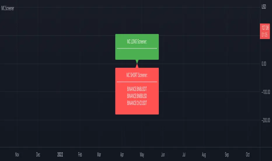
Market Cipher Screener
In recent years, the MarketCipher indicator has become more and more well-known. An expensive indicator that is suitable for trading crypto, but also stocks or Forex. The system works with already known indicators en scripts from Tradingview, but then merged into one working system. The large green and red circles play a major role in this. You can see these as buying or selling moments. I made a script that scans 40 tickers on those red and green circles, without having to buy MarketCipher. When a green or red circle is printed at MarketCipher, it also will appear in this screener. There is a green label for tickers that print a green circle and of course a red label for the tickers that print a red circle.
What's in the script?
- 40 cryptotickers are already included as standard. You can easily adjust this yourself via the wheel.
- Alerts when a new ticker meets the criteria
- The ability to move the labels so that you can load and side-by-side this script multiple times.
A few tips:
- Load the indicator multiple times to screen more tickers.
- The higher the timeframe, the more reliable the direction will be.
- Set an alert so you don't miss any opportunities.
Road map:
- Convert labels to table view.
- In the future table also implement the other components of MarketCipher.
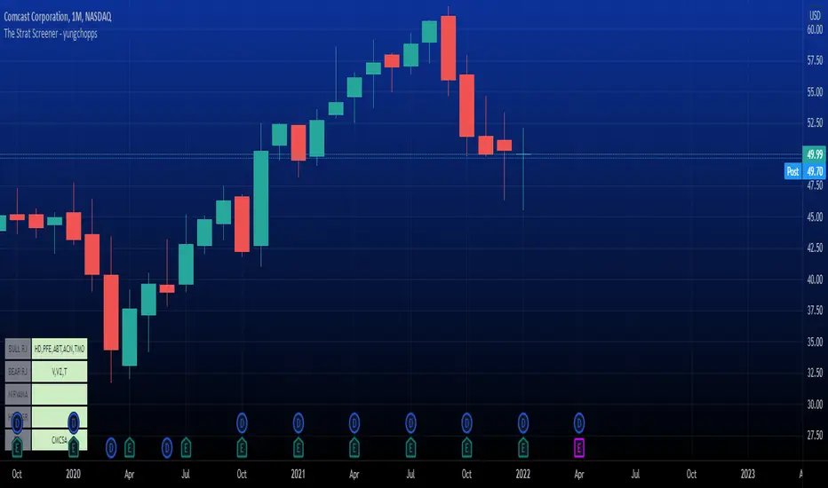
The Strat Screener - yungchoppsThis indicator scan up to 40 tickers of your choice for bullish and bearish Randy Jackson setups. Randy Jackson setups are 2u-2u-2d-2u for bullish cases and 2d-2d-2u-2d for bearish cases. If a ticker has a possible RJ setup, the ticker name will be display on the table depending if it is bullish or bearish. The only thing you need to do it change one of the default tickers to the ones you desire and the table will update if there are any RJ setups. The indicators search for RJ setups on the current timeframe that you are on.
Randy Jackson setups are part of the 'Strat' candlestick analysist. More information about the Strat can be found on the internet and YouTube. This indicator reads the previous candles of every selected ticker and searched for a RJ setup. If one exist, it will update the table with the tickers name. I will add more setups in the future.
This is a screener. This indicator really just makes it easier to scan many indicators at once. Its not hard to use... just place it on the chart and it will do the work for you. Hopefully mods find this enough of a description...
Multi-Symbol and Multi-Timeframe Supertrend Screener [Pineify]Multi-Symbol and Multi-Timeframe Supertrend Screener
Advanced Supertrend screener for TradingView that monitors 6 symbols across 4 timeframes simultaneously. Features customizable ATR periods, visual alerts, and color-coded trend direction displays for efficient market scanning.
Key Features
The Supertrend Screener is a comprehensive multi-symbol market monitoring tool that displays Supertrend indicator signals across multiple assets and timeframes in a single, organized table view. This screener eliminates the need to manually check individual charts by providing real-time trend analysis for up to 6 symbols across 4 different timeframes simultaneously.
How It Works
The screener utilizes the proven Supertrend indicator methodology, which combines Average True Range (ATR) and price action to determine trend direction. The core calculation involves:
Computing the ATR using a customizable period (default: 10)
Applying a multiplication factor (default: 3.0) to create dynamic support/resistance levels
Determining trend direction based on price position relative to these levels
Displaying results through color-coded cells with customizable text labels
The indicator employs the request.security() function to fetch data from multiple symbols and timeframes, ensuring accurate cross-market analysis without chart switching.
Trading Ideas and Insights
This screener excels in several trading scenarios:
Market Overview: Quickly assess overall market sentiment across major cryptocurrencies or forex pairs
Trend Confirmation: Verify trend alignment across multiple timeframes before entering positions
Divergence Spotting: Identify when shorter timeframes diverge from longer-term trends
Opportunity Scanning: Locate assets showing consistent trend direction across all monitored timeframes
Risk Management: Monitor multiple positions simultaneously to spot potential trend reversals
The screener is particularly effective for swing traders and position traders who need to monitor multiple assets without constantly switching between charts.
How Multiple Indicators Work Together
While this screener focuses specifically on the Supertrend indicator, it incorporates several complementary technical analysis components:
ATR Foundation: Uses Average True Range to adapt to market volatility, making the indicator responsive to current market conditions
Multi-Timeframe Analysis: Combines signals from 1-minute, 5-minute, 10-minute, and 30-minute timeframes to provide comprehensive trend perspective
Price Action Integration: The Supertrend calculation inherently incorporates price action by using high, low, and close values
Volatility Adjustment: The ATR-based calculation ensures the indicator adapts to different volatility regimes across various assets
The synergy between these elements creates a robust screening system that accounts for both momentum and volatility , providing more reliable trend identification than single-timeframe analysis.
Unique Aspects
Several features distinguish this screener from standard Supertrend implementations:
Table-Based Display: Presents data in an organized, space-efficient format rather than overlay plots
Customizable Visual Elements: Full control over text labels, colors, and background styling
Multi-Asset Capability: Monitors 6 different symbols simultaneously without performance degradation
Efficient Resource Usage: Optimized code structure minimizes calculation overhead
Professional Presentation: Clean, institutional-grade visual design suitable for trading desks
How to Use
Symbol Configuration: Input your desired symbols in the Symbol section (default includes major crypto pairs)
Timeframe Setup: Configure four timeframes for analysis (default: 1m, 5m, 10m, 30m)
Supertrend Parameters: Adjust the Factor (sensitivity) and ATR Period according to your trading style
Visual Customization: Set custom text labels and colors for up/down trends
Market Analysis: Monitor the table for consistent signals across timeframes and symbols
Interpretation Guide:
- Green cells indicate uptrend (price above Supertrend line)
- Red cells indicate downtrend (price below Supertrend line)
- Look for alignment across multiple timeframes for stronger signal confidence
Customization
The screener offers extensive customization options:
Factor Setting: Adjust sensitivity (higher values = less sensitive, fewer signals)
ATR Period: Modify lookback period for volatility calculation
Text Labels: Customize up/down trend display text
Color Scheme: Full RGB color control for text and background elements
Symbol Selection: Monitor any TradingView-supported symbols
Timeframe Array: Choose any four timeframes for comprehensive analysis
Conclusion
The Supertrend Screener transforms traditional single-chart analysis into an efficient, multi-dimensional market monitoring system. By combining the reliability of the Supertrend indicator with multi-timeframe and multi-symbol capabilities, this tool empowers traders to make more informed decisions with greater market context.
Whether you're managing multiple positions, scanning for new opportunities, or confirming trend direction before entries, this screener provides the comprehensive overview needed for professional trading operations. The clean interface and customizable features make it suitable for traders of all experience levels while maintaining the analytical depth required for serious market analysis.
Perfect for day traders, swing traders, and anyone requiring efficient multi-market trend monitoring in a single view.

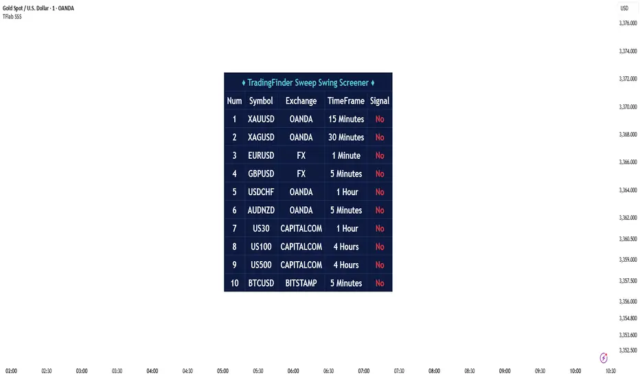
Sweep Swing Screener [TradingFinder]🔵 Introduction
Understanding how liquidity forms and how price reacts around key structural levels is essential for identifying precise, low-risk entry points. The Sweep Swing Screener is a specialized tool developed to continuously monitor market activity and detect liquidity sweeps, reaction zones, and valid confirmation candles across various trading instruments and timeframes.
This tool can be applied both to scan multiple symbols at once and to analyze all timeframes of a specific asset for potential reversal points. It begins by identifying a clear swing point, whether a swing high or a swing low, and then outlines a reaction zone between that level and either the highest or lowest value of the swing candle's open or close.
If the price revisits this zone, performs a liquidity grab, and prints an indecision candle like a doji or a narrow-bodied bar that closes within the zone, this may indicate a rejection of the level and the failure of a breakout attempt. At that moment, depending on the context, the screener may identify a bullish or bearish reversal and generate a corresponding Long or Short signal.
By emphasizing accurate entry timing, alignment with institutional order flow, and avoidance of common traps, this approach highlights market areas where liquidity engineering, reversal probability, and price inefficiency come together. As a result, the Sweep Swing Screener becomes a valuable part of any trader’s toolkit, particularly for those who rely on price action and liquidity logic to drive their decisions. It allows traders to focus on clean, actionable setups without getting lost in noise or misleading breakouts.
🔵 How to Use
The Sweep Swing Screener is designed to track market structure in real time and alert users when conditions for a potential reversal are present. Its methodology combines liquidity behavior with swing analysis and candle confirmation, all within predefined reaction zones.
To better understand this logic, consider a basic market flow where a swing high or low forms, followed by a return to that level. If the price sweeps the previous extreme and forms a confirming candle within the reaction zone, a signal is issued.
🟣 Long Signal
To identify a long setup, the screener looks for a valid swing low, often a level below which sell-side liquidity is likely to be clustered. Once found, it defines a reaction zone from the swing low to the lowest point between the candle’s open and close.
If the price returns to this area and creates a lower wick that extends beneath the swing low, the tool checks whether the price manages to close back inside the range, rejecting the breakdown. This indicates absorption of selling pressure and failure to sustain the move lower.
The screener then waits for a confirmation candle to appear. Typically, this is a doji or other small-bodied candle that closes inside the zone. If these conditions are met, the screener records a Long signal for that asset and, if enabled, sends a notification to alert the user.
🟣 Short Signal
For bearish setups, the screener begins by identifying a valid swing high, which usually marks a level where buy-side liquidity is concentrated. It then creates a reaction zone from the swing high to the highest point between the candle’s open and close.
When price returns to this level, sweeps above the swing high, and then fails to close higher, it may signal the presence of a bull trap and early exhaustion in the upward move.
A confirmation candle, usually a doji or a rejection bar that closes back within the zone, is then required. Once that occurs, the screener marks the asset with a Short signal and optionally sends a real-time alert to the user.
This type of setup helps highlight potential institutional sell zones, offering insight into where price is likely to reverse following a liquidity event.
🔵 Settings
🟣 Logical settings
Swing period : You can set the swing detection period.
Max Swing Back Method : It is in two modes "All" and "Custom". If it is in "All" mode, it will check all swings, and if it is in "Custom" mode, it will check the swings to the extent you determine.
Max Swing Back : You can set the number of swings that will go back for checking.
Maximum Distance Between Swing and Signal : The maximum number of candles allowed between the swing point and the potential signal. The default value is 50, ensuring that only recent and relevant price reactions are considered valid.
🟣 Display Settings
Table Size : Lets you adjust the table’s visual size with options such as: auto, tiny, small, normal, large, huge.
Table Position : Sets the screen location of the table. Choose from 9 possible positions, combining vertical (top, middle, bottom) and horizontal (left, center, right) alignments.
🟣 Symbol Settings
Each of the 10 symbol slots comes with a full set of customizable parameters :
Symbol : Define or select the asset (e.g., XAUUSD, BTCUSD, EURUSD, etc.).
Timeframe : Set your desired timeframe for each symbol (e.g., 15, 60, 240, 1D).
🟣 Alert Settings
Alert : Enables alerts for SSS.
Message Frequency : Determines the frequency of alerts. Options include 'All' (every function call), 'Once Per Bar' (first call within the bar), and 'Once Per Bar Close' (final script execution of the real-time bar). Default is 'Once per Bar'.
Show Alert Time by Time Zone : Configures the time zone for alert messages. Default is 'UTC'.
🔵 Conclusion
The Sweep Swing Screener provides a systematic method for identifying potential reversal zones by combining price structure, liquidity behavior, and candle-based confirmation. In markets that are often noisy and full of failed breakouts, focusing on these three elements helps clarify directional bias and supports more confident decision-making.
With the ability to scan multiple symbols and timeframes efficiently, this tool allows traders to stay focused on high-quality setups without the need to manually sift through dozens of charts. The inclusion of optional alerts further enhances its utility by offering timely updates when criteria are met.
By moving away from reactive strategies and toward structural anticipation, this screener supports traders who align their methods with institutional logic and the mechanics of smart money.
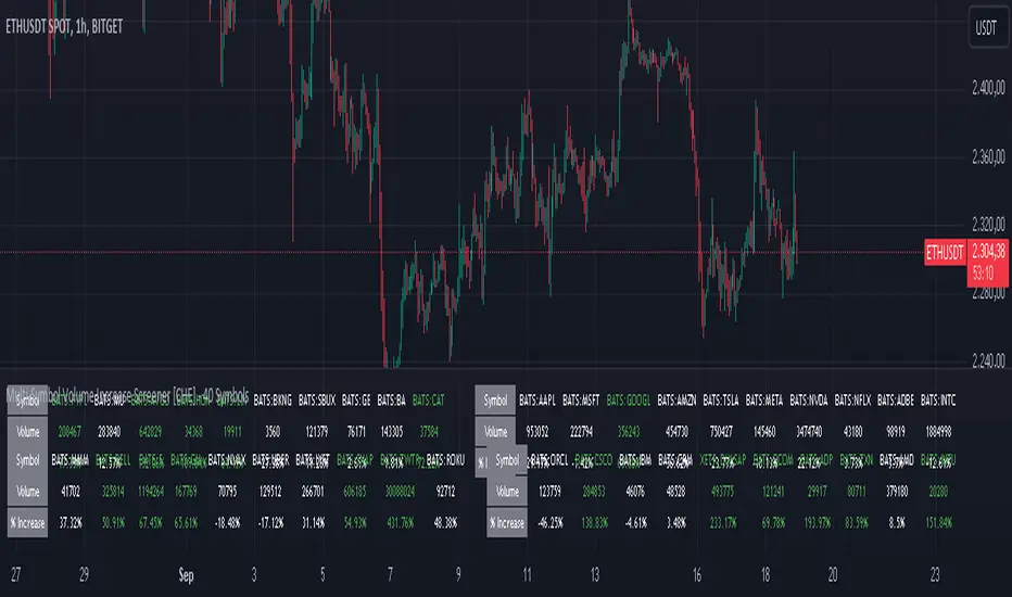
Multi-Symbol Volume Increase Screener [CHE] MultiSymbol Volume Increase Screener
Designed for TradingView
Presented by Chervolino
Introduction
Welcome to the presentation of the MultiSymbol Volume Increase Screener—a powerful tool designed to enhance your trading strategy on TradingView. Developed at the request of jscott143, this screener provides traders with realtime insights into significant volume movements across multiple symbols, enabling more informed and timely trading decisions.
Purpose and Objectives
Identify HighVolume Opportunities: Detect symbols experiencing a significant increase in volume compared to their historical average.
Monitor Multiple Symbols Simultaneously: Efficiently track up to five symbols in one view.
RealTime Alerts: Receive instant notifications when predefined volume conditions are met.
Comprehensive Overview: Display volume data and percentage increases in an organized table for easy analysis.
Key Features
1. MultiSymbol Monitoring
Track up to five different symbols simultaneously.
Customize the list of symbols based on your trading portfolio.
2. Volume Analysis
Compare current candle volume against the average volume over a specified period.
Calculate and display the percentage increase in volume.
3. RealTime Alerts
Set a volume increase multiplier (e.g., 1.5x) to trigger alerts.
Receive alerts via email, popup, or SMS when conditions are met.
4. UserFriendly Table Display
View symbols, their current volume, and percentage increase in a clear, concise table.
Colorcoded indicators highlight significant volume changes.
5. Customizable Parameters
Adjust the average volume period to suit different trading strategies.
Set your preferred volume increase multiplier for alerts.
How It Works
1. User Inputs:
Symbols Selection: Choose up to five symbols you wish to monitor.
Average Volume Period: Define the number of bars over which the average volume is calculated (default is 20).
Volume Increase Multiplier: Set the threshold for volume increase to trigger alerts (default is 1.5x).
2. Volume Calculation:
The screener fetches the current volume and calculates the simple moving average (SMA) of volume over the defined period for each symbol.
It then determines if the current volume exceeds the average volume by the specified multiplier.
3. Data Display:
A table is generated on the chart displaying each symbol, its current volume, and the percentage increase.
Green text indicates that the volume increase condition has been met.
4. Alert Generation:
When a symbol's current volume surpasses the average volume by the set multiplier, an alert is triggered.
Alerts are customizable and can be set to notify you through various channels.
Benefits
Enhanced DecisionMaking: Quickly identify highvolume trading opportunities across multiple assets.
Time Efficiency: Monitor several symbols without the need to switch between charts.
Proactive Trading: Stay informed with realtime alerts, allowing for timely trading actions.
Customization: Tailor the screener settings to align with your unique trading strategies and preferences.
Setup Instructions
1. Add the Screener to TradingView:
Navigate to TradingView and open the Pine Editor.
Add the MultiSymbol Volume Increase Screener indicator to your chart.
Save and apply the indicator.
2. Configure User Inputs:
Select up to five symbols you wish to monitor in the input fields "Symbol 1" to "Symbol 5".
Adjust the "Average Volume Period" and "Volume Increase Multiplier" as needed.
3. Set Up Alerts:
Click on the Alarm icon (🔔) in the TradingView toolbar.
In the "Condition" dropdown, select the "MultiSymbol Volume Increase Screener".
Choose the specific alert condition for each symbol (e.g., "Volume Increase Alert for Symbol 1").
Configure the alert actions (e.g., email, popup, SMS) and click "Create".
Repeat this process for each symbol you wish to monitor.
Visual Demonstration
Table Display Example:
| Symbol | Volume | % Increase |
| AAPL | 150,000 | 50.00% |
| MSFT | 120,000 | 20.00% |
| GOOGL | 180,000 | 80.00% |
| AMZN | 130,000 | 30.00% |
| TSLA | 160,000 | 60.00% |
Green Text: Indicates that the volume increase condition has been met for that symbol.
Alert Notification Example:
```
🚀 Symbol 1 shows a volume increase!
```
Note: Replace "Symbol 1" with the actual symbol as per your configuration.
Customization Options
Increase the Number of Symbols:
While the current screener monitors five symbols, it can be extended to monitor more by adding additional input fields and corresponding calculations. However, be mindful of TradingView's Pine Script limitations and potential performance impacts.
Adjust Volume Period and Multiplier:
Tailor the "Average Volume Period" and "Volume Increase Multiplier" to align with your specific trading strategies and market conditions.
Enhance Table Information:
Incorporate additional data points such as current price, price change percentage, or other technical indicators to enrich your analysis.
Benefits of Using the Screener
Efficiency: Saves time by providing a consolidated view of multiple symbols' volume activity.
Proactive Trading: Enables you to act swiftly on significant volume movements, which often precede price changes.
DataDriven Decisions: Facilitates informed trading decisions based on realtime volume analysis.
Customization: Offers flexibility to adapt the screener to various trading styles and preferences.
Conclusion
The MultiSymbol Volume Increase Screener is an invaluable tool for traders looking to capitalize on significant volume movements across multiple assets. Developed at the request of jscott143, this screener integrates seamlessly with TradingView, providing realtime insights and alerts to enhance your trading strategy.
Q&A
Feel free to ask any questions or request further customization to better suit your trading needs.
Contact Information
Created for: jscott143
Thank you for your attention!
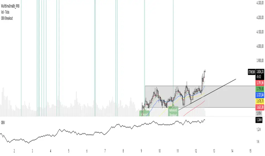
OBV Breakout Screener (By Tarso)1. Purpose of the Indicator
The "Advanced OBV Breakout Screener" is a specialized tool designed to find a powerful bullish signal. It scans for assets where buying pressure is increasing significantly, even though the price has not yet broken out.
The core strategy is to identify assets where:
Volume is leading Price: The On-Balance Volume (OBV) has already broken its recent high.
Price is still contained: The asset's price has not yet broken its recent high.
This setup helps you find potential trading opportunities right before a possible upward move.
2. How to Set Up the Indicator
First, you need to add the script to your TradingView account.
Open any chart on TradingView.
Click on the "Pine Editor" tab at the bottom of the screen.
Delete any existing code and paste the entire "Advanced OBV Breakout Screener" script into the editor.
Click "Add to chart". The indicator will now appear in a separate panel below your main price chart.
3. How to Use it with the Pine Screener (Step-by-Step)
This is the main purpose of the indicator. The script does all the complex analysis and provides a simple "1" (Signal is ON) or "0" (Signal is OFF). You only need to set up one filter.
Open the Stock Screener (or Crypto/Forex Screener).
Click the Filters button to open the settings panel.
Ensure you are on the Pine Screener tab (this allows you to filter using custom indicators).
In the indicator selection menu (it might say "Select Indicator..."), find and choose Advanced OBV Breakout Screener from your list.
Now, configure the single filter condition as follows:
In the first box, select Advanced Breakout Signal.
In the second box, select Equal to.
In the third box, select Number and type 1.
Your filter setup should look clean and simple, like this:
That's it! The screener will now display a list of all assets that currently meet the "Advanced Breakout" criteria for the timeframe you have selected (e.g., Daily, 4h, 1h).
4. Configuring the Lookback Period
By default, the indicator analyzes the last 20 periods. If you want to change this (for example, to scan for breakouts over 50 days), you must adjust it in the indicator's settings on your chart.
Go back to your chart view.
Find the "Advanced OBV Breakout Screener" panel.
Click the Settings icon (⚙️) next to the indicator's name.
In the "Inputs" tab, change the "Lookback Period (days)" to your desired value.
Click "OK".
The Pine Screener will automatically use this new setting for its market scan.
5. Understanding the On-Chart Visuals
When you add the indicator to your chart, you will see:
Blue Line: This is the On-Balance Volume (OBV).
Red Stepped Line: This represents the highest value the OBV has reached during the lookback period. A breakout happens when the blue line moves above this red line.
Green Triangle (▲): This symbol appears below a price candle whenever the full "Advanced Breakout" condition (OBV breakout + Price containment) is met, giving you a clear visual confirmation.
Ultimate Stock Trend & Liquidity Screener1. Overview & Originality
This script is a comprehensive, all-in-one screening tool designed to identify high-quality, trend-following opportunities in global stock markets. Its originality lies in combining seven distinct logical checks—spanning liquidity, trend, momentum, and volatility—into a single, cohesive framework.
www.tradingview.com
The script's core innovation is its "Total Score" system. This feature moves beyond simple binary filtering by quantifying how well a stock meets the ideal criteria for a tradable trend. This allows you to rank entire watchlists to find the most promising candidates, not just the ones that meet a minimum threshold.
Designed for full integration with the TradingView ecosystem, the script outputs all individual conditions and the Total Score as separate columns in the Pine Screener, enabling deep and flexible market analysis.
2. Core Concepts & How It Works
Built on the classic principles of trend-following, this screener validates potential trades against a robust checklist. The default parameters are tuned for stock market analysis, using standard lookback periods like the 50 and 200-day moving averages.
The script systematically checks for:
Liquidity: Guarantees the stock is actively traded by filtering for minimum daily dollar volume (turnover) and a healthy 30-day average volume, which is critical for good execution.
Trend Confirmation: Employs the classic 50/200 Simple Moving Average "golden cross" structure to confirm a healthy, long-term uptrend.
Trend Quality: Includes an optional filter to verify that the long-term 200-day SMA is actively sloping upwards, ensuring the underlying trend has momentum.
Trend Strength: Uses the Average Directional Index (ADX) to filter out weak or sideways markets, focusing only on stocks in a strong, established trend.
Momentum: Confirms the trend is supported by sustained buying pressure by checking that the Relative Strength Index (RSI) is in a bullish regime (above 50).
Volatility: Requires a minimum level of volatility using the Average True Range (ATR) as a percentage of the price, ensuring the stock has enough movement to be tradable.
Strategic Entry: Offers a user-selectable "Entry Mode" to fit different trading styles:
Breakout Mode: Identifies stocks hitting new highs on a surge of volume.
Pullback Mode: Finds stocks already in a strong uptrend that are experiencing a healthy dip to a short-term moving average.
3. How to Use This Script
This indicator is designed for two primary workflows:
Single-Stock Analysis: Apply the script to any stock chart to see a detailed diagnostic table in the bottom-right corner. This table provides a real-time checklist for all 7 conditions and the Total Score.
Full Market Screening (Recommended):
Open the Stock Screener on TradingView.
Click "Filters" and select this script from the Pine Screener menu.
Click the "Columns" button and add the new columns generated by this script ("Total Score," "Liquidity OK," etc.).
You can now sort your entire watchlist by "Total Score" to find the best candidates or filter for stocks that meet a minimum score (e.g., Total Score > 5 ).
4. Inputs & Customization
All parameters are fully customizable in the script's "Settings" menu. You can easily adjust moving average lengths, thresholds, and lookback periods to tailor the screener to your specific strategy, timeframe, or market.
5. Disclaimer
This tool is for educational and analytical purposes only. It is not financial advice and does not guarantee any specific outcome or profit. Past performance is not indicative of future results. Always use this screener as part of a complete trading plan that includes your own analysis and risk management.

Mondays Range screener by B1rdIntroducing the long awaited Monday Range Screener by B1rd!
The Monday Range Screener is a powerful and intuitive indicator designed to help traders identify potential range trading opportunities based on Monday's price ranges. With user-friendly features and real-time data, this screener empowers you to make informed trading decisions.
Key Features:
Ticker Flexibility: The screener allows you to easily swap tickers, giving you the freedom to monitor and analyze multiple assets of your choice.
Comprehensive Information: The indicator displays essential data in a clear and organized manner. The left column shows the ticker symbol, followed by the current price, Monday's high, Monday's low, and Monday's average in the subsequent columns.
Range Trading Highlighting: The Monday Range Screener highlights the current price when it falls within Monday's high and low range, helping you quickly identify potential range trading opportunities.
Alert System: With the built-in alert feature, you can receive timely notifications whenever the current price enters Monday's high or low range. Stay on top of market movements even when you're away from the screen.
Get ready to take your trading to the next level with the Monday Range Screener by B1rd. This reliable indicator helps you identify range trading opportunities and stay informed about Monday's price ranges. Enhance your trading approach and make confident decisions using this powerful tool.
Important note: Please be aware that there is a known bug in certain chart layouts that may cause an array error and prevent the table from being plotted. The cause of this issue is unclear at the moment. However, based on my experience, there are a few potential solutions that you can try:
Set all the sources to a single asset, such as BTCUSDT. If this workaround works, you can gradually introduce new sources one by one and observe if the issue persists.
Experiment with different chart layouts, timeframes, and assets. Sometimes, applying the Monday Range Screener to alternative settings can help resolve the problem.
I apologize for any inconvenience this bug may cause. Please consider these workarounds as temporary solutions until a more permanent resolution can be found.
Original indicator this screener is based on:
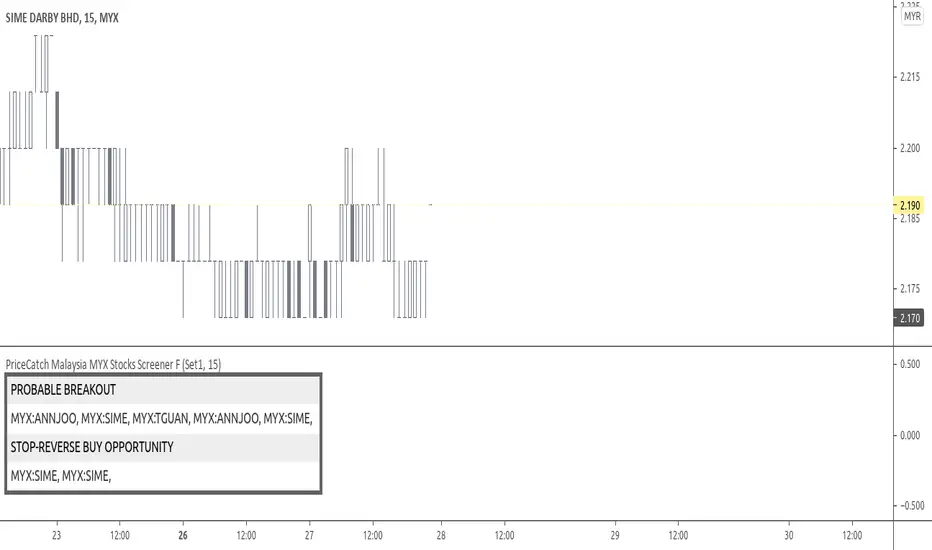
PriceCatch Malaysia MYX Stocks Screener FHi,
Tradingview community and Malaysian MYX Traders. Warm Greetings.
Malaysia MYX Stocks Screener
I am sharing a script that screens Malaysia MYX stocks for Probable Breakout Buy signal and Stop-Reverse Buy Signal. This script may prove to be useful to traders who trade Malaysia MYX listed stocks.
I have already shared the script "PriceCatch Signals Buy Signals" that marks the following levels on the chart.
Probable Breakout Buy Level
Stop-Reverse Buy Level
While the script "PriceCatch Signals Buy Signals" can be used independently, this script is intended to be used with the script "PriceCatch Signals Buy Signals".
Used together, these two scripts may help you identify probable buy opportunities. The purpose of this script is to help screen stocks quickly without manually going through every stock in your watch list.
Please read the Notes of the script "PriceCatch Signals Buy Signals" for explanation of its functionality.
Stock Set
This Free screener scans a list of 20 stocks. The full version scans a list of 60 stocks. The stocks list will be regularly updated. Care has been taken to include liquid stocks. MYX traders may suggest liquid stocks for inclusion in full version.
Chart resolution vs. Script resolution
I have noticed that if the chart resolution is set to 15 minutes time-frame and the screener resolution is selected as 2 Hours, then the results are correct. However, if the screener resolution is set to 5 minutes, then the results are not accurate. This is not an issue with script. So scanning higher time-frames from a lower time-frame chart works better. My advice however, is better to set the chart resolution to the same interval as screener resolution for sure results.
As usual with price action, longer time-frames produce more reliable signals.
CHART
You can have any stock on your chart, while the screener is scanning the stocks independently. In the above image, chart is set to 45 minutes time frame and stock is ABMB, however screener is screening stocks in 120 minutes time frame and has found GTRONIC.
NOTE - PRIOR TO USING THIS SCRIPT:
Please remember that the script is shared with absolutely no assurances about usability and any warranties whatsoever and as a responsible trader, please satisfy yourselves thoroughly and use it only if you are satisfied it works for you. Remember, you are 100% responsible for your actions. If you understand and accept that, you may use the script.
QUERIES/FEEDBACK
Please PM me.
Regards to all and wish everyone all the best with trading.
Pristine Adaptive Alpha ScreenerThe Pristine Adaptive Alpha Screener allows users to screen for all of the trading signals embedded in our premium suite of TradingView tools🏆
▪ Pristine Value Areas & MGI - enables users to perform comprehensive technical analysis through the lens of the market profile in a fraction of the time!
▪ Pristine Fundamental Analysis - enables users to perform comprehensive fundamental stock analysis in a fraction of the time!
▪ Pristine Volume Analysis - organizes volume, liquidity, and share structure data, allowing users to quickly gauge the relative volume a security is trading on, and whether it is liquid enough to trade
💠 How is this Screener Original?
▪ The screener allows users to screen for breakouts, breakdowns, bullish and bearish trend reversals, and allows users to narrow a universe of stocks based purely on fundamentals, or purely on technicals. One screening tool to support an entire technofundamental workflow!
💠 Signals Overview
Each of the below signals serves one of two purposes:
1) A pivot point to be used as a long or short entry
2) A tool for narrowing a universe of stocks to a shorter list of stocks that have a higher potential for superperformance
▪ HVY(highest volume in a year) -> Featured in Pristine Volume Analysis -> Entry signal
▪ Trend Template -> Inspired by Mark Minervini's famous trend filters -> Tool for narrowing a universe of stocks to a shorter list with a higher potential for superperformance
▪ Rule of 100 -> Metrics from Pristine Fundamental Analysis -> Tool for narrowing a universe of stocks to a shorter list with a higher potential for superperformance
▪ Bullish 80% Rule -> Featured in Pristine Value Areas & MGI -> Long entry signal -> Trend Reversal
▪ Bearish 80% Rule -> Featured in Pristine Value Areas & MGI -> Short entry signal -> Trend Reversal
▪ Break Above VAH -> Featured in Pristine Value Areas & MGI -> Long entry signal -> Trend Continuation
▪ Break Below VAL -> Featured in Pristine Value Areas & MGI -> Short entry signal -> Trend Continuation
💠 Signals Decoded
▪ HVY(highest volume in a year)
Volume is an important metric to track when trading, because abnormally high volume tends to occur when a new trend is kicking off, or when an established trend is hitting a climax. Screen for HVY to quickly curate every stock that meets this condition.
▪ Trend Template
Mark Minervini's gift to the trading world. Via his book "Think and Trade Like a Stock Market Wizard". Stocks tend to make their biggest moves when they are already in uptrends, and the Minervini Trend template provides criteria to assess whether a stock is in a clearly defined uptrend. Filter for trend template stocks using our tool.
▪ Rule of 100
Pristine Capital's gift to the trading world. The rule of 100 filters for stocks that meet the following condition: YoY EPS Growth + YoY Sales Growth >= 100%. Stocks that meet this criteria tend to attract institutional investors, making them strong candidates for swing trading to the long side.
💠 Market Profile Introduction
A Market Profile is a charting technique devised by J. Peter Steidlmayer, a trader at the Chicago Board of Trade (CBOT), in the 1980's. He created it to gain a deeper understanding of market behavior and to analyze the auction process in financial markets. A market profile is used to analyze an auction using price, volume, and time to create a distribution-based view of trading activity. It organizes market data into a bell-curve-like structure, which reveals areas of value, balance, and imbalance.
💠 How is a Value Area Calculated?
A value area is a distribution of 68%-70% of the trading volume over a specific time interval, which represents one standard deviation above and below the point of control, which is the most highly traded level over that period.
The key reference points are as follows:
Value area low (VAL) - The lower boundary of a value area
Value area high (VAH) - The upper boundary of a value area
Point of Control (POC) - The price level at which the highest amount of a trading period's volume occurred
If we take the probability distribution of trading activity and flip it 90 degrees, the result is our Pristine Value Area!
Market Profile is our preferred method of technical analysis at Pristine Capital because it provides an objective and repeatable assessment of whether an asset is being accumulated or distributed by institutional investors. Market Profile levels work remarkably well for identifying areas of interest, because so many institutional trading algorithms have been programmed to use these levels since the 1980's!
The benefits of using Market Profile include better trade location, improved risk management, and enhanced market context. It helps traders differentiate between trending and consolidating markets, identify high-probability trade setups, and adjust their strategies based on whether the market is in balance (consolidation) or imbalance (trending). Unlike traditional indicators that rely on past price movements, Market Profile provides real-time insights into trader behavior, giving an edge to those who can interpret its nuances effectively.
▪ Bullish 80% Rule
If a security opens a period below the value area low , and subsequently closes above it, the bullish 80% rule triggers, turning the value area green. One can trade for a move to the top of the value area, using a close below the value area low as a potential stop!
In the below example, HOOD triggered the bullish 80% rule after it reclaimed the monthly value area!
HOOD proceeded to rally through the monthly value area and beyond in subsequent trading sessions. Finding the first stocks to trigger the bullish 80% rule after a market correction is key for spotting the next market leaders!
▪ Bearish 80% Rule
If a security opens a period above the value area high , and subsequently closes below it, the bearish 80% rule triggers, turning the value area red. One can trade for a move to the bottom of the value area, using a close above the value area high as a potential stop!
ES proceeded to follow through and test the value area low before trending below the weekly value area
▪ Break Above VAH
When a security is inside value, the auction is in balance. When it breaks above a value area, it could be entering a period of upward price discovery. One can trade these breakouts with tight risk control by setting a stop inside the value area! These breakouts can be traded on all chart timeframes depending on the style of the individual trader. Combining multiple timeframes can result in even more effective trading setups.
RBLX broke out from the monthly value area on 4/22/25👇
RBLX proceeded to rally +62.78% in 39 trading sessions following the monthly VAH breakout!
▪ Break Below VAL
When a security is inside value, the auction is in balance. When it breaks below a value area, it could be entering a period of downward price discovery. One can trade these breakdowns with tight risk control by setting a stop inside the value area! These breakouts can be traded on all chart timeframes depending on the style of the individual trader. Combining multiple timeframes can result in even more effective trading setups.
CHWY broke below the monthly value area on 7/20/23👇
CHWY proceeded to decline -53.11% in the following 64 trading sessions following the monthly VAL breakdown!
💠 Metric Columns
▪ %𝚫 - 1-day percent change in price
▪ YTD %𝚫 - Year-to-date percent change in price
▪ MTD %𝚫 - Month-to-date percent change in price
▪ MAx Moving average extension - ATR % multiple from the 50D SMA -Inspired by Jeff Sun
▪ 52WR - Measures where a security is trading in relation to it’s 52wk high and 52wk low. Readings near 100% indicate close proximity to a 52wk high and readings near 0% indicate close proximity to a 52wk low
▪ Avg $Vol - Average volume (50 candles) * Price
▪ Vol RR - Candle volume/ Avg candle volume
💠 Best Practices
Monday -> Friday Post-market Analysis
1) Begin with a universe of stocks. I use the following linked universe screen as a starting point: www.tradingview.com
2) Screen for the HVY signal -> Add those stocks to a separate flagged (colored) watchlist
3) Screen for the Bullish 80% Rule signal -> Add those stocks to a separate flagged (colored) watchlist
4) Screen for the Break Above VAH Signal -> Add those stocks to a separate flagged (colored) watchlist
5) Screen for the Break Below VAL Signal -> Add those stocks to a separate flagged (colored) watchlist
6) Screen for the Bearish 80% Rule Signal -> Add those stocks to a separate flagged (colored) watchlist
7) Screen for the Bearish 80% Rule Signal -> Add those stocks to a separate flagged (colored) watchlist
8) Screen for the Trend Template Signal -> Add those stocks to a separate flagged (colored) watchlist
9) Toggle through each list and analyze each stock chart using the Supercharts tool in TradingView
10)Record the number of stocks in each list as a way of analyzing market conditions
Weekend Analysis
1) Begin with a universe of stocks. I use the following linked universe screen as a starting point: www.tradingview.com
2) Screen for the Rule of 100 Signal. Use this as a starting point for deeper fundamental and/or thematic and/or technical research
3) Screen for stocks that meet specific performance thresholds, such as YTD %𝚫 > 100% etc
💠 Get Creative
▪Users have the ability to layer signals on top of each other when screening. To do so, filter for a signal, and then filter your new list by another signal! Play around with the screener, and find what works best for you!

Up On Volume Screener [LevelUp]The Up On Volume Screener is a powerful scanner designed to identify stocks exhibiting strong bullish momentum, characterized by a higher close on the day or week accompanied by a significant spike in trading volume compared to the average. This screener allows traders to customize parameters such as moving average lengths, closing range requirements, and proximity to 52-week highs using multiples of the ATR (average true range).
By pinpointing stocks with robust buying pressure and high volume, the Up On Volume screener helps traders uncover potential breakout opportunities, early trend leaders, and stocks demonstrating relative strength, making it an essential tool for momentum, swing, and growth trading strategies.
🔹 Why Search For Up On Volume?
▪ Confirmation of Bullish Momentum: Stocks that close higher on the day/week signal buying pressure and bullish sentiment throughout the session. This helps traders and investors identify names that are attracting demand, possibly due to news, earnings, or sector strength.
▪ Volume Adds Conviction: When a stock closes up with increased volume, it suggests strong participation behind the move — not just a “head fake” or a thinly traded rally. High volume confirms that institutional players or multiple market participants are involved, which often leads to more reliable price trends.
▪ Early Stage Moves: Daily breakouts can often mark the beginning of a larger trend. Catching stocks on days they close up helps pinpoint emerging leaders and stocks transitioning from accumulation to bullish phases.
▪ Technical Strength: A bullish close (especially in the top half of the day’s price range) is a technical sign of demand. This is a favored criterion in many technical analysis strategies for swing trading, momentum trading, and even fundamental breakouts.
🔹 When Is Up On Volume Screen Most Helpful?
▪ After Market Close: Stocks that show strength and close up on high volume often show continued follow-through in the coming days/weeks.
▪ After Major News/Events: When stocks respond positively to news releases, earnings, or sector movements, searching for those that close up can help you catch momentum before it’s widely recognized.
▪ Trend Days: On days when the market is trending (not sideways or choppy), screening for stocks closing up helps you align with the strongest moves and avoid false signals.
▪ Early in Bullish Cycles: Searching for stocks closing up during the early stage of a market rally or sector rotation can help growth traders get in ahead of sustained upward moves.a
▪ Relative Strength Signals True Leadership: When most stocks decline in a weak market, those that hold firm or rise are showing clear relative strength. This means buyers are stepping in even when the broader mood is negative, often signaling institutional accumulation — these are the names likely to become tomorrow’s winners.
▪ Early Clues to New Cycles: Throughout history, the biggest winners in bull markets often began their runs during corrections and bear phases, not after the headlines turn positive. By focusing on stocks that close green on red days, you’re hunting for companies quietly building buying pressure, poised to break out when the tide turns.
▪ Faster Recoveries and Outperformance: Stocks that resist declines tend to rebound earlier and outpace the broader market once conditions improve. These resilient names frequently end up delivering outsized returns, often leading sector rallies or driving new market themes.
🔹 Screening Features - Setting Your Search Criteria
There are various search options that can be customized.
✓ Volume Gap Up %: Minimum volume percent change over the average volume.
✓ Moving Average: Set length for average volume calculations on daily and weekly timeframes.
✓ Closing Range %: Specify the preferred closing range on the day or week.
✓ Price With X ATR of 52-Week High: Filter for stocks within X ATRs of their 52-week highs.
🔹 Installation And Usage
▪ Mark this indicator as a Favorite.
▪ Use the Pine Screener to search for stocks.
▪ Save the search results to a watchlist.
▪ View the watchlist in TradingView.
🔹 Note
Some high-volume breakout scans rely on proprietary formulas. With this screener, every filter can be researched and verified - no black box! The only variables are price, volume % change, closing range and price within a specified ATR of the 52-week high.

Memecoin Screener | QuantumResearchMemecoin Screener | QuantumResearch
🚀 Overview
The Memecoin Screener is a specialized multi-asset relative strength tool designed to track, compare, and rank up to 10 different memecoins in real-time. Built for degens and serious meme investors alike, this screener goes beyond price action—analyzing inter-asset relative momentum using a proprietary ARSI-based strength scoring system.
Whether you're flipping $FARTCOIN or rotating between SEED_DONKEYDAN_MARKET_CAP:BONK , SEED_WANDERIN_JIMZIP900:WIF , or $BUTTHOLE, this tool will help you uncover which meme coin leads the pack—and which ones are fading into irrelevance.
🧩 1. Key Features
📊 Relative Strength Matrix
Each selected memecoin is compared against all others using ARSI. This creates a matrix of performance relationships between tokens, highlighting dominance and weakness.
🏆 Dynamic Ranking System
Every coin is scored based on its aggregate relative strength across the group, then ranked from strongest to weakest. The higher the score, the more dominant the token is across the pack.
🎯 Allocation Recommendations
Choose your allocation style—Aggressive, Mixed, or Conservative—and let the screener automatically assign exposure percentages to the top-ranked assets based on your risk profile.
Aggressive allocation
Mix allocation
Conservative allocation
🖥 Visual Screener Table
A clean, color-coded table tracks ✔︎ wins and ✘ losses in pairwise comparisons, shows total strength scores, ranks, and allocation recommendations—all at a glance.
🎨 Customizable Color Modes & UI Positioning
Choose from 8 stylish color palettes and 9 screen positions for the screener table. Tailor the visual layout to your trading workflow.
🧠 How It Works
1️⃣ Pairwise Strength Comparison
Each token is compared to every other token using the formula:
tokenX / tokenY → ARSI → strength score
2️⃣ Score Aggregation
The individual strength scores from all pairwise comparisons are summed to produce a final score for each token.
3️⃣ Ranking & Allocation
Scores are sorted and ranked. Based on the selected allocation mode, exposure is then recommended across the Top 3 coins only.
📈 Use Cases
🔍 Memecoin Rotation Strategy
Stay in the strongest trends and rotate out of weak ones using leaderboard-driven allocation.
⚔️ Long/Short Relative Plays
Go long the top-ranked coin and short the bottom-ranked one for a hedged memecoin momentum strategy.
📊 Group Sentiment Heatmap
Use the table to visually assess which assets are gaining or losing strength over time.
🎒 Position Sizing Guide
Let the allocation module assist you in determining where and how much to allocate, especially when flipping high-risk coins.
💡 Who Is This For?
✅ Degen Traders flipping microcaps and memes
✅ Solana memecoin fans tracking top performers
✅ Systematic traders looking for structured rotation
✅ Anyone seeking clarity in chaos during volatile market cycles
⚠️ Disclaimer
This tool is designed for informational purposes and does not constitute financial advice. Memecoins are volatile and highly speculative assets. Always perform your own due diligence and apply proper risk management.
Follow QuantumResearch for more alpha-driven tools that blend meme culture with advanced technical frameworks.
🧪 Meme smarter. Rotate faster. Survive longer.
Extreme Areas with MTF Screener by QTX Algo SystemsStatistically Extreme Areas with MTF Screener by QTX Algo Systems
Overview
This indicator is designed to automatically highlight zones where prices become statistically overextended, signaling potential reversal opportunities. Enhanced with a Multi Time Frame (MTF) Screener, it verifies these extremes across several timeframes for a comprehensive, multi-dimensional view of market conditions.
How It Works
Baseline Statistical Analysis:
The indicator establishes a baseline price range using historical data through a statistical percentile approach. This baseline reflects typical price extremes over time.
Volatility and Momentum Filters:
It incorporates a Bollinger Band Width Percentile (BBWP) to measure real-time volatility and combines this with a double‐smoothed SMI and a Price – Moving Average Ratio (PMARP) to assess short-term momentum. This dual-filter system ensures that signals are generated only when both volatility and momentum conditions are satisfied.
Directional Oscillator (BBO) Analysis:
A Bollinger Band Oscillator (BBO) is used to evaluate the slopes of the upper and lower bands, adding an extra layer of confirmation for identifying true market extremes.
MTF Screener Integration:
The added MTF Screener scans multiple timeframes, confirming that the statistically extreme conditions are not isolated events. This cross-verification provides a more robust signal, ensuring that the identified reversal zones are consistent across the market.
Customizable Visual Alerts:
The indicator allows for customizable color coding for various conditions (e.g., extreme low warnings, extreme high warnings, and potential reversals), offering clear, visual guidance for traders.
Why It’s Different and Valuable
This tool is more than just a simple merger of common indicators—it’s a carefully integrated system that validates price extremes across several dimensions. By combining statistical analysis with real-time volatility, momentum verification, and multi-timeframe confirmation, it provides a dynamic framework that helps traders identify high-probability reversal zones while minimizing false signals. The added MTF Screener ensures that these signals are consistent and reliable across different market views, enhancing the overall decision-making process.
How to Use
Monitor Visual Cues: Look for the color-coded signals that indicate statistically extreme price levels.
Confirm Across Timeframes: Use the MTF Screener component to ensure that the extreme conditions appear consistently across various timeframes.
Integrate with Your Strategy: Use this indicator alongside other technical tools to refine entry, exit, and stop-loss decisions.
Disclaimer
This indicator is for educational purposes only and is intended to support your trading analysis. It does not guarantee performance, and past results are not indicative of future outcomes. Always use proper risk management and conduct your own analysis before trading.

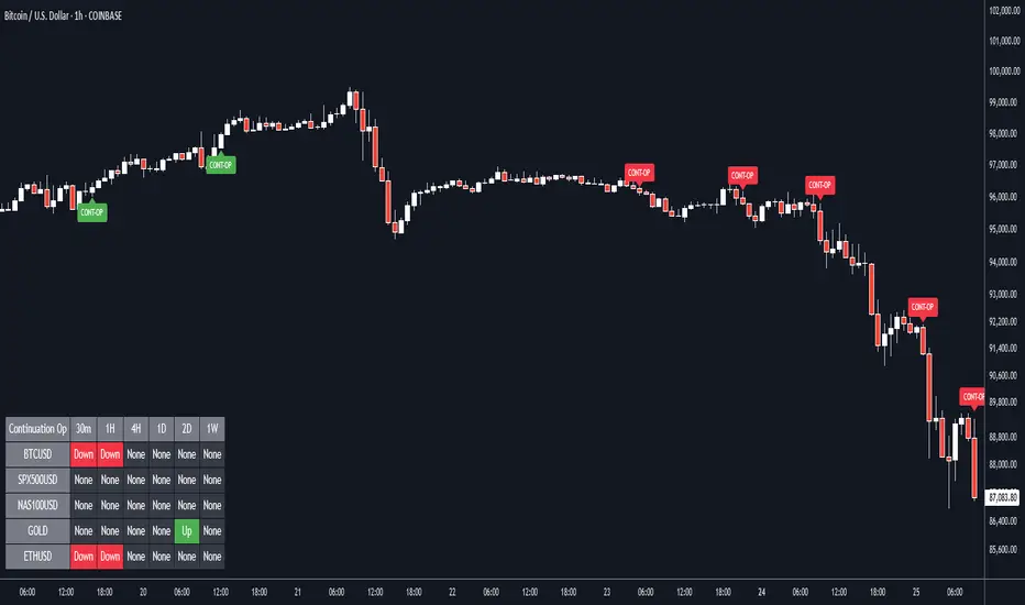
Continuation Opportunity with MTF Screener by QTX Algo SystemsContinuation Opportunity Indicator with MTF Screener by QTX Algo Systems
Overview
This enhanced indicator is designed to pinpoint key moments when an established trend is likely to continue. By combining traditional momentum analysis with dual volatility measures—and now integrating a powerful Multi Time Frame (MTF) Screener—it offers a multi-dimensional view of trend behavior. This tool not only detects when a pullback is simply a temporary consolidation (characterized by reduced volatility) but also confirms that the overall trend is poised to resume, validated across several timeframes.
How It Works
Core Methodology:
The base indicator uses a double‐smoothed Stochastic Momentum Index (SMI) combined with a Price – Moving Average Ratio (PMARP) to detect momentum crossovers that signal trend continuation. It also uses volatility filters to ensure that the signals occur only when market activity is strong.
Dual Volatility Analysis:
A Bollinger Band Width Percentile (BBWP) measure and historical volatility metrics work together to ensure that only meaningful pullbacks trigger signals—distinguishing between noise and genuine consolidation.
MTF Screener Integration:
The new MTF Screener feature extends the analysis beyond a single timeframe. It scans multiple assets and timeframes concurrently, confirming that a detected pullback or resumption signal appears consistently across the broader market view. This cross-verification minimizes false signals and provides traders with confidence that the trend continuation is robust.
Enhanced Visual Cues:
Color-coded backgrounds and well-defined signal triggers help traders quickly interpret when a pullback is likely just a consolidation phase and when increased volatility signals the trend’s resumption.
Why It’s Different and Valuable
Unlike a simple combination of separate indicators, this tool integrates each element in a systematic, layered approach. The MTF Screener adds an extra dimension by validating signals across different timeframes—ensuring that traders are not basing decisions on isolated, potentially misleading data. This cohesive design enhances overall accuracy and provides actionable insights that are more robust than what individual indicators would offer on their own.
How to Use
Monitor Visual Signals: Look for color-coded cues and momentum crossovers that appear after a pullback.
Validate Across Timeframes: Use the MTF Screener’s output to confirm that the continuation signal is consistent across various timeframes.
Integrate with Other Tools: Combine these signals with your existing technical analysis methods to refine your entry and exit points.
Disclaimer
This indicator is provided for educational purposes only and is intended to support your trading analysis. It does not guarantee performance, and past results are not indicative of future outcomes. Always use proper risk management and perform your own analysis before trading.
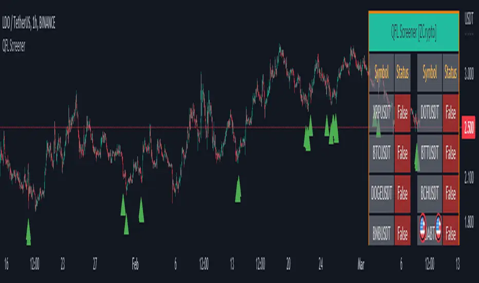
QFL Screener [ ZCrypto ]The QFL Screener is a robust tool inspired by Quickfingersluc's trading strategy.
Known as the Base Strategy or Mean Reversals, QFL focuses on identifying moments of panic selling and buying , presenting opportunities to enter trades at deeply discounted prices.
The QFL Screener is designed to enhance your trading efficiency by simultaneously scanning 40 symbols.
You have the flexibility to enable or disable specific symbols from the screening process, allowing you to tailor the screener to your preferred markets and instruments.
The Screener has a built-in alerts system . As soon as the QFL conditions align for any of the scanned symbols, you'll receive instant notifications, empowering you to take prompt action and seize potential trading opportunities.
In addition, I've incorporated a visual element to complement the alerts. Once the conditions are true, a green arrow shape will appear directly on the chart, providing a clear and intuitive signal of the QFL opportunity.
To provide a clear overview, our screener presents a comprehensive table that highlights when the QFL condition becomes true for each symbol. This table acts as a visual guide, enabling you to monitor the status of multiple symbols at a glance, streamlining your trading decision-making process.
With the QFL Screener, you gain an edge in identifying profitable trade setups based on Quickfingersluc's renowned approach. Experience the convenience of simultaneous screening, real-time alerts, and an intuitive table display, all in one user-friendly tool.
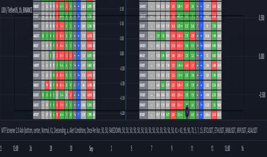
MTF Wave Screener [Cryptoheat]The "MTF Wave Screener" is a screener built to be able to scan the market quickly and easily in a very efficient way based on the "MTF Wave Stochastic RSI " function.
therefore it is basically an MTF wave stochastic scanner to monitor a wide scope of charts and know which to look deeper into using the "MTF Wave Stochastic RSI" itself. therefore it is recommended to be used with the other indicator and is considered an additional tool for those who use and master the "MTF Wave Stochastic RSI " indicator. if you do not know how it works, make sure to check it out here and read its description, which is a vital part for this one:
knowing how it works, you should be able to understand what it means for the chart to be Overbought, Oversold or having a Fake-out (mini-wave) on the MTF Wave Stochastic RSI, as well as the meaning of the values of K1, K2, K3 and the gap between K1 and K2. if not, please check it out by visiting the link attached earlier.
This table screener basically writes all the MTF data in a table showing mainly the chart's status as an option of (Oversold, Overbought, Fakeup or Fakedown) as well as the K1, K2, K3, Gap, value change from last candle data of all requested charts. Therefore acting as a market scanner for people who want to save the time needed to scan the whole market manually.
For example:
as you can see the table is showing 'GALA:USDT' pair as being oversold and having k1,k2 and k3 values of 0,0 and 9.76 respectively, therefore if you go check on the MTF Wave Stochastic RSI indicator, you will see that the current pair has a green highlight indicating oversold. and having the K1,K2 and K3 values as indicated on the indicator.
same goes for any other MTF status. Another example is when it shows a FAKEDOWN . Experienced MTF Wave Stoch RSI users know that this means that the MTF curves are formed in a bullish way showing that there is a retrace towards oversold only on the lowest time frame stochastic K1 while the normal time frame stochastic is still overbought. if you check the screener table you will see for example that 'QNTUSDT' pair is showing a FAKEDOWN the gap between K1 and K2 can be seen in the K1 and K2 values as well as the column named Gap val . with it you can determine the strength of that Fakedown. the bigger the Gap Val the higher the Fakeout and the bigger the expected bounce is should it play out.
checking on the QNTUSDT MTF Wave Stoch RSI you will see a clear fakedown between k1 and k2 (gray and blue curves), indicating a possible bounce incoming soon.
Overbought and Fakeup, each mean the opposite of Oversold and Fakedown respectively.
in short all the values contained on that screener table help you picture each chart's individual MTF Wave Stoch RSI of their own without having to check each one by itself. this is a very useful tool for traders who need to scan the market for the MTF data of each coin...
The screener comes with several options. in settings you can change the parameters for overbought, oversold , Fakeup and Fakedown in the settings according to the k1, k2, k3 values and differences. The table is made to screen 33 charts at the same time. to allow you to store more charts it is made in a way that you can choose not only those 33 but also 4 other x 33 watchlists and select the ones you want among them giving you the option to make your own 165 chart's watchlist and save it.
You must know that however, in the event that any of those default charts gets is not valid anymore, for example if a coin gets delisted of an exchange or a stock gets delisted the table will not work until you manually change that pair, even if it is in the alternative watchlists. in that case you will receive a warning message and a black indicator. in that event, please check for the pair that has been delisted and change it to another working pair and save as default.
PriceCatch Euronext Paris Stocks Screener v1Hi,
Tradingview community. Warm Greetings.
Euronext Paris Stocks Screener
I am sharing a script that screens Euronext Paris stocks for Probable Breakout Buy signal and Stop-Reverse Buy Signal. This script may prove to be useful to traders who trade Euronext Paris listed stocks.
I have already shared the script "PriceCatch Signals Buy Signals" that marks the following levels on the chart.
Probable Breakout Buy Level
Stop-Reverse Buy Level
While the script "PriceCatch Signals Buy Signals" can be used independently, this script is intended to be used with the script "PriceCatch Signals Buy Signals".
Used together, these two scripts may help you identify probable buy opportunities. The purpose of this script is to help screen stocks quickly without manually going through every stock in your watchlist.
Please read the Notes of the script "PriceCatch Signals Buy Signals" for explanation of its functionality.
Stocks Set
As Tradingview limits the number of security function calls, to get around, you have to select Set1 to screen first set of 25 stocks and then select Set2 to screen next set of 25 stocks.
List of Euronext Paris stocks
ACA AI AIR ALCRB ALGAU ALO ALONC ALVTX ATO BN BNP CA CLA COFA CS DBG DG EDF
EL ELIOR EN ENGI ETL FDJ FR FTI GET GLE MCPHY OR ORA POXEL PUB RI
RNO RXL SAF SAN SGO SMCP STLA STM SU TE TTE VIE VIV VK VLA WLN
Chart resolution vs. Script resolution
I have noticed that if the chart resolution is set to 15 minutes time-frame and the screener resolution is selected as 2 Hours, then the results are correct. However, if the screener resolution is set to 5 minutes, then the results are not accurate. This is not an issue with script. So scanning higher time-frames from a lower time-frame chart works better. My advice however, is better to set the chart resolution to the same interval as screener resolution for sure results.
As usual with price action, longer time-frames produce more reliable signals.
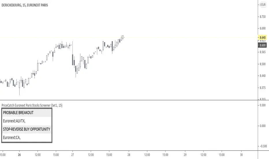
SOME CHARTS
Chart set to Daily time-frame and shows Derichebourg stock. Screener shows a Stop-Reverse Buy Opportunity on GET.
s3.tradingview.com
Example 2
Chart set to 30 min. timeframe and shows Derichebourg stock. Screener shows a Stop-Reverse Buy Opportunity on VIV .
s3.tradingview.com
NOTE - PRIOR TO USING THIS SCRIPT
Please remember that the script is shared with absolutely no assurances about usability and any warranties whatsoever and as a responsible trader, please satisfy yourselves thoroughly and use it only if you are satisfied it works for you. Remember, you are 100% responsible for your actions. If you understand and accept that, you may use the script.
QUERIES/FEEDBACK
Please PM me.
Regards to all and wish everyone all the best with trading.
PriceCatch - EuronextParis-Stocks screenerHi,
Tradingview community. Warm Greetings.
EuronextParis Stocks Screener
I am sharing a script that screens Euronext Paris stocks for Probable Breakout Buy signal and Stop-Reverse Buy Signal. This script may prove to be useful to traders who trade Euronext Paris listed stocks.
I have already shared the script "PriceCatch-Signals - Buy Signals" that marks the following levels on the chart.
Probable Breakout Buy Level
Stop-Reverse Buy Level
While the script "PriceCatch-Signals - Buy Signals" can be used independently, this script is intended to be used with the script "PriceCatch-Signals - Buy Signals".
Used together, these two scripts may help you identify probable buy opportunities. The purpose of this script is to help screen stocks quickly without manually going through every stock in your watchlist.
Please read the Notes of the script "PriceCatch-Signals - Buy Signals" for explanation of its functionality.
Stock Set
As Tradingview limits the number of security function calls, to get around, you have to select Set1 to screen first set of 25 stocks and then select Set2 to screen next set of 25 stocks.
Chart resolution vs. Script resolution
I have noticed that if the chart resolution is set to 15 minutes timeframe and the screener resolution is selected as 2 Hours, then the results are correct. However, if the screener resolution is set to 5 minutes, then the results are not accurate. This is not an issue with script. So scanning higher timeframes from a lower timeframe chart works better. My advice however, is better to set the chart resolution to the same interval as screener resolution for sure results.
As usual with price action, longer time-frames produce more reliable signals.
SOME CHARTS
Chart set to Daily timeframe and shows Derichebourg stock. Screener shows a Stop-Reverse Buy Opportunity on GET.
Example 2
Chart set to 30 min. timeframe and shows Derichebourg stock. Screener shows a Stop-Reverse Buy Opportunity on VIV.
NOTE - PRIOR TO USING THIS SCRIPT:
Please remember that the script is shared with absolutely no assurances about usability and any warranties whatsoever and as a responsible trader, please satisfy yourselves thoroughly and use it only if you are satisfied it works for you. Remember, you are 100% responsible for your actions. If you understand and accept that, you may use the script.
QUERIES/FEEDBACK
Please PM me.
Regards to all and wish everyone all the best with trading.

VB Finviz-style MTF Screener📊 VB Multi-Timeframe Stock Screener (Daily + 4H + 1H)
A structured, high-signal stock screener that blends Daily fundamentals, 4H trend confirmation, and 1H entry timing to surface strong trading opportunities with institutional discipline.
🟦 1. Daily Screener — Core Stock Selection
All fundamental and structural filters run strictly on Daily data for maximum stability and signal quality.
Daily filters include:
📈 Average Volume & Relative Volume
💲 Minimum Price Threshold
📊 Beta vs SPY
🏢 Market Cap (Billions)
🔥 ATR Liquidity Filter
🧱 Float Requirements
📘 Price Above Daily SMA50
🚀 Minimum Gap-Up Condition
This layer acts like a Finviz-style engine, identifying stocks worth trading before momentum or timing is considered.
🟩 2. 4H Trend Confirmation — Momentum Check
Once a stock passes the Daily screen, the 4-hour timeframe validates trend strength:
🔼 Price above 4H MA
📈 MA pointing upward
This removes structurally good stocks that are not in a healthy trend.
🟧 3. 1H Entry Alignment — Timing Layer
The Hourly timeframe refines near-term timing:
🔼 Price above 1H MA
📉 Short-term upward movement detected
This step ensures the stock isn’t just good on paper—it’s moving now.
🧪 MTF Debug Table (Your Transparency Engine)
A live diagnostic table shows:
All Daily values
All 4H checks
All 1H checks
Exact PASS/FAIL per condition
Perfect for tuning thresholds or understanding why a ticker qualifies or fails.
🎯 Who This Screener Is For
Swing traders
Momentum/trend traders
Systematic and rules-based traders
Traders who want clean, multi-timeframe alignment
By combining Daily fundamentals, 4H trend structure, and 1H momentum, this screener filters the market down to the stocks that are strong, aligned, and ready.

Stock Earnings Viewer for Pine ScreenerThe script, titled "Stock Earnings Viewer with Surprise", fetches actual and estimated earnings, calculates absolute and percent surprise values, and presents them for analysis. It is intended to use in Pine Screener, as on chart it is redundant.
How to Apply to Pine Screener
Favorite this script
Open pine screener www.tradingview.com
Select "Stock Earnings Viewer with Surprise" in "Choose indicator"
Click "Scan"
Data
Actual Earnings: The reported earnings per share (EPS) for the stock, sourced via request.earnings().
Estimated Earnings: Analyst-predicted EPS, accessed with field=earnings.estimate.
Absolute Surprise: The difference between actual and estimated earnings (e.g., actual 1.2 - estimated 1.0 = 0.2).
Percent Surprise (%): The absolute surprise as a percentage of estimated earnings (e.g., (0.2 / 1.0) * 100 = 20%). Note: This may return NaN or infinity if estimated earnings are zero, due to division by zero.
Practical Use
This screener script allows users to filter stocks based on earnings metrics. For example, you could screen for stocks where Percent Surprise > 15 to find companies exceeding analyst expectations significantly, or use Absolute Surprise < -0.5 to identify underperformers.
