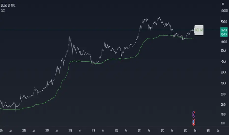
Pi Cycle Top & Bottom Indicator [InvestorUnknown]The Pi Cycle Top & Bottom Indicator is designed for long-term cycle analysis, particularly useful for detecting significant market tops and bottoms in assets like Bitcoin. By comparing the behavior of two moving averages, one with a shorter period (default 111) and the other with a longer period (default 350), the indicator helps investors identify potential turning points in the market.
Key Features:
Dual Moving Average System:
The indicator uses two moving averages (MA) to create a cyclic oscillator. The shorter moving average (Short Length MA) is more reactive to recent price changes, while the longer moving average (Long Length MA) smooths out long-term trends. Users can select between:
Simple Moving Average (SMA): A straightforward average of closing prices.
Exponential Moving Average (EMA): Places more weight on recent prices, making it more responsive to market changes.
Oscillator Mode Options:
The Pi Cycle Indicator offers two modes of oscillation to better suit different analysis styles:
RAW Mode: This mode calculates the raw ratio of the Short MA to the Long MA, offering a simple comparison of the two averages.
LOG(X) Mode: In this mode, the oscillator takes the natural logarithm of the Short MA to Long MA ratio. This transformation compresses extreme values and highlights relative changes more effectively, making it particularly useful for spotting shifts in long-term trends.
Cyclical Analysis:
The core of the Pi Cycle Indicator is its ability to visualize the relationship between the two moving averages. The ratio of the Short MA to the Long MA is plotted as an oscillator. When the oscillator crosses above or below a baseline (which is 1 for RAW mode and 0 for LOG(X) mode), it signals potential market turning points.
Visual Representation:
The indicator provides a clear visual display of market conditions:
Orange Line: Represents the Pi Cycle Oscillator, which shows the relationship between the short and long moving averages.
Gray Baseline: A reference line that dynamically adjusts based on the oscillator mode. Crosses above or below this line help indicate possible trend reversals.
Shaded Areas: Color-filled areas between the oscillator and the baseline, which are shaded green when the market is bullish (oscillator above baseline) and red when bearish (oscillator below baseline). This provides a visual cue to assist in identifying potential market tops and bottoms.
Use Cases:
The Pi Cycle Top & Bottom Indicator is primarily used in long-term market analysis, such as Bitcoin cycles, to identify significant tops and bottoms. These moments often coincide with large cyclical shifts, making it valuable for those aiming to enter or exit positions at key moments in the market cycle.
By analyzing the interaction between short-term and long-term trends, investors can gain insight into broader market dynamics and make more informed decisions regarding entry and exit points. The ability to switch between moving average types (SMA/EMA) and oscillator modes (RAW/LOG) adds flexibility for adapting to different market environments.
"bitcoin" için komut dosyalarını ara
Precision Cloud by Dr ABIRAM SIVPRASAD
Precision Cloud by Dr. Abhiram Sivprasad"
The " Precision Cloud" script, created by Dr. Abhiram Sivprasad, is a multi-purpose technical analysis tool designed for Forex, Bitcoin, Commodities, Stocks, and Options trading. It focuses on identifying key levels of support and resistance, combined with moving averages (EMAs) and central pivot ranges (CPR), to help traders make informed trading decisions. The script also provides a visual "light system" to highlight potential long or short positions, aiding traders in entering trades with a clear strategy.
Key Features of the Script:
Central Pivot Range (CPR):
The CPR is calculated as the average of the high, low, and close of the price, while the top and bottom pivots are derived from it. These act as dynamic support and resistance zones.
The script can plot daily CPR, support, and resistance levels (S1/R1, S2/R2, S3/R3) as well as optional weekly and monthly pivot points.
The CPR helps identify whether the price is in a bullish, bearish, or neutral zone.
Support and Resistance Levels:
Three daily support (S1, S2, S3) and resistance (R1, R2, R3) levels are plotted based on the CPR.
These levels act as potential reversal or breakout points, allowing traders to make decisions around key price points.
EMA (Exponential Moving Averages):
The script includes two customizable EMAs (default periods of 9 and 21). You can choose the source for these EMAs (open, high, low, or close).
The crossovers between EMA1 and EMA2 help identify potential trend reversals or momentum shifts.
Lagging Span:
The Lagging Span is plotted with a customizable displacement (default 26), which helps identify overall trend direction by comparing past price with the current price.
Light System:
A color-coded table provides a visual representation of market conditions:
Green indicates bullish signals (e.g., price above CPR, EMAs aligning positively).
Red indicates bearish signals (e.g., price below CPR, EMAs aligning negatively).
Yellow indicates neutral conditions, where there is no clear trend direction.
The system includes lights for CPR, EMA, Long Position, and Short Position, helping traders quickly assess whether the market is in a buying or selling opportunity.
Trading Strategies Using the Script
1. Forex Trading:
Trend-Following with EMAs: Use the EMA crossovers to capture trending markets in Forex. A green light for the EMA combined with a price above the daily or weekly pivot levels suggests a buying opportunity. Conversely, if the EMA light turns red and price falls below the CPR levels, look for shorting opportunities.
Reversal Strategy: Watch for price action near the daily S1/R1 levels. If price holds above S1 and the EMA is green, this could signal a reversal from support. The same applies to resistance levels.
2. Bitcoin Trading:
Momentum Breakouts: Bitcoin is known for its sharp moves. The script helps to identify breakouts from the CPR range. If the price breaks above the TC (Top Central Pivot) with bullish EMA alignment (green light), it could signal a strong uptrend.
Lagging Span Confirmation: Use the Lagging Span to confirm the trend direction. For Bitcoin's volatility, when the lagging span shows consistent alignment with the price and CPR, it often indicates continuation of the trend.
3. Commodities Trading:
Support/Resistance Bounce: Commodities such as gold and oil often react well to pivot levels. Look for price bouncing off S1 or R1 for potential entry points. A green CPR light along with price above the pivot range supports a bullish bias.
EMA Pullback Strategy: If price moves in a strong trend and pulls back to one of the EMAs, a green EMA light suggests re-entry on a pullback. If the EMA light is red and price breaks below the BC (Bottom Central Pivot), short positions could be considered.
4. Stocks Trading:
Long Position Strategy: For stocks, use the combination of the long position light turning green (price above TC and EMA alignment) as a signal to buy. This could be especially useful for riding bullish trends in growth stocks or during earnings seasons when volatility is high.
Short Position Strategy: If the short position light turns green, indicating price below BC and EMAs turning bearish, this could be an ideal setup for shorting overvalued stocks or during market corrections.
5. Options Trading:
Directional Bias for Options: The light system is particularly helpful for options traders. A green long position light provides a clear signal to buy call options, while a green short position light supports buying puts.
Pivot Breakout Strategy: Buy options (calls or puts) when the price breaks above resistance or below support, with confirmation from the CPR and EMA lights. This helps capture the sharp moves required for profitable options trades.
Conclusion
The S&R Precision Cloud script is a versatile tool for traders across markets, including Forex, Bitcoin, Commodities, Stocks, and Options. It combines critical technical elements like pivot ranges, support and resistance levels, EMAs, and the Lagging Span to provide a clear picture of market conditions. The intuitive light system helps traders quickly assess whether to take a long or short position, making it an excellent tool for both new and experienced traders.
The S&R Precision Cloud by Dr. Abhiram Sivprasad script is a technical analysis tool designed to assist traders in making informed decisions. However, it should not be interpreted as financial or investment advice. The signals generated by the script are based on historical price data and technical indicators, which are inherently subject to market fluctuations and do not guarantee future performance.
Trading in Forex, Bitcoin, Commodities, Stocks, and Options carries a high level of risk and may not be suitable for all investors. You should be aware of the risks involved and be willing to accept them before engaging in such activities. Always conduct your own research and consult with a licensed financial advisor or professional before making any trading decisions.
The creators of this script are not responsible for any financial losses that may occur from its use. Past performance is not indicative of future results, and the use of this script is at your own risk.
BTC Power of Law x Central Bank LiquidityThis indicator combines Bitcoin's long-term growth model (Power Law) with global central bank liquidity to help identify potential buy and sell signals.
How it works:
Power Law Oscillator: This part of the indicator tracks how far Bitcoin's current price is from its expected long-term growth, based on an exponential model. It helps you see when Bitcoin may be overbought (too expensive) or oversold (cheap) compared to its historical trend.
Central Bank Liquidity: This measures the amount of money injected into the financial system by major central banks (like the Fed or ECB). When more money is printed, asset prices, including Bitcoin, tend to rise. When liquidity dries up, prices often fall.
By combining these two factors, the indicator gives you a more accurate view of Bitcoin's price trends.
How to interpret:
Green Line : Bitcoin is undervalued compared to its long-term growth, and the liquidity environment is supportive. This is typically a buy signal.
Yellow Line: Bitcoin is trading near its expected value, or there's uncertainty due to mixed liquidity conditions. This is a hold signal.
Red Line: Bitcoin is overvalued, or liquidity is tightening. This is a potential sell signal.
Zones:
The background will turn green when Bitcoin is in a buy zone and red when it's in a sell zone, giving you easy-to-read visual cues.
Black-Scholes option price model & delta hedge strategyBlack-Scholes Option Pricing Model Strategy
The strategy is based on the Black-Scholes option pricing model and allows the calculation of option prices, various option metrics (the Greeks), and the creation of synthetic positions through delta hedging.
ATTENTION!
Trading derivative financial instruments involves high risks. The author of the strategy is not responsible for your financial results! The strategy is not self-sufficient for generating profit! It is created exclusively for constructing a synthetic derivative financial instrument. Also, there might be errors in the script, so use it at your own risk! I would appreciate it if you point out any mistakes in the comments! I would be even more grateful if you send the corrected code!
Application Scope
This strategy can be used for delta hedging short positions in sold options. For example, suppose you sold a call option on Bitcoin on the Deribit exchange with a strike price of $60,000 and an expiration date of September 27, 2024. Using this script, you can create a delta hedge to protect against the risk of loss in the option position if the price of Bitcoin rises.
Another example: Suppose you use staking of altcoins in your strategies, for which options are not available. By using this strategy, you can hedge the risk of a price drop (Put option). In this case, you won't lose money if the underlying asset price increases, unlike with a short futures position.
Another example: You received an airdrop, but your tokens will not be fully unlocked soon. Using this script, you can fully hedge your position and preserve their dollar value by the time the tokens are fully unlocked. And you won't fear the underlying asset price increasing, as the loss in the event of a price rise is limited to the option premium you will pay if you rebalance the portfolio.
Of course, this script can also be used for simple directional trading of momentum and mean reversion strategies!
Key Features and Input Parameters
1. Option settings:
- Style of option: "European vanilla", "Binary", "Asian geometric".
- Type of option: "Call" (bet on the rise) or "Put" (bet on the fall).
- Strike price: the option contract price.
- Expiration: the expiry date and time of the option contract.
2. Market statistic settings:
- Type of price source: open, high, low, close, hl2, hlc3, ohlc4, hlcc4 (using hl2, hlc3, ohlc4, hlcc4 allows smoothing the price in more volatile series).
- Risk-free return symbol: the risk-free rate for the market where the underlying asset is traded. For the cryptocurrency market, the return on the funding rate arbitrage strategy is accepted (a special function is written for its calculation based on the Premium Price).
- Volatility calculation model: realized (standard deviation over a moving period), implied (e.g., DVOL or VIX), or custom (you can specify a specific number in the field below). For the cryptocurrency market, the calculation of implied volatility is implemented based on the product of the realized volatility ratio of the considered asset and Bitcoin to the Bitcoin implied volatility index.
- User implied volatility: fixed implied volatility (used if "Custom" is selected in the "Volatility Calculation Method").
3. Display settings:
- Choose metric: what to display on the indicator scale – the price of the underlying asset, the option price, volatility, or Greeks (all are available).
- Measure: bps (basis points), percent. This parameter allows choosing the unit of measurement for the displayed metric (for all except the Greeks).
4. Trading settings:
- Hedge model: None (do not trade, default), Simple (just open a position for the full volume when the strike price is crossed), Synthetic option (creating a synthetic option based on the Black-Scholes model).
- Position side: Long, Short.
- Position size: the number of units of the underlying asset needed to create the option.
- Strategy start time: the moment in time after which the strategy will start working to create a synthetic option.
- Delta hedge interval: the interval in minutes for rebalancing the portfolio. For example, a value of 5 corresponds to rebalancing the portfolio every 5 minutes.
Post scriptum
My strategy based on the SegaRKO model. Many thanks to the author! Unfortunately, I don't have enough reputation points to include a link to the author in the description. You can find the original model via the link in the code, as well as through the search indicators on the charts by entering the name: "Black-Scholes Option Pricing Model". I have significantly improved the model: the calculation of volatility, risk-free rate and time value of the option have been reworked. The code performance has also been significantly optimized. And the most significant change is the execution, with which you can now trade using this script.
Realized Price Oscillator [InvestorUnknown]Overview
The Realized Price Oscillator is a fundamental analysis tool designed to assess Bitcoin's price dynamics relative to its realized price. The indicator calculates various metrics using data from the realized market capitalization and total supply. It applies normalization techniques to scale values within a specified range, helping investors identify overbought or oversold conditions over the long time horizon. The oscillator also features DCA-based signals to assist in strategic market entry and exit.
Key Features
1. Normalization and Scaling:
The indicator scales values using a limit that can be adjusted for decimal precision (Limit). It allows for both positive and negative values, providing flexibility in analysis.
Decay functionality is included to progressively reduce the extreme values over time, ensuring recent data impacts the oscillator more than older data.
f_rescale(float value, float min, float max, float limit, bool negatives) =>
((limit * (negatives ? 2 : 1)) * (value - min) / (max - min)) - (negatives ? limit : 0)
2. Realized Price Oscillator Calculation:
Realized Price Oscillator is computed using logarithmic differences between the open, high, low, and close prices and the realized price. This helps in identifying how the current market price compares with the average cost basis of the Bitcoin supply.
f_realized_price_oscillator(float realized_price) =>
rpo_o = math.log(open / realized_price)
rpo_h = math.log(high / realized_price)
rpo_l = math.log(low / realized_price)
rpo_c = math.log(close / realized_price)
3. Oscillator Normalization:
The normalized oscillator calculates the range between the maximum and minimum values over time. It adjusts the oscillator values based on these bounds, considering a decay factor. This normalized range assists in consistent signal generation.
normalized_oscillator(float x, float b) =>
float oscillator = b
var float min = na
var float max = na
if (oscillator > max or na(max)) and time >= normalization_start_date
max := oscillator
if (min > oscillator or na(min)) and time >= normalization_start_date
min := oscillator
if time >= normalization_start_date
max := max * decay
min := min * decay
normalized_oscillator = f_rescale(x, min, max, lim, neg)
4. Dollar-Cost Averaging (DCA) Signals:
DCA-based signals are generated using user-defined thresholds (DCA IN and DCA OUT). The oscillator triggers buy signals when the normalized low value falls below the DCA IN threshold and sell signals when the normalized high value exceeds the DCA OUT threshold.
5. Visual Representation:
The indicator plots candlestick representations of the normalized Realized Price Oscillator values (open, high, low, close) over time, starting from a specified date (plot_start_date).
Colors are dynamically adjusted using a gradient to represent the state of the oscillator, ranging from green (buy zone) to red (sell zone). Background and bar colors also change based on DCA conditions.
How It Works
Data Sourcing: Realized price data is sourced using Bitcoin’s realized market cap (BTC_MARKETCAPREAL) and total supply (BTC_SUPPLY).
Realized Price Oscillator Metrics: Logarithmic differences between price and realized price are computed to generate Realized Price Oscillator values for open, high, low, and close.
Normalization: The indicator rescales the oscillator values based on a defined limit, adjusting for negative values if allowed. It employs a decay factor to reduce the influence of historical extremes.
Conclusion
The Realized Price Oscillator is a sophisticated tool that combines market price analysis with realized price metrics to offer a robust framework for understanding Bitcoin's valuation. By leveraging normalization techniques and DCA thresholds, it provides actionable insights for long-term investing strategies.
Innocent Heikin Ashi Ethereum StrategyHello there, im back!
If you are familiar with my previous scripts, this one will seem like the future's nostalgia!
Functionality:
As you can see, all candles are randomly colored. This has no deeper meaning, it should remind you to switch to Heikin Ashi. The Strategy works on standard candle stick charts, but should be used with Heikin Ashi to see the actual results. (Regular OHLC calculations are included.)
Same as in my previous scripts we import our PVSRA Data from @TradersReality open source Indicator.
With this data and the help of moving averages, we have got an edge in the market.
Signal Logic:
When a "violently green" candle appears (high buy volume + tick speed) above the 50 EMA indicates a change in trend and sudden higher prices. Depending on OHLC of the candle itself and volume, Take Profit and Stop Loss is calculated. (The price margin is the only adjustable setting). Additionally, to make this script as simple and easily useable as possible, all other adjustable variables have been already set to the best suitable value and the chart was kept plain, except for the actual entries and exits.
Basic Settings and Adjustables:
Main Input 1: TP and SL combined price range. (Double, Triple R:R equally.)
Trade Inputs: All standard trade size and contract settings for testing available.
Special Settings:
Checkbox 1: Calculate Signal in Heikin Ashi chart, including regular candle OHLC („Open, High, Low, Close“)
Checkbox 2/3: Calculate by order fill or every tick.
Checkbox 4: Possible to fill orders on bar close.
Timeframe and practical usage:
Made for the 5 Minute to 1 hour timeframe.
Literally ONLY works on Ethereum and more or less on Bitcoin.
EVERY other asset has absolute 0% profitability.
Have fun and share with your friends!
Thanks for using!
Example Chart:
Risk Appetite & Directional Bias [NariCapitalTrading]Guide to the Risk Appetite & Directional Bias Indicator
This indicator is a tool designed to capture the relationship between Bitcoin and the S&P 500 (but could be any two assets of your choice, theoretically). This post aims to provide a detailed overview of the logic, components, and implementation of the indicator.
1. Introduction
This indicator leverages the relationship between Bitcoin and the S&P 500 to provide insights into the directional bias of the S&P 500 based on Bitcoin's movements. The premise is that Bitcoin, due to its 24/7 trading nature, often leads SP500 price movements. By dynamically adjusting the influence (beta) of Bitcoin based on historical data, this indicator aims to capture shifts in market sentiment or "risk appetite."
2. Core Concepts
a. Dynamic Weighting
The indicator uses a dynamic weighting mechanism to adjust the influence of Bitcoin on the S&P 500. The weight is based on the correlation between Bitcoin's and the S&P 500's returns, normalized by their respective volatilities.
// Calculate rolling correlation between Bitcoin and S&P 500
btcSp500Correlation = ta.correlation(btcChange, sp500Change, lookbackPeriod)
// Dynamic adjustment factor for Bitcoin influence on S&P 500
dynamicBtcWeight = btcWeightInput * btcSp500Correlation / normalizedBtcVolatility
b. Percentage Change and Volatility
Percentage change and volatility are critical components of the indicator. They are calculated for both Bitcoin and the S&P 500 to understand their respective behaviors over a defined lookback period.
// Function to calculate percentage change
f_change(src) =>
ta.change(src) * 100
// Function to calculate volatility
f_volatility(src, period) =>
ta.stdev(f_change(src), period)
These functions calculate the percentage change and standard deviation (volatility) of the asset prices.
c. Normalization
Normalization is applied to Bitcoin's volatility relative to the S&P 500's volatility to ensure that the influence of Bitcoin is appropriately scaled. This prevents Bitcoin's typically higher volatility from overwhelming the analysis.
// Normalize Bitcoin's volatility against S&P 500's volatility
normalizedBtcVolatility = sp500Volatility != 0 ? btcVolatility / sp500Volatility : na
3. Indicator Logic
The indicator's logic involves combining the historical change of the S&P 500 with the dynamically weighted influence of Bitcoin's change. The output is an "adjusted change" that reflects this combined impact.
// Combine the Bitcoin influence with S&P 500's historical change
adjustedChange = sp500Change + (dynamicBtcWeight * btcChange)
This adjusted change is used to determine the directional bias, categorized as "Bullish," "Bearish," or "Neutral."
4. Visualization
The indicator visualizes the predicted price of the S&P 500 based on the adjusted change. It uses different colors to represent different biases.
// Plot the predicted price with color indication based on bias
plotColor = bias == "Bullish" ? color.green : bias == "Bearish" ? color.red : color.blue
plot(predictedPrice, color=plotColor, title="Predicted SP500 Price", linewidth=2, style=plot.style_line)
Additionally, the adjusted change is plotted as a histogram.
5. Use Cases and Practical Applications
The indicator is particularly useful for day traders and swing traders who seek to anticipate market moves before they are fully reflected in traditional equity markets. This may/will require some parameter tuning and optimization on your part (the user).
For other researchers and quants: the dynamic weighting mechanism offers an example of how cross-asset relationships can be modeled and incorporated into pinescript studies.
6. Customization
Users can customize several aspects of the indicator:
Lookback Period: Defines the period over which correlation and volatility are calculated.
EMA Period: Adjusts the sensitivity of the indicator.
Initial Weight of Bitcoin Influence: Sets the starting point for Bitcoin's impact, which is then dynamically adjusted.
Short Term Holder MVRVShort-Term Holder MVRV is an indicator designed to assess the ratio between the Market Value and the Realized Value of Bitcoin that has been held for less than 155 days.
Market Value is calculated as the current price of Bitcoin multiplied by its circulating supply.
[ Realized Value is derived by multiplying the realized price of Bitcoin (the price at which the coins last moved) by the circulating supply. It represents the total cost basis of all Bitcoin held by short-term holders.
Key Interpretations:
Indicator Value < 1: When this metric is below 1, it suggests that the market value of Bitcoin held by short-term holders is lower than their cost basis (Realized Value), meaning they are, on average, holding at a loss. The lower this value, the greater the average loss.
Indicator Value > 1: When the metric exceeds 1, it indicates that the market value is higher than the realized value, signifying that short-term holders are, on average, in profit. The higher this value, the greater the average profit.
Indicator Value = 1: The value of 1 is seen as a breakeven point for short-term investors, often acting as a critical support or resistance level for Bitcoin's price.
BTC - Power Law OscillatorDescription:
The BTC - Power Law Oscillator is a technical analysis tool designed to help traders and investors identify potential overbought and oversold conditions in the Bitcoin market. This oscillator is based on a power law model that approximates Bitcoin's historical price trajectory, providing a framework for understanding deviations from this trajectory over time.
Key Features:
Exponential Model: The oscillator uses an exponential model that represents Bitcoin's price growth over time since its inception on January 3, 2009. This model is mathematically expressed as:
price=exp(5.71×ln(days since inception)−38.16)
This captures the long-term growth trend of Bitcoin, allowing for the analysis of deviations from this model.
Deviation Analysis: The Power Law Oscillator measures the percentage deviation of Bitcoin's closing price from the model price. This deviation is expressed as a percentage to illustrate how far the current price is from the expected model trajectory.
Normalization: The oscillator values are normalized to a 0-100 range. A quadratic transformation is applied to enhance sensitivity to higher values, allowing for better visualization and interpretation of extreme conditions.
Bands and Zones:
Upper Band (50): Indicates the 20% threshold. Values above this band suggest overbought conditions, where Bitcoin's price may be significantly above the expected trajectory.
Lower Band (15): Indicates the 5% threshold. Values below this band suggest oversold conditions, where Bitcoin's price may be significantly below the expected trajectory.
Top Zone: The area above the upper band is shaded red, highlighting potential sell or caution areas.
Bottom Zone: The area below the lower band is shaded green, highlighting potential buy or accumulation areas.
Benefits:
Trend Analysis: Helps identify long-term trends and potential reversals by analyzing price deviations from a theoretical model based on historical growth.
Market Timing: Assists in market timing decisions by indicating overbought and oversold conditions with visual bands and zones.
Enhanced Sensitivity: The quadratic normalization enhances sensitivity to changes in the oscillator, providing clearer signals for traders.
Usage Tips:
Complementary Tool: Use this oscillator in conjunction with other technical indicators and fundamental analysis for more comprehensive market insights.
Risk Management: Always employ sound risk management strategies when trading, as no single indicator can guarantee accurate predictions.
Market Context: Consider the broader market context, as Bitcoin's volatility can lead to significant short-term fluctuations.
The BTC - Power Law Oscillator provides a unique perspective on Bitcoin's price movements by leveraging a mathematical model to understand historical growth trends and deviations. Use this tool to gain deeper insights into market dynamics and enhance your trading strategy.
BTC Hash Rate to Price RatioDescription:
The BTC Hash Rate to Price Ratio indicator is a sophisticated tool designed to assist traders in identifying potential market turning points for Bitcoin by combining network health, market sentiment, and valuation metrics. This indicator integrates three key components—Hash Rate, RSI (Relative Strength Index), and MVRV (Market Value to Realized Value)—to provide a comprehensive analysis of Bitcoin's market dynamics.
Key Features:
Hash Rate Analysis: Assesses the computational power of the Bitcoin network, reflecting network health and miner confidence. Changes in the hash rate can signal shifts in market sentiment.
RSI (Relative Strength Index): A momentum oscillator that measures the speed and change of price movements, identifying overbought or oversold conditions. Smoothed RSI provides clearer insights into market momentum.
MVRV (Market Value to Realized Value): A valuation metric comparing Bitcoin's market value to its realized value, offering insights into whether Bitcoin is overvalued or undervalued. Smoothed MVRV enhances signal accuracy.
How It Works:
Red Zones (Sell Signals): Highlighted when both the MVRV and RSI are above the hash rate, indicating potential market tops.
Green Zones (Buy Signals): Highlighted when both the MVRV and RSI are below the hash rate and MVRV is under 15, suggesting potential market bottoms.
Customizable Parameters: Allows traders to adjust smoothing periods and signal thresholds, tailoring the indicator to different trading strategies and market conditions.
Visual Aids: Includes dotted lines at key RSI levels (15 and 75) for quick reference to potential overbought and oversold conditions.
Benefits:
Comprehensive Analysis: Combines technical, fundamental, and network metrics to offer a well-rounded perspective on market conditions.
Early Warning Signals: Aims to provide early indications of potential market reversals, helping traders make informed decisions.
Flexibility: Suitable for both short-term and long-term trading strategies, allowing for adaptation to various market environments.
Usage Tips:
Use this indicator in conjunction with other technical analysis tools and fundamental insights for best results.
Consider the broader market context and macroeconomic factors when interpreting signals.
Practice sound risk management techniques to optimize trading performance.
Unlock the potential of your Bitcoin trading strategy with the BTC Hash Rate to Price Ratio indicator, and gain deeper insights into market dynamics to make more informed trading decisions.
[Suitable Hope] Crypto Upside Model 3.0The "Crypto Upside Model 3.0" indicator dynamically calculates the potential price of any cryptocurrency based on various percentages of Ethereum or Bitcoin's market capitalization.
By fetching and analyzing marketcap data from TradingView sources, it allows traders to visualize potential price targets if their chosen cryptocurrency reaches specific market dominance levels. This tool is designed for daily timeframe analysis and can be used to set informed price expectations and strategic investment goals, providing valuable insights for long-term investment planning.
Why using the Crypto Upside Model 3.0?
Strategic Planning: Helps traders and investors set realistic price targets and investment goals by visualizing potential market cap scenarios.
Informed Decision-Making: Provides a data-driven approach to understanding how a cryptocurrency might perform relative to major assets like Bitcoin and Ethereum.
Customizable Analysis: Allows users to choose different comparison assets (ETH or BTC) and visualize various market cap dominance percentages, offering tailored insights.
Daily Timeframe Focus: Ideal for swing traders and long-term investors who operate on a daily analysis timeframe, providing relevant and actionable data.
Bull Markets: Identify potential price targets if your cryptocurrency's market cap increases significantly.
Bear Markets: Assess how much value could be retained relative to major cryptocurrencies.
Strategic Entry/Exit Points: Use the visualized targets to plan entry or exit points in your trading strategy.
Comparative Advantage
Dynamic Adaptation: Unlike fixed indicators, this tool adapts to any active chart, making it versatile for multiple cryptocurrencies.
Market Cap Insights: Provides a unique perspective by linking price targets to market cap dominance, a critical factor in the crypto market.
User Instructions
Setup: Add the " Upside Model 3.0" indicator to your TradingView chart.
Configuration: Use the input settings to select the comparison cryptocurrency (ETH or BTC) and enable the desired market cap percentage plots.
Analysis: The indicator will display potential price targets based on the selected market cap percentages, providing a visual guide for setting price expectations.
Limitations
Marketcap Data Availability: The indicator relies on marketcap data from TradingView, which may not be available for all cryptocurrencies. If the data is unavailable, the indicator will not function for that asset. This tool is more likely to work with older, established cryptocurrencies, as marketcap data for newer cryptocurrencies may not yet be available.
Daily Timeframe Restriction: The indicator is designed to work exclusively on the daily timeframe, limiting its applicability for intraday trading.
Assumptions of Market Dynamics: The calculations assume a direct correlation between market dominance and price, which may not account for other market dynamics and external factors influencing prices.
Data Accuracy: The accuracy of the indicator depends on the reliability of the data provided by TradingView, which may sometimes experience delays or inaccuracies.
Currently available cryptocurrencies: Bitcoin, Ethereum, Solana, Binance Coin, Cardano, Ripple, Polkadot, Avalanche, Chainlink, Litecoin, Dogecoin, Terra, Uniswap, VeChain, Stellar, Internet Computer, Hedera, Filecoin, Monero, Aave, TRON, NEAR Protocol, Compound, Maker,... For all compatible cryptocurrencies, please consult CRYPTOCAP's documentation.
Final notes
Although various sources ask a payment or user data for similar kind of private indicators, this one is entirely free and open source. "Uncanny" isn't it? I hope this indicator will provide you value. Feel free to leave a message if you have any questions or constructive feedback.
Examples of how I use this indicator
When using ETH's historical price as a reference compared to Bitcoin's marketcap, we can notice that price generally has been held between the +-30% and 50% lines of BTC's marketcap. If history is repeating again, we can expect major resistances around the 50% looking ahead into the future. This for me would be a great area to potentially reduce my ETH spot position.
When using SOL's historical price action, we can notice that the 15% line of ETH's marketcap has been a top in the previous cycle. Today SOL (July 2024), is back at this level. Could this be a top again or could price break this 15% level and head perhaps towards 30% which currently sits around $260? Time will tell.
These are 2 simple example of how I interpret the data. I'm keen to hear what other findings with other pairs you can find.
Dominance DashboardThe "Dominance Dashboard" is a TradingView indicator designed to provide traders with a clear and concise visual representation of Bitcoin Dominance (BTC.D). This script helps traders monitor BTC.D in real-time, offering insights into market dynamics and potential trading signals based on the changes in Bitcoin's market dominance.
Key Features
Real-Time BTC Dominance: Displays the current Bitcoin Dominance percentage.
Historical Comparison: Shows the previous day's Bitcoin Dominance for comparison.
Visual Indicators: Utilizes color-coded arrows to indicate changes in Bitcoin Dominance (increase or decrease).
Customizable Table Settings: Users can customize the position, size, and colors of the displayed table to suit their preferences.
How It Works
Data Retrieval: The script uses request.security to fetch the latest and previous day's BTC.D data.
Comparison Mechanism: It compares the current BTC Dominance with the previous day's value to determine whether BTC.D has increased, decreased, or remained unchanged.
Dynamic Table Display: Based on user preferences, the script dynamically adjusts the table's position, text size, and colors.
Using the Indicator
Table Settings:
Show Header: Toggle the visibility of the table header.
Position: Choose from various predefined positions (e.g., Top Right, Bottom Right) to place the dashboard on your chart.
Text Size: Select the text size (Tiny, Small, Normal, Large) for better readability.
Text and Border Colors: Customize the text and border colors to match your chart's theme.
Timeframe Settings:
Show Current BTC Dominance: Enable or disable the display of the current BTC Dominance percentage.
Underlying Concepts
BTC Dominance: Bitcoin Dominance (BTC.D) measures Bitcoin's market capitalization relative to the total market capitalization of all cryptocurrencies. Monitoring BTC.D helps traders understand the flow of capital in and out of Bitcoin compared to other cryptocurrencies.
Visual Change Indicators: The script uses simple arrow symbols (🔼 for an increase and 🔽 for a decrease) to provide quick visual cues about the direction of change in BTC Dominance. This feature helps traders quickly assess market conditions without deep analysis.
Practical Use Cases
Market Sentiment Analysis: A rising BTC Dominance could indicate a market shift towards Bitcoin, potentially signaling a bearish sentiment for altcoins. Conversely, a falling BTC Dominance might suggest increased interest in altcoins.
Trend Confirmation: Traders can use BTC Dominance trends to confirm their trading strategies. For example, if a trader is bullish on Bitcoin, an increasing BTC Dominance might reinforce their position.
Portfolio Management: By monitoring BTC Dominance, traders can make informed decisions about portfolio rebalancing between Bitcoin and other cryptocurrencies.
ALT Trend DetectionALT Trend Detection Indicator
Overview:
The "ALT Trend Detection" indicator is designed to help traders analyze the relationship between Bitcoin's dominance, Bitcoin's price, and the potential impact on altcoin prices. This indicator uses various time frames and average true range (ATR) calculations to detect trends and provide insights into the altcoin market conditions based on Bitcoin's movements.
How It Works:
BTC Dominance and Price Data:
The indicator fetches Bitcoin dominance data (percentage of the total cryptocurrency market cap that Bitcoin represents) and Bitcoin price data using the selected time frame.
It calculates whether Bitcoin dominance and price are trending up, down, or remaining stable based on ATR calculations.
Altcoin Trend Detection:
The indicator then evaluates different scenarios based on the combination of Bitcoin dominance and price movements. These scenarios help predict the potential impact on altcoin prices.
For instance, if Bitcoin dominance is up and Bitcoin price is up, it might indicate a bearish trend for altcoins. Conversely, if Bitcoin dominance is down and Bitcoin price is up, it might indicate a bullish trend for altcoins (altseason).
Table Display:
The indicator displays a table on the chart that summarizes the current conditions for Bitcoin dominance, Bitcoin price, and the expected impact on altcoins. Each cell in the table is color-coded to provide a quick visual representation of the trends.
Usage:
Add the indicator to your TradingView chart.
Customize the time frame, ATR multiplier, table position, table size, and background color as per your preference.
Observe the table displayed on the chart. It shows the current state of Bitcoin dominance, Bitcoin price, and the potential trend for altcoin prices based on predefined scenarios.
Use this information to make informed trading decisions about altcoins. For example, if the table shows "ALT SEASON" in green, it might be a good time to consider investing in altcoins.
By analyzing the interaction between Bitcoin dominance and price, this indicator helps traders identify potential opportunities and risks in the altcoin market.
Intellect_city - World Cycle - Ath - Timeframe 1D and 1WIndicator Overview
The Pi Cycle Top Indicator has historically been effective in picking out the timing of market cycle highs within 3 days.
It uses the 111 day moving average (111DMA) and a newly created multiple of the 350 day moving average, the 350DMA x 2.
Note: The multiple is of the price values of the 350DMA, not the number of days.
For the past three market cycles, when the 111DMA moves up and crosses the 350DMA x 2 we see that it coincides with the price of Bitcoin peaking.
It is also interesting to note that 350 / 111 is 3.153, which is very close to Pi = 3.142. In fact, it is the closest we can get to Pi when dividing 350 by another whole number.
It once again demonstrates the cyclical nature of Bitcoin price action over long time frames. However, in this instance, it does so with a high degree of accuracy over Bitcoin's adoption phase of growth.
Bitcoin Price Prediction Using This Tool
The Pi Cycle Top Indicator forecasts the cycle top of Bitcoin’s market cycles. It attempts to predict the point where Bitcoin price will peak before pulling back. It does this on major high time frames and has picked the absolute tops of Bitcoin’s major price moves throughout most of its history.
How It Can Be Used
Pi Cycle Top is useful to indicate when the market is very overheated. So overheated that the shorter-term moving average, which is the 111-day moving average, has reached an x2 multiple of the 350-day moving average. Historically, it has proved advantageous to sell Bitcoin around this time in Bitcoin's price cycles.
It is also worth noting that this indicator has worked during Bitcoin's adoption growth phase, the first 15 years or so of Bitcoin's life. With the launch of Bitcoin ETF's and Bitcoin's increased integration into the global financial system, this indicator may cease to be relevant at some point in this new market structure.
Crypto Realized Profits/Losses Extremes [AlgoAlpha]🌟🚀 Introducing the Crypto Realized Profits/Losses Extremes Indicator by AlgoAlpha 🚀🌟
Unlock the potential of cryptocurrency markets with our cutting-edge On-Chain Pine Script™ indicator, designed to highlight extreme realized profit and loss zones! 🎯📈
Key Features:
✨ Realized Profits/Losses Calculation: Uses real-time data from the blockchain to monitor profit and loss realization events.
📊 Multi-Crypto Compatibility: The Indicator is compatible on other Crypto tickers besides Bitcoin.
⚙️ Customizable Sensitivity: Adjust the look-back period, normalization period, and deviation thresholds to tailor the indicator to your trading style.
🎨 Visual Enhancements: Choose from a variety of colors for up and down trends, and toggle extreme profit/loss overlay for easy viewing.
🔔 Integrated Alerts: Set up alerts for high and extreme profit or loss conditions, helping you stay ahead of significant market movements.
🔍 How to Use:
🛠 Add the Indicator: Add the indicator to favorites. Customize settings like period lengths and deviation thresholds according to your needs.
📊 Market Analysis: Monitor the main oscillator and the bands to understand current profit and loss extremes in the market. When the oscillator is at the upper band, this means that the market is doing really well and traders/investors will be likely to take profit and cause a reversal. The opposite is true when the oscillator reaches the lower band. The main oscillator can also be used for trend analysis.
🔔 Set Alerts: Configure alerts to notify you when the market enters a zone of high profit or loss, or during trend changes, enabling timely decisions without constant monitoring.
How It Works:
The indicator calculates a normalized area under the RSI curve applied on on-chain data regarding the number of wallets in profit. It employs a custom "src" variable that aggregates data from the blockchain about profit and loss addresses, adapting to intraday or longer timeframes as needed. The main oscillator plots this normalized area, while the upper and lower bands are plotted based on a deviation metric to identify extreme conditions. Colored fills between these bands visually denote these zones. For interaction, the indicator plots bubbles for extreme profits or losses and provides optional bar coloring to reflect the current market trend.
🚀💹 Enjoy a comprehensive, customizable, and visually engaging tool that helps you stay ahead in the fast-paced crypto market!
Strength Compared to BTCThis indicatore plot for every candle a % difference referred to the corresponding BTCUSDT candle, so you can know if the chart is performing better or worse than Bitcoin.
Simple as that.
Enjoy.
ChartRage - ELMAELMA - Exponential Logarithmic Moving Average
This is a new kind of moving average that is using exponential normalization of a logarithmic formula. The exponential function is used to average the weight on the moving average while the logarithmic function is used to calculate the overall price effect.
Features and Settings:
◻️ Following rate of change instead of absolute levels
◻️ Choose input source of the data
◻️ Real time signals through price interaction
◻️ Change ELMA length
◻️ Change the exponential decay rate
◻️ Customize base color and signal color
Equation of the ELMA:
This formula calculates a weighted average of the logarithm of prices, where more recent prices have a higher weight. The result is then exponentiated to return the ELMA value. This approach emphasizes the relative changes in price, making the ELMA sensitive to the % rate of change rather than absolute price levels. The decay rate can be adjusted in the settings.
Comparison EMA vs ELMA:
In this image we see the differences to the Exponential Moving Average.
Price Interaction and earlier Signals:
In this image we have added the bars, so we can see that the ELMA provides different signals of resistance and support zones and highlights them, by changing to the color yellow, when prices interact with the ELMA.
Strategy by trading Support and Resistance Zones:
The ELMA helps to evaluate trends and find entry points in bullish market conditions, and exit points in bearish conditions. When prices drop below the ELMA in a bull market, it is considered a buying signal. Conversely, in a bear market, it serves as an exit signal when prices trade above the ELMA.
Volatile Markets:
The ELMA works on all timeframes and markets. In this example we used the default value for Bitcoin. The ELMA clearly shows support and resistance zones. Depending on the asset, the length and the decay rate should be adjusted to provide the best results.
Real Time Signals:
Signals occur not after a candle closes but when price interacts with the ELMA level, providing real time signals by shifting color. (default = yellow)
Disclaimer* All analyses, charts, scripts, strategies, ideas, or indicators developed by us are provided for informational and educational purposes only. We do not guarantee any future results based on the use of these tools or past data. Users should trade at their own risk.
This work is licensed under Attribution-NonCommercial-ShareAlike 4.0 International
creativecommons.org
Blockunity US Market Liquidity (BML)Get a clear view of US market liquidity and monitor its status at a glance to anticipate movements on risky assets.
The Idea
The BML aggregates and analyzes total USD market liquidity in trillions of dollars. It is used to monitor the liquidity of the USD market. When liquidity is good, all is well. If liquidity is low, the US will maneuver and sell treasury bills (debt) to replenish its treasury, which can lead to bearish pressure on markets, particularly those considered risky, such as Bitcoin.
How to Use
The indicator is very easy to use, there's nothing special about it. This tool is mainly intended to be used as fundamental information, and not for active trading.
Elements
The US Market Liquidity has several distinct components:
FED Balance Sheet
The Fed credits member banks’ Fed accounts with money, and in return, banks sell the Fed US Treasuries and/or US Mortgage-Backed Securities. This is how the Fed “prints” money to juice the financial system.
US Treasury General Account
The US Treasury General Account (TGA) balances with the NY Fed. When it decreases, it means the US Treasury is injecting money into the economy directly and creating activity. When it increases, it means the US Treasury is saving money and not stimulating economic activity. The TGA also increases when the Treasury sells bonds. This action removes liquidity from the market as buyers must pay for their bonds with dollars.
Overnight Reverse Repurchase Agreements
A reverse repurchase agreement (known as Reverse Repo or RRP) is a transaction in which the New York Fed under the authorization and direction of the Federal Open Market Committee sells a security to an eligible counterparty with an agreement to repurchase that same security at a specified price at a specific time in the future.
Earnings Remittances Due to the Treasury
The Federal Reserve Banks remit residual net earnings to the US Treasury after providing for the costs of operations, payment of dividends, and the amount necessary to maintain each Federal Reserve Bank’s allotted surplus cap. Positive amounts represent the estimated weekly remittances due to the US Treasury. Negative amounts represent the cumulative deferred asset position, which is incurred during a period when earnings are not sufficient to provide for the cost of operations, payment of dividends, and maintaining surplus.
Settings
Several parameters can be defined in the indicator configuration. You can:
Choose the smoothing and timeframe to be used in the plot.
Set the EMA lookback period and display it or not. This affects the color of the main plot.
Set the period to be taken into account when calculating the variation rate in the table.
Select the data to be taken into account in the calculation.
Activate or not the barcolor.
Lastly, you can modify all table parameters.
All Time High (ATH) Levels [LuxAlgo]The All Time High (ATH) Levels indicator displays a user-set amount of historical all-time high levels made on the user's chart, highlighting potential key price levels.
Displayed levels can be filtered out based on their duration, as well as their relative distance from each other.
The script also evaluates the role a level might have as a support or resistance using a percentage, classifying ATH levels as either support or resistance depending on the result.
🔶 USAGE
On certain assets market participants give a high level of attention to all-time highs made by an asset, with the most pertinent example being Bitcoin.
Previous all-time highs can play important roles as psychological price levels, with the most recent ones often offering major resistance points, and older ones being used as support.
Users can filter out temporary ATHs using the ATH Minimum Duration setting, removing any ATH that lasts less than the user-specified number of bars. Higher values of this setting effectively preserve ATHs that become distinguishable peaks. These can offer more significant support/resistance levels.
When displaying each historical level some of them can be very close to each other. Users can use the "Minimum Distance Between ATH" setting to filter out levels too close to each other, with higher values of this setting returning more spaced levels. Distances are first evaluated from the most recent ATH. Note that this setting can cause repainting.
🔹 SR Classification
The script evaluates the ability of an ATH level to act as a support or resistance since its occurrence, and measures its strength as a percentage, with higher percentage values suggesting a stronger support or resistance.
Levels classified with "R" suggest that the price was located below the level most of the time, indicative of a resistance, while a level classified with "S" suggests that the price was located above the level most of the time, indicative of a support.
Percentages between 99% to 50% are often indicative of supports/resistances being tested, while values below 50% reflect more centered levels. A value of 100% suggests that an ATH level was not tested enough. users can filter out any level with a percentage below the "Minimum %" setting.
🔶 SETTINGS
Show Last ATH: Specify the amount of most recent ATH's to display.
ATH Minimum Duration: Minimum duration (in bars) of an ATH, that is the minimum number of bars that must elapse before another ATH can be made.
Minimum Distance Between ATH: Minimum distance between displayed ATH levels, starting from the most recent ATH. This distance is a multiple of the average true range.
🔹 SR Classification
Show SR%: Show percentage as well as ATH level classification.
Minimum %: Minimum percentage values required to display an ATH level.
BTC Valuation
The BTC Valuation indicator
is a powerful tool designed to assist traders and analysts in evaluating the current state of Bitcoin's market valuation. By leveraging key moving averages and a logarithmic trendline, this indicator offers valuable insights into potential buying or selling opportunities based on historical price value.
Key Features:
200MA/P (200-day Moving Average to Price Ratio):
Provides a perspective on Bitcoin's long-term trend by comparing the current price to its 200-day Simple Moving Average (SMA).
A positive value suggests potential undervaluation, while a negative value may indicate overvaluation.
50MA/P (50-day Moving Average to Price Ratio):
Focuses on short-term trends, offering insights into the relationship between Bitcoin's current price and its 50-day SMA.
Helps traders identify potential bullish or bearish trends in the near term.
LTL/P (Logarithmic TrendLine to Price Ratio):
Incorporates a logarithmic trendline, considering Bitcoin's historical age in days.
Assists in evaluating whether the current price aligns with the long-term logarithmic trend, signaling potential overvaluation or undervaluation.
How to Use:
Z Score Indicator Integration:
The BTC Valuation indicator leverages the Z Score Indicator to score the ratios in a statistical way.
Statistical scoring provides a standardized measure of how far each ratio deviates from the mean, aiding in a more nuanced and objective evaluation.
Z Score Indicator
This BTC Valuation indicator provides a comprehensive view of Bitcoin's valuation dynamics, allowing traders to make informed decisions.
While indicators like BTC Valuation provide valuable insights, it's crucial to remember that no indicator guarantees market predictions.
Traders should use indicators as part of a comprehensive strategy and consider multiple factors before making trading decisions.
Historical performance is not indicative of future results. Exercise caution and continually refine your approach based on market dynamics.
BTC/USD Inflation priced in! ~Period 2009 - 2023 (by TAS)The script creates a custom indicator titled "BTC Adjusted for Economic Factors.
Adjusted BTC Price is plotted in red, making it more prominent. The adjusted price is Bitcoin's historical closing prices adjusted for cumulative inflation over time, based on the Core Consumer Price Index (CPI) annual inflation rates from 2009 onwards.
The script calculates the adjusted price of Bitcoin by taking into account the effect of inflation on its value. It uses annual CPI rates for each year from 2009 to 2022 to calculate a cumulative inflation factor. The script assumes a placeholder inflation rate of 2.5% for 2023, indicating that this value should be updated when the actual rate is available. The script suggests adding CPI rates for additional years as they become available to maintain the accuracy of the adjustment.
Here's a breakdown of how the script works:
Core CPI Annual Inflation Rates: It starts by defining the annual inflation rates for each year from 2009 to 2022, expressed as a percentage divided by 100 to convert to a decimal.
Cumulative Inflation Calculation: The script calculates cumulative inflation starting from the year 2009 up to the current year. For each year that has passed since 2009, it multiplies the cumulative inflation factor by (1 + cpiRate), where cpiRate is the inflation rate for that year. This effectively compounds the inflation rate over time.
Adjusting Bitcoin's Price: The script then adjusts Bitcoin's closing price (close) for the calculated cumulative inflation to get the adjusted price (adjustedPrice).
Plotting the Prices: Finally, it plots both the original and the adjusted Bitcoin prices on the chart, allowing users to visually compare how inflation has theoretically impacted Bitcoin's value over time.
--------------------------------------------------------------------------------------------------
Important to notice, Fib. Retracements from the 2017 cycle top to the recent top (¬80K) doesn't look invalidated.
--------------------------------------------------------------------------------------------------
Inputs and feedback are welcome!
THISMA cbpremiumDescription:
This script is tailored for traders interested in monitoring the premium difference between the Coinbase BTCUSD pair and another selected exchange.
Key Features:
- Customizable Exchange Selection: Users can input the symbol of any other exchange to compare against Coinbase's BTCUSD pair. The default comparison is set against BITFINEX:BTCUSD.
- Real-Time Premium Calculation: The script calculates the premium or discount of Coinbase's Bitcoin price over the chosen exchange. It does this by subtracting the closing price of Bitcoin on the selected exchange from Coinbase's closing price.
- Intuitive Color Coding: The premium difference is visually represented in a histogram format. If Coinbase's price is higher, the bar is shown in a bright yellow (RGB: 236, 222, 92), indicating a premium. If it's lower, the bar is displayed in a deep blue (RGB: 46, 125, 189), signifying a discount.
Applications:
- Market Comparison: This tool is excellent for traders who want to compare Bitcoin's market value across different exchanges quickly. It helps in identifying potential arbitrage opportunities.
- Price Analysis: By understanding the premium or discount of Bitcoin on Coinbase compared to another exchange, traders can gain insights into market sentiment and potential price movements on different platforms.
WRESBAL PlusWRESBAL Plus is an improved way of looking at the same data that drives WRESBAL, which is a commonly used series on FRED.
WRESBAL is a weekly average of combined balances on FRED using inputs that are weekly averages in some cases. For example the Treasury General Account has multiple FRED series including WDTGAL (wednesday level) and WTREGEN (wednesday weekly average) There are data sets that are tracking the same metrics which are updated daily such as RRPONTSYD as opposed to WLRRAL.
This situation leads to an opportunity to create a new and improved WRESBAL with the data that is updated more frequently. WRESBAL Plus solves the problem of waiting for weekly averages to update trends.
WRESBAL plus combines data sets from FRED that are updated more frequently and are the basis for the original WRESBAL equation. WRESBAL Plus offers a signal that predicts where WRESBAL will go, and this is important when determining the direction of asset prices as they relate to liquidity. One example of an asset that closely follows WRESBAL is Bitcoin.