MagiMagi (AI Trend & SMC)exclusively for Bond Team ・50EMA貫きの形を条件に売買シグナル点灯 ・AIトレンドを導入しトレンドの方向性を背景色の変化で可視化 ・大口のオーダーブロック表示 ・ダウ理論における高安を自動水平線にて表示Pine Script® göstergesiTikToku tarafından36
SuperTrend AI StrategyA Simple strategy tests for SuperTrend AI indicatorPine Script® stratejisivishnyo tarafındanGüncellendi 44
💰 Aymed55 AI v2 – Para Akışı + RSI + MACD + Alarm→ Para çıkışı + momentum kırılması = SAT ⚠️ 📌 What Does This Indicator Do? — Short Summary The Borsacı AI v2 indicator is designed to detect real money flow in the market. Its core purpose is simple: 👉 Follow where the money is going — enter early, exit early. It combines Volume + RSI + MACD to generate highly reliable buy/sell signals. 1) Detects Strong Money Inflow A BUY condition begins when: Volume is above 2× the 20-period volume average Price is moving upward Volume strength (volume deviation) is positive → This means big players are buying. 2) Detects Strong Money Outflow A SELL condition begins when: Volume is above 2× the average Price is falling → Means big players are selling. 3) BUY Signal (🚀 AL) A buy signal is triggered only when ALL of these align: ✔ Strong money inflow ✔ RSI below 70 (not overbought) ✔ MACD bullish crossover (momentum turning up) → Result: “Smart money is buying and momentum is shifting upward.” 4) SELL Signal (⚠️ SAT) A sell signal triggers when: ✔ Money outflow ✔ MACD bearish crossover → Result: “Money is leaving and downward momentum is starting.” 5) Background Coloring Green background = BUY conditions active Red background = SELL conditions active 6) Alerts Included TradingView alerts are generated for: 🚀 Buy Signal ⚠️ Sell Signal 🔎 In Summary This indicator answers one question: “Where is the money flowing, and when is momentum confirming it?” It gives early and reliable entry/exit points using a clean, powerful trio: 👉 Volume + RSI + MACD If you want, I can also write a full English description for TradingView’s description box or a marketing-style product description.Pine Script® göstergesiayhanuzun550 tarafındanGüncellendi 39
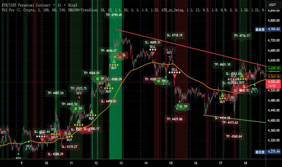
Precision AI Trading ProPrecision AI Trading Pro — TradingView Indicator EN / 中文雙語說明(No promo, high-level logic, originality stated) What it does |用途 EN Trend-aligned entries on 5m/15m (and higher) using multi-layer confirmations. It emphasizes confirmation over prediction, then derives adaptive TP/SL from volatility and recent structure. 中文 在 5/15 分鐘(與更高時框)進行趨勢對齊進場,重確認、不猜轉折;並依波動與近期結構自適應計算 TP/SL。 Why it’s original & useful |原創性與價值 EN This script implements a custom 11-filter confluence engine and a volatility-aware exit model. Filters are designed to complement each other: HTF context narrows bias, LTF structure checks timing, momentum/volume validate strength, and regime gates avoid chop. Exits use ATR- and swing-based distances with caps to keep results realistic. 中文 本腳本自研 11 重共振濾網 與 隨波動調整的出場模型:HTF 提供方向偏好,LTF 結構掌握時點;動能/量能驗證有效性;型態/趨勢強度門檻過濾震盪;出場以 ATR 與擺動區間計算距離並設上限,使績效更貼近實際。 How it works (high-level) |高層級運作 EN HTF alignment: EMA(3/8/21) + RSI/MACD on a higher timeframe (confirmed bars only) sets directional bias. LTF structure: Requires local EMA(3/8/21) alignment, Structure Breakout (recent swing ± ATR buffer), and optional Pullback to EMA8/21. Regime checks: ADX gate and EMA band width filter out low-trend conditions; Volume confirms pressure. Risk layer: Peak Guard (overheat/new-high/surge) blocks extended entries. Trendline/EMA200: Optionally require EMA200 or TL breakout with ATR tolerance. Exits: SL = max(ATR×k, swing buffer, % floor); TP = min(R×SL, ATR/% caps). No look-ahead: HTF uses confirmed bars; pivots only annotate context, not used as entry triggers. 中文 HTF 共振:高階時框 EMA(3/8/21)+RSI/MACD(僅採用確認棒)決定方向偏好。 LTF 結構:要求本階 EMA(3/8/21) 一致、結構突破(近期高低點 ± ATR 緩衝),並可選 回踩 EMA8/21。 市況門檻:ADX 閘 與 EMA 帶寬 排除低趨勢環境;量能 驗證推進力。 風險層:Peak Guard(過熱/創高/急漲)避免追價。 趨勢線/EMA200:可選擇要求 EMA200 或趨勢線突破(含 ATR 容忍帶)。 出場:SL = max(ATR×k, 擺動緩衝, % 下限);TP = min(R×SL, ATR/% 上限)。 避免前視:HTF 僅用確認棒;樞紐點僅作標註,不作入場條件。 Filters (11) |濾網(11 項) HTF Trend / Bright Zone (RSI) / LTF EMA(3/8/21) / MACD / Volume / ADX Gate / Structure Breakout / Pullback to EMA / EMA Band Width / Peak Guard / Trendline or EMA200 Confirmation (高階趨勢/RSI 亮區/本階 EMA 結構/MACD/量能/ADX 閘/結構突破/回踩 EMA/EMA 窄帶/高位防護/趨勢線或 EMA200 確認) User can define required passes (default 7).|可自訂需通過的濾網數(預設 7)。 Features |功能 Multi-market presets (Crypto / Gold / US Futures / Forex)|多市場預設 Adaptive TP/SL with labels (dynamic R:R)|自適應 TP/SL(含標註) Risk-based star rating (0★–5★)|風險星級評分 Signal modes: Conservative / Balanced / Aggressive|訊號模式:保守/平衡/積極 Peak Guard toggle|高位防護可切換 How to use |使用方式 Pick market preset; start with 5m/15m. Set required filters (default 7) and enable HTF confirmed bars. Tune TP/SL and risk per symbol/timeframe; use star rating as visual guidance. In choppy markets, raise ADX min and EMA-band threshold; in trend, relax them slightly. 選擇市場預設(建議 5/15 分鐘起)。 設定需通過的濾網數(預設 7),並啟用 HTF 確認棒。 依商品/時框微調 TP/SL 與風險;以星級作視覺參考。 震盪市提高 ADX 與帶寬門檻;趨勢市可適度放寬。 Notes |注意 Backtest behavior depends on bar resolution and fill rules; intrabar path may differ from live fills. Educational use only; not financial advice. No ads/links/contacts. Changelog |版本紀錄(示例,請用「Update」維護) 2025-09-05: Reversal v2.1 scoring & 2-step confirmation; TL rejection/OB-touch trigger (optional); EMA8 recapture via close; Peak Guard integrated; BTC/ETH/SOL presets refined; alerts expanded; label params cleaned. 2025-08-28: Fixed decimal bug; tuned presets for four markets; kept auto RR/SL logic.Pine Script® göstergesiyoyoman868 tarafından3315
Jarvis Bitcoin Predictor – Advanced AI-Powered TrendJarvis Bitcoin Predictor is an invite-only indicator designed to help traders anticipate market moves with precision. It combines advanced momentum tracking, volatility analysis, and adaptive trend filters to highlight high-probability trading opportunities. 🔹 Core Features: - AI-inspired algorithm for Bitcoin price prediction - Early detection of bullish and bearish trend reversals - Dynamic support & resistance zones - Clear buy/sell signal markers - Built-in alerts to never miss an opportunity Optimized for Bitcoin, but compatible with other crypto pairs 🔹 How it works (general explanation): The indicator uses a mix of momentum calculations, volatility filters, and adaptive trend detection to generate signals. When several market conditions align, Jarvis provides clear entry/exit signals designed to improve decision-making and timing. 🔹 How to use it: 1- Add Jarvis Bitcoin Predictor to your chart. 2- Follow the green signals/zones for bullish opportunities. 3- Follow the red signals/zones for bearish opportunities. 4- Combine with proper risk management and your own strategy. This tool was built to give traders clarity and confidence in the fast-paced crypto market. ⚠️ Important: This script is invite-only. To request access, please contact the author directly.Pine Script® göstergesiADCrypto_ tarafından25
AURA AI - Multi-Layer Signal System# AURA AI - Multi-Layer Signal System ## Originality and Value Proposition This indicator implements a proprietary multi-layer signal filtering system designed specifically for educational trading analysis. The core value lies in three advanced algorithmic features developed to address common issues in market analysis: 1. **Adaptive Signal Spacing Algorithm**: Dynamically adjusts signal frequency based on real-time volatility calculations using custom ATR multipliers (0.7x to 1.8x) 2. **Hierarchical Signal Filtering**: Three-tier priority system with conflict prevention, cooldown periods, and cross-validation 3. **Progressive Educational Framework**: Contextual learning system with market concept explanations ## Technical Implementation The system processes market data through multiple validation layers: - **Primary Signals**: Multi-condition convergence requiring simultaneous confirmation from trend detection, directional strength analysis, momentum indicators, volume validation, and positioning filters - **Trend Signals**: Direction-following analysis with moving average crossover confirmation and momentum validation - **Reversal Signals**: Counter-trend opportunity detection with strict distance requirements and timeout filtering ## Algorithm Components and Processing - **Adaptive Trend Detection**: Custom trailing stop methodology with configurable sensitivity parameters - **Directional Strength Analysis**: Smoothed momentum indicators with threshold validation - **Volume-Weighted Confirmation**: Market participation analysis using comparative volume metrics - **Multi-Timeframe Validation**: Higher timeframe directional bias with hysteresis algorithms for stable detection - **Custom Filtering Engine**: Proprietary noise reduction and signal prioritization algorithms ## Educational Framework Design The indicator includes a comprehensive learning system addressing the gap between technical analysis tools and trader education: - **Progressive Complexity**: Simplified interface for beginners transitioning to professional-grade controls - **Contextual Explanations**: Real-time tooltips explaining market conditions and signal rationale - **Risk Management Integration**: Built-in safeguards teaching proper trading practices - **Signal Classification**: Clear categorization helping users understand different opportunity types ## Justification for Closed-Source Protection This indicator warrants protection due to: 1. **Proprietary Filtering Algorithms**: Custom-developed signal prioritization and conflict resolution logic 2. **Adaptive Volatility System**: Original methodology for dynamic parameter adjustment 3. **Educational Integration**: Comprehensive learning framework with contextual market education 4. **Risk-Aware Design**: Built-in overtrading prevention and educational safeguards The combination of these elements creates a unified analytical and educational system that goes beyond standard indicator combinations. ## Configuration and Usage **Educational Mode**: Simplified interface focusing on high-probability setups with learning tooltips **Professional Mode**: Full parameter control for experienced traders with advanced filtering options Key settings include signal type selection, volatility adaptation parameters, multi-timeframe analysis, and day-of-week filtering for backtesting optimization. ## Market Application and Limitations This system is designed for educational analysis across multiple markets and timeframes. The adaptive algorithms adjust to different volatility environments, though users should understand that no analytical tool can predict future market movements. The indicator serves as an educational tool to help traders understand market dynamics while providing structured signal analysis. Proper risk management, position sizing, and market knowledge remain essential for successful trading. ## Important Disclosures - This indicator provides educational analysis tools, not trading advice - Past signal performance does not guarantee future results - No claims are made regarding win rates or profitability - Users must implement proper risk management practices - Market conditions can change, affecting any analytical system's relevancePine Script® göstergesiPlugnplaytradingtech tarafından8
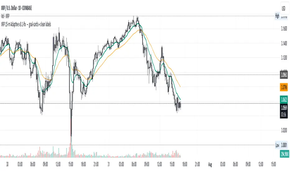
XRP AI 15‑m Adaptive v3.1Tracks XRP based on historical data curated by AI @DanielSpeiss Pine Script® stratejisiDanielSpeiss tarafından20
CryptoPulseStoch AICryptoPulseStoch AI Strategy This strategy combines Bollinger Bands, multi-timeframe EMAs (200 and 50), and Stochastic Oscillator for crypto trading signals on the 1-minute timeframe. Long entries trigger on Stochastic %K/%D crossovers in oversold zones with price breaking the lower Bollinger Band and an upward EMA trend; shorts on crossunders in overbought zones with price breaking the upper Bollinger Band and a downward EMA trend. Includes ATR-based risk management, position sizing, and R:R targets. Overlay on any chart; supports leverage (100% margin). Visual lines/labels for TP/SL/entries; alerts for webhooks. - **Account Balance (Default: 10000)**: Initial balance for calculating risk and position size; increase for larger accounts. - **BB Length (Default: 20)**: Periods for Bollinger Bands basis and deviation; shorter for more signals, longer for smoothing. - **BB Multiplier (Default: 2.0)**: Std dev factor for band width; higher widens bands, reducing false breakouts. - **Stochastic %K Length (Default: 14)**: Periods for Stochastic Oscillator %K calculation; adjust for sensitivity. - **Stochastic Smooth K (Default: 1)**: Smoothing period for %K; higher values reduce noise. - **Stochastic Smooth D (Default: 3)**: Smoothing period for %D; higher values smooth the signal line. - **Overbought Level (Default: 70)**: Stochastic threshold for bearish signals; lower for more frequent signals. - **Oversold Level (Default: 30)**: Stochastic threshold for bullish signals; higher for more frequent signals. - **Risk Per Trade (%) (Default: 2.0)**: Account percentage risked per trade; lower for conservative sizing. - **Risk:Reward Ratio (Default: 6.0)**: Target profit multiple of risk; higher aims for bigger wins. - **SL Multiplier (Default: 9.0)**: ATR factor for stop loss distance; adjust based on volatility. - **TP Multiplier (Default: 6.0)**: ATR factor for take profit distance, scaled by R:R; adjust for target distance. - **Line Length (bars) (Default: 25)**: Bars to extend TP/SL/entry lines; longer for better visibility. - **Label Position (Default: left)**: Text placement relative to lines (left/right); choose for chart clarity. - **ATR Period (Default: 14)**: Periods for ATR volatility measure; affects SL, TP, and position size. - **EMA Timeframe (Default: 5 min)**: Resolution for EMA 200/50 calculation; use lower TFs for finer trend confirmation. - **Visuals**: BB plots (blue basis, green upper, red lower); EMA200 (red), EMA50 (green); Stochastic %K (blue), %D (orange); red/green lines/labels for sell/buy entries, SL (red), TP (green). - **Alerts**: Conditions for buy/sell signals with webhook messages for integration (e.g., Bitget).Pine Script® stratejisithetraderlodge tarafından12
CryptoPulse AI### CryptoPulse AI Strategy This strategy combines Bollinger Bands, multi-timeframe EMAs (200 and 50), and candlestick wick detection for crypto trading signals. Long entries trigger on downward wicks breaking lower BB with upward EMA trend; shorts on upward wicks breaking upper BB with downward EMA trend. Includes ATR-based risk management, position sizing, and R:R targets. Overlay on any chart; supports leverage (100% margin). Visual lines/labels for TP/SL/entries; alerts for webhooks. - **Account Balance (Default: 10000)**: Initial balance for calculating risk and position size; increase for larger accounts. - **BB Length (Default: 20)**: Periods for Bollinger Bands basis and deviation; shorter for more signals, longer for smoothing. - **BB Multiplier (Default: 2.0)**: Std dev factor for band width; higher widens bands, reducing false breakouts. - **Wick to Body Ratio (Default: 1.1)**: Min wick size vs. body for valid signals (1.1 = 10% larger); higher requires stronger wicks. - **Risk Per Trade (%) (Default: 2.0)**: Account percentage risked per trade; lower for conservative sizing. - **Risk:Reward Ratio (Default: 6.0)**: Target profit multiple of risk; higher aims for bigger wins. - **SL Multiplier (Default: 9.0)**: ATR factor for stop loss distance; adjust based on volatility. - **Line Length (bars) (Default: 25)**: Bars to extend TP/SL/entry lines; longer for better visibility. - **Label Position (Default: left)**: Text placement relative to lines (left/right); choose for chart clarity. - **ATR Period (Default: 14)**: Periods for ATR volatility measure; affects SL and position size. - **EMA Timeframe (Default: 5 min)**: Resolution for EMA 200/50 calculation; use lower TFs for finer trend confirmation. - **Visuals**: BB plots (blue basis, green upper, red lower); EMA200 (red), EMA50 (green); red/green lines/labels for sell/buy entries, SL (red), TP (green). - **Alerts**: Conditions for buy/sell signals with webhook messages for integration (e.g., Bitget).Pine Script® stratejisithetraderlodge tarafından15
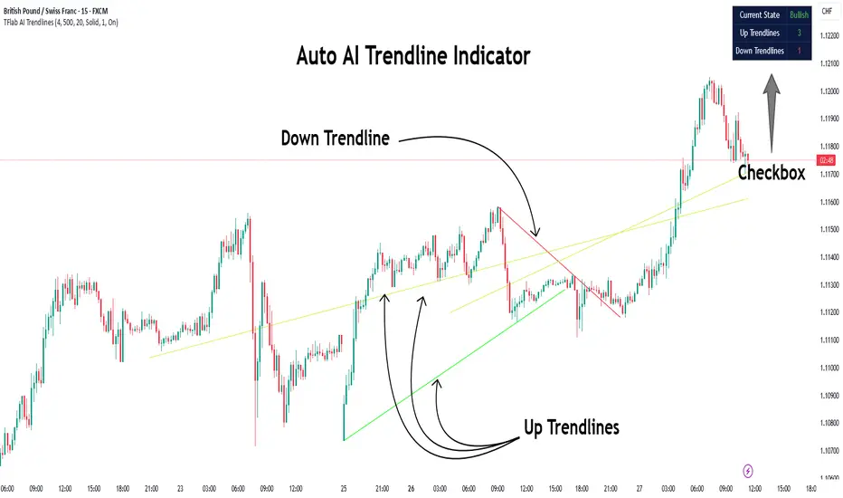
Auto AI Trendlines [TradingFinder] Clustering & Filtering Trends🔵 Introduction Auto AI trendlines Clustering & Filtering Trends Indicator, draws a variety of trendlines. This auto plotting trendline indicator plots precise trendlines and regression lines, capturing trend dynamics. Trendline trading is the strongest strategy in the financial market. Regression lines, unlike trendlines, use statistical fitting to smooth price data, revealing trend slopes. Trendlines connect confirmed pivots, ensuring structural accuracy. Regression lines adapt dynamically. The indicator’s ascending trendlines mark bullish pivots, while descending ones signal bearish trends. Regression lines extend in steps, reflecting momentum shifts. As the trend is your friend, this tool aligns traders with market flow. Pivot-based trendlines remain fixed once confirmed, offering reliable support and resistance zones. Regression lines, adjusting to price changes, highlight short-term trend paths. Both are vital for traders across asset classes. 🔵 How to Use There are four line types that are seen in the image below; Precise uptrend (green) and downtrend (red) lines connect exact price extremes, while Pivot-based uptrend and downtrend lines use significant swing points, both remaining static once formed. 🟣 Precise Trendlines Trendlines only form after pivot points are confirmed, ensuring reliability. This reduces false signals in choppy markets. Regression lines complement with real-time updates. The indicator always draws two precise trendlines on confirmed pivot points, one ascending and one descending. These are colored distinctly to mark bullish and bearish trends. They remain fixed, serving as structural anchors. 🟣 Dynamic Regression Lines Regression lines, adjusting dynamically with price, reflect the latest trend slope for real-time analysis. Use these to identify trend direction and potential reversals. Regression lines, updated dynamically, reflect real-time price trends and extend in steps. Ascending lines are green, descending ones orange, with shades differing from trendlines. This aids visual distinction. 🟣 Bearish Chart A Bullish State emerges when uptrend lines outweigh or match downtrend lines, with recent upward momentum signaling a potential rise. Check the trend count in the state table to confirm, using it to plan long positions. 🟣 Bullish Chart A Bearish State is indicated when downtrend lines dominate or equal uptrend lines, with recent downward moves suggesting a potential drop. Review the state table’s trend count to verify, guiding short position entries. The indicator reflects this shift for strategic planning. 🟣 Alarm Set alerts for state changes to stay informed of Bullish or Bearish shifts without constant monitoring. For example, a transition to Bullish State may signal a buying opportunity. Toggle alerts On or Off in the settings. 🟣 Market Status A table summarizes the chart’s status, showing counts of ascending and descending lines. This real-time overview simplifies trend monitoring. Check it to assess market bias instantly. Monitor the table to track line counts and trend dominance. A higher count of ascending lines suggests bullish bias. This helps traders align with the prevailing trend. 🔵 Settings Number of Trendlines : Sets total lines (max 10, min 3), balancing chart clarity and trend coverage. Max Look Back : Defines historical bars (min 50) for pivot detection, ensuring robust trendlines. Pivot Range : Sets pivot sensitivity (min 2), adjusting trendline precision to market volatility. Show Table Checkbox : Toggles display of a table showing ascending/descending line counts. Alarm : Enable or Disable the alert. 🔵 Conclusion The multi slopes indicator, blending pivot-based trendlines and dynamic regression lines, maps market trends with precision. Its dual approach captures both structural and short-term momentum. Customizable settings, like trendline count and pivot range, adapt to diverse trading styles. The real-time table simplifies trend monitoring, enhancing efficiency. It suits forex, stocks, and crypto markets. While trendlines anchor long-term trends, regression lines track intraday shifts, offering versatility. Contextual analysis, like price action, boosts signal reliability. This indicator empowers data-driven trading decisions. Pine Script® göstergesiTFlab tarafından22 2 K
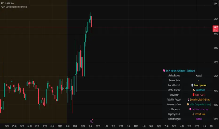
Nyx-AI Market Intelligence DashboardNyx AI Market Intelligence Dashboard is a non-signal-based environmental analysis tool that provides real-time insight into short-term market behavior. It is designed to help traders understand the quality of current price action, volume dynamics, volatility conditions, and structural behavior. It informs the trader whether the current market environment is supportive or hostile to trading and whether any active signal (from other tools) should be trusted, filtered, or avoided altogether. Nyx is composed of seven intelligent modules. Each module operates independently but is visually unified through a floating dashboard panel on the chart. This panel renders live diagnostics every few bars, maintaining a low visual footprint without drawing overlays or modifying price. Market Posture Engine This module reads individual candlesticks using real-time candle anatomy to interpret directional bias and sentiment. It examines body-to-range ratio, wick imbalances, and compares them to prior bars. If the current candle is a large momentum body with minimal wick, it is interpreted as a directional thrust. If it is a small body with equal wicks, it is considered indecision. Engulfing patterns are used to detect potential liquidity tests. The system outputs a plain-text posture signal such as Building Bullish Intent, Bearish Momentum, Indecision Zone, Testing Liquidity (Up or Down), or Neutral. Flow Reversal Engine This module monitors short-term structural shifts and volume contraction to detect early signs of reversal or exhaustion. It looks for lower highs or higher lows paired with weakening volume and closing behavior that implies loss of momentum. It also monitors divergence between price and volume, as well as bar-to-bar momentum stalls (where highs and lows stop expanding). When these conditions are met, it outputs one of several states including Top Forming, Bottom Forming, Flow Divergence, Momentum Stall, or Neutral. This is useful for detecting inflection points before they manifest on trend indicators. Fractal Context Engine This engine compares the current bar’s range to its surrounding structural context. It uses a dynamic lookback length based on volatility. It determines whether the market is in expansion (strong directional trend), compression (shrinking range), or a transitional phase. A special case called Flip In Progress is triggered when the current high and low exceed the entire recent range, which often precedes sharp reversals or volatility expansion. The result is one of the following: Trend Expansion, Trend Breakdown, Sideways or Coil, Flip In Progress, or Expansion to Coil. Candle Behavior Analyzer This module analyzes the last five candles as a set to detect behavioral traits that a single candle may not reveal. It calculates average body and wick size, and counts how many recent candles show thrust (large body dominance), trap behavior (price returns inside wicks), or weakness (small bodies with high wick ratios). The module outputs one of the following behaviors: Aggressive Buying, Aggressive Selling, Trap Pattern, Trap During Coil, Low Participation, Low Energy, or Fakeout Candle. This helps the trader assess sentiment quality and the reliability of price movement. Volatility Forecast and Compression Memory This module predicts whether a breakout is likely based on recent compression behavior. It tracks how many of the last 10 bars had significantly reduced range compared to average. If a certain threshold is met without any recent large expansion bar, the system forecasts that a volatility expansion is likely in the near future. It also records how many bars ago the last high volatility impulse occurred and classifies whether current conditions are compressing. The outputs are Expansion Likely, Active Compression, and Last Burst memory, which provide breakout timing and energy insights. Entry Filter This module scores the current bar based on four adaptive criteria: body size relative to range, volume strength relative to average, current volatility versus historical volatility, and price position relative to a 20-period moving average. Each factor is scored as either 1 or 2. The total score is adjusted by a behavioral modifier that adds or subtracts a point if recent candles show aggression or trap behavior. Final scores range from 4 to 8 and are classified into Optimal, Mixed, or Avoid categories. This module is not a trade signal. It is a confluence filter that evaluates whether conditions are favorable for entry. It is particularly effective when layered with other indicators to improve precision. Liquidity Intent Engine This engine checks for price behavior around recent swing highs and lows. It uses adaptive pivots based on volatility to determine if price has swept above a recent high or below a recent low. This behavior is often associated with institutional liquidity hunts. If a sweep is detected and price has moved away from the sweep level, the engine infers directional intent and compares current distance to the high and low to determine which liquidity pool is more dominant. The output is Magnet Above, Magnet Below, or Conflict Zone. This is useful for anticipating directional bias driven by smart money activity. Sticky Memory Tracking To avoid flickering between states on low volatility or noisy price action, Nyx includes a sticky memory system. Each module’s output is preserved until a meaningful change is detected. For example, if Market Posture is Neutral and remains so for several bars, the previous non-neutral value is retained. This makes the dashboard more stable and easier to interpret without misleading noise. Dashboard Rendering All module outputs are displayed in a clean two-column panel anchored to any corner of the chart. Text values are color-coded, tooltips are added for context, and the data refreshes every few bars to maintain speed. The dashboard avoids clutter and blends seamlessly with other chart tools. This tool is intended for informational and educational purposes only. It does not provide financial advice or trading signals. Nyx analyzes price, volume, structure, and volatility to offer context about the current market environment. It is not designed to predict future price movements or guarantee profitable outcomes. Traders should always use independent judgment and risk management. Past performance of any analysis logic does not guarantee future results.Pine Script® göstergesiAresIQ tarafından44113
Helacator Ai ThetaHelacator Ai Theta is a state-of-the-art advanced script. It helps the trader find the possibility of a trend reversal in the market. By finding that point at which the three black crows pattern combines with the three white soldiers pattern, it is the most cherished pattern in technical analysis for its signal of strong bullish or bearish momentum. Therefore, it is a very strong predictive tool in the ability of shifting markets. Key Highlights: Three White Soldiers and Three Black Crows Patterns The script identifies these candlestick formations that consist of three consecutive candles, either bullish (Three White Soldiers) or bearish (Three Black Crows). These patterns help the trader identify possible trend reversal points as they provide an early signal of a change in the market direction. It is with great care that the script is written to evaluate the position and relationship between the candlesticks for maintaining the accuracy of pattern recognition. Moving Averages for Trend Filtering: Two important ones used are moving averages for filtering any signals not in accordance with the general trend. The length of these MAs is variable, allowing the traders to be in a position to adapt the script for use under different market conditions. The moving averages ensure that signals are only taken in the direction that supports the general market flow, so it leads to more reliability within the signals. The MAs are not plotted on the chart for the sake of clarity, but they still perform a crucial function in signal filtering and can be displayed optionally for a more detailed investigation. Cooldown filter to reduce over-trading This is part of what is implemented in the script to prevent generation of consecutive signals too quickly. All this helps to reduce market noise and not overtrade—only when market conditions are at their best. The cooldown period can be set to be adjusted according to the trader's preference, making the script more versatile in its use. Practical Considerations: Educational Purpose: This script is for educational purposes only and should be part of a comprehensive trading approach. Proper risk management techniques should be observed while at the same time taking into consideration prevailing market conditions before making any trading decision. No Guaranteed Results: The script is aimed at bringing signal accuracy into improvement to align with the broader market trend and reducing noise, but past performance cannot guarantee future success. Traders should use this script within their broad trading approach. Clean and Simple Chart Display: The primary goal of this script is to have a clear and simple display on the chart. The signals are prominently marked with "BUY" and "SELL," and the color of the bars has changed according to the last signal, thus traders can easily read the output. Community and Open Source Open Source Contribution: This script is open for contribution by the TradingView community. Any suggestions regarding improvements are highly welcomed. Candlestick patterns, moving averages, and the combination of the cooldown filter are presented in such a way as to give traders something special, and any modifications or extra touch by the community is appreciated. Attribution and Transparency: The script is based on standard technical analysis principles and for all parts inspired by or derivated from other available open-source scripts, credit is given where it is due. In this way, transparency ensures that the script adheres to TradingView's standards and promotes a collaborative community environment.Pine Script® göstergesicowdaprettylad tarafından88 1.9 K
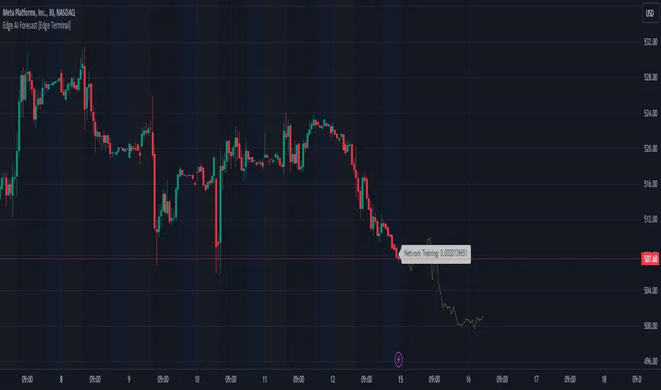
Edge AI Forecast [Edge Terminal]This indicator inputs the previous 150 closing prices in a simple two-layer neural network, normalizes the network inputs using a sigmoid function, uses a feedforward calculation to send it to the second layer, shows the MSE loss curve and uses both automatic and manual backpropagation (user input) to find the most likely forecast values and uses the analog forecasting algorithm to adjust and optimize the data furthermore to display potential prices on the chart. Here's how it works: The idea behind this script is to train a simple neural network to predict the future x values based on the sample data. For this, we use 2 types of data, Price and Volume. The thinking behind this is that price alone can’t be used in this case because it doesn’t provide enough meaningful pattern data for the network but price and volume together can change the game. We’re planning to use more different data sets and expand on this in the future. To avoid a bad mix of results, we technically have two neural networks, each processing a different data type, one for volume data and one for price data. The actual prediction is decided by the way price and volume of the closing price relate to each other. Basically, the network passes the price and volume and finds the best relation between the two data set outputs and predicts where the price could be based on the upcoming volume of the latest candle. The network adjusts the weights and biases using optimization algorithms like gradient descent to minimize the difference between the predicted and actual stock prices, typically measured by a loss function, (in this case, mean squared error) which you can see using the error rate bubble. This is a good measure to see how well the network is performing and the idea is to adjust the settings inputs such as learning rate, epochs and data source to get the lowest possible error rate. That’s when you’re getting the most accurate prediction results. For each data set, we use a multi-layer network. In a multi-layer neural network, the outputs of neurons in one layer serve as inputs to neurons in the next layer. Initially, the input layer of the neural network receives the historical data. Each input neuron represents a feature, such as previous stock prices and trading volumes over a specific period. The hidden layers perform feature extraction and transformation through a series of weighted connections and activation functions. Each neuron in a hidden layer computes a weighted sum of the inputs from the previous layer, applies an activation function to the sum, and passes the result to the next layer using the feedforward (activation) function. For extraction, we use a normalization function. This function takes a value or data (such as bar price) and divides it up by max scale which is the highest possible value of the bar. The idea is to take a normalized number, which is either below 1 or under 2 for simple use in the neural network layers. For the activation, after computing the weighted sum, the neuron applies an activation function a(x). To introduce non-linearity into the model to pass it to the next layer. We use sigmoid activation functions in this case. The main reason we use sigmoid function is because the resulting number is between 0 to 1 and is better for models where we have to predict the probability as an output. The final output of the network is passed as an input to the analog forecasting function. This is an algorithm commonly used in weather prediction systems. In this case, this is used to make predictions by comparing current values and assuming the patterns might repeat in the future. There are many different ways to build an analog forecasting function but in our case, we’re used similarity measurement model: X, as the current situation or set of current variables. Y, as the outcome or variable of interest. Si as the historical situations or patterns, where i ranges from 1 to n. Vi as the vector of variables describing historical situation Si. Oi as the outcome associated with historical situation Si. First, we define a similarity measure sim(X,Vi) that quantifies the similarity between the current situation X and historical situation Si based on their respective variables Vi. Then we select the K most similar historical situations (KNN Machine learning) based on the similarity measure sim(X,Vi). We denote the rest of the selected historical situations as {Si1, Si2,...Sik). Then we examine the outcomes associated with the selected historical situations {Oi1, Oi2,...,Oik}. Then we use the outcomes of the selected historical situations to forecast the future outcome Y^ using weighted averaging. Finally, the output value of the analog forecasting is standardized using a standardization function which is the opposite of the normalization function. This function takes a normalized number and turns it back to its original value by multiplying it by the max scale (highest value of the bar). This function is used when the final number is produced by the network output at the end of the analog forecasting to turn the final value back into a price so it can be displayed on the chart with PineScript. Settings: Data source: Source of the neural network's input data. Sample Bars: How many historical bars do you want to input into the neural network Prediction Bars: How many bars you want the script to forecast Show Training Rate: This shows the neural network's error rate for the optimization phase Learning Rate: how many times you want the script to change the model in response to the estimated error (automatic) Epochs: the network cycle or how many times you want to run the data through the network from the first layer to the last one. Usage: The sample bars input determines the number of historical bars to be used as a reference for the network. You need to change the Epochs and Learning Rate inputs for each asset and chart timeframe to get the lowest error rate. On the surface, the highest possible epoch and learning rate should produce the most effective results but that's not always the case. If the epochs rate is too high, there is a chance we face overfitting. Essentially, you might be over processing good data which can make it useless. On the other hand, if the learning rate is too high, the network may overshoot the optimal solution and diverge. This is almost like the same issue I mentioned above with a high epoch rate. Access: It took over 4 months to develop this script and we’re constantly improving it so it took a lot of manpower to develop this script. Also when it comes to neural networks, Pine Script isn’t the most optimal language to build a neural network in, so we had to resort to a few proprietary mathematical formulas to ensure this runs smoothly without giving out an error for overprocessing, specially when you have multiple neural networks with many layers. The optimization done to make this script run on Pine Script is basically state of the art and because of this, we would like to keep the code closed source at the moment. On the other hand we don’t want to publish the code publicly as we want to keep the trading edge this script gives us in a closed loop, for our own small group of members so we have to keep the code closed. We only accept invites from expert traders who understand how this script and algo trading works and the type of edge it provides. Additionally, at the moment we don’t want to share the code as some of the parts of this network, specifically the way we hand the data from neural network output into the analog method formula are proprietary code and we’d like to keep it that way. You can contact us for access and if we believe this works for your trading case, we will provide you with access.Pine Script® göstergesiEdgeTerminal tarafından1212170
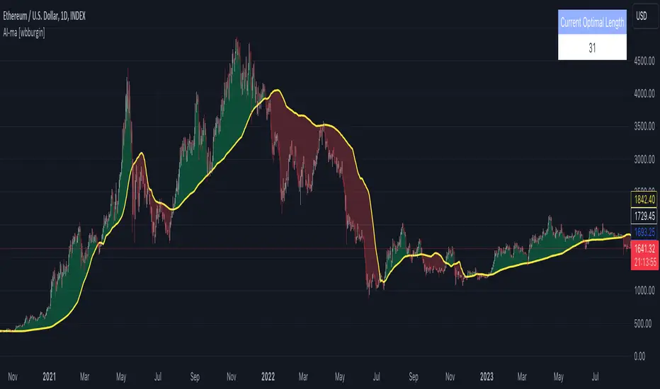
Optimal Moving Average (AI/ML) [wbburgin]Some traders swear by the 200-period moving average. Others, by the 100-period. Others, the 14-period. It depends on your asset, your timeframe, the trend… The fact of the matter is that no moving average will ever be a consistent indicator for a serious trader - a fixed-length moving average will always need confirmation indicators and tests. When your instrument is trending, you need a faster moving average to better fit the data; when your instrument is ranging, you need a slower moving average that cleans the data. This just is not possible given the way the moving average is traditionally coded, which makes it a lagging indicator. Thus we need a moving average that: can project the next prices, and can change its length depending on what best fits these future prices. The Optimal Moving Average selects the optimal moving average length for a projected future price. The algorithm classifies moving averages by their effectiveness in predicting future price movement. If a moving average of length n has historically been accurate in predicting the next bar, the moving average will be tested compared to its peers ( n -1, n +5, n -100, etc.) and promoted or demoted depending on its effectiveness. This means that the indicator will not have a length input like other static moving averages or machine-learning moving averages on TradingView- it will select the ideal length for your chart from the average that has the least error and best prediction. Advantages over other ML Moving Averages on TradingView The vast majority of AI/ML moving average algorithms classify their moving averages only by if the average is above or below the current price. This approach is inherently flawed because the model Is not predictive of future prices (the structural lagging problem still exists), Is not built on a variable-length MA (cannot select alternating lengths depending on the bar), and does not classify the scale of difference between the MA and the price. This indicator solves all those problems. It classifies moving averages by the scale of which their rate predicts the next price. Thus it is quick to catch trend changes but also acts as support or resistance, and models the projected price more accurately than a traditional moving average.Pine Script® göstergesiwbburgin tarafındanGüncellendi 3361
Support & Resistance AI (K means/median) [ThinkLogicAI]█ OVERVIEW K-means is a clustering algorithm commonly used in machine learning to group data points into distinct clusters based on their similarities. While K-means is not typically used directly for identifying support and resistance levels in financial markets, it can serve as a tool in a broader analysis approach. Support and resistance levels are price levels in financial markets where the price tends to react or reverse. Support is a level where the price tends to stop falling and might start to rise, while resistance is a level where the price tends to stop rising and might start to fall. Traders and analysts often look for these levels as they can provide insights into potential price movements and trading opportunities. █ BACKGROUND The K-means algorithm has been around since the late 1950s, making it more than six decades old. The algorithm was introduced by Stuart Lloyd in his 1957 research paper "Least squares quantization in PCM" for telecommunications applications. However, it wasn't widely known or recognized until James MacQueen's 1967 paper "Some Methods for Classification and Analysis of Multivariate Observations," where he formalized the algorithm and referred to it as the "K-means" clustering method. So, while K-means has been around for a considerable amount of time, it continues to be a widely used and influential algorithm in the fields of machine learning, data analysis, and pattern recognition due to its simplicity and effectiveness in clustering tasks. █ COMPARE AND CONTRAST SUPPORT AND RESISTANCE METHODS 1) K-means Approach: Cluster Formation: After applying the K-means algorithm to historical price change data and visualizing the resulting clusters, traders can identify distinct regions on the price chart where clusters are formed. Each cluster represents a group of similar price change patterns. Cluster Analysis: Analyze the clusters to identify areas where clusters tend to form. These areas might correspond to regions of price behavior that repeat over time and could be indicative of support and resistance levels. Potential Support and Resistance Levels: Based on the identified areas of cluster formation, traders can consider these regions as potential support and resistance levels. A cluster forming at a specific price level could suggest that this level has been historically significant, causing similar price behavior in the past. Cluster Standard Deviation: In addition to looking at the means (centroids) of the clusters, traders can also calculate the standard deviation of price changes within each cluster. Standard deviation is a measure of the dispersion or volatility of data points around the mean. A higher standard deviation indicates greater price volatility within a cluster. Low Standard Deviation: If a cluster has a low standard deviation, it suggests that prices within that cluster are relatively stable and less likely to exhibit sudden and large price movements. Traders might consider placing tighter stop-loss orders for trades within these clusters. High Standard Deviation: Conversely, if a cluster has a high standard deviation, it indicates greater price volatility within that cluster. Traders might opt for wider stop-loss orders to allow for potential price fluctuations without getting stopped out prematurely. Cluster Density: Each data point is assigned to a cluster so a cluster that is more dense will act more like gravity and 2) Traditional Approach: Trendlines: Draw trendlines connecting significant highs or lows on a price chart to identify potential support and resistance levels. Chart Patterns: Identify chart patterns like double tops, double bottoms, head and shoulders, and triangles that often indicate potential reversal points. Moving Averages: Use moving averages to identify levels where the price might find support or resistance based on the average price over a specific period. Psychological Levels: Identify round numbers or levels that traders often pay attention to, which can act as support and resistance. Previous Highs and Lows: Identify significant previous price highs and lows that might act as support or resistance. The key difference lies in the approach and the foundation of these methods. Traditional methods are based on well-established principles of technical analysis and market psychology, while the K-means approach involves clustering price behavior without necessarily incorporating market sentiment or specific price patterns. It's important to note that while the K-means approach might provide an interesting way to analyze price data, it should be used cautiously and in conjunction with other traditional methods. Financial markets are influenced by a wide range of factors beyond just price behavior, and the effectiveness of any method for identifying support and resistance levels should be thoroughly tested and validated. Additionally, developments in trading strategies and analysis techniques could have occurred since my last update. █ K MEANS ALGORITHM The algorithm for K means is as follows: Initialize cluster centers assign data to clusters based on minimum distance calculate cluster center by taking the average or median of the clusters repeat steps 1-3 until cluster centers stop moving █ LIMITATIONS OF K MEANS There are 3 main limitations of this algorithm: Sensitive to Initializations: K-means is sensitive to the initial placement of centroids. Different initializations can lead to different cluster assignments and final results. Assumption of Equal Sizes and Variances: K-means assumes that clusters have roughly equal sizes and spherical shapes. This may not hold true for all types of data. It can struggle with identifying clusters with uneven densities, sizes, or shapes. Impact of Outliers: K-means is sensitive to outliers, as a single outlier can significantly affect the position of cluster centroids. Outliers can lead to the creation of spurious clusters or distortion of the true cluster structure. █ LIMITATIONS IN APPLICATION OF K MEANS IN TRADING Trading data often exhibits characteristics that can pose challenges when applying indicators and analysis techniques. Here's how the limitations of outliers, varying scales, and unequal variance can impact the use of indicators in trading: Outliers are data points that significantly deviate from the rest of the dataset. In trading, outliers can represent extreme price movements caused by rare events, news, or market anomalies. Outliers can have a significant impact on trading indicators and analyses: Indicator Distortion: Outliers can skew the calculations of indicators, leading to misleading signals. For instance, a single extreme price spike could cause indicators like moving averages or RSI (Relative Strength Index) to give false signals. Risk Management: Outliers can lead to overly aggressive trading decisions if not properly accounted for. Ignoring outliers might result in unexpected losses or missed opportunities to adjust trading strategies. Different Scales: Trading data often includes multiple indicators with varying units and scales. For example, prices are typically in dollars, volume in units traded, and oscillators have their own scale. Mixing indicators with different scales can complicate analysis: Normalization: Indicators on different scales need to be normalized or standardized to ensure they contribute equally to the analysis. Failure to do so can lead to one indicator dominating the analysis due to its larger magnitude. Comparability: Without normalization, it's challenging to directly compare the significance of indicators. Some indicators might have a larger numerical range and could overshadow others. Unequal Variance: Unequal variance in trading data refers to the fact that some indicators might exhibit higher volatility than others. This can impact the interpretation of signals and the performance of trading strategies: Volatility Adjustment: When combining indicators with varying volatility, it's essential to adjust for their relative volatilities. Failure to do so might lead to overemphasizing or underestimating the importance of certain indicators in the trading strategy. Risk Assessment: Unequal variance can impact risk assessment. Indicators with higher volatility might lead to riskier trading decisions if not properly taken into account. █ APPLICATION OF THIS INDICATOR This indicator can be used in 2 ways: 1) Make a directional trade: If a trader thinks price will go higher or lower and price is within a cluster zone, The trader can take a position and place a stop on the 1 sd band around the cluster. As one can see below, the trader can go long the green arrow and place a stop on the one standard deviation mark for that cluster below it at the red arrow. using this we can calculate a risk to reward ratio. Calculating risk to reward: targeting a risk reward ratio of 2:1, the trader could clearly make that given that the next resistance area above that in the orange cluster exceeds this risk reward ratio. 2) Take a reversal Trade: We can use cluster centers (support and resistance levels) to go in the opposite direction that price is currently moving in hopes of price forming a pivot and reversing off this level. Similar to the directional trade, we can use the standard deviation of the cluster to place a stop just in case we are wrong. In this example below we can see that shorting on the red arrow and placing a stop at the one standard deviation above this cluster would give us a profitable trade with minimal risk. Using the cluster density table in the upper right informs the trader just how dense the cluster is. Higher density clusters will give a higher likelihood of a pivot forming at these levels and price being rejected and switching direction with a larger move. █ FEATURES & SETTINGS General Settings: Number of clusters: The user can select from 3 to five clusters. A good rule of thumb is that if you are trading intraday, less is more (Think 3 rather than 5). For daily 4 to 5 clusters is good. Cluster Method: To get around the outlier limitation of k means clustering, The median was added. This gives the user the ability to choose either k means or k median clustering. K means is the preferred method if the user things there are no large outliers, and if there appears to be large outliers or it is assumed there are then K medians is preferred. Bars back To train on: This will be the amount of bars to include in the clustering. This number is important so that the user includes bars that are recent but not so far back that they are out of the scope of where price can be. For example the last 2 years we have been in a range on the sp500 so 505 days in this setting would be more relevant than say looking back 5 years ago because price would have to move far to get there. Show SD Bands: Select this to show the 1 standard deviation bands around the support and resistance level or unselect this to just show the support and resistance level by itself. Features: Besides the support and resistance levels and standard deviation bands, this indicator gives a table in the upper right hand corner to show the density of each cluster (support and resistance level) and is color coded to the cluster line on the chart. Higher density clusters mean price has been there previously more than lower density clusters and could mean a higher likelihood of a reversal when price reaches these areas. █ WORKS CITED Victor Sim, "Using K-means Clustering to Create Support and Resistance", 2020, towardsdatascience.com Chris Piech, "K means", stanford.edu █ ACKNOLWEDGMENTS @jdehorty- Thanks for the publish template. It made organizing my thoughts and work alot easier. Pine Script® göstergesiThinkLogicAI tarafından4141 4.6 K
TCG AI ToolsIntroduction: This script is a result of an AI recommended created trading strategy that is design to offer new traders’ easy access to trend information and oversold/overbought conditions. Here we have combined commonly used indicators into a single unique visualization that quickly identifies trend changes and both RSI and Bollinger Band based overbought and oversold conditions, and allows all three indicators to be used simultaneously while taking up limited space on the chart. The value in combining these three indicators is found in the harmony and clarity they are able to provide new traders. Trend changes can be difficult to identify based solely on candlestick analysis, therefore using the moving averages allows the trader to simplify the process of establishing bullish or bearish trends. Once a trend is established it can be very attractive for new traders to establish entries at the wrong time. For this reason, it is useful to include two different overbought and oversold indicators. The Bollinger Bands are included as one of the methods for establishing extreme prices that often result in reversals, and the relative strength index is similarly utilized as a second means to warn traders of extreme conditions. Using the Indicator 1. MA10 MA20 Trend Indicator The large red/green horizontal bar located at the 0 line on the X axis is the trend direction indicator. This visualization compares the 10 and 20 period moving averages to establish trend. When the MA10 is above the MA20 the trend is considered bullish and supportive of long positions and indicates such by changing the color of the horizontal bar to green. When the MA10 is below MA20 the trend is considered bearish and indicates such by changing the color of the horizontal bar to red. Color changes occur at the moment of a MA crossover/under. 2. Relative Strength Index. The vertical red and green bars that make up the background of the panel indicate conditions wherein the RSI is considered overbought or oversold. When the vertical bar is red it indicates that RSI is below 30 suggesting that current conditions are oversold and supportive of long entries. When the vertical bar is green it suggests that the current conditions are overbought and are supportive of short entries. 3. Bollinger Band Extremes Within the horizontal red/green bar there are red and green arrows. These arrows represent periods where the price is exceeding the upper or lower Bollinger bands and indicate overbought/oversold conditions. When a green arrow appears, it indicates that the price has crossed below the lower BB and is supportive of long entries. If a red arrow appears it indicates that the price has crossed above the upper Bollinger band and conditions are supportive of short entries. Pine Script® göstergesiTheChartGuys tarafından1313453
Universal Moving Average Convergence DivergenceI changed MACD formula to divergence of (MA26/MA12 - 1). And its make it more useful. Cuz: 1) comparability with all other coins with different prices. 2) fix small numbers in low price coines like shiba 3) making a good indicator like RSI to use it for optimization and ML/AI projects as a variable Most important thing about this indicator is that its Universal Now you can compare the UMACD of Shiba with Bitcoin without any problem in matamatics space.No need to use virtuality and its important in Optimization problems that we rediuse the problem from a picture to a number(A plot to a list of numbers) If we don't care about exagrated pumps and dumps, we can say to it Normalized-MACD too. Cuz in normal situations its MAX ≈ 0.1 and MIN ≈ -0.1Pine Script® göstergesimablue tarafından11239
MoonFlag DailyThis is a useful indicator as it shows potential long and short regions by coloring the AI wavecloud green or red. There is an option to show a faint white background in regions where the green/red cloud parts are failing as a trade from the start position of each region. Its a combination of 3 algos I developed, and there is an option to switch to see these individually, although this has lots of info and is a bit confusing. It does have alerts and there are text boxes in the indicator settings where a comment can be input - this is useful for webhooks bots auto trading. Most useful in this indicator is that at the end of each green/long or red/short region there is a label that shows the % gain or loss for a trade. The label at the end of the chart shows the % of winning longs/shorts and the average % gain or loss for all the longs/shorts within the set test period (set in settings) So, I generally set the chart initially on a 15min timeframe with the indicator timeframe (in settings) set to run on say 30min or 1hour. I then select a long test period (several plus months) and then optimize the wavelcloud length (in settings) to give the best %profit per trade. (Longs always seem to give better results than shorts) I then, change the chart timeframe to much faster, say 1min or 5min, but leave the indicator timeframe at 1 hour. In this manner - the label only shows a few trades however, the algo is run at every bar close and when this is set to 1min, this means that losses will be minimised at the bot exits quickly. In comparison - if the chart is on a 15min timeframe - it can take this amount before the bot will exit a trade and by then there could be catastrophic losses. It is quite hard to get a positive result - although with a bit of playing around - just as a background indicator - I find this useful. I generally set-up on say 4charts all with different timeframes and then look for consistency between the long/short signal positions. (Although when I run as a bot I use a fast timeframe) Please do leave some comments and get in touch. MoonFlag (Josef Tainsh PhD)Pine Script® göstergesiMoonFlag tarafındanGüncellendi 5556
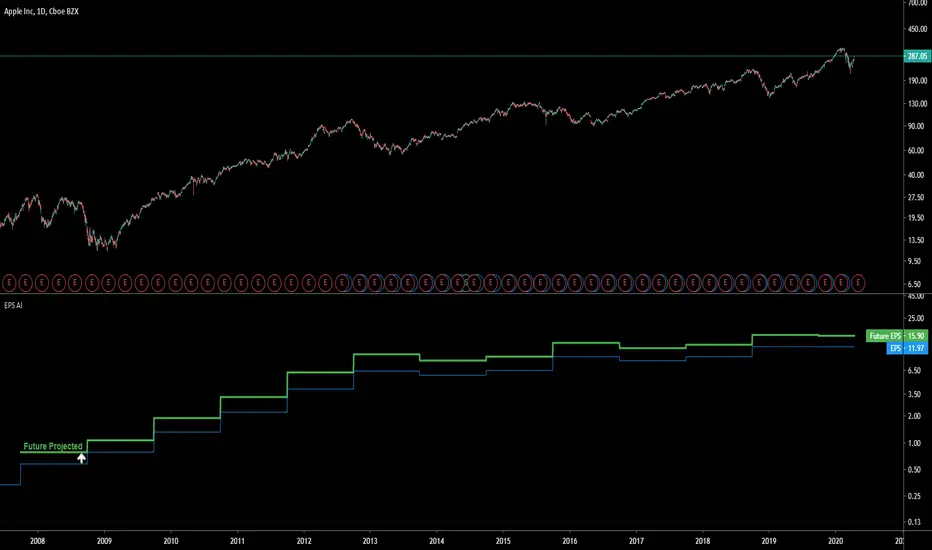
EPS AIThis indicator can be accessed by ANYONE by searching in the public indicator library located at the top of your chart! Enjoy! Introduction This indicator uses machine learning to predict the next Earnings Per Share (EPS) figure. The algorithm learns from previous figures in order to more accurately predict the next. As time continues, this indicator will become more accurate as it learns from an increased amount of data from earnings results. When the Future Projected EPS is positive, the line will appear green . When the Future Projected EPS is negative, the line will appear as red and sit below the EPS. Settings Panel The settings panel contains two tick-boxes. Quarterly Earnings : When selected, the EPS and future projected EPS will utilise quarterly results. Yearly results are used by default. Diluted EPS : When selected, the Diluted EPS and future projected Diluted EPS will be utilised. Basic EPS is used by default. Indicator Utility The EPS AI can be utilised on every securities instrument and time-frame. This indicator has been built in Pinescript V4 and will operate in real-time. This indicator can be accessed by ANYONE by searching in the public indicator library located at the top of your chart! Enjoy! Pine Script® göstergesiGrantPeace tarafından44216
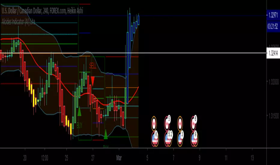
Alcides Indicator(AI) LiteAlcides Indicator (AI) Lite is a simple to use indicator that can be used with any type of asset, trading in any market including FOREX, Stocks, Commodities, Cryptocurrencies etc. The Lite version uses levels from either 1 hr or 4 hr time frame based on user input to indicate entry (BUY) into or exit (SELL) from an asset. The indicator also plots support for BUYs and Resistance for SELLs which can be used as a reference while setting your Stop Loss. BUY, SELL and TAKE GAINS alerts can be set on trading view to help monitor the asset as well. Even though the indicator signals BUYs and SELLs based on chosen Time Frame levels, the user must always use their discretion based on their TA and FA. Also, indicator repainting can occur based on time of signal/chart used (ex. 5m chart on 1 hr timeframe levels can repaint a BUY/SELL after 1 hr closes). Works best with Heikin Ashi candles and lower timeframes like 5m, 15m, 30m. The full version has more time frame levels to choose from, a few extra useful features and also recommends sell and buy levels based on the chosen time from. Contact me for access and more information. Pine Script® göstergesiTradeChartist tarafındanGüncellendi 1010143
ANB AI Alert (my ANN)Hi guy This is a high level trend predicting study. It is modified from the strategy by sirlof. Feel free to use it as you like. ::USAGE only on 15 minutes 1. add the study in your chart 2. create an alert on the right 3. select ANB AI Alert (my ANN)(0,1D) 4. select the option you wish 5. select once per bar close alert 6. you can select email alert which i usually like 7. once the trade is alerted, execute your trade TP: DYNAMIC (read more) SL: null Setting TP and SL: this is in consideration with the daily volatility and sessions USDCAD TP 400 points, no stop loss. To maximize profit, use trailing stops. most trades are 500 to 1800 points Pine Script® göstergesiDevLucem tarafındanGüncellendi 77216
Intelligent Volume-weighted Moving Average (AI)Introduction This indicator uses machine learning (Artificial Intelligence) to solve a real human problem. The volume-weighted moving average (VWMA) is one of the most used indicators on the planet, yet no one really knows what pair of volume-weighted moving average lengths works best in combination with each other. A reason for this is because no two VWMA lengths are always going to be the best on every instrument, time-frame, and at any given point in time. The "Intelligent Volume-weighted Moving Average" solves the moving average problem by adapting the period length to match the most profitable combination of volume-weighted moving averages in real time. How does the Intelligent Volume-weighted Moving Average work? The artificial intelligence that operates these moving average lengths was created by an algorithm that tests every single combination across the entire chart history of an instrument for maximum profitability in real-time. No matter what happens, the combination of these volume-weighted moving averages will be the most profitable. Can we learn from the Intelligent Volume-weighted Moving Average? There are many lessons to be learned from the Intelligent VWMA. Most will come with time as it is still a new concept. Adopting the usefulness of this AI will change how we perceive moving averages to work. Limitations This indicator does not change what has already been plotted and does not repaint in any way shape or form which means it is excellent for trading in real-time! Ultimately, there are no limiting factors within the range of combinations that has been programmed. The volume-weighted moving averages will operate normally, but may change lengths in unexpected ways - maybe it knows something we don't? Thresholds The range of VWMA lengths is between 5 to 40. The black crosses can be turned off in the settings panel. Test this indicator! I am also publishing tools that can be used to back-test this indicator and understand what period length is currently being used. There will be many more updates to come so stay tuned! Updated documentation and access to this indicator can be found at www.kenzing.com Pine Script® göstergesiGrantPeace tarafından1919161
Bishop AI - StrategyBishop AI model Indicator, to be used in conjunction with Fractal Identifier and Analytic Model Adapted to Strategy as requestedPine Script® stratejisiBishopTA tarafından141415