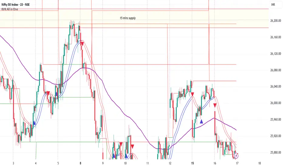
Key Levels - BlackDelta.ioPivots Point of high interest these line are not ordinary lines they are indicating HTF Weekly levels, Base you trading ideas around these Key Levels to gain higher probability setup's once price touches one these Key Levels get ready for a big move to continuation or a reversal, pair it with your other confluences to get more edge in the market.
if this indicator helped you leave a comment below :)
@BlackDelta_
Pivot noktaları ve seviyeleri

Boyen_Clean Historical Key Levels (WO, MO, & YO)Define historical Key Level Weekly Open, Montly Open and Yearly Open

Swing & Intraday Entry/Exit Setup V0.1Support & Resistance Levels with Moving Averages & Supertrend
Overview
This comprehensive indicator combines Multi Support/Resistance analysis , Moving Average, and Supertrend signals into one powerful tool. Designed for intraday/swing traders, it helps identify key price levels across Daily, Weekly, and Monthly while providing trend confirmation through MAs and Supertrend.
Product of: CandleCodex
License: Free for personal use | NOT FOR SALE
Version: 5.0 (Pine Script v6)
---
KEY FEATURES
Swing & Intraday Entry/Exit Setup V0.1 © CandleCodex™ (Daily/Weekly/Monthly)
- Previous Day High/Low (PDH/PDL) with customizable styling
- Previous Week High/Low (PWH/PWL) with independent settings
- Previous Month High/Low (PMH/PML) for swing traders
- Mid Levels - Adjustable percentage (default 50%) between high and low
- R1, R2, R3 - Projected resistance levels based on price range
- S1, S2, S3 - Projected support levels for breakout/breakdown targets
Moving Average
- 4 Fully Customizable MAs (20, 50, 100, 200 by default)
- Multiple MA Types: SMA, EMA, SMMA (RMA), WMA, VWMA
- Custom Source Selection: Close, Open, High, Low, HL2, HLC3, OHLC4
- Individual Colors & Toggle:** Show/hide each MA independently
Supertrend Indicator
- Buy/Sell Signals - Automatic labels on trend reversals
- Trend Highlighting - Background fill for bullish/bearish trends
- Customizable ATR Period & Multiplier (Default: 10, 3.0)
- Multiple Source Options: HL2, Close, Open, etc.
- Alert Conditions: Set alerts for buy/sell signals and trend changes
Information Tables
- 3 Separate Tables for Daily, Weekly, Monthly levels
- Adjustable Positions: 9 position options (top, middle, bottom - left, center, right)
- Custom Text Size: Tiny, Small, Normal, Large
- Live Price Display: Shows all levels with current prices
- Range Calculation: Displays trading range for each timeframe
Advanced Customization
- Line Styling: Width (1-5), Style (Solid/Dashed/Dotted), Color for EVERY level
- Label Options: Show/hide labels, show/hide prices, left/right positioning
- Historical Data: Display up to 50 previous periods
- Custom Session Timing: Set specific hours for daily levels (Indian market: 9:15-15:30)
- Copyright Watermark: Toggleable branding with position control
---
VISUAL CUSTOMIZATION
Every line (High, Low, Mid, R1-R3, S1-S3) has independent controls for:
- Color - Choose from full color palette with transparency
- Width - 1 to 5 pixels thickness
- Style - Solid, Dashed, or Dotted lines
- Show/Hide - Toggle individual levels on/off
Default Color Scheme:
- Daily: Green (High), Red (Low), Yellow (Mid)
- Weekly: Cyan (High), Magenta (Low), Light Green (Mid)
- Monthly: Orange (High), Purple (Low), Pink (Mid)
---
HOW TO USE
For Day Traders:
1. Enable Daily Levels - Focus on PDH/PDL as key intraday S/R zones
2. Watch for Breakouts - Price breaking PDH = bullish, breaking PDL = bearish
3. Use Mid Level - Acts as equilibrium; rejection zone for mean reversion
4. R/S Targets - Use R1, R2, R3 as profit targets above PDH; S1, S2, S3 below PDL
5. MA Confirmation - Enter trades in direction of MA trend
6. Supertrend Signals - Take BUY when price above Supertrend, SELL when below
For Swing Traders:
1. Enable Weekly/Monthly Levels - PWH/PWL and PMH/PML for bigger picture
2. Combine Timeframes - Strong rejection at PWL + Daily bullish Supertrend = long opportunity
3. Range Trading - Trade between PWH and PWL in consolidation
4. Breakout Confirmation - Use MA ribbon to confirm trend direction on HTF breakouts
Risk Management:
- Place Stop Loss just below PDL for longs, above PDH for shorts
- Targets: Use R1/S1 for scalping, R2/S2 for swing trades, R3/S3 for momentum trades
- Avoid Chop Zones: When price between MAs, wait for clear trend
---
SETTINGS GROUPS
1. ENABLE/DISABLE FEATURES - Master toggles for all components
2. DISPLAY SETTINGS - Labels, prices, positioning, historical periods
3. DAILY LEVELS STYLING - Complete customization for daily timeframe
4. WEEKLY LEVELS STYLING - Complete customization for weekly timeframe
5. MONTHLY LEVELS STYLING - Complete customization for monthly timeframe
6. MOVING AVERAGES - 4 independent MA configurations
7. SUPERTREND - ATR period, multiplier, signals, highlighting
8. TABLE SETTINGS - Position, size, colors for info tables
9. ADVANCED SETTINGS - Custom session timing, timezone
---
UNIQUE ADVANTAGES
All-in-One Solution - No need for multiple indicators cluttering your chart
Zero Lag - Calculates previous day/week/month data accurately without repainting
Full Control - Every visual element is customizable
Clean Interface - Organized settings with clear tooltips
Performance Optimized - Efficient code, no lag even with all features enabled
Indian Market Ready - Custom session timing (9:15 AM - 3:30 PM IST)
Free Forever - No subscriptions, no hidden costs
---
## 📖 TECHNICAL DETAILS
- Pine Script Version: v6
- Chart Type: Overlay indicator
- Calculation Method: Uses `request.security()` for accurate HTF data with `lookahead_on` to prevent repainting
- Data Structures: Uses Pine v5 matrices and custom types for efficient level management
- Performance: Max 500 lines, 500 labels for historical level display
---
IMPORTANT NOTES
- Works best on intraday timeframes (15min to 4hour)
- Requires TradingView Premium/Pro for reliable multi-timeframe data
- Previous day data appears after the first bar of new day
- Custom session timing only affects Daily levels (Weekly/Monthly use standard calendar)
- Tables display only on last bar to maintain performance
---
LEARNING RESOURCES
This indicator is designed to help traders understand:
- Key support and resistance concepts
- Multi-timeframe analysis techniques
- Trend following with moving averages
- Momentum trading with Supertrend
- Professional chart setup and risk management
---
COPYRIGHT & TERMS
© 2025 CandleCodex™ - All Rights Reserved
Developer: Siddharth Sharma
License: Mozilla Public License 2.0 with additional restrictions
Allowed:
- Personal trading use
- Educational purposes
- Sharing with attribution
Prohibited:
- Commercial sale or resale
- Rebranding as your own work
- Removing copyright notices
- Claiming authorship
This indicator is FREE and will always remain FREE.
If someone is selling this, they are violating copyright.
---
SUPPORT & FEEDBACK
For questions, suggestions, or bug reports:
- Comment below this publication
- Follow CandleCodex™ for updates
- Check release notes for latest improvements
If you find this indicator useful, please Like ❤️ and leave a comment!
---
Disclaimer: This indicator is for educational purposes only. Trading involves risk. Past performance does not guarantee future results. Always practice proper risk management and consult with a financial advisor before trading.

Auto-Anchored Fibonacci Volume Profile [Custom Array Engine]Description:
1. The Theoretical Foundation: Structure vs. Participation In professional technical analysis, traders often struggle to reconcile two distinct datasets: Price Geometry (where price should go) and Market Participation (where money actually went).
Why Fibonacci? (The Structure) Fibonacci Retracements map the mathematical structure of a trend. They identify psychological and algorithmic "interest zones" (0.382, 0.5, 0.618) where a correction is statistically likely to terminate. However, Fibonacci levels are theoretical—they are "lines in the sand" that do not guarantee liquidity or reaction.
Why Volume Profile? (The Verification) Volume Profile maps the historical exchange of shares at specific price levels. It reveals "fair value" (High Volume Nodes) and "market imbalance" (Low Volume Nodes). It is the only tool that verifies if a specific price level was actually accepted by institutional participants.
2. Underlying Calculations (The Custom Engine) This script operates on a custom-built calculation engine that bypasses standard built-in functions entirely. It uses Pine Script Arrays to build a Volume Profile from scratch. Here is the breakdown of the proprietary code logic:
A. The "Smart-Fill" Distribution Algorithm (Solves Gapping)
The Problem: Standard volume scripts often assign a candle's entire volume to a single price row. In volatile markets or steep trends, this creates visual "gaps" or a "barcode" effect because price moved too fast to register on every row.
My Solution: I wrote a custom loop that calculates the vertical overlap of every candle against the profile grid.
The Math: Volume Per Bin = Total Candle Volume / Bins Touched.
The Result: If a single volatile candle spans 10 price rows (bins), the script mathematically divides that volume and distributes it equally into all 10 array indices. This generates a solid, continuous distribution curve that accurately reflects price action through the entire candle range, not just the close.
B. Dynamic Arrays & Split-Volume Logic The script initializes two separate floating-point arrays (buyVolArray and sellVolArray) sized to the user's resolution (up to 300 rows). It iterates through the specific time-window of the swing:
If Close >= Open, the calculated volume slice is injected into the Buy Array.
If Close < Open, it is injected into the Sell Array.
These arrays are then visually stacked to render the dual-color profile, allowing traders to see the "Delta" (Buyer vs. Seller aggression) at key structural levels.
C. Custom Garbage Collection (Performance) To enable the "Auto-Anchoring" feature without causing chart lag or visual artifacts ("ghosting"), the script includes a Garbage Collection System. Before drawing a new profile, the script iterates through a tracking array of all existing objects (box.delete, line.delete) and clears them from memory. This ensures the indicator remains lightweight and responsive even when dragging chart margins or switching timeframes.
3. The Synthesis: Why Combine Them? The core philosophy of this script is Confluence . A Fibonacci level without volume is merely a suggestion; a Fibonacci level backed by volume is a defensive wall. By algorithmically anchoring a Volume Profile to the exact coordinates of a Fibonacci swing, this tool allows traders to instantly answer critical questions:
"Is the Golden Pocket (0.618) supported by a High Volume Node (HVN), or is it a Low Volume Node (LVN) that price might slice through?"
"Is the Shallow Retracement (0.382) holding because of structural support, or just a lack of selling pressure?"
4. How to Read the Indicator
The Geometry: The script automatically detects the trend and draws standard Fib levels (0, 0.236, 0.382, 0.5, 0.618, 0.786, 1.0).
The Confluence Check: Look for the Point of Control (Red Line). If this High Volume Node aligns with a key Fib level (e.g., the 0.618), the probability of a reversal increases significantly.
The Imbalance Check: Look for "Valleys" in the profile (Low Volume Nodes). These gaps often act as "slippage zones" where price travels quickly between structural levels.
Buy/Sell Splits: The dual-color bars (Teal/Red) reveal the composition of the volume. A 0.618 level held up by dominant Buy Volume is a stronger bullish signal than one with mixed volume.
5. Settings & Customization
Lookback Length: Sensitivity of the swing detection (Default: 200 bars).
Resolution: Granularity of the profile rows (Default: 100). Higher values provide smoother definition.
Width (%): Responsive sizing that scales the profile relative to the trend's duration.
Extend Lines: Option to project structural levels infinitely to the right.
Disclaimer This script is an analytical tool for visualizing historical market data. It does not provide trade signals or financial advice.

Advanced custom multi MA signals (EMA/SMA/VWMA/VWAP) Features of Multi Moving Averages
The biggest enemy in trading is "Noise." If you get swayed by minute fluctuations on the chart, you end up missing the forest for the trees.
This indicator (Advanced Custom Multi MA Signals) is not just a simple line. By combining the three core elements of Price, Time, and Volume, it acts as a navigation system that visualizes the market's "true trend." In particular, the ability to analyze 5 moving averages simultaneously across various timeframes is akin to viewing a 3D map of the battlefield.
Understanding Core Concepts
This indicator supports 4 types of moving averages. It is crucial to clearly understand the nature of each tool.
SMA (Simple Moving Average): The most basic average value. Since it produces fewer whipsaws (false signals), it is used as a baseline to judge the "long-term trend."
EMA (Exponential Moving Average): Places more weight on recent prices. It reacts sensitively to market changes, making it advantageous for identifying "entry points."
VWMA (Volume Weighted Moving Average): Incorporates "volume" into the price calculation. It acts as a "false signal filter," weeding out price moves that aren't backed by trading volume.
VWAP (Volume Weighted Average Price): The benchmark price used by institutional investors for daily trading. It is calculated based on the session, regardless of the period settings. It is considered the "lifeline" of day trading.
Indicator Settings Guide
Open the settings window and tune it to fit your trading style.
MA 01 ~ 05 (Moving Average Settings)
MA Type: Select according to your purpose. (Generally, EMA is recommended for short-term analysis, SMA/VWMA for long-term).
Length: Enter the period you wish to analyze (e.g., 20, 60, 120, 200).
Timeframe: This is the core feature. It allows you to overlay moving averages from a higher timeframe (e.g., 4-hour, Daily) onto the chart you are currently viewing (e.g., 15-minute).
Signal Option (Trading Signals)
Golden Cross (GC) / Death Cross (DC): Captures the moment the short-term line breaks through the long-term line. You can run up to 3 strategies simultaneously.
Ribbon Gradient (Trend Visualization)
Represents the gap between two moving averages with color. As the color deepens and the width expands, it indicates a powerful trend; if the width narrows, it suggests a high probability of a trend reversal.
5 Usage Strategies
The highlight of this indicator is the cross strategy utilizing the "Multi-Timeframe (MTF)" feature. Familiarize yourself with the 5 example strategies below and set up your own strategy based on your expertise.
💡 Tip 1. Do not go against the "Major Trend" (The Authority of the Weekly Candle)
Settings: Set MA5 to .
Interpretation: The Weekly 50 line is the "major trend line" managed by institutions and market makers. If the current price is above this line, maintain only a "Buy (Long)" bias; if below, maintain only a "Sell (Short)" bias. Adhering to this rule alone can help you avoid massive losses.
💡 Tip 2. Highly Reliable "Swing Signal" (Daily Golden Cross)
Settings: In Signal 1, configure the Short MA to and the Long MA to .
Interpretation: A Golden Cross where the 4-Hour 50 EMA breaks above the Daily 50 EMA often signifies a major "trend reversal" rather than a temporary rebound. This provides an ideal entry signal for office workers or swing traders who need high reliability.
💡 Tip 3. 4-Hour Candle as the Standard for "Precision Entry"
Situation: When the Daily trend is rising (Bullish alignment).
Strategy: While watching the 15-minute or 1-hour chart, set the indicator's Signal 2 to the cross of and .
Interpretation: When the Daily chart is in an uptrend, a Golden Cross occurring on the 4-Hour chart marks "the point where a correction (pullback) ends and the rise resumes." This is the entry point with the best risk-to-reward ratio.
💡 Tip 4. Filtering Out "Fake Signals" (The Secret of Volume)
Strategy: When creating a cross signal, try using VWMA (Volume Weighted) for the Long MA, even if you use EMA for the Short MA.
Reason: A Golden Cross caused simply by a rise in price can be a trap. However, if it breaks through the heavy VWMA line accompanied by volume, it is strong evidence that "genuine liquidity" has entered.
💡 Tip 5. Remember the "Hierarchy" (Higher Timeframe Priority Rule)
Principle: If a Golden Cross (Buy Signal) appears on the 4-Hour chart, but the Daily chart is in a Death Cross (Sell Signal) state, do not enter.
Interpretation: A signal from a lower timeframe cannot overcome the power of a higher timeframe. The professional approach is to trade with significant volume only when signals align (Sync) in the order of Weekly > Daily > 4-Hour. Keep this indicator's dashboard feature on and always check the status of higher timeframes.
Signal Generation Principle (Operating Mechanism)
Signals are generated when the set short-term moving average and long-term moving average cross each other.
📈 1. Golden Cross (BUY = Buy Signal)
Situation: The moment the short-term MA crosses upward from below the long-term MA.
Principle: It implies that recent buying pressure has broken through the resistance level accumulated over a long period.
📉 2. Death Cross (SELL = Sell Signal)
Situation: The moment the short-term MA crosses downward from above the long-term MA.
Principle: It implies that recent selling pressure has collapsed the long-term support line.
※ If the candles are not displaying correctly or are flickering, please set the indicator's 'Visual order' to 'Bring to front' as shown in the image below.
Investment Caution and Disclaimer
Before using this indicator for actual trading, please strictly read the contents below.
① Auxiliary indicators are a "Compass," not a "Book of Prophecy."
This indicator is merely a tool that mathematically calculates and visualizes past price data. A "magic indicator" that predicts future price fluctuations 100% accurately or guarantees profit does not exist. The signals provided are for reference only and must never be the sole basis for entry/exit decisions.
② The responsibility for all investments lies with "Yourself."
Financial investment (Cryptocurrencies, Stocks, Futures, etc.) involves high volatility and is a risky activity that can result in the loss of some or all of the principal. The final responsibility for all trading results (profits and losses) incurred by utilizing this indicator lies entirely with the investor. The distributor and developer accept no legal responsibility for investment results under any circumstances.
③ Past data does not guarantee the future.
Even a Golden Cross that fit perfectly in backtesting or past charts may operate differently in tomorrow's market situation (News, Macroeconomics, Unexpected Variables, etc.). Do not rely solely on technical analysis; you must conduct fundamental analysis and risk management in parallel.
④ Risk management is the top priority.
No matter how promising a signal appears, "all-in trading" (investing all assets in a single trade) is a shortcut to bankruptcy. More important than the indicator itself is adhering to the principles of strict scaling in (split buying) and Stop-Loss.

Goldbach Timing Model This indicator is designed as a simple visual framework rather than a rigid signal system. It highlights time-based structure and key alignment zones to help identify when price behavior is more likely to be active or responsive. The logic is intentionally flexible, allowing the user to apply their own discretion instead of relying on strict conditions. Its primary value is visual clarity and context, not automatic entries or exits.

NY Sessions - First 15 Minutes Range (Sterling)This Indicator will box in the first 15 minutes of the NY AM, NY LN, and NY PM sessions.
Works on 15m and lower timeframes.

Quasimodo (QML) Pattern [Kodexius]Quasimodo (QML) Pattern is a market structure indicator that automatically detects Bullish and Bearish Quasimodo formations using confirmed swing pivots, then visualizes the full structure directly on the chart. The script focuses on the classic liquidity-grab narrative of the QML: a sweep beyond a prior swing (the Head) followed by a decisive market structure break (MSB), leaving behind a clearly defined reaction zone between the Left Shoulder and the Head.
Detection is built on pivot highs and lows, so patterns are evaluated only after swing points are validated. Once a valid 4 pivot sequence is identified, the indicator draws the pattern legs, highlights the internal triangle area to emphasize the grab, marks the MSB leg, and projects a QML zone that can be used as a potential area of interest for retests.
This tool is designed for traders who work with structure, liquidity concepts, and reversal/continuation triggers, and who want a clean, repeatable QML visualization without manually marking swings.
🔹 Features
🔸 Confirmed Pivot Based Structure Mapping
The script uses classic built-in pivot logic to detect swing highs and swing lows.
🔸 Automatic Bullish and Bearish QML Detection
The indicator evaluates the most recent 4 pivots and checks for a valid alternating sequence (High-Low-High-Low or Low-High-Low-High). When the sequence matches QML requirements, the script classifies the setup as bullish or bearish:
Bullish logic (structure reversal up):
- Left Shoulder is a pivot Low
- Head is a lower Low than the Left Shoulder (liquidity sweep)
- MSB pivot exceeds the Reaction pivot
Bearish logic (structure reversal down):
- Left Shoulder is a pivot High
- Head is a higher High than the Left Shoulder (liquidity sweep)
- MSB pivot breaks below the Reaction pivot
🔸 Full Pattern Visualization (Legs + Highlighted Core)
When a pattern triggers, the script draws:
Three main legs: Left Shoulder to Reaction, Reaction to Head, Head to MSB
A shaded triangular highlight over the internal structure to make the liquidity-grab shape easy to spot at a glance
🔸 QML Zone Projection
A QML Zone box is drawn using the price range defined between the Left Shoulder and the Head, then extended to the right to remain visible as price develops. This zone is intended to act as a practical reference area for potential retests and reaction planning after MSB confirmation.
🔸 MSB Emphasis
A dotted MSB line is drawn between the Reaction point and the MSB point to visually emphasize the confirmation leg that completes the pattern logic.
🔸 Clean Point Tagging and Directional Labeling
Key points are labeled directly on the chart:
- “LS” at the Left Shoulder
- “Head” at the sweep pivot
- “MSB” at the break pivot
A directional label (“Bullish QML” or “Bearish QML”) is also printed to quickly identify the detected bias.
🔸 Configurable Visual Style
All main visual components are user configurable:
- Bullish and bearish colors
- Line width
- Label size
🔸 Efficient Update Logic
Pattern checks are only performed when a new pivot is confirmed, avoiding unnecessary repeated calculations on every bar. The most recent pattern’s projected elements (zone and label positioning) are updated as new bars print to keep the latest setup readable.
🔹 Calculations
This section summarizes the core logic used for detection and plotting.
1. Pivot Detection (Swing Highs and Lows)
The script relies on confirmed pivots using the user inputs:
Left Bars: how many bars must exist to the left of the pivot
Right Bars: how many bars must exist to the right to confirm it
float ph = ta.pivothigh(leftLen, rightLen)
float pl = ta.pivotlow(leftLen, rightLen)
When a pivot is confirmed, its true bar index is the pivot bar, not the current bar, so the script stores:
bar_index
2. Pivot Storage and History Window
Each pivot is stored as a structured object containing:
- price
- index
- isHigh (true for pivot high, false for pivot low)
A rolling history is maintained (up to 50 pivots) to keep processing stable and memory usage controlled.
3. Sequence Validation (Alternation Check)
The pattern evaluation always uses the latest 4 pivots:
p0: Left Shoulder candidate
p1: Reaction candidate
p2: Head candidate
p3: MSB candidate
Before checking bullish/bearish rules, the script enforces alternating pivot types:
bool correctSequence =
(p0.isHigh != p1.isHigh) and
(p1.isHigh != p2.isHigh) and
(p2.isHigh != p3.isHigh)
This prevents invalid structures like consecutive highs or consecutive lows from being interpreted as QML.
4. Bullish QML Conditions
A bullish QML is evaluated when the Left Shoulder is a Low:
Head must be lower than Left Shoulder (sweep)
MSB must be higher than Reaction (break)
if not p0.isHigh
if p2.price < p0.price and p3.price > p1.price
// Bullish QML confirmed
Interpretation:
p2 < p0 represents the liquidity grab below the prior swing low
p3 > p1 represents the market structure break above the reaction high
5. Bearish QML Conditions
A bearish QML is evaluated when the Left Shoulder is a High:
Head must be higher than Left Shoulder (sweep)
MSB must be lower than Reaction (break)
if p0.isHigh
if p2.price > p0.price and p3.price < p1.price
// Bearish QML confirmed
Interpretation:
p2 > p0 represents the liquidity grab above the prior swing high
p3 < p1 represents the market structure break below the reaction low
6. Drawing Logic (Structure, Highlight, Zone, Labels)
When confirmed, the script draws:
Three connecting legs (LS to Reaction, Reaction to Head, Head to MSB)
A shaded triangle using a transparent “ghost” line to enable filling
A dotted MSB emphasis line between Reaction and MSB
A QML Zone box spanning the LS to Head price range and projecting to the right
Point labels: LS, Head, MSB
A direction label: “Bullish QML” or “Bearish QML”
7. Latest Pattern Extension
To keep the newest setup readable, the script updates the most recently detected pattern by extending its projected elements as new bars print:
QML zone right edge is pushed forward
The main label x position is pushed forward
This keeps the last identified QML zone visible as price evolves, without having to redraw historical patterns on every bar.

Liquidity ZonesThis indicator automatically identifies and plots high-probability support and resistance zones based on institutional flow and pivot math. Unlike standard indicators that show every possible level, this script uses a smart "Volume & Velocity" filter to only display zones where significant market activity occurred.
These zones represent Market Inefficiencies. They mark specific price levels where the market moved aggressively away from 'zones' without looking back. These 'gaps' in the auction process often act as magnets for price, forcing a return to the zone to fill pending institutional orders and rebalance the market
Key Features
1. Smart Filtering: Only plots zones created during selected timeframes with Strong Trend
Momentum or Price/Volume Divergence. Weak zones are automatically ignored to keep the
chart clean.
2. Auto-Invalidation: Zones are projected forward in time until price touches them. Once price
enters a zone, it automatically turns gray and stops extending, indicating the liquidity has
been tested.
How to Use
1. Blue Boxes (Fresh Zones): These are untested liquidity levels. Look for price reactions
(reversals or bounces) when price approaches these extended blue zones.
2. Sky Blue Boxes (Tested Zones): Once a candle touches a blue box, it turns Sky Blue. This
means the level is no longer "fresh" and should be treated with caution or ignored.
3. Timeframes: This indicator is fractal, meaning it works on any timeframe, you can use 1,3,5 for ltf confirmations and scalping and 15,30,1h for htf confluence or intraday trading
Settings
# Show Filtered Zones: Toggle the visibility of the boxes on/off.
# Zone Timeframe: Controls the data used to calculate the zones.
# Colors: Customize the color of Fresh (Untested) vs. Touched (Tested) boxes.
-- 1nonly V

50-Point Psych Levels (Multiples of 50)50-Point Psychological Levels (Multiples of 50)
This indicator plots static psychological price levels at fixed point intervals (default every 50 points) across the chart. These levels are commonly watched by traders as natural areas of reaction, balance, support, and resistance, especially on index futures such as NQ, ES, YM, and RTY.
The script automatically centers the levels around the current market price and draws them across a configurable range above and below price. All levels extend across the entire chart and are drawn once only, keeping the display clean and preventing redraw lag.
Key Features
Plots horizontal levels at fixed point spacing (default: 50 points)
Automatically anchors around the latest price
Configurable range above and below price
Customizable line color, width, and style
Lightweight, non-repainting, static reference levels
Best Use Cases
Identifying psychological support and resistance
Confluence with VWAP, EMA structure, ORB levels, and volume
Futures trading (NQ, ES, YM, RTY), indexes, and large-tick instruments

Plan Your Trade, Trade Your Plan. Levels. - by TenAMTrader📍 Plan Your Trade, Trade Your Plan. Levels. — by TenAMTrader
Successful trading is rarely about predicting — it’s about preparing.
"Plan Your Trade, Trade Your Plan. Levels" is designed to bridge the gap between analysis and execution by forcing clarity before the trade ever happens. Instead of reacting to price in real time, this tool encourages traders to define their plan, map their key levels, and then simply trade what they already decided.
🧠 Why Planning Matters
Most trading mistakes don’t come from bad analysis — they come from abandoning a plan mid-trade. Emotions take over when levels aren’t clearly defined ahead of time.
This indicator is built around a simple philosophy:
Make the plan first. Trade the plan second.
By writing your thesis directly into the indicator and visually anchoring it to price, you remove ambiguity and hesitation when the market starts moving.
📊 What This Indicator Does
Converts your written trade plan or market outlook into clearly plotted price levels
Automatically identifies:
Pivot level (key decision point)
Resistance levels (above pivot)
Support levels (below pivot)
Displays contextual notes directly on the chart so you always remember why a level matters
Keeps your focus on execution, not interpretation
✍️ How to Use It
Paste your daily or weekly plan into the Input your Plan/Levels box
Let the script extract and plot the levels automatically
Observe how price behaves around predefined zones
Execute only what aligns with your original plan
No guesswork. No moving targets.
🎯 Designed For
Traders who value structure and discipline
Futures, index, and equity traders who trade key levels
Traders focused on process over prediction
⚠️ Important Disclaimer
This indicator is provided for educational and informational purposes only and does not constitute financial advice, investment advice, or a recommendation to buy or sell any security, futures contract, or financial instrument.
Trading involves substantial risk and is not suitable for all investors. Past performance is not indicative of future results. All trading decisions, risk management, and position sizing are the sole responsibility of the user.
By using this indicator, you acknowledge that TenAMTrader assumes no liability for any losses, damages, or decisions made based on its use.
Trade prepared. Trade disciplined.
"Plan Your Trade, Trade Your Plan.
— TenAMTrader

RTD-Nifty Pivot, Targets, Vix range and Trend AnalyzerRTD-Nifty Pivot, Targets, Vix range and Trend Analyzer

Options Pivot Smile## Options Pivot Smile
**Options Pivot Smile** is a visual market-structure indicator that transforms classic daily pivot levels into a smooth, bell-shaped “smile curve.” It is designed to help traders understand price equilibrium, directional bias, and volatility expansion using historically anchored support and resistance zones.
The script is optimized for discretionary analysis, options structure mapping, and futures market context.
---
### Core Concept
This indicator calculates **previous-day Pivot, S1, S2, R1, and R2** levels and projects them backward across configurable historical widths. These anchor points are then connected using a **Catmull–Rom spline**, producing a smooth bell-shaped curve that represents market balance and skew.
The result is a **visual distribution of price pressure**, rather than static horizontal levels.
---
### Key Features
#### 1. Daily Pivot-Based Levels
* Uses **previous daily High, Low, Close**
* Calculates:
* Pivot (P)
* Support: S1, S2
* Resistance: R1, R2
* Optional **pivot shift** for futures or synthetic instruments
* Optional **spread rounding** for options strike alignment
---
#### 2. Historical Anchor Projection
Each level is placed at a different historical distance:
* **R2 / S2** → farthest back
* **R1 / S1** → medium range
* **Pivot** → nearest anchor
This spacing creates the structural foundation for the bell curve.
---
#### 3. Smile / Bell Curve Visualization
* Smooth curve generated using **Catmull–Rom spline interpolation**
* Adjustable smoothness (number of curve segments)
* Customizable color and line width
* Represents equilibrium, skew, and volatility structure
---
#### 4. Structural Aids
Optional visual components include:
* Horizontal projection lines to the current bar
* Dotted straight connecting lines between anchor points
* Anchor dots at each pivot level
* Adaptive-width level boxes scaled by ATR
---
#### 5. Professional Styling Controls
* Line style: Solid / Dotted / Dashed
* Adjustable strike line width
* Independent colors for:
* S2, S1
* Pivot
* R1, R2
* Box opacity, borders, and label text colors
---
### Use Cases
* Market balance and mean-reversion analysis
* Options strike clustering and distribution framing
* Futures pivot bias visualization
* Contextual support/resistance mapping
* Intraday and swing structure reference
---
### Notes & Limitations
* This is a **visual analytical tool**, not a trading strategy
* Does not generate buy/sell signals
* Best used in conjunction with price action, volume, or volatility tools
* Requires sufficient historical bars to render the full structure
---
### Recommended Timeframes
* Intraday (5m–30m) for structure context
* H1–H4 for swing equilibrium
* Works on all symbols with daily data availability
---
**Options Pivot Smile** converts traditional pivot math into an intuitive visual distribution, helping traders see market structure as a curve rather than isolated lines.

SaLaSaLa V6 5m By Aleem MubarakThis strategy uses RSI-MA, Multi-timeframe crossing of RSI, Multi-timeframe crossing of MA and the Crossing of RSI with MA itself on the baseline timeframe (5 minutes), while the alignment timeframes are 15m, 1hr, 4hr.
It uses Bolinger Bands to filter out false breakouts and uses an adjustable step-wise trailing as the exit conditions, so for this reason the strategy has a trailing take profit.
This strategy works best on 5 minutes timeframe for scalpers.
You may find the backtesting result using the tester option on trading view.
Just Integrate your broker on Trading View and make the strategy pick trades automatically and watch your investment grow.
Credit to
Lux Algo, Techno Bloom for their indicators which was used as vision during checks

Buy the dips StrategyThis strategy getting in long position only after the price drop- Buy the dips
The % of the drop is Determined by SMA for the first trade
The inputs of SMA and % of the drop can be adjust from the User
After that Strategy start taking safe trades if not take profit from the first trade
The safe trades are Determined by step down deviation % and by quantity
There is no Stop loss is not for one with small tolerance to getting under
if any question ask

MTF Key Levels Pro [Confluence & Flow]MTF Key Levels Pro is an all-in-one market structure and context toolkit designed to reduce chart noise and surface the price levels that matter most. It combines multi-timeframe trend alignment, institutional-style reference levels (VWAP anchors, pivots, volume POC, prior day levels), and confluence detection so you can quickly identify where price is likely to react—and whether the broader flow supports continuation or reversal.
This script is intentionally modular: you can enable only what you trade (scalping, day trading, swing, position) while keeping the chart readable via selective plotting and a compact MTF dashboard.
What It Does
1) Key Levels Engine (Core Map)
The indicator plots a “key-level stack” from multiple methodologies so you are not relying on a single lens:
Volume Profile POC (Point of Control) over a configurable lookback (highest traded activity zone).
Daily Pivot Levels calculated from prior day H/L/C (PP, R1, S1 and extended levels in the logic).
Fibonacci Retracements from recent swing range (38.2 / 50 / 61.8).
Moving Averages (three configurable MAs for trend structure).
Previous Day High/Low (PDH/PDL) for intraday reference points.
ATH/ATL tracking (optional) for macro context.
2) Anchored VWAP Suite (Flow Anchors)
A multi-anchor VWAP system that resets and recalculates at the start of each period:
Hourly VWAP (scalping / micro-structure)
Daily VWAP (day trading standard reference)
Weekly VWAP (swing context)
Monthly VWAP (position context)
3) Multi-Timeframe Alignment Dashboard (Trend Consensus)
The dashboard pulls 5 configurable timeframes (defaults: 5m, 30m, 1h, 4h, D) and displays:
Price snapshot per timeframe
Trend direction (simple momentum/trend comparison vs lookback)
Volume
% change
Alignment status (BULL ALIGNED / BEAR ALIGNED / MIXED), including bars since alignment began
Use this to avoid trading against higher timeframe pressure and to time entries when multiple timeframes agree.
4) Order-Flow Lite (Volume & Delta)
A practical “flow confirmation” layer using candle-based volume classification:
Buy vs sell volume approximation (close vs open)
Delta strength label (Strong Buy / Strong Sell / Neutral)
Volume surge detection vs SMA(volume) with a configurable multiplier
Optional background shading on surge events
5) Confluence Zones (Signal Compression)
Confluence zones automatically form when multiple independent levels cluster together within a configurable tolerance:
You choose tolerance % and minimum levels required (e.g., 3+).
Zones are plotted as highlighted regions and listed in the dashboard with proximity markers (AT / NEAR).
This is the “decision layer”: the script doesn’t just draw levels—it tells you where multiple reasons to react overlap.
How to Use It (Practical Outline)
Typical Workflow
Check dashboard alignment: trade with alignment for continuation setups; treat MIXED as caution/mean-reversion regime.
Identify nearest confluence zones: prioritize trades at/near zones versus isolated single levels.
Use VWAP anchor + PDH/PDL + Pivot as the intraday framework, then confirm with volume surge/delta bias.
Manage risk around zones: zones are natural areas for rejection, breakout, or retest logic.
Recommended Configurations (Quick Start)
Scalping (1m–5m chart): Hourly VWAP + Daily VWAP + Daily Pivots + Confluence
Day Trading (5m–1h): Daily VWAP + Pivots + PDH/PDL + Confluence + Alignment dashboard
Swing (1h–4h): Weekly VWAP + MA50/MA200 + Confluence + Alignment
Position (D/W): Monthly VWAP + MA200 + ATH/ATL + Confluence
Alerts Included
Confluence Touch: triggers when price is within proximity of a confluence zone.
Trend Change: triggers when the alignment state changes (e.g., MIXED → BULL ALIGNED).
Volume Spike: triggers on surge events versus the configured baseline.
Notes / Intended Use
This indicator is built for context and decision support (key levels + trend consensus + flow cues). It is not a standalone “buy/sell system” by design; instead, it provides a structured map for entries, invalidation, and target planning around areas of highest market agreement.
If you want, I can also produce a TradingView-ready “Description + Feature bullets + How to trade + Settings guide + Alert guide” in the exact formatting style commonly used on public TradingView scripts (including a short disclaimer and a clean feature list).

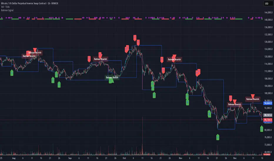
Batman SignalBATMAN SIGNAL: Identify Potential Reversal Patterns
The Batman Signal is designed to help spot potential reversal patterns that may indicate institutional activity at key price levels. It looks for a distinct "double rejection" structure, with the crucial second rejection accompanied by a liquidity spike (high volume), suggesting significant market participation.
🔑 KEY FEATURES
• Dynamic Support & Resistance Zones: Automatically calculates and draws key zones on your chart, giving an at-a-glance view of major price reaction levels where 'Batman' patterns are most likely to form.
• Momentum Clusters: See market bias instantly. Clusters of green or red dots in the top margin show where bullish or bearish patterns are actively forming. Nested purple diamonds within these clusters highlight high-volume liquidity spikes. Increasing concentration here can provide an early warning for the next major setup.
• Four Powerful, Independent Alerts: Each alert is a robust signal engineered to catch market turns. Use them separately or in sequence based on your style.
• Non-Repainting, Close-Based Signals: All final confirmation triangles plot ONLY AFTER the bar closes, providing dependable execution signals.
• Volume-Spike Confirmation: Core logic identifies "liquidity spikes" (high volume) at key rejection areas, filtering for significant market participation.
• Full Customization: Tune every aspect from trend sensitivity, zone detection, volume filters, pattern timing and structure to match any asset or timeframe.
🦇 THE FOUR BATMAN SIGNALS
The indicator scans for a specific "double rejection" structure:
• "Left Ear" – initial rejection at a key zone.
• "Right Ear" – volume-confirmed rejection at a similar level.
This creates four distinct, non-repainting alerts:
Bullish Right Ear Alert – Early warning at support.
Bearish Right Ear Alert – Early warning at resistance.
Confirmed Bullish Batman Signal – Final trigger after bar close.
Confirmed Bearish Batman Signal – Final trigger after bar close.
HOW TO READ THE CHART:
• Blue Lines – Dynamic support/resistance zones.
• "R" Labels & Purple Diamonds – Mark developing Right Ear rejections with volume spike.
• Green/Red Triangles – Show the confirmed, final Batman pattern signal.
• Clusters of Green/Red Dots – Show active bullish/bearish pattern zones (top margin).
• Nested Purple Diamonds – Highlight high-volume spikes within clusters.
• Gray EMA – Provides trend context.
⚙️ CUSTOMIZABLE INPUTS
Trend & Zones:
– Trend EMA Period – Adjust baseline trend sensitivity.
– Key Zone Lookback – Set how far back to scan for key levels.
– Zone Tolerance % – Fine-tune the zone width.
Pattern Logic:
– Min/Max Consolidation Bars – Control time window between Left and Right Ear.
– Min Wick Ratio for Right Ear – Filter for strong rejection wicks.
– Min Spike Size (ATR) – Set minimum volatility for the Right Ear.
Volume Filter (Right Ear Only):
– Toggle volume confirmation on/off.
– Volume Lookback Period – Bars used for average volume calculation.
– Min Volume Ratio – Right Ear volume must be this many times above average.
Visual Settings:
– Show/Hide labels and key zones.
– Customize bullish, bearish, and zone colors.
📘 HOW TO TRADE WITH IT
Apply the "Batman Signal" to your chart.
Watch price action at the blue zones and monitor the top-margin dot clusters for active momentum. Nested purple diamonds signal volume spikes.
Set alerts for your preferred signal type (Right Ear for early warning, or final Batman Signal for confirmation).
Alerts are robust and will fire on bar after print.
ALWAYS use sound risk management—define stop-loss and take-profit levels.
Recommended timeframes: 15min and 1 hour for optimal balance.
Works on all timeframes with appropriate tuning.
🔔 IMPORTANT ALERT SETUP TIP
When you change any input setting (e.g., Min Spike Size, Volume Filter), you MUST delete any existing alerts and create new ones.
TradingView saves alerts as a static snapshot of your settings at creation.
This ensures your alerts always match the strategy you see on the chart.
DISCLAIMER:
Note: This indicator is for informational purposes only and does not constitute financial advice.
Users are encouraged to backtest thoroughly and evaluate the indicator's performance in their trading strategy.
Liquidity Levels Pro Tool - thewallranka
Liquidity Levels Pro Tool is a market-structure and liquidity-mapping indicator designed to help discretionary futures and index traders identify statistically relevant price levels where reactions, continuations, or liquidity sweeps are more likely to occur.
This script is a decision-support tool, not a signal generator. It does not issue buy/sell alerts or predict future price movement. Instead, it organizes and scores liquidity information so traders can make their own contextual decisions.
What this indicator does
The script continuously detects and maintains liquidity zones derived from price pivots, then evaluates those zones using multiple structural and contextual factors:
Repeated price interaction (touches)
Freshness (time since last interaction)
Confluence with key reference levels
Reaction behavior after contact
Session relevance (RTH vs overnight)
Market regime (trend vs mean reversion)
Time-of-day effects (open, midday, power hour)
Only the most relevant zones—based on a dynamic scoring system—are displayed to reduce chart clutter and focus attention on levels that have historically mattered.
Core components
1. Liquidity Zones
Zones are built from pivot highs and lows and expanded into areas using a configurable tick-based padding. Nearby zones are merged to avoid redundancy.
Each zone is continuously evaluated and assigned a score (0–100) reflecting its relative importance.
2. Zone Scoring (No Lookahead)
Zone scores are based on:
Number of confirmed interactions
Recency of the last touch
Confluence with prior day/week levels, VWAP, and Opening Range
Reaction quality after touches (speed and follow-through)
Session alignment (zones that “work” in the current session are favored)
Penalties after liquidity sweeps
Zones are not forward-looking and do not rely on future data.
3. Context Engine
The script classifies the current environment using VWAP slope and distance:
Trend (up or down)
Mean reversion
Mixed/transition
Time-of-day context (Open, Midday, Power Hour) is also tracked internally and influences zone scoring.
This context is displayed in the HUD to support situational awareness, not automated decisions.
4. Liquidity Sweeps
Optional sweep detection highlights situations where price trades beyond a zone and closes back inside, indicating potential stop runs or failed breakouts.
Sweeps are rate-limited and applied conservatively to avoid visual noise.
5. Trade Planning Levels (Optional)
When enabled, the script highlights the nearest high-quality liquidity level above and below price based on score thresholds.
These are intended as reference targets, not trade entries or exits.
HUD (Heads-Up Display)
The on-chart HUD summarizes:
Key reference levels (prior day/week, Opening Range)
Nearest strong liquidity above/below price
Market regime and time-of-day context
Distance to levels (ticks or points)
The HUD is fully optional, positionable, and includes resizable modes (Small / Medium / Large) to fit different chart layouts.
How to use this tool
This indicator is best used as part of a discretionary trading process, for example:
Identifying areas where price is more likely to react or pause
Framing trades around higher-quality structure instead of arbitrary levels
Filtering setups based on session and regime context
Managing expectations near known liquidity rather than chasing price
It is intentionally designed not to provide trade signals.
Limitations and important notes
This script does not predict outcomes or guarantee reactions
High-scoring zones can still fail
Liquidity behavior is context-dependent and probabilistic
No performance claims or backtested results are provided
The indicator should not be used in isolation
Past behavior does not imply future results.
Chart and usage notes
The script is intended for standard time-based charts
Recommended for liquid futures and index products
Use a clean chart for clarity when publishing or sharing
No external indicators are required
Final note
Liquidity Levels Pro (Tool) — v6 is designed to organize complex market structure into a clear, readable framework, allowing traders to focus on execution and risk management rather than raw level detection.
This script reflects an analytical approach to intraday liquidity and structure, not an automated trading system.

Hitjo Zones TFTL;DR – READ THIS FIRST
This is a TWO-INDICATOR SYSTEM. Both indicators must be used together.
Hitjo Zones TF = WHERE you are allowed to trade
Hitjo Swing Trend = WHEN you are allowed to trade
Rules:
Only take BUY signals from Hitjo Swing Trend inside DEMAND zones from Hitjo Zones TF
Only take SELL signals from Hitjo Swing Trend inside SUPPLY zones from Hitjo Zones TF
Ignore signals when structure and timing do not align
Recommended setup: 1H chart with 4H or Daily zones.
Hitjo Swing Trading System
(Hitjo Zones TF + Hitjo Swing Trend)
This TradingView system combines higher-timeframe Supply & Demand zones with momentum-based swing entries to create a clean, rule-based swing trading framework.
It is designed for traders who want fewer but higher-quality trades, clear market structure, objective entry timing, and reduced overtrading.
Required Indicators
Hitjo Zones TF (Structure)
Automatically draws Supply & Demand zones using a selectable higher timeframe.
Displays SUPPLY and DEMAND labels when price enters key zones.
Defines where trades are allowed.
Do not trade based on zones alone.
Hitjo Swing Trend (Timing)
Displays BUY and SELL labels using EMA structure, momentum, and higher-timeframe trend.
Plots ATR-based stop loss and target levels.
Defines when to enter trades.
Do not take BUY or SELL signals outside zones.
Core Concept
Hitjo Zones TF tells you WHERE to trade.
Hitjo Swing Trend tells you WHEN to trade.
If both are not aligned, there is no trade.
Trading Rules
Long Trades
Take a BUY only when all conditions are true:
Price is inside or just above a DEMAND zone from Hitjo Zones TF
Higher-timeframe trend is bullish
A BUY label appears from Hitjo Swing Trend
There is room to target without immediately hitting resistance
Short Trades
Take a SELL only when all conditions are true:
Price is inside or just below a SUPPLY zone from Hitjo Zones TF
Higher-timeframe trend is bearish
A SELL label appears from Hitjo Swing Trend
There is room to target without immediately hitting support
Common Mistakes to Avoid
Buying just because DEMAND appears
Selling just because SUPPLY appears
Taking BUY or SELL signals in the middle of the chart
Counter-trend trading
Forcing trades on every signal
Stops and Targets
Hitjo Swing Trend plots:
Stop Loss using ATR (red)
Target using ATR (green)
These are visual guides only, not broker orders.
Recommended Setup
Chart timeframe: 1H
Zone timeframe (Hitjo Zones TF): 4H or Daily
Fast / Slow EMA: 8 / 21
ATR Stop / Target: 1.5 / 3.0
Remember This
DEMAND does not mean BUY
SUPPLY does not mean SELL
DEMAND + BUY = Long
SUPPLY + SELL = Short
Disclaimer
This system does not predict tops or bottoms and does not guarantee profits.
It is designed to help traders wait for alignment, reduce low-quality trades, and trade with structure.
Always manage risk appropriately.
TradingView Search Keywords
Supply Demand
Swing Trading
EMA Strategy
Multi Timeframe
Trend Following
Support Resistance
Momentum Trading
ATR Stop Loss
Crypto Trading
Stock Trading

Daily Dynamic Grid StrategyHi everyone,
This strategy is built around a dynamic daily grid concept, using an upper and lower daily range that is automatically divided into multiple grid levels.
The idea is to take advantage of daily volatility by executing DCA entries on specific grid levels, based on predefined conditions.
Key points of the strategy & feature:
I recommend using 1H or 2H timeframe for this strategy
Take profit by grid
When DCA is active (>1 entry), the exit condition switches to close above the average price
A hard stop loss is applied
Includes an optional Trailing TP / SL to help maximize profit during strong moves
Like most DCA-based strategies, it tends to have a high win rate, but during strong market dumps, losses can become relatively large
Can also be used for backtest on Forex markets such as Gold, where using the trailing option is generally more effective
And still trial for the webhook, may continue to improve and update this strategy in future versions.

NY Session Range & FlowNY Session Range & Flow is a rule-based intraday futures indicator designed for the New York session, with a focus on MNQ / NQ price behavior.
This indicator does not predict the market. Instead, it maps context, structure, and flow so traders can make disciplined decisions with predefined risk.
🔍 Core Concepts
NY Session Range & Flow combines:
Session structure
Range usage (ADR / AWR)
VWAP positioning & slope
Liquidity sweeps
Supply & Demand zones
Opening Range Breakouts
Mean reversion vs trend continuation logic
All signals are graded and throttled to reduce noise and overtrading.
📌 What the Indicator Shows
🕒 Session Logic (NY Time)
RTH (09:30–16:00 NY)
Trade windows (AM / PM)
Opening Range (09:30–09:45)
ETH session ranges (for context only)
📊 Range & Regime Awareness
ADR / AWR usage
Identifies expansion vs exhaustion
Helps avoid trading when range is already spent
📉 Flow & Bias
VWAP with optional ATR bands
VWAP slope filter for directional bias
Mean reversion distance rules
🧲 Liquidity & Structure
Prior Day High / Low
NY High / Low / Mid
Opening Range High / Low
Liquidity sweep detection
📦 Supply & Demand Zones
Higher-timeframe pivot-based zones
ATR-adjusted zone thickness
Last active zone tracking
🎯 Signal Types (Graded)
Trend Continuation
Sweep Reversal
Opening Range Breakout (ORB)
Mean Reversion to VWAP
Each signal is scored and graded (A+ → C) based on:
Structure
Liquidity
VWAP alignment
Regime context
Only signals that meet your selected quality threshold are displayed.
⚖️ Risk Visualization
Fixed Stop Loss & Take Profits in ticks
Supports SL + TP1 + TP2
Optional ATR trailing structure
Visual SL/TP lines for clarity (manual execution)
This is a decision-support tool, not an auto-trading system.
📋 Range Usage Table
Displays real-time usage for:
RTH
ETH
Weekly
Monthly ranges
Color-coded to highlight expansion and exhaustion.
⚠️ Important Notes
Designed for manual trading
Best suited for futures traders
Optimized for MNQ / NQ, but adaptable
Not financial advice
🔧 Recommended Use
Combine with strict risk management
One trade at a time
Respect session context and range limits

Kriptano short sniperKriptano short sniper
An indicator for finding SHORT entry points after sharp price movements in the cryptocurrency market.
Features:
Pump Detector: Automatically detects price spikes on 15m, 30m, and 1h intervals with customizable thresholds.
Resistance Levels: Dynamic lines on 7 timeframes (5m-1W) with automatic deletion after a breakout.
Volume Profile: Volume distribution by price levels with a sentiment profile (bullish/bearish zones). Can help identify pump reversal points.
Kriptano short sniper
Индикатор для поиска точек входа в SHORT после резких ценовых движений на криптовалютном рынке.
Возможности:
Детектор пампа: автоматическое выявление скачков цены на интервалах 15m, 30m, 1h с настраиваемыми порогами
Уровни сопротивления: динамические линии с 7 таймфреймов (5m-1W) с автоудалением после пробития
Volume Profile: распределение объема по ценовым уровням с профилем настроений (бычьи/медвежьи зоны). Может помочь в определении точки разворота пампа.
