spy scalp cheat codecombines hma directional scalping strategy plus the option to use optional stochastic quad band to confrim entry
Göstergeler ve stratejiler

Kijun Sen Standard Deviation | QuantLapse SystemsOverview
The Kijun Sen Standard Deviation indicator by QuantLapse Systems is a volatility-aware trend-following framework that combines the structural equilibrium of the Kijun Sen (基準線) with statistically adaptive standard deviation bands.
By anchoring trend detection to market structure and confirming direction through volatility expansion, the indicator delivers a cleaner, more reliable regime classification across varying market conditions.
Rather than reacting to short-term noise, the system focuses on identifying statistically justified trend phases , making it well-suited for disciplined, rule-based trading.
Technical Composition, Calculation, Key Components & Features
📌 Kijun Sen (基準線) – Structural Trend Baseline
Calculated as the midpoint between the highest high and lowest low over a user-defined period.
Represents market equilibrium and structural balance rather than short-term momentum.
Naturally adapts to expanding and contracting price ranges.
Provides a stable baseline for regime detection and volatility validation.
Acts as the anchor for deviation bands and persistent trend-state logic.
Unlike fast or reactive moving averages, the Kijun Sen emphasizes price structure and equilibrium , making it especially effective for higher-quality trend confirmation.
📌 Volatility Adjustment – Standard Deviation Bands
Standard deviation is calculated over a configurable lookback to measure current price dispersion.
Upper and lower envelopes are formed by applying a deviation multiplier to the Kijun Sen.
Band width expands during volatility surges and contracts during consolidation.
Creates proportional, volatility-aware thresholds instead of static offsets.
Visually represents market energy through expanding and compressing channels.
These adaptive bands ensure that trend signals only occur when volatility supports directional movement.
📌 Trend Signal & Regime Calculation
Bullish Trend is confirmed when price closes above the upper deviation band.
Bearish Trend is confirmed when price closes below the lower deviation band.
Once established, the trend state persists until an opposing volatility break occurs.
This persistence reduces whipsaws and improves regime stability.
Trend state is reinforced with color-coded lines, envelopes, and background shading.
This volatility-confirmed persistence model is visible in the chart, where trends remain intact through minor pullbacks and only flip on decisive expansion.
How It Works in Trading
✅ Volatility-Confirmed Trend Detection – Requires expansion beyond deviation bands.
✅ Noise Suppression – Filters low-energy price movement within volatility envelopes.
✅ Regime Persistence – Maintains trend state until statistical invalidation.
✅ Immediate Visual Context – Direction, strength, and transitions are clear at a glance.
Visual Representation
Trend signals are displayed directly on price using both line and background context:
🟢 Green / Teal Kijun & Envelope → Confirmed bullish regime.
🔴 Red / Pink Kijun & Envelope → Confirmed bearish regime.
Semi-transparent band fill visualizes volatility expansion and compression.
Buy and Sell labels appear only on confirmed regime transitions.
The lower panel includes:
Strategy equity curve based on trend exposure.
Buy & Hold equity for performance comparison.
Background regime shading synchronized with trend state.
Features and User Inputs
The Kijun Sen Standard Deviation framework offers a focused yet powerful set of configurable inputs:
Kijun Sen Length – Controls structural trend sensitivity.
Standard Deviation Controls – Adjust lookback length and multiplier for regime strictness.
Backtesting & Date Filters – Define evaluation periods and starting conditions.
Display Options – Toggle labels, equity curves, and background shading.
Color Customization – Fully configurable buy/sell colors for trends and equity curves.
These controls allow users to balance responsiveness, stability, and clarity without overfitting.
Practical Applications
The Kijun Sen Standard Deviation indicator is designed for traders who prioritize structure, volatility confirmation, and regime awareness.
Primary Trend Filtering – Identify and stay aligned with dominant market direction.
Volatility-Aware Trend Following – Participate only when price expansion confirms intent.
Risk-Managed Exposure – Avoid chop during compression and transitional phases.
Systematic Strategy Development – Use as a regime engine or higher-timeframe filter.
Performance Evaluation – Compare trend-following equity against buy-and-hold benchmarks.
This framework bridges classical Ichimoku structure with modern statistical validation.
Conclusion
The Kijun Sen Standard Deviation indicator by QuantLapse Systems represents a refined evolution of Ichimoku-based trend analysis.
By integrating the structural equilibrium of the Kijun Sen with adaptive standard deviation confirmation, the system delivers clearer regime classification, reduced noise, and more reliable trend participation.
Rather than attempting to predict price, it focuses on confirming when trends are statistically justified .
Who should use Kijun Sen Standard Deviation:
📊 Trend-Following Traders – Stay aligned with dominant market structure.
⚡ Momentum & Swing Traders – Enter only on volatility-backed expansions.
🤖 Systematic & Algorithmic Traders – Ideal as a regime filter or trend-state engine.
Past performance is not indicative of future results.
Disclaimer: All trading involves risk, and no indicator can guarantee profitability.
Strategic Advice: Always backtest thoroughly, optimize parameters responsibly, and align settings with your timeframe, asset class, and risk tolerance before live deployment.

Swing Elite Trend Direction [Free]Swing Elite Trend Direction
This indicator automatically identifies and labels market structure by detecting swing highs and swing lows, then classifying them as Higher Highs (HH), Higher Lows (HL), Lower Highs (LH), and Lower Lows (LL).
🔍 What It Does
The indicator uses a depth-based pivot detection algorithm to find significant swing points in price action. Each swing is then compared to the previous swing of the same type to determine the market structure:
HH (Higher High): Current swing high is above the previous swing high → bullish structure
HL (Higher Low): Current swing low is above the previous swing low → bullish structure
LH (Lower High): Current swing high is below the previous swing high → bearish structure
LL (Lower Low): Current swing low is below the previous swing low → bearish structure
📈 How To Use
Trend Identification:
Bullish trend is confirmed when you see HH followed by HL (or HL followed by HH)
Bearish trend is confirmed when you see LL followed by LH (or LH followed by LL)
The zigzag line color changes based on confirmed trend direction
Trade Setups:
In a bullish trend, look for pullbacks to HL areas for long entries
In a bearish trend, look for rallies to LH areas for short entries
Trend changes are signaled when structure breaks (e.g., bullish trend making a LL)
Depth Setting:
Higher depth values (e.g., 34-55) capture major swings for higher timeframe analysis
Lower depth values (e.g., 8-21) capture minor swings for shorter-term trading
Adjust based on your trading style and timeframe

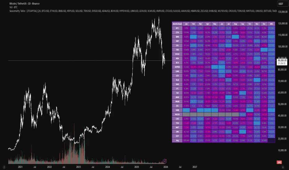
Seasonality Table - [JTCAPITAL]Seasonality Table - is a modified way to use monthly return aggregation across multiple assets to identify seasonal trends in cryptocurrencies and indices.
The indicator works by calculating in the following steps:
Asset Selection
The user defines a list of assets to include in the seasonality table. By default, the script allows up to 32 assets, including popular cryptocurrencies like BTC, ETH, BNB, XRP, and others. Each asset is identified by its symbol (e.g., "CRYPTO:BTCUSD").
Monthly Return Calculation
For each asset, the script requests monthly price data using request.security. Specifically, it retrieves the monthly open, close, and month number. The monthly return is calculated as:
Return = (Close - Open) / Open
This step provides a normalized measure of performance for each asset per month.
Data Aggregation
The script stores two key arrays for each asset and month combination:
sumReturns: The cumulative sum of monthly returns
countReturns: The number of months with valid data
This allows averaging returns later while handling months with missing data gracefully.
Table Construction
Rows representing months (January–December)
Columns representing each asset
An additional column showing the average return for all assets per month
A final row showing the yearly average return for each asset
Filling the Table
The table cells are filled as follows:
Monthly returns are averaged for each asset and displayed as a percentage.
Positive returns are colored green, negative returns red.
Missing data is displayed as a gray “—” placeholder.
Each row’s values are normalized for the color gradient to show relative performance.
Averages Computation
The script calculates two types of averages:
Monthly Average Across Assets : Sum of all asset returns for a month divided by the number of valid data points.
Yearly Average Per Asset : Sum of all monthly returns for an asset divided by the number of months with valid data.
These averages are displayed in the last column and last row respectively, with gradient coloring for visual comparison.
Buy and Sell Conditions
This indicator does not generate explicit buy or sell signals. Instead, it provides a visual heatmap of historical seasonality, allowing traders to:
Identify months where an asset historically outperforms (bullish bias)
Identify months with weak historical performance (bearish caution)
Compare seasonal patterns across multiple assets for portfolio allocation
Filters can be applied by adjusting the asset list, changing the color mapping, or focusing on specific months to highlight seasonal anomalies.
Features and Parameters
Number of assets: Set how many assets are included in the table (1–32).
Assets: Input symbols for the assets you want to analyze.
Low % Color: Defines the color for the lowest monthly returns in the gradient.
High % Color: Defines the color for the highest monthly returns in the gradient.
Cleaned asset names for concise display.
Gradient-based visualization for easier pattern recognition.
Monthly and yearly averages for comparative analysis.
Specifications
Monthly Return Calculation
Uses the formula (Close - Open) / Open for each asset per month. This standardizes performance across different price scales and ensures comparability between assets.
Arrays for Storage
sumReturns: Float array storing cumulative monthly returns.
countReturns: Integer array storing the number of valid data points per month.
These arrays allow efficient aggregation and average calculations without overwriting previous values.
Data Retrieval via Security Calls
Requests monthly OHLC data for each asset using request.security.
Ensures calculations reflect the correct timeframe and allow for historical comparison.
Color and Text Assignment
Green text for positive returns, red for negative returns.
Gray cells indicate missing data.
Gradient background shows relative magnitude within the month.
Seasonality Analysis
The table visually encodes which months historically produce stronger returns.
Useful for portfolio rotation, risk management, and identifying cyclical trends.
Scalability
Supports up to 32 assets.
Dynamically adapts to the number of assets and data availability.
Gradient scales automatically per row for consistent comparison.
Williams Fractals / Goldilocks Edition / [NPR21]This indicator, Williams Fractals — Goldilocks Edition , is a high-visibility technical analysis tool designed to identify key price reversal points on your chart. It is a refined version of the classic Williams Fractal, optimized for modern dark-themed trading environments with an emphasis on clarity and precise visual anchoring.
Indicator Description
The indicator identifies local price peaks (Highs) and valleys (Lows) using a specific look-back and look-forward period. Unlike standard fractals that can be difficult to read, this version features:
Enhanced Contrast: Darkened background labels (Deep Teal for Buy, Deep Red for Sell) that make the white and yellow text highly legible.
Long "V" Stems: Integrated arrow extensions that bridge the gap between the label and the candle, pointing precisely to the pivot point to remove any ambiguity during high volatility.
Customizable Spacing: User-defined offsets that allow the labels to sit comfortably above or below price action without overlapping other indicators.
How to Use It
Identify Reversals: A BUY signal appears under a local low, suggesting a potential upward move. A SELL signal appears above a local high, suggesting a potential downward move.
Support & Resistance: Use the fractal points to draw horizontal support and resistance lines.
Trend Confirmation: Fractals are most effective when used in conjunction with other indicators (like the EMA or WMA visible in your setup) to confirm trend direction.
Wait for Confirmation: Remember that a fractal is only "confirmed" after $n$ bars have closed to the right of the signal.
Understanding the "Periods (n)" Setting
The frequency of signals is entirely dependent on your Periods (n) input.
Lower Values (e.g., n=2): The indicator will find many local pivots, resulting in more frequent signals. This is useful for scalping or lower timeframes but may lead to more "noise".
Higher Values (e.g., n=5 or 10): The indicator requires a more significant peak or valley to trigger, resulting in fewer, more significant signals. This is better for identifying major trend shifts.

Interest ZonesThis indicator automatically identifies and plots "Interest Zones" around significant pivot highs and lows, representing potential areas of institutional interest, support/resistance, or accumulation/distribution. Zones are dynamically merged when pivots cluster near the same price level and extended for visibility.
How It Works (Technical Methodology)
Pivot Point Detection
The indicator uses Pine Script's ta.pivothigh() and ta.pivotlow() with asymmetric left/right lengths (default left=20, right=13) to detect swing highs and lows. This allows for customizable sensitivity – longer left for stronger confirmation, shorter right for faster detection.
Zone Start Condition (Filtering)
Multiple modes control from which point in history zones begin to be drawn:
"None": All historical pivots (limited by max zones).
"Auto (Start of Day)": Zones only from the beginning of the current trading day (resets daily).
"Manual Date": User-defined fixed date.
"Interactive (Chart)": User-confirmed date via input (useful for backtesting specific periods).
"Last X Bars": Only pivots within the last user-defined number of bars (default 400).
A vertical line marks the start point in date-based modes for visual reference.
Zone Construction
For each valid pivot:
Zone thickness is based on ATR(14) × user-defined multiplier (default 0.3) for dynamic, volatility-adjusted height.
Pivot High zones: Centered below the high (potential supply/resistance).
Pivot Low zones: Centered above the low (potential demand/support).
Zones are drawn as boxes extending to the right, with gray fill and border.
Merge & Overlap Logic
When a new pivot falls inside an existing zone or is very close (within user-defined "Proximity Sensitivity %" of the zone's midpoint, default 1.1%):
The new pivot is merged into the existing zone.
A counter ("x2", "x3", etc.) is displayed on the zone, indicating how many pivots have clustered there.
The zone is strengthened visually (counter text) and extended further right.
This highlights high-interest levels where price repeatedly reversed.
Zone Management
In "None" mode: Only the most recent user-defined max zones are kept (default 5) – oldest deleted automatically.
In other modes: Up to ~490 zones (performance limit), oldest pruned if exceeded.
All zones auto-extend to the right on the last bar for continuous visibility.
Visual Elements
Uniform gray color for all zones (configurable).
Transparent background fill (adjustable).
Counter text in white (configurable) when zones have multiple touches.
Clean, non-directional design – focuses purely on clustered reversal points.
How to Use
Interest Zones highlight price levels where the market has shown repeated respect through multiple swing pivots – often coinciding with institutional order clusters, psychological levels, or hidden support/resistance.
Higher counter values ("x3+", "x5+"): Stronger zones – higher probability of reaction on retest.
Use for:
Potential reversal or bounce areas when price approaches a zone.
Confluence with other tools (order blocks, FVG, volume profile, etc.).
Stop-loss placement beyond zones or take-profit at opposite zones.
Daily reset ("Auto Start of Day"): Ideal for intraday trading – fresh zones each session.
Backtesting: Use "Manual" or "Interactive" date modes to analyze specific historical periods.
"Last X Bars": Good for medium-term swing analysis without full history clutter.
Adjust ATR multiplier for tighter (lower) or wider (higher) zones based on asset volatility. Increase proximity sensitivity for more aggressive merging in ranging markets.
Combine with trend direction, volume, or higher-timeframe structure for best results.
Disclaimer
This indicator is a technical analysis tool and should be used in conjunction with other forms of analysis. Past performance does not guarantee future results. Always use proper risk management.

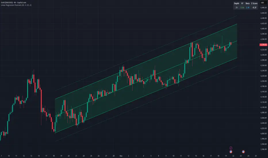
Linear Regression ChannelsThis indicator dynamically identifies and plots the best-fit linear regression channels based on recent pivot points, optimizing for statistical strength across user-defined depths.
How It Works (Technical Methodology)
1. Pivot Point Detection
The indicator uses Pine Script's ta.pivothigh() and ta.pivotlow() functions with a configurable sensitivity length to detect swing highs and lows. All recent pivot indices are stored in an array (limited to avoid performance issues), providing potential starting points for regression calculations.
2. Multi-Depth Evaluation
Users input comma-separated "Pivot History Depths" (e.g., "5,20,50"). For each depth:
- The script evaluates regression fits starting from the most recent pivots, up to the specified depth count.
- It calculates linear regression statistics for each possible channel originating from those pivot bars backward to the current bar.
3. Linear Regression Calculation
For each candidate channel:
- Slope (m) and intercept (b) are computed using least-squares method.
- R-squared (R²) measures goodness of fit (how well price follows the trend line).
- Standard error of the estimate is calculated to quantify volatility around the regression line.
- A composite score = R² × log(length) prioritizes stronger fits on longer periods.
4. Best-Fit Selection and Validation
- Only channels with R² ≥ user-defined minimum (default 0.5) are considered valid.
- The channel with the highest score for each depth is selected and drawn.
- This ensures the most statistically significant and relevant channels are displayed, avoiding weak or short-term noise.
5. Channel Construction
- Mean Line: The regression trend line extended slightly into the future.
- Inner Channels: ± user-configurable standard deviation multiplier (default 2.0σ) around the mean.
- Outer Bands: ±1.5× the inner deviation for additional visual context.
- Filled areas between mean and inner channels for better visibility.
- Color: Green shades for upward slopes (bullish trend), red shades for downward slopes (bearish trend).
6. Dashboard and Statistics
- Optional table in the top-right corner displays for each depth:
- Depth value
- R² (colored green if >0.7, orange otherwise)
- Slope (Beta) – positive blue for uptrend, red for downtrend
- Current Z-Score: How many standard deviations the latest close is from the expected regression value (yellow if |Z| > 2)
How to Use
Regression channels help identify trending markets, potential mean reversion, and overextension.
- Upward Channels (Green): Price above the mean may indicate strength; pullbacks to the mean or lower band offer long opportunities. Overextension above upper band could signal exhaustion.
- Downward Channels (Red): Price below the mean may indicate weakness; rallies to the mean or upper band offer short opportunities. Overextension below lower band could signal capitulation.
- High R² (>0.7): Strong trending channel – trade in direction of slope.
- Low R²: Choppy/range-bound market – avoid trend-following trades.
- Z-Score: |Z| > 2 suggests price is statistically overextended from the trend (potential reversion setup).
- Multi-Depth: Smaller depths catch short-term trends; larger depths capture major trends. Use multiple for confluence across timeframes.
Combine with volume, support/resistance, or other indicators for confirmation.
Disclaimer
This indicator is a technical analysis tool and should be used in conjunction with other forms of analysis. Past performance does not guarantee future results. Always use proper risk management.
Long Position (Manual Setup)BINANCE:BTCUSDT
This script is for long position setup manually....
Just enter the following data ......
1. higher entry price
2. lower entry price
3. stop loss price
4. targets ( up to 5 targets)
5- extra targets ( up to 3 extra targets)
then you will have the long position draw in the chart with the trade summary including risk and reward percentage.

SpectreSPECTRE - Precision Reversal Detection System
OVERVIEW
Spectre is a channel breakout indicator designed to identify high-probability reversal points by combining Donchian channel breaches with momentum confirmation. It generates BUY signals at oversold extremes and SELL signals at overbought extremes, filtered by trend strength to avoid low-conviction setups.
This indicator replaces the Regime Engine, which will continue to evolve independently as an experimental platform for testing new strategies and enhancements. Spectre was selected as the production replacement based on extensive backtesting across multiple assets and timeframes, which demonstrated superior win rates compared to alternative sell logic approaches (RSI-based exits outperformed CMO-based exits in 13 of 18 test configurations).
SIGNAL LOGIC
BUY CONDITIONS (all must be true):
Price touches or breaks below Donchian lower band
RSI is at or below oversold threshold (default: 35)
ADX confirms sufficient trend strength (default: ≥22)
BBWP confirms adequate volatility (default: ≥20%)
Cooldown period has elapsed since last buy
Cascade limit not reached
SELL CONDITIONS (all must be true):
Price touches or breaks above Donchian upper band
RSI is at or above overbought threshold (default: 70)
ADX confirms sufficient trend strength (default: ≥22)
BBWP confirms adequate volatility (default: ≥20%)
Cooldown period has elapsed since last sell
Cascade limit not reached
Price is not underwater (if protection enabled)
KEY FEATURES
NON-REPAINTING DONCHIAN CHANNELS
Uses previous bar's high/low extremes to prevent signal repainting. What you see in history is what you would have seen in real-time.
MULTI-FACTOR CONFIRMATION
Signals require agreement between price action (Donchian), momentum (RSI), and trend strength (ADX) to filter out low-quality setups.
VOLATILITY FILTER (BBWP)
Bollinger Band Width Percentile measures current volatility relative to historical norms. Low BBWP indicates compressed ranges where breakouts are less reliable - signals are blocked until volatility returns.
CASCADE PROTECTION
Limits consecutive signals in the same direction to prevent overexposure during extended trends. Resets when a signal fires in the opposite direction.
UNDERWATER PROTECTION (Unique to Spectre)
Tracks average entry price of recent buys and blocks sell signals when price has fallen significantly below this level. This prevents locking in large losses during drawdowns and allows positions to recover before exiting.
REGIME DETECTION
Visual background shading indicates current market regime based on Directional Indicator spread and On-Balance Volume trend. Green indicates bullish regime (+DI > -DI, OBV rising). Red indicates bearish regime (-DI > +DI, OBV falling). White/Gray indicates neutral or ranging conditions.
RECOMMENDED SETTINGS BY TIMEFRAME
For 5-minute charts, use RSI Buy 30-35, RSI Sell 70-75, ADX 20-24.
For 15-minute charts, use RSI Buy 30-35, RSI Sell 68-72, ADX 22-26.
For 30-minute charts (default), use RSI Buy 32-38, RSI Sell 68-72, ADX 22-26.
For 1-hour charts, use RSI Buy 35-40, RSI Sell 65-70, ADX 20-24.
For 4-hour charts, use RSI Buy 35-40, RSI Sell 65-70, ADX 18-22.
These are starting points - optimize for your specific assets.
INFO PANEL GUIDE
Regime shows current market bias (Bullish/Bearish/Neutral). RSI shows current value with buy/sell threshold status. ADX shows trend strength categorized as Weak (<15), Range (15-24), Trend (24-34), or Strong (>34). BBWP shows volatility percentile with a warning symbol when below minimum. Donchian shows price position relative to channel bands. Avg Buy shows average entry price and underwater status. Cascade shows current consecutive signal counts versus limits.
USAGE TIPS
Works best in ranging or mean-reverting markets
Reduce RSI thresholds in strong trends (tighter = fewer signals)
Increase ADX minimum in choppy markets to filter noise
Enable underwater protection for swing trading, disable for scalping
Use regime background to contextualize signals (buy in green, sell in red)
Combine with support/resistance levels for additional confirmation

Quant VWAP System 3.8 This is the lower-indicator companion to the "Quant VWAP System." While the main chart tells you where the price is, this oscillator tells you how statistically significant the move is.
It uses a Z-Score algorithm to normalize price action. This means it ignores dollar amounts and instead measures how many Standard Deviations (SD) the price is away from its mean (VWAP). This allows you to instantly spot "Overbought" or "Oversold" conditions on any asset (Bitcoin, Forex, or Stocks) without needing to guess.
Key Features:
1. Normalized Extremes (The "Kill Zones")
±2.0 SD: These dotted lines represent statistical extremes. When the signal line crosses above +2.0, the asset is mathematically expensive (Overbought). When it crosses below -2.0, it is mathematically cheap (Oversold).
The Logic: Price rarely sustains movement beyond 2 Standard Deviations without a reversion or a pause.
2. The Squeeze Radar (Yellow Dots)
Volatility Detection: A row of Yellow Dots appearing on the center line indicates a "Squeeze."
What it means: The Standard Deviation bands are compressing. Energy is building.
Warning: DO NOT trade Mean Reversion when you see Yellow Dots. A squeeze often leads to a violent breakout. Wait for the dots to disappear to confirm the direction of the explosion.
3. Momentum Coloring
Green Line: Z-Score is rising (Bullish Momentum).
Red Line: Z-Score is falling (Bearish Momentum).
This helps you spot divergences (e.g., Price makes a Higher High, but the Oscillator makes a Lower High = Exhaustion).
How to Trade with It
Strategy A: The "Zero Bounce" (Trend Continuation)
Scenario: You are in a Bull Trend.
Signal: The Oscillator line pulls back to the Zero Line (White), turns Green, and curls upward.
Meaning: Price has tested the average (VWAP) and buyers have stepped in. This is a high-probability entry for trend continuation.
Strategy B: The "Extreme Fade" (Reversion)
Scenario: The Oscillator pushes deep into the Red Zone (+2.0 SD).
Signal: The line turns Red and crosses back down below the +2.0 dotted line. A small Red Triangle will appear.
Meaning: The statistical extension has failed, and price is likely snapping back to the mean.
Strategy C: Squeeze Breakout
Scenario: Yellow Dots appear on the center line.
Action: Stop trading. Wait.
Signal: The dots disappear, and the line shoots aggressively through +1.0 SD (Long) or -1.0 SD (Short). Ride the momentum.

cd_VW_Cx IMPROVED - Quant VWAP System: Regime, Magnets & Z-ScoQuant VWAP System: Regime, Magnets & Z-Score Matrix
This indicator is a comprehensive Quantitative Trading System designed to move beyond simple support and resistance. Instead of static lines, it uses Statistical Probability (Z-Score) and Standard Deviation to define the current market regime, identify institutional value zones, and project high-probability liquidity targets.
It is engineered for Day Traders and Scalpers (Crypto & Futures) who need to know if the market is Trending, Ranging, or preparing for a Breakout.
1. The "Regime" System (Standard Deviation Bands)
The core engine anchors a VWAP (Volume Weighted Average Price) to your chosen timeframe (Daily, Weekly, or Monthly) and projects volatility bands based on market variance.
The Trend Zone (Inner Band / 1.0 SD): This is the "Fair Value" zone. In a healthy trend, price will pull back into this zone and hold. A hold here signals a high-probability continuation (Trend Following).
The Reversion Zone (Outer Band / 2.0 SD): This represents a statistical extreme. Price rarely sustains movement beyond 2 Standard Deviations without a reversion. A touch of this band signals "Overbought" or "Oversold" conditions.
2. Liquidity Magnets (Virgin VWAPs)
The script automatically tracks "Unvisited VWAPs" from previous sessions. These are price levels where significant volume occurred but have not yet been re-tested.
The Logic: Algorithms often target these "open loops." The script visualizes them as Blue Dashed Lines with price tags.
Smart Scaling (Anti-Scrunch): Includes a custom "Ghost Engine" that automatically hides or "ghosts" magnets that are too far away. This prevents your chart from being squashed (scrunched) on lower timeframes, keeping your candles perfectly readable while still tracking targets in the background.
3. The Quant Matrix (Dashboard)
A real-time Heads-Up Display (HUD) that interprets the data for you:
Regime: Detects Volatility Squeezes. If the bands compress, it signals "⚠ SQUEEZE", warning you to stop mean-reversion trading and prepare for an explosive breakout.
Bias: Color-coded Trend Direction (Bullish/Bearish) based on VWAP slope.
Signal: actionable text prompts such as "BUY DIP" (Trend Following), "FADE EXT" (Mean Reversion), or "PREP BREAK" (Squeeze).
4. Visual Intelligence
Bold Day Separators: Clear, vertical dotted dividers with Date Stamps to instantly separate trading sessions.
Dynamic Labels: Floating labels on the right axis identify exactly which deviation level is which, preventing chart confusion.
How to Use
Strategy A: The Trend Pullback (continuation)
Check Matrix: Ensure Bias is BULLISH (Green).
Wait: Allow price to pull back into the Inner Band (Dark Green Zone).
Trigger: If price holds the Center VWAP or the -1.0 SD line, enter Long.
Target: The next Liquidity Magnet above or the +2.0 SD band.
Strategy B: The Reversion Fade (Counter-Trend)
Check Matrix: Ensure price is labeled "EXTREME" or Signal says "FADE EXT".
Trigger: Price touches or pierces the Outer Band (2.0 SD).
Action: Enter counter-trend (Short) with a target back to the Center VWAP (Mean Reversion).
Strategy C: The Magnet Target
Identify a "MAGNET" line (Blue Dashed) near current price.
These act as high-probability Take Profit levels. Price will often rush to these levels to "close the loop" before reversing.
Settings
Anchor: Daily (default), Weekly, or Monthly.
Magnet Focus Range: Adjusts how aggressively the script hides distant magnets to fix chart scaling (Default: 2%).
Visuals: Fully customizable colors, label sizes, and dashboard position.

Early Trend Warning Using MTF AnalysisAs an active trader and software professional, I build my own indicators. I built this one today which I want to share with fellow traders.
If you are a trend trader then HTF/MTF analysis is very critical. It is virtually impossible to constantly track multiple tickers all the time. One should not take a buy trade when MTF is bearish and vice versa. This indicator solves this problem.
The EMA Trend Warning indicator helps traders detect potential trend changes early by analyzing price interactions with multi-timeframe Exponential Moving Averages (EMAs) and their momentum. It sends instant alerts when price crosses above or below EMAs with supporting momentum, making it easier to capture bullish or bearish moves.
The EMA Trend Warning indicator detects potential trend changes by monitoring price against 14-period EMAs on multiple timeframes: 15-minute, 30-minute, and 1-hour charts. It sends alerts when the price crosses above or below the EMA with supporting momentum, helping traders identify early bullish or bearish signals.
How It Works:
1. Calculates 14-period EMA on 15m, 30m, and 1H charts.
2. Computes EMA slopes to determine momentum direction.
3. BUY alert triggers when price crosses above the 15m EMA and at least one EMA slope is upward.
4. SELL alert triggers when price crosses below the 15m EMA and at least one EMA slope is downward.
5. Alerts fire once per bar and track previous state to avoid repeated notifications.
Features:
1. Multi-timeframe EMA monitoring.
2. Momentum confirmation with EMA slopes.
3. Instant BUY/SELL alerts.
4. Tracks previous trend state to prevent alert spam.
Benefits:
1. Detects trend changes early for better entry timing.
2. Confirms trend across multiple timeframes.
3. Saves time with automated alerts.
4. Helps traders align trades with market momentum.
Please consider this indicator as EARLY WARNING ONLY. Take trade based on multiple confluences post receiving any warning. I have tested it on BTCUSD since yesterday, multiple warning alerts were 100% perfect.

Multi-Fractal Trading Plan [Gemini] v22Multi-Fractal Trading Plan
The Multi-Fractal Trading Plan is a quantitative market structure engine designed to filter noise and generate actionable daily strategies. Unlike standard auto-trendline indicators that clutter charts with irrelevant data, this system utilizes Fractal Geometry to categorize market liquidity into three institutional layers: Minor (Intraday), Medium (Swing), and Major (Institutional).
This tool functions as a Strategic Advisor, not just a drawing tool. It calculates the delta between price and structural pivots in real-time, alerting you when price enters high-probability "Hot Zones" and generating a live trading plan on your dashboard.
Core Features
1. Three-Tier Fractal Engine The algorithm tracks 15 distinct fractal lengths simultaneously, aggregating them into a clean hierarchy:
Minor Structure (Thin Lines): Captures high-frequency volatility for scalping.
Medium Structure (Medium Lines): Identifies significant swing points and intermediate targets.
Major Structure (Thick Lines): Maps the "Institutional" defense lines where trend reversals and major breakouts occur.
2. The Strategic Dashboard A dynamic data panel in the bottom-right eliminates analysis paralysis:
Floor & Ceiling Targets: Displays the precise price levels of the nearest Support and Resistance.
AI Logic Output: The script analyzes market conditions to generate a specific command, such as "WATCH FOR BREAKOUT", "Near Lows (Look Long?)", or "WAIT (No Setup)".
3. "Hot Zone" Detection Never miss a critical test of structure.
Dynamic Alerting: When price trades within 1% (adjustable) of a Major Trend Line, the indicator’s labels turn Bright Yellow and flash a warning (e.g., "⚠️ WATCH: MAJOR RES").
Focus: This visual cue highlights the exact moment execution is required, reducing screen fatigue.
4. The Quant Web & Markers
Pivot Validation: Deep blue fractal markers (▲/▼) identify the exact candles responsible for the structure.
Inter-Timeframe Web: Faint dotted lines connect Minor pivots directly to Major pivots, visualizing the "hidden" elasticity between short-term noise and long-term trend anchors.
5. Enterprise Stability Engine Engineered to solve the "Vertical Line" and "1970 Epoch" glitches common in Pine Script trend indicators. This engine is optimized for Futures (NQ/ES), Forex, and Crypto, ensuring stability across all timeframes (including gaps on ETH/RTH charts).
Operational Guide
Consult the Dashboard: Before executing, check the "Strategy" output. If it says "WAIT", the market is in chop. If it says "WATCH FOR BOUNCE", prepare your entry criteria.
Monitor Hot Zones: A Yellow Label indicates price is testing a major liquidity level. This is your signal to watch for a rejection wick or a high-volume breakout.
Utilize the Web: Use the faint web lines to find "confluence" where a short-term pullback aligns with a long-term trend line.
Configuration
Show History: Toggles "Ghost Lines" (Blue) to display historical structure and broken trends.
Fractal Points: Toggles the geometric pivot markers.
Hot Zone %: Adjusts the sensitivity of the Yellow Warning system (Default: 1%).
Max Line Length: A noise filter that removes stale or "spiderweb" lines that are no longer statistically relevant.

SMC Strategy Tool v1.0 - Institutional SuiteDescription: The SMC Strategy Tool v1.0 is a comprehensive technical analysis suite designed for traders following the Smart Money Concepts (SMC) methodology. It combines market structure, institutional liquidity zones, and mathematical pivots to provide a high-probability trading environment.
Key Features:
Automatic Market Structure: Real-time detection of CHoCH (Change of Character) and BOS (Break of Structure) based on price action confirmation.
Institutional Order Flow (FVG): Identifies Fair Value Gaps with a dynamic mitigation system (boxes disappear once the price fills the inefficiency).
Premium & Discount Zones: Automatically calculates the current trading range and highlights the "cheap" (Discount) and "expensive" (Premium) areas for optimal entry.
Daily Pivot Points: Seamless integration of Daily Pivots (P, R1-R3, S1-S3) for institutional confluence.
Live Analytics Dashboard: A clean, non-intrusive table monitoring Market Phase, RSI (Momentum), and ATR (Volatility).
Smart Alerts: Built-in logic for "Discount Entry" during Bullish trends and "Premium Entry" during Bearish trends.
How to Trade:
Identify the Trend: Look at the Dashboard for the current Market Phase (Bullish/Bearish).
Wait for Value: Do not chase the price. Wait for the price to return to the Discount Zone (for Longs) or Premium Zone (for Shorts).
Find Confluence: The highest probability trades occur when a Discount/Premium entry aligns with an FVG and a Daily Pivot level.
Confirmation: Check the RSI cell. If it's red/green, the move might be exhausted; wait for a neutral reading or a structural reaction.
Available Alerts:
Trend Shift (CHoCH): Get notified immediately when the market structure shifts (e.g., from Bearish to Bullish).
Trend Continuation (BOS): Signals when the current trend is confirmed by a new structural break.
Discount Zone Entry (Long Bias): Notifies you when the price enters the Discount Zone while the Market Phase is Bullish. This prevents FOMO buying at high prices.
Premium Zone Entry (Short Bias): Notifies you when the price enters the Premium Zone while the Market Phase is Bearish. This ensures you are selling at institutional "expensive" prices.
How to set up Alerts:
Click the Alerts icon in the right sidebar.
Under Condition, select: SMC Strategy Tool v1.0 - Institutional Suite.
Select "Any alert() function call" (or Qualsiasi chiamata alla funzione alert()).
Choose your preferred notification method (Popup, Email, or App notification).
The alert message will automatically include the Ticker, Timeframe, and the specific action to take!

OCC Strategy Optimized (MA 5 + Delayed TSL)# OCC Strategy Optimized (MA 5 + Delayed TSL) - User Guide
## Introduction
The **OCC Strategy Optimized** is an enhanced version of the classic **Open Close Cross (OCC)** strategy. This strategy is designed for high-precision trend following, utilizing the crossover logic of Open and Close moving averages to identify market shifts. This optimized version incorporates advanced risk management, multi-timeframe analysis, and a variety of moving average types to provide a robust trading solution for modern markets.
>
> **Special Thanks:** This strategy is based on the original work of **JustUncleL**, a renowned Pine Script developer. You can find their work and profile on TradingView here: (in.tradingview.com).
---
## Key Features
### 1. Optimized Core Logic
- **MA Period (Default: 5):** The strategy is tuned with a shorter MA length to reduce lag and capture trends earlier.
- **Crossing Logic:** Signals are generated when the Moving Average of the **Close** crosses the Moving Average of the **Open**.
### 2. Multi-Timeframe (MTF) Analysis
- **Alternate Resolution:** Use a higher timeframe (Resolution Multiplier) to filter out noise. By default, it uses $3 \times$ your current chart timeframe to confirm the trend.
- **Non-Repainting:** Includes an optional delay offset to ensure signals are confirmed and do not disappear (repaint) after the bar closes.
### 3. Advanced Risk Management
This script features a hierarchical exit system to protect your capital and lock in profits:
- **Fixed Stop Loss (Initial):** Protects against sudden market reversals immediately after entry.
- **Delayed Trailing Stop Loss (TSL):**
- **Activation Delay:** The TSL only activates after the trade reaches a specific profit threshold (e.g., 1%). This prevents being stopped out too early in the trade's development.
- **Ratchet Trail:** Once activated, the stop loss "ratchets" up/down, never moving backward, ensuring you lock in profits as the trend continues.
- **Take Profit (TP):** A fixed percentage target to exit the trade at a pre-defined profit level.
### 4. Versatility
- **12 MA Types:** Choose from SMA, EMA, DEMA, TEMA, WMA, VWMA, SMMA, HullMA, LSMA, ALMA, SSMA, and TMA.
- **Trade Direction:** Toggle between Long-only, Short-only, or Both.
- **Visuals:** Optional bar coloring to visualize the trend directly on the candlesticks.
---
## User Input Guide
### Core Settings
- **Use Alternate Resolution?:** Enable this to use the MTF logic.
- **Multiplier for Alternate Resolution:** How many charts higher the "filter" timeframe should be.
- **MA Type:** Select your preferred moving average smoothing method.
- **MA Period:** The length of the Open/Close averages.
- **Delay Open/Close MA:** Use `1` or higher to force non-repainting behavior.
### Risk Management Settings
- **Use Trailing Stop Loss?:** Enables the TSL system.
- **Trailing Stop %:** The distance the stop follows behind the price (Optimized Default: 1.5%).
- **TSL Activation % (Delay):** The profit % required before the TSL starts moving. (Optimized Default: 2.0% to ensure 0.5% profit is locked immediately).
- **Initial Fixed Stop Loss %:** Your hard stop if the trade immediately goes against you.
- **Take Profit %:** Your ultimate profit target for the trade.
---
## How to Trade with This Strategy
1. **Identify the Trend:** Look for the Moving Average lines (Close vs Open) to cross.
2. **Wait for Confirmation:** If using MTF, ensure the higher timeframe also shows a trend change.
3. **Manage the Trade:** Let the TSL work. With the default **2.0% Activation** and **1.5% Trail**, the strategy will automatically lock in **0.5% profit** the moment the threshold is hit, then follow the price higher.
4. **Position Sizing:** Adjust the `Properties` tab in the script settings to match your desired capital allocation (Default is 10% of equity).
---
## Recommended Settings
1. Trialing < Activation
2. Check ranging
## Credits
Original Strategy by: **JustUncleL**
Optimized and Enhanced by: **Antigravity AI**

EAOverview
The provided Pine Script code implements a technical analysis indicator known as the UT Bot Alerts. It is a volatility-based trend-following system designed to generate Buy and Sell signals. It uses the Average True Range (ATR) to calculate a dynamic trailing stop line, which helps identify trend reversals.
Key Components & Logic
1. Inputs (User Settings):
• Key Value (a): A sensitivity multiplier. A lower value makes the signals more frequent (sensitive), while a higher value filters out noise (less sensitive).
• ATR Period (c): The timeframe used to calculate the Average True Range (volatility). Default is 10.
• Heikin Ashi (h): A boolean switch (True/False) that allows calculations to be based on Heikin Ashi candles (smoother price action) instead of standard candlesticks.
2. Core Mechanism (ATR Trailing Stop):
• The script calculates an ATR Trailing Stop (xATRTrailingStop).
• Uptrend: If the price is rising, the stop line moves up but never moves down, acting as dynamic support.
• Downtrend: If the price is falling, the stop line moves down but never moves up, acting as dynamic resistance.
3. Signal Generation:
• Buy Signal: Generated when the price (specifically a 1-period EMA) crosses above the Trailing Stop line. This indicates a shift to an uptrend.
• Sell Signal: Generated when the price crosses below the Trailing Stop line. This indicates a shift to a downtrend.
4. Visuals & Alerts:
• Labels: It plots "Buy" (Green) and "Sell" (Red) labels on the chart at the point of the signal.
• Bar Colors: It colors the candlesticks Green during an uptrend and Red during a downtrend.
• Alerts: It creates alert conditions (UT Long and UT Short) that can be hooked into TradingView's alarm system for real-time notifications.
Summary
In short, this script is a Trend Reversal Indicator. It helps traders stay in a trade as long as the price remains on the correct side of the volatility-adjusted trailing stop, and it alerts them immediately when the trend direction changes.

Williams Fractals / Goldilocks [NPR21]📊 Williams Fractals — Goldilocks
Description
Williams Fractals — Goldilocks highlights confirmed swing highs and lows using a refined Williams Fractals approach that balances signal frequency and clarity. BUY and SELL labels mark structurally important pivot points while avoiding chart clutter. The Periods (n) setting controls how often signals appear—lower values produce more signals, higher values filter noise. Signals are non-repainting and work on any instrument and any timeframe. Best used as a market structure and confirmation tool.
🔧 How to Use (Quick Guide)
BUY labels = confirmed swing lows (potential support / pullback areas)
SELL labels = confirmed swing highs (potential resistance / exhaustion areas)
Use for structure and confirmation, not as a standalone entry system
Combine with trend direction, key levels, VWAP/EMAs, volume, or momentum
⏱️ Recommended Periods by Timeframe
The Periods (n) setting determines how many and how often labels print.
1m–3m (Scalping): n = 2
More frequent signals; captures short-term swings.
5m–15m (Intraday): n = 8-9
Balanced sensitivity; filters minor noise.
30m–1h+ (HTF/Swing): n = 15-21
Fewer, stronger pivots; highlights major structure.
Rule of thumb: Lower timeframe → lower n. Higher timeframe → higher n.
🌍 Markets & Timeframes
Not futures-only. Works well on stocks, ETFs, forex, crypto, indices, and any timeframe. Adjust n to match the market’s pace.

B + A + D v0.4This script combines a momentum histogram (B-Xtrender) with trend strength and direction filters (ADX + DI).
The histogram is built from EMA differentials processed through RSI, showing short- and long-term momentum shifts around the zero line. ADX with DI+ / DI− is used to confirm whether the market is trending and in which direction.
Bullish signals appear when the histogram turns positive and DI+ dominates DI− with sufficient trend strength.
Bearish signals appear when the histogram turns negative and DI− dominates DI+ with sufficient trend strength.
Important note for users:
The strongest and most reliable signals are those that appear immediately after the histogram crosses the zero line (from negative to positive or from positive to negative). Signals that appear later, while the histogram is already extended in the trend, tend to be weaker and should be treated as continuation signals rather than high-probability reversals.
Credits:
Special thanks to the authors of the original concepts and scripts:

Impulse Trend Suite LITE🚀 Impulse Trend Suite LITE
Smart trend visualization with precise flip arrows. A lightweight, momentum-filtered trend tool designed to stay clean, avoid repeated signals, and keep you focused only on real market direction.
🔍 Quick Guide
BUY setup = green arrow + green background
SELL setup = red arrow + red background
Stay in the move while color doesn’t change
ATR channel helps avoid chasing overextended candles

Big Notional Volume Bubbles (Lower-TF Order Flow Approximation)Big Notional Volume Bubbles (Lower-TF Order Flow Approximation)
### Overview
This indicator visualizes large notional trading activity by scanning lower-timeframe candles inside each chart bar and highlighting periods where unusually high traded value (volume × price) occurs.
This script is intended to help short-term traders and scalpers identify bursts of aggressive activity, potential absorption zones, and areas of heightened participation, using standard OHLCV data.
Important: This indicator does not access true market order tape or DOM data. It is an approximation based on lower-timeframe OHLCV data provided by TradingView.
What the Indicator Shows
Each bubble represents a lower-timeframe candle where traded notional value exceeds a user-defined threshold.
Bubble size scales with the notional value of that candle.
Green bubbles indicate the lower-timeframe candle closed higher (buy-side pressure approximation).
Red bubbles indicate the lower-timeframe candle closed lower (sell-side pressure approximation).
Bubbles can be plotted at candle closes or wick extremes for contextual analysis.
How It Works
1. Lower-timeframe OHLCV data is requested using `request.security_lower_tf`.
2. Notional value is calculated as volume × price for each micro-candle.
3. The script selects the largest notional events per bar that exceed the minimum threshold.
4. These events are rendered as bubbles on the main price chart.
Intended Use Cases
Scalping and short-term trading
Momentum ignition and continuation analysis
Absorption and failed breakout detection
Effort versus result analysis
Confirmation at key structural levels
Recommended Settings
Lower timeframe: Start with 1 (1 minute). Seconds-based timeframes may not be supported on all feeds.
Minimum notional (USD/USDT):
BTC / ETH: 25,000 – 250,000
Mid-cap assets: 5,000 – 50,000
Adjust based on liquidity and volatility
Max bubbles per bar: 3–8 to avoid visual clutter
Limitations
This indicator does not display individual market orders or aggressor-side execution.
Buy/sell classification is inferred from candle direction, not bid/ask data.
Lower-timeframe data availability depends on the selected symbol and exchange feed.
This tool should not be used as a standalone signal generator.
Best Practices
Use in conjunction with market structure, VWAP, and key price levels.
Focus on price behavior after a bubble appears rather than the bubble itself.
Interpret bubbles as areas of interest, not directional guarantees.

Elephant Edge Session Levels Predictor**Elephant Edge** is a robust trading tool designed to streamline decision-making for swing and intraday traders alike. It combines accuracy and simplicity to help you spot promising buy and sell signals with ease. The Session Levels Predictor+ feature draws upper and lower percentile lines derived from session data, enabling traders to pinpoint key support and resistance areas accurately. It computes these percentile projections from daily sessions automatically and displays them as sleek, adjustable lines—perfect for intraday and short-term strategies focused on statistical price boundaries.
For **swing traders**, Elephant Edge highlights pivotal market reversals and trend shifts, allowing you to seize bigger trends and maintain momentum. For **intraday traders**, it offers precise buy and sell thresholds, providing reliable entry and exit cues during active market hours.
No matter if you're chasing quick trades or sustaining positions over several sessions, Elephant Edge promotes a methodical and disciplined strategy. Its smart signals cut through market clutter, delivering a solid advantage while eliminating emotional biases.
With **Elephant Edge**, you shift from merely responding to the market to trading with **precision, assurance, and reliability**.

SR Channel + EMA + RSI MTF + VolHighlight - Edited by MochiSR + Volume + RSI MTF – edited by Mochi
This indicator combines three tools into a single script:
SR Zones from Pivots
Automatically detects clusters of pivot highs/lows and groups them into support and resistance zones.
Zone width is tightened using a percentage of the pivot cluster range so levels are more precise and cleaner.
Each zone includes:
A colored box (SR area),
A dashed midline,
A POC line (price level with the highest traded volume inside the zone),
A label showing the zone price and distance (%) from current price.
Zone color is dynamic but simple and stable:
If price closes below the mid of the zone → it is treated as resistance (red).
If price closes above the mid of the zone → it is treated as support (green).
Box, lines, and label always share the same color.
Volume Inside the Zone + POC
Calculates buy/sell volume for candles whose close lies inside each zone.
Uses abs(buyVol − sellVol) / (buyVol + sellVol) to measure volume imbalance and control box opacity:
Stronger, more one‑sided volume → darker box (stronger zone).
POC is drawn as a thin line with the same color as the zone to highlight the best liquidity level for entries/TP.
Multi‑Timeframe RSI Dashboard
Shows RSI(14) values for multiple timeframes (1m, 5m, 15m, 30m, 1h, 4h, 8h, 1d), each can be toggled on/off.
Background color of each RSI cell:
RSI > 89 → red (strong overbought),
80–89 → orange (warning area),
RSI < 28 → lime (strong oversold),
Otherwise → white (neutral).
The goal of this script is to give traders a clear view of:
Key support/resistance zones,
Their volume quality and POC,
And multi‑TF overbought/oversold conditions via the RSI dashboard – all in one indicator to support retest/flip‑zone trading.

XAUUSD M15 momentum real Detects when xausd enters a healthy directional phase during the NY session, and only flags entries with real momentum and controlled volatility.
