CE - 42MACRO Equity Factor Table This is Part 1 of 2 from the 42MACRO Recreation Series
The CE - 42MACRO Equity Factor Table is a whole toolbox packaged in a single indicator.
It aims to provide a probabilistic insight into the market realized GRID Macro Regime, use a multiplex of important Assets and Indices to form a high probability Implied Correlation expectation and allows to derive extra market insights by showing the most important aggregates and their performance over multiple timeframes... and what that might mean for the whole market direction, as well as the underlying asset.
WARNING
By the nature of the macro regimes, the outcomes are more accurate over longer Chart Timeframes (Week to Months).
However, it is also a valuable tool to form a proper,
market realized, short to medium term bias.
NOTE
This Indicator is intended to be used alongside the 2nd part "CE - 42MACRO Yield and Macro"
for a more wholistic approach and higher accuracy.
Due to coding limitations they can not be merged into one Indicator.
Methodology:
The Equity Factor Table tracks specifically chosen Assets to identify their performance and add the combined performances together to visualize 42MACRO's GRID Equity Model.
For this it uses the below Assets, with more to come:
Dividend Compounders ( AMEX:SPHD )
Mid Caps ( AMEX:VO )
Emerging Markets ( AMEX:EEM )
Small Caps ( AMEX:IWM )
Mega Cap Growth ( NASDAQ:QQQ )
Brazil ( AMEX:EWZ )
United Kingdom ( AMEX:EWU )
Growth ( AMEX:IWF )
United States ( AMEX:SPY )
Japan ( AMEX:DXJ )
Momentum ( AMEX:MTUM )
China ( AMEX:FXI )
Low Beta ( AMEX:SPLV )
International ex-US ( NASDAQ:ACWX )
India ( AMEX:INDA )
Eurozone ( AMEX:EZU )
Quality ( AMEX:QUAL )
Size ( AMEX:OEF )
Functionalities:
1. Correlations
Takes a measure of Cross Market Correlations
2. Implied Trend
Calculates the trend for each Asset and uses the Correlation to obtain the Implied Trend for the underlying Asset
There are multiple functionalities to enhance Signal Speed and precision...
Reading a signal only over a certain threshold, otherwise being colored in gray to signal noise or unclear market behavior
Normalization of Signal
Double Normalization of Signal for more Speed... ideal for the Crypto Market
Using an additional Hull Moving Average to enhance Signal Speed
Additional simple Background coloring to get a Signal from the HMA
Barcoloring based on the Implied Correlation
3. Equity Factor Table
Shows market realized Asset performance
Provides the approximate realized GRID market regimes
Informs about "Risk ON" and "Risk OFF" market states
Now into the juicy stuff...
Visuals:
There is a variety of options to change visual settings of what is plotted and where
+ additional considerations.
Everything that is relevant in the underlying logic which can improve comprehension can be visualized with these options.
More to come
Market Correlation:
The Market Correlation Table takes the Correlation of all the Assets to the Asset on the Chart,
it furthermore uses the Normalized KAMA Oscillator by IkkeOmar to analyse the current trend of every single Asset.
(To enhance the Signal you can apply the mentioned Indicator on the relevant Assets to find your target Asset movements that you intend to capture...
and then change the length of the Indicator in here)
It then Implies a Correlation based on the Trend and the Correlation to give a probabilistically adjusted expectation for the future Chart Asset Movement.
This is strengthened by taking the average of all Implied Trends.
Thus the Correlation Table provides valuable insights about probabilistically likely Movement of the Asset over the defined time duration,
providing alpha for Traders and Investors alike.
Equity Factors:
The table provides valuable information about the current market environment (whether it's risk on or risk off),
the rough GRID models from 42MACRO and the actual market performance.
This allows you to obtain a deeper understanding of how the market works and makes it simple to identify the actual market direction,
makes it possible to derive overall market Health and shows market strength or weakness.
Utility:
The Equity Factor Table is divided in 4 Sections which are the GRID regimes:
Economic Growth:
Goldilocks
Reflation
Economic Contraction:
Inflation
Deflation
Top 5 Equity Factors:
Are the values green for a specific Column?
If so then the market reflects the corresponding GRID behavior.
Bottom 5 Equity Factors:
Are the values red for a specific Column?
If so then the market reflects the corresponding GRID behavior.
So if we have Goldilocks as current regime we would see green values in the Top 5 Goldilocks Cells and red values in the Bottom 5 Goldilocks Cells.
You will find that Reflation will look similar, as it is also a sign of Economic Growth.
Same is the case for the two Contraction regimes.
This whole Indicator, as well as the second part, is based to a majority on 42MACRO's models.
I only brought them into TV and added things on top of it.
If you have questions or need a more in-depth guide DM me.
Will make a guide to all functionalities if necessity becomes apparent.
GM
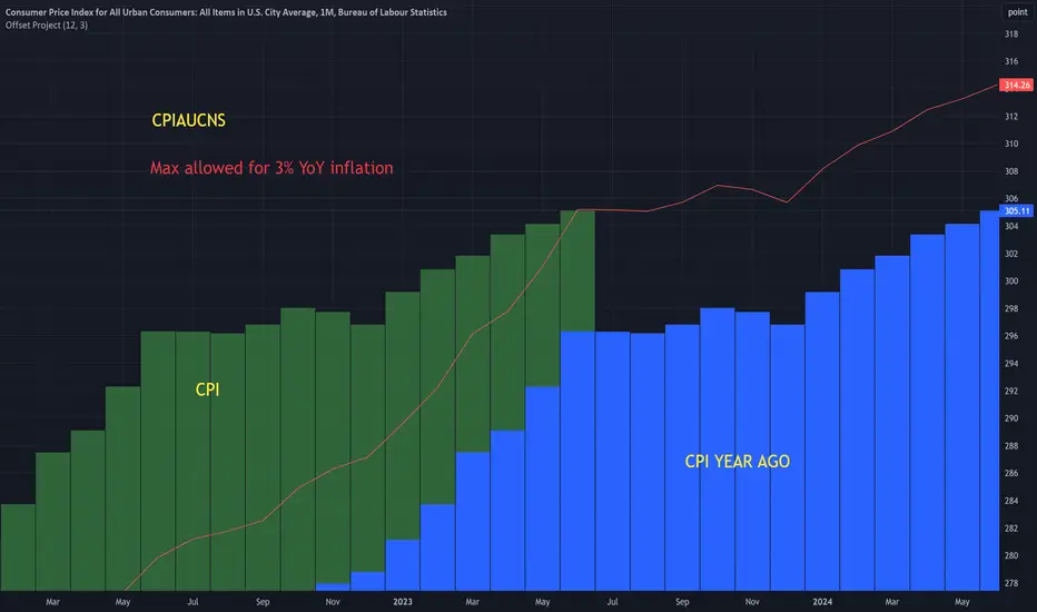
Inflation

Offset ProjectIntended for use with CPI symbols like:
CPIAUCNS (all items)
CPILFENS (core)
Shows the CPI values from a year ago, next to the current values. This makes it easier to visualize the base effects .
Has a ' max inflation rate ' parameter. This is shown as a red line. So for example, if it's set to 3, then CPI must stay below the red line in in order for the inflation rate to stay below 3.
Extreme Fundamental PricesExtreme Fundamental Prices is developed for Stock Markets to see the optimum, estimated and extreme estimated prices of any stocks on any markets. It works globally. Every country has different inflation, interest and deposit interest rates. The indicator consider these difference and it adopts itself automatically for chosen stock. Only the "Deposit Interest Rate" is manual because tradingview does not support this value for every country or value is wrong. If you know the deposit interest rate of your country enter the value manually. This is priority. Otherwise switch to "Interest Rate" on the menu. However the Optimum P/E line is not developed to work perfectly with this option. The Extreme Fundamental Prices indicator consists three lines which are,
-Optimum P/E
-Estimated 1Y Price
-Extreme Estimated 1Y Price
Optimum P/E line consists the financial data of chosen stock and economic data of country; which are financials of the stocks, inflation rate, deposit interest rate and interest rate(if "Interest Rate" option chosen).
Estimated 1Y Price line consists the financial data of chosen stock.
Extreme Estimated 1Y Price line consists the financial data of chosen stock.
This indicator does not tell you to buy or sell the stock. If stock price above these lines, the stock is fundamentally overpriced. If stock price below these lines, the stock is not fundamentally overpriced. Logically, price can tend to meet these lines.
For Instance, default value 33.00 is the current Deposit Interest Rate of Turkey. I am using this rate to look stocks on BIST. If you are looking on NASDAQ, just simply enter the deposit interest rate value of USA, looking for DAX enter the Euro Zone deposit interest rate.

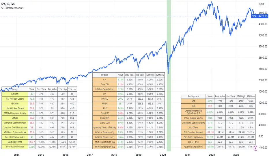
SFC MacroeconomicsThe Macroeconomics indicator can give us an instant view of the most important economic indicators. The indicator displays different tables in different sectors:
- Money : It give us a basic information about the money indicators in USA;
- Surveys: They are usually used as leading indicators.
- Inflation: It is showing overall inflation in the country
- Employment: Provides deep information about the current labor market
- Government: Usually legging indicators, but providing very good information about the USA
- Others: Few important indicators, for example GDP.
How we can use the indicator:
1) The indicator can be used to help traders, getting an instant overview of the economic indicators, helping them to create the Macroeconomic analysis.
2) The indicator can be use as a preparation before the high-impact news.
Note:
Yellow colour - leading indicators
Orange colour - legging indicators
Tables are showing the current data, also 12 months high and low. This is very important information, because it shows the extremes and normally if the current data is 12 months high or low it will be observed by the big players.
Before use this indicator, traders need basic macroeconomic understanding. A good knowledge is required in order to take advantage of the indicators and create the economic analysis or bias.
[Tommy's Inflation Index]#Inflation #FEDWATCH #FA
Hello dear beloved Traders and Investors around the world! As you are aware, the world is on a fierce battle against the inflation caused by the massive QE (Quantitative Easing) after the pandemic. All we see on the news is about this very world-wide fiscal phenomenon and how central bank of each nation are controlling it with their monetary policies. Consequently, FED’s hawkish stance to maintain tightening position has suppressed our market. The interest rates have spiked more rapidly than ever absorbing all the cash in the market.
The confrontation between Inflation Vs. Recession currently is the most integral and yet complex issue that needs to be wisely dealt with. Anyhow, whether we want it or not, the markets are being directly impacted by the tension of this inflation war. Hence, traders and investors should keep our eyes on the circumstances and trends of macro-economy to possibly comprehend, forecast, and prepare for the upcoming events. Economic indexes and data are always to be regularly monitored. Especially, inflation related indexes such as CPI (Consumer Price Index), PCE (Personal Consumption Expenditure), PPI (Produce Price Index) and Michigan inflation have stronger interrelation with the market these days.
Tradingview provides many economic indexes and data as you can see in the economy sector of the symbol search. I have found it quite useful to track the macro economy analyzing these data. As globally, people generally refer to the YoY (Year over year) and MoM (Month over month) since the relative percentage change rate is the key factor. There are raw data of CPI, PCE, PPI as well as the core of all these etc. on Tradingview. But unfortunately, there are no YoY and MoM (Only a few) data. Don’t worry. Today is your lucky day because I made them myself for you.
Today I wish to share the “Inflation Index” that I have been working during the Korean’s New Year Holidays. It automatically computes and visualizes the CPI, core CPI, PCE, core PCE, PPI, and core PPI both YoY and MoM. It might show you wrong values or errors if your chart is not on Monthly timeframe. By the way core inflation is goods and services sectors, excluding food and energy. If you check ‘Core or not?’ box, it distinguishes the regular and core indexes. I am going to regularly update this inflation index on pine script, so go ahead. It’s all yours!
Your subscription, likes, and comments inspire me a lot!
#인플레이션 #연준 #FA
안녕하세요 트레이더 여러분 토미입니다!
과도한 양적완화 여파로 생긴 인플레이션 사태를 잡기 위해 미국 연준을 포함한 각국의 중앙은행은 이례적으로 강력한 긴축정책을 펼치고 있습니다. 특히 그 어느때보다 연준의 FOMC 회의 및 기준 금리 변경 사안에 영향을 미칠 만한 여러 경제 지표들에 시장이 민감하게 반응하는 실정입니다. 여기 계신 분이라면 요즘 CPI(소비자물가지수), PCE(개인소비지출물가지수), PPI(생산자물가지수), 그리고 미시간 물가지수 등 미국 인플레이션 관련 지수들이 얼마나 중요한지 알고 계시리라 생각합니다. 코인, 주식, 선물 등 종목을 불문하고 우리가 원하던 원하지 않던 애네들 발표될 때마다 시장이 미친듯이 요동치는 사실은 부정할 수 없습니다.
최근 트레이딩뷰도 많은 경제 지표들을 제공해주고 있습니다. 우리가 자주 보는 CPI, PCE, 그리고 PPI도 있지만 우리가 통상적으로 참고하는 인플레이션 수치는 해당 지표들의 YoY(전년대비)와 MoM(전월대비)입니다. 아쉽게 트레이딩뷰에는 YoY와 MoM 수치가 없어서 대부분 뭐 인베스팅닷컴이나 구글 이런 곳에서 보셨을 겁니다. 그래서 그냥 제가 트레이딩뷰에서도 쉽게 열람할 수 있게 만들어버렸습니다. CPI, PCE, PPI, 근원 CPI, 근원 PCE, 그리고 근원 PPI의 YoY와 MoM 지수를 쉽게 볼 수 있게 디자인했습니다. 설날에 집에 짱박혀서 코딩만 했네요. 차트 상단 지표(Indicator)에 Tommy’s Inflation Index 검색 후 클릭하시면 사용하실 수 있습니다. 참고로 차트가 월봉으로 되어있지 않으면 오류가 발생할 가능성이 높으니 이 점 양해바랍니다. 지표 즐겨찾기에 추가 해놓고 중간중간 필요할 때 켜서 보시면 될 것 같습니다. 이 지표는 제가 주기적으로 업데이트 할 예정이니 앞으로도 많은 관심 부탁드립니다.
여러분의 구독, 좋아요, 댓글은 저에게 큰 동기부여가 된답니다~

Markets vs Inflation [x7.am]Markets vs Inflation(CPI US) also known as Inflation-Adjusted Return.
The inflation-adjusted return is the measure of return that takes into account the time period's inflation rate. The purpose of the inflation-adjusted return metric is to reveal the return on an investment after removing the effects of inflation.
Removing the effects of inflation from the return of an investment allows the investor to see the true earning potential of the security without external economic forces. The inflation-adjusted return is also known as the real rate of return or required rate of return adjusted for inflation. It is a more accurate measure of investment performance than the nominal rate of return.
The inflation-adjusted return accounts for the effect of inflation on an investment's performance over time.
Also known as the real return, the inflation-adjusted return provides a more realistic comparison of an investment's performance.
Inflation will lower the size of a positive return and increase the magnitude of a loss.
Assume you have saved $10,000 to buy a car but decide to invest the money for a year before buying to ensure that you have a small cash cushion left over after getting the car. Earning 5% interest, you have $10,500 after 12 months. However, because prices increased by 3% during the same period due to inflation, the same car now costs $10,300.
Consequently, the amount of money that remains after you buy the car—which represents your increase in purchasing power—is $200, or 2% of your initial investment. This is your real rate of return, as it represents the amount that you gained after accounting for the effects of inflation.
Markets vs Inflation indicators use in 1 months interval
SP:SPX , INDEX:BTCUSD , TVC:GOLD , TVC:DJI

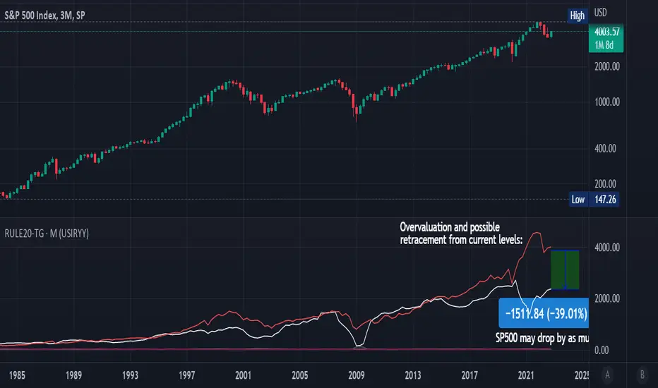
Rule Of 20 - Fair Value Estimation by Inflation & Earnings (TG)The Rule Of 20 is a heuristic calculation to find the fair value of an asset or market given its earnings and current inflation.
Its calculation is straightforward: the fair multiple of the price or price-to-earnings ratio of a stock should be 20 minus the rate of inflation.
In math terms: fair_price-to-earnings_ratio = (20 - inflation) ; fair_value = current_price * fair_price-to-earnings_ratio / real_price-to-earnings_ratio
For example, if a stock or index was trading on 11 times earnings and inflation was 2%, then the theory would be that the fair price-to-earnings ratio would be 20-2 = 18, which is much higher than the real price-to-earnings ratio of 11, and hence the asset would be undervalued.
Conversely, a market or company that was trading on 18 times price-to-earnings ration when inflation was 8% was seen as overvalued, because of the fair price-to-earnings ratio being 20-8=12, hence much lower than the real price-to-earnings ratio of 18.
We can then project the delta between the fair PE and real PE onto the asset's value to obtain the projected fair value, which may be a target of future value the asset may reach or hover around.
For example, as of 1st November 2022, SPX stood at 3871.97, with a PE ratio of 20.14 and an inflation in the US of 7.70. Using the Rule Of 20, we find that the fair PE ratio is 20-7.7=12.3, which is much lower than the current PE ratio of 20.14 by 39%! This may indicate a future possibility of a further downside risk by 39% from current valuation levels.
The origins of this rule are unknown, although the legendary US fund manager Peter Lynch is said to have been an active proponent when he was directing the Fidelity’s Magellan fund from 1977 to 1990.
For more infos about the Rule Of 20, reading this article is recommended: www.sharesmagazine.co.uk
This indicator implements the Rule Of 20 on any asset where the Financials are availble to TradingView, and also for the entire SP:SPX index as a way to assess the wider US stock market. Technically, the calculation is a bit different for the latter, as we cannot access earnings of SPX through Financials on TradingView, so we access it using the QUANDL:MULTPL/SP500_PE_RATIO_MONTH ticker instead.
By default are displayed:
current asset value in red
fair asset value according to the Rule Of 20 in white for SPX, or different shades of purple/maroon for other assets. Note that for SPX there is only one calculation, whereas for other assets there are multiple different ways to calculate earnings, so different fair values can be computed.
fair price-to-earnings ratio (PE ratio) in light grey.
real price-to-earnings ratio in darker grey.
This indicator can be used on SP:SPX ticker, and on most NASDAQ:* tickers, since they have Financials integrated in TradingView. Stocks tickers from other exchanges may not provide Financials data, so this indicator won't work then. If this happens, try to find the same ticker on NASDAQ instead.
Note that by default, only the US stock market is considered. If you want to consider stocks or assets in other regions of the world, please change the inflation ticker to a ticker that reflect the target region's inflation.
Also adding a table to ease interpretation was considered, but then the Timeframe MTF parameter would not work, and since the big advantage of this indicator is to allow for historical comparisons, the table was dropped.
Enjoy, and keep in mind that all models are wrong, but some are useful.
Trade safely!
TG
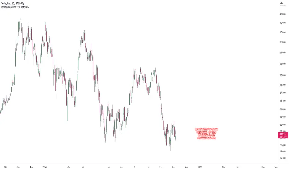
Price Comparison with Inflation and Interest RateHello dear traders.
This indicator creates a label on the chart.
It measures the difference between the price of the selected symbol at the beginning of the year and the current price, and tells you whether it has more returns than the inflation rate in the region you selected.
The return of the selected symbol on the label since the beginning of the year, the inflation value of the selected region and the interest rate of the selected region are written.
If the symbol's return since the beginning of the year is higher than the inflation return, the label color will be green, otherwise it will be red.
Below you can see a stock with an above-inflationary return.
You can select a region from the inputs section. Currently, Turkey, America and Europe regions can be selected.
While preparing this indicator, tradingview resources were used.
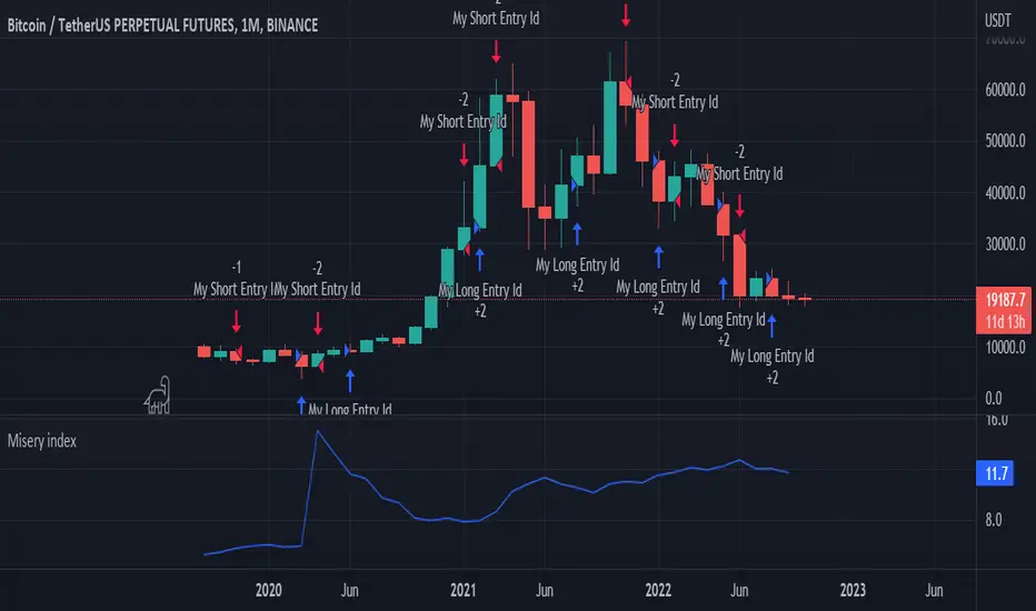
Misery index strategyHi all,
It's bear market so let's have a look at the misery index.
Misery index = inflation(%) + unemployment (%)
It's only possible to use this chart on the monthly (as misery index is updated monthly), but just for fun I added a strategy to it. If misery index increases you short and you go long when MI decreases.
Enjoy
p.s. the band is pretty cool too
Annualizer: New Indicator + CPI AnalysisThis indicator calculates the annualized month-over-month percent change of a cumulative index and plots it alongside the year-over-year percent change for comparison. It was developed for the purpose of analyzing the inflation rate of CPI indexes such as “CPIAUCSL.” It can also be used on M2 money supply and pretty much any cumulative index. It will not produce useful outputs on percent change indexes such as “USCCPI” because it performs percent change calculations which are already applied to those indexes.
This indicator takes data from the monthly chart, regardless of how often the data is reported or what the timeframe of the current chart is. Doing so allows it to work on all timeframes while displaying only monthly data outputs but limits it from recognizing data which might be released more often than once per month. This limitation should be suitable for macroeconomic data such as CPI and M2 money supply which are usually analyzed on a month-to-month basis.
If the ticker symbol is "M2SL" which is M2 money supply, annualized percent change is plotted in green, otherwise, it’s plotted in blue.
CPI analysis:
Upon deploying this indicator, it was observed that the year-over-year (YoY) inflation rate (red) is a lagging indicator of the annualized month-over-month (MoM) inflation rate (blue) and that it appears to almost be a moving average of it. A moving average plot was temporarily added for comparison to the YoY and it was found that the difference between the two plots is negligible and that for the purposes of high-level analysis of inflation, the two plots can be considered to be no different from one another. Below is a screenshot for demonstration. Notice how closely the white 12-month SMA of the annualized rate tracks the YoY rate.
For other indexes which may see more dramatic changes month-over-month such as M2 money supply, the difference between the two signals becomes more pronounced but they are still comparable. The conclusion is that the YoY inflation rate can be considered to be a 12-month simple moving average of the annualized MoM rate.
12-month SMA:
It’s easy to see and stands to reason that if the annualized MoM inflation rate (blue) remains where it has been for the previous 2 months YoY inflation (red) will begin falling and eventually reach similar levels due to its moving-average-like behavior. This will bring us back to the 2% YoY inflation target of the Fed within no more than 10 months. There may be a perception that deflation is required to bring prices back down to the purple channel of CPI to make prices pre-Covid "normal" again. We were headed in that direction in July with a slightly negative MoM CPI read. What may have freaked investors out about the August report (most recent as of this writing) is that the inflation rate, rather than continuing into negative deflationary territory, has bounced back into positive territory.
M2 money supply isn’t an integral part of this analysis, but it helps demonstrate the indicator. It can be observed that CPI growth lags M2 money supply growth which seems to have leveled off.
I’m not a macroeconomist so I’m probably missing some things, but I do not see a lagging indicator such as YoY inflation being at 8.25% while annualized MoM inflation is at 1.42% as something to freak out about as investors have seemingly done. I’m a stock market bear as of last week, but I do not feel this CPI analysis strongly supports a bearish thesis, nor is it bullish. Next month’s annualized MoM % change may begin to sway me one way or the other depending on what this chart looks like when it’s updated.

CPI and PPIMarket tracker of the year-on-year (YoY) change in inflation (both PPI Finished Goods and CPI).
Useful for identifying the turns in market conditions, and therefore helps with anticipation of changes in monitory policy.
This metric can be used to inform about current market conditions and potential risk=reward outcomes in the future.

Inflation Adjusted Performance: Ticker/M2 money supplyPlots current ticker / M2 money supply, to give an idea of 'inflation adjusted performance'.
~In the above, see the last decade of bullish equities is not nearly as impressive as it seems when adjusted to account for the FED's money printing.
~Works on all timeframes/ assets; though M2 money supply is daily data release, so not meaningful to plot this on timeframe lower than daily.
~To display on same pane; comment-out line 6 and un-comment line 7; then save, remove and re-add indicator.
~Scale on the right is meaningless; this indicator is just to show/compare the shape of the charts.

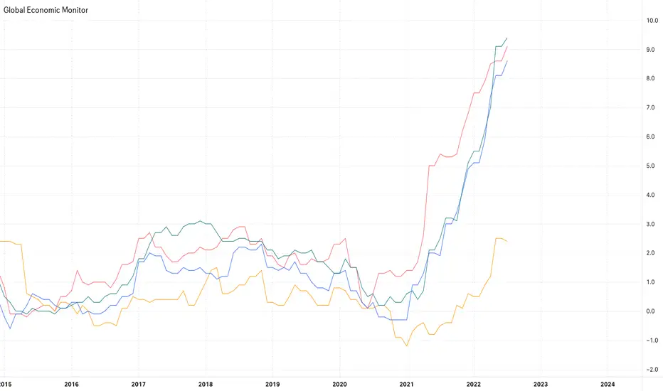
Global Economic MonitorThis indicator shows multiple economic data such as inflation rate, GDP etc. of the countries below.
U.S.
Japan
EU
U.K.
Australia
New Zealand
Canada
Switzerland
China
You can select 3 data at the same time so that you can compare data in single country or among multiple countries.
Available data:
Inflation Rate(YoY)
Inflation Rate(MoM)
Inflation Expectation
GDP
GDP Growth
Unemployment Rate
Retail Sales
—————————————
主要国の経済指標(インフレ率やGDPなど)を表示することのできるインジケーターです。
対象国/地域:
アメリカ
日本
EU
イギリス
オーストラリア
ニュージーランド
カナダ
スイス
中国
データは最大3つまで同時に表示することができます。
一つの国で複数指標を比較したり、同一指標を異なる国で比較する時に選択してください。
選択可能データ
インフレ率(対前年比)
インフレ率(対前月比)
期待インフレ率
GDP
GDP成長率
失業率
小売売上高
Quantity Theory of Money (Inflation Growth Rate)Quantity Theory of Money ( Inflation Growth Rate)
Equation:
%ΔM+%ΔV=%ΔP+%ΔY
M - Money Supply , V - Money Velocity , Y - Real GDP, P - Price
This script only takes into account money supply theory and does not account for increases/decreases in inflation due to energy costs. QTM Calculation is compared to USIRYY , USCCPI , and Sticky Price CPI . Flex_CPI and Flex_Core_CPI are not available in Trading View for comparison.
Simple Moving Average Default it set to 3 quarters for smoothing purposes. You can change this via the input window as you see fit.

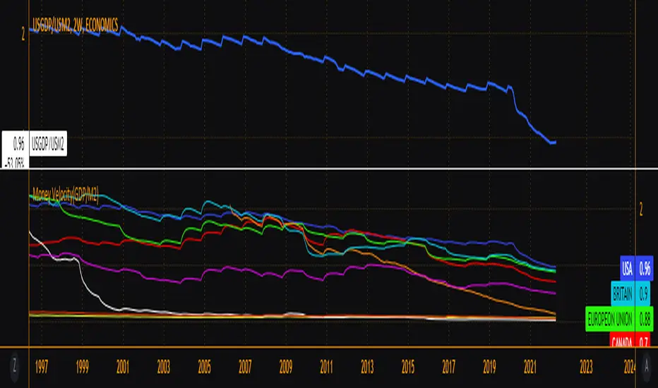
Money Velocity(GDP/M2)V=GDP/M2
Major world economy's money supply velocity. Compare how each country's monetary policy has played out and current trajectory in comparison to others. The velocity of money is a measure of the number of times that the average unit of currency is used to purchase goods and services within a given time period. The concept relates the size of economic activity to a given money supply, and the speed of money exchange is one of the variables that determine inflation.
EFTENG: Inflation Price Forecast indicator
With this indicator, when you add monthly and annual positive inflation rates, the price of the parity is estimated according to inflation. You can enter inflation rates as either positive or negative. You can write positive inflation rates as they are, but when writing negative inflation rates, the rate must be preceded by a negative phrase. A (-) sign should be placed in front of the negative inflation rate. Their codes are open and anyone can develop these codes. In the use of indicators, it is useful to look at the monthly chart because inflation rates are given on a monthly basis. As a result of these data, you can see the most accurate results on the monthly chart. The green line shows the positive inflation, the red line the negative inflation, and the gray line shows the annual positive and negative inflation. You can arrange the colors and line formats according to your desire.
TR: Enflasyon Fiyat Tahmini indikatörü
Bu indikatör ile aylık, yıllık pozitif enflasyon oranları eklediğinizde paritenin fiyatını enflasyona göre fiyat tahminde bulunmaktadır. Enflasyon oranlarını isterseniz pozitif isterseniz negatif olarak giriş yapabilirsiniz. Pozitif enflasyon oranlarını olduğu gibi yazabilirsiniz ancak negatif enflasyon oranını yazarken oranın başında negatif ibaresi bulunmalıdır. Negatif enflasyon girişini oranın önüne (-) işareti konulmalıdır. Kodları açık ve herkes bu kodları geliştirebilir. İndikatör kullanımında ise Aylık grafikte bakmanızda fayda var çünkü enflasyon oranları aylık bazda verilmektedir. Bu veriler neticesinde en doğru sonuçları aylık grafikte görebilirisiniz. Yeşil çizgi pozitif enflasyonu kırmızı çizgi negatif enflasyonu gri çizgi yıllık pozitif ve negatif enflasyonu göstermektedir. Renkleri, çizgi biçimleri isteğinize göre düzenleyebilirsiniz.

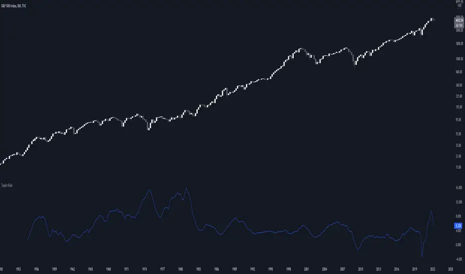
Taylor RuleThe Taylor rule is a simple formula that John Taylor devised to guide policymakers. It calculates what the federal funds rate should be, as a function of the output gap and current inflation. Here, we measure the output gap as the difference between potential output and real GDP. Inflation is measured by changes in the CPI, and we use a target inflation rate of 2%. We also assume a steady-state real interest rate of 2%.
Fed Balance Sheet Growth Rate p.a.Plots the rate of change in the Fed Balance sheet.
Defaults to annual rate of change.
Option to plot the raw balance sheet data.

Inflation NationThis is a measure between current inflation and inflation if the velocity of money increased to 1.4 (pre-pandemic levels).

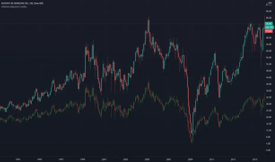
Inflation-Adjusted CandlesDeflates time series of historical open, close, high, low prices. This adjusts price data for inflation and removes the effect of price inflation.
inflation-adjusted price for period 't' = (price / cpi ) * 100
Historical CPI is pulled from Quandl.
gold price levels denominated in usd/gramsPlots the gold price (USD) for the quantities (grams) identified as support or resistance in the indicator settings. Default values are:
75 gold grams
300 gold grams
500 gold grams
1000 gold grams
5000 gold grams
More context: The purchasing power of Bitcoin

Total Inflation ModelMeasure of the total economy wide inflation of the US Dollar.
Total Inflation = growth rate of money supply / economic output

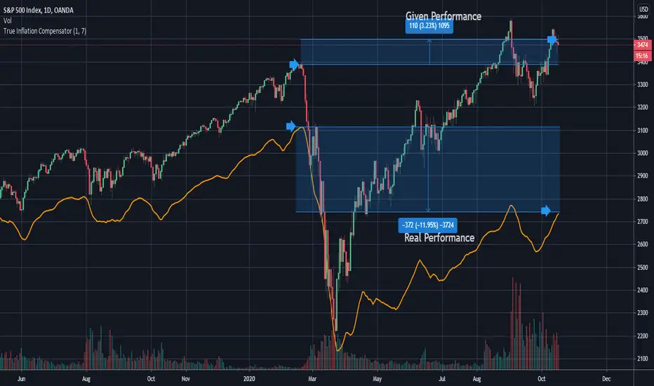
True Inflation Compensator (USD)This script will draw your underlying ticker compensating for a truer USD inflation rate based on an average between the M2 money supply increase and the government's reported CPI. It only considers the last year of inflation by default, but you can set any amount of years in the options.
This is especially relevant given the current massive printing that is going on within the US economic system. If you look at the S&P500 the market has by no means completely recovered, but due to massive printing most do not realize this by just looking at the base chart. A similar concept applies to Bitcoin. Unfortunately due to today's economic climate one must compensate for printing to get a true analysis of how investments are doing.