Option Chain-Based Call & Put Momentum VisualizerOption Chain-Based Call & Put Momentum Visualizer
invite-only by @JjpTradingAcademy
Overview
The Option Chain-Based CE/PE Momentum Visualizer is a powerful analytical tool designed to track real-time momentum and sentiment shifts between Call (CE) and Put (PE) options directly on the chart. It offers deep insight into option buyers’ and sellers’ behavior by analyzing multiple strikes, dynamically calculating cumulative CE/PE strength, and correlating it with underlying index price movements.
How to Use
The bottom pane of the indicator displays the decay data for both Call and Put options at every candle, green shows positive, red shows negative, and orange shows neutral. At the centre, it shows difference between Call and Put decay data, if the difference is less than 35 then it indicates with lime color otherwise it appears with purple color, When the trend changes between from lime and purple, the indicator plots a purple bar representing strong candles that often precede high momentum moves.
High/Low ranges are automatically plotted once the middle value drops below 10.
A breakout/breakdown of purple candle at the range indicates a strong directional movement on either side.
Reference images for visual guidance:
Inputs
To ensure proper functionality, fill in all fields correctly - Index/Stock Symbol Name, Pre-Market 's ATM Level, Options Type (OTM, ITM, OTM+ITM), Options Expiry Date, Options Symbol Prefix, Strike Interval If these are not set correctly, runtime errors may occur.
CE/PE Candle Strength – Displays CE/PE strength % for each candle
Highlight Prior Range – Marks previous High/Low zones for visual confirmation
Show Historical Entry Zone – Displays earlier High/Low ranges with color fills to highlight zone strength
Alerts
Purple Bar Signal
(Setup: Add Alert → Condition: "Option Chain-Based Call & Put Momentum Visualizer" → "Purple Bar Signal")
Security Call
All signals are calculated on bar close.
The script uses security () calls to fetch individual option OHLC data for accurate CE/PE momentum analysis.
Access
Invite-Only.
Request access via TradingView PM to @JjpTradingAcademy
Redistribution, reselling, or code extraction is strictly prohibited.
Disclaimer
This indicator is for educational purposes only.
It does not constitute financial advice or a guaranteed system of profitability.
Trading options involves significant risk - always conduct your own research and apply sound risk management.
Indexanalysis

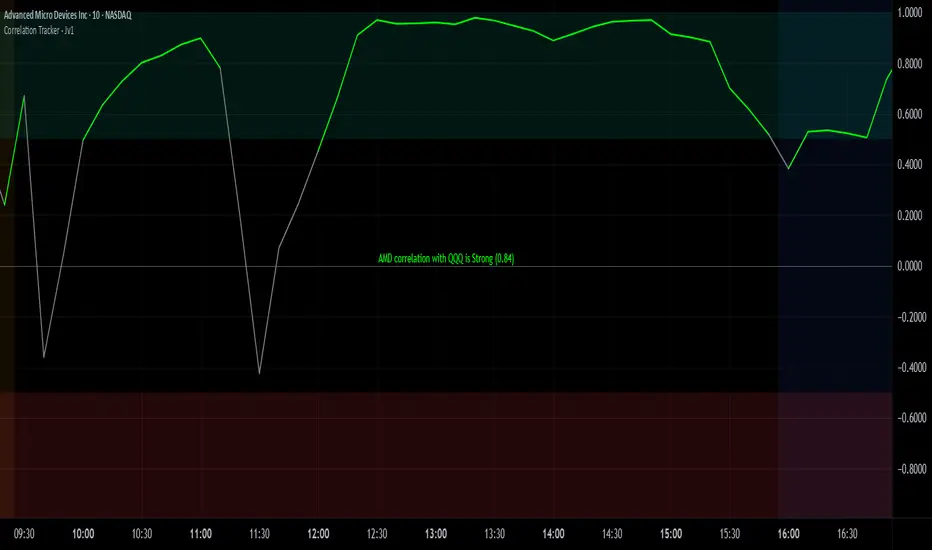
Correlation Tracker - Joe v1Correlation Tracker – Joe v1
This indicator calculates the correlation between a selected ticker and an index over a user-defined period. It visualizes correlation with color-coded lines, thresholds, and a descriptive rating, helping traders quickly gauge the strength and direction of correlation.
________________________________________
Options and What They Do
General Settings
• Symbol: Select the ticker you want to analyze.
• Use Chart Symbol: If enabled, the script will use the symbol of the current chart instead of a manually selected symbol.
• Index: Choose the reference index or asset to compare the correlation against. Default is NASDAQ:QQQ.
• Length: Sets the number of periods used to calculate correlation via a moving average. Shorter lengths respond faster; longer lengths smooth correlation.
Correlation Rating Settings
• Show Correlation Rating: Display a textual description of correlation strength (e.g., Ultra Strong, Moderate, Weak).
• Position: Choose where the correlation rating table will appear on the chart (Top/Bottom, Left/Center/Right).
Correlation Line Settings
• Positive Color: Line color when correlation is above the positive threshold. Default: green.
• Negative Color: Line color when correlation is below the negative threshold. Default: red.
• Neutral Color: Line color when correlation is between thresholds. Default: gray.
Correlation Thresholds
• Positive – From: Minimum correlation value considered positive. Default: 0.5 (range 0–0.9).
• Positive Color BG: Background color fill for positive correlation range.
• Negative – From: Maximum correlation value considered negative. Default: -0.5 (range -0.9–0).
• Negative Color BG: Background color fill for negative correlation range.
________________________________________
How It Works
1. Calculates correlation between the selected ticker and the index using logarithmic returns.
2. Plots the correlation line with colors based on thresholds: positive (green), negative (red), neutral (gray).
3. Displays a correlation rating table showing strength (Ultra Weak → Ultra Strong) and absolute correlation on a 0–1 scale.
4. Allows customization of visual appearance, thresholds, and position of rating for clarity on any chart.
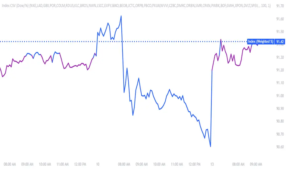
Make & Track An Index — Custom Weighted (by Quinn Millegan)Fixed pinescript security call issue limiting to 40 calls
Autocorrelation Price Forecasting [The Quant Science]Discover how to predict future price movements using autocorrelation and linear regression models to identify potential trading opportunities.
An advanced model to predict future price movements using autocorrelation and linear regression. This script helps identify recurring market cycles and calculates potential gains, with clear visual signals for quick and informed decisions.
Main function
This script leverages an autocorrelation model to estimate the future price of an asset based on historical price relationships. It also integrates linear regression on percentage returns to provide more accurate predictions of price movements.
Insights types
1) Red label on a green candle: Bearish forecast and swing trading opportunity.
2) Red label on a red candle: Bearish forecast and trend-following opportunity.
3) Green label on a red candle: Bullish forecast and swing trading opportunity.
4) Green label on a green candle: Bullish forecast and trend-following opportunity.
IMPORTANT!
The indicator displays a future price forecast. When negative, it estimates a future price drop.
When positive, it estimates a future price increase.
Key Features
Customizable inputs
Analysis Length: number of historical bars used for autocorrelation calculation. Adjustable between 1 and 200.
Forecast Colors: customize colors for bullish and bearish signals.
Visual insights
Labels: hypothetical gains or losses are displayed as labels above or below the bars.
Dynamic coloring: bullish (green) and bearish (red) signals are highlighted directly on the chart.
Forecast line: A continuous line is plotted to represent the estimated future price values.
Practical applications
Short-term Trading: identify repetitive market cycles to anticipate future movements.
Visual Decision-making: colored signals and labels make it easier to visualize potential profit or loss for each trade.
Advanced Customization: adjust the data length and colors to tailor the indicator to your strategies.
Limitations
Prediction price models have some limitations. Trading decisions should be made with caution, considering additional market factors and risk management strategies.

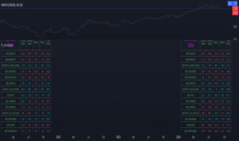
Relative Strength and MomentumRelative Strength and Momentum Indicator
Unlock deeper market insights with the Relative Strength and Momentum Indicator—a powerful tool designed to help traders and investors identify the strongest stocks and sectors based on relative performance. This custom indicator displays essential information on relative strength and momentum for up to 15 different symbols, compared against a benchmark index, all within a clear and organized table format.
Key Features:
1. Customizable Inputs: Choose up to 15 symbols to compare, along with a benchmark index, allowing you to tailor the indicator to your trading strategy. The 'Lookback Period' input defines how many weeks of data are analyzed for relative strength and momentum.
2. Relative Strength Calculation: For each selected symbol, the indicator calculates the Relative Strength (RS) against the chosen benchmark. This RS is further refined using an exponential moving average (EMA) to smooth the results, providing a more stable trend overview.
3. Momentum Analysis: Momentum is determined by analyzing the rate of change in relative strength. The indicator calculates a momentum rank for each symbol, based on its relative strength’s improvement or deterioration.
4. Percentile Ranking System: Each symbol is assigned a percentile rank (from 1 to 100) based on its relative strength compared to the others. Similarly, momentum rankings are also assigned from 1 to 100, offering a clear understanding of which assets are outperforming or underperforming.
5. Visual Indicators:
a. Green: Signals improving or stable relative strength and momentum.
b. Red: Indicates declining relative strength or momentum.
c. Aqua: Highlights symbols performing well on both relative strength and momentum—ideal candidates for further analysis.
6. Two Clear Tables:
a. Relative Strength Rank Table: Displays weekly rankings of relative strength for each symbol.
b. Momentum Table: Shows momentum trends, helping you identify which symbols are gaining or losing strength.
7. Color-Coded for Easy Analysis: The tables are color-coded to make analysis quick and straightforward. A green color means the symbol is performing well in terms of relative strength or momentum, while red indicates weaker performance. Aqua marks symbols that are excelling in both areas.
Use Case:
a. Sector Comparison: Identify which sectors or indexes are showing both relative strength and momentum to pick high-potential stocks. This allows you to align with broader market trends for improved trade entries.
b. Stock Selection: Quickly compare symbols within the same sector to find the stronger performers.
Plot background depending on Index EMA 10 and EMA 20This indicator gives the user an easy way to check the conditions of the market.
Up market should be good for breakout traders.
Down market should be good for breakdown shortsellers
The others should be good for pullback buyers.
This script automaticlly check which index should be used for the depending on which ticker is view. If no match is found indicator will use IXIC as reference.
The script works for Nordic and US stocks.
"OMXSPI"
"OBX"
"OMXSPI"
"OMXHPI"
"OMXCPI"
"IXIC"
It then alculated the EMA10 and EMA20 for the index and plots the background depending on 6 differnet conditions.
EMA10 below EMA20 and EMA10 and EMA20 is sloping down. //Down market
EMA10 above EMA20 and EMA10 and EMA20 is sloping up. //Up market
EMA10 below EMA20 and EMA10 sloping up and EMA20 is sloping down. //First indication by market to move up
EMA10 above EMA20 and EMA10 sloping down and EMA20 is sloping up. //First indication by market to move down
EMA10 below EMA20 and EMA10 sloping up and EMA20 is sloping up. //Possible MA cross over
EMA10 below EMA20 and EMA10 sloping down and EMA20 is sloping down. //Possible MA cross over

Ticker vs IndexI was exploring a simple idea how I can visualize the ticker performance against the underlying Index (or any other ticker) performance.
how it works:
When the line is moving up (blue zone), the ticker is performing better than the underlying index (e.g. SPX)(configurable).
When the line is moving down (red zone), the ticker is performing worse than the underlying index.
How to use it:
Use as confirmation always in conjunction with other (main) indicators, avoid "buy" when indicator is in the red zone
Also, crossing over the zero line is often an indication for an upcoming upward move
Try to different SMA length - default is 20 but 10 was often showing better results
(No financial advise, for testing purposes only)
world stage indexThis is an indicator that expresses the ratio of "stage1" and "stage4" of world index.
40 symbols are as follows
(JAPAN, US, EUROPE, and CANADA)
OSE:NK2251!, DJ:DJI, NASDAQ:IXIC, SP:SPX, XETR:DAX, TVC:CAC40, TVC:UKX, TSX:TSX
(ASIA)
TVC:SHCOMP, SZSE:399001, TVC:HSI, TWSE:TAIEX, BSE:SENSEX, OANDA:SG30SGD, INDEX:KSI, SET:SET
(EUROPE)
INDEX:SX5E, INDEX:FTSEMIB, SIX:SMI, BME:IBC, EURONEXT:BEL20, TVC:AEX, OMXCOP:OMXC25, XETR:0Q5X
(Pacific Ocean)
ASX:XJO, TVC:NZ50G, IDX:COMPOSITE, FTSEMYX:FBMKLCI, BMFBOVESPA:IBOV, BMV:ME, BVL:SPBLPGPT, BYMA:IMV
(Eastern Europe & Middle East)
MOEX:IMOEX, GPW:WIG20, OMXHEX:OMXH25, OMXSTO:OMXS30, DFM:DFMGI, TADAWUL:TASI, OSE:GNRI, EGX:EGX30
The criteria are as follows:
EMA5≧EMA20≧EMA40 : Stage1
EMA5≦EMA20≦EMA40 : Stage4
A.The sum of Stage1 was multiplied by 2.5 and drawn on a scale of 0 to 100, with yellow area
B.The Sum of Stage4 was multiplied by 2.5 and drawn on a scale of 0 to 100, with blue area.
C. The ratio of A/B was multiplied by 2.5 and drawn on a scale of 0 to 100, with red lines.
This idea is from Kojirou Kousi.
40 symbols of this script are partially different from Kojiro kousi's idea.
But he said the difference isn't matter.
「小次郎講師指数」に着想を得た、世界40カ国の株価指数stage状態です。
参考文献は、小次郎講師著書「世界一わかりやすい投資の勝ち方」です。
小次郎講師とは一部異なるシンボルを採用していますが、
多少の違いは余り大した問題では無いと御本人から教わった事があります。
先進国に関してはおそらくほとんど同じだと思います。
stage1の合計の%を黄色、stage4の合計の%を青色、stage1の合計/stage4の合計の%を赤で表示しています。
雰囲気で分かればいいので、正確な数字までは表示しませんでした。
個人的には現状分析以外にも、プラクティス時に世界情勢を把握するのに重宝しています。
