Planetary Speed - CEPlanetary Speed - Community Edition
Welcome to the Planetary Speed - Community Edition , a specialized tool designed to enhance W.D. Gann-inspired trading by plotting the speed of selected planets. This indicator measures changes in planetary ecliptic longitudes, which may correlate with market timing and volatility, making it ideal for traders analyzing equities, forex, commodities, and cryptocurrencies.
Overview
The Planetary Speed - Community Edition calculates the speed of a chosen planet (Mercury, Venus, Mars, Jupiter, Saturn, Uranus, Neptune, or Pluto) by comparing its ecliptic longitude across time. Supporting heliocentric and geocentric modes, the script plots speed data with high precision across various chart timeframes, particularly for markets open 24/7 like cryptocurrencies. Traders can customize line colors and add multiple instances for multi-planet analysis, aligning with Gann’s belief that planetary cycles influence market trends.
Key Features
Plots the speed of eight planets (Mercury, Venus, Mars, Jupiter, Saturn, Uranus, Neptune, Pluto) based on ecliptic longitude changes
Supports heliocentric and geocentric modes for flexible analysis
Customizes line colors for clear visualization of planetary speed data
Projects future speed data up to 250 days with daily resolution
Works across default TradingView timeframes (except monthly) for continuous markets
Enables multiple script instances for tracking different planets on the same chart
How to Use
Access the script’s settings to configure preferences
Choose a planet from Mercury, Venus, Mars, Jupiter, Saturn, Uranus, Neptune, or Pluto
Select heliocentric or geocentric mode for calculations
Customize the line color for speed data visualization
Review plotted speed data to identify potential market timing or volatility shifts
Add multiple instances to track different planets simultaneously
Get Started
The Planetary Speed - Community Edition provides full functionality for astrological market analysis. Designed to highlight Gann’s planetary cycles, this tool empowers traders to explore celestial influences. Trade wisely and harness the power of planetary speed!
Gann

Planetary Signs - CEPlanetary Signs - Community Edition
Welcome to the Planetary Signs - Community Edition , a specialized tool designed to enhance W.D. Gann-inspired trading by highlighting zodiac sign transitions for selected planets. This indicator marks when planets enter specific zodiac signs, which may correlate with market turning points, making it ideal for traders analyzing equities, forex, commodities, and cryptocurrencies.
Overview
The Planetary Signs - Community Edition calculates the ecliptic longitude of a chosen planet (Sun, Moon, Mercury, Venus, Mars, Jupiter, Saturn, Uranus, Neptune, or Pluto) and highlights periods when it enters user-selected zodiac signs (Aries, Taurus, Gemini, etc.). Supporting heliocentric and geocentric modes, the script plots sign transitions with minute-level accuracy, syncing perfectly with chart timeframes. Traders can customize colors for each sign and add multiple instances for multi-planet analysis, aligning with Gann’s belief that zodiac transitions influence market trends.
Key Features
Highlights zodiac sign transitions for ten celestial bodies (Sun, Moon, Mercury, Venus, Mars, Jupiter, Saturn, Uranus, Neptune, Pluto)
Supports heliocentric and geocentric modes (Pluto heliocentric-only; Sun and Moon geocentric)
Allows selection of one or multiple zodiac signs with customizable highlight colors
Plots vertical lines and labels (e.g., “☿ 0 ♈ Aries”) at sign transitions with minute-level accuracy
Projects future sign transitions up to 120 days with daily resolution
Enables multiple script instances for tracking different planets or signs on the same chart
How to Use
Access the script’s settings to configure preferences
Choose a planet from the Sun, Moon, Mercury, Venus, Mars, Jupiter, Saturn, Uranus, Neptune, or Pluto
Select one or more zodiac signs (e.g., Aries, Taurus) to highlight
Customize the highlight color for each selected zodiac sign
Select heliocentric or geocentric mode for calculations
Review highlighted periods and labeled lines to identify zodiac sign transitions
Use transitions to anticipate potential market turning points, integrating Gann’s astrological principles
Get Started
The Planetary Signs - Community Edition provides full functionality for astrological market analysis. Designed to highlight Gann’s zodiac cycles, this tool empowers traders to explore celestial transitions. Trade wisely and harness the power of planetary alignments!

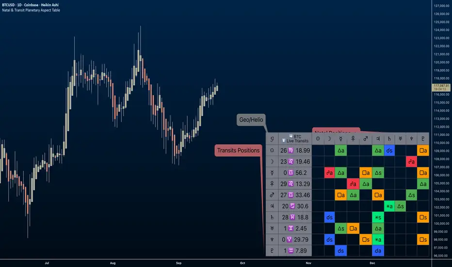
Natal & Transit Planetary Aspect Table📐 Natal & Transit Planetary Aspect Table
This open-source TradingView indicator displays a customizable table of astrological aspects between natal (first trade or custom date) planetary positions and current/live transits. Built in Pine Script v6, it leverages the AstroLib library for accurate geocentric or heliocentric longitude calculations, supporting a range of financial assets and historical events. Ideal for astro-finance enthusiasts, it highlights major and minor aspects with orbs, applying/separating status, and color-coded visuals. Supports 10 planetary bodies in geocentric mode (Sun, Moon, Mercury, Venus, Mars, Jupiter, Saturn, Uranus, Neptune, Pluto) or 11 in heliocentric mode (adds Earth).
Why Use This Indicator?
Astrology offers a unique lens for market analysis by examining planetary alignments relative to an asset's "birth" date (e.g., first trade), potentially revealing cycles, trends, and timing insights that complement technical and fundamental strategies. This tool empowers traders to integrate astro-finance principles, visualizing cosmic influences that may correlate with price movements, reversals, or volatility—backed by historical presets and customizable options for personalized research.
Key Features:
- 23 preset natal dates for assets like BTC, ETH, NYSE, and more (e.g., BTC genesis block on 2009-01-03), with credits to Susan Abbott Gidel for most of the first trade dates from her book " Trading In Sync With Commodities: Introducing Astrology To Your Technical Toolbox ."
- Manual natal and transit timestamp inputs for flexibility.
- Supports geocentric (default) or heliocentric views (displayed as 𝒢 or ℋ in the table), with adjustable observer location (latitude, longitude, timezone).
- Configurable aspects: Conjunction (☌), Opposition (☍), Trine (△), Square (□), Sextile (⚹), and minors like Semi-Sextile (⚺), Quincunx (⚻), etc., with user-defined orbs and colors.
- Applying (a) or separating (s) status is determined by comparing the orb on the current bar to the previous one—if decreasing, applying; if increasing, separating. This simplified approach may differ from traditional astrological methods that consider planetary speeds, directions (direct/retrograde), and which body is faster/slower.
- Table displays planet symbols or names, degrees/signs with tooltips showing exact longitude (e.g., hovering over a planet symbol reveals its precise degree), and aspect symbols/tags (e.g., ⚹a for applying sextile).
- Tooltip on the dates cell to view the exact transit and natal dates for easy tracking.
- Live mode updates with chart timeframe; test mode allows the user to move the transit date historically or to the future via a custom timestamp.
- Customizable table position, text size, colors, and visibility.
How to Use:
1. Add the indicator to your TradingView chart.
2. Select a preset or manual natal date in settings.
3. Choose live transits or test mode with a custom timestamp.
4. Enable/disable aspects and adjust orbs/colors as needed.
5. Hover over cells for detailed tooltips (e.g., exact orb and applying/separating status).
Powered by @BarefootJoey AstroLib for ephemeris data. For best accuracy, verify positions against external sources.
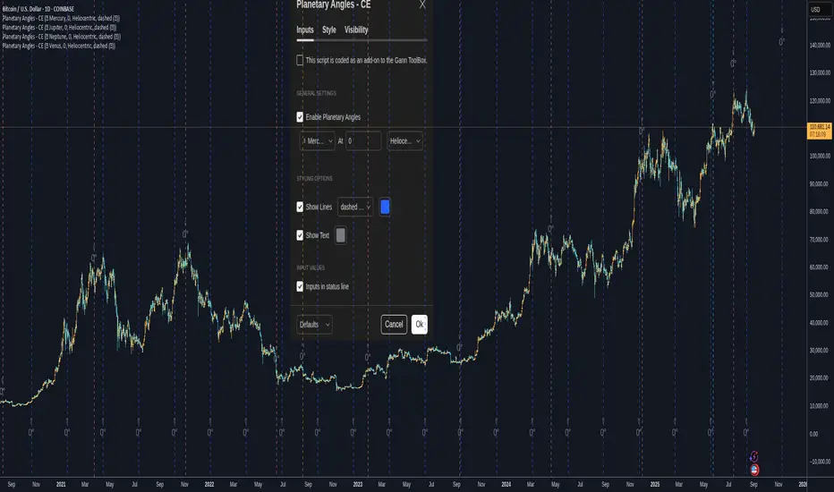
Planetary Angles - CEPlanetary Angles - Community Edition
Welcome to the Planetary Angles - Community Edition, a dynamic tool designed to enhance W.D. Gann-inspired trading by pinpointing dates when a selected planet reaches a user-defined ecliptic longitude angle. This feature-complete indicator provides traders with precise astrological timing for market analysis across equities, forex, commodities, and cryptocurrencies. It empowers traders to integrate celestial events into their strategies with ease.
Overview
The Planetary Angles - Community Edition calculates and plots vertical lines on your chart to mark dates when a chosen planet (Mercury, Venus, Mars, Jupiter, Saturn, Uranus, Neptune, or Pluto) crosses a specific longitude angle (0° to 359.99°) in either heliocentric or geocentric mode. With customizable line and label styling, this script highlights key astrological moments, helping traders identify potential market turning points based on Gann’s time-theory principles. It supports multiple instances on a single chart, offering flexibility for multi-planet analysis.
Key Features
Custom Angle Selection : Choose any ecliptic longitude angle (0° to 359.99°) to track when a planet crosses that precise degree.
Planetary Coverage : Supports eight planets (Mercury, Venus, Mars, Jupiter, Saturn, Uranus, Neptune, Pluto) for comprehensive astrological analysis.
Heliocentric and Geocentric Modes : Toggle between heliocentric and geocentric calculations to align with your preferred perspective.
Styling Options : Customize line styles (solid, dotted, dashed) and colors for lines and labels, with options to enable/disable lines and text for clarity.
Labeled Visuals : Displays labeled markers (e.g., “☿ 90°”) on the chart, with tooltips for easy identification of planetary angle crossings.
Multi-Instance Support : Add the script multiple times to track different planets or angles simultaneously on the same chart.
How It Works
Open Settings : Access the script’s settings to configure your preferences.
Enable the Script : Check the box to activate Planetary Angles.
Select a Planet : Choose from Mercury, Venus, Mars, Jupiter, Saturn, Uranus, Neptune, or Pluto.
Set the Angle : Input a specific ecliptic longitude angle (0° to 359.99°) to track.
Choose Planetary Mode : Select heliocentric or geocentric mode for the calculations.
Customize Styling : Adjust line and label styles and colors, and enable/disable lines or labels as needed.
Analyze and Trade : Observe the plotted vertical lines and labels to identify when the selected planet crosses the chosen angle, using these moments to inform your trading strategy.
Get Started
As a gift to the TradingView community and Gann traders, the Planetary Angles - Community Edition is provided free of charge. With no features locked, this tool offers full access to precise planetary angle tracking for enhanced market timing. Trade wisely and leverage the cosmic precision of Gann’s methodology!
Retrograde Planets - CERetrograde Planets - Community Edition
Welcome to the Retrograde Planets - Community Edition, a specialized tool designed to empower traders with W.D. Gann’s time-theory principles by highlighting planetary retrograde cycles. This feature-complete indicator allows traders to visualize critical retrograde periods for market analysis across equities, forex, commodities, and cryptocurrencies. As a seamless add-on to the Gann ToolBox, it enhances time-based trading strategies with precision and clarity.
Overview
The Retrograde Planets - Community Edition identifies and highlights retrograde cycles for Mercury, Venus, Mars, Jupiter, Saturn, Uranus, and Neptune, key periods often associated with market volatility and trend shifts in Gann’s methodology. By calculating ecliptic longitudes with high accuracy, the script plots historical and future retrograde periods (up to 365 days ahead) on your chart, complete with visual highlights and labels. This tool is ideal for traders leveraging astrological cycles to anticipate market turning points.
Key Features
Retrograde Cycle Highlighting : Displays retrograde periods for Mercury, Venus, Mars, Jupiter, Saturn, Uranus, and Neptune, marking start and end points with vertical lines and labels.
Historical and Future Projections : Visualizes past retrograde cycles and projects future ones up to a year in advance with minute-level precision.
Customizable Planet Selection : Choose from seven planets to focus on specific retrograde cycles relevant to your analysis.
24/7 Market Optimization : Enable extended future data for continuous markets like crypto, improving performance and projection accuracy.
Styling Flexibility : Customize the highlight color for retrograde periods to enhance chart clarity and align with your visual preferences.
Labeled Visuals : Includes labels (e.g., “℞ Starts,” “℞ Ends”) with tooltips for easy identification of retrograde cycle boundaries.
How It Works
Open Settings : Access the script’s settings to configure your preferences.
Select a Planet : Choose from Mercury, Venus, Mars, Jupiter, Saturn, Uranus, or Neptune to analyze its retrograde cycles.
Enable Retrograde Cycles : Check the box to activate retrograde highlighting for the selected planet.
Customize Highlight Color : Adjust the color of the highlighted retrograde periods for better chart visibility.
Enable 24/7 Mode (Optional) : For crypto or continuous markets, activate the 24/7 setting to include extended future data.
Analyze and Trade : Use the highlighted retrograde periods and labeled lines to identify potential market volatility or trend changes, integrating Gann’s time-theory into your strategy.
Get Started
As a gift to the TradingView community and Gann traders, the Retrograde Planets - Community Edition is provided free of charge. With no features locked, this tool offers full access to retrograde cycle analysis for precise market timing. Trade wisely and harness the power of planetary cycles!

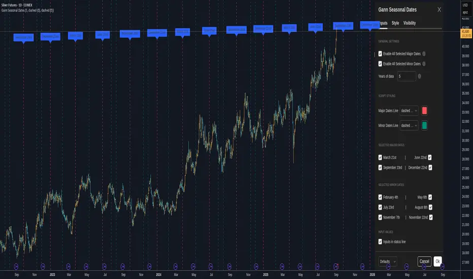
Gann Seasonal Dates - CEGann Seasonal Dates - Community Edition
Welcome to the Gann Seasonal Dates V1.61 - Community Edition, a powerful tool designed to enhance time-based trading with W.D. Gann’s seasonal date methodology. This feature-complete indicator allows traders to plot critical seasonal dates on charts for equities, forex, commodities, and cryptocurrencies. It empowers traders to anticipate market turning points with precision.
Overview
The Gann Seasonal Dates plots Gann’s major and minor seasonal dates, which are rooted in the cyclical nature of solstices, equinoxes, and their midpoints. Major dates include the vernal equinox (March 21st), summer solstice (June 22nd), autumnal equinox (September 23rd), and winter solstice (December 22nd). Minor dates mark the halfway points between these events (February 4th, May 6th, July 23rd, August 8th, November 7th, and November 22nd). With customizable styling and historical data up to 50 years, this script helps traders identify key time-based market events.
Key Features
Major and Minor Seasonal Dates : Plot four major dates (solstices and equinoxes) and six minor dates (midpoints) to highlight potential market turning points.
Customizable Date Selection : Enable or disable individual major and minor dates to focus on specific cycles relevant to your analysis.
Historical Data Range : Adjust the lookback period up to 50 years, with recommendations for optimal performance based on your TradingView plan (5 years for Basic, 20 for Pro/Pro+/Premium).
Styling Options : Customize line styles (solid, dotted, dashed) and colors for major and minor dates to enhance chart clarity.
Labeled Visuals : Each plotted date includes a label with a tooltip (e.g., "Vernal equinox") for easy identification and context.
How It Works
Configure Settings : Enable major and/or minor dates and select specific dates (e.g., March 21st, February 4th) to display on your chart.
Set Historical Range : Adjust the years of data (up to 50) to plot historical seasonal dates, ensuring compatibility with your TradingView plan’s processing limits.
Customize Styling : Choose line styles and colors for major and minor dates to differentiate them visually.
Analyze and Trade : Use the plotted vertical lines and labels to identify potential market turning points, integrating Gann’s time-based cycles into your strategy.
Get Started
As a gift to the TradingView community and Gann traders, the Gann Seasonal Dates - Community Edition is provided free of charge. With no features locked, this tool offers full access to Gann’s seasonal date methodology for precise time-based analysis. Trade wisely and leverage the power of seasonal cycles!
Astro ToolBox - CEAstro ToolBox - Community Edition
Welcome to the Astro ToolBox - Community Edition, a meticulously designed tool that brings precise planetary ephemeris data to the TradingView community. Inspired by W.D. Gann’s astrological principles, this feature-complete indicator empowers traders to integrate celestial data into their market analysis across equities, forex, commodities, and cryptocurrencies.
Overview
The Astro ToolBox - Community Edition delivers accurate ephemeris data, calculating the ecliptic longitude and latitude of celestial bodies for any selected date. Supporting the Sun, Moon, Mercury, Venus, Mars, Jupiter, Saturn, Uranus, Neptune, and Pluto, this script offers both heliocentric and geocentric perspectives with high precision (within 1-2 arc seconds), it provides traders with a robust dataset for time-based analysis, enhancing Gann-inspired trading strategies.
Key Features
Comprehensive Planetary Data : Displays longitude and optional latitude for ten celestial bodies (Sun, Moon, Mercury, Venus, Mars, Jupiter, Saturn, Uranus, Neptune, Pluto) on user-specified dates.
Heliocentric and Geocentric Modes : Toggle between heliocentric and geocentric calculations (Pluto is heliocentric-only; Moon is geocentric-only).
Zodiac Sign Integration : Optionally display the astrological sign and degree for the selected planet’s longitude, enhancing astrological analysis.
Customizable Display Options : Enable/disable exact time display, longitude rounding, and latitude visibility for tailored data presentation.
Flexible Table Positioning : Choose from nine screen positions (e.g., Top Right, Bottom Center) to place the ephemeris table, with customizable colors for seamless chart integration.
High-Precision Calculations : Utilizes optimized algorithms to deliver near-real-time planetary positions without relying on external APIs.
How It Works
Select a Date : Choose the date for which you want to view planetary data using the input field.
Choose a Planet : Select from the Sun, Moon, Mercury, Venus, Mars, Jupiter, Saturn, Uranus, Neptune, or Pluto.
Set Planetary Mode : Toggle between heliocentric or geocentric modes to align with your analysis approach.
Customize Output : Enable options like zodiac signs, sign degrees, latitude, or exact time, and adjust the table’s position and color.
View Results : The ephemeris data appears in a clear, customizable table on your chart, providing longitude, latitude (optional), and astrological sign details.
Analyze and Trade : Leverage the data to identify time-based turning points or correlations with price action, integrating Gann’s astrological principles into your strategy.
Get Started
As a gift to the TradingView community and Gann traders, the Astro ToolBox - Community Edition is offered free of charge. With no features locked, this tool provides full access to precise ephemeris data for astrological market analysis. Trade wisely and harness the power of celestial insights!

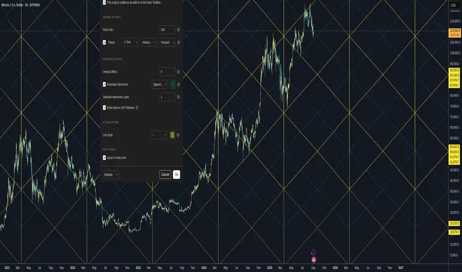
Gann Planetary Lines V1.35 - CEGann Planetary Lines V1.35 - Community Edition
Welcome to the Gann Planetary Lines V1.35 - Community Edition, a powerful tool inspired by W.D. Gann’s astrological trading principles, designed to bring planetary-based price and time analysis to the TradingView community. This feature-complete indicator offers Gann traders and enthusiasts a robust solution for charting planetary influences across equities, forex, commodities, and cryptocurrencies.
Overview
The Gann Planetary Lines V1.35 - Community Edition transforms planetary longitude angles into price levels, leveraging Gann’s methodology to map celestial movements onto financial charts. This script supports plotting lines for the Sun, Moon, Mercury, Venus, Mars, Jupiter, Saturn, Uranus, Neptune, and Pluto, with customizable settings for heliocentric or geocentric perspectives. By integrating harmonic angles and advanced styling options, it provides a comprehensive framework for identifying key price levels and potential market turning points.
Key Features
Planetary Line Projections : Plot lines for ten celestial bodies (Sun, Moon, Mercury, Venus, Mars, Jupiter, Saturn, Uranus, Neptune, Pluto) based on their ecliptic longitudes, offering insights into price-time relationships.
Heliocentric and Geocentric Modes : Switch between heliocentric and geocentric calculations (Pluto is heliocentric-only; Sun and Moon are geocentric).
Customizable Price Unit ($/°) : Adjust the dollar-per-degree value to square planetary lines with your chart’s price scale, ensuring precise alignment.
Harmonic Support : Plot harmonic angles (Opposition, Square, Trine, Sextile, Quintile) with layer selection for multi-level analysis.
Vertical Offset and Styling : Shift lines vertically for custom harmonics and style them with adjustable thickness and colors for clear visualization.
24/7 Market Optimization : Enable extended future data for continuous markets like crypto, enhancing performance and projection accuracy.
Multi-Layer Projections : Display up to nine layers of planetary lines, each offset by 360°, to capture long-term price objectives.
How It Works
Configure Settings : Set the price unit ($/°) to align with your asset’s price action and select a planet from the dropdown menu.
Choose Planetary Mode : Toggle between heliocentric or geocentric modes and enable reverse direction for downward lines.
Enable Harmonics (Optional) : Select desired harmonics (e.g., Square, Trine) and adjust the layer to visualize additional price levels.
Customize Display : Adjust line thickness, color, and vertical offset to enhance chart clarity and match your analysis style.
Analyze and Trade : Use plotted planetary and harmonic lines to identify support, resistance, and potential turning points, integrating Gann’s astrological insights into your trading strategy.
Get Started
As a gift to the TradingView community and Gann traders, the Gann Planetary Lines V1.35 - Community Edition is offered free of charge. No features are locked—enjoy the full power of planetary analysis to enhance your trading. Trade wisely and explore the cosmic edge of Gann’s methodology!
Gann For XAUUSDThe Gann levels for XAUUSD indicator is designed to plot dynamic Gann levels based on either the previous day’s Close price (for large-cap stocks) or the current day’s Open price (for small-cap stocks). These levels help traders identify key price zones, reversals, and potential trading opportunities.
🔑 Key Features:
Auto/Manual Toggle →
Auto Mode: Automatically fetches the previous day’s Close and today’s Open using real-time market data.
Manual Mode: Allows traders to manually input values for customized backtesting or specific scenarios.
Large vs. Small Stocks Modes → Choose between two calculation sets depending on whether you’re trading large or small stocks.
Dynamic Gann Levels → Multiple levels (e.g., ±T1, ±T2, ±T3, EB, KB, MB, AB, QB, etc.) are plotted with distinct colors for clarity.
Chart Labels → Each level is clearly labeled with its value, making it easy to read without hovering over lines.
Info Panel → Displays the active mode (Auto/Manual) and the exact Close and Open values being used.
🎯 How to Use:
Select Large Stocks mode for higher-value instruments (levels calculated from previous day’s Close).
Select Small Stocks mode for smaller instruments (levels calculated from today’s Open).
Use the Auto Mode for convenience (no daily inputs needed) or switch to Manual Mode if you want to test specific price scenarios.
Watch how price reacts to Gann levels for potential support/resistance zones and trade setups.
⚠️ Disclaimer:
This indicator is intended for educational purposes only and should not be considered financial advice. Always use proper risk management and combine with other tools/analysis before trading.

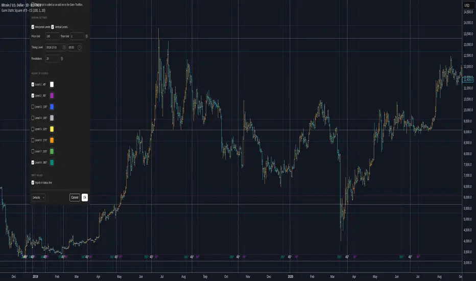
Gann Static Square of 9 - CEGann Static Square of 9 - Community Edition
Welcome to the Gann Static Square of 9 - Community Edition, a meticulously crafted tool designed to empower traders with the timeless principles of W.D. Gann’s Square of 9 methodology. This indicator is tailored for the TradingView community and Gann Traders, providing a robust solution for analyzing price and time dynamics across various markets.
Overview
The Gann Static Square of 9 harnesses the mathematical precision of Gann’s Square of 9 chart, plotting key price and time levels based on a fixed starting point of 1. Unlike its dynamic counterpart , this static version uses a consistent origin, making it ideal for traders seeking to map Gann’s geometric angles (45°, 90°, 135°, 180°, 225°, 270°, 315°, and 360°) with a standardized framework. By adjusting the price and time units, users can tailor the indicator to suit any asset, from equities and forex to commodities and cryptocurrencies.
Key Features
Fixed Starting Point: Begins calculations at a base value of 1, providing a standardized approach to plotting Gann’s Square of 9 levels.
Comprehensive Angle Projections: Plots eight critical Gann angles (45°, 90°, 135°, 180°, 225°, 270°, 315°, and 360°), enabling precise identification of support, resistance, and time-based targets.
Customizable Price and Time Units: Adjust the price unit (Y-axis) and time unit (X-axis) to align with the specific characteristics of your chosen market, ensuring optimal fit for price action and volatility.
Horizontal and Vertical Levels: Enable horizontal price levels to identify key support and resistance zones, and vertical time levels to pinpoint potential market turning points.
Revolution Control: Extend projections across multiple 360° cycles to uncover long-term price and time objectives, with user-defined revolution counts.
Customizable Aesthetics: Assign distinct colors to each angle for enhanced chart clarity and visual differentiation.
and more!
How It Works
Configure Settings: Set the price and time units to match your asset’s characteristics, and select the desired number of revolutions to project future levels.
Enable Levels: Choose which Gann angles (45° to 360°) to display, tailoring the indicator to your analysis needs.
Visualize Key Levels: The indicator plots horizontal price levels and optional vertical time levels, each labeled with its corresponding angle and price/time value.
Analyze and Trade: Leverage the plotted levels to identify critical support, resistance, and time-based turning points, enhancing your trading strategy with Gann’s proven methodology.
Get Started
As a token of appreciation for the TradingView community, and Gann traders, this Community Edition is provided free of charge. Trade safe and enjoy!
Gann Dynamic Square of 9 - CEWelcome to the Gann Dynamic Square of 9 - Community Edition
a powerful and versatile tool designed for traders utilizing W.D. Gann's renowned Square of 9 methodology. Crafted with gratitude for the TradingView community and Gann trading enthusiasts worldwide.
Overview
The Gann Dynamic Square of 9 leverages the mathematical precision of Gann’s Square of 9 chart, plotting key price and time levels based on a user-defined high or low pivot point. Unlike static Square of 9 models, this dynamic version adapts to your chosen anchor point, starting calculations from your selected price level rather than a fixed value. The indicator projects critical angles (45°, 90°, 135°, 180°, 225°, 270°, 315°, and 360°) with a customizable price unit, enabling precise alignment with market dynamics.
Key Features
Customizable Pivot Points : Anchor the Square of 9 to a user-defined high or low price level, allowing for tailored projections of support, resistance, and time-based targets.
Dynamic Angle Projections : Automatically calculates and plots the eight key Gann angles (45°, 90°, 135°, 180°, 225°, 270°, 315°, and 360°) based on your input, with support for multiple revolutions to identify future price and time targets.
Flexible Price Unit : Adjust the price unit to suit any asset, ensuring compatibility across various markets and price scales. Experimentation is encouraged to find the optimal setting for your trading instrument.
Horizontal and Vertical Levels : Enable horizontal price levels and vertical time levels to visualize critical support/resistance zones and time-based turning points.
User-Friendly Interface : Intuitive input options make it easy to configure price units, pivot placement, revolution counts, and more, streamlining your analysis process.
and more!
How It Works
Select Your Pivot: Choose a significant high or low price level to anchor the Square of 9, setting the foundation for all calculations.
Adjust Settings: Customize the price unit, enable/disable specific angles, and select the number of revolutions to match your trading strategy.
Visualize Key Levels: The indicator plots horizontal price levels and optional vertical time levels, each labeled with its corresponding Gann angle and price/time value.
Analyze and Trade: Use the plotted levels to identify potential support, resistance, and time-based turning points, enhancing your market analysis with Gann’s time-tested principles.
Get Started, enjoy, trade wisely, and unlock the power of Gann’s timeless methodology!

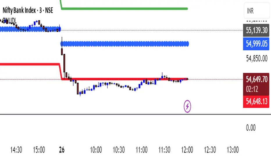
KATIK BankNifty Upside/Downside LevelsThe KATIK BankNifty Upside/Downside Levels (BNUDL) indicator plots key daily reference levels for BankNifty based on its opening price. Using a predefined daily move percentage, it calculates potential upside and downside levels from the open. The script displays:
Up Level (Green): Potential bullish threshold above the open
Down Level (Red): Potential bearish threshold below the open
Open Price (Blue Circles): Daily BankNifty opening level
This tool helps traders quickly identify intraday directional bias and potential support/resistance zones around the opening price.
Gann Bosameer This indicator identifies dynamic support and resistance levels using Gann angles from highs and lows.
It helps traders visualize the “price ladder” for potential upward or downward moves, with both manual and automatic pivot options and multiple angle selections.
⚠️ For analytical purposes only – not a financial advice or trading recommendation.

Mikula's Master 360° Square of 12Mikula’s Master 360° Square of 12
An educational W. D. Gann study indicator for price and time. Anchor a compact Square of 12 table to a start point you choose. Begin from a bar’s High or Low (or set a manual start price). From that anchor you can progress or regress the table to study how price steps through cycles in either direction.
What you’re looking at :
Zodiac rail (far left): the twelve signs.
Degree rail: 24 rows in 15° steps from 15° up to 360°/0°.
Transit rail and Natal rail: track one planet per rail. Each planet is placed at its current row (℞ shown when retrograde). As longitude advances, the planet climbs bottom → top, then wraps to the bottom at the next sign; during retrograde it steps downward.
Hover a planet’s cell to see a tooltip with its exact longitude and sign (e.g., 152.4° ♌︎). The linked price cell in the grid moves with the planet’s row so you can follow a planet’s path through the zodiac as a path through price.
Price grid (right): the 12×24 Square of 12. Each column is a cycle; cells are stepped price levels from your start price using your increment.
Bottom rail: shows the current square number and labels the twelve columns in that square.
How the square is read
The square always begins at the bottom left. Read each column bottom → top. At the top, return to the bottom of the next column and read up again. One square contains twelve cycles. Because the anchor can be a High or a Low, you can progress the table upward from the anchor or regress it downward while keeping the same bottom-to-top reading order.
Iterate Square (shifting)
Iterate Square shifts the entire 12×24 grid to the next set of twelve cycles.
Square 1 shows cycles 1–12; Square 2 shows 13–24; Square 3 shows 25–36, etc.
Visibility rules
Pivot cells are table-bound. If you shift the square beyond those prices, their highlights won’t appear in the table.
A/B levels and Transit/Natal planetary lines are chart overlays and can remain visible on the table as you shift the square.
Quick use
Choose an anchor (date/time + High/Low) or enable a manual start price .
Set the increment. If you anchored with a Low and want the table to step downward from there, use a negative value.
Optional: pick Transit and Natal planets (one per rail), toggle their plots, and hover their cells for longitude/sign.
Optional: turn on A/B levels to display repeating bands from the start price.
Optional: enable swing pivots to tint matching cells after the anchor.
Use Iterate Square to shift to later squares of twelve cycles.
Examples
These are exploratory examples to spark ideas:
Overview layout (zodiac & degree rails, Transit/Natal rails, price grid)
A-levels plotted, pivots tinted on the table, real-time price highlighted
Drawing angles from the anchor using price & time read from the table
Using a TradingView Gann box along the A-levels to study reactions
Attribution & originality
This script is an original implementation (no external code copied). Conceptual credit to Patrick Mikula, whose discussion of the Master 360° Square of 12 inspired this study’s presentation.
Further reading (neutral pointers)
Patrick Mikula, Gann’s Scientific Methods Unveiled, Vol. 2, “W. D. Gann’s Use of the Circle Chart.”
W. D. Gann’s Original Commodity Course (as provided by WDGAN.com).
No affiliation implied.
License CC BY-NC-SA 4.0 (non-commercial; please attribute @Javonnii and link the original).
Dependency AstroLib by @BarefootJoey
Disclaimer Educational use only; not financial advice.

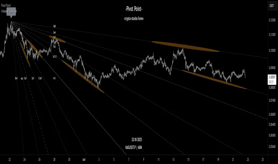
Indexed Gann Fan“This indicator automatically builds an unique trend-based Gann fan by selecting swing high/swing low ubased on price fluctuation index over time for each segment of the chart.
It helps traders identify the true market trend and pinpoint key support and resistance levels at precise angles.
Designed for traders familiar with Gann’s methodology who want a clearer understanding of market structure and greater confidence in their trading decisions.”
__________________________________________________________________________________
Индикатор автоматически по выбору экстремума строит уникальный трендовый веер Ганна, используя индекс колебаний цены во времени для каждого участка графика.
Помогает видеть направление тренда и определять ключевые углы поддержки и сопротивления.
Инструмент создан для трейдеров знакомых с методологией Ганна, которые хотят получать более ясное понимание рыночной структуры и принимать решения с максимальной уверенностью.
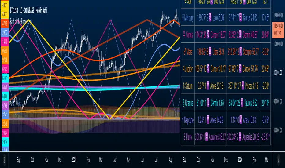
Path of the Planets🪐 Path of the Planets
Path of the Planets is an open-source Pine Script™ v6 indicator. It is inspired by W.D. Gann’s Path of Planets chart, specifically the Chart 5-9 artistic replica by Patrick Mikula "shown below". The script visualizes planetary positions so you can explore possible correlations with price. It overlays geocentric and heliocentric longitudes and declinations using the AstroLib library and includes an optional positions table that shows, at a glance, each body’s geocentric longitude, heliocentric longitude, and declination. This is an educational tool only and not trading advice.
Key Features
Start point: Choose a date and time to begin plotting so studies can align with market events.
Adjustments: Mirror longitudes and shift by 360° multiples to re-frame cycles.
Planets: Toggle geocentric and heliocentric longitudes and declinations for Sun, Mercury, Venus, Earth, Mars, Jupiter, Saturn, Uranus, Neptune, and Pluto. Moon declination is available.
Positions table: Optional color-coded table (bottom-right) with three columns labeled Geo, Helio, and Dec. Values show degrees with the zodiac sign for the longitudes and degrees for declinations.
Visualization: Solid lines for geocentric longitudes, circles for heliocentric longitudes, and columns for declinations. Includes a zero-declination reference line.
How It Works
Converts bar timestamps to Julian days via AstroLib.
Fetches positions with AstroLib types: geocentric (0), heliocentric (1), and declination (3).
Normalizes longitudes to the −180° to +180° range, applies optional mirroring and 360° shifts, and converts longitudes to zodiac sign labels for the table.
Plots and the table update only on and after the selected start time.
Usage Tips
Apply on daily or higher timeframes when studying broader cycles. For degrees, use the left scale.
Limitations at the moment: default latitude, longitude, and timezone are set to 0; aspects and retrogrades are not included; the focus is on raw paths.
License and Credits
Dependency: @BarefootJoey Astrolib
Contributions and observations are welcome.
Concentric Geometry – Invariant MetricsConcentric Geometry – Invariant Metrics
This indicator demonstrates the invariant concept of a concentric circle around a selected price range. By anchoring two points (A & B), it calculates a set of ratios and slopes that remain consistent under concentric scaling of price and time. These invariants include the raw slope (ΔP/N), concentric slope, π-adjusted ratios, and √2 offsets — all of which can be used to explore deeper geometric relationships in the market.
What has been demonstrated here is not an “out-of-the-box” trading system. Instead, the outputs provide the raw invariant metrics from which the trader must derive their own ratios and extensions. For example, price-to-bar ratio inputs are not fixed — they need to be derived from the invariants themselves, and experimenting with them is the key to uncovering harmonic alignments and scaling behaviors.
Key features include:
• Range & Bars Analysis – Price range (ΔP) and bar count (N) between anchors.
• Core Invariants – Midpoint, radius (price and bar units), upper/lower bounds.
• Linear Slope Metrics – ΔP/N and √2 concentric slope.
• π-Adjusted Price/Bar – Harmonic arc-length ratio.
• Circumference & Offsets – Circle circumference, √2 and 1/√2 offsets in price and bar units.
This tool is best suited for traders studying market geometry, W.D. Gann principles, harmonic ratios, or the geometric methods of Michael Jenkins. It does not generate buy/sell signals — instead, it equips the trader with building blocks for geometric exploration.
Key point: The trader must experiment with the ratios derived from these metrics. Playing with different price-to-bar relationships unlocks the true potential of concentric market geometry, whether applied to dynamic anchored VWAPs, concentric overlays, or Vesica Piscis structures.
Use it to:
• Compare slopes across swings
• Derive new ratios from invariant metrics
• Anchor dynamic anchored VWAPs to concentric nodes
• Explore concentric or Vesica Piscis overlays
• Support advanced geometric trading strategies

Crypto Gann Channel Strategy (Long Bias, fixed)This is Gann Strategy Cody with Long Bias. Please try and let me know if can be improved.

Advanced Gann S/R LevelsThis powerful Pine Script indicator brings the legendary forecasting methods of W.D. Gann directly onto your TradingView chart. It's designed to provide traders with a complete, automated framework for identifying high-probability intraday support and resistance levels.
By combining the principles of Gann Pivot Points with the harmonic relationships of the Gann Square of 9, this tool calculates and plots the most critical price levels for the current trading day, helping you anticipate market turning points with greater clarity.
Key Features
Dynamic Gann Pivots: Automatically calculates and displays the central Pivot Point along with three levels of support (S1, S2, S3) and resistance (R1, R2, R3) based on the previous day's data.
Gann Square of 9 Levels: Implements Gann's esoteric mathematical formula to find natural harmonic price levels, plotting the most significant static support and resistance zones for the day.
Fully Customizable Display: You have complete control over the indicator's appearance. From the settings menu, you can:
Toggle each set of levels on or off (e.g., show only the Pivot and S1/R1).
Change the line style (Solid, Dashed, Dotted).
Adjust the position of the price labels (Left or Right).
Set the line extension length.
On-Chart Information Table: A clean, non-intrusive table on the top-right of your chart displays the exact values of all key levels for quick reference.
Built-in Alerts: Set alerts for when the price crosses the main Pivot, R1, or S1 levels, so you never miss a potential trading opportunity.
Core Concepts Explained
Gann Pivot Point: Calculated as (High + Low + Close) / 3 from the previous day, this level represents the intraday "balance point." Trading above the pivot is generally considered bullish for the session, while trading below it is bearish.
Gann Square of 9: This is a more advanced Gann method based on the principle that prices move in a predictable way related to their square roots. This indicator calculates the most powerful "cardinal cross" levels, which often act as major reversal points.
How to Use This Indicator
Identify the Intraday Trend: Use the main Pivot Point as your guide. If the price is consistently holding above the pivot, look for buying opportunities. If it's holding below, look for shorting opportunities.
Look for Confluence: The most powerful signals occur when a Gann Pivot level lines up closely with a Square of 9 level. This "confluence" creates an extremely strong support or resistance zone.
Breakout Trading: When the price breaks decisively through a key level (e.g., R1), the next level above it (R2) becomes the logical price target.
Range Trading: In a sideways market, you can use the support and resistance levels as boundaries to trade between. Consider entering a long trade near a strong support level and taking profit near resistance.
Disclaimer: This indicator is for educational and informational purposes only. It does not constitute financial advice. Trading involves significant risk, and you should always conduct your own research and risk management before entering any trade.

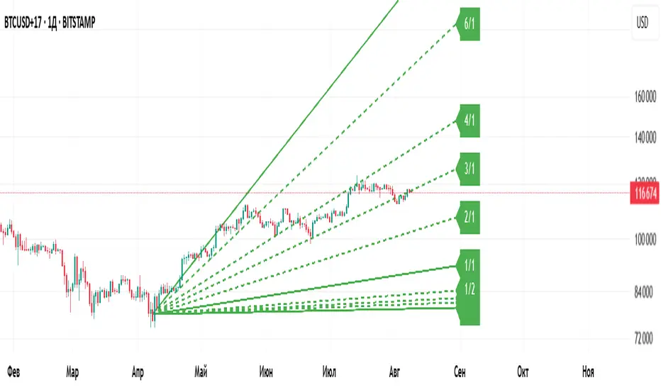
Gann Fan Master – Selectable Base Angle & Fibonacci AnglesGann Fan Master – Selectable Base Angle & Fibonacci Angles
This indicator plots a Gann Fan from point A1 through point B1, with full customization over:
Base angle selection (8/1, 1/1, 1/8)
Main angle set
Fibonacci-based angles
Up to 10 custom user-defined angles
Logarithmic or linear slope calculation
Custom fan color and extended line length
Perfect for manual chart analysis — you select A1 and B1, the script calculates and draws the fan with labeled angles.
How It Works
-Select A1 (time & price) and B1 (time & price).
-The script calculates the base slope depending on the selected base angle:
Linear scale: slope = (B1 − A1) / Δt / base_angle_value
Logarithmic scale: slope = (ln(B1) − ln(A1)) / Δt / base_angle_value
-Each enabled angle is drawn from A1, extended by the chosen number of bars, and labeled with its value.
-Fan color is determined automatically by direction (green for upward, red for downward) or can be overridden.
Quick Start
-Add the indicator to your chart.
-In settings:
A1 Time/Price — starting point.
B1 Time/Price — second point (defines slope).
Base Angle — choose 8/1, 1/1, or 1/8.
Extend Fan (Bars) — number of bars to extend lines into the future.
Logarithmic Fan Calculation — toggle for log-scale mode.
Enable desired angle sets: Main, Fibonacci, or Custom.
-Optionally, enable Use Custom Fan Color and set your own color.
Settings
Enable Fan — master switch.
A1 Time/A1 Price, B1 Time/B1 Price — anchor points.
Base Angle — 8/1, 1/1, 1/8.
Extend Fan (Bars) — extension length.
Use Custom Fan Color / Fan Color — manual color override.
Main Angles — 1/8, 1/4, 1/3, 1/2, 1/1, 2/1, 3/1, 4/1, 6/1, 8/1.
Fibonacci Angles — 0.214, 0.35, 0.382, 0.618, 0.786, 0.886, 0.9335, 1.118, 1.236, 1.382, 1.618.
Custom Angles — up to 10 values (dotted lines), labels from the exact value.
Usage Tips
-Choosing A1 and B1:
A1 — significant starting swing high or low.
B1 — next key swing to define slope.
-Logarithmic scale:
Ideal for long-term exponential trends (crypto, growth stocks).
Prices must be > 0.
-Watch how price reacts to different angles:
1/1 as median trend, fractional for support/resistance, multiples for acceleration/slowdown.
Disclaimer
This is a technical analysis tool. It is not financial advice. Trading decisions are made at your own risk.
Gann Fan Master – Selectable Base Angle & Fibonacci Angles
Индикатор строит веер Ганна от точки A1 через точку B1 с полной кастомизацией:
Выбор базового угла (8/1, 1/1, 1/8)
Набор основных углов
Углы Фибоначчи
До 10 пользовательских углов
Расчёт в логарифмической или линейной шкале
Цвет веера по направлению или заданный вручную
Настройка длины продления линий
Идеально подходит для ручного анализа графика — вы задаёте A1 и B1, а скрипт рассчитывает и строит веер с подписями углов.
Как это работает
-Задайте A1 (время и цена) и B1 (время и цена).
-Скрипт рассчитывает базовый наклон в зависимости от выбранного базового угла:
Линейная шкала: наклон = (B1 − A1) / Δt / base_angle_value
Логарифмическая шкала: наклон = (ln(B1) − ln(A1)) / Δt / base_angle_value
-Каждый включённый угол рисуется из точки A1, продлевается на заданное число баров и подписывается.
-Цвет линий определяется автоматически по направлению (зелёный — вверх, красный — вниз) или задаётся вручную.
Быстрый старт
1)Добавьте индикатор на график.
2)В настройках:
A1 Time/Price — начальная точка.
B1 Time/Price — вторая точка (задаёт наклон).
Base Angle — выберите 8/1, 1/1 или 1/8.
Extend Fan (Bars) — длина продления линий в барах.
Logarithmic Fan Calculation — переключатель логарифмического режима.
Включите нужные блоки углов: Main, Fibonacci, Custom.
3)При желании активируйте Use Custom Fan Color и задайте цвет веера.
Настройки
Enable Fan — общий выключатель.
A1 Time/A1 Price, B1 Time/B1 Price — опорные точки.
Base Angle — 8/1, 1/1, 1/8.
Extend Fan (Bars) — продление линий.
Use Custom Fan Color / Fan Color — цвет вручную.
Main Angles — 1/8, 1/4, 1/3, 1/2, 1/1, 2/1, 3/1, 4/1, 6/1, 8/1.
Fibonacci Angles — 0.214, 0.35, 0.382, 0.618, 0.786, 0.886, 0.9335, 1.118, 1.236, 1.382, 1.618.
Custom Angles — до 10 значений (точечные линии) с подписями.
Советы по применению
Выбор A1 и B1:
A1 — значимый экстремум начала движения.
B1 — следующий важный экстремум для задания наклона.
Логарифмическая шкала:
Подходит для долгосрочных экспоненциальных трендов (крипто, акции роста).
Цена должна быть > 0.
Следите, как цена реагирует на разные углы:
1/1 — медианный тренд.
Дробные углы — потенциальная поддержка/сопротивление.
Кратные — ускорение/замедление движения.
Дисклеймер
Это инструмент технического анализа и не является инвестиционной рекомендацией. Торговые решения вы принимаете на свой страх и риск.
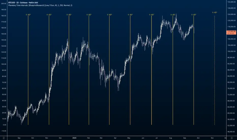
Planetary Time Intervals [Javonnii]🪐 Planetary Time Intervals Indicator 🪐
This innovative planetary time-based market timing indicator enables traders to analyze and project planetary degree intervals directly onto any chart with exceptional accuracy. Built on a custom planetary framework, it calculates planetary positions down to the arc-second across all timeframes, accommodating up to 500 future bars. This capability allows for both clean intraday analysis and long-term market timing.
The framework operates autonomously and requires no external data or updates. It reliably computes planetary positions across centuries and supports seamless analysis across all markets—whether 24/7 assets like crypto or session-based instruments like stocks—with smooth, gap-free planetary data on any ticker or timeframe. Perfect for time-based market studies on deep historical datasets such as the Dow Jones.
🔶 FEATURES
Key planetary timing tools include:
- Standard Degree Interval Plotting (Fixed Increments)
- Price-to-Planetary Degree Conversions (360 Units Reduction & 1/10 Price Method) for Direct Price-to-Time Harmonics
- Geocentric & Heliocentric Models (Including Moon for Lunar Cycles)
- Absolute Degree Handling for Retrogrades
- Visual Projections: Background Highlights, Vertical Lines, and Degree Labels
- Math Display for Calculation Transparency
- Scaling Adjustments for Volatile Assets (e.g., Crypto, Indices)
- Multi-Timeframe Support Up to 500 Bars
- Alert Conditions for Interval Projections
- Customizable Interval Logic and Styling
- + More (Check changelog for updates)
🔶 BASIC DEMONSTRATION
On a daily stock chart, select a key low as your reference point (datetime and price). Choose a 30° interval for Mercury, and the indicator projects vertical lines forward at each degree milestone, with shaded backgrounds indicating potential cycle zones. Labels display traversed degrees, highlighting alignments in real-time.
For the 360 Conversion, input a price like $5,000—it reduces to 320° via modular arithmetic (5000 mod 360 = 320°), converting the price directly into a planetary time interval that may sync with numerological patterns or past turns.
🔶 USAGE & EXAMPLES
In the image below, the indicator is applied to a long-term weekly BTCUSD chart from 2015 to 2026. Selecting a historical low point (price = 198.02) as the reference, the 360 Conversion method derives the interval directly from the price. Since 198.02 is already under 360, the interval is simply 198.02° (no further reduction needed). Vertical yellow lines project these Sun-based intervals forward, aligning with a few key market turns, bull runs, and corrections. The math is displayed in the label "198.02° Low = 198.02° 360 Conversion 198.02°", illustrating the price-to-planetary time conversion process. Numerology enthusiasts might reduce 198.02° further (1+9+8+0+2=20, then 2+0=2) for symbolic insights into market balance or duality.
Supported planets: Sun, Moon, Mercury, Venus, Mars, Jupiter, Saturn, Uranus, Neptune, Pluto.
🔶 SETTINGS
- Timing Method: Select Standard Interval, 360 Conversion, or 1/10 Price.
- Planetary View: Geocentric/Heliocentric; Toggle Moon Inclusion.
- Interval Setup: Enter degrees (e.g., 45°); Enable Absolute for Retrogrades.
- Base Reference: Input datetime and price from high/low.
- Visuals: Toggle highlights, lines, math labels; Set colors/styles.
- Scaling: Adjust for asset ranges (e.g., multipliers for high or low prices).
- Limits: Bar count (up to 500)
- Styling: Label formats, projection options.
🔶 CONCLUSION
Planetary and numerological timing offers a unique lens on market rhythms, blending celestial mechanics with number-based insights for deeper analysis. This indicator is an original creation providing precise, flexible tools to explore these concepts, with a strong focus on converting price data into actionable planetary time intervals. As with all trading, past patterns aren't guarantees—pair with sound risk management and your overall approach.
🔶 HOW TO GET ACCESS
This public invite-only script is for planetary traders, market analysts, numerology enthusiasts, and anyone interested in harmonic degree-based timing. Reach out to the author for access details to this indicator and related resources.
Gann Square of 9 cardinal cross and trinesGann Square of 9
This indicator is a powerful tool for traders who use W.D. Gann's methodologies to forecast potential support and resistance levels. It visualizes key price levels derived from the Gann Square of 9, a classic tool in technical analysis that relates price and time through geometric angles and rotations.
How It Works
The Gann Square of 9 is a spiral number chart where price moves in a clockwise spiral. Key angles on this square (such as 90°, 180°, 270°, and 360°) are used to identify price levels that act as magnets for future price action. This indicator automates that process by calculating these levels dynamically from a chosen pivot point.
Key Features
This script provides comprehensive and customizable functionality, including several unique enhancements:
Customizable Pivot Point: Choose your pivot price source from various options, including open, high, low, close, hl2, hlc3, ohlc4, and kryptec.
Dynamic Pivot Updates: The indicator can automatically reset its pivot price at the beginning of a new period (e.g., a new day, week, or month), allowing the levels to adapt to recent market changes.
Fixed Pivot Option: To prevent the indicator from changing when you scroll through historical data, you can choose to use a fixed pivot price. This anchors the levels to a specific value, ensuring they remain constant regardless of the visible chart range.
Extended Gann Angles: In addition to the traditional 90°, 180°, and 270° levels, this script also includes the 120° and 240° angles for more granular analysis of potential turning points.
Multiplier and Rotations: Fine-tune the distance between the Gann levels with the multiplier input. The rotations parameter allows you to raise or lower the entire set of levels by one or more 360° rotations, adapting the indicator to different price ranges.
How to Use
Choose Your Pivot: The indicator's levels are all based on a single pivot price.
For a static analysis, enable "Use Fixed Pivot Price?" and enter a specific price you want to anchor your analysis to.
For a dynamic analysis, select your desired "Resolution" (e.g., 'W' for weekly) and the pivot price will be set based on the previous period's data.
Adjust Rotations: Use the rotations input to shift the entire set of levels up or down until they align with a significant support or resistance area on your chart.
Analyze Levels: The plotted lines represent potential support and resistance zones. A price move through one level may target the next one in the sequence.
Disclaimer: This indicator is a tool for technical analysis and should not be considered financial advice. Past performance of these levels does not guarantee future results. Always use proper risk management and conduct your own research before making any trading decisions.
THOT_GANNThis indicator is based on wd Gann square of 9 levels
i added 3 ema 50 100 and 200 to follow a right trend
also i added VWAP to understand buyer is aggressive or seller.
now study all together we can trade on breakout and reversal.
