OOO Trade (By Bodinphat)Script Description (for TradingView Publish Page)
Description:
This indicator is an advanced trend-following system that combines multi-timeframe signals, order block zones (OB Zones), and precision-based metrics to help traders identify high-probability buy and sell opportunities.
It automatically analyzes EMA trends, RSI pullbacks, ADX strength, and volume confirmation to calculate a dynamic confidence score for both long and short directions.
The system also displays:
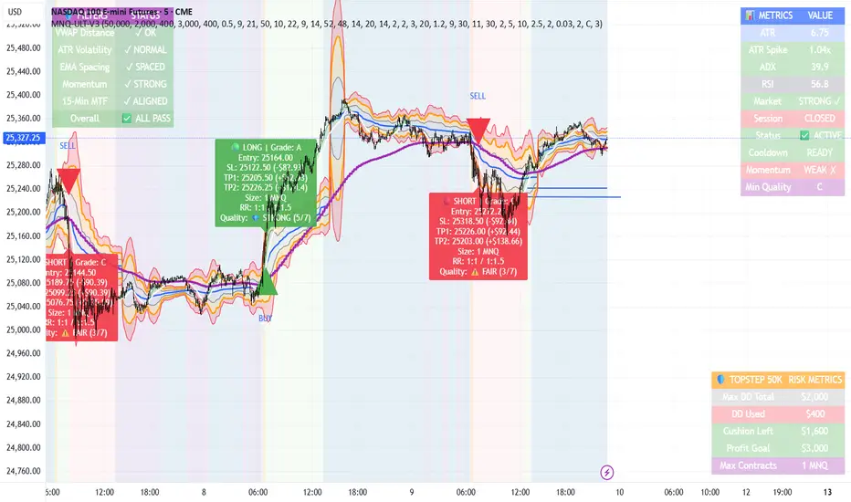
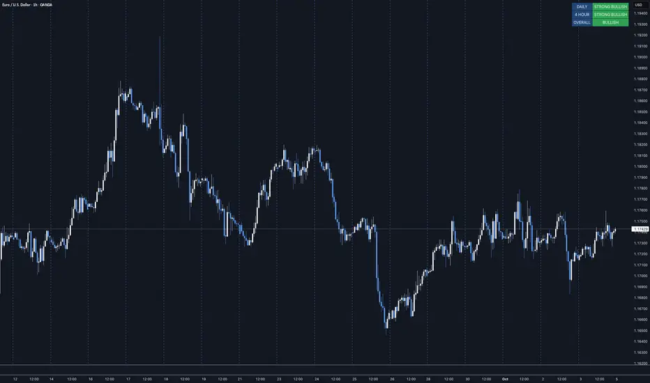
📊 Multi-Timeframe Trend Strip (M1 → D1) — showing each timeframe’s directional bias (Buy/Sell/Neutral).
🎯 OB Zones (Order Blocks) — highlights institutional demand (Bullish OB) and supply (Bearish OB) zones on the chart.
📋 Right-Side Info Panel — displays key metrics such as score, accuracy, SL/TP targets, and bias direction in real-time.
⚡ Session Filters — optional London/NY session filters for more accurate signal alignment.
This tool is ideal for traders who want to follow structured price action while maintaining a clear view of market strength and institutional zones.
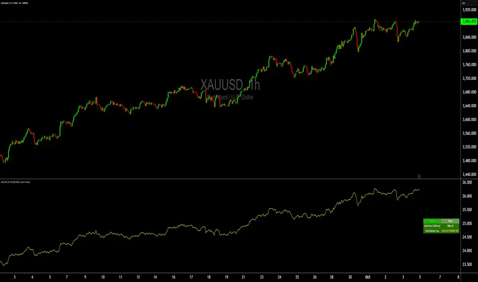
It works best with XAUUSD, GBPUSD, and major indices on intraday or swing timeframes.
Disclaimer:
This indicator is for educational and informational purposes only.
It does not constitute financial advice. Please test thoroughly before using in live trading.
Pine Script® göstergesi