Sylwia 9.1 Ultimate – Full MTF + TDI (mobile-flat)Pour tester le script de nombreux réglages dans les optionsPine Script® göstergesiGrobicgwen tarafındanGüncellendi 9
Bollinger Bands Delta Matrix Analytics [BDMA] Bollinger Bands Delta Matrix Analytics (BDMA) v7.0 Deep Kinetic Engine – 5x8 Volatility & Delta Decision Matrix 1. Introduction & Concept Bollinger Bands Delta Matrix Analytics (BDMA) v7.0 is an analytical framework that merges: - Spatial analysis via Bollinger Bands (%B location), - with a 4-factor Deep Kinetic Engine based on: • Total Volume • Buy Volume • Sell Volume • Delta (Buy – Sell) Z-Scores and converts them into an expanded 5×8 decision matrix that continuously tracks where price is trading and how the underlying orderflow is behaving. BDMA is not a trading system or strategy. It does not generate entry/exit signals. Instead, it provides a structured contextual map of volatility, volume, and delta so traders can: - identify climactic extensions vs. fakeouts, - distinguish strong initiative moves vs. passive absorption, - and detect squeezes, traps, and liquidity voids with a unified visual dashboard. 2. Spatial Engine – Bollinger S-States (S1–S5) The spatial dimension of BDMA comes from classic Bollinger Bands. Price location is expressed as Percent B (%B) and mapped into 5 spatial states (S-States): S1 – Hyper Extension (Above Upper Band) Price has pushed beyond the upper Bollinger Band. Often associated with parabolic or blow-off behavior, late-stage momentum, and elevated reversal risk. S2 – Resistance Test (Upper Zone) Price trades in the upper Bollinger region but remains inside the bands. Represents a sustained test of resistance, typically within an established or emerging uptrend. S3 – Neutral Zone (Middle) Price hovers around the mid-band. This is the mean reversion gravity field where the market often consolidates or transitions between regimes. S4 – Support Test (Lower Zone) Price trades in the lower Bollinger region but inside the bands. Represents a sustained test of support within range or downtrend structures. S5 – Hyper Drop (Below Lower Band) Price extends below the lower Bollinger Band. Often aligned with panic, forced liquidations, or capitulation-type behavior, with increased snap-back risk. These 5 S-States define the vertical axis (rows) of the BDMA matrix. 3. Deep Kinetic Engine – 4-Factor Z-Score & D-States (D1–D8) The Deep Kinetic Engine transforms raw volume and delta into standardized Z-Scores to measure how abnormal current activity is relative to its recent history. For each bar: - Raw Buy Volume is estimated from the candle’s position within its range - Raw Sell Volume is complementary to buy volume - Raw Delta = Buy Volume – Sell Volume - Total Volume = Buy Volume + Sell Volume These 4 series are then normalized using a unified Z-Score lookback to produce: 1. Z_Vol_Total – overall activity and liquidity intensity 2. Z_Vol_Buy – aggression from buyers (attack) 3. Z_Vol_Sell – aggression from sellers (defense or attack) 4. Z_Delta – net victory of one side over the other Thresholds for Extreme, Significant, and Neutral Z-Score levels are fully configurable, allowing you to tune the sensitivity of the kinetic states. Using Z_Vol_Total and Z_Delta (plus threshold logic), BDMA assigns one of 8 Deep Kinetic states (D-States): D1 – Climax Buy Extreme Total Volume + Extreme Positive Delta → Buying climax or blow-off behavior. D2 – Strong Buy High Volume + High Positive Delta → Confirmed bullish initiative activity. D3 – Weak Buy / Fakeout Low Volume + High Positive Delta → Bullish delta without commitment, low-liquidity breakout risk. D4 – Absorption / Conflict High Volume + Neutral Delta → Aggressive two-way trade, strong absorption, war zone behavior. D5 – Neutral Low Volume + Neutral Delta → Low-energy environment with low conviction. D6 – Weak Sell / Fakeout Low Volume + High Negative Delta → Bearish delta without commitment, low-liquidity breakdown risk. D7 – Strong Sell High Volume + High Negative Delta → Confirmed bearish initiative activity. D8 – Capitulation Extreme Volume + Extreme Negative Delta → Panic selling or capitulation regime. These 8 D-States define the horizontal axis (columns) of the BDMA matrix. 4. The 5×8 BDMA Decision Matrix The core of BDMA is a 5×8 matrix where: - Rows (1–5) = Spatial S-States (S1…S5) - Columns (1–8) = Kinetic D-States (D1…D8) Each of the 40 possible combinations (SxDy) is pre-computed and mapped to: - a Status or Regime Title (for example: Climax Breakout, Bear Trap Spring, Capitulation Breakdown), - a Bias (Climactic Bull, Neutral, Strong Bear, Conflict or Reversal Risk, and similar labels), - and a Strategic Signal or Consideration (for example: High reversal risk, Wait for confirmation, Low probability zone – avoid). Internally, BDMA resolves all 40 regimes so the current state can be displayed on the dashboard without performance overhead. 5. Key Regime Families (How to Read the Matrix) 5.1. Breakouts and Breakdowns Climax Breakout (Top-side) Spatial S1 with Kinetic D1 or D2 Bias: Explosive or Extreme Bull Signal: - Strong or climactic upside extension with abnormal bullish orderflow. - Trend continuation is possible, but reversal risk is extremely high after blow-off phases. Low-Conviction Breakout (Fakeout Risk) S1 with D3 (Weak Buy, low liquidity) Bias: Weak Bull – Caution Signal: - Breakout not supported by volume. - Elevated risk of failed auction or bull trap. Capitulation Breakdown (Bottom-side) Spatial S5 with Kinetic D8 Bias: Climactic Bear (panic) Signal: - Capitulation-type selling or forced liquidations. - Trend can still proceed, but snap-back or violent short-covering risk is high. Initiative Breakdown vs. Weak Breakdown - Strong, high-volume breakdown typically corresponds to D7 (Strong Sell). - Low-volume breakdown often corresponds to D6 (Weak Sell or Fakeout) with potential for failure. 5.2. Absorption, Traps and Springs Absorption at Resistance (Top-side conflict) S1 or S2 with D4 (Absorption or Conflict) Bias: Conflict – Extreme Tension Signal: - Heavy two-way trade near resistance. - Potential distribution or reversal if sellers begin to dominate. Bull Trap or Failed Auction Typically S1 with D6 (Weak Sell breakdown behavior after a top-side attempt) Indicates a breakout attempt that fails and reverses, often after poor liquidity structure. Absorption at Support and Bear Trap (Spring) S4 or S5 with D4 or D3 Bias: Conflict or Weak Bear – Reversal Risk Signal: - Aggressive buying into lows (spring or shakeout behavior). - Potential bear trap if price reclaims lost territory. 5.3. Trend Phases Strong Uptrend Phases Typically seen when S2–S3 combine with strong bullish kinetic behavior. Bias: Strong or Extreme Bull Signal: - Pullbacks into S3 or S4 with supportive kinetic states often act as trend continuation zones. Strong Downtrend Phases Typically seen when S3–S4 combine with strong bearish kinetic behavior. Bias: Strong or Extreme Bear Signal: - Rallies into resistance with strong bearish kinetic backing may act as continuation sell zones. 5.4. Neutral, Exhaustion and Squeeze Exhaustion or Liquidity Void S1 or S5 with D5 (Neutral kinetics) Bias: Neutral or Exhaustion Signal: - Spatial extremes without kinetic confirmation. - Often marks the end of a move, with poor follow-through. Choppy, Low-Activity Range S3 with D5 Bias: Neutral Signal: - Low volume, low conviction market. - Typically a low-probability environment where standing aside can be logical. Squeeze or High-Tension Zone S3 with D4 or tightly clustered kinetic values Bias: Conflict or High Tension Signal: - Hidden battle inside a volatility contraction. - Often precedes large directionally-biased moves. 6. Dashboard Layout & Reading Guide When Show Dashboard is enabled, BDMA displays: 1. Title and Status Line Name of the current regime (for example: Climax Breakout, Bear Trap Spring, Mean Reversion). 2. Bias Line Plain-language summary of directional context such as Climactic Bull, Strong Bear, Neutral, or Conflict and Reversal Risk. 3. Signal or Strategic Notes Concise guidance focused on risk and context, not entries. For example: - High reversal risk – aggressive traders only - Wait for confirmation (break or rejection) - Low probability zone – avoid taking new positions 4. Kinetic Profile (4-Factor Z-Score) Shows the current Z-Scores for Total Volume (Activity), Buy Volume (Attack), Sell Volume (Defense), and Delta (Net Result). 5. Matrix Heatmap (5×8) Visual representation of S-State vs. D-State with color coding: - Bullish clusters in a green spectrum - Bearish clusters in a red spectrum - Conflict or exhaustion zones in yellow, amber, or neutral tones The dashboard can be repositioned (top right, middle right, or bottom right) and its size can be adjusted (Tiny, Small, Normal, or Large) to fit different layouts. 7. Inputs & Customization 7.1. Core Parameters (Bollinger and Z-Score) - Bollinger Length and Standard Deviation define the spatial engine. - Z-Score Lookback (All Factors) defines how many bars are used to normalize volume and delta. 7.2. Deep Kinetic Thresholds - Extreme Threshold defines what is considered climactic (D1 or D8). - Significant Threshold distinguishes strong initiative vs. weak or fakeout behavior. - Neutral Threshold is the band within which delta is treated as neutral. These thresholds allow you to tune the sensitivity of the kinetic classification to fit different timeframes or instruments. 7.3. Calculation Method (Volume Delta) Geometry (Approx) - Fast, non-repainting approach based on candle geometry. - Suitable for most users and real-time decision-making. Intrabar (Precise) - Uses lower-timeframe data for more precise volume delta estimation. - Intrabar mode can repaint and requires compatible data and plan support on the platform. - Best used for post-analysis or research, not blind automation. 7.4. Visuals and Interface - Toggle Bollinger Bands visibility on or off. - Switch between Dark and Light color themes. - Configure dashboard visibility, matrix heatmap display, position, and size. 8. Multi-Language Semantic Engine (Asia and Middle East Focus) BDMA v7.0 includes a fully integrated multi-language layer, targeting a wide geographic user base. Supported Languages: English, Türkçe, Русский, 简体中文, हिन्दी, العربية, فارسی, עברית All dashboard labels, regime titles, bias descriptions, and signal texts are dynamically translated via an internal dictionary, while semantic meaning is kept consistent across languages. This makes BDMA suitable for multi-language communities, study groups, and educational content across different regions. However, due to the heavy computational load of the Deep Kinetic Engine and TradingView’s strict Pine Script execution limits, it was not possible to expand support to additional languages. Adding more translation layers would significantly increase memory usage and exceed runtime constraints. For this reason, the current language set represents the maximum optimized configuration achievable without compromising performance or stability. 9. Practical Usage Notes BDMA is most powerful when used as a contextual overlay on top of market structure (HH, HL, LH, LL), higher-timeframe trend, key levels, and your own execution framework. Recommended usage: - Identify the current regime (Status and Bias). - Check whether price location (S-State) and kinetic behavior (D-State) agree with your trade idea. - Be especially cautious in climactic and absorption or conflict zones, where volatility and risk can be elevated. Avoid treating BDMA as an automatic green equals buy, red equals sell tool. The real edge comes from understanding where you are in the volatility or kinetic spectrum, not from forcing signals out of the matrix. 10. Limitations & Important Warnings BDMA does not predict the future. It organizes current and recent data into a structured context. Volume data quality depends on the underlying symbol, exchange, and broker feed. Forex, crypto, indices, and stocks may all behave differently. Intrabar mode can repaint and is sensitive to lower-timeframe data availability and your plan type. Use it with extra caution and primarily for research. No indicator can remove the need for clear trading rules, disciplined risk management, and psychological control. 11. Disclaimer This script is provided strictly for educational and analytical purposes. It is not a trading system, signal service, financial product, or investment advice. Nothing in this indicator or its description should be interpreted as a recommendation to buy or sell any asset. Past behavior of any indicator or market pattern does not guarantee future results. Trading and investing involve significant risk, including the risk of losing more than your initial capital in leveraged products. You are solely responsible for your own decisions, risk management, and results. By using this script, you acknowledge that you understand these risks and agree that the author or authors and publisher or publishers are not liable for any loss or damage arising from its use.Pine Script® göstergesiata_sabanci tarafından22106
SCOTTGO - Day Trade Stock Quote V4This Pine Script indicator, titled "SCOTTGO - Day Trade Stock Quote V4," is a comprehensive, customizable dashboard designed for active traders. It acts as a single, centralized reference point, displaying essential financial and technical data directly on your chart in a compact table overlay. 📊 Key Information Provided The indicator is split into sections, aggregating various critical data points to provide a holistic picture of the stock's current state and momentum: 1. Ownership & Short Flow This section provides fundamental context and short-interest data: Market Cap, Shares Float, and Shares Outstanding: Key figures on the company's size and publicly tradable shares. Short Volume %: Indicates the percentage of trading activity driven by short sellers. Daily Change %: Shows the day's price movement relative to the previous close. 2. Price & Volatility This tracks historical and immediate price levels: Previous Close, Day High/Low: Key daily reference prices. 52-Week High/Low: Important long-term boundaries. Earnings Date: A crucial fundamental date (currently displayed as a placeholder). 3. Momentum & Volume These metrics are essential for understanding intraday buying and selling pressure: Volume & Average Volume: The current trade volume compared to its historical average. Relative Volume (RVOL): Measures how much volume is currently trading compared to the average rate for that time period (shown for both Daily and 5-Minute rates). Volume Buzz (%): A percentage representation of how much current volume exceeds or falls below the average. ADR % & ATR %: Measures of volatility. RSI, U/D Ratio, and P/E Ratio: Momentum and valuation indicators. 4. Context This provides background information on the security: Includes the Symbol, Exchange, Industry, and Sector (note: some fields use placeholder data as this information is not always available via Pine Script). ⚙️ Customization The dashboard is highly customizable via the indicator settings: You can control the visibility of every single metric using the Section toggles. You can change the position (Top Left, Top Right, etc.), size, and colors of the entire table. In summary, this script is a powerful tool for day traders who need to monitor a large number of fundamental, technical, and volatility metrics simultaneously without cluttering the main chart area.Pine Script® göstergesiSCOTTGO tarafındanGüncellendi 35
LJ Parsons Adjustable expanding MRT Fibpapers.ssrn.com Market Resonance Theory (MRT) reinterprets financial markets as structured multiplicative, recursive systems rather than linear, dollar-based constructs. By mapping price growth as a logarithmic lattice of intervals, MRT identifies the deep structural cycles underlying long-term market behaviour. The model draws inspiration from the proportional relationships found in musical resonance, specifically the equal temperament system, revealing that markets expand through recurring octaves of compounded growth. This framework reframes volatility, not as noise, but as part of a larger self-organising structure.Pine Script® göstergesiwallabimba tarafından7
Algo ۞ Halo 7MAs WonderA complete trend following and important MA crossing tool. The indicator is self-explanatory. You decide where you want the triggers to go. Enjoy!Pine Script® göstergesiinspyr24 tarafından25
SFP + Binance Hedge Direct (Full)RSI SFP + Binance Direct Auto-Trading (Hedge Mode) RSI SFP + 币安直连自动交易脚本 (双向持仓模式) 🇨🇳 中文说明 (Chinese) 简介 / Introduction 这是一个专为 Binance Futures Signal Bot(币安合约信号机器人) 深度定制的 RSI SFP(假突破)策略脚本。它移除了对第三方中间商(如 WunderTrading)的依赖,实现了 TradingView 到币安的毫秒级直连下单,极大降低了滑点。 核心功能 / Key Features SFP 针尖策略: 基于 RSI 背离 + 前高/前低假突破(Swing Failure Pattern)捕捉反转机会。支持 "触碰即入场" 或 "收线确认" 模式。 币安直连 (Binance Direct): 内置符合币安 Hedge Mode (双向持仓) 标准的 JSON 生成器。支持自动挂入 TP/SL (止盈止损) 单。 智能资金管理: 无需手动计算总金额。只需输入 本金 (Margin) 和 杠杆 (Leverage),脚本自动计算总名义价值 (Notional Value) 并发送给交易所。 多重过滤系统: 集成 布林带 (Bollinger Bands) 和 成交量 (Volume) 过滤器,有效过滤震荡中的假信号。 双重报警支持: 机器人端: 发送标准 JSON 指令,包含开单、金额、止盈止损价。 手机端: 通过隐藏绘图输出,支持发送清晰易读的文本消息(如 "BTC Long, Entry: 95000, TP: 96000")。 设置指南 / Setup Guide 参数设置: 在 🤖 Bot Connection 中填入币安提供的 signalId 和 uid。 在 Position & Money 中设置您的单笔本金和杠杆(如 1000 U, 100x)。 币安设置: 在币安创建信号机器人时,务必选择 Order Size 单位为 USDT。 报警设置 (双报警模式): 自动交易: 创建报警 -> 选择 Any alert() function call -> 填入 Webhook URL -> 消息框留空。 手机提醒: 创建报警 -> 选择 Bullish/Bearish Reversal -> 填入 {{plot("Alert_Entry")}} 等占位符 -> 发送到 App。 🇺🇸 English Description Introduction This is a specialized RSI SFP (Swing Failure Pattern) strategy script tailored for the Binance Futures Signal Bot. It eliminates the need for third-party middleware (like WunderTrading), enabling direct, low-latency execution from TradingView to Binance with minimal slippage. Key Features SFP Strategy: Captures reversals based on RSI Divergence + Structure False Breakouts (Wick-based). Supports "Touch Only" or "Close Return" entry modes. Binance Direct Integration: Built-in JSON generator strictly compliant with Binance Hedge Mode. Automatically attaches TP/SL (Take Profit & Stop Loss) orders directly to the entry signal. Smart Money Management: No need to calculate position sizes manually. Simply input your Margin (USDT) and Leverage. The script auto-calculates the Total Notional Value to send to the exchange. Advanced Filtering: Integrated Bollinger Bands and Volume filters to reduce false signals during choppy markets. Dual Alert System: For Bot: Sends raw JSON commands with execution details. For Phone: Uses hidden plots to allow clean, human-readable text alerts (e.g., "BTC Long, Entry: $...", "TP: $..."). Setup Guide Script Settings: Paste your Binance signalId and uid in the 🤖 Bot Connection section. Set your Margin and Leverage in Position & Money (e.g., 1000 USDT, 100x). Binance Settings: When creating the Signal Bot on Binance, ensure Order Size unit is set to USDT. Alert Setup (Double-Alert Method): For Auto-Trading: Create Alert -> Select Any alert() function call -> Check Webhook -> Leave Message empty. For Phone Notification: Create Alert -> Select Bullish/Bearish Reversal -> Use placeholders like {{plot("Alert_Entry")}} -> Notify on App. ⚠️ Risk Warning This script automates high-leverage trading. Ensure your Binance Futures account is set to Hedge Mode before running. Use at your own risk.Pine Script® göstergesizc8990682 tarafından1
Equal Highs/Lows Multi-Pivot [Julio]Equal Highs/Lows Multi-Pivot Description A sophisticated multi-timeframe pivot analysis tool that detects and highlights equal highs and equal lows across four different pivot lengths simultaneously. This indicator identifies price levels where the market creates identical extremes, a powerful signal of institutional support/resistance and potential reversal or breakout zones. How It Works Four Independent Pivot Streams Pivot 1 (Intraday - 2 bars): Ultra-fast level detection for scalpers Pivot 2 (Session - 4 bars): Short-term swing levels Pivot 3 (Daily - 6 bars): Medium-term structural levels Pivot 4 (Weekly - 9 bars): Long-term institutional levels Equal High (EQH) Detection Compares consecutive swing highs and draws a line when two highs are nearly identical within a defined threshold. The indicator uses ATR-based confluence to determine "equality," filtering out noise while catching true market structure. Equal Low (EQL) Detection Same logic applied to swing lows, identifying support zones where price repeatedly fails to break below previous lows. Key Features Four Simultaneous Timeframes: Analyze intraday, session, daily, and weekly structures all on one chart ATR-Based Confluence Threshold: Automatically adjusts sensitivity based on current volatility (no fake signals) Color-Coded Levels: Each pivot length has distinct colors for instant visual identification Highs: Red, Orange, Yellow, Fuchsia Lows: Green, Blue, Aqua, Purple Confirmation Mode: Optional setting to wait for full pivot confirmation before marking levels Customizable Alert Zones: Toggle individual pivot lengths on/off to reduce clutter Smart Label Positioning: Labels auto-center between the two equal pivots for clarity Ideal For Swing traders tracking support/resistance across multiple timeframes Scalpers identifying micro-structure for quick entries and exits Market structure analysts studying institutional price action patterns Multi-timeframe traders needing confluence from intraday to weekly levels Anyone trading 1-minute to 4-hour charts Trading Applications Identify strong support/resistance zones: Equal levels = confirmed institutional levels Confirm trend reversals: Multiple equal lows = strong accumulation zone; multiple equal highs = distribution Plan entries with precision: Enter near equal levels for higher probability setups Detect liquidity concentration: Where price repeatedly tests the same level Multi-timeframe confluence: Look for equal levels across multiple pivot lengths for ultra-strong zones How to Use Identify the equal levels: Color-coded lines instantly show where price creates matching extremes Check for confluence: Strong setups occur where multiple pivot lengths align Wait for price action: Watch for breakouts through equal levels or reversals at these zones Enter with structure: Use equal levels as entry/exit triggers combined with your trading methodology Manage with confidence: These levels mark institutional decision points Customization Options Adjust pivot lengths to match your preferred timeframe structure Set ATR threshold sensitivity (lower = stricter equality, higher = more signals) Toggle confirmation mode for additional filter Enable/disable individual pivot streams to reduce visual clutter Customize colors to match your chart theme Default Settings Optimized For NASDAQ futures and liquid forex pairs Intraday and swing trading (1-minute to 4-hour charts) Smart Money / ICT trading methodologies Volatility-adjusted confluence detectionPine Script® göstergesijulioperez75955 tarafından34
Liquidity Mix- Supply and DemandLiquidity Mix highlights developing and confirmed supply/demand zones and optional trade guides with entries, stops, targets, and risk/reward math. Benefits: see high-probability reaction areas early, size positions automatically from your risk input, track reward multiples, and receive optional alerts when price tags zones or entries—all in one overlay.Pine Script® göstergesiansky711 tarafındanGüncellendi 9
Universal Valuation 4.0 - QuantSyUniversal Valuation 4.0 - Market Extremes Detector A professional-grade indicator designed to identify extreme market conditions and potential reversal zones with high precision. 📊 WHAT IT DOES: Measures market valuation extremes to help investors identify optimal entry and exit points. The indicator displays a score that signals when markets are significantly overbought or oversold. 📈 HOW TO USE: - Values above +1.5: Overbought territory (purple background) - Values below -1.5: Oversold territory (aqua background) - Values near 0: Neutral market conditions 🎯 VISUAL FEATURES: - Clean oscillator display with dynamic color coding - Real-time readings table for quick assessment - Background highlighting for extreme zones - Neon pink/blue gradient for easy interpretation Perfect for swing traders and investors looking to identify accumulation and distribution zones. **⚠️ Disclaimer** Educational tool only - does not constitute investment advice. The developer assumes no liability for any trading profits or losses incurred through the use/misuse of this indicator. This indicator does not include any features related to interest, leverage, or gambling. Users are fully responsible for making sure their assets and trading practices align with Islamic guidelines.Pine Script® göstergesiQuantSy tarafından1
Clean Industry DataClean Industry Data – Overview Clean Industry Data is a utility tool designed to give traders an instant, structured view of key fundamental and volatility metrics directly on the chart. The script displays a compact, customizable information panel containing: Industry & Sector Market Cap and Free-Float Market Cap Free-Float Percentage Average Daily Rupee Volume Relative Volume (R.Vol) based on daily volume % from 10 / 21 / 50 EMAs (calculated on daily closes) ADR (14-day) with threshold-based indicators ATR (current timeframe) with colour-coded risk cues All volume-based statistics are anchored to daily data, ensuring the values remain consistent across all timeframes. The display table supports flexible positioning, custom background/text colours, and adjustable text size. This script is ideal for traders who want a quick, accurate snapshot of a stock’s liquidity, volatility, and broader classification — without digging through multiple menus or external sources.Pine Script® göstergesijigz11 tarafından4428
SYMBOL NOTES - UNCORRELATED TRADING GROUPSWrite symbol-specific notes that only appear on that chart. Organized into 6 uncorrelated groups for safe multi-pair trading. 📝 SYMBOL NOTES - UNCORRELATED TRADING GROUPS This indicator solves two problems every serious trader faces: 1. Keeping Track of Your Analysis Write notes for each trading pair and they'll only appear when you view that specific chart. No more forgetting your key levels, trade ideas, or analysis! 2. Avoiding Correlated Risk The symbols are organized into 6 groups where ALL pairs within each group are completely UNCORRELATED. Trade any combination from the same group without worrying about double exposure. ━━━━━━━━━━━━━━━━━━━━━━━━━━━━━━━━━━━━━━━━━━━━━ 🎯 THE PROBLEM THIS SOLVES Have you ever: - Opened XAUUSD and EURUSD at the same time, then Fed news hit and BOTH positions went against you? - Traded GBPUSD and GBPJPY together, then BOE announcement stopped out both trades? - Forgotten what levels you were watching on a pair? This indicator helps you avoid these costly mistakes! ━━━━━━━━━━━━━━━━━━━━━━━━━━━━━━━━━━━━━━━━━━━━━ 📁 THE 6 UNCORRELATED GROUPS Each group contains pairs that share NO common currency: ``` GRUP 1: XAUUSD • EURGBP • NZDJPY • AUDCHF • NATGAS GRUP 2: EURUSD • GBPJPY • AUDNZD • CADCHF GRUP 3: GBPUSD • EURJPY • AUDCAD • NZDCHF GRUP 4: USDJPY • EURCHF • GBPAUD • NZDCAD GRUP 5: USDCAD • EURAUD • GBPCHF GRUP 6: NAS100 • DAX40 • UK100 • JPN225 ``` **Example - GRUP 1:** - XAUUSD → Uses USD + Gold - EURGBP → Uses EUR + GBP - NZDJPY → Uses NZD + JPY - AUDCHF → Uses AUD + CHF - NATGAS → Commodity (independent) = 7 different currencies, ZERO overlap! ━━━━━━━━━━━━━━━━━━━━━━━━━━━━━━━━━━━━━━━━━━━━━ **✅ HOW TO USE** 1. Add indicator to any chart 2. Open Settings (gear icon ⚙️) 3. Find your symbol's group and input field 4. Write your note (support levels, trade ideas, etc.) 5. Switch charts - your note appears only on that symbol! ━━━━━━━━━━━━━━━━━━━━━━━━━━━━━━━━━━━━━━━━━━━━━ ⚙️ SETTINGS - Note Position: Choose where the note box appears (6 positions) - Text Size: Tiny, Small, Normal, or Large - Show Group Name: Display which correlation group - Show Symbol Name: Display current symbol - Colors: Customize background, text, group label, and border colors ━━━━━━━━━━━━━━━━━━━━━━━━━━━━━━━━━━━━━━━━━━━━━ 💡 TRADING STRATEGY TIPS Safe Multi-Pair Trading: 1. Pick ONE group for the day 2. Look for setups on ANY symbol in that group 3. Open positions freely - they won't correlate! 4. Even if major news hits, only ONE position is affected ━━━━━━━━━━━━━━━━━━━━━━━━━━━━━━━━━━━━━━━━━━━━━ 🔧 COMPATIBLE WITH - All major forex brokers - Prop firms (FTMO, Alpha Capital, etc.) - Works on any timeframe - Futures symbols supported (MGC, M6E, etc.) ━━━━━━━━━━━━━━━━━━━━━━━━━━━━━━━━━━━━━━━━━━━━━ Pine Script® göstergesiSaeid21 tarafındanGüncellendi 14
Gold Fair Value [Alpha Extract]Gold-anchored Bitcoin fair value model is a macro-fundamental valuation indicator that anchors Bitcoin price assessment to gold market dynamics, establishing fair value zones through percentage change influence modelling and adaptive band multipliers. This overlay system provides institutional-grade context for identifying accumulation zones, distribution zones, and fair value equilibrium across all market cycles with minimal chart clutter through sophisticated gradient fill visualization. 🔶 Gold-Anchored Valuation Framework Establishes Bitcoin's theoretical fair value by integrating daily gold price movements into a smoothed asset baseline, applying percentage change calculations over configurable periods to measure gold's momentum influence. The system translates gold's relative strength or weakness into Bitcoin price expectations through adjustable influence multipliers, creating a dynamic fair value line that adapts to shifting macro-fundamental relationships between digital and traditional store-of-value assets. 🔶 Multi-Layer Statistical Band System Implements asymmetric upper and lower band multipliers applied to the fair value baseline, creating five distinct valuation zones: extreme overvaluation, moderate overvaluation, fair value equilibrium, moderate undervaluation, and extreme undervaluation. The asymmetric configuration (default 1.46x upper, 0.74x lower) reflects Bitcoin's historical tendency toward asymmetric volatility patterns with more violent upside moves and grinding downside action, optimizing zone accuracy for actionable trading decisions. 🔶 Gradient Fill Visualization Employs sophisticated transparency-based gradient fills between bands to create visually intuitive valuation heat maps, with darker orange shading indicating proximity to fair value and lighter shading showing extreme deviation zones. The system maintains chart readability by hiding individual band lines while preserving the filled zones, eliminating visual clutter while delivering maximum information density for rapid market assessment without overwhelming the trader with excessive line plots. 🔶 Historical Context & Position Management The lower band zones have historically preceded periods of constructive price behavior including consolidation phases and early-stage recovery rallies, while upper band interactions have preceded distribution and correction events. This historical pattern recognition enables traders to position proactively based on valuation extremes rather than reactively chasing momentum, supporting systematic accumulation during undervaluation periods and graduated profit-taking during overvaluation extremes. All analysis provided by Alpha Extract is for educational and informational purposes only. The information and publications are not meant to be, and do not constitute, financial, investment, trading, or other types of advice or recommendations.Pine Script® göstergesiAlphaExtract tarafından62
SFP + TP/SL + WT JSON BOT (Touch/Return)Smart Reversal Engine with Automated TP/SL & WunderTrading Integration This invite-only indicator is designed for traders seeking highly responsive reversal detection and fully automated execution. It combines multiple market conditions into a single confirmation system that identifies high-probability turning points with minimal delay. The tool provides: 🔷 Key Features ✔ Real-time reversal detection Signals are generated the moment specific market conditions align—no need to wait for candle closures. This allows extremely early entries with minimal lag. ✔ Auto-calculated TP/SL levels Profit-taking and protection levels are dynamically generated based on market structure. Visual TP/SL lines appear directly on the chart for clarity. ✔ Backtesting suite Last N trades statistics Monthly performance summary (last 4 months) Estimated PnL based on user-defined capital & leverage On-chart TP/SL markers Everything updates automatically as new signals appear. ✔ Fully automated execution through WunderTrading When enabled, the indicator automatically sends structured JSON alerts compatible with WT bots: Enter Long Enter Short Exit All Including: Market orders Position size based on your capital settings Exchange-level TP/SL placement This allows the chart signals to translate directly into live trading actions. 🔷 Customization Users can freely adjust: Entry behavior mode TP/SL model Capital allocation Leverage settings Backtest window Without exposing or modifying the underlying logic. 🔷 Notes This script does not repaint after confirmation. Real-time signals may update during candle formation (normal for intrabar processing). Strategy logic is proprietary and not disclosed. Access is invite-only. If you would like access, contact me directly through TradingView messages. Setup guide and WT integration instructions are provided for all subscribers. 智能反转引擎(Smart Reversal Engine)+ 自动 TP/SL + WunderTrading 全自动交易接口 这是一个 邀请制(Invite-Only) 指标,专为追求高响应性反转信号、自动化交易执行的用户打造。 它将多重市场条件整合成统一的判定系统,在极短延迟下识别潜在的高概率转折点。 不会披露策略逻辑、指标原理或内部结构。 🔷 主要功能 ✔ 实时反转信号(无需等待收线) 当关键市场条件同时满足时,系统会即时给出提醒。 适用于希望提前布局、减少延迟的交易者。 ✔ 自动计算 TP / SL 止盈/止损根据市场位置自动生成,图表上清晰显示,仅需跟随即可。 无需手动测量价格距离。 ✔ 完整回测统计系统 最近 N 笔交易统计 最近 4 个月月度表现 根据本金与杠杆估算的 PnL 每一笔 TP / SL 自动打标 所有统计数据均实时更新。 ✔ 完整支持 WunderTrading 全自动下单 启用后可自动发送结构化 JSON 信号,包括: 开多 开空 全部平仓 并自动附带: 市价单 依照用户设置的手数 / 杠杆 交易所级别 TP / SL 挂单 实现从图表信号 → 自动交易执行的全流程自动化。 🔷 自定义设置 你可以自由调整: 入场模式 TP/SL 比例 本金 杠杆 回测窗口长度 无需触碰或理解核心逻辑。 🔷 注意事项 指标在信号确认后不会重绘 实时信号在未收线时可能动态变化(属正常现象) 核心算法为私有内容,不会公开 采用 Invite-Only 授权方式Pine Script® göstergesizc8990682 tarafındanGüncellendi 1
ICT Fair Value Gap (FVG) Detector │ Auto-Mitigated │ 2025Accurate ICT / Smart Money Concepts Fair Value Gap (FVG) detector Features: • Detects both Bullish (-FVG) and Bearish (+FVG) using strict 3-candle rule • Boxes automatically extend right until price mitigates them • Boxes auto-delete when price closes inside the gap (true mitigation) • No repainting – 100% reliable • Clean, lightweight, and works on all markets & timeframes • Fully customizable colors and transparency How to use: – Bullish FVG (green) = potential support / buy zone in uptrend – Bearish FVG (red) = potential resistance / sell zone in downtrend Exactly matches The Inner Circle Trader (ICT) methodology used by thousands of SMC traders in 2024–2025. Enjoy and trade safe!Pine Script® göstergesikeerthanamurugesan tarafındanGüncellendi 1165
"Smart Dashboard" for Institutional Price Targets.This script is designed to create a "Smart Dashboard" for Institutional Price Targets. Think of it as a tool that asks, "What does Wall Street think this stock is worth?" and then draws specific "Buy Zones" on your chart based on those professional valuations. Here is a breakdown of how it works in plain English for an investor: 1. The Core Concept: Wall Street Consensus The indicator doesn't use standard technical analysis (like RSI or Moving Averages). Instead, it looks at Fundamental Data. It pulls the average Price Target set by institutional analysts (banks, hedge funds, research firms). Example: If Goldman Sachs, Morgan Stanley, and JP Morgan all agree that NVDA is worth $150, this tool grabs that $150 number. 2. The "Data Engine" (The Smart Part) The code includes a sophisticated "search engine" (Section 2 & 3 of the code) to ensure it finds the most accurate price target. The Problem: Sometimes data feeds are empty, or they are in the wrong currency (e.g., a Canadian stock showing a price target in USD, which makes the chart look broken). The Solution: This script follows a "Waterfall" priority list to find data: Priority 1: It checks NASDAQ data first (often the most accurate for tech stocks like Apple or Tesla). Priority 2: If the local currency data is missing, it forces a search for USD data (this is the "USD Fix" in the title). Priority 3: It checks NYSE data. Backup: If all else fails, it uses the generic TradingView average. In short: It works very hard to make sure it doesn't give you a blank screen or a currency error. 3. The "Institutional Buy Zones" (The Strategy) Once the tool finds the "Fair Value" (the Analyst Target), it calculates deep discount levels where an institutional investor might want to buy the dip. It draws four colored lines below the current price: Target (Dashed Line): This is the Fair Value. (The goal). Level 1 (Green Line - 90%): This is 10% below fair value. A standard "buy the dip" zone. Level 2 (Blue Line - 70%): This is 30% below fair value. This is considered a "Value Buy" or a "Deep Discount." Level 3 (Orange Line - ~66.5%): A specific Fibonacci-style extension of the deep discount. Level 4 (Red Line - 63%): The "Crash" buy zone. If price hits this, the stock is trading massively below what analysts think it is worth. 4. The Dashboard On the screen (top right by default), there is a clean table that summarizes everything: Target: Tells you the exact price analysts are aiming for. Dist %: Tells you how far away the current price is from that target (e.g., "+20%" means the stock needs to rise 20% to hit the target). Source: Tells you where it found the data (e.g., "Nasdaq FQ"), so you know if the data is trustworthy. How an Investor Uses This: Validation: You want to buy a stock, but you check this tool. If the price is above the dashed Target line, the tool is telling you the stock is effectively "overpriced" compared to Wall Street's expectations. Entry Points: You are waiting to enter a position. You set limit orders at the Green (90%) or Blue (70%) lines, knowing these are math-based discount levels relative to the company's fundamental valuation. Summary: It automates the research process of looking up analyst price targets and draws "Sale Price" lines on your chart automatically.Pine Script® göstergesiRickyKwok666 tarafından23
Burry Bubble DetectorThis indicator implements Michael Burry's bubble detection methodology, originally outlined in his famous 2020 analysis of GameStop (GME). Burry identified extreme bubble conditions when a stock's price significantly deviates from its fundamental book value, specifically when the Price-to-Book ratio exceeds extreme multiples. The indicator creates valuation zones based on book value per share and identifies when a stock enters bubble territory according to Burry's criteria: • Deep Value Zone: Price ≤ 0.5x Book Value (Burry's preferred buying area) • Fair Value: Price between 0.5x and 1.5x Book Value • Bubble Warning: Price exceeds user-defined multiple of book value (default 3x) • Extreme Bubble: Price exceeds higher multiple of book value (default 5x) Key features include: Visual bubble zones with dynamic background coloring Price-to-Book ratio monitoring Speculation Score combining valuation extremes, volume spikes, and volatility Entry signals when price enters the deep value zone Comprehensive dashboard displaying current valuation zone and key metrics The indicator requires user input of fundamental data (book value and shares outstanding) to establish the baseline valuation framework. Once configured, it continuously monitors whether the current price represents fair value or extreme speculation relative to the company's book value. This methodology is particularly useful for identifying when stocks have detached from fundamental value and entered unsustainable bubble conditions, regardless of short-term price momentum. Additional Publishing Information: When publishing, you may want to include the following notes in the description or as additional context: "This indicator requires proper configuration of fundamental inputs (book value and shares outstanding) for accurate bubble detection. These values should be updated periodically to reflect the company's current financial position. The indicator is most effective when used with companies that have meaningful book value and where Price-to-Book serves as a relevant valuation metric. The bubble detection framework is based on the principle that sustained prices significantly exceeding several multiples of book value represent speculative excess rather than fundamental value creation." This description clearly explains the theoretical foundation of the indicator, its operational requirements, and the specific methodology it implements. The tags cover the key concepts and make the indicator discoverable for users specifically interested in value investing, bubble detection, and fundamental valuation analysis. Pine Script® göstergesiTimmy741 tarafından7
CoreEdgeTrader™ Quarterly EPSVisualized Quarterly EPS, including: EPS: Reported EPS Std EPS: Standardized EPS Actual: real number QoQ change YoY change By @CoreEdgeTrader Pine Script® göstergesiCoreEdgeTrader tarafından0
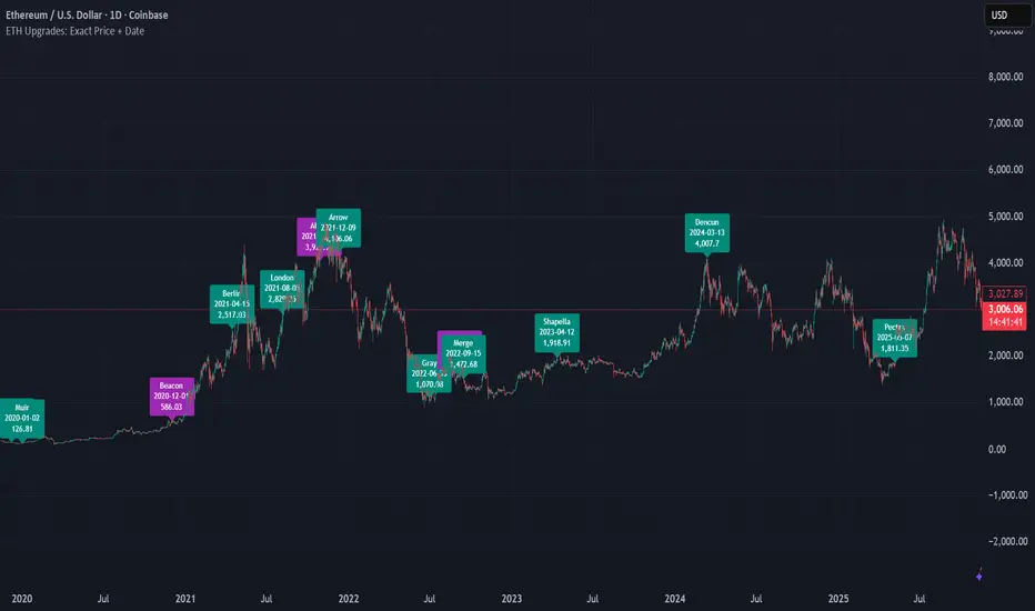
ETH Upgrades: Exact Price + DateThis indicator places markers on the chart that show you the exact date and price where each Ethereum upgrade occurred.Pine Script® göstergesiRed3Gamer tarafından1
Minervini VCP Pattern -Indian ContextThis script implements Mark Minervini's Trend Template and VCP (Volatility Contraction Pattern) pattern, specifically adapted for Indian stock markets (NSE). It helps identify stocks that are in strong uptrends and ready to break out. Core Concepts Explained 1. What is the Minervini Trend Template? Mark Minervini's method identifies stocks in Stage 2 uptrends - the sweet spot where institutional money is accumulating and stocks show the strongest momentum. Think of it as finding stocks that are "leaders" rather than "laggards." 2. What is VCP (Volatility Contraction Pattern)? A VCP occurs when: Stock price consolidates (moves sideways) after an uptrend Price swings get tighter and tighter (like a coiled spring) Volume dries up (fewer people trading) Then it breaks out with force. You can customize the strategy settings without editing code. Key Settings: Minimum Price (₹50): Filters out penny stocks that are too volatile Min Distance from 52W Low (30%): Stock should be at least 30% above its yearly low Max Distance from 52W High (25%): Stock should be within 25% of its yearly high (showing strength) Moving Average Periods: 10, 50, 150, 200 days (industry standard) Minimum Volume (100,000 shares): Ensures the stock is liquid enough to trade Indian Market Adaptation: The default values (₹50 minimum, volume thresholds) are adjusted for NSE stocks, which behave differently than US markets. The script pulls weekly chart data even when you're viewing daily charts. Why it matters: Weekly trends are more reliable than daily noise. Professional traders use weekly charts to confirm the bigger picture. What are Moving Averages (MAs)? Simple averages of closing prices over X days They smooth out price action to show trends Think of them as the "average cost" of buyers over different time periods The 4 Key MAs: 10 MA (Fast): Very short-term trend 50 MA: Short to medium-term trend 150 MA: Medium to long-term trend 200 MA: Long-term trend (the "grandfather" of all MAs) Why Weekly MAs? The script also calculates 10 and 50 MAs on weekly data for additional confirmation of the bigger trend. The script Finds the highest and lowest prices over the past 52 weeks (1 year). Why it matters: Stocks near 52-week highs are showing strength (institutions buying) Stocks far from 52-week lows have "room to run" upward This is a psychological level that influences trader behaviour. What is Volume here ? The number of shares traded each day High volume = many traders interested (conviction) Low volume = lack of interest (weakness or consolidation) Volume in VCP: During consolidation (sideways movement), volume should dry up - this shows sellers are exhausted and buyers are holding. When volume spikes on a breakout, it confirms the move. NSE Context: Indian stocks often have different volume patterns than US stocks, so the 50-day average is used as a baseline. Relative Strength vs Nifty: Example: If your stock is up 20% and Nifty is up 10%, your stock has strong RS If your stock is up 5% and Nifty is up 15%, your stock has weak RS (avoid it!) Why it matters: The best performing stocks almost always have strong relative strength before major moves. The 13 Minervini Conditions:- Condition 1: Price > 50/150/200 MA Meaning: Current price must be above ALL three major moving averages. Why: This confirms the stock is in a clear uptrend. If price is below these MAs, the stock is weak or in a downtrend. Condition 2: MA 50 > 150 > 200 Meaning: The moving averages themselves must be in proper order. Analogy: Think of this like layers in a cake - short-term on top, long-term at bottom. If they're tangled, the trend is unclear. Condition 3: 200 MA Rising (1 Month) Meaning: The 200 MA today must be higher than it was 20 days ago. Why: This confirms the long-term trend is UP, not flat or down. The means "20 bars ago." Condition 4: 50 MA Rising Meaning: The 50 MA today must be higher than 5 days ago. Why: Confirms short-term momentum is accelerating upward. Condition 5: Within 25% of 52-Week High Meaning: Current price should be within 25% of its 1-year high. Example: 52-week high = ₹1000 Current price must be above ₹750 (within 25%) Why: Strong stocks stay near their highs. Weak stocks fall far from highs. Condition 6: 30%+ Above 52-Week Low (OPTIONAL) Meaning: Stock should be at least 30% above its yearly low. Note: The script marks this as "SECONDARY - Optional" because the other conditions are more important. However, it's still a good confirmation. Condition 7: Price > 10 MA Meaning: Very short-term strength - price above the 10-day moving average. Why: Ensures the stock hasn't just rolled over in the immediate term. Condition 8: Price >= ₹50 Meaning: Filters out stocks below ₹50. Why: In Indian markets, stocks below ₹50 tend to be penny stocks with poor liquidity and higher manipulation risk. Condition 9: Weekly Uptrend Meaning: On the weekly chart, price must be above both weekly MAs, and they must be properly aligned. Why: Confirms the bigger picture trend, not just daily fluctuations. Condition 10: 150 MA Rising Meaning: The 150 MA is trending upward over the past 10 days. Why: Another confirmation of medium-term trend health. Condition 11: Sufficient Volume Meaning: Average volume must exceed 100,000 shares (or your custom setting). Why: Ensures you can actually buy/sell the stock without moving the price too much (liquidity). Condition 12: RS vs Nifty Strong Meaning: The stock's relative strength vs Nifty must be improving. Why: You want stocks that are outperforming the market, not underperforming. Condition 13: Nifty in Uptrend Meaning: The Nifty 50 index itself must be above its 50 MA. Why: "A rising tide lifts all boats." It's easier to make money in individual stocks when the overall market is bullish. VCP Requirements: Volatility Contracting: Price swings getting tighter (coiling spring) Volume Drying Up: Fewer shares trading + trending lower The Setup: When volatility contracts and volume dries up WHILE all 13 trend conditions are met, you have a VCP setup ready to explode. What You See on Chart: Colored Lines: 10 MA (green), 50 MA (blue), 150 MA (orange), 200 MA (red) Blue Background: Trend template conditions met (watch zone) Green Background: Full VCP setup detected (buy zone) ↟ Symbol Below Price: New VCP buy signal just triggered Information Table: What it does: Creates a checklist table on your chart showing the status of all conditions. Table Structure: Column 1: Condition name Column 2: Status (✓ green = met, ✗ red = not met) Final Row: Shows "BUY" (green) or "WAIT" (red) based on full VCP setup status. Dos: Example: Account size: ₹5,00,000 Risk per trade: 1% = ₹5,000 Entry: ₹1000 Stop loss: ₹920 (8% below) Distance to stop: ₹80 Shares to buy: ₹5,000 / ₹80 = 62 shares Exit Strategy: Sell 1/3 at +20% profit Sell another 1/3 at +40% profit Let the final 1/3 run with a trailing stop Always exit if price closes below 10 MA on heavy volume What This Script Does NOT Do: Guarantee profits - No strategy works 100% of the time Account for news events - Earnings, regulatory changes, etc. Consider fundamentals - Company financials, debt, management quality Adapt to market crashes - Works best in bull markets Best Market Conditions: ✅ Nifty in uptrend (above 50 MA) ✅ Market breadth positive (more stocks advancing) ✅ Sector rotation happening ❌ Avoid in bear markets or high volatility periods References: Trade Like a Stock Market Wizard by Mark Minervini Think & Trade Like a Champion by Mark Minervini Chart attached: AU Small Finance Bank as on EoD dated 28/11/25 This script is a powerful tool for educational purpose only, remember: It's a tool, not a crystal ball. Use it to find high-probability setups, then apply proper risk management and patience. Good luck! Pine Script® göstergesikingshukghosh71 tarafından66124
Market Pulse 5X — مؤشر نبض السوق الخماسي📘 Market Pulse 5X — Advanced Multi-Factor Market Engine A unified momentum, volume, volatility, structure, and candle-pressure model. Market Pulse 5X is a next-generation multi-factor indicator that analyzes the market from five independent dimensions and merges them into a single, normalized score between -100 and +100. Instead of relying on a single indicator, Market Pulse 5X gives you a full diagnostic reading of market health in one place — momentum strength, volume confirmation, volatility state, trend structure, and real candle pressure. 🔥 What Does Market Pulse 5X Do? It answers one question: “Who is in control right now — buyers or sellers — and how strong is that control?” It analyzes the market using: Momentum Engine (RSI, dual ROC, acceleration) Volume Intelligence (MFI, OBV, Volume ROC, A/D) Volatility Map (ATR %, Bollinger width, deviations) Market Structure Score (HH/LL logic, MA-distance) Candle Pressure Model (wicks, bodies, close strength) And it combines all five into one clear line with color dynamics and histogram confirmation. 🚀 Key Features 🔹 1. Momentum Engine A weighted blend of: Normalized RSI Short- & long-term ROC Market acceleration Designed to detect real directional strength. 🔹 2. Volume Intelligence Confirms whether the move is supported by real liquidity: MFI OBV (smoothed & normalized) Volume ROC Accumulation/Distribution No more guessing if a breakout is “fake volume” or real demand. 🔹 3. Volatility Map Tracks volatility shifts using: ATR percentage Bollinger Band Width Price deviation inside the band Helps you anticipate breakout conditions before they happen. 🔹 4. Market Structure Score Identifies the true trend direction by: Detecting HH/LL shifts Measuring distance from 20/50/200 MAs Gives clarity on trend strength — not just price fluctuation. 🔹 5. Candle Pressure Model Reads pure candle behavior: Bullish vs bearish candle ratio Wick dominance (buying/selling pressure) Close-position strength Accurate sentiment reading candle-by-candle. 📊 How to Read the Indicator Above +30 → Beginning of bullish control Above +70 → Overbought zone (potential reversal) Below -30 → Beginning of bearish control Below -70 → Oversold zone (bottom-formation area) Crossing 0 → Trend-shift confirmation The indicator’s color gradient makes momentum shifts instantly clear. 🛎️ Built-In Alerts Strong Buy Signal Strong Sell Signal Zero-line bullish cross Zero-line bearish cross Overbought zone Oversold zone Everything is ready to activate with one click. 🌟 Why Traders Love Market Pulse 5X ✓ Five indicators combined into one ✓ Cleaner charts, stronger signals ✓ Works for scalping, swing trading, and trend following ✓ Removes noise and delivers a direct reading of market health ✓ Not a “signal generator” — but a reliable decision-support tool ⚡ Best Use-Case Strategy Watch for movement from below -30 → above -30 Wait for the zero-line breakout for confirmation Entries are strongest when the previous move came from the oversold/overbought zones Use +70/-70 zones for trend exhaustion and reversal anticipation Simple. Consistent. Professional-grade. Market Pulse 5X A complete market heartbeat. One line. Zero confusion. 📘 مؤشر نبض السوق الخماسي – Market Pulse 5X مؤشر متقدم يجمع ٥ عوامل تحليل قوية في خط واحد: الزخم – السيولة – التقلبات – اتجاه السوق – ضغط الشموع. بدل ما تتابع ٢٠ مؤشر… هذا يعطيك قراءة نهائية واضحة من –100 إلى +100. 🔥 وش يسوي المؤشر؟ يعطيك جواب لسؤال واحد: “مين مسيطر الآن؟ المشترين ولا البائعين؟ وبأي قوة؟” ويحسبها من خلال: الزخم (RSI + ROC + تسارع الحركة) الحجم (MFI + OBV + تجميع/تصريف) التقلبات (ATR + عرض البولنجر) بنية الاتجاه (قمم وقيعان + MAs) ضغط الشموع (فتائل + جسم + الإغلاق) وفي النهاية تطلع لك قراءة واحدة بدون صداع. 🎯 طريقة القراءة فوق +30 → بداية سيطرة مشترين فوق +70 → ذروة شراء (احتمال انعكاس) تحت -30 → بداية سيطرة بائعين تحت -70 → ذروة بيع (بداية تكوين قاع) خط الصفر → أهم خط لتغيير الاتجاه 🛎️ إشارات وتنبيهات جاهزة إشارة شراء قوية إشارة بيع قوية تقاطع مع خط الصفر (دخول/خروج ترند) دخول ذروة شراء دخول ذروة بيع الكل جاهز بضغطة زر. 🌟 ليه المؤشر قوي؟ ✓ يجمع أهم بيانات السوق في قراءة واحدة ✓ يخفف التشويش ✓ يناسب سكالبينغ + سوينغ + استثمار ✓ يعطيك فكرة عن “صحة الحركة” مو مجرد إشارة دخول ✓ مفيد جداً لو ربطته مع مؤشرات الاتجاه اللي تستخدمها 💡 أفضل طريقة تستخدمه فيها راقب −30 و +30 إذا طلع من المنطقة السلبية وقطع الصفر → دخول ممتاز إذا وصل +70 وبدأ يضعف → حضّر نفسك للخروج إذا لامس −70 وبدأ يقوى → بداية ارتداد محترمة Market Pulse 5X خط واحد يكشف لك كل شيء يصير داخل الشارت.Pine Script® göstergesisniperlrt tarafındanGüncellendi 22742
FX Strength MTFFX strength indicator with 8h, daily and weekly reset settingPine Script® göstergesiTuni5 tarafından4
VaCs Pro Max by CS (Final Version - V9)VaCs Pro Max by CS (Final Version - V9) – TradingView Indicator Overview Introduction: The VaCs Pro Max indicator is a comprehensive, all-in-one technical analysis tool designed for traders who seek a clear, visual, and flexible overview of market trends, levels, sessions, and key signals. This advanced TradingView script integrates multiple technical indicators, market level trackers, session visualizations, and the innovative AlphaTrend module to provide actionable insights across any timeframe. 1. Technical Indicators: This module combines essential trend-following and market momentum tools: VWAP (Volume Weighted Average Price): Shows the average price weighted by volume, helping traders identify key support/resistance levels. Customizable color allows easy chart visibility. EMAs (Exponential Moving Averages): Two EMAs (fast and long) track short-term and long-term price trends. Traders can adjust lengths and colors for personalized analysis. Parabolic SAR: Highlights potential trend reversals with dots above/below candles. Step and maximum settings allow fine-tuning for sensitivity. S2F Bands (Stock-to-Flow): A dynamic band system representing mid, upper, and lower levels derived from EMA. Useful for identifying overbought/oversold zones. Logarithmic Growth Channel (LGC): Provides logarithmic regression channels, highlighting long-term price structure and growth trends. Adjustable length and band colors. Linear Regressions: Two regression lines (short and long) detect trend directions and deviations over customizable periods. Liquidity Zones: Highlights recent highs/lows over a defined lookback period, showing potential support/resistance clusters. SMC Markers (Swing Market Context): Marks pivot highs and lows using visual labels, helping identify swing points and trend continuation patterns. 2. Market Levels: Track weekly and Monday high/low levels for precise intraday and swing trading decisions: Weekly Levels: Highlight the previous week’s high and low for reference. Monday Levels: Focus on the day’s opening range, particularly useful for weekly breakout strategies. 3. Session Boxes (UTC): Visual boxes mark major trading sessions (London, New York) in UTC time: London Session Box: Highlights market activity between 08:00–16:30 UTC. New York Session Box: Highlights market activity between 13:30–20:00 UTC. Boxes automatically adjust to session highs and lows for clear intraday structure visualization. 4. Vertical Session Lines (Turkey Time – UTC+3): These vertical lines provide an easy-to-read visualization of key market opens and closes: US (NYSE), EU (LSE), JP (TSE), CN (SSE) lines: Color-coded and labeled, showing market opening and closing times in Turkish local time. Ideal for identifying session overlaps and liquidity spikes. 5. AlphaTrend Module: The AlphaTrend module is a dynamic trend-following system offering both visual guidance and trade signals: Trend Calculation: Uses ATR and RSI/MFI logic to determine dynamic trend levels. Signals: Generates BUY and SELL markers based on trend crossovers. Customizable Settings: Multiplier, period, source input, and volume data modes allow tailored sensitivity. Visuals: Filled areas between main and lag lines highlight trend direction, making it easy to interpret market bias at a glance. Alerts: Includes multiple alert conditions such as potential and confirmed BUY/SELL, and price crossovers, suitable for automated notifications. Usage & Benefits: All modules have on/off toggles in the input panel, allowing users to customize the chart view without losing performance. Color-coded visuals, session boxes, and trend channels improve readability, especially during high volatility. Suitable for day trading, swing trading, and long-term analysis due to multi-timeframe adaptability. The combination of trend indicators, liquidity zones, and session analysis provides a holistic view of market structure. Alerts enable traders to automate monitoring without constantly staring at the chart. Conclusion: VaCs Pro Max by CS (V9) is designed for both professional and semi-professional traders who want an all-inclusive, visually intuitive, and highly configurable TradingView indicator. It merges classical technical indicators with modern trend and session analysis tools, making it an indispensable tool for informed trading decisions.Pine Script® göstergesicdssvg tarafından34
NQBA This indicator is designed for educational purposes only and aims to support traders in analyzing price action using a combination of advanced technical tools. The script provides: Overbought and oversold zones derived from deviation factors and momentum filters. Dynamic levels based on several adaptive moving averages (Adaptive EMA, Normal EMA, and Trend EMA). Enhanced trend lines calculated using ATR-based channel formulas with adjustable volatility filters. Visual signals intended to highlight trend direction, momentum shifts, and potential reversal areas. Dynamic support and resistance channels that adapt to market volatility. This indicator does not guarantee performance, profitability, or specific trading outcomes. It should not be considered financial or investment advice. Results may vary depending on market conditions and user inputs, and it is recommended to combine this indicator with additional analysis tools before taking any trading decision.هذا المؤشر مصمم لأغراض تعليمية فقط، ويهدف إلى مساعدة المتداول في تحليل حركة السعر باستخدام مزيج من الأدوات الفنية المتقدمة. يقوم المؤشر بعرض: مناطق التشبّع الشرائي والبيعي بناءً على معاملات الانحراف ومؤشرات الزخم. مستويات ديناميكية تعتمد على متوسطات متحركة تكيفية (Adaptive EMA – Normal EMA – Trend EMA). خطوط اتجاه محسّنة تعتمد على قيم النطاق اللحظي (ATR) مع استخدام خوارزميات لضبط حجم القناة. إشارات مرئية تساعد على متابعة الاتجاه العام والزخم وتحديد مناطق التحول المحتملة. قنوات دعم ومقاومة تعتمد على خطوط متغيرة حسب تذبذب السوق. لا يعتمد هذا المؤشر على معادلات تعطي نتائج مؤكدة، ولا يمثل نصيحة استثمارية أو مالية. قد تختلف نتائج الأداء من مستخدم لآخر ويجب استخدامه مع أدوات واستراتيجيات تحليل إضافية قبل اتخاذ أي قرار تداول. Pine Script® göstergesiNQBA tarafından372